math 1 at-home learning packet: 4/27/20-5/8/20 wednesday …
TRANSCRIPT
Math 1 At-Home Learning Packet: 4/27/20-5/8/20
Wednesday 4.29 10-1 Organizing and Displaying Data Notes: p.686-690 Assignment: p.691-692 # 2-22 even
Friday 5.1 10-2 Frequency and Histograms Notes: p.695-697 Assignment:p.698-699 #1-14
Tuesday 5.5 10-3 Data Distributions Notes: p.702-705 Assignment: p.706-707 #2-6 even, #8-9, #10-13, #24-26 #41-43
Friday 5.8 Extension Data Plots and Distributions Notes: p.710-711 Assignment: p.712-713 #1-9 Additional Resources: If you have internet access you can use the following to help you with your packet:
- Khan Academy - Desmos Graphing Calculator www.desmos.com/calculator - Additional Answers are at the back of the packet to selected exercises

Organizing and Displaying Data
Who uses this?Nutritionists can display health information about food in bar graphs.
ObjectivesOrganize data in tables and graphs.
Choose a table or graph to display data.
Vocabularybar graphline graphcircle graph
Bar graphs, line graphs, and circle graphs can be used to present data in a visual way.
A bar graph displays data with vertical or horizontal bars. Bar graphs are a good way to display data that can be organized into categories. Using a bar graph, you can quickly compare the categories.
1E X A M P L E Reading and Interpreting Bar Graphs
Use the graph to answer each question.
Ài>`
�>�
/ÕÀ�iÞ
�iiÃi
�>Þ���>�Ãi
�>ÌÊ}®ä Ó { È n £ä
�>ÌÊ��Ìi�ÌÊ�vÊ>Ê-ÕLÊ->�`Ü�V�
��}
Ài`
�i�
Ì
A Which ingredient contains the most fat?mayonnaise The bar for mayonnaise is the longest.
B How many more grams of fat are in ham than in turkey?6 - 3 = 3 There are 6 grams of fat in ham and 3 grams
of fat in turkey.
C How many total fat grams are in this sandwich?1 + 6 + 3 + 9 + 11 = 30 Add the number of fat grams for each
ingredient.
D What percent of the total fat grams in this sandwich are from turkey?
3 _ 30
= 1 _ 10
= 10% Out of 30 total fat grams, 3 fat grams are from turkey.
Use the graph to answer each question. 1a. Which ingredient contains the least amount of fat? 1b. Which ingredients contain at least 8 grams of fat?
Vict
oria
Sm
ith/H
MH
Vict
oria
Sm
ith/H
MH
686 Chapter 10 Data Analysis and Probability
10-1CC.9-12.S.ID.1 Represent data with plots on the real number line (dot plots, histograms, and box plots).
CC13_A1_MESE647036_C10L01.indd 686CC13_A1_MESE647036_C10L01.indd 686 4/30/11 3:53:30 AM4/30/11 3:53:30 AM

ÓxÓä£x£äxä
�ÛiÀ>}iÊ>ÌÌi�`>�ViÊ
«iÀÊ}>�
iÊÌ��ÕÃ>�`î
9i>À
-«�ÀÌÃÊ�ÌÌi�`>�ViÊ>ÌÊ-Ì>ÌiÊ���i}i
Óäää
Óää£
ÓääÓ
ÓääÎ
Óää{
Óääx
���ÌL>�� >Ã�iÌL>��
A double-bar graph can be used to compare two data sets. A double-bar graph has a key to distinguish between the two sets of data.
2E X A M P L E Reading and Interpreting Double Bar Graphs
Use the graph to answer each question.
A In which year did State College have the greatest average attendance for basketball?2003Find the tallest orange bar.
B On average, how many more people attended a football game than a basketball game in 2001?20,000 - 13,000 = 7000Find the height of each bar for 2001 and subtract.
2. Use the graph to determine which years had the same average basketball attendance. What was the average attendance for those years?
A line graph displays data using line segments. Line graphs are a good way to display data that changes over a period of time.
3E X A M P L E Reading and Interpreting Line Graphs
Use the graph to answer each question.
nä
Èä
{ä
Óä
ä
/i�«iÀ>ÌÕÀiÊ��Ê"�iÊ�>Þ
/i�«iÀ>ÌÕÀiÊÂ�®
/��i��`��}�Ì {\ääÊ�°�° {\ääÊ*°�° n\ääÊ*°�°n\ääÊ�°�° ���
A At what time was the temperature the warmest?4:00 P.M. Identify the highest point.
B During which 4-hour time period did the temperature increase the most?From 8:00 A.M. to noon Look for the segment with the greatest
positive slope.
3. Use the graph to estimate the difference in temperature between 4:00 A.M. and noon.
10-1 Organizing and Displaying Data 687
CS10_A1_MESE612225_C10L01.indd 687CS10_A1_MESE612225_C10L01.indd 687 2/15/11 2:38:04 PM2/15/11 2:38:04 PM
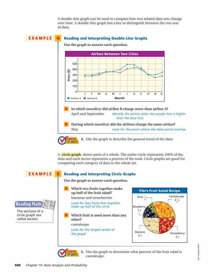
Fibi’s Fruit Salad Recipe
Blueberry1 c
Cantaloupe1_2
c2Kiwi 1_
2 c
Banana2 c
Strawberry2 c
A double-line graph can be used to compare how two related data sets change over time. A double-line graph has a key to distinguish between the two sets of data.
4E X A M P L E Reading and Interpreting Double-Line Graphs
Use the graph to answer each question.
xää
{ää
Îää
Óää
£ää
ä
��Àv>ÀiÊiÌÜii�Ê/Ü�Ê�Ì�iÃ
*À�ViÊf®
���Ì���À���iÊ��À���iÊ�
� � � � � � � � - " �
A In which month(s) did airline B charge more than airline A?April and September Identify the points when the purple line is higher
than the blue line.
B During which month(s) did the airlines charge the same airfare?May Look for the point where the data points overlap.
4. Use the graph to describe the general trend of the data.
A circle graph shows parts of a whole. The entire circle represents 100% of the data and each sector represents a percent of the total. Circle graphs are good for comparing each category of data to the whole set.
5E X A M P L E Reading and Interpreting Circle Graphs
Use the graph to answer each question.
A Which two fruits together make up half of the fruit salad?bananas and strawberries
Look for two fruits that together make up half of the circle.
B Which fruit is used more than any other?cantaloupeLook for the largest sector of the graph.
5. Use the graph to determine what percent of the fruit salad is cantaloupe.
The sections of a circle graph are called sectors.
Sam
Dud
geon
/HM
HS
am D
udge
on/H
MH
688 Chapter 10 Data Analysis and Probability
CS10_A1_MESE612225_C10L01.indd 688CS10_A1_MESE612225_C10L01.indd 688 2/15/11 2:38:06 PM2/15/11 2:38:06 PM

ÎÓÓ{£Ènä
Õ�LiÀ
����>���V�i�
��>Ì
��ÀÃi *�}
-�ii«
��ÛiÃÌ�V�Ê-��ÜÊ �ÌÀ�iÃ
��Û�Ã���Ê�vÊÀ�«Ã
�À�Îx¯
��Ýi`ÊÛi}iÌ>L�iÃ
x¯
-�ÞLi>�ÃÓä¯
�>���ÜÓx¯
7�i>ÌÊ£x¯
6E X A M P L E Choosing and Creating an Appropriate Display
Use the given data to make a graph. Explain why you chose that type of graph.
A Livestock Show Entries
Animal Number
Chicken 38
Goat 10
Horse 32
Pig 12
Sheep 25
A bar graph is appropriate for this data because it will be a good way to compare categories.
Step 1 Determine an appropriate scale and interval. The scale must include all of the data values. The scale is separated into equal parts, called intervals.
Step 2 Use the data to determine the lengths of the bars. Draw bars of equal width. The bars should not touch.
Step 3 Title the graph and label the horizontal and vertical scales.
B Division of Crops
CropArea
(acres)
Corn 70
Fallow 50
Mixed vegetables 10
Soybeans 40
Wheat 30
A circle graph is appropriate for this data because it shows categories as parts of a whole.
Step 1 Calculate the percent of the total represented by each category.
Corn: 70 _ 200
= 0.35 = 35%
Soybeans: 40 _ 200
= 0.2 = 20%
Fallow: 50 _ 200
= 0.25 = 25%
Wheat: 30 _ 200
= 0.15 = 15%
Mixed vegetables: 10 _ 200
= 0.05 = 5%
Step 2 Find the angle measure for each sector of the graph. Since there are 360° in a circle, multiply each percent by 360°.Corn: 0.35 × 360° = 126°Fallow: 0.25 × 360° = 90°Mixed vegetables: 0.05 × 360° = 18°Soybeans: 0.2 × 360° = 72°Wheat: 0.15 × 360° = 54°
Step 3 Use a compass to draw a circle. Mark the center and use a straightedge to draw one radius. Then use a protractor to draw each central angle.
Step 4 Title the graph and label each sector.
10-1 Organizing and Displaying Data 689
CS10_A1_MESE612225_C10L01.indd 689CS10_A1_MESE612225_C10L01.indd 689 2/15/11 2:38:09 PM2/15/11 2:38:09 PM

Use the given data to make a graph. Explain why you chose that type of graph.
C Chinnick College Enrollment
Year Students
1930 586
1955 2,361
1980 15,897
2005 21,650
A line graph is appropriate for this data because it will show the change in enrollment over a period of time.
Step 1 Determine the scale and interval for each set of data. Time should be plotted on the horizontal axis because it is independent.
Step 2 Plot a point for each pair of values. Connect the points using line segments.
Step 3 Title the graph and label the horizontal and vertical scales.
Óä]äää
£x]äää
£ä]äää
x]äää
ä
�����V�Ê���i}iÊ �À����i�Ì
-ÌÕ
`i�
ÌÃ
9i>À£�Îä £�xx £�nä Óääx
6. Use the given data to make a graph. Explain why you chose that type of graph.
The data below shows how Vera spends her time during a typical 5-day week during the school year.
Vera’s Schedule
Activity Sleeping Eating School Sports Homework Other
Time (h) 45 8 30 10 10 17
THINK AND DISCUSS 1. What are some comparisons you can make by looking at a bar graph?
2. Name some key components of a good line graph.
3. GET ORGANIZED Copy and complete the graphic organizer. In each box, tell which kind of graph is described.
Shows how a whole
is divided in parts
Graph Type
Compares categories
Shows change over time
/THER���
690 Chapter 10 Data Analysis and Probability
CC13_A1_MESE647036_C10L01.indd 690CC13_A1_MESE647036_C10L01.indd 690 4/30/11 4:11:07 AM4/30/11 4:11:07 AM

Îä
Óä
£ä
ä Dog Cat Guineapig
Rabbit
����>�Ê,iÃVÕiÊ,iÃ�`i�ÌÃ
Õ�LiÀ
����>�
{ä
Îä
Óä
£ä
ä*À�ViÊf®
/Þ«iÊ�vÊÃi>Ì
>ÃiL>��Ê/�V�iÌÃ
Clublevel
Upperreserve
Boxseat
Bleacher
-Ì>`�Õ�Ê� -Ì>`�Õ�Ê
30
20
10
0
Movie Ticket Sales
Tick
ets
sold
(t
ho
usa
nd
s)
Weeks since release 1 2 3 4 5 6
Èä
{ä
Óä
ä
�iVÌ���Ê*���
6�ÌiÀÊÃÕ««�ÀÌʯ®
7ii�ÃÊLiv�ÀiÊi�iVÌ���>�`�`>ÌiÊ� >�`�`>ÌiÊ
n Ç È x { Î Ó £
Homework Help OnlineParent Resources OnlineExercisesExercises
GUIDED PRACTICEVocabulary Use the vocabulary from this lesson to answer the following questions.
1. In a circle graph, what does each sector represent?
2. In a line graph, how does the slope of a line segment relate to the rate of change?
SEE EXAMPLE 1 Use the bar graph for Exercises 3 and 4.
3. Estimate the total number of animals at the shelter.
4. There are 3 times as many ? as ? at the animal shelter.
SEE EXAMPLE 2 Use the double-bar graph for Exercises 5–7.
5. About how much more is a club level seat at stadium A than at stadium B?
6. Which type of seat is the closest in price at the two stadiums?
7. Describe one relationship between the ticket prices at stadium A and stadium B.
SEE EXAMPLE 3 Use the line graph for Exercises 8 and 9.
8. Estimate the number of tickets sold during the week of the greatest sales.
9. Which one-week period of time saw the greatest change in sales?
SEE EXAMPLE 4 Use the double-line graph for Exercises 10–12.
10. When was the support for the two candidates closest?
11. Estimate the difference in voter support for the two candidates five weeks before the election.
12. Describe the general trend(s) of voter support for the two candidates.
10-1 Organizing and Displaying Data 691
x - x x - x 10-1
CS10_A1_MESE612225_C10L01.indd 691CS10_A1_MESE612225_C10L01.indd 691 2/15/11 2:38:14 PM2/15/11 2:38:14 PM

Colors in Ball Playpen
Yellow24% Green
17%
Blue18%
Purple 10%
Red31%
£Óää
nää
{ää
ä
�>À���½ÃÊ6�`i�Ê�>�iÊ-V�ÀiÃ
-V�Ài
�>�iÊ�Õ�LiÀ£ Ó Î { x È
Item/Activity Spending ($)
Clothing 35
Food 25
Entertainment 25
Other 15
�iÀ��ii
��««iÜ>
��VÌ>Ü
>Û>��
-��ÕÝ
/À�Li
*�«Õ�>Ì���ÊÌ��ÕÃ>�`îä xä £ää £xä Óää Óxä Îää
>Ì�ÛiÊ��iÀ�V>�Ê*�«Õ�>Ì���]ÊÓäää
-�ÕÀVi\Ê1°-°Êi�ÃÕÃÊÕÀi>Õ
Óxä
Óää
£xä
£ää
xä
ä
ÕÃÌ��iÀÃ
�>ÞÊ�vÊÌ�iÊÜii�
,>Þ½ÃÊ,iÃÌ>ÕÀ>�Ì
- � / 7 / � -
����iÀ�Õ�V�
SEE EXAMPLE 5 Use the circle graph for Exercises 13–15.
13. Which color is least represented in the ball playpen?
14. There are 500 balls in the playpen. How many are yellow?
15. Which two colors are approximately equally represented in the ball playpen?
SEE EXAMPLE 6 16. The table shows the breakdown of Karim’s monthly budget of $100. Use the given data to make a graph. Explain why you chose that type of graph.
PRACTICE AND PROBLEM SOLVING
For See Exercises Example
17–18 1 19–21 2 22–23 3 24–26 4 27–28 5 29 6
Independent Practice Use the bar graph for Exercises 17 and 18.
17. Estimate the difference in population between the tribes with the largest and the smallest population.
18. Approximately what percent of the total population shown in the table is Cherokee?
Use the double bar graph for Exercises 19–21.
19. On what day did Ray do the most overall business?
20. On what day did Ray have the busiest lunch?
21. On Sunday, about how many times as great was the number of dinner customers as the number of lunch customers?
Use the line graph for Exercises 22 and 23.
22. Between which two games did Marlon’s score increase the most?
23. Between which three games did Marlon’s score increase by about the same amount?
See Extra Practice for more Skills Practice and Applications Practice exercises.
Extra Practice
692 Chapter 10 Data Analysis and Probability
CS10_A1_MESE612225_C10L01.indd 692CS10_A1_MESE612225_C10L01.indd 692 2/15/11 2:38:18 PM2/15/11 2:38:18 PM

Îä
Óä
£ä
ä
�Õ>�½ÃÊ-Ì�V�Ê6>�ÕiÃ
6>�ÕiÊ«iÀÊÃ�>ÀiÊf®
�>Ìi-Ì�V�Ê9-Ì�V�Ê8
�>�Óää{
�«ÀÓää{
�Õ�Óää{
"VÌÓää{
�>�Óääx
>ÀÃÊ��Ê>Ê�Ài�}�ÌÊ/À>��
/>��ÊV>ÀÎÎ
���`��>ÊV>ÀÊ££
��>ÌV>À£È
�ÝV>ÀÓ{
�}��iÊV>À{
��««iÀÊV>Àn
Olympic Medals, 1896
United States
Germany
France
All Others
Great Britain
Greece
Use the double-line graph for Exercises 24–26.
24. What was the average value per share of Juan’s two stocks in July 2004?
25. Which stock’s value changed the most over any time period?
26. Describe the trend of the values of both stocks.
Use the circle graph for Exercises 27 and 28.
27. About what percent of the total number of cars are hopper cars?
28. About what percent of the total number of cars are gondola or tank cars?
29. The table shows the weight of twin babies at various times from birth to four weeks old. Use the given data to make a graph. Explain why you chose that type of graph.
Write bar, double-bar, line, double-line, or circle to indicate the type of graph that would best display the data described.
30. attendance at a carnival each year over a ten-year period
31. attendance at two different carnivals each year over a ten-year period
32. attendance at five different carnivals during the same year
33. attendance at a carnival by age group as it relates to total attendance
34. Critical Thinking Give an example of real-world data that would best be displayed by each type of graph: line graph, circle graph, double-bar graph.
Age (days)
Boy’s Weight (lb)
Girl’s Weight (lb)
1 5.3 5.7
3 5.0 5.2
7 5.5 5.9
14 6.2 6.8
28 7.9 7.5
35. The first modern Olympic Games took place in 1896 in Athens, Greece. The circle graph shows the total number of medals won by several countries at the Olympic Games of 1896.
a. Which country won the most medals? Estimate the percent of the medals won by this country.
b. Which country won the second most medals? Estimate the percent of the medals won by this country.
10-1 Organizing and Displaying Data 693
CS10_A1_MESE612225_C10L01.indd 693CS10_A1_MESE612225_C10L01.indd 693 2/15/11 2:38:21 PM2/15/11 2:38:21 PM

Frequency and Histograms
ObjectivesCreate stem-and-leaf plots.
Create frequency tables and histograms.
Vocabularystem-and-leaf plotfrequencyfrequency tablehistogramcumulative frequency
Stems are always consecutive numbers. In Example 1B, neither player has scores that start with 15, so there are no leaves in that row.
A stem-and-leaf plot arranges data by dividing each data value into two parts. This allows you to see each data value.
The last digit of a value iscalled a leaf.
The key tells you how toread each value.
The digits other than thelast digit of each valueare called a stem.
1E X A M P L E Making a Stem-and-Leaf Plot
A The numbers of students in each of the elective classes at a school are given below. Use the data to make a stem-and-leaf plot.24, 14, 12, 25, 32, 18, 23, 24, 9, 18, 34, 28, 24, 27
Õ�LiÀÊ�vÊ-ÌÕ`i�ÌÃÊ��Ê �iVÌ�ÛiÊ�>ÃÃiÃ
�iÞ\ÊÓ]ÎÊ�i>�ÃÊÓÎ
-Ìi� �i>ÛiÃ
ä£ÓÎ
�ÓÊ{ÊnÊnÎÊ{Ê{Ê{ÊxÊÇÊnÓÊ{
The tens digits are the stems.
The ones digits are the leaves. List the leaves from least to greatest within each row.
Title the graph and add a key.
B Marty’s and Bill’s scores for ten games of bowling are given below. Use the data to make a back-to-back stem-and-leaf plot.Marty: 137, 149, 167, 134, 121, 127, 143, 123, 168, 162Bill: 129, 138, 141, 124, 139, 160, 149, 145, 128, 130
Bowling Scores
Key: |14|1 means 141 3|14| means 143
Marty Bill
12 13 14 15 16
4 8 9 0 8 9 1 5 9 0
7 3 1 7 4 9 3
8 7 2
The first two digits are the stems.
The ones digits are the leaves.
Put Marty’s scores on the left side and Bill’s scores on the right.
Title the graph and add a key.
The graph shows that three of Marty’s scores were higher than Bill’s highest score.
1. The temperatures in degrees Celsius for two weeks are given below. Use the data to make a stem-and-leaf plot.
7, 32, 34, 31, 26, 27, 23, 19, 22, 29, 30, 36, 35, 31
Why learn this?Stem-and-leaf plots can be used to organize data, like the number of students in elective classes. (See Example 1.)
Tom
Ste
war
t/C
OR
BIS
Tom
Ste
war
t/C
OR
BIS
10-2 Frequency and Histograms 695
10-2CC.9-12.S.ID.1 Represent data with plots on the real number line (dot plots, histograms, and box plots).
CC13_A1_MESE647036_C10L02.indd 695CC13_A1_MESE647036_C10L02.indd 695 4/30/11 3:58:15 AM4/30/11 3:58:15 AM

Golf Tournament Scores
6
5
4
3
2
1
0
Freq
uen
cy
68–7
071
–73
74–7
677
–7980
–82
Scores
The frequency of a data value is the number of times it occurs. A frequency table shows the frequency of each data value. If the data is divided into intervals, the table shows the frequency of each interval.
2E X A M P L E Making a Frequency Table
The final scores for each golfer in a tournament are given below. Use the data to make a frequency table with intervals.
77, 71, 70, 82, 75, 76, 72, 70, 77, 74, 71, 75, 68, 72, 75, 74
Step 1 Identify the least and greatest values.
The least value is 68. The greatest value is 82.
Step 2 Divide the data into equal intervals.
For this data set, use an interval of 3.
Step 3 List the intervals in the first column of the table. Count the number of data values in each interval and list the count in the last column. Give the table a title.
2. The numbers of days of Maria’s last 15 vacations are listed below. Use the data to make a frequency table with intervals.
4, 8, 6, 7, 5, 4, 10, 6, 7, 14, 12, 8, 10, 15, 12
A histogram is a bar graph used to display the frequency of data divided into equal intervals. The bars must be of equal width and should touch, but not overlap.
3E X A M P L E Making a Histogram
Use the frequency table in Example 2 to make a histogram.
Step 1 Use the scale and interval from the frequency table.
Step 2 Draw a bar for the number of scores in each interval.
All bars should be the same width. The bars should touch, but not overlap.
Step 3 Title the graph and label the horizontal and vertical scales.
3. Make a histogram for the number of days of Maria’s last 15 vacations.
4, 8, 6, 7, 5, 4, 10, 6, 7, 14, 12, 8, 10, 15, 12
The intervals in a histogram must be of equal size.
Golf Tournament Scores
Scores Frequency
68–70 3
71–73 4
74–76 6
77–79 2
80–82 1
696 Chapter 10 Data Analysis and Probability
CS10_A1_MESE612225_C10L02.indd 696CS10_A1_MESE612225_C10L02.indd 696 2/15/11 2:11:48 PM2/15/11 2:11:48 PM

Cumulative frequency shows the frequency of all data values less than or equal to a given value. You could just count the number of values, but if the data set has many values, you might lose track. Recording the data in a cumulative frequency table can help you keep track of the data values as you count.
4E X A M P L E Making a Cumulative Frequency Table
The heights in inches of the players on a school basketball team are given below.
72, 68, 71, 70, 73, 69, 79, 76, 72, 75, 72, 74, 68, 70, 69, 75, 72, 71, 73, 76
a. Use the data to make a cumulative frequency table.
Step 1 Choose intervals for the first column of the table.
Step 2 Record the frequency of values in each interval for the second column.
Step 3 Add the frequency of each interval to the frequencies of all the intervals before it. Put that number in the third column of the table.
Step 4 Title the table. Basketball Players’ Heights
Height (in.) Frequency
Cumulative Frequency
68–70 6 6
71–73 8 14
74–76 5 19
77–79 1 20
b. How many players have heights under 74 in?All heights under 74 in. are displayed in the first two rows of the table, so look at the cumulative frequency shown in the second row.There are 14 players with heights under 74 in.
4. The numbers of vowels in each sentence of a short essay are listed below.
33, 36, 39, 37, 34, 35, 43, 35, 28, 32, 36, 35, 29, 40, 33, 41, 37 a. Use the data to make a cumulative frequency table. b. How many sentences contain 35 vowels or fewer?
THINK AND DISCUSS 1. In a stem-and-leaf plot, the number of ? is always the
same as the number of data values. (stems or leaves)
2. Explain how to make a histogram from a stem-and-leaf plot.
3. GET ORGANIZED Copy and complete the graphic organizer.
��ÜÊ>ÀiÊÌ�iÞ>���i
��ÜÊ>ÀiÊÌ�iÞ`�vviÀi�̶
>ÀÊ�À>«�ÃÊÛÃÊ��ÃÌ�}À>�Ã
10-2 Frequency and Histograms 697
CC13_A1_MESE647036_C10L02.indd 697CC13_A1_MESE647036_C10L02.indd 697 4/30/11 3:58:43 AM4/30/11 3:58:43 AM

Homework Help OnlineParent Resources OnlineExercisesExercises
GUIDED PRACTICE 1. Vocabulary A(n) ? is a data display that shows individual data values.
(stem-and-leaf plot or histogram)
SEE EXAMPLE 1 2. Sports The ages of professional basketball players at the time the players were recruited are given. Use the data to make a stem-and-leaf plot.
3. Weather The average monthly rainfall for two cities (in inches) is given below. Use the data to make a back-to-back stem-and-leaf plot.
Average Monthly Rainfall (in.)
Austin, TX 1.9 2.4 1.9 3.0 3.6 3.3 1.9 2.1 3.2 3.5 2.2 2.3
New York, NY 3.3 3.1 3.9 3.7 4.2 3.3 4.1 4.1 3.6 3.3 4.2 3.6
SEE EXAMPLE 2 4. Sports The finishing times of runners in a 5K race, to the nearest minute, are given. Use the data to make a frequency table with intervals.
SEE EXAMPLE 3 5. Biology The breathing intervals of gray whales are given. Use the frequency table to make a histogram for the data.
SEE EXAMPLE 4 6. The scores made by a group of eleventh-grade students on the mathematics portion of the SAT are given.
a. Use the data to make a cumulative frequency table.
b. How many students scored 650 or higher on the mathematics portion of the SAT?
PRACTICE AND PROBLEM SOLVING 7. The numbers of people who visited a park each day over two weeks during different
seasons are given below. Use the data to make a back-to-back stem-and-leaf plot.
Visitors to a Park
Summer 25 25 26 27 27 57 59 22 23 29 22 23 54 53
Winter 11 12 13 9 30 27 4 19 14 19 21 33 35 9
Ages When Recruited
21 23 21 18 22 19 24 22 21 22 20 21
Finishing Times in 5K Race (to the nearest minute)
19 25 23 29 32 30 21 22 24
19 28 26 31 34 30 28 25 24
Breathing Intervals (min)
Interval Frequency
5–7 4
8–10 7
11–13 7
14–16 8
Scores on Mathematics Portion of SAT
520 560 720 690 540 630 790 540
600 580 710 500 540 660 630
698 Chapter 10 Data Analysis and Probability
10-2
CS10_A1_MESE612225_C10L02.indd 698CS10_A1_MESE612225_C10L02.indd 698 2/15/11 2:11:53 PM2/15/11 2:11:53 PM

Solar cars usually weigh between 330 and 880 pounds. A conven-tional car weighs over 4000 pounds.
Automobiles
For See Exercises Example
7–8 1 9 2 10 3 11 4
Independent Practice 8. Weather The daily high temperatures in degrees Fahrenheit in a town during one month are given. Use the data to make a stem-and-leaf plot.
9. The overall GPAs of several high school seniors are given. Use the data to make a frequency table with intervals.
10. Chemistry The atomic masses of the nonmetal elements are given in the table. Use the frequency table to make a histogram for the data.
Atomic Masses of Nonmetal Elements
Interval 0–49.9 50–99.9 100–149.9 150–199.9 200–249.9
Frequency 11 3 2 0 2
11. The numbers of pretzels found in several samples of snack mix are given in the table.
a. Use the data to make a cumulative frequency table.
b. How many samples of snack mix had fewer than 42 pretzels?
12. Automobiles The table shows gas mileage for the most economical cars in July 2004, including three hybrids.
Gas Mileage of Economical Cars
Mileage in City (mi/gal) 32 60 48 38 36 60 35 38 32
Mileage on Highway (mi/gal) 38 51 47 46 47 66 43 46 40
Make a back-to-back stem-and-leaf plot for the data.
13. Damien’s math test scores are given in the table:
a. Make a stem-and-leaf plot of Damien’s test scores.
b. Make a histogram of the test scores using intervals of 5.
c. Make a histogram of the test scores using intervals of 10.
d. Make a histogram of the test scores using intervals of 20.
e. How does the size of the interval affect the appearance of the histogram?
f. Write About It Which histogram makes Damien’s grades look highest? Explain.
14. /////ERROR ANALYSIS///// Two students made stem-and-leaf plots for the following data:
530, 545, 550, 555, 570. Which is incorrect? Explain the error.
.,
.-
..
.0
).)�.)
!Lm^f E^Zo^l
D^r3Ê.+].Êf^ZglÊ.+.
.,
.-
..
./
.0
).)�.
)
"Lm^f E^Zo^l
D^r3Ê.+].Êf^ZglÊ.+.
Numbers of Pretzels
42 39 39 38 40
41 44 42 38 44
47 36 40 40 43 38
Damien’s MathTest Scores
75 84 68
72 59 88
72 77 81
84 60 70
Daily High Temperatures (°F)
68 72 79 77 70 72 75 71 64 64
68 62 70 71 78 83 83 87 91 89
87 75 73 70 69 69 62 58 71 76
Overall GPAs
3.6 2.9 3.1 3.0 2.5 2.6 3.8 2.9
2.2 2.9 3.1 3.3 3.6 3.0 2.3 2.8 2.9See Extra Practice for more Skills Practice and Applications Practice exercises.
Extra Practice
© R
eute
rs/C
OR
BIS
© R
eute
rs/C
OR
BIS
10-2 Frequency and Histograms 699
CS10_A1_MESE612225_C10L02.indd 699CS10_A1_MESE612225_C10L02.indd 699 2/15/11 2:11:55 PM2/15/11 2:11:55 PM

16. Entertainment The top ten movies in United States theaters for the weekend of June 25–27, 2004, grossed the following amounts (in millions of dollars). Create a histogram for the data. Make the first interval 5–9.9.
17. Critical Thinking Margo’s homework Age
Under 18
18–30
31–54
55 and older
assignment is to make a data display of some data she finds in a newspaper. She found a frequency table with the given intervals.
Explain why Margo must be careful when drawing the bars of the histogram.
18. What data value occurs most often
�iÞ\ÊÎ]ÓÊ�i>�ÃÊΰÓ
-Ìi� �i>ÛiÃ
Î{x
ÓÊÎÊ{Ê{ÊÇÊ�äÊ£ÊxÊÇÊÇÊÇÊn£ÊÓÊÓÊÎ
in the stem-and-leaf plot? 7 47 4.7 777
19. The table shows the results of a survey about time spent on the Internet each month. Which statement is NOT supported by the data in the table?
Time Spent on the Internet per Month
Time (h) Frequency Cumulative Frequency
0–4 4 4
5–9 6 10
10–14 3 13
15–19 16 29
20–24 12 41
25–29 7 48
30–34 2 50
The interval of 30 to 34 h/mo has the lowest frequency. More than half of those who responded spend more than 20 h/mo on the
Internet. Only four people responded that they spend less than 5 h/mo on the Internet. Sixteen people responded that they spend less than 20 h/mo on the Internet.
Ticket Sales (million $)
23.9 19.7 18.8 13.5 13.1
11.2 10.2 7.5 6.1 5.1
15. The 2004 Olympic results for women’s weightlifting in the 48 kg weight class are 210, 205, 200, 190, 187.5, 182.5, 180, 177.5, 175, 172.5, 170, 167.5, and 165, measured in kilograms. Medals are awarded to the athletes who can lift the most weight.
a. Create a frequency table beginning at 160 and using intervals of 10 kg.
b. Create a histogram of the data.
c. Tara Cunningham from the United States lifted 172.5 kg. Did she win a medal? How do you know?
700 Chapter 10 Data Analysis and Probability
CS10_A1_MESE612225_C10L02.indd 700CS10_A1_MESE612225_C10L02.indd 700 2/15/11 2:11:57 PM2/15/11 2:11:57 PM

Who uses this?Sports analysts examine data distributions to make predictions. (See Example 4.)
ObjectivesDescribe the central tendency of a data set.
Create and interpret box-and-whisker plots.
Vocabularymeanmedianmoderangeoutlierfirst quartilethird quartileinterquartile range (IQR)box-and-whisker plot
A measure of central tendency describes the center of a set of data. Measures of central tendency include the mean, median, and mode.
• The mean is the average of the data values, or the sum of the values in the set divided by the number of values in the set.
• The median is the middle value when the values are in numerical order, or the mean of the two middle numbers if there are an even number of values.
• The mode is the value or values that occur most often. A data set may have one mode or more than one mode. If no value occurs more often than another, the data set has no mode.
The range of a set of data is the difference between the greatest and least values in the set. The range is one measure of the spread of a data set.
1E X A M P L E Finding Mean, Median, Mode, and Range of a Data Set
The numbers of hours Isaac did homework on six days are 3, 8, 4, 6, 5, and 4. Find the mean, median, mode, and range of the data set.
3, 4, 4, 5, 6, 8 Write the data in numerical order.
mean: 3 + 4 + 4 + 5 + 6 + 8 __ 6
= 30 _ 6
= 5 Add all the values and divide by the number of values.
median: 3, 4, 4, 5, 6, 8The median is 4.5.
There is an even number of values. Find the mean of the two middle values.
mode: 4 4 occurs more than any other value.
range: 8 - 3 = 5 Subtract the least value from the greatest value.
1. The weights in pounds of five cats are 12, 14, 12, 16, and 16. Find the mean, median, mode, and range of the data set.
A value that is very different from the other values in a data set is called an outlier. In the data set below, one value is much greater than the other values.
-OST�OF�DATA -EAN� -UCH�DIFFERENT�VALUE
Data Distributions
AP
Pho
to/D
ave
Mar
tinA
P P
hoto
/Dav
e M
artin
702 Chapter 10 Data Analysis and Probability
10-3CC.9-12.S.ID.2 Use statistics appropriate to the shape of the data distribution to compare center (median, mean) and spread (interquartile range, standard deviation) of two or more different data sets. Also CC.9-12.S.ID.3, CC.9-12.S.ID.1
CC13_A1_MESE647036_C10L03.indd 702CC13_A1_MESE647036_C10L03.indd 702 4/30/11 4:01:17 AM4/30/11 4:01:17 AM

2E X A M P L E Determining the Effects of Outliers
Identify the outlier in the data set {7, 10, 54, 9, 12, 8, 5} , and determine how the outlier affects the mean, median, mode, and range of the data.
5, 7, 8, 9, 10, 12, 54 Write the data in numerical order.
The outlier is 54. Look for a value much greater or less than the rest.
With the Outlier:
mean: 5 + 7 + 8 + 9 + 10 + 12 + 54 ___ 7
= 15
median: 5, 7, 8, 9, 10, 12, 54The median is 9.mode: Each value occurs once.There is no mode.range: 54 - 5 = 49
Without the Outlier:
mean: 5 + 7 + 8 + 9 + 10 + 12 ___ 6
= 8.5
median: 5, 7, 8, 9, 10, 12The median is 8.5.mode: Each value occurs once.There is no mode.range: 12 - 5 = 7
The outlier increases the mean by 6.5, the median by 0.5, and the range by 42. It has no effect on the mode.
2. Identify the outlier in the data set {21, 24, 3, 27, 30, 24} , and determine how the outlier affects the mean, median, mode, and range of the data.
As you can see in Example 2, an outlier can strongly affect the mean of a data set, while having little or no impact on the median and mode. Therefore, the mean may not be the best measure to describe a data set that contains an outlier. In such cases, the median or mode may better describe the center of the data set.
3E X A M P L E Choosing a Measure of Central Tendency
Niles scored 70, 74, 72, 71, 73, and 96 on his six geography tests. For each question, choose the mean, median, or mode, and give its value.
A Which measure gives Niles’s test average?The average of Niles’s scores is the mean.
mean: 70 + 74 + 72 + 71 + 73 + 96 ___ 6
= 76
B Which measure best describes Niles’s typical score? Explain.The outlier of 96 causes the mean to be greater than all but one of the test scores, so it is not the best measure in this situation.
The data set has no mode.
The median best describes the typical score.
median: 70, 71, 72, 73, 74, 96 Find the mean of the two middle values.
The median is 72.5.
Josh scored 75, 75, 81, 84, and 85 on five tests. For each question, choose the mean, median, or mode, and give its value.
3a. Which measure describes the score Josh received most often?
3b. Which measure should Josh use to convince his parents that he is doing well in school? Explain.
10-3 Data Distributions 703
CS10_A1_MESE612225_C10L03.indd 703CS10_A1_MESE612225_C10L03.indd 703 2/15/11 2:54:15 PM2/15/11 2:54:15 PM

Measures of central tendency describe how data cluster around one value. Another way to describe a data set is by its spread—how the data values are spread out from the center.
Quartiles divide a data set into four equal parts. Each quartile contains one-fourth of the values in the set. The first quartile is the median of the lower half of the data set. The second quartile is the median of the data set, and the third quartile is the median of the upper half of the data set.
The interquartile range (IQR) of a data set is the difference between the third and first quartiles. It represents the range of the middle half of the data.
A box-and-whisker plot can be used to show how the values in a data set are distributed. You need five values to make a box-and-whisker plot: the minimum (or least value), first quartile, median, third quartile, and maximum (or greatest value).
4E X A M P L E Sports Application
The numbers of runs scored by a softball team in 20 games are given. Use the data to make a box-and-whisker plot.
3, 4, 8, 12, 7, 5, 4, 12, 3, 9, 11, 4, 14, 8, 2, 10, 3, 10, 9, 7
Step 1 Order the data from least to greatest.
2, 3, 3, 3, 4, 4, 4, 5, 7, 7, 8, 8, 9, 9, 10, 10, 11, 12, 12, 14
Step 2 Identify the five needed values.
2, 3, 3, 3, 4, 4, 4, 5, 7, 7, 8, 8, 9, 9, 10, 10, 11, 12, 12, 14
Minimum Q1 Q2 Q3 Maximum 2 4 7.5 10 14
Step 3 Draw a number line and plot a point above each of the five needed values. Draw a box through the first and third quartiles and a vertical line through the median. Draw lines from the box to the minimum and maximum.
0 2 4 6 8 10 12 14
First quartileMedian
Third quartileMaximumMinimum
4. Use the data to make a box-and-whisker plot.
13, 14, 18, 13, 12, 17, 15, 12, 13, 19, 11, 14, 14, 18, 22, 23
The first quartile is sometimes called the lower quartile, and the third quartile is sometimes called the upper quartile.
qu
ThandThe first quartile is
ti ll d th
704 Chapter 10 Data Analysis and Probability
CS10_A1_MESE612225_C10L03.indd 704CS10_A1_MESE612225_C10L03.indd 704 2/15/11 2:54:16 PM2/15/11 2:54:16 PM

5E X A M P L E Reading and Interpreting Box-and-Whisker Plots
The box-and-whisker plots show the ticket sales, in millions of dollars, of the top 25 movies in 2000 and 2007 (for the United States only).
0 50 100 150 200 250 300 350
Year 2007
Year 2000
A Which data set has a greater median? Explain.The vertical line in the box for 2007 is farther to the right than thevertical line in the box for 2000.The data set for 2007 has a greater median.
B Which data set has a greater interquartile range? Explain.The length of the box for 2007 is greater than the length of the box for 2000.The data set for 2007 has a greater interquartile range.
C About how much more were the ticket sales for the top movie in 2007 than for the top movie in 2000?2007 maximum: about $335 million2000 maximum: about $260 million335 - 260 = 75
The ticket sales for the top movie in 2007 were about $75 million morethan for the top movie in 2000.
Use the box-and-whisker plots above to answer each question. 5a. Which data set has a smaller range? Explain.
5b. About how much more was the median ticket sales for the top 25 movies in 2007 than in 2000?
THINK AND DISCUSS 1. Explain when the median is a value in the data set.
2. Give an example of a data set for which the mean is twice the median. Explain how you determined your answer.
3. Suppose the minimum in a data set is the same as the first quartile. How would this affect a box-and-whisker plot of the data?
4. GET ORGANIZED Copy and complete the graphic organizer. Tell which measure of central tendency answers each question.
�i>ÃÕÀiÃÊ�vÊi�ÌÀ>�Ê/i�`i�VÞ
�i>ÃÕÀi 1Ãi`ÊÌ�Ê��ÃÜiÀ
7�>ÌÊ�ÃÊÌ�iÊ>ÛiÀ>}i
7�>ÌÊ�ÃÊÌ�iÊ�>�vÜ>ÞÊ«���ÌÊ�vÊÌ�iÊ`>Ì>
7�>ÌÊ�ÃÊÌ�iÊ��ÃÌÊV�����ÊÛ>�Õi
Read the maximum values from the box-and-whisker plots.
Subtract the maximum values.
10-3 Data Distributions 705
CC13_A1_MESE647036_C10L03.indd 705CC13_A1_MESE647036_C10L03.indd 705 4/30/11 4:01:40 AM4/30/11 4:01:40 AM

Homework Help OnlineParent Resources OnlineExercisesExercises
GUIDED PRACTICE 1. Vocabulary What is the difference between the range and the interquartile range
of a data set?
SEE EXAMPLE 1 Find the mean, median, mode, and range of each data set.
2. 85, 83, 85, 82 3. 12, 22, 33, 34, 44, 44
4. 10, 26, 25, 10, 20, 22, 25, 20 5. 71, 73, 75, 78, 78, 80, 85, 86
SEE EXAMPLE 1 Identify the outlier in each data set, and determine how the outlier affects themean, median, mode, and range of the data.
6. 10, 96, 12, 17, 15 7. 64, 75, 72, 13, 64
SEE EXAMPLE 3 Adrienne scored 82, 54, 85, 91, and 83 on her last five science tests. For eachquestion, choose the mean, median, or mode, and give its value.
8. Which measure best describes Adrienne’s typical score? Explain.
9. Which measure should Adrienne use to convince her soccer coach she is doing wellin science? Explain.
SEE EXAMPLE 4 Use the data to make a box-and-whisker plot.
10. 21, 31, 26, 24, 28, 26 11. 12, 13, 42, 62, 62, 82
The box-and-whisker plots show the scores, in
100 20 30 40 50
Natasha
Simonthousands of points, of two players on a video game. Use the box-and-whisker plots to answer each question.
12. Which player has a higher median score? Explain.
13. Which player had the lowest score? Estimate this score.
PRACTICE AND PROBLEM SOLVING Find the mean, median, mode, and range of each data set.
For See Exercises Example
14–17 1 18–19 2 20–21 3 22–23 4 24-26 5
Independent Practice 14. 75, 63, 89, 91 15. 1, 2, 2, 2, 3, 3, 3, 4
16. 19, 25, 31, 19, 34, 22, 31, 34 17. 58, 58, 60, 60, 60, 61, 63
Identify the outlier in each data set, and determine how the outlier affects themean, median, mode, and range of the data.
18. 42, 8, 54, 37, 29 19. 3, 8, 3, 3, 23, 8
Lamont bowled 153, 145, 148, and 166 in four games. For each question, choose themean, median, or mode, and give its value.
20. Which measure gives Lamont’s average score?
21. Which measure should Lamont use to convince his parents to let him join a bowling league? Explain.
Use the data to make a box-and-whisker plot.
22. 62, 63, 62, 64, 68, 62, 62 23. 85, 90, 81, 100, 92, 85
SEE EXAMPLE 5
See Extra Practice for more Skills Practice and Applications Practice exercises.
Extra Practice
706 Chapter 10 Data Analysis and Probability
10-3
CS10_A1_MESE612225_C10L03.indd 706CS10_A1_MESE612225_C10L03.indd 706 2/15/11 2:54:21 PM2/15/11 2:54:21 PM

0 25 50 75 100 125 150 175 200
Sneaks R Us
Jump N RunThe box-and-whisker plots show the prices, in dollars, of athletic shoes at two sports apparel stores. Use the box-and-whisker plots to answer each question.
24. Which store has the greater median price? About how much greater?
25. Which store has the smaller interquartile range? What does this tell you about the data sets?
26. Estimate the difference in price between the most expensive shoe type at Jump NRun and the most expensive shoe at Sneaks R Us.
Find the mean, median, mode, and range of each data set.
27. 1, 2, 3, 4, 5, 6, 7, 8, 9, 10 28. 5, 6, 6, 5, 5
29. 2.1, 4.3, 6.5, 1.2, 3.4 30. 0, 1 _ 4
, 1 _ 2
, 3 _ 4
, 1
31. 23, 25, 26, 25, 23 32. –3, –3, –3, –2, –2, –1
33. 1, 4, 9, 16, 25, 36 34. 1, 0, 0, 1, 1, 4
35. Estimation Estimate the mean of 16 7__8 , 12 1__
4 , 22 1__10 , 18 5__
7 , 19 1__3 , 13 8__
11 , and 13 8__11 .
Tell whether each statement is sometimes, always, or never true.
36. The mean is a value in the data set.
37. The median is a value in the data set.
38. If a data set has one mode, the mode is a value in the data set.
39. The mean is affected by including an outlier.
40. The mode is affected by including an outlier.
41. Sports The table shows the attendance at six football games at Jefferson High School. Which measure of central tendency best indicates the typical attendance at a football game? Why?
42. Weather The high temperatures in degrees Fahrenheit on 11 consecutive days were 68, 71, 75, 74, 75, 71, 73, 71, 72, 74, and 79. Find the mean, median, mode, and range of the temperatures. Describe the effect on the mean, median, mode, and range if the next day’s temperature was 70 °F.
43. Advertising A home-decorating store sells five types of candles, which are priced at $3, $2, $2, $2, and $15. If the store puts an ad in the paper titled “Best Local Candle Prices,” which measure of central tendency should it advertise? Justify your answer.
Use the data to make a box-and-whisker plot.
44. 25, 28, 26, 16, 18, 15, 25, 28, 26, 16 45. 2, 3, 5, 7, 11, 13, 17, 19, 23, 29, 31
46. 1, 1, 1, 1, 2, 2, 2, 2, 3, 3, 4, 4, 4, 4, 4 47. 50, 52, 45, 62, 36, 55, 40, 50, 65, 33
Attendance at Football Games
Eagles vs. Bulldogs 743
Eagles vs. Panthers 768
Eagles vs. Coyotes 835
Eagles vs. Bears* 1218
Eagles vs. Colts 797
Eagles vs. Mustangs 854
*Homecoming Game
mes
© M
icha
el P
rince
/CO
RB
IS©
Mic
hael
Prin
ce/C
OR
BIS
10-3 Data Distributions 707
CS10_A1_MESE612225_C10L03.indd 707CS10_A1_MESE612225_C10L03.indd 707 2/15/11 2:54:22 PM2/15/11 2:54:22 PM

5 10 15 20 25 30Minutes
35 40 45 50
Time Spent StudyingMath (Juniors)
105 15 20 25 30Minutes
35 40 45 50
Time Spent StudyingMath (Seniors)
A dot plot is a data representation that uses a number line and x’s, dots, or other symbols to show frequency. Dot plots are sometimes called line plots.
1E X A M P L E Making a Dot Plot
Mrs. Montoya asked her junior and senior students how many minutes each of them spent studying math in one day, rounded to the nearest five minutes. The results are shown below. Make a dot plot showing the data for juniors and a dot plot showing the data for seniors.
Time Spent Studying Math (min)
Frequency (Juniors)
Frequency (Seniors)
5 2 0
10 1 1
15 3 2
20 4 3
25 5 4
30 5 4
35 4 6
40 3 5
45 2 4
Find the least and greatest values in each data set. Then use these values to draw a number line for each graph. For each student, place a dot above the number line for the number of minutes he or she spent studying.
Dot Plots and DistributionsEXTENSIONEXTENSION
ObjectivesCreate dot plots.
Use a dot plot to describe the shape of a data distribution.
Vocabularydot plot uniform distributionsymmetric distributionskewed distribution
1. The cafeteria offers items at six different prices. John counted how many items were sold at each price for one week. Make a dot plot of the data.
Price ($) 1.50 2.00 2.50 3.00 3.50 4.00 4.50
Items 3 3 5 8 6 5 3
710 Chapter 10 Data Analysis and Probability
CC.9-12.S.ID.3 Interpret differences in shape, center, and spread in the context of the data sets, accounting for possible effects of extreme data points (outliers). Also CC.9-12.S.ID.1
CC13_A1_MESE647036_C10EX.indd 710CC13_A1_MESE647036_C10EX.indd 710 6/2/11 1:52:59 AM6/2/11 1:52:59 AM

32.5 3.5 4 4.5 5 5.5 6.56Miles
Team A
2.5 3 3.5 4 4.5 5 5.5Miles
6 6.5
Team B
2. Data for team C members are shown below. Make a dot plot and determine the type of distribution. Explain what the distribution means.
Miles 3 3.5 4 4.5 5 5.5 6
Team C 3 2 2 2 3 2 2
Types of Distributions
10 2 3 4 5 6 7 10 2 3 4 5 6 7 10 2 3 4 5 6 7
2E X A M P L E Shapes of Data Distributions
The data table shows the number of miles run by members of two track teams during one day. Make a dot plot and determine the type of distribution for each team. Explain what the distribution means for each.
Miles 3 3.5 4 4.5 5 5.5 6
Team A 2 3 4 4 3 2 0
Team B 1 2 2 3 4 6 5
Make dot plots of the data.
A dot plot gives a visual representation of the distribution, or “shape”, of the data. The dot plots in Example 1 have different shapes because the data sets are distributed differently.
The data for team A show a symmetric distribution. The distances run are evenly distributed about the mean.
The data for team B show a skewed right distribution. Most team members ran a distance greater than the mean.
UNIFORM DISTRIBUTION SYMMETRIC DISTRIBUTION SKEWED DISTRIBUTION
In a uniform distribution , all data points have an approximately equal frequency.
In a symmetric distribution , a vertical line can be drawn and the result is a graph divided in two parts that are approximate mirror images of each other.
In a skewed distribution , the data is not uniform or symmetric. The data may be skewed to the right or skewed to the left.
711Extension 711
CS10_A1_MESE612225_C10EX.indd 711CS10_A1_MESE612225_C10EX.indd 711 2/15/11 2:37:09 PM2/15/11 2:37:09 PM

ExercisesExercises
1. Biology Michael is collecting data for the growth of plants after one week. He planted nine seeds for each of three different types of plants and recorded his data in the table below.
Growth of Plants (in.)
Type A Type B Type C
0.9 2.1 1.9
0.9 2.2 2.0
1.0 2.2 2.0
1.0 2.2 2.1
1.1 2.3 2.1
1.2 2.3 2.1
1.2 2.4 2.2
1.3 2.5 2.2
1.4 2.6 2.3
a. Create a dot plot for each type of plant.
b. Describe the distributions.
c. Which data value(s) occur(s) the most often in each dot plot? the least often?
d. For each dot plot, list the heights in order from least frequent to most frequent.
2. Nutrition Julia researched grape juice brands to determine how many grams of sugar each brand contained per serving (8 fluid ounces = 1 serving). The data she collected is shown in the table.
a. Identify any outlier(s) in the data set.
b. Make a dot plot for the data with the outlier(s) and a dot plot for the data without the outlier(s).
c. Describe the distribution of the data with and without the outlier(s).
d. How does excluding the outlier(s) affect the mean, median, and mode of the data set?
3. The frequency table shows the number of siblings of each student in a class. Use the table to make a dot plot of the data, and describe the distribution.
Number of Siblings Frequency
0 7
1 9
2 5
3 1
4 1
Grams of Sugar in Grape Juice (per serving)
15 0 36 18 30 1030 15 35 30 36 3036 30 38 16 35 16
© Ocean/Corbis10
3016
sEXTENSION
712712 Chapter 10 Data Analysis and Probability
CS10_A1_MESE612225_C10EX.indd 712CS10_A1_MESE612225_C10EX.indd 712 2/15/11 2:37:13 PM2/15/11 2:37:13 PM

20 1 3 4 5 6 7 8 9 10
Dot Plot B
3210 4 5 6 7 8 9 10
Dot Plot A
2019 21 22 23 24 25 26 27 28 29 30 31Even though identical twins share the same DNA, they are often of different heights. According to one study, the average height difference between identical twins is 1.7 cm.
Biologygy
4. School The list below shows which grade each member of a high school marching band belongs to.
9, 12, 9, 10, 9, 12, 9, 9, 11, 12, 12, 10, 10, 9, 9, 11, 9, 10, 10, 12, 9, 12, 11, 9, 12, 11, 10, 9, 12, 12, 9, 9, 11, 12
a. Make a dot plot of the data.
b. Explain how you can use the dot plot to find the mean, median, and mode of the data set. Then find each of these values.
Use the dot plot for Exercises 5 and 6.
4746 48 49 50 51 52 53 54 55 56 57 58 59 60 61 62
5. Write About It Compare stem-and-leaf plots and dot plots.
a. How are they similar and how are they different?
b. What information can you get from each graph?
c. Can you make a dot plot given a stem-and-leaf plot? Explain.
d. Can you make a stem-and-leaf plot given a dot plot? If so, make a stem-and-leaf plot of the data in the dot plot at right. If not, explain why not.
6. Write About It Compare histograms and dot plots.
a. How are they similar and how are they different?
b. What information can you get from each graph?
c. Can you make a dot plot given a histogram? Explain.
d. Can you make a histogram given a dot plot? If so, make a histogram of the data in the dot plot at right. If not, explain why not.
7. Multi-Step Gather data on the heights of people in your classroom. Separate the data for males from the data for females. Make two dot plots representing the data collected for each group. Compare the dot plots and the distributions of the data.
8. The dot plot at right shows an example of a bimodal distribution. Why is this an appropriate name for this type of distribution?
9. Critical Thinking Magdalene and Peter conducted the same experiment. Both of their data sets had the same mean. Both made dot plots of their data that showed symmetric distributions, but Peter’s dot plot shows a greater range than Magdalene’s dot plot. Identify which plot below belongs to Peter and which belongs to Magdalene.
©Im
age
Sour
ce/G
etty
Imag
es
713Extension 713
CS10_A1_MESE612225_C10EX.indd 713CS10_A1_MESE612225_C10EX.indd 713 2/15/11 2:37:15 PM2/15/11 2:37:15 PM

