textual anaylsis of children's magazine front covers
TRANSCRIPT

Textual Analysis of Children’s magazine..By Chloe Harrison

The magazine uses bright colours to appeal to young children , and is eye-catching when stacked with other magazines. The magazine also looks fun as it stands out and Noddy is on the front and his eye line is positioned to the readers, so they feel like Noddy is looking directly at them which creates a welcoming mode of address for the young children.‘Noddy’ is the central image of the magazine which appeals to children as they recognize the cartoon. Also this communicates that he is the main focus of the magazine and content inside will relate to him.
The magazine has no cover lines which suits the target audience as young children may not be able to read. Also this emphasizes that the magazine is mainly about ‘Noddy’.
The skyline is easy to read as it’s the only text on the page, and is in a large colourful font on a yellow background so the text contrasts and it stands out. Also the word ‘fun’ is used to appeal to children and the word ‘free’ is placed in a different font colour to stand out and appeal to the audience, influencing their purchase.
The issue number is clearly seen as its positioned in the centre of the cartoon sun and in a red font which contrasts with the yellow colour, so parents that buy the magazine are aware of the issue number as the front covers look consistent.
‘Five’ is clearly seen on the magazine as its in red font and contrasts with the white background, so the audience are reassured this is the official Noddy magazine.
The background of the magazine is a beach setting which appeals to young children as it looks fun and reminds the children of holidays they may have had. Also this communicates the magazine may be a summer issue and involve fun activities inside.

The magazine is crowded with familiar cartoons from ‘CBeebies’ so that it again appeals to children. A technique called ‘star power’ is used as children may purchase the magazine because ‘Charlie and Lola’ are in the magazine. Also this makes the magazine stand out when stacked as its colourful and very busy.
The masthead is recognisable as its in the consistent format that is seen on the television programme.
This is so audiences recognise the magazine and are interested in buying the magazine.
The right side of the magazine reveals some of the magazines content like a free poster which is written in a white font with a orange background which is bright making it stand out and appealing to the audience as it looks fun as a cartoon is on right appealing again to the young audience. The other cover lines are above and in bright colours which contrast with one another and are gender neutral colours as they avoided using pink’s which is stereotypically a female colour making the magazine appeal to both genders.
The representations of the cartoons are appropriate for example the cartoon from ‘Charlie and Lola’ is stood in a unfeminine dress, with scruffy hair suggesting she’s a stereotypical ‘tomboy’ in comparison to the young girl at the bottom, wearing a pink skirt, with pink strands in her hair, stood in a ‘ballet pose’ suggesting she’s a typical ‘girly girl’. Doing this successfully appeals to a varied audience. This to ensure that no child is excluded from enjoying the magazine.
‘Weekly’ and ‘Fun’ are written in multi-colours to excite the audience so the magazine appeals to them. The front cover is full of various cartoons. This is because if a selection of cartoons are on the cover, an individuals favourite like Rasta Mouse may be seen and they would purchase the magazine because of this reason.
The font is slightly angled to mimic a child's handwriting This appeals to the children as they feel a child has made it, and they know the content inside is appropriate and enjoyable for them.
Distributor is easily seen as it contrasts with the white background.
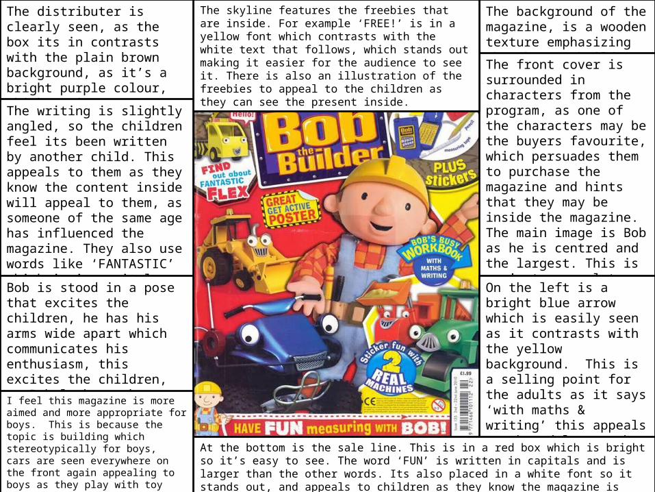
The background of the magazine, is a wooden texture emphasizing that he’s a builder. The front cover is surrounded in characters from the program, as one of the characters may be the buyers favourite, which persuades them to purchase the magazine and hints that they may be inside the magazine. The main image is Bob as he is centred and the largest. This is again to appeal to the children, and also the buyers instantly recognize him when stacked with other magazines.
The skyline features the freebies that are inside. For example ‘FREE!’ is in a yellow font which contrasts with the white text that follows, which stands out making it easier for the audience to see it. There is also an illustration of the freebies to appeal to the children as they can see the present inside.
On the left is a bright blue arrow which is easily seen as it contrasts with the yellow background. This is a selling point for the adults as it says ‘with maths & writing’ this appeals to the adults as they know it has an educational value for their children which is beneficial.
At the bottom is the sale line. This is in a red box which is bright so it’s easy to see. The word ‘FUN’ is written in capitals and is larger than the other words. Its also placed in a white font so it stands out, and appeals to children as they know the magazine is entertaining. The word ‘BOB’ is also larger, and in a white font, so they know they can interact with Bob inside.
The distributer is clearly seen, as the box its in contrasts with the plain brown background, as it’s a bright purple colour, which again contrasts with the plain white writing, so its easily seen.The writing is slightly angled, so the children feel its been written by another child. This appeals to them as they know the content inside will appeal to them, as someone of the same age has influenced the magazine. They also use words like ‘FANTASTIC’ which is in capital letters. This again appeals to the child as they are excited to read the magazine.
Bob is stood in a pose that excites the children, he has his arms wide apart which communicates his enthusiasm, this excites the children, as Bob looks so happy. This appeals to the child as they want to be happy like him.I feel this magazine is more aimed and more appropriate for boys. This is because the topic is building which stereotypically for boys, cars are seen everywhere on the front again appealing to boys as they play with toy cars, and the theme colours avoid pink which is again stereotypically a girls colour.