revised draft june 1999 - world...
TRANSCRIPT

The size distribution of income among world citizens: 1820- 19901
François Bourguignon2 and Christian Morrisson3
Revised draft June 1999
1 We thank A. Atkinson, G. Fields and B. Milanovic for helpful comments on an earlier version of this paper2 Delta and Ehess, Paris3 University Paris I

2
Abstract
This paper investigates the evolution of the size distribution of income among world citizen during a
period extending practically over the last two centuries. Estimations of the distribution for the
historical period are based on Maddison’s population and GDP per capita estimates on one hand and
on rough estimates and/or simple assumptions about the distribution of income within countries or
groups of countries on the other. It is found that the inequality of the world income distribution
increased more or less continuously since the beginning of the 19th century until World War II. Since
then, however, the evolution seems to have stabilized. The composition of inequality has also radically
changed over time. Inequality arose mostly within countries in the early 19th century whereas most
decomposable inequality measures indicate that more than half of it is now due to differences between
countries. The paper also analyzed the contribution of both demographic and economic growth in the
various parts of the world to changes in the overall distribution of income. The evolution of the
mobility of individual incomes on a world income scale is also studied. Most results obtained in the
paper appear to be little sensitive to assumptions made on the evolution of the distribution of income
within countries.
Résumé
1
The revival of empirical growth economics during the 1990s brought with it a renewed interest for the
world distribution of income. Indeed, beyond theoretical issues concerned with the determinants of the
economic growth of nations, most of the recent literature on 'convergence' of GDP per capita across
countries is essentially dealing with the world distribution of income and the question of whether that
distribution is likely to equalize or on the contrary polarize in the long-run. An example of this
analogy is given by the recent symposium of the Journal of Economic Perspectives devoted to the
'Distribution of World Income' which is exclusively concerned with macroeconomic convergence
issues. 1
This treatment of world income inequality considers all citizen in a given country as perfectly
identical. But by completely ignoring income disparities within countries it leads to underestimating
the extent of inequality. In effect this line of work focuses on ‘international’ rather than ‘world’
inequality. By 1820, for instance, we estimate in the present paper that the coefficient of Gini for the
world distribution was .50, whereas it would only have been .16 if individual incomes had been equal
within each country. By disregarding country inequality, the recent empirical growth literature gives a
biased view rather than an accurate representation of how the actual world distribution of individual
incomes may have changed over time.
A possible justification for focusing on international differences in GDP per capita is that they tend to
change more quickly and more dramatically than national income distributions. Therefore the
dynamics of the world distribution of income would mostly have its roots in the international
component of world inequality which arises in differences between countries rather than in the
evolution of the distribution of income within countries. We shall see that indeed inequality among
countries is a key factor in explaining world inequality. However, we shall also see that changes in the
world distribution of income arising from heterogeneous growth of GDP and population in presence of
national income disparities are rather complex and not well approximated by the hypothesis that all
citizen within a country have the same income.
There have been various attempts at estimating the world inequality of personal incomes and its
evolution over time.2 The present paper is the first to take a historical view at the evolution of the
world size distribution of income. It does so by updating previous work on the evolution of world
1 Pritchett (1997a, b), Jones (1997). In several papers on convergence and income mobility of countries Quah isalso often referring to the world distribution of income. See Quah (1996a, b)
2 See Kirman and Tomasini (1969), Whalley (1979), Berry et al. (1983a, 1983b, 1991), Summers and Kravis(1984), Adelman (1984), Grosh and Nafziger (1986), Theil (1989 ), Yotopoulos (1989), Ravallion et al. (1991),Theil and Seale (1994), Sprout and Weaver (1997), Schultz (1997), Milanovic (1999).
2
income inequality from the 50s to the 80s and extending it back to the beginning of the 19th century.
The history that we unveil of world inequality over almost two centuries differs rather radically from
what is usually seen in the current literature on world economic inequalities in the post-world- war II
era. It also differs from the available historically oriented literature - Baumol et al. (1994), Pritchett
(1997a,b) - because it provides a quantification of the evolution of world income inequality rather
than a qualitative description of its evolution.
In the early 19th century, the industrial revolution is under way in Britain and beginning in France.
The inequality of world incomes is already high but comparable to what may be observed in today's
rather inegalitarian countries. The Gini coefficient is around .50. Then, the spreading of the industrial
revolution first to Western Europe and European populated countries in America and the Pacific -
which we shall refer to, following Maddison, as the 'European offshoots' - as well as the increase in
income inequality within these booming countries produced a true explosion of world inequalities and
actually shaped the inequalities of the world of today. From 1820 to the eve of World War I, this
process was virtually continuous, the Gini coefficient increasing regularly from .50 to .61. It then
decelerated between the wars and has come close to a stop since 1950. By that time the world Gini
coefficient had reached .64, a level of inequality practically unknown in any contemporary society.
Thus, the peak of world inequality was reached in the first half of the 20th century after more than a
century of divergence. Since then, and in comparison with such a dramatic evolution, the situation
seems to have somewhat stabilized.
This general evolution of world inequality hides complex mechanisms and constant changes in the
nationality of the individuals at the various ladders of the world income hierarchy. For instance, the
initial process of world divergence actually comprised a strong convergence process among European
countries and their offshoots in America and the Pacific after 1870/1890, and at the same time
growing income disparities between this group of countries and the rest of the world. Likewise, the
apparent stabilization of the world distribution since 1950 resulted from the conjunction of a relative
slowing down of economic growth in the preceding set of countries, the catching up of Japan and East
Asia, and since the beginning of the 80s the take off of China. However, differences in GDP per capita
growth rates among countries are insufficient to explain this complex evolution in the 19th or the 20th
centuries. For instance, the growth performance of China is important in shaping the evolution of the
world distribution of income because of the exceptionally large demographic weight of that country
and also because of the dramatic changes which occurred in the distribution of income there. In the
same way, the increased world disparities observed in the 19th century as a consequence of the
industrial revolution had much to do with the initial size of the Western European population and its
demographic growth rate. Beyond describing in some detail the evolution of the world distribution of
3
income over the last two centuries, a second contribution of this paper is precisely to quantify the
respective importance of aggregate economic growth, population growth and the structure of domestic
income inequalities in shaping the world distribution of income and explaining its evolution.
The general organization of the paper is as follows. Section 1 focuses on the data used throughout the
paper, in particular for the historical period, and the methodology followed to reconstitute the world
distribution of income. It also discusses the difference it makes to take into account domestic income
disparities in comparison with assuming no heterogeneity within countries as usually done in the
recent literature. Section 2 presents the basic facts on the overall evolution of the world income
distribution since 1820 and the results of sensitivity analysis on several crucial assumptions made in
the construction of the data base. It also compares the evolution with and without domestic income
inequality. Section 3 provides partial explanations of that evolution by decomposing changes in the
world distribution into contributions of the evolution of the word structure of GDP per capita, the
structure of population and domestic income inequality. This decomposition analysis is essentially
conducted in terms of a small number of regions or groups of countries the behavior of which may be
considered as relatively homogeneous. Section 4 analyzes more systematically this mobility of both
countries and world citizen along the world income scale. The main findings are summarized in the
concluding section.
1) Methodology and data
The methodology to estimate the distribution of income relies on three types of data for each country,
i, to be included in the analysis: a) real GDP per capita, Yi ; b) population, Ni ; c) the distribution of
income summarized by vintile income shares, Vij , j=1, ...,20. The world distribution is then obtained
by considering that each vintile of a country is made up of individuals with identical incomes. For
each country, we thus define 20 groups of .05.Ni individuals with income yij = 20.Yi.Vij.3 We then pool
all these groups together, rank them by increasing income and compute the cumulative function and
Lorenz curve of the world distribution of income. If there are n countries, these two functions are thus
described by 20.n values. Comparisons of these functions over time is done by interpolating linearly
so as to obtain the values of the cumulative function and the Lorenz curves for arbitrary values of their
arguments - income level or world population shares. Income inequality measures are easily computed
3 Original distribution data actually consisted of decile shares. This was a problem because it was introducingsome indivisibilities in the computation of the world distribution. Indeed, a decile of the Chinese populationrepresents approximately 2 centiles of the world population. Using vintiles permitted avoiding this problem. Analgorithm was thus designed to generate vintile shares out of decile shares. It simply consists of finding a split ofeach decile guaranteeing that the Lorenz curve is everywhere increasing and convex. It turned out that ourestimates of the world distribution were little sensitive to the parameters of this algorithm.
4
on the basis of these functions. In addition, it is also possible to follow the country composition of the
various quantiles of the world distribution -i.e. what share of the top centile of the world belongs to
country X - as well as the world rank of the various vintiles of a given country - i.e. what share of the
population of country X is in the top word centile, or any other quantile, of the world distribution.
An alternative to the preceding methodology in line with standard practice in the recent literature on
the world distribution of income consists of estimating the density of the distribution on the basis of
the available 20.n country-decile observations by Kernel techniques. Ideally, one would have preferred
to rely on country density functions estimated with the same Kernel technique and to mix those
estimates to get the world distribution. However, this was made difficult by the limited information
available on national income distributions. This also explains why the analysis of the country
composition of world quantiles is made with the discrete representation of the world distribution
described above rather than with Kernel density estimates.
Data on GDP per capita and population are borrowed from Maddison (1995) who was the first to
construct consistent historical series over a period starting as early as in 1820 for some countries and
ending in 1992. However, it proved necessary to complement and to slightly modify this data source.
On one hand, series for many non-European countries, and even for Eastern European countries in
Maddison begin some time between 1870 and 1913. We thus extended the original series so as to
cover the whole 1820-1992 period. This was simply done by applying to countries with missing data
in some period, the growth rates actually observed for 'comparable' countries over the same time
interval. On the other hand, we regrouped all countries in a slightly more aggregate way than what is
found in Maddison (1995). This was to avoid dealing with countries too small to really affect the
world distribution and also to solve problems of missing distribution data. These groupings, the detail
of which appears in the Appendix I, are based on criteria of consistency and homogeneity. For
instance, we put together Austria, Hungary and Czechoslovakia, which share obvious common
characteristics if one considers the entire 1820-1992 period, and not only the post-WWII period.
Another example is that of Germany which is artificially kept united throughout the whole period, and
in particular before the 19th century unification and during the 1945-90 split. Good arguments may
also be found for considering jointly Argentina and Chile, two Latin-American countries with recent
European immigration, or Taiwan and Korea, two economies which shared very much the same
evolution over the last 40 years but also had similar economic histories both in terms of economic
growth and distribution during the century or so before.
5
This grouping led us to consider a set of 33 groups of countries. These groups include some single
countries like China,4 India, Italy or the US the weight of which in the world is significant at some
stage or another either in demographic or in economic terms. They include small groups of
comparable countries as in the examples given above. They also include large groups of very small
countries which came to existence only in the rather recent history and, thus, could not be followed
over a much longer period. So, Subsaharan Africa is broken down in only four groups: South-Africa,
Nigeria - the largest country of the region -, three countries with a similar economic evolution - Cote
d'Ivoire, Ghana and Kenya - and all the other countries, that is 46 countries. The reason for this choice
is simply that something is known, even very imperfectly of the first three groups whereas much less
can be said of the countries in the last group.
The definition of these 33 groups is such that each group represents at least one per cent of the world
population or world GDP in 1950. None of them can thus really be considered as negligible in the
world economy. For further analysis, these 33 groups are in turn aggregated into 6 'blocks' defined
on a geographical, economic or historical basis. These regions are: Africa, Asia except the Asian
'tigers' (Japan, Korea and Taiwan), these Asian tigers, Latin America except Argentina and Chile,
Eastern Europe (Russia, Poland, Rumania, Bulgaria, Yugoslavia, Greece and Turkey), and finally the
'western block' which comprises all western Europe, including Austria-Hungary and Czechoslovakia,
and its offshoots in America including Argentina and Chile, and in the Pacific. The objective of this
second level aggregation is both to permit a simpler description and analysis of the evolution of the
world distribution and to test the kind of bias introduced by the aggregation procedure. Indeed, going
from the 33 groups of countries to 6 blocks may in some sense be compared to going from
approximately 200 countries in today's world to the 33 groups considered in this study. It must be
noted, though that inequality within each of the 6 aggregate blocks is likely to be more volatile than
within the 33 groups of countries defined so as to include countries with a comparable historical
growth experience and comparable income distribution.
Data sources for the distribution of income in the 33 country groups differ according to the period
under analysis. They generally refer to size-weighted household income per capita data.5 For the post-
WWII period, the data are those used in Berry et al. (1983a,b) after updating. For the pre-WWII
period, data for today's developed countries are taken from existing historical series and adapted so as
4 There has been some recent discussion on the recent growth performances of China. The computation reportedhere corresponds to the ‘fast growth’ scenario found in Maddison. Computations with more modest growthperformances have also been made. We do not report then here for lack of space. However, it is worth stressingthat they do not lead to fundamentally different conclusions.5 Distribution data in agreement with this definition are generally available for the recent period. For moredistant periods available distribution data have been corrected in an approximate way to fit the same definition.The complete set of distribution data may be obtained on request from the authors.
6
to fit the vintile definition used throughout the period. Raw data for the US and UK come from
Lindert (1999) and for continental Europe from Morrisson (1999).6 For other countries, we essentially
proceeded by analogy. In other words, we assumed that country, or country-group i at time t for which
no distribution data was available had the same distribution as country or country-group j at time t'
according to a set of assumptions which are summarized in Appendix II. The sensitivity of changes in
aggregate inequality, as measured by two widely used decomposable measures, with respect to a
change in the inequality within each of the 33 country group is given in Appendix III. On the basis of
these figures, it may be checked that none of the conclusions obtained below on the evolution of the
inequality of the world distribution is weakened by the imprecision of national income distribution
data.
2) The evolution of the world income distribution since 1820
In this section, we discuss the aggregate characteristics of the evolution of the world income
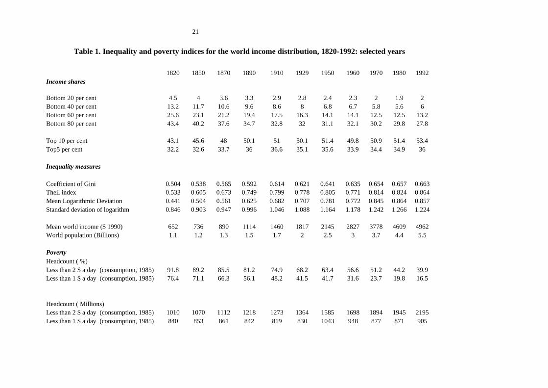
distribution as it comes out of the data just presented. Table 1 shows the shares of various quantiles of
the world population as well as a set of standard inequality measures for selected years spaced 20 to
30 years over the whole period. Figure 1 shows the evolution of density curves estimated by Kernel
techniques on the country-vintile observations discussed above. For the sake of clarity, only 4 curves
are shown, which delimitate in an obvious way the period under analysis.
The evolution shown by these various indicators is quite clear. World inequality increased quickly
and more or less continuously from 1820 to 1950, with a pause only between 1910 and 1929. In
comparison with such a strong and continuous increase in most inequality measures, it would seem
that world inequality almost leveled off since 1950. However, a careful inspection of the various
indicators in Table 1 reveals that the distribution continued to worsen during most of that period, even
though at a much slower rate than before. It is only between 1950 and 1960, and then between 1970
and 1992 that some signs of stabilization seem to appear. In the latter period the shares of the six
bottom world deciles stop falling for the first time since 1820, but that of the top decile increases again
after having fallen slightly in the 1950s. The general evolution is thus quite clear. The distribution
worsened more or less continuously since the beginning of the 19th century, but this process
considerably slowed down since 1950.
Although the comparison is difficult, this evolution is qualitatively comparable with the rough
estimates given by Pritchett (1997b) on the basis of between country inequality between 1870 and
1990. He found that the standard deviation of the logarithm of income per capita might have doubled
6 Another source with a broad coverage of distribution data is Fields (1999).
7
during that period, from .5 to a little more than 1. Because we are taking into account the within
country inequality, our estimates for both years are higher. But the increase in inequality is smaller
because within inequality is still dominant around 1870.7
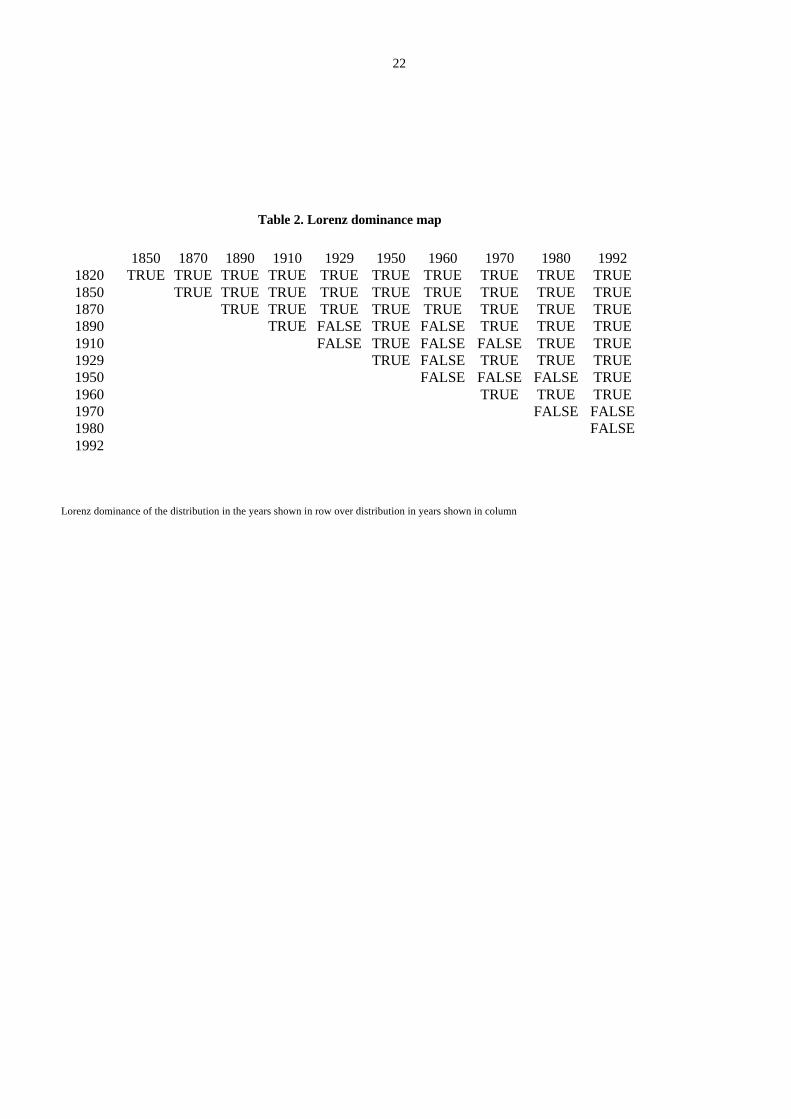
A slightly more rigorous version of that statement may be obtained by using Lorenz dominance, rather
than relying on standard inequality measures(see Table 2). Comparing the ordinates of the Lorenz
curve appearing in the top part of Table 1, it may be seen that there is almost systematically
dominance of the distribution observed in the earlier years over all the others. The only exception
before 1950 takes place between 1890 and 1910 on one hand, and 1929 on the other.This systematic
worsening in terms of dominance stops with the 1950 distribution which dominates only 1992. It must
be noticed, though, that the distribution of 1960 dominates that of all posterior years. This
corresponds to the continuing slight trend toward more inequality observed in the inequality measures
shown in Table 1. This also suggests that the changes in the distribution of world income became more
complex since 1950.
It is well known that the Lorenz dominance criterion ignores gains in social welfare due to a higher
mean income by focusing exclusively on the distribution of relative incomes. It is also interesting to
consider changes in world social welfare by using the 'generalized Lorenz dominance' which
compares the absolute income of successive poorest segments of the population.8 Simple calculations
made from Table 1 shows that this dominance criterion breaks down only once between 1929 and
1950. This is due mostly to adverse conditions in China where war was almost permanent between
1933 and 1949. Except for that period the mean income of all lower income segments of the world
distribution and therefore world social welfare increased continuously, even though almost insensibly
for the poorest 60 per cent at the beginning of the 19th century.
That the shape of the world distribution tended to change over the last 40 years or so, is also confirmed
by the evolution of the whole density curve shown in Figure 1. Income is on the horizontal axis in this
figure, but to make the curves comparable over time, it is normalized by the mean income of the
richest country. Under these conditions, the continuous rapid increase in world inequality is first
noticeable with the leftward shift of the mode of the distribution and the lengthening of its right-hand
tail. It may be seen that, indeed, this shift stopped after 1950. Another noticeable change is the shift in
the secondary mode of the distribution which may be observed in the right-hand part of the figure.
7 A more detailed analysis of the evolution of between and within country inequality is shown in Table 3 anddiscussed below.8 On this concept see Shorrocks (1983) or Cowell (1998)
8
This mode also tended to move rightward, at a distance approximately constant of the first mode, and
to become more prominent over time. In 1992, however, this trend seems to be reversed.
Instead of considering relative income scales as in the preceding figure, or implicitly through
inequality measures, it is also interesting to look at absolute scales. The poverty ratios reported in
Table 1 show the proportion of the world population below two absolute income thresholds equal
respectively to 1$ and 2$ a day ( at purchasing power parity of 1985) used in the literature since the
World Bank Development Report of 1990. After correcting for inflation between 1985 and 1990 and
for an average GDP share of consumption, these values correspond approximately to annual incomes
equal respectively to 625$ and 1250$ in 1990 ppp with our definitions of income. With these figures,
it turns out that the worsening of the world income distribution has not been so severe as for the
proportion of poor to increase in spite of the growth of the world mean income. In effect, even though
it was strongly inegalitarian economic growth contributed to a steady decline in the headcount poverty
measure throughout the whole period under analysis. On both accounts, the orders of magnitude
suggested by the figures appearing in Table 1 are striking. On one hand, over the 172 years
considered here, the mean income of world inhabitants was multiplied by 7.6. Meanwhile, the mean
income of the bottom 20 per cent was multiplied by only slightly more than 3, that of the bottom 60
per cent by approximately 4, and that of the top decile by almost 10. On the other hand, this increased
inequality did not prevent poverty to decline. Our estimates suggest that approximately 75 per cent of
the world population in 1820 was below the most severe poverty line of 1$ a day. This proportion was
down to 16.5 per cent in 1992. Even with a weaker definition of poverty, the drop is quite substantial.
Slightly more than 90 per cent of the world population was below the 2$ a day poverty line in 1820.
This proportion was only 40 per cent in 1992.
Another way of looking at the preceding 'absolute' figures consists of normalizing them by today's
standard of living in a given country. The change in inequality looks still more impressive. For
instance, the tenfold increase in the mean income of the top 5 or 10 per cent of the world distribution
would be equivalent to jumping from the few bottom centiles to the very top decile in today's
developed countries' income scale. By contrast, the change in the welfare of the 60 per cent poorest
in the world during the same period was only equivalent to a jump from today's mean income of the
bottom 20 per cent to that of the top 20 per cent in the U.S. or in most European countries.
Another view at the preceding figures consists of considering numbers of people rather than
proportions of the world population. Was or was not economic growth able to reduce the absolute
number of poor in the world, and if so, when has it been? Looking at the most demanding definition of
poverty, Table 1 suggests that the absolute number of ‘very poor’ remained approximately constant
9
ever since 1820. It practically did not change until 1929, it then increased until 1950-1960 but fell
again afterwards. With the 2$ a day poverty line, the absolute number of poor increased continuously
ever since 1820, and is still increasing. This evolution results from a complex combination of effects
linked to the growth in the mean income of the world population, its changing distribution, and
differential rates of population growth across the world income scale. Some simple simulations show
that the second factor played a major role. Without change in the distribution of the world income,
that is with the same growth rate of incomes across and within countries the absolute number of poor
would have been decreasing continuously. It may be computed that it would be today less than 150
millions rather than 900 using the 1$ a day line and 650 millions rather than 2200 using the 2$ a day
line.
Country specific growth rates explain that indeed poverty declined at a much slower pace than what
was just suggested. It also explains the increase in world inequality observed at least until 1950. From
that point of view, it is interesting to isolate that component of the evolution of the world distribution
of income from what may be due to income disparities within each country or country group and
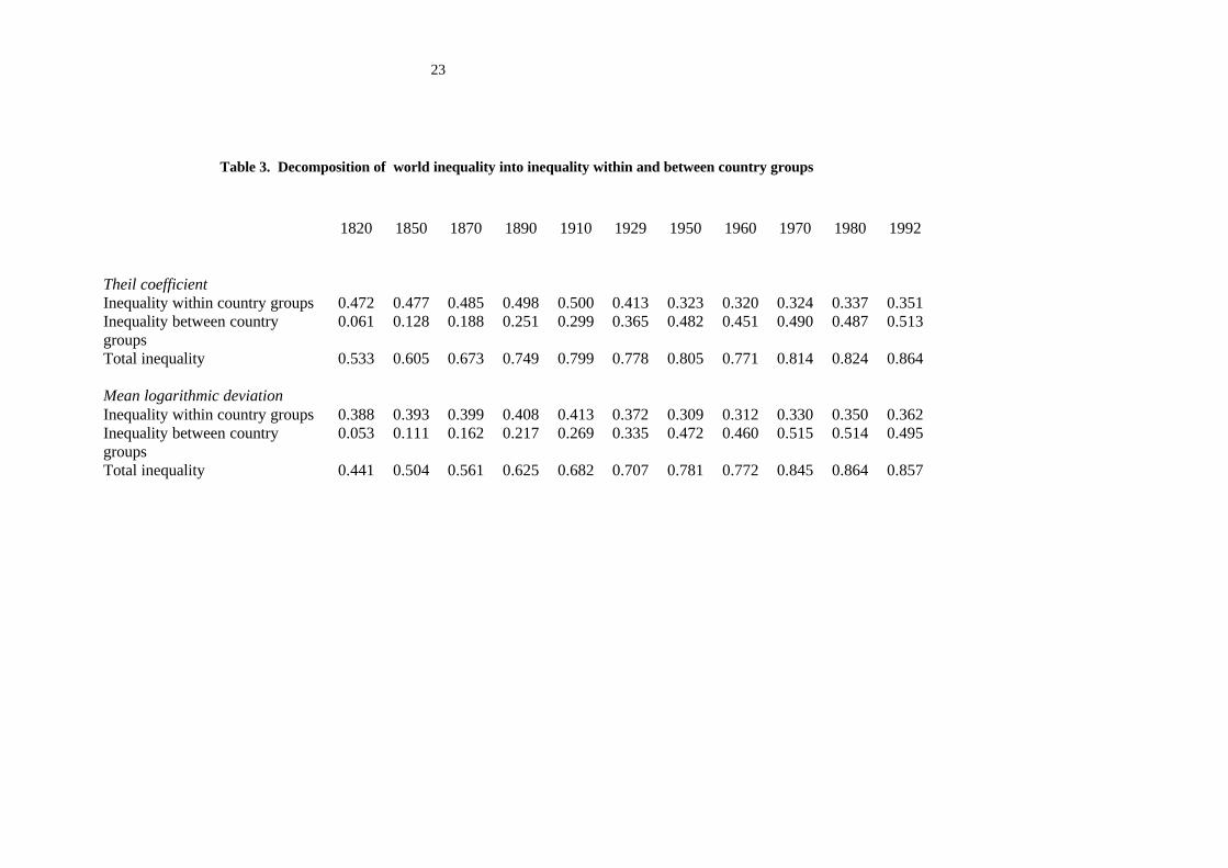
changes in them. Table 3 shows the decomposition of inequality into a within and a between country
components. The two inequality measures used here are part of the standard decomposable measures.
The between component of inequality refers to the inequality that would be observed if incomes were
identical within each country, or group of countries. The 'within' component is obtained by difference
and corresponds to the average inequality within country using total income - for the Theil coefficient
- or total population - for the mean logarithmic deviations - as weights.9 It can be seen quite clearly
on Table 3 that: a) the within component represents a decreasing share of total inequality, but that b) it
nevertheless remains an essential part of world inequality throughout the period. Interestingly enough,
the within component represents 80 per cent and more of total inequality in the first half of the 19th
century. Indeed, at that time, very few countries are in advance of the others in the world. These are
essentially the United Kingdom, some continental European countries and the United States, the
difference with other countries in the world being rather limited. GDP per capita in China or India is
around 500 $ (ppp-1990), that of UK is only three times larger. But then, the gaps between countries
widens at a fast speed. The differential between UK and China is 6:1 in 1910 and 10:1 in 1950. At the
end of that period within country inequality falls quite significantly. As a result, it can be seen in Table
3 that the increase in the inequality between countries has actually been larger than the increase in
overall inequality - as measured by the Theil coefficient and the mean logarithmic deviation - during
the 1820-1950 period. The increase in the within component, mostly due to increasing inequalities in
the second wave of countries going through the industrial revolution –i.e. the US, Germany, Belgium,
10
… in the 1870s or 1880s - had little effect on the overall level of inequality. Likewise, the substantial
drop in domestic inequality observed in developed countries from the pre-WWI to the post-WWII
times was unable to offset the increase in the inequality across countries when using the mean
logarithmic deviation. However, this may be a matter of inequality measure since the increase in
between inequality was nearly fully compensated by the within component when the Theil coefficient
is used. . The shares of the within and between components seem to have approximately stabilized in
the postwar period, the former representing approximately 40 per cent of overall world inequality.
This within country component of world inequality is sufficiently important for the density function of
the world distribution of income to be substantially different when using vintile-country observations
as done in figure 1, or country observations as in figure 2. The same is true of the evolution of these
density curves. In figure 2, the Kernel estimate of the density function is obtained every year on a set
of 33 observations corresponding to the GDP per capita of the groups of countries included in the
analysis. The density curve for 1820 is unimodal with a small increase at the bottom right end of the
curve. The corresponding density curve in figure 1 was flatter with a main double peaked mode and a
secondary mode on the right-hand side tail. With time the density curve shifts rightward as before. But
two secondary modes appear in 1910 and become more prominent in 1950. Such an evolution is
much less pronounced in figure 2. Likewise, contrarily to what was observed with the density curves
accounting for within country inequality, the change between 1950 and 1992 is quite dramatic with a
general flattening of the density curve and the appearance of double mode in the left half of the curve.
That a density based on 33 country observations should behave differently from a density function
based on 660 vintile-country observations is to be expected. In effect the latter should tend to
smoothen the irregularities of the former, and also to exhibit less variation over time. In other words,
the inequality within country is expected to play some dampening role with respect to cross-country
variations in mean incomes. This is exactly what is observed. On the basis of the comparison of
figures 1 and 2, it would thus seem dangerous to interpret changes in the distribution of GDP per
capita across countries in figure 2 as true changes in the distribution of world income, as this is done in
very much of the recent literature on the subject. Depending on the degree of inequality in countries
where relative income variations are the largest, changes in the world hierarchy of GDP per capita
may have quite different impact on the actual distribution of income among world citizens. It may be
the case that economic analysis leads naturally to consider countries as the logical statistical unit on
which international convergence or divergence of income must be gauged. With the same reasoning,
it may also be natural to ignore population size in such an exercise as this is usually done in the recent
9 Other members of the entropy family of decomposable inequality measures use combinations of income andpopulation shares as weights with the consequence that these weights do not sum to unity. See Bourguignon
11
literature. However, if the object of the analysis is the world distribution of income and the degree of
inequality or poverty among world citizens, the preceding results show that ignoring within country
income disparities may be quite misleading.
3. Decomposition of the changes in the world distribution of income
We now go further than the preceding descriptive analysis by decomposing the changes in some
inequality measures into various components meant to represent the various forces behind the
observed evolution of the world income distribution. To do so we use the same decomposable
measures as above, that is the Theil index and the mean logarithmic deviation, in a slightly different
way.
The objective is to put into evidence the role of both the rates of economic and demographic growth of
the various countries or country groups as well as that of changes in domestic income distribution
upon the evolution of world inequality. Given the decomposability properties of the measures being
used the last component is easy to determine. For the first two components, things are a little more
difficult. We evaluate here the contribution of a country's economic growth to the change in
inequality by computing what would have been the change in world inequality had the income per
capita in that country grown at the same rate as the mean world income per capita during the period
under analysis. In this way we are trying to capture the effect of the 'differential rate of growth'
between a country and the rest of the world on world inequality. This does not raise problem when we
consider relatively small countries, which by definition could not significantly affect world averages.
This is not so for larger countries and a fortiori for regions of the world. Because of this, the
decomposition methodology used below is not exact in the sense that the sum of national contributions
to changes in inequality may differ from the observed change in inequality.10 However, as the
objective is to put into evidence the major sources of change rather than to quantify them precisely,
this is not a real problem. The same hypothetical scenario of a common growth rate is used for
evaluating the contribution of the demographic growth of a country or a region to the change in world
inequality.
(1979) and Shorrocks (1980).10 There is no perfect decomposition formula available in the present case. Ours generalizes the well-knownmethodology introduced by Mookherjee and Shorrocks (1982) to non-infinitesimal changes - the samemethodology was used in the context of the world distribution of income by Berry et al. (1983a). The samelinear approximation methodology leads here to important residuals in the decomposition formula because actualdifferential changes in income or population are too big for a linear approximation to work satisfactorily.
12
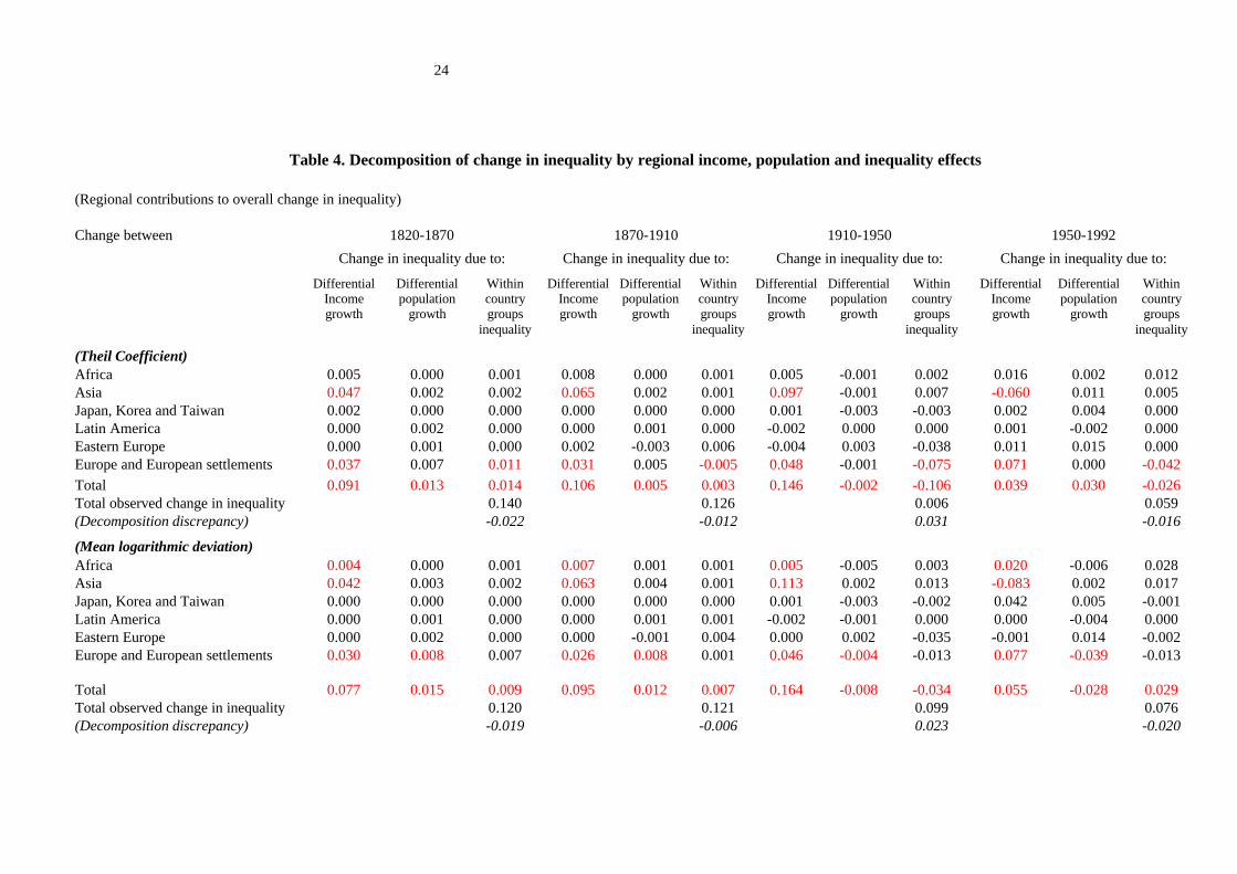
Table 4 shows the results of that decomposition when the original 33 country groups are aggregated
into the 6 large regions mentioned above. Even at that low level of disaggregation, the decomposition
methodology permits identifying very clearly the main forces which have influenced the evolution of
the world distribution of income over the last 170 years. To make things simpler, we have broken
down the whole period into three intervals: the 19th century, the inter-war period, and the post world
war II period. It is possible, however, that this breakdown tends to smoothen some phenomena which
would show up more markedly with another periodicity.
Whether inequality is measured by the Theil coefficient or the mean logarithmic deviation, the
dominant unequalizing force throughout the 19th century and the first half of the 20th century is the
relatively slow economic growth of the Asian region, the most populated area of the world. Between
1820 and 1950, income per capita in that region, which represented almost two thirds of the global
population in the early 19th century, grew at an average annual rate of 0.2 per cent, that is 4.5 times
less than the world average and 6 times less than the group of European countries and their offshoots
in America and in the Pacific. This slow growth of Asia is due to India which proved to be the slowest
growing important country in the world, but also to China, which did not much better. The evidence
collected by Maddison suggests that income per capita increased overall by a little more than 10 per
cent in India and by about 17 per cent in China between 1820 and 1950. The corresponding figure was
around 400 per cent for those countries where the industrial revolution started in Europe, and still
much bigger in their settlements abroad. True, the terminal years of this period were among the worse
both in India and in China during practically all the period under analysis and the picture is a little less
dramatic if one considers only the sub-period 1820-1910. Even so, however, Asia under-performed all
the other regions of the world. Its overall growth has been a little above 30 per cent, whereas it was
200 per cent in Europe, 60 per cent in Latin America and even 45 per cent in Africa. The reasons for
the growth under-performance of Asia may be different during the 19th century and during the first
half of the 20th century, but this is the phenomenon which most affected the world distribution of
income until 1950.
The vigorous enrichment of the European population is the second major unequalizing factor in the
world distribution. Following on the intuition developed by Pritchett (1997b), the first century and a
half after the beginning of the industrial revolution witnessed a dramatic 'divergence' in the world
economy, the richest becoming continuously richer and the poorest being practically cut off from
economic growth. The income differential between on one hand Western Europe and its offshoots and,
on the other hand, Asia or Africa, that is practically between the richest 20 per cent of the world and
the poorest 60 per cent went up from 1:3 in 1820 to 1:5 in 1910 and to 1:9 in 1950! Interestingly
enough, the enrichment of Europe and impoverishment of Asia between 1820 and 1950 together
13
represent a total increase in inequality approximately equivalent to the actual increase observed in the
world during the whole 1820-1992 period.
The contribution of European economic growth to world inequality continued after 1950. This means
that the rate of growth of European countries and their offshoots has been systematically higher than
the average economic growth in the world throughout all the period under analysis. The difference
with the previous period is that the slow growth of Africa then became the second significant positive
contribution to world inequality. Historically, the slowing down of Africa with respect to world
average income growth thus appears as a feature of the post-colonial era.
There are forces toward more equality of the world distribution, too. If we keep focusing on the effect
of regional economic growth, that is the income columns of Table 4, we see that the main equalizing
force came from the growth performance of the Asian region during the post-war period. However,
getting into more detail shows that it is undoubtedly China, and still more precisely China in the last
12 years of the period under analysis which is responsible for that evolution. Except for India other
countries in Asia have also grown faster than the world average during the last 40 years or so. But,
because of relative population sizes, China's growth is the dominant factor.
A second set of equalizing forces is to be found in the evolution of inequality within regions and
within countries. From that point of view, the most important movement undoubtedly took place
within European countries during the first half of the 20th century. This drop in within inequality
partly corresponds to the important redistribution undertaken in most developed countries from before
World War I until just after World War II. The impact of this evolution upon the world distribution of
income has been substantial if one considers an inequality measure like the Theil index which gives
relatively more weight to changes at the top of the distribution. Together with the equalizing effect of
the Soviet revolution in Russia and the socialization of Eastern European countries this equalization
of incomes within European societies offset a large part of the increase in world inequality which
arose from divergences in national economic growth rates. This compensation is less important with
the mean logarithmic deviation because of the lesser weight given to richer countries in that measure.
In fact, Table 1 shows that the only noticeable equalizing change in the world distribution between
1910 and 1950 is a small drop in the income share of the richest 5 per cent of the world population.
Changes in the inequality within the group of European countries also played a significant
unequalizing role in the first half of the 19th century and an equalizing role in the second half of the
20th century. In both cases, however, the explanation is to be found not so much in a change in
14
national income distributions as in the evolution of the inequality among European countries.11 The
increase in European inequality between 1820 and 1870 is before all the reflection of a divergent
evolution between the United Kingdom and its old colonies in America and in the Pacific, on one
hand, and the rest of Europe on the other hand. The income per capita advantage of the 'Anglo-Saxon'
countries over the other European countries was around 40 per cent at the beginning of the 19th
century. It was close to 80 per cent in 1870. Things change only slightly between 1870 and 1910. The
United States and the United Kingdom simply switch ranks in the world distribution and Germany
comes back to its initial relative income position with respect to the richest country of the world. In
1950, the distance between the United States and other countries substantially increased in comparison
with 1910, but part of that evolution may probably be explained by the effects of the WWII in Europe.
The catching up really takes place after the war, and the inequality between the countries of the
European group gets back in 1992 to a level which is intermediate between that observed in 1820 and
1870. If it were not for the persistent lag in the development of Argentina and Chile, and the slowing
down of the old Austro-Hungarian empire linked to the temporary communist rule in Czechoslovakia
and Hungary, the distribution of income across European countries would have been in 1992 almost
identical to what it was almost 200 years before. That final convergence, which also includes the
effects of the economic recovery after the war, is what explains the drop in European inequality in
Table 4 and its contribution to less world inequality after 1950.
One could have expected a similar story of convergence to show up in the contribution of the Asian
tigers, Japan, Korea and Taiwan, to the evolution of the world distribution. That this group of
countries had no effect on the level of world inequality before 1950 is not too surprising. They grew
more or less like other non-industrial countries. Between 1950 and 1992, however, they made an
extraordinary jump in the world hierarchy of income, multiplying their income per capita by
approximately 10 and moving from a level slightly below the world mean to the mean of the richest
group of countries. It turns out that this contributed to an increase in inequality across countries both
with the Theil index and the mean logarithmic deviation. This effect is less pronounced for the former
measure which gives more weight to the fact that these new rich economies are more egalitarian than
the rest of the world.
Summarizing the preceding points, the main forces which contributed to the change in the world
distribution of income since 1820 were as follows. On the unequalizing side, the dominant force is: a)
the divergence between Anglo-Saxon and the other European countries in the first half of the 19th
century; b) the relatively poor growth performances of China and India until late in the 20th century
11 Indeed the within component of inequality in Table 4 is defined at the regional level. It thus includesinequality across countries of the same region.
15
together with the exceptional relative growth of the group of countries which had already begun to
industrialize by 1820; c) the slow growth of Africa over the second half of the 20th century. On the
equalizing side, the main factors were: a) the equalizing of incomes in European countries, Russia and
Eastern Europe in the inter-war period and just after WW II; b) the quick catching up of European
countries over the United States after WWII; c) the outstanding growth performance of China in the
last one or two decades. Another important phenomenon which characterizes the same period is the
miracle growth of the Asian tigers. We have seen, however, that its effect on the world distribution
was inegalitarian and somewhat limited.
Two factors have not been considered. First, nothing has been said of Latin America. The reason for
this is that the pace of economic growth in that region has approximately coincided over the last two
centuries with the world average. In other words, it has always been midway between the high rates of
growth of the group of European countries and the relatively slow rates observed elsewhere in the
world, for a very long time in Asia and now in Africa. Second, it is rather remarkable that no big
change in the distribution of world income seems to be associated with demographic growth rates. The
reason is to be found first of all in the fact that changes in the regional structure of the world
population have not been very big after all. Over 170 years, the major change has been that the less
populated regions in 1820, Africa and Latin America, have grown more rapidly than the others - the
growth of the North-American, Australian, Argentinian and Chilean populations being in the present
analysis amalgamated with that of old Europe. Overall this has been equivalent to Asia losing part of
its importance for the profit of the two preceding regions, certainly not a very important change for the
world distribution of income. It must also be stressed that pure demographic changes have ambiguous
effects on the distribution of income when they affect relatively more one extreme of the distribution
or the other. Indeed, it is easily seen that they then lead to crossing Lorenz curves. An example of this
ambiguity is provided in Table 4 by the population effect for the 1950-1992 period which is
inegalitarian with the Theil index but egalitarian with the mean logarithmic deviation.
4) Mobility
Another way of looking at the origin of changes in the world distribution of income is to consider
how the nationality composition of specific quantiles of the world distribution has changed over time
and, symmetrically, how various income groups fared relatively to the world scale of income. This is
equivalent to considering the general issue of mobility of countries, and of income groups within
countries in the world income scale.
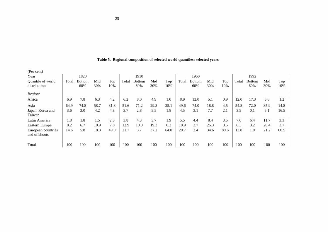
To get a first idea of mobility, Table 5 shows the regional composition of various quantiles of the
world distribution at various points of time during the last two centuries. If the distribution of income
16
were the same in all countries, the regional composition of all quantiles would be the same as that of
the world population. A country or a region poorer than average would then be over-represented
among the bottom quantiles of the world population and vice-versa. This may be seen for Asia in
Table 5, whose weight in the world population in 1820 was 65 per cent but which accounted for 75 per
cent of the world's poor and 32 per cent of the rich.
Table 5 shows a rather clear evolution over the period under analysis. The divergence between rich
European countries and their offshoots on one hand and the other regions on the other, which
continuously increased over the whole period, explains the substantial increase in their share in the
richest 10 per cent of the world observed until 1950. This share increased from 49 per cent in 1820 to
64 per cent in 1910 and 81 per cent in 1950. The latter figure is affected by very adverse conditions in
China and India, which produced an abnormal temporary impoverishment of that region and
consequently a rise in the share of other regions, including Europe, in the richest world group. In any
case, the interesting point is that the relative share of Europe among world rich fell after 1950. In
1992, they represented a little more than 60 per cent of the top decile of the world population versus
64 per cent in 1910.
This stop in the ascending European supremacy may be explained by two factors. On one hand, the
rise of economic affluence among the Asian tigers, Japan, Korea and Taiwan which led them to
represent 16.5 per cent of the top world decile in 1992 severely reduced the relative importance of the
European component of the world's top 10 per cent. If it had not been for this factor, the European
share would have been considerably higher in 1992 than what was actually observed. On the other
hand, the European rate of population growth started to decline in comparison with the rest of the
world around the middle of the 20th century.
At the other extreme of the income spectrum, the dominant change in the composition of the world
poor is without any doubt the continuously increasing share of the African continent, an evolution
which sharply accelerated during the last century. Both because of its specific population and
economic growth performances, the share of this region among the world's poorest 60 per cent
remained constant at 8 per cent throughout the 19th century and then increased to 12 per cent around
1950 - a figure likely to be an under-estimation because of the adverse political and climatic events in
Asia at that time- and 17.5 per cent in 1992. This evolution is still more pronounced if a more
restrictive definition of poverty is used. Only 11 per cent of world inhabitants with income less than
625 $ lived in Africa in 1950. This proportion was above 40 per cent in 1992. Poverty which was
above all an Asian problem until just after WorldWar II is becoming more and more an African
problem. On the contrary after a deep decline from 1820 to 1950 Asia is catching up with more
17
developed regions. Its share in the top world decile increased from 4.5 to 14.8 per cent between 1950
and 1992, and its share in the world mid three deciles almost doubled from 18.8 to 36 per cent.
Finally, Latin America and Eastern Europe concentrated mostly in the mid three deciles throughout
the whole 1820-1992 period.
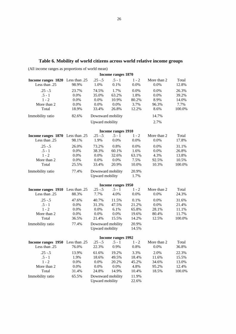
Another way of looking at the dynamics of the world income distribution is to consider how countries,
and citizen within countries perform within a scale defined at the world level. This fits the more
standard view taken in the recent literature on convergence and mobility - see in particular Quah
(1996a). The corresponding transition matrices are shown in Table 6. In these matrices income groups
are defined as in Quah relatively to the world mean - .25, .5, 1 and 2 times the world mean
respectively.
The dominant feeling in examining the matrices shown in Table 6 is that of the extreme immobility of
national citizen within the world population at the beginning of the period under analysis. More than
80 per cent individuals stayed in their world income groups between 1820 and 1870, and only a little
less between 1870 and 1910. Also downward mobility is much higher than upward mobility. Things
are substantially modified in the 20th century. On one hand, overall mobility increases since the
immobility ratio goes down to 65 per cent for 1950-92. More importantly, however, upward mobility
is becoming substantial since 1910-50. In the long-run, one would not observe a bunching of national
deciles toward the bottom of the distribution as with the transition matrices of the 19th century but an
ergodic distributions resembling the 'twin peaks' recently popularized by Quah. This 'polarization' of
the world income distribution is already noticeable when comparing the column and row margins of
the transition matrices in Table 6, which correspond to what would have been the evolution of the
distribution in the absence of heterogeneity in demographic growth rates.
For a better understanding of the present convergence literature, it is important to realize that this
evolution, and this difference with respect to the 19th century is essentially due to a small number of
national growth performances during the 20th century. The drop in inequality among European
countries and their offshoots between 1910 and 1950 is the major factor explaining the increase in
upward mobility during that period. Likewise, the acceleration of growth in China and among the 3
Asian tigers is responsible for the increase in the upward mobility observed during the last 40 years. It
is difficult not to recognize that both phenomenon seem in some sense exceptional and that it is
uncertain whether the transition matrices observed in the recent history are stationary, as it is so often
assumed in the recent literature on convergence. At this respect, it is also worth stressing that the
mobility pattern in the world income distribution during the last 170 years fail to pass the most
elementary test of being Markovian. For instance, multiplying the transition matrix of 1820-1870 by
18
that of 1870-1910 leads to a matrix which is substantially different from that actually observed
between 1820 and 1910. Thus, the historical perspectives as well as the introduction of national
income disparities in the analysis significantly alter the conclusions suggested by mobility analysis
performed across countries over the last 30 or 40 years.
Conclusion
Contrary to the recent literature on income inequality which focuses on the divergence of GDP per
capita across countries during the last 40 years, and more rarely the last century, this paper emphasized
a longer period and a more general perspective on the world distribution of income. On one hand,
owing to our beginning the analysis in 1820 we can observe the major effects the Industrial Revolution
had on the distribution of world income. On the other hand, because we take into account the
distribution of income within countries we measure world inequalities among individuals instead of
among countries.
First, world income inequalities have truly exploded since the early 19th century. The Gini coefficient
has increased by 30 per cent and the Theil index has increased by 60 per cent between 1820 and 1992.
Second, this evolution is essentially due to a dramatic increase of inequality among countries or
regions of the world. The between country component of inequality as measured by the Theil index is
estimated to have been .06 in 1820; it was above .50 in 1992. Changes in inequality within countries
have been important at some stages in history, and in particular the drop in inequality within European
countries and their offshoots in America and in the Pacific during the first half of this century. In the
long run, however, the increase of inequality across countries was the leading factor in the evolution
of the world distribution of income. Third, it seems that the most important changes in that distribution
now lie behind us. There is comparatively little difference between the world distribution as it is today
and as it was in 1950 in comparison with the soaring inequality observed in the previous 130 years.
This does not mean that the distribution has become stable, however, or that a convergence process
analogous to the one we have stressed for Europe and its offshoots is starting to take place at the world
scale. In particular, the increasing concentration of world poverty in some regions of the world is
worrying. Fourth, lengthening the time horizon and taking into account inequality within countries
also leads to a change in our perception of mobility within the world income scale. It suggests in
particular that mobility of individuals in the world distribution of income is strongly history
dependent.
19
References
Adelman, I., (1984), Development Strategies and the Size Distribution of World Income, Middle EastTechnical University Studies in Development,11(1-2), pages 177-93; reprinted in Adelman, I. (1995),The selected essays of Irma Adelman. Volume 2. Institutions and development strategies. Aldershot,U.K.: Elgar
Baumol, W., Nelson, R. and E. Wolff (1994), The Convergence of Productivity, Its Significance, andIts Varied Connotations, in (eds.), Convergence of productivity: Cross-national studies and historicalevidence, Oxford and New York: Oxford University Press, pages 3-19.
Berry, A., Bourguignon, F. and C. Morrisson, (1983a), Changes in the World Distribution of Incomebetween 1950 and 1977, Economic Journal, 93(37), pages 331-50.
Berry, A., Bourguignon, F. and C. Morrisson, (1983b), The Level of World Inequality: How MuchCan One Say?, Review of Income and Wealth, 29(3), pages 217-41.
Berry, A., Bourguignon, F. and C. Morrisson, (1991), Global Economic Inequality and Its Trendssince 1950, in Osberg,L., ed., Economic inequality and poverty:International perspectives. Armonk,N.Y. and London: Sharpe, pages 60-91.
Bourguignon, F. (1979), Decomposable Income Inequality Measures, Econometrica, 47(4), pages 901-20.
Cowell, F. (1999), The measurement of inequality, in A. B. Atkinson and F. Bourguignon, eds,Handbook of Income Distribution, Elsevier, Amsterdam (forthcoming)
Fields, G. (1999), Inequality and Development, forthcoming
Grosh, M. and W. Nafziger (1986), The Computation of World Income Distribution, EconomicDevelopment and Cultural Change, pages 347-59
Jones,C., (1997), On the Evolution of the World Income Distribution, Journal of EconomicPerspectives, 11(3), pages 19-36.
Kirman, A. and L. Tomasini, (1969), A New Look at International Income Inequalities, EconomiaInternazionale, 22(3), pages 437-61.
Lindert, P. (1999), Three Centuries of Inequality in Britain and America, in A. B. Atkinson and F.Bourguignon, eds, Handbook of Income Distribution, Elsevier, Amsterdam (forthcoming)
Maddison, A. (1997), Monitoring the World Economy, OECD, P aris
Milanovic, B. (1999), True world income distribution, 1988 and 1993: First calculation based onhousehold surveys alone, Mimeo, World Bank
Mookherjee, D., and A. Shorrocks, (1982), A Decomposition Analysis of the Trend in UK IncomeInequality, Economic Journal, 92(368), pages 886-902.
20
Morrisson, C. (1999), Historical Perspectives on Income Distribution: The Case of Europe, in A. B.Atkinson and F. Bourguignon, eds, Handbook of Income Distribution, Elsevier, Amsterdam(forthcoming)
Pritchett, L., (1997a), La distribution pass ée et future du revenu mondial, Economie Internationale,pages 19-42.
Pritchett, L., (1997b), Divergence, Big Time, Journal of Economic Perspectives, 11(3), pages 3-17.
Quah, D., (1996a), Empirics for Economic Growth and Convergence, European Economic Review,40(6), pages 1353-75.
Quah, D., (1996b), Twin Peaks: Growth and Convergence in Models of Distribution Dynamics,Economic Journal, 106(437), pages 1045-55.
Ravallion, M., G. Datt and D. van der Walle (1991), “Quantifying Absolute Poverty in the DevelopingWorld”, Review of Income and Wealth, vol. 37, No. 4, pp. 345-361.
Schultz, T. P., (1997), Inequality in the Distribution of Personal Income in the World: How it isChanging and Why, Mimeo, Yale University
Shorrocks, A. (1980),The Class of Additively Decomposable Inequality Measures, Econometrica,48(3), pages 613-25.
Shorrocks, A. (1983), Ranking Income Distributions, Economica, 50(197), pages 3-17.
Sprout, R. and J. Weaver (1992), International Distribution of Income: 1960-1987, Kyklos, 45, p. 237-258
Summers, R. and I. B. Kravis (1984), “Changes in the world income distribution”, Journal of PolicyModeling, vol. 6, pp. 237-269 May 1984.
Theil, H. (1989), The Development of International Inequality: 1960-1985, Journal of Econometrics,42(1), pages 145-55.
Theil, H., and J. Seale (1994), The Geographic Distribution of World Income, 1950-1990, DeEconomist, 142(4), pages 387-419.
Yotopoulos, P. (1989), Distribution of real Income: Within Countries and by World Income Classes,Review of Income and Wealth, 35, p. 357-376
Whalley, J. (1979), The Worldwide Incompe Distribution: some Speculative Calculations, Review ofIncome and Wealth, 25, p. 261-276
21
Table 1. Inequality and poverty indices for the world income distribution, 1820-1992: selected years
1820 1850 1870 1890 1910 1929 1950 1960 1970 1980 1992Income shares
Bottom 20 per cent 4.5 4 3.6 3.3 2.9 2.8 2.4 2.3 2 1.9 2Bottom 40 per cent 13.2 11.7 10.6 9.6 8.6 8 6.8 6.7 5.8 5.6 6Bottom 60 per cent 25.6 23.1 21.2 19.4 17.5 16.3 14.1 14.1 12.5 12.5 13.2Bottom 80 per cent 43.4 40.2 37.6 34.7 32.8 32 31.1 32.1 30.2 29.8 27.8
Top 10 per cent 43.1 45.6 48 50.1 51 50.1 51.4 49.8 50.9 51.4 53.4Top5 per cent 32.2 32.6 33.7 36 36.6 35.1 35.6 33.9 34.4 34.9 36
Inequality measures
Coefficient of Gini 0.504 0.538 0.565 0.592 0.614 0.621 0.641 0.635 0.654 0.657 0.663Theil index 0.533 0.605 0.673 0.749 0.799 0.778 0.805 0.771 0.814 0.824 0.864Mean Logarithmic Deviation 0.441 0.504 0.561 0.625 0.682 0.707 0.781 0.772 0.845 0.864 0.857Standard deviation of logarithm 0.846 0.903 0.947 0.996 1.046 1.088 1.164 1.178 1.242 1.266 1.224
Mean world income ($ 1990) 652 736 890 1114 1460 1817 2145 2827 3778 4609 4962World population (Billions) 1.1 1.2 1.3 1.5 1.7 2 2.5 3 3.7 4.4 5.5
PovertyHeadcount ( %)Less than 2 $ a day (consumption, 1985) 91.8 89.2 85.5 81.2 74.9 68.2 63.4 56.6 51.2 44.2 39.9Less than 1 $ a day (consumption, 1985) 76.4 71.1 66.3 56.1 48.2 41.5 41.7 31.6 23.7 19.8 16.5
Headcount ( Millions)Less than 2 $ a day (consumption, 1985) 1010 1070 1112 1218 1273 1364 1585 1698 1894 1945 2195Less than 1 $ a day (consumption, 1985) 840 853 861 842 819 830 1043 948 877 871 905
22
Table 2. Lorenz dominance map
1850 1870 1890 1910 1929 1950 1960 1970 1980 19921820 TRUE TRUE TRUE TRUE TRUE TRUE TRUE TRUE TRUE TRUE1850 TRUE TRUE TRUE TRUE TRUE TRUE TRUE TRUE TRUE1870 TRUE TRUE TRUE TRUE TRUE TRUE TRUE TRUE1890 TRUE FALSE TRUE FALSE TRUE TRUE TRUE1910 FALSE TRUE FALSE FALSE TRUE TRUE1929 TRUE FALSE TRUE TRUE TRUE1950 FALSE FALSE FALSE TRUE1960 TRUE TRUE TRUE1970 FALSE FALSE1980 FALSE1992
Lorenz dominance of the distribution in the years shown in row over distribution in years shown in column
23
Table 3. Decomposition of world inequality into inequality within and between country groups
1820 1850 1870 1890 1910 1929 1950 1960 1970 1980 1992
Theil coefficientInequality within country groups 0.472 0.477 0.485 0.498 0.500 0.413 0.323 0.320 0.324 0.337 0.351Inequality between countrygroups
0.061 0.128 0.188 0.251 0.299 0.365 0.482 0.451 0.490 0.487 0.513
Total inequality 0.533 0.605 0.673 0.749 0.799 0.778 0.805 0.771 0.814 0.824 0.864
Mean logarithmic deviationInequality within country groups 0.388 0.393 0.399 0.408 0.413 0.372 0.309 0.312 0.330 0.350 0.362Inequality between countrygroups
0.053 0.111 0.162 0.217 0.269 0.335 0.472 0.460 0.515 0.514 0.495
Total inequality 0.441 0.504 0.561 0.625 0.682 0.707 0.781 0.772 0.845 0.864 0.857
24
Table 4. Decomposition of change in inequality by regional income, population and inequality effects
(Regional contributions to overall change in inequality)
Change between 1820-1870 1870-1910 1910-1950 1950-1992
Change in inequality due to: Change in inequality due to: Change in inequality due to: Change in inequality due to:
DifferentialIncomegrowth
Differentialpopulation
growth
Withincountrygroups
inequality
DifferentialIncomegrowth
Differentialpopulation
growth
Withincountrygroups
inequality
DifferentialIncomegrowth
Differentialpopulation
growth
Withincountrygroups
inequality
DifferentialIncomegrowth
Differentialpopulation
growth
Withincountrygroups
inequality
(Theil Coefficient)Africa 0.005 0.000 0.001 0.008 0.000 0.001 0.005 -0.001 0.002 0.016 0.002 0.012Asia 0.047 0.002 0.002 0.065 0.002 0.001 0.097 -0.001 0.007 -0.060 0.011 0.005Japan, Korea and Taiwan 0.002 0.000 0.000 0.000 0.000 0.000 0.001 -0.003 -0.003 0.002 0.004 0.000Latin America 0.000 0.002 0.000 0.000 0.001 0.000 -0.002 0.000 0.000 0.001 -0.002 0.000Eastern Europe 0.000 0.001 0.000 0.002 -0.003 0.006 -0.004 0.003 -0.038 0.011 0.015 0.000Europe and European settlements 0.037 0.007 0.011 0.031 0.005 -0.005 0.048 -0.001 -0.075 0.071 0.000 -0.042
Total 0.091 0.013 0.014 0.106 0.005 0.003 0.146 -0.002 -0.106 0.039 0.030 -0.026Total observed change in inequality 0.118 0.139 0.140 0.114 0.139 0.126 0.117 0.034 0.006 0.043 0.050 0.059(Decomposition discrepancy) -0.022 -0.012 0.031 -0.016
(Mean logarithmic deviation)Africa 0.004 0.000 0.001 0.007 0.001 0.001 0.005 -0.005 0.003 0.020 -0.006 0.028Asia 0.042 0.003 0.002 0.063 0.004 0.001 0.113 0.002 0.013 -0.083 0.002 0.017Japan, Korea and Taiwan 0.000 0.000 0.000 0.000 0.000 0.000 0.001 -0.003 -0.002 0.042 0.005 -0.001Latin America 0.000 0.001 0.000 0.000 0.001 0.001 -0.002 -0.001 0.000 0.000 -0.004 0.000Eastern Europe 0.000 0.002 0.000 0.000 -0.001 0.004 0.000 0.002 -0.035 -0.001 0.014 -0.002Europe and European settlements 0.030 0.008 0.007 0.026 0.008 0.001 0.046 -0.004 -0.013 0.077 -0.039 -0.013
Total 0.077 0.015 0.009 0.095 0.012 0.007 0.164 -0.008 -0.034 0.055 -0.028 0.029Total observed change in inequality 0.101 0.139 0.120 0.115 0.139 0.121 0.132 0.034 0.099 0.056 0.050 0.076(Decomposition discrepancy) -0.019 -0.006 0.023 -0.020
25
Table 5. Regional composition of selected world quantiles: selected years
(Per cent)Year 1820 1910 1950 1992Quantile of worlddistribution
Total Bottom60%
Mid30%
Top10%
Total Bottom60%
Mid30%
Top10%
Total Bottom60%
Mid30%
Top10%
Total Bottom60%
Mid30%
Top10%
Region:
Africa 6.9 7.8 6.3 4.2 6.2 8.0 4.9 1.0 8.9 12.0 5.1 0.9 12.0 17.3 5.6 1.2
Asia 64.9 74.8 58.7 31.8 51.6 71.2 29.3 25.1 49.6 74.0 18.8 4.5 54.8 72.0 35.9 14.8Japan, Korea andTaiwan
3.6 3.0 4.2 4.8 3.7 2.8 5.5 1.8 4.5 3.1 7.7 2.1 3.5 0.1 5.1 16.5
Latin America 1.8 1.8 1.5 2.3 3.8 4.3 3.7 1.9 5.5 4.4 8.4 3.5 7.6 6.4 11.7 3.3Eastern Europe 8.2 6.7 10.9 7.8 12.9 10.0 19.3 6.3 10.9 3.7 25.3 8.5 8.3 3.2 20.4 3.7European countriesand offshoots
14.6 5.8 18.3 49.0 21.7 3.7 37.2 64.0 20.7 2.4 34.6 80.6 13.8 1.0 21.2 60.5
Total 100 100 100 100 100 100 100 100 100 100 100 100 100 100 100 100
26
Table 6. Mobility of world citizens across world relative income groups
(All income ranges as proportions of world mean)
Income ranges 1870Income ranges 1820 Less than .25 .25 -.5 .5 - 1 1 - 2 More than 2 Total
Less than .25 98.9% 1.0% 0.1% 0.0% 0.0% 12.8%
.25 -.5 23.7% 74.5% 1.7% 0.0% 0.0% 26.3%.5 - 1 0.0% 35.0% 63.2% 1.8% 0.0% 39.2%1 - 2 0.0% 0.0% 10.9% 80.2% 8.9% 14.0%
More than 2 0.0% 0.0% 0.0% 3.7% 96.3% 7.7%Total 18.9% 33.4% 26.8% 12.2% 8.6% 100.0%
Immobility ratio 82.6% Downward mobility 14.7%
Upward mobility 2.7%
Income ranges 1910Income ranges 1870 Less than .25 .25 -.5 .5 - 1 1 - 2 More than 2 Total
Less than .25 98.1% 1.9% 0.0% 0.0% 0.0% 17.8%
.25 -.5 26.0% 73.2% 0.8% 0.0% 0.0% 31.1%.5 - 1 0.0% 38.3% 60.1% 1.6% 0.0% 26.8%1 - 2 0.0% 0.0% 32.6% 63.1% 4.3% 13.8%
More than 2 0.0% 0.0% 0.0% 7.5% 92.5% 10.5%Total 25.5% 33.4% 20.9% 10.0% 10.3% 100.0%
Immobility ratio 77.4% Downward mobility 20.9%Upward mobility 1.7%
Income ranges 1950Income ranges 1910 Less than .25 .25 -.5 .5 - 1 1 - 2 More than 2 Total
Less than .25 88.3% 7.7% 4.0% 0.0% 0.0% 24.3%
.25 -.5 47.6% 40.7% 11.5% 0.1% 0.0% 31.6%.5 - 1 0.0% 31.3% 47.5% 21.2% 0.0% 21.4%1 - 2 0.0% 0.0% 6.1% 65.8% 28.1% 11.1%
More than 2 0.0% 0.0% 0.0% 19.6% 80.4% 11.7%Total 36.5% 21.4% 15.5% 14.2% 12.5% 100.0%
Immobility ratio 77.4% Downward mobility 20.9%Upward mobility 14.5%
Income ranges 1992Income ranges 1950 Less than .25 .25 -.5 .5 - 1 1 - 2 More than 2 Total
Less than .25 76.0% 22.3% 0.9% 0.8% 0.0% 36.8%
.25 -.5 13.9% 61.6% 19.2% 3.3% 2.0% 22.3%.5 - 1 1.9% 18.6% 49.5% 18.4% 11.6% 15.5%1 - 2 0.0% 0.0% 20.2% 45.2% 34.6% 13.0%
More than 2 0.0% 0.0% 0.0% 4.8% 95.2% 12.4%Total 31.4% 24.8% 14.9% 10.4% 18.5% 100.0%
Immobility ratio 65.5% Downward mobility 11.9%Upward mobility 22.6%
27
Appendix I. Data definition : sources and problems
(i) Population and GDP
All available data on population and GDP in Maddison (1995) have been used or taken into account. For
1950-92, the original data was collected from publications by various international organizations (OECD, World
Bank, etc..). For previous years, Maddison carried out a huge work of critical assessment of existing data and
consistency checks . He also adjusted all data in order to take into account changes of national frontiers. All GDP
data are expressed in Geary-Khamis 1990 Dollars.
For several countries Maddison’s series begin after 1820 (for example, 1870 for Argentina, 1900 for Chile,
Colombia, Peru and Venezuela, etc.). For each of these countries and each missing period, it was assumed that
both GDP and the population grew at the same rate as in the nearest country in the same region - see below- for
which data was available. For example, we estimated the GDP of Portugal in 1820 using rate of growth of Spain
GDP between 1820 and 1850 and Portugal’s GDP figure for 1850 (a figure given by Maddison).
(ii) Income distribution
It is rather easy to find estimates of income distribution for the 1950-92 period. The literature on international
comparisons of income distribution is indeed abundant (see below). In general all distribution figures in this
paper refer to household disposable income per capita, or possibly per adult equivalent, with households being
weighted in the data base by their size. In some cases, however, other definitions are used. This is true mostly for
developing countries. The difference with the previous definition does not lead to big discrepancies, however –
on this point see Lecaillon et al. (1984).
Things are much more difficult for the 1820-1950 period. Estimates for Europe and European settlements are
drawn from Lindert (1999) and Morrisson (1999). As these authors studied only a limited number of countries,
we followed the same methodology as above. We chose as a reference the nearest and the most similar country
for which some estimates of the income distribution was available. For example, we assumed distribution in
Austria-Hungary and in Czechoslovakia was the same as in Germany throughout the whole period. As some
estimates are available for Russia, we assumed the distribution was the same in Poland and in the country group
made of Bulgaria, Greece, Romania and Yugoslavia.
No source is available for Latin American, African and Asian countries prior to 1950. We assumed the
distribution was the same as that observed in 1950 in all previous years, except in 5 cases : China, India,
Indonesia, North Africa and the Philippines-Thailand country group. In the latter cases, rough estimates were
obtained from the shares of Europeans in total income and known figures on the income gap between rural and
urban zones.
28
In most cases, the internal distribution for a group of countries was taken to be identical to that of a
representative country in that group, e.g. Sweden for the Scandinavian group.
Appendix III gives the sensitivity of some world inequality measures to inequality within each particular country
or group of countries considered in this study. In general they are very small so that one may expect that
measurement errors tend to compensate each other without very much influence upon aggregate estimates. This
is not true for big countries, however. Special care has been taken for them in order to make sure that the
evolution of inequality over time in our data base, rather than the distribution itself, was in agreement with what
is known in the literature.
(iii) Country grouping
The annual series of Maddison relate to 56 countries, including some very small ones like Norway. Maddison
regrouped all other countries into 4 groups of countries - 15 in Europe, 37 in Latin America, 45 in Asia and 46 in
Africa - representing altogether less than 10% of world GDP. Estimates for these groups are available for 1820,
1870, 1900, 1913, 1929 and every year since 1950.
We started with Maddison’s definitions of countries and country groups and made some additional
aggregations so as to obtain country groups B or single countries- representing at least 1 per cent of the world
population. Indeed, it was assumed that single countries smaller than this limit could not have any significant
influence on the world distribution of income. In some other cases, the aggregation was done for more obvious
reasons. For instance we put all Scandinavian countries together and we merged West Germany and East
Germany, which Madison included in the 15 European countries mentioned above. Likewise, we put together
Austria, Hungary and Czechoslovakia because they all belonged to the Habsburg empire from 1820 to 1918 and
had a rather similar economic evolution until 1950. We also added Ethiopia, Tanzania, Zaire to the 46 African
countries, but we took 3 countries - Algeria, Morocco and Tunisia deemed to have behaved in a very similar
way from 1820 to 1950 - out of this group to set up a North Africa group.
In some cases, this clustering process was convenient for other reasons. When missing data for some countries
were systematically replaced by data referring to some specific country, it made sense to consider all these
countries as a single group. This is the reason why Bangladesh, Burma and Pakistan are considered as a single
country group.
At the end of this grouping process we eventually obtained a set of 15 single countries and 18 country groups.
Of course every grouping may be criticized in one way or another. But given the length of the total period
under analysis (172 years), these choices seem rather satisfactory.
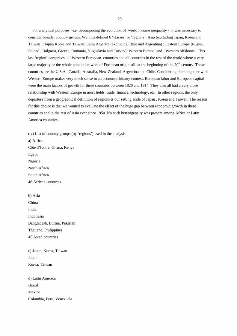
29
For analytical purposes -i.e. decomposing the evolution of world income inequality - it was necessary to
consider broader country groups. We thus defined 6 ‘classes’ or ‘regions’: Asia (excluding Japan, Korea and
Taiwan) ; Japan Korea and Taiwan; Latin America (excluding Chile and Argentina) ; Eastern Europe (Russia,
Poland , Bulgaria, Greece, Romania, Yugoslavia and Turkey); Western Europe and ‘Western offshoots’. This
last ‘region’ comprises all Western European countries and all countries in the rest of the world where a very
large majority or the whole population were of European origin still at the beginning of the 20th century. These
countries are the U.S.A , Canada, Australia, New-Zealand, Argentina and Chile. Considering them together with
Western Europe makes very much sense in an economic history context. European labor and European capital
were the main factors of growth for these countries between 1820 and 1914. They also all had a very close
relationship with Western Europe in most fields: trade, finance, technology, etc. In other regions, the only
departure from a geographical definition of regions is our setting aside of Japan , Korea and Taiwan. The reason
for this choice is that we wanted to evaluate the effect of the huge gap between economic growth in these
countries and in the rest of Asia ever since 1950. No such heterogeneity was present among Africa or Latin
America countries.
(iv) List of country groups (by ‘regions’) used in the analysis
a) Africa:
Côte d’Ivoire, Ghana, Kenya
Egypt
Nigeria
North Africa
South Africa
46 African countries
b) Asia
China
India
Indonesia
Bangladesh, Burma, Pakistan
Thailand, Philippines
45 Asian countries
c) Japan, Korea, Taiwan
Japan
Korea, Taiwan
d) Latin America
Brazil
Mexico
Colombia, Peru, Venezuela
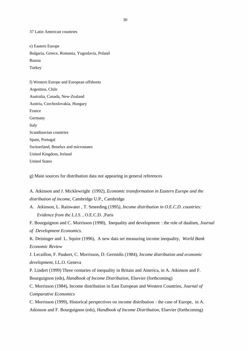
30
37 Latin American countries
e) Eastern Europe
Bulgaria, Greece, Romania, Yugoslavia, Poland
Russia
Turkey
f) Western Europe and European offshoots
Argentina, Chile
Australia, Canada, New-Zealand
Austria, Czechoslovakia, Hungary
France
Germany
Italy
Scandinavian countries
Spain, Portugal
Switzerland, Benelux and microstates
United Kingdom, Ireland
United States
g) Main sources for distribution data not appearing in general references
A. Atkinson and J. Micklewright (1992), Economic transformation in Eastern Europe and the
distribution of income, Cambridge U.P., Cambridge
A. Atkinson, L. Rainwater , T. Smeeding (1995), Income distribution in O.E.C.D. countries:
Evidence from the L.I.S. , O.E.C.D. ,Paris
F. Bourguignon and C. Morrisson (1998), Inequality and development : the role of dualism, Journal
of Development Economics.
K. Deininger and L. Squire (1996), A new data set measuring income inequality, World Bank
Economic Review
J. Lecaillon, F. Paukert, C. Morrisson, D. Germidis (1984), Income distribution and economic
development, I.L.O. Geneva
P. Lindert (1999) Three centuries of inequality in Britain and America, in A. Atkinson and F.
Bourguignon (eds), Handbook of Income Distribution, Elsevier (forthcoming)
C. Morrisson (1984), Income distribution in East European and Western Countries, Journal of
Comparative Economics
C. Morrisson (1999), Historical perspectives on income distribution : the case of Europe, in A.
Atkinson and F. Bourguignon (eds), Handbook of Income Distribution, Elsevier (forthcoming)

31
M. Sawyer (1976), Income distribution in O.E.C.D. countries 1976, O.E.C.D. , Paris
W. Van Ginneken and J-G Park (1984), Generating internationally comparable income distribution
estimates, I.L.O. Geneva
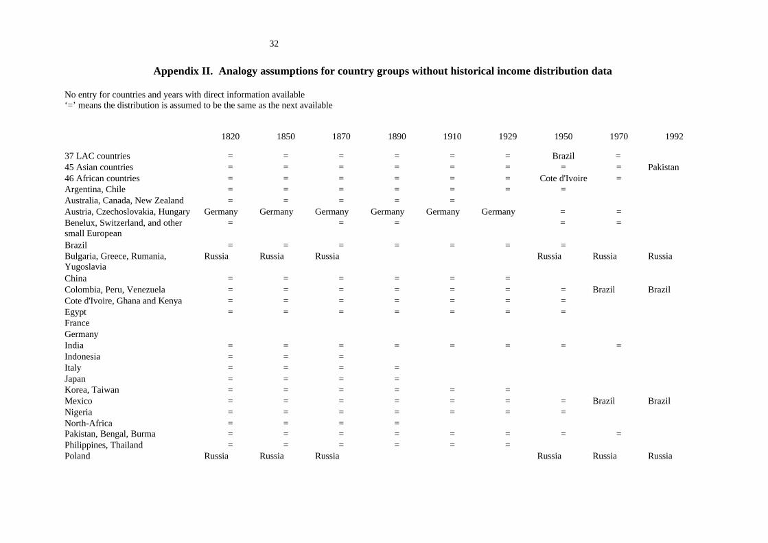
32
Appendix II. Analogy assumptions for country groups without historical income distribution data
No entry for countries and years with direct information available‘=’ means the distribution is assumed to be the same as the next available
1820 1850 1870 1890 1910 1929 1950 1970 1992
37 LAC countries = = = = = = Brazil =45 Asian countries = = = = = = = = Pakistan46 African countries = = = = = = Cote d'Ivoire =Argentina, Chile = = = = = = =Australia, Canada, New Zealand = = = = =Austria, Czechoslovakia, Hungary Germany Germany Germany Germany Germany Germany = =Benelux, Switzerland, and othersmall European
= = = = =
Brazil = = = = = = =Bulgaria, Greece, Rumania,Yugoslavia
Russia Russia Russia Russia Russia Russia
China = = = = = =Colombia, Peru, Venezuela = = = = = = = Brazil BrazilCote d'Ivoire, Ghana and Kenya = = = = = = =Egypt = = = = = = =FranceGermanyIndia = = = = = = = =Indonesia = = =Italy = = = =Japan = = = =Korea, Taiwan = = = = = =Mexico = = = = = = = Brazil BrazilNigeria = = = = = = =North-Africa = = = =Pakistan, Bengal, Burma = = = = = = = =Philippines, Thailand = = = = = =Poland Russia Russia Russia Russia Russia Russia
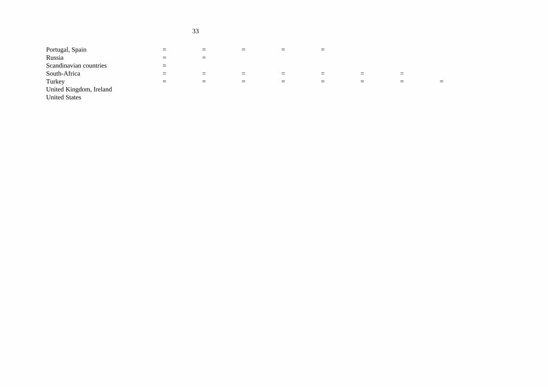
33
Portugal, Spain = = = = =Russia = =Scandinavian countries =South-Africa = = = = = = =Turkey = = = = = = = =United Kingdom, IrelandUnited States
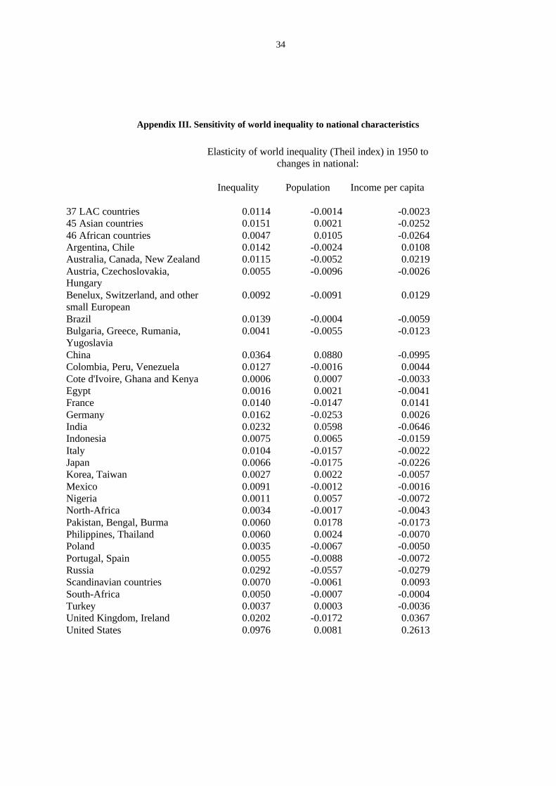
34
Appendix III. Sensitivity of world inequality to national characteristics
Elasticity of world inequality (Theil index) in 1950 tochanges in national:
Inequality Population Income per capita
37 LAC countries 0.0114 -0.0014 -0.002345 Asian countries 0.0151 0.0021 -0.025246 African countries 0.0047 0.0105 -0.0264Argentina, Chile 0.0142 -0.0024 0.0108Australia, Canada, New Zealand 0.0115 -0.0052 0.0219Austria, Czechoslovakia,Hungary
0.0055 -0.0096 -0.0026
Benelux, Switzerland, and othersmall European
0.0092 -0.0091 0.0129
Brazil 0.0139 -0.0004 -0.0059Bulgaria, Greece, Rumania,Yugoslavia
0.0041 -0.0055 -0.0123
China 0.0364 0.0880 -0.0995Colombia, Peru, Venezuela 0.0127 -0.0016 0.0044Cote d'Ivoire, Ghana and Kenya 0.0006 0.0007 -0.0033Egypt 0.0016 0.0021 -0.0041France 0.0140 -0.0147 0.0141Germany 0.0162 -0.0253 0.0026India 0.0232 0.0598 -0.0646Indonesia 0.0075 0.0065 -0.0159Italy 0.0104 -0.0157 -0.0022Japan 0.0066 -0.0175 -0.0226Korea, Taiwan 0.0027 0.0022 -0.0057Mexico 0.0091 -0.0012 -0.0016Nigeria 0.0011 0.0057 -0.0072North-Africa 0.0034 -0.0017 -0.0043Pakistan, Bengal, Burma 0.0060 0.0178 -0.0173Philippines, Thailand 0.0060 0.0024 -0.0070Poland 0.0035 -0.0067 -0.0050Portugal, Spain 0.0055 -0.0088 -0.0072Russia 0.0292 -0.0557 -0.0279Scandinavian countries 0.0070 -0.0061 0.0093South-Africa 0.0050 -0.0007 -0.0004Turkey 0.0037 0.0003 -0.0036United Kingdom, Ireland 0.0202 -0.0172 0.0367United States 0.0976 0.0081 0.2613
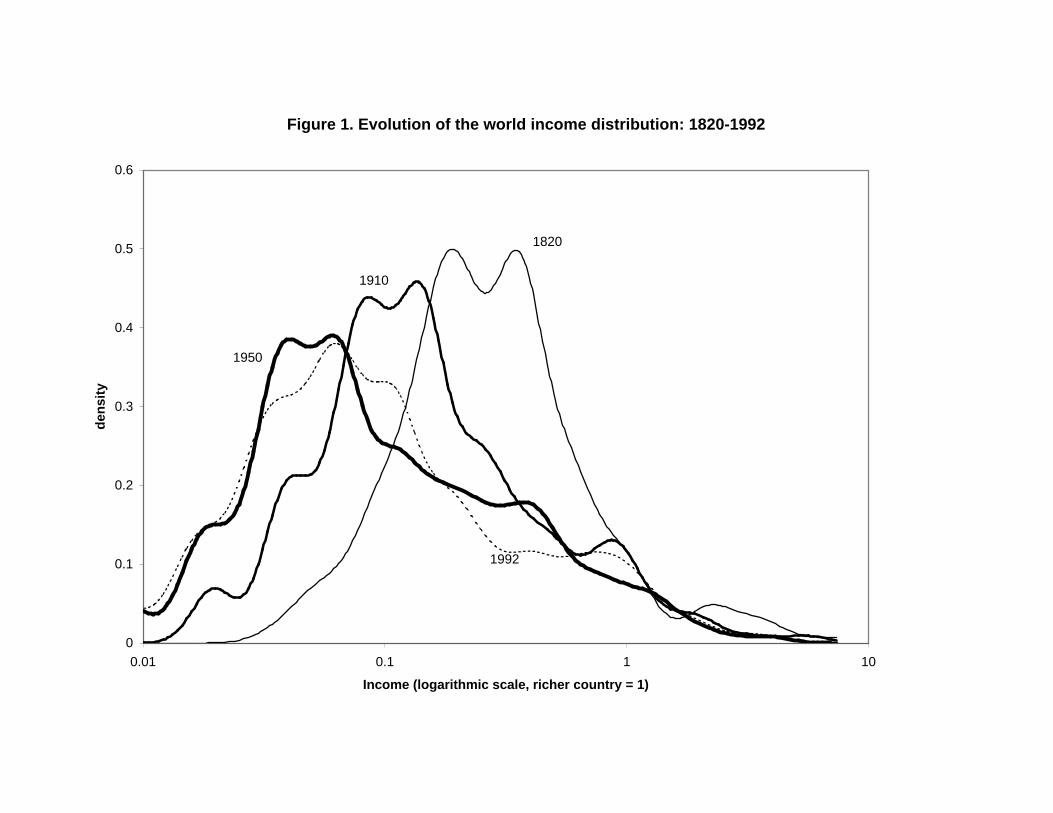
Figure 1. Evolution of the world income distribution: 1820-1992
0
0.1
0.2
0.3
0.4
0.5
0.6
0.01 0.1 1 10
Income (logarithmic scale, richer country = 1)
den
sity
1820
1910
1950
1992
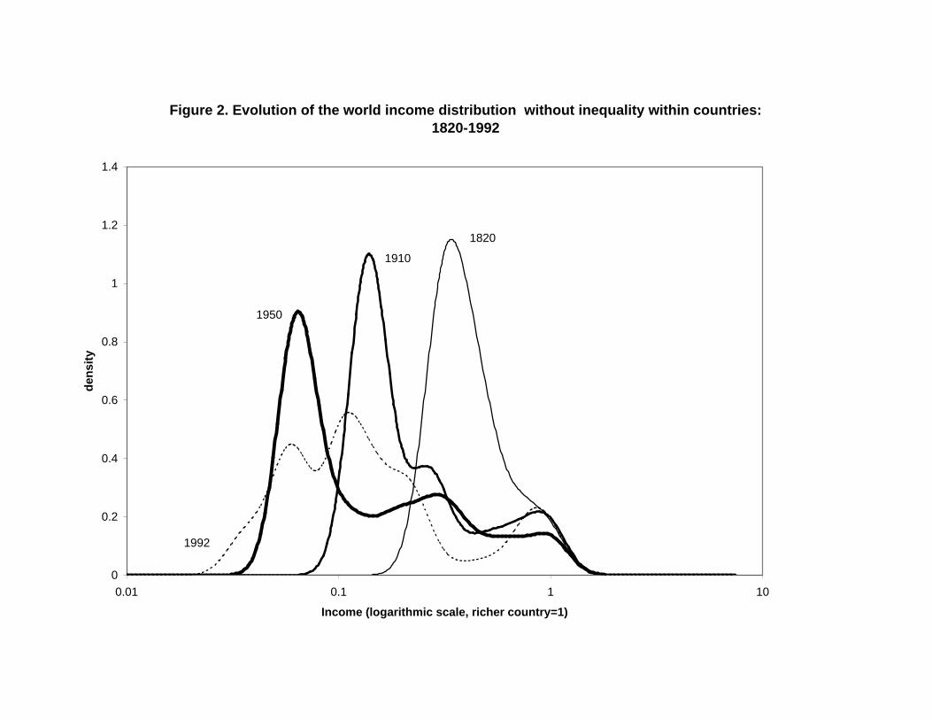
Figure 2. Evolution of the world income distribution without inequality within countries: 1820-1992
0
0.2
0.4
0.6
0.8
1
1.2
1.4
0.01 0.1 1 10
Income (logarithmic scale, richer country=1)
den
sity
1820
1910
1950
1992