gui development for advanced software -...
TRANSCRIPT

�
�
�
�
�
�
�
�
�
�
�
�
�
GGUUII DDeevveellooppmmeenntt ffoorr AAddvvaanncceedd SSooffttwwaarree
Best Practices for Designing and Building User Interfaces
The User Interface Company™
Phone: 617.621.0060 Email: [email protected]
www.ics.com
Integrated Computer Solutions Incorporated
Copyright © 2005 Integrated Computer Solutions, Inc. � www.ics.com � Phone: 617-621-0060
2
�
GUI Development for Advanced Software Best Practices for Designing and Building User Interfaces �
���������������
Introduction.........................................................................................................3
Brief History.....................................................................................................3 Usability Defined .............................................................................................3
Process of Software Creation............................................................................4 User Requirements & Task Analysis .............................................................4 Visual Design and Prototyping ......................................................................5 Design and Verification ..................................................................................5 Coding..............................................................................................................6 Testing .............................................................................................................7
GUI Design Principles ........................................................................................7 Function before form ......................................................................................7 Avoid clutter ....................................................................................................8 Be consistent in form and function ...............................................................8
Design guidelines for specific elements...........................................................9 Layout and organization.................................................................................9 Windows and Dialogs ...................................................................................10 Menus and Controls......................................................................................10 Interaction and Devices ................................................................................12 Icons and Text ...............................................................................................13 Themes and colors........................................................................................14 Internationalization and Portability..............................................................14 Help, Documentation, Customer Support, Installation ..............................15
Conclusion ........................................................................................................16 About ICS ..........................................................................................................17
Copyright © 2005 Integrated Computer Solutions, Inc. All rights reserved. This document may not be reproduced without written consent from Integrated Computer Solutions, Inc. Qt is a registered trademark of Trolltech, AS. All other trademarks are property of their owners.
Copyright © 2005 Integrated Computer Solutions, Inc. � www.ics.com � Phone: 617-621-0060
3
GUI Development for Advanced Software Best Practices for Designing and Building User Interfaces
Introduction�High-quality Graphical User Interfaces are crucial to the successful adoption and use of software applications. Although there will always be a small group of users for prototype-quality, cutting edge applications, the majority of users are no longer willing to tolerate software products that are hard to learn or difficult to use. In this article we take a look at the process of designing Graphical User Interfaces (GUIs) and show that well designed GUIs do not happen by accident or ambivalence. Instead, they are a result of adopting a systematic approach to design. We will also examine the role of a good GUI builder, development and testing environment, and other design tools in creating software products that provide a richer user experience.
Brief History The word interface - meaning a surface forming a common boundary between adjacent regions - has been around since the late 1800s. In the 1960s it saw wider usage when describing connections between computer hardware elements. The early interface to the computer was not friendly to the operator. Computers were designed for specific uses and were operated by experienced technicians. We have come a long way from knobs, dials and punch cards to using high resolution displays, windows, mice and keyboards. General purpose use of computers has soared in the last decade with the rising popularity of the Web. Users with different backgrounds and varying levels of experiences are now interacting with computers to accomplish various tasks and are becoming aware of usability issues with current software. If it is something with which they interact everyday, users are willing to pay more for quality, ease of use, completeness and robustness and are ready to discard badly designed, incomplete, buggy and annoying software products. For a pictorial history of user-interfaces, click here.
Usability Defined For a product to be “usable,” it must let the user accomplish a task effectively. To be effective, the product has to be easy to use, know its user’s needs and keep the user engaged. Usability is not limited to GUI. Everyday products have to meet the same standards for usability to succeed. The processes for creating physical products are well understood and are necessary to mitigate the risks of failure. Unfortunately, very few software firms apply similar rigorous process to the interface design of their products. Most of today’s GUIs are designed by software engineers. Usable GUI creation is, however, a multidisciplinary task involving the skills of a software engineer, a psychologist and an artist. With proper training, use of appropriate tools, and user involvement, engineering teams can cultivate sensitivity to good design and respond to user needs.

Copyright © 2005 Integrated Computer Solutions, Inc. � www.ics.com � Phone: 617-621-0060
4
Process of Software Creation In many organizations, software developers are shielded from both the business demands and the user expectations for the products on which they are working. This separation is often detrimental to the usability and success of the product. It is imperative that engineers know exactly what the product is, who it is for, and what the end-users are expecting. They should be aware of the key business goals of the product (e.g. capture x% market share in n months, reduce console time by x%, decrease error rate by x%) and who the stakeholders are other than the intended users (e.g. retailers, sales force, lawyers, manufacturing, accounting, documentation). In the field of Industrial Design, the goals are the same as that of a usable GUI: enhance the user’s experience, optimize the functionality, and improve the human factors. The field of ID has evolved common processes that guide them step by step. These steps include:
• Planning: Product definition and Research, Resources, Timing • Concept Generation • Product Development • Design Development • Engineering & Production
As you may have noticed, emphasis is put on design and usability and less on manufacturing and production. This is true of most mature fields because once the specification and design is complete, the construction is often straightforward. Traditional engineering disciplines have been refined over ages to effectively synthesize a final product according to specifications. Software engineering differs from traditional engineering in many ways but both aspire to build usable, reliable products taking into account the requirements and needs of the users. We present a proven process consisting of iterative steps to incrementally create usable graphical interfaces. It is based on Object-Oriented methodology. I should emphasize however that in the real-world, the steps are not as delineated as presented here. I would like to stress iteration, experimentation and team work over perfection and formality. Extremely formal processes can stifle creativity and breed resentment.
User Requirements & Task Analysis Defining of user requirements and analysis of how tasks are performed are the most important parts of the UI design process yet are almost always overlooked. It is a good idea to involve the end user right from the beginning. It is essential that the designer understand the task that the user is trying to accomplish. By asking pertinent questions and by observing users performing similar tasks, the designer can get a better understanding of what to develop. Copious notes (and perhaps videos) should be taken during this step and referred to during the design process. The process has to be continual so there are no surprises for the developers or for the users when the software is delivered. Each iteration of the product should be tested with the users and their suggestions and complaints should be addressed. Focus groups and surveys can also be utilized, but no technique is more effective than one-on-one face time with potential users

Copyright © 2005 Integrated Computer Solutions, Inc. � www.ics.com � Phone: 617-621-0060
5
of the software. Once you have a fairly stable list of requirements and tasks from the users, it should be ordered according to the priorities assigned to the requested features or tasks. Again, the user will be the best judge whether a task or feature is important or not. Sometimes, because of time or budget constraints, you might have to offer an alternate method or a workaround to accomplish the task and meet the requirement. Open discussions with users about what is possible in the given timeframe and budget are helpful in aligning their expectations with what is deliverable. It is inevitable that requirements will change during the course of the project. The design and coding process has to be flexible to accommodate these changes. In a project with heavy graphical elements, these changes could be costly. By using the right layout tools and design methodology, the negative impact of such changes can be significantly reduced, allowing delivery of a better user interface without affecting the project’s budget.
Visual Design and Prototyping The visual design step is where the user interface for the application begins to take shape. For products that will have extensive user interaction, this step is extremely important. The final goal is an arrangement of form, shape and content in a manner that embodies the user’s view of the problem being solved. Initial designs usually begin with storyboards comprised of hand drawn sketches on whiteboards or in notebooks. It usually takes three or four iterations before a good interface and workflow can emerge. A common barrier to effective use of multiple iterations is that the developers are unwilling to throw away initial designs. Instead of coming up with new or alternate designs, many designers try to massage their initial concept into the final design. Lack of good user-interface prototyping tools is one of the main reasons for this phenomenon. If developers hand-code their prototypes, they are far more reluctant to give it up and try a totally different design. Rapid application development tools (RAD tools) and GUI builders are extremely valuable for visual design, prototyping, and building software applications. They enable developers to explore various designs without commitment or bias. With minimal programming, some of the tools allow designers to experiment not only with the visual aspect but also with the user interaction which the whiteboard or pen and paper models cannot provide.
Design and Verification An application, of course, is more than a user interface. It needs functionality resulting from of gathering a prioritized list of user requirements and tasks. The functionality needs to be coded by developers. Future changes and extensions to the application may be required. The code might have to be maintained and ported to newer technologies. Components used in one part may need to be reused in other parts. All these characteristics of software necessitate that it be designed with care instead of jumping headfirst into constructing it. Software design methodologies originally focused

Copyright © 2005 Integrated Computer Solutions, Inc. � www.ics.com � Phone: 617-621-0060
6
on process-based structured approaches. Although these techniques provided adequate solutions for smaller problems, more complex applications require greater attention on maintenance and reuse. It is now widely believed that using objects to represent components leads to better design, and implementation of applications. Object oriented methods are better at representing physical and conceptual elements and processes. User interface elements cleanly fit into an object oriented design because of their hierarchical nature and event based response. It is better to think of user interface objects as views of non-GUI objects. Once you have decomposed the problem into objects and identified the views (UI), interactions between objects can be determined to accomplish the tasks from the requirements list. This keeps the visual parts separate from the non-visual parts and reduces the overall impact on the system when the view needs to be modified. It is also helpful in providing an initially simple UI that allows for gradually adding complexity without affecting the application design. This technique of keeping the display (view), interaction (controller) and the processing (model) separate is one of the key ideas in design of applications with graphical interfaces and is known as model-view-controller (MVC) architecture. Use of Design Patterns; solutions to design problems that crop up time and again in software design; is an effective technique that can help reduce complexity and effort. Object-Oriented GUI design is discussed in more detail in another paper (Click here for ICS’ Technical Library).
Coding Based on the above discussion, it would appear that coding should be the easiest part of the whole process. In practice, writing high quality code takes time because one is not just writing code, also debugging, refining, adding, designing, tuning, and optimizing the code within the constraints of the available resources. A collaborative team of solid developers with a variety of skill sets and experience is an absolute must. They should choose the appropriate programming language, compiler, debugger, source code management, testing tools, libraries, GUI builders and other tools that may be needed to successfully construct, deploy, and maintain the application on the target platform. Some staff may also require training in new toolkits and unfamiliar tools. With GUI-intensive applications, programming can quickly become extremely complex because a lot of code is required to accomplish even seemingly simple things. It is therefore critical that the right GUI toolkit is selected. To assure long-term support for your application, and a ready supply of development tools, the toolkit should have a strong history of industry adoption and a large user base. For especially complex, performance-critical applications, using C++ as the programming language along with X/Motif for a GUI library is very common. Productivity in such environments is enhanced by using tools that provide pre-fabricated sets of components and common UI elements (such as File Open / File Save dialogs) and advanced GUI builders such as BXPRO that present the X/Motif widgets as C++ classes. Modern UI toolkits (Motif, Qt, Java) provide a rich set of widgets that can be used to construct almost any GUI. The extensibility of these libraries allows developers to build custom widgets based on these toolkits. In some cases, it might be necessary or desirable to purchase a specialized
Copyright © 2005 Integrated Computer Solutions, Inc. � www.ics.com � Phone: 617-621-0060
7
widget or widget set to save development time and effort. Modern GUI builders allow manual modification of non-UI code blocks, but it is a good idea to not touch the automatically generated code for the UI portion. It is recommended that the Generation Gap pattern (inheritance from generated code) be used in such cases. Integrated development environments (IDEs) such as CodeCenter from Centerline Systems, provide an editor, debugger, compiler, build system, and documentation generation from within a single application. They may also provide source control, class browsing, refactoring or even a GUI builder. Use of IDEs is more prevalent on the Windows platform (Microsoft Visual C++) and for use with Java (Eclipse, BX for Java) but Linux IDEs are also making inroads. IDEs can be used to enforce coding standards and instill good coding habits. They provide a more structured environment in which developers can work with common tools. A good extensible IDE should let developers use their favorite editors, debugging tools or GUI builders so that the IDEs don’t seem to constrict the more creative developers.
Testing Even experienced engineers inject an average of 1 defect in every 20 lines of code [Humphrey 95]. Bugs are a natural consequence of human beings writing code. Testing for bugs is usually the last step in the process cycle but if bugs are detected and fixed earlier, the payback is higher and the effect on existing code is lower. Code reviews, better designs, unit testing and better automated tools can all play a vital role in reducing and finding bugs. Centerline TestCenter is a top quality testing tool for C/C++ that can provide graphical coverage analysis, error simulation, memory leak detection and easy integration into existing development environments. GUI-based applications present a special challenge for testing because automated testing is hard to do and manual testing does not provide enough coverage. Numerous interface elements present many logical paths that an application can go through. It is difficult to test every permutation and combination of events that can occur on GUI objects. Automated testing tools such as QC Replay (click for PDF) for Motif and KD Executor for Qt are available for testing complex applications containing many GUI objects. These tools use record and playback allowing developers to exercise the GUI and have the sequence of events and objects they act on be recorded as a script. Future changes to application logic can be tested by replaying the script and verifying against a previous result. Several scripts of increasing complexity can be recorded as a test suite for testing application behavior.
GUI Design Principles
Function before form American architect Louis Sullivan, in an article published in 1896 wrote, “…form ever follows function…Are we so decadent, so imbecile, so utterly weak of eyesight, that we cannot perceive this truth so simple, so very simple? Is it indeed a truth so transparent that we see through it but do not see it? …”
Copyright © 2005 Integrated Computer Solutions, Inc. � www.ics.com � Phone: 617-621-0060
8
The dictum by Sullivan could easily be applied to user-interface design. Far too many user interfaces of today add too many bells and whistles without regard to functionality. Effects and visual design elements in the GUI should not detract users from the usability of the application. Unless the application being designed is very special purpose, most modern applications are expected to have several common features such as a menu bar, access to help, status, etc. Unfamiliar metaphors and controls are likely to confuse the users. Effort should be directed towards designing the interface to let the user accomplish the task effectively.
Avoid clutter Clutter is one of the biggest enemies of usability. Clutter confuses users. Too many controls make the task seem more complex than it is. By eliminating non-essential screen items, you can reduce the interaction time and number of steps required by the user. If the interface is too cluttered, users may miss critical information. Interfaces should be simple, clear and unambiguous without losing the distinguishing characteristics of important elements. If the users reach their limits of comprehension before reaching their goal, they may become bored or irritated with the user interface. Do not confuse clutter with complexity. Treat it the same way you would treat the clutter at home or office – get rid of things that you don’t need and organize the remaining things so that they are easy to find and use.
Be consistent in form and function Users often make a mental model of what the application controls do when they perform a task. These models are a result of their experiences with similar applications. If the behavior of your application deviates from screen to screen, the users start focusing more on the functioning of the application than on the task at hand. Consistency can be hard to achieve if multiple developers are involved in the design and development. Style guides and coding standards can be used to keep the design consistent. GUI builders can also help in this regard by enforcing consistent “global” settings to all UI elements throughout your application. Themes and style sheets are another way to keep the visual aspects consistent while allowing for some user customization. A common look and common functionality is especially important if you have multiple products. Consistency in this case will not only promote reuse of code but can save money by reusing documentation, training and marketing material. Users are also more inclined to use software that appears and behaves similar to something they have used before.

Copyright © 2005 Integrated Computer Solutions, Inc. � www.ics.com � Phone: 617-621-0060
9
Screenshot of the BXPRO GUI Builder for Motif
(Click here to enlarge and see more)
Design guidelines for specific elements In this section we present guidelines for some of the common features found in most applications. In many cases the design may be dictated by the underlying windowing system (Microsoft Windows, OSX, KDE etc.) or the toolkit (Motif, Java, Qt). Each platform usually has its own style guide that acts as a repository for design guidelines and standards. Usually these guides contain too much information and try to cover every conceivable topic. Below, we present a few items that consistently come up during discussions and design.
Layout and organization If you follow object-oriented techniques in your application and use a modern GUI toolkit, you will end up with components that have views. The views are arranged on the screen in way that lets the user progress through a task. Most toolkits have what are known as “Layout Managers” – a container that allow grouping and positioning of controls in different ways. These containers can be used recursively to arrange larger areas. Layout managers also take care of resizing their contents when the GUI is resized. A common mistake is to position components in absolute locations. This rigidity causes problems not only when resizing, but also when fonts or look and feel is changed by the user. Another problem seen often is that the underlying components do resize but in an unexpected way. Some GUI builders compound this issue by writing out absolute positions instead of using layout managers. It is important to test each window to make sure that it resizes properly. Beyond resizing, the layout managers play an important role in enforcing consistency by employing consistent margins at widget boundaries and consistent spacing between elements. These spacings and margins are usually adjustable by the developers and in some cases by the users. Other organizational design is the responsibility of the developer. The components on a screen should be organized in a clear and regular fashion according to the progression of steps in the task to be done. It is best to keep
Application being built
Palette
Resource Editor
Browser
Copyright © 2005 Integrated Computer Solutions, Inc. � www.ics.com � Phone: 617-621-0060
10
widget sizes in a proportion with which users are likely to be familiar. Some of the classic proportions used since ancient times in various forms are square (1:1), square root of 2 (1:1.414), golden ratio (1:1618). Applications that are designed to be used for extended periods of time are allowed to take over the whole screen but shouldn’t be rigidly fixed to a certain size. Ideally, the application would remember the last configuration of windows and would restore the sizes and locations on restart.
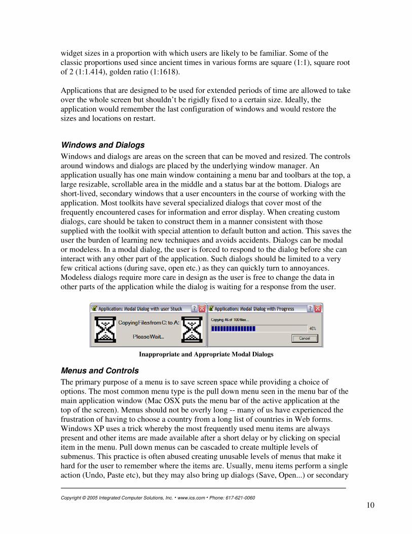
Windows and Dialogs Windows and dialogs are areas on the screen that can be moved and resized. The controls around windows and dialogs are placed by the underlying window manager. An application usually has one main window containing a menu bar and toolbars at the top, a large resizable, scrollable area in the middle and a status bar at the bottom. Dialogs are short-lived, secondary windows that a user encounters in the course of working with the application. Most toolkits have several specialized dialogs that cover most of the frequently encountered cases for information and error display. When creating custom dialogs, care should be taken to construct them in a manner consistent with those supplied with the toolkit with special attention to default button and action. This saves the user the burden of learning new techniques and avoids accidents. Dialogs can be modal or modeless. In a modal dialog, the user is forced to respond to the dialog before she can interact with any other part of the application. Such dialogs should be limited to a very few critical actions (during save, open etc.) as they can quickly turn to annoyances. Modeless dialogs require more care in design as the user is free to change the data in other parts of the application while the dialog is waiting for a response from the user.
Inappropriate and Appropriate Modal Dialogs�
Menus and Controls The primary purpose of a menu is to save screen space while providing a choice of options. The most common menu type is the pull down menu seen in the menu bar of the main application window (Mac OSX puts the menu bar of the active application at the top of the screen). Menus should not be overly long -- many of us have experienced the frustration of having to choose a country from a long list of countries in Web forms. Windows XP uses a trick whereby the most frequently used menu items are always present and other items are made available after a short delay or by clicking on special item in the menu. Pull down menus can be cascaded to create multiple levels of submenus. This practice is often abused creating unusable levels of menus that make it hard for the user to remember where the items are. Usually, menu items perform a single action (Undo, Paste etc), but they may also bring up dialogs (Save, Open...) or secondary

Copyright © 2005 Integrated Computer Solutions, Inc. � www.ics.com � Phone: 617-621-0060
11
windows. Menus can also be used to make choices or to set states instead of performing actions. It is a good idea to group menu items by functionality and by frequency of usage and to place them under well defined menus (File, Edit, View, Tools, and Help). Menu items that are frequently used can be assigned an accelerator or a hot-key. Hotkeys are key combinations that invoke the menu item. Each platform has standardized ones for common tasks. Deviating from the standard is a sure way to confuse the users. Many menu items are also available as toolbar actions. Toolbar buttons are a simple 1-click way to perform actions or to set states without having to go through a menu bar. They usually contain just an icon so it is necessary to provide a good icon and reinforce the usage by using the same icon in the menu item. Good tool tips are also essential for conveying the functionality of toolbar buttons. Menus, Hotkeys and Toolbar buttons present a good opportunity for code reuse when a common action is performed using them. Combo boxes (option menus) are special cases of menus that allow users to choose one of several values. Combo boxes should only be used to offer choices. They should not be used to perform actions. Context menus, also known as popup menus are used to present a list of available actions that are specific to the current context (object being edited or pointed to). The menu “pops” into existence by pressing the right mouse button (Ctrl-Click on OSX). The trouble with context menus is that the user does not know whether they exist or not. Also, some systems make the functionality available only through context menus. A context menu should be viewed as a time saving device for an action already on the toolbar or a pulldown menu. It can also help in reducing clutter by presenting choices that are only applicable to the current context. Deep cascading inside a context menu should be avoided. Pushbuttons, Toggle Buttons, Radio Buttons and Checkboxes are some other controls that are available in most toolkits. These usually support text as well as icons. Use Pushbuttons to invoke an action. Toggle buttons, Radio Buttons and Checkboxes can all represent a binary state but are often misused. When using a single control to represent two opposite states, use a Toggle button or a Check box and make sure that the two settings (on or off) are truly opposite of each other. (Example: bold or not bold). Customarily, checkboxes are used in dialogs and toggle buttons in toolbars. When you have many such exclusive choices, it is best to represent them with separate toggle buttons (example: bold, italic, underline – mutually independent yet related). Use Radio buttons grouped together when presenting choices that are one-of-many i.e. only one choice is valid at a given time. Turning one button on would automatically turn the others off. The choices are related but not opposite. Use radio buttons when the number of controls is from 2 to 7. In some toolkits, a combination of menu and a
Copyright © 2005 Integrated Computer Solutions, Inc. � www.ics.com � Phone: 617-621-0060
12
pushbutton is also available. On a single click, the control behaves like a push button but on holding the mouse for a small amount of time, a pull down menu is presented. Sometimes, the pull down menu is available via a secondary narrow control on the right of the button. (Commonly seen in back/forward buttons of a web browser) Sliders are used to select a value from a range. Toolkits do a good job of providing sliders with various display styles for tick marks and settings for orientation (Vertical or Horizontal). Most toolkits limit sliders to integer values and leave it up to the developer to do the math to convert internal integer values to floating point values via some mapping. The required granularity and the range of the underlying field should be taken into account when presenting a slider to adjust its value. In cases where exact values are required, a text field should be provided next to the slider so that the user can read and specify the value precisely.
Interaction and Devices Other than the screen, the mouse and the keyboard are the primary devices used to interact with applications. Most users expect that moving a mouse will position the cursor. Hovering over a control with a mouse may show tool tips or changes information in the status bar. Clicking on a control will cause focus to be transferred to the control and the control to be activated. Holding the context mouse button (Right-Click or Ctrl-Click) may bring up a context menu. Most of these behaviors are implemented by default by well-developed toolkits. We have seen many applications where developers, in the name of economy and creativity, throw users off by sidestepping default standard behavior. You can proactively help the user’s interaction with the application in a number of ways listed below:
• Provide short mouse-over tool tips. • Provide a more detailed single line contextual help on the status bar when user is
hovering over the controls. • Change pointer shapes to denote the possible operation (moving objects, I-beam,
arrow, watch, resize). • Provide status bar help and iconic/pointer feedback when performing drag and
drop operations. • Provide keyboard shortcuts (hotkeys) for frequently used operations and make
sure that the key combination is clearly labeled in the corresponding menu item. • Make sure that the default actions on dialogs are non-destructive. • Maintain a consistent keyboard/input focus policy and tab navigation. For
example, power users will generally use the following keys without reaching for the mouse: <Shift> <Tab> goes to the previous field and selects everything in it. <Ctrl>-<C> copies the text, <Tab> moves to the next field, <Ctrl>-<V> pastes the text.
• Be aware of and educate users that there are default keyboard shortcuts in almost every toolkit component. When a component has focus, you can usually activate it by pressing the space bar, Esc usually dismisses a dialog box, arrow and PageUp,

Copyright © 2005 Integrated Computer Solutions, Inc. � www.ics.com � Phone: 617-621-0060
13
PageDn keys move scrollable regions. Home and End keys can be used to navigate to the beginning and end respectively of text fields or scrollable regions.
• Provide feedback using a progress bar for a lengthy operation and allow the user to abort the process by performing the task in small chunks and checking periodically to update the progress and check for user input.
• Depending upon your target users, provide accessibility features if not already provided for by the underlying operating system by accepting input from alternate devices.
Icons and Text Icons are valuable symbols that can give a unique identity to your product line and at the same time save screen space and provide a pleasing experience to the user. The advantages can only be derived if the icons are well designed, are unambiguous and are displayed effectively and consistently. They need to be reinforced by associating them closely with the corresponding textual equivalent (menu item or help string). When making icons for international use, the icons need to respect foreign cultures and norms yet be recognizable by people from varying backgrounds. It is best to avoid icons based on pop culture or local history. With advances in graphics hardware, it is no longer necessary to limit the colors or sizes of icons but it is wise to stick with sizes mandated by the toolkit or the operating system. Good icons often use large objects with simple outlines yet distinctive shapes. Two sizes of the same icons are usually designed with different styles for active, highlighted and disabled states. Some toolkits can derive these states automatically from a single icon but manual design avoids undesired effects. It is a good idea to show newly designed icons to potential users and have them evaluate the effectiveness. Text occurs in various forms throughout the application. Use of text extends from read only text (for identification in labels, buttons, menus, fields), to single line text fields, to multi-line editors to fully functional WSYWIG markup editors. Here are some general guidelines for using text:
• Be consistent in usage of fonts and sizes for a particular purpose. Do not use too many typefaces, sizes or weights.
• Limit the use of non-default text and text background colors to error conditions or for bubble help.
• Use fonts that are readable on the target screen resolution. Although serif type is more readable, sans serif fonts like Helvetica and Futura have gained popularity due to their minimalist and modern look.
• Align labels in a consistent manner. • For scripting and display of code or numeric data, use fixed fonts to help in
alignment. • Construct specialized GUI components to help the user enter date, time in an
unambiguous way. • Be mindful of conversion of text to other languages. • Use consistent phraseology, tone and tense.

Copyright © 2005 Integrated Computer Solutions, Inc. � www.ics.com � Phone: 617-621-0060
14
Themes and colors Themes are a great way to allow users to customize the look of the application. Instead of letting the users change the look of a few scattered items here and there, themes let you retain an overall stylistic control of the application by allowing only coordinated overall changes. Themes, or skins as they are sometimes called, require that you separate the content from the look and require some support from the toolkit being used to write the GUI. In simple cases, only the colors, icons, images and fonts change but in more sophisticated theme support, low level widget renderings can also be changed. This allows one to test the application look on alternate platforms without first compiling and running them. Today’s graphics cards allow the use of millions of colors. Unfortunately many applications use colors indiscriminately despite availability of extensive research in color theory and perception. Colors can be used to convey information in a more comprehensible and legible manner by focusing attention toward specific information, displaying information graphically (progress bars, meters) or by generally increasing appeal of the interface. Designers should keep in mind that using bright colors in applications that are used over a long period can cause visual fatigue. Colors should be chosen knowing the fact that about 10% of the population has some degree of color blindness. Many colors have negative cultural or historical associations that should be taken into account in an increasingly multicultural workplace. Some other suggestions regarding the use of color:
• Unless it is a highly graphical application, use no more than 7 solid colors. • Use blues for backgrounds and other areas that you don’t want to stand out (eye
has the fewest blue receptors). • Use dark text on light backgrounds for use in brightly lit areas. • Use similar colors for related items. It will help the user mentally link the items. • Conform to conventions in color usage. Example: red=danger, yellow=caution,
green=safe. • Related sets of colors can be obtained using standard tables (varying values of a
given hue, complementary colors of opposing hues etc.) See the visibone website for some commercial color charts.
Internationalization and Portability More and more applications today are striving for increased market share by tapping into the rapidly emerging international market. To be usable in the region of deployment, applications not only need to present the information in the local language but also need to be mindful of the cultural and traditional symbols and metaphors. Humor and obscure references in interfaces should be avoided. The actual task of internationalization (I18N) is easier if supported by the toolkit or the operating system. In most cases, this involves treating labels and icons as external resources and maintaining a table of values for these resources for each supported language. In addition to text, units of currency, measurements (of distance, weight, volume etc.) and date formats also need to be updated for each supported region.

Copyright © 2005 Integrated Computer Solutions, Inc. � www.ics.com � Phone: 617-621-0060
15
Special thought needs to put into the layout for applications using languages that read right-to-left. Some translations may not fit into the boundaries of labels or buttons if the widgets are made fixed size. Layout issues for internationalization are best resolved by providing alternate themes for each language. Use of themes for I18N allows for better fine tuning and testing before deployment. Even with great progress in compiler technology and standardization of programming languages, application portability among various operating systems remained poor for a long time because of the lack of robust portable GUI toolkits. Java & Qt have become popular amongst developers and vendors primarily because of the promise of the “write-once, run anywhere” paradigm. Although achieving portability is not as simple as that yet, many applications can now be primarily developed on a one platform and used on other platforms with a fraction of effort that was required earlier. These toolkits provide a development environment that supports a higher level abstraction for OS-specific attributes such as the file system, device control, system calls, graphics, application installation and registry, memory management, build (make) systems etc. This allows maintenance of just one version of code, tracking of just one set of bugs thereby reducing feature gap among supported platforms, reduction of development team sizes, and increased productivity and cost savings. You do lose direct control via low-level libraries for writing performance critical portions demanding applications but one can provide multiple versions of such code for each platform as a special case.
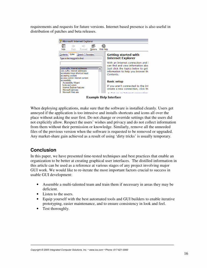
Help, Documentation, Customer Support, Installation Help within an application takes a variety of forms. The simplest and best help is to provide clearly labeled fields, buttons, menu items, dialogs and window titles. If the users can guess and anticipate the functionality, the software will seem intuitive. In addition, most modern applications provide short popup help for most actions. A longer and more descriptive single line of help may appear in the status line when the user hovers over an element in the interface. Context-sensitive or “What’s this?” help provides even more detailed information about a control. This is normally supported by most toolkits in a way that enables the user to click on an item and query more information regarding it (usually in a longer form of a popup balloon). Full-fledged task-oriented help is provided by specialized interfaces provided by the toolkit or the operating system. This extensive hyperlinked help contains detailed usage information as well as task oriented step-by-step instructions. Tutorials with gradually increasing levels of complexity can also be included here. It is a good idea to provide a fully indexed search capability within the help system to let the users find exactly what they need. Supplemental documents and additional help can be provided via the Internet through a dedicated web page that the users can get to from the application’s help menu. It is also a good idea to build an online community of users of the application where they can post questions and answers and help each other out. A technical person in the organization should monitor periodically to gauge the user response to new features and collect
Copyright © 2005 Integrated Computer Solutions, Inc. � www.ics.com � Phone: 617-621-0060
16
requirements and requests for future versions. Internet based presence is also useful in distribution of patches and beta releases.
Example Help Interface�
When deploying applications, make sure that the software is installed cleanly. Users get annoyed if the application is too intrusive and installs shortcuts and icons all over the place without asking the user first. Do not change or override settings that the users did not explicitly allow. Respect the users’ wishes and privacy and do not collect information from them without their permission or knowledge. Similarly, remove all the unneeded files of the previous version when the software is requested to be removed or upgraded. Any market-share gain achieved as a result of using ‘dirty tricks’ is usually temporary.
Conclusion In this paper, we have presented time-tested techniques and best practices that enable an organization to be better at creating graphical user interfaces. The distilled information in this article can be used as a reference at various stages of any project involving major GUI work. We would like to re-iterate the most important factors crucial to success in usable GUI development:
• Assemble a multi-talented team and train them if necessary in areas they may be deficient.
• Listen to the users. • Equip yourself with the best automated tools and GUI builders to enable iterative
prototyping, easier maintenance, and to ensure consistency in look and feel. • Test thoroughly.

Copyright © 2005 Integrated Computer Solutions, Inc. � www.ics.com � Phone: 617-621-0060
17
About ICS Driven by the belief that the success of any software application ultimately depends on the quality of the user interface, Integrated Computer Solutions, Inc., The User Interface Company™, of Cambridge, MA, is the world’s leading provider of advanced user-interface development tools and services for professional software engineers in the aerospace, petrochemical, transportation, military, communications, entertainment, scientific, and financial industries. Long recognized as the platform of choice for visually developing mission-critical, high-performance Motif applications, ICS' BX series of GUI builders has recently been expanded to provide a complete line of tools that accelerate development of Java™. ICS is the largest independent supplier of add-on products to the Qt multi-platform framework developed by Trolltech. Supporting the software development community since 1987, ICS also provides custom UI development services, custom UI component development, training, consulting, and project porting and implementation services. More information about ICS can be found at http://www.ics.com
The User Interface Company™
Phone: 617.621.0060 Email: [email protected]
www.ics.com
Integrated Computer Solutions Incorporated