ed sheeran website analysis
TRANSCRIPT
Prior to the planning of our own website, we researched existing artists to analyse what features we admired and what worked well when viewing the websites as an audience.
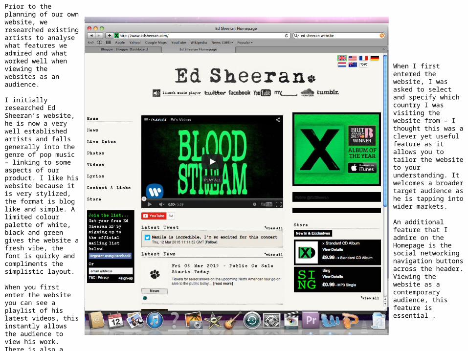
I initially researched Ed Sheeran’s website, he is now a very well established artists and falls generally into the genre of pop music – linking to some aspects of our product. I like his website because it is very stylized, the format is blog like and simple. A limited colour palette of white, black and green gives the website a fresh vibe, the font is quirky and compliments the simplistic layout.
When you first enter the website you can see a playlist of his latest videos, this instantly allows the audience to view his work. There is also a live Twitter feed linked to Ed’s personal Twitter account. Clear navigation links are located down the left side, ensuring easier navigation when moving from one page to another.
When I first entered the website, I was asked to select and specify which country I was visiting the website from – I thought this was a clever yet useful feature as it allows you to tailor the website to your understanding. It welcomes a broader target audience as he is tapping into wider markets.
An additional feature that I admire on the Homepage is the social networking navigation buttons across the header. Viewing the website as a contemporary audience, this feature is essential .

This page displays his Live Tour Dates, it shows his fans when and where he is touring and gives them the opportunity to purchase tickets. I like this feature on the website because it feels more personal and intimate as if he is personally inviting fans to come and see him.
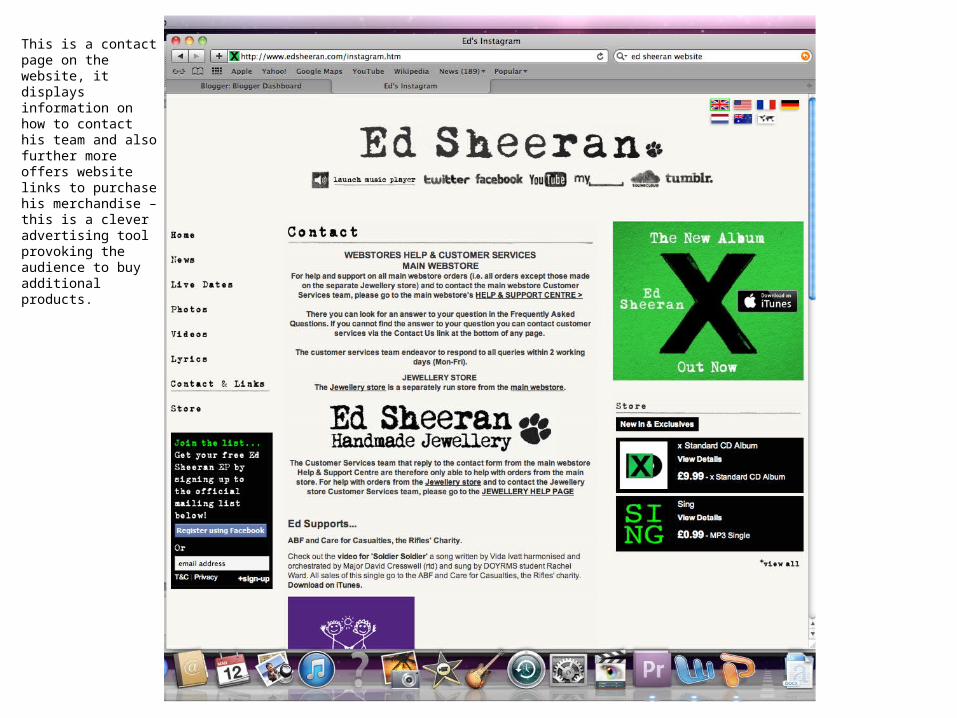
This is a contact page on the website, it displays information on how to contact his team and also further more offers website links to purchase his merchandise – this is a clever advertising tool provoking the audience to buy additional products.
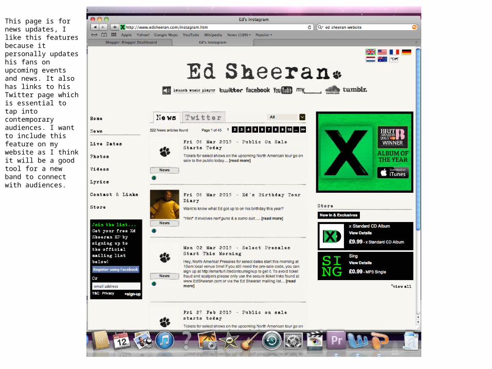
This page is for news updates, I like this features because it personally updates his fans on upcoming events and news. It also has links to his Twitter page which is essential to tap into contemporary audiences. I want to include this feature on my website as I think it will be a good tool for a new band to connect with audiences.