dps analysis final
TRANSCRIPT

Analysing Double Page Spreads of Music Magazines

Analysis of Music Magazine Double Page Spread – Lilly Allen
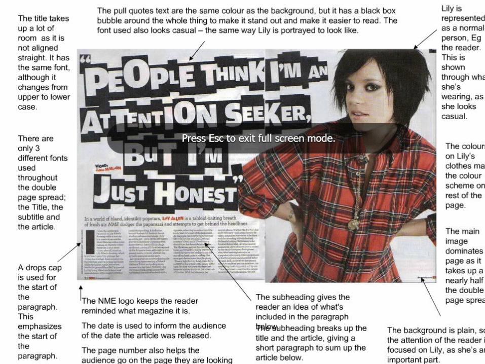
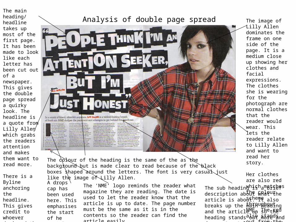
Analysis of double page spreadThe main heading/ headline takes up most of the first page. It has been made to look like each letter has been cut out of a newspaper. This gives the double page spread a quirky look. The headline is a quote from Lilly Allen which grabs the readers attention and makes them want to read more.
There is a Byline anchoring the headline. This gives credit to whoever designed the lettering.
There are 3 different types of font used throughout out this page. The title, The sub heading and the article.
A drops cap has been used here. This emphasises the start of he article.
The ‘NME’ logo reminds the reader what magazine they are reading. The date is used to let the reader know that the article is up to date. The page number must be the same as it is in the contents so the reader can find the article easily.
The sub heading is a brief description about what the article is about. It also breaks up the main heading and the article up so the heading stands out more and does not get lost within the article.
The image of Lilly Allen dominates the frame on one side of the page. It is a medium close up showing her clothes and facial expressions. The clothes she is wearing for the photograph are normal clothes that the reader would wear. This lets the reader relate to Lilly Allen and want to read her story.
Her clothes are also red which matches the colour scheme throughout NME. The red also stands out from the white background.The colour of the heading is the same of the as the background but is made clear to read
because of the black boxes shaped around the letters. The font is very casual just like the image of Lilly Allen.

Analysis of Music Magazine double page spread – NME Dizzee Rascal

ANALYSIS OF ARTICLES- DOUBLE PAGE SPREAD 1 NME
Mise en scene is created by the graffiti on the wall. This creates a textured background and gives personality to the page. It also gives you information about Dizzee Rascal because that is what he might like to do.
The main image dominates the frame one page. It is medium long shot. This gives the reader an idea of the environment and let you see the expression on his face. The movement in the image lets the reader know more Dizzee Rascal before they read the article. The page number
must match the contents page. There must be a date so the reader knows if the article is up to date.
The Byline gives credit to the photographer that took the photos for the Dizzee Rascal article.
The subheading gives the reader a brief description of what the rest of the article is about. It is in a slightly bigger text then the article but smaller then the title.
The main headline is a play on words to the saying ‘Rages to riches’ by using the word ‘tags’ which is something graffiti artists are known for gives you an idea what the article will be about e.g. Dizzee rise to fame.
The article is in four columns and wraps around the radio making the radio and mise en scene stand out more and not get lost in the text.
The caption saying ‘Dizzee Rascal’ Lets the reader know who the image is in case they do not recognise him. A paint splat effect has been sued to relate to the main image.
The beer bottles and radio shows interests of Dizzee Rascal and adds to the mise en scene.
The copy uses drop texts to make it clear when the article starts.

Analysis of written article
The article itself is basically about how Dizzee Rascal has became so succssful and famous in the year 2009. It tells you the things he ahs been up to like Winning the Mercury Prize and Kate Moss and himself.
The style of article is written in third person as it is someone else telling the story of what happened when Dizzee Rascal arrived for his photoshoot.
It is written in 4 short columns each of approx75-100 words