analysis dps
TRANSCRIPT

By having an entire page dedicated to the image of Lady Gaga, it is made clear that she is the subject of the article. The use of a high fashion style photograph gives the magazine a professional look and pulls the reader in due to the model’s sexual/romantic gaze.
The large red ‘L’ is iconic of Q Magazine’s articles and gives a real house style to every issue.
Surprisingly for a modern pop magazine, Q continues to use a sans serif font for it’s body of text. This would usually be considered to look ‘old fashioned’ but here, Q’s fashion forward photography and sans serif font works together perfectly to create a slick look to the page.
By placing the small masthead in the right hand corner, each page has a sense of branding but in a way that isn’t obnoxious or distracting from the main article.
The black, white and red colour scheme is iconic of Q Magazine and is also a very contemporary and edgy colour scheme for a pop magazine.
I chose to look at Q magazine because it’s iconic in it’s layout and colour scheme which is unusual for a music magazine. From looking at this Double Page Spread, I have seen how a large image can really add to the interest of a page however, if I do use a large photo, I think I will use it as a background for my interview/article.

The use of red to distinguish interview questions from answers is a useful way of making the interview easy for a consumer to read
By making the model appear in colour whilst the background is in black and white, all attention is drawn to her and the background becomes less distracting. This also makes for a more dynamic and modern image which is also what Rita Ora is known for.
The use of a large decorative font to write out the artist’s name draws attention to the subject of the article and may make the reader more attracted to the page. The fact that it is spread across the whole page may suggest that her name is a statement in itself.
The model’s invitational gaze grabs the attention of the reader and makes them want to read the article.
The use of a grey font for the main body of text is very effective as it reflects the mid-tones of the image, uniting it with the article itself.
I chose to look at this magazine because of how both the image and content covers both pages which is something I hadn’t seen before. I think I’d like to take forward the concept of matching font colours to the image itself to give a sense of unity to the different components of the double page spread.
Page number and section name is written in white font on a black banner to ensure that it’s easy to read but subtle so that it doesn’t distract from the main content of the page.
By spreading the image across both pages, our eyeflow is made to move from left to right as we also read the heading and interview. This makes for a natural eyeflow which is comfortable to the reader.
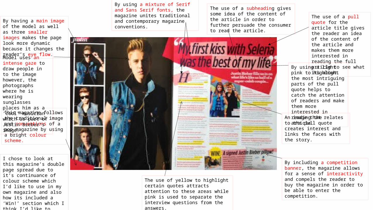
By using a mixture of Serif and Sans Serif fonts, the magazine unites traditional and contemporary magazine conventions. The use of a pull quote for
the article title gives the reader an idea of the content of the article and makes them more interested in reading the full article to see what its about.
By using a light pink to highlight the most intriguing parts of the pull quote helps to catch the attention of readers and make them more interested in reading the article.
By having a main image of the model as well as three smaller images makes the page look more dynamic because it changes the reader’s eye flow.
An image that relates to the pull quote creates interest and links the faces with the story.
By including a competition banner, the magazine allows for a sense of interactivity and compels the reader to buy the magazine in order to be able to enter the competition.
The use of yellow to highlight certain quotes attracts attention to these areas while pink is used to separate the interview questions from the answers.
The use of a subheading gives some idea of the content of the article in order to further persuade the consumer to read the article.
This magazine follows the traditional image and conventions of a pop magazine by using a bright colour scheme.
Model uses an intense gaze to draw people in to the image however, the photographs where he is wearing sunglasses places him as a ‘cool’ musician which is part of Justin Bieber’s image.
I chose to look at this magazine’s double page spread due to it’s continuance of colour scheme which I’d like to use in my own magazine and also how its included a ‘Win!’ section which I think I’d like to incorporate in my own work.
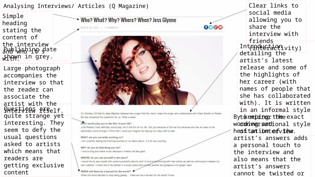
Analysing Interviews/ Articles (Q Magazine)Simple heading stating the content of the interview and who it’s with.
Clear links to social media allowing you to share the interview with friends (interactivity)
Publishing date shown in grey.
Large photograph accompanies the interview so that the reader can associate the artist with the interview itself.
Introduction detailing the artist’s latest release and some of the highlights of her career (with names of people that she has collaborated with). It is written in an informal style to mirror the conversational style of an interview.
Questions are quite strange yet interesting. They seem to defy the usual questions asked to artists which means that readers are getting exclusive content
By keeping the exact wording and hesitation of the artist’s answers adds a personal touch to the interview and also means that the artist’s answers cannot be twisted or misquoted in the future.
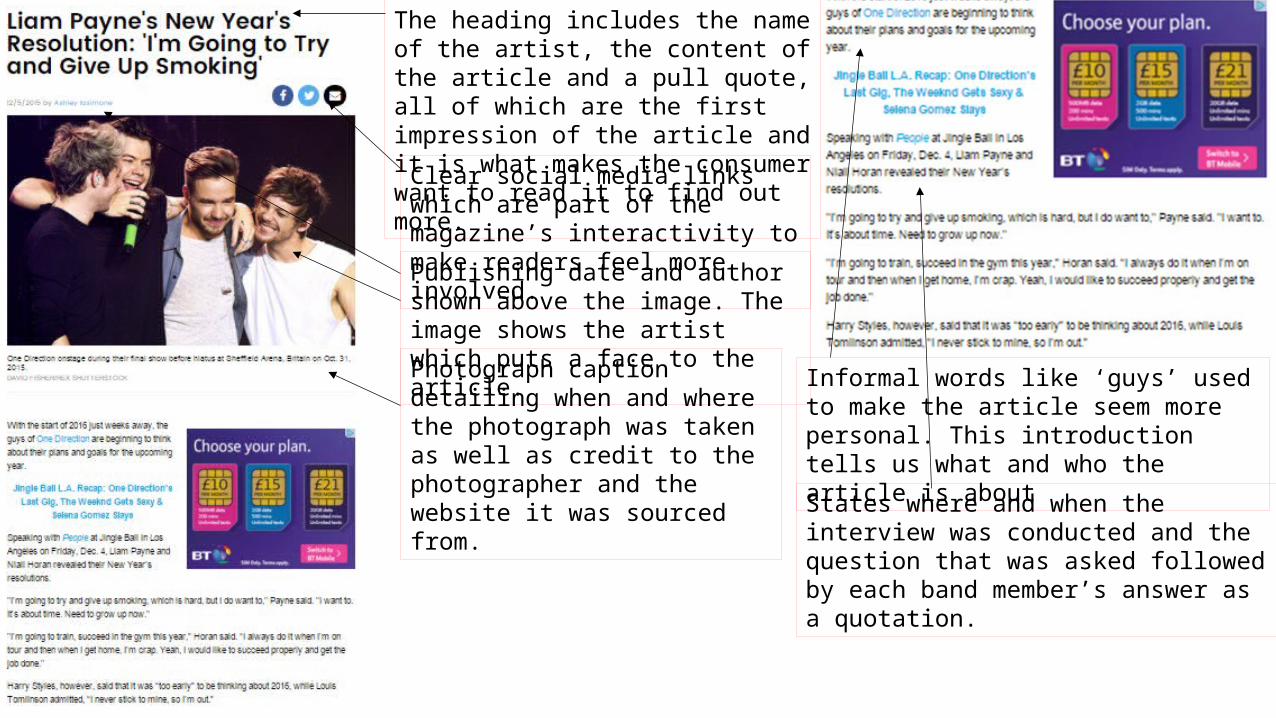
The heading includes the name of the artist, the content of the article and a pull quote, all of which are the first impression of the article and it is what makes the consumer want to read it to find out more.
Clear social media links which are part of the magazine’s interactivity to make readers feel more involved.
Publishing date and author shown above the image. The image shows the artist which puts a face to the article.
Photograph caption detailing when and where the photograph was taken as well as credit to the photographer and the website it was sourced from.
Informal words like ‘guys’ used to make the article seem more personal. This introduction tells us what and who the article is about
States where and when the interview was conducted and the question that was asked followed by each band member’s answer as a quotation.

Heading includes a question, the artists name and the name of the person who conducted the interview. Use of phrases such as “the most popular human alive”
Begins with a quote from the artist and paints an image of the situation in which the interview was conducted. This details the place and time of year .The article then describes the artist talking about her latest music video shoot and the inspiration behind it. The article embeds the interview within itself making it seem like a storyline that creates a more readable and interesting article. The use of anecdotes also makes the interview easier to read because it is a lot more dynamic than a simple question and answer format.