data presentation and summary - nyujsimonof/classes/1305/pdf/datapres.pdfdata presentation and...
TRANSCRIPT
Data presentation and summary
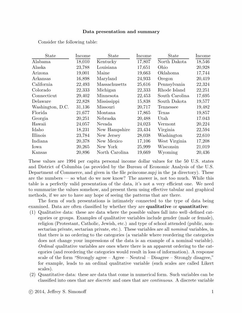
Consider the following table:
State Income State Income State IncomeAlabama 18,010 Kentucky 17,807 North Dakota 18,546Alaska 23,788 Louisiana 17,651 Ohio 20,928Arizona 19,001 Maine 19,663 Oklahoma 17,744Arkansas 16,898 Maryland 24,933 Oregon 20,419California 22,493 Massachusetts 25,616 Pennsylvania 22,324Colorado 22,333 Michigan 22,333 Rhode Island 22,251Connecticut 29,402 Minnesota 22,453 South Carolina 17,695Delaware 22,828 Mississippi 15,838 South Dakota 19,577Washington, D.C. 31,136 Missouri 20,717 Tennessee 19,482Florida 21,677 Montana 17,865 Texas 19,857Georgia 20,251 Nebraska 20,488 Utah 17.043Hawaii 24,057 Nevada 24,023 Vermont 20,224Idaho 18,231 New Hampshire 23,434 Virginia 22,594Illinois 23,784 New Jersey 28,038 Washington 22,610Indiana 20,378 New Mexico 17,106 West Virginia 17,208Iowa 20,265 New York 25,999 Wisconsin 21,019Kansas 20,896 North Carolina 19,669 Wyoming 20,436
These values are 1994 per capita personal income dollar values for the 50 U.S. statesand District of Columbia (as provided by the Bureau of Economic Analysis of the U.S.Department of Commerce, and given in the file pcincome.mpj in the js directory). Theseare the numbers — so what do we now know? The answer is, not too much. While thistable is a perfectly valid presentation of the data, it’s not a very efficient one. We needto summarize the values somehow, and present them using effective tabular and graphicalmethods, if we are to have any hope of seeing the patterns that are there.
The form of such presentations is intimately connected to the type of data beingexamined. Data are often classified by whether they are qualitative or quantitative:(1) Qualitative data: these are data where the possible values fall into well–defined cat-
egories or groups. Examples of qualitative variables include gender (male or female),religion (Protestant, Catholic, Jewish, etc.) and type of school attended (public, non-sectarian private, sectarian private, etc.). These variables are all nominal variables, inthat there is no ordering to the categories (a variable where reordering the categoriesdoes not change your impressions of the data is an example of a nominal variable).Ordinal qualitative variables are ones where there is an apparent ordering to the cat-egories (and reordering the categories would result in loss of information). A responsescale of the form “Strongly agree – Agree – Neutral – Disagree – Strongly disagree,”for example, leads to an ordinal qualitative variable (such scales are called Likertscales).
(2) Quantitative data: these are data that come in numerical form. Such variables can beclassified into ones that are discrete and ones that are continuous. A discrete variable
c© 2014, Jeffrey S. Simonoff 1
is one where the possible outcomes can be counted; for example, the number of childrenin a family, or the number of airline accidents this year. Qualitative variables wherea number has been assigned to each category are sometimes thought of as discretequantitative variables also. A continuous variable is one where the possible valuesare so numerous that they cannot be counted (or, there are so many that the countis effectively infinite). Examples of such a variable are the temperature in a roomwhen you enter it, the gross national product of a country, and the net profits of acorporation. Quantitative variables are often viewed as being on an interval scale oron a ratio scale. Interval–scaled data are ones where the difference between valuesis meaningful; for example, the 20 degree difference between 40◦F and 60◦F meansthe same thing as the difference between 80◦F and 100◦F. Ratio–scaled data are datawhere there is a true zero point, so that ratios makes sense; for example, someonewho is 70 inches tall is twice as tall as someone who is 35 inches tall (so height isratio–scaled), but 80◦F is not “twice as hot” as 40◦F (so temperature Fahrenheit isnot ratio–scaled).Data presentation for qualitative data is pretty straightforward. The natural way of
presenting this type of data is by using a frequency distribution — that is, a tabulation(or tally of the number of observations in the data set that fall into each group.
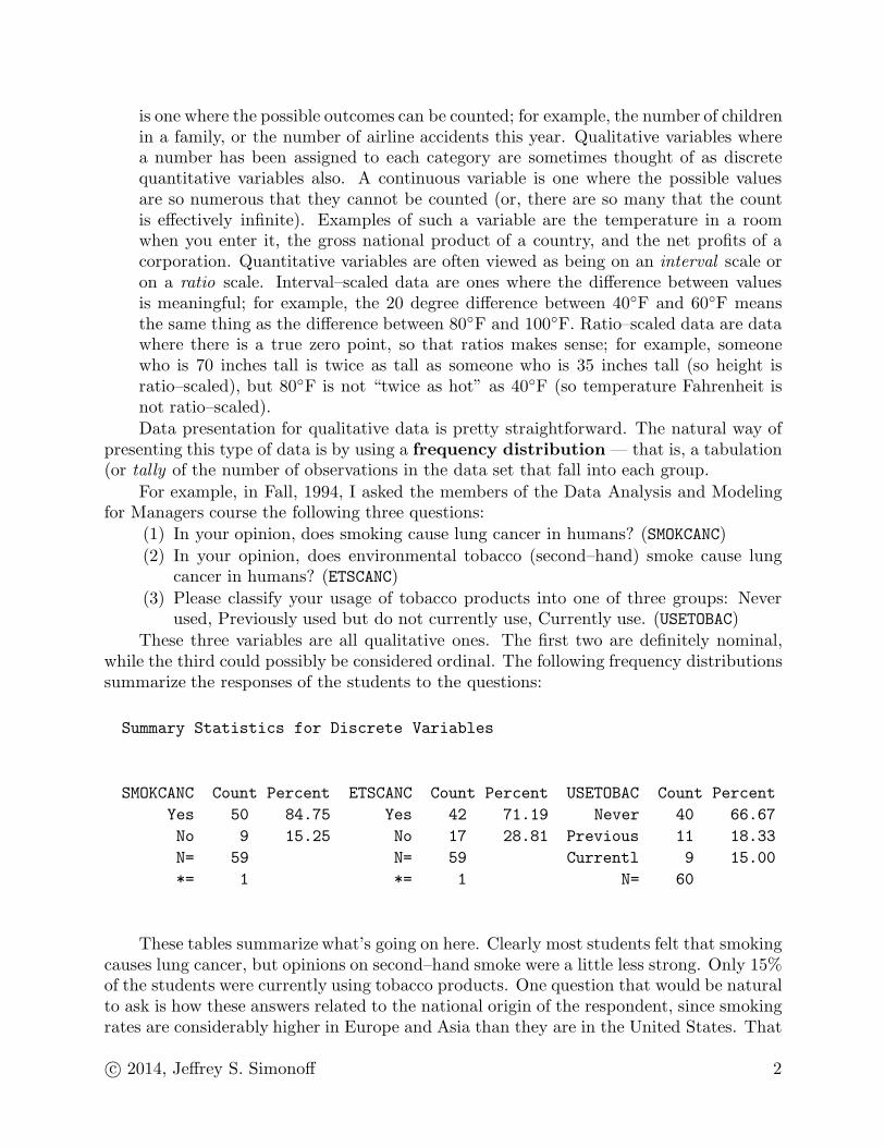
For example, in Fall, 1994, I asked the members of the Data Analysis and Modelingfor Managers course the following three questions:
(1) In your opinion, does smoking cause lung cancer in humans? (SMOKCANC)
(2) In your opinion, does environmental tobacco (second–hand) smoke cause lungcancer in humans? (ETSCANC)
(3) Please classify your usage of tobacco products into one of three groups: Neverused, Previously used but do not currently use, Currently use. (USETOBAC)
These three variables are all qualitative ones. The first two are definitely nominal,while the third could possibly be considered ordinal. The following frequency distributionssummarize the responses of the students to the questions:
Summary Statistics for Discrete Variables
SMOKCANC Count Percent ETSCANC Count Percent USETOBAC Count Percent
Yes 50 84.75 Yes 42 71.19 Never 40 66.67
No 9 15.25 No 17 28.81 Previous 11 18.33
N= 59 N= 59 Currentl 9 15.00
*= 1 *= 1 N= 60
These tables summarize what’s going on here. Clearly most students felt that smokingcauses lung cancer, but opinions on second–hand smoke were a little less strong. Only 15%of the students were currently using tobacco products. One question that would be naturalto ask is how these answers related to the national origin of the respondent, since smokingrates are considerably higher in Europe and Asia than they are in the United States. That
c© 2014, Jeffrey S. Simonoff 2
is, sensible data analysis will often focus on issues of the association between variables, inaddition to properties of the variables separately. The term correlation is often used aswell, particularly for quantitative variables. When we examine such associations, we mustalways remember that just because two events occur together, that doesn’t mean that onecauses the other; that is, correlation does not imply causation.
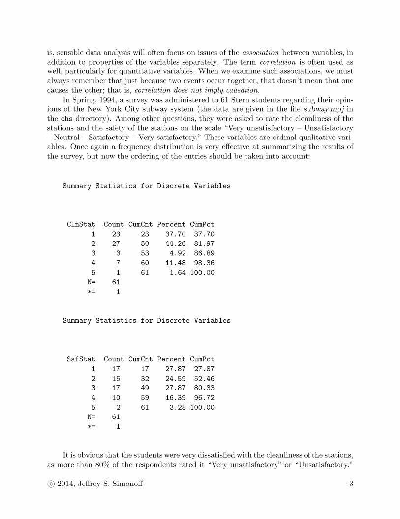
In Spring, 1994, a survey was administered to 61 Stern students regarding their opin-ions of the New York City subway system (the data are given in the file subway.mpj inthe chs directory). Among other questions, they were asked to rate the cleanliness of thestations and the safety of the stations on the scale “Very unsatisfactory – Unsatisfactory– Neutral – Satisfactory – Very satisfactory.” These variables are ordinal qualitative vari-ables. Once again a frequency distribution is very effective at summarizing the results ofthe survey, but now the ordering of the entries should be taken into account:
Summary Statistics for Discrete Variables
ClnStat Count CumCnt Percent CumPct
1 23 23 37.70 37.70
2 27 50 44.26 81.97
3 3 53 4.92 86.89
4 7 60 11.48 98.36
5 1 61 1.64 100.00
N= 61
*= 1
Summary Statistics for Discrete Variables
SafStat Count CumCnt Percent CumPct
1 17 17 27.87 27.87
2 15 32 24.59 52.46
3 17 49 27.87 80.33
4 10 59 16.39 96.72
5 2 61 3.28 100.00
N= 61
*= 1
It is obvious that the students were very dissatisfied with the cleanliness of the stations,as more than 80% of the respondents rated it “Very unsatisfactory” or “Unsatisfactory.”
c© 2014, Jeffrey S. Simonoff 3

Cleanliness can be viewed as a “quality of life” issue, and on that score the MetropolitanTransit Authority is apparently not doing the job. The picture is a little better as regardssafety, but is still not good enough, as more than half the respondents rate safety in the“Unsatisfactory” categories. What is interesting about this is that crime rates in thesubways are lower than they are above ground, but perceptions don’t necessarily followthe facts.
Let’s go back now to the per capita income data on page 1. In theory we could form afrequency distribution for this variable (although Minitab won’t allow this using the tally
command), but there’s really no reason to try, since it would just be a list of 51 numbers.For this continuous variable, a raw frequency distribution isn’t very helpful, since it prettymuch duplicates the original table. We need to form a set of categories for this variable,and then look at the resultant frequency distribution. Here’s an example:
Summary Statistics for Discrete Variables
PCIncome Count CumCnt Percent CumPct
15800-19800 18 18 35.29 35.29
19800-23800 25 43 49.02 84.31
23800-27800 5 48 9.80 94.12
27800-31800 3 51 5.88 100.00
N= 51
This isn’t too great either. We’ve chosen categories that are too wide, and the sum-mary frequency distribution is too coarse to be very useful. How do we know how manycategories to use? A general rule of thumb is to use in the range of 5 to 15 categories, withusually no more than 7 or 8 for sample sizes less than 50. It’s also often helpful to definecategories using round numbers, to make it easier to interpret the results. The best rule,however, is to just look at the frequency distribution and see what makes sense.
Here’s another frequency distribution for the per capita income data:
c© 2014, Jeffrey S. Simonoff 4

Summary Statistics for Discrete Variables
PCIncome Count CumCnt Percent CumPct
15800-16800 1 1 1.96 1.96
16800-17800 7 8 13.73 15.69
17800-18800 5 13 9.80 25.49
18800-19800 5 18 9.80 35.29
19800-20800 9 27 17.65 52.94
20800-21800 4 31 7.84 60.78
21800-22800 8 39 15.69 76.47
22800-23800 4 43 7.84 84.31
23800-24800 2 45 3.92 88.24
24800-25800 2 47 3.92 92.16
25800-26800 1 48 1.96 94.12
26800-27800 0 48 0.00 94.12
27800-28800 1 49 1.96 96.08
28800-29800 1 50 1.96 98.04
29800-30800 0 50 0.00 98.04
30800-31800 1 51 1.96 100.00
N= 51
This is a lot more informative than before. First, we see that income values rangebetween roughly $15,800 and $31,800. A “typical” value seems to be a bit more than$20,000. Interestingly, the distribution of income values drops much more quickly below$20,000 than above it; income values stretch all the way out to over $30,000, but there areno values below $15,000.
This pattern can be seen more clearly in a graphical representation of the frequencydistribution called a histogram. Here’s the histogram that corresponds to the frequencydistribution above:
c© 2014, Jeffrey S. Simonoff 5
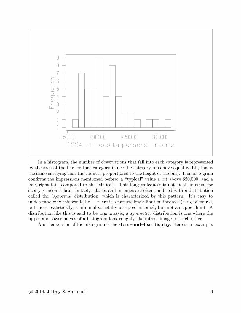
In a histogram, the number of observations that fall into each category is representedby the area of the bar for that category (since the category bins have equal width, this isthe same as saying that the count is proportional to the height of the bin). This histogramconfirms the impressions mentioned before: a “typical” value a bit above $20,000, and along right tail (compared to the left tail). This long–tailedness is not at all unusual forsalary / income data. In fact, salaries and incomes are often modeled with a distributioncalled the lognormal distribution, which is characterized by this pattern. It’s easy tounderstand why this would be — there is a natural lower limit on incomes (zero, of course,but more realistically, a minimal societally accepted income), but not an upper limit. Adistribution like this is said to be asymmetric; a symmetric distribution is one where theupper and lower halves of a histogram look roughly like mirror images of each other.
Another version of the histogram is the stem–and–leaf display. Here is an example:
c© 2014, Jeffrey S. Simonoff 6
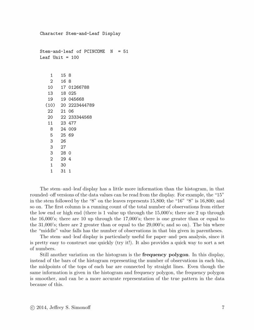
Character Stem-and-Leaf Display
Stem-and-leaf of PCINCOME N = 51
Leaf Unit = 100
1 15 8
2 16 8
10 17 01266788
13 18 025
19 19 045668
(10) 20 2223444789
22 21 06
20 22 233344568
11 23 477
8 24 009
5 25 69
3 26
3 27
3 28 0
2 29 4
1 30
1 31 1
The stem–and–leaf display has a little more information than the histogram, in thatrounded–off versions of the data values can be read from the display. For example, the “15”in the stem followed by the “8” on the leaves represents 15,800; the “16” “8” is 16,800; andso on. The first column is a running count of the total number of observations from eitherthe low end or high end (there is 1 value up through the 15,000’s; there are 2 up throughthe 16,000’s; there are 10 up through the 17,000’s; there is one greater than or equal tothe 31,000’s; there are 2 greater than or equal to the 29,000’s; and so on). The bin wherethe “middle” value falls has the number of observations in that bin given in parentheses.
The stem–and–leaf display is particularly useful for paper–and–pen analysis, since itis pretty easy to construct one quickly (try it!). It also provides a quick way to sort a setof numbers.
Still another variation on the histogram is the frequency polygon. In this display,instead of the bars of the histogram representing the number of observations in each bin,the midpoints of the tops of each bar are connected by straight lines. Even though thesame information is given in the histogram and frequency polygon, the frequency polygonis smoother, and can be a more accurate representation of the true pattern in the databecause of this.
c© 2014, Jeffrey S. Simonoff 7
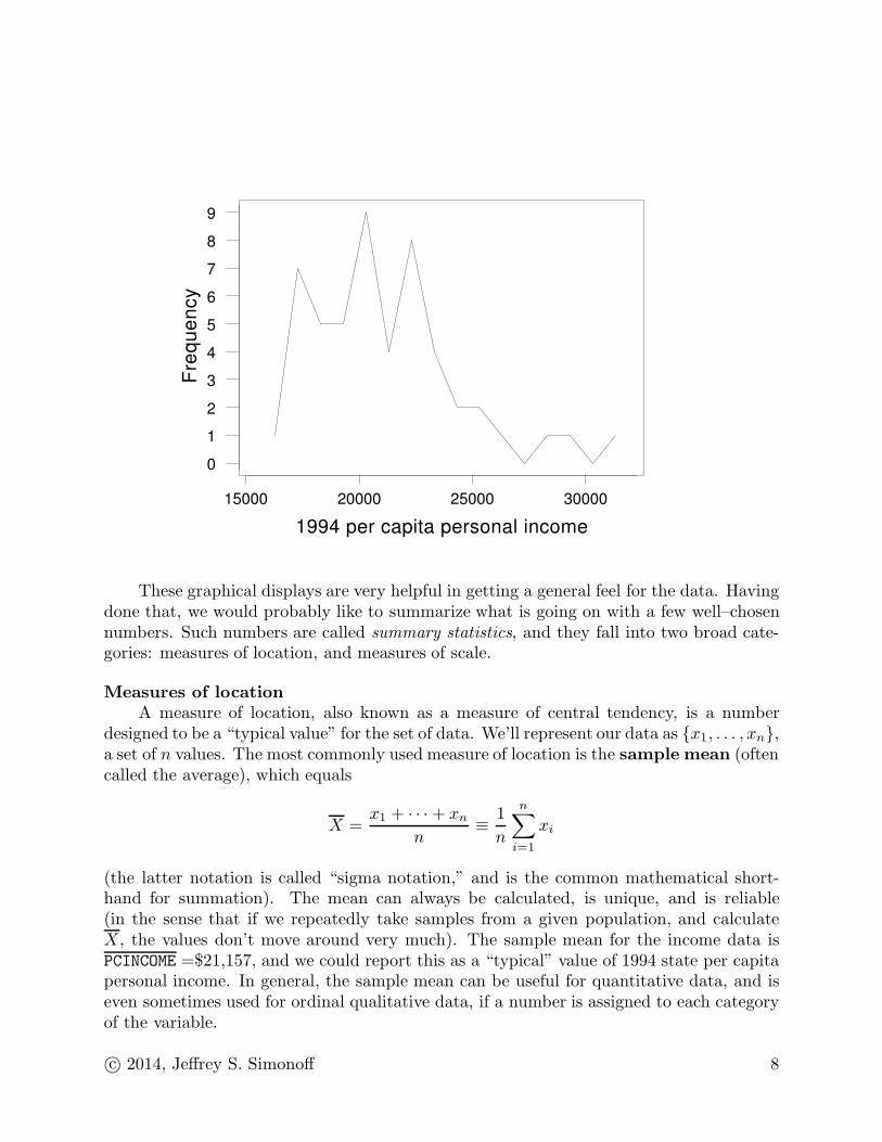
30000250002000015000
9
8
7
6
5
4
3
2
1
0
1994 per capita personal income
Fre
qu
en
cy
These graphical displays are very helpful in getting a general feel for the data. Havingdone that, we would probably like to summarize what is going on with a few well–chosennumbers. Such numbers are called summary statistics, and they fall into two broad cate-gories: measures of location, and measures of scale.
Measures of location
A measure of location, also known as a measure of central tendency, is a numberdesigned to be a “typical value” for the set of data. We’ll represent our data as {x1, . . . , xn},a set of n values. The most commonly used measure of location is the sample mean (oftencalled the average), which equals
X =x1 + · · · + xn
n≡
1
n
n∑
i=1
xi
(the latter notation is called “sigma notation,” and is the common mathematical short-hand for summation). The mean can always be calculated, is unique, and is reliable(in the sense that if we repeatedly take samples from a given population, and calculateX, the values don’t move around very much). The sample mean for the income data isPCINCOME =$21,157, and we could report this as a “typical” value of 1994 state per capitapersonal income. In general, the sample mean can be useful for quantitative data, and iseven sometimes used for ordinal qualitative data, if a number is assigned to each categoryof the variable.
c© 2014, Jeffrey S. Simonoff 8
The mean isn’t perfect, however. If you go back to the histogram or stem–and–leafdisplay and see where the mean falls, you can see that it seems to be too high to be“typical,” falling too far in the upper tail. The problem is that the mean is not robust. Arobust statistic is one that is not severely affected by unusual observations, and the meandoesn’t have this property — it is very severely affected by such observations. If a value isunusually high or low, the mean will “follow” it, and will correspondingly be too high ortoo low, respectively (such an unusual value is called an outlier, since it lies outside theregion where most of the data are).
For the income data, there are three values that are noticeably larger than the othervalues: 28,038 (New Jersey), 29,402 (Connecticut) and 31,136 (Washington, D.C.). Thefirst two of these states benefit from having many residents who earn high salaries in NewYork City, without having their average income drawn down by the poorer parts of thecity (since the suburbs are in different states from the city). Washington, D.C. is a specialcase — a city where most of the population is relatively poor, but where a small portionof the population (connected with the Federal government) are very wealthy. It’s not clearwhether we should consider these values as outliers, or as just part of the generally longright tail of the distribution of the data. If we decided to consider them as outliers, wewould examine them to see what makes them unusual (as I just did), and we might omitthem from our analysis to see how things look without them.
What would be desirable is a measure of location that is robust. One such measureis the sample median. The median is defined as the “middle” value in the sample, if ithas been ordered. More precisely, the median has two definitions, one for even n and onefor odd n:
n odd n even
x( n+1
2 )[
x(n
2 ) + x( n
2+1)
]/
2
The notation x(i) means the ith smallest value in the sample (so x(1) is the minimum, andx(n) is the maximum).
Thus, for the income data, the median is the 26th largest (or smallest) value, or$20,488. Note that it is almost $700 smaller than the sample mean, since it is less affectedby the long right tail. Since money data are often long right–tailed, it is generally goodpractice to report things like median income or median revenue, and mean rainfall or meanheight (since these latter variables tend to have symmetric distributions). The differencebetween the mean and median here is not that large, since the income variable is notthat long–tailed, but the difference between the two can sometimes be very large. Thatsometimes leads people to report one value or the other, depending on their own agenda.A noteworthy example of this was during the 1994 baseball season before and during theplayer strike, when owners would quote the mean player salary of $1.2 million, while theplayers would quote the median player salary of $500,000.
Not only were both of these figures correct, but they even both reflected the concernsof each group most effectively. The “units” of measurement for the mean are dollars, sinceit is based on a sum of dollars, while the units of measurement for the median are people,since it is based on ordering the observations. Since an owner cares about typical totalpayroll (25 times the mean player salary, since there are 25 players on a team), he or she
c© 2014, Jeffrey S. Simonoff 9
is most interested in the mean; since a player cares about what he can earn, he is mostinterested in the median.
The median is also a useful location measure for ordinal qualitative data, since theidea of a “middle” value is well–defined. The median values for both the station cleanlinessand station safety variables in the subway survey are “Unsatisfactory,” which is certainlya reasonable representation of what that data says.
A different robust location measure is the trimmed mean. This estimator ordersthe observations, and then throws out a certain percentage of the observations from thebottom and from the top. Minitab gives a 5% trimmed mean. The 5% trimmed mean isclearly not as robust as the median, since if more than 5% of the observations are outliersin the low (or high) direction, they are not trimmed out. The estimator becomes morerobust (but less accurate for clean data) as the trimming percentage increases, culminatingin the median, which is the (almost) 50% trimmed mean.
A fourth location measure is the sample mode, which is simply the value that occursmost often in the data. This isn’t very useful for continuous data, but it is for discreteand especially qualitative data. Indeed, the mode is the only sensible location measurefor nominal qualitative data. The modes for the smoking survey were “Smoking causeslung cancer,” “Second–hand smoke causes lung cancer,” and “I have never used tobaccoproducts,” all eminently reasonable reflections of what would be considered “typical” re-sponses. The mode for station cleanliness is “Unsatisfactory”, but there are two modes forstation safety (“Very unsatisfactory” and “Neutral”), reflecting less unanimity of opinionfor the latter question.
The concept of the mode can be extended to continuous data by allowing some “fuzzi-ness” into the definition. For continuous data, a mode is a region that has a more concen-trated distribution of values than contiguous regions nearby. The histogram (or stem–and–leaf display) can be used to identify these regions. For the income data, we might identifythree modes — around $17,500, $20,500 and $22,500, respectively. This has the appealingcharacterization of low, medium and high income states, respectively. Members of eachgroup include Arkansas, Louisiana and West Virginia (low), Iowa, Kansas and Nebraska(medium), and Delaware, Pennsylvania and Washington (high), which ties in well with theknown association between higher income and the presence of large corporations.
Measures of scale
Location measures only give part of the story, as it is also important to describe thevariability in the sample. For example, a fixed income security that provides a constantreturn of 10% over five years and a real estate investment that averages a 10% return peryear over five years both have the same location measure, but are clearly not equivalentinvestments. More specifically, measures of scale (also known as measures of variability ormeasures of dispersion) are the primary focus in two important business applications:(1) quality control: a manufacturing process that is stable is said to be “in control”; a
process that is producing widgets, say, with the correct average diameter, but withtoo large variability around that average, is said to be “out of control”
(2) the stock market: stocks that are more variable than the market (often measuredusing “beta”) are riskier, since they go up or down more than the market as a wholedoes
c© 2014, Jeffrey S. Simonoff 10
Many different measures of variability have been suggested. A simple one is the range
of the data, or the difference between the largest and smallest values (x(n) − x(1)). Thisis easy to calculate, but not very useful, since it is extremely non–robust (an unusualvalue becomes the minimum or maximum, and causes the range to become much larger).[An aside: the range can also be used to calculate a location estimate. The midrange isthe average of the minimum and maximum values in the sample, [x(1) + x(n)]/2, or themidpoint of the interval that contains all of the values.]
A better range–based scale estimate trims off the most extreme values, and uses therange of the “middle” values that are left. To define such an estimate, we first have todefine the quartiles of the sample. Roughly speaking, the quartiles correspond to the 25%points of the sample; so, the first quartile is the value corresponding to one–fourth of thesample being below and three–fourths above, the second quartile corresponds to half aboveand below (that is, the median), and the third quartile corresponds to three–fourths of thesample below and one–fourth above. Unfortunately, for most sample sizes, “one–fourth”and “three–fourths” are not well–defined, so we need to make the definition more precise.Different statistical packages use slightly different definitions, but here’s a common one:the first quartile is the value corresponding to a rank of
1 +⌊
n+12
⌋
2,
where b·c is the largest integer less than or equal to the value being evaluated. So, forexample, say n = 32; then, the first quartile corresponds to a rank of
1 +⌊
332
⌋
2=
1 + 16
2= 8
1
2.
Thus, the first quartile is the average of the eighth and ninth smallest values in the sample.The third quartile is similarly defined, as the value corresponding to a rank of
n −
⌊
n+12
⌋
− 1
2.
Thus, for n = 32, the third quartile corresponds to a rank of 32− (16− 1)/2 = 32− 7.5 =24.5, or the average of the 24th and 25th smallest values. If this seems a bit mysterious,perhaps it will be clearer if you notice that this is the average of the eighth and ninthlargest values in the sample, just as the first quartile is the average of the eight and ninthsmallest values.
The first and third quartiles are values that are relatively unaffected by outliers, sincethey do not change even if the top and bottom 25% of the sample values are sent off to±∞. The difference between them, the interquartile range (IQR) is therefore a muchmore robust measure of scale, as it represents the width of the interval that covers the“middle half” of the data. [An aside: the IQR can also be used to calculate a more robustlocation estimate. The midhinge is the average of the first and third quartiles, or themidpoint of the interval that contains the middle half of the data. Another term for thequartiles is the hinges, which accounts for the name of this location estimate.]
c© 2014, Jeffrey S. Simonoff 11

The quartiles and interquartile range provide an easy–to–calculate set of values thatcan summarize the sample. The five number summary is simply the set of five num-bers {minimum, first quartile, median, third quartile, maximum}, which can be useful tosummarize the general position of the data values. Here is output for the income data thatgives the five number summary:
Descriptive Statistics
Variable N Mean Median Tr Mean StDev SE Mean
PCINCOME 51 21157 20488 20904 3237 453
Variable Min Max Q1 Q3
PCINCOME 15838 31136 18546 22610
The five number summary is (15838, 18546, 20488, 22610, 31136). The summary showsthat half of the values are in the interval (18546, 22610), with the IQR equaling $4064.Since the median $20488 is roughly in the middle of this interval (that is, it is not far fromthe midhinge (18546 + 22610)/2 = $20578), this suggests that the middle of the incomedistribution is roughly symmetric (a conclusion that the histogram supports). The upperfourth of the data cover a much wider range than the lower fourth, however ($8526 versus$2708), suggesting a long right (upper) tail (a conclusion also supported by the histogram).
Using the IQR to measure variability leads to the construction of a useful graphicalsummary of a set of data called the boxplot (sometimes called it the box–and–whiskerplot). Here is the boxplot for the income data:
c© 2014, Jeffrey S. Simonoff 12
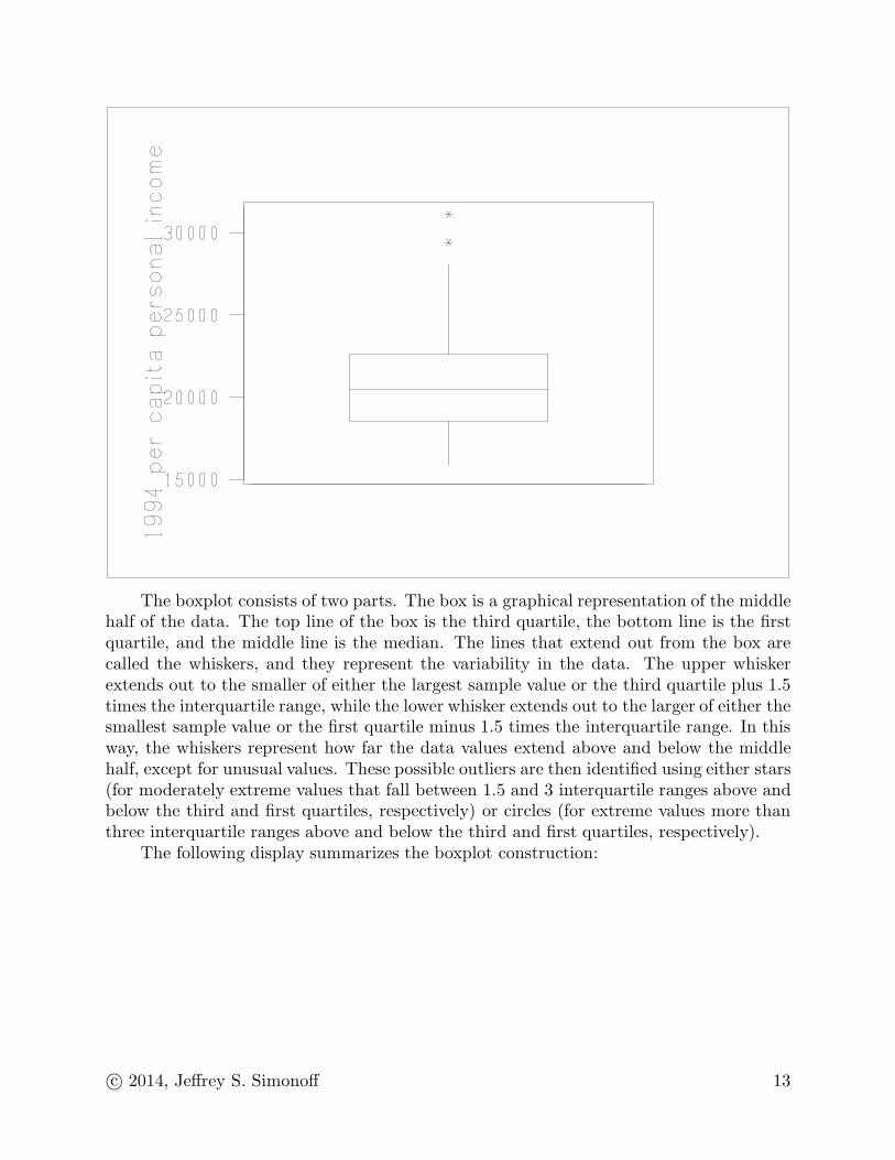
The boxplot consists of two parts. The box is a graphical representation of the middlehalf of the data. The top line of the box is the third quartile, the bottom line is the firstquartile, and the middle line is the median. The lines that extend out from the box arecalled the whiskers, and they represent the variability in the data. The upper whiskerextends out to the smaller of either the largest sample value or the third quartile plus 1.5times the interquartile range, while the lower whisker extends out to the larger of either thesmallest sample value or the first quartile minus 1.5 times the interquartile range. In thisway, the whiskers represent how far the data values extend above and below the middlehalf, except for unusual values. These possible outliers are then identified using either stars(for moderately extreme values that fall between 1.5 and 3 interquartile ranges above andbelow the third and first quartiles, respectively) or circles (for extreme values more thanthree interquartile ranges above and below the third and first quartiles, respectively).
The following display summarizes the boxplot construction:
c© 2014, Jeffrey S. Simonoff 13

c© 2014, Jeffrey S. Simonoff 14
The boxplot for the income data indicates asymmetry, as the upper whisker is longerthan the lower whisker. There are also two moderate upper outliers flagged, which corre-spond to Connecticut and Washington, D.C.
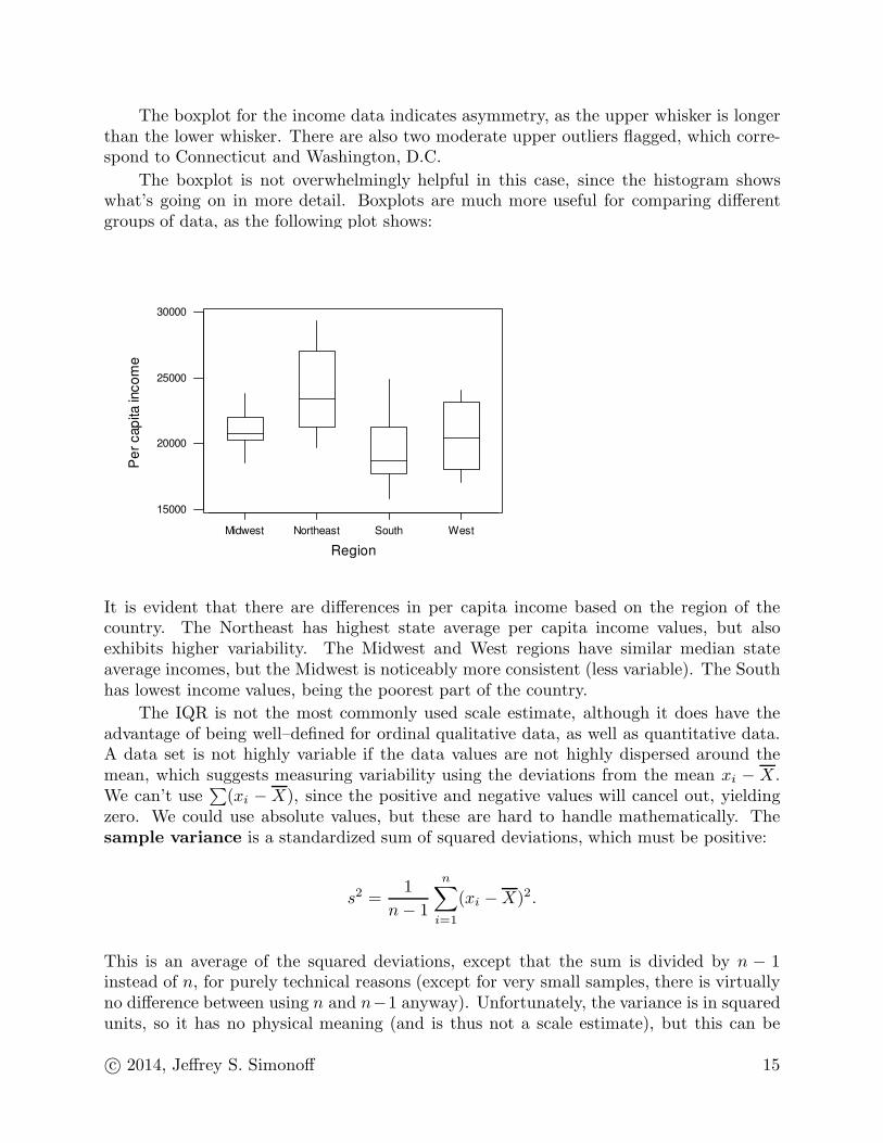
The boxplot is not overwhelmingly helpful in this case, since the histogram showswhat’s going on in more detail. Boxplots are much more useful for comparing differentgroups of data, as the following plot shows:
WestSouthNortheastMidwest
30000
25000
20000
15000
Region
Pe
r cap
ita in
co
me
It is evident that there are differences in per capita income based on the region of thecountry. The Northeast has highest state average per capita income values, but alsoexhibits higher variability. The Midwest and West regions have similar median stateaverage incomes, but the Midwest is noticeably more consistent (less variable). The Southhas lowest income values, being the poorest part of the country.
The IQR is not the most commonly used scale estimate, although it does have theadvantage of being well–defined for ordinal qualitative data, as well as quantitative data.A data set is not highly variable if the data values are not highly dispersed around themean, which suggests measuring variability using the deviations from the mean xi − X.We can’t use
∑
(xi − X), since the positive and negative values will cancel out, yieldingzero. We could use absolute values, but these are hard to handle mathematically. Thesample variance is a standardized sum of squared deviations, which must be positive:
s2 =1
n − 1
n∑
i=1
(xi − X)2.
This is an average of the squared deviations, except that the sum is divided by n − 1instead of n, for purely technical reasons (except for very small samples, there is virtuallyno difference between using n and n−1 anyway). Unfortunately, the variance is in squaredunits, so it has no physical meaning (and is thus not a scale estimate), but this can be
c© 2014, Jeffrey S. Simonoff 15
fixed by taking its square root, resulting in the sample standard deviation:
s =
√
√
√
√
1
n − 1
n∑
i=1
(xi − X)2 =
√
√
√
√
1
n − 1
[
n∑
i=1
x2i − n
(
X)2
]
.
The usefulness of the standard deviation comes from the following rule of thumb: forroughly symmetric data sets without outliers (what we might call “well–behaved” data), wecan expect that about two–thirds of the observations will fall within one standard deviationof the mean; about 95% will fall within two standard deviations of the mean; and roughly99.7% will fall within three standard deviations of the mean. Besides summarizing what’sgoing on in the sample, the sample mean and standard deviation can also be used toconstruct a rough prediction interval; that is, an interval where we expect future valuesfrom the same population to fall.
Say we were told that annual rainfall in New York City is 35 inches, with a standarddeviation of 3 inches, based on historical (sample) data. Since rainfall data are well–behaved, this tells us that roughly two–thirds of years have rainfall in the range 35 ± 3 =(32, 38), while roughly 95% of years have rainfall in the range 35 ± 6 = (29, 41). If aparticular year had 29 inches of rainfall, we wouldn’t be very surprised, but if a year hadonly 23 inches, we would, since that is four standard deviations away from the mean, ahighly unusual result.
The income data have a standard deviation of $3236, so the rule of thumb would say,for example, that roughly two–thirds of all states have per capita incomes in the range21157 ± 3236, or (17921, 24393). In fact, 35 of the 51 values, or 68.6% of the values, arein this interval, quite close to two–thirds. Roughly 95% of the values should be in theinterval 21157 ± 6472, or (14685, 27629). In fact, 48 of the 51 values, or 94.1% are in theinterval, again quite close to the hypothesized value. It should be noted, however, thatsome luck is involved here, since the income data are a bit too long–tailed to be considered“well–behaved.”
A good way to recognize the usefulness of the standard deviation is in description ofthe stock market crash of October 19, 1987 (“Black Monday”). From August 1 throughOctober 9, the standard deviation of the daily change in the Dow Jones Industrial Averagewas 1.17%. On Black Monday the Dow lost 22.61% of its value, or 19.26 standard
deviations! This is an unbelievably large drop, and well justifies the description of acrash. What apparently happened is that the inherent volatility of the market suddenlychanged, with the standard deviation of daily changes in the Dow going from 1.17% to8.36% for the two–week period of October 12 through October 26, and then dropping backto 2.09% for October 27 through December 31. That is, the market went from stable toincredibly volatile to stable, with higher volatility in the second stable period than in thefirst period.
The second stable period wasn’t actually quite stable either. By the middle of 1988(eight months after the crash) the standard deviation of daily changes in the Dow was downto a little more than 1% again. That is, volatility eventually settled down to historicallevels. This is not unusual. Historical data show that since 1926, about 2% of the time stockvolatility suddenly changes from stable to volatile. Once this volatile period is entered,
c© 2014, Jeffrey S. Simonoff 16
the market stays volatile about 20% of the time, often changing again back to the level ofvolatility that it started at. If these sudden “shocks” could be predicted, you could makea lot of money, but that doesn’t seem to be possible.
The standard deviation, being based on squared deviations around the mean, is notrobust. We can construct an analogous, but more robust, version of the estimate usingthe same ideas as those that led to the standard deviation, but replacing nonrobust termswith more robust versions. So, instead of measuring variability using deviations around the(nonrobust) X, we measure them using deviations around the (robust) median (call it M);instead of making positive and negative deviations positive by squaring them (a nonrobustoperation), we make them all positive by taking absolute values (a robust operation);instead of averaging those squared deviations (a nonrobust operation), we take the medianof the absolute deviations (a robust operation). This leads to the median absolute
deviation, the median of the absolute deviations from the sample median; that is,
MAD = median|xi − M |
(the MAD is $2106 for the income data). For well–behaved data, the sample standarddeviation satisfies the relationships s ≈ IQR/1.35 ≈ 1.5×MAD, but for asymmetric data,or data with outliers, the MAD and IQR are much less affected by unusual values, whiles is inflated by them.
One other important property of location and scale measures should be mentionedhere. All location estimates are linear operators, in the following sense: if a constant isadded to all of the data values, the location estimate is added to by that constant as well;if all of the data values are multiplied by constant, the location estimate is multiplied bythat constant as well.
Scale estimates, on the other hand, are multiplicative operators, in the following sense:if a constant is added to all of the data values, the scale estimate is unaffected; if all of thedata values are multiplied by a constant, the scale estimate is multiplied by the absolutevalue of that constant.
It is sometimes the case that data values are easier to analyze if they are examinedusing a scale that emphasizes the structure better. One such transformation that isoften appropriate for long right–tailed data is the logarithm. I noted earlier that salaryand income data are often modeled as following a lognormal distribution. Data values thatfollow this distribution have the important property that if they are analyzed in the logscale, they appear “well–behaved” (that is, symmetric, with no outliers; more technically,they look roughly normally distributed). There is a good reason why this pattern occurs forincome data, which is related to the mathematical properties of the logarithm function.The logarithm has the property that it converts multiplications to additions; that is,log(a×b) = log(a)+log(b) (the other important property of logarithms is that they convertexponentiation to multiplication; that is, log(ab) = b × log(a)). People typically receivewage increases as a percentage of current wage, rather than fixed dollar amounts, whichimplies that incomes are multiplicative, rather than additive. If incomes are examined ina log scale, these multiplications become additions. That is, log–incomes can be viewedas sums of (log) values. It turns out that sums of values are usually symmetric, withoutoutliers (that is, well–behaved).
c© 2014, Jeffrey S. Simonoff 17

What this means is that if the income data are transformed, by taking logs, theresultant log–incomes will look more symmetric. Logarithms can be taken to any base;common choices are base 10, the common logarithm, and base e, the natural logarithm,where e is the transcendental number e ≈ 2.71828 . . .). It is easy to convert logarithmsfrom one base to another. For example, log10(x) = loge(x) × log10(e) = .4343 × loge(x).Here is a histogram of the log–incomes (base 10):
As expected, the long right tail has pretty much disappeared. This shows up in thesummary statistics as well:
Descriptive Statistics
Variable N Mean Median Tr Mean StDev SE Mean
LogIncome 51 4.3208 4.3115 4.3176 0.0638 0.0089
Variable Min Max Q1 Q3
LogIncome 4.1997 4.4933 4.2683 4.3543
The mean 4.321 and median 4.312 are similar, as is typical for roughly symmetric data.The log transformation is a monotone transformation, which means that the median of
c© 2014, Jeffrey S. Simonoff 18
the log–incomes equals the log of the median of the incomes; that is, 4.3115 = log(20488).This is not true for the mean, which leads to yet another location estimate. The sample
geometric mean is calculated as follows:(1) Log the data (base 10, to keep things simple).(2) Determine the sample mean of the logged data.(3) Raise 10 to a power equaling the sample mean of the logged data.
This algorithm can be written as follows: the geometric mean G equals
G = 10(∑
n
i=1log10(xi)/n)
(to distinguish this from the average, the average is sometimes called the sample arithmeticmean).
Since the geometric mean is based on an arithmetic mean of logged data, it is lessaffected by long right tails than the arithmetic mean, and is likely to move in the directionof the median. The geometric mean of the income data is 104.3208 = $20931, which isindeed in the direction of the median $20488 from the (arithmetic) mean $21157.
These results don’t really show the power of transformation in data analysis. We willtalk a good deal about transformations in class. In particular, we will use log transfor-mations often during the semester in various contexts, where their benefits will becomeclearer. One place where this is true is when looking at the relationships between variables.
Scatter plots and correlation
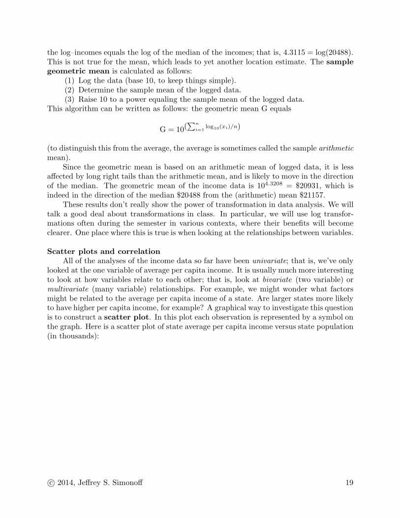
All of the analyses of the income data so far have been univariate; that is, we’ve onlylooked at the one variable of average per capita income. It is usually much more interestingto look at how variables relate to each other; that is, look at bivariate (two variable) ormultivariate (many variable) relationships. For example, we might wonder what factorsmight be related to the average per capita income of a state. Are larger states more likelyto have higher per capita income, for example? A graphical way to investigate this questionis to construct a scatter plot. In this plot each observation is represented by a symbol onthe graph. Here is a scatter plot of state average per capita income versus state population(in thousands):
c© 2014, Jeffrey S. Simonoff 19
3000020000100000
30000
25000
20000
15000
Population
Pe
r cap
ita in
co
me
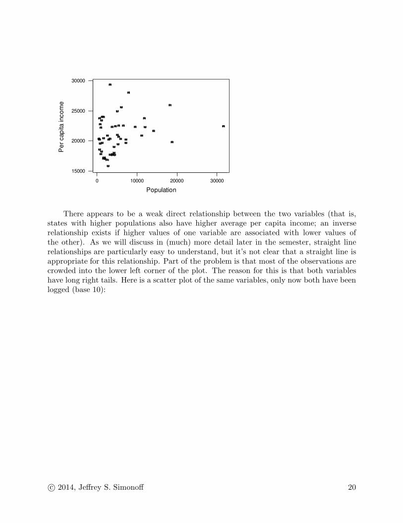
There appears to be a weak direct relationship between the two variables (that is,states with higher populations also have higher average per capita income; an inverserelationship exists if higher values of one variable are associated with lower values ofthe other). As we will discuss in (much) more detail later in the semester, straight linerelationships are particularly easy to understand, but it’s not clear that a straight line isappropriate for this relationship. Part of the problem is that most of the observations arecrowded into the lower left corner of the plot. The reason for this is that both variableshave long right tails. Here is a scatter plot of the same variables, only now both have beenlogged (base 10):
c© 2014, Jeffrey S. Simonoff 20
4.53.52.5
4.5
4.4
4.3
4.2
Logged population
Lo
gg
ed
inco
me
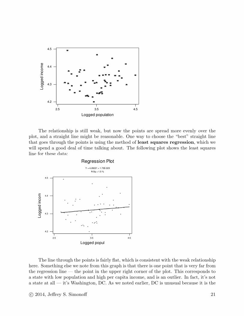
The relationship is still weak, but now the points are spread more evenly over theplot, and a straight line might be reasonable. One way to choose the “best” straight linethat goes through the points is using the method of least squares regression, which wewill spend a good deal of time talking about. The following plot shows the least squaresline for these data:
4.53.52.5
4.5
4.4
4.3
4.2
Logged popul
Lo
gg
ed
inco
m
R-Sq = 1.5 %
Y = 4.26021 + 1.73E-02X
Regression Plot
The line through the points is fairly flat, which is consistent with the weak relationshiphere. Something else we note from this graph is that there is one point that is very far fromthe regression line — the point in the upper right corner of the plot. This corresponds toa state with low population and high per capita income, and is an outlier. In fact, it’s nota state at all — it’s Washington, DC. As we noted earlier, DC is unusual because it is the
c© 2014, Jeffrey S. Simonoff 21
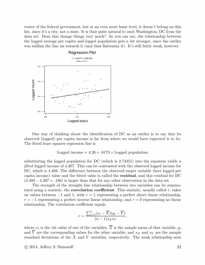
center of the federal government, but at an even more basic level, it doesn’t belong on thislist, since it’s a city, not a state. It is thus quite natural to omit Washington, DC from thedata set. Does this change things very much? As you can see, the relationship betweenthe logged average per capita and logged population gets a bit stronger, since the outlierwas pulling the line up towards it (and thus flattening it). It’s still fairly weak, however.
4.53.52.5
4.5
4.4
4.3
4.2
Logged popul
Lo
gg
ed
inco
m
R-Sq = 5.7 %
Y = 4.20376 + 3.23E-02X
Regression Plot
One way of thinking about the identification of DC as an outlier is to say that itsobserved (logged) per capita income is far from where we would have expected it to be.The fitted least squares regression line is
Logged income = 4.26 + .0173 × Logged population;
substituting the logged population for DC (which is 2.74351) into the equation yields afitted logged income of 4.307. This can be contrasted with the observed logged income forDC, which is 4.493. The difference between the observed target variable (here logged percapita income) value and the fitted value is called the residual, and this residual for DC(4.493 − 4.307 = .186) is larger than that for any other observation in the data set.
The strength of the straight–line relationship between two variables can be summa-rized using a statistic, the correlation coefficient. This statistic, usually called r, takeson values between −1 and 1, with r = 1 representing a perfect direct linear relationship,r = −1 representing a perfect inverse linear relationship, and r = 0 representing no linearrelationship. The correlation coefficient equals
r =
∑ni=1(xi − X)(yi − Y )
(n − 1)sXsY,
where xi is the ith value of one of the variables, X is the sample mean of that variable, yi
and Y are the corresponding values for the other variable, and sX and sY are the samplestandard deviations of the X and Y variables, respectively. The weak relationship seen
c© 2014, Jeffrey S. Simonoff 22
in the plots is also reflected in the correlation coefficient, since the correlation betweenlogged average per capita income and logged population is only .239. The outlier can havea strong effect on r; it equals only .122 when DC is included in the data.
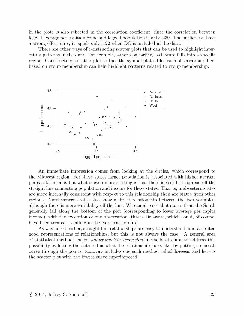
There are other ways of constructing scatter plots that can be used to highlight inter-esting patterns in the data. For example, as we saw earlier, each state falls into a specificregion. Constructing a scatter plot so that the symbol plotted for each observation differsbased on group membership can help highlight patterns related to group membership:
Midwest
Northeast
South
West
4.53.52.5
4.5
4.4
4.3
4.2
Logged population
Lo
gg
ed
inco
me
An immediate impression comes from looking at the circles, which correspond tothe Midwest region. For these states larger population is associated with higher averageper capita income, but what is even more striking is that there is very little spread off thestraight line connecting population and income for these states. That is, midwestern statesare more internally consistent with respect to this relationship than are states from otherregions. Northeastern states also show a direct relationship between the two variables,although there is more variability off the line. We can also see that states from the Southgenerally fall along the bottom of the plot (corresponding to lower average per capitaincome), with the exception of one observation (this is Delaware, which could, of course,have been treated as falling in the Northeast group).
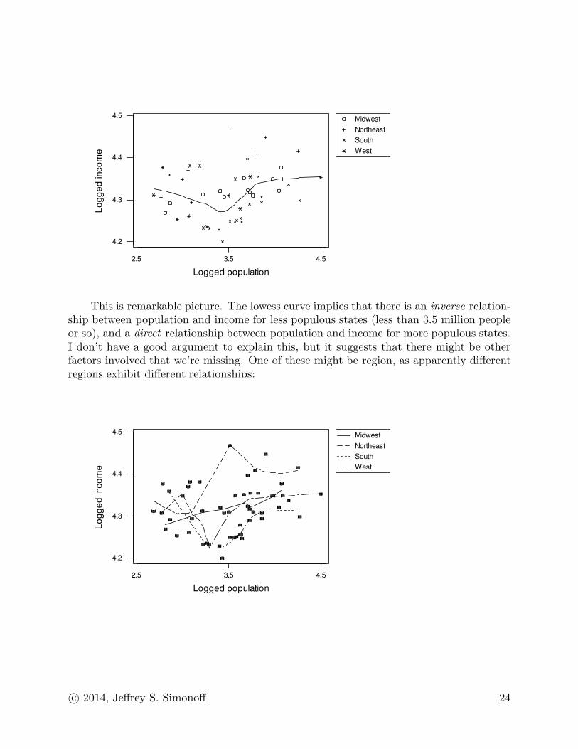
As was noted earlier, straight line relationships are easy to understand, and are oftengood representations of relationships, but this is not always the case. A general areaof statistical methods called nonparametric regression methods attempt to address thispossibility by letting the data tell us what the relationship looks like, by putting a smoothcurve through the points. Minitab includes one such method called lowess, and here isthe scatter plot with the lowess curve superimposed:
c© 2014, Jeffrey S. Simonoff 23
Midwest
Northeast
South
West
4.53.52.5
4.5
4.4
4.3
4.2
Logged population
Lo
gg
ed
inco
me
This is remarkable picture. The lowess curve implies that there is an inverse relation-ship between population and income for less populous states (less than 3.5 million peopleor so), and a direct relationship between population and income for more populous states.I don’t have a good argument to explain this, but it suggests that there might be otherfactors involved that we’re missing. One of these might be region, as apparently differentregions exhibit different relationships:
Midwest
Northeast
South
West
4.53.52.5
4.5
4.4
4.3
4.2
Logged population
Lo
gg
ed
inco
me
c© 2014, Jeffrey S. Simonoff 24

Some guidelines on thinking about data
The most effective way (by far) to get a feeling for how to think about data is toanalyze it; experience is the best teacher. Still, there are some guidelines that can behelpful to consider.(1) Notice the title at the top of the page. Before you do anything, you should think
about your data. What are the questions you would like to answer? What are thecorrect “units” of study? For example, if you’re interested in the purchasing behaviorof individual consumers, data on statewide consumption patterns are unlikely to beas useful as data at the individual level, if you can get it.
This issue should come up before you ever gather a single data point, since itdetermines what kinds of data you’ll look for. It also comes up after you have thedata, in that the question you want to answer will often determine how you shouldlook at the data. For example, say you are interested in the process by which peopledecide whether to respond to a direct mail advertisement. Knowing the number ofresponses from a particular demographic group (or building a statistical model topredict that number) doesn’t answer the question you’re interested in. Rather, youshould convert your data to rates, where you are examining the proportion of mailingssent out that result in a response.
(2) Look at your individual variables. You are probably going to want to learn somethingabout the general level and scale in your variables; construct descriptive statistics todo that. Graphical displays that show the distribution of values include the histogramand stem–and–leaf display. Boxplots summarize the positions of key values (quartiles,limits of the data), but are generally less useful when looking at variables one at atime.
(3) Think about (possible) relationships between variables in your data. If you thinktwo variables might be related to each other, construct a scatter plot of them (byconvention, if one variable is naturally thought of as the “target,” while the otheris the “predictor,” the former goes on the vertical axis, while the latter goes on thehorizontal axis). A numerical summary of the association between two variables is thecorrelation coefficient. If the variables you’re looking at are categorical, or discretewith a small number of possible values, a cross–tabulation of the variables (includingrow or column percentages, as appropriate) allows you to see any relationships.
(4) The best way to think about problems is often from a predictive point of view; thatis, can I use information that I have to model, or predict, future values. In thiscontext, a fitted regression line superimposed on a scatter plot provides a graphicalrepresentation of what a straight line prediction would look like. If you’re interested tosee whether the relationship between two variables might be nonlinear, a scatterplotsmoother like lowess can be superimposed on a scatter plot.
(5) There are often subgroups in data, and it’s of interest to see if variables differ basedon group membership. Side–by–side boxplots are an excellent graphical tool to useto assess this. Descriptive statistics separated by group membership give numericalsummaries that can be used with the graphical summary provided by the boxplots.Scatter plots where different symbols are used to identify members of different groupsalso might be helpful.
c© 2014, Jeffrey S. Simonoff 25

(6) Think about whether a transformation of the data makes sense. Long right–taileddata often benefit from taking logarithms, as do data that operate multiplicativelyrather than additively (money data, for example).
(7) Don’t be afraid to ignore items (1)–(6)! Look at your data in any way that makessense to you. A good way to think about analyzing data is that it involves twoparts: exploratory analysis, which is detective work, where you try to figure out whatyou’ve got and what you’re looking for; and inference, which is based on the scientificmethod, where you carefully sift through the available evidence to decide if generallyheld beliefs are true or not. The nature of exploratory analysis means that you’llspend a lot of time following false clues that lead to dead ends, but if you’re patientand thorough, like Sherlock Holmes or Hercule Poirot you’ll eventually get your man!
c© 2014, Jeffrey S. Simonoff 26

Minitab commands
To enter data by hand, click on the Worksheet window, and enter the values in asyou would in any spreadsheet. To then save the data as Minitab file, click on the Session
window, and then click on the “diskette” icon and enter a file name in the appropriatebox. This creates a Minitab “project” file in .mpj format. These files also can includestatistical output, graphs, and multiple data files. To read in a previously saved data file,click on the “open folder” icon and enter the file name in the appropriate box. Data filesalso can be inputted to Minitab as worksheets. Click on File → Open Worksheet andchoose the appropriate file type (possibilities include Excel, Extensible Markup Language(.xml), and text) and file name.
Frequency distributions for qualitative variables are obtained by clicking on Stat →Tables → Tally Individual Variables. Enter the variable names in the box underVariables: (note that you can double click on variable names to “pick them up”). You’llprobably want to click on the box next to Percents to get the percent of the sample witheach value. If there is a natural ordering to the categories, clicking on the boxes next toCumulative counts and Cumulative percents is also appropriate.
An inherently continuous variable can be converted to a discrete one (which can thenbe summarized using a frequency distribution) by clicking on Data → Code. If the code isto a set of numbers, click Numeric to Numeric; if it is to a set of labels, click Numeric to
Text. Enter the original variable under Code data from columns:, and a new variablename or column number under Store coded data in columns: (you can put the samevariable name in the latter box, but then the original values will be overwritten). Enter aset of original ranges in the boxes under Original values:, and the corresponding newvalues in the boxes under New:. If more than eight recodings are needed, the dialog boxcan be called repeatedly until all values are recoded.
To construct a histogram, click on Graph → Histogram. Clicking on Simple will givea histogram, while clicking on With Fit will superimpose the best-fitting normal curve. Atechnically more correct version of the plot would be obtained by first clicking on Tools →Options → Individual graphs → Histograms (double clicking on Individual graphs)and clicking the radio button next to CutPoint. Right-clicking on a constructed graphallows you to change the appearance of the histogram (this is true for most plots). Youcan add a frequency polygon to the histogram by right-clicking on it, clicking on Add →Smoother, and changing the Degree of smoothing value to 0. You can then omit thebars (leaving only the frequency polygon) by right-clicking on the graph, clicking Select
item → Bars, and then pressing the delete key (you can select other parts of this, andmost other, graphical displays this way, and delete them if you wish the same way).
To construct a stem–and–leaf display, click on Graph → Stem-and-Leaf. Enter thevariable name under Graph variables. Note that the stem–and–leaf display appears inthe Session Window, not in a Graphics Window. To get stem–and–leaf displays separatedby groups, click the box next to By variable:, and enter the variable that defines thegroups (the variable that defines the groups must use different integer values to define thegroups).
To construct a boxplot, click on Graph → Boxplot. To construct separate boxplots ofdifferent variables, click on Simple and enter the variable name(s) under Graph variables.
c© 2014, Jeffrey S. Simonoff 27
To construct side–by–side boxplots, click on Graph → Boxplot → With Groups. Enter thevariable name(s) under Graph variables and the variable(s) that determine the groupsunder Categorical variables for grouping. Note that these grouping variables canbe either numerical or categorical.
To obtain descriptive statistics, click on Stat → Basic Statistics → Display De-
scriptive Statistics. Enter the variable name(s) under Variables. To get descriptivestatistics separated by groups, click the box next to By variables:, and enter the variablethat defines the groups (either a numerical or categorical grouping variable can be usedhere).
To create new variables or transform old ones, click on Calc → Calculator. Enterthe new variable name under Store result in variable and the transformation desiredunder Expression. If you put a current variable name under Store result in variable
you will overwrite the old values of the variable. So, for example, to take logs (base 10),use LOGT( ) under Expression (Log base 10 under Functions:).
To construct a scatter plot, click on Graph → Scatterplot → Simple. Enter thevariable name for the vertical axis under Y variables and the variable name for the hori-zontal axis under X variables. You can construct multiple scatter plots at the same timeby adding variable names. To construct a plot with different symbols for observationsfrom different groups, click on Graph → Scatterplot → With Groups. Enter the variablename for the vertical axis under Y variables, the variable name for the horizontal axisunder X variables, and the name of the variable that defines the groups under Cate-
gorical variables for grouping. To superimpose a lowess curve on a plot, right-clickon the plot, and click Add → Smoother, and click OK when the dialog box pops up. Tosuperimpose separate lowess lines for different groups on the same plot, you would click inthe box next to Apply same groups of current displays to lowess smoother (thisonly appears in the multiple group scatter plot situation).
To construct a scatter plot with a least squares regression line superimposed, clickon Stat → Regression → Fitted Line Plot. Enter the variable name for the verticalaxis under Response (Y):, and the variable name for the horizontal axis under Predictor(X):. Much more extensive regression output, including diagnostic statistics and graphics,is obtained by clicking Stat → Regression → Regression → Fit Regression Model.Enter the target variable (Y ) under Responses: and the predictor (X) under Continuouspredictors:.
To obtain the correlation coefficient between two variables, or among a set of variables,click on Stat → Basic Statistics → Correlation. Enter the variable names underVariables.
c© 2014, Jeffrey S. Simonoff 28

“If you torture the data long enough, it will confess.”— Ronald Coase
“ ‘Data, Data, Data!’ Holmes cried impatiently, ‘I can’t make bricks without clay!’ ”— A. Conan Doyle, The Adventure of the Copper Beeches
“ ‘I can only suggest that, as we are practically without data, we should endeavour toobtain some.’ ”
— R. Austin Freeman, A Certain Dr. Thorndike
“Data, data, everywhere, and not a thought to think.”— John Allen Paulos
“Everyone spoke of an information overload, but what there was in fact was a non–information overload.”
— Richard Saul Wurman, What–If, Could–Be
“In God we trust. All others bring data.”— W. Edwards Deming
“It’s not what you don’t know that hurts, it’s what you know that ain’t so.”— Anonymous
c© 2014, Jeffrey S. Simonoff