composition - how to make pictures
DESCRIPTION
Composition-how to make picturesThe importance of composition in picture making - The picturestarts in your mind - The four main elements of composition:picture area, depth. line, and value - Varying the size ofobjects and using common sense to place them in a picture -Overlapping - Composing in depth - Using line to control themovement of the viewer 's eye - Planning with simple values -Controlling values in a composition.TRANSCRIPT
Famous Artists Course Famous Artists Schools, Inc. , Westport, Connecticut
Composition - how to make pictures
Albert Dorne
Fred Ludekens
Norman Rockwell
AI Parker
Ben Stahl
Stevan Dohanos
Jon Whitcomb
Robert Fawcett
Peter Heick
George Giusti
Austin Briggs
Harold Von Schmidt
COPYRIGHT © 1960, FAMOUS ARTISTS SCHOOLS, Inc. Printed in U.S.A.
2
You are studying art to learn to make pic. tures. In your Course you will learn to draw people - animals - inanimate objects - anything you can see or imagine . But it takes more than drawing to make a p icture . It takes drawing plus planning. Be cause planning the arrangement of the objects in the picture space is 50 basic, we are introducing you to its simple fundamentals as early as your third lesson . Refer back to this lesson often - it will increase in meaning and value with every picture you make .
Later in your Course we will take up more advanced studies in this very important aspect of making pictures, which is known as Composition .
Composition Composition means the selection and arrangement of appropriate elements within the picture space so that they express the artist's idea clearly and effectively. It makes a great deal of difference how we put together the things we draw within our picture space. Often, a picture will succeed or fail, depending on how well it is composed.
Composition, in a basic sense, means combining [arms and space to produce a harmonious whole. When we make a picture. we arrange the picture elements much the way a composer of music arranges musical notes and themes to form a harmonious resull. The composer of music creates an arrangement in sound - we, as artists, create a visual arrangement. In composing a picture we are chiefly interested in where we place our objects in the picture space, how important we make them in size and value, and how they relate to each other and to the outside borders of the picture.
Good pictures, we see, do not simply happen. They are not the result of thoughtlessly throwing together miscellaneous objects or filling up a background with details. No maLler how well we draw or paint, unless 'we plan our picture carefully, it is likely to leave the viewer with an unsatisfied feeling. A wellcomposed picture, on the other hand, will give the viewer a satisfied sense of order or beauty, a lthough he may not realize by what methods this satisfaction was produced.
Every picture starts with an idea - a story we have to tell, an effect or mood we are striving to communicate. In composing, we select those things [or our picture which clarify our idea, and we discard those which may distract or confuse.
No maller what the subject of your picture may be. begin by asking yourself: " ' '''hat is the basic idea I want to get across? What things must I put in the picture so that the viewer will understand it at once? \,yhal is important - and what isn't?"
In composing, you emphasize those elements of your picture that will dramatite it the most. Usually this requires a change in the si/es of things. You make important objects larger or clearer or stronger than they may appear in reality, and less important objects you make smaller or less distincl.
ObjeCls can be featured or played down by adjusting their position as well as their size. For instance. you might place a powerful, important figure in the middle of your picture space and draw him large. so he would dominate the picture. By contrast, a shy, retiring character might be shown much smaller and to the side, dominated by the space and the objects around him.
The artist can actually control which part of his picture the viewer will linger over and find most meaningful. By the way he arranges the objects, he can establish a definite focal point or center of interest, and lead the eye to it indirectly or directly. He can also use light and dark tones to help emphasize this center of interest.
Often the artist can use the natural shape of his subject to
good effect in establishing his composition and the proportions of his picture. For example. if the subject is a wide expanse of meadow or sea, it might well suggest a picture of a long, hori· zontal shape. For a picture of a long, narrow subject like a tall man or a church tower, a vertical picture of similar proportions might drama tile the height of the subject most strikingly. Di(· ferent forms are often best expressed by different picture shapes.
All of these are principles you can apply in developing your own compositions. Once you have learned how to use these principles, you will soon find yourself giving sharper, clearer expression to your ideas - saying what you want to say directly and interestingly in pictures.
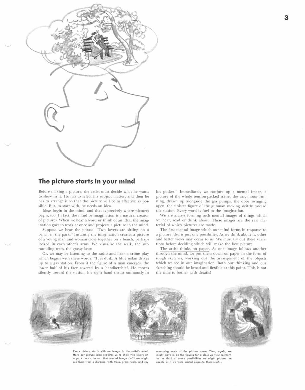
The picture starts in your mind
Before making a picture, the artist must decide what he wants to show in it. He has to select his subject matter, a nd then he has to arrange it so that the piClure will be as effective as possible. But, to start with, he needs an idea.
Jdeas begi n in the mind, and that is precisely where pictures begin, too. In fact, the mind or irnagin ation is a natura l creator of pictures, \!\lhen we hear a word or think of an idea, the imagination goes to work at once and projects a piclUre in the mind.
Suppose we hear the phrase "T wo lovers are silting on a bench in the park." Instantly the im agination creates a picture of a young man and woman close tOgether on a bench, perhaps locked in each other's arms. We visualize the walk, the SUT
rounding trees, the grassy lawn. Or, we may be listening to the radio and hear a crime play
which begins with these words: "It is dusk. A blue sedan drives up to a gas station. From it the figure of a man emerges, the lower half of his face covered by a handkerchief. H e moves silently toward the station, his right hand thrust ominously in
Every picture darh wilh an image in the artist', mind. Here our picture ideo requires us to show two lovers on Q park bench. In our fint me ntal image (left) we might see them from a distonce, with trees, grau, walk, and sky
\ j
his pocket." Im mediately we conjure up a mental image, a picture of the whole tension-packed scene: the car, motor running, drawn up alongside the gas pumps, the door swinging open, the sinister figure of the gunman moving swiftly toward the station. Every word is fuel to the imagination.
We are always forming such mental images of things which we hear, read or think about. These images are the raw material of wh ich piclUres are made.
The first mental image which our mind forms in response to a piclUre idea is just one possibility. As we thi nk abollt it, other and bener views may occur to us. 'Ve must try out these variations before deciding which will make the best picture.
The artist thinks on paper. As o ne image follows another through the mind, we put them down on paper in the form of rough sketches, working out the arrangement of the objects which we see in our imagination. Both OUT thinking and Ollr sketch ing should be broad and flexible at this point. This is not the time to bother with details!
occupying much of the picture spoce. Then, 090in, we might move in on the figures for 0 dose-up view (cenler). In the third of mony possibilities we might picture the couple 0 $ if we were seated opposite them (rig ht).
3
4 l esson Famous Art ists Course 3 Composition - how to make pictures
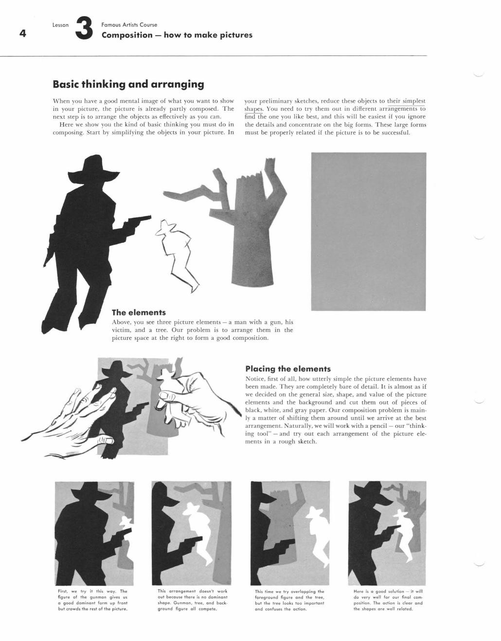
Basic thinking and arranging
'''' hen you have a good mental image of wha t you want LO show in your picture, the picture is already panly composed. The next step is LO arrange the objects as effectively as you can.
Here we show you the kind of basic thinking you must do in composing. Stan by simplifying the objects in your picture. ]n
The elements
your preliminary sketches, reduce these objects to their simplest shapes. You need to try them out in different arrangements LO
find the one you like best, and this will be easiest if you ignore the details and concentrate on the big forms. These large forms must be properly related if the picture is LO be successfu l.
Above, you see three picture elements - a man with a gun, his vict im, and a tree. Our problem is to arrange them in the picture space at the right to form a good composition.
First, we try it this way. The figure of the gunman gives us a good dominant form up front bul crowds the rest of the picture.
This orrongement doesn' t work out becouse there is no dominont shope. Gunman , tree, ond background figure all compete.
Placing the elements NoLice. first of all , how ullerly simple the picture elements have been made. They are completely bare of detail. It is almost as if we decided on the general size, shape, and value of the picture elements and the background and cut them out of pieces of black, white, and gray paper. Our composition problem is main· Iy a maller of shifting them around until we arrive at the best arrangement. Naturally, we will work with a pencil - our "think· ing tool" - and try out each arrangement of the picture ele· ments in a rough sketch.
This lime we Iry overlapping th. foreground figure ond the Iree, bul the Iree looks 100 important and confuses the action.
Here is a good solution - il will do ve ry well for our final com· position. The odion is cleor and the shapes are we ll reloted.
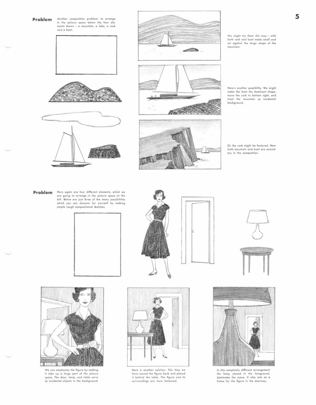
Problem
Problem
Analher composition proble m: 10 arrange in Ihe picture spoce below Ihe four elemenh shown - a mounla in, (I lake, (I rock
and (I boot.
Here again ore four different elements. which we ore going 10 OHonge in the picture space 01 Ihe
left. Below ore just three of the many possibili ties which you can discover for your~lf by making
simple rough compositional sketches.
We con emphasize the figure by making it toke up a large port of the pictu re
space. The door, lamp, and toble serve as incidental objects in the bockground.
-
\
~
Here is onother solution. This time we have moved the figure bock ond ploced it behind the tab le. The figure ond its surroundings are more balanced.
p
We might try them this woy - with both rock and boo t mo de smoll and
set against Ihe large sho pe of the mounlain .
Here', onolhe r possibility. We might make Ihe boo. Ihe dominon! shope, move Ihe rock 10 bottom right, and treol the mountain os iMidenlol background.
0, the rock might be featured. Now bolh moun lo in and boot ore seco ndary in Ihe composition.
In this completely different o rrongement the lomp, placed in the foreg round, dominates the scene. II also o cts os (I
frame for the figure in the doorway.
5
6 l esson Famous Artists Course 3 Composition - how to make pictures
The four main elements of composition
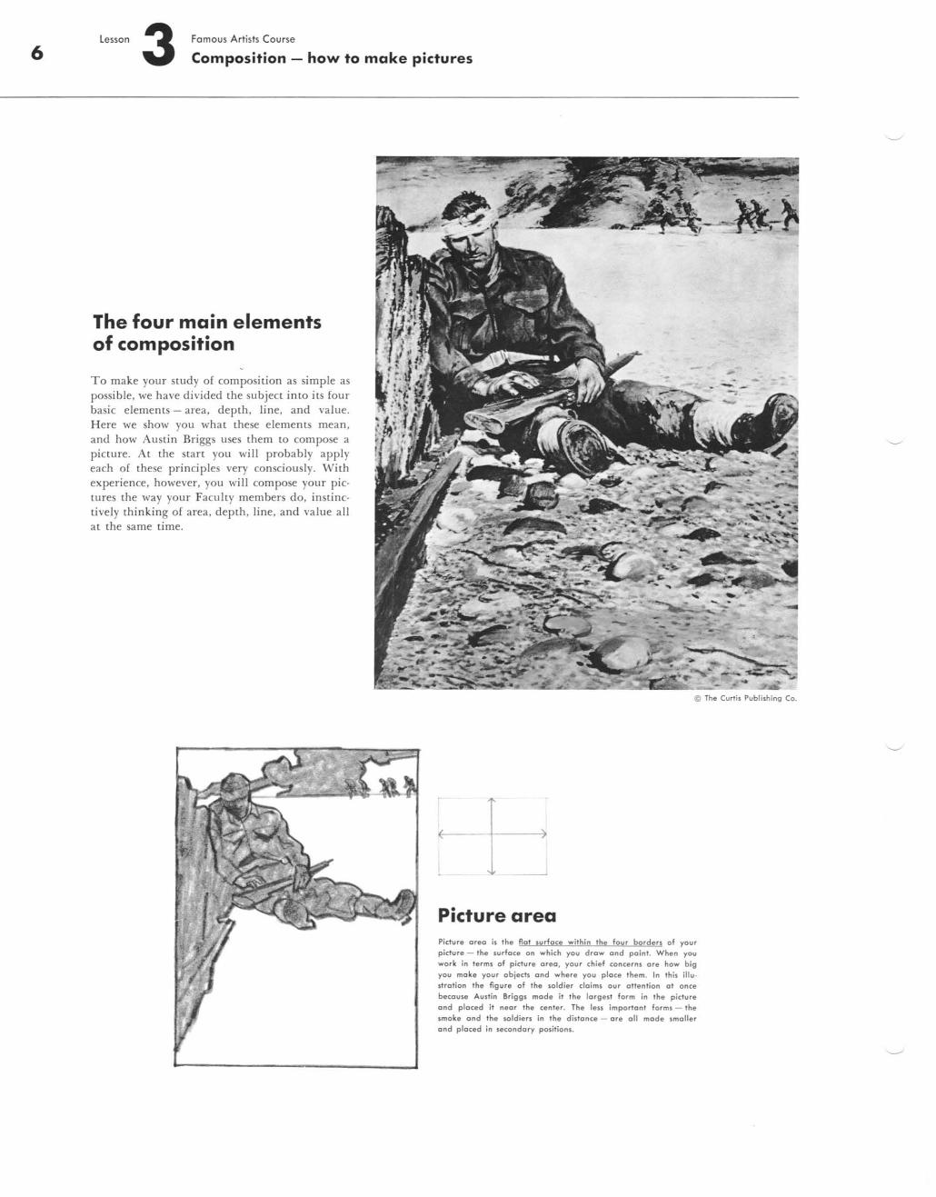
To make your sLUdy of composiLion as simple as possible, we have divided the subject in to its four basic elements - area, depth , line, and value. H ere we show you what these elements mean, and how Austin Briggs uses them to compose a picture. At the Slart you wi II probably apply each of these principles very consciously. With experience, however, you will compose your pictures the way your Faculty members do, instinctively thinki ng of area. depth. line. and value all at the same time.
~ The Curtis Pub1iming Co.
Picture area Pidure orea is the Rot surfoce within 'h, four borders of your picture - the surface on which you drew end point . When you work in terms of pidure areo , your chief concerns ore how big you moke your objeds ond where you ploce them . In this illuItration 'he figure of the loldier claims our oU,nlion 0' once because Austin 8riggs mode it the largest form in the picture ond ploced it neor Ihe cenler. The leu importont forms - the Imoke ond 'he soldiers in the dislonce - ore all mode smaller ond ploced in secondory position,.
.~
l
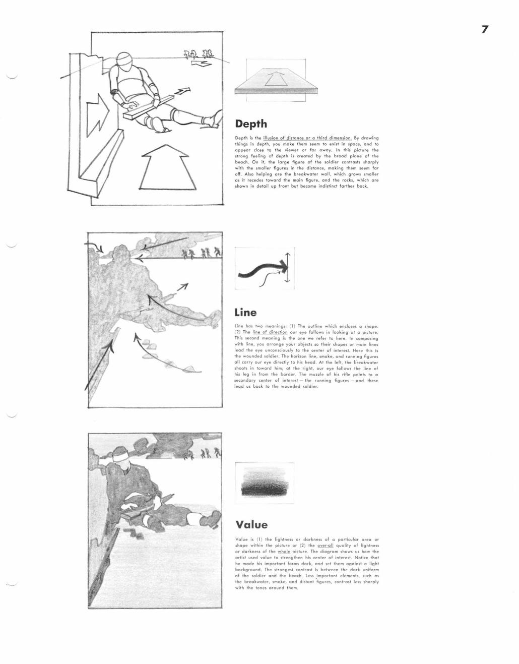
Depth Depth il the iIIudo" of dillonce or a third dimension. By drawing things in depth, you make them seem to exist in space, and 10
appear dose 10 the viewer or for away. In this picture the slrong feeling of depth is crealed by the brood plane of the
beach. On ii, the large figure of the soldier conlrosts sharp ly with the smoUer figures in the distance, making them seem for off. Also helping ore the breakwater woll, which growl smaller 01 it recedes IQword the main figure. ond the rockl. which are shown in detoil up fronl but become indi5tind farther bock.
L ~ Line line hos two meaning'! (1) The outline which endole! 0 shape. (2) The line of direction our eye follows in looking 01 a pidure. This second meaning i, Ihe one we refer to here. In (omposing with line, you arrange your objects so their shopel or moin lines lead the eye unconsciously to the center of interest. Here this is the wounded soldier . The horizon line, smoke, and running "gures 011 corry our eye directly to his heod . At the left, the oreokwoter shoals in toward him; ot the right, our eye follows the line of his leg in from the border. The muule of his rifle points TO 0
secondary center of interesT - the running "gurel - ond thele lead us bock to the wounded soldier.
Value Value is (1) the lightn ess or dorkne ss of a particular oreo or shope with in the picture or (2) the over-all quality of lightneu or dorkness of the who le picture. The d iogrom shows us how the ortist used volue to strengthen his ce nter of intere st. Notice thol he mode his importont fo rms dork, ond se t them ogoin st 0 light bockground . The strongest controlt is between the dork uniform of the so ld ier and the be ach . Le n importont ele men", such o s the breakwater, smoke, and distant figures, controst leu shorply with the tones around them.
7
8
r
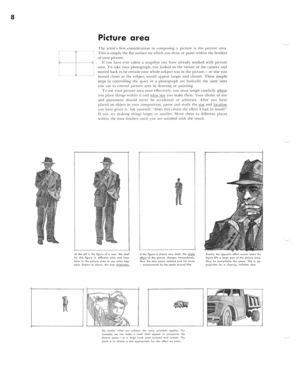
Picture area The art ist"s first consideration in composing a picLUre IS the pi cture area. This is simpl y the Hal surface on which you draw or paint within the borders of your picture.
If you have ever taken a snapshot you have a lready worked with picture area. T o take your phoLOgraph . you looked in the viewer of the camera a nd moved back LO be certai n your whole subject was in the picture - or e lse you moved closer so the subject would appear larger and clearer. These simple steps in controlling the space in a photograph are basica lly the same ones you use to control picture area in drawing or pa inting.
To use your pi cture area most effeClively. you must weigh carefu lly where you place things within it a nd wha t size you make them. Your choice of size and placemenl should never be accidenlal or arbilrary. After you have placed an objecl in your composili on, pause and sLUdy the size and loca lion you have given iL Ask you rsel f: " Does lhis creale the effect r had in mind?" If nOl, try making lhings larger or smaller. Move lhem lO differenl places within the four borders until YOll are salisfied with the result.
At the left is the figure of a man. We .holl try this figure in diffe rent sizes and loca· tions in the picture area to .ee what hop. pens. Drown as above, the man d ominates.
If the figure i. drown very small, the whole effect of the picture changes tremendoudy. Now the man ..eems isolated and for away - overpowered by the space around him .
No maHer what our subject, the some princ:iple applies. For example, we can ma ke a small child appear to overpower the picture spa ce - o r a huge truck seem isolated and remote. The point is to choose a si ze appropriate for the eRect we wont.
Exactly the opposite effect occu rs when the figure fills a large pori of the picture area . Now he overw helms the space. Thh i. ap· prapriate for a close.up, intimate view.
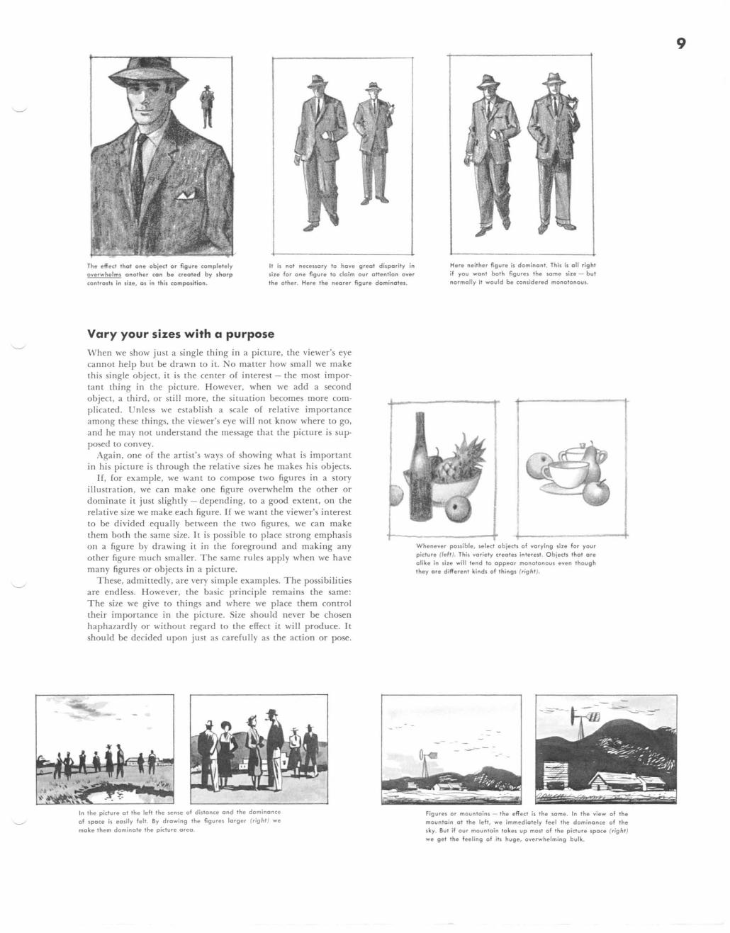
The effect that one objed or figure completely overwhelms another can be created by sharp contrasts in size, as in this composition.
It is not neceuory to hove greot disparity in size for one figure to cloim our oHention over the other. Here the neorer figure dominates.
Vary your sizes with a purpose
When we show just a single thing in a picture. the viewer's eye cannot help but be drawn to it. No matter how small we make this single object, it is the center of interest - the most impor· tant thing in the picture. However, when we add a second object. a third. or st ill more. the situation becomes more complicated. Unless we establish a scale of relative importance among these things, the viewer's eye will not know where to go, and he may not understand the message that the picture is sup· posed to convey.
Again, one of the artist's ways of showing what is important in his picture is through the relative sizes he makes his objects.
If, for example, we want to compose two figures in a story illustration, we can make one figure overwhelm the other or dominate it just slightly - depending, to a good extent, on the relative size we make each figure. If we want the viewer's interest to be divided equally between the two figures, we can make them both the same size. It is possible to place strong emphasis on a figure by drawing it in the foreground and making any other figure much smaller. The same rules apply when we have many figures or objects in a picture.
These. admittedly. are very simple examples. The possibilities are endless. However, the basic principle remains the same: The size we give to things and where we place them control their importance in the picture. Size should never be chosen haphazardly or without regard to the effeCL it will produce. It should be decided upon just as carefully as the action or pose.
In the picture at the left the sense of distance ond the dominonce
of space is easily felt. By drawing the figures larger (right ) we
make them dominote the picture oreo.
- .-
Here neither figure is dominont. This is oil right if you wont bath figures the some size - but normal ly it would be considered monotonous.
Whenever pouible. select objects of varying size for your picture (/eft). This variety creates interest. Objects thot are olike in size will tend to Oppeor monotonous even though they are different kinds of thing$ (r ight).
Figures or mountains - the effect is the some. In the view of the mountain at the left, we immediotely feel the dominance of the sky. But if our moun to in tokes up most of the picture space (right )
we get the feeling of ih huge, overwhelming bulk.
9
10 l esson 3 Famous Artists Course
Composition - how to make pictures
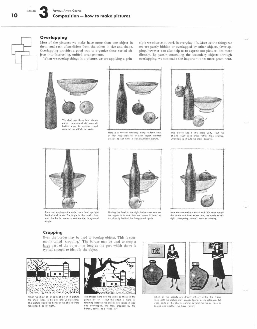
Overlapping Most of the pictures we make have more than one object in them . a nd each often differs from the others in size a nd shape. Overlapping provides a good way to organize these varied objects into interesting. unified arrangements.
When we overlap things in a picture. we are applying a prin-
dple we observe at work in everyday life. 'fost of the things we see are panly hidden or overlapped by other objects. Overlapping, however. can also help LIS to expre~s our picture idea more directly. By panly concea ling the secondary objects through overl apping. we ca n make the imponan t ones more prom inent.
We shQII use these fQur simple objects 100 demonstrate some ef· fective ways 10 QverlQP - and some of Ihe pitfalls to ovoid.
PQor .overlapping - the objects .ore lined up behind each other. The apple in the bowl is lost, Qnd the bottle seems 10 resl an the foreground apple.
Cropping
Here is a natural tendency many students have at hrst; Ihey shaw all of each abiect. holated objects dQ nat make a well-orgQniled picture .
Moving Ihe bawl to Ihe right helps - we con see the apple in it nQw. But Ihe bottle is lined up 100 directly behind the fQregraund apple.
Even the border may be used to overlap objects. This is commonly ca lled "cropping. " The border may be used to Crop a large pan of the Object - as long as the part which shows is lypical enough to identify the object.
This picture has a little more unity - but the objects lauch each other rather than overlap. Overlapping .hQuld be more decisive.
Now Ihe composition works well. We have mQved the bottle and bowl to the left, the apple 10 Ihe right. Everythin g doesn' l hove to overlap.
When we show all .of each object in a p icture the effect tends to be dull and uninteresting . This picture would be better if the objects were rearranged al at right.
The shapes here a re the lOme as thQse in the picture at left - bUI the eff ect is more in· teresti ng because the object • .ore varied in .in and overlapped. The tree, cropped by the border, serves as a " lead in ."
When all the obiects are drown entirely within Ih e frame lines Oe") Ihe picture may appear formol or monotonous. But when ports .of the .objects extend beyond the frame lines or behind .one anQther, we have variety.
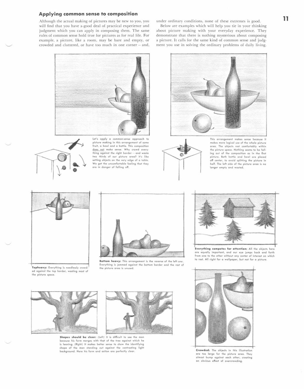
Applying common sense to composition Although the actual making of pictures may be new to you, you will find that you have a.good deal of. practical experience and judgment which you can apply in composing them. The same rules of common sense hold true for pictures as for real life. For example. a picture. like a room, may be bare and empty. or crowded and cluttered, or have too much in one corner - and.
,
let' s apply a common·sense approach to picture making in this arrangement of some fruit, a bowl and a bottle . This composition does nal make sense. Why crowd every· thing ogainsl the rig hI border - and waste two thirds of our picture area? It 's like
setting objects on the very edge of a toble. We get the uncomfortable feeling thot they are in donger of foiling off.
under ordinary conditions, none of these extremes is good. Below are examples which will help YOli tie in your thinking
abollt picture making with your everyday experience. They demonstrate that there is nothing mysterious about composing a picture. It calls for the same kind of common sense and judgment you use in solving the ordinary problems of daily living.
This arrangement makes sense becouse it mokes mare logicol use of the whole picture orea. The objects resl comfortably within the picture spoce. Nothing seems to be foil . ing out of the composition 0$ in the first picture. Both bailie ond bowl ore placed
off center, to ovoid splitting the picture in holf. The left side of the piclure area is no longer empty and wosted.
Toph e avy: Everything is needleuly crowd· ed ogoind the top border, wasting most of the picture space.
Bottom h e avy : This orrongement is the reverse of the left one . Everything is jammed ogainsl Ihe bottom border ond the resl of the picture area is unused .
campe tes for atte ntion : All the objects here are equolly importanl, and our eye jumps bock and forth from one to the other without any center of interest on which to rest. All right for a wallpaper, but nol for 0 picture.
Shopes should b e d e ar: (lell) It is difficult 10 see the man because his form merges with Ihol of Ihe Iree ogoinsl which he is leoning. (RighI) II makes beller sense 10 show Ihe identifying shope of Ihe man slonding oul ogoinsl the controsting light background. Here his form and oction are perfectly cleor. Crowded: The objects in this illustration
are too lorge for the picture area . They almost bump against each other, crealing on obvious effect of overcrowding.
11
12 l esson 3 Famous Art ists Course
Composition - how to make pictures
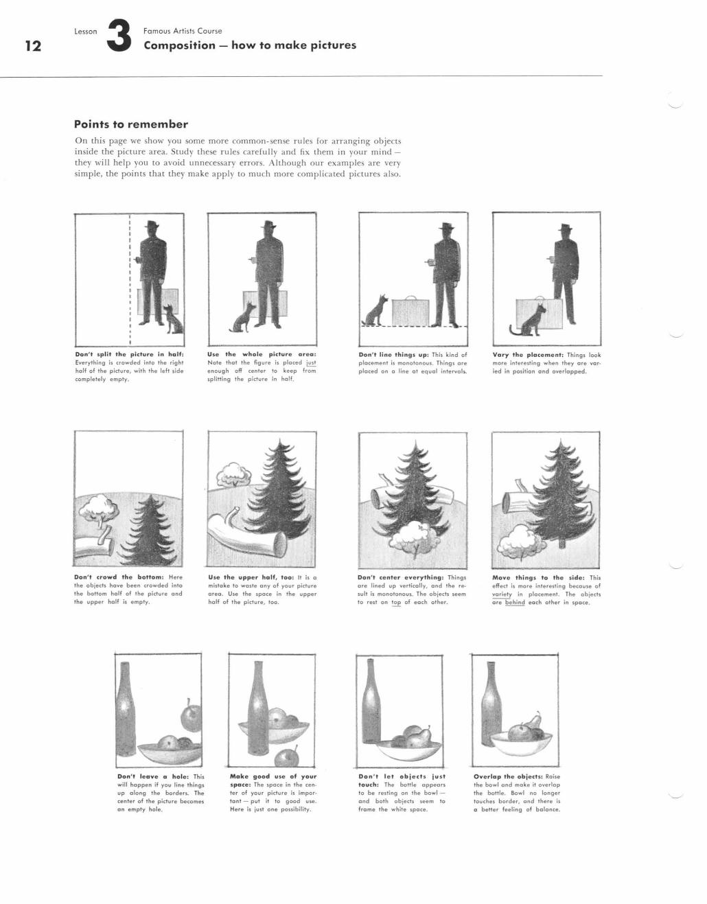
Points to remember On this page we show you some more common-sense rules for arranging objects inside the picture area. Study these rules carefully and fix them in your mind -they will help you to avoid unnecessary errors. Although our examples are very simple, the points that they make apply to much more complicated pictures also.
Don' t s plit th e picture in half: Everything is crowded into the right half of the picture, with the left side completely empty.
Don ' t crowd the bottom: Here the objects have been crowded into the bottom holf of the picture and the upper half is empty.
Don' t leave a hol e : This will happen if you line things up along the borders. The cenler of the picture becomes an em ply hole.
Use the whole picture area : Nate that the figure is placed ~ enough off cenler to keep from splitting the picture in half.
Use th e uppe r half, too : It is a mistake to waste any of your picture area . Use the space in the upper half of the picture, too.
Make good u se of your space: The space in the center of your picture is important - put it to good UN! .
Here is just one possibility.
A ______ _ Don' t li ne thing s up: This kind of placement is monotonous. Things are placed on a line at equal intervall.
Don ' t ce nte r eve rything : Things are lined up vertically. and the result is monotonous. The objects seem 10 rest on ~ of each other.
Don ' t l e t obj e cts ju s t touch: The bollie appears to be resting on the bowland both objects seem to frame the white space.
Vary th e placement: Things look more interesting when they are var· ied in position and overlapped.
Move thing s to th e si d e: This effect is more interesting because of variety in placement. The objects are behind each other in space.
Ove rlap t h e objects : Raise the bowl and moke it overlap the bottle. Bowl no longer touches border, and there is a beller feeling of balance.
lesson 3 Famous Artists Course
Composition - how to make pictures
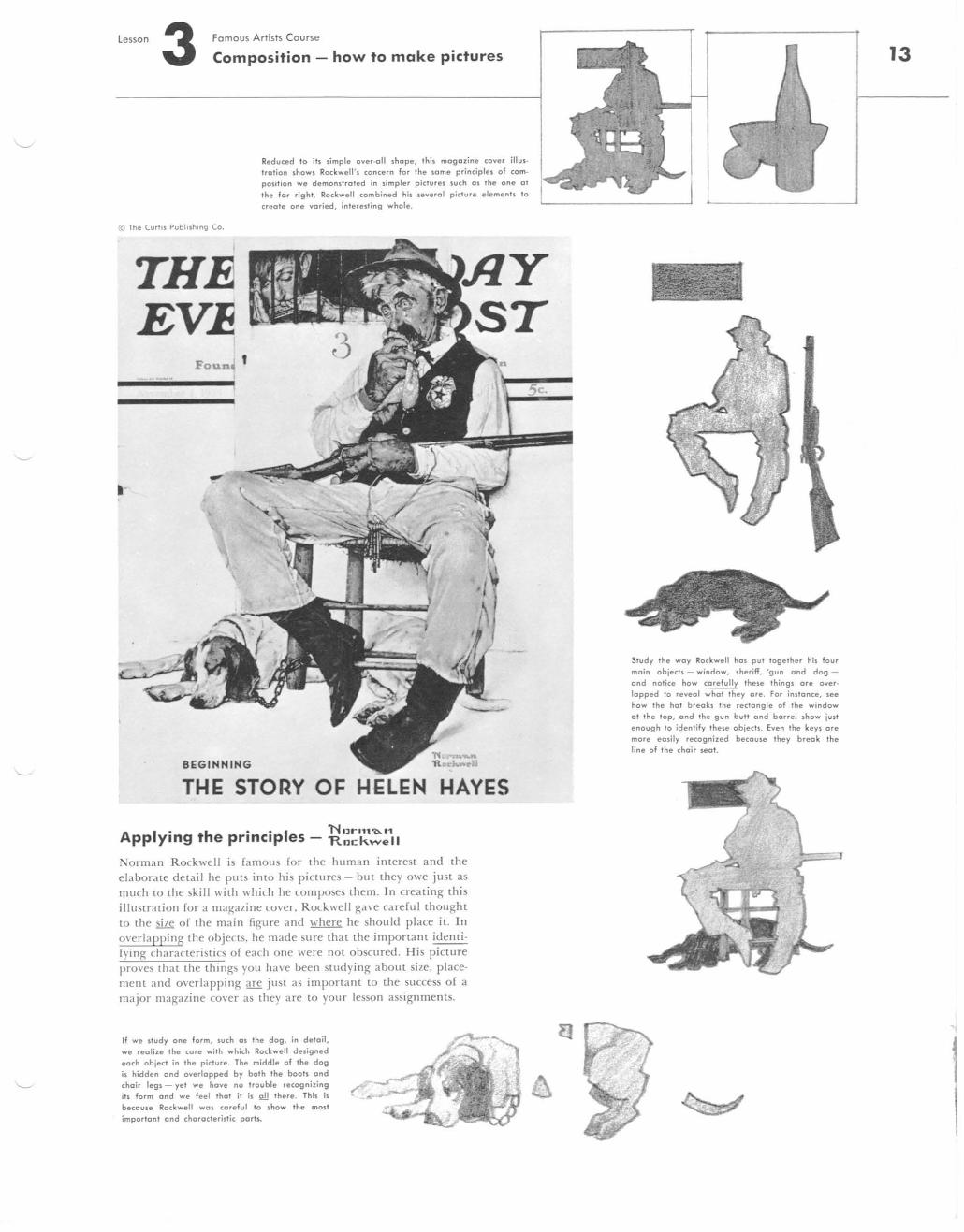
Reduced to ih simple over·oll shope, this magazine cover illustration shows Rockwell's concern for the some principles of composition we demonstrated in simpler pictures such as the one at the for right. Rockwell combined his severo I picture elements to
create one varied, interesting whole.
© The Curtis Publishing Co.
THE EV~
Foun~ t
.-•
BEGINNING
THE STORY OF HELEN HAYES
A I • h •• I 1'lllrl1t"'" pp ymg t e prmclp es - R",: k",ell
Norman Rockwell is famous for the human interest and the elaborate detail he puts into his pictures - but they owe just as much to the sk ill with \\,hich he composes them. In creating this illustration for a magazine cover, Rockwell gave careful thought to the sile of the main figure and where he should place it. In overlapping the objects, he made sure that the important identi· fying characteristics of each one were not obscured. His picture proves (hat the things you have been studying about size, placement and overlapping are just as important to the success of a major magazine cover as they are to your lesson ass ignments.
If we study one form, such as the dog, in detail, we realize the care with which Rockwell designed each object in the picture. The middle of the dog is hidden and overlapped by both the boots and choir legs - yet we hove no trouble recognizing its form and we feel that it is 2!! there. This is because Rockwell was careful to show the most
important and characteristic porh.
Study the way Rockwell has put together his four main objects - window, sheriff, 'gun and dog and notice how carefully these things are over· lapped to reveal what they are. For inslance, see how the hal breaks the rectangle of the window at the top, and the gun bull and barrel show just enough to identify these objects. Even the keys are more easily recognized because they break the line of the choir seat.
13
14
l
@ The Cvrtis Pvblishing Co.
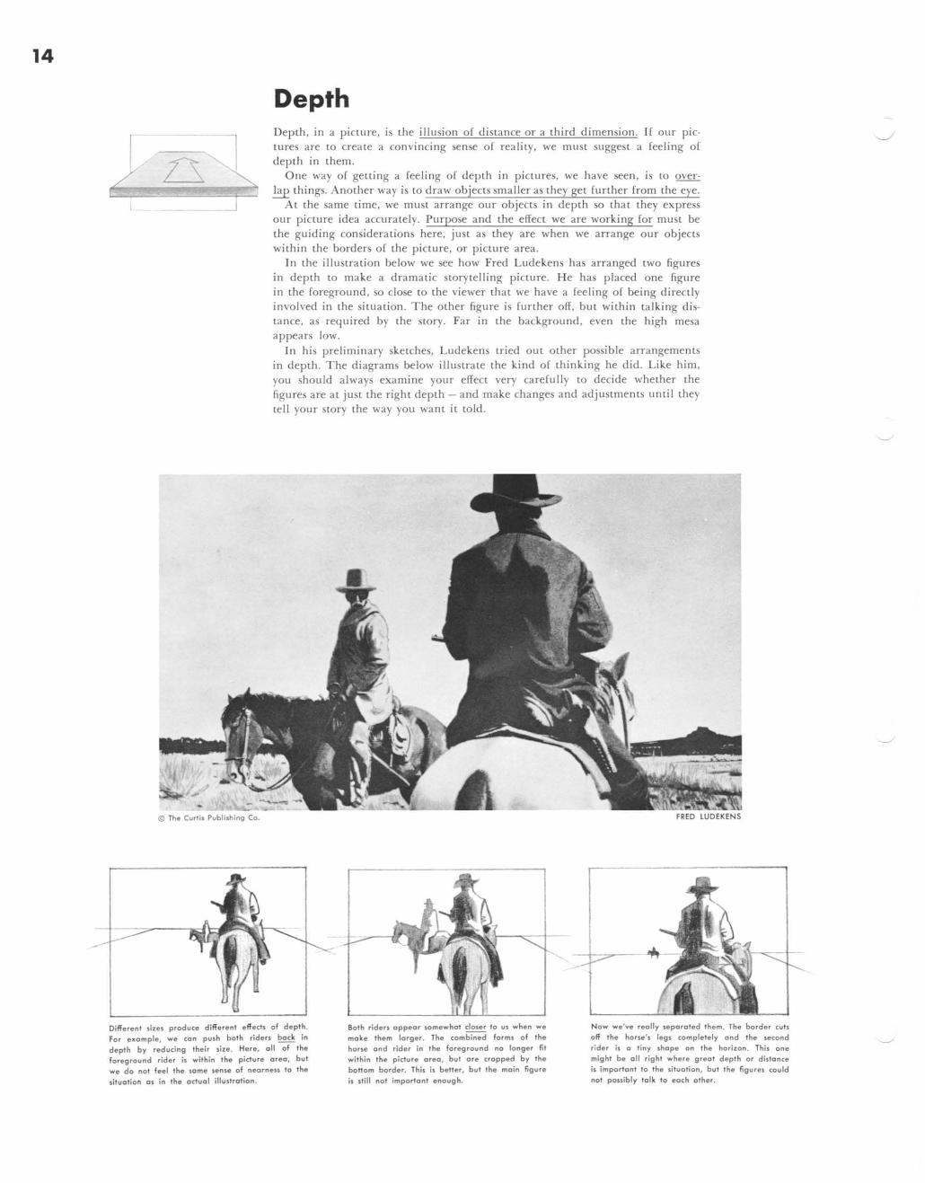
Depth Depth, in a picllIre, is the illusion of distance or a third dimension. If our pictures are LO create a convincing sense of reality. we mllst suggest a feeling of depth in them.
One way of geuing a feeling of depth in pictures, we have seen, is to over~ things. Another way is to draw objects smaller as they gel further from the eye.
Al the same lime, we must arrange our objeCls in depth so that they express our picture idea accurately. Purpose and the effect we are working for must be the guiding considerations here, just as they are when we arrange our objects within the borders of the picture. or picture area.
In the illustration below we see how Fred Ludekens has arranged two figures in depth to make a dramatic storytelling picture. He has placed one figure in the foreground . so close to the viewer that we have a feeling or being directly involved in the situation. The other figure is further off, but within talking distance, as required by the story. Far in the background, even the high mesa appears low.
In his preliminary sketches. Ludekens tried out other possible arrangements in depth. The diagrams below illustrate the kind of thinking he did. Like him, you should always examine your effect very carefully to decide whether the figures are at just the right depth - and make changes and adjustments until they tell your story the way you want it told.
FRED LUDEKENS
Differen' slIes prodvce differen' effech of dep,h. For exomple, we can pvsh both riders bock in depth by reducing their size. Here, 011 of the foreground rider is within the pictvre area, but we do not feel the some sense of nearnen to the situation as in the actual illustration .
80th rid en appear somewhat closer to UI when we make 'hem larger. The combined forml of the hone and rider in the foregrovnd no longer fit within the picture area, but are cropped by the bot1om border. This il bet1er, but 'he main figure il slill no' important enough.
Now we've really leporoted them. The border cvls off the horse ', legs completely and the second rider is a tiny shope an the horilon . Thil one might be all righ' where great depth or didance is important to the situation, but the figures covld not ponibly talk to each other.
lesson Fomous Artists Course 3 Composition - how to make pictures
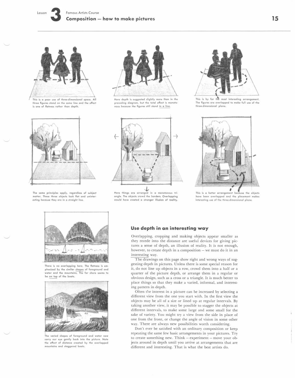
This is a poor use of three-dimensionol space. three figures stand on the some line and the effect is one of Aatness rather than depth.
-----------I +---~~_4~
The same principles apply, regardless of subject moiler. These three objects look Aot and uninteresting because they are in (I straight line.
There is no overlapping here. The flatness is emphasized by the similar shapes of foreground and water and the mountains. The for shore seems to be on top of the bools.
The varied shopel of foreground and water now corry our eye gently bock into the picture. Note the effect of distance created by the overfopped mountains and stagge red booh.
Here depth is suggested slightly more than in the preceding diagram, but the total effed is monotonous because the figures still stand in a line.
-.L. Here thing I are arranged in a monotonous triangle. The objeds crowd the borden. Overlapping would have created a "ranger illusion of reality.
most interesting arrangement. The figures are overlapped to make full ule of the three-dimensional plane.
This is a betler the objeds have been overlapped and the placement makes interesting use of the three-dimensional plane.
Use depth in an interesting way
Overlapping. cropping and making objects appear smaller as they recede into the distance are useful devices for giving pictures a sense of depth, an illusion of reality. It is not enough, however, to create depth in a composition - we must do it in an interesting way.
The drawings on this page show right and wrong ways of suggest ing depth in pictures. Unless there is some special reason for it , do not line up objects in a row, crowd them into a half or a quarter of the picture depth, or arrange them in a regular or obvious design, such as a cross or a triangle. It is much better to place things so that they make a varied, informal, and interesting pattern in depth.
Often the interest in a picture can be increased by selecting a different view from the one you start with. In the first view the objects may be all of a size or lined up at regular interva ls. By taking another view, it may be possible to stagger the objects at different intervals, to make some large and some small for the sake of variety. You might try a view from the side in place of one from the front. or change the angle of vision in some other way. There are always new possibilities worth considering.
Don't ever be satisfied with an ordinary composit ion or keep repeating the same few basic arrangements in your pictures. Try to create something new. Think - experiment - move your objects around in depth unt il you arrive at arrangements that are different and interesting. That is what the best artists do.
15
16
@ The Curti, Publi lhing Co.
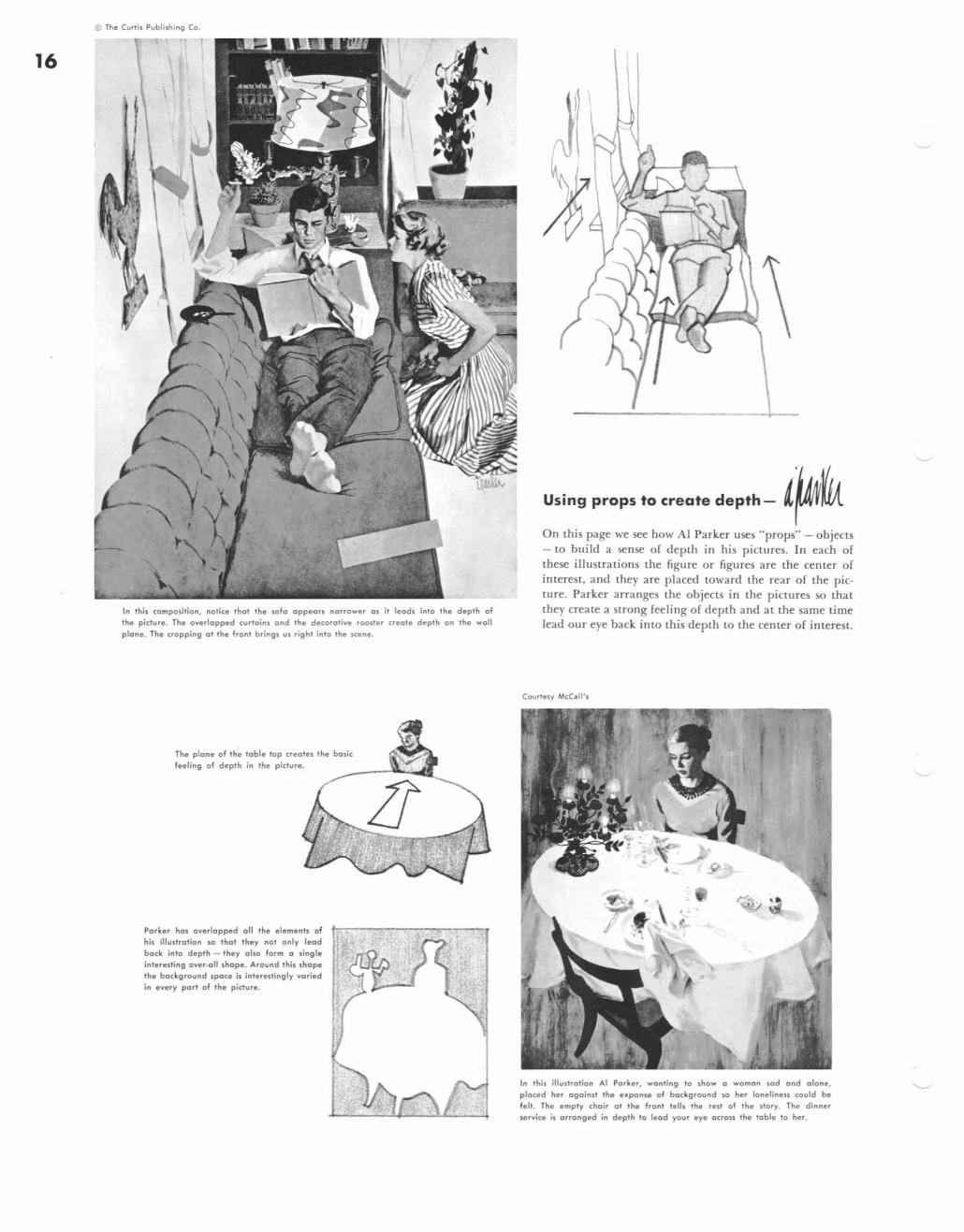
In this compolition, notice that Ihe wfo appears norrower as it lead. inlo the depth of the picture. Th. overlapped curtoins and Ihe decorative r OOl l e r creal. depth on the woll
plane. Th. cropping (II the front bring. 1.11 right into Ihe Ice ne.
Th. plone of 'he loble lop creote. the basic f.eling of depth in Ihe pictur •.
Porker hal overlapped all the elements of
hil illustration so that they nol only lead bock inlo depth - they also form (I single in'.restins over·oll shope . Around Ihil .hap. the background space i. interestingly varied in every port of the picture.
U,;ng P'Op' to "eote depth - l~'{u On this page we see how Al Parker uses "props" - objects - to build a sense or depth in his piClures. In each or these illustrations the figure or figures are the cenler o[ interest, and they are placed toward the rear of the picture. Parker arranges the objects in the pictures so that they create a strong feeling of depth and at the same time lead our eye back into this depth to the center of interest.
Courte.y McC.W.
In Ihi$ iIIU$tralian AI Porker, ..... onling to $ho ..... a ..... oman lad and alan., placed her again$t the upon .. of background sa her lonelineu could b,
fell . The empty choir 01 Ihe fronl tell$ the rell of the slory. The dinner .ervice is arranged in depth to lead your eye oeroS$ the lobi, to her.
Lesson 3 Composition - how to make pictures Famous Artists Course
© The CurTis Publishing Co.
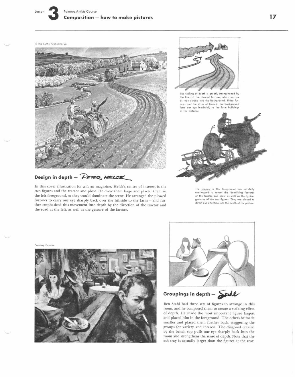
Design in depth - f)EY~ MtrlCa( -
The feeling of depth is greotly strengthened by the lines of the plowed furrows , which norrow os they extend into the bockground. These fur· rows and the strips of trees in the bockground leod our eye inevitobly to the form buildings in the distonce.
]n this cover iIlustration for a farm maga7ine. Heick's center of interest is the two figures and the tractor and plow. He drew them large and placed them in the left foreground, so they would dominate the scene. He arranged the plowed furrows to carry our eye sharply back over the hillside to the farm - and fur· ther emphasized this movement into depth by the direction of the tractor and the road at the left. as well as we gesture of the farmer.
The shopes in the foreground ore corefully overlopped to reveol the identifying features of the troctor ond plow os well os the typical gestures of the two figures . They ore ploced to direct our attention into the depth of the picture.
CourTesy Esquire
Groupings in depth -~
Ben Stahl had three sets of figures to arrange in this room, and he composed them to ·create a striking effect of depth. He made the most important figure largest and placed him in the foreground. The others he made smaller and placed them further back, staggering the groups for variety and interest. The diagonal created by the bench top pulls our eye sharply back into the room and strengthens the sense of depth. ote that the ash tray is actually larger than the figures at the rear.
17
18
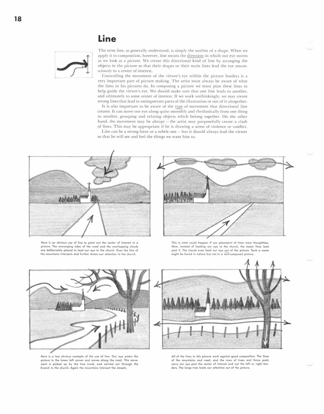
Line The term line. as generally understood , is simply the outline o [ a shape. \\' hen we apply it to composition, however, line mea ns the direction in which OliT eye moves as we look at a picture. \\'e creatc this directional kind of line by arranging the objects in the picture so that their shapes or their main lines lead the eye uncon· sciously to a center of interest.
Controlling the movement of the viewer's eye within the picture borders is a very irnportant pan of picture making. The artist must a lwa ys be aware of what the lines in his pi ctures do. In composi ng a picllIre we must plan these Jines to help guide the viewer's eye. \'\Ie should make Slife thal one line leads LO another, and ultimately LO some center of interest. If we work unthinkingly, we may create strong lines that lead to unimportant parts of the illustration or out of it altogether.
It is also important to be aware of the type of movement that directional line creates. It can move our eye a long quite smoothly and rhythmi ca lly from one thing to another, grouping and relating objects whi ch belong together. On the other hand , the movement ma y be abrupt - the artist may purposefully create a clash of lines. This may be appropriate if he is drawing a scene of violence or confl ict.
Line ca n be a strong force or a subtle one - but it should a lways lead the viewer so that he will see and feel the things we want him to.
H.r. is on obvious use of line to point out the center of intered in a p ictu re. The converging side, of Ihe rood ond the overlapping douds ore deliberotely ploced to lead our eye to the church . Even Ihe line of the mountoins intersects ond further drows our attention 10 Ihe church.
Here is 0 less obvious exomple of the ule of line. Our eye enters Ihe picture in the lower left corner ond move, olong Ihe rood . This move
ment is pid:ed up by the Iree trunk, ond (orried out through Ihe bronch to the church. Agoin the mountoinl interJect the steeple.
This is what could happen if our plocement of lines were thought1en. Now, instead of leoding our eye to the church. Ihe mojor linel leod post it. The douds even leod our eye out of the picture. Such 0 scene might be found in noture but not in 0 well.composed picture.
All of the linel in this picture work ogoinJi good (ompOlilion. The linel of the moUntoinl ond rood, ond th. rOWI of Ireel and rence pOlh (orry our eye pOll Ih. cenler of inler.sl ond out the left o r right bor
den. The lorge tr" leods our otten lion out of the picture.

lesson Famous Artists Course 3 Composition - how to make pictures
1 This lirst altempt at composing two ligures in the picture space is very weak. The lines of the man' s suit are
confused by those of the drape behind him. The lamp-shade hil! the edge of the other drape and confuses the lines of the woman' s head . The window in the center is on empty, wasted space. Our eye is pulled down and
out the bottom border by the converging lines of the woman's hand, the drape, and the man's side.
1 Almost every main line in this picture works against good composition . The lines of the rood, fence , and hill corry
our eye sharply to the left border. Even the tree leans out of the picture. The man 's arm runs into the top line of the hill.
2 By moving the man to the right and raising his arm we greatly improve the center area . The dull rectangle of the window has been broken into two interesting irreg-ular shapes. By showing more of the choir we move the woman out of the corner. However, the side of her head comes together with the drape confusingly and her arm still leads to the bottom . We have added a coRee table in the corner but it bumps the man 's leg .
\
2 See how much easier it is 10 focus on both the man and girl when the strong lines of the rood and fence are turned around to lead to her. The tree helps to block movement oul of the rig hi border but it still leans out of the picture.
The man's arm and the line of the hill are less confusing.
Using line to full advantage
3 Finally we change the woman 's pose to tie the whole composition together. Now her left arm leads up and over to the man , the graceful line of her hand being continued in his hand-on .hip gesture. Her head hOi been moved to the left of the edge of the drape and the lamp has been moved bock . The table is shifted to the right to block the movement of skirt and trouser lines out the bottom border.
3 This is still better. The girl has been moved to the left, so thai she is no longer portly concealed by the tree . Drop · ping the hill line makes both man and girl stand out more clearly. The tree trunk and branches turn our eye move
ment back into the picture and help frame the two ligures.
The demonstrations above show YOLl, step by step. how weak, confusing compositions can be strengthened and clarified by more thoughtful use of line. ""hen you plan a picture, make it a point to study the direction of the lines in your rough sketch. Decide whether or not your main lines keep the eye within the picture. Ask yourself: Do the background lines become confused with the lines of the center of interest? Are the lines crowded together or - just as undesirable - spaced at equal, monotonous intervals? Asking and answering questions like these will help you get the most out of the lines in your picture.
19
20
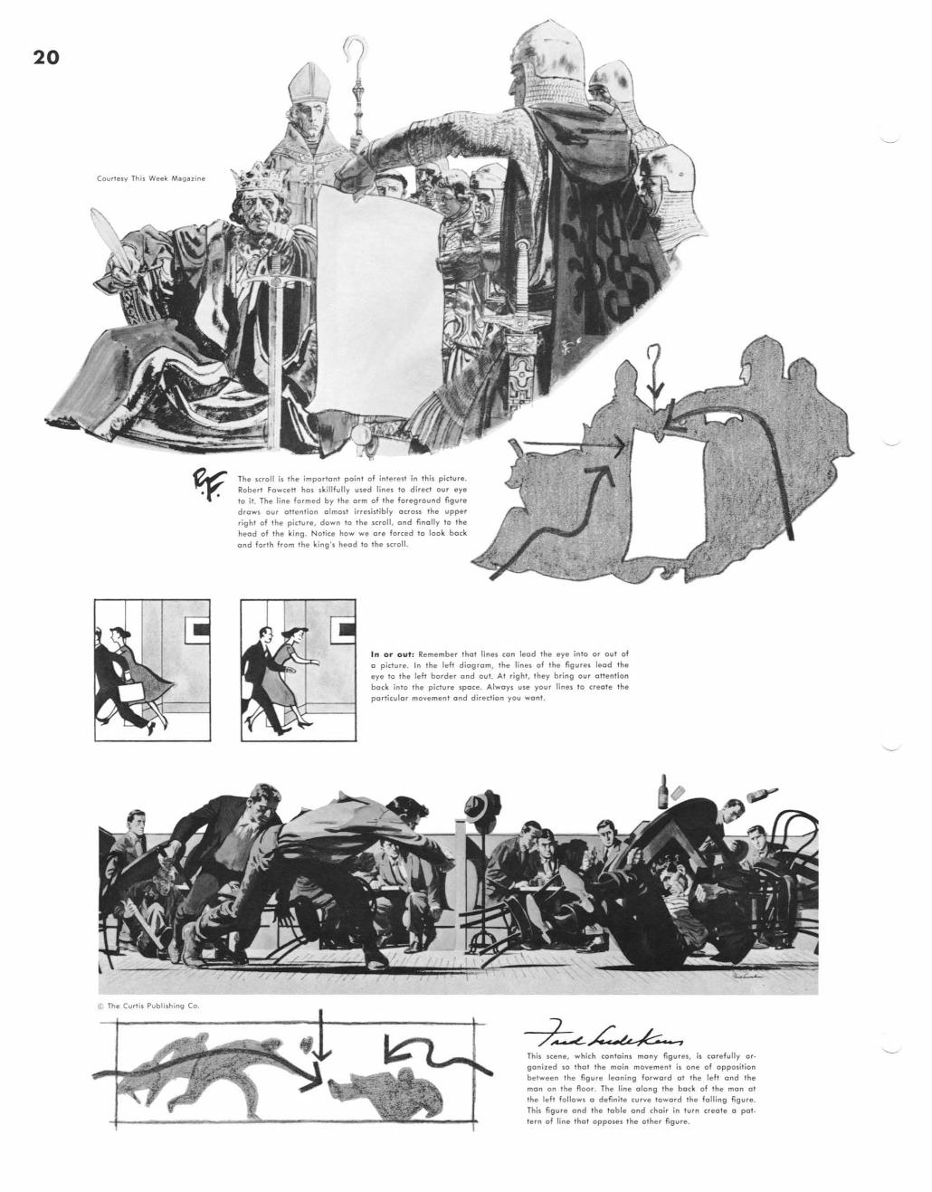
Courtesy This Week M.g azine
It. The Curl;, Publishing Co.
The $croll is the imporlonl point of inlerest in Ihis picture. Robert Fowcett hos skillfull y used lines 10 direct our eye to it. The line formed by Ihe arm of the foreground figure draws our ottenlio" o lmos, irresistibly ocrou Ihe upper right of the picture, down to the scroll, and finolly 10 Ihe head of Ihe king . Notice how we ore forced 10 look bock
and forlh from Ihe king " head 10 the scroll.
'n or out: Remember Ihol lines con lead Ihe eye into or Qui of o picture . In Ihe left diogrom, the lines of the figures leod the eye to Ihe left border and out. At righl. they bring our oHention bock into Ihe picture spoee. Alwoys use your lines 10 creote the
porticulor movement a nd direction you wonl .
, This scene, which contoins mony figures , is core fully or· gonized so thot the moin movement is one of opposition between the figure leoning forword 01 the left ond the mon on the Aoor. The line olong the bock of the mon 01
the left follows 0 definite curve toword Ihe foiling figure .
This figure ond the toble ond choir in turn creole 0 pot. lern of line Ihol opposes the o ther figure .
•

lesson 3 Famous Artists Course
Composition - how to make pictures
Here is on excellent example of conlrolled movement in on illl)$lrotion. The emphasis is on movement in depth. Our eye slorh 01 Ihe lower Tight.hond cor
ner and moves counter-clockwise as shown in the diagram. The gloJl on Ihe Roor becomeslhe ultimate
focal center. Even Ihe shadow on the rug guides our attention ocron Ihe Roor 10 the hand and gloJl.
Colleclion Mr .nd Mrl. J.mel Thr.11 Soby
The efFectivenen of this Ben Shohn picture is due in pori to the careful placement of Ihopes which have directional movement. Note thot all three heads are on the some line
and our aU en lion is guided loword this line by the bocl,> ground trees. The shawl in which Ihe child is wrapped also leads ou r eye up to Ih. heads.
The Curl is Publishing Co.
Although the hunter is a small figure, we have no
difficulty in seeing him amidst Ihe huge Irees. This is because Heick used the lines of the trees and the landscape to guide aUf eye 10 the man.
Tong e " ts: Don 'l arrange objects so Ihot a line on one will meet a line on another . They will form a longer line and drow the eye away from
the center of interest. In the left diagram the lines at the lop of the man' s head, 01 his shoulders and jacket boUom form distracting tongenh - which are easily corrected (righ') by moving the objects a little.
Picture corne rs: Picture corners, due 10 the meeling of the frame IineJ, are II rang and oUtod attention. Don' t let any of a picture' , main lines run into corners - as the rood, long branch and top of Ihe tree trunk do in the left diagram - or they will lead the eye oul of the picture. plan your
lines 01 01 the righl to keep the viewer 's interest within Ihe picture area .
21
22
• . ,
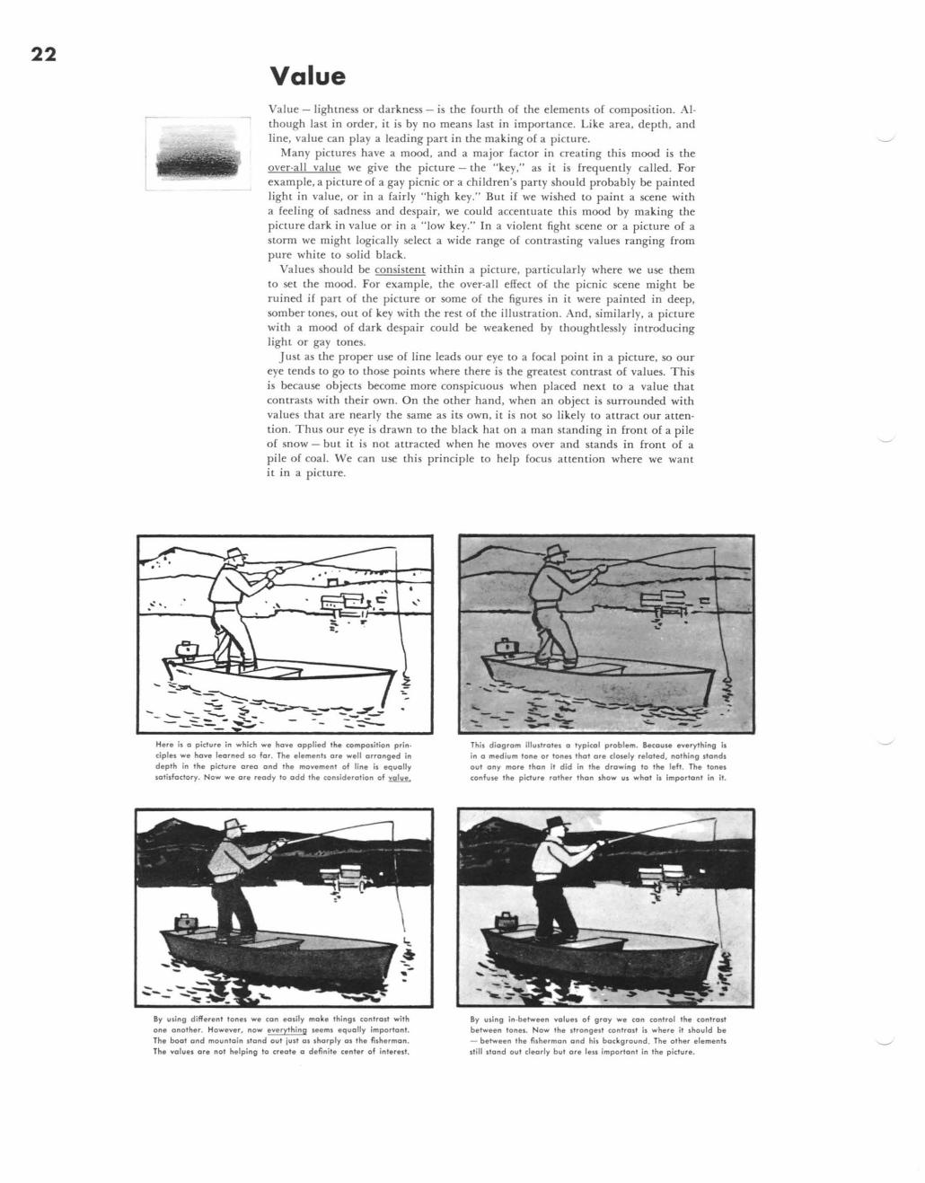
Value Value - lightness or darkness - is the fourth of the elements of composition. AI· though last in order, it is by no means last in importance. Like area, depth. and line. value can playa leading part in the making of a picture.
Many piCLures have a mood, and a major factor in creating this mood is the over-all value we give the picture - the "key," as it is frequently called. For example, a picture of a gay picnic or a children's party should probably be painted light in value, or in a fairly "high key." But if we wished to paint a scene with a feeling of sadness and despair. we could accentuate this mood by mak ing the picture dark in value or in a "'ow key." In a violent fight scene or a picture of a storm we might logically select a wide range of contrasting values ranging from pure white to solid black.
Values hould be consistent within a picture. particularly where we use them to set the mood. For example. the over-all effect of the picnic scene might be ruined if part of the picture or some of the figures in it were painted in deep. somber lOnes. out of key with the rest of the illustration. And, similarly, a picture with a mood of dark despair could be weakened by thoughtlessly introducing light or gay tones.
Just as the proper use of line leads our eye lO a focal point in a picture. so our eye tends to go to those points where there is the greatest contrast of values. This is because objects become more conspicuous when placed next to a value that contrasts with their own. On the other hand. when an object is surrounded with values that are nearly the same as its own, it is not so likely to attract our attention. Thus OLlr eye is drawn lO the black hat on a man standing in front of a pile of snow - but it is not attracted when he moves over and stands in front of a pile of coal. We can L1SC this principle to help focus attention where we want it in a picture .
. .,
~ . '" e
" t: ~
-...
:::~~ -..;:,.. - -=='--_ - ~ S _ -~~--::-_~_-- .;::-- - ...;:;;-- - - -- -~ ---- -- --
Here is a pic1ure in which we have applied the composition principles we have learned 50 for . The elemenll are well arranged in depth in the picture area and the movement of line is equalJy satisfactory. Now we are ready to odd the conlideration of nili£L
By uling different tonel we can eOlily make thing I cantrall with one another. However, now every!hing Heml equally important. The boot and mounloin stand out just 01 sharply 01 Ihe fisherman . The values are nol helping to creole a definite center of inlerelt_
---,.. This diagram iIlultroles a typical problem. Becaule everything is in a medium tone or tones that are dosely related. nothing stands out any mare than it did in the drawing to the left. The tones confuH the picture rolher Ihon show us what is important in it.
By using in-between values of gray we can conlrol Ihe conlrolt between tones. Now the Ilrongell conlroll is where it should be - between 'he fisherman and his background. The other elemenll Itill Itond out deorly but ore lell important in the pic1ure_
lesson Fomous Artists Course 3 Composition - how to make pictures
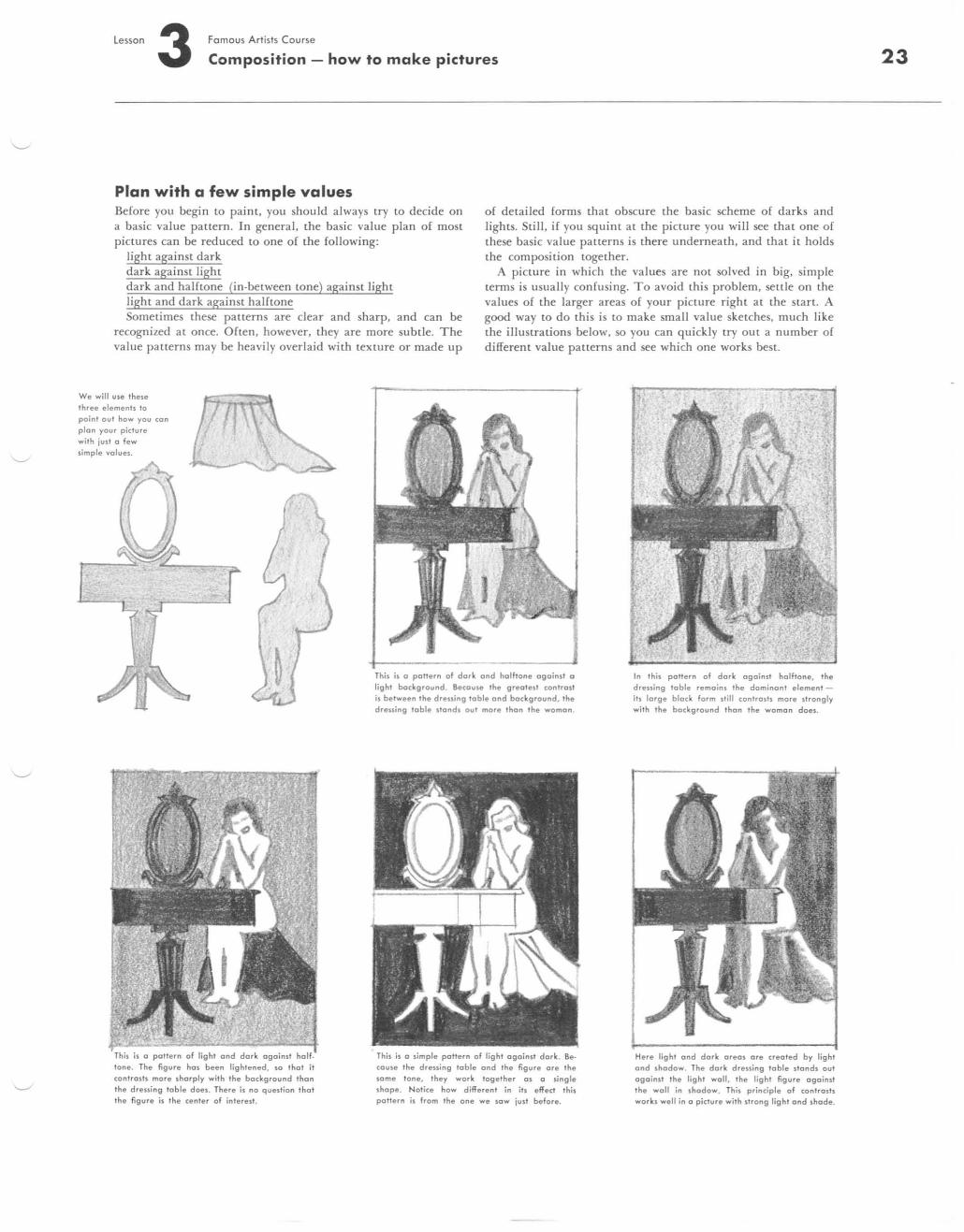
Plan with a few simple values Before you begin to paint, you should always try to decide on a basic value pattern. In general. the basic value plan o[ most pictures can be reduced to one of the following:
o[ detailed forms that obscure the basic scheme of darks and lights. Still, if you squint at the picture you will see that one of these basic value patterns is there underneath, and that it holds the composition together. light against dark
dark against light dark and halftone (in-between tone) against light light and dark against halftone
A picture in which the values are nOt solved in big. simple terms is usually confusing. To avoid this problem, settle on the values of the larger areas of your picture right at the start. A good way to do this is to make small value sketches, much like the illustrations below. so you can quickly try out a number of different value patterns and see which one works best.
Sometimes these pauerns are clear and sharp. and can be recognized at once. Often, however, they are more subtle. The value patterns may be heavi ly overlaid with texture or made up
We will use these three ele ments to point out how you c;on pJon your pic:lure with juSI 0 few simple values.
Th is is 0 paltern of light and d ork againsl hoJf· tone. The figure has been lightened, so thol it c;ontrosts more shorpJy with the bac;kgrou nd than the d ressing table does. The re is no question Ihat the figure is the c;enter of interest.
This is 0 poNern of dork and halftone ogoinst a Jight bac;kground. Bec;ouse Ihe greotesl c;onlrast is between Ihe dressing lable and boc;kground, Ihe dressing table stands oul more than the womon_
This is a simple poNern of Jight against dork . Be· couse the drening table and the figure ore Ihe some tone, they work logelher as a singJe shape. Notice how different in ih eff ect Ihis pollern is from the one we sow jusl befo re.
In this poNern of dark agoinst halftone, the drening loble remoins the dominant element its large black form slill c;ontrosls more sirongly with the bac;kground Ihon the woman does_
Here light and dark areas afe crea ted by light and shadow. The dark dreuing table slonds out agoinst Ihe lighl wall. Ihe light figure ogoi n51 the woll in shadow. This princ;iple of c;onlrosts works well in a pic;lure with strong light and shade.
23
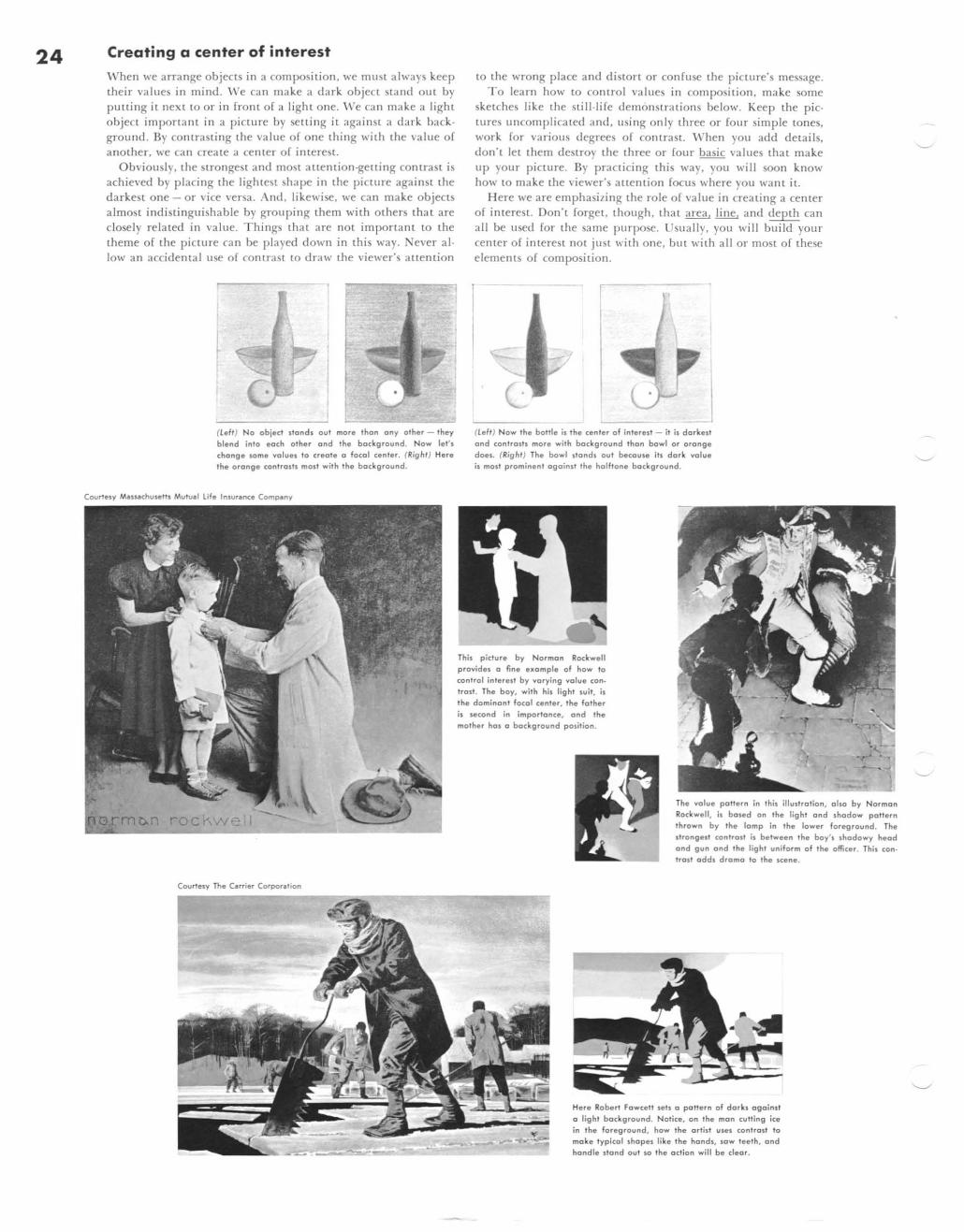
24 Creating a center of interest
\·"hen we arrange objects in a composition. we must always keep their values in mind. ' Ve ca n make a dark object sland out by pUlling it next to or in front of a light one. ' Ve ca n make a light objeCL important in a picture by selling it aga inst a dark background. By contrasti ng the value of one thing with the value of another, we can create a center of interesl.
Obviously. the strongest and most auenlion-gening contraSt is achieved by placing the lightest shape in the picture agai nst the darkest one - or vice versa. And, likewise. we ca n make objects a lmost indi st inguishable by grouping them with others that are closely re la ted in value. Things that are nOt imponant to the theme of the picture can be played down in this way. Never alIowan accidental use of contrast to draw the viewer's auention
•
(I.eft) No object stands out more thon ony other - they blend into each other and the background . Now let' s chang e some yolues to create a focal cen ter. (Right) Here the orange coni ralls most with the background.
Courtesy MaS ... chut.elti Muh.l.l l ife Insur.nce Compeny
Courtesy The C.rrier Corporetion
to the wrong place and diston or confuse the picture's message. To learn how to control values in composition, make some
sketches like the still -life demonstrations below. Keep the pictures uncomplicated a nd , using onl y three or four simple tones, work for various degrees or contrast. \\rhen you add details, don't let them destroy the three or fOllr basic values that make up your picture. By practicing this way. you will soon know how to make the viewer's auention focus where YOll want it.
Here we are emphasi7ing the role of value in creating a center of interest. Don't forget, though. th at area, line, and depth can all be used for the same purpose. Usually, you will build your center of interest not JUSt with one, but with all or most of these elements of composition.
(I.em Now the bottle is the center of inlerest - it is darkest and contraSIl more with background Ihon bawl or orange does. (Right) The bawl stands out because its dark yal ue is most prominent against Ihe halftone ba ckground.
This picture by Norman Rockwell provides a fine eKomple of how to control inle relt by varying yalue can· Irost. The boy, wilh his light suit, is the dominant focal cenler, the falher is second in impo rtance, and Ihe mol her halo background position.
The yalu e paNern in this iIIustralion, 0 110 by Norman Rockwell, is ba$ld on the light and shadow pa!!e rn thrown by the lamp in the lower foreground . The strongesl contrasl is between the boy's shadowy head and gun and 'he lighl uniform of 'he officer. This can. trosl odds drama to the scene.
Here Roberl Fawce!! .els a paNern of dark. against a light background. Notice, on Ihe man cutting ice in the foreground, how the artisl ules conlrasl to make typi cal shapes like the hands, sow teeth, and handle stand oul 10 'he action will be clear.
l esson Famous Artists Course 3 Composition - how to make pictures
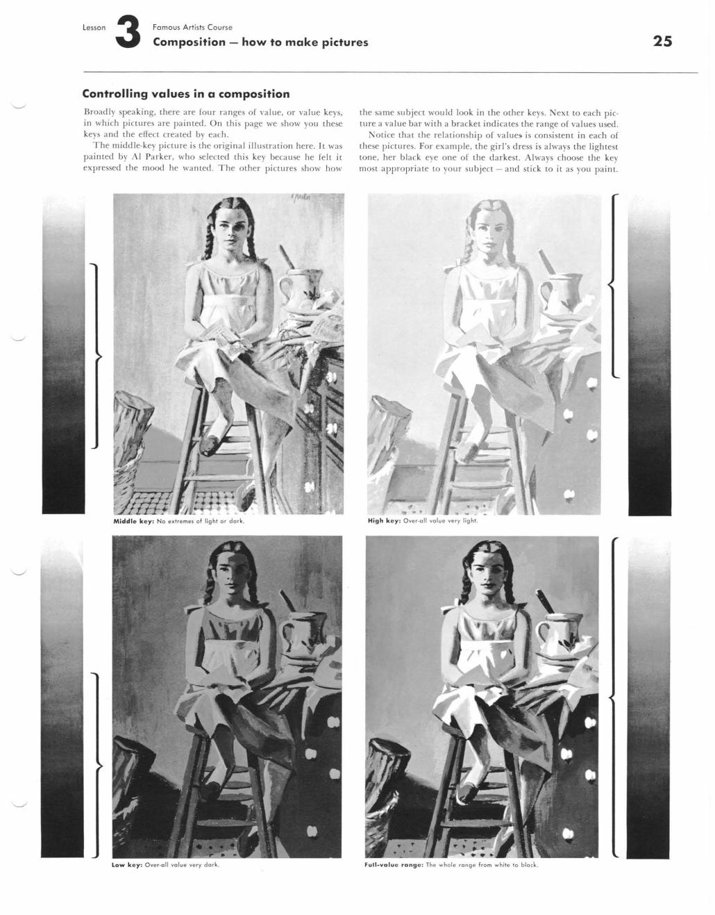
Controlling values in a composition
Broadly speaking, there are four ranges of value, or value keys, in which pictures are painted. On this page we show you these keys and the effect created by each.
The middle-key piclUre is the origi nal illustration here. It was painted by AI Parker , who selected this key because he fell it expressed the mood he wa nted . The other piclUres show how
Middl e k e y: No e)(Tremel of lighT or dark .
low k e y : Over-all value very dark.
the same subject would look in the other keys. Next to each piclUre a value bar with a bracket indicates the range of values used.
Notice that the relationship of value5 is consistent in each of these pictures. For examp le, the girl's dress is always the lightest LOne, her black eye one of the d arkesl. Always choose the key most appropriate to your subject - and st ick to it as you pail'll.
... , High k ey: Over·all value very light.
Full -va lue range: The whole range from white to block.
25
26
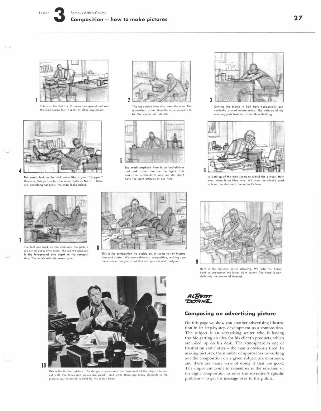
1
5
lesson Famous Artists Course 3 Composition - how to make pictures
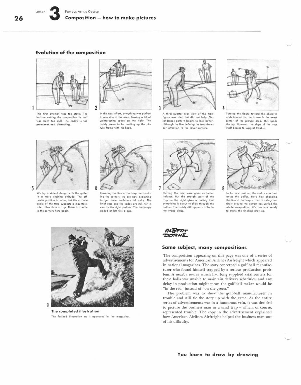
Evolution of the composition
This firs' oHemp! WQJ too Jtotic. The horizon (u"ing the composition in half well much too dull. Th. caddy is too promin ent and dillroding .
w. try (I violent design with the golfer
in (I more exciting aHitud.. The off· eenl.r polition is better, but the extreme angle of the trap sugg esh (I mountainside rather thon (I trap. There is 'roubl. in Ih. corners her. ogain.
9
2
6
The completed illustration
In this nut e ffort, everythi ng wos pushed
to one sid. of the area, leoying (I 101 of
uni"t.,."i"; spoce on the right. The coddy Hems to be holding up Ihe picture frame with his head .
lowering the line of the trap and Oyoid
ing th. corners, we ore now beginning to gel some iemblance of unity. The brief case ond the caddy or. still not in exactly the r ight position. The landscape ad ded at left fiUs a gap.
The finished illustration as it appeared in the magalines.
3
7
A three·quarter rear vjew of the main fig ure was tried hut did nal help. Our
landscape pattern hegins 10 look better, although the line defining the trap draws our altentian to the lower corners.
Shif.ing the brief cas. give, us better balance . But the ,traight part of Ihe trap on the right givel a feeling that
e ... e rything is a hou. to slide through the bottom. Th. caddy still appears to be in the wrong place.
4
8
Turning the figure toward Ihe observer adds interelf but he is now in Ihe u act
center of the picture area. This spoils the try. Howe ... er, the slope of Ihe trap itself begins to suggell troub le.
In his new position , ,h. (oddy now bal. ances the golfer. Note how changing the line of ,h. 'rap 10 that it swin g s e n· lirely arou nd Ihe bottom has unified the whole composition. We or. now ready to make Ihe fini shed drawing .
Same subject, many compositions
The composition appearing on this page was one of a series of advertisements [or American Airlines Airfreight which appeared in nationa l magazines. The story concerned a gOlf-ball manufacturer who found himself trapped by a serious production problem. A nearby source which had long supplied vital centers for these ba lls was unable to maintain delivery schedules, and any delay in production might mean the golf-ball maker would be "in the red" instead of "on the green."
The problem was to show the golf-ball manufacturer in trouble and still tie the story up with the game. As the entire series o[ advertisements was in a humorous vein, it was decided to picture the business man in a sand trap - which, of course, represented trouble. The copy in the advertisement explained how American Airlines Airfreight helped the business man out of his difficulty.
You learn to draw by drawing
4
7
lesson 3 Famous Artists Course
Composition - how to make pictures
2 3 This wos the flnt try. It seems too spread ou t and the man seems lost in a tot of office equ ipment.
This look-down view also loses the man . The typewriter, rather tha n the mon, oppeors to be the center of inte rest.
Culling this sketch in holf bOTh horizontolly and vert icolly proved uninteresting . The ottitude of the mon suggests lo ziness rot her than th inking .
The man' s fe et on the desk seem like a good " stopper ." However, this picture hos the some foults o s No. 3 - there ore d isturbing ton gents, the mon looks a slee p.
8
5 Too much emp hosis here is on bookshelves ond desk rot he r thon on the figure. This looks too orchitecturol o nd we still don' t have the right alt itude in ou r he ro.
6 A dose-up of the man seems to crowd the picture. How_ eve r, there is on ideo he re. We show the client's prod. ucts on the desk ond the subject' s foce.
The feet ore bock on the desk and the picture is opened out a little more. The dient' s products in the foreg round give depth to the composition. The mon's attitude seems good.
This is the com position we decide on . It seems to sa y frustra tio n ond dutter. We now refine our composition , making sure there ore no tangents ond that ou r spoce is well designed. 9
10 This is the finished picture. The design o f space ond the plocement of the objects turned ou t welt. The tones ond values ore goad - ond while there ore mony elemen ts in the picture, our attention is held by the mon' s heod .
He re is the finished penci l drawing . We add the heavy book to strengthen the lower right corner. The heod is now definiTe ly the center of interest.
Composing an advertising picture
On this page we show you another advertising illustration in its step-by-step developmeot as a composition. The subject is an adverti sing writer who is hav ing trouble geuing an idea for his client's products, whi ch are piled up on his desk. The atmosphere is one o[ frustration and cluuer - the man is obviously tired. In making pictures, the number o[ approaches to working out the composi tion on a given subject are enormous, and there are man y ways of doing it that are good. The important point to remember is the selection of the right composition to solve the advertiser's specific problem - to get his message over to the public.
27
28
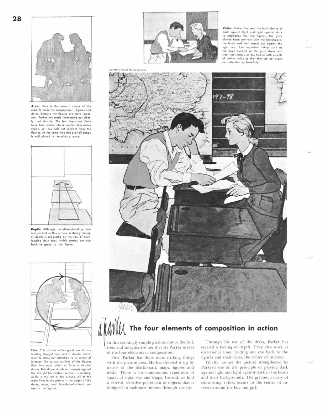
Are a : Her. if the o"er-oll shape of the main forms in the composition - figures and desks. Secause Ihe fig"".s ore more impor. lont, Porker hos mode them stand oul clearly and sharply. Th. leu impariont desks have bun mode inlo a simpler, leu active shope, 10 they will not distract from the figures. AI the lome time Ihis over-all shope is well placed in ,h. picture space .
Depth : Although Iwa-dimensional poHern is importont in Ihis pidure, a s'rong f •• ling
of depth is suggelted by the row of overlapping desk tops, which cor-ries our eye
bock in spoce 10 th. figures .
Lin e: This picture makes good ule of contrOlling straight lines and (I circulol movement to draw our oltention to its cent.r of
in Ie rest. Th. curved outlines of the figures Row inlo each other to form a circular shape. This shope stands out sharply again It the straight horizontals, verticals, and diog.
onals in the rest of the picture. AU of the main linel in the picture - the edges of the dellu, mopl, and blackboard - lead our
eye to the figurel.
Courlely Good Housekeeping -,-,.,.-~
• ~.z'" -_.ar.; t'1.- J A . /d-;-0 •• ,/ ,. . ".' ..
Value: Porker hal used the bOlic device of dark ogai.ut light and light against dark to empholiu the two figures. The girl ' l blonde head contrOlh with the blackboard.
the boy's dork hair stands out ogoinst the light mop. teu important thing 1 such 01
the boY'1 sweOler or the girl 's drell (ontrost lell sharply or ore tied in wilh obieeft of similor value so that they do not claim our otten lion so for cefully .
\UA. The four elements of composition in action
In this seemingly simple picture. notice the full, free, and imaginative use that Al Parker makes of the four elements of composition.
First, Parker has done some striking things with the picture area. He has divided it up by means of the blackboard, maps, figures and desks. There is no monotonous repetition of spaces of equal si7e and shape. Instead, we find a careful, sensitive placement of objects that is designed to maintain interest through variety.
Through his use of the desks, Parker has created a feeling of depth. They also work as directional lines. leading our eye back to the figures and their faces, the center of interest.
Finally, we see the picture strengthened by Parker's use of the principle of playing dark against light and light aga inst dark in the heads and their backgrounds. The greatest variety of contrasting values occurs in the center of interest around the boy and girl.
~ ~
o U
... Q) -o
Il.