pictures make you smarter
TRANSCRIPT
this is a new chapter 111
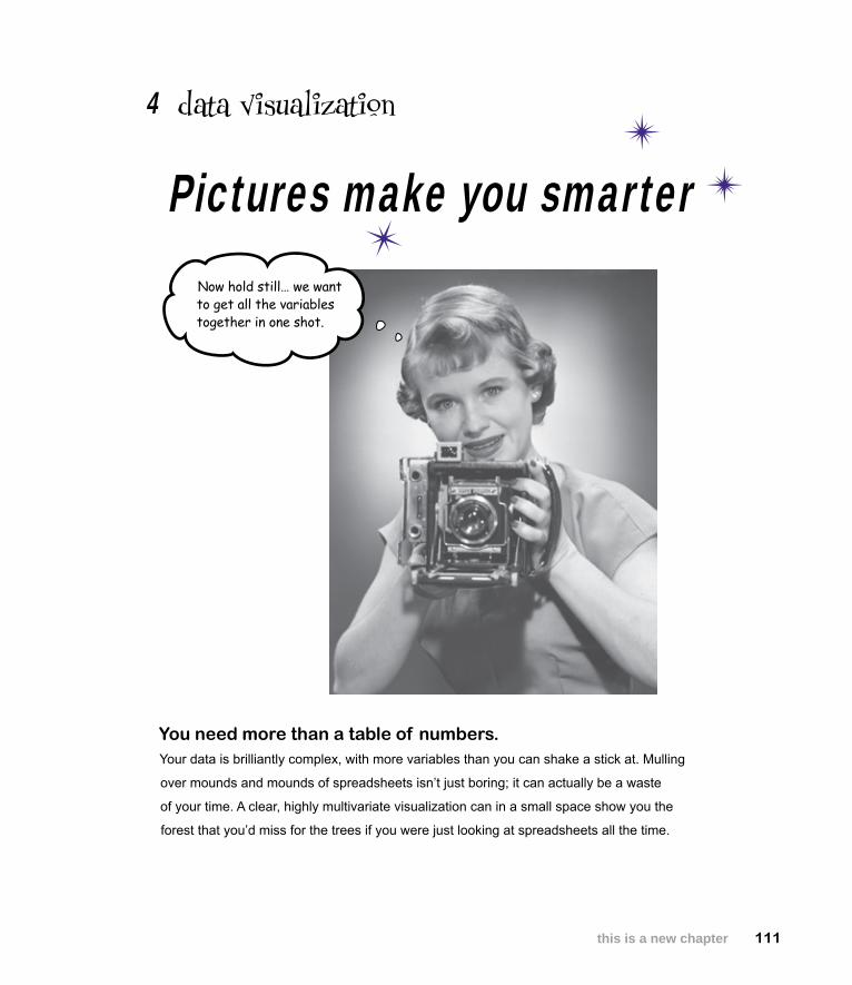
Now hold still… we want to get all the variables together in one shot.
data visualization4
Pictures make you smarter
You need more than a table of numbers. Your data is brilliantly complex, with more variables than you can shake a stick at. Mulling
over mounds and mounds of spreadsheets isn’t just boring; it can actually be a waste
of your time. A clear, highly multivariate visualization can in a small space show you the
forest that you’d miss for the trees if you were just looking at spreadsheets all the time.
112 Chapter 4
you’re in the army now
New ArmyMen’s Women’s Children’s Pets
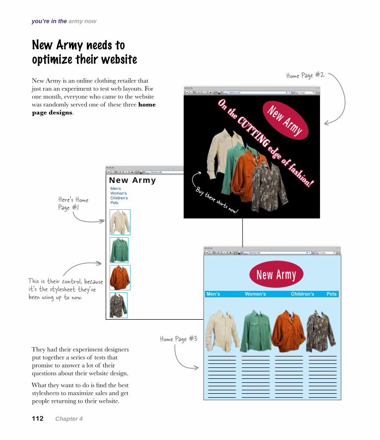
New Army needs to optimize their website
New Army is an online clothing retailer that just ran an experiment to test web layouts. For one month, everyone who came to the website was randomly served one of these three home page designs.
They had their experiment designers put together a series of tests that promise to answer a lot of their questions about their website design.
What they want to do is find the best stylesheets to maximize sales and get people returning to their website.
Here’s what the client wants
New Army
On the CUTTING edge of fashion!Buy these shirts now!
New ArmyMen’s Women’s Children’s Pets
Here’s Home Page #1
Home Page #2
Home Page #3
This is their control, because it’s the stylesheet they’ve been using up to now.
you are here 4 113
data visualization
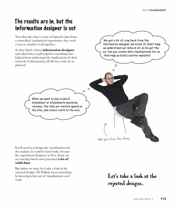
The results are in, but the information designer is out
Web guru from New Army
You’ll need to redesign the visualizations for the analysis. It could be hard work, because the experiment designers at New Army are an exacting bunch and generated a lot of solid data.
But before we start, let’s take a look at the rejected designs. We’ll likely learn something by knowing what sort of visualizations won’t work.
Let’s take a look at the rejected designs…
Now that they have a store of fantastic data from a controlled, randomized experiment, they need a way to visualize it all together.
So they hired a fancy information designer and asked him to pull together something that helped them understand the implications of their research. Unfortunately, all did not work out as planned.
We got a lot of crap back from the information designer we hired. It didn’t help us understand our data at all, so he got the ax. Can you create data visualizations for us that help us build a better website?
What we want to see is which stylesheet or stylesheets maximize revenue, the time our visitors spend on the site, and return visits to the site.
114 Chapter 4
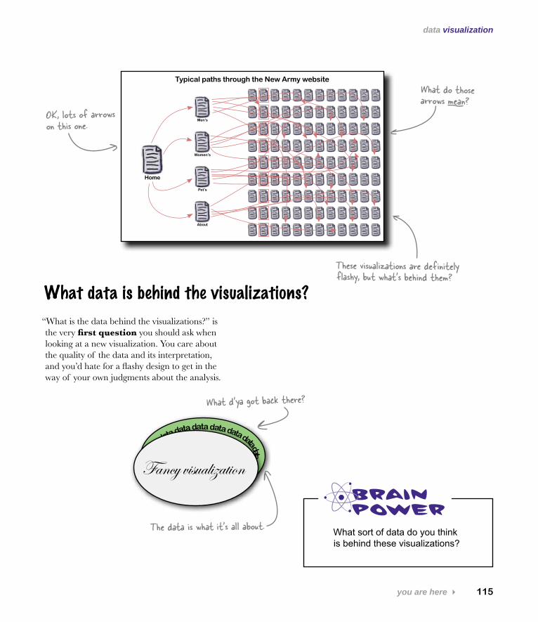
dubious designs
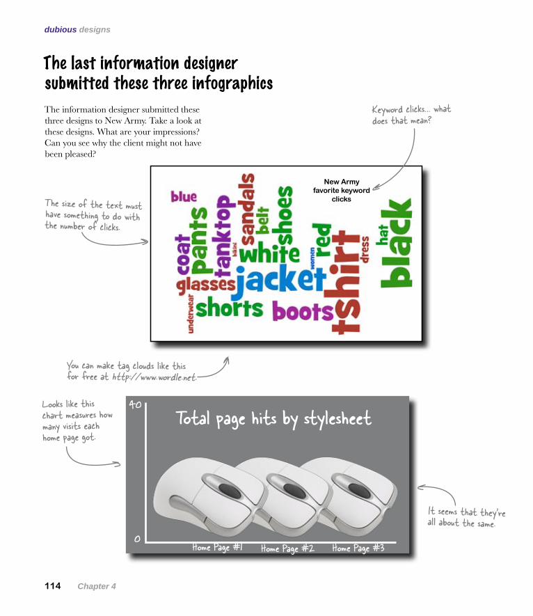
The last information designer submitted these three infographics
The information designer submitted these three designs to New Army. Take a look at these designs. What are your impressions? Can you see why the client might not have been pleased?
You can make tag clouds like this for free at http://www.wordle.net.
New Army favorite keyword
clicks
Home Page #10
40
Home Page #2 Home Page #3
Total page hits by stylesheetLooks like this chart measures how many visits each home page got.
It seems that they’re all about the same.
Keyword clicks… what does that mean?
The size of the text must have something to do with the number of clicks.
you are here 4 115
data visualization
These visualizations are definitely flashy, but what’s behind them?
What data is behind the visualizations?
“What is the data behind the visualizations?” is the very first question you should ask when looking at a new visualization. You care about the quality of the data and its interpretation, and you’d hate for a flashy design to get in the way of your own judgments about the analysis.
What d’ya got back there?
data data data data data data data data data data data data data data da
ta data
Fancy visualization
The data is what it’s all about. What sort of data do you think is behind these visualizations?
Home
Men’s
Women’s
Pet’s
About
Typical paths through the New Army website
OK, lots of arrows on this one.
What do those arrows mean?
116 Chapter 4
let’s see that data
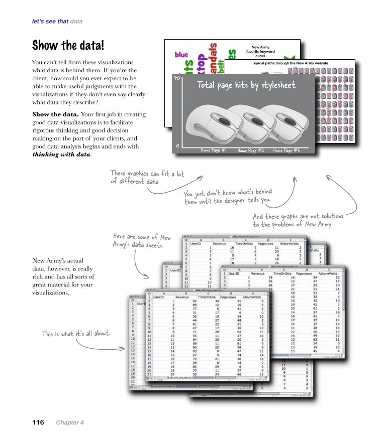
Show the data!You can’t tell from these visualizations what data is behind them. If you’re the client, how could you ever expect to be able to make useful judgments with the visualizations if they don’t even say clearly what data they describe?
Show the data. Your first job in creating good data visualizations is to facilitate rigorous thinking and good decision making on the part of your clients, and good data analysis begins and ends with thinking with data.
And these graphs are not solutions to the problems of New Army.
These graphics can fit a lot of different data.
Here are some of New Army’s data sheets.
This is what it’s all about.
You just don’t know what’s behind them until the designer tells you.
New Army’s actual data, however, is really rich and has all sorts of great material for your visualizations.
New Army favorite keyword
clicks
Home
Men’s
Women’s
Pet’s
About
Typical paths through the New Army website
Home Page #10
40
Home Page #2 Home Page #3
Total page hits by stylesheet
you are here 4 117
data visualization
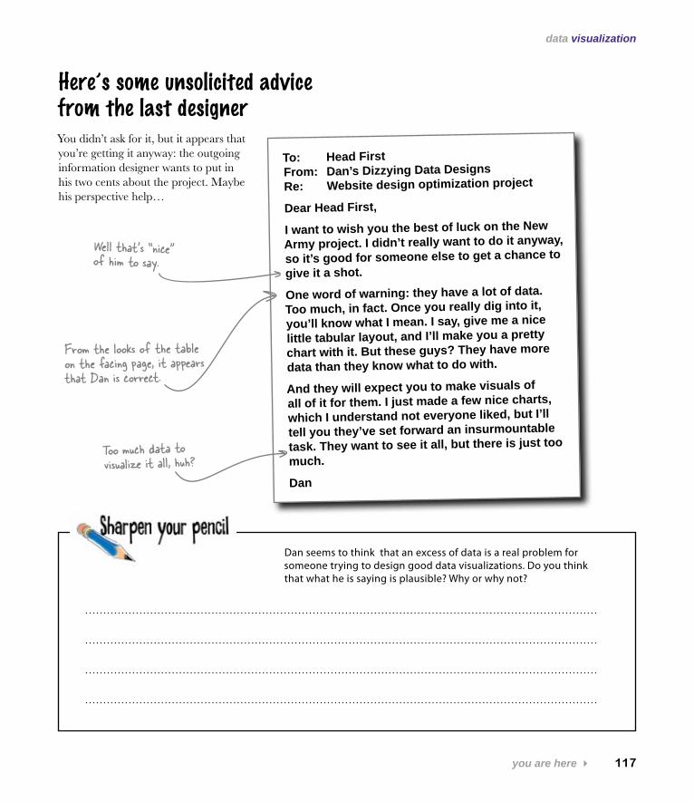
To: Head First From: Dan’s Dizzying Data Designs Re: Website design optimization project
Dear Head First,
I want to wish you the best of luck on the New Army project. I didn’t really want to do it anyway, so it’s good for someone else to get a chance to give it a shot.
One word of warning: they have a lot of data. Too much, in fact. Once you really dig into it, you’ll know what I mean. I say, give me a nice little tabular layout, and I’ll make you a pretty chart with it. But these guys? They have more data than they know what to do with.
And they will expect you to make visuals of all of it for them. I just made a few nice charts, which I understand not everyone liked, but I’ll tell you they’ve set forward an insurmountable task. They want to see it all, but there is just too much.
Dan
Dan seems to think that an excess of data is a real problem for someone trying to design good data visualizations. Do you think that what he is saying is plausible? Why or why not?
Here’s some unsolicited advice from the last designerYou didn’t ask for it, but it appears that you’re getting it anyway: the outgoing information designer wants to put in his two cents about the project. Maybe his perspective help…
From the looks of the table on the facing page, it appears that Dan is correct.
Well that’s “nice” of him to say.
Too much data to visualize it all, huh?
118 Chapter 4
the more data the better
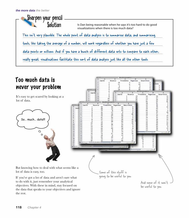
Too much data is never your problem
Is Dan being reasonable when he says it’s too hard to do good visualizations when there is too much data?
It’s easy to get scared by looking at a lot of data.
But knowing how to deal with what seems like a lot of data is easy, too.
If you’ve got a lot of data and aren’t sure what to do with it, just remember your analytical objectives. With these in mind, stay focused on the data that speaks to your objectives and ignore the rest.
Some of this stuff is going to be useful to you.
And some of it won’t be useful to you.
This isn’t very plausible. The whole point of data analysis is to summarize data, and summarizing
tools, like taking the average of a number, will work regardless of whether you have just a few
really great. visualizations facilitate this sort of data analysis just like all the other tools.
data points or millions. And if you have a bunch of different data sets to compare to each other,
So… much… data!!!
you are here 4 119
data visualization
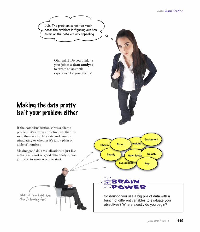
Eye-appeal
Charm
So how do you use a big pile of data with a bunch of different variables to evaluate your objectives? Where exactly do you begin?
Duh. The problem is not too much data; the problem is figuring out how to make the data visually appealing.
Making the data pretty isn’t your problem either
If the data visualization solves a client’s problem, it’s always attractive, whether it’s something really elaborate and visually stimulating or whether it’s just a plain ol’ table of numbers.
Making good data visualizations is just like making any sort of good data analysis. You just need to know where to start.
Oh, really? Do you think it’s your job as a data analyst to create an aesthetic experience for your clients?
What do you think the client’s looking for?
Insight
Beauty
Pizazz
Wow! factor
Excitement
Splash
Pop
120 Chapter 4
compare well
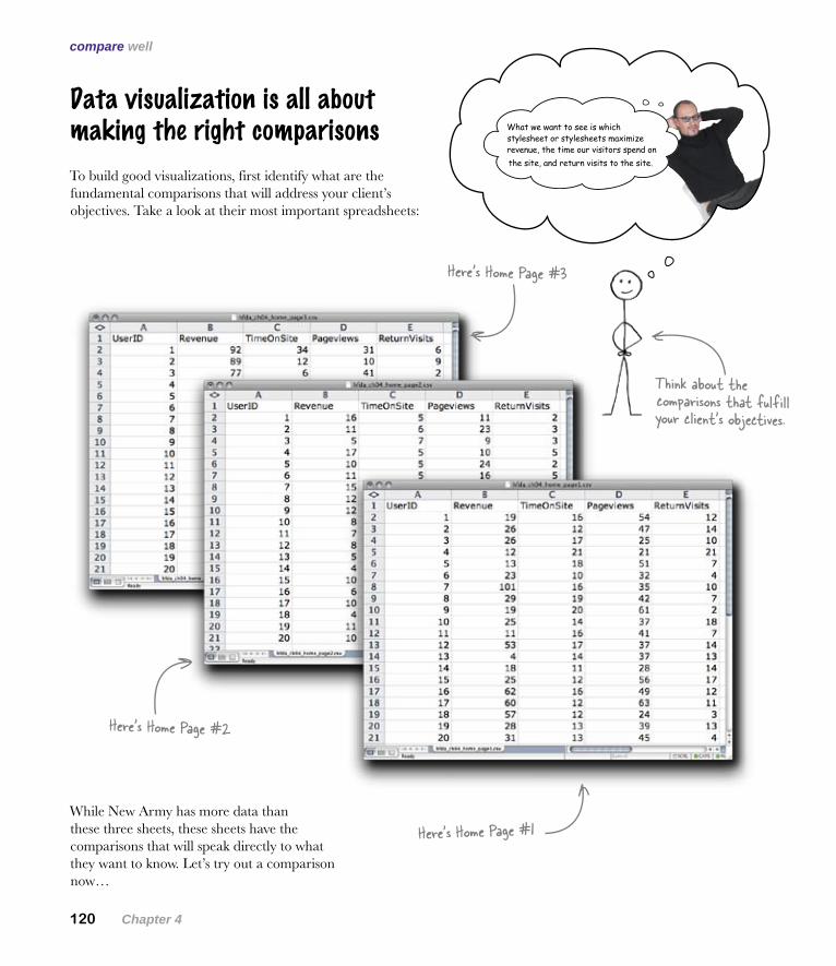
Data visualization is all about making the right comparisons
To build good visualizations, first identify what are the fundamental comparisons that will address your client’s objectives. Take a look at their most important spreadsheets:
While New Army has more data than these three sheets, these sheets have the comparisons that will speak directly to what they want to know. Let’s try out a comparison now…
What we want to see is which stylesheet or stylesheets maximize revenue, the time our visitors spend on the site, and return visits to the site.
Think about the comparisons that fulfill your client’s objectives.
Here’s Home Page #1
Here’s Home Page #2
Here’s Home Page #3
you are here 4 121
data visualization
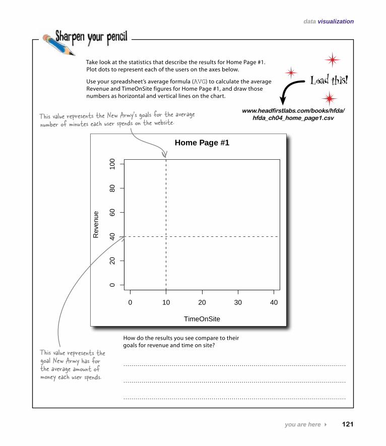
Take look at the statistics that describe the results for Home Page #1. Plot dots to represent each of the users on the axes below.
Use your spreadsheet’s average formula (AVG) to calculate the average Revenue and TimeOnSite figures for Home Page #1, and draw those numbers as horizontal and vertical lines on the chart.
How do the results you see compare to their goals for revenue and time on site?
0 10 20 30 40
020
4060
8010
0
Home Page #1
TimeOnSite
Rev
enue
www.headfirstlabs.com/books/hfda/ hfda_ch04_home_page1.csv
Load this!
This value represents the New Army’s goals for the average number of minutes each user spends on the website.
This value represents the goal New Army has for the average amount of money each user spends.
122 Chapter 4
your scatterplot
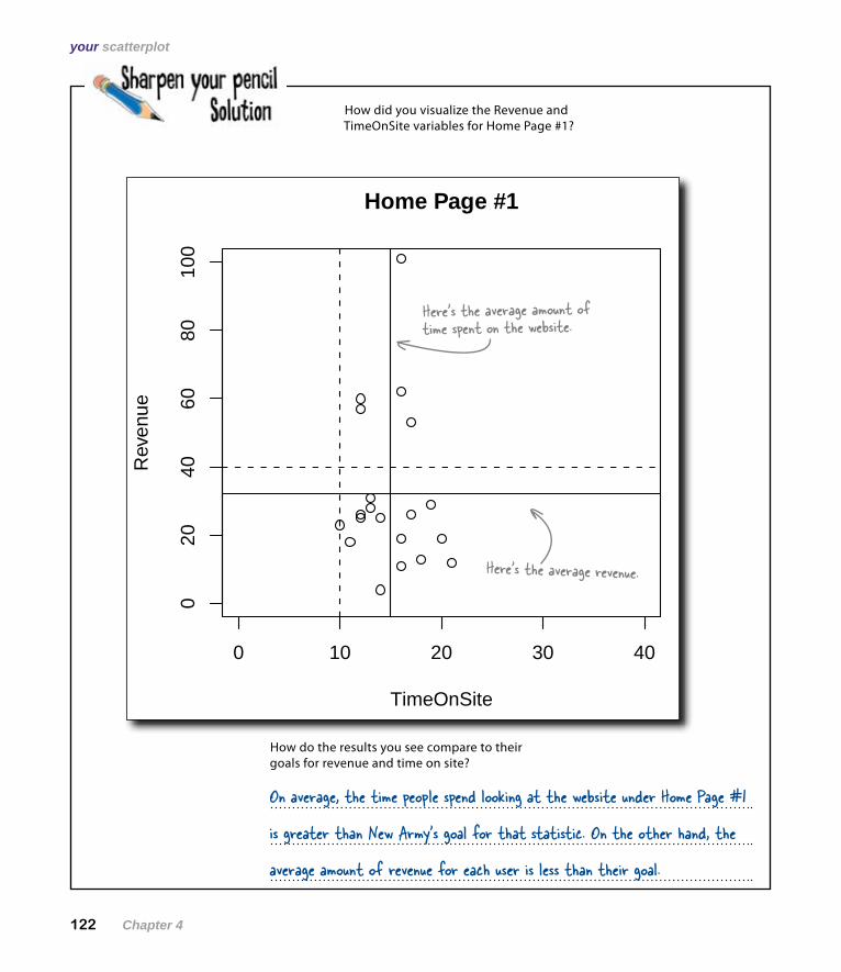
How did you visualize the Revenue and TimeOnSite variables for Home Page #1?
0 10 20 30 40
020
4060
8010
0Home Page #1
TimeOnSite
Rev
enue
Here’s the average revenue.
Here’s the average amount of time spent on the website.
How do the results you see compare to their goals for revenue and time on site?
On average, the time people spend looking at the website under Home Page #1
is greater than New Army’s goal for that statistic. On the other hand, the
average amount of revenue for each user is less than their goal.
you are here 4 123
data visualization
0 10 20 30 40
020
4060
8010
0
Home Page #1
TimeOnSite
Rev
enue
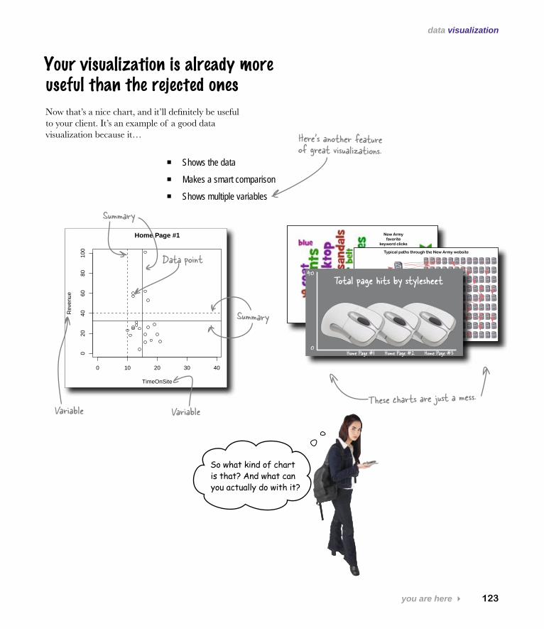
Your visualization is already more useful than the rejected ones
Shows the data �
Makes a smart comparison �
Shows multiple variables �
Now that’s a nice chart, and it’ll definitely be useful to your client. It’s an example of a good data visualization because it…
New Army favorite
keyword clicks
Home
Men’s
Women’s
Pet’s
About
Typical paths through the New Army website
Home Page #10
40
Home Page #2 Home Page #3
Total page hits by stylesheet
Here’s another feature of great visualizations.
VariableVariable
Summary
Summary
These charts are just a mess.
Data point
So what kind of chart is that? And what can you actually do with it?
124 Chapter 4
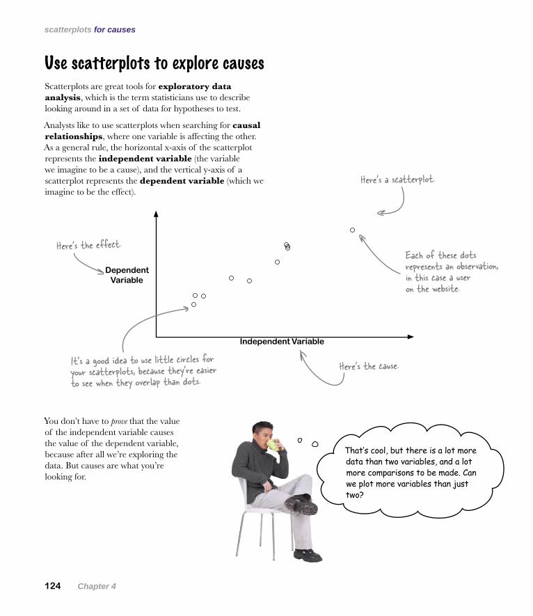
scatterplots for causes
You don’t have to prove that the value of the independent variable causes the value of the dependent variable, because after all we’re exploring the data. But causes are what you’re looking for.
Use scatterplots to explore causes
Dependent Variable
Independent Variable
Scatterplots are great tools for exploratory data analysis, which is the term statisticians use to describe looking around in a set of data for hypotheses to test.
Analysts like to use scatterplots when searching for causal relationships, where one variable is affecting the other. As a general rule, the horizontal x-axis of the scatterplot represents the independent variable (the variable we imagine to be a cause), and the vertical y-axis of a scatterplot represents the dependent variable (which we imagine to be the effect).
Here’s a scatterplot.
Each of these dots represents an observation, in this case a user on the website.
It’s a good idea to use little circles for your scatterplots, because they’re easier to see when they overlap than dots.
Here’s the cause.
Here’s the effect.
That’s cool, but there is a lot more data than two variables, and a lot more comparisons to be made. Can we plot more variables than just two?
you are here 4 125
data visualization
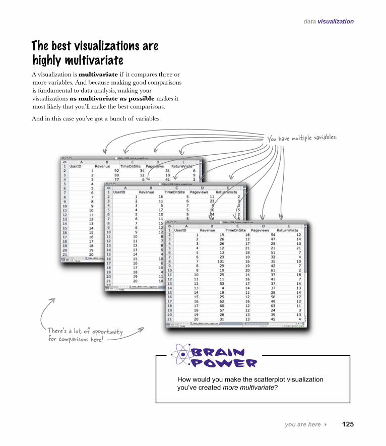
The best visualizations are highly multivariate
How would you make the scatterplot visualization you’ve created more multivariate?
A visualization is multivariate if it compares three or more variables. And because making good comparisons is fundamental to data analysis, making your visualizations as multivariate as possible makes it most likely that you’ll make the best comparisons.
And in this case you’ve got a bunch of variables.
You have multiple variables.
There’s a lot of opportunity for comparisons here!
126 Chapter 4
make it multivariate
0 10 20 30 40
040
80
Home Page #1
TimeOnSite
Rev
enue
0 20 40 60 80
040
80
Home Page #1
Pageviews
Rev
enue
0 5 10 20 30
040
80
Home Page #1
ReturnVisits
Rev
enue
0 10 20 30 40
040
80
Home Page #2
TimeOnSite
Rev
enue
0 20 40 60 80
040
80
Home Page #2
Pageviews
Rev
enue
0 5 10 20 30
040
80
Home Page #2
ReturnVisits
Rev
enue
0 10 20 30 40
040
80
Home Page #3
TimeOnSite
Rev
enue
0 20 40 60 80
040
80
Home Page #3
Pageviews
Rev
enue
0 5 10 20 30
040
80
Home Page #3
ReturnVisits
Rev
enue
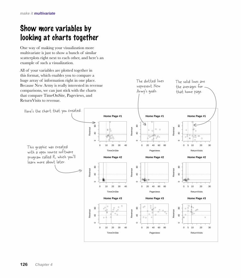
Show more variables by looking at charts together
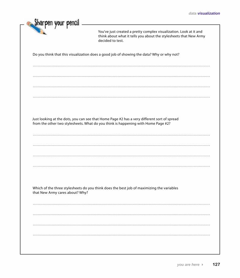
Here’s the chart that you created.
The dotted lines represent New Army’s goals.
The solid lines are the averages for that home page.
One way of making your visualization more multivariate is just to show a bunch of similar scatterplots right next to each other, and here’s an example of such a visualization.
All of your variables are plotted together in this format, which enables you to compare a huge array of information right in one place. Because New Army is really interested in revenue comparisons, we can just stick with the charts that compare TimeOnSite, Pageviews, and ReturnVisits to revenue.
This graphic was created with a open source software program called R, which you’ll learn more about later.
you are here 4 127
data visualization
You’ve just created a pretty complex visualization. Look at it and think about what it tells you about the stylesheets that New Army decided to test.
Do you think that this visualization does a good job of showing the data? Why or why not?
Just looking at the dots, you can see that Home Page #2 has a very different sort of spread from the other two stylesheets. What do you think is happening with Home Page #2?
Which of the three stylesheets do you think does the best job of maximizing the variables that New Army cares about? Why?
128 Chapter 4
analyze the visualization
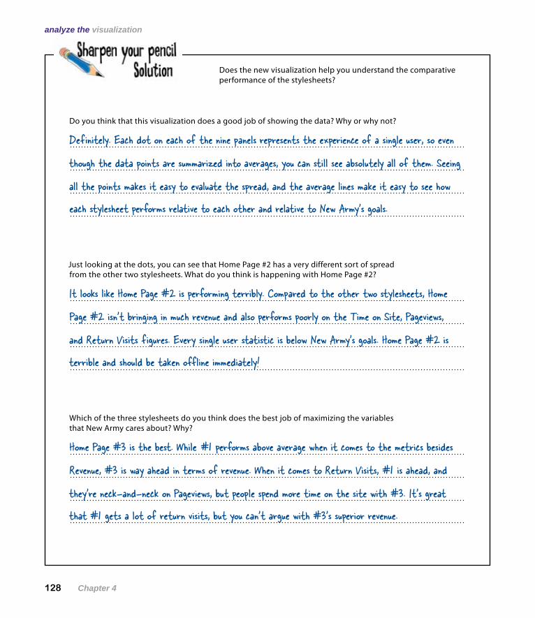
Does the new visualization help you understand the comparative performance of the stylesheets?
Do you think that this visualization does a good job of showing the data? Why or why not?
Definitely. Each dot on each of the nine panels represents the experience of a single user, so even
though the data points are summarized into averages, you can still see absolutely all of them. Seeing
each stylesheet performs relative to each other and relative to New Army’s goals.
all the points makes it easy to evaluate the spread, and the average lines make it easy to see how
Just looking at the dots, you can see that Home Page #2 has a very different sort of spread from the other two stylesheets. What do you think is happening with Home Page #2?
It looks like Home Page #2 is performing terribly. Compared to the other two stylesheets, Home
Page #2 isn’t bringing in much revenue and also performs poorly on the Time on Site, Pageviews,
terrible and should be taken offline immediately!
and Return Visits figures. Every single user statistic is below New Army’s goals. Home Page #2 is
Which of the three stylesheets do you think does the best job of maximizing the variables that New Army cares about? Why?
Home Page #3 is the best. While #1 performs above average when it comes to the metrics besides
Revenue, #3 is way ahead in terms of revenue. When it comes to Return Visits, #1 is ahead, and
that #1 gets a lot of return visits, but you can’t argue with #3’s superior revenue.
they’re neck-and-neck on Pageviews, but people spend more time on the site with #3. It’s great
you are here 4 129
data visualization
Let’s see what the client thinks…
Q: What software tool should I use to create this sort of graphic?
A: Those specific graphs are created in a statistical data analysis program called R, which you’re going to learn all about later in the book. But there are a number of charting tools you can use in statistical programs, and you don’t even have to stop there. You can use illustration programs like Adobe Illustrator and just draw visualizations, if you have visual ideas that other software tools don’t implement.
Q: What about Excel and OpenOffice? They have charting tools, too.
A: Yes, well, that’s true. They have a limited range of charting tools you can use, and you can probably figure out a way to create a chart like this one in your spreadsheet program, but it’s going to be an uphill battle.
Q: You don’t sound too hot on spreadsheet data visualizations.
A: Many serious data analysts who use spreadsheets all the time for basic calculations and lists nevertheless wouldn’t dream of using spreadsheet charting tools. They can be a real pain: not only is there a small range of charts you can create in spreadsheet programs, but often, the programs force you into formatting decisions that you might not otherwise make. It’s not that you can’t make good data graphics in spreadsheet programs; it’s just that there’s more trouble in it than you’d have if you learned how to use a program like R.
Q: So if I’m looking for inspiration on chart types, the spreadsheet menus aren’t the place to look?
A: No, no, no! If you want inspiration on designs, you should probably pick up some books by Edward Tufte, who’s the authority on data visualization by a long shot. His body of work is like a museum of excellent data visualizations, which he sometimes calls “cognitive art.”
Q: What about magazine, newspapers, and journal articles?
A: It’s a good idea to become sensitive to data visualization quality in publications. Some are better than others when it comes to designing illuminating visualizations, and when you pay attention to the publications, over time, you’ll get a sense of which ones do a better job. A good way to start would be to count the variables in a graphic. If there are three or more variables in a chart, the publication is more likely to be making intelligent comparisons than if there’s one variable to a chart.
Q: What should I make of data visualizations that are complex and artistic but not analytically useful?
A: There’s a lot of enthusiasm and creativity nowadays for creating new computer-generated visualizations. Some of them facilitate good analytical thinking about the data, and some of them are just interesting to look at. There’s absolutely nothing wrong with what some call data art. Just don’t call it data analysis unless you can directly use it to achieve a greater understanding of the underlying data.
Q: So something can be visually interesting without being analytically illuminating. What about vice versa?
A: That’s your judgement call. But if you have something at stake in an analysis, and your visualization is illuminating, then it’s hard to imagine that the graphic wouldn’t be visually interesting!
130 Chapter 4
communicate with your client
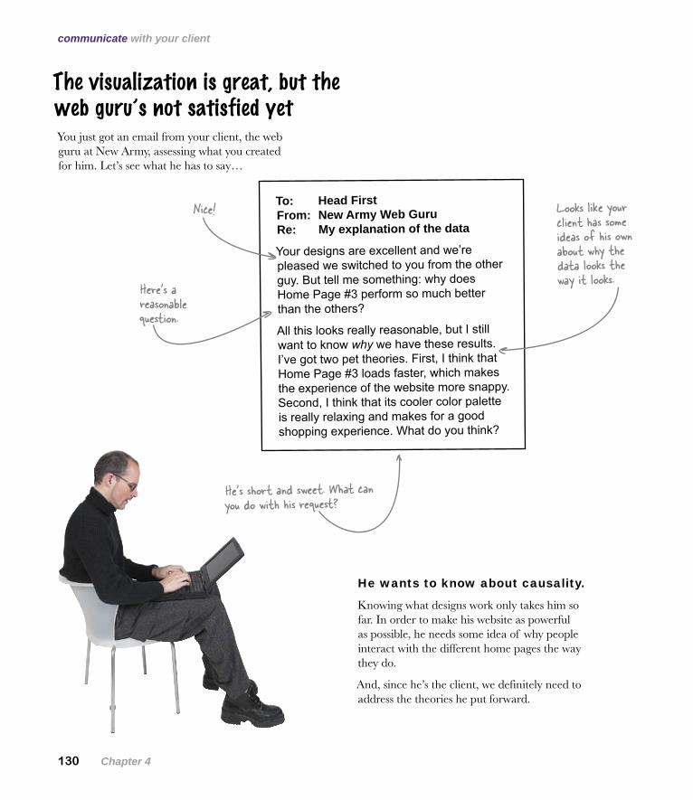
He wants to know about causality.
Knowing what designs work only takes him so far. In order to make his website as powerful as possible, he needs some idea of why people interact with the different home pages the way they do.
And, since he’s the client, we definitely need to address the theories he put forward.
The visualization is great, but the web guru’s not satisfied yet
To: Head First From: New Army Web Guru Re: My explanation of the data
Your designs are excellent and we’re pleased we switched to you from the other guy. But tell me something: why does Home Page #3 perform so much better than the others?
All this looks really reasonable, but I still want to know why we have these results. I’ve got two pet theories. First, I think that Home Page #3 loads faster, which makes the experience of the website more snappy. Second, I think that its cooler color palette is really relaxing and makes for a good shopping experience. What do you think?
Looks like your client has some ideas of his own about why the data looks the way it looks.Here’s a
reasonable question.
Nice!
You just got an email from your client, the web guru at New Army, assessing what you created for him. Let’s see what he has to say…
He’s short and sweet. What can you do with his request?
you are here 4 131
data visualization
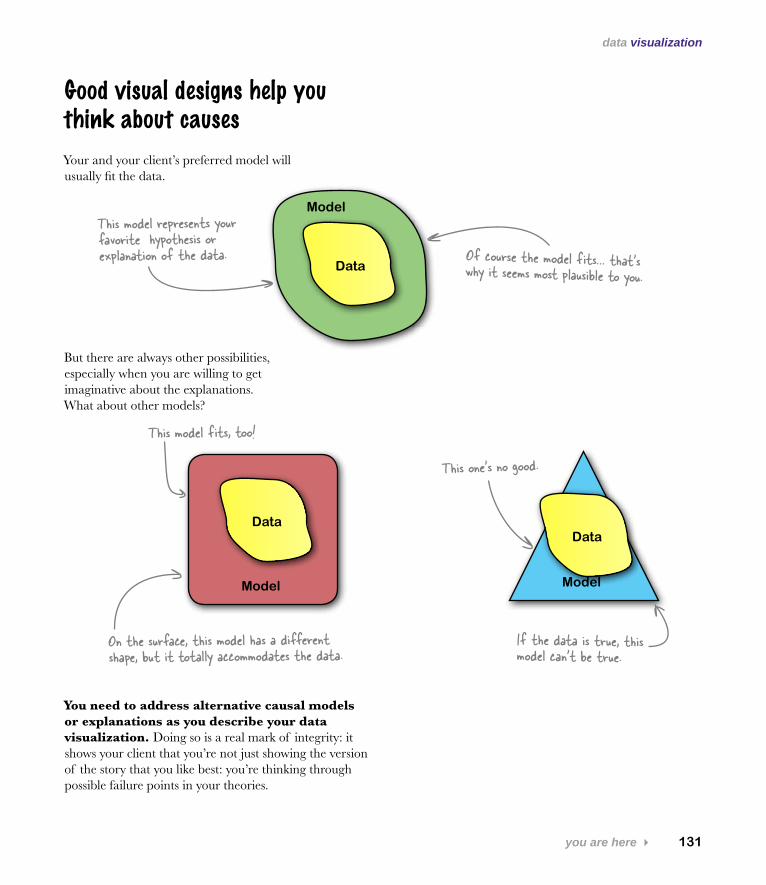
Model
Your and your client’s preferred model will usually fit the data.
But there are always other possibilities, especially when you are willing to get imaginative about the explanations. What about other models?
You need to address alternative causal models or explanations as you describe your data visualization. Doing so is a real mark of integrity: it shows your client that you’re not just showing the version of the story that you like best: you’re thinking through possible failure points in your theories.
Data
Model
Data
This one’s no good.
Model
Data
This model fits, too!
This model represents your favorite hypothesis or explanation of the data. Of course the model fits… that’s why it seems most plausible to you.
On the surface, this model has a different shape, but it totally accommodates the data.
If the data is true, this model can’t be true.
Good visual designs help you think about causes
132 Chapter 4
the boss’s hypotheses
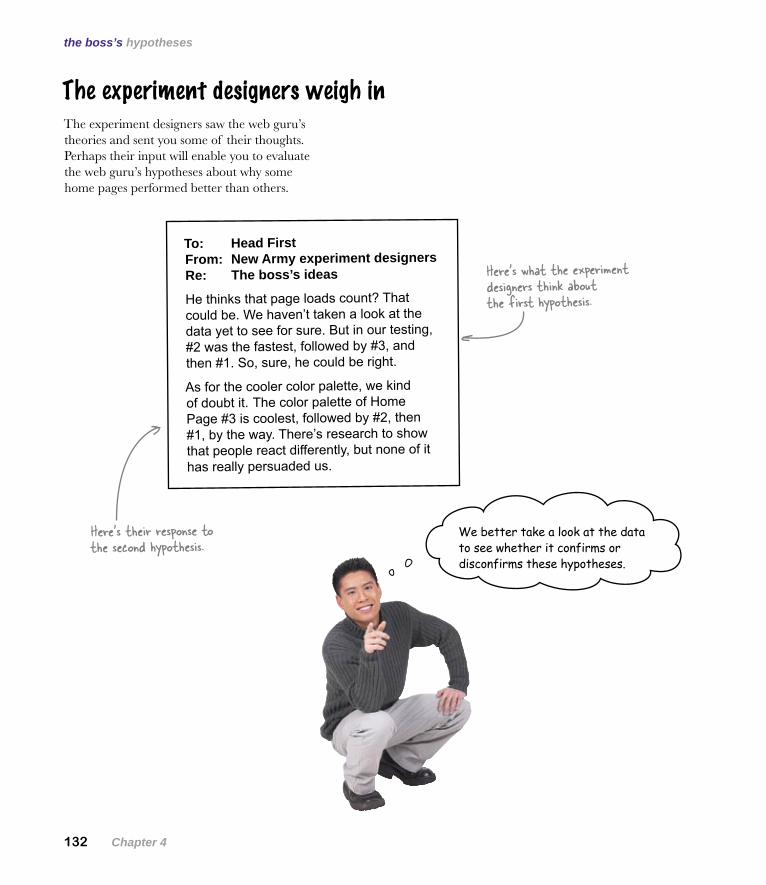
To: Head First From: New Army experiment designers Re: The boss’s ideas
He thinks that page loads count? That could be. We haven’t taken a look at the data yet to see for sure. But in our testing, #2 was the fastest, followed by #3, and then #1. So, sure, he could be right.
As for the cooler color palette, we kind of doubt it. The color palette of Home Page #3 is coolest, followed by #2, then #1, by the way. There’s research to show that people react differently, but none of it has really persuaded us.
The experiment designers weigh in
We better take a look at the data to see whether it confirms or disconfirms these hypotheses.
The experiment designers saw the web guru’s theories and sent you some of their thoughts. Perhaps their input will enable you to evaluate the web guru’s hypotheses about why some home pages performed better than others.
Here’s what the experiment designers think about the first hypothesis.
Here’s their response to the second hypothesis.
you are here 4 133
data visualization
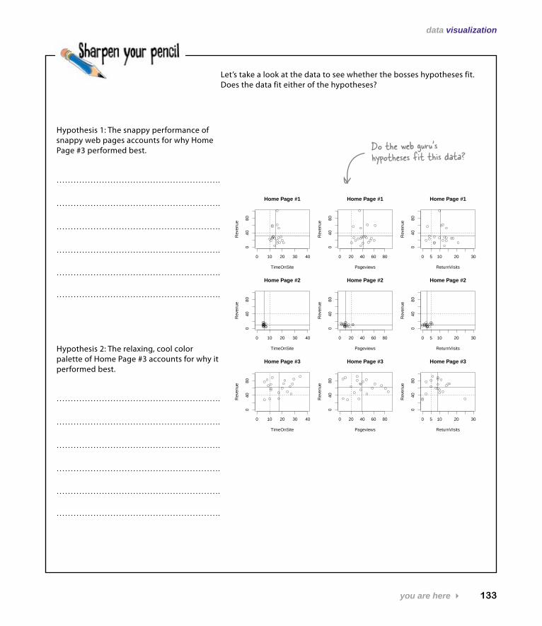
Let’s take a look at the data to see whether the bosses hypotheses fit. Does the data fit either of the hypotheses?
0 10 20 30 40
040
80
Home Page #1
TimeOnSite
Rev
enue
0 20 40 60 80
040
80
Home Page #1
Pageviews
Rev
enue
0 5 10 20 30
040
80
Home Page #1
ReturnVisits
Rev
enue
0 10 20 30 40
040
80
Home Page #2
TimeOnSite
Rev
enue
0 20 40 60 80
040
80
Home Page #2
Pageviews
Rev
enue
0 5 10 20 30
040
80
Home Page #2
ReturnVisits
Rev
enue
0 10 20 30 40
040
80
Home Page #3
TimeOnSite
Rev
enue
0 20 40 60 80
040
80
Home Page #3
Pageviews
Rev
enue
0 5 10 20 300
4080
Home Page #3
ReturnVisits
Rev
enue
Hypothesis 1: The snappy performance of snappy web pages accounts for why Home Page #3 performed best.
Hypothesis 2: The relaxing, cool color palette of Home Page #3 accounts for why it performed best.
Do the web guru’s hypotheses fit this data?
134 Chapter 4
fitting hypotheses
0 10 20 30 40
040
80
Home Page #1
TimeOnSite
Rev
enue
0 20 40 60 80
040
80
Home Page #1
Pageviews
Rev
enue
0 5 10 20 30
040
80
Home Page #1
ReturnVisits
Rev
enue
0 10 20 30 40
040
80
Home Page #2
TimeOnSite
Rev
enue
0 20 40 60 800
4080
Home Page #2
Pageviews
Rev
enue
0 5 10 20 30
040
80
Home Page #2
ReturnVisits
Rev
enue
0 10 20 30 40
040
80
Home Page #3
TimeOnSite
Rev
enue
0 20 40 60 80
040
80
Home Page #3
Pageviews
Rev
enue
0 5 10 20 300
4080
Home Page #3
ReturnVisits
Rev
enue
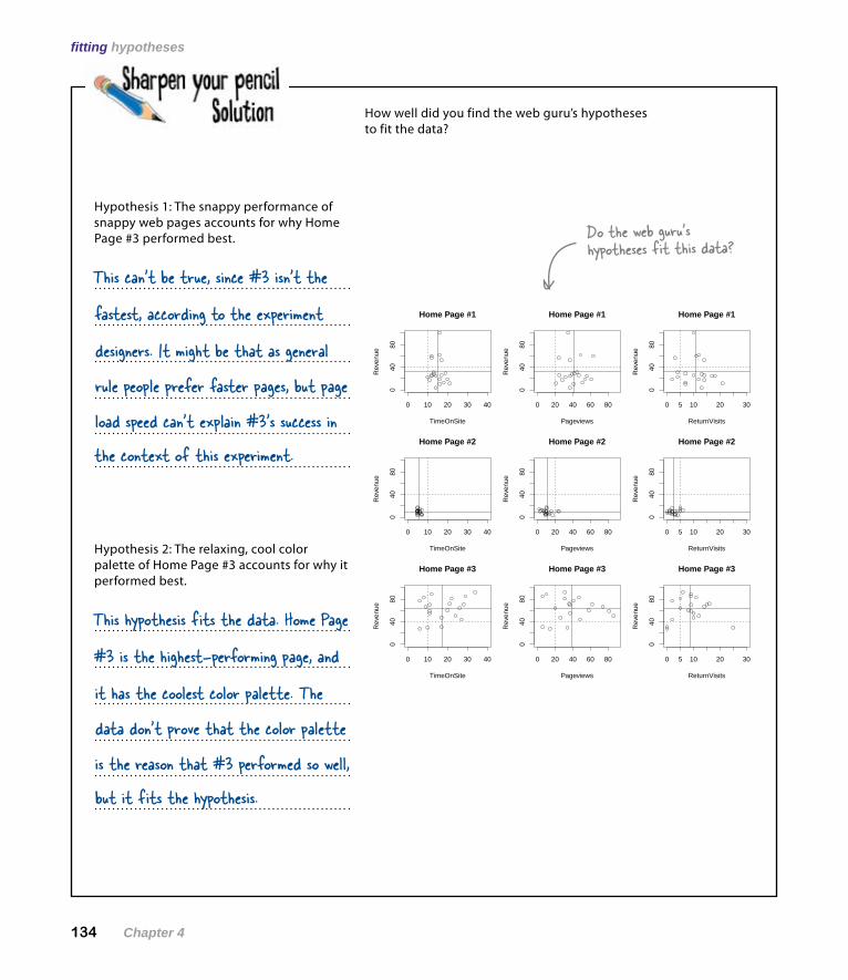
Hypothesis 1: The snappy performance of snappy web pages accounts for why Home Page #3 performed best.
This can’t be true, since #3 isn’t the
fastest, according to the experiment
rule people prefer faster pages, but page
designers. It might be that as general
load speed can’t explain #3’s success in the context of this experiment.
Hypothesis 2: The relaxing, cool color palette of Home Page #3 accounts for why it performed best.
This hypothesis fits the data. Home Page
#3 is the highest-performing page, and
data don’t prove that the color palette
it has the coolest color palette. The
is the reason that #3 performed so well, but it fits the hypothesis.
Do the web guru’s hypotheses fit this data?
How well did you find the web guru’s hypotheses to fit the data?
you are here 4 135
data visualization
To: Head First From: New Army experiment designers Re: We don’t know why Home Page #3 is stronger
We’re delighted to hear that #3 is the best, but we really don’t know why. Who knows what people are thinking? But that is actually OK: as long as we’re showing improvement on the business fundamentals, we don’t need to understand people in a deep way. Still, it’s interesting to learn as much as we can.
The stylesheets are really different from each other in many ways. So when it comes to isolating individual features that might account for the performance differential, it’s hard. In the future, we’d like to take Home Page #3 and test a bunch of subtle permutations. That way, we might learn things like how button shape or font choice affect user behavior.
But we conjecture that there are two factors. First, Home Page #3 is really readable. We use fonts and a layout that are easy on the eyes. Second, the page hierarchy is flatter. You can find pretty much everything in three clicks, when for Home Page #1 it takes you more like seven clicks to find what you want. Both could be affecting our revenue, but we need more testing to say for sure.
Here’s what the experiment designers want to do next.
The experiment designers have some hypotheses of their own
They’ve had an opportunity to take a look at your scatterplots and sent you some of their own thinking about what’s going on. These people are data junkies, and their hypotheses definitely fit.
On the basis of what you’ve learned, what would you recommend to your client that he do regarding his web strategy?
Maybe it’s fonts and layout.
Maybe it’s hierarchy of the pages.
136 Chapter 4
happy client
The client is pleased with your work
Very cool. I agree with your assessments of the hypotheses and your recommendation. I’m implementing Home Page #3 for our website. Job well done.
What would you tell your client to do with his website on the bases of the data you visualized and the explanatory theories you evaluated?
Stick with Home Page #3 and test for finer-grained elements of the user’s experience, like variable
navigation, style, and content. There are a bunch of different possible explanations for #3’s
performance that should be investigated and visualized, but it’s clear that #3 is the victor here.
You created an excellent visualization that enabled New Army to quickly and simultaneously assess all the variables they tested in their experiment.
And you evaluated that visualization in light of a bunch of different hypotheses, giving them some excellent ideas about what to test for in the future.
you are here 4 137
data visualization
Orders are coming in from everywhere!Because of the new website, traffic is greater than ever. Your visualization of the experimental results showed what they needed to know to spruce up their website.
Even better, New Army has embarked on a continuous program of experimentation to fine-tune their new design, using your visualization to see what works. Nice job!
New Army’s optimized website is really paying off.
New Army sent you these shirts as a thank-you.
Hope they fit!