an introduction to data visualization
TRANSCRIPT
Laboratorio di Metaprogetto 2015-2016
An introduction to Data Visualization
Milano 19.11.2015 / Scuola del Design

1. Why2. How3. Resources

1. Why
Lab. di Metaprogetto 2015-2016 / An introduction to Data Visualization / 4
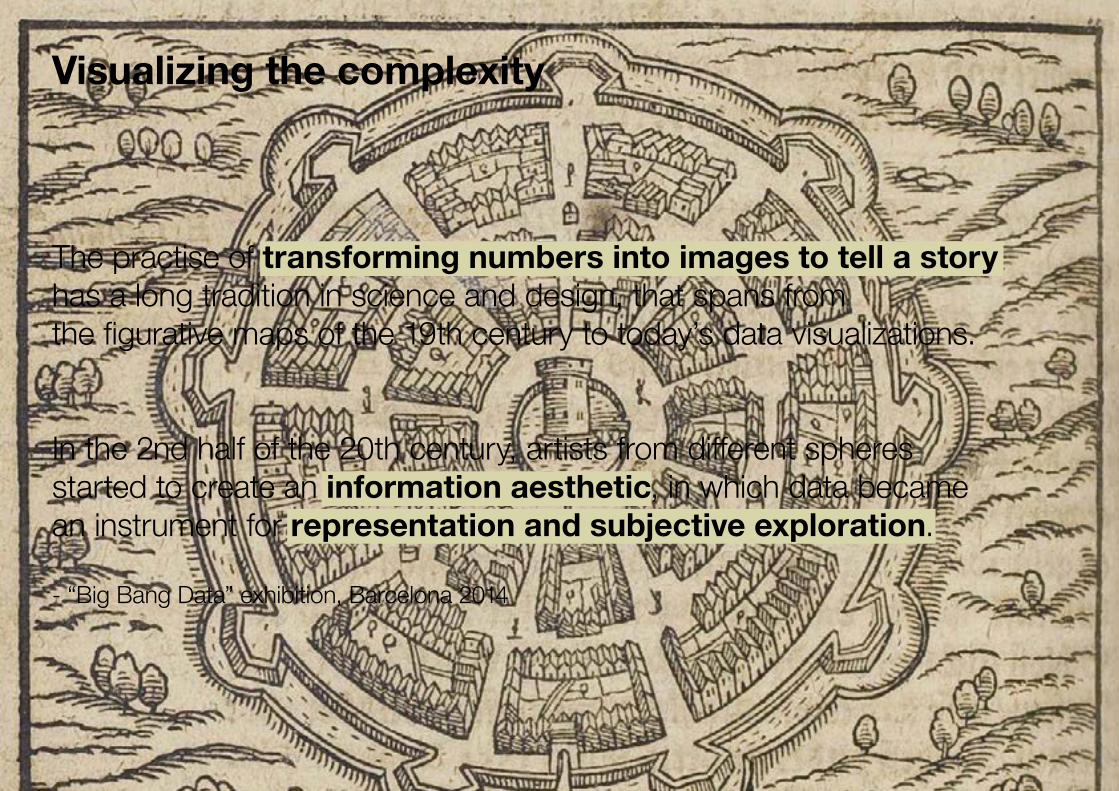
Visualizing the complexity
The practise of transforming numbers into images to tell a story has a long tradition in science and design, that spans from the figurative maps of the 19th century to today’s data visualizations.
In the 2nd half of the 20th century, artists from different spheres started to create an information aesthetic, in which data became an instrument for representation and subjective exploration.
- “Big Bang Data” exhibition, Barcelona 2014
Lab. di Metaprogetto 2015-2016 / An introduction to Data Visualization / 5
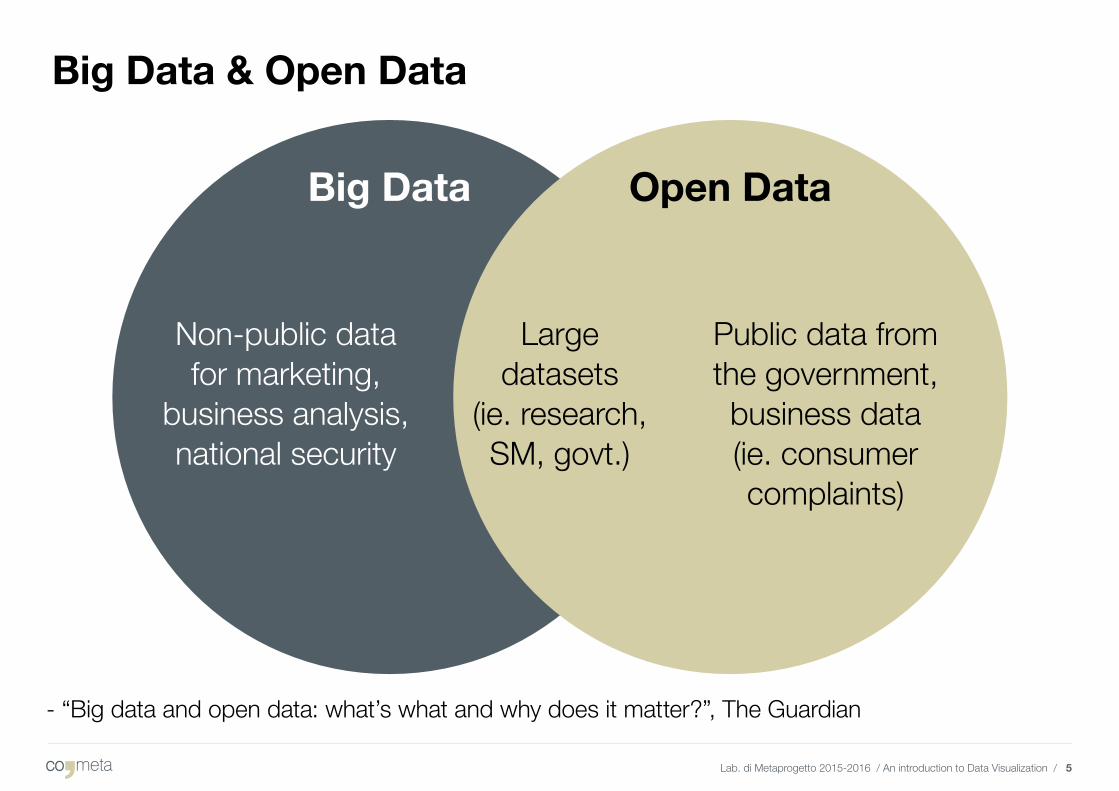
Big Data & Open Data
Big Data
Non-public datafor marketing,
business analysis, national security
Public data from the government, business data(ie. consumer complaints)
Largedatasets
(ie. research, SM, govt.)
Open Data
- “Big data and open data: what’s what and why does it matter?”, The Guardian
Lab. di Metaprogetto 2015-2016 / An introduction to Data Visualization / 6
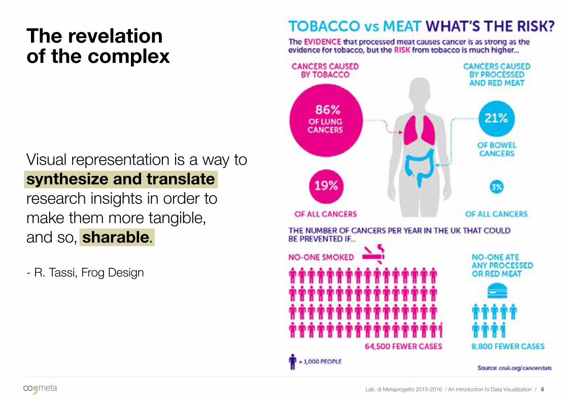
The revelation of the complex
Visual representation is a way to synthesize and translate research insights in order to make them more tangible, and so, sharable.
- R. Tassi, Frog Design
Lab. di Metaprogetto 2015-2016 / An introduction to Data Visualization / 7
Principles
Substance + Statistics + Design,Clarity + Precision + Efficiency.- E. R. Tufte
Lab. di Metaprogetto 2015-2016 / An introduction to Data Visualization / 8
Aesthetics VS Exactitude
To my mind exactitude means three things above all:
1. A well-defined and well-calculated plan for the work in question;2. An evocation of clear, incisive, memorable images;3. A language as precise as possible both in choice of words and
in expression of the subtleties of thought and imagination.
- Italo Calvino, “Six Memos for the Next Millenium”

2. How
Lab. di Metaprogetto 2015-2016 / An introduction to Data Visualization / 10
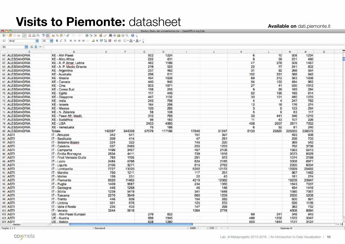
Visits to Piemonte: datasheet Available on dati.piemonte.it
Lab. di Metaprogetto 2015-2016 / An introduction to Data Visualization / 11
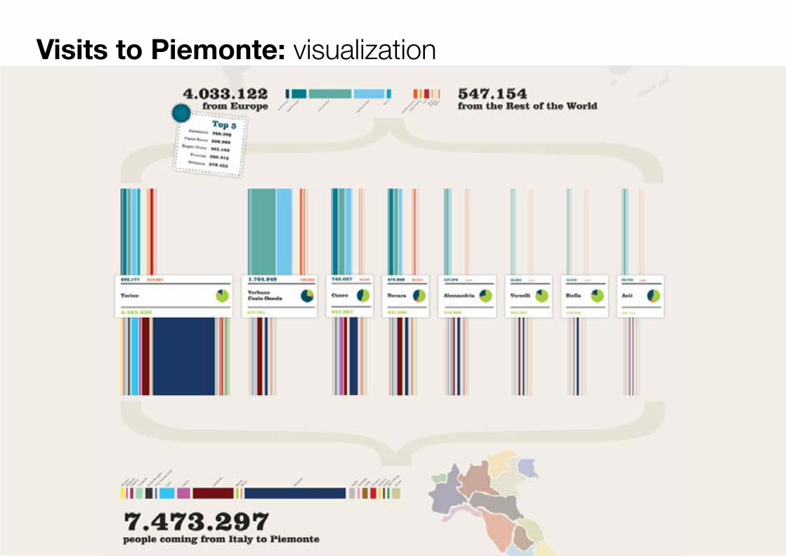
Visits to Piemonte: visualization
Lab. di Metaprogetto 2015-2016 / An introduction to Data Visualization / 12
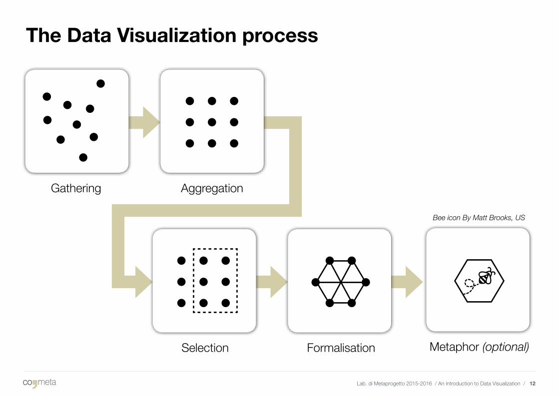
The Data Visualization process
Gathering Aggregation
Selection Formalisation Metaphor (optional)
Bee icon By Matt Brooks, US
Lab. di Metaprogetto 2015-2016 / An introduction to Data Visualization / 13
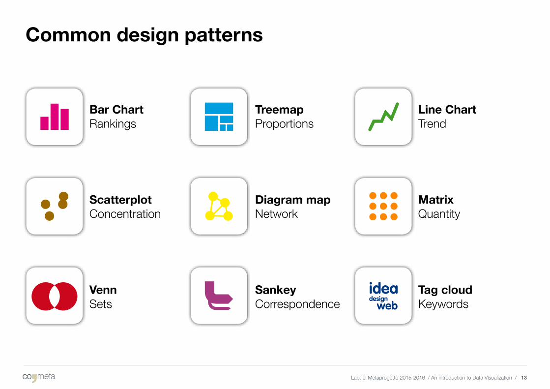
Common design patterns
Bar ChartRankings
ScatterplotConcentration
VennSets
TreemapProportions
Diagram mapNetwork
SankeyCorrespondence
Line ChartTrend
MatrixQuantity
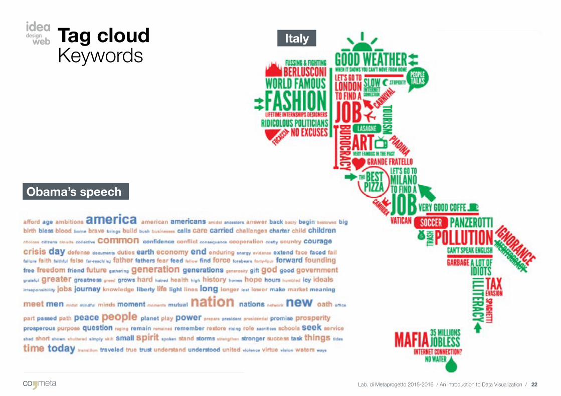
Tag cloudKeywords
Lab. di Metaprogetto 2015-2016 / An introduction to Data Visualization / 14
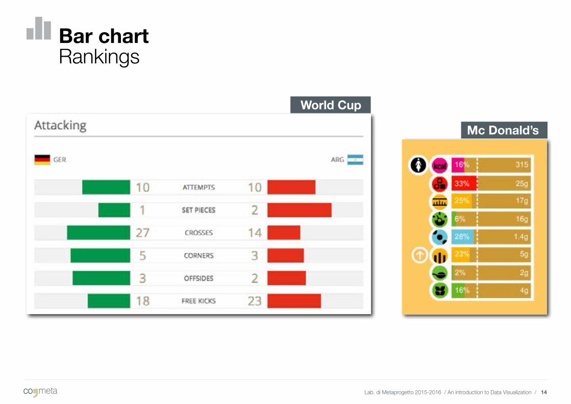
Bar chart Rankings
Mc Donald’s
World Cup
Lab. di Metaprogetto 2015-2016 / An introduction to Data Visualization / 15
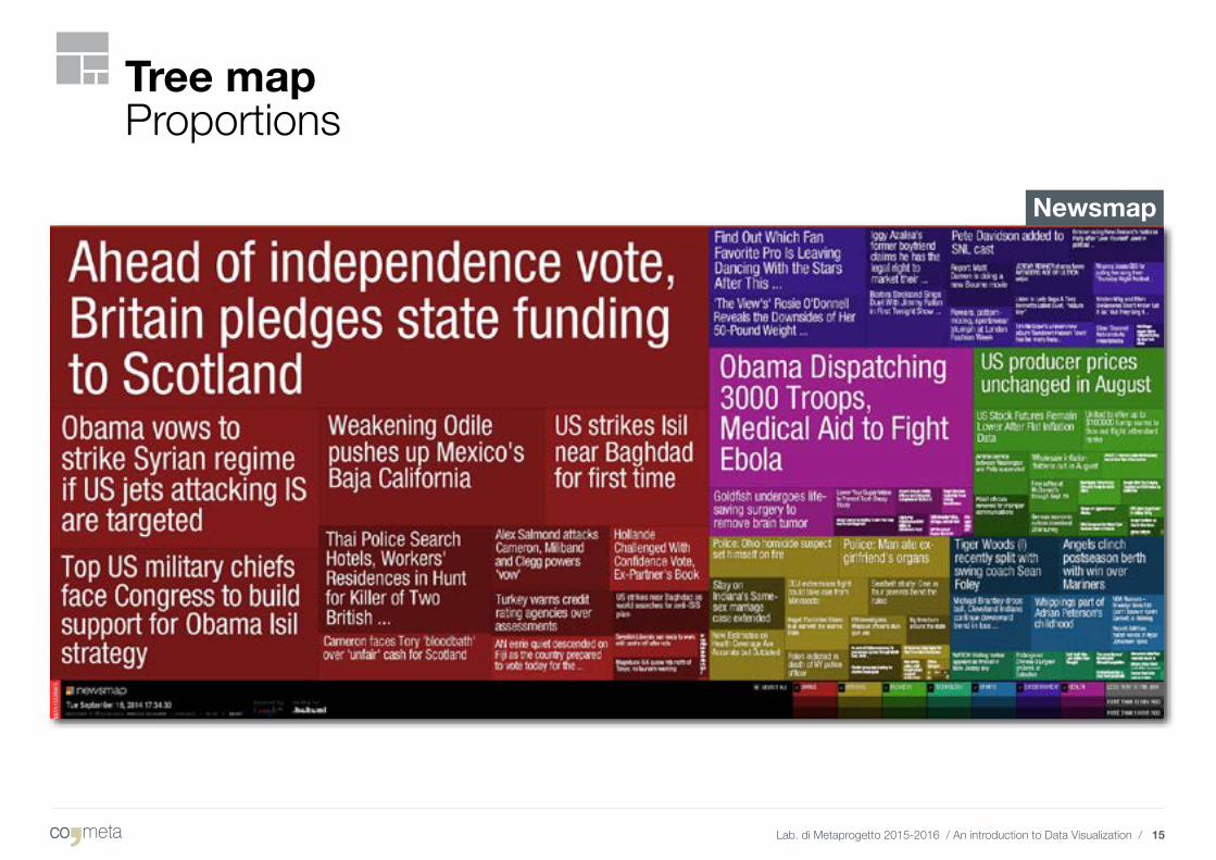
Newsmap
Tree mapProportions
Lab. di Metaprogetto 2015-2016 / An introduction to Data Visualization / 16
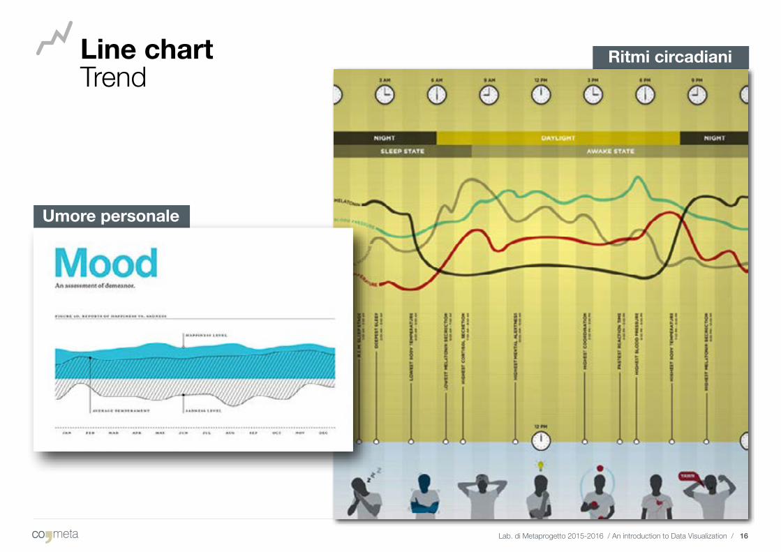
Line chart Trend
Ritmi circadiani
Umore personale
Lab. di Metaprogetto 2015-2016 / An introduction to Data Visualization / 17
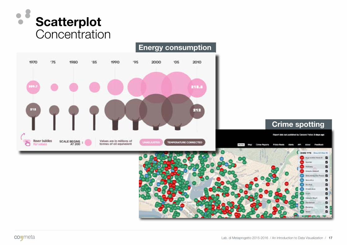
Scatterplot Concentration
Crime spotting
Energy consumption
Lab. di Metaprogetto 2015-2016 / An introduction to Data Visualization / 18
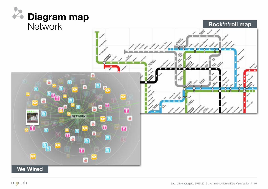
Diagram map Network Rock’n’roll map
We Wired
Lab. di Metaprogetto 2015-2016 / An introduction to Data Visualization / 19
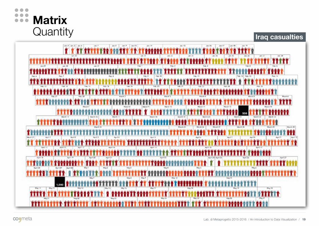
MatrixQuantity Iraq casualties
Lab. di Metaprogetto 2015-2016 / An introduction to Data Visualization / 20
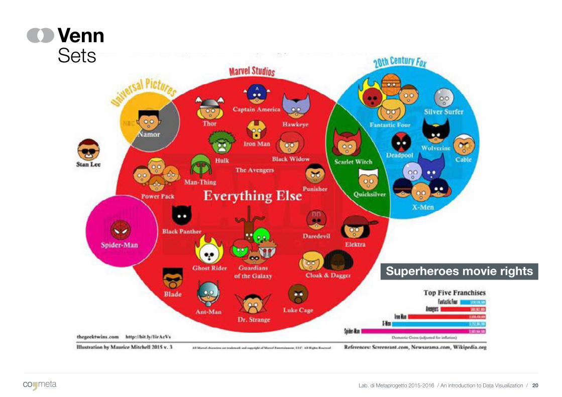
Venn Sets
Superheroes movie rights
Lab. di Metaprogetto 2015-2016 / An introduction to Data Visualization / 21
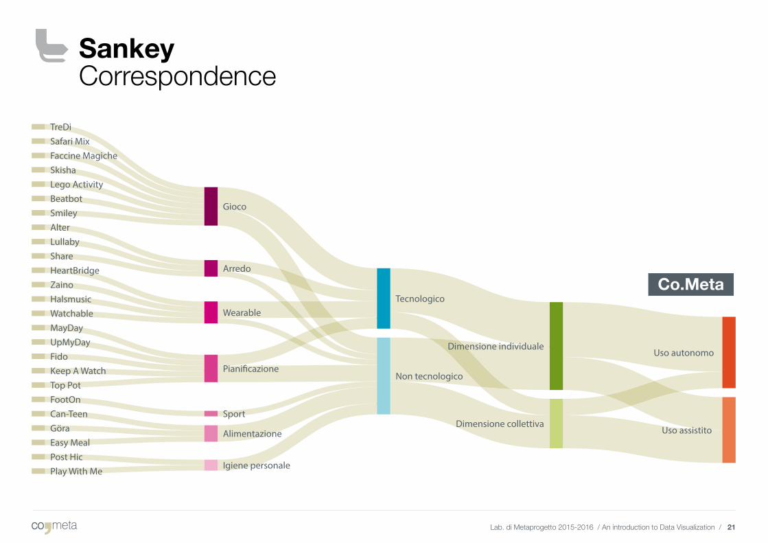
Sankey Correspondence
Co.Meta
Lab. di Metaprogetto 2015-2016 / An introduction to Data Visualization / 22
Tag cloudKeywords
Italy
Obama’s speech
Lab. di Metaprogetto 2015-2016 / An introduction to Data Visualization / 23
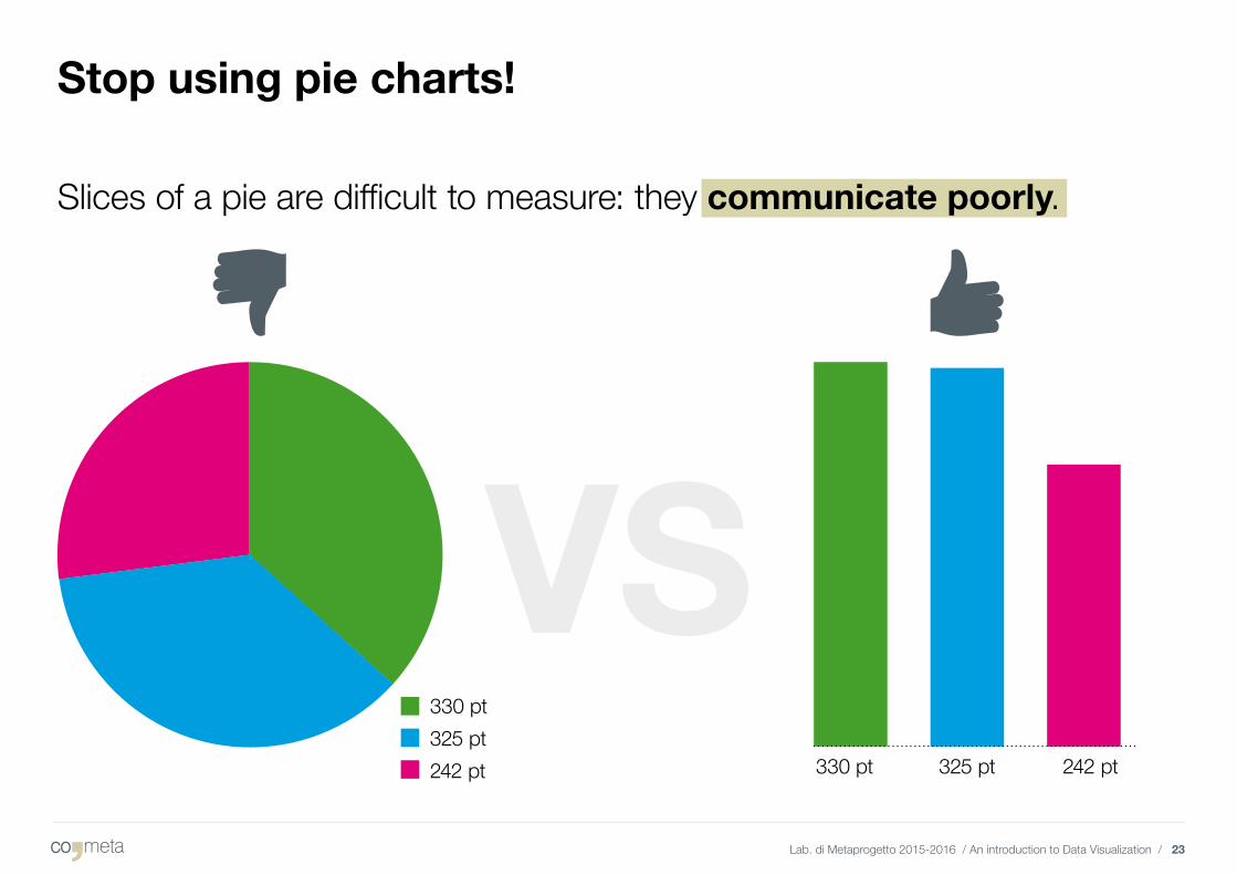
Stop using pie charts!
330 pt 325 pt 242 pt
Slices of a pie are difficult to measure: they communicate poorly.
330 pt325 pt242 pt
Lab. di Metaprogetto 2015-2016 / An introduction to Data Visualization / 24
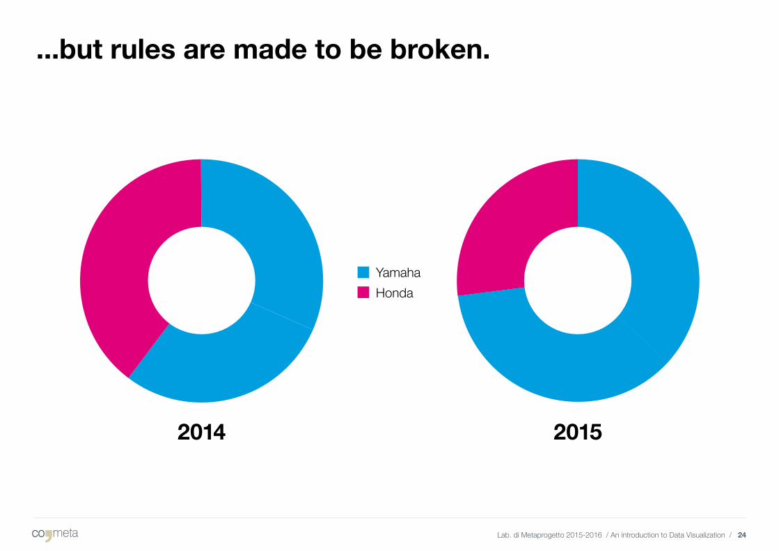
...but rules are made to be broken.
20152014
YamahaHonda

3. Resources
Lab. di Metaprogetto 2015-2016 / An introduction to Data Visualization / 26
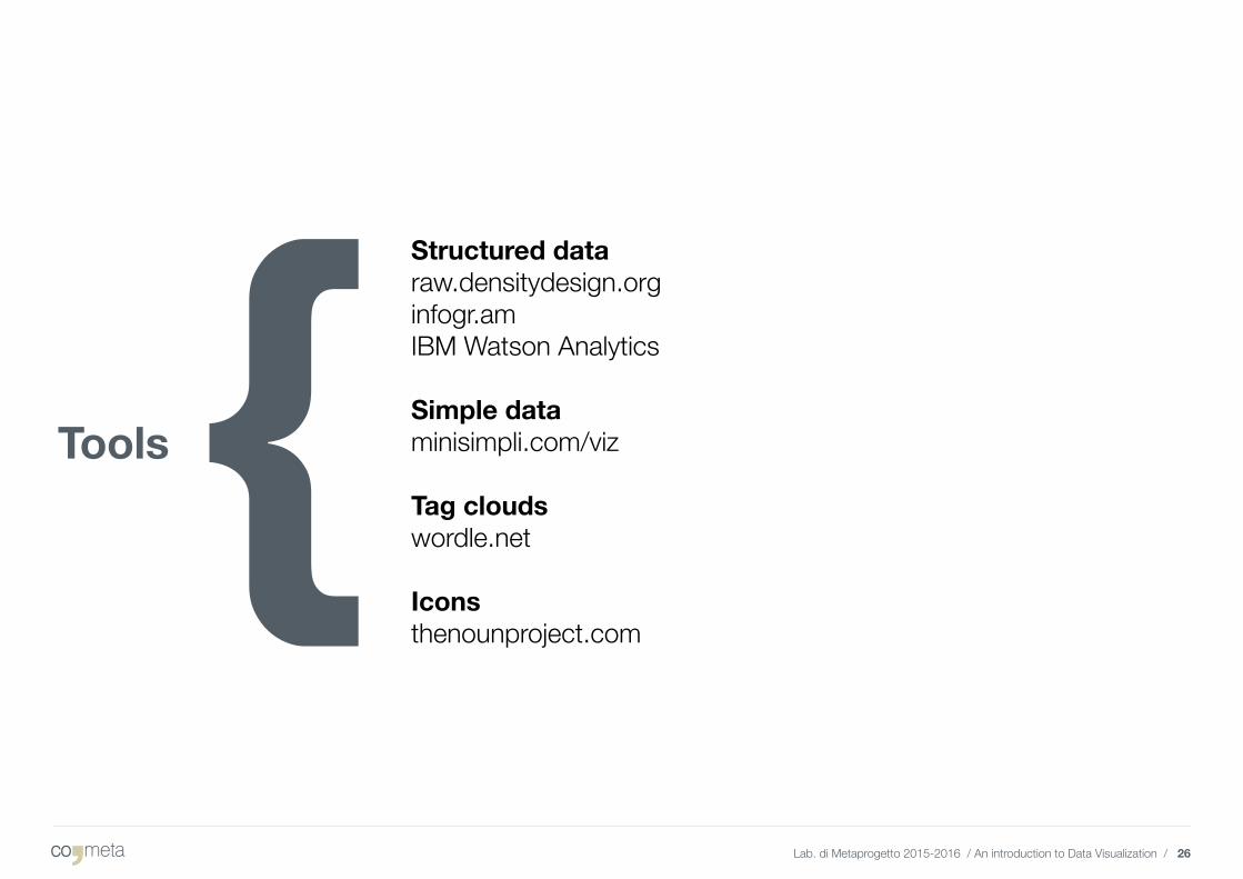
Tools
Structured dataraw.densitydesign.orginfogr.amIBM Watson Analytics
Simple dataminisimpli.com/viz
Tag cloudswordle.net
Iconsthenounproject.com
Lab. di Metaprogetto 2015-2016 / An introduction to Data Visualization / 27
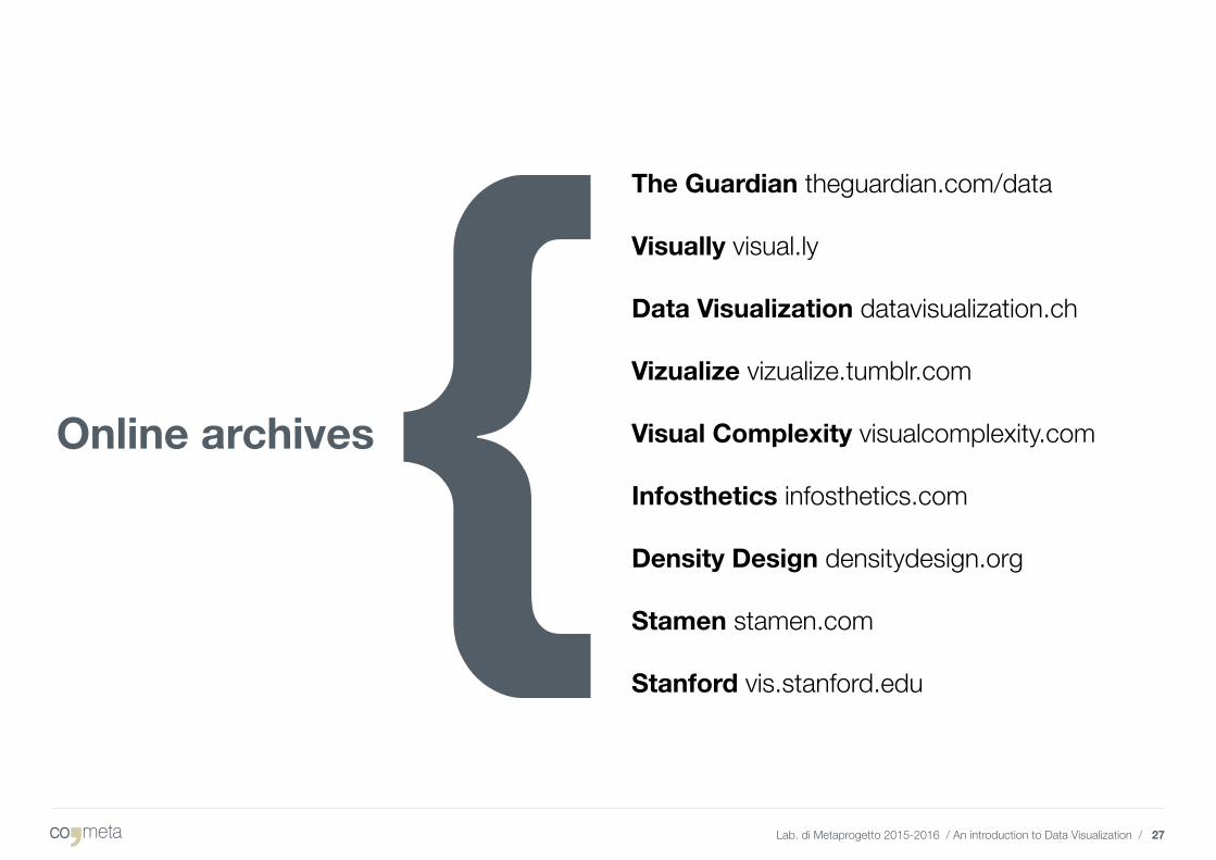
Online archives
The Guardian theguardian.com/data
Visually visual.ly
Data Visualization datavisualization.ch
Vizualize vizualize.tumblr.com
Visual Complexity visualcomplexity.com
Infosthetics infosthetics.com
Density Design densitydesign.org
Stamen stamen.com
Stanford vis.stanford.edu
Lab. di Metaprogetto 2015-2016 / An introduction to Data Visualization / 28
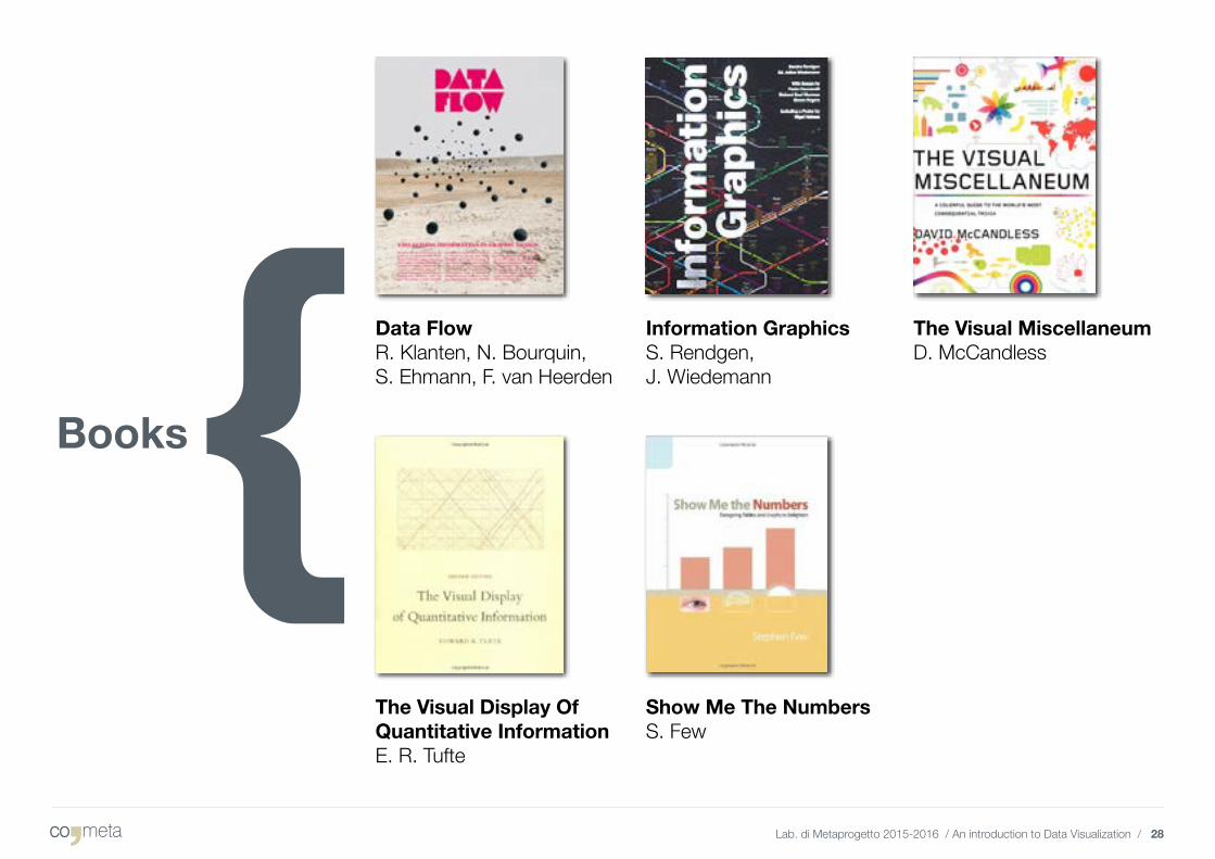
The Visual Miscellaneum D. McCandless
Data Flow R. Klanten, N. Bourquin, S. Ehmann, F. van Heerden
The Visual Display OfQuantitative InformationE. R. Tufte
Information GraphicsS. Rendgen,J. Wiedemann
Show Me The NumbersS. Few
Books
