introduction to data visualization part 2:...
TRANSCRIPT
Introduction to Data
Visualization Part 2: Tools
Reed Jones
Hosted by ALCTS, Association for Library Collections and Technical Services

Overview
7 different tools
Explain criteria used for testing
Pros and Cons
Discussion of best application of each tool
Questions

Criteria for selection
I picked a few options that best fit my criteria for successful usage.
My criteria for testing tools:
Create a simple analysis comparing employee and avg cost per completion of digitizing an
object
Filter the results based on various dimensions
Split the analysis into different pages
Share the results easily

Excel
Excel and Data go hand in hand
Spreadsheets and so much more

Why you should use it
Integrates with data from almost anywhere
Familiar setting for most users
Calculations in excel are powerful
Huge community to help you when you are stuck

Possible downsides
Difficult to master
Not easy to publish dynamic charts online

Did it pass my test
Yes

Tableau
This is what the software was built to do.
Clever touches help you at every step.
Why you should use it
Easier to learn
Tons of support resources
Constant updates continue to increase functionality
Easy to publish results online
Blend data from multiple sources

Possible downsides
Cost prohibitive ($70 per user per month)
Tradeoff: functionality vs. ease of use
Sometimes its easier to go back to the data and manipulate it before bringing to tableau

Did it pass my test
Yes
What it beat to make the list: Microsoft Power BI
Google Sheets / Google Data Studio
Google seems to have a solution to everything
Surprisingly useful for a free tool

Why you should use it
Logical design layout and familiar
No cost for you to try it
Easy to get visuals working
Can create most visuals you will need

Possible downsides
Beta
Could go away (Google has a history)
Does not connect to most data sources directly

Did it pass my test
Yes,…......... but it was weird

Datawrapper
The quick solution to your data visualization problems
A tool built by journalists to meet deadlines
The copy and paste master

Why you should use it
Quickest option to create simple visualizations
No cost to try (though free access is limited to 10,000 chart views per month)

Possible downsides
Does not scale
Limited functionality
Not a dynamic solution (but still interactive)

Did it pass my test
No... but it has some nice options that make it worth trying.
What it beat to make the list: Raw

Highcharts
Something a little different from the rest
Data plus JavaScript equals dynamic web visuals

Why you should use it
Free to use for individuals, schools, and non-profits
Highcharts cloud makes creating charts simple and quick
No view limit
Live data update functionality

Possible downsides
Highcharts cloud is very limited
Need to know JavaScript to get the most out of the product
But available documentation is good

Did it pass my test
No,…. but it offers a free solution for most simple visualizations (highcharts cloud)
Can be a workaround for publishing excel visuals
What it beat to make the list: D3js

Honorable Mention: Alma Analytics
If you have it why not use it?
A nice compliment for generated reports
Allows for user interaction
Can be exported to PDF, Excel, or Powerpoint (limitations apply)
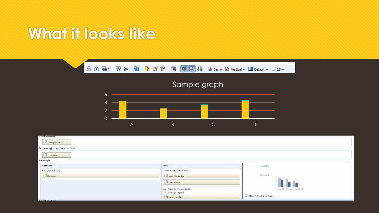
What it looks like
0
2
4
6
A B C D
Sample graph


Conclusion
Best all around: Tableau and Excel
Best free option: Highcharts or Google Data Studio
Best for use in a pinch: Datawrapper

Questions