tufts data lab introduction to data visualization techniques · introduction to data visualization...
TRANSCRIPT

Tufts Data Lab
1
Introduction to Data Visualization Techniques Using Microsoft Excel 2016
Edited by Carolyn Talmadge Jonathan Gale, Revised by Kyle Monahan on April 18, 2017
INTRODUCTION ................................................................................................................................................................................. 1
CHOOSING THE MOST APPROPRIATE TYPE OF CHART OR GRAPH FOR DATA VISUALIZATION ........................................................... 1
I. SUMMARY TABLES ............................................................................................................................................................................. 2
II. BAR CHARTS ...................................................................................................................................................................................... 3
BAR GRAPHS FOR CATEGORICAL DATA ........................................................................................................................................ 3
BAR GRAPHS FOR LONGITUDINAL DATA ...................................................................................................................................... 4
STAKED BAR CHARTS VS CLUSTERED BAR CHARTS ....................................................................................................................... 4
III. PIE CHARTS ...................................................................................................................................................................................... 6
IV. HISTOGRAMS ................................................................................................................................................................................... 7
HOW TO MAKE A HISTOGRAM CHART IN EXCEL .......................................................................................................................... 7
V. LINE GRAPHS .................................................................................................................................................................................... 8
WHEN TO USE A LINE GRAPH ....................................................................................................................................................... 8
VI. SCATTER PLOTS ............................................................................................................................................................................... 9
WHEN TO USE A SCATTER PLOT ................................................................................................................................................... 9
TYPES OF CORRELATION ............................................................................................................................................................... 9
WHEN TO USE A TREND LINE OR REGRESSION LINE ................................................................................................................... 10
HOW TO ADD A TREND LINE TO DATA IN EXCEL ........................................................................................................................ 10
EXCEL EXERCISE……………………………………………………………………………………………………………………………………………………………………………. 11
HOW TO CREATE A GRAPH/CHART IN EXCEL ................................................................................................................................... 12
HOW TO EXPORT A GRAPH/CHART CREATED IN EXCEL ................................................................................................................... 14
RESOURCES ..................................................................................................................................................................................... 14
Introduction This exercise provides an overview of basic best practices for tabular data visualization techniques using Microsoft Excel
2016. It covers determining the best type of data visualization for one’s data and how to create and format
charts/graphs in Microsoft Excel.

Tufts Data Lab
2
Choosing the Most Appropriate Type of Chart or Graph for Data Visualization The first step to visualizing data in graphical form is to determine what type of visualization technique works best for the
data. This tutorial presents several types of graphs and charts for data visualization.
Read through the following descriptions to determine which type of graph or chart is most appropriate, and to discover
best practice tips for each type of visualization.
I. Summary Tables Summary tables display data in simple, digestible ways. When data are presented as a summary table, specific values
can be emphasized with different techniques. Both raw and processed data may be displayed in a summary table,
depending upon the application and emphasis. A summary table should help inform the intended audience about the
related work.
Figure 1 depicts a summary table of the 4 major household cooking fuel sources in each of the districts of Phnom Penh
province as recorded by the 2008 Cambodian census1. This particular summary table highlights the most used cooking
fuel source in each district. The use of a summary table allows the viewer to assess data and to note significant values or
relationships. In Figure 1, the summary table quickly shows the prominent use of firewood in Dangkao District
compared to the other districts of Phnom Penh. This table also highlights the overall usage of liquid natural gas as the
primary cooking fuel source in the entire province.
Main Cooking Fuel Source, Phnom Penh Districts, 20081
District Firewood Charcoal Liq. Natural Gas Electricity Chamkar Mon 1558 5615 25408 602
Doun Penh 803 4400 17458 480
Prampir Meakkakra 502 3103 14361 255
Tuol Kouk 1713 6570 23012 730
Dangkao 18790 6971 10045 325
Mean Chey 8428 14448 27167 721
Ruessei Kaev 7979 9724 14113 519
Saensokh 5355 7090 9905 362
Total 45128 57921 141469 3994
Figure 1: This summary table lists Cambodian households’ main source of cooking fuel for the districts contained within
Phnom Penh province in 2008.
II. Bar Charts Bar charts use a horizontal (X) axis and a vertical (Y) axis to plot categorical data or longitudinal data. Bar charts
compare or rank variables by grouping data by bars. The lengths of the bars are proportional to the values the group
represents. Bar charts can be plotted vertically or horizontally. In the vertical column chart below, the categories being
compared are on the horizontal axis, and on the horizontal bar chart below, the categories being compared are on the
vertical axis.
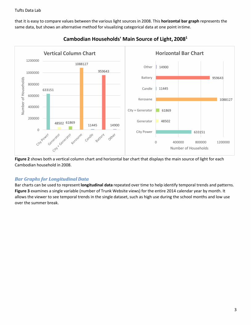
Bar Graphs for Categorical Data Bar charts are useful for ranking categorical data by examining how two or more values or groups compare to each
other in relative magnitude, at a given point in time.
Figure 2 shows both a vertical column chart and horizontal bar chart representing the same data. The vertical column
chart measures the categorical data (household light source) at one point in time and “ranks” the categorical data so
Tufts Data Lab
3
that it is easy to compare values between the various light sources in 2008. This horizontal bar graph represents the
same data, but shows an alternative method for visualizing categorical data at one point in time.
Cambodian Households' Main Source of Light, 20081
Figure 2 shows both a vertical column chart and horizontal bar chart that displays the main source of light for each
Cambodian household in 2008.
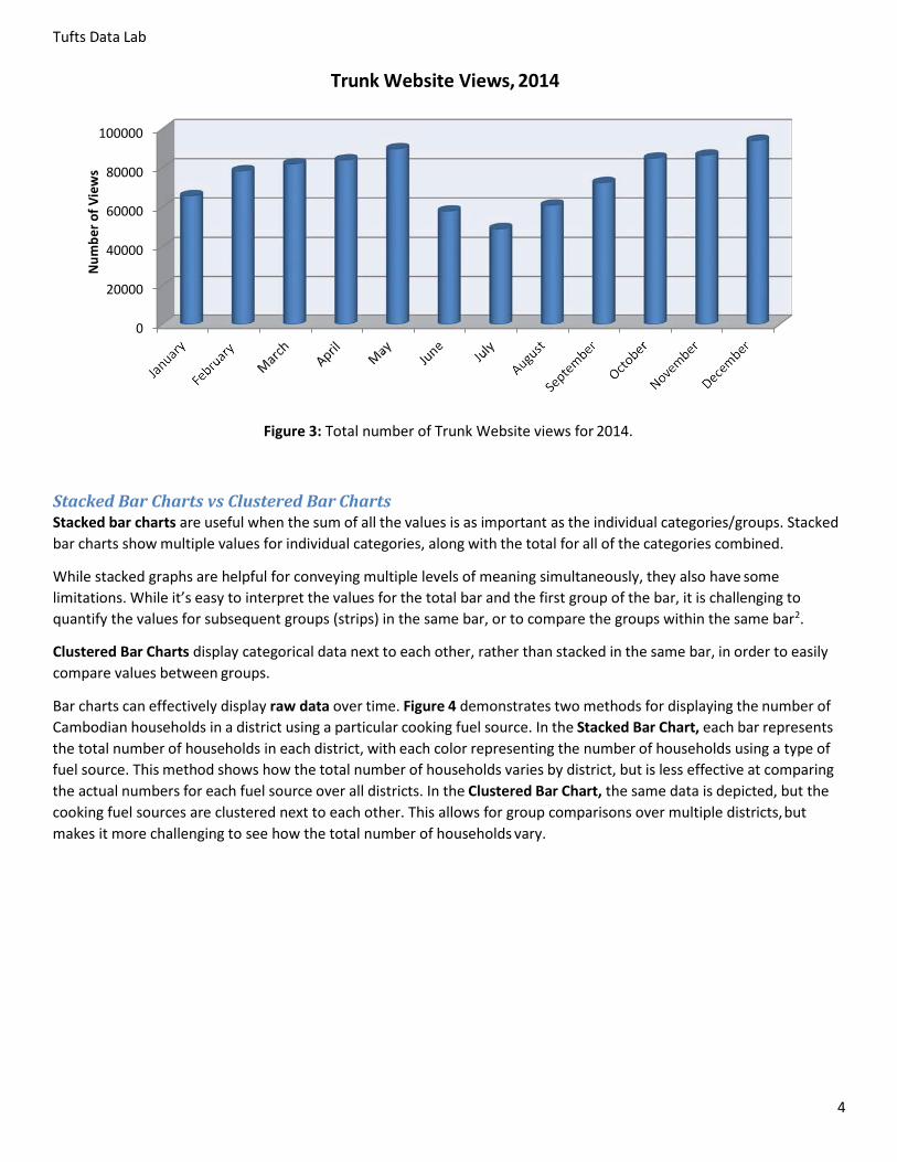
Bar Graphs for Longitudinal Data Bar charts can be used to represent longitudinal data repeated over time to help identify temporal trends and patterns.
Figure 3 examines a single variable (number of Trunk Website views) for the entire 2014 calendar year by month. It
allows the viewer to see temporal trends in the single dataset, such as high use during the school months and low use
over the summer break.
Vertical Column Chart
Horizontal Bar Chart
O
a
Candl
o n
Ci + n a o
n a o
Ci o
Nu
mb
er o
f H
ou
seh
old
s
Tufts Data Lab
4
Trunk Website Views, 2014
100000
80000
60000
40000
20000
0
Figure 3: Total number of Trunk Website views for 2014.
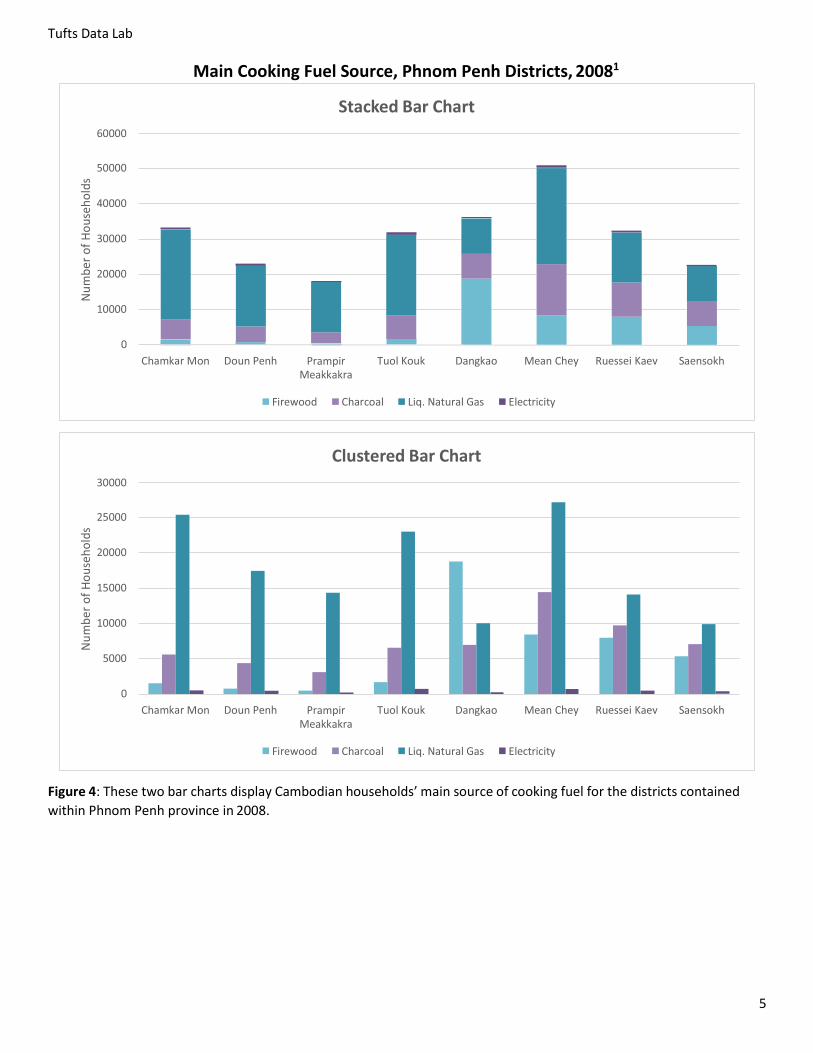
Stacked Bar Charts vs Clustered Bar Charts Stacked bar charts are useful when the sum of all the values is as important as the individual categories/groups. Stacked
bar charts show multiple values for individual categories, along with the total for all of the categories combined.
While stacked graphs are helpful for conveying multiple levels of meaning simultaneously, they also have some
limitations. While it’s easy to interpret the values for the total bar and the first group of the bar, it is challenging to
quantify the values for subsequent groups (strips) in the same bar, or to compare the groups within the same bar2.
Clustered Bar Charts display categorical data next to each other, rather than stacked in the same bar, in order to easily
compare values between groups.
Bar charts can effectively display raw data over time. Figure 4 demonstrates two methods for displaying the number of
Cambodian households in a district using a particular cooking fuel source. In the Stacked Bar Chart, each bar represents
the total number of households in each district, with each color representing the number of households using a type of
fuel source. This method shows how the total number of households varies by district, but is less effective at comparing
the actual numbers for each fuel source over all districts. In the Clustered Bar Chart, the same data is depicted, but the
cooking fuel sources are clustered next to each other. This allows for group comparisons over multiple districts, but
makes it more challenging to see how the total number of households vary.
Nu
mb
er o
f V
iew
s
Tufts Data Lab
5
Main Cooking Fuel Source, Phnom Penh Districts, 20081
Figure 4: These two bar charts display Cambodian households’ main source of cooking fuel for the districts contained
within Phnom Penh province in 2008.
Stacked Bar Chart
Ch Mon Doun nh ampi a a
Tuol ou Dan ao M n C Ru s i a Sa nso h
Fi ood Ch oal Liq. a ural as El i i
Clustered Bar Chart
Ch Mon Doun nh ampi a a
Tuol ou Dan ao M n C Ru s i a Sa nso h
Fi ood Ch oal Liq. a ural as El i i
Nu
mb
er o
f H
ou
seh
old
s N
um
ber
of
Ho
use
ho
lds
Tufts Data Lab
6
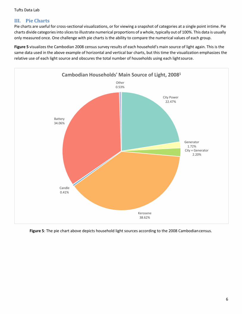
III. Pie Charts Pie charts are useful for cross-sectional visualizations, or for viewing a snapshot of categories at a single point in time. Pie
charts divide categories into slices to illustrate numerical proportions of a whole, typically out of 100%. This data is usually
only measured once. One challenge with pie charts is the ability to compare the numerical values of each group.
Figure 5 visualizes the Cambodian 2008 census survey results of each household’s main source of light again. This is the
same data used in the above example of horizontal and vertical bar charts, but this time the visualization emphasizes the
relative use of each light source and obscures the total number of households using each light source.
Figure 5: The pie chart above depicts household light sources according to the 2008 Cambodian census.
Cambodian Households' Main Source of Light, 2008
O0.
Ci o
22.
a34.
n a o
1. Ci + n a o
2.
Candl0.
o n38.
7
Gr de D tr
Tufts Data Lab
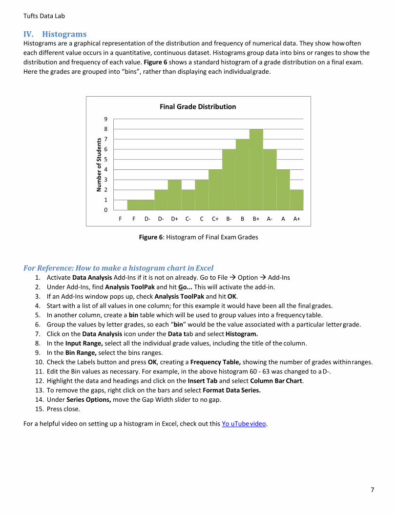
IV. Histograms Histograms are a graphical representation of the distribution and frequency of numerical data. They show how often
each different value occurs in a quantitative, continuous dataset. Histograms group data into bins or ranges to show the
distribution and frequency of each value. Figure 6 shows a standard histogram of a grade distribution on a final exam.
Here the grades are grouped into “bins”, rather than displaying each individual grade.
Figure 6: Histogram of Final Exam Grades
For Reference: How to make a histogram chart in Excel 1. Activate Data Analysis Add-Ins if it is not on already. Go to File Option Add-Ins
2. Under Add-Ins, find Analysis ToolPak and hit Go... This will activate the add-in.
3. If an Add-Ins window pops up, check Analysis ToolPak and hit OK.
4. Start with a list of all values in one column; for this example it would have been all the final grades.
5. In another column, create a bin table which will be used to group values into a frequency table.
6. Group the values by letter grades, so each “bin” would be the value associated with a particular letter grade.
7. Click on the Data Analysis icon under the Data tab and select Histogram.
8. In the Input Range, select all the individual grade values, including the title of the column.
9. In the Bin Range, select the bins ranges.
10. Check the Labels button and press OK, creating a Frequency Table, showing the number of grades within ranges.
11. Edit the Bin values as necessary. For example, in the above histogram 60 - 63 was changed to a D-.
12. Highlight the data and headings and click on the Insert Tab and select Column Bar Chart.
13. To remove the gaps, right click on the bars and select Format Data Series.
14. Under Series Options, move the Gap Width slider to no gap.
15. Press close.
For a helpful video on setting up a histogram in Excel, check out this Yo uTube video.
Nu
mb
er o
f St
ud
en
ts
8
Tufts Data Lab
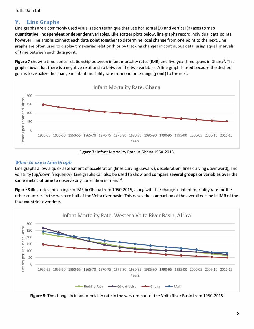
V. Line Graphs Line graphs are a commonly used visualization technique that use horizontal (X) and vertical (Y) axes to map
quantitative, independent or dependent variables. Like scatter plots below, line graphs record individual data points;
however, line graphs connect each data point together to determine local change from one point to the next. Line
graphs are often used to display time-series relationships by tracking changes in continuous data, using equal intervals
of time between each data point.
Figure 7 shows a time-series relationship between infant mortality rates (IMR) and five-year time spans in Ghana3. This
graph shows that there is a negative relationship between the two variables. A line graph is used because the desired
goal is to visualize the change in infant mortality rate from one time range (point) to the next.
Figure 7: Infant Mortality Rate in Ghana 1950-2015.
When to use a Line Graph Line graphs allow a quick assessment of acceleration (lines curving upward), deceleration (lines curving downward), and
volatility (up/down frequency). Line graphs can also be used to show and compare several groups or variables over the
same metric of time to observe any correlation in trends4.
Figure 8 illustrates the change in IMR in Ghana from 1950-2015, along with the change in infant mortality rate for the
other countries in the western half of the Volta river basin. This eases the comparison of the overall decline in IMR of the
four countries over time.
Figure 8: The change in infant mortality rate in the western part of the Volta River Basin from 1950-2015.
Infant Mortality Rate, Ghana
Infant Mortality Rate, Western Volta River Basin, Africa
ur ina Faso Côt d oi hana li
Dea
ths
per
Th
ou
san
d B
irth
s D
eath
s p
er T
ho
usa
nd
Bir
ths
9
Tufts Data Lab
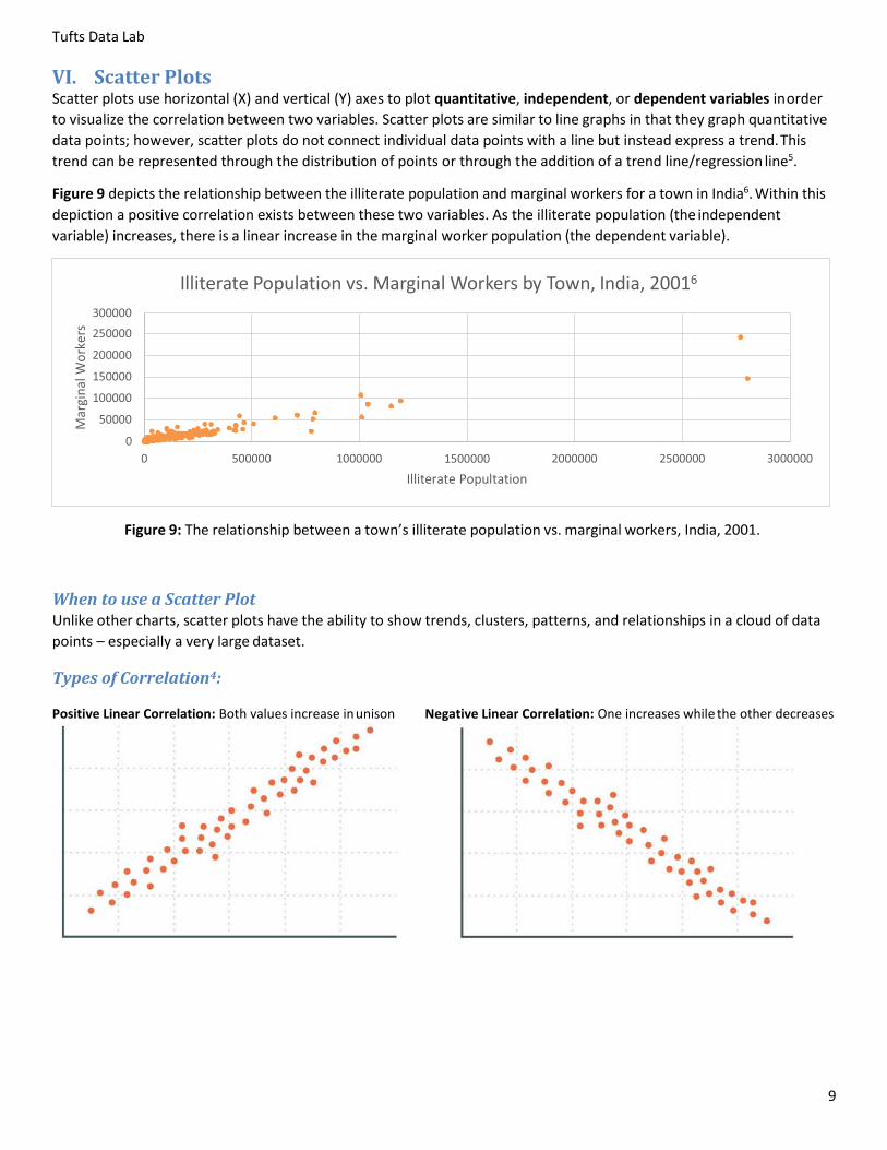
VI. Scatter Plots Scatter plots use horizontal (X) and vertical (Y) axes to plot quantitative, independent, or dependent variables in order
to visualize the correlation between two variables. Scatter plots are similar to line graphs in that they graph quantitative
data points; however, scatter plots do not connect individual data points with a line but instead express a trend. This
trend can be represented through the distribution of points or through the addition of a trend line/regression line5.
Figure 9 depicts the relationship between the illiterate population and marginal workers for a town in India6. Within this
depiction a positive correlation exists between these two variables. As the illiterate population (the independent
variable) increases, there is a linear increase in the marginal worker population (the dependent variable).
Figure 9: The relationship between a town’s illiterate population vs. marginal workers, India, 2001.
When to use a Scatter Plot Unlike other charts, scatter plots have the ability to show trends, clusters, patterns, and relationships in a cloud of data
points – especially a very large dataset.
Types of Correlation4:
Positive Linear Correlation: Both values increase in unison Negative Linear Correlation: One increases while the other decreases
Illiterate Population vs. Marginal Workers by Town, India, 2001
Mar
gin
al W
ork
ers
Tufts Data Lab
10
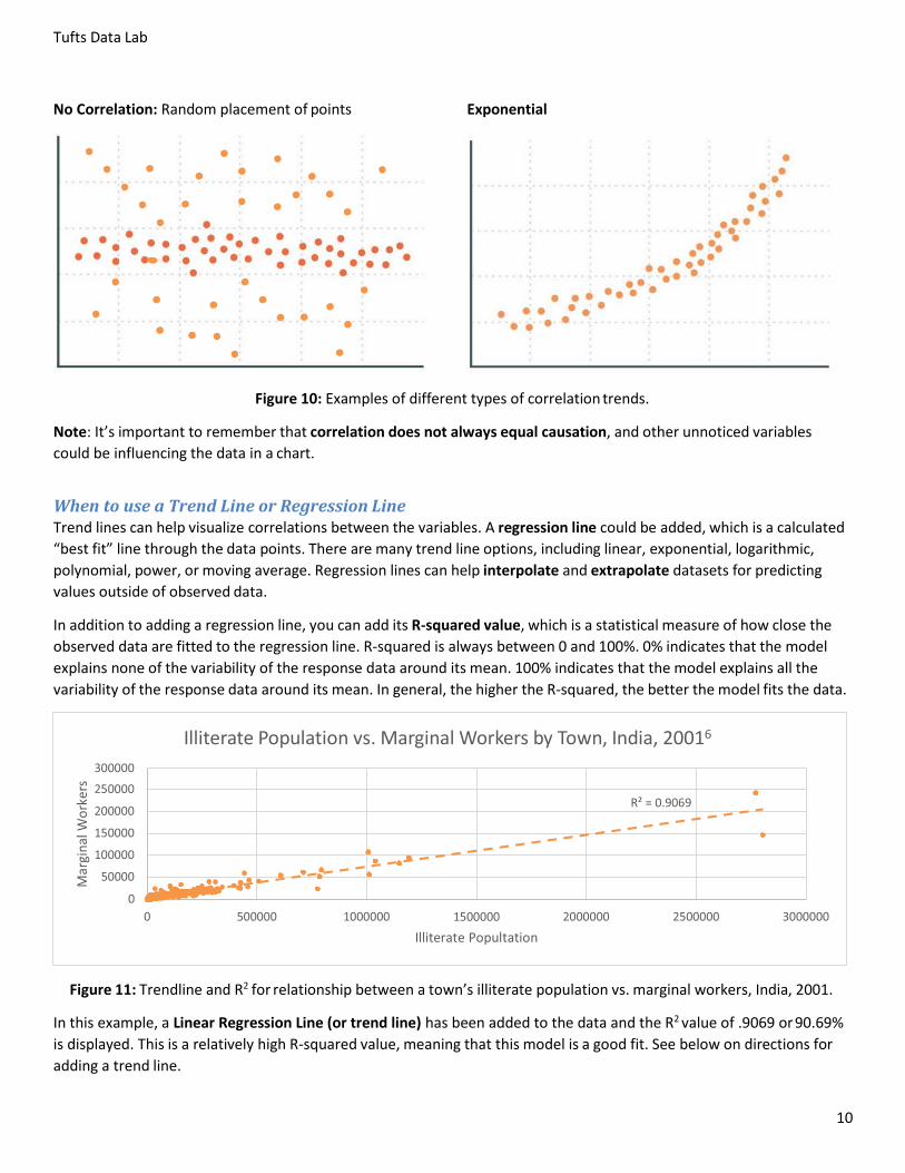
No Correlation: Random placement of points Exponential
Figure 10: Examples of different types of correlation trends.
Note: It’s important to remember that correlation does not always equal causation, and other unnoticed variables
could be influencing the data in a chart.
When to use a Trend Line or Regression Line Trend lines can help visualize correlations between the variables. A regression line could be added, which is a calculated
“best fit” line through the data points. There are many trend line options, including linear, exponential, logarithmic,
polynomial, power, or moving average. Regression lines can help interpolate and extrapolate datasets for predicting
values outside of observed data.
In addition to adding a regression line, you can add its R-squared value, which is a statistical measure of how close the
observed data are fitted to the regression line. R-squared is always between 0 and 100%. 0% indicates that the model
explains none of the variability of the response data around its mean. 100% indicates that the model explains all the
variability of the response data around its mean. In general, the higher the R-squared, the better the model fits the data.
Figure 11: Trendline and R2 for relationship between a town’s illiterate population vs. marginal workers, India, 2001.
In this example, a Linear Regression Line (or trend line) has been added to the data and the R2 value of .9069 or 90.69%
is displayed. This is a relatively high R-squared value, meaning that this model is a good fit. See below on directions for
adding a trend line.
Illiterate Population vs. Marginal Workers by Town, India, 2001
= 0.
Mar
gin
al W
ork
ers

Tufts Data Lab
11
How to add a trend line to data in Excel: 1. Left click on the data points in the chart to select them then right click Select Add Trendline…
2. Under Trendline Options, select the most appropriate trend/regression type.
3. To show the R-squared value, check the last box to “Display R-squared value on Chart”.
Excel Exercise Exercise data is located S:\Tutorials & Tip Sheets\Tufts\Tutorial Data\Introduction to Data Visualization\
In Windows Explorer, copy the exercise data titled DataVisualization_ExcelExerciseInClass.xlsx to your H: drive and
open the file.
To create the following charts and graphs using the instructions provided within the How to Create a Graph/Chart in
Excel section above. Be sure to include appropriate titles, legends, axis labels, etc. Note how to export your chart or
graph into MS Word, PowerPoint, Publisher, ArcGIS, or Adobe InDesign.
1. Using the “Cambodia (Light)” sheet, create a vertical bar chart of the main sources of household light in
Cambodia (similar to page 3).
2. Using the “Phnom Penh (Cooking Fuel)” sheet, create a stacked bar chart of each district’s main sources of
cooking fuel (similar to page 5). Hint: Highlight the Districts and the fuel sources used (not TOTAL), and
click on column charts ( ) > More column charts > Select Stacked Column > Select the stacked column
which summarizes by fuel type.
3. Once again using the “Cambodia (Light)” sheet, create a pie chart of the main sources of household light in
Cambodia using the data on the percentage of households (similar to page 6).
4. Using the “Volta Basin (Infant Mortality)” sheet, create a line graph of the infant mortality rate in these West
African countries (similar to page 8).
5. Using the “India Towns” sheet, create a scatter plot of the relationship between illiterate population and
marginal workers for Indian towns. Add in a trend line and see the example and instructions on page 10.
Note: The graphs of 1-5 can be checked by looking at the examples in this tutorial at the pages provided.
Tufts Data Lab
12
How to Create a Graph/Chart in Excel 1. Open to the sheet containing the data.
2. Organize the data so each variable is in a separate column. Highlight the data that will be included in the graph.
3. On the top menu bar, select Insert Charts select the desired type of graph.
4. A graph will be inserted into the current Sheet in Excel.
5. To put the chart in its own sheet, press the Move Chart icon (or right click on the chart and press Move Chart
) and select New Sheet.
6. Enter a name for the New Sheet and press OK.
How to Style a Graph/Chart in Excel It is important to include all necessary elements of a chart, so the reader is able to understand the data.
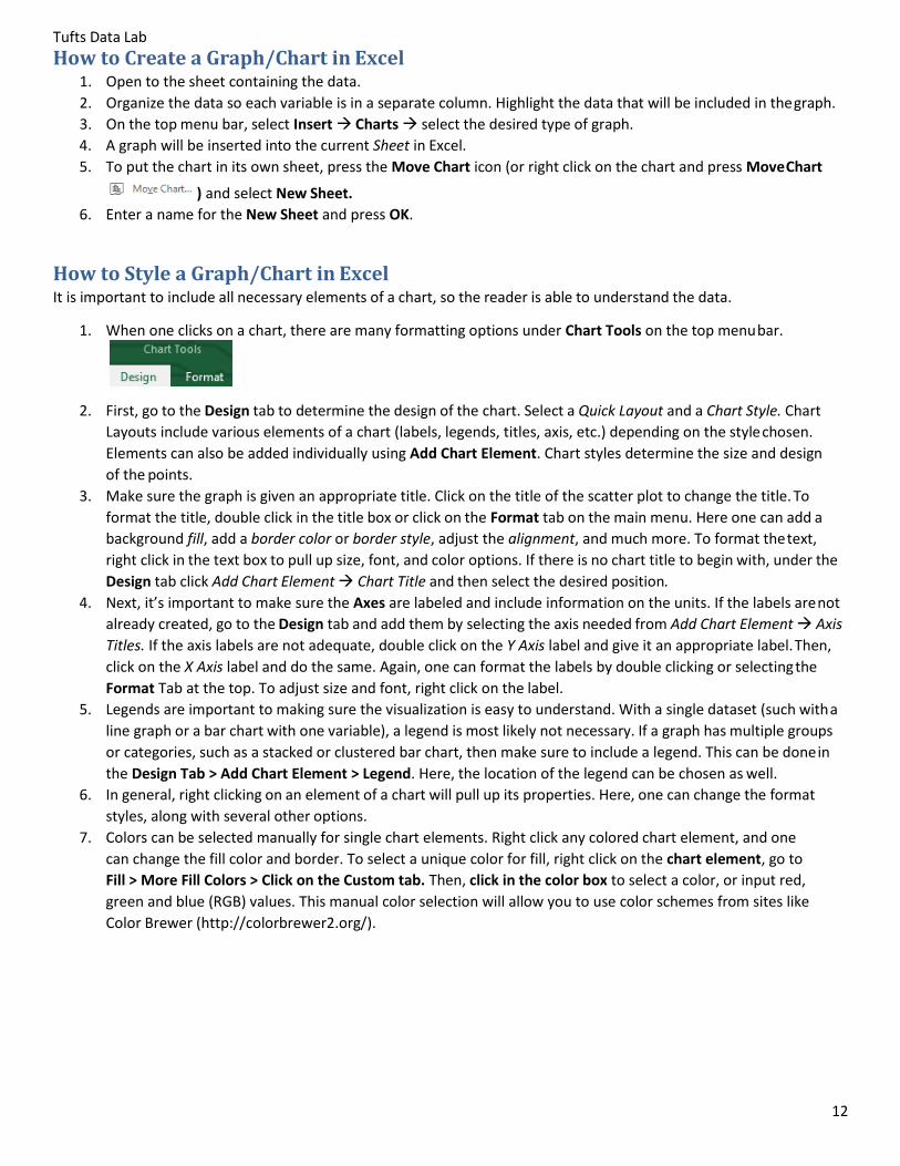
1. When one clicks on a chart, there are many formatting options under Chart Tools on the top menu bar.
2. First, go to the Design tab to determine the design of the chart. Select a Quick Layout and a Chart Style. Chart
Layouts include various elements of a chart (labels, legends, titles, axis, etc.) depending on the style chosen.
Elements can also be added individually using Add Chart Element. Chart styles determine the size and design
of the points.
3. Make sure the graph is given an appropriate title. Click on the title of the scatter plot to change the title. To
format the title, double click in the title box or click on the Format tab on the main menu. Here one can add a
background fill, add a border color or border style, adjust the alignment, and much more. To format the text,
right click in the text box to pull up size, font, and color options. If there is no chart title to begin with, under the
Design tab click Add Chart Element Chart Title and then select the desired position.
4. Next, it’s important to make sure the Axes are labeled and include information on the units. If the labels are not
already created, go to the Design tab and add them by selecting the axis needed from Add Chart Element Axis
Titles. If the axis labels are not adequate, double click on the Y Axis label and give it an appropriate label. Then,
click on the X Axis label and do the same. Again, one can format the labels by double clicking or selecting the
Format Tab at the top. To adjust size and font, right click on the label.
5. Legends are important to making sure the visualization is easy to understand. With a single dataset (such with a
line graph or a bar chart with one variable), a legend is most likely not necessary. If a graph has multiple groups
or categories, such as a stacked or clustered bar chart, then make sure to include a legend. This can be done in
the Design Tab > Add Chart Element > Legend. Here, the location of the legend can be chosen as well.
6. In general, right clicking on an element of a chart will pull up its properties. Here, one can change the format
styles, along with several other options.
7. Colors can be selected manually for single chart elements. Right click any colored chart element, and one
can change the fill color and border. To select a unique color for fill, right click on the chart element, go to
Fill > More Fill Colors > Click on the Custom tab. Then, click in the color box to select a color, or input red,
green and blue (RGB) values. This manual color selection will allow you to use color schemes from sites like
Color Brewer (http://colorbrewer2.org/).
Tufts Data Lab
14
How to Export a Graph/Chart Created in Excel Charts created in Excel can be exported to other software packages such as Word, PowerPoint, Publisher, ArcGIS, and
InDesign. Depending upon the software, different methods may be required.
1. In other Microsoft products (including Word, PowerPoint, and Publisher), a chart can be copied directly. The
chart will retain all data and formatting. It can continue to be styled in any of these products the same way as in
Excel described above. To copy a chart, make sure the chart itself (rather than any of the elements contained
within the chart) is selected before copying.
2. In ArcGIS, a chart can be copied into either Data view or Layout view with a simple Copy in Excel and Paste in
ArcGIS. Unlike charts copied into Microsoft products, this copied chart will be an image. All changes and styling
must be completed in Excel before copying.
3. In Adobe InDesign, a chart can be copied from Excel and pasted into a layer. Similar to ArcGIS, the copied chart
will be an image, so all editing should be completed before copying.
4. One can also use SnagIt to export a chart as an image, similar to ArcGIS. In SnagIt, be sure to capture at high
resolution. You can select a resolution in SnagIt by Image > Effects > Select Image Resolution from the
dropdown menu > Press the gear icon > Input at least 300 dpi.
Resources Data 101 Series. http://visage.co/category/data-101 A series of tutorials on best-practices of data usage and visualization techniques.
Color Advice for Maps. http://colorbrewer2.org A diagnostic tool for evaluating the robustness of individual color schemes.
Global Database of Events, Language, and Tone (GDELT). http://www.gdeltproject.org
A database and visualization platform of broadcast, print, and web news that identifies the people, locations,
organizations, counts, themes, sources, emotions, counts, quotes and events.
Additional Visualization Tools
Visualizing Data - http://www.visualisingdata.com/resources
Data Visualization - http://selection.datavisualization.ch
“Chart Choosers”
Juice Analytics - http://labs.juiceanalytics.com/chartchooser/index.html
Extreme Presentation - http://extremepresentation.typepad.com/blog/2006/09/choosing_a_good.html
Data Visualization Fundamentals
Lynda - http://www.lynda.com/Design-Infographics-tutorials/Data-Visualization-Fundamentals/153776-
2.html?org=tufts.edu
Data Visualization for Data Analysts
Lynda - http://www.lynda.com/Excel-tutorials/Data-Visualization-Data-Analysts/178123-2.html?org=tufts.edu

Tufts Data Lab
15
1 Royal Government of Cambodia. General Population Census of Cambodia, 2008. Phnom Penh, Cambodia: National Institute of Statistics, 2010.
2 Stacked Graph. (2014, October 1). Retrieved January 2016, from http://betterevaluation.org/evaluation-options/stacked_graph
3 United Nations Population Division. Department of Economic and Social Affairs. Infant Mortality Rate. New York, New York. United Nations Environment Programme, 2015. http://geodata.grid.unep.ch/options.php?selectedID=776&selectedDatasettype=1
4 Starr, B. (2015, January 05). Data Visualization 101: Line Charts. Retrieved January 2016, from http://visage.co/data-visualization- 101-line-charts
5 Carter, M., Wiebe, E. N., & Ferzli, M. (2015, May 15). Graphing Resources. Retrieved January 2016, from https://www.ncsu.edu/labwrite/res/gh/gh-linegraph.html
6 ML InfoMap. IndiaMap: Town Socio-Demographic. New Delhi, India: ML InfoMap, 2001.
7 Raleigh, Clionadh, Andrew Linke, Håvard Hegre and Joakim Karlsen. 2010. Introducing ACLED-Armed Conflict Location and Event Data. Journal of Peace Research 47(5) 651-660.
8 United Nations Security Council Report. Report of the Secretary-General on the Implementation of Security Council Resolutions 2139 (2014), 2165 (2014), 2191 (2014) and 2258 (2015). Retrieved January 2016, from http://www.securitycouncilreport.org/atf/cf/%7B65BFCF9B-6D27-4E9C-8CD3-CF6E4FF96FF9%7D/s_2016_60.pdf