#2 - css layouts overview
DESCRIPTION
- HTML5 structure - Layout -- Block vs Inline -- Floats -Absolute positioning Flexbox CSS regions Box model CSS ResetTRANSCRIPT

Tecniche di animazionedigitale I

Michele BertoliFounder / Lead Software Engineer at Igloo
Basic 2November 28, 2012
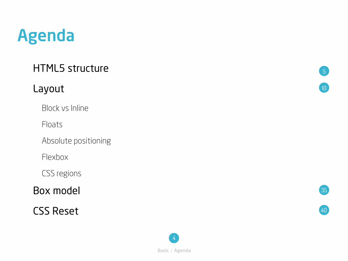
HTML5 structure
Layout
Block vs Inline
Floats
Absolute positioning
Flexbox
CSS regions
Box model
CSS Reset
Agenda
Basic / Agenda
4
5
35
40
10
HTML5 structure
Basic / HTML5 structure
6
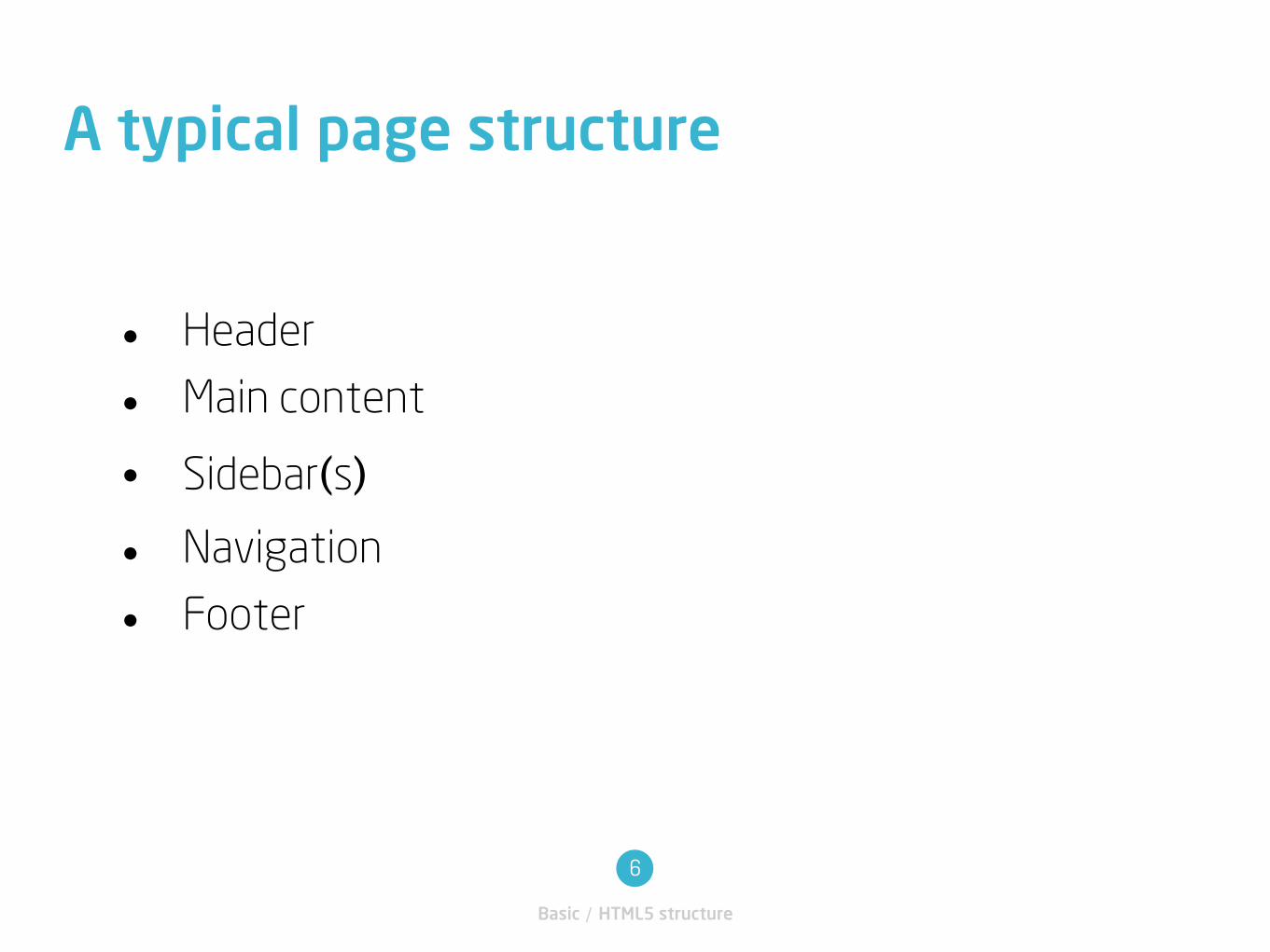
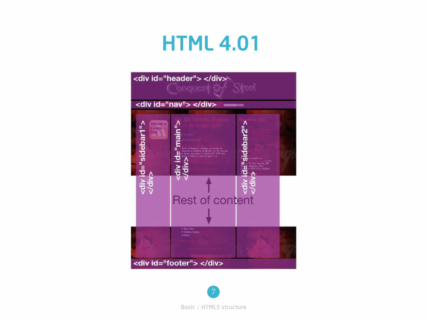
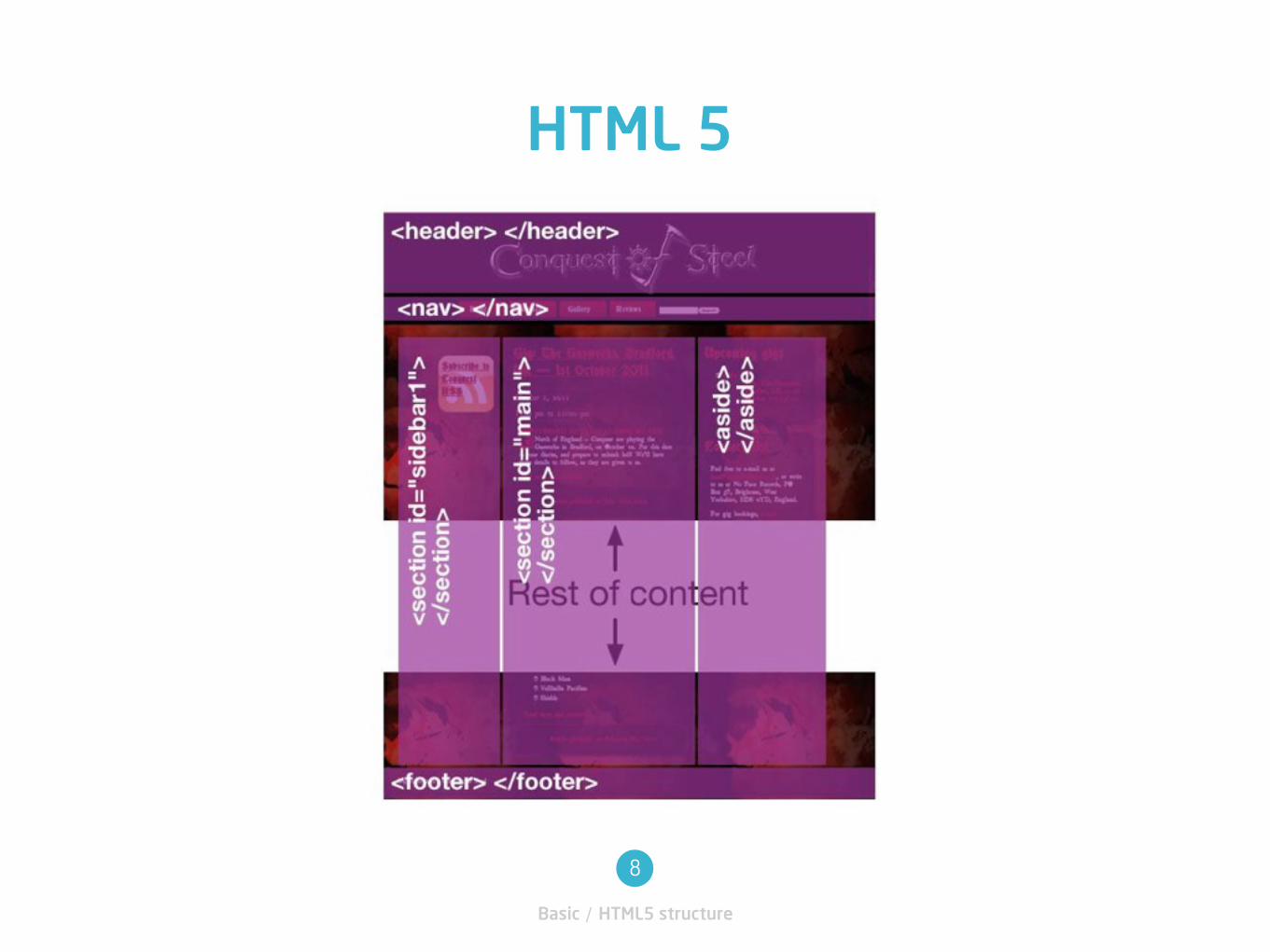
• Header
• Main content
• Sidebar(s)• Navigation
• Footer
A typical page structure
Basic / HTML5 structure
7
HTML 4.01
Basic / HTML5 structure
8
HTML 5
Basic / HTML5 structure
9
Samples
• http://2010dev.wordpress.com
• http://twentyelevendemo.wordpress.com/
Layout
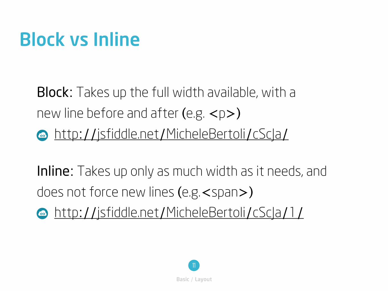
Block: Takes up the full width available, with a
new line before and after (e.g. <p>) http://jsfiddle.net/MicheleBertoli/cScJa/
Inline: Takes up only as much width as it needs, and
does not force new lines (e.g.<span>) http://jsfiddle.net/MicheleBertoli/cScJa/1/
Block vs Inline
Basic / Layout
11
A float is a box that is shifted to the left or right on the
current line. The most interesting characteristic of a
float (or “floated” or “floating” box) is that content
may flow along its side (or be prohibited from doing so
by the “clear” property). Content flows down the right
side of a leftfloated box and down the left side of a
rightfloated box.
Floats
Basic / Layout
12
www.w3.org/TR/CSS21/visuren.html#floats
float:right;
float:left;
http://jsfiddle.net/MicheleBertoli/edamS/
Samples
Basic / Layout
13
http://jsfiddle.net/MicheleBertoli/edamS/1/
http://jsfiddle.net/MicheleBertoli/edamS/2/
http://jsfiddle.net/MicheleBertoli/edamS/3/
This property indicates which sides of an
element's box(es) may not be adjacent to
an earlier floating box.
The 'clear' property
Basic / Layout
14
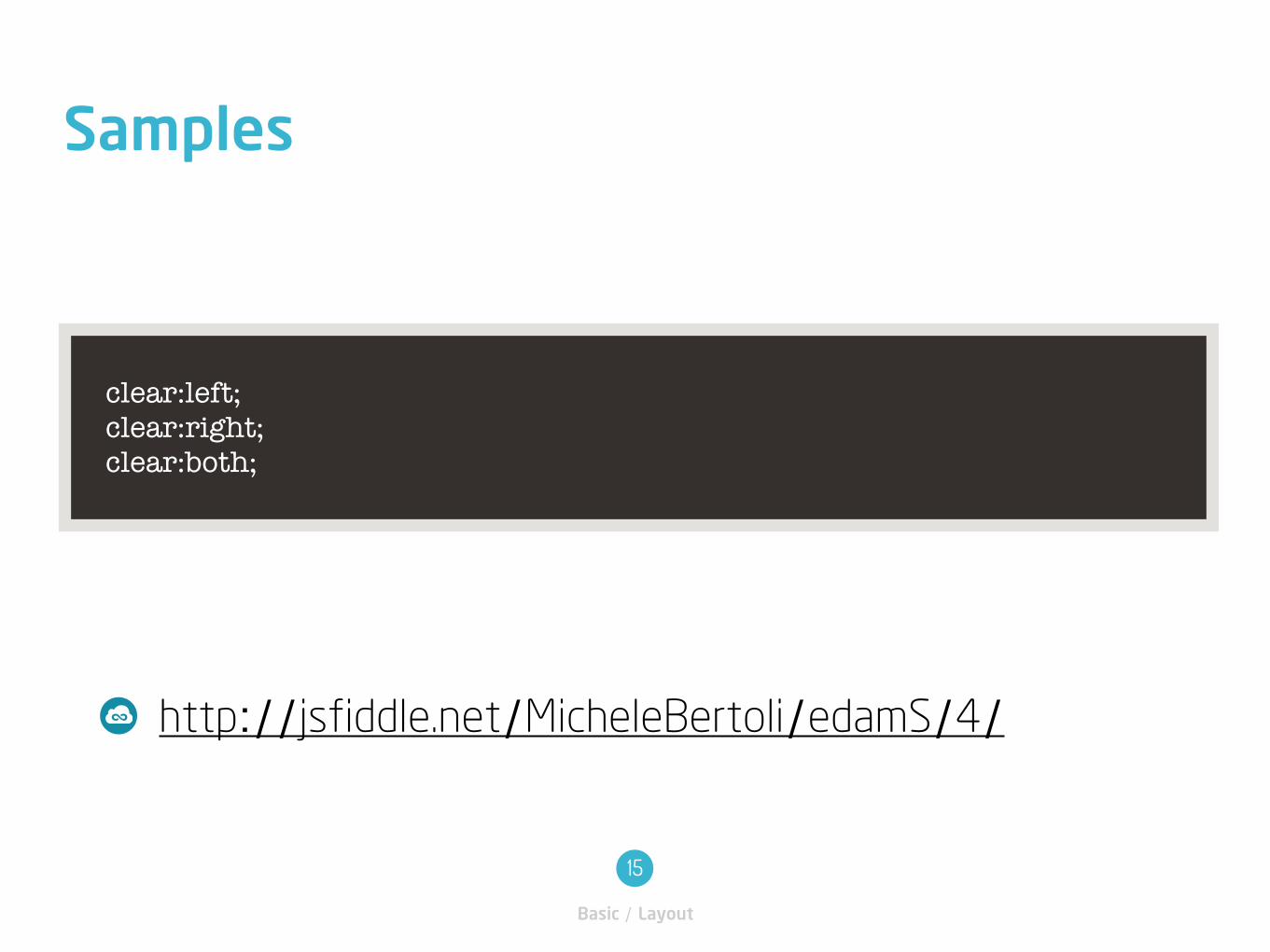
http://jsfiddle.net/MicheleBertoli/edamS/4/
Samples
Basic / Layout
15
clear:left; clear:right; clear:both;
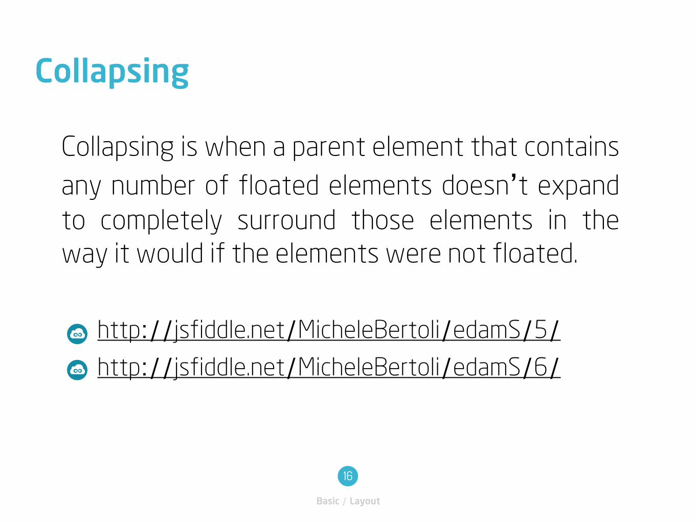
Collapsing is when a parent element that contains
any number of floated elements doesn’t expand
to completely surround those elements in the
way it would if the elements were not floated.
Collapsing
Basic / Layout
16
http://jsfiddle.net/MicheleBertoli/edamS/5/http://jsfiddle.net/MicheleBertoli/edamS/6/

position:relative;
Absolute positioning
Basic / Layout
17
A relative positioned element is positioned relative to
its normal position.
http://jsfiddle.net/MicheleBertoli/pq4A5/
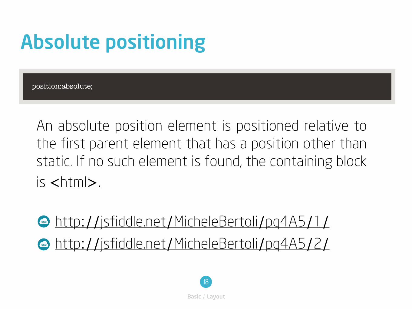
position:absolute;
Absolute positioning
Basic / Layout
18
An absolute position element is positioned relative to
the first parent element that has a position other than
static. If no such element is found, the containing block
is <html>.
http://jsfiddle.net/MicheleBertoli/pq4A5/1/ http://jsfiddle.net/MicheleBertoli/pq4A5/2/
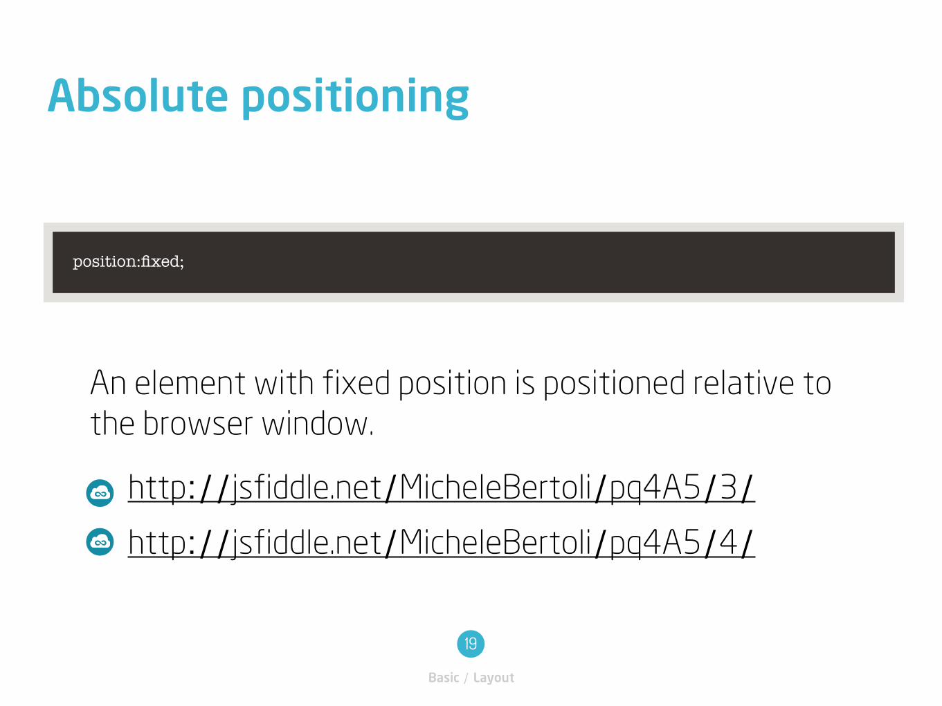
position:fixed;
Absolute positioning
Basic / Layout
19
An element with fixed position is positioned relative to
the browser window.
http://jsfiddle.net/MicheleBertoli/pq4A5/3/http://jsfiddle.net/MicheleBertoli/pq4A5/4/
Coffee Break
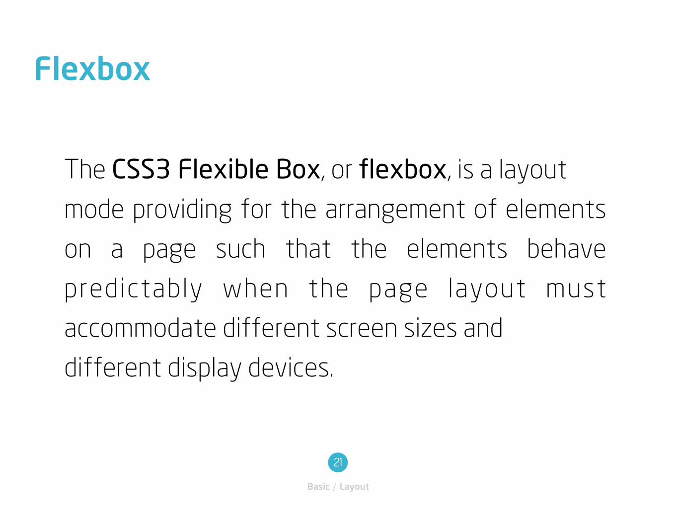
The CSS3 Flexible Box, or flexbox, is a layout
mode providing for the arrangement of elements
on a page such that the elements behave
predictably when the page layout must
accommodate different screen sizes and
different display devices.
Flexbox
Basic / Layout
21
Flexbox
Basic / Layout
22
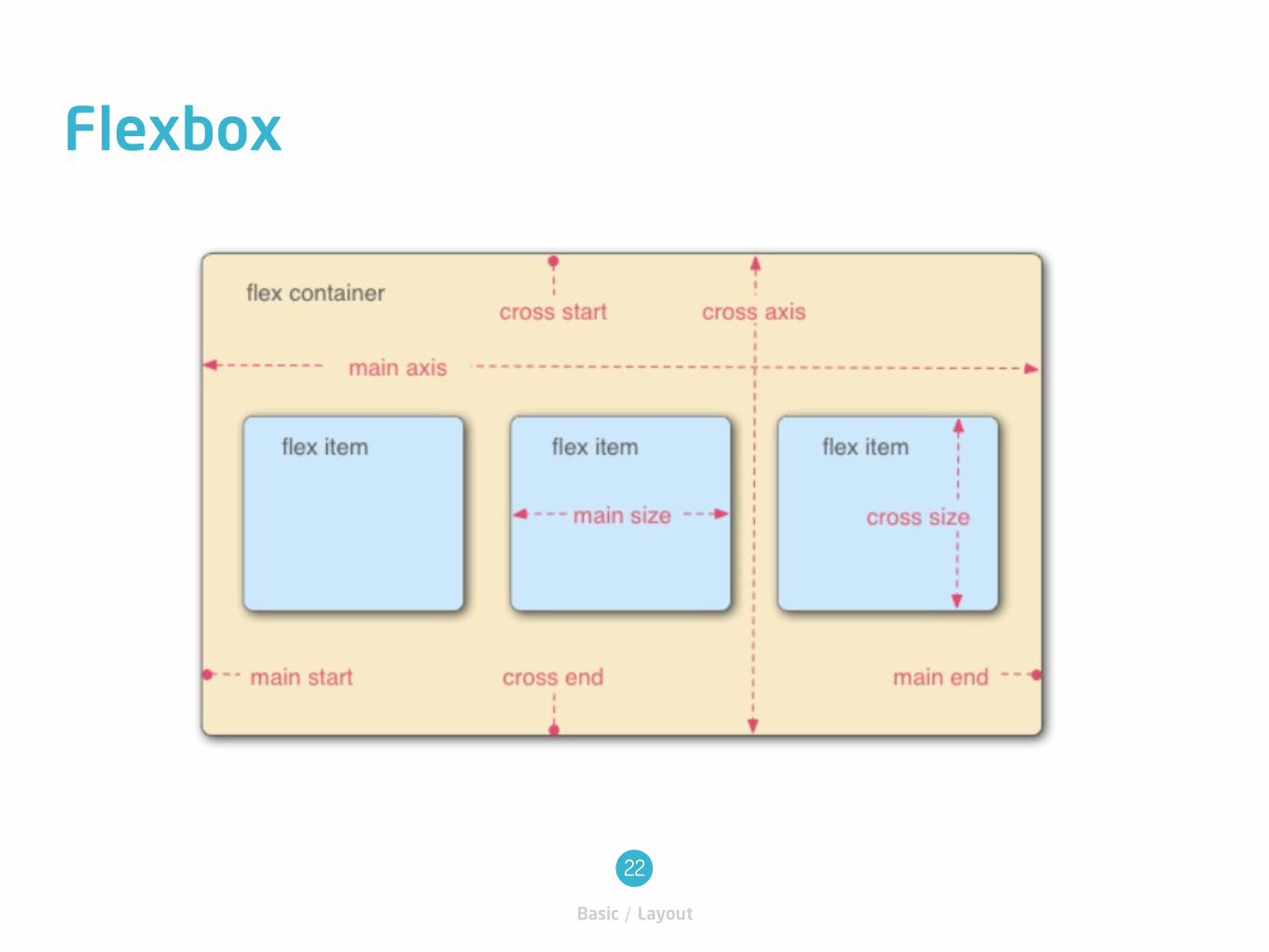
Flex container
The parent element in which flex items are contained. A flex
container is defined using the flex or inline-flex values of the
display property.
Vocabulary
Basic / Layout
23
Flex item
Each child of a flex container becomes a flex item. Text
directly contained in a flex container is wrapped in an
anonymous flex item.
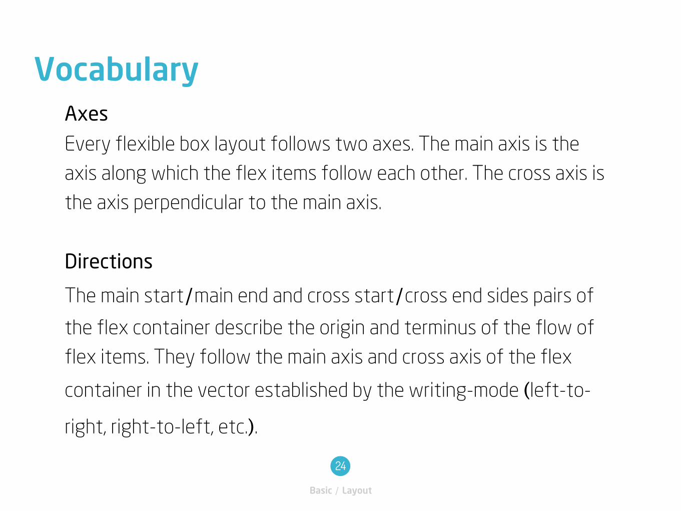
Axes
Every flexible box layout follows two axes. The main axis is the
axis along which the flex items follow each other. The cross axis is
the axis perpendicular to the main axis.
Directions
The main start/main end and cross start/cross end sides pairs of
the flex container describe the origin and terminus of the flow of
flex items. They follow the main axis and cross axis of the flex
container in the vector established by the writing-mode (left-to-
right, right-to-left, etc.).
Vocabulary
Basic / Layout
24
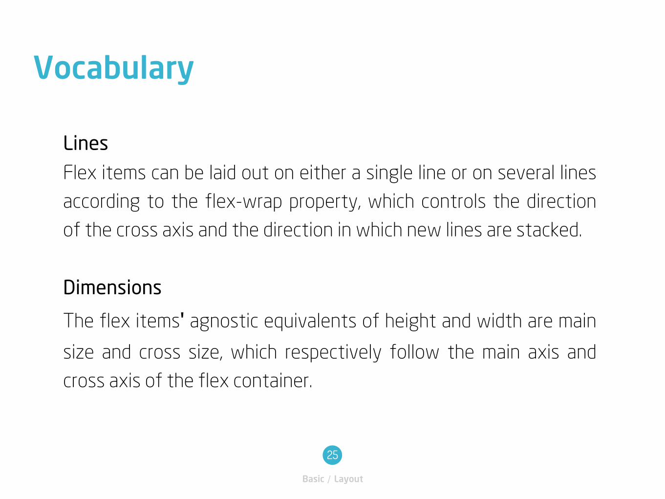
Lines
Flex items can be laid out on either a single line or on several lines
according to the flex-wrap property, which controls the direction
of the cross axis and the direction in which new lines are stacked.
Dimensions
The flex items' agnostic equivalents of height and width are main
size and cross size, which respectively follow the main axis and
cross axis of the flex container.
Vocabulary
Basic / Layout
25
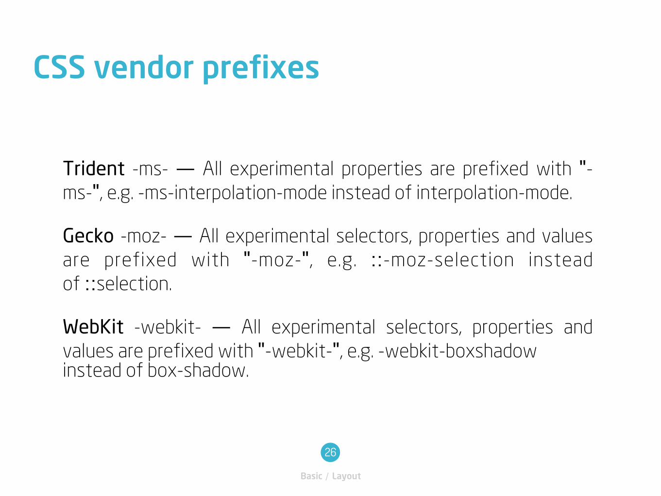
Trident -ms- — All experimental properties are prefixed with "-ms-", e.g. -ms-interpolation-mode instead of interpolation-mode.
Gecko -moz- — All experimental selectors, properties and values
are prefixed with "-moz-", e.g. ::-moz-selection instead
of ::selection.
WebKit -webkit- — All experimental selectors, properties and
values are prefixed with "-webkit-", e.g. -webkit-boxshadowinstead of box-shadow.
CSS vendor prefixes
Basic / Layout
26
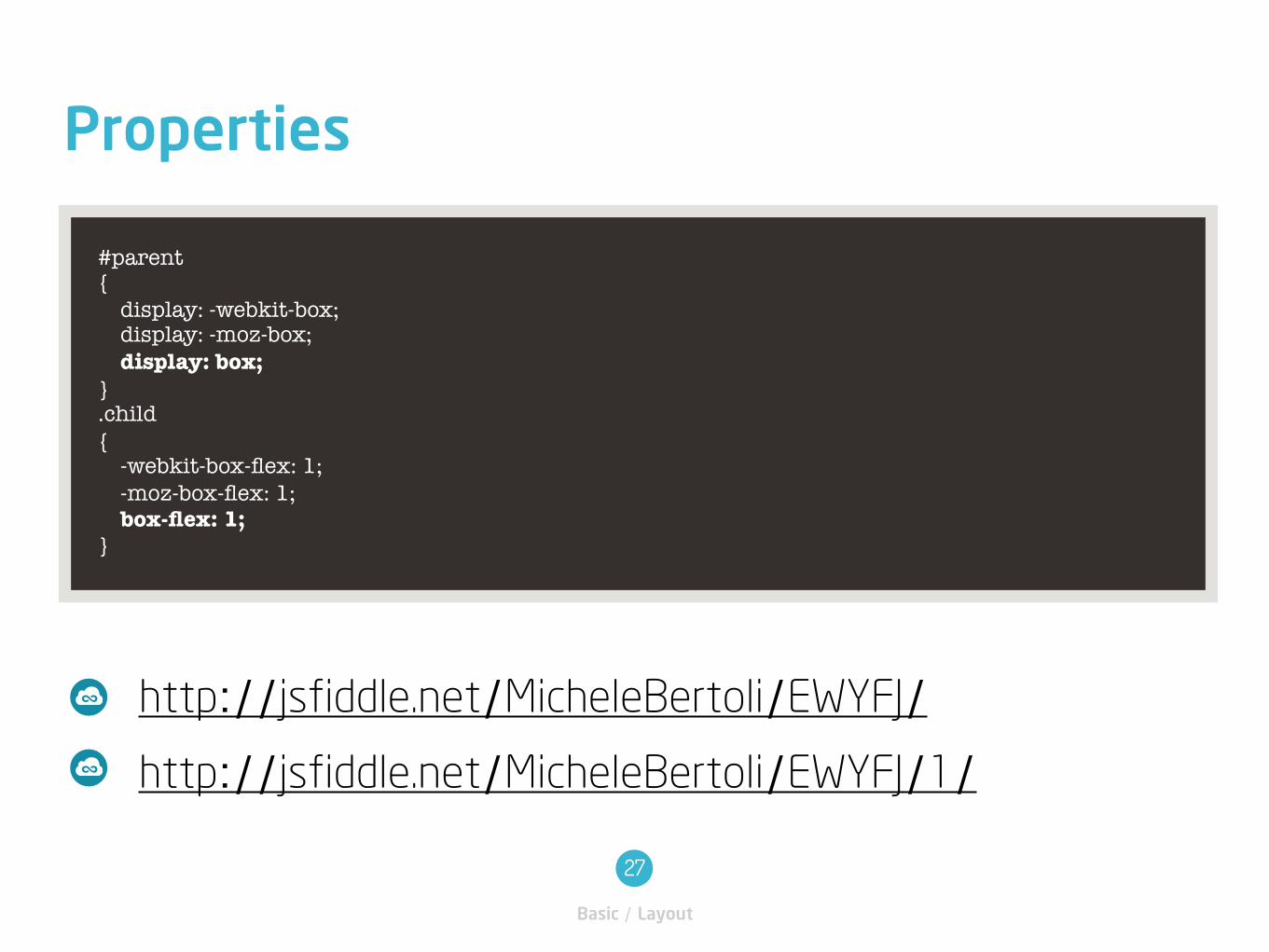
#parent { display: -webkit-box; display: -moz-box; display: box; } .child { -webkit-box-flex: 1; -moz-box-flex: 1; box-flex: 1; }
Properties
Basic / Layout
27
http://jsfiddle.net/MicheleBertoli/EWYFJ/1/http://jsfiddle.net/MicheleBertoli/EWYFJ/
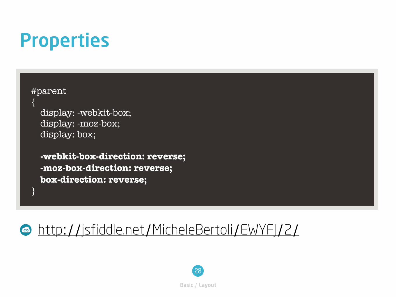
#parent { display: -webkit-box; display: -moz-box; display: box;
-webkit-box-direction: reverse; -moz-box-direction: reverse; box-direction: reverse; }
Properties
Basic / Layout
28
http://jsfiddle.net/MicheleBertoli/EWYFJ/2/
Browser support
Basic / Layout
29
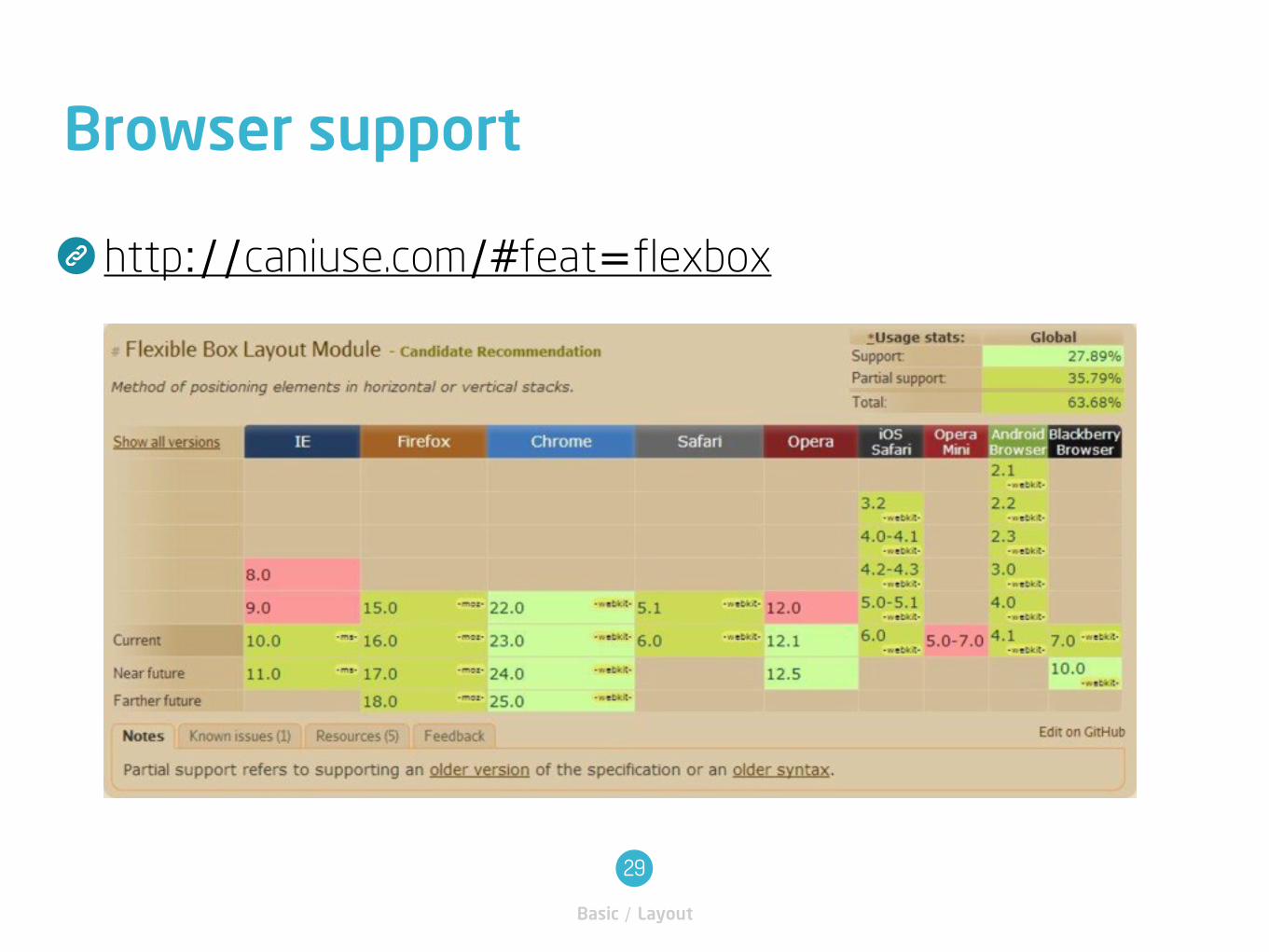
http://caniuse.com/#feat=flexbox
Flexie.js
Basic / Layout
30
Cross-browser support for the Flexible Box
Model.
http://flexiejs.com
http://flexiejs.com/playground/?random
Samples
Basic / Layout
31
http://bennettfeely.com/flexplorer/
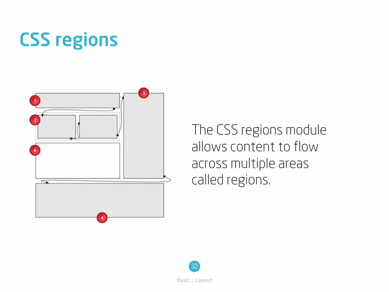
CSS regions
Basic / Layout
32
The CSS regions module
allows content to flow
across multiple areas
called regions.
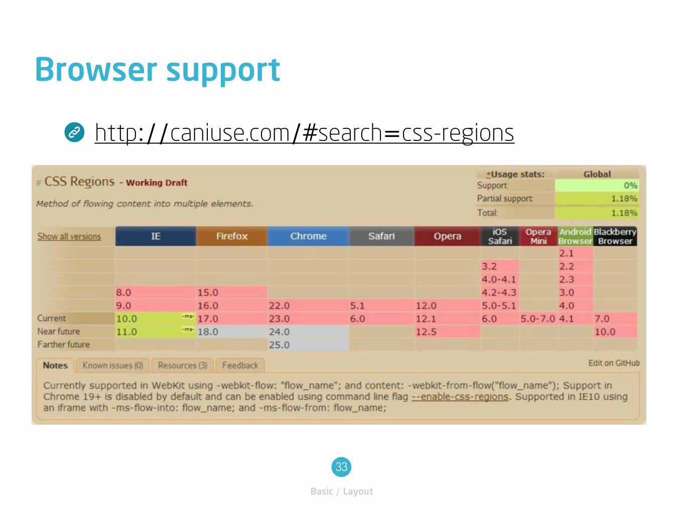
Browser support
Basic / Layout
33
http://caniuse.com/#search=css-regions
Samples
Basic / Layout
34
http://umaar.github.com/css-region-demo/
Box model
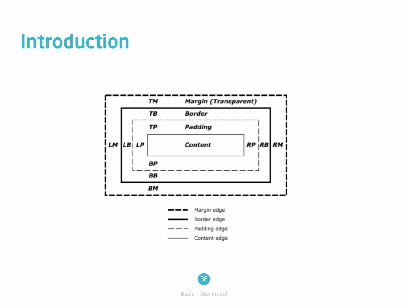
Introduction
Basic / Box model
36
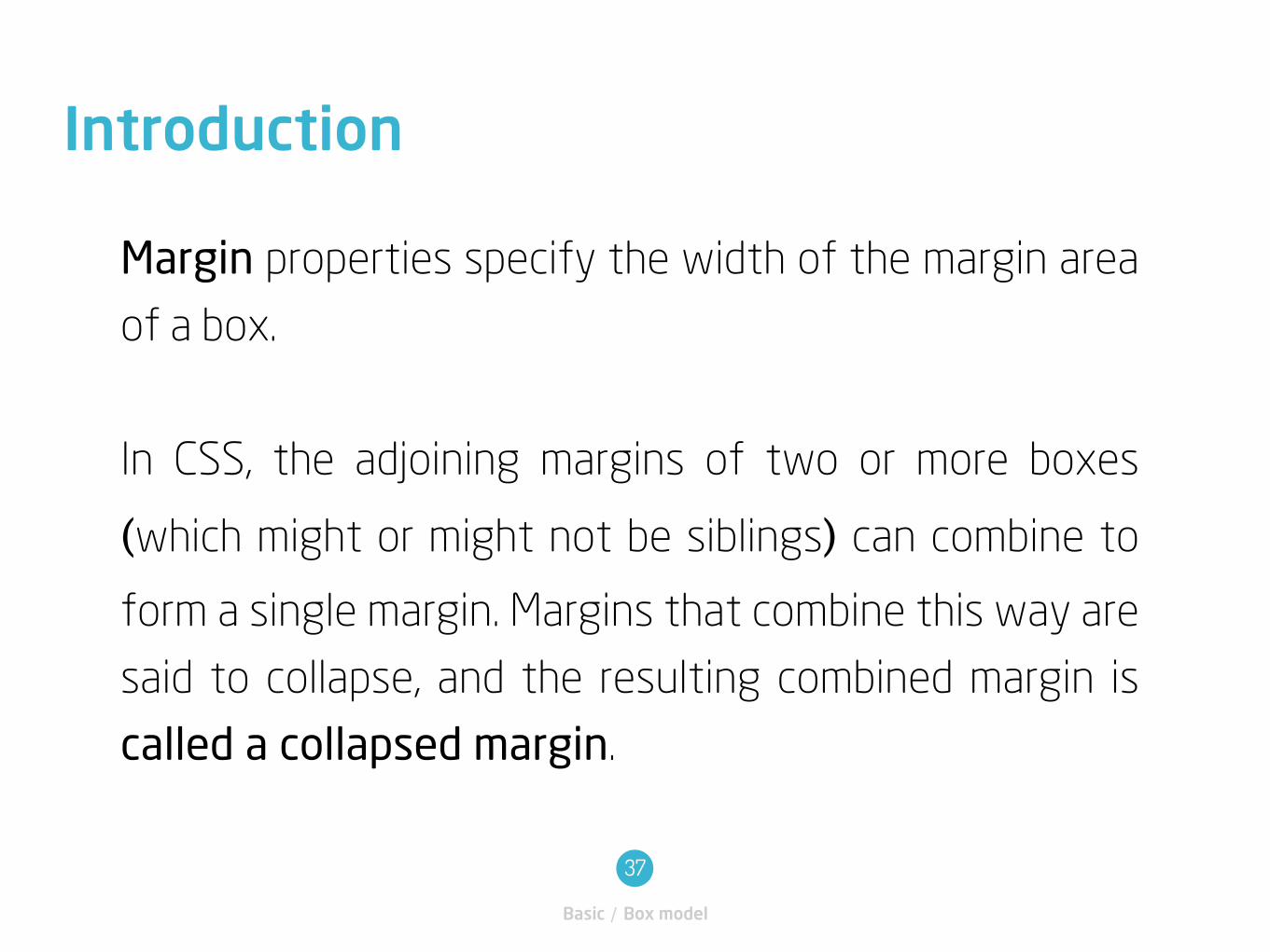
Margin properties specify the width of the margin area
of a box.
In CSS, the adjoining margins of two or more boxes
(which might or might not be siblings) can combine to
form a single margin. Margins that combine this way are
said to collapse, and the resulting combined margin is
called a collapsed margin.
Introduction
Basic / Box model
37
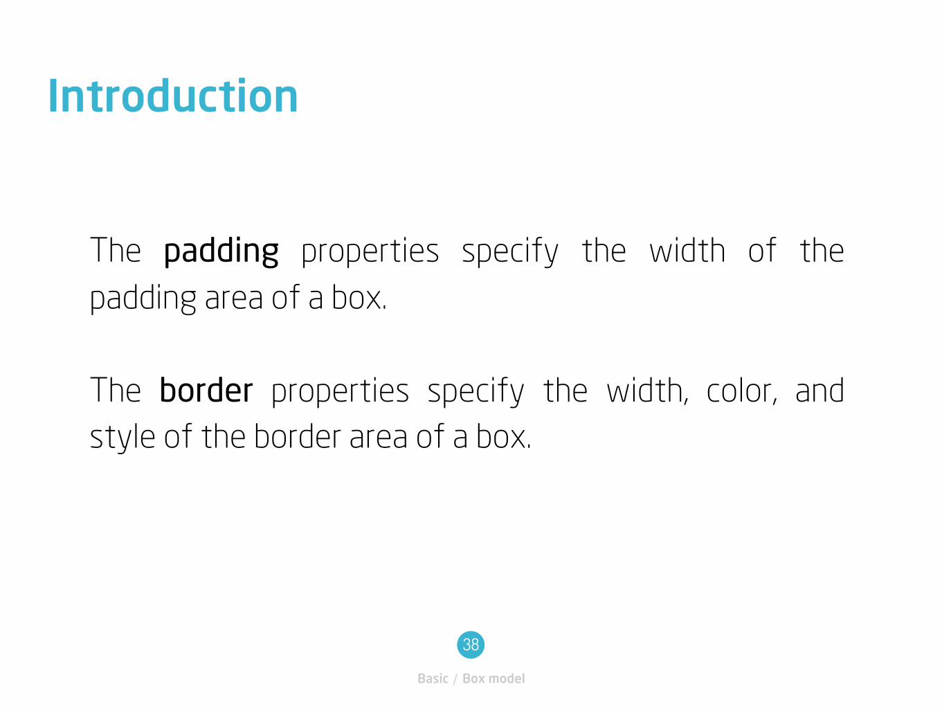
The padding properties specify the width of the
padding area of a box.
The border properties specify the width, color, and
style of the border area of a box.
Introduction
Basic / Box model
38
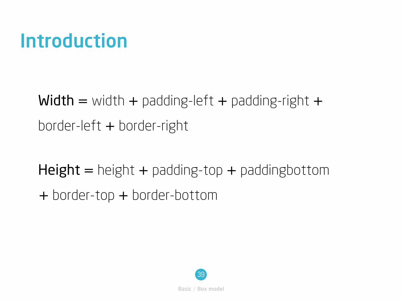
Width = width + padding-left + padding-right +border-left + border-right
Height = height + padding-top + paddingbottom
+ border-top + border-bottom
Introduction
Basic / Box model
39
CSS Reset
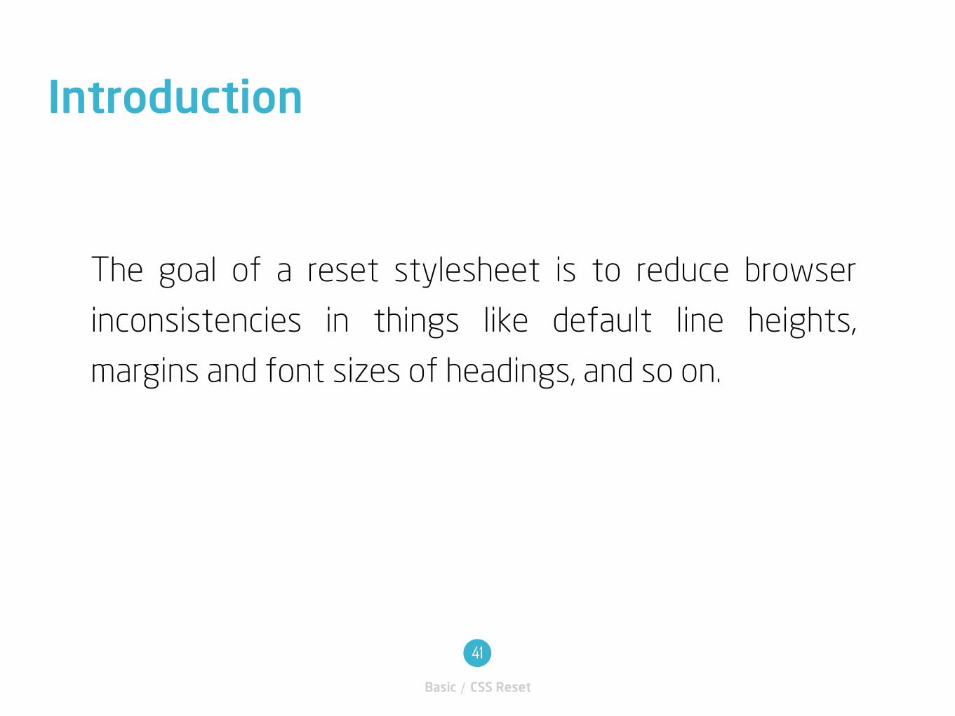
The goal of a reset stylesheet is to reduce browser
inconsistencies in things like default line heights,
margins and font sizes of headings, and so on.
Introduction
Basic / CSS Reset
41
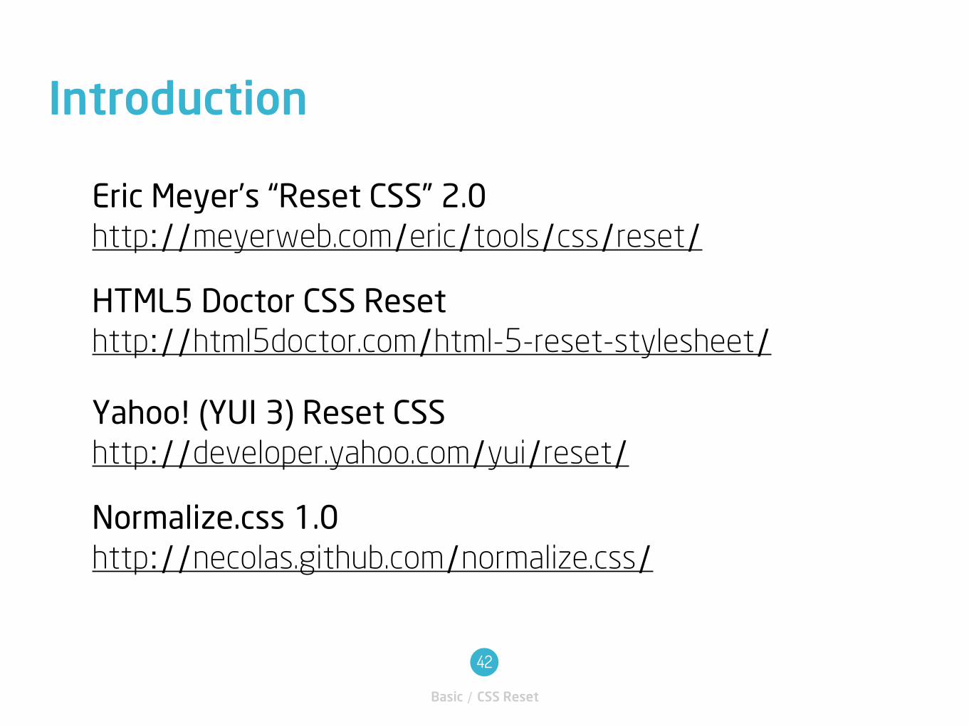
Eric Meyer’s “Reset CSS” 2.0http://meyerweb.com/eric/tools/css/reset/
HTML5 Doctor CSS Resethttp://html5doctor.com/html-5-reset-stylesheet/
Yahoo! (YUI 3) Reset CSShttp://developer.yahoo.com/yui/reset/
Normalize.css 1.0http://necolas.github.com/normalize.css/
Introduction
Basic / CSS Reset
42
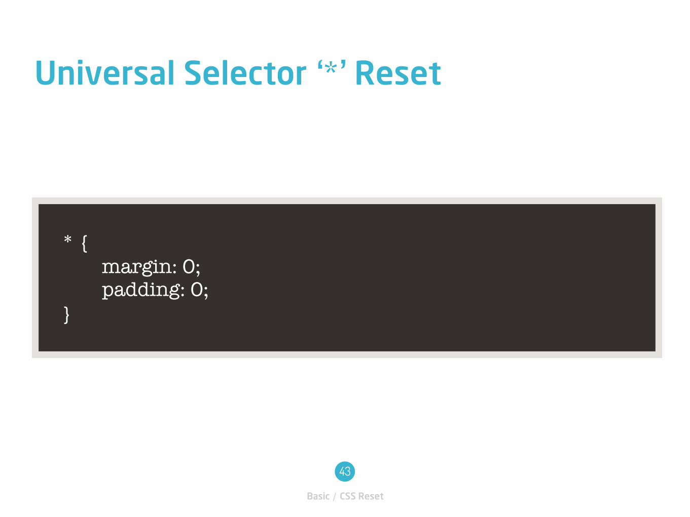
* { margin: 0; padding: 0; }
Universal Selector ‘*’ Reset
Basic / CSS Reset
43

Thank you