workshop landing pages - rui marcelino
TRANSCRIPT
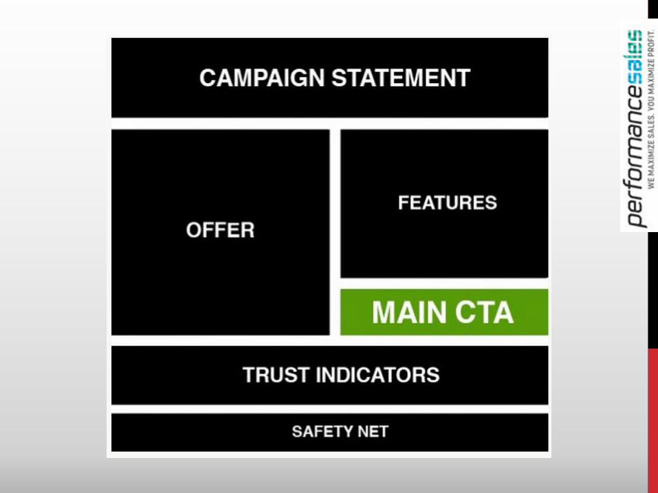
Campaign Statement
A concise, yet powerful statement that
sums up your entire product or service.
• What separates your business from its competition?
• Answer in one sentence only – the fewer the words, the
better.
Often the headline, or sub-heading, your Campaign Statement should be
a valuable hook to entice your audience in.
• “Social Media Management Made Easy”
• “The World’s Easiest Accounting System”
Trust Indicators.
Trust indicators are simple things you can
include in your landing page design to build
trust and credibility.
Whilst they might not be a part of your main offer, their presence can greatly
increase and support conversions.
Trust indicators that you can incorporate could include: • Customer testimonials or reviews
• Third-party validators (such as media reviews, ‘as seen in’ references or trust
marks)
• Partner validation (such as PayPal/Mastercard/Visa logos or logos of current
clients).
Offer
What are users going to get as a potential
customer?
• What does your product or service offer´?
• That stands out from the crowd?
• Keep it short and straight-forward – bullet points are your friend.
• Don’t Describe – mention benefits
Don’t get your offer confused with your call-to-action
sometimes your offer is successfully delivered as a main heading.
• 30-Day Money Back Guarantee!
• Full Access to tools, guides webinars & more
• First two weeks FREE.
Call-to-action (CTA).
Your CTA is the statement that instructs your
audience to take a specific action.
This will often be the submission of a form or a button that takes users through to a
final destination somewhere on a website (such as a document download).
• Make your CTA(s) clear and unambiguous. If you are offering a free $50
voucher, make the button say “Get your free $50 voucher” instead of “submit” or
“subscribe”.
• Use whitespace to make your CTA stand out. Colour contrast will help to
assert the importance of the page to your CTA.
• Remove all distractions from the page.
• Keep your page clean and uncluttered, leaving only one available path to
interact with your page – the CTA.
The Safety Net.
The purpose of the safety net is to capture the
attention of those who are not yet ready to
buy.
Even if you have the most relevant landing page that delivers everything that a
potential customer needs to purchase, some just may not be ready..
If they won’t convert now, the safety net serves to keep the relationship intact and
entice them back later:
• Follow us on Facebook/Twitter.
• A free takeaway, such as an ebook or company whitepaper.
• Bookmark this page.
• Visit our blog.
Test….Test….Test….
Test everything in your Landing Page
Use A/B testing to improve conversion rates
• Test you headline and sub-hedline
• Test your call to action (CTA)
• Test your Hero Shot/ Images
• Test you body copy
• Test form VS Call to Action Button
FOR YOUR PROPOSITION TO STICK,
IT MUST MAKE THE AUDIENCE:
Pay Attention >> Is it relevant and compelling?
Understand and Remember >> Is it concrete?
Agree/Believe >> Is it credible?
Care >> Is it beneficial to them personally?
Be Able to Act Upon It >> Is there immediate satisfaction?
CHALLENGE
Details for Story That Will Appear in a High School eNewspaper:
Target: Students
• Next Thursday, all teachers will attend a day-long
conference on best practices in education
• Renowned scholars will conduct workshops
• Teachers will learn the latest research on knowledge
retention and maintaining positive classroom behavior
• Keynote speaker is the mayor
What’s the Best Headline?

There Will Be No School on Thursday
EXAMPLES