we love pop overview
TRANSCRIPT
‘We Love Pop’ An Overview.

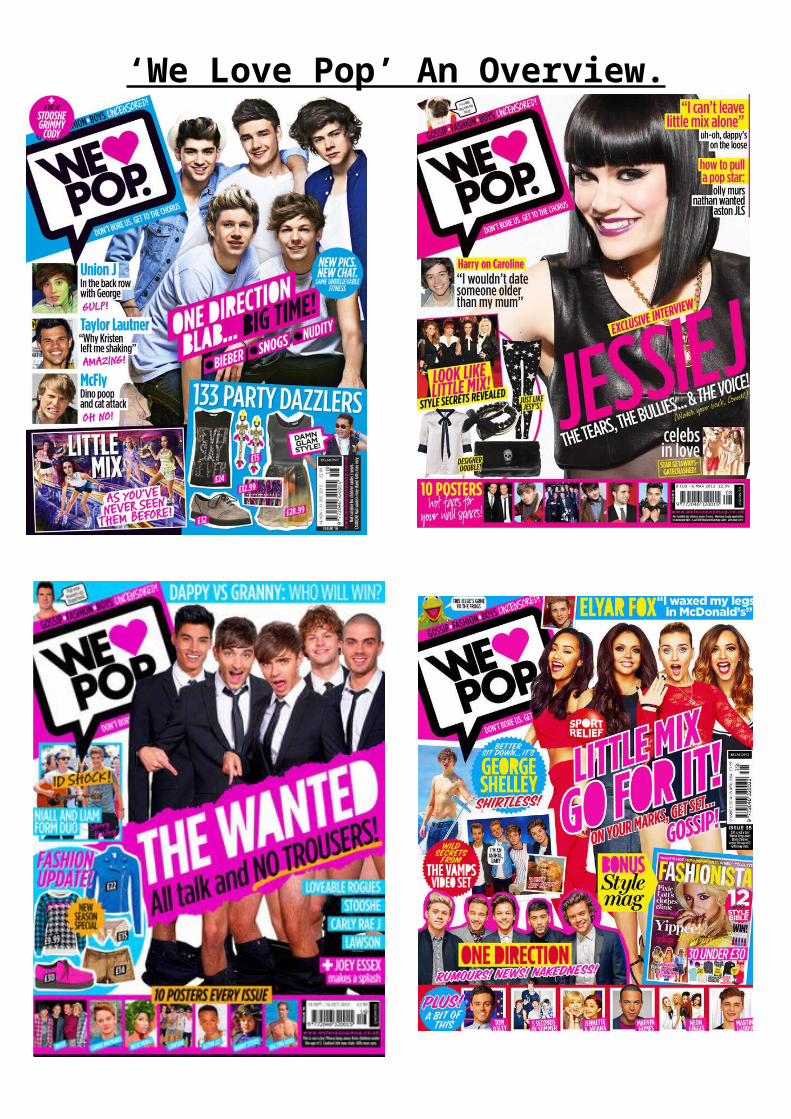
‘We Love Pop’ An Overview.All three of these are front covers of pop magazine ‘We Love Pop’. They all share many similarities and differences, these similarities allow a symbiotic link to be portrayed making the magazine look professional and recognisable. Each of the mastheads are placed in the top left hand corner in signature display font. Each of the mastheads are written in the exact same colour an font to ensure the magazines brand identity is shown perfectly and so the reader can easily find the magazine on the shelf, this will prevent their attention being swayed by rival publications, as their eye will be instantly drawn to the magazine they are loyal to . As it is written in bold black font the masthead will catch the reader’s attention quickly and to draw them into reading the magazine. As they are all in the top left hand corner it is the first thing the reader sees when they look at the front cover, as the western eye moves from left to right.
Each magazine’s masthead replaces the word ‘love’ with a ‘ shape. All of the hearts are a bright, vibrant pink colour again, making sure the magazines fun, bright, high energy brand identity is shown throughout as the colour pink is girly and exciting. The use of a heart shape is more visual, creative, unique and fun than a simple word and this serves to both attract and reflect the target audience. It also creates a familiar feel to the magazine as we can recognise this bright pink heart and would make us think of pop. The reader can also easily spot this heart on a magazine shelf and straight away understand it is a ‘We Love Pop’ magazine.
The masthead sits inside a speech bubble in each of the three magazines, which again is another similarity, the speech bubble is looks cartoon-like to create a young and funky effect. It is outlined in black, again to make sure each of the mastheads stand out and grab attention and to highlight that this is the masthead. This speech bubble is in the same position on each magazine to create continuity throughout. The bottom of the speech bubble sits next to an image of one of the additional artist photographs, to make it look as if that certain artist is saying ‘We Love Pop’ making it more exciting for the reader and more personal and providing the idea that the celebrity gives the magazine their approval. By using a speech bubble it is as if the magazine is speaking out to the reader, like a friend. It also makes the masthead sound as if it is being spoken to them. This would create effect on the reader as it gives a friendly approach.
The speech bubble sits on top of a rectangular block of colour, in two of the front covers the colour is a familiar bright pink, the same pink which the heart shape is filled with, again to create a continuous, neat and professional look. However, unlike two of the front covers, one of them sits on a blue background. Yet, this is because the same colour blue is feature in other elements of the magazine. For example, the fashion section in the bottom right hand corner sits on a block of blue colour, to ensure there are not too many colours being used on the magazine, this would make the magazine appear messy and unprofessional. Therefore, in the similar other two front covers the colour pink is used for both the main sell line and additional sell lines. Similarly, the final front cover magazine uses the colour pink to surround the main sell line.
Another similarity between the three magazines is the slogans used, which sit above and below the masthead. The first slogan states ‘Gossip. Fashion. Boys. Uncensored!’ by having these sort snappy words sitting above the masthead, it states to the reader what the magazine consists of and by keeping it short and sweet, it is easy for the target audience to read quickly and grabs there attention enough to make them want to read more, as too much information on the front cover is boring and time consuming. Also, the words used are common to see on a pop magazine as this is everything we would expect to see inside a pop magazine. By each of the magazines including these words it would make it familiar for the reader, so they know that all of their magazines include everything they want to read about and always will. Each of the magazines include these words in

‘We Love Pop’ An Overview.the exact same font to ensure it is easy to read and familiar to the reader. They are all also written in black to make the magazine look professional and eye catching. The word ‘uncensored!’ is written in white unlike the other words written in black. This makes the word stand out, making it seem more interesting and exciting as the reader would be excited about why it’s uncensored and would feel exited to get ultimate gossip. The idea that the information is ‘uncensored’ is also a lure, as it suggests that nothing will be held back. Also, the exclamation mark appears on each cover to ensure the reader knows each magazine will feature outstanding, excellent gossip and to generate a sense of anticipation and excitement. However, the full stops all appear in different colours such as, white and yellow, to make sure that although each magazine will always feature this amount of gossip, fashion and boys, all of the issues will have different information and it will always be fun and interesting.
Each of the magazines include a strapline underneath the masthead. It states ‘Don’t bore us. Get to the chorus’ this catchy slogan is memorable as it appears on each of the magazines, as it rhymes and it is short and snappy. As each of the magazines include it, it suggests that the magazine will never be boring, it is full of exciting news and gossip. Also, the word ‘chorus reminds us that it is a music magazine. There is significance in the idea that, in a pop song, the chorus is the best bit, the catchiest and greatest bit. This reflects how the magazine constantly provides only the best bits of pop news and gossip. In the final front cover, The Wanted seem to cover the slogan, however, loyal members of the audience would still be able to know what the slogan says as it features on every single issue of the magazine. It also reminds us of how catch and memorable the slogan is. This would be effective as it gives the magazine a fun and friendly feel, as the reader feels as if it knows the magazine.
Unlike the first two front covers, the final cover includes a turquoise headline with the text ‘DAPPY VS GRANNY: WHO WILL WIN?’ written in white. This capitalised skyline grabs intrigue an attention, as ‘We Love Pop’ does not always include a skyline, making this particular issue stand out from the rest. It still however, fits in with the magazine and looks fun and vibrant which is a convention of pop magazines. Notice that the artist used is again a pop artist therefore Dappy fits with the pop magazine genre.
Not only does the final front cover include a skyline, it also includes a small photograph in the top left corner, similar to the second front cover with Jessie J. One of the images is of a pug dog with a fun, colourful collar on and a speech bubble coming out of its mouth. Similarly, the final front cover includes a small feature article photograph of Simon Cowell with a small speech bubble coming out of its mouth. The use of this adds a touch of fun to the magazines. As it is common for ‘We Love Pop’ to include this small image it creates anticipation to who will be on the next issue. Although the first front cover does not include this image, it includes a puff instead, in the same place, to ensure this fun element will not be missed.
Puffs are usually included on magazines in general. Yet, the puffs used in pop magazines are usually filled with vibrant colours and exciting, chatty gossip.
This was taken from an issue of ‘We Love Pop’ magazine and as we can see the puff is a vibrant fuchsia pink to grab the reader’s attention to the gossip inside. In this example, the magazine is talking to the reader as a friend, reminding us of the chatty tone a pop magazine has, therefore, the reader can feel as if the magazine is a friend to them as the magazine reveals secrets to them.

‘We Love Pop’ An Overview.
However, it is unusual that one of the three of these magazines does not include a puff as this is a convention of pop magazines. But, the first front cover with One Direction features two circular puffs, one filled with pink and the other in blue. This sticks to the colour scheme of this magazine to make it appear professional, also as they are both circular it makes the magazine appear tidy and professional. The writing inside the puff is white to ensure there is a continuous look. The final image includes a funky, spiked shape as the puff. It is bright yellow making the shape look almost like a sun shape, to add to the happy, bright brand identity.
Another common feature of these front covers is the use of a fashion section. This fashion section is commonly used in all pop magazines as not only does the magazine focus on music, they usually include several pages of clothes and fashion as the target audience is for young female teens, and they would be excited by this. Each magazine includes several items of clothing to grab their attention and to make sure that they know exactly what type of fashion is included and what they should be wearing. This indicates the fact that pop magazines cover a range of subject matter that will be of interest to the target audience, not just music. This reminds us that the interests and requirements of a young teenage girl are unlike those of a male fan of indie rock. She needs to know the magazine will cover a range of her favourite things- this will persuade her to buy it.
In each of the magazines, the main sell like is centre of the frame and would sit in front of the main artist as the sell line would usually be about the main artist featured. They are all bold, capitalised and eye catching to ensure the reader is drawn in to the main sell line. Each of the sell lines featured on these particular front covers are diagonal to make it look interesting, funky and fun, adding to the exciting brand identity and making ‘We Love Pop’ stand out from normal music magazines. In each of these magazines the colour pink is used for the sell line, or it is used for the sell line to sit in front of. Pink is used throughout each of the magazines as it is a typical feminine colour and makes the magazine look bright, vibrant and girly, which would be adored by the target audience. The topic in most of the main sell-lines is gossip ridden.
In all three of these examples, we can clearly see how the main sell lines are full of chat and
exclusive information about celebrities.

‘We Love Pop’ An Overview.
The colours used in all three of these front covers are similar. They all seem to feature only four or five main colours to use for the text and to highlight key areas of the magazine. The main colours used are black, white, turquoise-blue, yellow and pink. These colours represent the pop genre brilliantly as they are fun and nice to look at, whilst they also reflect the fun, vibrant persona of the target audience. They fill the covers with excitement and make them look intriguing, yet the black and white keep it formal and professional as too many colours can become messy and untidy, taking away the professionalism of the magazine.
The artists used in all three magazines are pop artists, barring one who is Taylor Launter however, it is common to see handsome young men on the front cover as it is exciting for the feminine teen audience, as they would find him appealing to look at and would then want to read and buy the magazine. They are likely to be fans of the ‘Twilight’ franchise and would have a crush on him. All of the artists being pop artists would show the genre of the magazine clearly so it is easy to grab their target audience’s attention. As it would be unusual to feature a band such as ‘The Killers’ on a pop magazine as they would usually be featured on a rock magazine. All of the images featured on the magazines, the artist appears smiley, happy and enjoying life. Which adds to the fun brand identity of the magazine. They all use direct address to give a friendly approach to reader as it makes it more personal, as if their artist is looking at them, inviting them to read the magazine. Considering patterns in relation to other mise-en-scene elements for example, costume, body language, hair and make-up. Consider composition of and type of shot too.
The mode of address used throughout all three front covers is formal and chatty. This gives a friendly and humorous feel to the magazine. They all use buzz words such as ‘Exclusive’ ‘New’ and ‘Shock’ grabbing our attention and making us excited by this. They also use fun and memorable language techniques for example, the onamatapia of ‘GULP!’ is funny for the reader. One of the magazines also uses a PUN such as ‘DAMN GLAM STYLE’ next to an image on PYI, referring to his upbeat memorable song ‘gang nam style’. All the chatty language gives an informal approach to the magazine. And as they all include this type of address we feel as if the magazine is a friend to the reader as it uses terms a young audience would understand, rather than the language being too formal and difficult to understand. By using short snappy sentences and words, the reader can be drawn into reading the magazine as it makes it appear fun and easy to read.
These are all examples of how the language used in pop magazine is similar to how tenage girls would talk to their friends, highlighting how the reader can relate to the magazine making it sound humorous and interesing.
Finally, the pug featured in all three magazines sits in the same place (the bottom right corner), as the pug includes the least important information such as the barcode and the price. The magazine would want to present the price of the magazine here as the western eye moves from left to right,

‘We Love Pop’ An Overview.therefore, the reader would be able to see all of the information featured inside the magazine before seeing the price. This is effective as the reader would be too excited about all the gossip inside that they would not hesitate to buy it. From an aesthetic perspective, it is also a part f the front cover that is not going to enhance it in any way.
In conclusion, from carrying out my overview it has allowed me to, in depth, get a wider understanding of pop magazines. It has shown me how they successfully address their target audience by using chatty vocabulary and informal language. How the use of colour is used to attract its audience and fill them with enthusiasm and excitement. The use of puffs are inserted to grab attention and give a sneak peak to ultimate gossip of what’s inside. Therefore, overall, ‘We Love Pop’ is a brilliant pop magazine which includes successful features of how to create an attention grabbing, gossip filled magazine which its loyal audience see, as a friend.