visual rhetoric in information design: designing for...
TRANSCRIPT
Visual rhetoric in information design: designing for credibility and engagement Book or Report Section
Accepted Version
Moys, J.L. (2017) Visual rhetoric in information design: designing for credibility and engagement. In: Black, A., Luna, P., Lund, O. and Walker, S. (eds.) Information Design: research and practice. Routledge, Farnham, UK. ISBN 9780415786324 (Part 2, chapter 12) Available at http://centaur.reading.ac.uk/69200/
It is advisable to refer to the publisher’s version if you intend to cite from the work. See Guidance on citing .Published version at: https://www.routledge.com/InformationDesignResearchandPractice/BlackLunaLundWalker/p/book/9780415786324
Publisher: Routledge
All outputs in CentAUR are protected by Intellectual Property Rights law, including copyright law. Copyright and IPR is retained by the creators or other copyright holders. Terms and conditions for use of this material are defined in the End User Agreement .
www.reading.ac.uk/centaur

CentAUR
Central Archive at the University of Reading
Reading’s research outputs online
1
Visual rhetoric in information design
Designing for credibility and engagement
Jeanne-Louise Moys
Genre plays a central role in defining the visual conventions designers draw upon for
presenting information and influencing the ways in which users, in turn, experience and
interpret information. Drawing on evidence from user research, this chapter examines the
rhetorical associations of some of the typographic and layout conventions associated with
good practice in information design.
In 2013, Lippincott redesigned UK energy provider npower’s customer energy bill
(Figures 1a–d). npower’s press release declared that the redesign aimed to ‘cut out the
clutter’, enable different kinds of reading strategies (particularly skimming and
checking), and ‘prioritise’ the information that ‘customers want to know’ (npower,
2013). It also stated that the redesign was intended to build relationships and trust
‘through the provision of clear, simple and easy to understand information’.
Figures 1a–d
Lippincott’s redesigned npower energy bill (Reproduced with permission from npower and
Lippincott)
These statements highlight how information design can facilitate particular kinds
of engagement and contribute to ethos – the way in which the provider of the
information is perceived. They also reveal some principles of information design such
as: clarity, simplicity and functionality. Applied to the presentation of information,
these principles evidence particular typographic and layout conventions. Using good
practice guidelines to highlight visual characteristics of information design, this chapter
explores how these conventions convey particular rhetorical impressions
Genre and visual rhetoric
Building on Bonsiepe’s 1965 (reprinted in Bonsiepe, 1999a) paper on visual-verbal
rhetoric, a number of writers within communication and design disciplines have
framed design as visual rhetoric1. Drawing on a definition of ‘rhetoric as persuasion’,
1 Examples include: Buchanan (1985), Kinross (1989), Trummel (1988), Kostelnick (1990; 1996),
Kostelnick and Hassett (2003), Bennett (2006), and De Almeida (2009).

2
analyses of visual rhetoric are often used to explain and critique design’s powers of
persuasion for advertising, marketing and social campaigns (Margolin, 1979; Blake,
1981; Forlizzi and Lebbon, 2006; Tyler, 2006). Visual rhetoric has also been applied to
a wider range of design artefacts, including: manuscripts (Connors, 1983), posters
(Ehses, 1984), and railway timetables (Kinross, 1989).
Kostelnick and Hassett (2003) explore visual rhetoric within a framework that
focuses on the conventional nature of visual communication. They contend that genres
provide ways of identifying shared meaning, suggesting that ‘visual language clings to a
genre like a magnet’ (Kostelnick and Hassett, 2003, 97). Graphic conventions acquire
rhetorical meaning through their association with the visual characteristics of
document genres (Waller and Delin, 2010).
Genre associations also help users decide how to engage with information. Waller
(2012, 242) emphasizes how the graphic presentation and layout of everyday genres,
such as magazines and user guides, imply particular engagement strategies:
When readers see them, they know what they are, and what to do with them. The graphic
layout of such genres effectively contains the rules or affordances for their use: Engaging
layouts and large headings invite the magazine reader to browse; the orderly layout of a user
guide invites systematic reading, referencing a task outside of the text through diagrams, and
providing large numerals as a visual target to the returning reader.
Waller (2012) discusses the creation of graphic argument across a range of print and
digital examples. He demonstrates how changes in layout, for example in redesigned
functional documents or between a printed and digital newspaper article, enable users
to adopt particular reading strategies and may clarify or obscure relationships between
information2. Similarly, improving the layout of charts and diagrams (see Figures 2a
and 2b) can also help to visually articulate relationships between information and make
information more accessible at a glance.
Figure 2a and 2b
CIDR’s redesign of the Dementia flow chart shows how spatial organisation supports graphic
argument and ease of reading
2 Waller’s work builds on and contributes to a body of cross-disciplinary work that demonstrates how the
presentation of text suggests particular kinds of reading strategies and articulates graphic argument
across a range of genres and artefacts. This body of work incorporates research from within linguistics,
psychology, typography, and technical communication. Examples include: Bernhardt (1985), Hartley
(1980; 1985), Hartley and Burnhill (1977), Kostelnick (1990; 1996), Twyman (1982; 1985; 1986),
Walker (1982; 2001), Waller, (1982; 1985; 2012), and Waller and Whalley (1987).

3
In this respect, definitions of visual rhetoric as ‘the art of directed
communication’ (Kinross, 1989, 376) are more readily applicable to information design
than definitions emphasizing persuasion. From this perspective, visual rhetoric is used
to explore how the presentation and organization of information creates meaning.
Similar to Bonsiepe’s (1999b, 66) description of ‘semantic typography’, some rhetorical
approaches consider how ‘the differentiation of the text supports the interpretation’.
Kostelnick (1990, 1996) describes two sets of rhetorical functions in text design:
structural and stylistic. These are summarized in Table 1. [please typeset table in two
columns]
Table 1 Rhetorical functions in text design
Structural functions
• Reveal document structure
• Develop cohesion
• Enable expansion or contraction
Stylistic functions
• Create interest
• Convey tone
• Establish credibility
• Signal emphasis
• Indicate usability
(After Kostelnick 1990; 1996)
Kostelnick’s distinction between structural and stylistic rhetorical functions shows how
visual rhetoric can be analysed both at the level of graphic argument and in relation to
users’ affective impressions of visual presentation:
Since seeing precedes reading, the reader’s first glance influences the information processing
that follows. The balanced arrangement of visual elements on the page, the contrast among
these elements, the efficient use of space – together these create a unified visual display that
predisposes the reader to respond [strategically] to the information in the document. Such
responses are often dismissed as subjective and impressionistic … but they must be regarded
as intrinsic to the rhetoric of the document (Kostelnick 1990, 200).
Getting the right ‘look and feel’ for a project is usually considered a central concern in
branding discourse. In contrast, information design tends to prioritise functionality
and accessibility. Typographic decisions are focused primarily on legibility and
functionality rather than typeface personality – the emphasis is on clarity not identity3.
3 Information designers often work within a different range of parameters to their branding colleagues.
Many information design projects, such as consumer bills and public sector forms, are for clients with

4
Thus, information design’s focus on usability means that information design is often
assumed to have a ‘look and feel’ that is visually neutral in comparison to other genres.
Kinross and the ‘rhetoric of neutrality’
At the first Information Design conference in 1984, Robin Kinross queried whether the
presentation of information can be neutral. His paper was subsequently published in
Design Issues as ‘The rhetoric of neutrality’ (1985 reprinted 1989). Building on
Bonsiepe, and considering differing definitions of ‘rhetoric’, Kinross argued that
information-focused genres such as railway timetables are not devoid of visual rhetoric.
Kinross (1989, 374) proposed that ‘by the simple fact that they organize and articulate
and give visual presence to information’ genres such as timetables ‘use rhetorical
means’. In order to communicate with ‘eloquence’ (Kinross 1989, 375), timetables and
other information design genres use structural devices such as tabular arrangements
(see Figure 3).
Figure 3a and 3b
Tabular arrangement in railway timetables (Reproduced with permission from the
Department of Typography & Graphic Communication)
Kinross extended his discussion of visual rhetoric beyond the typographic and
structural articulation of information. Kinross (1989, 385) criticised information
designers who ‘deny any idea of rhetorical persuasion’. His argument traced the roots
and values of information design to the ideological underpinnings of Modernism. He
suggested that the seeming neutrality of the ‘efficiency, sobriety and seriousness’
(Kinross 1989, 384) of the HFG Ulm-associated style that emerged in the 1950s, in
particular, was in itself rhetorical.
Information design continues to uphold principles of clarity, functionality, and
simplicity. Current redesigns (see Figures 2a and b) feature increased use of
typographic and spatial differentiation as designers endeavour to enhance the clarity of
communication, facilitate different reading strategies for users with different literacies
and information needs, establish the appropriate ethos and tone for commercial and
public sector clients, and design for digital channels with new affordances. Moving
away from Kinross’s focus on the ideological roots of information design principles, the
remainder of this chapter examines how visual conventions currently associated with
good practice in information design carry rhetorical associations for users.
an established house style. Historically, the technology used to automate consumer bills, for example,
has also constrained the visual design of functional documents.

5
The rhetoric of ‘good’ design
Although Kostelnick (1990) suggests that users’ at-a-glance impressions are often
undervalued, an increasing number of studies suggest that ‘good’ design has benefits
for both usability and rhetoric. These studies encompass both digital and printed
genres. For example:
Larson and colleagues (Larson and Picard 2005; Larson, Hazlett et al.
2006; Hazlett, Larson et al. 2008; Larson 2010) explore whether
conventions associated with ‘good’ typography influence users’ perception
of documents and a reader’s ability to perform cognitive tasks. Their
research suggests that: ‘A well designed page is more likely to be impactful
and cause the reader to act on the message’ (Larson, 2010).
Townsend and Shu (2010, 453; 458) examine users’ judgments of
credibility from annual reports and conclude that ‘good design increases a
company’s perceived value’
Black and Stanbridge (2012) found evidence to support the premise that
users’ impressions of visual design influenced their assumptions about
how easy information was to understand in a range of everyday
documents received by mail. This study reveals the ‘combined aesthetic
and functional impact of document design and its capacity either to
facilitate interaction between the initiating organization and the user or,
conversely, to deliver a negative experience’ (Black and Stanbridge, 2012,
265).
Studies of user interfaces suggest that participants’ judgments of visual
appeal are related to their impressions of usability (Kurosu and
Kashimura, 1995; Tractinsky, 1997) and that this effect translates into
their experience of ease of use (Tractinsky, Katz et al, 2000) and
performance (Sauer and Sonderegger, 2009; Sonderegger and Sauer,
2010).
Li and Yeh (2010) show that design aesthetics can improve users’
judgments of trust and usefulness in mobile commerce.
However, the criteria used to claim ‘good design’ are not always explicit in these
studies. So, what is ‘good’ design?
An effective design solution will be appropriate to its particular set of parameters
defined in relation to audience, channel, content, client, context of use and purpose.
However, it is possible to generalise about good practice. Evaluations of information
design often focus on reader engagement and clarity of communication. For example:

6
Good typography helps readers plan their reading strategy, tells them where they are and
helps them to find their way about; good graphic design allows one to say in words and
illustrations what could not be said in either form alone (MacDonald-Ross and Waller, 2000,
182).
In addition to language, relationship, and content criteria for document evaluation, the
Simplification Centre’s document benchmarking research identifies four areas of
design criteria for assessing ‘the visual impact of the document and the way its design
influences usability’ (Waller, 2011, 15). These are:
1 Legibility – incorporating both the use of legible fonts and layout
attributes (such as text alignment and adopting an appropriate column
measure for the text size) to improve ease of reading
2 Graphic elements – the use of bulleted or numbered lists, charts,
diagrams, graphs, tables and other graphic devices
3 Structure – how the organisation of the document supports its purpose
4 Impression – ‘the attractiveness and approachability of the document’s
overall appearance’ (Waller, 2011, 18).
Comparing two versions of a fictitious pharmaceutical leaflet (see Figures 4a and b),
Dickinson et al (2010) describe their recommendations for good practice [Paul please
insert appropriate cross-reference to Dickinson chapter]. These include:
Using space to improve the clarity of the document structure and
maintain a logical text flow
Increasing the visibility of typographic differentiation of headings and
bulleted information
Introducing emphasis through combining different type weights
Using colour and graphic elements to support the document structure and
draw attention to particular kinds of information.
Figures 4a and 4b
Consumation’s redesign of a fictitious pharmaceutical leaflet used in their 2010 study
(Reproduced with permission of David Dickinson)
To understand the interplay between document structure and overall impression, it is
useful to examine typographic presentation in more detail.
7
Designing for credibility and engagement
Typeface personality
Establishing credibility and communicating tone are frequently explained in relation to
the congeniality of type – choosing a typeface with an appropriate personality for the
information, genre and audience. A substantial body of cross-disciplinary research
supports the role of typeface personality. Recent studies indicate that the
appropriateness of the typeface personality in relation to content and genre influences
users’ impressions of document rhetoric (Brumberger, 2001; 2003; 2004) and ‘ethos’
(Shaikh, 2007a; 2007b; Shaikh and Fox, 2008; Shaikh, Fox, and Chaparro, 2007).
Shaikh’s research is important to this discussion for two reasons. Firstly, because
she tested users’ impressions of typeface personality across a range of on-screen
documents rather than using artificial specimens that bear little resemblance to the
presentation of information in everyday documents or interfaces. Secondly, her
research shows that users make judgments about the credibility of the author or
provenance of a document in relation to the legibility and appropriate use of typefaces
in relation to genre (Shaikh, 2007a; 2007b). Using an appropriate4 and legible typeface
is essential to conveying a sense of ethos and increasing the users’ inclination to read
the text.
Nevertheless, the congeniality of type tends to be a given in information design
practice. Information designers tend to use primarily ‘neutral’ typefaces, selected for
their legibility and functionality (in a terms of the availability of a range of weights and
styles for typographic differentiation) rather than selecting typefaces with strong
personality attributes.
Moreover, it is easy to shift the associations of a typeface by changing other
typographic attributes. For example, in Figure 5, the same typeface is used for the body
text and the warning stamp. However, by changing the colour and texture of the
4 For printed communications, serif typefaces have conventionally been associated with more traditional
and authoritative uses than sans serif typefaces. However, these associations are likely to be shifting as
users are increasingly becoming accustomed to seeing legible sans serif typefaces used for a range of
purposes in both printed and digital genres. Given the suitability of sans serif for legibility on screen
and, particularly, small screen devices, it is likely that the rhetorical associations for serif and sans serif
faces is shifting and onscreen, sans serif information may increasingly seem more credible (through its
association with reputable and well-designed websites) and more professional (if it is seen to be more
authentic and in line with current trends rather than old-fashioned or ‘difficult’ information).
8
typeface for the stamp information and rotating it and putting a frame around it, its
voice becomes more authoritative than when it is typeset as continuous text.
Figure 5
Variations in colour, texture and placement to suggest authority in an HMRC tax reminder
letter (INSERT PERMISSIONS) [Paul please crop as appropriate]
Typographic differentiation provides a more integrated framework for describing
how variations in typographic presentation influence visual rhetoric.
Typographic differentiation
Typographic differentiation refers to the way in which different kinds of information
(headings, subheadings, introductory summaries, captions, sidebars, pull-out quotes,
etc.) are articulated within a document. This differentiation is created through both
stylistic changes – such as a change in typeface, size and weight – and structural
changes – such as including additional space before a heading or placing information in
a shoulder box.
Information design borrows the concept of the difference threshold or minimum
visible difference from psychology. The typographic specification of two text elements
may differ, but this does not necessarily mean that the difference is discernible at a
glance. To ensure that the hierarchy and structure of a document is clear, subheadings,
for example, should be sufficiently differentiated from the body text so that the
difference is noticeable to the average reader.
The level of typographic differentiation used influences visual rhetoric.
Comparing tabloid and broadsheet newspapers may suggest that communicating
credibility and seriousness is simply a case of reducing the level of stylistic
differentiation and avoiding drop shadows, reversed text and other typographic effects.
To explore how typographic differentiation influences visual rhetoric, I conducted a
series of three participant studies (see Moys 2011; 2014a; 2014b)5. The aims were to
5 The participant interviews drew on methods such as repertory grid analysis (Moys 2014a) and multiple
sort tasks (Moys 2011) derived from George Kelly’s (1955) personal construct approach. These methods
require participants to articulate in their own words their impressions of the similarities and
differences between a set of stimuli (in my research the typographic test material). In this way, I could
explore what kind of judgments users form in relation to typographic presentation, without relying on a
set of predetermined descriptors that may or may not be meaningful to participants. A selection of the
adjectives that reoccurred across participants were subsequently tested in a paired comparison study
(Moys 2014b) to assess the generalizability of the findings. These studies used a combination of real
documents and controlled test material to identify and test realistic combinations of typographic
attributes in document design.

9
determine what kinds of judgments users make from typographic presentation and
whether these judgments are affected by the kind of typographic differentiation applied
to information.
Qualitative data from across the three studies confirmed that participants’
personal experience of genres provides a framework for their interpretation of
documents. Throughout the interviews, participants made explicit and unprompted
references to a range of document genres and examples in order to explain their
judgments and how users could be expected to engage with specific examples. For
example, one participant described two examples as: ‘the dentist-waiting room group:
[the] sort of thing people are going to pick up, casually browse through, [and] not read
all that seriously’.
In addition to assumptions about genre and readership, participants made a
number of rhetorical judgments in relation to typographic presentation. These included
assumptions about:
Accessibility: whether the content would be easy or difficult to read and
understand
Content: whether the information was serious or light-hearted and its
complexity, readability and tone
Credibility: whether the information and its author was objective, reliable
and reputable
Engagement: the imagined audience and whether and how users would
engage with information
Intention: whether the information was commercial, factual, journalistic
or professional in origins
Style: whether the information was likely to be conveyed in a particular
mode of address ranging from matter-of-fact and straightforward to
friendly and interesting to patronising
Value: whether the information was factual, important, informative,
interesting and useful.
The typographic differentiation studies compared users’ judgments of test material to
which three kinds of typographic differentiation (high, moderate, and low) were
applied. Unsurprisingly, documents with a high or exaggerated level of stylistic
differentiation were seen as the most sensationalist, superficial and patronising. The
studies also indicated that prominent headings suggest importance. However, if the
display type is substantially differentiated from the body text, users are likely to
consider the information to be less credible or serious. Participants often described
10
documents with exaggerated differentiation as ‘patronising’, ‘in your face’ and
‘shouting’ at users to grab their attention, rather than ‘quietly stating’ useful
information that would speak for itself.
Generally, documents with a low or very subtle level of stylistic differentiation
were not necessarily the least sensationalist but tended to be seen as highbrow and
difficult to understand. Instead, information that moderately exceeds the difference
threshold is likely to be judged to be accessible, credible, objective, and informative
(Moys 2014a; 2014b). The most credible documents exemplify the characteristics of a
moderate pattern of typographic differentiation. These:
… use a more restricted set of stylistic variations to differentiate information. They are most
likely to use bold weights for display text but seldom apply effects such as shadows or
outlines. The layout is characterized by a high degree of orderliness, with regularly spaced
columns and graphic objects. This sense of orderliness is reinforced by the use of rules and
boxes and the even distribution of space throughout the layout (Moys, 2014a, 49).
In addition the typographic differentiation studies indicate that the way in which text is
typeset also influences their judgments of the accessibility and style of information. For
example, participants considered:
The use of uppercase lettering in headings to be ‘shouting’ at and
‘patronising’ readers rather than simply an indication of importance
Justified text to be particularly formal and serious
Loose leading to reduce the formality and seriousness of information
Text set in wide columns to require closer, more leisurely reading whereas
text in moderately sized columns was considered informative and text set
in short, narrow columns to be of less value.
The orderliness and complexity of layouts is also considered to influence visual
rhetoric. For example, Kinross (1989) referred to Bonsiepe’s (1968) work on measures
of orderliness in his discussion of ‘neutrality’ in information design. Barton and Barton
(1987, 12–13) note that ‘semantic simplicity’ is related to both the number of visual
elements and the ‘compatibility’ of visual elements. However, the articulation of
particular kinds of information may require varying degrees of visual complexity
(Waller, 1980) and users may have different simplicity/complexity preferences for
different applications. Comber and Maltby (1997) apply Bonsiepe’s techniques for
11
measuring orderliness in compositions to studies of ‘layout complexity’ for graphical
user interfaces. Their results indicate that online users prefer more complex layouts6.
The typographic differentiation studies showed that layout complexity does have
rhetorical effects. For example:
Multicolumn layouts using very wide columns and symmetrical designs
were seen as particularly formal and pretentious
Multicolumn layouts using irregular column widths and incorporating
very narrow columns were seen as less credible than documents with a
clear and proportionate grid
Layouts in which graphic objects were not aligned to the grid or
positioned in ways that interrupted the text flow were seen as less credible
and user-friendly
Layouts that incorporated irregular shapes and prominent graphic objects
were considered more sensational than those which incorporate more
subtle and rectilinear boxes or rules that emphasise the underlying grid
structure
Both very cluttered designs and those featuring prominent areas of white
space and loose leading (interline spacing) were considered less credible
than those that were more regular and moderate in their use of space.
Furthermore, research that compares users’ impressions of horizontal and vertical
layouts of both hard and soft newspaper articles indicate that orientation has a
rhetorical influence on users’ evaluations of tone. Middlestadt and Barnhurst (1999,
272) found that articles presented in horizontal format were perceived as more
‘tranquil’ than when presented in a vertical layout. Similarly, Dickinson et al (2010,
239) suggest that text presented in tall, thin columns ‘appears daunting’ to readers in
comparison to shorter columns in a landscape module.
Dickinson et al (2010, 239) also describe the role of text density in information
design:
A document with narrow margins and limited white space between sections can appear
daunting to readers, offering no entry points, and little alternative to reading the whole
document from the beginning, which few readers want. Density can affect readers’
6 Thus, it is important to consider how the conventions and associations of printed genres may not
necessarily translate into digital genres. Hand-held devices afford further opportunities for expanding,
contracting and layering information – attributes that we have already seen evolve in web design. The
effects of the interactive and fluid organization of information on visual rhetoric requires further
research (Askehave and Nielsen 2005).
12
assessment of the size of the body text (it looks like small print) and ultimately their
confidence to read. Clear section structure and consistent white space, like the space between
rungs on a ladder, offers a series of safe footholds by which leaflet users can descend into
detail at their own rate.
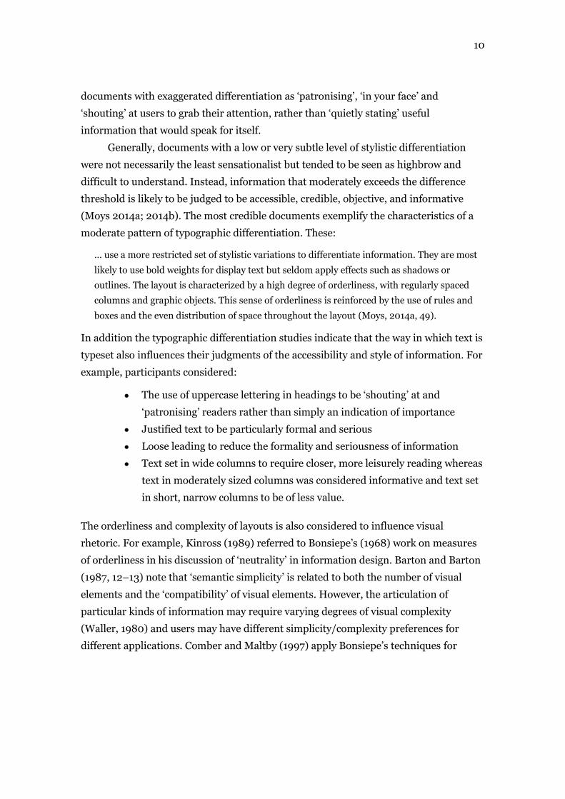
The typographic texture of information seemingly influences users’ at-a-glance
judgments of the difficulty and seriousness of information. In two of the typographic
differentiation studies (Moys 2014a; 2014b), the content of the test material was
rendered as a third order approximation of English (see Figure 8). This meant that the
text had a reasonably realistic texture but was free of linguistic meaning. Interestingly,
even though the meaning of the text was not discernible, some participants made
judgments about the style of writing and the difficulty of the information in relation to
typographic texture. In particular, where the computer-generated third order
approximations had created very long sentences and words, participants considered the
examples to be particularly academic, serious and hard to read. This finding suggests
that information design principles for content such as using plain language and writing
in short sentences improves users’ impressions of accessibility even before they begin
to read a text more closely.
Figure 6
Examples of typographic test material set using a third order approximation of English to
minimise the influence of linguistic attributes on the results (Reproduced with permission of
the author)
Graphic devices
In the first typographic differentiation study (Moys, 2011), participants seemed to make
a number of assumptions about documents that incorporate graphic devices such as
bulleted or numbered lists; tables; graphs, charts or diagrams; and step-by-step panels.
For example, regardless of the subject matter or target audience of the magazines,
articles using these graphic devices were considered to be:
Easier to understand
More important, informative and factual
More useful (particularly for examples including step-by-step panels).
It would seem that these graphic devices carry meaning beyond simply indicating a
rhetorical structure, as they influenced participants’ assumptions about the kind of
information, its value, complexity and accessibility contained in a document. This may
be particularly important for information design genres dealing with financial, legal or
health-related information that is likely to be considered difficult or stressful.

13
Other graphic devices, such as rules and boxes that reinforce the underlying
organisation of information, also carry rhetorical meaning. In the typographic
differentiation studies (Moys 2014a; 2014b), participants judged documents that
feature horizontal and vertical rules and boxed elements to be more serious and factual
than documents that did not contain many rules or boxes. Emphasising the visual
structure of information through rules and boxes, rather than accentuating or reducing
the white space between elements, seemed to reinforce participants’ assumptions that
information was well thought out and useful. However, increasing the weight of graphic
rules, the use of colour and decorative effects applied to graphic elements, angling or
rotating boxes, introducing irregularly shaped elements or using reversed text reduced
this effect. Examples including these characteristics were considered to be
sensationalist, patronising or desperate to attract attention.
User research conducted by the National Archives in the UK for legislation.gov
indicates that the presence of official symbols, such as the crest in the top left-hand
corner of their website, increase users’ assumptions about the reliability and authority
of legal information. However, this effect is not limited to official symbols. Particular
graphic devices used in information design also carry rhetorical associations.
Rather than relying solely on continuous text, the use of graphic devices – such as
tables, lists and diagrams – is favoured in information design because these devices are
considered to make information more accessible. In his discussion of the Simplification
Centre’s design criteria for document benchmarking, Waller (2011, 16) highlights that:
… graphic alternatives to prose such as a tables, lists and flowcharts [are] particularly
relevant to financial documents, as it has been shown than conditional information is easier
to understand when choices are shown graphically, or diagrammatically.
Waller (2011; Waller and Whalley, 1987) also explains how visualising arguments or
diagramming different viewpoints can help users make comparisons and establish
relationships. As MacDonald-Ross and Waller (2000, 182) argue good information
design ‘allows one to say in words and illustrations what could not be said in either
form alone’. However, it would seem that particular graphic devices also carry
rhetorical connotations and using them may encourage users to engage with
information from the outset.

14
Conclusion
This chapter has focused on users’ rhetorical impressions of visual conventions in
information design. The chapter has explored how graphic conventions associated with
promoting clarity and usability also influence users’ judgments of information.
Visual rhetoric isn’t simply about creating something that looks professional for
corporate or public sector service clients. It’s also about making complex information
seem accessible and credible. The kind of typographic articulation applied can
encourage users to ignore or engage with information based on their initial impressions
of genre, credibility, difficulty and usefulness. Appropriate typographic differentiation
can promote accessibility and clarity as well as setting the correct tone. In some
situations, users may be stressed or feeling overwhelmed by their particular
circumstances. Examples include information relating to finance, health or legal issues.
In these instances, good information design needs to be personable, empathetic and
reassuring for users, as well as communicating the ethos of the information provider.

15
References
Askehave, Inger and Anne E. Nielsen. 2005. ‘What are the characteristics of digital genres? –
genre theory from a multi-modal perspective.’ Proceedings of the 38th Hawaii
International Conference on System Sciences.
Barton, Ben and Marthalee Barton. 1987. ‘Simplicity in visual representation: a semiotic
approach.’ Journal of Business and Technical Communication 1, 9–26.
Bennett, Audrey. 2006. ‘Introduction: The rise of research in graphic design.’ Design Studies:
Theory and research in graphic design – a reader, edited by A. Bennett. New York,
Princeton Architectural Press: 14–23.
Bernhardt, Stephen A. 1985. ‘Text structure and graphic design: the visible design.’ In Systemic
perspectives on discourse: selected theoretical papers from the 9th International
Systemic Workshop 2, edited by J. D. Benson and W. S. Greaves, 18–38. Norwood, NJ:
Ablex.
Black, Alison and Karen Stanbridge. 2012. ‘Documents as “critical incidents” in organization to
consumer communication.’ Visible Language 46(3), 246–281.
Blake, Nigel. 1981. ‘Rhetoric and the problem of honest design.’ Information Design Journal
2(2), 74–90.
Bonsiepe, Gui. 1968. ‘A method of quantifying order in typographic design.’ The Journal of
Typographic Research II(3), 203–220.
Bonsiepe, Gui. 1999a. ‘Visual/verbal rhetoric.’ In Looking closer 3: classic writings on graphic
design, edited by Michael Bierut, Jessica Helfand, Steven Heller and Rick Poyner, 167–
173. New York: Allworth Press.
Bonsiepe, Gui. 1999b. Interface: an approach to design. Maastricht: Jan van Eyck Akademie.
Brumberger, Eva. 2001. The rhetoric of typography: five experimental studies on typeface
personality and its effects on readers and reading. PhD thesis: New Mexico State
University.
Brumberger, Eva. 2003. ‘The rhetoric of typography: the persona of typeface and text.’
Technical Communication 50(2), 206–223.
Brumberger, Eva. 2004. ‘The rhetoric of typography: effects on reading time, reading
comprehension and perceptions of ethos.’ Technical Communication 51(1), 13–24.
Buchanan, Richard. 1985. ‘Declaration by design: rhetoric, argument, and demonstration in
design practice.’ Design Issues 2(1): 4–22.
Comber, Tim and John R. Maltby. 1997. ‘Layout complexity: does it measure usability?’ In
Human-Computer Interaction Interact ’97 – Proceedings of International Conference on
Human-Computer Interaction, edited by S. Howard, J. Hammond, & G. Lindgaard, 623–
626. London: Chapman Hall.
Connors, Robert. 1983. ‘Actio: a rhetoric of manuscripts.’ Rhetoric Review 2(1), 64–73.
16
De Almeida, Cristina. 2009. ‘The rhetorical genre in graphic design: its relationship to design
authorship and implications to design education.’ Journal of Visual Literacy 28(2): 186–
198.
Dickinson, David and Jane Teather, Suzy Gallina, Emily Newsom-Davis. 2010. ‘Medicine
package leaflets – does good design matter?’ Information Design Journal 18(3), 225–
240.
Ehses, Hanno. 1984. ‘Representing Macbeth: a case study in visual rhetoric.’ Design Issues 1(1),
53–63.
Forlizzi, Jodie and Cherie Lebbon. 2006. ‘From Formalism to social significance in
Communication Design.’ Design Studies: theory and research in graphic design – a
reader, edited by Audrey Bennett, 51–63. New York: Princeton Architectural Press.
Hartley, James. 1980. ‘Spatial cues in text.’ Visible Language, 14, 62–79.
Hartley, James. 1985. Designing instructional text, 2nd edition, London: Kogan Page.
Hartley, James and Peter Burnhill. 1977. ‘Understanding instructional text: typography, layout
and design.’ Adult Learning, edited by M.J.A Howe, 223–247. London: Wiley.
Hazlett, Richard. L., Kevin Larson, A. Dawn Shaikh, and Barbara S, Chaparro. 2008. ‘The
instant impact of onscreen aesthetics: the effects of typeface personality.’ Paper presented
at CHI 2008 Conference on Computer-Human Interaction. Florence, Italy.
Kelly, George. 1955. The psychology of personal constructs. New York: Norton.
Kinross, Robin. 1989. ‘The rhetoric of neutrality.’ in Design discourse: history/theory/criticism,
edited by Margolin, Victor, 373–385. Chicago: University of Chicago Press.
Kostelnick, Charles. 1990. ‘The rhetoric of text design in professional communication.’ The
Technical Writing Teacher XVII(3), 189–202.
Kostelnick, Charles. 1996. ‘Supra-textual design: the visual rhetoric of whole documents.’
Technical Communication Quarterly 5(1), 9–33.
Kostelnick, Charles and Michael Hassett. 2003. Shaping information: the rhetoric of visual
conventions. Carbondale: Southern Illinois University Press.
Kurosu, Masaaki and Kaori Kashimura. 1995. ‘Apparent usability vs. inherent usability:
experimental analysis on the determinants of apparent usability.’ CHI ’95 Conference
Companion. New York, NY: ACM, 292–293.
Larson, Kevin. 2010. ‘The art, technology and science of reading.’ Paper presented at MIX10.
Las Vegas.
Larson, Kevin and Rosalind Picard. 2005. ‘The aesthetics of reading.’ Paper presented at
Human-Computer Interaction Consortium. Colorado.
Larson, Kevin, Richard L. Hazlett, Barbara. S. Chaparro, and Rosalind W. Picard. 2006.
‘Measuring the aesthetics of reading.’ in People and computers XX – Engage –
Proceedings of HCI 2006, edited by N. Bryan-Kinns, A. Blandford, P. Curzon, & L. Nigay,
41–56. London: Springer-Verlag
17
Li, Yung-Ming and Yung-Shao Yeh. 2010. ‘Increasing trust in mobile commerce through design
aesthetics.’ Computers in Human Behavior 26, 673–684.
MacDonald-Ross, Michael and Robert Waller. 2000. ‘The transformer revisited.’ Information
Design Journal 9(2&3), 177–193.
Margolin, Victor. 1979. ‘The visual rhetoric of propaganda.’ Information Design Journal 1(2),
107–122.
Moys, Jeanne-Louise. 2011. ‘Typographic voice: researching readers’ interpretations.’ The
Simplification Centre: Technical Papers. Retrieved 27 April 2014 from:
http://www.simplificationcentre.org.uk/resources/technical-papers/
Moys, Jeanne-Louise. 2014a. ‘Investigating readers’ impressions of typographic differentiation
using repertory grids.’ Visible Language 47(3), 91–118.
Moys, Jeanne-Louise. 2014b. ‘Typographic layout and first impressions – testing how changes
in text layout influence readers’ judgments of documents.’ Visible Language 48(1), 46–
72.
npower press release. 2013. ‘npower launches simple new bill and cuts number of tariffs.’
Retrieved 26 January 2015 from:
http://npowermediacentre.com/releases/ReleaseDetailPage.aspx?releaseId=4758.
Sauer, Juergen and Andreas Sonderegger. 2009. ‘The influence of prototype fidelity and
aesthetics of design in usability tests: effects on user behaviour, subjective evaluation and
emotion.’ Applied Ergonomics 40, 670–677.
Shaikh, Dawn. 2007a. Psychology of on-screen type: investigations regarding typeface
personality, appropriateness, and impact on document perception. PhD thesis: Wichita
State University.
Shaikh, Dawn. 2007b. ‘The effect of website typeface appropriateness on the perception of a
company’s ethos.’ Usability News 9(2). Retrieved 6 October 2010 from:
http://www.surl.org/usabilitynews/92/POF.asp.
Shaikh, Dawn and Doug Fox. 2008. ‘Does the typeface of a resume impact our perception of the
applicant?’ Usability News 10(1). Retrieved 6 October 2010 from:
http://www.surl.org/usabilitynews/101/pof.asp.
Shaikh, Dawn and Doug Fox and Barbara Chaparro. 2007. ‘The effect of typeface on the
perception of email.’ Usability News 9(1). Retrieved 6 October 2010 from:
http://www.surl.org/usabilitynews/91/POF2.asp.
Sonderegger, Andreas and Juergen Sauer. 2010. ‘The influence of design aesthetics in usability
testing: effects on user performance and perceived usability.’ Applied Ergonomics 41(3),
403–410.
Townsend, Claudia and Suzanne B. Shu. 2010. ‘When and how aesthetics influences financial
decisions.’ Journal of Consumer Psychology 20, 452–458.
Tractinsky, Noam. 1997. ‘Aesthetics and apparent usability: empirically assessing cultural and
methodological issues.’ CHI 97 Conference Proceedings. New York, NY: ACM, 115–122.

18
Tractinsky, Noam, A.S Katz and D. Ikar. 2000. ‘What is beautiful is usable.’ Interacting with
Computers 13, 127–145.
Trummel, P. 1988. ‘Rhetoric + typography: creative interaction in modern communication.’
IEEE Transactions on Professional Communication 31(3): 124–129.
Twyman, Michael. 1982. ‘The graphic presentation of language’, Information Design Journal, 3,
2–22.
Twyman, Michael. 1985. ‘Using pictorial language: a discussion of the dimensions of the
problem.’ Designing usable texts, edited by T.M. Duffy and R.H.W. Waller, 245–312.
Orlando, Florida: Academic Press.
Twyman, Michael. 1986. ‘Articulating graphic language: a historical perspective.’ Towards a
new understanding of literacy, edited by M.E. Wrolstad and D.F. Fisher, 188–251. New
York: Praeger.
Tyler, Ann. 2006. ‘Shaping belief: the role of audience in visual communication.’ Design
Studies: theory and research in graphic design – a reader, edited by Audrey Bennett,
36–49. New York: Princeton Architectural Press.
Walker, Sue. 1982. ‘Describing verbal graphic language: practicalities and implications.’
Information Design Journal 3(2), 102–109.
Walker, Sue. 2001. Typography and language in everyday life: prescriptions and practices.
Harlow: Longman.
Waller, Robert. 1980. ‘Review of Tom Vernon’s Gobbledegook.’ Information Design Journal
1(4), 283–85.
Waller, Robert. 1982. ‘Text as diagram: using typography to improve access and understanding’,
in The technology of text, edited by D Jonassen, 137–166. Englewood Cliffs, NJ:
Educational Technology Publications,
Waller, Robert. 1985. ‘Using typography to structure arguments: a critical analysis of some
examples’, in The technology of text, volume 2, edited by D Jonassen, 105–125.
Englewood Cliffs, NJ: Educational Technology Publications.
Waller, Robert. 2011. ‘What makes a good document? The criteria we use.’ The Simplification
Centre: Technical Papers 2. Retrieved 27 April 2014 from:
http://www.simplificationcentre.org.uk/resources/technical-papers/
Waller, Robert. 2012. ‘Graphic literacies for a digital age: the survival of layout.’ The
Information Society: an international journal 28(4): 236–252.
Waller, Robert and Judy Delin. 2010. ‘Towards a pattern language approach to document
description.’ Paper presented at Multidisciplinary Approaches to Discourse, Moissac,
France.
Waller, Robert and Peter Whalley. 1987. ‘Graphically organised prose.’ In Learning and
instruction, edited by E. De Corte, H. Lodewijks, R. Parmentier, and P. Span, 369–381.
Oxford: Pergamon Press.