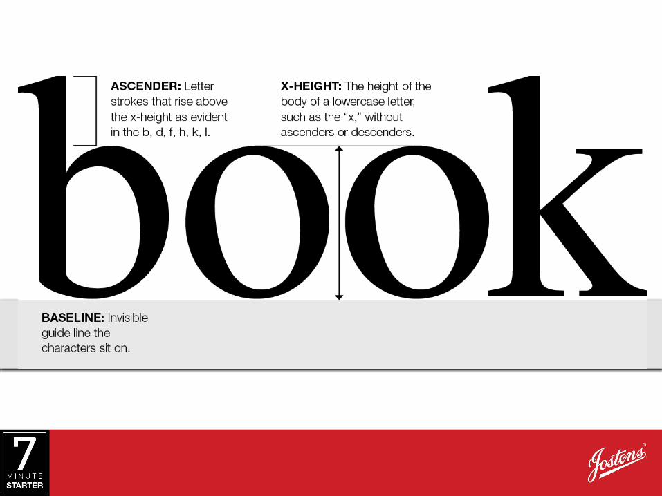
typography: building blocks. learn typography is timeless, yet always changing. it’s helpful when...
TRANSCRIPT

Typography: Building Blocks
LEARN• Typography is timeless, yet always
changing. It’s helpful when deciding upon a font to know parts of the typographic anatomy.


NOT ALL POINTS ARE MADE EQUAL

SPACED OUT
The readability of stories
and captions is enhanced
by maintaining a consistent
point size and carefully
considering the leading or
the typographic spacing.
14 POINT WITH 15 POINT LEADINGAlso called line spacing, leading is the space between lines of text, measured in points from baseline to baseline. As the difference between the point and the leading increases, so does the space between the lines.
14 POINT WITH 22 POINT LEADING
Also called line spacing, leading is the space
between lines of text, measured in points from
baseline to baseline. As the difference between the
point and the leading increases, so does the space
between the lines.
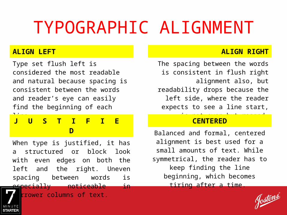
TYPOGRAPHIC ALIGNMENTALIGN LEFT
Type set flush left is considered the most readable and natural because spacing is consistent between the words and reader’s eye can easily find the beginning of each line.
ALIGN RIGHT
The spacing between the words is consistent in flush right alignment also,
but readability drops because the left side, where the reader expects to see a
line start, is not even but ragged.
J U S T I F I E D
When type is justified, it has a structured or block look with even edges on both the left and the right. Uneven spacing between words is especially noticeable in narrower columns of text.
CENTERED
Balanced and formal, centered alignment is best used for a small amounts of text.
While symmetrical, the reader has to keep finding the line beginning, which
becomes tiring after a time.

PRACTICE• Complete the exit ticket to review the
terms learned in the presentation.

USE• Analyze your spreads:
– Is all text easy to read? If not, consider changing:
• The font
• The font size
• The alignment
• The leading