typographic - pragma ade · programming, we qualify it as typographic programming, ... typographers...
TRANSCRIPT

1 1
1 1
HansHagen
TypographicProgramming

2 2
2 2

3 3
3 3
Introduction
Introduction Preliminary Version 1
Today, automated typesetting is quite popular, which is partly due to the fact thatdocument coding standards have evolved, in particular XML. For instance, when younavigate the internet, a typesetting engine is at work to render the pages. When youask for a print preview, you often get a different rendering. So, one document sourcecan result in different views.
The vehicle that we use for automated typesetting of books is called CONTEXT. Thissystem is based on the well known typesetting engine and language TEX and thegraphic programming environment METAPOST. Systems like this provide a mixtureof predefined typographical solutions and document specific programming. Thecode needed to perform the task ends up in a file or collection of files, oftencalled styles. Because writing such styles is closely related to both typography andprogramming, we qualify it as typographic programming, the theme of this book.
This book is not a reference manual to CONTEXT. For the many possibilities thatthese systems provide we refer to the suite of manuals that come with the system.Some of the mechanism mentioned here are described in detail in dedicated manuals.Here we focus on the more general aspects of document design and the translationof design into a style. Because we will focus a lot on esthetics, quality, and structure,we elaborate a it on these themes.
If you typeset a document, the quality of the result is determined by several factors,like:
• the consistency of the design: layout, font and color usage• the match between the design and the content: a 400 word summary is not the
same as one made up of 100 words• the application of quality control in all stages of the process• the presence of typographic directives in the source code: special symbols, com-
pound words, extensive tagging• the amount of structure present in the document source: a change in typographic
behavour needs to be triggered and demands well defined anchor points• the flexibility of the designer and style writer with regards to the content and
graphical gimmicks
No matter how hard we try to set up a style in a structured way, in practice we oftenend up is a messy situation. To mention a few possible reasons:
• the design is kind of fixed before the content is known, e.g. some elements needmore space than special areas (like margins) provide
• the amount and nature of text and graphics is quite different from the dummiesused during the design

4 4
4 4
2 Preliminary Version Introduction
• the fonts and/or line spacing are not suitable for the content, e.g. math• what starts as consistent color usage ends up in seemingly random usage due to
ad hoc decisions• the design does not match the structure of the document, i.e. the content is far
from similar to the nice quotes and demo texts used for demonstrating the design• content is dropped due to flaws in the design and/or design elements are omitted
because the content turns out to be different• click and point applications are seldom stimulate stuctured design: a few pages
look different than 100 pages with real content ending up on left and right handpages
• dimensions and other specifications are fuzzy or worse, meaningless numberslike “level 5 in this or that menu” are used to communicate
• designs are not always consistent: in interactive programs this can normally besolved on the fly, leading to even less consistency
The bottom line is not that interactive markup programs are better or worse thancommand driven typesetting engines. Both have their applications, advantages andshortcomings. Producing a 50 page booklet is not the same as automatically type-setting 100 books of 200 pages each in a similar layout, especially if you take intoaccount production factors like the number of permitted keystrokes (or mouse move-ments and clicks), update time and production time. The complication mentionedin the previous paragraph come from the fact that both demand a different way ofthinking and handling. Whatever method one chooses, the problem of matchingdesign to content does not change.
Due to its nature, command driven typesetting leaves less room for quick hacks andlast minute tweaking. Setting up a style for a complex layout and complex contentis therefore related to computer programming:
• identify and analyze the problem and boundary conditions• generalize and implement an as robust as possible solution• set up a representative test bed and check the results
In this book we take existing, frozen, and in my opinion proper designs as startingpoint and therefore we are freed from fighting the inconsistent boundary conditionsmentioned before.
On the following pages, we will demonstrate how to implement style elements. Itis not my intention to replicate complete styles for books, but careful reading willlearn you how to do that yourself. We will also spent some words on the fine pointsof style design, but as said, the details and real dirty tricks can be found in manualsthat come with CONTEXT, for instance details.pdf. We assume that the reader has

5 5
5 5
Introduction Preliminary Version 3
at least some knowledge of CONTEXT and is familiar with the concept of commanddriven (or: intentional) typesetting.
Another aspect to keep in mind when reading this manual is that taste, of boththe designer and the consumer changes over time. For some time I consideredthe newspaper I’ve been reading each morning to be superior in design: it usedmixed ragged right and aligned typesetting, provides a balanced mixture betweenserif (specially designed for the paper) and sans serif font. Parts of the paper wereprofessionally layed out and I had plans to show some of that in this manual. Alas,as per 2004 the design was changed to an all rather bold serif titles and ragged rightonly. Gone was the subtle and clean look and feel, back were the screaming titles,and worse: gone was my appetite for reading that paper. So, when you read thismanual in a few years from now, keep in mind that it was written in 2004, using thepossibilities of that years TEX and CONTEXT: a frozen moment in time.1
We will now switch to document style design mode. Don’t panic if you don’tunderstand all the commands and options. Many of them will be used several timesand their working will become clear. It really helps if you have a recent version ofCONTEXT on your system so that you can key in code and play with those settingsyourself.
There was a time when in the process of bookproduction the different skills wereassigned to different persons: designer, typographer, lithographer, printer, etc. Pho-tographs were made by a photographer, who in many cases was also responsible forscaling and cutting the picture to its desired size. The computer has diffused theborder between those skills. However, since design and typography are to someextend two dimensions, we run into situations were a nice design is matched bybad typography or the reverse. It’s no real problem if a designer is dyslectic and atypographer color blind, but you may wonder about the opposite. The author ofthis document is neither a designer nor a typographer, so you are warned.
Hans Hagen — Hasselt 2004
For those who have access to a library with Dutch newspapers: take a look at the 2002–2003 issues of1
‘Trouw’ to get a good feeling.

6 6
6 6
4 Preliminary Version Introduction

7 7
7 7
Contents
Contents Preliminary Version 5
This book is divided in sections. Color combinations are used to identify a subsection. I owe an apology to readers who are colorblind. I felt that it was time for acolorful document and I always want to use some of the more recent CONTEXT tricks.
TypesettingIntroduction 7Breaking 9Samples 13Spacing 25Protruding and HZ 27
OrganizationIntroduction 37Structure 39Alternatives 41Reuse 43Coding 45XML 47
LayoutIntroduction 49Definition 51Lines 53Esthetics 59Sideness 63Columns 65Ornaments 67Graphics 69
ExamplesIntroduction 71Full Page 73Simple Page 78

8 8
8 8
6 Preliminary Version Contents

9 9
9 9
Typesetting Introduction
Typesetting Preliminary Version Introduction 7
todo

10 10
10 10
8 Preliminary Version Typesetting

11 11
11 11
Typesetting Breaking
Typesetting Preliminary Version Breaking 9
When TEX breaks paragraphs into lines, it assigns penalties or rewards (negative penal-ties) to possible breakpoints. When the final decisions are made, the accumulatedpenalties play an important role. When in a next stage the paragraph has to be splitacross pages, a similar system of penalties comes into play. You can control thissystem by setting the values of penalties for certain situations.1
variable value scope
\brokenpenalty 100 paragraph\hyphenpenalty 50 paragraph\widowpenalty 0 page\clubpenalty 0 page\doublehyphendemerits 10000 paragraph\finalhyphendemerits 5000 paragraph\adjdemerits 10000 paragraph
Because a non linear scale is used, and because some values have special meanings, inpractice it takes some trial and error to get the effects you want. You should also keepin mind that setting one penalty may influence the consequences of setting anotherone. For instance, you can prevent widow lines by setting the \widowpenalty to avery high value, but in a three line paragraph this may lead to club lines when the\clubpenalty is much lower.
A naive approach to get the best of everything is to assign all variables a high value,like:
\brokenpenalty 10000 \hyphenpenalty 10000
\doublehyphendemerits 10000 \finalhyphendemerits 10000
\widowpenalty 10000 \clubpenalty 10000
\adjdemerits 5000
This may lead to many underfull pages and rather ugly paragraphs, especiallywhen strict hyphenation rules are applies (for instance values larger than 3 forlefthyphenmin and/or righthyphenmin). We’ve run into designers who had noproblem with such strict settings. Since in this particular case ragged right alignmentwas used, it more or less meant that TEX’s sophisticated linebreak mechanisms areturned off.
In this section we simplify the process of breaking paragraphs and pages. For those who are interested1
in the nasty details, the reasoning behind these mechanisms, and the special meaning of some values,we refer to Donald Knuth’s TEXbook.

12 12
12 12
10 Breaking Preliminary Version Typesetting
On the next pages, we show the consequence of setting the variables mentioned here.Each sample is visually split into three parts demonstrating what happens when oneline firts on the previous page, and one line has to move to the next page.
Each line has a background, demonstrating the natural width of the line: the amountof text that sticks out of the background bar is compensated by stretchable spacebetween the words.
We will use a quote from Hermann Zapf as sample text. When typeset in the runningtext, this looks as follows:
Coming back to the use of typefaces in electronic publishing: many of the new Hermann Zapftypographers receive their knowledge and information about the rules of typographyfrom books, from computer magazines or the instruction manuals which they getwith the purchase of a PC or software. There is not so much basic instruction,as of now, as there was in the old days, showing the differences between good andbad typographic design. Many people are just fascinated by their PC’s tricks, andthink that a widely--praised program, called up on the screen, will make everythingautomatic from now on.
When TEX breaks this text into lines, it will hyphenate words when needed. This texthas the following hyphenation points:
zapf
In order to show the differences in settings, a smaller font size will be used. Exam-ple 1.1 shows how this text will will be typeset. The right part shows the hyphenationpoints.
Coming back to the use of typefaces in elec-tronic publishing: many of the new typog-raphers receive their knowledge and infor-mation about the rules of typography frombooks, from computer magazines or the in-struction manuals which they get with thepurchase of a PC or software. There is notso much basic instruction, as of now, as therewas in the old days, showing the differencesbetween good and bad typographic design.Many people are just fascinated by their PC’stricks, and think that a widely--praised pro-gram, called up on the screen, will make ev-erything automatic from now on.
zapf
normal broken
Example 1.1

13 13
13 13
Typesetting Preliminary Version Breaking 11
The previously shown strict settings (10000 or more) can have rather disasterousresults, as shown in Example 1.2. When we use such values, it will be no surprisethat those who have strict opinions about breaking prefer ragged right texts.
Coming back to the use of typefaces in elec-tronic publishing: many of the new typog-raphers receive their knowledge and infor-mation about the rules of typography frombooks, from computer magazines or the in-struction manuals which they get with thepurchase of a PC or software. There is notso much basic instruction, as of now, as therewas in the old days, showing the differencesbetween good and bad typographic design.Many people are just fascinated by their PC’stricks, and think that a widely--praised pro-gram, called up on the screen, will make ev-erything automatic from now on.
Coming back to the use of typefaces inelectronic publishing: many of the newtypographers receive their knowledge andinformation about the rules of typographyfrom books, from computer magazines orthe instruction manuals which they get withthe purchase of a PC or software. There isnot so much basic instruction, as of now,as there was in the old days, showing thedifferences between good and bad typographicdesign. Many people are just fascinated bytheir PC’s tricks, and think that a widely--praised program, called up on the screen, willmake everything automatic from now on.
normal strict
Example 1.2
Another reason for prefering ragged right text is that even 25 years after TEX surfaced,most desk top publishing systems are still pretty bad when it comes to breakingparagraphs into lines. By looking at lines only (while TEX takes the whole paragraphinto account) the only way out when aligning text is stretching the space. Example 1.3demonstrates that TEX can align rather well.
Coming back to the use of typefaces in elec-tronic publishing: many of the new typog-raphers receive their knowledge and infor-mation about the rules of typography frombooks, from computer magazines or the in-struction manuals which they get with thepurchase of a PC or software. There is notso much basic instruction, as of now, as therewas in the old days, showing the differencesbetween good and bad typographic design.Many people are just fascinated by their PC’stricks, and think that a widely--praised pro-gram, called up on the screen, will make ev-erything automatic from now on.
Coming back to the use of typefaces in elec-tronic publishing: many of the new typog-raphers receive their knowledge and infor-mation about the rules of typography frombooks, from computer magazines or the in-struction manuals which they get with thepurchase of a PC or software. There is notso much basic instruction, as of now, asthere was in the old days, showing the dif-ferences between good and bad typographicdesign. Many people are just fascinated bytheir PC’s tricks, and think that a widely--praised program, called up on the screen,will make everything automatic from nowon.
Example 1.3
Keep in mind that the width is smaller than normally used, a more realistic situationis example 1.4.

14 14
14 14
12 Breaking Preliminary Version Typesetting
Coming back to the use of typefaces in electronic publishing: many of the new typographersreceive their knowledge and information about the rules of typography from books, fromcomputer magazines or the instruction manuals which they get with the purchase of a PCor software. There is not so much basic instruction, as of now, as there was in the old days,showing the differences between good and bad typographic design. Many people are justfascinated by their PC’s tricks, and think that a widely--praised program, called up on thescreen, will make everything automatic from now on.
normal
Coming back to the use of typefaces in electronic publishing: many of the new typog-raphers receive their knowledge and information about the rules of typography frombooks, from computer magazines or the instruction manuals which they get with thepurchase of a PC or software. There is not so much basic instruction, as of now, asthere was in the old days, showing the differences between good and bad typographicdesign. Many people are just fascinated by their PC’s tricks, and think that a widely--praised program, called up on the screen, will make everything automatic from now on.
ragged
Example 1.4

15 15
15 15
brokenpenalty
This penalty is added after each linethat ends with a hyphenated word.
High values will discourage TEX inbreaking a page there.
Typesetting Samples
Typesetting Preliminary Version Samples 13
Coming back to the use of typefaces in elec-tronic publishing: many of the new typog-raphers receive their knowledge and infor-mation about the rules of typography frombooks, from computer magazines or the in-struction manuals which they get with thepurchase of a PC or software. There is notso much basic instruction, as of now, as therewas in the old days, showing the differencesbetween good and bad typographic design.Many people are just fascinated by their PC’stricks, and think that a widely--praised pro-gram, called up on the screen, will make ev-erything automatic from now on.
Coming back to the use of typefaces in elec-tronic publishing: many of the new typog-raphers receive their knowledge and infor-mation about the rules of typography frombooks, from computer magazines or the in-struction manuals which they get with thepurchase of a PC or software. There is notso much basic instruction, as of now, as therewas in the old days, showing the differencesbetween good and bad typographic design.Many people are just fascinated by their PC’stricks, and think that a widely--praised pro-gram, called up on the screen, will make ev-erything automatic from now on.
0 2500
Coming back to the use of typefaces in elec-tronic publishing: many of the new typog-raphers receive their knowledge and infor-mation about the rules of typography frombooks, from computer magazines or the in-struction manuals which they get with thepurchase of a PC or software. There is notso much basic instruction, as of now, as therewas in the old days, showing the differencesbetween good and bad typographic design.Many people are just fascinated by their PC’stricks, and think that a widely--praised pro-gram, called up on the screen, will make ev-erything automatic from now on.
Coming back to the use of typefaces in elec-tronic publishing: many of the new typog-raphers receive their knowledge and infor-mation about the rules of typography frombooks, from computer magazines or the in-struction manuals which they get with thepurchase of a PC or software. There is notso much basic instruction, as of now, as therewas in the old days, showing the differencesbetween good and bad typographic design.Many people are just fascinated by their PC’stricks, and think that a widely--praised pro-gram, called up on the screen, will make ev-erything automatic from now on.
5000 10000
Coming back to the use of typefaces in elec-tronic publishing: many of the new typog-raphers receive their knowledge and infor-mation about the rules of typography frombooks, from computer magazines or the in-struction manuals which they get with thepurchase of a PC or software. There is notso much basic instruction, as of now, as therewas in the old days, showing the differencesbetween good and bad typographic design.Many people are just fascinated by their PC’stricks, and think that a widely--praised pro-gram, called up on the screen, will make ev-erything automatic from now on.
Coming back to the use of typefaces in elec-tronic publishing: many of the new typog-raphers receive their knowledge and infor-mation about the rules of typography frombooks, from computer magazines or the in-struction manuals which they get with thepurchase of a PC or software. There is notso much basic instruction, as of now, as therewas in the old days, showing the differencesbetween good and bad typographic design.Many people are just fascinated by their PC’stricks, and think that a widely--praised pro-gram, called up on the screen, will make ev-erything automatic from now on.
50000 1000000000

16 16
16 16
widowpenalty
This is the penalty added before the lastline of a paragraph. This penalty deter-mines how eager TEX will be in splittinga page before the last line.
14 Samples Preliminary Version Typesetting
Coming back to the use of typefaces in elec-tronic publishing: many of the new typog-raphers receive their knowledge and infor-mation about the rules of typography frombooks, from computer magazines or the in-struction manuals which they get with thepurchase of a PC or software. There is notso much basic instruction, as of now, as therewas in the old days, showing the differencesbetween good and bad typographic design.Many people are just fascinated by their PC’stricks, and think that a widely--praised pro-gram, called up on the screen, will make ev-erything automatic from now on.
Coming back to the use of typefaces in elec-tronic publishing: many of the new typog-raphers receive their knowledge and infor-mation about the rules of typography frombooks, from computer magazines or the in-struction manuals which they get with thepurchase of a PC or software. There is notso much basic instruction, as of now, as therewas in the old days, showing the differencesbetween good and bad typographic design.Many people are just fascinated by their PC’stricks, and think that a widely--praised pro-gram, called up on the screen, will make ev-erything automatic from now on.
0 2500
Coming back to the use of typefaces in elec-tronic publishing: many of the new typog-raphers receive their knowledge and infor-mation about the rules of typography frombooks, from computer magazines or the in-struction manuals which they get with thepurchase of a PC or software. There is notso much basic instruction, as of now, as therewas in the old days, showing the differencesbetween good and bad typographic design.Many people are just fascinated by their PC’stricks, and think that a widely--praised pro-gram, called up on the screen, will make ev-erything automatic from now on.
Coming back to the use of typefaces in elec-tronic publishing: many of the new typog-raphers receive their knowledge and infor-mation about the rules of typography frombooks, from computer magazines or the in-struction manuals which they get with thepurchase of a PC or software. There is notso much basic instruction, as of now, as therewas in the old days, showing the differencesbetween good and bad typographic design.Many people are just fascinated by their PC’stricks, and think that a widely--praised pro-gram, called up on the screen, will make ev-erything automatic from now on.
5000 10000
Coming back to the use of typefaces in elec-tronic publishing: many of the new typog-raphers receive their knowledge and infor-mation about the rules of typography frombooks, from computer magazines or the in-struction manuals which they get with thepurchase of a PC or software. There is notso much basic instruction, as of now, as therewas in the old days, showing the differencesbetween good and bad typographic design.Many people are just fascinated by their PC’stricks, and think that a widely--praised pro-gram, called up on the screen, will make ev-erything automatic from now on.
Coming back to the use of typefaces in elec-tronic publishing: many of the new typog-raphers receive their knowledge and infor-mation about the rules of typography frombooks, from computer magazines or the in-struction manuals which they get with thepurchase of a PC or software. There is notso much basic instruction, as of now, as therewas in the old days, showing the differencesbetween good and bad typographic design.Many people are just fascinated by their PC’stricks, and think that a widely--praised pro-gram, called up on the screen, will make ev-erything automatic from now on.
50000 1000000000

17 17
17 17
clubpenalty
This is the penalty added after the firstline of a paragraph. This penalty deter-mines TEX’s willingness to split a pageafter the first line.
Typesetting Preliminary Version Samples 15
Coming back to the use of typefaces in elec-tronic publishing: many of the new typog-raphers receive their knowledge and infor-mation about the rules of typography frombooks, from computer magazines or the in-struction manuals which they get with thepurchase of a PC or software. There is notso much basic instruction, as of now, as therewas in the old days, showing the differencesbetween good and bad typographic design.Many people are just fascinated by their PC’stricks, and think that a widely--praised pro-gram, called up on the screen, will make ev-erything automatic from now on.
Coming back to the use of typefaces in elec-tronic publishing: many of the new typog-raphers receive their knowledge and infor-mation about the rules of typography frombooks, from computer magazines or the in-struction manuals which they get with thepurchase of a PC or software. There is notso much basic instruction, as of now, as therewas in the old days, showing the differencesbetween good and bad typographic design.Many people are just fascinated by their PC’stricks, and think that a widely--praised pro-gram, called up on the screen, will make ev-erything automatic from now on.
0 2500
Coming back to the use of typefaces in elec-tronic publishing: many of the new typog-raphers receive their knowledge and infor-mation about the rules of typography frombooks, from computer magazines or the in-struction manuals which they get with thepurchase of a PC or software. There is notso much basic instruction, as of now, as therewas in the old days, showing the differencesbetween good and bad typographic design.Many people are just fascinated by their PC’stricks, and think that a widely--praised pro-gram, called up on the screen, will make ev-erything automatic from now on.
Coming back to the use of typefaces in elec-tronic publishing: many of the new typog-raphers receive their knowledge and infor-mation about the rules of typography frombooks, from computer magazines or the in-struction manuals which they get with thepurchase of a PC or software. There is notso much basic instruction, as of now, as therewas in the old days, showing the differencesbetween good and bad typographic design.Many people are just fascinated by their PC’stricks, and think that a widely--praised pro-gram, called up on the screen, will make ev-erything automatic from now on.
5000 10000
Coming back to the use of typefaces in elec-tronic publishing: many of the new typog-raphers receive their knowledge and infor-mation about the rules of typography frombooks, from computer magazines or the in-struction manuals which they get with thepurchase of a PC or software. There is notso much basic instruction, as of now, as therewas in the old days, showing the differencesbetween good and bad typographic design.Many people are just fascinated by their PC’stricks, and think that a widely--praised pro-gram, called up on the screen, will make ev-erything automatic from now on.
Coming back to the use of typefaces in elec-tronic publishing: many of the new typog-raphers receive their knowledge and infor-mation about the rules of typography frombooks, from computer magazines or the in-struction manuals which they get with thepurchase of a PC or software. There is notso much basic instruction, as of now, as therewas in the old days, showing the differencesbetween good and bad typographic design.Many people are just fascinated by their PC’stricks, and think that a widely--praised pro-gram, called up on the screen, will make ev-erything automatic from now on.
50000 1000000000

18 18
18 18
hyphenpenalty
This penalty is added after each loca-tion in the paragraph where TEX canhyphenate and therefore this penaltydetermines the way TEX splits the para-graph into lines.
16 Samples Preliminary Version Typesetting
Coming back to the use of typefaces in elec-tronic publishing: many of the new typog-raphers receive their knowledge and infor-mation about the rules of typography frombooks, from computer magazines or the in-struction manuals which they get with thepurchase of a PC or software. There is notso much basic instruction, as of now, as therewas in the old days, showing the differencesbetween good and bad typographic design.Many people are just fascinated by their PC’stricks, and think that a widely--praised pro-gram, called up on the screen, will make ev-erything automatic from now on.
Coming back to the use of typefaces inelectronic publishing: many of the newtypographers receive their knowledge andinformation about the rules of typographyfrom books, from computer magazines orthe instruction manuals which they get withthe purchase of a PC or software. There isnot so much basic instruction, as of now,as there was in the old days, showing thedifferences between good and bad typographicdesign. Many people are just fascinated bytheir PC’s tricks, and think that a widely--praised program, called up on the screen, willmake everything automatic from now on.
0 2500
Coming back to the use of typefaces inelectronic publishing: many of the newtypographers receive their knowledge andinformation about the rules of typographyfrom books, from computer magazines orthe instruction manuals which they get withthe purchase of a PC or software. There isnot so much basic instruction, as of now,as there was in the old days, showing thedifferences between good and bad typographicdesign. Many people are just fascinated bytheir PC’s tricks, and think that a widely--praised program, called up on the screen, willmake everything automatic from now on.
Coming back to the use of typefaces inelectronic publishing: many of the newtypographers receive their knowledge andinformation about the rules of typographyfrom books, from computer magazines orthe instruction manuals which they get withthe purchase of a PC or software. There isnot so much basic instruction, as of now,as there was in the old days, showing thedifferences between good and bad typographicdesign. Many people are just fascinated bytheir PC’s tricks, and think that a widely--praised program, called up on the screen, willmake everything automatic from now on.
5000 10000
Coming back to the use of typefaces inelectronic publishing: many of the newtypographers receive their knowledge andinformation about the rules of typographyfrom books, from computer magazines orthe instruction manuals which they get withthe purchase of a PC or software. There isnot so much basic instruction, as of now,as there was in the old days, showing thedifferences between good and bad typographicdesign. Many people are just fascinated bytheir PC’s tricks, and think that a widely--praised program, called up on the screen, willmake everything automatic from now on.
Coming back to the use of typefaces inelectronic publishing: many of the newtypographers receive their knowledge andinformation about the rules of typographyfrom books, from computer magazines orthe instruction manuals which they get withthe purchase of a PC or software. There isnot so much basic instruction, as of now,as there was in the old days, showing thedifferences between good and bad typographicdesign. Many people are just fascinated bytheir PC’s tricks, and think that a widely--praised program, called up on the screen, willmake everything automatic from now on.
50000 1000000000

19 19
19 19
exhyphenpenalty
This penalty is added after each loca-tion in the paragraph where the userindicates that TEX may hyphenate. Thispenalty determines the way TEX splitsthe paragraph into lines.
Typesetting Preliminary Version Samples 17
Coming back to the use of typefaces in elec-tronic publishing: many of the new typog-raphers receive their knowledge and infor-mation about the rules of typography frombooks, from computer magazines or the in-struction manuals which they get with thepurchase of a PC or software. There is notso much basic instruction, as of now, as therewas in the old days, showing the differencesbetween good and bad typographic design.Many people are just fascinated by their PC’stricks, and think that a widely--praised pro-gram, called up on the screen, will make ev-erything automatic from now on.
Coming back to the use of typefaces in elec-tronic publishing: many of the new typog-raphers receive their knowledge and infor-mation about the rules of typography frombooks, from computer magazines or the in-struction manuals which they get with thepurchase of a PC or software. There is notso much basic instruction, as of now, as therewas in the old days, showing the differencesbetween good and bad typographic design.Many people are just fascinated by their PC’stricks, and think that a widely--praised pro-gram, called up on the screen, will make ev-erything automatic from now on.
0 2500
Coming back to the use of typefaces in elec-tronic publishing: many of the new typog-raphers receive their knowledge and infor-mation about the rules of typography frombooks, from computer magazines or the in-struction manuals which they get with thepurchase of a PC or software. There is notso much basic instruction, as of now, as therewas in the old days, showing the differencesbetween good and bad typographic design.Many people are just fascinated by their PC’stricks, and think that a widely--praised pro-gram, called up on the screen, will make ev-erything automatic from now on.
Coming back to the use of typefaces in elec-tronic publishing: many of the new typog-raphers receive their knowledge and infor-mation about the rules of typography frombooks, from computer magazines or the in-struction manuals which they get with thepurchase of a PC or software. There is notso much basic instruction, as of now, as therewas in the old days, showing the differencesbetween good and bad typographic design.Many people are just fascinated by their PC’stricks, and think that a widely--praised pro-gram, called up on the screen, will make ev-erything automatic from now on.
5000 10000
Coming back to the use of typefaces in elec-tronic publishing: many of the new typog-raphers receive their knowledge and infor-mation about the rules of typography frombooks, from computer magazines or the in-struction manuals which they get with thepurchase of a PC or software. There is notso much basic instruction, as of now, as therewas in the old days, showing the differencesbetween good and bad typographic design.Many people are just fascinated by their PC’stricks, and think that a widely--praised pro-gram, called up on the screen, will make ev-erything automatic from now on.
Coming back to the use of typefaces in elec-tronic publishing: many of the new typog-raphers receive their knowledge and infor-mation about the rules of typography frombooks, from computer magazines or the in-struction manuals which they get with thepurchase of a PC or software. There is notso much basic instruction, as of now, as therewas in the old days, showing the differencesbetween good and bad typographic design.Many people are just fascinated by their PC’stricks, and think that a widely--praised pro-gram, called up on the screen, will make ev-erything automatic from now on.
50000 1000000000

20 20
20 20
doublehyphendemerits
While TEX is breaking a paragraph intolines, it calculates demerits for potentiallinebreaks. This value is added to thedemerits of a line if that line as wellas the previous one both end with ahyphen.
18 Samples Preliminary Version Typesetting
Coming back to the use of typefaces in elec-tronic publishing: many of the new typog-raphers receive their knowledge and infor-mation about the rules of typography frombooks, from computer magazines or the in-struction manuals which they get with thepurchase of a PC or software. There is notso much basic instruction, as of now, as therewas in the old days, showing the differencesbetween good and bad typographic design.Many people are just fascinated by their PC’stricks, and think that a widely--praised pro-gram, called up on the screen, will make ev-erything automatic from now on.
Coming back to the use of typefaces in elec-tronic publishing: many of the new typog-raphers receive their knowledge and infor-mation about the rules of typography frombooks, from computer magazines or the in-struction manuals which they get with thepurchase of a PC or software. There is notso much basic instruction, as of now, as therewas in the old days, showing the differencesbetween good and bad typographic design.Many people are just fascinated by their PC’stricks, and think that a widely--praised pro-gram, called up on the screen, will make ev-erything automatic from now on.
0 2500
Coming back to the use of typefaces in elec-tronic publishing: many of the new typog-raphers receive their knowledge and infor-mation about the rules of typography frombooks, from computer magazines or the in-struction manuals which they get with thepurchase of a PC or software. There is notso much basic instruction, as of now, as therewas in the old days, showing the differencesbetween good and bad typographic design.Many people are just fascinated by their PC’stricks, and think that a widely--praised pro-gram, called up on the screen, will make ev-erything automatic from now on.
Coming back to the use of typefaces in elec-tronic publishing: many of the new typog-raphers receive their knowledge and infor-mation about the rules of typography frombooks, from computer magazines or the in-struction manuals which they get with thepurchase of a PC or software. There is notso much basic instruction, as of now, as therewas in the old days, showing the differencesbetween good and bad typographic design.Many people are just fascinated by their PC’stricks, and think that a widely--praised pro-gram, called up on the screen, will make ev-erything automatic from now on.
5000 10000
Coming back to the use of typefaces in elec-tronic publishing: many of the new typog-raphers receive their knowledge and infor-mation about the rules of typography frombooks, from computer magazines or the in-struction manuals which they get with thepurchase of a PC or software. There is notso much basic instruction, as of now, asthere was in the old days, showing the dif-ferences between good and bad typographicdesign. Many people are just fascinated bytheir PC’s tricks, and think that a widely--praised program, called up on the screen, willmake everything automatic from now on.
Coming back to the use of typefaces inelectronic publishing: many of the newtypographers receive their knowledge and in-formation about the rules of typography frombooks, from computer magazines or the in-struction manuals which they get with thepurchase of a PC or software. There is notso much basic instruction, as of now, asthere was in the old days, showing the dif-ferences between good and bad typographicdesign. Many people are just fascinated bytheir PC’s tricks, and think that a widely--praised program, called up on the screen, willmake everything automatic from now on.
50000 1000000000

21 21
21 21
finalhyphendemerits
When the pre-last line ends with a hy-phen, TEX adds this value to the demer-its of that line, thereby discouraging aline break at that point when the para-graph is split into lines.
Typesetting Preliminary Version Samples 19
Coming back to the use of typefaces in elec-tronic publishing: many of the new typog-raphers receive their knowledge and infor-mation about the rules of typography frombooks, from computer magazines or the in-struction manuals which they get with thepurchase of a PC or software. There is notso much basic instruction, as of now, as therewas in the old days, showing the differencesbetween good and bad typographic design.Many people are just fascinated by their PC’stricks, and think that a widely--praised pro-gram, called up on the screen, will make ev-erything automatic from now on.
Coming back to the use of typefaces in elec-tronic publishing: many of the new typog-raphers receive their knowledge and infor-mation about the rules of typography frombooks, from computer magazines or the in-struction manuals which they get with thepurchase of a PC or software. There is notso much basic instruction, as of now, as therewas in the old days, showing the differencesbetween good and bad typographic design.Many people are just fascinated by their PC’stricks, and think that a widely--praised pro-gram, called up on the screen, will make ev-erything automatic from now on.
0 2500
Coming back to the use of typefaces in elec-tronic publishing: many of the new typog-raphers receive their knowledge and infor-mation about the rules of typography frombooks, from computer magazines or the in-struction manuals which they get with thepurchase of a PC or software. There is notso much basic instruction, as of now, as therewas in the old days, showing the differencesbetween good and bad typographic design.Many people are just fascinated by their PC’stricks, and think that a widely--praised pro-gram, called up on the screen, will make ev-erything automatic from now on.
Coming back to the use of typefaces in elec-tronic publishing: many of the new typog-raphers receive their knowledge and infor-mation about the rules of typography frombooks, from computer magazines or the in-struction manuals which they get with thepurchase of a PC or software. There is notso much basic instruction, as of now, as therewas in the old days, showing the differencesbetween good and bad typographic design.Many people are just fascinated by their PC’stricks, and think that a widely--praised pro-gram, called up on the screen, will make ev-erything automatic from now on.
5000 10000
Coming back to the use of typefaces in elec-tronic publishing: many of the new typog-raphers receive their knowledge and infor-mation about the rules of typography frombooks, from computer magazines or the in-struction manuals which they get with thepurchase of a PC or software. There is notso much basic instruction, as of now, asthere was in the old days, showing the dif-ferences between good and bad typographicdesign. Many people are just fascinated bytheir PC’s tricks, and think that a widely--praised program, called up on the screen, willmake everything automatic from now on.
Coming back to the use of typefaces in elec-tronic publishing: many of the new typog-raphers receive their knowledge and infor-mation about the rules of typography frombooks, from computer magazines or the in-struction manuals which they get with thepurchase of a PC or software. There is notso much basic instruction, as of now, asthere was in the old days, showing the dif-ferences between good and bad typographicdesign. Many people are just fascinated bytheir PC’s tricks, and think that a widely--praised program, called up on the screen, willmake everything automatic from now on.
50000 1000000000

22 22
22 22
adjdemerits
In the process of breaking a paragraphinto lines, TEX tags each of the lines asvery loose, loose, decent or tight.
If two lines are tagged differently, TEXqualifies them as being visually incom-patible. In that case the value of thisvariable is added to the demerits of thelines.
20 Samples Preliminary Version Typesetting
Coming back to the use of typefaces in elec-tronic publishing: many of the new typog-raphers receive their knowledge and infor-mation about the rules of typography frombooks, from computer magazines or the in-struction manuals which they get with thepurchase of a PC or software. There is notso much basic instruction, as of now, as therewas in the old days, showing the differencesbetween good and bad typographic design.Many people are just fascinated by their PC’stricks, and think that a widely--praised pro-gram, called up on the screen, will make ev-erything automatic from now on.
Coming back to the use of typefaces in elec-tronic publishing: many of the new typog-raphers receive their knowledge and infor-mation about the rules of typography frombooks, from computer magazines or the in-struction manuals which they get with thepurchase of a PC or software. There is notso much basic instruction, as of now, as therewas in the old days, showing the differencesbetween good and bad typographic design.Many people are just fascinated by their PC’stricks, and think that a widely--praised pro-gram, called up on the screen, will make ev-erything automatic from now on.
0 2500
Coming back to the use of typefaces in elec-tronic publishing: many of the new typog-raphers receive their knowledge and infor-mation about the rules of typography frombooks, from computer magazines or the in-struction manuals which they get with thepurchase of a PC or software. There is notso much basic instruction, as of now, as therewas in the old days, showing the differencesbetween good and bad typographic design.Many people are just fascinated by their PC’stricks, and think that a widely--praised pro-gram, called up on the screen, will make ev-erything automatic from now on.
Coming back to the use of typefaces in elec-tronic publishing: many of the new typog-raphers receive their knowledge and infor-mation about the rules of typography frombooks, from computer magazines or the in-struction manuals which they get with thepurchase of a PC or software. There is notso much basic instruction, as of now, as therewas in the old days, showing the differencesbetween good and bad typographic design.Many people are just fascinated by their PC’stricks, and think that a widely--praised pro-gram, called up on the screen, will make ev-erything automatic from now on.
5000 10000
Coming back to the use of typefaces in elec-tronic publishing: many of the new typog-raphers receive their knowledge and infor-mation about the rules of typography frombooks, from computer magazines or the in-struction manuals which they get with thepurchase of a PC or software. There is notso much basic instruction, as of now, asthere was in the old days, showing the dif-ferences between good and bad typographicdesign. Many people are just fascinated bytheir PC’s tricks, and think that a widely--praised program, called up on the screen, willmake everything automatic from now on.
Coming back to the use of typefaces in elec-tronic publishing: many of the new typog-raphers receive their knowledge and infor-mation about the rules of typography frombooks, from computer magazines or the in-struction manuals which they get with thepurchase of a PC or software. There is notso much basic instruction, as of now, asthere was in the old days, showing the dif-ferences between good and bad typographicdesign. Many people are just fascinated bytheir PC’s tricks, and think that a widely--praised program, called up on the screen, willmake everything automatic from now on.
50000 1000000000

23 23
23 23
pretolerance
When the paragraph is split into linesTEX calculates the badness for each (pos-sible) line; the badness is the the ac-cumulates stretch divided by the maxi-mum allowed stretch.
In a first attempt to break a paragraphinto lines, TEX will not try any furtherwhen the badness for each line is lessthan the pretolerance. Otherwise TEXwill start the second attempt to breakthe paragraph into lines (see next page).
Typesetting Preliminary Version Samples 21
Coming back to the use of typefaces in elec-tronic publishing: many of the new typog-raphers receive their knowledge and infor-mation about the rules of typography frombooks, from computer magazines or the in-struction manuals which they get with thepurchase of a PC or software. There is notso much basic instruction, as of now, as therewas in the old days, showing the differencesbetween good and bad typographic design.Many people are just fascinated by their PC’stricks, and think that a widely--praised pro-gram, called up on the screen, will make ev-erything automatic from now on.
Coming back to the use of typefaces in elec-tronic publishing: many of the new typog-raphers receive their knowledge and infor-mation about the rules of typography frombooks, from computer magazines or the in-struction manuals which they get with thepurchase of a PC or software. There is notso much basic instruction, as of now, as therewas in the old days, showing the differencesbetween good and bad typographic design.Many people are just fascinated by their PC’stricks, and think that a widely--praised pro-gram, called up on the screen, will make ev-erything automatic from now on.
0 50
Coming back to the use of typefaces in elec-tronic publishing: many of the new typog-raphers receive their knowledge and infor-mation about the rules of typography frombooks, from computer magazines or the in-struction manuals which they get with thepurchase of a PC or software. There is notso much basic instruction, as of now, as therewas in the old days, showing the differencesbetween good and bad typographic design.Many people are just fascinated by their PC’stricks, and think that a widely--praised pro-gram, called up on the screen, will make ev-erything automatic from now on.
Coming back to the use of typefaces in elec-tronic publishing: many of the new typog-raphers receive their knowledge and infor-mation about the rules of typography frombooks, from computer magazines or the in-struction manuals which they get with thepurchase of a PC or software. There is notso much basic instruction, as of now, as therewas in the old days, showing the differencesbetween good and bad typographic design.Many people are just fascinated by their PC’stricks, and think that a widely--praised pro-gram, called up on the screen, will make ev-erything automatic from now on.
100 200
Coming back to the use of typefaces in elec-tronic publishing: many of the new typog-raphers receive their knowledge and infor-mation about the rules of typography frombooks, from computer magazines or the in-struction manuals which they get with thepurchase of a PC or software. There is notso much basic instruction, as of now, as therewas in the old days, showing the differencesbetween good and bad typographic design.Many people are just fascinated by their PC’stricks, and think that a widely--praised pro-gram, called up on the screen, will make ev-erything automatic from now on.
Coming back to the use of typefaces inelectronic publishing: many of the newtypographers receive their knowledge andinformation about the rules of typographyfrom books, from computer magazines orthe instruction manuals which they get withthe purchase of a PC or software. There isnot so much basic instruction, as of now,as there was in the old days, showing thedifferences between good and bad typographicdesign. Many people are just fascinated bytheir PC’s tricks, and think that a widely--praised program, called up on the screen, willmake everything automatic from now on.
500 1000

24 24
24 24
tolerance
If a second pass is needed becausethe pretolerance is exceeded, TEX willhyphenate words. In that case, thebaddness as well as penalties, for in-stance resulting from a hyphenation,determine the demerits of line. Thistime the tolerance determines if TEX ac-cepts an alternative solution.
Keep in mind that TEX considers all pos-sible ways to break a paragraph intolines, and for each solution the demer-its are calculated. TEX will choose thesolution with the least demerits for aparagraph.
When this pass fails, the third andemergency pass will be exercised (seenext page).
22 Samples Preliminary Version Typesetting
Coming back to the use of typefaces in electronicpublishing: many of the new typographers receivetheir knowledge and information about the rulesof typography from books, from computer mag-azines or the instruction manuals which theyget with the purchase of a PC or software. Thereis not so much basic instruction, as of now, as therewas in the old days, showing the differences be-tween good and bad typographic design. Manypeople are just fascinated by their PC’s tricks,and think that a widely--praised program, calledup on the screen, will make everything automaticfrom now on.
Coming back to the use of typefaces in elec-tronic publishing: many of the new typog-raphers receive their knowledge and informa-tion about the rules of typography from books,from computer magazines or the instructionmanuals which they get with the purchase ofa PC or software. There is not so much basicinstruction, as of now, as there was in the olddays, showing the differences between goodand bad typographic design. Many people arejust fascinated by their PC’s tricks, and thinkthat a widely--praised program, called up onthe screen, will make everything automatic fromnow on.
0 50
Coming back to the use of typefaces in elec-tronic publishing: many of the new typog-raphers receive their knowledge and informa-tion about the rules of typography from books,from computer magazines or the instructionmanuals which they get with the purchase ofa PC or software. There is not so much basicinstruction, as of now, as there was in the olddays, showing the differences between goodand bad typographic design. Many people arejust fascinated by their PC’s tricks, and thinkthat a widely--praised program, called up onthe screen, will make everything automaticfrom now on.
Coming back to the use of typefaces in elec-tronic publishing: many of the new typog-raphers receive their knowledge and informa-tion about the rules of typography from books,from computer magazines or the instructionmanuals which they get with the purchase ofa PC or software. There is not so much basicinstruction, as of now, as there was in the olddays, showing the differences between goodand bad typographic design. Many people arejust fascinated by their PC’s tricks, and thinkthat a widely--praised program, called up onthe screen, will make everything automaticfrom now on.
100 200
Coming back to the use of typefaces in elec-tronic publishing: many of the new typog-raphers receive their knowledge and infor-mation about the rules of typography frombooks, from computer magazines or the in-struction manuals which they get with thepurchase of a PC or software. There is notso much basic instruction, as of now, as therewas in the old days, showing the differencesbetween good and bad typographic design.Many people are just fascinated by their PC’stricks, and think that a widely--praised pro-gram, called up on the screen, will make ev-erything automatic from now on.
Coming back to the use of typefaces in elec-tronic publishing: many of the new typog-raphers receive their knowledge and infor-mation about the rules of typography frombooks, from computer magazines or the in-struction manuals which they get with thepurchase of a PC or software. There is notso much basic instruction, as of now, as therewas in the old days, showing the differencesbetween good and bad typographic design.Many people are just fascinated by their PC’stricks, and think that a widely--praised pro-gram, called up on the screen, will make ev-erything automatic from now on.
500 1000

25 25
25 25
emergencystretch
This variable holds the amount of extrastretch that TEX may apply per line inorder to avoid overfull lines. Normallysome stretch is built into the space,which in TEX actually is glue and nota character.
The emergency pass is the third andlast pass that TEX will make over theparagraph. Keep your fingers crossed.
A combination of a relative high toler-ance and a moderate emergency stretchis often sufficient to prevent overfullboxes and therefore acceptable in situ-ations where you cannot scrutinize theresult.
In these examples the tolerance is set tothe vary low value of 1. A value of 0would block breaking.
Typesetting Preliminary Version Samples 23
Coming back to the use of typefaces in electronicpublishing: many of the new typographers receivetheir knowledge and information about the rulesof typography from books, from computer mag-azines or the instruction manuals which theyget with the purchase of a PC or software. Thereis not so much basic instruction, as of now, as therewas in the old days, showing the differences be-tween good and bad typographic design. Manypeople are just fascinated by their PC’s tricks,and think that a widely--praised program, calledup on the screen, will make everything auto-matic from now on.
Coming back to the use of typefaces in elec-tronic publishing: many of the new typogra-phers receive their knowledge and informationabout the rules of typography from books, fromcomputer magazines or the instruction man-uals which they get with the purchase of a PC orsoftware. There is not so much basic instruc-tion, as of now, as there was in the old days,showing the differences between good and bad ty-pographic design. Many people are just fasci-nated by their PC’s tricks, and think that a widely--praised program, called up on the screen, willmake everything automatic from now on.
0em 1em
Coming back to the use of typefaces in elec-tronic publishing: many of the new typogra-phers receive their knowledge and informationabout the rules of typography from books, fromcomputer magazines or the instruction man-uals which they get with the purchase of a PC orsoftware. There is not so much basic instruc-tion, as of now, as there was in the old days,showing the differences between good and bad ty-pographic design. Many people are just fasci-nated by their PC’s tricks, and think that awidely--praised program, called up on the screen,will make everything automatic from now on.
Coming back to the use of typefaces in elec-tronic publishing: many of the new typogra-phers receive their knowledge and informa-tion about the rules of typography from books,from computer magazines or the instructionmanuals which they get with the purchase ofa PC or software. There is not so much basicinstruction, as of now, as there was in the olddays, showing the differences between goodand bad typographic design. Many people are justfascinated by their PC’s tricks, and think thata widely--praised program, called up on thescreen, will make everything automatic fromnow on.
2em 3em
Coming back to the use of typefaces in elec-tronic publishing: many of the new typogra-phers receive their knowledge and informa-tion about the rules of typography from books,from computer magazines or the instructionmanuals which they get with the purchase ofa PC or software. There is not so much basicinstruction, as of now, as there was in the olddays, showing the differences between goodand bad typographic design. Many peopleare just fascinated by their PC’s tricks, andthink that a widely--praised program, calledup on the screen, will make everything auto-matic from now on.
Coming back to the use of typefaces in elec-tronic publishing: many of the new typog-raphers receive their knowledge and infor-mation about the rules of typography frombooks, from computer magazines or the in-struction manuals which they get with thepurchase of a PC or software. There is not somuch basic instruction, as of now, as therewas in the old days, showing the differencesbetween good and bad typographic design.Many people are just fascinated by their PC’stricks, and think that a widely--praised pro-gram, called up on the screen, will make ev-erything automatic from now on.
4em 5em

26 26
26 26
24 Preliminary Version Typesetting

27 27
27 27
Typesetting Spacing
Typesetting Preliminary Version Spacing 25
interlinespace, identation, whitespace, alignment

28 28
28 28
26 Preliminary Version Typesetting

29 29
29 29
protruding
this feature in its most simple form isalso known as hanging punctuation
hz
if you want less disturbing gaps in yourparagraph, then hz is your friend
Typesetting Protruding and HZ
Typesetting Preliminary Version Protruding and HZ 27
Hanging punctuation is considered to be a quality of high end typesetting. The mainreason applying this feature is that it provides a more uniform right margin.
Protruding is more than hanging punctuation.
Protruding is more than hanging punctuation.The second of the previous lines has the period hanging into the right margin. Sincethe punctuation (including hyphens) do not take much (visual) space they are presentbut not prominent. This makes the characters that end up at the margin line upnicely and this has a positive effect on the so called grayness of the paragraph.
PDFTEX extends this mechanism to any character and while doing so, it takes thehanging into account when calculating the most optimal linebreaks. Since parts ofthe last character of the lines no longer end up in the available space, slightly moreroom is available. In multi column documents this may lead to paragraphs takingless space but this is compensated by the fact that one has to increase the distancebetween columns in order not to let the hanging characters come too close to thenext column. You can apply protruding to the left as well as to the right edge of theparagraph.
Since PDFTEX provides control over what characters to protrude for which font in-stance, you can imagine that CONTEXT has some support for protruding built in.
naturalT 1 q a i m : / , " -pureT 1 q a i m : / , " -normalT 1 q a i m : / , " -
30 30
30 30
28 Protruding and HZ Preliminary Version Typesetting
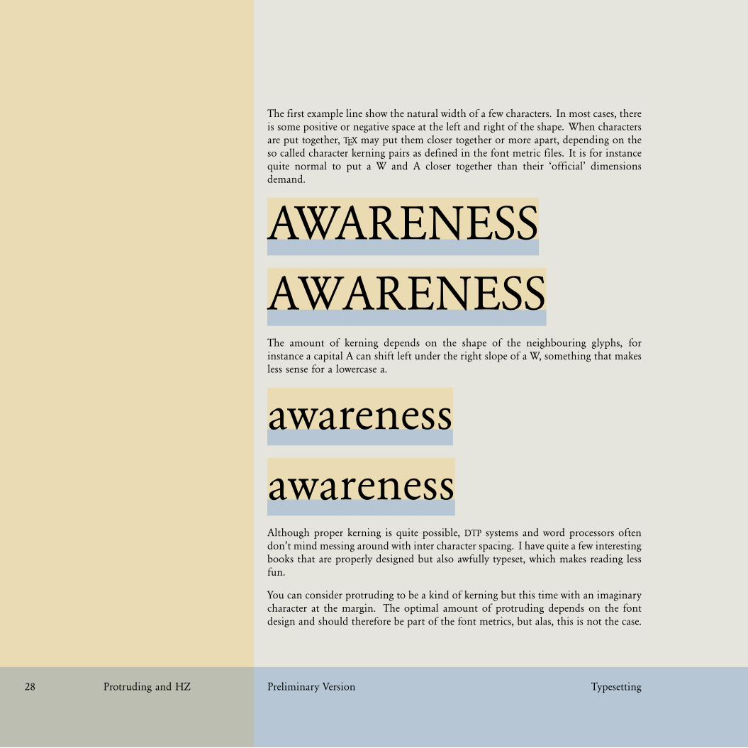
The first example line show the natural width of a few characters. In most cases, thereis some positive or negative space at the left and right of the shape. When charactersare put together, TEX may put them closer together or more apart, depending on theso called character kerning pairs as defined in the font metric files. It is for instancequite normal to put a W and A closer together than their ‘official’ dimensionsdemand.
AWARENESSAWARENESSThe amount of kerning depends on the shape of the neighbouring glyphs, forinstance a capital A can shift left under the right slope of a W, something that makesless sense for a lowercase a.
awarenessawarenessAlthough proper kerning is quite possible, DTP systems and word processors oftendon’t mind messing around with inter character spacing. I have quite a few interestingbooks that are properly designed but also awfully typeset, which makes reading lessfun.
You can consider protruding to be a kind of kerning but this time with an imaginarycharacter at the margin. The optimal amount of protruding depends on the fontdesign and should therefore be part of the font metrics, but alas, this is not the case.

31 31
31 31
Typesetting Preliminary Version Protruding and HZ 29
Therefore in CONTEXT we have implemented protruding as font handling. There canbe multiple font handlers active at the same time, as we will see later.
If you want to make optimal use of this feature, you should consider making fontspecific definition files, which is not that complex, but here we will stick to a fewprebuild handlers.
The ‘pure’ handler only protrudes punctuation, while the ‘normal’ handler applies tothe whole characterset but with average optimal values. The results are demonstratedexample 1.5 (where we quote E.R. Tufte) and 1.6 (where we quote Hermann Zapf).
We thrive in information--thick worlds be-cause of our marvelous and everyday ca-pacity to select, edit, single out, structure,highlight, group, pair, merge, harmonize,synthesize, focus, organize, condense, re-duce, boil down, choose, categorize, cata-log, classify, list, abstract, scan, look into,idealize, isolate, discriminate, distinguish,screen, pigeonhole, pick over, sort, inte-grate, blend, inspect, filter, lump, skip,smooth, chunk, average, approximate,cluster, aggregate, outline, summarize,itemize, review, dip into, flip through,browse, glance into, leaf through, skim,refine, enumerate, glean, synopsize, win-now the wheat from the chaff and sepa-rate the sheep from the goats.
We thrive in information--thick worldsbecause of our marvelous and everydaycapacity to select, edit, single out, struc-ture, highlight, group, pair, merge, har-monize, synthesize, focus, organize, con-dense, reduce, boil down, choose, cat-egorize, catalog, classify, list, abstract,scan, look into, idealize, isolate, dis-criminate, distinguish, screen, pigeon-hole, pick over, sort, integrate, blend, in-spect, filter, lump, skip, smooth, chunk,average, approximate, cluster, aggregate,outline, summarize, itemize, review, dipinto, flip through, browse, glance into,leaf through, skim, refine, enumerate,glean, synopsize, winnow the wheat fromthe chaff and separate the sheep from thegoats.
pure disabled
Example 1.5
Since Tufte’s quote has so much punctuation, it is well suited for showing the differ-ence between italic (or slanted) and regular hanging punctuation as demonstrated inExample 1.7. You need a magnifying glass to see the difference.
How do we trigger this feature? First of all you need to be aware of the fact thatbefore you actually define a font, you need to tell what handling you want to apply.Say that we want to hang only the serif fonts and say that we use Palatino as maintypeface.

32 32
32 32
30 Protruding and HZ Preliminary Version Typesetting
Coming back to the use of typefaces inelectronic publishing: many of the newtypographers receive their knowledge andinformation about the rules of typogra-phy from books, from computer maga-zines or the instruction manuals whichthey get with the purchase of a PC orsoftware. There is not so much basic in-struction, as of now, as there was in theold days, showing the differences betweengood and bad typographic design. Manypeople are just fascinated by their PC’stricks, and think that a widely--praisedprogram, called up on the screen, willmake everything automatic from now on.
Coming back to the use of typefaces inelectronic publishing: many of the newtypographers receive their knowledge andinformation about the rules of typogra-phy from books, from computer maga-zines or the instruction manuals whichthey get with the purchase of a PC orsoftware. There is not so much basic in-struction, as of now, as there was in theold days, showing the differences betweengood and bad typographic design. Manypeople are just fascinated by their PC’stricks, and think that a widely--praisedprogram, called up on the screen, willmake everything automatic from now on.
normal pure
Example 1.6
We thrive in information--thick worlds becauseof our marvelous and everyday capacity to se-lect, edit, single out, structure, highlight, group,pair, merge, harmonize, synthesize, focus, or-ganize, condense, reduce, boil down, choose,categorize, catalog, classify, list, abstract, scan,look into, idealize, isolate, discriminate, distin-guish, screen, pigeonhole, pick over, sort, inte-grate, blend, inspect, filter, lump, skip, smooth,chunk, average, approximate, cluster, aggregate,outline, summarize, itemize, review, dip into,flip through, browse, glance into, leaf through,skim, refine, enumerate, glean, synopsize, win-now the wheat from the chaff and separate thesheep from the goats.
We thrive in information--thick worlds becauseof our marvelous and everyday capacity to se-lect, edit, single out, structure, highlight, group,pair, merge, harmonize, synthesize, focus, or-ganize, condense, reduce, boil down, choose,categorize, catalog, classify, list, abstract, scan,look into, idealize, isolate, discriminate, distin-guish, screen, pigeonhole, pick over, sort, inte-grate, blend, inspect, filter, lump, skip, smooth,chunk, average, approximate, cluster, aggre-gate, outline, summarize, itemize, review, dipinto, flip through, browse, glance into, leafthrough, skim, refine, enumerate, glean, synop-size, winnow the wheat from the chaff andseparate the sheep from the goats.
pure italic pure normal
Example 1.7
\setupfontsynonym [Serif] [handling=pure]
\definettypeface[palatino][rm][serif][palatino][default]
Here we instruct the font loader to treat serif fonts in a special way by applyinghandling pure. Next we define a typeface collection palatino and in the processthe fonts tagged as Serif will get hanging set. If we also want the bold variants tohang, we should add:
\setupfontsynonym [SerifBold] [handling=pure]

33 33
33 33
Typesetting Preliminary Version Protruding and HZ 31
We thrive in information--thick worlds becauseof our marvelous and everyday capacity to se-lect, edit, single out, structure, highlight, group,pair, merge, harmonize, synthesize, focus, or-ganize, condense, reduce, boil down, choose,categorize, catalog, classify, list, abstract, scan,look into, idealize, isolate, discriminate, distin-guish, screen, pigeonhole, pick over, sort, inte-grate, blend, inspect, filter, lump, skip, smooth,chunk, average, approximate, cluster, aggregate,outline, summarize, itemize, review, dip into,flip through, browse, glance into, leaf through,skim, refine, enumerate, glean, synopsize, win-now the wheat from the chaff and separate thesheep from the goats.
We thrive in information--thick worlds becauseof our marvelous and everyday capacity to se-lect, edit, single out, structure, highlight, group,pair, merge, harmonize, synthesize, focus, or-ganize, condense, reduce, boil down, choose,categorize, catalog, classify, list, abstract, scan,look into, idealize, isolate, discriminate, distin-guish, screen, pigeonhole, pick over, sort, inte-grate, blend, inspect, filter, lump, skip, smooth,chunk, average, approximate, cluster, aggre-gate, outline, summarize, itemize, review, dipinto, flip through, browse, glance into, leafthrough, skim, refine, enumerate, glean, synop-size, winnow the wheat from the chaff andseparate the sheep from the goats.
pure italic pure normal
Example 1.8
We can now enable this typeface collection by:
\setupbodyfont[palatino]
and turn on hanging by:
\setupalign[hanging]
Hanging is turned off by:
\setupalign[nohanging]
If you want to set all serif weights at once, you can call a typescript before definingthe typeface:
\usetypescript [serif] [hanging] [pure]
for hanging punctuation, or for all characters:
\usetypescript [serif] [hanging] [normal]
This is not the place to describe how to define such handlings, for that we refer to themain handling definition file hand-def.tex. The pure handling vector is definedas:

34 34
34 34
32 Protruding and HZ Preliminary Version Typesetting
\startfonthandling [pure]
\defineprotrudefactor , 0 1
\defineprotrudefactor . 0 1
\defineprotrudefactor : 0 1
\defineprotrudefactor ; 0 1
\defineprotrudefactor - 0 1
\defineprotrudefactor hyphen 0 1
\defineprotrudefactor endash 0 .5
\defineprotrudefactor emdash 0 .33 % .5
\stopfonthandling
The handling itself is defined as follows:
\definefonthandling [pure] [pure] [type=hanging]
\definefonthandling [purebold] [pure] [type=hanging]
\definefonthandling [pureslanted] [pure] [type=hanging,right=1.5]
\definefonthandling [pureitalic] [pure] [type=hanging,right=1.5]
\definefonthandling [pureboldslanted] [pure] [type=hanging,right=1.5]
\definefonthandling [purebolditalic] [pure] [type=hanging,right=1.5]
The right parameter (there is also left) is a multiplication factor that is applied tothe values in the associated vector. Such definitions can be more extensive, like:
\definefonthandling
[normalitalic]
[punctuation,alpha,extended]
[type=hanging,right=1.5]
Here we combine three vectors into one handling. Now, if you think this is complex,you think probably right. Normally you will just invoke protruding handlingsdefined previously, but the mechanisms are there to tune them.

35 35
35 35
Typesetting Preliminary Version Protruding and HZ 33
In typesetting the two characters hz are tightly connected to Hermann Zapf andthe next couple of pages we will discuss a method for optimizing the look and feelof a paragraph using a mechanism that is inspired on his work. Although officialqualified in PDFTEX as font adjusting, we will use the short qualification hz since thisis how it’s called in the PDFTEX community.
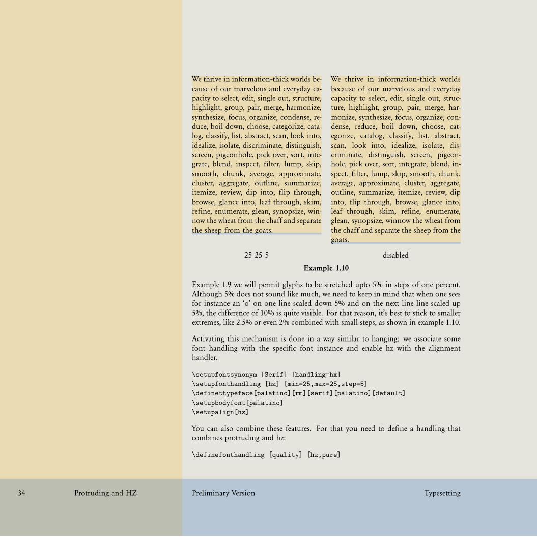
Example 1.9 shows hz in action. The left side paragraph is typeset with hz enabledand has a more even spacing than the right hand text. The average reader will notnotice the trick, but those sensitive for character shapes will see that some glyphsare slightly widened. Ideally the programs that built the glyph should be definedin such a way that this goes unnoticed, but in practice glyph programs are not thatclever and so a brute force horizontal scaling is applied. The values are promilles. Astep of 5 means that each alternative font instance will be .5% narrower or wider. Aminimum value of 80 means that the glyphs will be scaled at most 8% smaller thannormal. Normally one will not use such extremes.
We thrive in information--thick worldsbecause of our marvelous and everyday ca-pacity to select, edit, single out, structure,highlight, group, pair, merge, harmonize,synthesize, focus, organize, condense,reduce, boil down, choose, categorize,catalog, classify, list, abstract, scan, lookinto, idealize, isolate, discriminate, distin-guish, screen, pigeonhole, pick over, sort,integrate, blend, inspect, filter, lump, skip,smooth, chunk, average, approximate,cluster, aggregate, outline, summarize,itemize, review, dip into, flip through,browse, glance into, leaf through, skim, re-fine, enumerate, glean, synopsize, winnowthe wheat from the chaff and separate thesheep from the goats.
We thrive in information--thick worldsbecause of our marvelous and everydaycapacity to select, edit, single out, struc-ture, highlight, group, pair, merge, har-monize, synthesize, focus, organize, con-dense, reduce, boil down, choose, cat-egorize, catalog, classify, list, abstract,scan, look into, idealize, isolate, dis-criminate, distinguish, screen, pigeon-hole, pick over, sort, integrate, blend, in-spect, filter, lump, skip, smooth, chunk,average, approximate, cluster, aggregate,outline, summarize, itemize, review, dipinto, flip through, browse, glance into,leaf through, skim, refine, enumerate,glean, synopsize, winnow the wheat fromthe chaff and separate the sheep from thegoats.
50 50 10 disabled
Example 1.9
36 36
36 36
34 Protruding and HZ Preliminary Version Typesetting
We thrive in information--thick worlds be-cause of our marvelous and everyday ca-pacity to select, edit, single out, structure,highlight, group, pair, merge, harmonize,synthesize, focus, organize, condense, re-duce, boil down, choose, categorize, cata-log, classify, list, abstract, scan, look into,idealize, isolate, discriminate, distinguish,screen, pigeonhole, pick over, sort, inte-grate, blend, inspect, filter, lump, skip,smooth, chunk, average, approximate,cluster, aggregate, outline, summarize,itemize, review, dip into, flip through,browse, glance into, leaf through, skim,refine, enumerate, glean, synopsize, win-now the wheat from the chaff and separatethe sheep from the goats.
We thrive in information--thick worldsbecause of our marvelous and everydaycapacity to select, edit, single out, struc-ture, highlight, group, pair, merge, har-monize, synthesize, focus, organize, con-dense, reduce, boil down, choose, cat-egorize, catalog, classify, list, abstract,scan, look into, idealize, isolate, dis-criminate, distinguish, screen, pigeon-hole, pick over, sort, integrate, blend, in-spect, filter, lump, skip, smooth, chunk,average, approximate, cluster, aggregate,outline, summarize, itemize, review, dipinto, flip through, browse, glance into,leaf through, skim, refine, enumerate,glean, synopsize, winnow the wheat fromthe chaff and separate the sheep from thegoats.
25 25 5 disabled
Example 1.10
Example 1.9 we will permit glyphs to be stretched upto 5% in steps of one percent.Although 5% does not sound like much, we need to keep in mind that when one seesfor instance an ‘o’ on one line scaled down 5% and on the next line line scaled up5%, the difference of 10% is quite visible. For that reason, it’s best to stick to smallerextremes, like 2.5% or even 2% combined with small steps, as shown in example 1.10.
Activating this mechanism is done in a way similar to hanging: we associate somefont handling with the specific font instance and enable hz with the alignmenthandler.
\setupfontsynonym [Serif] [handling=hx]
\setupfonthandling [hz] [min=25,max=25,step=5]
\definettypeface[palatino][rm][serif][palatino][default]
\setupbodyfont[palatino]
\setupalign[hz]
You can also combine these features. For that you need to define a handling thatcombines protruding and hz:
\definefonthandling [quality] [hz,pure]

37 37
37 37
Typesetting Preliminary Version Protruding and HZ 35
We thrive in information--thick worldsbecause of our marvelous and everydaycapacity to select, edit, single out, structure,highlight, group, pair, merge, harmonize,synthesize, focus, organize, condense, re-duce, boil down, choose, categorize, cata-log, classify, list, abstract, scan, look into,idealize, isolate, discriminate, distinguish,screen, pigeonhole, pick over, sort, inte-grate, blend, inspect, filter, lump, skip,smooth, chunk, average, approximate, clus-ter, aggregate, outline, summarize, itemize,review, dip into, flip through, browse,glance into, leaf through, skim, refine,enumerate, glean, synopsize, winnow thewheat from the chaff and separate thesheep from the goats.
We thrive in information--thick worldsbecause of our marvelous and everydaycapacity to select, edit, single out, struc-ture, highlight, group, pair, merge, har-monize, synthesize, focus, organize, con-dense, reduce, boil down, choose, cat-egorize, catalog, classify, list, abstract,scan, look into, idealize, isolate, dis-criminate, distinguish, screen, pigeon-hole, pick over, sort, integrate, blend, in-spect, filter, lump, skip, smooth, chunk,average, approximate, cluster, aggregate,outline, summarize, itemize, review, dipinto, flip through, browse, glance into,leaf through, skim, refine, enumerate,glean, synopsize, winnow the wheat fromthe chaff and separate the sheep from thegoats.
50 50 10 / pure disabled
Example 1.11
Watch how we hook this into the font definition. We need to activate both mecha-nism.
\setupfontsynonym [Serif] [handling=quality]
\setupfonthandling [hz] [min=25,max=25,step=5]
\definettypeface[palatino][rm][serif][palatino][default]
\setupbodyfont[palatino]
\setupalign[hz,hanging]
The result is shown in example 1.11 and 1.12. The default extremes of hz are 20/20,but 25/25 is acceptable as well.
You can finetune the percentages per character (glyph). In this case, the A will gethalf the scaling and the B a bit more. So, given 20/20 extremes, the A will have10/10 extremes.
\startfonthandling [hz]
\defineadjustfactor A .5
\defineadjustfactor B .7

38 38
38 38
36 Protruding and HZ Preliminary Version Typesetting
We thrive in information--thick worlds be-cause of our marvelous and everyday ca-pacity to select, edit, single out, structure,highlight, group, pair, merge, harmonize,synthesize, focus, organize, condense, re-duce, boil down, choose, categorize, cata-log, classify, list, abstract, scan, look into,idealize, isolate, discriminate, distinguish,screen, pigeonhole, pick over, sort, inte-grate, blend, inspect, filter, lump, skip,smooth, chunk, average, approximate,cluster, aggregate, outline, summarize,itemize, review, dip into, flip through,browse, glance into, leaf through, skim,refine, enumerate, glean, synopsize, win-now the wheat from the chaff and separatethe sheep from the goats.
We thrive in information--thick worldsbecause of our marvelous and everydaycapacity to select, edit, single out, struc-ture, highlight, group, pair, merge, har-monize, synthesize, focus, organize, con-dense, reduce, boil down, choose, cat-egorize, catalog, classify, list, abstract,scan, look into, idealize, isolate, dis-criminate, distinguish, screen, pigeon-hole, pick over, sort, integrate, blend, in-spect, filter, lump, skip, smooth, chunk,average, approximate, cluster, aggregate,outline, summarize, itemize, review, dipinto, flip through, browse, glance into,leaf through, skim, refine, enumerate,glean, synopsize, winnow the wheat fromthe chaff and separate the sheep from thegoats.
25 25 5 / pure disabled
Example 1.12
\defineadjustfactor C .7
...
\stopfonthandling
The definition of the hz handling is as follows (see hand-def.tex):
\definefonthandling [hz] [hz,extended] [type=hz]
The extended vector is just a mapping onto similar looking glyphs, and its startswith:
\startfonthandling [extended]
\inherithandling Acircumflex A
\inherithandling acircumflex a
....
\stopfonthandling
You can overload these values, but it needs to be done before the font is defined.

39 39
39 39
Organization Introduction
Organization Preliminary Version Introduction 37
In the manual titled “It’s in the Details” you can find a lot of information on howto move text on the grid, how to fine tune the positioning of graphics and how tohandle backgrounds and other fancy aspects of typesetting documents.
Since quality has a lot to do with an eye for detail, we could repeat much what isdiscussed in the manual mentioned. However, here we will discuss details from theperspective of style writing.
There are some basic rules in typography with regards to the amount of differentfonts and sizes used in a document and on a page. For instance, when additional(sub)title show up in a later stage, try to give it a place in the existing structureinstead of just making up a new fuzzy structuring level.
Although TEX users happily use the programmability of TEX to handle all kind ofspecial cases, they will seldom end up with many different font sizes. The sameis true for colors. The main reason for this is that a structured document sourceleads to a structure in font and color usage as well as spacing. This positive effectis often compensated in a negative way by a rather dull design, simply because thepreprogrammed options are limited.
If you are bounds to a specific design, this section may be disappointing. Discussionsabout what looks good tend to freeze in taking stands in what is good: “one shouldalways”, “this reads better”, “this is normal”, “everyone knows”, and similar quotesare hard to counter, even harder when underlying logic is missing while actually acertain amount of logic is needed in order to be able to implement solutions.
system in layoutsystem in fontssystem in colorsystem in headingssystem in spacingsymmetry in dimensions (left and right page things)section headers - examples - maybe from projects but ’improved’

40 40
40 40
38 Preliminary Version Organization

41 41
41 41
Organization Structure
Organization Preliminary Version Structure 39
todo

42 42
42 42
40 Preliminary Version Organization

43 43
43 43
Organization Alternatives
Organization Preliminary Version Alternatives 41
todo

44 44
44 44
42 Preliminary Version Organization

45 45
45 45
Organization Reuse
Organization Preliminary Version Reuse 43
todo

46 46
46 46
44 Preliminary Version Organization

47 47
47 47
Organization Coding
Organization Preliminary Version Coding 45
todo

48 48
48 48
46 Preliminary Version Organization

49 49
49 49
Organization XML
Organization Preliminary Version XML 47
todo
50 50
50 50
48 Preliminary Version Organization

51 51
51 51
Layout Introduction
Layout Preliminary Version Introduction 49
todo

52 52
52 52
50 Preliminary Version Layout

53 53
53 53
this is a header line
this is a footer line
Coming back to the use of typefaces in electronic publishing: many of the new typographersreceive their knowledge and information about the rules of typography from books, fromcomputer magazines or the instruction manuals which they get with the purchase of a PCor software. There is not so much basic instruction, as of now, as there was in the old days,showing the differences between good and bad typographic design. Many people are justfascinated by their PC’s tricks, and think that a widely--praised program, called up on thescreen, will make everything automatic from now on.
Coming back to the use of typefaces in electronic publishing: many of the new typographersreceive their knowledge and information about the rules of typography from books, fromcomputer magazines or the instruction manuals which they get with the purchase of a PCor software. There is not so much basic instruction, as of now, as there was in the old days,showing the differences between good and bad typographic design. Many people are justfascinated by their PC’s tricks, and think that a widely--praised program, called up on thescreen, will make everything automatic from now on.
Coming back to the use of typefaces in electronic publishing: many of the new typographersreceive their knowledge and information about the rules of typography from books, fromcomputer magazines or the instruction manuals which they get with the purchase of a PCor software. There is not so much basic instruction, as of now, as there was in the old days,showing the differences between good and bad typographic design. Many people are justfascinated by their PC’s tricks, and think that a widely--praised program, called up on thescreen, will make everything automatic from now on.
Coming back to the use of typefaces in electronic publishing: many of the new typographersreceive their knowledge and information about the rules of typography from books, fromcomputer magazines or the instruction manuals which they get with the purchase of a PCor software. There is not so much basic instruction, as of now, as there was in the old days,showing the differences between good and bad typographic design. Many people are justfascinated by their PC’s tricks, and think that a widely--praised program, called up on thescreen, will make everything automatic from now on.
Coming back to the use of typefaces in electronic publishing: many of the new typographersreceive their knowledge and information about the rules of typography from books, fromcomputer magazines or the instruction manuals which they get with the purchase of a PCor software. There is not so much basic instruction, as of now, as there was in the old days,showing the differences between good and bad typographic design. Many people are justfascinated by their PC’s tricks, and think that a widely--praised program, called up on thescreen, will make everything automatic from now on.
Layout Definition
Layout Preliminary Version Definition 51
In this section we will focus on setting up a layout. In a following section I will use(parts of) existing publications as an example, but before we go into that detail, I’llspend some words on the general approach.
Text will flow into the main text area. This area is positioned on a (virtual) sheet ofpaper. Headers and footers are more or less part of the text area as we will see later.Left and right margins have a live on their own but information may flow from themain text area to margins, for instance margin words.
In the margin you see a letter size sheet with a simple symmetrical layout, set upwith:
\setuppapersize
[letter][letter]
\setuplayout
[width=middle,
height=middle]
These two commands will be present in most style files. The second sheet shows theheader and footer areas in gray.
\setupcolors
[state=start]
\setupbackgrounds
[header,footer][text]
[background=color,
backgroundcolor=gray]
Such a simple layout can be tested with some dummy texts, as in:
\setupheadertexts[this is a header line]
\setupfootertexts[this is a footer line]
\starttext
\dorecurse{10}{\input zapf \blank}
\stoptext
A more prominent way of showing the main areas is to use the command:
\showframe
So, setting up the basic layout can be summarized as follows:
54 54
54 54
52 Definition Preliminary Version Layout
• define the paper size• set up the basic layout areas• define dedicated backgrounds, overlays and layers• set up the text areas and margins
If you start from an existing layout definition, you can either try to copy this to thepoint (pt), or accept small differences due to the way CONTEXT handles text. If youhave some (or complete) control over the design, this is no problem and since inCONTEXT many measures are somehow related, you will get a rather consistent layoutautomatically. If on the other hand you run into a designer who keeps measuringhis or her eye catching design element, you will probably end up in an inconsistentresult, especially with complex documents.
When a design is made using a desk-top publishing system, you will get a couple ofpages with sample text on (horizontal) grid lines, and special elements (like graphics)aligned on vertical alignment lines (a kind of pseudo columns). However, when youstart using real content, real margin words, real graphics, and real display material,trouble strikes: solutions have to be found for all those boundary cases. Especiallydemands with regards to grid snapping can be conflicting. No matter what you mayfind on your way: start simple! In the end the quality not in a few points more orless but in the way your text consistently aligns, which in turn depends on the linecharacteristics. Fortunately you can count on not too many people who are able todistinguish points from base points and can relate asked font sizes to design sizes.Also, once proofing starts, you can rely on the printers used for printing proof sheetsfor not being too accurate.

55 55
55 55
Layout Lines
Layout Preliminary Version Lines 53
In desk-top publishing applications, the gridlines often determine where things areanchored. In CONTEXT we can work with grids, but when setting up the layout weprefer grid independent measure, if only because we can then more easily adapt thelayout independent from font choices.
You may wonder how lines of text are related to text areas. As you may expect,CONTEXT will try to put the lines of a text at equal distances when possible. You caninstruct TEX to stretch the space between lines, but this is not the default behaviour.So, in most cases you don’t have to bother about the way lines end up on the paper.There are however situations where TEX needs help, although it may take a while untilyou notice this. In case you consider it a shortcoming: it sometimes better to havecontrol than to fight hard coded behaviour.
We can best illustrate this with a few example lines. Let’s typeset the name of themusic CD that I am listening to while writing this paragraph.
Tales of a Librarian — Tori AmosThe characters sit on what we call the baseline. If you take a sample text like this,you will notice that all character representations (glyphs) are on top of the baseline.The same is true for the following CD title:
Storm — Heather NovaWhile browsing my stack of CD’s, it took a while before I hit a title that extendsbelow the baseline, like:
Feast on Scraps — Alanis MorissetteThe amount of room taken on top of the baseline is called height, the amount belowthe baseline is tagged as depth. Here is another line with depth:
Bad Love — Randy NewmanWhen finding solutions for typographic problems, it really makes a difference if wehave to take the depth into account or not. It is for that reason that a sample textshould have height as well as depth. Watch the following line:
a b c d e f g h i j k l m n o p q r s t u v w x y z
A bit reordered this shows up as:
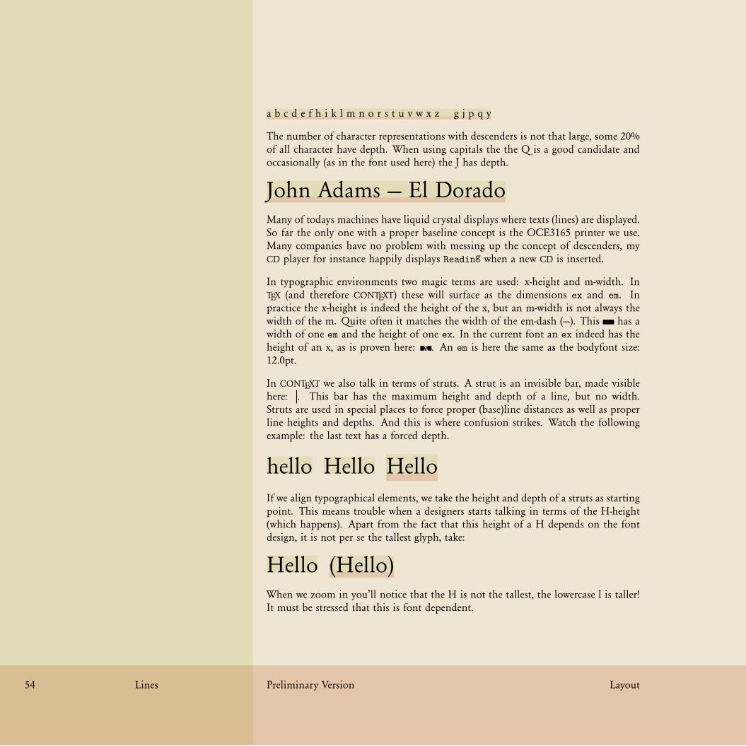
56 56
56 56
54 Lines Preliminary Version Layout
a b c d e f h i k l m n o r s t u v w x z g j p q y
The number of character representations with descenders is not that large, some 20%of all character have depth. When using capitals the the Q is a good candidate andoccasionally (as in the font used here) the J has depth.
John Adams — El DoradoMany of todays machines have liquid crystal displays where texts (lines) are displayed.So far the only one with a proper baseline concept is the OCE3165 printer we use.Many companies have no problem with messing up the concept of descenders, myCD player for instance happily displays Reading when a new CD is inserted.
In typographic environments two magic terms are used: x-height and m-width. InTEX (and therefore CONTEXT) these will surface as the dimensions ex and em. Inpractice the x-height is indeed the height of the x, but an m-width is not always thewidth of the m. Quite often it matches the width of the em-dash (—). This has awidth of one em and the height of one ex. In the current font an ex indeed has theheight of an x, as is proven here: x . An em is here the same as the bodyfont size:12.0pt.
In CONTEXT we also talk in terms of struts. A strut is an invisible bar, made visiblehere: . This bar has the maximum height and depth of a line, but no width.Struts are used in special places to force proper (base)line distances as well as properline heights and depths. And this is where confusion strikes. Watch the followingexample: the last text has a forced depth.
hello Hello HelloIf we align typographical elements, we take the height and depth of a struts as startingpoint. This means trouble when a designers starts talking in terms of the H-height(which happens). Apart from the fact that this height of a H depends on the fontdesign, it is not per se the tallest glyph, take:
Hello (Hello)When we zoom in you’ll notice that the H is not the tallest, the lowercase l is taller!It must be stressed that this is font dependent.

57 57
57 57
Layout Preliminary Version Lines 55
(Hello)In for instance German language documents, you will encounter the umlaut to bethe height forcing champion.
Äquator Überschrift ÖffnungIn CONTEXT the strut height is normally set to 72% of the line height, and thereforethe depths takes the other 28%. In the font used here, the height and depth of a (are (7.11,2.25) and those of a Q are (6.825,2.12). As you can see, the CONTEXT defaultvalues are not far from those of a (.
By default the lineheight is set to 2.8 times the x-height of the body font whichmeans that when you adapt the body font size, the line distance will nicely adaptitself. Alas, this is not always what a designer has in mind when he or she demandsa 10 point body font with a 12 point lineheight.
typeface sample strut ( ratio 10pt 11pt 12pt
Garamond (Hello) (7.11,2.25) 11.64801pt 12.81282pt 13.97762ptPalatino (Hello) (7.2,2.17) 13.13197pt 14.4452pt 15.75838ptModern (Hello) (7.5,2.5) 12.05553pt 13.26108pt 14.46669pt
The previous table demonstrates that a font size of say 10 points does not result insimilar perceived size. The table also shows clearly that the x-height differs per font.The default value of 2.8ex is an acceptable compromise, especially since it permitsinline math without too much distortion of the grid. Beware of small lineheightsin combination with non average ascenders and descenders (these are the officialqualifications for the part of a glyph above and below the baseline).
Often only the main body font and fonts of special typographical elements liketitles are specified. This leaves the style programmer to take care of figuring outthe occasionally showing up monospaced and math fonts. In that case you needcarefully check the relative font size.
The idea behind this rather long excursion into lineheights is that instead offocusing on grids and baseline related points, you can best rely on the proper layoutdimensions and leave everything else for later, when the font system is set up andthe fine points of typesetting are dealt with.
Take for instance header and footer lines. By default a header text is forced upwardsand a footer text downwards. The next two examples demonstrate this.
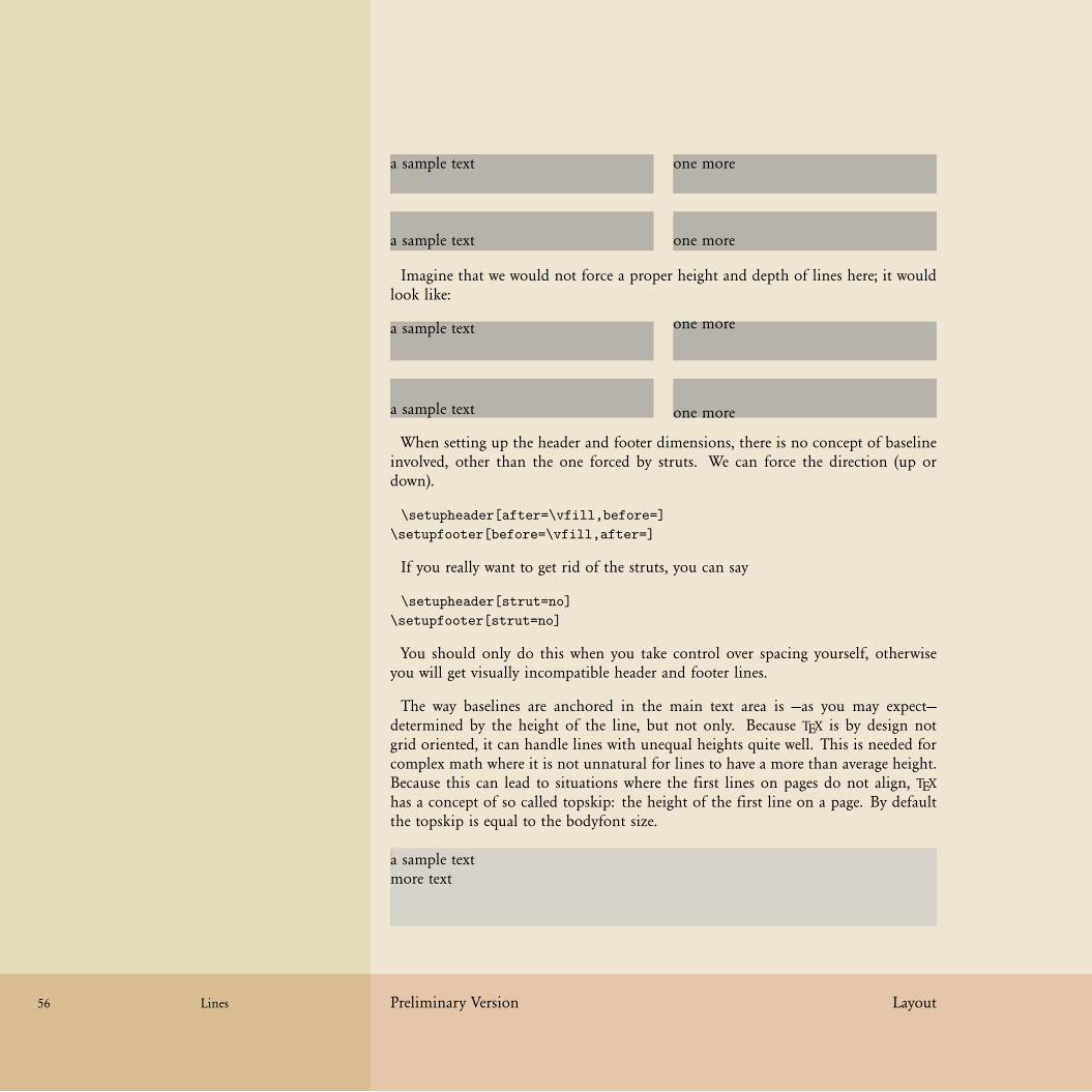
58 58
58 58
56 Lines Preliminary Version Layout
a sample text one more
a sample text one more
Imagine that we would not force a proper height and depth of lines here; it wouldlook like:
a sample text one more
a sample text one more
When setting up the header and footer dimensions, there is no concept of baselineinvolved, other than the one forced by struts. We can force the direction (up ordown).
\setupheader[after=\vfill,before=]
\setupfooter[before=\vfill,after=]
If you really want to get rid of the struts, you can say
\setupheader[strut=no]
\setupfooter[strut=no]
You should only do this when you take control over spacing yourself, otherwiseyou will get visually incompatible header and footer lines.
The way baselines are anchored in the main text area is —as you may expect—determined by the height of the line, but not only. Because TEX is by design notgrid oriented, it can handle lines with unequal heights quite well. This is needed forcomplex math where it is not unnatural for lines to have a more than average height.Because this can lead to situations where the first lines on pages do not align, TEXhas a concept of so called topskip: the height of the first line on a page. By defaultthe topskip is equal to the bodyfont size.
a sample textmore text

59 59
59 59
Layout Preliminary Version Lines 57
In practice this means that the first line in the text area is not aligned like theheader and footer lines. This is demonstrated below:
header text
first linesecond line
footer text
For the moment this is all you need to know about lines when you set up thelayout:
• forget about the grid and lineheights, we can deal with them later• in the header and footer lines text can be moved up and down, but keep inmind that height and depth will be forced• notice that the first line in the text area has some additional space on top
The following pages will introduce some ways of defining the basic layout. Forthat we will use a few existing publications as starting point. We start each sectionwith an introduction page.

60 60
60 60
58 Preliminary Version Layout

61 61
61 61
The Earth, as a habitat for animal life, is in oldage and has a fatal illness. Several, in fact. Itwould be happening whether humans had everevolved or not. But our presence is like theeffect of an old-age patient who smokes manypacks of cigarettes per day — and we humansare the cigarettes.
The Earth, as a habitat for animal life, is in oldage and has a fatal illness. Several, in fact. Itwould be happening whether humans had everevolved or not. But our presence is like theeffect of an old-age patient who smokes manypacks of cigarettes per day — and we humansare the cigarettes.
Layout Esthetics
Layout Preliminary Version Esthetics 59
At the end of 2003 on the CONTEXT mailing some users started asking questionsabout how to set up a layout using commonly accepted rules for dimensions, prefer-able using presets.1 In this section we will therefore deal with the relationship betweenlayout dimensions and esthetics.
One such rule is that the average number of characters on a line must lay in therange 65–75. Other rules —we call them rules because they tend to have devotedfollowers— demand a certain relationship between the dimensions of the text areaand the papersize. Yet another rule is that the height and width of a text area havea pleasing ratio. You can imagine that therefore one decision may trigger a chainreaction in settings. In a system like CONTEXT one can quite well define a layout insuch a way that the chain is executed in the proper way.
Let’s start with the rule we mentioned first: the average width of a line. As anexample we take a quote from one of Peter D. Wards books:
The Earth, as a habitat for animal life, is in old age and has a fatal illness. Several,Peter D. Wardin fact. It would be happening whether humans had ever evolved or not. But ourpresence is like the effect of an old-age patient who smokes many packs of cigarettesper day — and we humans are the cigarettes.
I may go unnoticed, but in a properly typeset text, the distance between charactersdepends on the shape of the character and is called kerning. If we don’t kern thistext we get:
The Earth, as a habitat for animal life, is in old age and has a fatal illness. Several,in fact. It would be happening whether humans had ever evolved or not. But ourpresence is like the effect of an old-age patient who smokes many packs of cigarettesper day — and we humans are the cigarettes.
If you don’t see the difference, watch the following instance; here we have put thekerned and unkerned text on top of each other. It’s up to you to determine whichof the samples in the margin is kerned.
The Earth, as a habitat for animal life, is in old age and has a fatal illness. Several,in fact. It would be happening whether humans had ever evolved or not. But ourpresence is like the effect of an old-age patient who smokes many packs of cigarettesper day — and we humans are the cigarettes.
The Earth, as a habitat for animal life, is in old age and has a fatal illness. Several,in fact. It would be happening whether humans had ever evolved or not. But ourpresence is like the effect of an old-age patient who smokes many packs of cigarettesper day — and we humans are the cigarettes.
The kerning is font dependent and some font designs have hardly any kerns whileothers have many. It may be clear that when the width of a word depends on kerning,
The komascript style for LATEX was mentioned as an example of such presets.1

62 62
62 62
ab
cd
ef
gh
ij
kl
mn
op
qr
st
uv
wx
yz
60 Esthetics Preliminary Version Layout
so will breaking the paragraph into lines. It also means that stating that a line mayhave at most 70 characters is somewhat strange. The next three examples have anaverage of 65 characters.
The Earth, as a habitat for animal life, is in old age and has a fatalillness. Several, in fact. It would be happening whether humans hadever evolved or not. But our presence is like the effect of an old-age patient who smokes many packs of cigarettes per day — and wehumans are the cigarettes.
The Earth, as a habitat for animal life, is in old age and has a fatalillness. Several, in fact. It would be happening whether humans hadever evolved or not. But our presence is like the effect of an old-agepatient who smokes many packs of cigarettes per day — and we humansare the cigarettes.
The Earth, as a habitat for animal life, is in old age and has a fatalillness. Several, in fact. It would be happening whether humans hadever evolved or not. But our presence is like the effect of an old-age patient who smokes many packs of cigarettes per day — and wehumans are the cigarettes.
Here the average is calculated using language dependent character frequency tables:english, dutch and german. Watch how the slight differences in width influence theway a line is broken. The graphic in the margin shows the distribution for english(red), dutch (green) and german (blue). The line next three examples have an averagewidth of 85 characters.
The Earth, as a habitat for animal life, is in old age and has a fatal illness. Several,in fact. It would be happening whether humans had ever evolved or not. But ourpresence is like the effect of an old-age patient who smokes many packs of cigarettesper day — and we humans are the cigarettes.
The Earth, as a habitat for animal life, is in old age and has a fatal illness. Several,in fact. It would be happening whether humans had ever evolved or not. But ourpresence is like the effect of an old-age patient who smokes many packs of cigarettesper day — and we humans are the cigarettes.
The Earth, as a habitat for animal life, is in old age and has a fatal illness. Several,in fact. It would be happening whether humans had ever evolved or not. But ourpresence is like the effect of an old-age patient who smokes many packs of cigarettesper day — and we humans are the cigarettes.
The next four renderings show the difference between a width of 65 characters basedon the emwidth, exheight, frequence and average character width. All are fontdependent, and the frequency method is language dependent as well.

63 63
63 63
Layout Preliminary Version Esthetics 61
The Earth, as a habitat for animal life, is in old age and has a fatal illness. Several,in fact. It would be happening whether humans had ever evolved or not. But ourpresence is like the effect of an old-age patient who smokes many packs of cigarettesper day — and we humans are the cigarettes.
The Earth, as a habitat for animal life, is in old age and has a fatalillness. Several, in fact. It would be happening whether humans hadever evolved or not. But our presence is like the effect of an old-age patient who smokes many packs of cigarettes per day — and wehumans are the cigarettes.
The Earth, as a habitat for animal life, is in old age and has a fatalillness. Several, in fact. It would be happening whether humans hadever evolved or not. But our presence is like the effect of an old-age patient who smokes many packs of cigarettes per day — and wehumans are the cigarettes.
The Earth, as a habitat for animal life, is in old age and has a fatalillness. Several, in fact. It would be happening whether humans had everevolved or not. But our presence is like the effect of an old-age patientwho smokes many packs of cigarettes per day — and we humans are thecigarettes.
In CONTEXT you can set the method and the associated language with:
todo: proper command
\usemodule[layout]
\chardef\charwidthmethod=4
\def\charwidthlanguage{\currentmainlanguage}
Method 1 ignores the widths and assumes that each character has a width of .5em,which is true for most monospaced fonts. Method 2 takes the x as starting point,and assumes that it’s height kind of matches its width. Method 3 is the best one,and determines the average width based on the language specific character table.Method 4 is a mixture between the first two methods: character specific widthsapplied to an equal distribution. Method 0 reports the total count, which normallyis 100. The next table shows the average character width per language and method.
0 / amount 1 / .5em 2 / ex 3 / frequency 4 / list
en 99.98999pt 5.9994pt 4.9915pt 5.0436pt 5.29799ptnl 100.13403pt 6.00804pt 4.99869pt 5.0877pt 5.29799ptde 100.00998pt 6.0006pt 4.99251pt 5.05304pt 5.29799pt
The command \averagecharwidth returns the average character width using thechosen method. This means that settings like the following are correct:

64 64
64 64
62 Esthetics Preliminary Version Layout
\setuplayout[width=65\averagecharwidth]
However, you should be aware that this value is font dependent, so it’s better tofreeze the character width using:
\freezeaveragecharacterwidth
The next few pages are dedicated to a few preset layouts.
todo

65 65
65 65
Layout Sideness
Layout Preliminary Version Sideness 63
todo

66 66
66 66
64 Preliminary Version Layout

67 67
67 67
Layout Columns
Layout Preliminary Version Columns 65
todo

68 68
68 68
66 Preliminary Version Layout

69 69
69 69
Layout Ornaments
Layout Preliminary Version Ornaments 67
todo

70 70
70 70
68 Preliminary Version Layout

71 71
71 71
Layout Graphics
Layout Preliminary Version Graphics 69
todo

72 72
72 72
70 Preliminary Version Layout
73 73
73 73
Examples Introduction
Examples Preliminary Version Introduction 71
todo

74 74
74 74
72 Preliminary Version Examples

75 75
75 75
Examples Full Page
Examples Preliminary Version Full Page 73
This is one of those books that you can hardly overlook when it sits on display ina bookshop: it’s a kind of brick, in this case a colorful one. The books is made upmostly of pictures of animals. There is an introduction and there are lots of tablesmostly of interest to specialists in nature preservement.
The right edge of the pages are colored, and sort of mark sections. However, withinthose sections there are subsections, marked by titles layed over the photo’s. Thereare no pagenumbers, which means that the structure is not accessible, which is notthat much a problem because it’s a picture book and not an encyclopedia.
MARAKELE The making of a south african national park
Photographs: Louise Agnew, Andy Rouse, Paul van Vlissingen, Tet van Vlissingen
African Parks BV, Langbroekerdijk A97, 3947 BE Langbroek, The Netherlands
www.africanparks-conservation.com ISBN 90-808037-1-5

76 76
76 76
73 Full Page Preliminary Version Examples
\definepapersize
[thisbook]
[width=18cm,
height=22cm]
\setuppapersize
[thisbook]
[thisbook]
\setuplayout
[backspace=0pt,
topspace=0pt,
cutspace=4mm,
header=0pt,
footer=0pt,
width=middle,
height=middle,
edgedistance=0mm,
edge=4mm]
\setuppagenumbering
[alternative=doublesided]
This book is special in the way that there are only a few pages with text and manywith photographs that fill the page. This means that we have two layout setups. Let’sstart with the easy part, the pages with pictures.
The cutspace is taken by the edge area. This narrow band will be used for color bandidentifying the sections of the book.

77 77
77 77
Examples Preliminary Version Full Page 74
\setupcolors
[state=start]
\definecolor[edgecolor][darkgray]
\defineoverlay
[pagegraphic]
[\uniqueMPpagegraphic{pagegraphic}]
\startuniqueMPpagegraphic{pagegraphic}
StartPage ;
fill if OnRightPage :
rightboundary Page leftenlarged RightEdgeWidth
else :
leftboundary Page rightenlarged LeftEdgeWidth
fi withcolor OverlayColor ;
StopPage ;
\stopuniqueMPpagegraphic
\setupbackgrounds
[page]
[background=pagegraphic,
backgroundcolor=edgecolor]
The colored bar can best be implemented as a background graphic. Since it runsover the whole page height, the page background is the most appropriate one to use.
Because the color changes we use a symbolic name for the color. That way we canredefine the color per section. The doublesided layout forces us to implement a left-and rightpage alternative. We could have used the left- and rightpage backgrounds,but the current approach saves us keystrokes.
More details about METAPOST graphics can be found in the MetaFun manual. Forthe moment it is sufficient to know that a unique graphic will be recalculated whenthe circumstances change: background dimensions, background color, side of page.
We didn’t account yet for inaccuracies in the process of cutting a book to its intendeddimensions. Normally you will add some extra margins to graphics so that they stickexceed the page boundary. This so called bleeding will prevent white bands at thepage boundary due to to wide cutting.

78 78
78 78
75 Full Page Preliminary Version Examples
\useMPlibrary[dum]
\defineexternalfigure
[fullpage]
[width=\textwidth,
height=\textheight,
text=]
\setupmakeup
[standard]
[page=,
doublesided=no]
\startstandardmakeup
\externalfigure[whatever][fullpage]
\stopstandardmakeup
\startstandardmakeup
\externalfigure[whatever][fullpage]
\stopstandardmakeup

79 79
79 79
RIGHT TITLE
LEFT TITLE
Examples Preliminary Version Full Page 76
\definelayer
[textlayer]
[doublesided=yes,
width=\textwidth,
height=\textheight]
\setupbackgrounds
[text]
[background=textlayer]
\definestartstop
[Title]
[style=TitleFont,
color=white]
\definelayerpreset
[rtitle]
[corner={right,top},location={left,bottom},x=.5cm,y=1cm]
\definelayerpreset
[ltitle]
[x=.5cm,y=1cm]
\definefont
[TitleFont]
[Sans at 18pt]
\startstandardmakeup
\setlayer[textlayer]{\externalfigure[whatever][fullpage]}
\setlayer[textlayer][odd] [preset=rtitle]{\Title{RIGHT TITLE}}
\setlayer[textlayer][even][preset=ltitle]{\Title{LEFT TITLE}}
\stopstandardmakeup
We use a layer to collect the title. Because the position depends on the page, weneed to test for a left or righthand page and both need a different placement. Analternative approach is to avoid layers and put the titles in the text stream. However,layers are more appropriate for this kind of situations.

80 80
80 80
77 Full Page Preliminary Version Examples
not yet finished

81 81
81 81
Examples Simple Page
Examples Preliminary Version Simple Page 78
Often much attention is paid to the presentation of a music CD: a full color insert,booklet or printed carrier is quite common. In most cases the design, photographyand information are interesting, attractive, and well done. The typography on theother hand often spoils the whole. Typesetting the text with TEX and then using theresult as input for the used desk top application would improve the look and feel alot.
For our our next exploration we will define the layout for one of Tori Amos CD’s,one with mostly photographs. If you want to see a CD with real nice typesetting (andstructure as well), take a look at Tales of a Librarian, 7567-83658-5.
Keep in mind that TEX is not really meant for typesetting such one-time typesettingjobs, we only want to demonstrate a few principles and tricks.
StrangeLittleGirls
Warner Music Group, New York, USA
www.toriamos.com 7567-83486-2

82 82
82 82
78 Preliminary Version Examples

83 83
83 83
1 1
1 1
Examples Preliminary Version 79
\setuppapersize
[CD]
[oversized]
\setuplayout
[location=middle,
marking=on,
backspace=26mm,
topspace=12mm,
bottomspace=9mm, % 12mm - 3mm
header=0pt,
footer=8mm,
footerdistance=2mm,
margin=0pt,
width=middle,
height=middle]
The layout is quite simple: we only use the text area. At first glance a backspace of22 mm makes more sense, however, because we want to make live easy when dealingwith text, we let the text width determine the dimensions.

84 84
84 84
1 1
1 1
1 1
1 1
80 Preliminary Version Examples
\setupcolors
[state=start]
\setupbackgrounds
[page]
[background=pagegraphic,
backgroundcolor=darkgray]
\defineoverlay[pagegraphic][\reuseMPgraphic{pagegraphic}]
\startreusableMPgraphic{pagegraphic}
StartPage ;
fill Page enlarged 2mm withcolor OverlayColor ; % 2mm bleed
path p, q, r ;
p := Field[Text][Text] enlarged 4mm ;
q := Field[Text][Footer] enlarged 4mm bottomenlarged -3mm ;
r := Field[Text][Text] enlarged 1mm ;
fill p withcolor white ;
fill q withcolor white ;
fill r withcolor OverlayColor ;
StopPage ;
\stopreusableMPgraphic
Apart from the cover (which has a full page photograph) each page has the samebackground. This means that we can reuse the background graphic.
Watch how we play a bit with the dimensions of the bottomspace and footer back-ground area. This way we end up with a nicely centered footer. Don’t worry if youdon’t grab this immediately, since there are many ways to accomplish this.
The bottom graphic demonstrates how the footer and text backgrounds overlap intoone common background.
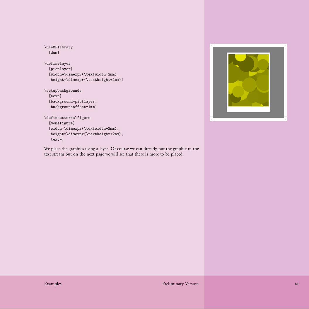
85 85
85 85
1 1
1 1
Examples Preliminary Version 81
\useMPlibrary
[dum]
\definelayer
[pictlayer]
[width=\dimexpr(\textwidth+2mm),
height=\dimexpr(\textheight+2mm)]
\setupbackgrounds
[text]
[background=pictlayer,
backgroundoffset=1mm]
\defineexternalfigure
[somefigure]
[width=\dimexpr(\textwidth+2mm),
height=\dimexpr(\textheight+2mm),
text=]
We place the graphics using a layer. Of course we can directly put the graphic in thetext stream but on the next page we will see that there is more to be placed.
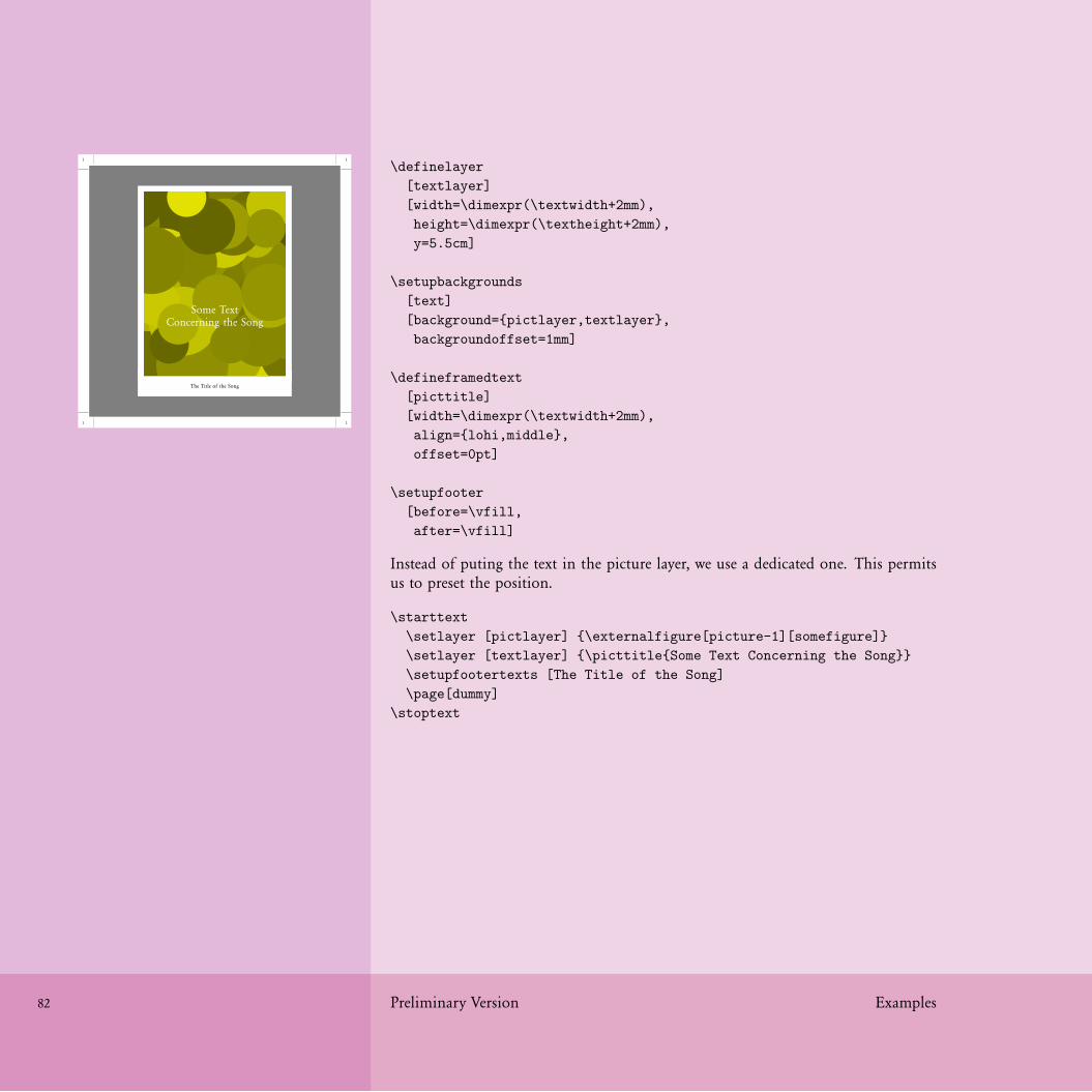
86 86
86 86
1 1
1 1
The Title of the Song
Some TextConcerning the Song
82 Preliminary Version Examples
\definelayer
[textlayer]
[width=\dimexpr(\textwidth+2mm),
height=\dimexpr(\textheight+2mm),
y=5.5cm]
\setupbackgrounds
[text]
[background={pictlayer,textlayer},
backgroundoffset=1mm]
\defineframedtext
[picttitle]
[width=\dimexpr(\textwidth+2mm),
align={lohi,middle},
offset=0pt]
\setupfooter
[before=\vfill,
after=\vfill]
Instead of puting the text in the picture layer, we use a dedicated one. This permitsus to preset the position.
\starttext
\setlayer [pictlayer] {\externalfigure[picture-1][somefigure]}
\setlayer [textlayer] {\picttitle{Some Text Concerning the Song}}
\setupfootertexts [The Title of the Song]
\page[dummy]
\stoptext

87 87
87 87
Examples Preliminary Version 83
For a small booklet a bit of coding does not harm, but when typesetting a bigdatabase you may like the following approach: variables and a setup.
\setupvariables [cd] [pict=,text=,foot=]
\startsetups[sample]
\setlayer
[pictlayer]
{\externalfigure[\getvariable{cd}{pict}][somefigure]}
\setlayer
[textlayer]
{\picttitle{\getvariable{cd}{text}}}
\setupfootertexts
[\getvariable{cd}{foot}]
\page[dummy]
\stopsetups
This separates the typesetting directives and the content so that we can adapt theplacement without the need to change the source in many places.
\setupvariables
[cd]
[pict=picture-1,
text=Some Text Concerning the Song,
foot=The Title of the Song]
\setups[sample]
Although it is not discussed here, we show how we set up the fonts. By coincidencethis CD booklet is typeset in the same font as we use here: Garamond.
\definefont [FooterFont][Serif at 8pt]
\definefont [TextFont] [Serif at 16pt]
\setupframedtexts
[picttitle]
[frame=off,
color=white,
style=\TextFont\setstrut\strut]

88 88
88 88
84 Preliminary Version Examples
\setupfooter
[style=\FooterFont\setstrut\strut]

89 89
89 89
1 1
1 1
ToriAmosStrangeLittleGirls
Examples Preliminary Version 85
\definelayer
[pagelayer]
[width=\dimexpr(\paperwidth+4mm),
height=\dimexpr(\paperheight+4mm),
offset=-2mm]
\setupbackgrounds
[page]
[background={pagegraphic,pagelayer}]
\setlayer
[pagelayer]
{\externalfigure
[picture-0]
[width=\dimexpr(\paperwidth+4mm),
height=\dimexpr(\paperheight+4mm),
text=]}
\setuplayout[page]
\startstandardmakeup
\setupalign[middle]
\vfill
\definedfont[Serif at 60pt]
\color[white]{ToriAmos}
\vskip 2mm
\definedfont[Serif at 20pt]
\setstrut \strut \color[white]{StrangeLittleGirls}
\vskip2mm
\stopstandardmakeup
\setuplayout[reset]
The rest of the booklet is just cover picture and a back page with text. For thatpurpose we extend the definition of the page background. Watch how we temporaryswitch to a predefine full page layout.

90 90
90 90
1 1
1 1
Here follows quite some ragged right text in a very small bodyfont. No impres-sive typesetting takes place here, but who will read this text anyway.
86 Preliminary Version Examples
\setlayer
[pagelayer]
[preset=righttop,x=2mm,y=2mm]
{\tfxx 7567-83486-2}
\startstandardmakeup
\setupalign[right] \switchtobodyfont[6pt]
Here follows quite some ragged right text in a very
small bodyfont. No impressive typesetting takes place
here, but who will read this text anyway.
\vfill
\stopstandardmakeup
You probably noticed the multiples of 2mm in offsets and positions. These areneeded because we define the page backgrounds to bleed 2mm. Such a bleed isneeded in order to compensate for print and cut errors.
We presented the pages not in their natural order. Normally you will start with thedefinitions and end with the content, surrounded by one pair of \starttext and\stoptext.

91 91
91 91
1 1
1 1
00 Some Title01 Another Title
Some more unreadable small text.
toriamos-3.jpg
Examples Preliminary Version 87
\definelayout
[leaflet]
[backspace=12mm, % 26 - 14
cutspace=40mm] % 26 + 14
\setupbackgrounds
[text]
[background=textgraphic]
\defineoverlay
[textgraphic]
[\uniqueMPgraphic{textgraphic}]
\startuniqueMPgraphic{textgraphic}
fill OverlayBox enlarged 1mm withcolor .2white ;
\stopuniqueMPgraphic
\setuplayout[leaflet]
\startstandardmakeup
\startcolor[white]
\setupalign[right] % raggedright
\switchtobodyfont[12pt]
\definedescription [track] [width=1.5em,before=,after=]
\starttrack{00} Some Title \stoptrack
\starttrack{01} Another Title \stoptrack
\vfill
\switchtobodyfont[5pt]
Some more unreadable small text.
\stopcolor
\stopstandardmakeup
\setuplayout[reset]
As usual there are some ugly things like the barchart and a few logos. You can usethe page layer to place and position them. We leave that as an exercise for the reader.

92 92
92 92
88 Preliminary Version Examples

93 93
93 93
Preliminary Version 89