chapter 1 type and typography chapter 2 typographic...
TRANSCRIPT

Chapter 1 Type and Typography
Chapter 2 Typographic Procedures, Rules, and Niceties
Chapter 3 Type on the Desktop
ch01.kleper 10/23/00 10:44 AM Page lii

Part
One
OneTYPOGRAPHIC
METHODS AND
PROCEDURES
ch01.kleper 10/20/00 4:48 PM Page 1

ch01.kleper 10/20/00 4:48 PM Page 2

Chapter
11
Type and Typography
Type is the heart of most visually conveyed communication.
Despite the rapid technological changes that occur on
an almost daily basis, our understanding of type and our com-
prehension of the information that it conveys remain constant.
Reading remains the one computer skill that is unlikely to
change.
The proper use of type can help to communicate a message
by attracting readers—making the reading experience more
enjoyable by making it more attractive, more organized, and
more comprehensible. Despite changes in technology, the use
of type and the representation of the alphabet have been a
constant element in the recorded history of mankind.
ch01.kleper 10/20/00 4:49 PM Page 3

Typewritten versus Typeset
As late as the mid-1980s, most computer installations thatprovided some word-processing capability usuallyoffered two forms of printed output: dot-matrix and let-ter-quality characters (Figure 1.1). Both varieties of printerwere engineered to produce output that conformed torequirements for standard office documents. These docu-ment types included such categories as work drafts,reports, tabular matter, and, depending upon the qualitylevel of the character forms, correspondence.
Correspondence quality became a default standard forevaluating the quality of line-printer output during theearly days of personal computing. This “standard,” whichhas never been formally defined, is nothing more than anobjective measure of how well the line printer producedcharacters similar to those of a typical office typewriter.Thus, instead of computer technology providing better-appearing output than had been available in the homeand office, the goal became the imitation of standard type-writer output.
The idea for the typewriter, which continues to influ-ence business communication today, was first stated in1714 by Henry Mill. Mill, an Englishman, received apatent for a machine that he described as “an artificialmachine or method for impressing or transcribing of let-ters, singly or progressively, one after another as in writ-ing, whereby all writings whatsoever may be engrossedin paper or parchment so neat and exact as not to be dis-tinguished from print.”1 Mill’s machine failed; however,his idea obviously did not. In 1867, C. Sholes and SamuelW. Soulé, printers in Milwaukee, and their associate, Car-los Glidden, continued development of what wouldbecome known as the type-writer. By 1873, they had com-pleted a practical working model, which was manufac-tured shortly thereafter by E. Remington and Sons of Ilion,New York. The acceptance of the machine by business andindustry stimulated other inventors to produce similarmachines. By 1886 there were more than 50,000 typewrit-ers in use.2
Ironically, the typewriter was invented to imitate print-ers’ type, and the earliest typewriters actually used piecesof metal type mounted on the typebars. The typewriter,while providing only a coarse typographic image, didserve to automate the handwriting process, and by sodoing, to change the way in which offices conducted busi-ness (Figure 1.2).
4 Part one • Typographic Methods and Procedures
The Typewritten Legacy:The Typewriter as a Typesetter
Soon after the typewriter became popular, it produced anunexpected effect on the printing trade. It appeared thattypewritten correspondence commanded a great deal ofrespect and, perhaps, curiosity. This interest was so over-whelming that in 1884 the Central Type Foundry ofBoston introduced a typeface for printers called Type-Writer. This typeface reportedly had a larger sales volume
1. Blanchard N., Carroll H., Jr. “The Early Word Processors.” ResearchReport 3. Lake George, NY: State University at Farmingdale, 1981.
2. Ibid.
FIGURE 1.1Enlargements of dot-matrix and letter-quality characters.
�
FIGURE 1.2 The Sholes Typewriter, patented in 1871, was devised to bring printers’ typesetting capabilities into the office environment. The keyboard arrangement has remained virtually unchanged for more than 100 years.
�
ch01.kleper 10/20/00 4:49 PM Page 4

Chapter one • Type and Typography 5
than any other metal typeface previously issued. Accord-ing to one account, the design was suggested by a sta-tioner from Huntingdon, Pennsylvania, named J. C. Blair,who was reputedly a typographic expert. The typefacewas sold with the intention that “circulars could be madeto resemble genuine correspondence, and thus secure forthem the attention which it was previously so hard toget.”3 By the turn of the century, nearly every typefoundry had a similar design in its specimen book. Quiteironically, the typewriter, which had been invented to sim-ulate printing, was universally being simulated in print(Figure 1.3). Today, most typesetting machine vendors,page-printer manufacturers, and type library publishers
still offer one or more typefaces that resemble typewrittencharacters. It is for this reason that Courier is among themost commonly used type designs in the world.
The coarse, misaligned, and handcrafted look of type-writer fonts has influenced the “grunge type” move-ment of the 1990s, which consists of designs that areanti-establishment, anti-convention, and anti-unifor-mity. Grunge types appear to represent a disregard fortradition, order, and most of all, legibility. They havebeen termed “subjective typography” since their formsand designs convey a meaning beyond the words thatthey represent:
CarnivalTypeface: Carnival
COMMONWORLDTypeface: Commonworld
Free Dom NormalTypeface: Free
FreakshowTypeface: Freakshow
This curious interest in automating an older, manualwriting process is also seen today in the hundreds of fontsthat simulate handwriting. One company, Signature Soft-ware,4 not only offers large collections of handwrittenfonts, but also offers a service to convert a customer’shandwriting into a custom font. Their contextual hand-writing fonts, available for Macintosh and Windows sys-tems, use the exclusive SigSoft Handwriter, a utility thatvaries the shapes of a letter on the basis of its surround-ing letters, and smoothly connects letters in the same wayan individual does when writing by hand:
WáÑç iç táÑ c÷ÆëíÑ oü hîåÄç eïûçìíTypeface: SigTsui
W°Ñç iç táÑ c÷ÆëíÑ oü hîåÄç eïûçìíTypeface: SigLisa
It was not until the 1930s that the typewriter became alegitimate device for the setting of type. At that time therewas a need for a compatible method for generating “type”
3. A good source of historic background information related to theearly typesetting process is Annenberg, Maurice. A TypographicalJourney through the Inland Printer, 1883–1900 Baltimore: Maran Press,1977.
FIGURE 1.3Typewriter typefaces from the 1923 edition of the American TypeFounders (ATF) specimen book.
�
4. See Appendix A for contact information.
ch01.kleper 10/20/00 4:49 PM Page 5

for use on the mimeograph machine. The major typeset-ting alternatives of the day were the hot-metal linecast-ing machines, such as the Linotype and Intertype, and themore complicated character caster, the Monotype. Thesemachines were too large, sophisticated, and expensive tomeet the needs of an office reproduction department, sothe typewriter, having undergone considerable improve-ments in construction and capabilities since its introduc-tion, became an office typesetter.
A number of machines were introduced that weremuch more than ordinary typewriters, yet much less thantypical typesetters. The IBM Executive Typewriter pro-vided proportionally spaced characters, while the FridenJustowriter offered justified output (i.e., text aligned atboth the left- and right-hand margins) and paper-tapestorage. The VariTyper was one of the first typewriter-likemachines specifically made for typesetting applications(Figure 1.4). It remained in a class by itself until 1967,when the IBM Selectric Composer was introduced.
These specialized machines, which provided limitedtypographic capabilities, became known as direct impres-sion, or strike-on, typesetters. Many people referred to theiroutput as cold type (as contrasted with hot-metal typeset-ting), and the term has been used loosely—and erro-
6 Part one • Typographic Methods and Procedures
neously—to describe any typesetting method that doesnot involve the casting of molten metal.
As the offset printing process replaced or augmentedother forms of office reproduction, the strike-on methodof typesetting grew in popularity. Unlike ordinary car-bon-ribbon typewriters, strike-on machines producedsharp, dense (black), proportionally spaced characterssuitable for graphic reproduction.
By the end of the 1980s, the long reliance on the type-writer to generate office documents resulted in the emer-gence of what was termed office-quality reproduction. Thislevel of quality can be defined as “monospaced typewrit-ten characters of a single style and size, appearing in sin-gle- or double-spaced line format, in either justified orunjustified mode, and usually occupying a standard 8.5 ×11-inch sheet.” Many of these attributes were virtuallyunchanged from those achieved on the earliest typewrit-ers, despite the computer-processing power and outputoptions that were readily available and capable of sup-porting much more sophisticated typographic treatment.Today, some businesses remain tied to the typewritten tra-dition that can be broken easily with inexpensive desk-top publishing tools and some basic typesetting, design,and layout skills.
A close-up view of the Varityper changeable type font.
FIGURE 1.4The VariTyper machine, although resembling atypewriter, had many typographic capabilities,including changeable typefaces in a range oftype sizes as well as justified output.
�
ch01.kleper 10/20/00 4:49 PM Page 6

Chapter one • Type and Typography 7
The Typewritten Legacy: Why Typeset?
The outputting of typographic composition and page ele-ments—commonly called imagesetting, in the professionalcontext, and desktop publishing, in the general context—provides many more advantages than simply a betterappearance than typewritten output. Yet, appearance is,perhaps, the major factor in opting for typesetting. Thereare literally tens of thousands of typeface choices suited toa wide variety of specialized uses and to convey almostany feeling or mood. Consider the lightly flowing scripttypeface on an elegant menu, or the bold, commandingtypeface in a truck advertisement. The selection of anappropriate typeface is very important in communicat-ing a message (Figure 1.5). (The process of making thatchoice will be examined later.)
The use of appropriate typefaces, properly composed,not only helps to communicate, but also adds an elementof prestige to printed material. The image that a company,or an individual, projects is enhanced by good typogra-phy, and this increased attractiveness helps to catch andhold the reader’s eye. Getting and maintaining thereader’s attention is critical for effective communicationbecause the message that will be read is the one whichhas more visual appeal (Figure 1.6).
While a difference in type style helps to attract thereader’s eye, it is the difference in type size that helps to
FIGURE 1.5The proper selection of a typeface reinforces a message by providing a visual structure for information content. To get an idea of howimportant type selection is, imagine if we were to reverse the font selection on the specimens below.
�
You are cordially invitedto attend the world premiere
of the revolutionary
Laser Typesetter
Exceptional ResolutionPhenomenal SpeedImpressive Price
Graphitel Lumiset
t
Unauthorized Entry
FORBIDDENST�P
FIGURE 1.6This 1970s Varityper advertisement compares the effectiveness ofphototypesetting over typewriting.
�
ch01.kleper 10/20/00 4:49 PM Page 7

organize information in terms of its relative importance.Typewritten text is all the same size, despite the fact thatall of the information it represents is not necessarily of thesame factual value. While the content display for type-written text has very little flexibility other than capital-ization, underlining, changing from double space to sin-gle space, or changing the margins, typeset output hasmuch flexibility in displaying pieces of informationaccording to their relative importance. This capabilitymakes it easier for the reader to locate the informationthat the message’s originator considers most important.
Some of the most compelling reasons for many busi-nesses to choose typeset output are purely economic con-siderations. Typesetting provides increased character den-sity. While typewritten characters are usually limited to 12characters per linear inch, typeset characters can be from50% to over 200% denser in terms of their compactnesson the line. Combine this increased density with the capa-bility of minutely controlling the vertical spacing of lines,and typeset matter can easily transmit more informationin a given space than typewritten matter (Figure 1.7) andwithout sacrificing readability. Estimates of this space-saving factor range from 40% to about 60%, dependingupon the type sizes and styles involved.
Just as microfilm dramatically reduces the bulk of paperrecords, the process of converting information into typesetform has a similar positive effect on reducing paper bulk.It is this reduction in the space that information needs tooccupy which provides economic benefits for users oftypesetting technology, such as digital publishers. Reducedspace requirements mean less paper to buy, less paper to
8 Part one • Typographic Methods and Procedures
use, less paper to convert (cut, fold, insert, etc.), less paperto handle, less paper to distribute (mail), and less paperto store. Not only are significant dollar savings possible,but the reduction in handling time means that informa-tion can move faster and more efficiently. In addition, well-designed and composed documents can be maintained inelectronic form, to be delivered and read on- or offline,and printed on-demand when needed.
Even when substituting a computer screen for paper,there are several common advantages. Although designingfor the screen has its own design considerations, the use ofproperly executed typographic elements increases boththe aesthetic and communication value of the message.
The equipment used to produce typeset output doesnot need to be on-site or in-house in order to realize itsmajor benefits since typesetting and design services can beout-sourced. However, when the entire typesetting oper-ation is captive within a company, it provides significantadditional benefits as compared with having typesettingperformed by an outside vendor, such as a service bureau.Attractively priced, high-resolution page printers makein-house output affordable for almost every business. Themost immediate benefit of having the output equipmenton-site is that of control. The typesetting personnel arenow company personnel, and the production equipmentnow serves only one client. Information is typeset accord-ing to company needs and priorities; and sensitive, con-fidential, or valuable company data never leaves thepremises. With fewer, and only company, people involvedin the process, company data is more secure.
Having typesetting equipment located within a com-pany also provides increased convenience. The problemsof communicating information over telephone lines or theInternet, or sending media to an outside source, are elim-inated. Turnaround time is reduced because there is noneed to wait for messengers, spend time seeking sourcesof supply, or explain over the telephone how the jobshould have looked. Last-minute changes are handledaccording to priorities set internally, without delay orfinancial penalty.
Typography: The Art of Typesetting
Typography is the process of selecting typefaces, sizes, andspacing requirements for the display and layout of a mes-sage (printed piece, web page, multimedia screen, etc.).It is a process that requires considerable care and attentionbecause actual harm might be done to a message by care-less and inappropriate typographic decisions.
FIGURE 1.7Compare the typewritten specimen on the top with the typesetspecimen on the bottom. Not only is the typeset information easier to read, but it also makes more efficient use of space.
�
Most contemporary typesetting keyboards are
highly reliable, with error rates not usually
exceeding 1 in 30,000 keystrokes. People,
however, are usually less reliable. It is human
error which most directly affects the highest
attainable level of quality in any typesetting
system. Studies have shown that the average
human error rate is, at best, in the range of 1
to 10 errors per 6000 keystrokes.
Most contemporary typesetting keyboards are highly reliable, with error rates not usually exceeding 1 in 30,000 keystrokes. People, however, are usually less reliable. It is human error which most directly affects the highest attainable level of quality in any typesetting system. Studies have shown that the average human error rate is, at best, in the range of 1 to 10 errors per 6000 keystrokes.
TYPEWRITTEN
TYPESET
ch01.kleper 10/20/00 4:50 PM Page 8

Chapter one • Type and Typography 9
Typesetting has its roots in metal. The earliest metaltype used in Western civilization was cast by JohannesGutenberg in the fifteenth century. Prior to that time entirebook pages had been carved in wood, a very slow andexacting craft that left no margin for error. Gutenberg’sinvention of a handheld mold to cast identical characterimages made the mass production of type a reality. Notonly could pages of type be assembled faster, but the typecould be used again and again (Figure 1.8).5
Much of the terminology used today in typesetting isderived from the use of metal type. Many of the termsused to describe each piece of metal are human descrip-tors (face, feet, shoulder, body), as is type’s overall labelof “character” (Figure 1.9). Type has been given manyhuman qualities over the centuries, both in prose and inpoetry, to provide testimony to its contribution tomankind.
Point SizeThe point size of the type is determined by measuring theheight of the type body (Figure 1.9a). Since the typefacedesign is limited to the physical dimensions of the typesurface, the point size appearing in print (be it a metalimpression, a phototypeset or page printer letter, or other)is found by measuring the distance from the uppermostlimit of an upward-reaching letter (an ascender), such asb, d, f, h, l, or t, to the lowermost limit of a downward-projecting letter (a descender), such as g, j, p, q, or y.
Em MeasurementEach typographic character is allotted a dimension pro-portional to its width (Figure 1.9b). An m has a wider setwidth than an i, and an h is wider than an l.
The set width of an alphabet is based upon em mea-surement. Simply stated, the em is the square of the pointsize. In the case of a 12-point em, each side of the face ofthe em is equal to 12 points (Figure 1.10a). A 30-point emmeasures 30 points on each of the four sides of its face(Figure 1.10b).
5. For information about Gutenberg, see Updike, Daniel Berkeley.Printing Types: Their History, Forms, and Use. New York: Dover, 1980.
FIGURE 1.8Gutenberg’s invention of the handheld mold was responsible forhelping to spread literacy by creating the mass production of books.
�FIGURE 1.9A piece of metal type, the building block responsible for popular literacy, and the first form of mass communication.
�
FIGURE 1.10The em is the square of the point size, regardless of whether thetype is three-dimensional (metal) or two-dimensional (laserprinter, imagesetter, etc.).
�
ch01.kleper 10/20/00 4:50 PM Page 9

Relative UnitsWhen all of the characters in use have identical widths,such as in typewriting, calculating the number of charac-ters that will fill a line is easy. However, when charactersof various widths, various designs, and various sizes willoccupy a line, calculating characters per line is a muchmore difficult task. For this purpose, the em of each type-face design is divided into a number of vertical slicescalled relative units (RU). There are usually no fewer than18 relative units to the em, and on more sophisticatedtypesetting machines, the number might surpass 100units. PostScript and TrueType technologies, which arecurrent standards, are based on systems of 1,000 or moreunits to the em.
When a 48-point em and a 72-point em have beendivided into 54 relative units (Figure 1.11), we say that weare working with a 54-unit system. The widest characters—such as the W, the fractions, and the copyright and trade-mark symbols—are each assigned the full 54-unit value.The comma, the narrowest character, receives a unit
10 Part one • Typographic Methods and Procedures
assignment of 12. All other characters receive a unitassignment directly related to their relative width. The Gis equal to 42, the v receives 27, and the f gets 18.
Notice that each particular character listed in Figure1.11. has the same unit value, regardless of its point size.In other words, a lowercase g has a unit value of 30 regard-less of whether it is in reference to a 48-point em, a 72-point em, or an em of any other size. Yet, comparing therelative width of a 48-point g with that of a 72-point g, itis obvious that they are not the same size, which is wherethe relative part of the term relative unit assumes real mean-ing. In 48-point type, the g’s relative unit value of 30 is30/54 of 48, or about 27 linear points. In 72-point type,the g’s relative unit value remains 30, or 30/54 of the 72-point em. In this case the g has a value of approximately40 points.
These ideas should be kept in mind when reading thenext section about the typographic measurement system.Knowledge of relative units and typographic measure-ments will be combined to show how to determine thenumber of characters that can fill each line.
Typography: Typographic Measurement
Although most people recognize that type is measured inpoints, few actually know how large a point is. There are72 points to the inch, each point being equal to 0.0138 inch.Type sizes (Figure 1.12) in the 9- to 12-point range are typ-ically used for reading matter and are classified as textsizes. Type sizes of 14 points and larger are normally usedfor headlines (heads) and subheadlines (subheads) andare classified as display sizes.
gwi
gwi
72 point em space
48 point em space
FIGURE 1.11To determine numerical values for each character of a type style, the em space is divided into vertical divisions called relative units,which are assigned to characters on the basis of their widths.
�
For the First Time in Our History!100% American Made
With Full Manufacturer's Warranty
Top of the Line ModelsFormerly Sold for Twice the Price
Thousands Sold NationwideAvailable for the Next 2 Days Only
Over the Counter Replacement for 30 Days
FIGURE 1.12Size is an effective method for indicating relative importance andorganizing information for the reader.
�
ch01.kleper 10/20/00 4:50 PM Page 10

Chapter one • Type and Typography 11
Pica UnitsPage dimensions, column widths, and line lengths aremeasured in larger units called picas. There are 6 picas in1 inch, and 12 points in 1 pica (resulting in 72 points in 1inch). The length of a line of type is called the measure,and is sometimes indicated by a multiplication symbolmeaning “by”, as in ×24, or a delta (∆24), and meaning aline length of 24 picas.
Line MeasurementThe typeset line measure is comparable to the typewrittenline width; the major difference is the difficulty in deter-mining how many characters of a certain typeface will filla typeset line. On a standard typewriter, there are either10 characters to the inch (pica) or 12 characters to the inch(elite). In a typographic system, any one of thousands ofdifferent type designs might be in place, in any one ofdozens, or possibly hundreds, of different sizes. To copewith this problem of estimating how many characters willfit on one line—called copyfitting (see page 73)—and howmany lines (or possibly pages) will be needed, typeset-ters use a measurement called the character count.
The Size of a WordCopyfitting calculations always take into account anallowance for word spaces. As a general rule, the typicalword length is considered to be five characters. Becauseeach word must be followed by a space, the copyfittingestimate for the average word length is then six characters.If the total number of characters in a document is known,an approximation of the number of words can be derivedby dividing the total by 6.
Em MeasurementWhen type was set using metal characters, the sizes of thespaces were fixed fractional divisions of the em space. Theem itself served as a spacing unit, usually for indention atthe beginning of paragraphs or to fill out short lines. Theem was divided in half vertically to form two en spaces,also used for indenting, and since it had the same widthas the figures, for setting (aligning) columns of numbersas well. In Figure 1.13, a line of metal type illustrates theheight relationship between the spaces and the charac-ters. Spaces, which do not print, are considerably shorterthan characters. The amount of indention is based upontradition and is directly related to the length of the linemeasure.
The en space is too wide to serve as a normal spacebetween words, so the em space is further divided intothree vertical divisions, the 3-to-em, or 3-em, spaces. The 3-em space is the normal space used between words. Theem space is further divided into increments of four (4-em)and five (5-em) to provide additional spacing options (Fig-ure 1.14).
Typography: The Use of Space
It is the control of space that determines, in many instances,the quality of the typesetting. Take, for example, the prob-lem of justification. Justification is the process of adjustingthe space between words (and sometimes characters) toforce a line of type to completely fill its line measure.Accomplishing justification on an ordinary typewriter isquite simple. First, the copy is typed, with attention givento the amount of space remaining at the end of each line.
FIGURE 1.13In hand composition, pieces ofmetal type are assembled in ashallow handheld tray called acomposing stick. After lines oftype are spaced either out or in to fit snugly within the line mea-sure, a thin (2-point) strip of leadis inserted to separate the lines.These strips are called leads, andthe space between the lines oftype is called leading. If no leadsare inserted, the lines are said tobe set solid. Thicker (6-point)strips of metal, called slugs, areused when 6 points or more ofleading are required.
�
ch01.kleper 10/20/00 4:50 PM Page 11

In the example shown here (Figure 1.15), x’s have beenused to indicate the amount of excess space remaining.When the copy is retyped, the excess space is distributedbetween words to space out the line and fill the measure.
JustificationJustifying metal type is also a two-step process. First theline is assembled using 3-em spaces between words. Asthe end of the line approaches, it becomes obvious to the
12 Part one • Typographic Methods and Procedures
compositor (the person setting the type) whether the lastword will leave the line short, will need to be hyphen-ated, will need to be carried to the next line, or would fitif there were slightly more space. The decision thenbecomes whether to expand (space out) the line to fill themeasure, in which case minute increments of space madeof slivers of copper, brass, and paper are added to the 3-em spaces; or whether to contract (space in) the line tomake room for the last word, in which case some or all ofthe 3-em spaces are replaced by smaller spaces, or multi-ple pieces of spacing material.
Today this decision-making process is carried on in anelectronic form by desktop computers. Recall that eachcharacter has a unit assignment based on its width, andthat the unit system is devised by the manufacturer of thetypesetting equipment (or the publisher of the digitaltype) with X number of units to the em. Remember, too,that the specific unit assignments vary from one typefacedesign to another.
The process can best be explained by describing how atraditional typesetting machine performs its calculations.The typesetting machine stores within its memory a tableof width values for each typeface it is using. When a linemeasure is specified, the typesetter converts that numberinto em units, for internal calculation. For example, theline measure might be 18 picas and the type size might be10-point. First, the machine determines how many 10-pointems will fit in an 18-pica line measure. Remember that anem is the square of the point size, so each 10-point emrequires 10 linear points. To divide the line measure by 10points, the line measure must first be converted from picasto points. There are 12 points in each pica; therefore, the 18-pica measure is equal to 216 points. Dividing the 216 pointsby the 10-point em yields 21.6 ems per line. Second, the
em space
en spaces
3-em spaces
4-em spaces
5-em spaces
This is an example of howx
an ordinary office type-xx
writer can be used to com-
pose justified lines ofxxx
type.
This is an example of how
an ordinary office type-
writer can be used to com-
pose justified lines of
type.
FIGURE 1.14The metal em space is divided into several vertical subdivisions, eachfulfilling a different typographic purpose. These designations remainin most digital publishing software applications.
�
FIGURE 1.15Typewriter justification.
�
ch01.kleper 10/20/00 4:50 PM Page 12

Chapter one • Type and Typography 13
As each 10-point character is processed, its unit value issubtracted from 777.6. The minimum and maximum wordspaces are assigned fixed unit values as well, with the min-imum unit value being used for initial calculations. As theend of the line approaches (the justification or hot zone), themachine’s logic determines if there is enough room forpart or all of the next word. If the word or partial wordfits, its unit value is subtracted; if it does not, it is carriedto the next line. The excess units remaining at the end ofthe line are equally divided among the word spaces, whichthen expand to fill the line measure (Figure 1.16).
The process that takes place on a typewriter is consid-erably more unrefined in its execution of interword spaceallotment. In most cases the characters are monospaced,and the spaces used to justify lines are multiples of thefixed character width. Justifying spaces are thereforeeither as wide as any character or two or more times aswide. This process makes for loose-fitting lines.
Returning to the justification example, what if the totalunit count of characters and spaces equals exactly 777.6?If this were to happen, the line would be set with mini-mum-width word spaces. This is perhaps the ideal situa-tion, since tight (close-fitting) word spaces are preferablefor increased ease in reading. However, what if the oppo-site were to happen, wherein there was either considerablespace left at the end of the line, or so few spaces in theline that they quickly reached their maximum allowableexpansion? What would become of the remaining space?
The usual solution is to add small increments of spacebetween characters in a process called letterspacing. Let-terspacing is not considered good typographic practicebecause it pulls words apart, making them less recogniz-able as patterns for the reader’s eye (Figure 1.17). Let-terspacing has no place in the typewriter environmentsince the size of a space is usually no smaller than thewidth of the average character.
Although justification is a very common way of ori-enting lines of type, it is by no means the only way. Linescan be centered (quad center), wherein the remaining space
B Line measure = 24 picas = 192 points
Total unit count for this line = 264 units
P = 13 units
l = 5 units
a = 10 units
c = 8 units
e = 8 units
Line length of 345.6 units minusCharacter unit count of 264 = 81.6 units
81.6 units of remaining space / 6 spaces =an additional 13.6 units added to each word space
F
E
Unit system = 18 units/em19.2 ems x 18 units/em = 345.6 units/line
D
Point size = 10 pointsEm = 10 points square192 points / 10 points = 19.2 ems per line
C
24 picas
Placement tests have been conclusive in providing
Placement tests have been conclusive in providing↑ ↑↑↑↑ ↑
S h e h a d l i t t l e i d e a w h at h e a c t u a l ly meant by his casual remark, although s h e f e l t t r u l y h u r t . D i d h e r e a l l y mean that he considered her insensitive a n d c o l d ? H i s u n t i m e l y d e p a r t u r e put distance, as well as space between them. Only Re i l ly was aware o f what was on Randy's mind when he confronted L i s a , a n d h e w a s t h e l e a s t a b l e t o a d e q u at e ly e x p l a i n a n y o f i t t o h e r. Reilly, after all , had his own problems, and h i s devo t i on to h i s worker s was o f c o n s i d e r ab ly l e s s i m p o r t a n c e t h a n his need to have his business survive.
She had little idea what he actually meant by his casual remark, although she felt truly hurt. Did he really mean that he considered her insensitive and cold? His untimely departure put distance, as well as space between them. Only Reilly was aware of what was on Randy's mind when he confronted Lisa, and he was the least able to adequately explain any of it to her. Reilly, after all, had his own problems, and his devotion to his workers was of considerably less importance than his need to have his business survive.
Excessive letter and word spacingNormal letter and word spacing
FIGURE 1.16The process of electronic machine justification involves (1) convert-ing the line measure into points; (2) calculating the number of emsof the point size that will fit on the line; (3) calculating how manyunits of space the line measure represents; (4) subtracting the unitwidth of each character and space that will fit on the line; and (5)distributing the remaining units among the word spaces to expandthe line to fill the measure.
�
machine multiplies the ems per line by its units-per-emvalue. For this example, a 36-unit system is being used;therefore, there are 36 units in one em, and there are 777.6units (21.6 ems × 36 units/em) in a single line that is 18picas wide and composed of 10-point characters.
FIGURE 1.17Compare the properly spaced lines in theparagraph on the left with the excessivelyletter- and word-spaced lines in the para-graph on the right. The texture of the com-position is referred to as “color,” and atrained eye can easily discern the qualityof typography on the basis of its overall fit.
�
ch01.kleper 10/20/00 4:50 PM Page 13

at the end of the line is equally divided between thebeginning and end of the line, or they can be either flushleft (quad left) or flush right (quad right), wherein all ofthe remaining space is placed either at the end or thebeginning of the line, respectively (Figure 1.18).
The composition of justified lines of text has a long tra-dition in the graphic arts. Prior to the invention of print-ing, scribes laboriously copied manuscripts by hand.Because paper was very expensive, they paid specialattention to filling each line with as many characters aspossible. All of their lines were carefully written to be ofconsistent length, regardless of how words were broken(hyphenated). Early printers imitated this style in theireffort to make the new craft of printing approach the qual-ity of the established art of hand inscription.
Typography: The Typographic Basics
Four elements are common to every typeset job. Theseelements are descriptors, which specify how typeset textshould appear on a page.
Line LengthConsider the typical typewritten document (Figure 1.19).If it became necessary to communicate a description ofthis page over the telephone so that the person you were
14 Part one • Typographic Methods and Procedures
talking to could duplicate the layout, what elementswould you choose to describe? Assuming that a standardsheet of 8.5 × 11 inches will be used, it might be appro-priate initially to specify the margins (their sizes and in thecase of the right and left margins, whether they are flushon one or both sides). Subtracting the values of the leftand the right margins yields the length of the line of char-acters if justified, and an approximation of line length ifnot justified. The first descriptor then is the “line length”or “line measure.”
Character SizeMeasuring the number of characters per inch will deter-mine the pitch—either pica or elite. This descriptor canbe labeled “character size.”
TypefaceThousands of typeface designs are in use today. For sim-plification, let’s say that the original page was composedon a typewriter (how quaint). Despite the smaller numberof font choices on a typewriter, it might still be difficult, asit sometimes is in typesetting, to determine the exact iden-tity of the type style that was used. Assuming that bothyou and the person on the other end of the telephone havea specimen sheet of common typewriter designs, you canthen specify the “style.”
Line Measure
Quad Leftxxxxxx xxxxx xxxx x xxx xxx x xxx xx x xxxx x xxxxx xx xxxxxx x x xxxxxx xxx xxxxxxx xxxx xxxxx xxxxxx xxx xxxxx xx xxxxxxx xxx xxxxxx xxxxx xxxx xxxx xxxx x xxxxx x xxxxxxxx xxxx xxxxx xxxxxx xxx xxxx xxxxxxxx xxxx xxxxxx xxxxx xxx xxx xxx x xxx xx x xxxx x xxxxx xxxx xxxxxx x x xxxxxx xxx xxxxxxx xxxx xxxxx xxxxxx xxx xxxxx xxx xxxxxxx xxx xxxxxx xxxxx xxxx xxxx xxxx x xxxxx x xxxxxxxx xxxx xxxxx xxxxxx xxx xxxx xxxxxxxx xxxx
Quad Rightxxxxxx xxxxx xxxx x xxx xxx x xxx xx x xxxx x xxxxx xx xxxxxx x x xxxxxx xxx
xxxxxxx xxxx xxxxx xxxxxx xxx xxxxx xx xxxxxxx xxx xxxxxx xxxxx xxxx xxxx xxxx x xxxxx x xxxxxxxx xxxx xxxxx xxxxxx xxx xxxx xxxxxxxx xxxx xxxxxx xxxxx xxx xxx
xxx x xxx xx x xxxx x xxxxx xxxx xxxxxx x x xxxxxx xxx xxxxxxx xxxx xxxxx xxxxxx xxx xxxxx xxx xxxxxxx xxx xxxxxx xxxxx xxxx xxxx xxxx x xxxxx x xxxxxxxx xxxx
xxxxx xxxxxx xxx xxxx xxxxxxxx xxxx
Quad Centerxxxxxx xxxxx xxxx x xxx xxx x xxx xx x xxxx x xxxxx xx xxxxxx x x xxxxxx xxx
xxxxxxx xxxx xxxxx xxxxxx xxx xxxxx xx xxxxxxx xxx xxxxxx xxxxx xxxx xxxx xxxx x xxxxx x xxxxxxxx xxxx xxxxx xxxxxx xxx xxxx xxxxxxxx xxxx xxxxxx xxxxx xxx xxx
xxx x xxx xx x xxxx x xxxxx xxxx xxxxxx x x xxxxxx xxx xxxxxxx xxxx xxxxx xxxxxx xxx xxxxx xxx xxxxxxx xxx xxxxxx xxxxx xxxx xxxx xxxx x xxxxx x xxxxxxxx xxxx
xxxxx xxxxxx xxx xxxx xxxxxxxx xxxx
FIGURE 1.18Quadding variations commonly applied to paragraph composition.
�
FIGURE 1.19The anatomy of a generic typewritten page.
�
Left MarginTop Margin
Bottom Margin
Running Head
FolioRight Margin
ch01.kleper 10/20/00 4:50 PM Page 14

Chapter one • Type and Typography 15
Interline SpacingThe remaining physical attribute is quite easy to evalu-ate. It is the vertical spacing increment, generally called“single or double spacing.”
Basic ParametersIf these four elements can be specified prior to producinga typewritten page, the appearance of the product will bevery predictable. The same concept applies in typesetting,and similar descriptors, or parameters, must be specified.
Line MeasureLook now at the typeset job shown in Figure 1.20. Fromyour experience with the previous typewritten example,you should have a good idea of what values you mustderive before producing such a job. In the typeset exam-ple you must also have a line length or line measure. Thisparameter indicates how wide your typeset lines will be.It is specified in picas. If the line measure consists of anyfractional part of a pica, as in 27 1/2 picas, the fraction isexpressed in points, in this case 6 points (6 points = 1/2pica). Some desktop publishing programs would expressthis line length as 27p6.
Type SizeThe next parameter—although the order of specificationis usually of no consequence when you are writing the
specifications—is “type size.” Determining the size of pre-viously typeset material is somewhat tricky becauseimagesetters (and page printers) can set in increments assmall as 1/10 point (and even smaller), and because thesample being measured might have passed through areproduction system (photo offset, photocopier, etc.) thatcould have altered the size of the characters. There is noway to determine how much change in type size mighthave occurred without a careful comparison between theprinted sample and the original output from the image-setter. For most work, a minute difference in type size isnot significant; however, for some legal, business, andgovernmental jobs, as well as lengthy jobs in which asmall increment will result in a significant difference, typesize specification can be critical.
Measuring type size is usually performed with a cleartype gauge or a magnifier with a special reticle. The pur-chase of a few measuring tools is a good investment foranyone involved in the specification of typographic infor-mation (Figure 1.21).
A good approximation of the size of the type is themeasurement between the top of the ascender and thebottom of the descender (Figure 1.22).
FontThe next parameter to be determined is the typeface ortype font. A font is the collection of all the letters, figures,punctuation, and special characters of a particular type-face design in a certain point size. In traditional terms, a
Typeface
↓Line Measure
the
the
Point Size→→(measured from top of
ascender to bottom of descender)
Line Space→→(measured baseline
to baseline)
FIGURE 1.20A simple typeset job has four basic parameters.
�
ch01.kleper 10/20/00 4:51 PM Page 15

10-point Bodoni Italic and an 18-point Bodoni Italic aretwo different fonts. Today, most digital publishing appli-cations refer to a typeface design as a “font,” without asize being associated with it.
Determining the type font is probably the most diffi-cult task in this exercise. Remember, however, that we areworking backwards in this example, trying to reconstructa previously typeset job. This is not the usual approach. Inmost cases, the choice of typeface is selected from a spec-imen list, and this selection is based on criteria related tothe purpose of the message or the function of the printedor presentation piece.
If you know the particular typesetting environmentfrom which the example was set, then the universe oftype-style choices is significantly reduced, and the prob-lem becomes one of comparing the printed characters toa set of specimen sheets. However, if the environment isnot known, you must depend upon your knowledge oftypefaces and their subtle differences in design.6
16 Part one • Typographic Methods and Procedures
Line SpacingThe last of the basic typographic parameters is the spacebetween lines, the line spacing. While the typewriter nor-mally provides only single or double spacing, the page-layout software can specify line-spacing increments assmall as 1/10 of a point and even, in some cases, as littleas 1/1,000 of a point or smaller. As previously mentioned,the line spacing is measured from the baseline of one lineto the baseline of the next (Figure 1.23) and is also referredto as leading.
The similarities between the typewritten and typesetpages are numerous, as well they should be since the type-writer was invented as a typesetting machine for the officeand the home. Not surprisingly then, each of the fourbasic typographic parameters has a parallel value in type-writing:
Typewriting Typesettingline length line measurecharacter size type sizestyle typefacesingle/double spacing line spacing
Typographic Details
The earliest metal type was cast by Johannes Gutenbergin the fifteenth century (Figure 1.24).7 Describing anddefining type was fairly easy when type was physicallyformed from metal: Type was a piece of metal—composedof lead, tin, and antimony—0.918 inch high with a char-acter or symbol in relief on one end. Since the introductionof strike-on, phototypesetting, imagesetting, laser printingand other forms of page printing, the word type hasbecome somewhat abstract, because it now refers only tothe resultant typographic image and not the image sourceitself. Some people called type derived from nonrelief
FIGURE 1.21Type and page measurement tools are still important in a digital world.
�
6. FontExpert Typeface Recognition Software is an expert system thatdoes what even few typographic experts can do: accurately identifytype specimens from printed samples. It does not require any mea-suring or interpretation on the part of the user, thereby eliminatingthe possibility of input errors or misinterpretation.
Digital publishers need to identify typefaces on a regular basis. Acustomer will present a sample of work that was done elsewhere andask that a similar design be used. The challenge of finding either theexact match or a similar one may represent a significant time invest-ment—one which cannot easily be billed to the customer. FontExpertcan reduce the time to seconds, and produce an unrivaled list ofmatching fonts.
The program works from scanned images of a small number ofcharacters. Although the scanned input is best at 300 dpi, the pro-gram still does a remarkably accurate job using fax-quality (200 dpi)character input. It compares the data that it extracts from the sam-ples with its database of more than 20,000 fonts, each of which hasdata for all upper- and lowercase characters and the numerals. In
seconds it presents a list, in order of physical similarity, of the type-faces that are the closest matches, along with a bitmap image of thecharacter set that it has in its database. It is sufficiently accurate to beable to distinguish between character weights (light, regular, bold,etc.). It can also provide listings of “similar to” typefaces from com-peting font foundries.
The desktop publishing revolution has produced tens of thou-sands of PostScript and TrueType typeface designs, far more thanwere available for phototypesetting or earlier technologies. In recog-nition of that fact, FontExpert provides an “Open Database” feature,so that users can add their own font libraries. In this way, when amatch is made that lists a font which the user has on hand, he or shecan begin production that much sooner.
FontExpert is available from Allied Compugraphics, Inc.; seeAppendix A for contact information. A demo version of the softwareis available at the Allied Compugraphics Web site.
7. For information about Gutenberg, see Updike, Daniel Berkeley.Printing Types: Their History, Forms, and Use. New York: Dover, 1980.
ch01.kleper 10/20/00 4:51 PM Page 16

Chapter one • Type and Typography 17
masters flat type, to emphasize the difference. Yet all typethat appears on paper (or other substrates, or on a com-puter screen) is flat, regardless of its derivation, so whatis needed is a definition of type as it appears to the readerand not the creator of the graphic images.
Does a typewriter create type? As mentioned earlier,some early designs of the typewriter actually used print-ers’ type on the typebars. Yet even today, after more than100 years of typewriter development, it is easy to differ-entiate typewritten characters from typeset characters inmost cases (Figure 1.25). To answer the above question,typewriters do not create type. For that matter, traditional
T k y x-height
Ascender Line
Waist Line
Descender Line
Base Line
Point Size:Top of ascenderto bottom ofdescender.
Packing: In computer programming, grouping two or more units of information into one unit to save storage space and reduce transmission time. The unit can later be "unpacked" and the original units reconstructed.
Packing: In computer programming, grouping two or more units of information into one unit to save storage space and reduce transmission time. The unit can later be "unpacked" and the original units reconstructed.
Packing: In computer programming, grouping two or more units of information into one unit to save storage space and reduce transmission time. The unit can later be "unpacked" and the original units reconstructed.
Packing: In computer programming, grouping two or more units of information into one unit to save storage space and reduce transmission time. The unit can later be "unpacked" and the original units reconstructed.
Packing: In computer programming, grouping two
or more units of information into one unit to save
storage space and reduce transmission time. The
unit can later be "unpacked" and the original units
reconstructed.
Packing: In computer programming, grouping two
or more units of information into one unit to save
storage space and reduce transmission time. The
unit can later be "unpacked" and the original units
reconstructed.
8/8
8/12
8/11
8/10
8/13
8/9
FIGURE 1.22To find the point size of previously typeset material, locate an ascender and a descender in proximity with one another and measure the distance between their outer limits.
�
FIGURE 1.23Line spacing is space added between lines of type, either toimprove readability or to vertically justify lines to fill a pagedepth. Type size and line spacing are usually specified together,separated by a slash, as in “8/10.”
�
FIGURE 1.24Johannes Gutenberg is considered the father of printing, havingdevised workable procedures for composing and reusing type andfor mass-producing printed pages.
�
ch01.kleper 10/20/00 4:51 PM Page 17

typesetting machines, such as strike-on devices, photo-typesetters, and imagesetters, are only a segment of a grow-ing population of devices with typesetting capability.
There are qualities associated with typeset charactersthat make them unique and immediately identifiable. Alist of such attributes would include
• Sharp, clean character edges • Proportional spacing• Range of point sizes• Variations in character strokes (thick and thin)• Variety of typeface designs• Design variations of a single style (italic, bold, con-
densed, expanded, etc.)
The first two attributes are the most useful (and per-haps critical) in determining the quality level obtainablefrom a typesetting device. Often, evaluating them is basedsolely on subjective judgments. At graphic arts tradeshows, the typeset output from competing devices is fre-quently compared under a magnifying glass, by expertsand tradespeople alike. Usually, the result is that there islittle agreement over which is best and why.
18 Part one • Typographic Methods and Procedures
There are, then, a range of acceptable standards fortypeset output. The particular level chosen is most likelybased upon the purpose for which the type will be used(utilitarian, glamour, business); the environment in whichit will be used (home, office, trade shop); the needs of theuser (space factors, sizes, typefaces); the size and needsof the audience (short-lived information, archival storage,promotional, entertainment); and the methods of repro-ducing the message (copier, conventional printing, digitalprinting, digital transmission, on-screen).
Determining if a sample of characters can be classifiedas type is a fairly easy task when using the aforemen-tioned attributes. What is difficult is evaluating how goodthe characters are as specimens of the typographic form.The answer to this question must be determined by theuser, who considers all of the factors that are significant ina given situation. (Also see “What Distinguishes a Low-cost Font from a High-priced Font?” on page 99.)
Typeface GeometryType can be found almost everywhere we look: on storewindows, buses, frozen food packages, tax forms, com-puter screens, and even medicines and candies. Theproper use of type begins with some attention to thesmallest parts of the letters, and some special terms usedby typographers (Figure 1.26):
• The arm of a character is a horizontal projection orshort, upward-sloping stroke.
• A bar is an enclosed horizontal stroke.• The stem is the main part of the letter.• A cross stroke or crossbar is that part of the letter
which cuts across the stem.• The tail or leg is a downward projection.• The apex is the uppermost point at which the
stems come together.• The vertex is the lowermost joint at which the
stems join.• The ear is the projection found on certain lower-
case g’s.• The spur is the finishing stroke on certain upper-
case G’s.• The counter is the enclosed space within certain
characters such as o, e, and a.
• The bowl is the rounded boundary found on letterssuch as p, q, d, and b.
• The loop is the closed round stroke found on cer-tain lowercase g’s.
When describing any of the thousands of typeface designsin use, typographers frequently speak of the characteris-tics of specific styles using these terms.
FIGURE 1.25Enlarged characters from a dot-matrix printer, daisy-wheel printer,laser printer, and phototypesetter.
�
ch01.kleper 10/20/00 4:51 PM Page 18

Chapter one • Type and Typography 19
The collection of all of the various characters and sym-bols of a particular type design in a particular size is calledthe font. Fonts vary in size, from the basic alphabet to wellover 200 characters (Figure 1.27). Unicode fonts (see page111) may contain over 30,000 characters.
Typographic Lines of ReferenceThe relationship of characters to one another within a fontis assessed most easily by viewing the characters in rela-tion to the four typographic lines of reference. These lines
are used by typeface designers to determine such thingsas the relative height of the lowercase characters to theuppercase characters (the x-height) and the amount of dip(below the baseline) that rounded lowercase characterssuch as e and o will require. In Figure 1.22, notice that allof the characters rest on the baseline. Directly above it is theupper limit of the main part of all lowercase characters,which is called the mean line. The distance between thebaseline and the mean line is called the x-height, becauseit is the height of the lowercase x. Typefaces that havelarge (in relation to the point size) x-heights are usuallyeasier to read (Figure 1.28).
Arms
Bars
Stems
Cross strokes
Tails
Apex
Vertex
Spur
Ear
Counter
Bowl
Loop
FIGURE 1.26Anatomy of type.
�
ch01.kleper 10/20/00 4:51 PM Page 19

20 Part one • Typographic Methods and Procedures
abcdefghijklmnopqrstuvwxyz
abcdefghijklmnopqrstuvwxyz
ABCDEFGHIJKLMNOPQRSTUVWXYZ
ſ � ff fi fl ffi ffl � � �
1234567890 1234567890
, . / <> ; : ' " [ ]{ } \ | = + - _ ~ ! @ % ^ & * ( ) `
$ # £ % ¢
⅜ ¼ ⅓ ⅝ ½ ⅔ ⅞
₁₂₃₄₅A
© ™ • ®
§ ¶ † ‡
+ - ∞ ≈ √ ∫ µ ≤ ≥ ÷ ≠ ∑ ⁄ ±
� � � � � � � � � � � � � � � � � � � � � � � � � � � ! " # $ % & '
ABCDEFGHIJKLMNOPQRSTUVWXYZ
uppercase
lower case
SMALL CAPITALS
Ligatures
Figures
Fractions
Punctuation
Commercial/Monetary
Superior Figures
Special Characters
Mathematical Signs
Swash
Reference Marks
Ornaments
A Font of Type
FIGURE 1.27A standard font of type.
�
ch01.kleper 10/20/00 4:51 PM Page 20

Chapter one • Type and Typography 21
The two remaining lines are the extreme limits of thelowercase character shapes. Lowercase characters thatdescend below the baseline (g, j, p, q, y) are called descen-ders. The lowermost point of a descender is the descenderline. Conversely, lowercase characters that ascend or pro-ject upward (b, d, f, h, k, l, t) are called ascenders. The upper-most point of an ascender is the ascender line, or as it issometimes called, the cap line.
Single Typeface VariationsWhen type is being set, it is common practice to deal withdifferent elements of a page layout in different ways.Although the same statement could be made about type-writing, there is considerably more flexibility in typeset-ting, even when limited typographic resources are beingused. Headlines or other forms of composition that sepa-rate text should be set so that they stand out. Words intext that are to be emphasized also require special atten-tion. It is possible to meet these needs by using variationsof a single type design.
All-Capital CompositionRoutine typesetting and typewriting involves the use ofcapital (uppercase) and lowercase letters. Two obviousvariations are all-capital composition and all-lowercasecomposition. NOTICE THAT ALL-CAPITAL COMPOSI-TION CAN BE USED FOR EMPHASIS AND ALSOTHAT IT IS MORE DIFFICULT TO READ.8 (There will be
more to say about the readability of type later on.) All-lowercase composition is easier to read, yet robs the readerof important information that capital letters provide. Likeall-capital composition, it should be used with discretion.
Italic and Boldface VariationsTraditionally, printers have used the italic and boldfaceforms to emphasize text and to organize information foreasier reading. Most desktop computers have families oftype available, which are standard variations of a basictypographic design. The traditional family usuallyincludes an italic, boldface, lightface, condensed, andexpanded version, although it might also include designsformed from a mix of these versions, such as a condensedlightface or an expanded boldface. Type family membersall have physical attributes that make them design-com-patible and therefore good choices for composing workinvolving multiple typefaces (Figure 1.29). In the realmof desktop publishing there is sometimes a distinctionmade between a simple and a complex family. A simplefamily consists of the basic members: regular, italic, bold,and bold italic, although it may consist of fewer members.A complex family is extended and includes most of theadditional variations.
Desktop computers usually have the capability to pro-duce a slanted variation of the normal character weight.This variation is an oblique (or pseudo-italic) that isslanted from 7 to 15 degrees to the right, although the sys-tem may identify it as italic. A true italic variation is onethat is produced by the typeface designer, not one that isderived from another form. Type that is slanted beyond 15degrees, either to the right or to the left, is said to be skewed(Figure 1.30).
Tyx Tyx Tyx✽Tyx
x x72 point
A selection of 36 point typefaces.
FIGURE 1.28All of the specimens in the top row of this example have the same point size but different x-heights. The larger the sizeof the x-height, the more legible the typeface.
�
8. All-capital composition should also be avoided within e-mail mes-sages, where it has become the functional equivalent of shouting.
ch01.kleper 10/20/00 4:51 PM Page 21

Type WeightIn addition to the bold weight, the typeface design mayhave been drawn within a range of relative line thick-nesses ranging from thin to black. The complete range oftype weights is shown in Figure 1.31.
Typeface Family ManagementThere is a rich field of choices—for both character weightsand widths—in PostScript Type 1 and TrueType fonts, and
22 Part one • Typographic Methods and Procedures
the native Macintosh and Windows operating systemssupport a variety of options. The operating systems cangenerate variations (bold, italic, bold italic, etc.) from theregular typeface, although it is inadvisable to do so. Inaddition, with third-party utilities, such as TypeTamer(Figure 1.32) or Adobe Type Reunion for Macintosh, theuser can gather all family members within an applica-tion’s font menu in a hierarchical order.
Simulated Outline and Shadow StylesTrue outline and shadow variations are drawn by thetypeface designer; however, similar, although less com-pelling, effects can be simulated by word processing,desktop publishing, and other categories of programs onboth Macintosh and Windows computers. Simulated vari-ations often do not print well on high-resolution outputdevices, although they may suffice on laser and inkjetprinters. In almost all cases, outline and shadow fontsshould be used only in display sizes since they are inap-propriate for body copy and their narrow opening andtinted shadows have a tendency to fill-in in small sizes.
Reverse TypeText that must appear against a solid background, or beused in call-outs on a dark area of a photograph or illus-tration, is set in white. Reverse type (see Figure 2.65 onpage 70) provides contrast with a black or dark back-ground. White type set on a graphic or photograph is saidto be dropped out. Reverse type can also be used to aligntype by repeating the line above, but setting the portionthat is used as a spacer in reverse (Figure 1.33). This tech-nique makes it possible to align bullets, or other listeditems, without setting tabs.
FIGURE 1.29The Goudy type family members all bear a close family resemblance.
�
t t tt t t tNormal 5% 10% 15% 20% 25% 30%
FIGURE 1.30Slanted type variations.
�
ThinExtra LightBookMediumDemi BoldBoldHeavyBlack
FIGURE 1.31The range of type weights of URW Nimbus Sans Novus Display 24 point.
�
ch01.kleper 10/20/00 4:51 PM Page 22

Chapter one • Type and Typography 23
Reverse characters are also used as fixed spaces.Designers may specify that they want to use the width ofa lower case j between words in a headline. An actual jcharacter, set in reverse, will produce a space equal to itswidth (Figure 1.34).
Character WidthStandard characters are designed in proportion to ourexpectations, neither condensed nor expanded (see“Anamorphic Reshaping,” page 39). Desktop publishing
options usually provide controls over the relative widthof the font, typically altering it in fixed 10% steps, butalso allowing for single percent increments. The charac-ter width of type is usually altered to make a line of typefit precisely within a given line measure. Changing thewidth of a font should be done with care, however, since
FIGURE 1.32The TypeTamer utility providesthe capability to list all installedfonts alphabetically and groupedby family. The user can see theactual font characters and selectan individual character to insertdirectly in the text. (ImpossibleSoftware, Inc.; see Appendix Afor contact information.)
�
1. The headline is set using a "j" in place of each space.
ElegancejBeginsjat HamiltonjManor
2. Each "j" is set as a reverse character.
ElegancejBeginsjat HamiltonjManor
3. The result is wordspacing equal to the width of the "j" character.
ElegancejBeginsjat HamiltonjManor
1. The first part of line one is repeated on each line...Each Acme hardwood floor features: —A full 10-year warrantyEach Acme hardwood floor features: —Wet-mop clean-upEach Acme hardwood floor features: —No-wax surfaceEach Acme hardwood floor features: —Built-in scratch resistence
2. The unneeded text is highlighted and set in reverse...Each Acme hardwood floor features: —A full 10-year warrantyEach Acme hardwood floor features: —Wet-mop clean-upEach Acme hardwood floor features: —No-wax surfaceEach Acme hardwood floor features: —Built-in scratch resistence
3. The reversed text provides precise spacing...Each Acme hardwood floor features: —A full 10-year warrantyEach Acme hardwood floor features: —Wet-mop clean-upEach Acme hardwood floor features: —No-wax surfaceEach Acme hardwood floor features: —Built-in scratch resistence
FIGURE 1.33Reverse type can be used as a simple method for aligning text.
�
FIGURE 1.34Any character can be used as a fixed space by composing it in thesame color as the page background.
�
ch01.kleper 10/23/00 4:20 PM Page 23

extremes in either direction are unattractive and often lookunnatural. Generally, it is better to modify the letterspac-ing value of a given block of text than to tinker with theset width of characters (Figure 1.35).
Small CapsA less common single-face variation is the use of small capitals. Small capitals, or small caps, as they generally areknown, are capital letters that have a lower cap line thanthe normal capital version of the same size. The small capletters are, in fact, as high as the x-height of the lowercasecharacters. Because small caps have limited function, theywere not usually part of the repertoire of characters availableon a typesetting machine, although they are common withindesktop publishing programs in a pseudo form. They can becomposed from virtually any book typeface by setting themat approximately 80% of the cap height, and increasing theset width to 105–110%. The preferred method for settingsmall caps is to purchase the expert set of the font in ques-tion, which contains the properly designed characters.
Type-Size VariationsVarying type size is probably the most common methodof producing variety in the appearance of typeset matter.The typesetting machines produced up to the early 1980swere manufactured with a built-in range of sizes that they
24 Part one • Typographic Methods and Procedures
were capable of reproducing. The ranges were in discretesteps, such as twelve sizes between 6-point and 72-point,or a continuous range, such as every half-point sizebetween 5-point and 96-point. Regardless of the extent ofthe range, it usually embodied two categories of type size:text size and display size. Typically, the text range is con-sidered to be sizes between 9-point and 12-point. Thesesizes are used for the body matter of books, newspapers,magazines, and the like. The display range includes allsizes larger than 14-point. These sizes are used for head-lines and subheads in combination with body matter. Aportion of a size range is shown in Figure 1.36.
Orientation or RotationAfter type has been composed, there are various orienta-tions that can be applied to it. For example, it can berotated, clockwise or counterclockwise, to any prescribedangle. Type may be set at an angle to conform with theorientation of a graphic element, such as a street nameappearing on a map (Figure 1.37) or a photo that has beenrotated for graphic effect (Figure 1.38). Text may also berotated to set it apart from other elements on the page, inorder to draw the reader’s interest. Additionally, text maybe mirrored, to present a three-dimensional effect, or mod-ified in some other way (Figure 1.39). (See “Special EffectsTypography,” page 78.)
Normal
The Common Cold has an Uncommon Cure90%
The Common Cold has an Uncommon Cure80%
The Common Cold has an Uncommon Cure70%
The Common Cold has an Uncommon Cure30%
The Common Cold has an Uncommon Cure110%
The Common Cold has an Uncommon Cure120%
The Common Cold has an Uncommon Cure130%
The Common Cold has an Uncommon Cure150%
The Common Cold has an Uncommon Cure
FIGURE 1.35A range of character width settings.
�
ch01.kleper 10/23/00 4:20 PM Page 24

Chapter one • Type and Typography 25
ABCDEabcde123
6 point ABCDEabcde123
8 point
ABCDEabcde12310 point
ABCDEabcde12312 point
ABCDEabcde12314 point
ABCDEabcde12318 point
ABCDEabcde12324 point
ABCDEabcde12336 point
ABCDEabcde12348 point
FIGURE 1.36A specimen of a point-size range for asingle typeface. In general, the larger the point size, the more attention it getsfrom the reader. The selection of pointsizes is normally based upon the relativeimportance of the information that isbeing displayed.
�
Courtesy of DeLorme Mapping, Lower Main St., POB 298, Freeport, ME 04032, 207 865-1234.
FIGURE 1.37Identification of map features, such as roads, is much easier whenthe associated names are properly aligned.
� FIGURE 1.38Text is normally easiest to read when it conforms with the angleof the object that it identifies.
�
ch01.kleper 10/20/00 4:52 PM Page 25
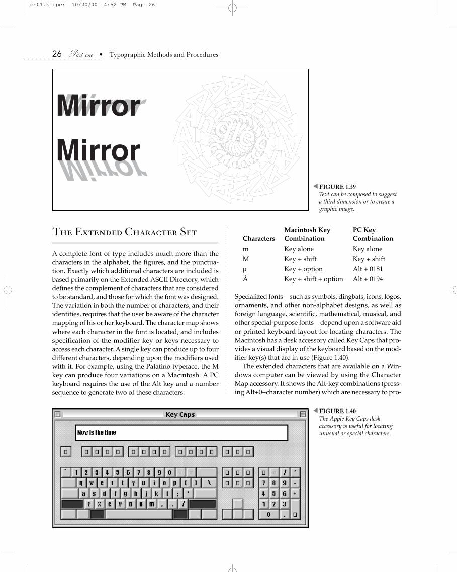
The Extended Character Set
A complete font of type includes much more than thecharacters in the alphabet, the figures, and the punctua-tion. Exactly which additional characters are included isbased primarily on the Extended ASCII Directory, whichdefines the complement of characters that are consideredto be standard, and those for which the font was designed.The variation in both the number of characters, and theiridentities, requires that the user be aware of the charactermapping of his or her keyboard. The character map showswhere each character in the font is located, and includesspecification of the modifier key or keys necessary toaccess each character. A single key can produce up to fourdifferent characters, depending upon the modifiers usedwith it. For example, using the Palatino typeface, the Mkey can produce four variations on a Macintosh. A PCkeyboard requires the use of the Alt key and a numbersequence to generate two of these characters:
26 Part one • Typographic Methods and Procedures
Macintosh Key PC Key Characters Combination Combination
m Key alone Key aloneM Key + shift Key + shiftµ Key + option Alt + 0181Â Key + shift + option Alt + 0194
Specialized fonts—such as symbols, dingbats, icons, logos,ornaments, and other non-alphabet designs, as well asforeign language, scientific, mathematical, musical, andother special-purpose fonts—depend upon a software aidor printed keyboard layout for locating characters. TheMacintosh has a desk accessory called Key Caps that pro-vides a visual display of the keyboard based on the mod-ifier key(s) that are in use (Figure 1.40).
The extended characters that are available on a Win-dows computer can be viewed by using the CharacterMap accessory. It shows the Alt-key combinations (press-ing Alt+0+character number) which are necessary to pro-
MirrorMirrorAngledAngled
Angled
Ang
led
An
gle
dA
ng
led
Ang
led
AngledAngled AngledAngled
Angled
Angled
An
gled
An
gled
Angled
AngledAngledMirrorMirror
FIGURE 1.39Text can be composed to suggest a third dimension or to create agraphic image.
�
FIGURE 1.40The Apple Key Caps desk accessory is useful for locatingunusual or special characters.
�
ch01.kleper 10/20/00 4:52 PM Page 26

Chapter one • Type and Typography 27
duce characters that do not have either a dedicated keyor a common key sequence (Figure 1.41)
The Macintosh and Windows operating systems do notmap all character positions uniformly, so files that areshared between the two systems may show anomalies.Care should always be taken when transferring files thatcontain members of the extended character set. The use ofUnicode fonts (see page 111) will not only overcome thisproblem, but will provide a universal solution for cor-rectly specifying and displaying virtually any charactershape.
Typeface Classification
One of the most perplexing problems confronting someonenew to typesetting is the overwhelming variety of type-face designs from which to choose. There are literally tensof thousands of styles available, many of which have fam-ilies drawn as well. Printers have devised many methodsfor classifying typefaces on the basis of either the physicalattributes of the designs or their historical development.The complexities of organizing such a vast population ofdesigns, coupled with the subtle design differences of sim-ilar typefaces, make identification of particular typefacesdifficult, even, in some cases, for experienced typogra-phers. For this reason, only a basic scheme of typeface clas-sification will be offered here (Figure 1.42).
Serif versus Sans SerifA typeface either has, or does not have, serifs. Serifs areending strokes on the arms, stems, and tails of some type-face designs. If a typeface has serifs, it is termed a romantypeface. If the typeface is without serifs, it is called a sans
serif typeface. Typefaces that slant to the right, be theyserif or sans serif, are called italic variations. Almost alltype families include an italic member, and usually a bold-face member as well (Figure 1.43).
FIGURE 1.41Characters that are a part of the font complement, but are not represented on the normalkeyboard, can be located by usingthe Windows Character Mapaccessory program.
�
Blackletter
RomanModern
Square SerifSans Serif
Script
DecorativeCursive
FIGURE 1.42These eight categories of type comprise a simple schemeof typeface classification.
�
ch01.kleper 10/20/00 4:52 PM Page 27

RomanThe designation of serifed typefaces as roman is compli-cated by the fact that any typeface which stands uprightin comparison to an italic form is also called roman. Thissystem of designation is somewhat confusing since bothroman and sans serif typefaces have italic forms.
BlackletterThe earliest typefaces—those from the Gutenberg work-shop—were copies of the letterforms found in handwrit-ten manuscripts. As a group they are called Blackletter, aversion of which is referred to as Old English. These lettersappear heavy and ornate, and have angular serifs.
Old StylePrinting from movable type spread from Germany south-ward to Italy, and there the classical letterforms ofHumanist manuscripts became the model for the romantypefaces. The earliest roman forms were called old style.
ModernThe roman forms underwent many changes during theperiod from approximately 1470 to 1775. In 1775,Giambattista Bodoni introduced a type design of mechan-ical structure, with heavy stems and light serifs. Hisdesign is classified as a modern typeface.9
Square SerifsAround the turn of the nineteenth century, a new com-mercial interest in type design began. One significantresult of that attention was the formation of a group oftype designs called the square serifs. Square serifs havesquared-off serifs at the extremities of each character.
28 Part one • Typographic Methods and Procedures
Sans SerifIn 1816, William Caslon IV designed a typeface with noserifs. This design was in itself an innovation of majorproportions. It was the first sans serif typeface, the first ofmany and the beginning of a major classification. Sansserif typefaces usually require more line spacing sincetheir simpler design does not provide readers with theadvantage of horizontal serifs to lead their eyes across thepage.
Scripts and CursivesTypefaces that imitate handwriting were first used in thesixteenth century. They appear to be drawn with pen andink, and are classified as scripts and cursives. The lettersof a script typeface are joined; the letters of a cursive type-face are not.
Decorative and DisplayTypefaces that do not fit into any of the previous classifi-cations can be grouped into a category called decorativeand display.
Typeface Recognition
The recognition of a particular face is usually accomplishedby identifying a distinctive character, often a g or an a; orby noting certain design characteristics, such as the fin-ishing stroke on Q, or the spur on the G (Figure 1.44).
Making Type Easier to Read
Two measures are used to assess how easily a typefacecan be comprehended by a reader. The first is the legibil-ity of the typeface, i.e., how well each character design
Scenic Greeting CardsScenic Greeting CardsScenic Greeting Cards
Scenic Greeting CardsScenic Greeting CardsScenic Greeting Cards
S S
(a) (b)
FIGURE 1.43(a) A serif typeface with italic andbold variations. (b) A sans seriftypeface, also with italic and boldvariations. A sans serif typefacethat slants to the right may alsobe referred to as an “oblique.”
�
9. For information about the history of type design see Updike, DanielBerkeley. Printing Types: Their History, Forms, and Use. New York:Dover, 1980.
ch01.kleper 10/20/00 4:52 PM Page 28

Chapter one • Type and Typography 29
conveys its symbolic form to the reader. It is obvious thatthe various letter R’s in Figure 1.45 are not all equally iden-tifiable as that character. The degree of legibility that atypeface possesses is controlled by the typeface designer.Although the legibility is designed into the typeface, andits features cannot be changed by the user, the manner inwhich the typeface is used can directly affect how easythe type is to read. The use of type in its position in a lay-out, in its relation to other graphic elements, and in itsspecific form (type size, line length, line spacing) on thepage are all aspects of readability—the second measure oftypeface comprehension—and are all under the controlof the page designer.
The Legibility of PrintWithin typographic circles, the question has arisen of howit is possible, within a printed piece, to divorce the legi-bility of the typeface from the readability of the printed ordisplayed material. The consensus is that, realistically, itcannot be done. The legibility of a typeface—roman orsans serif, italic or bold—is just as much a factor in read-ability as are line length, line spacing, and point size. In
other words, too long a line length, little or no line spac-ing, and the wrong choice of point size can ruin the legi-bility of a typeface by altering the criteria under which itwas designed. Conversely, an illegible, poorly designed,or extremely ornate or complex typeface cannot easily beimproved by the variables of readability. Since legibilityand readability are so intimately related in their influenceon the effectiveness of graphic communication, the termlegibility of print has been devised to refer to both.
The Measurement of WorkNumerous studies have been conducted to determine thetypographic factors that are most significant in increas-ing the legibility of print. Although most of these havebeen conducted in relation to print media, the results canbe applied, with caution and judgment, to text displayedin electronic media formats. Most of the print research hasused the measurement of work as the method of assessment.Since 1896, this measurement has been defined as thespeed, in time, at which subjects are able to read and tolocate answers to problems.
Reading has been defined by Smith and Decant as “theperception of graphic symbols. It is the process of relatinggraphic symbols to the reader’s fund of experience.”10
This definition is valid regardless of whether the reader isviewing a printed page or a computer monitor. Readinghas, therefore, three main variables: the graphic symbols,the form of presentation (printed material, screen display,etc.), and the reader.
To the mix of variables associated with the legibility ofprint we can add those that the reader touches, such asthe tactile feel of the paper surface, and those that theprinter has chosen and the reader sees, such as the colorof the paper and ink, and the overall color or contrast ofthe page. In an electronic media environment, the legibil-ity of print can be influenced by the size, brightness, andglare of the screen, as well as the background and fore-ground colors used on the screen display.
The reader presents his or her own mix of variables: hisor her personality, age, sex, IQ, maturity, willingness tolearn, frustration tolerance, and reading skills, includingeyesight. Other factors are the textual intent, whetherpleasure-oriented or work-oriented, the length of textmatter, the degree of interest, and the rate of speed andfatigue.
There is one other fundamental difference betweenreading print and reading from a Web site. The print mate-rial, in a physical form such as a book, can be evaluatedquickly in terms of its length and content. The reader forms
g g g gg g g g
Bell Bold Bodoni Bold Centaur Bold Cooper Black
Helvetica Bold Myriad Bold Palatino BoldTimes New Roman Bold
FIGURE 1.44Certain characters, such as the lower case g, have definite, definingcharacteristics that provide clues as to the identity of the typeface.
�
R R R R
R R R R
Asphalt-Black Avalon Caflisch Script Carnival
Civilite Critter Lilith Initials Old English Text
FIGURE 1.45Eight examples of the letter R. How would you rank them interms of their legibility?
�
10. Zachrisson, Bror. Studies in the Legibility of Printed Text. Stockholm:Almqvist and Wiksell, 1965.
ch01.kleper 10/20/00 4:52 PM Page 29

an opinion (and perhaps an attitude) related to how longit will take to read, how much effort it will require, andhow enjoyable the experience may be. The reader who ispresented with a Web site can make no such assessment.The amount of material at the site is impossible to deter-mine. You can’t judge a Web site by its home page, anymore than you can judge a book by its cover. Additionally,the book can be read anywhere; at a desk, in a lounge chair,under a tree—Web pages, generally, must be read whilesitting in front of a computer.11 Finally, printed text retainsits physical location on the page, which sometimes acts asa memory cue in the retention process. Scrolling displaysof Web text generally do not offer such physical landmarks.
Eye MovementsAs early as 1907, Ruediger, a reading researcher, con-cluded that the eyes can easily process ten times the num-ber of words that they actually do. The main impedimentsto speed, he found, were the comprehension and the qual-ity of the text. He found that fluency of comprehensionwas directly related to smooth, rhythmical eye move-ments.12 The eye tends to divide a line of text into evenunits, and fixates upon these delineations in even jumps.This phenomenon is called point vision. E. W. Dolch hasconcluded that “the good reader is not fixating words orphrases of sentences. He is actually and literally fixatingparts of the line.”13
These facts have had a direct and quite meaningfulimpact on the use of type. Since the fewer fixations the eyemust make causes greater speed of reading, it makes senseto use a minimum of space between words (word spaces)and to avoid wide or extended typefaces, which are nowknown to reduce reading speed and to cause eye fatigue.
Block OutlinesIn 1910, Bertram Goodhue, the designer of the typefaceCheltenham, wrote that reading speed is dependent upona reader’s ability to make “pictures” out of words.14
Almost 25 years earlier, Cattell had shown by experi-mentation that the eye is capable of perceiving a wholeword as quickly as a single letter. The block outlines oflowercase words provide a distinctive form, one not to befound in all-capital composition (Figure 1.46).
30 Part one • Typographic Methods and Procedures
Character DifferentiationThe composition of all capitals has been proven todecrease the legibility of print. In extensive studies, G. W.Ovink found that differentiating characteristics of capi-tals must be clearly discernible. For example, the crossstroke at the bottom of the Q, which differentiates it fromthe O, must be obvious. He also found that the middlearm of the E and F should be shorter than the top arm andshould not be too narrow, and that hairline stems and ser-ifs and heavy or long serifs should be avoided.15
Character ShapesLowercase letters having more variation in shape have agreater legibility in print.16 Investigations by Ovink,Roethlein, Sanford, and Tinker all reached this same con-clusion. Among their findings was that the relative widthof the lowercase letter is a factor in legibility.17 Comparehow easily an e or an i is read as opposed to an m or a w.They also found that the more simple the outline of the let-ter, the more legible the letter; that the serifs affect legi-bility; that shading, or variation of stress, affects legibility;and that the white space, or spaces within the outline ofa letter, is a strong influence on that letter’s legibility—the greater the space, the greater the legibility.18
Much research has been conducted into the mechani-cal aspects of type design. Some of the earliest interestwas expressed by Benjamin Franklin in a letter to NoahWebster concerning type contour, in which he wrote “[it]makes the line more even, but renders it less immediatelylegible; as the paring of all men’s noses might smooth andlevel their faces, but would render their physiognomies
11. That need not be the case. This topic is addressed in Chapter 19 of Volume II of this work.
12. Ruediger, William C. “Field of Distinct Vision.” Columbia Contributions to Philosophy and Psychology 16.1 (1907).
13. Dolch, Edward William. Psychology and Teaching of Reading.Westport, CT: Greenwood Press, 1970, c1951.
14. Zachrisson, Bror. Studies in the Legibility of Printed Text. Stockholm:Almqvist and Wiksell, 1965.
SPECIAL SHAPES
Special ShapesFIGURE 1.46Words that appear in uppercase and lowercase form are easier for theeyes to perceive as “pictures.”
�
15. Zachrisson, Bror. Studies in the Legibility of Printed Text. Stockholm:Almqvist and Wiksell, 1965.
16. According to Miles A. Tinker, Schwarz in 1775 was the first tonotice that the lower case is more legible than the upper case.
17. Zachrisson, Bror. Studies in the Legibility of Printed Text. Stockholm:Almqvist and Wiksell, 1965.
18. Ibid.
ch01.kleper 10/20/00 4:53 PM Page 30
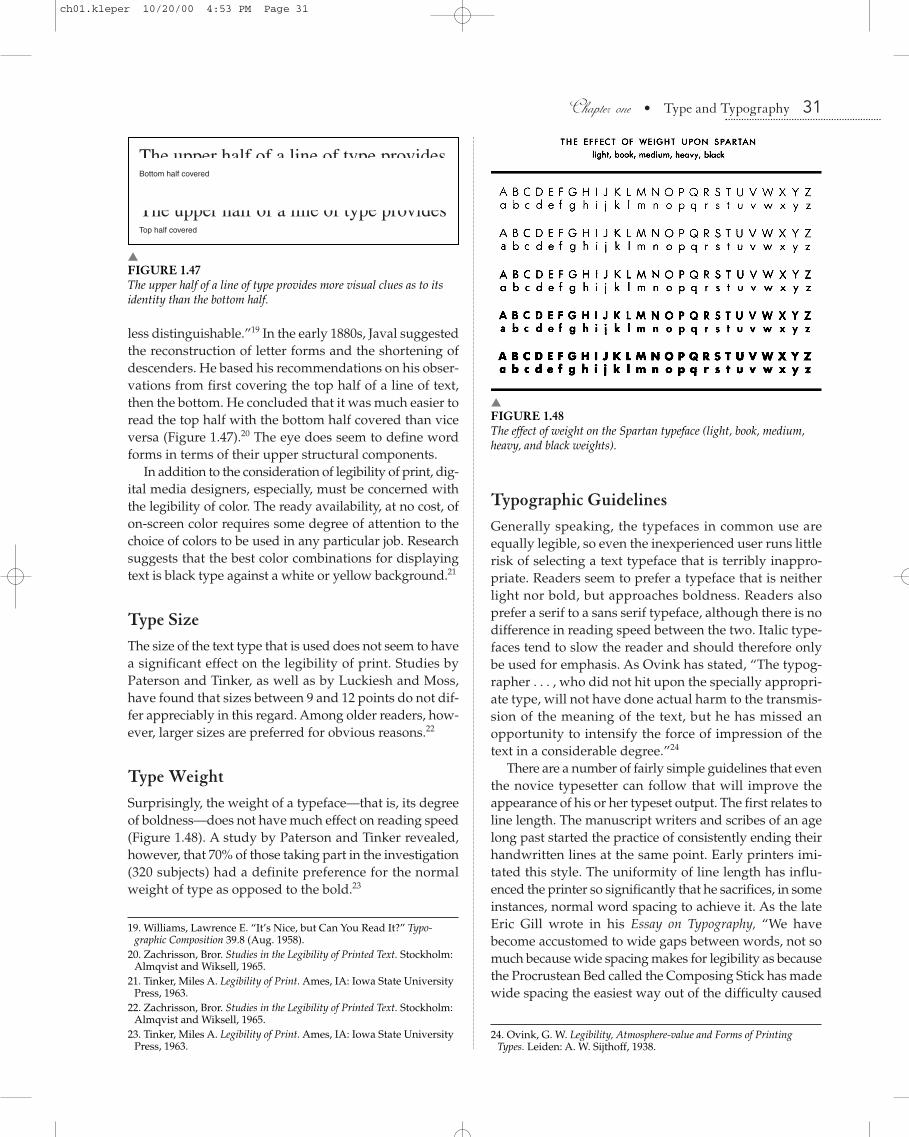
Chapter one • Type and Typography 31
less distinguishable.”19 In the early 1880s, Javal suggestedthe reconstruction of letter forms and the shortening ofdescenders. He based his recommendations on his obser-vations from first covering the top half of a line of text,then the bottom. He concluded that it was much easier toread the top half with the bottom half covered than viceversa (Figure 1.47).20 The eye does seem to define wordforms in terms of their upper structural components.
In addition to the consideration of legibility of print, dig-ital media designers, especially, must be concerned withthe legibility of color. The ready availability, at no cost, ofon-screen color requires some degree of attention to thechoice of colors to be used in any particular job. Researchsuggests that the best color combinations for displayingtext is black type against a white or yellow background.21
Type SizeThe size of the text type that is used does not seem to havea significant effect on the legibility of print. Studies byPaterson and Tinker, as well as by Luckiesh and Moss,have found that sizes between 9 and 12 points do not dif-fer appreciably in this regard. Among older readers, how-ever, larger sizes are preferred for obvious reasons.22
Type WeightSurprisingly, the weight of a typeface—that is, its degreeof boldness—does not have much effect on reading speed(Figure 1.48). A study by Paterson and Tinker revealed,however, that 70% of those taking part in the investigation(320 subjects) had a definite preference for the normalweight of type as opposed to the bold.23
Typographic GuidelinesGenerally speaking, the typefaces in common use areequally legible, so even the inexperienced user runs littlerisk of selecting a text typeface that is terribly inappro-priate. Readers seem to prefer a typeface that is neitherlight nor bold, but approaches boldness. Readers alsoprefer a serif to a sans serif typeface, although there is nodifference in reading speed between the two. Italic type-faces tend to slow the reader and should therefore onlybe used for emphasis. As Ovink has stated, “The typog-rapher . . . , who did not hit upon the specially appropri-ate type, will not have done actual harm to the transmis-sion of the meaning of the text, but he has missed anopportunity to intensify the force of impression of thetext in a considerable degree.”24
There are a number of fairly simple guidelines that eventhe novice typesetter can follow that will improve theappearance of his or her typeset output. The first relates toline length. The manuscript writers and scribes of an agelong past started the practice of consistently ending theirhandwritten lines at the same point. Early printers imi-tated this style. The uniformity of line length has influ-enced the printer so significantly that he sacrifices, in someinstances, normal word spacing to achieve it. As the lateEric Gill wrote in his Essay on Typography, “We havebecome accustomed to wide gaps between words, not somuch because wide spacing makes for legibility as becausethe Procrustean Bed called the Composing Stick has madewide spacing the easiest way out of the difficulty caused
The upper half of a line of type provides
The upper half of a line of type provides Bottom half covered
Top half covered
FIGURE 1.47The upper half of a line of type provides more visual clues as to itsidentity than the bottom half.
�
19. Williams, Lawrence E. “It’s Nice, but Can You Read It?” Typo-graphic Composition 39.8 (Aug. 1958).
20. Zachrisson, Bror. Studies in the Legibility of Printed Text. Stockholm:Almqvist and Wiksell, 1965.
21. Tinker, Miles A. Legibility of Print. Ames, IA: Iowa State UniversityPress, 1963.
22. Zachrisson, Bror. Studies in the Legibility of Printed Text. Stockholm:Almqvist and Wiksell, 1965.
23. Tinker, Miles A. Legibility of Print. Ames, IA: Iowa State UniversityPress, 1963.
FIGURE 1.48The effect of weight on the Spartan typeface (light, book, medium,heavy, and black weights).
�
24. Ovink, G. W. Legibility, Atmosphere-value and Forms of PrintingTypes. Leiden: A. W. Sijthoff, 1938.
ch01.kleper 10/20/00 4:53 PM Page 31

by the tyrannical insistence upon equal length of lines.”25
Generally speaking, readers dislike line lengths that aretoo short or too long (Figure 1.49).
Paragraph IndentionsEven subtleties in text arrangement, such as paragraphindention, can significantly affect the legibility of print.An indention is a space that sets the paragraph apart fromother lines of type. It helps the reader’s eye to identifyand organize blocks of text. Only the first paragraph of achapter or major subdivision does not require the inden-tion, since the reader has no difficulty determining thebeginning of a series of paragraphs. Studies conducted inthe 1960s by Miles Tinker found that indention canimprove legibility significantly.26 As a general rule, para-graphs with line lengths up to 18 picas should be indented1 em space; those with line lengths from 19 to 23 picasshould be indented 11/2 em spaces; and those with linelengths between 24 and 30 picas should be indented 2 emspaces. Editorial style, or design designation, however,might dictate otherwise.
QuaddingThe last line of a paragraph does not usually fill the linemeasure. In hand composition, large metal spaces two orthree times as large as an em were used to fill the space tothe right of the final line. These spaces were called quads,and the process of using them was called quadding. In type-set output from a phototypesetter or imagesetter, space is
32 Part one • Typographic Methods and Procedures
simply the absence of an exposure of light to photographicmaterial. Quadding becomes a machine command con-trolling the position of less than a full line of type. The lastline of a paragraph is pushed to the left, and therefore iscalled quad left (QL or flush left). A line pushed to the rightis designated as quad right (QR or flush right). Centeredlines are designated as quad center (QC or centered).
When lines are quadded, they gain the benefit of uni-form word spacing. Because all excess space in a line isplaced to the left, the right, or divided between the two,the fit of words in quadded lines is usually easier to read.Many publications have adopted the practice of settingall lines quad left, in a style known as ragged right or flushleft, ragged right. This style of line orientation has beenshown to be easier to read. It also helps to avoid whatGeorge Bernard Shaw described as “rivers of white[which] trickle down between words like raindrops onthe window pane.”27
Most readers are not aware of whether the text they arereading is ragged or justified. Do you know which styleyour daily newspaper uses? Check it the next time youpick up a copy.
Line SpacingThe vertical space from the baseline of one line of type tothe baseline of the following line of type is called line spac-ing or leading. The term leading is derived from the prac-tice of setting type by hand and separating each line ofmetal type with a thin 2-point strip of metal called a lead(Figure 1.50).
A block of type is specced, or marked-up, by indicatingthe size of the type followed by the line spacing. If the typeis 10-point, and the line spacing is 12-point, then the mark-up would be “10/12,” which is read “ten on twelve.” As arule of thumb, line spacing is usually 120% of the pointsize (Figure 1.51).
LetterspacingSometimes the justification of lines of text is attemptedunder the worst of conditions. The line measure might betoo short, or the words might be too long and unhyphen-ated, the minimum word space might be too wide, or thetext might be wrapped around an irregular graphic. Theresult is copy that is poorly spaced and difficult to read(Figure 1.52).
Words can be spaced only so far apart before they losetheir cohesiveness and become difficult to read. For thisreason, most professional typesetting software has typo-graphic spacing controls, which allow the user to set min-imum and maximum expansion limits for word spaces.
OPTIMUM LINE LENGTHSingle Column: 25-26 picasDouble Column: 17-18 picas
(set solid [s], with line space [l])
Type Size Line Length12 pt. s ...................................... 17-37 pi12 pt. l ....................................... 17-33 pi10 pt. s ...................................... 17-27 pi10 pt. l ....................................... 14-31 pi8 pt. s ........................................ 13-25 pi8 pt. l ......................................... 14-38 pi6 pt. s .......................................... 9-25 pi6 pt. l ......................................... 14-38 pi
FIGURE 1.49The optimum line lengths for various sizes of text type, based onresearch conducted by Miles Tinker.
�
25. Lawson, Alexander. “It’s Time to Re-examine some ComposingRoom Procedures.” Inland Printer/American Lithographer. 155.3 (June 1965).
26. Tinker, Miles A. Legibility of Print. Ames, IA: Iowa State UniversityPress, 1963.
27. Currier, Everett Raymond. Type Spacing. New York: M. J. Bowles,1912.
ch01.kleper 10/20/00 4:53 PM Page 32

Chapter one • Type and Typography 33
When the maximum word-space value is surpassed, andif the user has specified the option, small increments ofspace are added between individual characters in the line.This letterspacing degrades the word shapes on which thereader’s eyes depend for quick recognition (Figure 1.53).Letterspacing should be avoided if possible.
A certain amount of letterspace is designed into eachcharacter, so that it does not touch the character that pre-cedes or follows it. This minute space, located on both theleft and right sides of each character, is called the left andright side bearing. The side bearings establish the inter-character space that the designer has determined to be
optimum. Designers typically increase the side-bearingspacing for typefaces that will be viewed on-screen.
KerningThe opposite of letterspacing is kerning. Instead of addingspace between letters to fill a line, minute increments ofspace are subtracted from between certain character pairsin order to improve their fit and therefore make themmore eye-appealing. Kerning is most common in displayadvertising, where differences in character fit are mostobvious and aesthetically unacceptable (Figure 1.54).
Elevators have become indispensible in all large printing offices, both for the conveyance of passengers and of freight....While necessary, certain grave dangers attend their use, as they may cause injuries to the person and loss of life, and they are the means by which fires very frequently spread with rapidity. 1894 Edition of the American Dictionary of Printing and Bookmaking.
FIGURE 1.50Lines of handset metal type were separated with thin strips of metalcalled leads, hence the term leading.
�
Elevators have become indispeboth for the conveyance of pnecessary, certain grave dangers injuries to the person and loss which fires very frequently spreaAmerican Dictionary of Printing
2 point lead
10 point type
10/12
FIGURE 1.51Basic typographic specification refers to the type size and line spacing, with the values, in points, separated by a slash.
�
The typographic implications ofthis capability are enormous. Notonly can cus tomers’ input ber ece ived ove r t he t e l ephone( immed ia t e ly, and f rom anydistance), but, by using a dedicatedcomputer which offers electronicmail, customers may leave files forpick-up at the convenience of thetypesetter operator (usually atnight when the telephone ratesa r e l ow es t ) . Com pl e t edtypesetting can then be mailedback to the customer. Even withthe speed of the Postal Service,this method of doing business canbe more efficient than currentpractices.
Information about manufacturer’sproducts and prices is believed tobe accurate as o f the t ime ofpub l i ca t i on . Be adv i s edthat vendors’ product descriptionsand specifications are subject tochange wi thou t no t i ce . Whenavailable, complete addresses andte lephone numbers have beenlisted. The publisher maintains noliability or responsibility for theaccuracy o f c l a ims , nor t heperformance of capabilities statedby m anu fac tu re rs o r t he i rrepresentatives.
FIGURE 1.52Examples of poorly justified text.
�
Words can be spaced on lyso fa r apar t be fore theylose the i r cohes ivenessand be come d i f f i cu l t tore ad . For th i s re ason mostpro fe ss iona l typese t t ingsof tware has typographicspac ing cont ro l s , whicha l low the u se r to se t min i -mu m and maximum ex-pans ion l imi t s fo r wordspace s . Whe n the max i -mu m word space va lue i ssu rpasse d , and i f the userhas spe c i f i e d the opt ion ,smal l incre me nts o f spaceare adde d be tween ind i -v idu a l charac te rs in thel ine . Th i s l e t t e r spac ingde grade s the word shapeson which the re ader ’s eyede pe nds for qu ick recogni -t ion . Le t te r spac ing shouldbe avo ide d i f poss ib le .
FIGURE 1.53Excessively letterspaced lines slow the reading rate since the readermust determine where one word ends and the other begins.
�
The unTrival Pursuitof Excellence
The unTrival Pursuitof Excellence
FIGURE 1.54Kerning helps to compensate for the placement of irregular char-acter shapes in proximity to one another. Kerning is generallyapplied to specific character pairs that are known to result ininappropriate character fit, such as “T” and “o”.
�
ch01.kleper 10/20/00 4:53 PM Page 33

TrackingSome typesetting systems and page-layout programs havean additional character-spacing option, usually referred toas character compensation or tracking. This option permitsthe user to specify a small increment of space that is to beuniformly removed—or less commonly, added—betweenall characters. The result of using negative tracking (reduc-ing intercharacter space) is tighter-fitting—although notnecessarily more readable or more eye-pleasing—typog-raphy. Negative character compensation can be used effec-tively to save space by squeezing characters closertogether. The addition of space between characters can beused to lighten the “color,” or overall pattern of density(the balance of black and white), that a particular font cre-ates on a page or screen (Figure 1.55).
HyphenationThe hyphenation process is linked intimately with theprocess of justification. The objective of line justification,as we have already discussed, is to pack as many charac-ters on one line as will reasonably fit, while maintainingoptimum word spacing and avoiding letterspacing.Hyphenation becomes necessary when a word falling atthe end of a line causes that line to exceed the point atwhich it should be ended (the justification range).
Early phototypesetting machines required the use ofperforated tapes with all end-of-line information included;in other words, the lines had to be justified prior to type-setting. These justified tapes could be prepared on a count-ing keyboard, which calculated the unit width of each typedcharacter and indicated to the operator when the justifi-cation zone was reached. Another method involved run-ning an unjustified tape through a reader on a specialcomputer so that a new justified tape could be prepared.
The first use of a digital computer in the typesettingfield occurred during the early 1960s, when a general-pur-pose computer, used for accounting and payroll functions,was programmed for typesetting. Removing the end-of-line, decision-making function from the perforator oper-ator resulted in two major benefits. It increased thethrough-put speed and also allowed the operator to pro-duce a tape from a less-sophisticated and less-expensivekeyboard.
One of the first computers built to perform a specific(special-purpose) typesetting task was the CompugraphicLinasec. It was used to justify tape, but lacked the stor-age capacity necessary for hyphenation, thereby requir-ing a human monitor to respond to word breaks appear-ing on a CRT screen. The Linasec was followed by theCompugraphic Justape, which had the ability to accept
34 Part one • Typographic Methods and Procedures
an unjustified tape and output a justified tape, all withoutthe aid of a human monitor.
Today, typesetting machines (imagesetters, plain-papertypesetters, page printers, etc.) receive rasterized pageinformation which is derived from data that has beencomposed in the computer, where all of the hyphenationand justification (popularly known as H & J) calculationshave occurred.
No TrackingNo well conducted printing-office can be carried onwithout rules, yet it is generally a mistake to formulatea vast number of regulations and post them up in dif-ferent parts of the establishment. Some of those whichare to be found in particular offices are unnecessary,for an acquaintance with them is presupposed whena workman is engaged, as he must have served anapprenticeship. It is unnecessary, for instance, to estab-lish a rule that men must pick up the type they drop.(American Dictionary of Printing and Bookmaking, 1894)
Loose TrackingNo well conducted printing-office can be car-ried on without rules, yet it is generally a mis-take to formulate a vast number of regulationsand post them up in different parts of the estab-lishment. Some of those which are to be foundin particular offices are unnecessary, for anacquaintance with them is presupposed whena workman is engaged, as he must have servedan apprenticeship. It is unnecessary, forinstance, to establish a rule that men must pickup the type they drop. (American Dictionary ofPrinting and Bookmaking, 1894)
Tight TrackingNo well conducted printing-office can be carried on withoutrules, yet it is generally a mistake to formulate a vast num-ber of regulations and post them up in different parts of theestablishment. Some of those which are to be found in par-ticular offices are unnecessary, for an acquaintance with themis presupposed when a workman is engaged, as he musthave served an apprenticeship. It is unnecessary, for instance,to establish a rule that men must pick up the type they drop.(American Dictionary of Printing and Bookmaking, 1894)
FIGURE 1.55Tracking serves to change the space between characters uniformly,without consideration for individual character shapes.
�
ch01.kleper 10/20/00 4:53 PM Page 34

Chapter one • Type and Typography 35
The H & J algorithms used in most desktop publish-ing, design, and screen-presentation applications use aline-at-a-time method to determine end-of-line decisions.28
This is less elegant that other methods, such as those usedby the TeX typesetting language,29 which applies a set ofexpert rules to the entire paragraph in order to determinethe optimum line-break points.
Hyphenless JustificationWhen the last word in a line exceeds the line measure,one option is to carry the entire word over to the next lineand make up the space by using interword and intrawordspacing. If all such hyphenation decisions are made in thismanner, the result is hyphenless justification, which givesthe appearance of very loose lines. Hyphenless justifica-tion is a poor typographic style and should be avoided.
The alternative is to hyphenate the word and carry onlypart of it to the next line. Most traditional typesettingmachines accomplished this process by using one or acombination of three different methods: discretionaryhyphenation, the rules of English, or dictionary look-up.
Discretionary HyphenationThe first method of hyphenation relied totally on thejudgment of the keyboard operator. The operator mightanticipate that the typesetter’s computer logic could not
differentiate between certain words, such as pre-sent andpres-ent, or be able to handle the hyphenation of certaintechnical terms or unusual names. In such cases, the oper-ator would insert a code called a discretionary hyphen (orsoft hyphen) at the proper points, to make the correct breakpoints obvious to the computer, should that particularword exceed the justification zone. If such words did notfall at the end of the line, the discretionary hyphenationcodes were ignored during processing.
The Rules of EnglishThe second hyphenation method relied on the rules ofEnglish language logic. The typesetter computer was pro-grammed with information based upon grammaticalusage. Such instructions included not breaking a word(a) after fewer than two letters, (b) so that three or fewerletters were carried to the next line, (c) after a consonantfollowed by a vowel, and (d) before a punctuation mark,as well as many others. Logic programs were not perfectbecause there are many exceptions to accepted rules ofEnglish usage. At best, such programs were about 98%accurate.
Dictionary Look-upThe third and most precise method of hyphenation was bydictionary look-up. In this method, an entire dictionary wasstored on hard disk and consulted as needed. Althoughthis method was very effective, it was also more expensiveand required continuous updating for new words. A vari-ation of this method was an exception-word dictionary, aspecial collection of words that a particular user or com-pany frequently encountered. The exception-word dic-tionary was used in conjunction with a logic program andwith discretionary hyphenation, as well as in cases of con-fusing word pairs.
28. A notable exception is the Adobe Multi-Line Composer introducedin the InDesign program in 1999.
29. TeX is a sophisticated program that facilitates the setting of com-plex typographic matter, most notably of a mathematical nature. Itwas written by Donald Knuth of Stanford University. TeX uses whatKnuth refers to as “control sequences” to communicate the form inwhich a specified portion of text is to be processed. There are about900 control sequences that TeX is capable of processing, and the userretains the option of respecifying commands so that he or she canremember them more easily.
ch01.kleper 10/20/00 4:53 PM Page 35