the process of creating the tv listings
TRANSCRIPT
THE PROCESS OF
CREATING THE TV
LISTINGSBy Beth Cox

STEP 1.
We cropped all the pictures we print screened from the
documentary, leaving us with a neat image to use in our double
page spread.

We cropped all the pictures by using this tool…
which is found on
the sidebar within
Photoshop.
This is what it looked
like when we were
cropping the image.
You drag the box over
the area you want to
keep and let go when
you are happy with the
crop. Then you should
be left with only what
you wanted to keep.
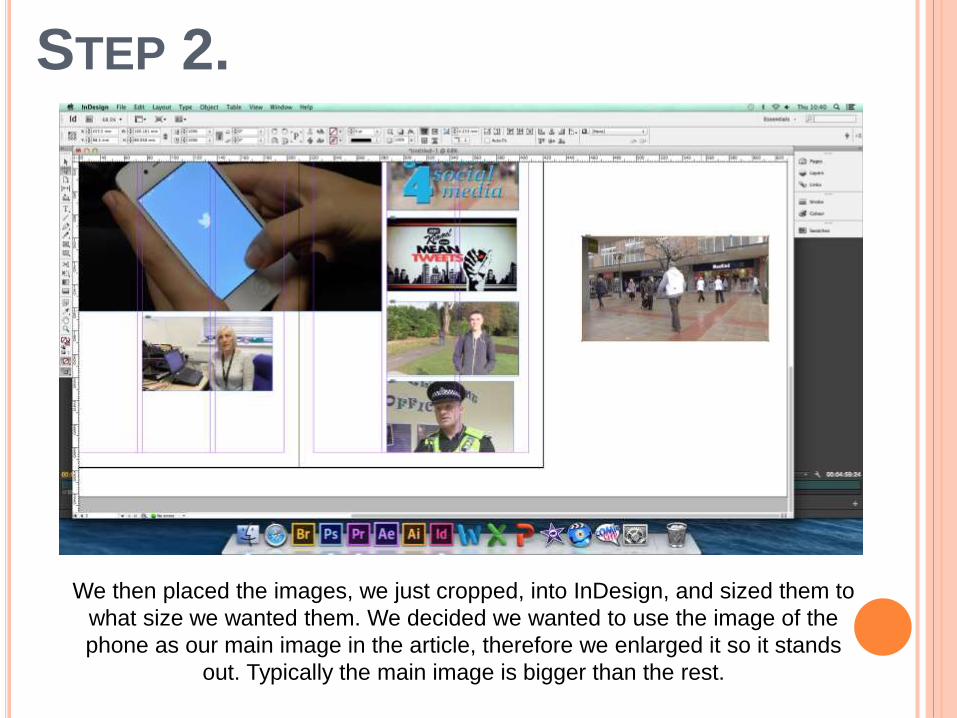
STEP 2.
We then placed the images, we just cropped, into InDesign, and sized them to
what size we wanted them. We decided we wanted to use the image of the
phone as our main image in the article, therefore we enlarged it so it stands
out. Typically the main image is bigger than the rest.

STEP 3.
We have inserted some filler text into our columns so we can get an idea of
how much we need to write for the article, the size of font we want, and
whether we have the right amount of columns and the columns are the right
length/width.
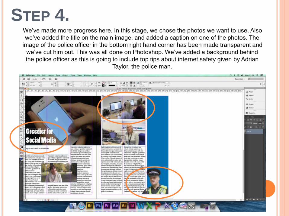
STEP 4.We’ve made more progress here. In this stage, we chose the photos we want to use. Also
we’ve added the title on the main image, and added a caption on one of the photos. The
image of the police officer in the bottom right hand corner has been made transparent and
we’ve cut him out. This was all done on Photoshop. We’ve added a background behind
the police officer as this is going to include top tips about internet safety given by Adrian
Taylor, the police man.
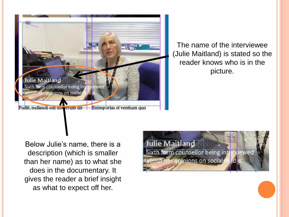
Below Julie’s name, there is a
description (which is smaller
than her name) as to what she
does in the documentary. It
gives the reader a brief insight
as what to expect off her.
The name of the interviewee
(Julie Maitland) is stated so the
reader knows who is in the
picture.
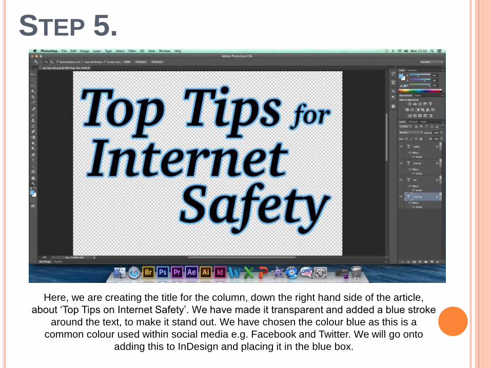
STEP 5.
Here, we are creating the title for the column, down the right hand side of the article,
about ‘Top Tips on Internet Safety’. We have made it transparent and added a blue stroke
around the text, to make it stand out. We have chosen the colour blue as this is a
common colour used within social media e.g. Facebook and Twitter. We will go onto
adding this to InDesign and placing it in the blue box.

STEP 6.We then placed the text we just created in Photoshop, into InDesign. We resized it to the
size we wanted and placed it where we wanted it to be. It’s the title for the article down
the right hand side of the double page spread. The title ‘Top Tips for Internet Safety’
gives the reader a clear understanding as to what that article is going to be about.
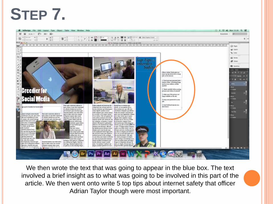
STEP 7.
We then wrote the text that was going to appear in the blue box. The text
involved a brief insight as to what was going to be involved in this part of the
article. We then went onto write 5 top tips about internet safety that officer
Adrian Taylor though were most important.
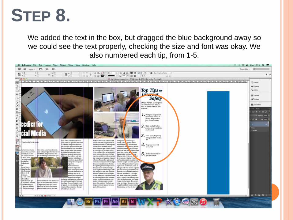
STEP 8.We added the text in the box, but dragged the blue background away so
we could see the text properly, checking the size and font was okay. We
also numbered each tip, from 1-5.
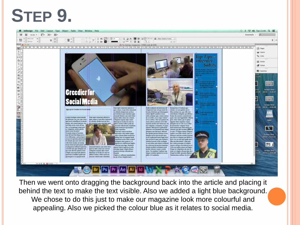
STEP 9.
Then we went onto dragging the background back into the article and placing it
behind the text to make the text visible. Also we added a light blue background.
We chose to do this just to make our magazine look more colourful and
appealing. Also we picked the colour blue as it relates to social media.
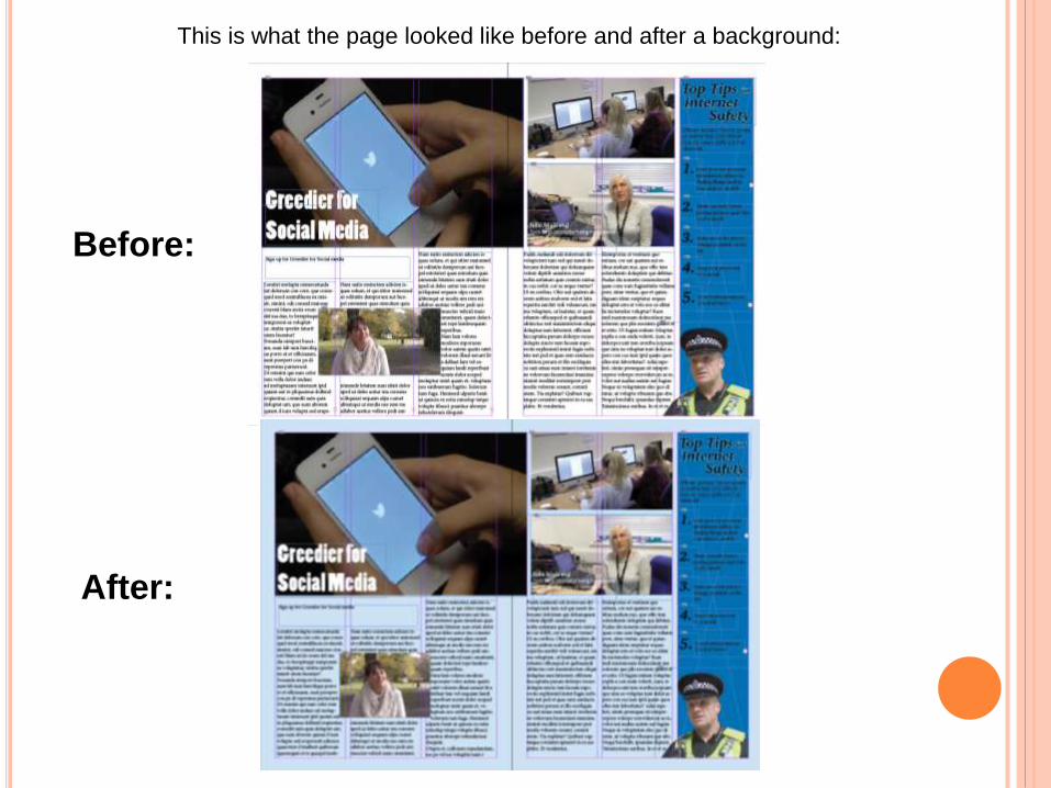
This is what the page looked like before and after a background:
Before:
After:
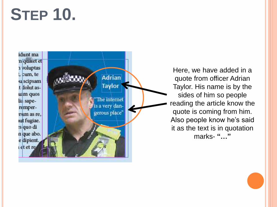
STEP 10.
Here, we have added in a
quote from officer Adrian
Taylor. His name is by the
sides of him so people
reading the article know the
quote is coming from him.
Also people know he’s said
it as the text is in quotation
marks- “…”

STEP 11.This is what our double page spread looks like so far. We’ve neatened up the Top
Tips article, making all the text equal and placed correctly. Also we’ve made sure
that all the text is visible and readable. This is a print screen of what the article looks
like without the guide lines, giving us a more realistic view of what the final product
will look like.
STEP 12.
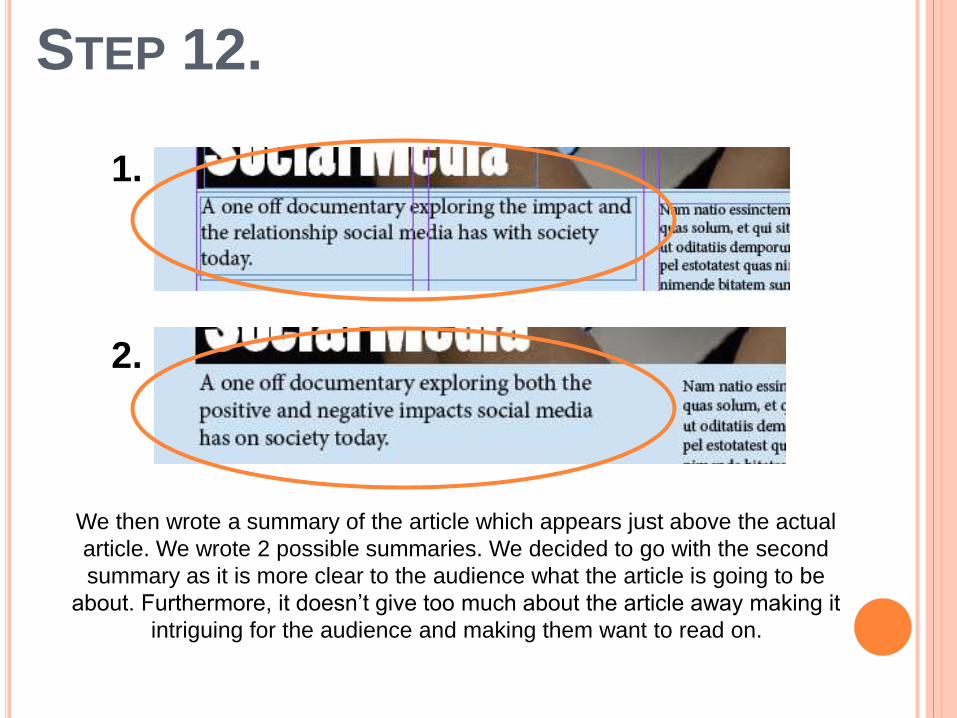
We then wrote a summary of the article which appears just above the actual
article. We wrote 2 possible summaries. We decided to go with the second
summary as it is more clear to the audience what the article is going to be
about. Furthermore, it doesn’t give too much about the article away making it
intriguing for the audience and making them want to read on.
1.
2.
STEP 13.
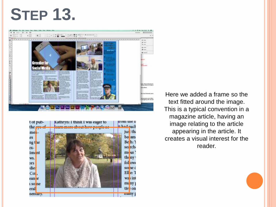
Here we added a frame so the
text fitted around the image.
This is a typical convention in a
magazine article, having an
image relating to the article
appearing in the article. It
creates a visual interest for the
reader.
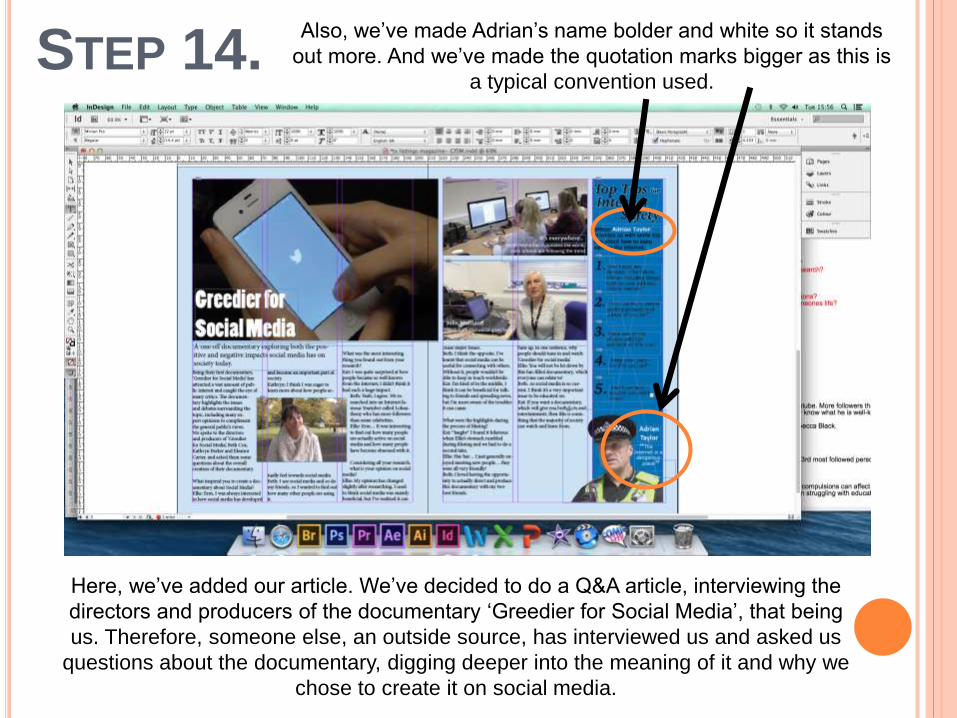
STEP 14.
Here, we’ve added our article. We’ve decided to do a Q&A article, interviewing the
directors and producers of the documentary ‘Greedier for Social Media’, that being
us. Therefore, someone else, an outside source, has interviewed us and asked us
questions about the documentary, digging deeper into the meaning of it and why we
chose to create it on social media.
Also, we’ve made Adrian’s name bolder and white so it stands
out more. And we’ve made the quotation marks bigger as this is
a typical convention used.
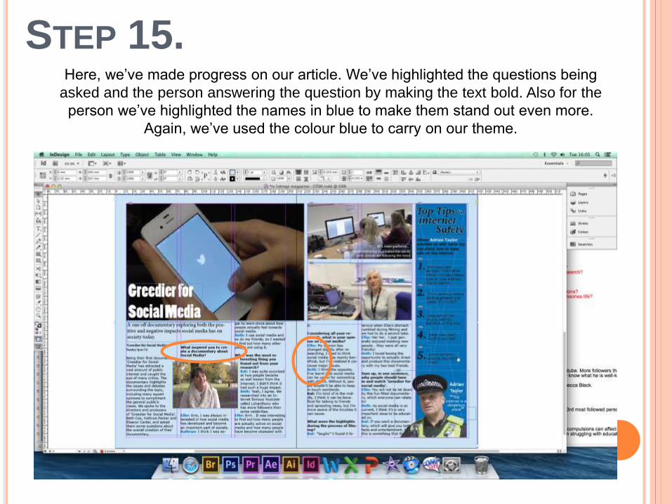
STEP 15.Here, we’ve made progress on our article. We’ve highlighted the questions being
asked and the person answering the question by making the text bold. Also for the
person we’ve highlighted the names in blue to make them stand out even more.
Again, we’ve used the colour blue to carry on our theme.
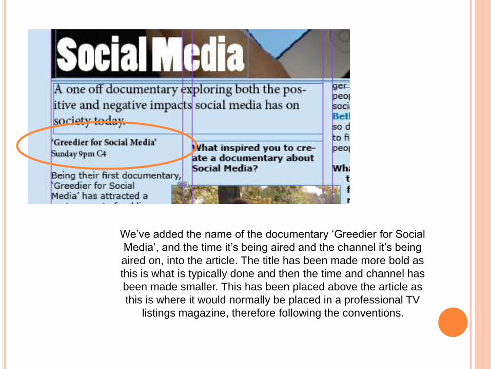
We’ve added the name of the documentary ‘Greedier for Social
Media’, and the time it’s being aired and the channel it’s being
aired on, into the article. The title has been made more bold as
this is what is typically done and then the time and channel has
been made smaller. This has been placed above the article as
this is where it would normally be placed in a professional TV
listings magazine, therefore following the conventions.
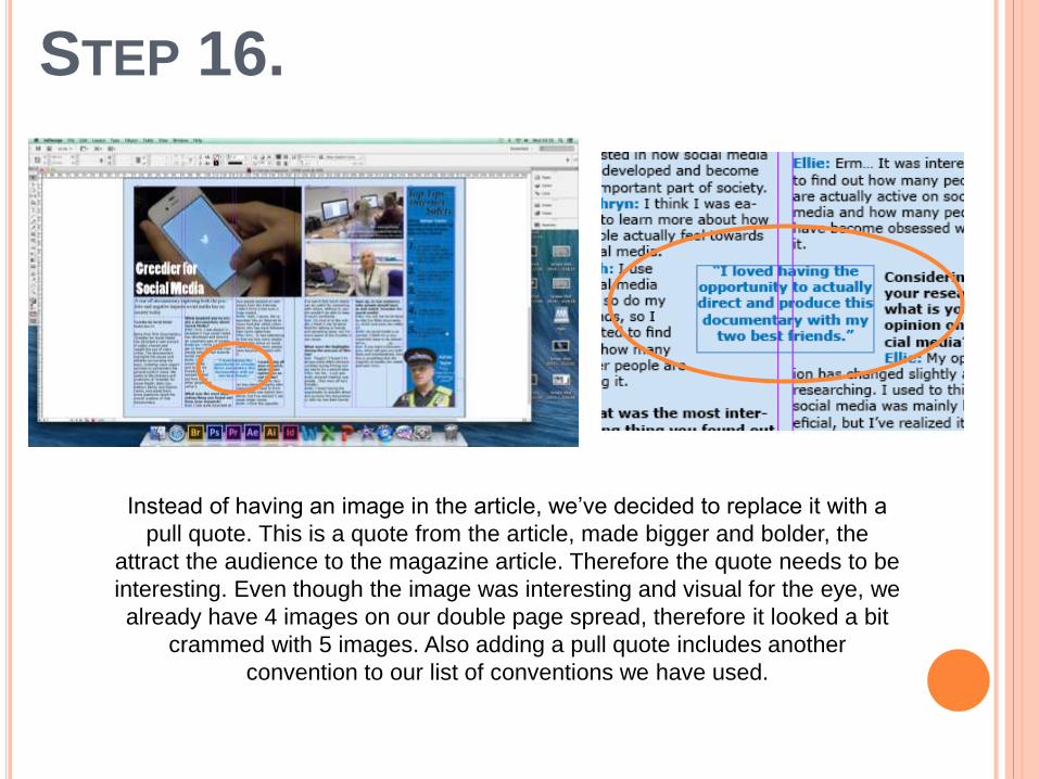
STEP 16.
Instead of having an image in the article, we’ve decided to replace it with a
pull quote. This is a quote from the article, made bigger and bolder, the
attract the audience to the magazine article. Therefore the quote needs to be
interesting. Even though the image was interesting and visual for the eye, we
already have 4 images on our double page spread, therefore it looked a bit
crammed with 5 images. Also adding a pull quote includes another
convention to our list of conventions we have used.
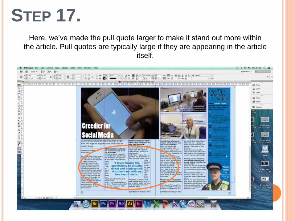
STEP 17.Here, we’ve made the pull quote larger to make it stand out more within
the article. Pull quotes are typically large if they are appearing in the article
itself.
STEP 18.
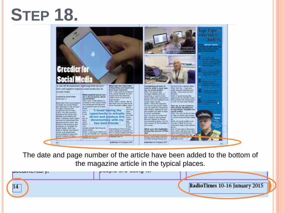
The date and page number of the article have been added to the bottom of
the magazine article in the typical places.
STEP 19.
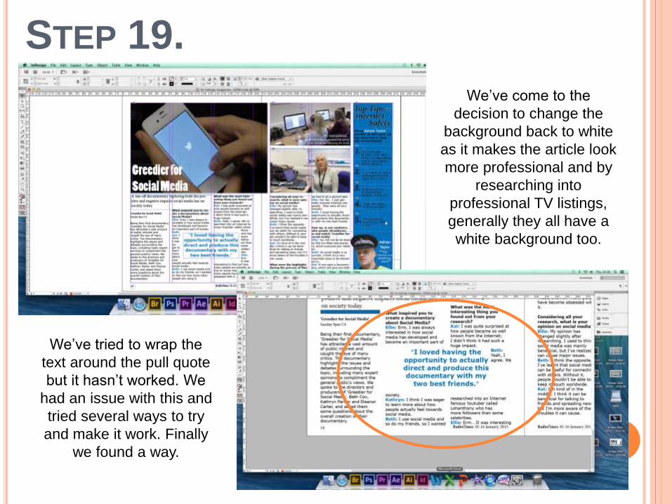
We’ve come to the
decision to change the
background back to white
as it makes the article look
more professional and by
researching into
professional TV listings,
generally they all have a
white background too.
We’ve tried to wrap the
text around the pull quote
but it hasn’t worked. We
had an issue with this and
tried several ways to try
and make it work. Finally
we found a way.
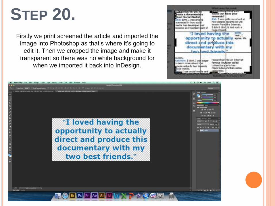
STEP 20.Firstly we print screened the article and imported the
image into Photoshop as that’s where it’s going to
edit it. Then we cropped the image and make it
transparent so there was no white background for
when we imported it back into InDesign.

STEP 21.
We then imported the image that we saved from Photoshop, used a pen
tool to add little points around the box of the text, and then pulled each
point in which dragged the text around the quote. We added points and
dragged them until we were happy with how it fitted in the text. Personally I
think the end result looks neat and professional.
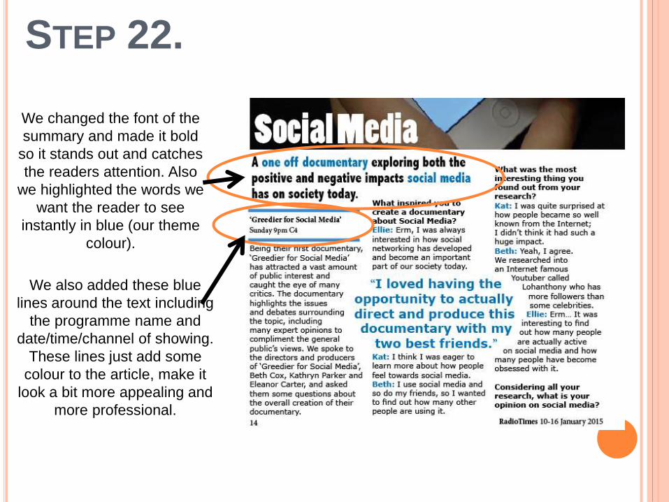
STEP 22.
We changed the font of the
summary and made it bold
so it stands out and catches
the readers attention. Also
we highlighted the words we
want the reader to see
instantly in blue (our theme
colour).
We also added these blue
lines around the text including
the programme name and
date/time/channel of showing.
These lines just add some
colour to the article, make it
look a bit more appealing and
more professional.
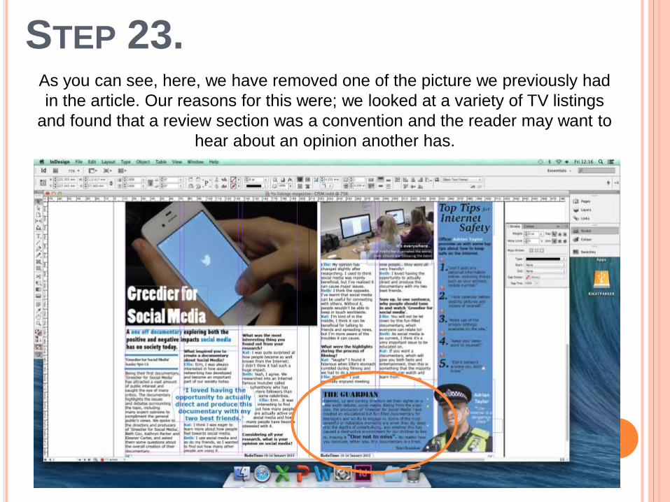
STEP 23.As you can see, here, we have removed one of the picture we previously had
in the article. Our reasons for this were; we looked at a variety of TV listings
and found that a review section was a convention and the reader may want to
hear about an opinion another has.
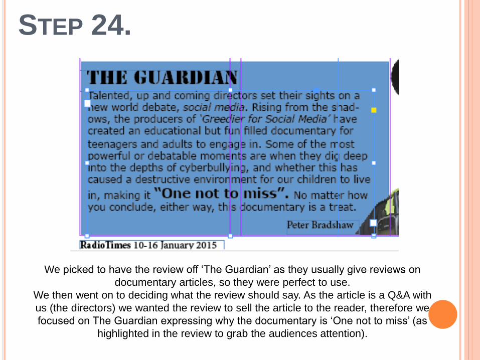
STEP 24.
We picked to have the review off ‘The Guardian’ as they usually give reviews on
documentary articles, so they were perfect to use.
We then went on to deciding what the review should say. As the article is a Q&A with
us (the directors) we wanted the review to sell the article to the reader, therefore we
focused on The Guardian expressing why the documentary is ‘One not to miss’ (as
highlighted in the review to grab the audiences attention).

FINAL PRODUCT

Overall, I am happy with the outcome of the TV Listings double page spread. I think
it looks professional, intriguing, and fun. The use of the blue colour scheme makes it
look fun and not boring which will attract the readers attention, making them more
likely to read the article. The font type and size are readable and the images and
pull quote are the correct size and positioning within the article. By following the
conventions of TV Listings, I am happy with the article we have produced to
advertise our documentary
‘Greedier for Social Media’.
OVERALL…