text and image
DESCRIPTION
This is a typography introduction for Fall 2D's text and image assignmentTRANSCRIPT
Text and ImageThis is no shotgun marriage
Thursday, February 4, 2010
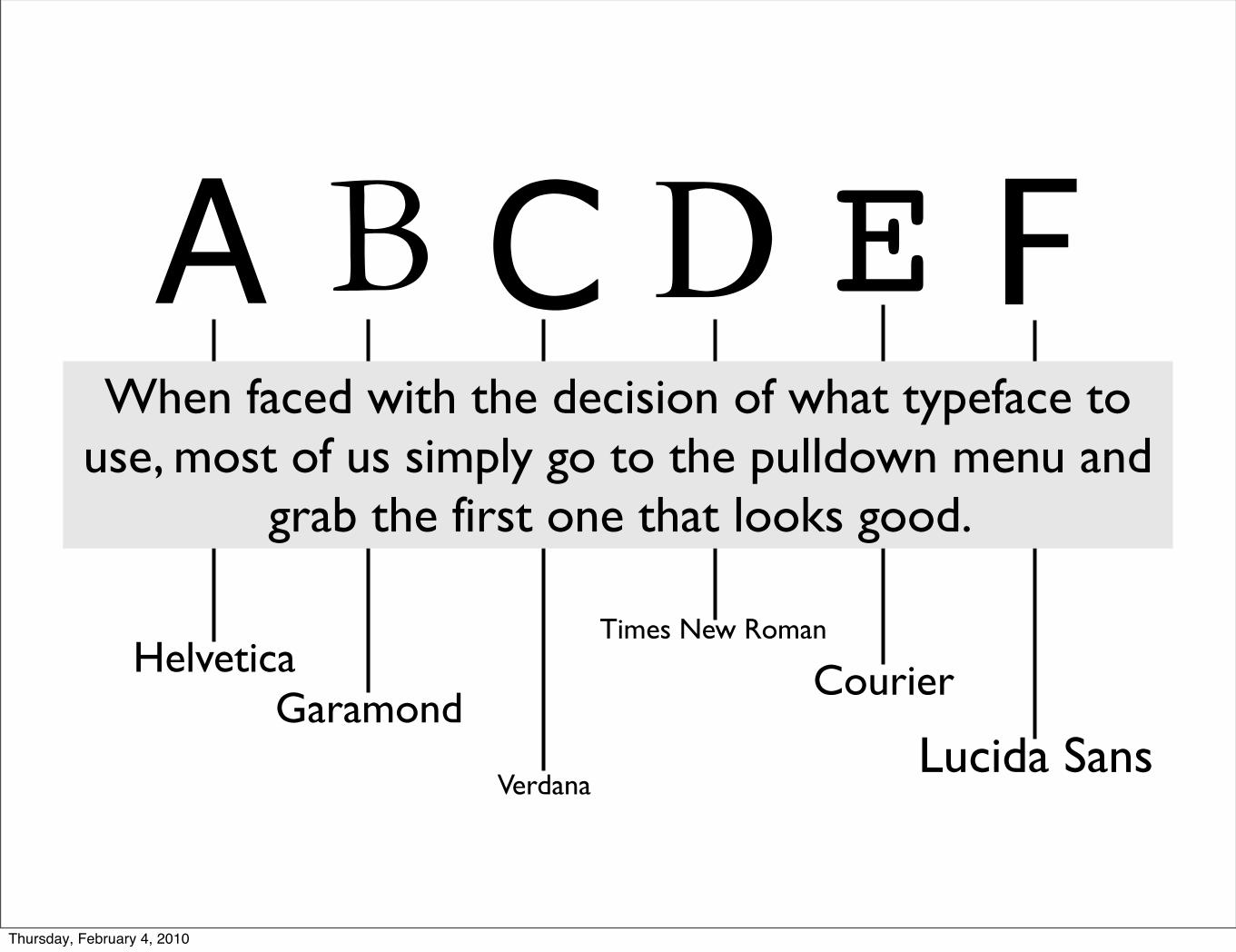
A B C D E F
HelveticaGaramond
Verdana
Times New Roman
Courier
Lucida Sans
When faced with the decision of what typeface to use, most of us simply go to the pulldown menu and
grab the first one that looks good.
Thursday, February 4, 2010
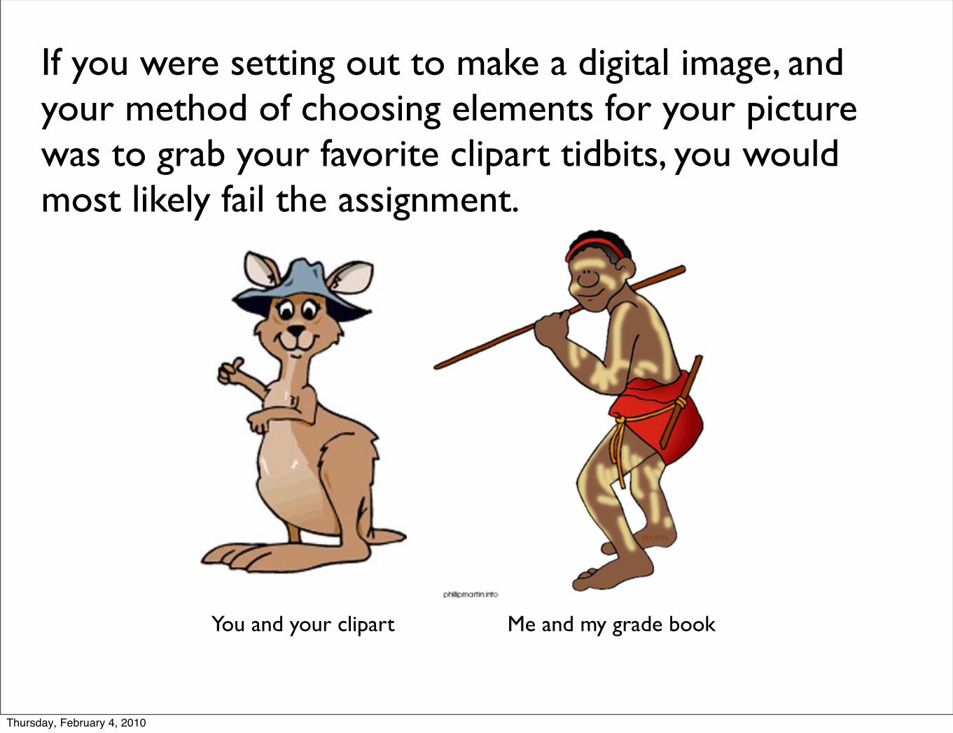
If you were setting out to make a digital image, and your method of choosing elements for your picture was to grab your favorite clipart tidbits, you would most likely fail the assignment.
Thursday, February 4, 2010
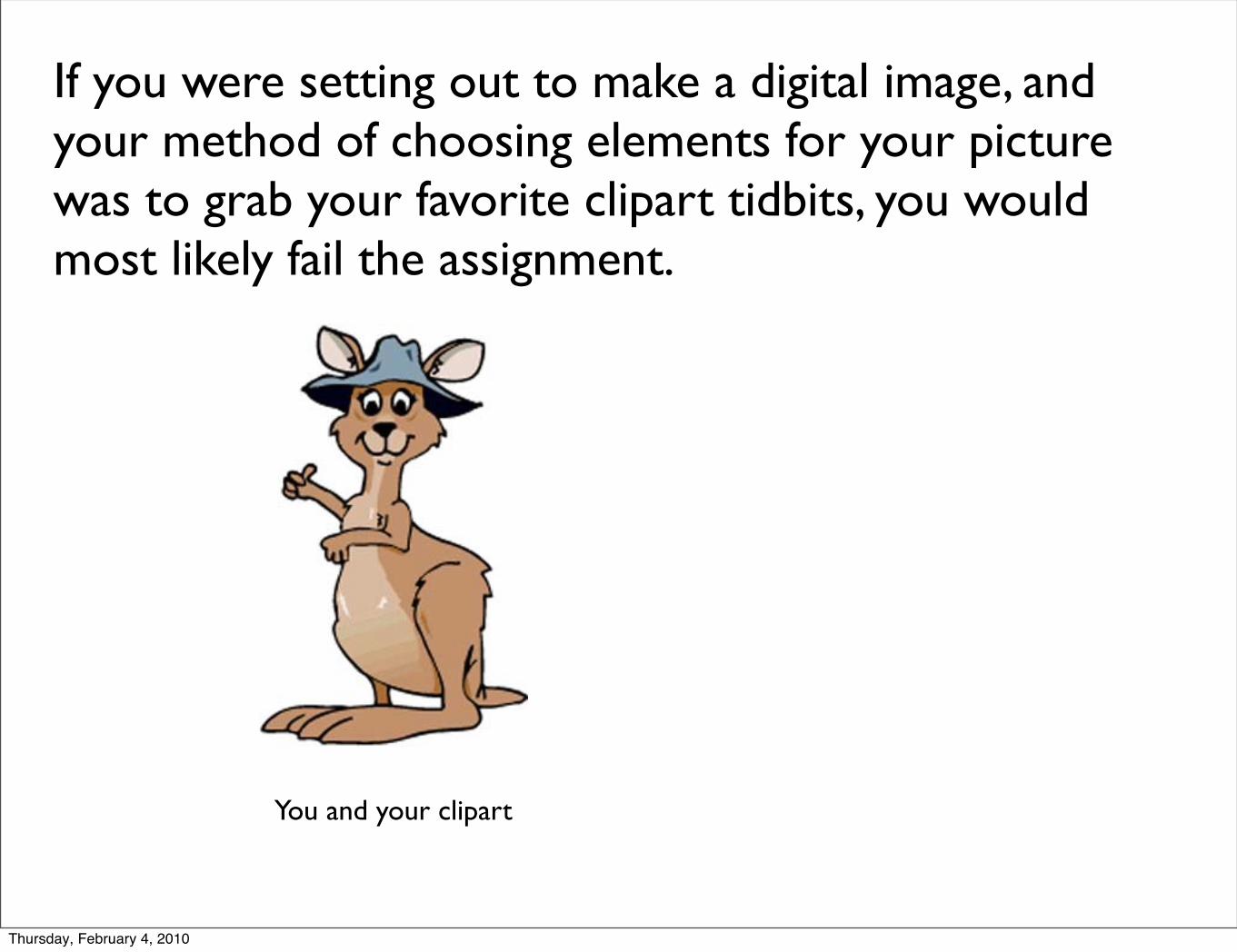
If you were setting out to make a digital image, and your method of choosing elements for your picture was to grab your favorite clipart tidbits, you would most likely fail the assignment.
You and your clipart
Thursday, February 4, 2010
If you were setting out to make a digital image, and your method of choosing elements for your picture was to grab your favorite clipart tidbits, you would most likely fail the assignment.
You and your clipart Me and my grade book
Thursday, February 4, 2010
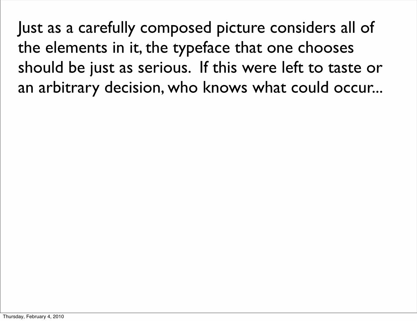
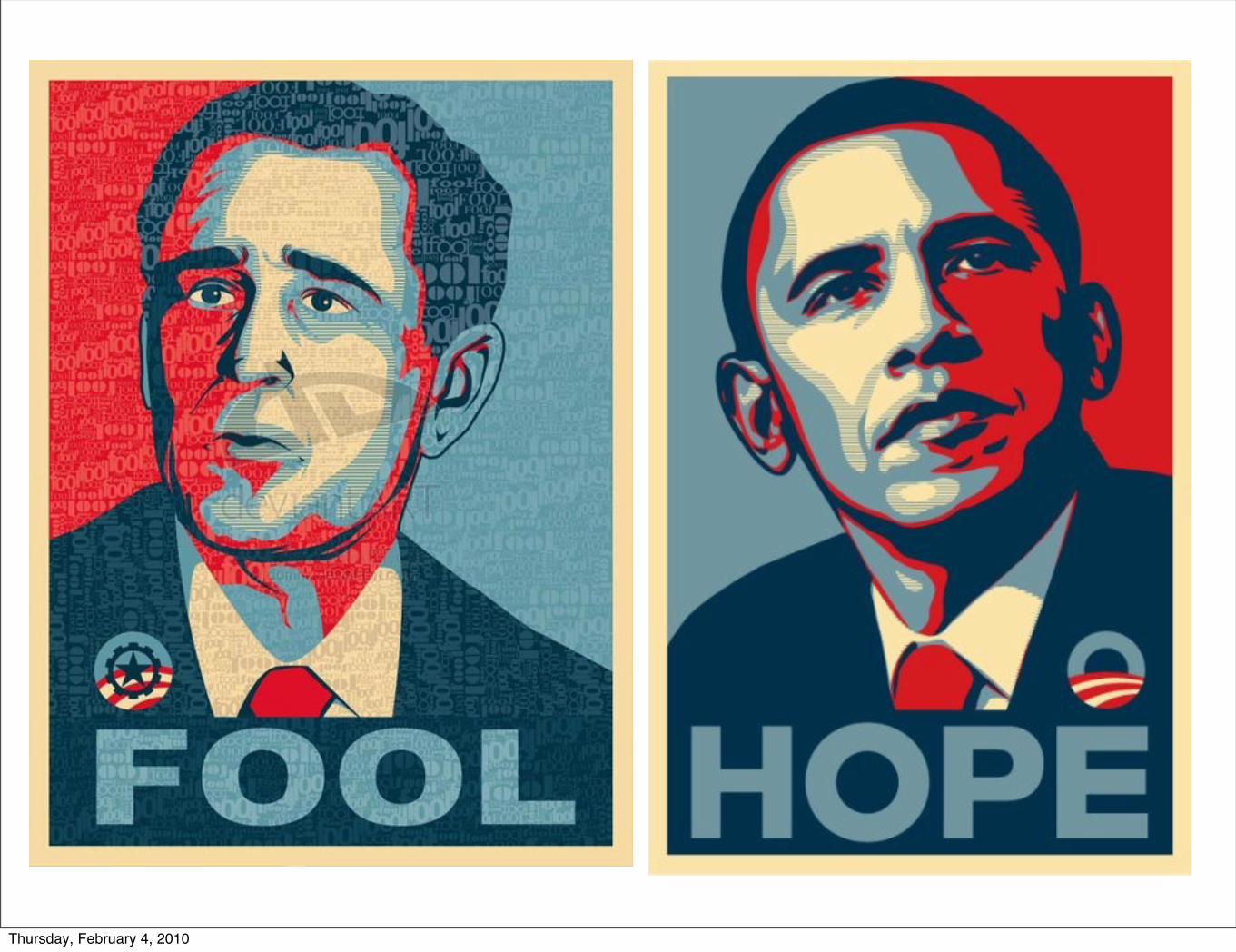
Just as a carefully composed picture considers all of the elements in it, the typeface that one chooses should be just as serious. If this were left to taste or an arbitrary decision, who knows what could occur...
Thursday, February 4, 2010
Just as a carefully composed picture considers all of the elements in it, the typeface that one chooses should be just as serious. If this were left to taste or an arbitrary decision, who knows what could occur...
Apple Computeryeeesh.....
Thursday, February 4, 2010
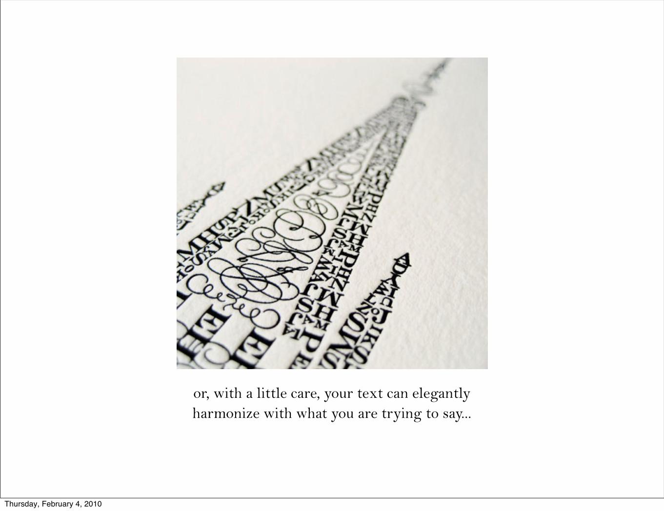
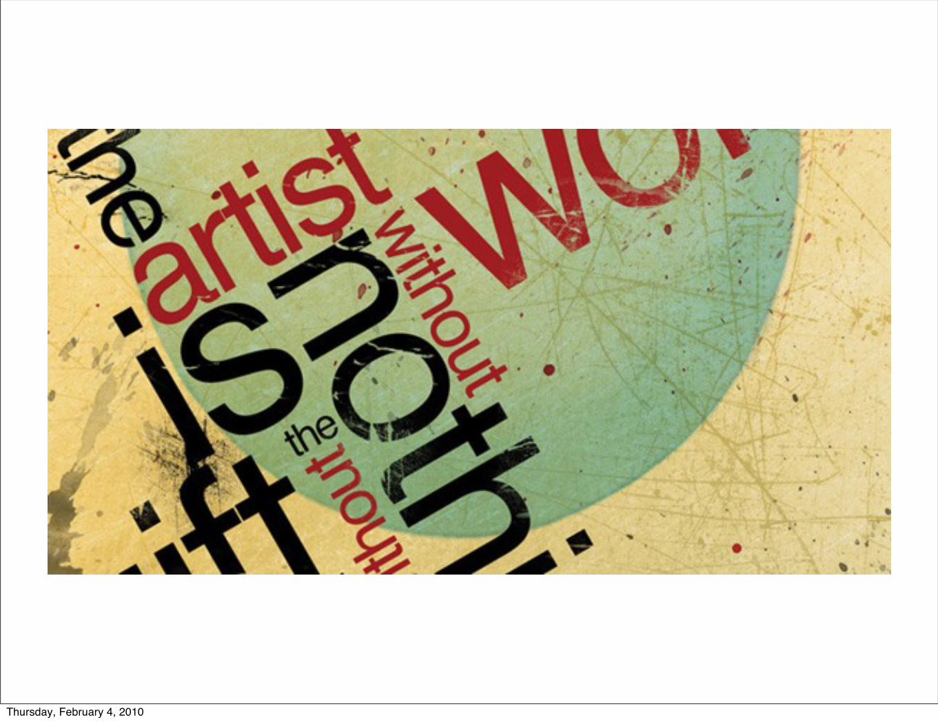
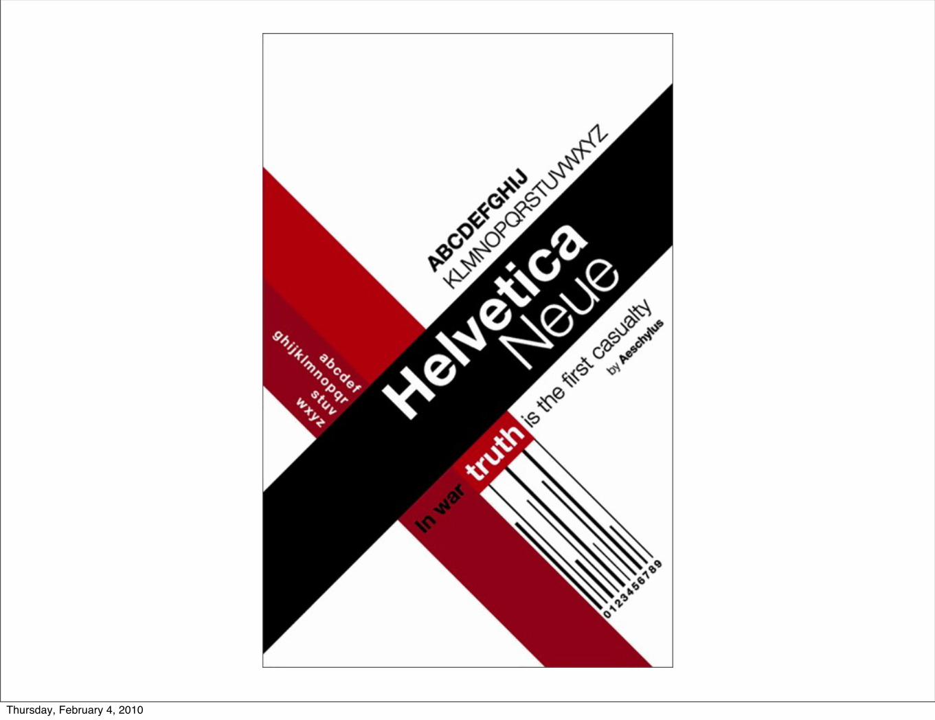
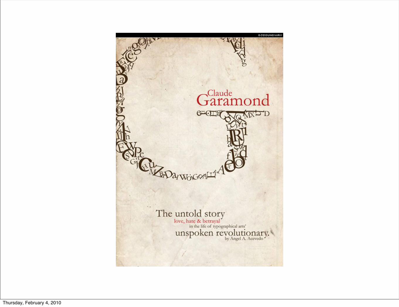
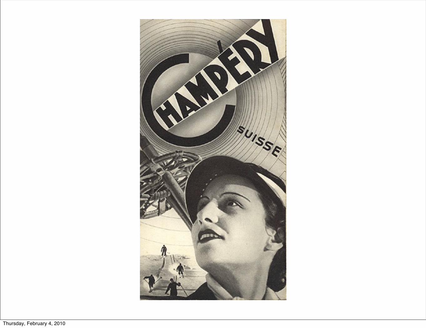
or, with a little care, your text can elegantly harmonize with what you are trying to say...
Thursday, February 4, 2010
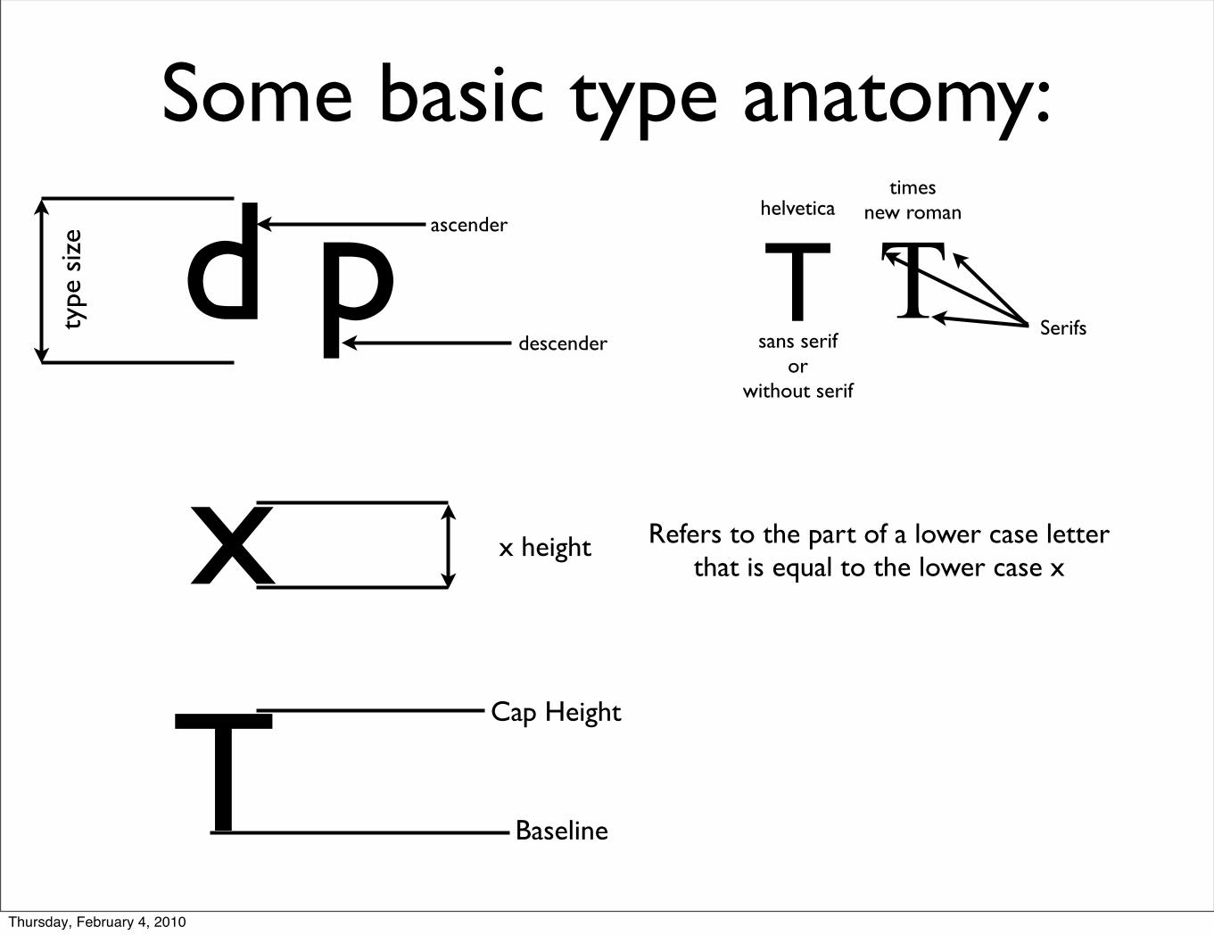
Some basic type anatomy:
d ptype
siz
e ascender
descender
x x height Refers to the part of a lower case letter that is equal to the lower case x
TCap Height
Baseline
T TSerifs
sans serifor
without serif
helveticatimes
new roman
Thursday, February 4, 2010
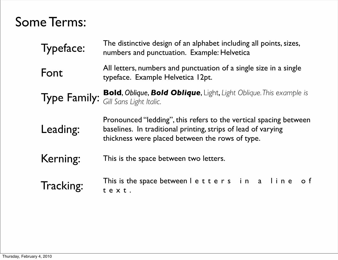
Some Terms:
Typeface:
Font
Type Family:
Leading:
Kerning:
Tracking:
The distinctive design of an alphabet including all points, sizes, numbers and punctuation. Example: Helvetica
All letters, numbers and punctuation of a single size in a single typeface. Example Helvetica 12pt.
Bold, Oblique, Bold Oblique, Light, Light Oblique. This example is Gill Sans Light Italic.
Pronounced “ledding”, this refers to the vertical spacing between baselines. In traditional printing, strips of lead of varying thickness were placed between the rows of type.
This is the space between two letters.
This is the space between l e t t e r s i n a l i n e o f t e x t .
Thursday, February 4, 2010
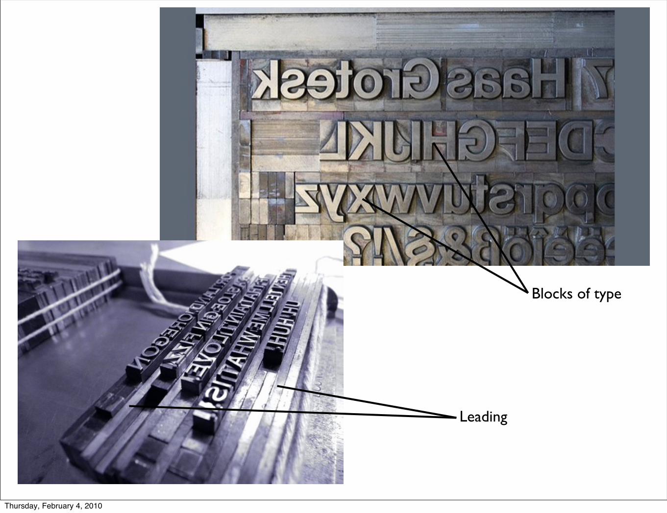
Blocks of type
Leading
Thursday, February 4, 2010
Thursday, February 4, 2010
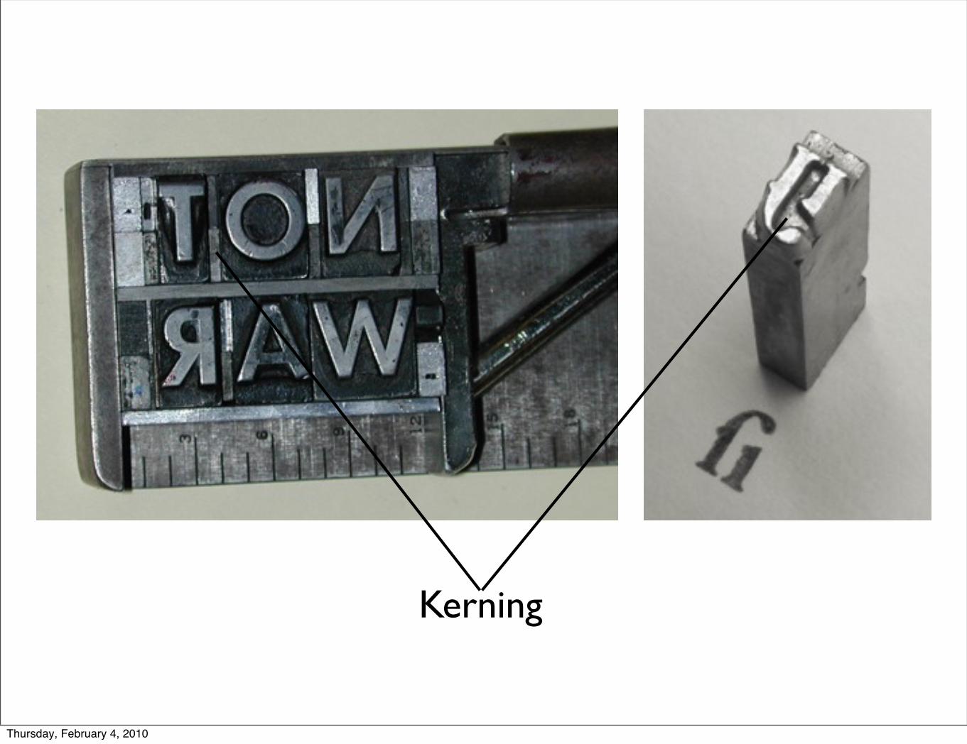
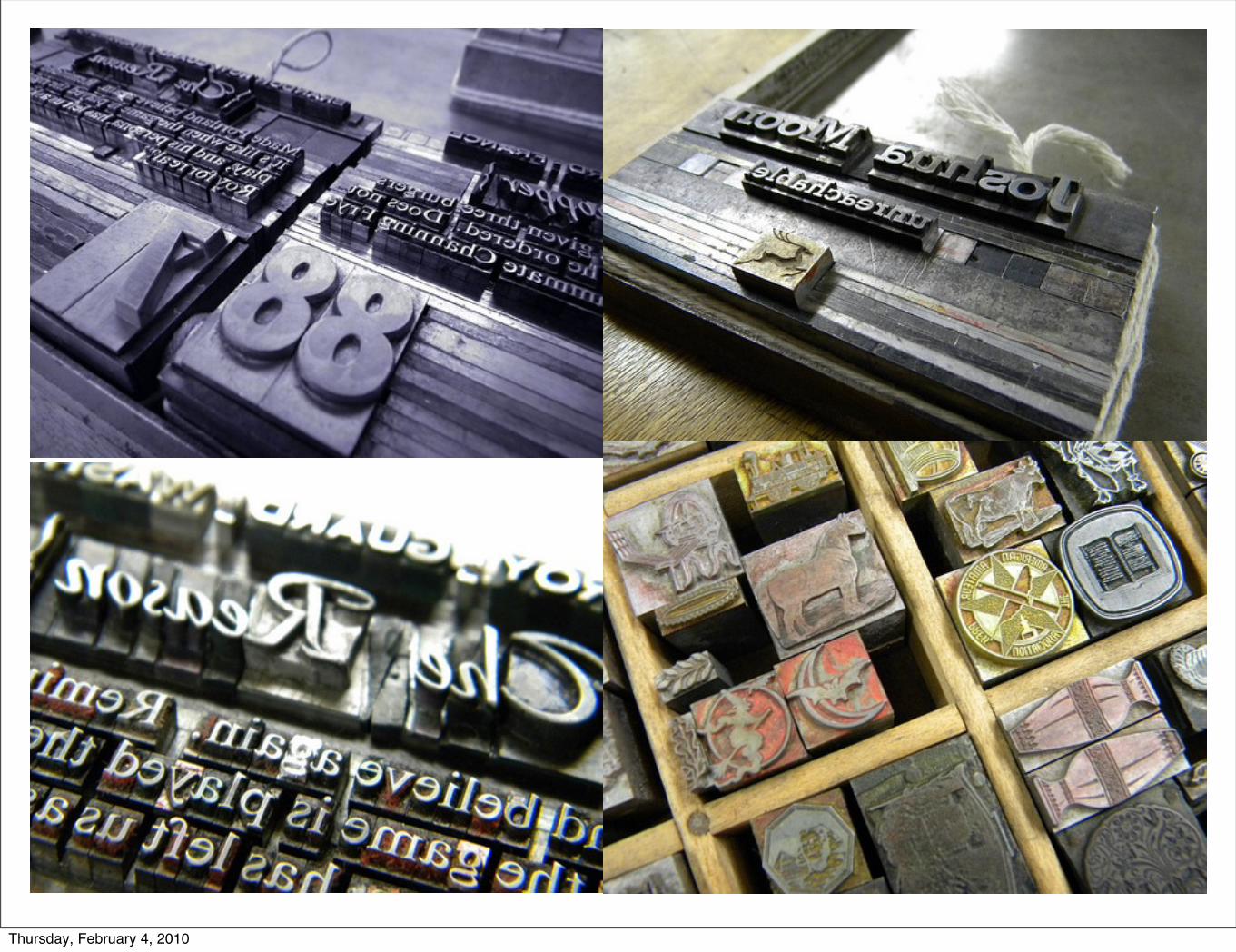
Kerning
Thursday, February 4, 2010

Thursday, February 4, 2010
Thursday, February 4, 2010
Thursday, February 4, 2010
Thursday, February 4, 2010
Thursday, February 4, 2010
Thursday, February 4, 2010
Thursday, February 4, 2010
Thursday, February 4, 2010
Thursday, February 4, 2010
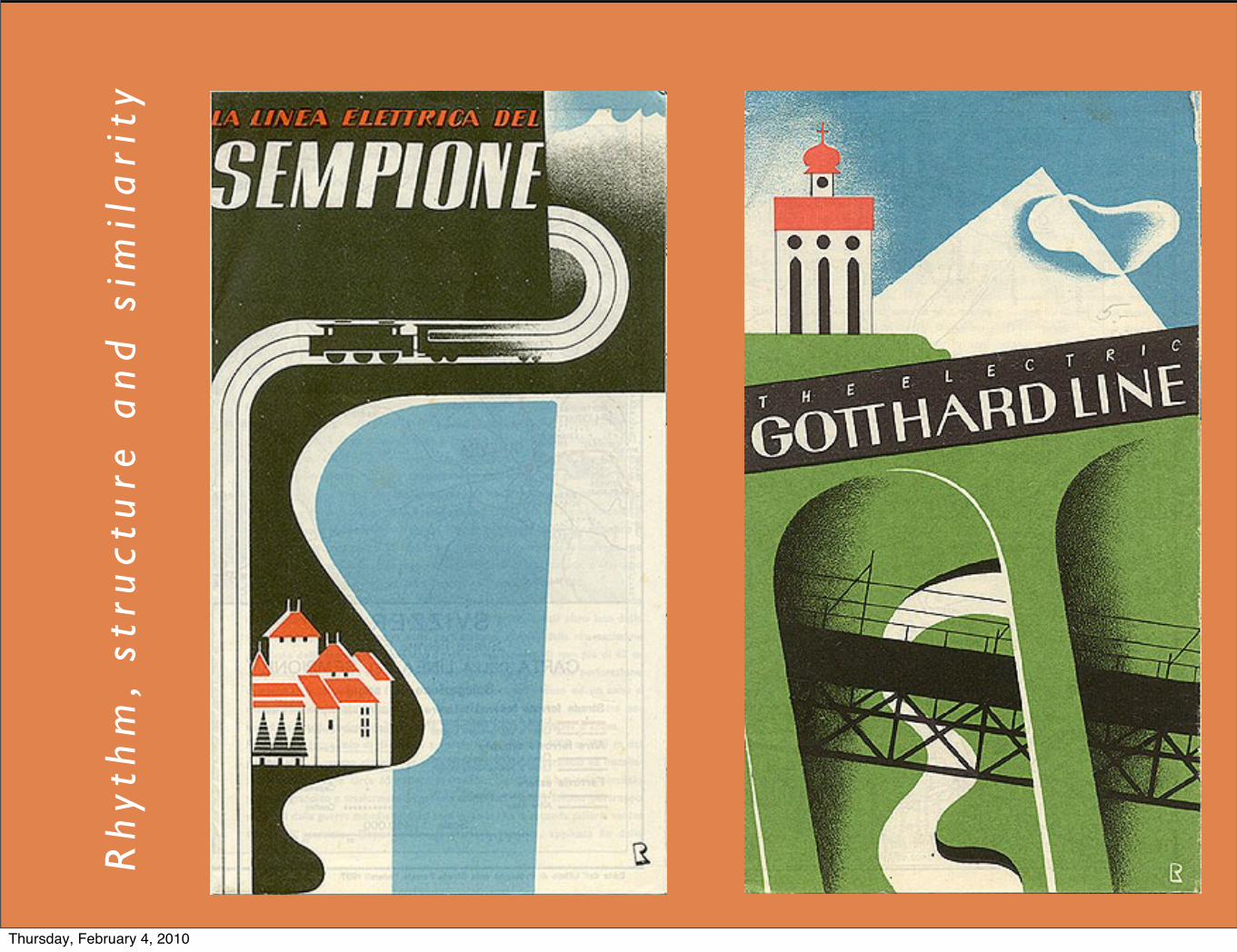
Rh
yth
m,
stru
ctu
re a
nd
sim
ila
rity
Thursday, February 4, 2010
Thursday, February 4, 2010
Thursday, February 4, 2010
Thursday, February 4, 2010
Thursday, February 4, 2010
Thursday, February 4, 2010

Thursday, February 4, 2010
Thursday, February 4, 2010

Thursday, February 4, 2010
Thursday, February 4, 2010
Thursday, February 4, 2010
Thursday, February 4, 2010
Thursday, February 4, 2010
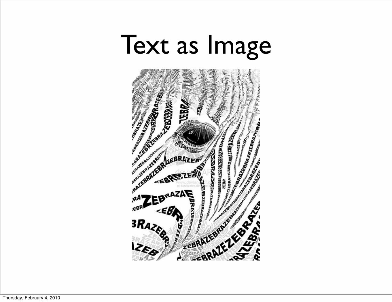
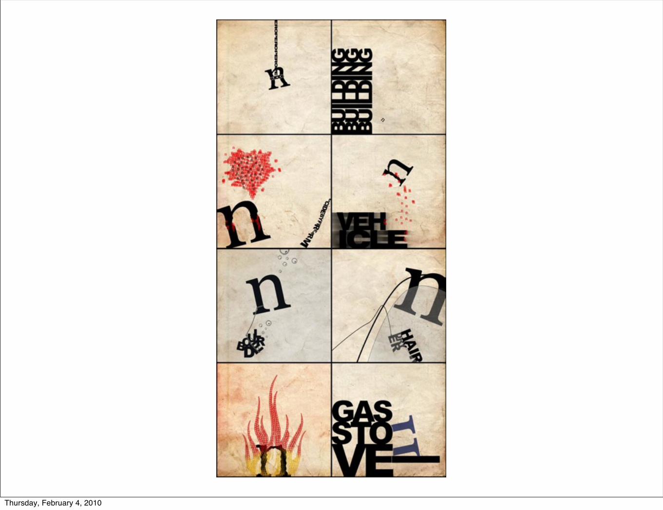
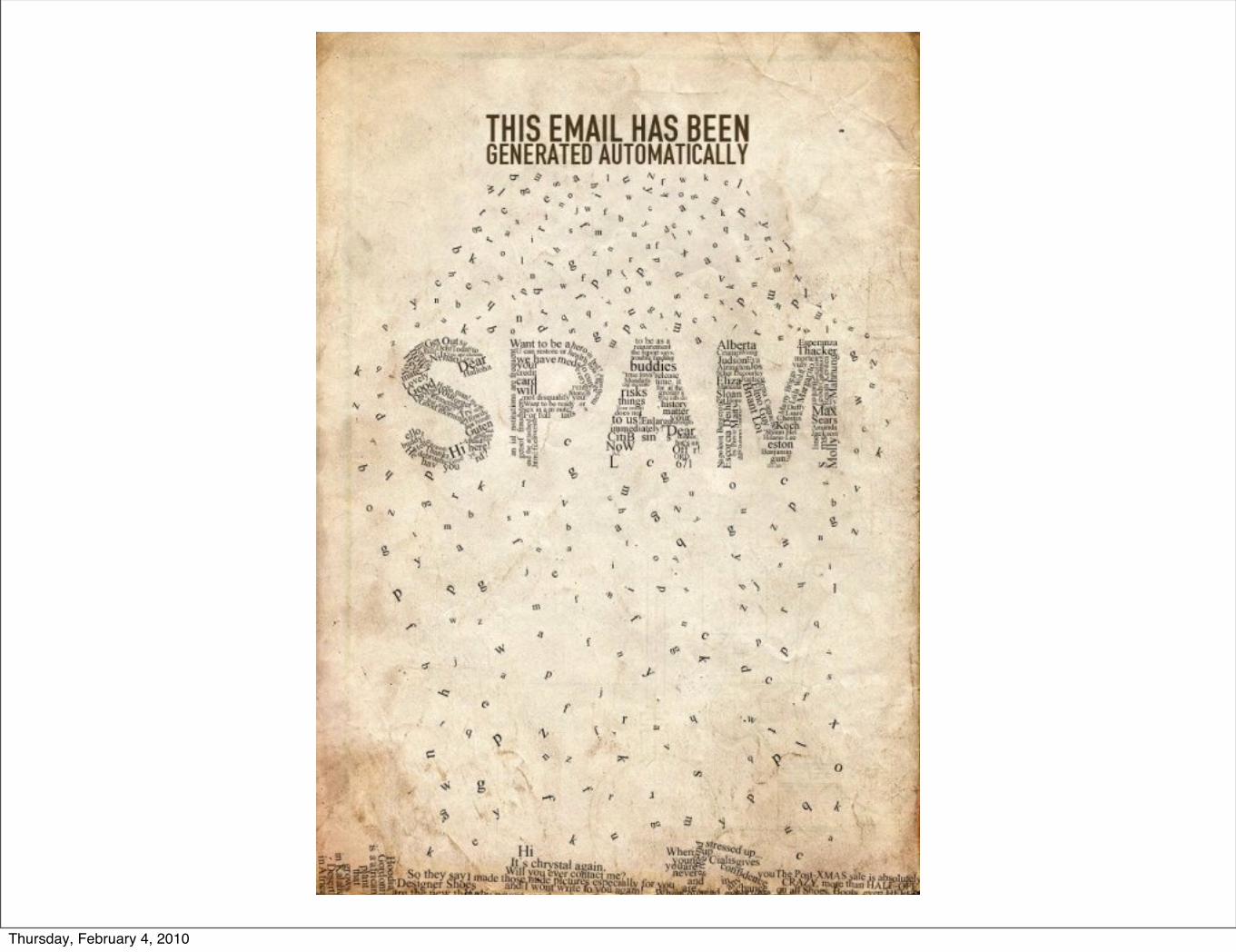
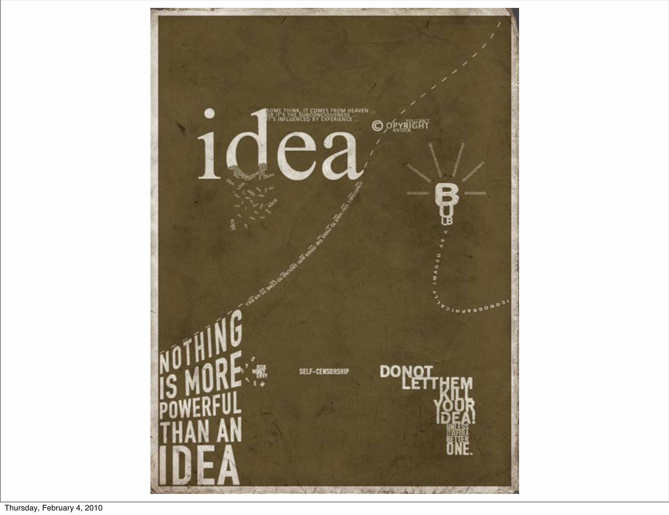
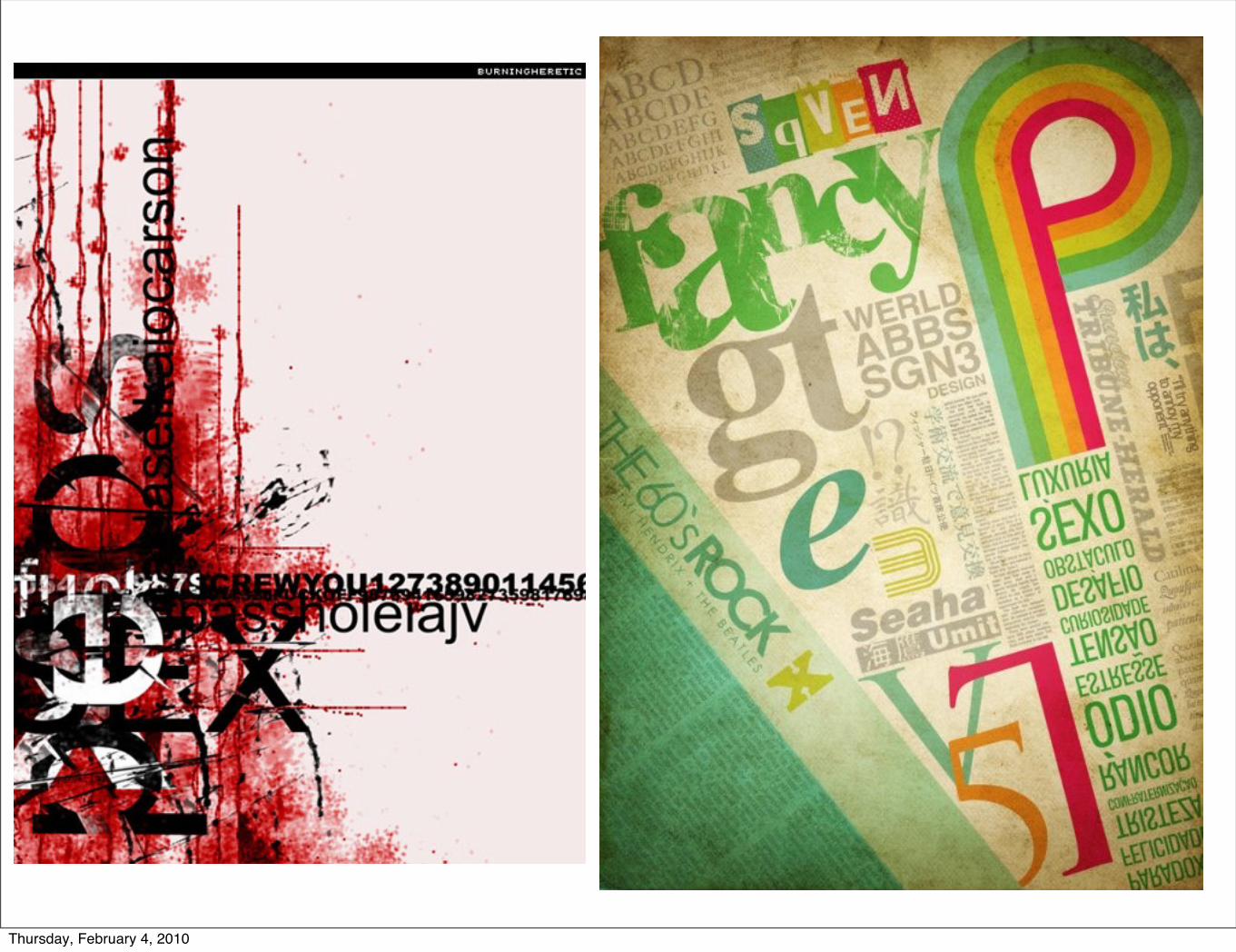
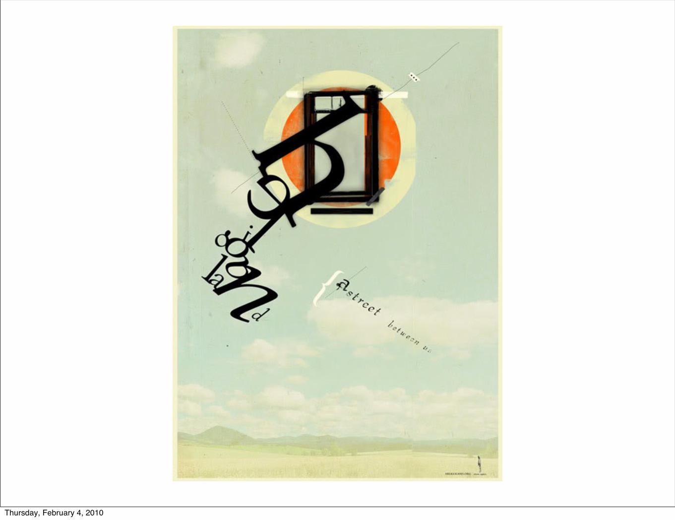
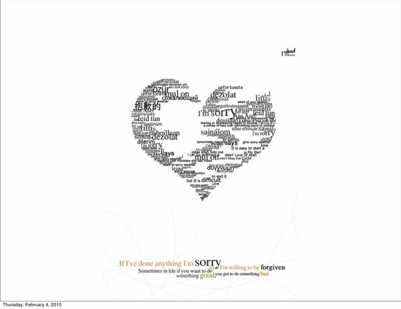
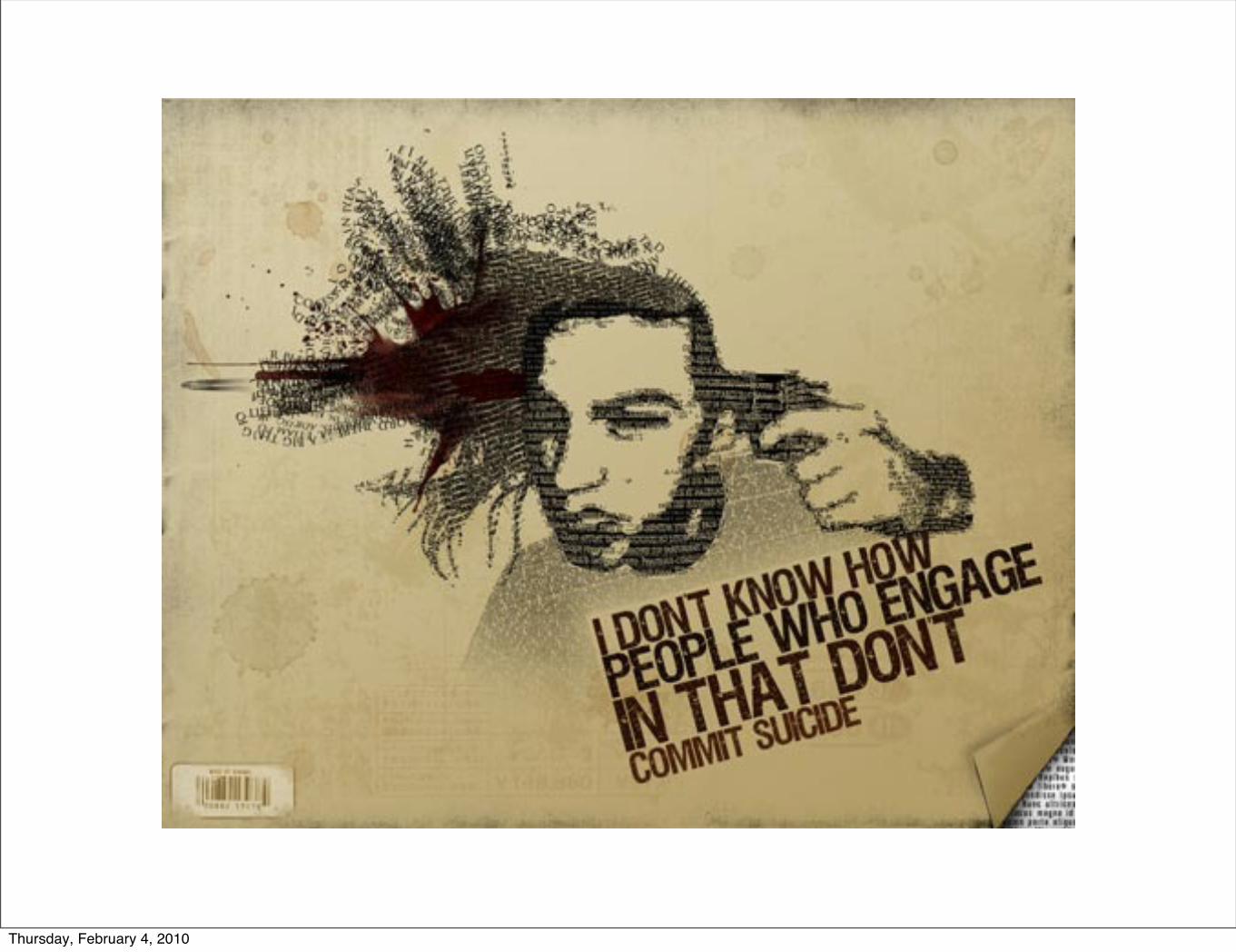
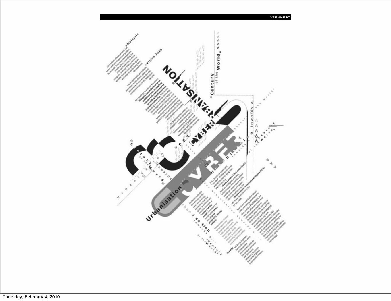
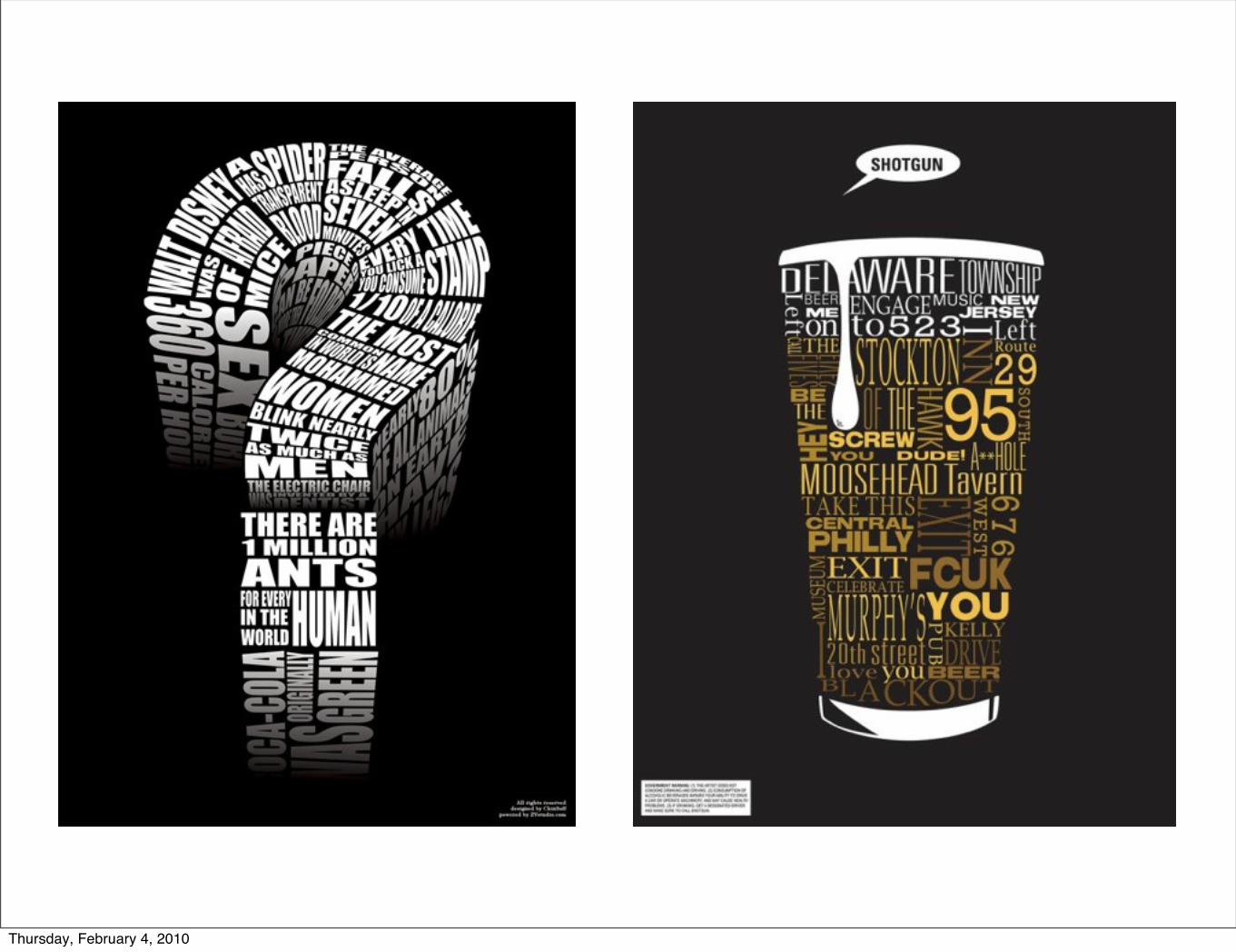
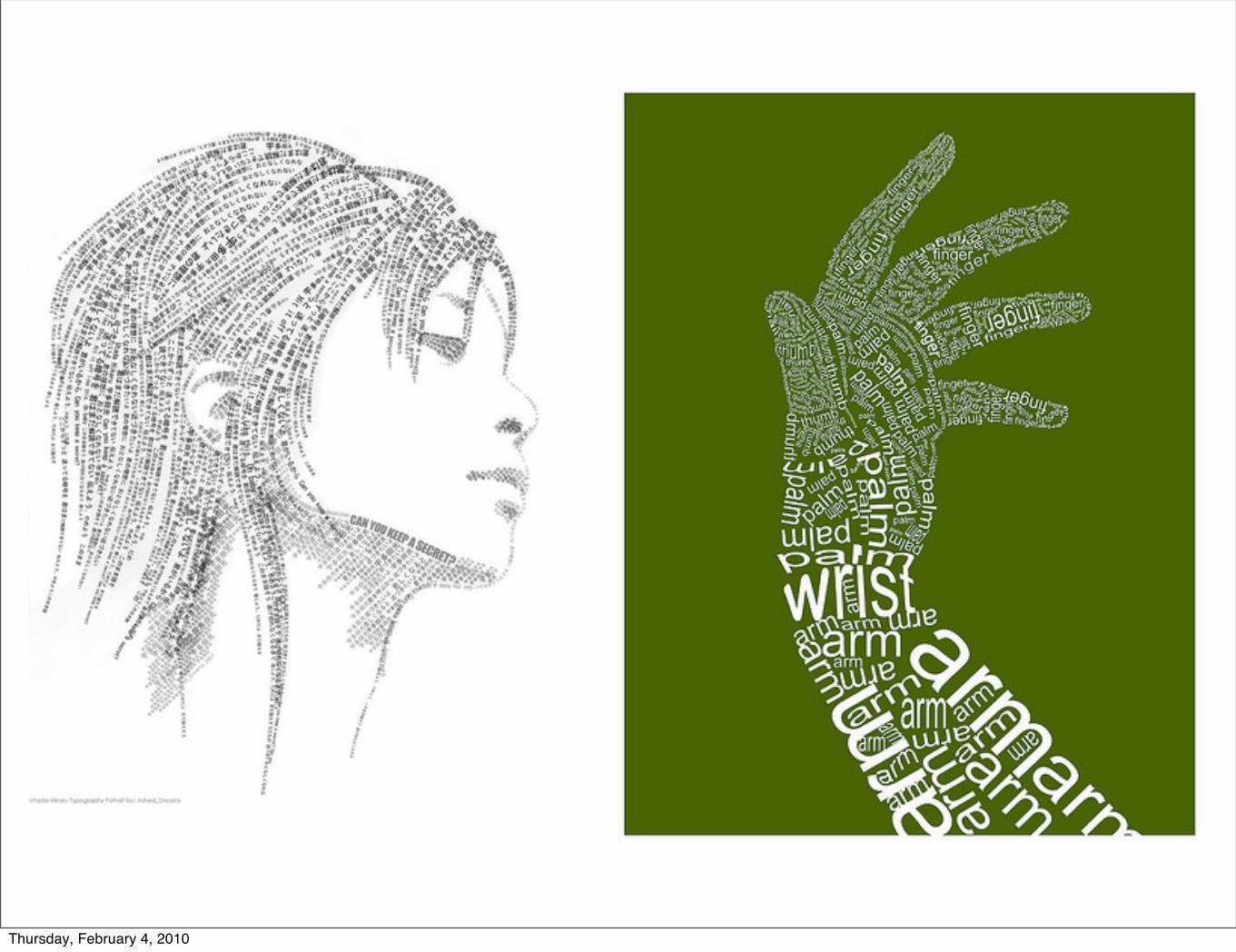
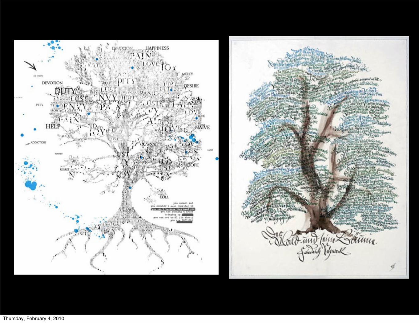
Text as Image
Thursday, February 4, 2010
Thursday, February 4, 2010
Thursday, February 4, 2010
Thursday, February 4, 2010
Thursday, February 4, 2010

Thursday, February 4, 2010

Thursday, February 4, 2010

Thursday, February 4, 2010

Thursday, February 4, 2010