task 9!
TRANSCRIPT

Evaluation Are the final pieces fit for purpose? The purpose was to design a range of products to promote awareness of key environmental issues and the organisation Surfers Against Sewage. This was achieved in the production process, as all the pieces were part of a fresh set of ideas that aimed to entice a much younger, enthusiastic audience. If the purpose was to raise awareness to all the issues the client had campaigns for then, yes it was achieved and the designs are fit for the purpose. Evidence to support this.
In order to determine whether the pieces are of the standard set by the client or if they promote the same issues surrounding the concerns campaigned for, it is important to compare and contrast the existing work with that I created. On the left is the current, existing logo by Surfers Against Sewage. On the right hand side is the one created for the client in the production process lasting four weeks. Do they still keep to the same colours? Yes, the blue, which reflects the ocean, has been kept intact. Is there the name of the organisation in a house style font, which can be replicated in other pieces of production? Yes, the Surfers Against Sewage text was not used underneath the logo when placed on products such as merchandise. Instead it was used in the membership form to show professionalism through consistency. Similarities. Was the original idea to incorporate the eye and wave again? No, I first wanted to create a logo where an eye was trapped in a jar. The tears from the eye were meant to lead to the waves surrounding it. It was seen as something very technical and aesthetically pleasing. However, when putting the idea into production it did not look fit for purpose or professional enough.

As you can see it is not visually appealing like the final piece. I feel without going through this process of over complicating the logo design, I would not have realised the slickness of the simplicity. It was not just the jar that made it look less appealing, the colour, eye and representation of the client’s organisation. Here having ‘SAS’ in tear drops and a plain font made the organisation look bland and nothing special. In stark contrast the final design uses a bright shade to strike a vibrant look to Surfers Against Sewage. This is much more fit for purpose as it is using the same ideas but presents it in a clever way. This shows the thought process. I realised that the logo was to be used in other products and needed to be smaller. Would the first design stand out when made smaller? No, it is for this reason I cut the unnecessary parts off. I used brighter colours and took the negativity off the full logo. The eye was made to a much more professional looking standard. It was based on looked at through research and created entirely on Photoshop. The logo had a week spent on it to make sure it was good enough to be used on other products created later in the 4-‐week process.
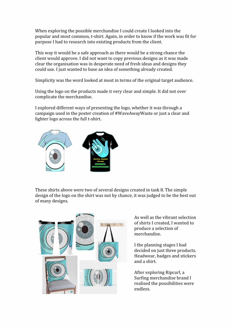
When exploring the possible merchandise I could create I looked into the popular and most common, t-‐shirt. Again, in order to know if the work was fit for purpose I had to research into existing products from the client. This way it would be a safe approach as there would be a strong chance the client would approve. I did not want to copy previous designs as it was made clear the organisation was in desperate need of fresh ideas and designs they could use. I just wanted to base an idea of something already created. Simplicity was the word looked at most in terms of the original target audience. Using the logo on the products made it very clear and simple. It did not over complicate the merchandise. I explored different ways of presenting the logo, whether it was through a campaign used in the poster creation of #WaveAwayWaste or just a clear and lighter logo across the full t-‐shirt.
These shirts above were two of several designs created in task 8. The simple design of the logo on the shirt was not by chance, it was judged to be the best out of many designs.
As well as the vibrant selection of shirts I created, I wanted to produce a selection of merchandise. I the planning stages I had decided on just three products. Headwear, badges and stickers and a shirt. After exploring Ripcurl, a Surfing merchandise brand I realised the possibilities were endless.
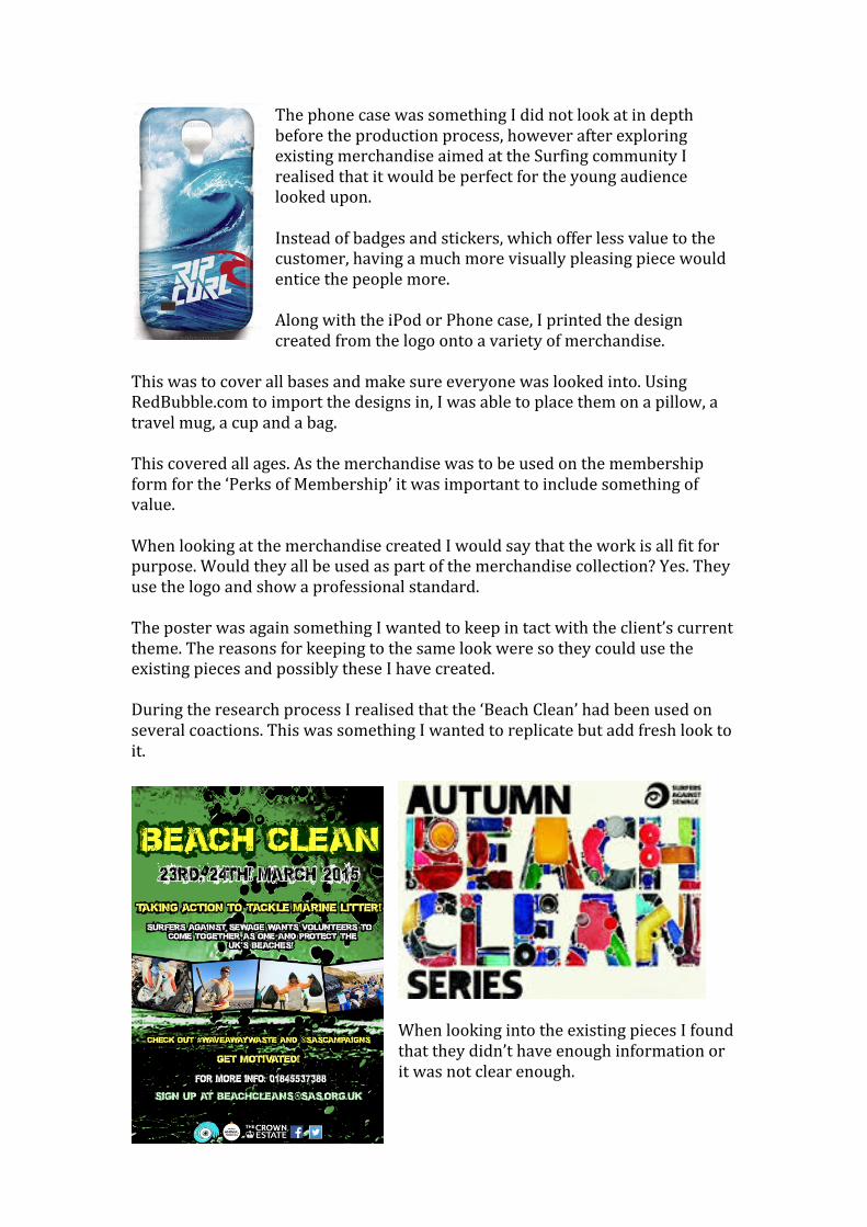
The phone case was something I did not look at in depth before the production process, however after exploring existing merchandise aimed at the Surfing community I realised that it would be perfect for the young audience looked upon. Instead of badges and stickers, which offer less value to the customer, having a much more visually pleasing piece would entice the people more. Along with the iPod or Phone case, I printed the design created from the logo onto a variety of merchandise.
This was to cover all bases and make sure everyone was looked into. Using RedBubble.com to import the designs in, I was able to place them on a pillow, a travel mug, a cup and a bag. This covered all ages. As the merchandise was to be used on the membership form for the ‘Perks of Membership’ it was important to include something of value. When looking at the merchandise created I would say that the work is all fit for purpose. Would they all be used as part of the merchandise collection? Yes. They use the logo and show a professional standard. The poster was again something I wanted to keep in tact with the client’s current theme. The reasons for keeping to the same look were so they could use the existing pieces and possibly these I have created. During the research process I realised that the ‘Beach Clean’ had been used on several coactions. This was something I wanted to replicate but add fresh look to it.
When looking into the existing pieces I found that they didn’t have enough information or it was not clear enough.

In my design I made it keep to the style already created and make it more interesting. I felt that in order to attract new members, and young ones of that, I had to include images of what existing members had done. The previous Beach clean posters did not have information and they were too bright, I wanted to add a small piece of negativity to the work. Using a dark green background adds the nature and environment, however makes the audience aware of the issue. The previous beach clean was made to look too exciting and this could be seen to gloss over the serious issues. Using the darker fonts and having it well structured showed the professionalism and therefore made it fit for purpose.
The final poster was not created in one attempt, in there were over 10 different creations made in the one week of poster creation. During this process I explored various colours and shades as well as the compositional features. I experimented with shapes and the position of the logo. It was by going through this process I got to a design I felt
was suitable to both the client and audience. The reasons I feel the poster is fit for purpose is that there is not one feature that isn’t in something of a professional comparison.
The sponsor has been incorporated in the final poster, the date and all the required information are included and I have added additional features to make it look of the standard set. In other designs I have tried to use too many colours for the text. Looking at this above, it keeps to clear shades. This can be much
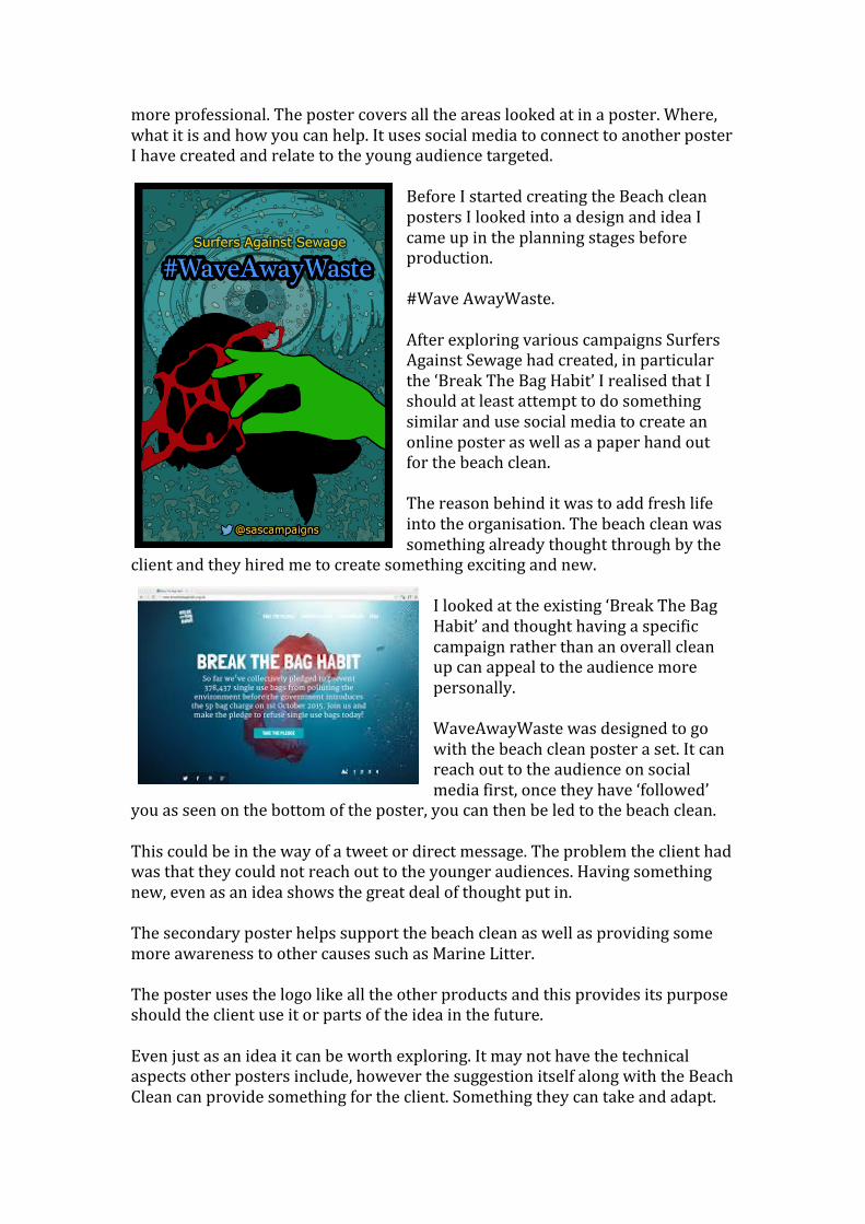
more professional. The poster covers all the areas looked at in a poster. Where, what it is and how you can help. It uses social media to connect to another poster I have created and relate to the young audience targeted.
Before I started creating the Beach clean posters I looked into a design and idea I came up in the planning stages before production. #Wave AwayWaste. After exploring various campaigns Surfers Against Sewage had created, in particular the ‘Break The Bag Habit’ I realised that I should at least attempt to do something similar and use social media to create an online poster as well as a paper hand out for the beach clean. The reason behind it was to add fresh life into the organisation. The beach clean was something already thought through by the
client and they hired me to create something exciting and new. I looked at the existing ‘Break The Bag Habit’ and thought having a specific campaign rather than an overall clean up can appeal to the audience more personally. WaveAwayWaste was designed to go with the beach clean poster a set. It can reach out to the audience on social media first, once they have ‘followed’
you as seen on the bottom of the poster, you can then be led to the beach clean. This could be in the way of a tweet or direct message. The problem the client had was that they could not reach out to the younger audiences. Having something new, even as an idea shows the great deal of thought put in. The secondary poster helps support the beach clean as well as providing some more awareness to other causes such as Marine Litter. The poster uses the logo like all the other products and this provides its purpose should the client use it or parts of the idea in the future. Even just as an idea it can be worth exploring. It may not have the technical aspects other posters include, however the suggestion itself along with the Beach Clean can provide something for the client. Something they can take and adapt.
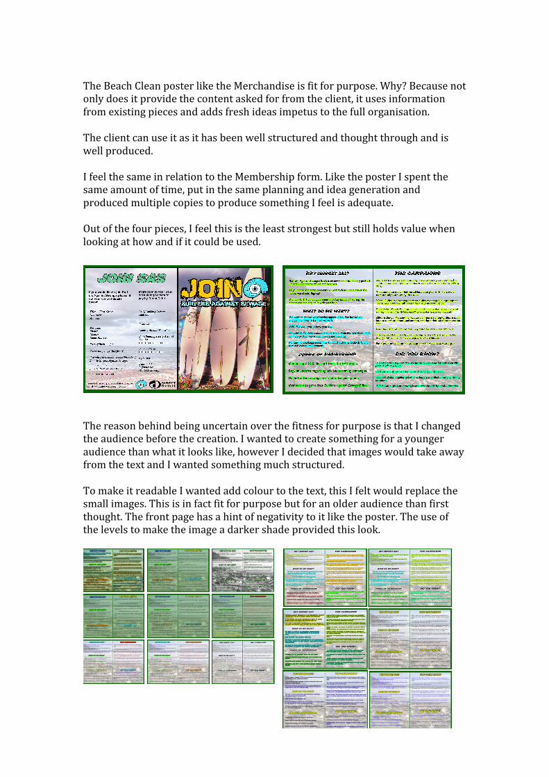
The Beach Clean poster like the Merchandise is fit for purpose. Why? Because not only does it provide the content asked for from the client, it uses information from existing pieces and adds fresh ideas impetus to the full organisation. The client can use it as it has been well structured and thought through and is well produced. I feel the same in relation to the Membership form. Like the poster I spent the same amount of time, put in the same planning and idea generation and produced multiple copies to produce something I feel is adequate. Out of the four pieces, I feel this is the least strongest but still holds value when looking at how and if it could be used.
The reason behind being uncertain over the fitness for purpose is that I changed the audience before the creation. I wanted to create something for a younger audience than what it looks like, however I decided that images would take away from the text and I wanted something much structured. To make it readable I wanted add colour to the text, this I felt would replace the small images. This is in fact fit for purpose but for an older audience than first thought. The front page has a hint of negativity to it like the poster. The use of the levels to make the image a darker shade provided this look.
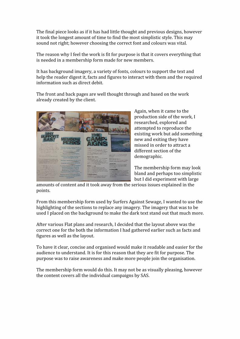
The final piece looks as if it has had little thought and previous designs, however it took the longest amount of time to find the most simplistic style. This may sound not right; however choosing the correct font and colours was vital. The reason why I feel the work is fit for purpose is that it covers everything that is needed in a membership form made for new members. It has background imagery, a variety of fonts, colours to support the text and help the reader digest it, facts and figures to interact with them and the required information such as direct debit. The front and back pages are well thought through and based on the work already created by the client.
Again, when it came to the production side of the work, I researched, explored and attempted to reproduce the existing work but add something new and exiting they have missed in order to attract a different section of the demographic. The membership form may look bland and perhaps too simplistic but I did experiment with large
amounts of content and it took away from the serious issues explained in the points. From this membership form used by Surfers Against Sewage, I wanted to use the highlighting of the sections to replace any imagery. The imagery that was to be used I placed on the background to make the dark text stand out that much more. After various Flat plans and research, I decided that the layout above was the correct one for the both the information I had gathered earlier such as facts and figures as well as the layout. To have it clear, concise and organised would make it readable and easier for the audience to understand. It is for this reason that they are fit for purpose. The purpose was to raise awareness and make more people join the organisation. The membership form would do this. It may not be as visually pleasing, however the content covers all the individual campaigns by SAS.

Do the products created communicate my message? As I was working for a client, in professional practice, their message is my message. In the brief, they wanted something modern, fresh and relevant to its audience and the wider world. The audience was a younger, more energetic person that wants to add new ideas to the organisation. They all add new life and content. They are all colourful and keep to the intentions decided upon. The client can use them as they fill the criteria they were after. The message before these products were created was to raise awareness to the issues, now I have produced this work; it raises awareness but starts to educate people at a young age. This new message of education to the younger audience can reduce some of the concerns raised. The target audience is a young age range of 15-‐21. As the production process went through the age range started to be thought about as a much older person. The use of social media, negative colours and a change in merchandise suggested that the age range was older. I feel even though the target audience may have risen higher, the work produced is still suitable for them. All of the pieces have some technical aspects t them, some more than others and the planning provides that stability in the structure of the work.

As the message was to reach out to a younger audience, I feel this has been achieved. The target audience was thought about throughout the production process, with each design created it was looked upon as if it would appeal to the audience. Techniques I used that appealed to the audience were the following. Having social media incorporated in the poster, items that they would buy being part of the merchandise creation, highlighted text that would help digest the information and dark, negative imagery used to shock and educate them.
Here is a poster aimed at preventing drinking and taking drugs whilst driving. It is not the same topic as the poster and membership form, but has the same purpose and techniques in order to grab the reader’s attention and educate. The campaign poster uses images of the topic to go with the title or text. Here it is the same; this uses a person at the wheel with facts and figures supporting the image. The facts and figures are used in the membership form. This is to educate the younger reader. If you can shock them into something they had been unaware of, it is one step closer to preventing them
from doing or stopping it. Here, the poster is clear and concise and makes it easily readable for the young audience. When educating them it is important to not have too much detail in the work as they can lose concentration very quickly. When exploring media campaigns aimed at the same age range, you can see and understand how appropriate the work you have created is. When looking at the poster I created, it has the target audience actually in the piece. This is the first indication given to the reader about who it is aimed towards. Here it has the teenagers in the image walking away from the rubbish, whereas the second image from the left on the poster I created for the client has a ‘typical’ member of the demographic aimed towards.

The original intension of the work was to create something educational and fun for a younger age range to enjoy.
Merchandise was meant to be of the interactive nature. Having stickers or badges such as here on the left would be a way to incorporate the merchandise and the membership form. The membership was to have areas to place the stickers, concerning each topic such as a sticker of an industry to go next to the piece about waste pumped into the oceans. This was not created as I felt the audience had to be older in order to include much more text. Also, targeting children would mean that you are relying on the parents or guardians to pay for the membership or merchandise. Having a slightly older audience would allow to use both the educational theme and use merchandise but to a more professional manner.
The hat was something I based the mind map and planning stages on. It was a necessity. Surfers need hats and it is beachwear. However, I felt if the products were made they must appeal to all ages. Having a t-‐shirt can be suitable to the target market, which is important, but also can branch out to the mass market. This will allow development for the client. My original intention for merchandise changed and as did the poster. I wanted to have some very negative imagery in order to shock the young reader. This would educate them and perhaps entice them to sign up to the organisation.

Something like this image already created by Surfers Against Sewage. I decided against it and stuck to negative colours rather than imagery. I wanted to contrast the images with the theme. Having negative images can often put the young audience off. Using pictures of people the same age helping the organisation was a tool to attract them.
My original idea of using existing images to attract the audience was not used as I felt it was too similar. Instead I chose a font that would do the same but keep it unique. The membership form was the same, however instead of a dark theme it was meant to be something very simple. With the use of images to help digest the text it was to be aimed at a young audience to be signed up to the family membership package.
This on the left was the first idea for the membership form, something exciting and for a young age range. I decided against it as it was restricting the possible market. Without any text or anything about what the client is and what they do, it is missing the point and instead looking at what the audience wants to see, such as colours and
images. I wanted to produce something that helped the client expand and attract a much large audience. Having just text was the way I saw this. It can be suitable to a young audience, with the use of different fonts and background imagery, but it is acceptable for mass-‐market use also.
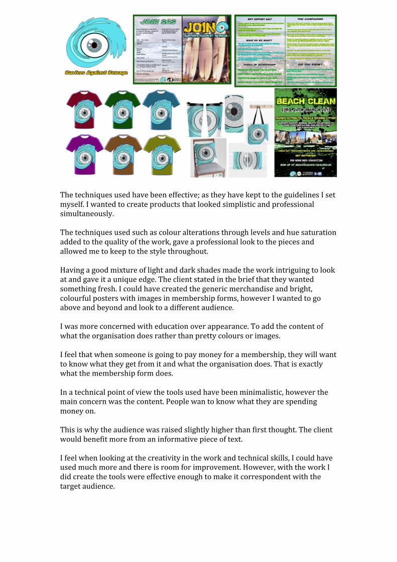
The techniques used have been effective; as they have kept to the guidelines I set myself. I wanted to create products that looked simplistic and professional simultaneously. The techniques used such as colour alterations through levels and hue saturation added to the quality of the work, gave a professional look to the pieces and allowed me to keep to the style throughout. Having a good mixture of light and dark shades made the work intriguing to look at and gave it a unique edge. The client stated in the brief that they wanted something fresh. I could have created the generic merchandise and bright, colourful posters with images in membership forms, however I wanted to go above and beyond and look to a different audience. I was more concerned with education over appearance. To add the content of what the organisation does rather than pretty colours or images. I feel that when someone is going to pay money for a membership, they will want to know what they get from it and what the organisation does. That is exactly what the membership form does. In a technical point of view the tools used have been minimalistic, however the main concern was the content. People wan to know what they are spending money on. This is why the audience was raised slightly higher than first thought. The client would benefit more from an informative piece of text. I feel when looking at the creativity in the work and technical skills, I could have used much more and there is room for improvement. However, with the work I did create the tools were effective enough to make it correspondent with the target audience.

When looking at one product of the 4 that had the most technical techniques used it would have to be the logo. Various different types were created, using the Rotoscope tool to its full effect. Once I had decided on the final logo and how it was to be created I had to look at the waves. It was more complex to create than it looks, making it surround the eye was important and to have other shades of colour inside needed more Rotoscoping and developing of layers. The techniques for the eye were to use the shape tool. The star and circular shapes made it look much better than the first design.
The techniques for the poster were also a tricky process. The levels tool to choose the correct background colour had to be correct. The use of the green was something planned in the early production stages. I would consider the layout of the text across the page as a technique that required a rather lot of planning and other creations. To get the size and colour right was hard. This has been effective as it contains fewer colours and is more attractive than the design’s made earlier.
The merchandise required techniques such as the Rotoscope as well. The opacity was also manipulated The design need intricate cutting out. Further techniques were to add gradient on the shirts. After experimenting without it was vital something was added to the work. I would consider the content to be effective as it appeals to the audience and a large mass market. It has all the information required, perhaps it goes above what is needed, however it also has a good balance between content and visual clarity. The products have a much more professional look to them. They are simple yet effective. This reflects the content throughout. It does not have anything over the top; it keeps the boundaries set with the chosen target market. The impact my advertising campaign will have will be minimal. The Beach clean will be as successful as the previous ones and will attract previous members,

perhaps persuade them to join but in terms of impact to the oceans and the issues such as marine litter, there will be little change. The large industries will keep doing what they are doing. The poster WaveAwayWaste and this beach clean will educate people at a younger age and perhaps in the long term, the waste in the sea will be less, but in the short term the sad reality is more people will need to be involved and voices from high places will need to be contacted. Surfers Against Sewage, the client have had petitions before where they have reached out to members of the government, however with the issues here being of industry and general littering, there is little the government can do to help in the short term. Like mentioned before, the best way to get through and make a change is to start at a young age (which is why I chose a young audience for the products). Starting at a young age can raise awareness to them of the problems polluting can do. The public overall will not change as dramatically as hoped but the targeted audience on the social media sites that are given the chance to read the hashtag or status by Surfers Against Sewage would perhaps stop before littering in future. The technical qualities of my work would be the products being made to a good standard on Photoshop, using tools and adjustments to manipulate an image I wanted to create from the planning stages. The Aesthetical qualities of the work are the logo and merchandise. They look fit for purpose and keep to the target audience. The bright colours are similar to that of previous logos and merchandise by the client and therefore show consistency in the products and research to look in to the background of Surfers Against Sewage. The colours on the logo represent those commonly seen near the ocean or beach. This can visually support what is being said in the work produced. The overall look of the poster and membership has a good use of different fonts and sizes, a good respect for the composition and layout of the piece as well as looking into the colours that would best reflect the audience and the client’s organisation. Blue and green were shades kept throughout the planning and production process.