presentatieon23
TRANSCRIPT

{
“Who are your target audience and how will you attract and address them?”
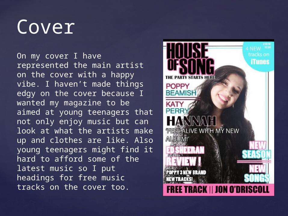
On my cover I have represented the main artist on the cover with a happy vibe. I haven’t made things edgy on the cover because I wanted my magazine to be aimed at young teenagers that not only enjoy music but can look at what the artists make up and clothes are like. Also young teenagers might find it hard to afford some of the latest music so I put headings for free music tracks on the cover too.
Cover

I have aimed my magazine at a young teenage audience. There are bright/neon colours to draw in a younger audience and a bold masthead that is put together in a stylish way. I have also put a small heading under the mast head that reads ‘The party starts here’ This makes the magazine less serious and more up beat and again more likely to draw in a younger audience.
MAST HEAD.

HeadlinesThe headlines surrounding the main headline are made colourful, some of the writing is chunky, some of the fonts are thin. I chose to do this because if I made the fonts to similar on the cover it wouldn’t look appealing to a younger audience and would look more like a news paper or to ‘serious’. However I did make the main headline bold and in the colour black with a thin stroke of white around the edge, it also has a quote from the artist underneath. I did this to make it stand out among the colourful headlines. I also placed in the middle to draw more attention to it.
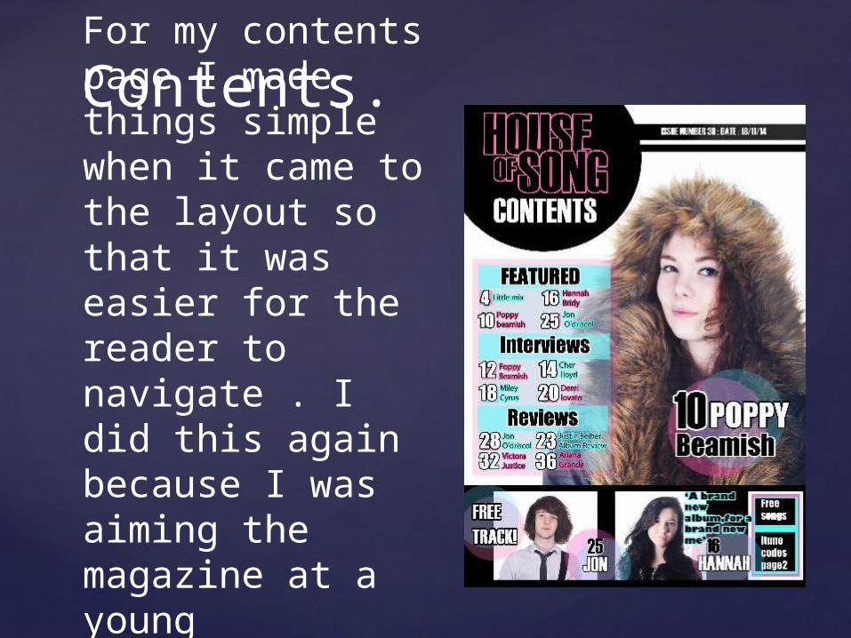
For my contents page I made things simple when it came to the layout so that it was easier for the reader to navigate . I did this again because I was aiming the magazine at a young teenagers.
Contents.

I also included on the contents page where to find codes for free tunes on I tunes . As I mentioned on the cover I did this because a younger audience may not have the resources/money to go out and buy music. So free downloads on Itunes will definitely attract those who may not be able to spare money on music.
Freebies!

Simple and colourful was the look I went for on my article again to to attract a younger audience.I also put a large quote among the text to draw attention to what the artist is saying and the message they are trying to communicate. with the audience. I tried to make the Q&A uplifting because young teenagers can start feeling lost at their age so ‘never give up’ seemed like a good quote to chose from the article.
Article


For the over all look of my magazine I made it colourful and made it uplifting for a younger audience so they can take a break from homework and dream about how they could be in a magazine one day.
Over all look