play: creative deck
TRANSCRIPT
WWW.NICOLEDINH.DESIGN
CATEGORIESPrint, Identity, Product Design, Motion
YEAR2020
LINKhttps://bit.ly/3aK3H83
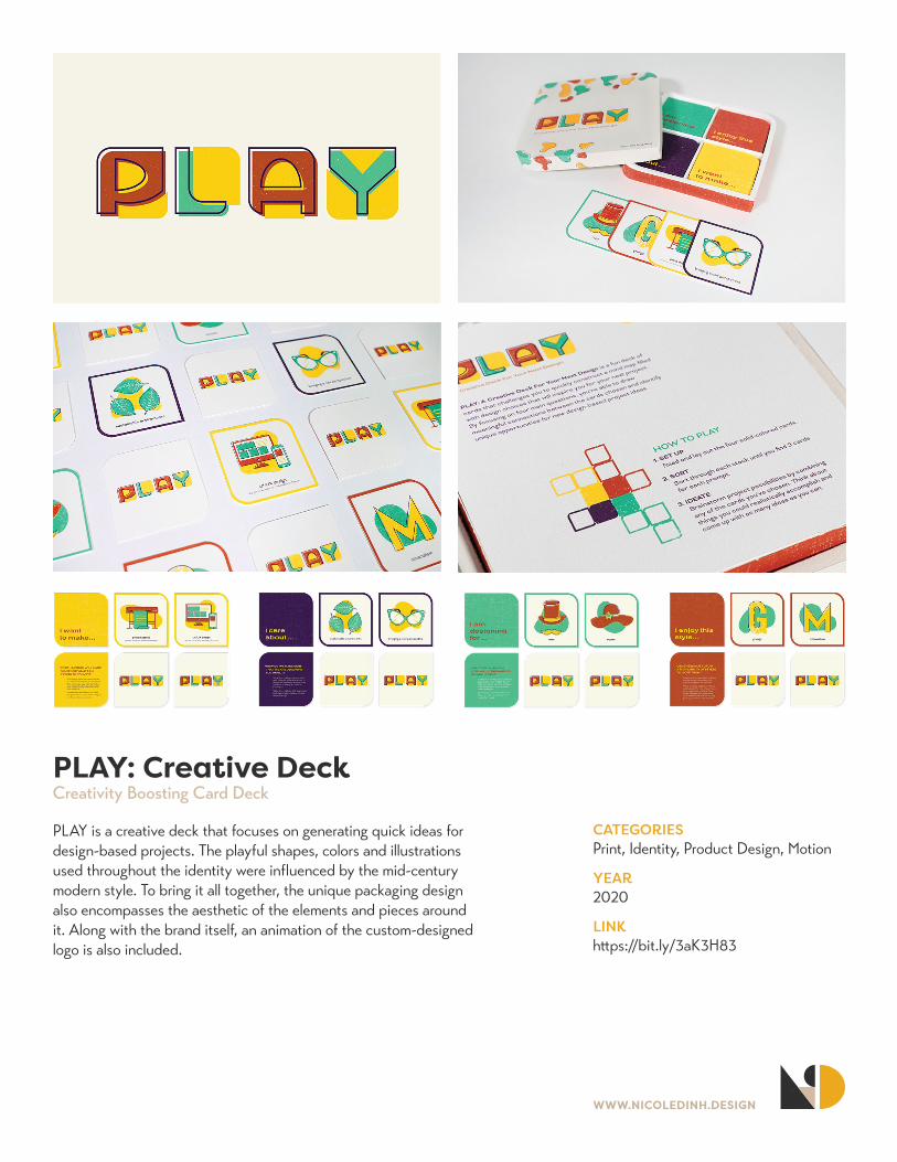
PLAY: Creative DeckCreativity Boosting Card Deck
PLAY is a creative deck that focuses on generating quick ideas for design-based projects. The playful shapes, colors and illustrations used throughout the identity were influenced by the mid-century modern style. To bring it all together, the unique packaging design also encompasses the aesthetic of the elements and pieces around it. Along with the brand itself, an animation of the custom-designed logo is also included.
WWW.NICOLEDINH.DESIGN
CATEGORIESIdentity, Environmental, Collaboration
YEAR2020
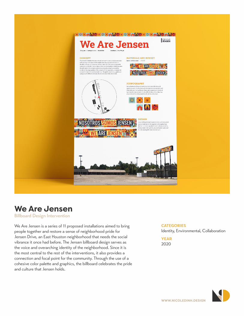
We Are JensenBillboard Design Intervention
We Are Jensen is a series of 11 proposed installations aimed to bring people together and restore a sense of neighborhood pride for Jensen Drive, an East Houston neighborhood that needs the social vibrance it once had before. The Jensen billboard design serves as the voice and overarching identity of the neighborhood. Since it is the most central to the rest of the interventions, it also provides a connection and focal point for the community. Through the use of a cohesive color palette and graphics, the billboard celebrates the pride and culture that Jensen holds.
WWW.NICOLEDINH.DESIGN
CATEGORIESIdentity, Environmental, Product Design
YEAR2020
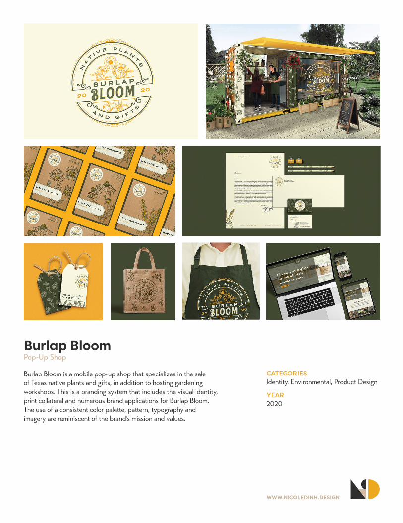
Burlap BloomPop-Up Shop
Burlap Bloom is a mobile pop-up shop that specializes in the sale of Texas native plants and gifts, in addition to hosting gardening workshops. This is a branding system that includes the visual identity, print collateral and numerous brand applications for Burlap Bloom. The use of a consistent color palette, pattern, typography and imagery are reminiscent of the brand’s mission and values.
WWW.NICOLEDINH.DESIGN
CATEGORIESPrint, Branding, UI/UX, Product Design
YEAR2020
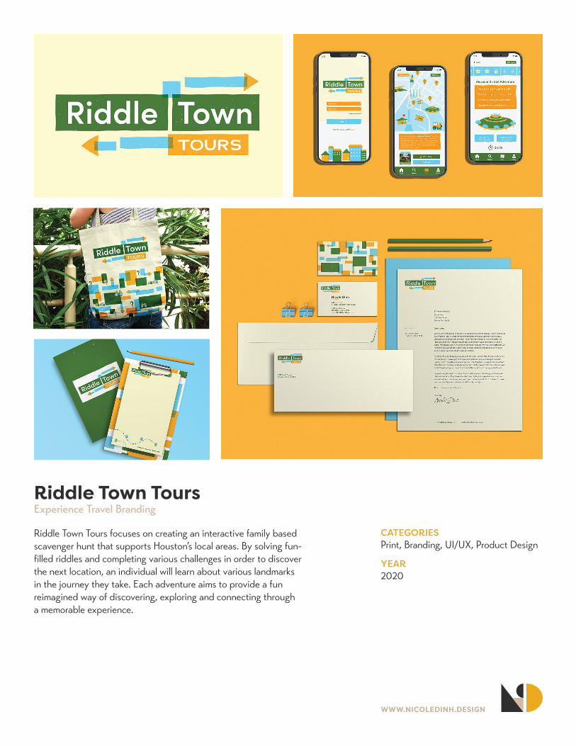
Riddle Town ToursExperience Travel Branding
Riddle Town Tours focuses on creating an interactive family based scavenger hunt that supports Houston’s local areas. By solving fun-filled riddles and completing various challenges in order to discover the next location, an individual will learn about various landmarks in the journey they take. Each adventure aims to provide a fun reimagined way of discovering, exploring and connecting through a memorable experience.
WWW.NICOLEDINH.DESIGN
CATEGORIESExhibition Design, Identity
YEAR2020
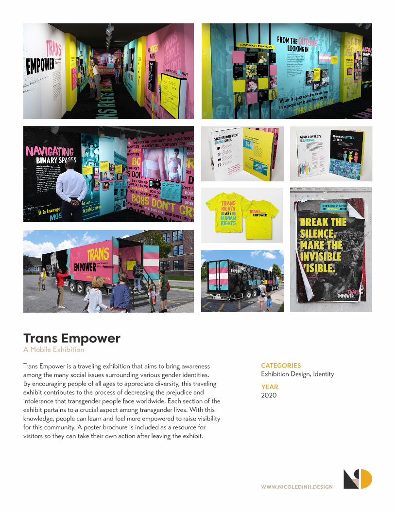
Trans EmpowerA Mobile Exhibition
Trans Empower is a traveling exhibition that aims to bring awareness among the many social issues surrounding various gender identities. By encouraging people of all ages to appreciate diversity, this traveling exhibit contributes to the process of decreasing the prejudice and intolerance that transgender people face worldwide. Each section of the exhibit pertains to a crucial aspect among transgender lives. With this knowledge, people can learn and feel more empowered to raise visibility for this community. A poster brochure is included as a resource for visitors so they can take their own action after leaving the exhibit.

WWW.NICOLEDINH.DESIGN
CATEGORIESIllustration, Environmental, Collaboration
YEAR2021
Birds of Bolivar PeninsulaInterpretive Sign Packagae
This collaborative interpretive sign package aims to educate viewers about migratory birds that reside along the Bolivar Peninsula, their ecological importance and the need to take action to conserve them and their habitats. Each bird species includes a vertical and horizontal format with information on food sources, identification, nesting and other crucial topics surrounding the bird. The visual aesthetic utilizes a mix of hand-drawn lines and vivid watercolor illustrations to subtly capture viewers’ attention. The chosen colors mimic the identification of the bird and their habitat.
WWW.NICOLEDINH.DESIGN
CATEGORIESPrint, Identity, Product Design
YEAR2020
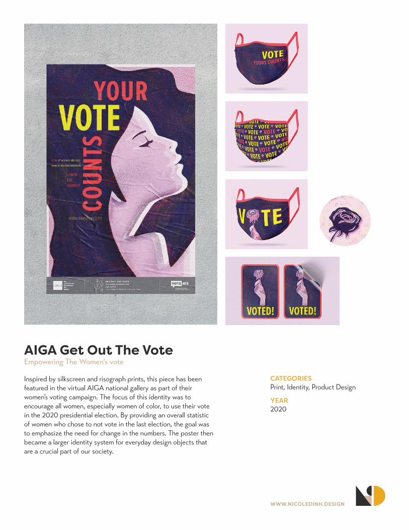
AIGA Get Out The VoteEmpowering The Women’s vote
Inspired by silkscreen and risograph prints, this piece has been featured in the virtual AIGA national gallery as part of their women’s voting campaign. The focus of this identity was to encourage all women, especially women of color, to use their vote in the 2020 presidential election. By providing an overall statistic of women who chose to not vote in the last election, the goal was to emphasize the need for change in the numbers. The poster then became a larger identity system for everyday design objects that are a crucial part of our society.
WWW.NICOLEDINH.DESIGN
CATEGORIESPrint, Data Visualization
YEAR2021
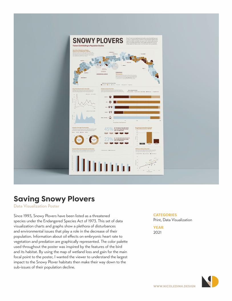
Saving Snowy PloversData Visualization Poster
Since 1993, Snowy Plovers have been listed as a threatened species under the Endangered Species Act of 1973. This set of data visualization charts and graphs show a plethora of disturbances and environmental issues that play a role in the decrease of their population. Information about oil effects on embryonic heart rate to vegetation and predation are graphically represented. The color palette used throughout the poster was inspired by the features of the bird and its habitat. By using the map of wetland loss and gain for the main focal point to the poster, I wanted the viewer to understand the largest impact to the Snowy Plover habitats then make their way down to the sub-issues of their population decline.
WWW.NICOLEDINH.DESIGN
CATEGORIESPrint, Illustration, Writing, Layout
YEAR2019
DIMENSIONS7”x10”
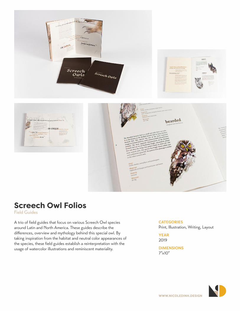
Screech Owl FoliosField Guides
A trio of field guides that focus on various Screech Owl species around Latin and North America. These guides describe the differences, overview and mythology behind this special owl. By taking inspiration from the habitat and neutral color appearances of the species, these field guides establish a reinterpretation with the usage of watercolor illustrations and reminiscent materiality.
WWW.NICOLEDINH.DESIGN
CATEGORIESMotion Graphics, Illustration
YEAR2020
LINKhttps://vimeo.com/480508574
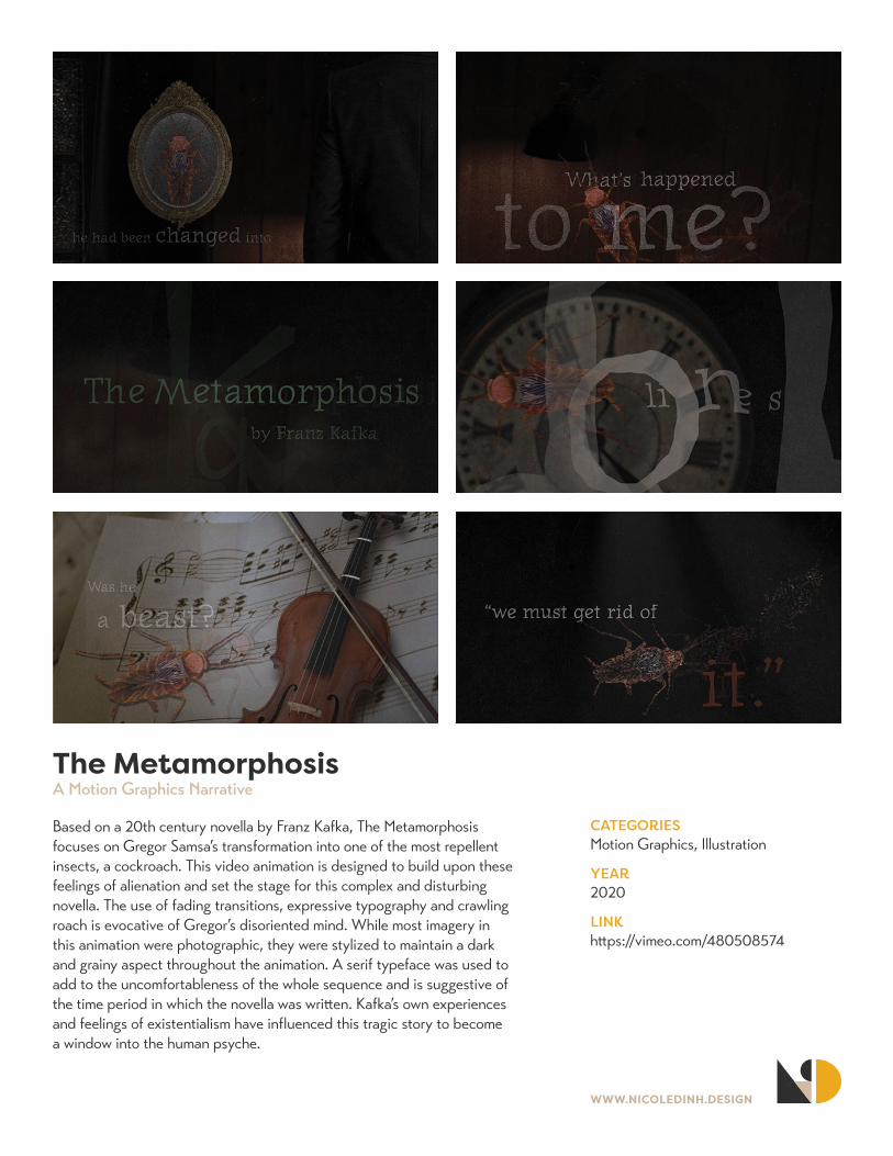
The MetamorphosisA Motion Graphics Narrative
Based on a 20th century novella by Franz Kafka, The Metamorphosis focuses on Gregor Samsa’s transformation into one of the most repellent insects, a cockroach. This video animation is designed to build upon these feelings of alienation and set the stage for this complex and disturbing novella. The use of fading transitions, expressive typography and crawling roach is evocative of Gregor’s disoriented mind. While most imagery in this animation were photographic, they were stylized to maintain a dark and grainy aspect throughout the animation. A serif typeface was used to add to the uncomfortableness of the whole sequence and is suggestive of the time period in which the novella was written. Kafka’s own experiences and feelings of existentialism have influenced this tragic story to become a window into the human psyche.
WWW.NICOLEDINH.DESIGN
CATEGORIESMotion Graphics
YEAR2020
LINKhttps://vimeo.com/485718934
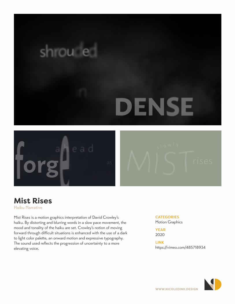
Mist RisesHaiku Narrative
Mist Rises is a motion graphics interpretation of David Crowley’s haiku. By distorting and blurring words in a slow pace movement, the mood and tonality of the haiku are set. Crowley’s notion of moving forward through difficult situations is enhanced with the use of a dark to light color palette, an onward motion and expressive typography. The sound used reflects the progression of uncertainty to a more elevating voice.
WWW.NICOLEDINH.DESIGN
CATEGORIESPrint, Layout Design, Project Management
YEAR2020
DIMENSIONS6.5”x8”
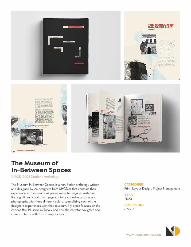
The Museum of In-Between SpacesUHGD 2021 Student Anthology
The Museum In-Between Spaces is a non-fiction anthology written and designed by 24 designers from UHGD21 that contains their experience with museums as places we’ve to imagine, visited or find significantly odd. Each page contains cohesive textures and photographs with three different colors, symbolizing each of the designer’s experiences with their museum. My piece focuses on the Avanos Hair Museum in Turkey and how the narrator navigates and comes to terms with this strange location.
WWW.NICOLEDINH.DESIGN
CATEGORIESPrint, Magazine Layout, Collaboration
YEAR2019
DIMENSIONS7”x9”
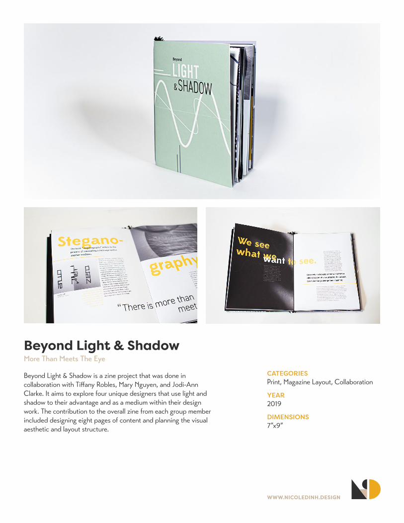
Beyond Light & ShadowMore Than Meets The Eye
Beyond Light & Shadow is a zine project that was done in collaboration with Tiffany Robles, Mary Nguyen, and Jodi-Ann Clarke. It aims to explore four unique designers that use light and shadow to their advantage and as a medium within their design work. The contribution to the overall zine from each group member included designing eight pages of content and planning the visual aesthetic and layout structure.
WWW.NICOLEDINH.DESIGN
CATEGORIESHTML, CSS, JavaScript, UI/UX
YEAR2020
LINKhttps://bit.ly/3voAtDR
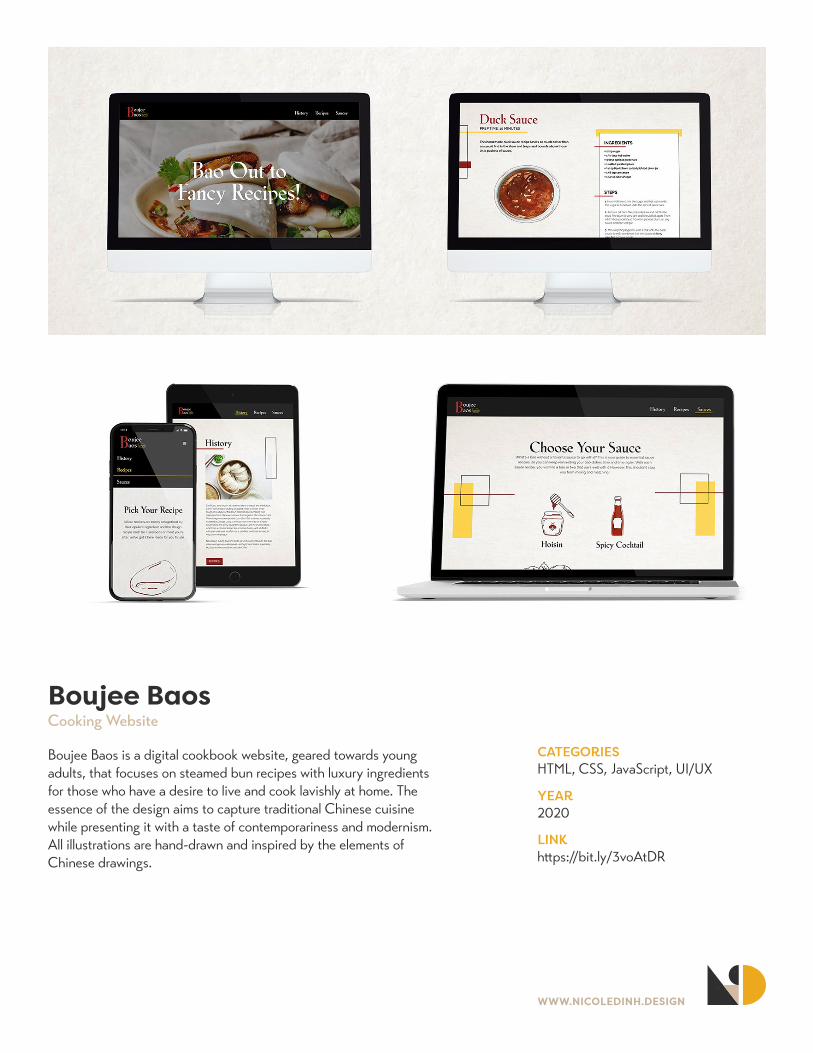
Boujee BaosCooking Website
Boujee Baos is a digital cookbook website, geared towards young adults, that focuses on steamed bun recipes with luxury ingredients for those who have a desire to live and cook lavishly at home. The essence of the design aims to capture traditional Chinese cuisine while presenting it with a taste of contemporariness and modernism. All illustrations are hand-drawn and inspired by the elements of Chinese drawings.
WWW.NICOLEDINH.DESIGN
CATEGORIESAdobe XD, UI/UX
YEAR2020
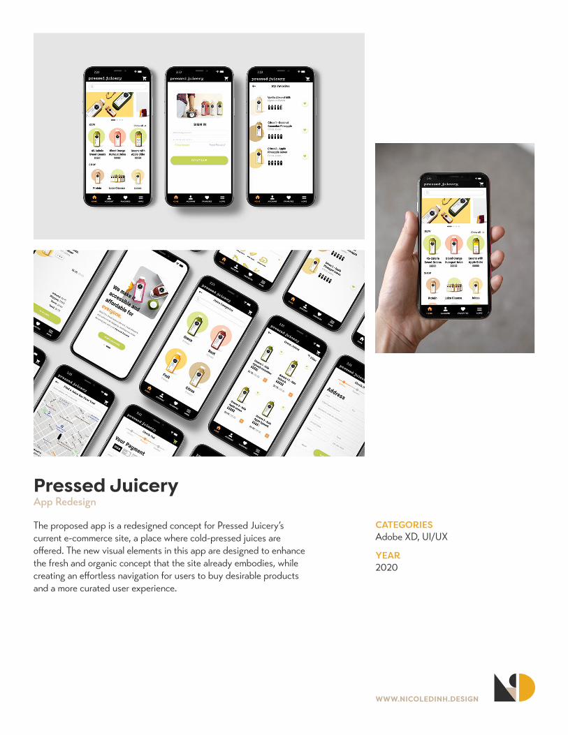
Pressed JuiceryApp Redesign
The proposed app is a redesigned concept for Pressed Juicery’s current e-commerce site, a place where cold-pressed juices are offered. The new visual elements in this app are designed to enhance the fresh and organic concept that the site already embodies, while creating an effortless navigation for users to buy desirable products and a more curated user experience.
WWW.NICOLEDINH.DESIGN
CATEGORIESAdobe XD, UI/UX
YEAR2021
LINKhttps://adobe.ly/2PyfBuD
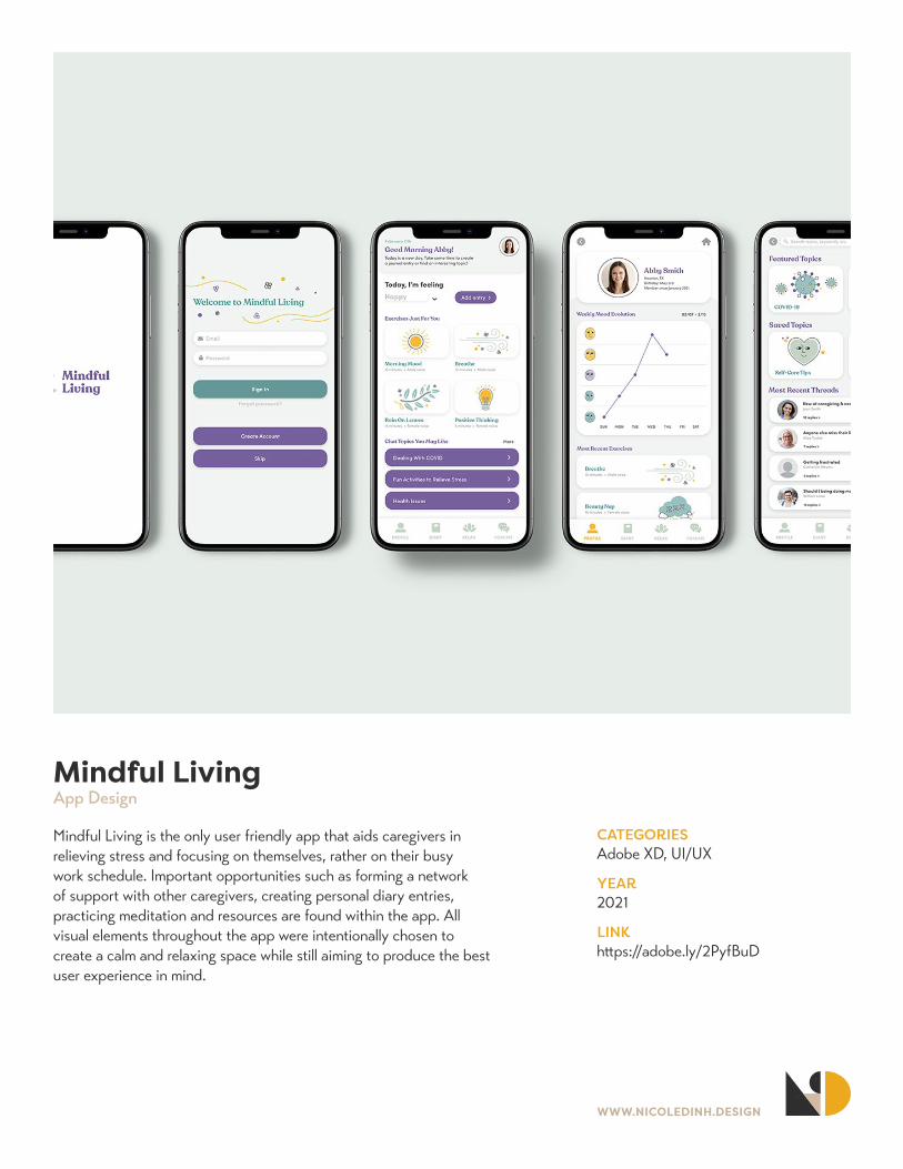
Mindful LivingApp Design
Mindful Living is the only user friendly app that aids caregivers in relieving stress and focusing on themselves, rather on their busy work schedule. Important opportunities such as forming a network of support with other caregivers, creating personal diary entries, practicing meditation and resources are found within the app. All visual elements throughout the app were intentionally chosen to create a calm and relaxing space while still aiming to produce the best user experience in mind.

WWW.NICOLEDINH.DESIGN
CATEGORIESHTML, CSS, JavaScript, UI/UX
YEAR2019
LINKhttps://bit.ly/3nvoWji
Daily OwlsField Guide Website
Daily Owls is a digital field guide that touches on understanding and identifying the most popular Owl species in North America. The color palette, font choices and hand-drawn illustrations are used to enhance the feeling of an owl’s habitat and characteristics. Readers can peruse through the different traits of owl species on a single page as well as listen to their unique voice. With easy navigation and interactive information, the field guide provides a pleasant experience for any owl enthusiast.
WWW.NICOLEDINH.DESIGN
CATEGORIESPrint, Layout
YEAR2019
DIMENSIONS8.5”x11”
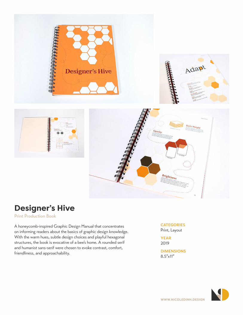
Designer’s HivePrint Production Book
A honeycomb-inspired Graphic Design Manual that concentrates on informing readers about the basics of graphic design knowledge. With the warm hues, subtle design choices and playful hexagonal structures, the book is evocative of a bee’s home. A rounded serif and humanist sans-serif were chosen to evoke contrast, comfort, friendliness, and approachability.