painted wood 3
DESCRIPTION
painted woodTRANSCRIPT
Historical Materialsand Techniques
P A R T T H R E E
156
I , a number of polychrome sculptures were examinedand treated by the author. They belong to the first generation of sculp-tures in Bavaria to reflect the influence of Italian Mannerism in the
province. The relationship to Italian Renaissance sculpture is evident, as isthe sculptors’ awareness of Italian art via contact with artists in Munichand Augsburg who had visited and trained in Italy. Roots of the develop-ment of Baroque ideas can be traced. A general examination revealedobvious differences in the outline of decorative elements between thecarved surfaces and the polychromy. Furthermore, eyes, eyebrows, lips,and cheeks were found to have been painted directly on the carvedwooden surface, and must have been covered with layers of priming andthe authentic polychromy immediately after carving.
Such observations have been made repeatedly, but there is still noaccepted explanation for this quite commonly used local coloring in com-bination with polychromy (Rosenfeld 1990:153).1 Three sculptural groupshave been selected to explain and illustrate these observations in detail.
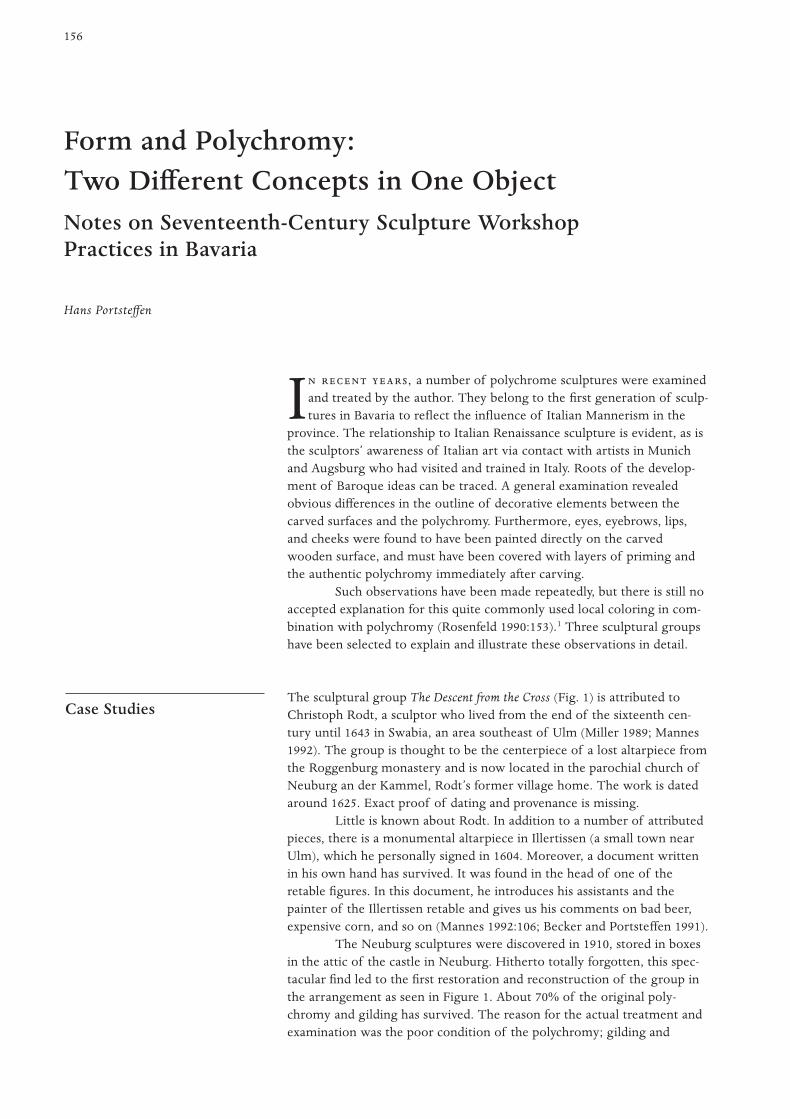
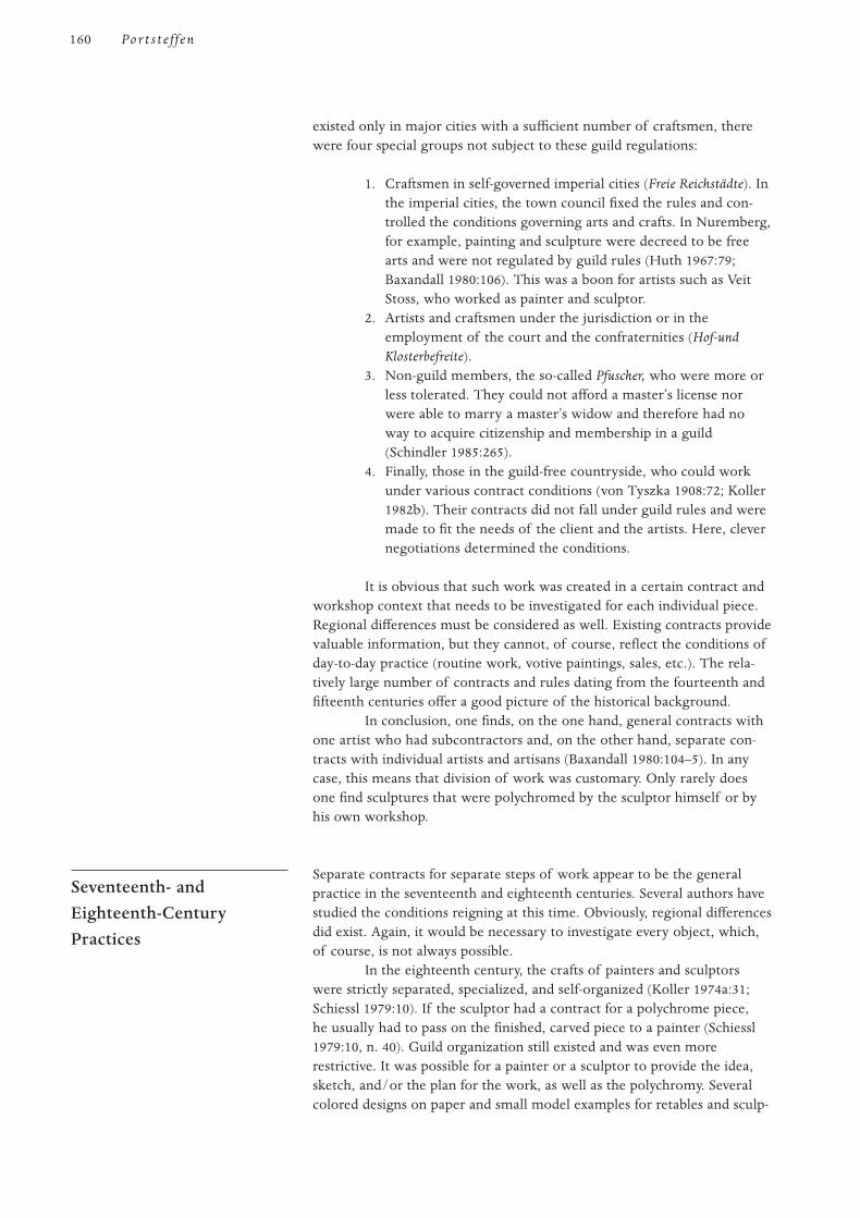
The sculptural group The Descent from the Cross (Fig. 1) is attributed toChristoph Rodt, a sculptor who lived from the end of the sixteenth cen-tury until 1643 in Swabia, an area southeast of Ulm (Miller 1989; Mannes1992). The group is thought to be the centerpiece of a lost altarpiece fromthe Roggenburg monastery and is now located in the parochial church ofNeuburg an der Kammel, Rodt’s former village home. The work is datedaround 1625. Exact proof of dating and provenance is missing.
Little is known about Rodt. In addition to a number of attributedpieces, there is a monumental altarpiece in Illertissen (a small town nearUlm), which he personally signed in 1604. Moreover, a document writtenin his own hand has survived. It was found in the head of one of theretable figures. In this document, he introduces his assistants and thepainter of the Illertissen retable and gives us his comments on bad beer,expensive corn, and so on (Mannes 1992:106; Becker and Portsteffen 1991).
The Neuburg sculptures were discovered in 1910, stored in boxesin the attic of the castle in Neuburg. Hitherto totally forgotten, this spec-tacular find led to the first restoration and reconstruction of the group inthe arrangement as seen in Figure 1. About 70% of the original poly-chromy and gilding has survived. The reason for the actual treatment andexamination was the poor condition of the polychromy; gilding and
Case Studies
Form and Polychromy: Two Different Concepts in One ObjectNotes on Seventeenth-Century Sculpture Workshop Practices in Bavaria
Hans Portsteffen

paint layers were flaking due to inadequate environmental conditions.The group was acquired by the Bavarian state from a private owner.Consequently, the group was transferred to the village church of Neuburg.
The original polychromy shows silvered and gilded areas of thedrapery, and faces and arms are painted in a very lively manner. Closeexamination revealed that the painter did not fully comprehend the sculp-tor’s concept. This is supported by four observations:
1. A hole had been prepared for a separately carved button. Theplanned button had been forgotten, and the painter coveredthe site in a manner similar to the surrounding area.
2. The painter did not pay careful attention to the borders ofinner and outer parts of the robes. After applying silver leaf tolarge areas of the outer part of the robe, he needed to correctthose areas and did so by applying gold leaf over the silver leaf.
3. One leg was painted flesh color; apparently, the painter didnot recognize the carved breeches. He later corrected this byadding silver leaf.
4. The carved relief area in the cap of one of the upper sculp-tures was overlooked; the outline of the carving was notreoutlined in the priming layers.
The most important observation made was in the lacunae of the poly-chromy on the face of Saint John. Beneath the priming and polychromyand directly on the wooden surface, the lips are painted red.
The busts of Saint Kunigunde (Fig. 2) and Saint Heinrich areattributed to the same sculptor. They have survived, although badly dam-aged, and are now in the Heimatmuseum in Illertissen. These polychromebusts had once been attached to reliquaries, which are now missing. Theremaining parts of the polychromy are original and have never been
157F P : T D C O O
Figure 1
The Descent from the Cross, attributed to
Christoph Rodt. First quarter of the seven-
teenth century. Limewood. H:approx. 250 cm.
In the parochial church of Neuburg an der
Kammel.
Figure 2
Bust of Saint Kunigunde, attributed to
Christoph Rodt. First quarter of the seven-
teenth century. Large areas of the authentic
polychromy are lost. Limewood. H:45.5 cm.
In the Collection of Heimatmuseum,
Illertissen.
treated. In spite of the losses, the colorful and very delicate decoration isstill apparent. The losses give deep insight into the technique and the elab-orate carving of the sculptures, which is covered with thick priming layers.Again the lips are painted directly on the wood surface, as are the cheeks,eyes, and eyebrows (Fig. 3).
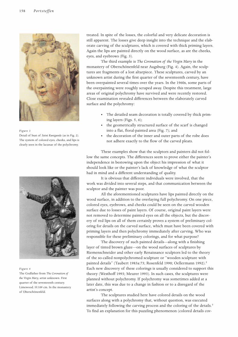
The third example is The Coronation of the Virgin Mary in themonastery of Oberschönenfeld near Augsburg (Fig. 4). Again, the sculp-tures are fragments of a lost altarpiece. These sculptures, carved by anunknown artist during the first quarter of the seventeenth century, havebeen overpainted several times over the years. In the 1960s, some parts ofthe overpainting were roughly scraped away. Despite this treatment, largeareas of original polychromy have survived and were recently restored.Close examination revealed differences between the elaborately carvedsurface and the polychromy:
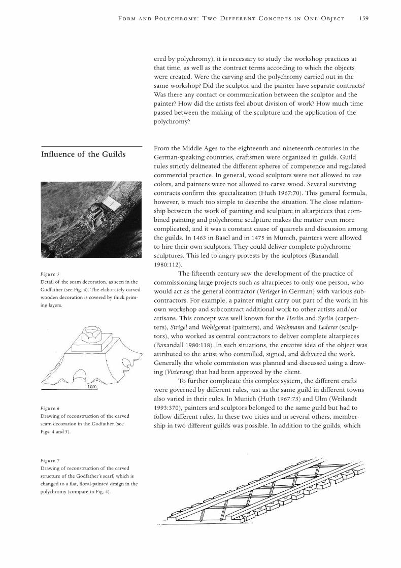
• The detailed seam decoration is totally covered by thick prim-ing layers (Figs. 5, 6);
• the geometrically structured surface of the scarf is changedinto a flat, floral-painted area (Fig. 7); and
• the decoration of the inner and outer parts of the robe doesnot adhere exactly to the flow of the carved pleats.
These examples show that the sculptors and painters did not fol-low the same concepts. The differences seem to prove either the painter’sindependence in bestowing upon the object his impression of what itshould look like or the painter’s lack of knowledge of what the sculptorhad in mind and a different understanding of quality.
It is obvious that different individuals were involved, that thework was divided into several steps, and that communication between thesculptor and the painter was poor.
All the aforementioned sculptures have lips painted directly on thewood surface, in addition to the overlaying full polychromy. On one piece,colored eyes, eyebrows, and cheeks could be seen on the carved woodensurface due to losses of paint layers. Of course, original paint layers werenot removed to determine painted eyes on all the objects, but the discov-ery of red lips on all of them certainly proves a system of preliminary col-oring for details on the carved surface, which must have been covered withpriming layers and then polychromy immediately after carving. Who wasresponsible for these preliminary colorings, and for what purpose?
The discovery of such painted details—along with a finishinglayer of tinted brown glaze—on the wood surfaces of sculptures byRiemenschneider and other early Renaissance sculptors led to the theoryof the so-called nonpolychromed sculpture or “wooden sculpture withpainted details” (Taubert 1983a:73; Rosenfeld 1990; Oellermann 1992).2
Each new discovery of these colorings is usually considered to support thistheory (Westhoff 1993; Meurer 1993). In such cases, the sculptures wereplanned without polychromy. If polychromy was sometimes added at alater date, this was due to a change in fashion or to a disregard of theartist’s concept.
The sculptures studied here have colored details on the woodsurfaces along with a polychromy that, without question, was executedimmediately following the carving process and the coloring of the details.3
To find an explanation for this puzzling phenomenon (colored details cov-
158 Por t s t e f f en
Figure 3
Detail of bust of Saint Kunigunde (as in Fig. 2).
The system of colored eyes, cheeks, and lips is
clearly seen in the lacunae of the polychromy.
Figure 4
The Godfather from The Coronation of
the Virgin Mary, artist unknown. First
quarter of the seventeenth century.
Limewood. H:109 cm. In the monastery
of Oberschönenfeld.
ered by polychromy), it is necessary to study the workshop practices atthat time, as well as the contract terms according to which the objectswere created. Were the carving and the polychromy carried out in thesame workshop? Did the sculptor and the painter have separate contracts?Was there any contact or communication between the sculptor and thepainter? How did the artists feel about division of work? How much timepassed between the making of the sculpture and the application of thepolychromy?
From the Middle Ages to the eighteenth and nineteenth centuries in theGerman-speaking countries, craftsmen were organized in guilds. Guildrules strictly delineated the different spheres of competence and regulatedcommercial practice. In general, wood sculptors were not allowed to usecolors, and painters were not allowed to carve wood. Several survivingcontracts confirm this specialization (Huth 1967:70). This general formula,however, is much too simple to describe the situation. The close relation-ship between the work of painting and sculpture in altarpieces that com-bined painting and polychrome sculpture makes the matter even morecomplicated, and it was a constant cause of quarrels and discussion amongthe guilds. In 1463 in Basel and in 1475 in Munich, painters were allowedto hire their own sculptors. They could deliver complete polychromesculptures. This led to angry protests by the sculptors (Baxandall1980:112).
The fifteenth century saw the development of the practice ofcommissioning large projects such as altarpieces to only one person, whowould act as the general contractor (Verleger in German) with various sub-contractors. For example, a painter might carry out part of the work in hisown workshop and subcontract additional work to other artists and/orartisans. This concept was well known for the Herlin and Syrlin (carpen-ters), Strigel and Wohlgemut (painters), and Weckmann and Lederer (sculp-tors), who worked as central contractors to deliver complete altarpieces(Baxandall 1980:118). In such situations, the creative idea of the object wasattributed to the artist who controlled, signed, and delivered the work.Generally the whole commission was planned and discussed using a draw-ing (Visierung) that had been approved by the client.
To further complicate this complex system, the different craftswere governed by different rules, just as the same guild in different townsalso varied in their rules. In Munich (Huth 1967:73) and Ulm (Weilandt1993:370), painters and sculptors belonged to the same guild but had tofollow different rules. In these two cities and in several others, member-ship in two different guilds was possible. In addition to the guilds, which
Influence of the Guilds
159F P : T D C O O
Figure 5
Detail of the seam decoration, as seen in the
Godfather (see Fig. 4). The elaborately carved
wooden decoration is covered by thick prim-
ing layers.
Figure 6
Drawing of reconstruction of the carved
seam decoration in the Godfather (see
Figs. 4 and 5).
Figure 7
Drawing of reconstruction of the carved
structure of the Godfather’s scarf, which is
changed to a flat, floral-painted design in the
polychromy (compare to Fig. 4).
existed only in major cities with a sufficient number of craftsmen, therewere four special groups not subject to these guild regulations:
1. Craftsmen in self-governed imperial cities (Freie Reichstädte). Inthe imperial cities, the town council fixed the rules and con-trolled the conditions governing arts and crafts. In Nuremberg,for example, painting and sculpture were decreed to be freearts and were not regulated by guild rules (Huth 1967:79;Baxandall 1980:106). This was a boon for artists such as VeitStoss, who worked as painter and sculptor.
2. Artists and craftsmen under the jurisdiction or in theemployment of the court and the confraternities (Hof-undKlosterbefreite).
3. Non-guild members, the so-called Pfuscher, who were more orless tolerated. They could not afford a master’s license norwere able to marry a master’s widow and therefore had noway to acquire citizenship and membership in a guild(Schindler 1985:265).
4. Finally, those in the guild-free countryside, who could workunder various contract conditions (von Tyszka 1908:72; Koller1982b). Their contracts did not fall under guild rules and weremade to fit the needs of the client and the artists. Here, clevernegotiations determined the conditions.
It is obvious that such work was created in a certain contract andworkshop context that needs to be investigated for each individual piece.Regional differences must be considered as well. Existing contracts providevaluable information, but they cannot, of course, reflect the conditions ofday-to-day practice (routine work, votive paintings, sales, etc.). The rela-tively large number of contracts and rules dating from the fourteenth andfifteenth centuries offer a good picture of the historical background.
In conclusion, one finds, on the one hand, general contracts withone artist who had subcontractors and, on the other hand, separate con-tracts with individual artists and artisans (Baxandall 1980:104–5). In anycase, this means that division of work was customary. Only rarely doesone find sculptures that were polychromed by the sculptor himself or byhis own workshop.
Separate contracts for separate steps of work appear to be the generalpractice in the seventeenth and eighteenth centuries. Several authors havestudied the conditions reigning at this time. Obviously, regional differencesdid exist. Again, it would be necessary to investigate every object, which,of course, is not always possible.
In the eighteenth century, the crafts of painters and sculptorswere strictly separated, specialized, and self-organized (Koller 1974a:31;Schiessl 1979:10). If the sculptor had a contract for a polychrome piece,he usually had to pass on the finished, carved piece to a painter (Schiessl1979:10, n. 40). Guild organization still existed and was even morerestrictive. It was possible for a painter or a sculptor to provide the idea,sketch, and/or the plan for the work, as well as the polychromy. Severalcolored designs on paper and small model examples for retables and sculp-
Seventeenth- andEighteenth-CenturyPractices
160 Por t s t e f f en

tures have survived. Such pieces were made as a means of furtheringdiscussion among the contract partners and artisans and of helping thefuture owner to picture the final work (Schiessl 1979:17; Koller 1974a:24).Contracts were then made with each artisan separately (Koller 1974a:33;Volk 1984:189).4 The growing self-confidence among the different artistsled to the practice of signing their work separately (Taubert 1983b).Painters responsible for the polychromy on sculptures and retables wereno longer anonymous.
Usually the painter started working immediately after completion of thecarving or erection of an altarpiece. But time did not pass as fast as it doestoday. If the polychrome concept was discussed or contracted during orafter erection or carving was completed, it is possible that some timeelapsed before the polychromy was applied. There are known instanceswhere years passed after the erection of an altar retable or the carving of asculpture before the polychromy was applied. This might have been due tolack of funds, a change of mind, or uncertain times. One known case isthe Baroque organ in Maihingen (1737), which was never polychromed atall (Walch 1991; Böttger 1991; Scheuch 1991). The rough wood construc-tion and surface of the carvings can still be seen, and blemishes and jointsare filled with paste (Fig. 8). This is actually a very rare and astonishingexample of an unpainted work in a church with an elaborately poly-chromed interior. Here, too, we find lips and eyes painted directly on therough and uneven wood surface, which calls for a finish of priming andpolychromy. Another example is the monumental retable in the Church ofÜberlingen, where the design and the sculpture were contracted to JörgZürn in 1613 and the carpentry to Joseph Mutschlenbeck, while the poly-chromy was commissioned in January 1614 to the painter WilhelmBaumhauer. During the following half-year, the polychromy order wascanceled “for various reasons,” as the document says, and it was never exe-cuted (von Manteuffel 1969:17, 154, 156).
The Procedure
161F P : T D C O O
Figure 8
Organ in Maihingen/Donau-Ries, Johann
Martin Baumeister 1737. Detail of the sculp-
ture decoration of the organ. The face of the
angel shows repairs in the wood, which calls
for priming and polychromy. Eyes and lips are
painted. Limewood. In the parochial church
of Maihingen.
Other examples of delay in executing the polychromy are the pul-pit and high altar of the monastery church of Saint Veit an der Glan,Austria, constructed in 1634 and painted in 1637; the altarpiece in theparochial church in Strasbourg, Austria, constructed in 1747 and paintedin 1772 (Koller 1974a:31); and the high altar in the monastery of Disentis,where the polychromy was applied twenty years later (Brachert 1972:161).For the medieval Pietá of Georgenberg, Austria, there is literary proofthat it stood in the church after carving for some time before it waspolychromed (Koller 1982a; Koller 1993). Other examples have beenpublished (Schiessl 1979:29; Bayerisches Nationalmuseum 1985:264;Württembergisches Landesmuseum Stuttgart 1993:26:447, 27:448).
Conditions such as poor communication, division of labor, and delay incontracting different steps of the work influenced artistic production. Awork of art cannot be executed in separate steps by various artists withoutconsequences, especially when there is little or no contact between thepersons involved, or when there is a lapse of time between the operations.
Little is known about the relationship between sculptors andpainters and how they coped with these circumstances. Literary sourcesmay shed some light. For example, there is a statement by the sculptorHagenauer, who made the high altar of Köstendorf, Austria, in which hecalls for precise priming. “Not to waste the quality of carving,” he wantedto be contracted for the priming and the polychromy as well. Apparentlyhe had had some bad experiences with painters (Koller 1974b:118):
To preserve my pleasure in the clear carving and diversity of facial expression
and not, as has often enough happened to me, to find it wasted by poor
priming; to the extent that neither the clear contours, the diversity of expres-
sions, nor the difference between the flowers and the other ornaments could
be discerned, nor who it was made by and what it was meant to be, therefore
I plan to take over not only the carving but the polychromy as well.5
This statement may reflect the situation and the feelings of thesculptors who had to pass their work on to a painter, or who were con-tracted separately. If one presupposes any professional pride, such discon-tent must have been widespread.6 From this point of view, the coloring ofthe eyes, cheeks, lips, and so on, directly on the wood surface might beinterpreted as the sculptor’s finishing touch: an indication that he wantedto assert his concept of his creation before passing it on to a painter. Thisinterpretation stresses the artist’s feelings, which is, of course, a moderninterpretation. In any case, the sculptor’s own coloring of details confirmsthat there were strict guild rules and a division of labor.
The concerned artists and artisans probably knew that the poly-chromy might be executed several years later, or perhaps not at all. In suchcases of delayed polychromy, the provisional coloring of the eyes, et cetera,served as a first step toward the polychrome finish of the piece and allowedfor immediate use. To describe this phenomenon, the term temporary orprovisional coloring might be useful.
Conclusion
162 Por t s t e f f en
1 Some of these observations follow:
(bei) den im Verlauf der Schwanthaler-Restaurierungen untersuchten 67
Figureninkarnaten. . . . finden sich fast stets direkt auf dem Holz schwarze Augen-und rote
Lippen- sowie Blut-(z.B. bei Sebastiansfiguren) angaben, die von der Hand des Bildhauers
stammen dürften [Examination of 67 polychrome sculptures attributed to members of the
Schwanthaler family revealed that most of the sculptures showed black-colored eyes, red
lips and blood marks (in the case of sculptures of Saint Sebastian) painted directly onto the
wooden surface, probably done by the sculptor] (Koller 1974a:48).
dunkel eingesetzte Pupillen, die sogar unter Kreidegrundfassungen gefunden worden
sind . . . eine Gepflogenheit des bildhauerischen Gestaltungsvorgangs, durch die der Blick
festgelegt wurde [colored eyes, found underneath polychromy are part of the customary
manner of design, determining the direction of the glance] (Brachert and Kobler 1981:807).
Denn selbst wenn man eine direkt aufs Holz gemalte Pupille findet, muss es sich nicht
immer um ein holzfarbenes Bildwerk handeln, sondern man muss damit rechnen, dass
der Bildhauer während seiner Arbeit eine solche Zeichnung als Hilfsmittel benutzt hat,
um seinem Werk Lebendigkeit zu verleihen und evt. schnitztechnische Korrekturen
vornehmen zu können [The finding of colored eyes on the wooden surface does not
always prove that the sculpture is a nonpolychromed one. It is just as possible that the
sculptor uses these colored markings to enliven the piece and to control his work]
(Westhoff and Haussman 1987:130).
2 See Rosenfeld 1990 for references on this subject.
3 The authenticity of the polychromy is usually determined by the manner of the polychromy,
by the presence of visible repair work in the wooden surface that called for a covering by poly-
chromy, by the lack of any patina (soiling) on the wooden surface, and by the evidence of the
typical rough surface generally prepared for the better adhesion of the priming layers.
4 The high altar in the monastery church of Fürstenzell near Passau fits as an example for
division of work and separate contracts: design of the retable, J. B. Straub; sculpture work,
J. B. Straub; carpentry, Jacob Kalchgrueb; carved ornaments, Wolfgang Reittmayr; polychromy
and gilding, Andreas Math.
5 Translated by M. Nierhaus from the German:
Und damit meine Freyd bey reiner Ausarbeitung und verschidtenen Ausdruck der
Gesichter mir vollkommen bleibe und nicht so, wie es mir schon oftmals geschehen ist,
durch Vergründung verpatzet wird, dass man weder mehr eine reinen Conturn noch
verschiedene Gesichtsbildung, weder Unterschied der Blumen noch anderer Auszierung
erkennt hat, von wem es gemacht und was es sein oder vorstellen sollte, so gedänke
zugleich auch nebst der Bildhauer- auch die Fassarbeit zu Übernehmen.
6 According to some other contracts of that time, the sculptor was required to finish his part
with the priming. This is reasonable, because the accuracy of his carving would not then be
affected by the influence of the painter (Koller 1976:163).
Baxandall, M.
1980 The Limewood Sculpture of Renaissance Germany. New Haven, Conn., and London: Yale
University Press.
Bayerisches Nationalmuseum
1985 Bayerische Rokokoplastik—Vom Entwurf zur Ausführung. Munich: Bayerisches
Nationalmuseum.
Becker, R., and H. Portsteffen
1991 Die Kreuzabnahme von Christoph Rodt in Neuburg an der Kammel. Zeitschrift für
Kunstechnologie und Konservierung 2:246–62.
References
Notes
163F P : T D C O O

Böttger, P.
1991 Die Kirche des ehem. Franziskaner-Minoritenklosters in Maihingen. Zur
Gesamtrestaurierung und zur Restaurierung der Orgel 1979–1990. Arbeitsheft des
Bayerischen Landesamtes für Denkmalpflege 52:24–34.
Brachert, T.
1972 Die Techniken der polychromen Holzskulptur. Maltechnik Restauro 3:153–78.
Brachert, T., and F. Kobler
1981 Fassung von Bildwerken. In Reallexikon zur Deutschen Kunstgeschichte, vol. 7, ed.
Willibald Sauerländer and Karl August Wirth, 743–826. Munich: Alfred Druckenmüller.
Huth, H.
1967 Künstler und Werkstatt der Spätgotik. Darmstadt, Germany: Wissenschaftliche
Buchgesellschaft.
Koller, M.
1974a Barockaltäre in Österreich: Technik-Fassung-Konservierung. In Restauratorenblätter der
Denkmalpflege in Österreich, vol. 2, 17–64. Vienna: Bundesdenkmalamt Wien.
1974b Polierweiss—Eine Sondertechnik des Barock. In Restauratorenblätter der Denkmalpflege in
Österreich, vol. 2, 117–24. Vienna: Bundesdenkmalamt Wien.
1976 Fassung und Fassmaler an Barockaltären. Maltechnik-Restauro 3:157–72.
1982a Das Frühwerk Riemenschneiders—Zur Bilanz des Berliner Forschungsprojektes.
Maltechnik Restauro 4:282–86
1982b Zur Sozialgeschichte von Kunst und Handwerk im 17. Jahrhundert, Datenlage und
Forschungsstand. In Wolfenbütteler Arbeiten zur Barockforschung, vol. 13, ed. W. Brückner,
K. Blickle, and C. Breuer, 425–40. Wiesbaden: Harrasowitz.
1993 Das Vesperbild aus St. Georgenberg/Tirol. Restauro 5:295.
Mannes, J.
1992 Der Hochaltar Christoph Rodts in der Pfarrkirche St. Martin zu Illertissen. Master’s
thesis, University of Würzburg.
Meurer, H.
1993 Zum Verständnis der holzsichtigen Skulptur. In Meisterwerke Massenhaft—Die
Bildhauerwerkstatt des Niklaus Weckmann und die Malerei in Ulm um 1500, 147–52.
Exhibition catalogue. Stuttgart: Württembergisches Landesmuseum Stuttgart.
Miller, A.
1989 Christoph Rodt, ein schäwbischer Bildhauer des Frühbarocks. Heimatkundliche
Schriftenreihe für den Landkreis Günzburg 9:3-7. Günzburg, Germany: Historischer
Verein Günzburg.
Oellermann, E.
1992 Der Hochaltar in St. Martin zu Lorch am Rhein. In Flügelaltäre des späten Mittelalter, ed.
Krohm and Oellermann, 9–22. Berlin: Staatliche Museum, Preussischer Kulturbesitz,
Riemann.
Rosenfeld, J.
1990 Die nichtpolychromierte Retabelskulptur als bildreformerisches Phänomen im ausgehenden
Mittelalter und in der beginnenden Neuzeit. Ammersbek bei Hamburg, Germany: Verlag
an der Lottbek.
Scheuch, A.
1991 Zu den Restaurierungsarbeiten am Orgelgehäuse der Barockorgel der Maihinger
Klosterkirche. Arbeitsheft des Bayerischen Landesamtes für Denkmalpflege 52:99–105.
164 Por t s t e f f en
Schiessl, U.
1979 Rokokofassung-Materialillusion. Mittenwald, Germany: Mäander.
Schindler, H.
1985 Bayerische Bildhauer. Munich: Friedrich Pustet.
Taubert, J.
1983a Zur Oberflächengestalt der sogenannten ungefassten spätgotischen Holzplastik. In
Farbige Skulpturen, Bedeutung-Fassung-Restaurierung, 73–88. Munich: Callwey.
1983b Zur Restaurierung des Kruzifixes von Ignaz Günther aus Altmannstein. In Farbige
Skulpturen, Bedeutung-Fassung-Restaurierung, 195–98. Munich: Callwey.
Volk, P.
1984 Johann Baptist Straub 1704–1784. Munich: Hirmer.
von Manteuffel, C. Z.
1969 Die Bildhauerfamilie Zürn 1606–1666. Weissenhorn: Konrad.
von Tyszka, C.
1908 Handwerk und Handwerker in Bayern im 18. Jahrhundert. Inaugural diss., Hone
Staatswissenschaftliche Fakultät der Königlichen Eberhard-Karls-Universität Tübingen.
Walch, K.
1991 Zur Restaurierung und Dokumentation der Maihinger Orgel. Arbeitsheft des Bayerischen
Landesamtes für Denkmalpflege 52:40–47.
Weilandt, G.
1993 Die Ulmer Künstler und ihre Zunft. In Meisterwerke Massenhaft—Die Bildhauerwerkstatt
des Niklaus Weckmann und die Malerei in Ulm um 1500, 369–88. Exhibition catalogue.
Stuttgart: Württembergisches Landesmuseum Stuttgart.
Westhoff, H.
1993 Holzsichtige Skulptur aus der Werkstatt des Nikolaus Weckmann. In Meisterwerke
Massenhaft—Die Bildhauerwerkstatt des Niklaus Weckmann und die Malerei in Ulm um 1500,
135–46. Exhibition catalogue. Stuttgart: Württembergisches Landesmuseum Stuttgart.
Westhoff, H., and B. Haussmann
1987 Zwiefalten und Alpirsbach—zwei monochrome Altäre? Zeitschrift für Kunsttechnologie
und Konservierung 1:125–30.
Württembergisches Landesmuseum Stuttgart
1993 Meisterwerke Massenhaft—Die Bildhauerwerkstatt des Niklaus Weckmann und die Malerei in
Ulm um 1500. Exhibition catalogue. Stuttgart: Württembergisches Landesmuseum
Stuttgart.
165F P : T D C O O
166
Renate Gold
I , an unusual form ofpainting was developed in the sixteenth century: the technique of bis-muth painting. The technique is found mostly on small decorative
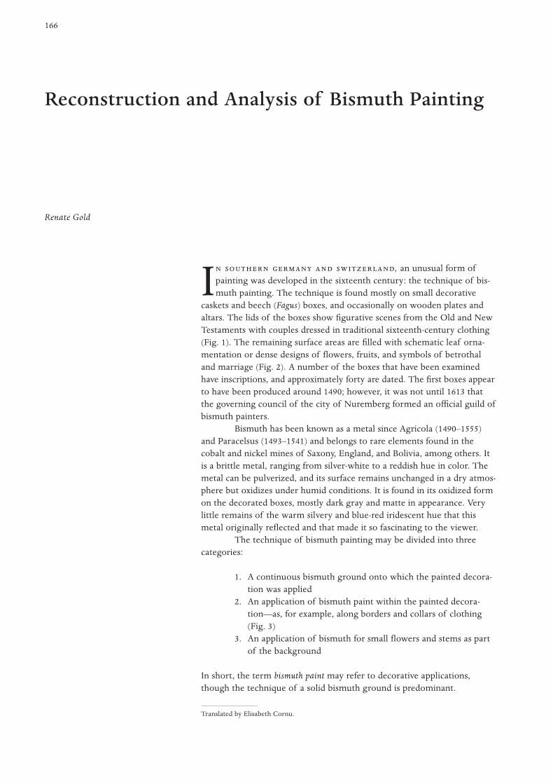
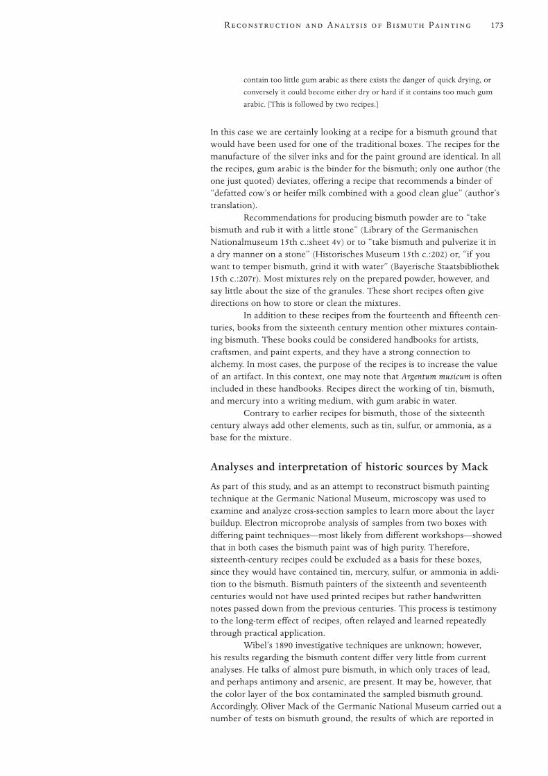
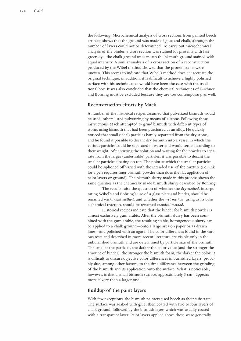
caskets and beech (Fagus) boxes, and occasionally on wooden plates andaltars. The lids of the boxes show figurative scenes from the Old and NewTestaments with couples dressed in traditional sixteenth-century clothing(Fig. 1). The remaining surface areas are filled with schematic leaf orna-mentation or dense designs of flowers, fruits, and symbols of betrothaland marriage (Fig. 2). A number of the boxes that have been examinedhave inscriptions, and approximately forty are dated. The first boxes appearto have been produced around 1490; however, it was not until 1613 thatthe governing council of the city of Nuremberg formed an official guild ofbismuth painters.
Bismuth has been known as a metal since Agricola (1490–1555)and Paracelsus (1493–1541) and belongs to rare elements found in thecobalt and nickel mines of Saxony, England, and Bolivia, among others. Itis a brittle metal, ranging from silver-white to a reddish hue in color. Themetal can be pulverized, and its surface remains unchanged in a dry atmos-phere but oxidizes under humid conditions. It is found in its oxidized formon the decorated boxes, mostly dark gray and matte in appearance. Verylittle remains of the warm silvery and blue-red iridescent hue that thismetal originally reflected and that made it so fascinating to the viewer.
The technique of bismuth painting may be divided into threecategories:
1. A continuous bismuth ground onto which the painted decora-tion was applied
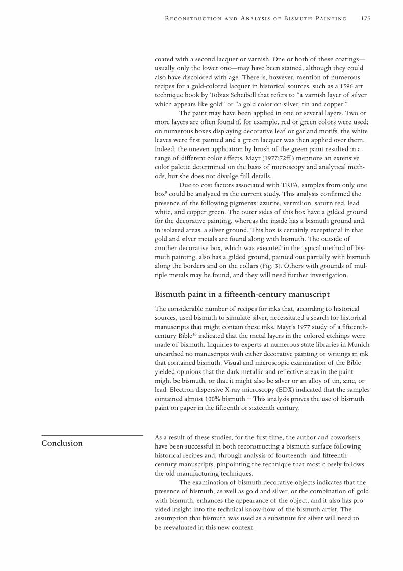
2. An application of bismuth paint within the painted decora-tion—as, for example, along borders and collars of clothing(Fig. 3)
3. An application of bismuth for small flowers and stems as partof the background
In short, the term bismuth paint may refer to decorative applications,though the technique of a solid bismuth ground is predominant.
Reconstruction and Analysis of Bismuth Painting
Translated by Elisabeth Cornu.

The study of bismuth painting was carried out by the author for her doc-toral dissertation, titled “Bismuth Painting.” As part of the study, historicaland contemporary records were researched to compile a sequential recordof investigations into the materials and techniques used for bismuthdecoration.
First attempt at reconstruction of bismuth by Wibel, 1890
In 1890, Justus Brinckmann, the founding director of the Museum fürKunst und Gewerbe (Museum of Arts and Crafts) in Hamburg, bought abismuth box dated 15551 and asked Ferdinand Wibel, director of thechemical state laboratory, to carry out an examination. In an extensive1891 essay on the results of his research, Wibel describes a bismuth surfacethat is visible in the center of the painted box and, after removal of thesurface varnish, appears as a matte lead gray area with a red tone. Byremoving a small sample from the 0.1 mm metal layer with a knife, heconfirmed that it is a brittle metal that flakes off in small pieces, revealingan underlying ground of chalk with a glue-like binder (Wibel 1891).
Wibel determined that the paint ground consisted almost exclu-sively of bismuth with small traces of antimony and arsenic; copper andtin were completely absent (Wibel 1891:5). Deciding that pure bismuthcould not possibly be hammered or rolled into a foil, unless the old metal
Summary of PublishedTechnical Researchinto Bismuth
167R A B P
Figure 1
Box, ca. 1560. Painted with bismuth.
H:14.5 cm; W:36.5 cm; D:24 cm. From the
Germanisches Nationalmuseum, Nuremberg
(Inventory no. HG 7865).
Figure 2
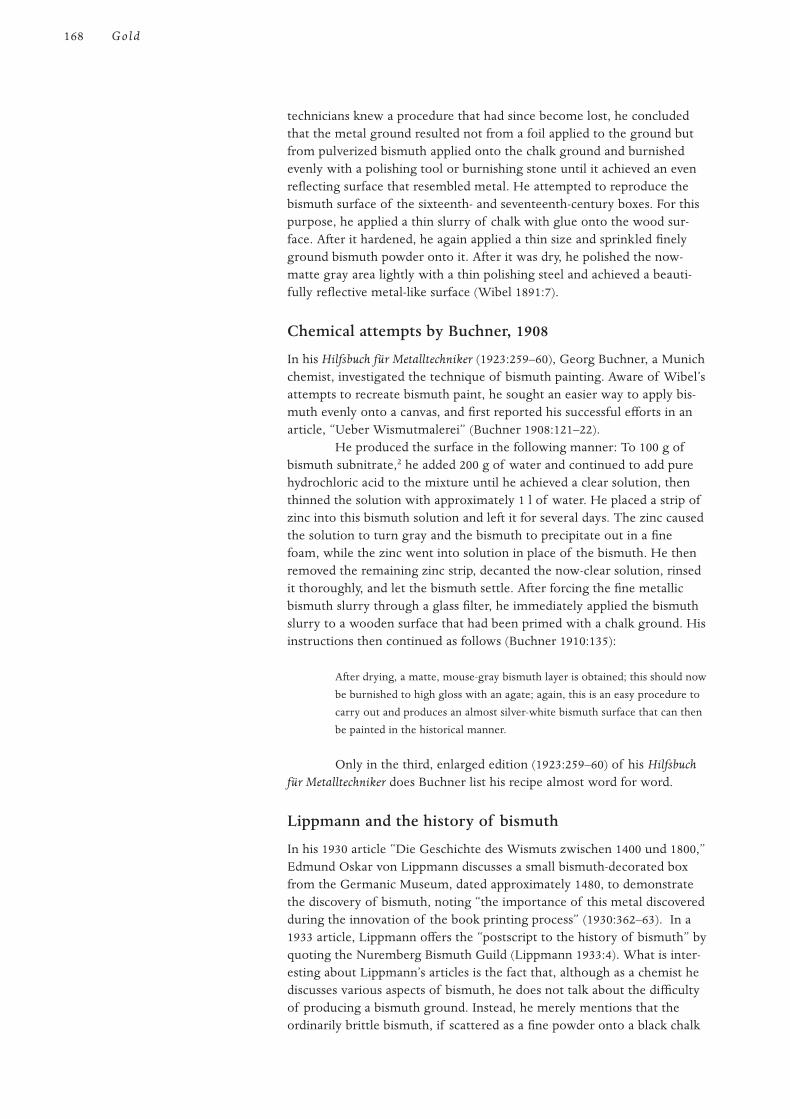
Writing cabinet, ca. 1650, with bismuth
ground. H:31.5 cm; W:41 cm; D:30.5 cm.
From the Bayerisches Nationalmuseum,
Munich (Inventory no. 60/I 14).
Figure 3
Box, dated 1544. Gold background, with
bismuth on the border of the garments.
H:17.4 cm; W:45.8 cm; D:29.5 cm. From
the Bayerisches Nationalmuseum, Munich
(Inventory no. 10/303).
technicians knew a procedure that had since become lost, he concludedthat the metal ground resulted not from a foil applied to the ground butfrom pulverized bismuth applied onto the chalk ground and burnishedevenly with a polishing tool or burnishing stone until it achieved an evenreflecting surface that resembled metal. He attempted to reproduce thebismuth surface of the sixteenth- and seventeenth-century boxes. For thispurpose, he applied a thin slurry of chalk with glue onto the wood sur-face. After it hardened, he again applied a thin size and sprinkled finelyground bismuth powder onto it. After it was dry, he polished the now-matte gray area lightly with a thin polishing steel and achieved a beauti-fully reflective metal-like surface (Wibel 1891:7).
Chemical attempts by Buchner, 1908
In his Hilfsbuch für Metalltechniker (1923:259–60), Georg Buchner, a Munichchemist, investigated the technique of bismuth painting. Aware of Wibel’sattempts to recreate bismuth paint, he sought an easier way to apply bis-muth evenly onto a canvas, and first reported his successful efforts in anarticle, “Ueber Wismutmalerei” (Buchner 1908:121–22).
He produced the surface in the following manner: To 100 g ofbismuth subnitrate,2 he added 200 g of water and continued to add purehydrochloric acid to the mixture until he achieved a clear solution, thenthinned the solution with approximately 1 l of water. He placed a strip ofzinc into this bismuth solution and left it for several days. The zinc causedthe solution to turn gray and the bismuth to precipitate out in a finefoam, while the zinc went into solution in place of the bismuth. He thenremoved the remaining zinc strip, decanted the now-clear solution, rinsedit thoroughly, and let the bismuth settle. After forcing the fine metallicbismuth slurry through a glass filter, he immediately applied the bismuthslurry to a wooden surface that had been primed with a chalk ground. Hisinstructions then continued as follows (Buchner 1910:135):
After drying, a matte, mouse-gray bismuth layer is obtained; this should now
be burnished to high gloss with an agate; again, this is an easy procedure to
carry out and produces an almost silver-white bismuth surface that can then
be painted in the historical manner.
Only in the third, enlarged edition (1923:259–60) of his Hilfsbuchfür Metalltechniker does Buchner list his recipe almost word for word.
Lippmann and the history of bismuth
In his 1930 article “Die Geschichte des Wismuts zwischen 1400 und 1800,”Edmund Oskar von Lippmann discusses a small bismuth-decorated boxfrom the Germanic Museum, dated approximately 1480, to demonstratethe discovery of bismuth, noting “the importance of this metal discoveredduring the innovation of the book printing process” (1930:362–63). In a1933 article, Lippmann offers the “postscript to the history of bismuth” byquoting the Nuremberg Bismuth Guild (Lippmann 1933:4). What is inter-esting about Lippmann’s articles is the fact that, although as a chemist hediscusses various aspects of bismuth, he does not talk about the difficultyof producing a bismuth ground. Instead, he merely mentions that theordinarily brittle bismuth, if scattered as a fine powder onto a black chalk
168 Gold

ground, may be burnished into a brilliantly metallic, reflective surface.He published his essays in a multiple volume book in 1953 (Lippmann1953:86–91).
Reconstructions by Deggeller, Sutter, and Bohring, 1963
These three authors wrote articles on bismuth and their experiences inreproducing a bismuth ground. Deggeller (1963) abbreviated Buchner’s1910 recipe, and Sutter (1963) cited it almost verbatim and added his ownresults from attempts to reconstruct the chalk ground. Bohring (1963)modified Buchner’s techniques by wetting the zinc strip with hydrochloricacid before placing it into the solution of bismuth, which was producedfrom bismuth subnitrate, water, and hydrochloric acid. He then groundthe bismuth slurry on a glass plate, added rabbit-skin glue, and appliedthe mixture to a chalk ground consisting of a minimum of four layers.Bohring reconstructed the method “in the modern sense” and expressedregrets that the technique of bismuth painting had fallen into oblivion.
Reconstructions by Wehlte, 1967
In 1967, Kurt Wehlte published his groundbreaking Werkstoffe undTechniken der Malerei, in which he cited, almost verbatim, Bohring’s 1963reconstruction experiments. He considers this the most successful of themany attempts to reproduce bismuth painting, but adds that “it is possibleto reach the goal by using finely ground bismuth metal in its dry form,then adding water and glue and burnishing upon drying. The larger gran-ules of the bismuth powder, in contrast to the bismuth slurry, result in atotally different visual effect” (Wehlte 1967:745–46).
Wehlte points out in his introduction that in his three decades ofartistic and technical work, he had often heard of bismuth paint but hadnever been able to obtain details from art historians nor had he foundmuch useful information in the technical literature (Wehlte 1967:744).Wehlte placed bismuth painting in a chapter on special techniques and, byhighlighting it as he did for techniques of wall painting or panel painting,rejuvenated the technique. The popularity of Wehlte’s book, which hasappeared in numerous editions, has increased knowledge and awarenessamong experts of this almost forgotten technique.
Differentiation between dry and wet methodsby Herrmann
Christian Herrmann (1977) completed a study in which he followedBuchner’s recipe in detail and added Sutter’s observations, as well as hisown amendments. Notably, Herrmann describes the process of obtainingthe bismuth slurry as a wet process, and characterizes the reconstructionattempts based on mechanical pulverization of the metallic bismuth as adry process. One of the dry methods is the reconstruction process listedby Bohring, first presented by Wehlte, in which pure bismuth powder isground with a mortar and pestle to a very fine powder and then shakenthrough a fine copper sieve. Another reconstruction of a dry process wasSutter’s recipe, in which the slurry was applied to a chalk ground consist-ing of four layers that had been finely polished with sandpaper and, aftersix hours, was burnished with an agate. Bohring had described this processas a dry method.
169R A B P
Practical translation of recipes by Mayr
Katharina Mayr (1977:72–73, 82–84)3 reported her study in which shereconstructed bismuth ground based on the articles by Wibel, Deggeller,and Sutter, as well as on both Buchner (although he was not mentionedby name) and Bohring. She presented eight reconstruction experimentsstarting with Wibel’s recipe, which she modified in a second experimentby increasing the concentration of the glue layer and thereby bindingmore of the bismuth powder to obtain a particularly thick reflecting sur-face. She repeated this method with more-refined bismuth powder, whichwas passed through a wire sieve, and the finer grain size resulted in amore even surface. In her fourth experiment, she duplicated Bohring’s so-called dry process by utilizing a larger bismuth content, stronger glue,and a glass sieve, but also let the bismuth slurry dry before applying it. Insummarizing her experiments, she noted that all the bismuth slurries pro-duced a darker color and less reflective surface than was obtained with apulverized bismuth.
Schiessl’s references to fourteenth- and fifteenth-century recipes
In the 1980s, Ulrich Schiessl described reconstruction attempts by Wibel,Buchner, and finally Bohring, though he does not mention proportionsof ingredients (Schiessl 1983). In connection with investigations into theetymology of the word bismuth, as well as its material scientific expla-nations, Schiessl also cited studies of Emil Ploss (1959:317–21) andfourteenth- and fifteenth-century recipes, offered as additional recon-struction possibilities.
Summary
All efforts to reconstruct the bismuth painting technique since 1891 werebased on the subjective interpretations of each author, and they did notreflect historical analysis or sources. The initiative for technical examina-tion came from art historians and museologists who had rediscovered thebismuth boxes and their unusual decorative technique.
In an 1876 article, August von Eye became the first cultural historian toconcern himself with bismuth-decorated boxes (von Eye 1876:1–3). Hebelieved that the boxes had been neglected because of
the inconspicuous shape in which they have been passed on to our time.
Imbued from the very beginning with very little artistry and created as
usable objects that preferably after much handling were tossed aside, these
objects were not able to be cleaned or restored due to their technique of
manufacture, and therefore were unable to draw the attention of science or
collectors.4
It is evident from von Eye’s comment, that his evaluation placed theboxes in a lower value range, a placement compounded by the fact thatthe boxes could not be cleaned or restored because knowledge of theirmanufacturing technique had been lost.
Considerations of theBismuth Techniqueby Historians
170 Gold

Art historian Jakob Stockbauer makes a value judgment in thearticle, “The Wooden Boxes in the Bayerischen Gewerbemuseum” (1887),and in a later three-volume work he asks, in reference to bismuth-decoratedboxes, whether “the mineral which today we call bismuth should bebrought into connection with this art at all” (Stockbauer 1893:243). In thefirst guide to the Museum für Kunst und Gewerbe in Hamburg, JustusBrinckmann (1893) discusses bismuth paintings and reports on Wibel’sreconstruction attempts.
In 1905, Hans Stegmann, an early art historian, wrote, “A thinlayer of bismuth powder was applied onto a thick chalk ground, the usualpaintings ground, and then burnished by means of a polishing stone untila metal-like reflective surface appeared.” Of its quality, he says that “frombeginning to end this painting technique cannot lay claim to an art work,”and adds, “It is an easy step from this relatively cheap and simple tech-nique to an even cheaper one.” He refers to small boxes with appliedcolored engravings or woodcuts with similar decorative patterns but notbismuth ground (Stegmann 1905:37).5
Ernst Darmstaedter (1927) appears to cite Buchner’s essays inaddition to Wibel’s, listing both procedures in abbreviated form in hisarticle. In 1928, art historian Heinrich Kohlhausen writes of bismuth-decorated boxes that the chalk ground merely has bismuth powder sprin-kled onto it and then is burnished with a polishing stone (Deneke andKahsnitz 1978:1126). Hans Lanz (1969) describes the process slightlymore extensively: “The metal was applied in powder form onto a glue-like binder on a chalk ground and then burnished with an agate to anevenly smooth silvery reflecting surface.”
Horst Appuhn, art historian, describes this technique (1986:791),writing that “the ground of multicolored tempera paintings consists ofbismuth, a metal that, after being ground, is applied with a binder ontothe usual chalk ground and then is polished with an agate.” BernwardDeneke, a folk historian, noted in 1969 that “the metal was applied ontothe chalk ground in a powder and reflected through the varnish layers”(Deneke 1969:141–42) and, like Kohlhausen, did not mention the binder.
Summary
In reviewing published art historical material concerned with the technol-ogy of bismuth painting, it is evident that modern research was initiatedin 1890 by Brinckmann; this is not surprising considering the number ofobjects to which he had access or of which he was aware, although manywere difficult to identify. Confirmation of a bismuth ground raised ques-tions about technique from chemists and others, and this eventually led tonumerous investigations.6
With the article from von Eye and the push by Brinckmann forchemical investigations, museologists moved bismuth boxes into the lime-light, although bismuth painting was considered artistically insignificant.The authors of the first articles were especially uncertain about bismuth’svalue as a material, and even Stockbauer presented bismuth painting as arelatively cheap and simple technique. Cultural historians, by contrast, pre-sented the recipes for producing the bismuth ground in very few sentencesbut in a schematic fashion, wishing perhaps to convey an idea of thedifficulty of this process.
171R A B P
Preliminary comments
Traditional bismuth boxes offer a rich spectrum of research hypotheseswith regard to makers, purchasers, distributors, and centers and periodsof manufacture, which in turn allow for evaluation by art historians andacceptance into museum collections. Other considerations are manufactur-ing techniques, ornamentation, themes of decoration, and, last but notleast, composition of the bismuth ground and the colors used in thedecoration.
In the study carried out by the author, the assistance of specialistswas needed in order to satisfactorily investigate the various aspects of thebismuth ground and paint, and staff in various museums with bismuth boxcollections provided support. Technical difficulties were encountered firstwith the identification of the bismuth ground and then with the interpre-tation of retouchings and overpainting. Scientists assisted with microscopyand ultraviolet microscopic analysis, but due to cost factors, only limitedtotal reflectance X-ray fluorescence analysis (TRFA) could be carried out.7
Evaluation of recipes from the fourteenth to theeighteenth century
Among numerous authoritative handwritten manuscripts from the four-teenth and fifteenth centuries are recipes for inks that optically resemblesilver ink but that have bismuth as the base. One of these manuscriptsindicates how this ink may be applied to wood. These recipes give rise tothe following questions:
1. Are there extant historical artifacts that demonstrate the useof these recipes?
2. Is it possible to duplicate these recipes without the factualknowledge of their manufacture?
3. Is modern bismuth different in appearance from historicbismuth?
4. How closely do the recipes of Wibel, Buchner, and Bohring re-create the original manufacturing techniques?
In order to answer these questions, the various recipes must first be exam-ined in detail.
The earliest recipe for the manufacture of “silver ink” is found ina 1384 manuscript (Library of the Germanischen Nationalmuseum 1384):
If you want to write so that it looks like silver, take a powder that is called
bismuth. Pulverize it on a stone with some egg white or with gum arabic, as
a pigment, and then mix it with the same gum arabic to an ink consistency
that runs well out of the pen nib. Then rub it with a tooth so that it comes
out clear and fine just like good silver.8
Most recipes state that they can be used “as a good ink,” and onlya few indicate the possibility of use as a paint medium. In one fifteenthcentury manuscript (Library of the Germanischen Nationalmuseum15th c.:sheet 4v), it is stated that
if bismuth is being applied to wood with a sponge or by other means, then
you have to be careful [this is mentioned explicitly] that the mixture does not
Current Research intoBismuth, Based onHistorical Sources andAnalytical Methods
172 Gold
contain too little gum arabic as there exists the danger of quick drying, or
conversely it could become either dry or hard if it contains too much gum
arabic. [This is followed by two recipes.]
In this case we are certainly looking at a recipe for a bismuth ground thatwould have been used for one of the traditional boxes. The recipes for themanufacture of the silver inks and for the paint ground are identical. In allthe recipes, gum arabic is the binder for the bismuth; only one author (theone just quoted) deviates, offering a recipe that recommends a binder of“defatted cow’s or heifer milk combined with a good clean glue” (author’stranslation).
Recommendations for producing bismuth powder are to “takebismuth and rub it with a little stone” (Library of the GermanischenNationalmuseum 15th c.:sheet 4v) or to “take bismuth and pulverize it ina dry manner on a stone” (Historisches Museum 15th c.:202) or, “if youwant to temper bismuth, grind it with water” (Bayerische Staatsbibliothek15th c.:207r). Most mixtures rely on the prepared powder, however, andsay little about the size of the granules. These short recipes often givedirections on how to store or clean the mixtures.
In addition to these recipes from the fourteenth and fifteenth cen-turies, books from the sixteenth century mention other mixtures contain-ing bismuth. These books could be considered handbooks for artists,craftsmen, and paint experts, and they have a strong connection toalchemy. In most cases, the purpose of the recipes is to increase the valueof an artifact. In this context, one may note that Argentum musicum is oftenincluded in these handbooks. Recipes direct the working of tin, bismuth,and mercury into a writing medium, with gum arabic in water.
Contrary to earlier recipes for bismuth, those of the sixteenthcentury always add other elements, such as tin, sulfur, or ammonia, as abase for the mixture.
Analyses and interpretation of historic sources by Mack
As part of this study, and as an attempt to reconstruct bismuth paintingtechnique at the Germanic National Museum, microscopy was used toexamine and analyze cross-section samples to learn more about the layerbuildup. Electron microprobe analysis of samples from two boxes withdiffering paint techniques—most likely from different workshops—showedthat in both cases the bismuth paint was of high purity. Therefore,sixteenth-century recipes could be excluded as a basis for these boxes,since they would have contained tin, mercury, sulfur, or ammonia in addi-tion to the bismuth. Bismuth painters of the sixteenth and seventeenthcenturies would not have used printed recipes but rather handwrittennotes passed down from the previous centuries. This process is testimonyto the long-term effect of recipes, often relayed and learned repeatedlythrough practical application.
Wibel’s 1890 investigative techniques are unknown; however,his results regarding the bismuth content differ very little from currentanalyses. He talks of almost pure bismuth, in which only traces of lead,and perhaps antimony and arsenic, are present. It may be, however, thatthe color layer of the box contaminated the sampled bismuth ground.Accordingly, Oliver Mack of the Germanic National Museum carried out anumber of tests on bismuth ground, the results of which are reported in
173R A B P
the following. Microchemical analysis of cross sections from painted beechartifacts shows that the ground was made of glue and chalk, although thenumber of layers could not be determined. To carry out microchemicalanalysis of the binder, a cross section was stained for proteins with fastgreen dye; the chalk ground underneath the bismuth ground stained withequal intensity. A similar analysis of a cross section of a reconstructionproduced by the Wibel method showed that the protein stains wereuneven. This seems to indicate that Wibel’s method does not recreate theoriginal technique; in addition, it is difficult to achieve a highly polishedsurface with his technique, as would have been the case with the tradi-tional box. It was also concluded that the chemical techniques of Buchnerand Bohring must be excluded because they are too contemporary, as well.
Reconstruction efforts by Mack
A number of the historical recipes assumed that pulverized bismuth wouldbe used; others listed pulverizing by means of a stone. Following theseinstructions, Mack attempted to grind bismuth with different types ofstone, using bismuth that had been purchased as an alloy. He quicklynoticed that small (ideal) particles barely separated from the dry stone,and he found it possible to decant dry bismuth into a vessel in which thevarious particles could be separated in water and would settle according totheir weight. After stirring the solution and waiting for the powder to sepa-rate from the larger (undesirable) particles, it was possible to decant thesmaller particles floating on top. The point at which the smaller particlescould be siphoned off varied with the intended use of the mixture (i.e., inkfor a pen requires finer bismuth powder than does the flat appliction ofpaint layers or ground). The bismuth slurry made in this process shows thesame qualities as the chemically made bismuth slurry described by Bohring.
The results raise the question of whether the dry method, incorpo-rating Wibel’s and Bohring’s use of a glass plate and binder, should berenamed mechanical method, and whether the wet method, using as its basea chemical reaction, should be renamed chemical method.
Historical recipes indicate that the binder for bismuth powder isalmost exclusively gum arabic. After the bismuth slurry has been com-bined with the gum arabic, the resulting stable, homogeneous slurry canbe applied to a chalk ground—onto a large area on paper or as drawnlines—and polished with an agate. The color differences found in the vari-ous tests and described in more recent literature are visible only in theunburnished bismuth and are determined by particle size of the bismuth.The smaller the particles, the darker the color value (and the stronger theamount of binder); the stronger the bismuth foam, the darker the color. Itis difficult to discuss objective color differences in burnished layers, proba-bly due, among other factors, to the time difference between the grindingof the bismuth and its application onto the surface. What is noticeable,however, is that a small bismuth surface, approximately 3 cm2, appearsmore silvery than a larger one.
Buildup of the paint layers
With few exceptions, the bismuth painters used beech as their substrate.The surface was soaked with glue, then coated with two to four layers ofchalk ground, followed by the bismuth layer, which was usually coatedwith a transparent layer. Paint layers applied above these were generally
174 Gold
coated with a second lacquer or varnish. One or both of these coatings—usually only the lower one—may have been stained, although they couldalso have discolored with age. There is, however, mention of numerousrecipes for a gold-colored lacquer in historical sources, such as a 1596 arttechnique book by Tobias Scheibell that refers to “a varnish layer of silverwhich appears like gold” or “a gold color on silver, tin and copper.”
The paint may have been applied in one or several layers. Two ormore layers are often found if, for example, red or green colors were used;on numerous boxes displaying decorative leaf or garland motifs, the whiteleaves were first painted and a green lacquer was then applied over them.Indeed, the uneven application by brush of the green paint resulted in arange of different color effects. Mayr (1977:72ff.) mentions an extensivecolor palette determined on the basis of microscopy and analytical meth-ods, but she does not divulge full details.
Due to cost factors associated with TRFA, samples from only onebox9 could be analyzed in the current study. This analysis confirmed thepresence of the following pigments: azurite, vermilion, saturn red, leadwhite, and copper green. The outer sides of this box have a gilded groundfor the decorative painting, whereas the inside has a bismuth ground and,in isolated areas, a silver ground. This box is certainly exceptional in thatgold and silver metals are found along with bismuth. The outside ofanother decorative box, which was executed in the typical method of bis-muth painting, also has a gilded ground, painted out partially with bismuthalong the borders and on the collars (Fig. 3). Others with grounds of mul-tiple metals may be found, and they will need further investigation.
Bismuth paint in a fifteenth-century manuscript
The considerable number of recipes for inks that, according to historicalsources, used bismuth to simulate silver, necessitated a search for historicalmanuscripts that might contain these inks. Mayr’s 1977 study of a fifteenth-century Bible10 indicated that the metal layers in the colored etchings weremade of bismuth. Inquiries to experts at numerous state libraries in Munichunearthed no manuscripts with either decorative painting or writings in inkthat contained bismuth. Visual and microscopic examination of the Bibleyielded opinions that the dark metallic and reflective areas in the paintmight be bismuth, or that it might also be silver or an alloy of tin, zinc, orlead. Electron-dispersive X-ray microscopy (EDX) indicated that the samplescontained almost 100% bismuth.11 This analysis proves the use of bismuthpaint on paper in the fifteenth or sixteenth century.
As a result of these studies, for the first time, the author and coworkershave been successful in both reconstructing a bismuth surface followinghistorical recipes and, through analysis of fourteenth- and fifteenth-century manuscripts, pinpointing the technique that most closely followsthe old manufacturing techniques.
The examination of bismuth decorative objects indicates that thepresence of bismuth, as well as gold and silver, or the combination of goldwith bismuth, enhances the appearance of the object, and it also has pro-vided insight into the technical know-how of the bismuth artist. Theassumption that bismuth was used as a substitute for silver will need tobe reevaluated in this new context.
Conclusion
175R A B P
The study has also confirmed, for the first time, the use ofalmost pure bismuth for decorative painting on paper in the fifteenth orsixteenth century.
Alexandra Bersch, Museum für Kunsthandwerk (Museum of Arts andCrafts) in Frankfurt, facilitated the use of scientific equipment; it was onher initiative that the otherwise costly total reflectance X-ray fluorescenceanalysis could be carried out. Oliver Mack, from the Germanic NationalMuseum in Nuremberg, addressed scientific questions and helped tobring them into the practical realm with technical equipment availableto conservators.
1 Housed in the Museum für Kunst und Gewerbe (Museum of Arts and Crafts), Hamburg.
Inventory no. 1890 413.
2 This is an old nomenclature for (BiO)NO3 and is approximately 70 g of metallic bismuth.
3 See also Mayr 1984.
4 See also Deneke and Kahsnitz (1978:1119).
5 See also Deneke and Kahsnitz (1978:1137).
6 Brinckmann states in the annual report of the Museum für Kunst und Gewerbe:
The paint ground of bismuth paintings: this work was initiated by the Administration for
the Arts and Applied Arts. Its purpose was to establish the nature of the ground of the so-
called “Bismuth paintings.” During this investigation, the body of questions grew substan-
tially so that the end result was an extensive publication which seemed very desirable and
which therefore appeared in print in the Jahrbuch der Wissenschaftlichen Anstalten.
7 This was facilitated by Alexandra Bersch, restorer of paintings and sculptures at the Museum
für Kunsthandwerk in Frankfurt.
8 Author’s translation is from Old German.
9 In the collection of the Museum für Kunsthandwerk, Frankfurt. Dated 1552 or 1557.
Inventory no. 6784.
10 In the collection of the Tiroler Landesmuseum, Innsbruck. Inventory no. F.B. 129.
11 The author took part in this examination, along with restorers Gerdi Maierbacher-Legl
(Munich) and Michael Klingler (Innsbruck). Scientific analysis was carried out by Karl Nigge,
technician at the Department of Material Science and Technology of Metals at the University
of Erlangen/Nuremberg, using a Raster electron microscope equipped with an EDX
spectrometer.
Appuhn, H.
1986 Kleine Kästchen mit Malerei auf Wismutgrund. In Die Renaissance im deutschen Südwest,
vol. 2, 791–801. Exhibition catalogue of the Baden-Württemberg. Karlsruhe:
Landesmuseum Karlsruhe.
Bayerische Staatsbibliothek
15th c. Manuscript Clm 20 174. Munich.
Bohring, L.
1963 Wismut für heutiges Gestalten. Maltechnik 2:107–12.
Brinckmann, J.
1893 Zur Technik der Wismutmalerei. Kunstgewerbeblatt, NF 3:(27–29).
References
Notes
Acknowledgments
176 Gold
Buchner, G.
1908 Ueber Wismutmalerei. Bayerisches Industrie- und Gewerbeblatt 13:121–22.
1910 Wismutmalerei. Bayerisches Industrie- und Gewerbeblatt 14:135.
1923 Wismutbelag für Wismutmalerei. In Hilfsbuch für Metalltechniker,. 3d ed., 259–60.
Berlin: Verlag Justus Springer.
Darmstaedter, E.
1927 Wismutmalerei: Kultur des Handwerks. Amtliche Zeitschrift der Ausstellung München: Das
Bayerische Handwerk, 298–301. Munich: Ausstellung München.
Deggeller, S.
1963 Wismut und die Geschichte der Wismutmalerei. Maltechnik 2:33–38
Deneke, B.
1969 Wismutmalerei. In Bauernmöbel: Ein Handbuch für Sammler und Liebhaber, 141–42.
Munich: Keysersche Verlagsbuchhandlung.
Deneke, B., and R. Kahsnitz, eds.
1978 Zur Person: Das Germanische Nationalmuseum Nürnberg 1852–1977. Beiträge zu seiner
Geschichte. Munich and Berlin: Deutscher Kunstverlag.
Herrmann, C.
1977 Ein Beitrag zur Geschichte und Technik der Wismutmalerei. Diploma diss., Institut für
Technologie und Malerei des Staatlichen Akademie der Bildenden Künste, Stuttgart.
Historisches Museum
15th c. Manuscript 12 45. Bern.
Lanz, H.
1969 Kästchen mit Wismutmalerei. In Schweizerische Volkskunst, ed. Robert Wildhaber,
42–46. Opladen, Switzerland: Friedrich Middelhaufe.
Library of the Germanischen Nationalmuseum
1384 Manuscript 3227. Nuremberg.
15th c. Manuscript 141 871. Nuremberg.
1596 Manuscript 98077. Nuremberg.
Lippmann, E. O. von
1930 Die Geschichte des Wismuts zwischen 1400 und 1800. Forschungen und Fortschritte:
Nachrichten der Deutschen Wissenschaft und Technik 28(6):362–63.
1933 Nachträge zur Geschichte des Wismuts. Chemiker-Zeitung 1:4.
1953 Beiträge zur Geschichte der Naturwissenschaften und der Technik. Vol. 2. Weinheim: Verlag
Chemie G.m.b.H.
Mayr, K.
1977 Wismutmalerei. Diploma diss., Meisterschule für Konservierung und Technologie
an der Akademie der Bildenden Künste (Master School for Conservation and
Technology), Vienna.
1984 Wismutmalerei. Restauratorenblätte 7:153–71.
Ploss, E.
1959 Kleinere Mitteilungen: Wismut (eine etymologische Studie). In Archiv für das
Studium der neueren Sprachen und Literatur, 317–21. Brunswick, Berlin, and
Hamburg: Westermann.
177R A B P
Schiessl, U.
1983 Techniken der Fassmalerei in Barock und Rokoko. Worms, Germany: Werner’sche
Verlagsgesellschaft.
Stegmann, Hans
1905 Die Holzmöbel des Germanischen Nationalmuseums. In Mitteilungen aus dem
Germanischen Nationalmuseum, 18–38. Nuremberg: Verlag des Germanischen
Nationalmuseums.
Stockbauer, J.
1887 Die Holzkästchen im Bayerischen Gewerbemuseum. Kunst und Gewerbe: Zeitschrift zur
Förderung deutscher Kunstindustrie 21:324–30.
1893 Geschichte der Technischen Künste. Vol. 3. Stuttgart, Berlin and Leipzig: Union Deutscher
Verlagsgesellschaft.
Sutter, J.
1963 Wismutmalerei und ihre Technik. Maltechnik 2:39–43
von Eye, J. L. A.
1876 Wismutmalereien im germanischen Museum. Anzeiger für Kunde der Deutschen Vorzeit,
NF 1 (23):1–3.
Wehlte, K.
1967 Werkstoffe und Techniken der Malerei. Ravensburg: Otto Maier Verlag.
Wibel, F.
1891 Beiträge zur Geschichte, Etymologie und Technik des Wismuths und der Wismuth-
Malerei. In Jahrbuch der Hamburgischen Wissenschaftlichen Anstalten. Vol. 8, 3–25.
Hamburg: Lütcke and Wulff.
178 Gold
179
I , it is essential to have a thorough knowledge ofthe original materials and techniques used to decorate the surfaces ofthe objects that come into the conservator’s care; if these materials are
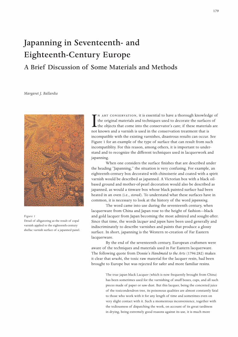
not known and a varnish is used in the conservation treatment that isincompatible with the existing varnishes, disastrous results can occur. SeeFigure 1 for an example of the type of surface that can result from suchincompatiblity. For this reason, among others, it is important to under-stand and to recognize the different techniques used in lacquerwork andjapanning.
When one considers the surface finishes that are described underthe heading “Japanning,” the situation is very confusing. For example, aneighteenth-century box decorated with chinoiserie and coated with a spiritvarnish would be described as japanned. A Victorian box with a black oil-based ground and mother-of-pearl decoration would also be described asjapanned, as would a tinware box whose black painted surface had beenheated in an oven (i.e., stoved). To understand what these surfaces have incommon, it is necessary to look at the history of the word japanning.
The word came into use during the seventeenth century, whenlacquerware from China and Japan rose to the height of fashion—blackand gold lacquer from Japan becoming the most admired and sought-after.Since that time, the words lacquer and japan have been used generally andindiscriminately to describe varnishes and paints that produce a glossysurface. In short, japanning is the Western re-creation of Far Easternlacquerware.
By the end of the seventeenth century, European craftsmen wereaware of the techniques and materials used in Far Eastern lacquerware.The following quote from Dossie’s Handmaid to the Arts (1796:282) makesit clear that urushi, the toxic raw material for the lacquer resin, had beenbrought to Europe but was rejected for safer and more familiar resins.
The true japan black Lacquer (which is now frequently brought from China)
has been sometimes used for the varnishing of snuff boxes, cups, and all such
pieces made of paper or saw-dust. But this lacquer, being the concreted juice
of the toxicondendron tree, its poisonous qualities are almost constantly fatal
to those who work with it for any length of time and sometimes even on
very slight contact with it. Such a momentous inconvenience, together with
the tediousness of dispatching the work, on account of its great tardiness
in drying, being extremely good reasons against its use, it is much more
Japanning in Seventeenth- and Eighteenth-Century EuropeA Brief Discussion of Some Materials and Methods
Margaret J. Ballardie
Figure 1
Detail of alligatoring as the result of copal
varnish applied to the eighteenth-century
shellac varnish surface of a japanned panel.
advisable to employ the common kind of varnish, which when managed judi-
ciously, may be rendered nearly both as beautiful and durable, without either
the danger or the difficulty attending the other.
Dossie incorrectly reports that urushi comes from Rhus toxicoden-dron, a sumac tree, and is fatal; in fact, it is extracted from another sumac,Rhus verniciflua, which can induce a serious rash that may require hospitaltreatment. However, his rejection of urushi for its difficult drying require-ments correctly pinpoints why it was not widely adopted. Indeed, crafts-men of the period experimented with familiar materials, such as resins, aswell as the more recently imported shellacs from India, in attempts toduplicate the look of oriental lacquerware. Eventually they discovered thatby building up layers of clear varnish over a colored ground—or incorpo-rating designs such as Chinese figures, fanciful animals, and flower formswithin the layers of varnish (using gold or other metal powders)—theycould create surfaces similar in appearance to those of genuine orientallacquer panels.
In many European countries, publications appeared that describedthe techniques, materials, and designs used to re-create the fashionableChinese-influenced decorations of what came to be known as chinoiserie;of these, A Treatise of Japaning and Varnishing by John Stalker and GeorgeParker (1688) is probably the best known. Because it was written for ama-teurs, the instructions are concise, though often buried in flowery asides,as the following example illustrates (Stalker and Parker 1971:16):
Lay all your Colours and Blacks exquisitely even and smooth; and where ever
mole-hills and knobs, asperities and roughness in colours or varnish offer to
appear, with your Rush sweep them off, and tell them their room is more
acceptable to you than their company. If this ill usage will not terrifie them,
or make them avoid your work, give them no better entertainment than you
did before, but maintain your former severity, and with your Rush whip them
off, as often as they molest you.
Stalker and Parker also include a recipe for “White Varnishing or Japan”(1971:21–23), variations of which appear in other literature. The varnishused for white japan is a mixture of resins they called “Best WhiteVarnish.” If the recipe is reproduced carefully according to the instruc-tions, the result is very attractive, with the translucent look of ivory.Throughout the process, the secret of success is to allow plenty of dryingtime between layers and to keep the layers very smooth.
Note that the format of the following recipes1 and directions(Stalker and Parker 1971:10–11) has been reorganized for clarity.
White Varnishing or Japan
Ingredients
1 oz. [31.1 g] isinglass dissolved in 30 oz. [852.36 ml] water, to produce
isinglass size
Flake white (lead white)
Potato starch, cooked in water to thin paste (1 oz. [31.1 g] starch to l pt.
[568.26 ml] water)2
Best White Varnish (see recipe below)
White Japan
180 Bal la rd i e
Application
• Gesso ground: Mix 20 oz. [568.26 ml] isinglass size with whiting to the
consistency of light cream. Apply three coats. When dry, rub back the
surface until very smooth.
• Flake white layer: Mix remaining 10 oz. [284.12 ml] isinglass size with
flake white. Apply at least three coats. When dry, smooth the surface
gently.
• Starch layer: Apply two coats.
• Best White Varnish layers: Apply up to twelve coats.3
Best White Varnish
Ingredients
Stalker and Parker Adaptation by the author
1 lb. Gum Sandrick 1 lb. (454 g) sandarac
1 oz. Gum Mastic 1 oz. (28.5 g) mastic
3 oz. Venice Turpentine 3 oz. (87 ml) Venice turpentine
11⁄2 oz. Gum-Capal 11⁄2 oz. (42.5 g) copal1⁄2 oz. Gum-Elemni 1⁄2 oz. (14 g) elemi1⁄2 oz. Gum-Benzion or Benjamin 1⁄2 oz. (14 g) benzoin
11⁄2 oz. Gum Animae 1 oz. (28.5 g) copal (substituted)1⁄2 oz. White Rosine 1⁄2 oz. (14 g) rosin
Preparation
In separate glass containers, dissolve the following groups of resins in the
volumes of alcohol indicated:
copal and resin 10 fl. oz. (290 ml) alcohol
benzoin and Venice turpentine 10 fl. oz. (290 ml) alcohol
sandarac and mastic 30 fl. oz. (870 ml) alcohol
elemi 5 fl. oz. (145 ml) alcohol
After the resins have dissolved completely (about twelve hours), filter the
solution and mix carefully together. Note
a The author found that six layers proved sufficient.
b The original solvent was “spirits of wine.”
Two further versions of the white japan recipe may be foundin the eighteenth-century literature. Although one—in the PolygraphicDictionary (1735), under the heading “Japan”—is almost identical to thatof Stalker and Parker, the second—in Dossie’s Handmaid to the Arts(1796:314)—shows significant differences. Dossie maintains that the ges-soed ground should not be applied because it causes the japanned groundto “crack and fly off in flakes.” Applied in its place is a layer of “clear-coat”or a “clear-col,” which is a hot size with the addition of a small amountof whiting. When dry, it is rubbed smooth and, although it fills only thepores of the wood, can produce an excellent surface. Following Dossie’sdirections, the flake white and the starch mentioned in the white japanrecipe are mixed together while dry and bound with mastic varnish.Then, what is now virtually a paint is applied in thin layers; once theseare absolutely dry, the surface is gently rubbed smooth.
It is important to note that the Best White Varnish was, in fact,not white or colorless; the resulting layers tended to be pale ochre orumber, and they darkened over time. These white japan surfaces wereoften decorated with designs inspired by Chinese porcelain and were
181J S - E -C E
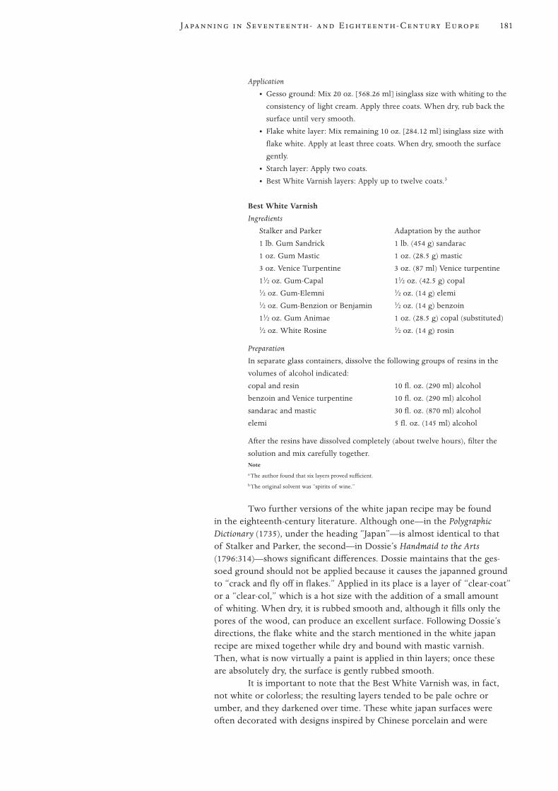
painted with pigments bound in gum arabic. The surface then would befinished in layers of pale shellac rubbed smooth, and polished with a mix-ture of oil and rottenstone (Fig. 2).
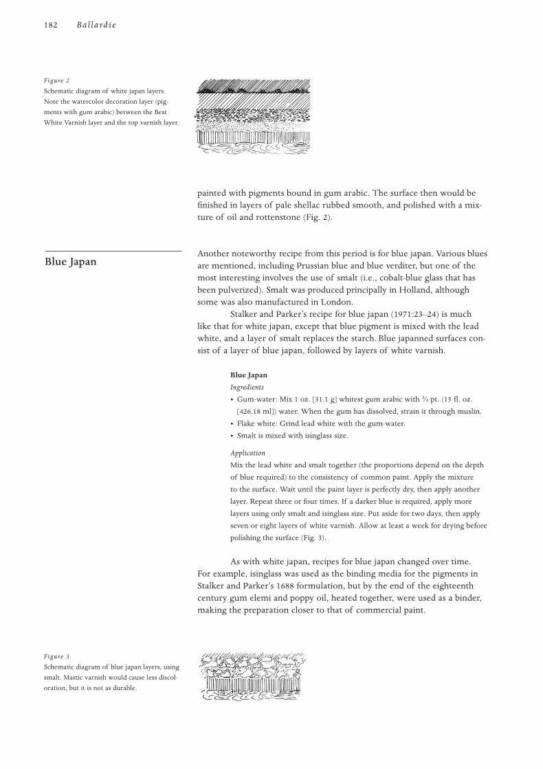
Another noteworthy recipe from this period is for blue japan. Various bluesare mentioned, including Prussian blue and blue verditer, but one of themost interesting involves the use of smalt (i.e., cobalt-blue glass that hasbeen pulverized). Smalt was produced principally in Holland, althoughsome was also manufactured in London.
Stalker and Parker’s recipe for blue japan (1971:23–24) is muchlike that for white japan, except that blue pigment is mixed with the leadwhite, and a layer of smalt replaces the starch. Blue japanned surfaces con-sist of a layer of blue japan, followed by layers of white varnish.
Blue Japan
Ingredients
• Gum-water: Mix 1 oz. [31.1 g] whitest gum arabic with 3⁄4 pt. (15 fl. oz.
[426.18 ml]) water. When the gum has dissolved, strain it through muslin.
• Flake white: Grind lead white with the gum-water.
• Smalt is mixed with isinglass size.
Application
Mix the lead white and smalt together (the proportions depend on the depth
of blue required) to the consistency of common paint. Apply the mixture
to the surface. Wait until the paint layer is perfectly dry, then apply another
layer. Repeat three or four times. If a darker blue is required, apply more
layers using only smalt and isinglass size. Put aside for two days, then apply
seven or eight layers of white varnish. Allow at least a week for drying before
polishing the surface (Fig. 3).
As with white japan, recipes for blue japan changed over time.For example, isinglass was used as the binding media for the pigments inStalker and Parker’s 1688 formulation, but by the end of the eighteenthcentury gum elemi and poppy oil, heated together, were used as a binder,making the preparation closer to that of commercial paint.
Blue Japan
182 Bal la rd i e
Figure 2
Schematic diagram of white japan layers.
Note the watercolor decoration layer (pig-
ments with gum arabic) between the Best
White Varnish layer and the top varnish layer.
Figure 3
Schematic diagram of blue japan layers, using
smalt. Mastic varnish would cause less discol-
oration, but it is not as durable.
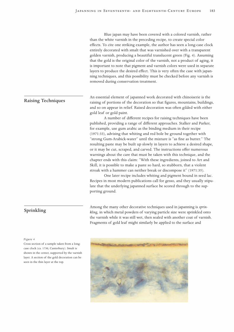
Blue japan may have been covered with a colored varnish, ratherthan the white varnish in the preceding recipe, to create special coloreffects. To cite one striking example, the author has seen a long-case clockentirely decorated with smalt that was varnished over with a transparentgolden varnish, producing a beautiful translucent green (Fig. 4). Assumingthat the gold is the original color of the varnish, not a product of aging, itis important to note that pigment and varnish colors were used in separatelayers to produce the desired effect. This is very often the case with japan-ning techniques, and this possibility must be checked before any varnish isremoved during conservation treatment.
An essential element of japanned work decorated with chinoiserie is theraising of portions of the decoration so that figures, mountains, buildings,and so on appear in relief. Raised decoration was often gilded with eithergold leaf or gold paint.
A number of different recipes for raising techniques have beenpublished, providing a range of different approaches. Stalker and Parker,for example, use gum arabic as the binding medium in their recipe(1971:33), advising that whiting and red bole be ground together with“strong Gum-Arabick-water” until the mixture is “as fine as butter.” Theresulting paste may be built up slowly in layers to achieve a desired shape,or it may be cut, scraped, and carved. The instructions offer numerouswarnings about the care that must be taken with this technique, and thechapter ends with this claim: “With these ingredients, joined to Art andSkill, it is possible to make a paste so hard, so stubborn, that a violentstroak with a hammer can neither break or discompose it” (1971:35).
One later recipe includes whiting and pigment bound in seed lac.Recipes in most modern publications call for gesso, and they usually stipu-late that the underlying japanned surface be scored through to the sup-porting ground.
Among the many other decorative techniques used in japanning is sprin-kling, in which metal powders of varying particle size were sprinkled ontothe varnish while it was still wet, then sealed with another coat of varnish.Fragments of gold leaf might similarly be applied to the surface and
Sprinkling
Raising Techniques
183J S - E -C E
Figure 4
Cross section of a sample taken from a long-
case clock (ca. 1730, Canterbury). Smalt is
shown in the center, supported by the varnish
layer. A section of the gold decoration can be
seen in the thin layer at the top.
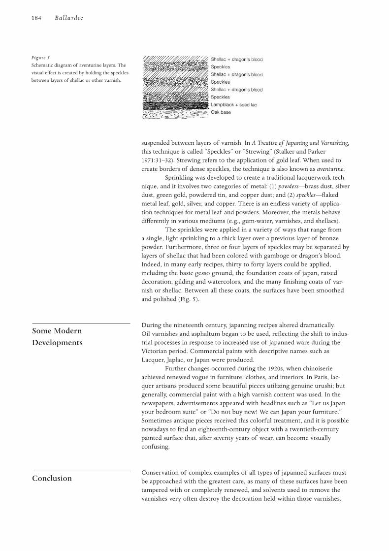
suspended between layers of varnish. In A Treatise of Japaning and Varnishing,this technique is called “Speckles” or “Strewing” (Stalker and Parker1971:31–32). Strewing refers to the application of gold leaf. When used tocreate borders of dense speckles, the technique is also known as aventurine.
Sprinkling was developed to create a traditional lacquerwork tech-nique, and it involves two categories of metal: (1) powders—brass dust, silverdust, green gold, powdered tin, and copper dust; and (2) speckles—flakedmetal leaf, gold, silver, and copper. There is an endless variety of applica-tion techniques for metal leaf and powders. Moreover, the metals behavedifferently in various mediums (e.g., gum-water, varnishes, and shellacs).
The sprinkles were applied in a variety of ways that range froma single, light sprinkling to a thick layer over a previous layer of bronzepowder. Furthermore, three or four layers of speckles may be separated bylayers of shellac that had been colored with gamboge or dragon’s blood.Indeed, in many early recipes, thirty to forty layers could be applied,including the basic gesso ground, the foundation coats of japan, raiseddecoration, gilding and watercolors, and the many finishing coats of var-nish or shellac. Between all these coats, the surfaces have been smoothedand polished (Fig. 5).
During the nineteenth century, japanning recipes altered dramatically.Oil varnishes and asphaltum began to be used, reflecting the shift to indus-trial processes in response to increased use of japanned ware during theVictorian period. Commercial paints with descriptive names such asLacquer, Japlac, or Japan were produced.
Further changes occurred during the 1920s, when chinoiserieachieved renewed vogue in furniture, clothes, and interiors. In Paris, lac-quer artisans produced some beautiful pieces utilizing genuine urushi; butgenerally, commercial paint with a high varnish content was used. In thenewspapers, advertisements appeared with headlines such as “Let us Japanyour bedroom suite” or “Do not buy new! We can Japan your furniture.”Sometimes antique pieces received this colorful treatment, and it is possiblenowadays to find an eighteenth-century object with a twentieth-centurypainted surface that, after seventy years of wear, can become visuallyconfusing.
Conservation of complex examples of all types of japanned surfaces mustbe approached with the greatest care, as many of these surfaces have beentampered with or completely renewed, and solvents used to remove thevarnishes very often destroy the decoration held within those varnishes.
Conclusion
Some ModernDevelopments
184 Bal la rd i e
Figure 5
Schematic diagram of aventurine layers. The
visual effect is created by holding the speckles
between layers of shellac or other varnish.
For example, shellac varnishes are often very difficult to treat with sol-vents, as they readily absorb the solvent, and the result may be that sud-denly the entire layer dissolves. Another important consideration is thatthe seventeenth- and eighteenth-century varnishes were not clear andcolorless; although desired, such varnishes were then unobtainable.
Very few articles have been written on conservation of japannedobjects. Activities of the ICOM Interim Lacquer Group3 address FarEastern lacquer, as well as Western lacquering techniques (i.e., japanning);however, those of us in the group are a small minority in the vast conser-vation field.
1 Measurements are given in British imperial units and converted to metric.
2 The author was advised that potato starch was the starch most likely used in seventeenth-
century Europe.
3 The Interim Lacquer Group is part of the Furniture and Lacquer Working Group of the
ICOM Committee for Conservation.
Dossie, Robert
1796 The Handmaid to the Arts. 2d ed. London: J. Nourse Bookseller.
Polygraphic Dictionary
1735 London: Hitch and Davis.
Stalker, John, and George Parker
1971 A Treatise of Japaning and Varnishing. 1688. Reprint, London: Alec Tiranti.
References
Notes
185J S - E -C E
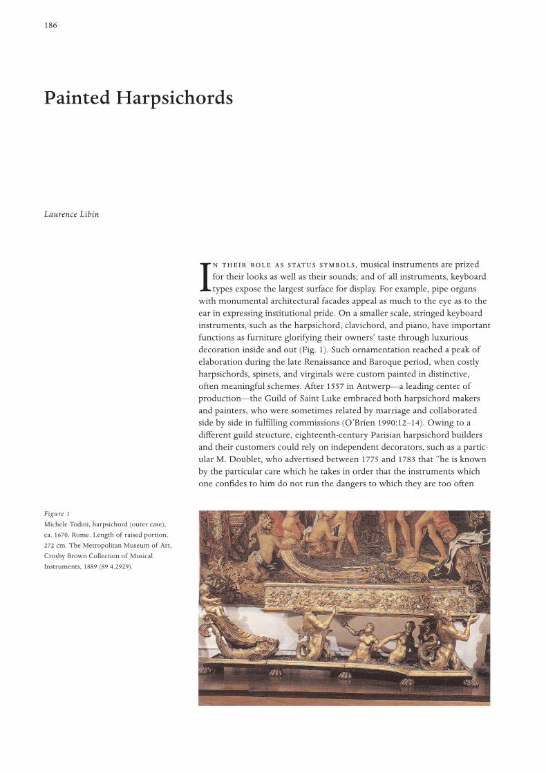
186
I , musical instruments are prizedfor their looks as well as their sounds; and of all instruments, keyboardtypes expose the largest surface for display. For example, pipe organs
with monumental architectural facades appeal as much to the eye as to theear in expressing institutional pride. On a smaller scale, stringed keyboardinstruments, such as the harpsichord, clavichord, and piano, have importantfunctions as furniture glorifying their owners’ taste through luxuriousdecoration inside and out (Fig. 1). Such ornamentation reached a peak ofelaboration during the late Renaissance and Baroque period, when costlyharpsichords, spinets, and virginals were custom painted in distinctive,often meaningful schemes. After 1557 in Antwerp—a leading center ofproduction—the Guild of Saint Luke embraced both harpsichord makersand painters, who were sometimes related by marriage and collaboratedside by side in fulfilling commissions (O’Brien 1990:12–14). Owing to adifferent guild structure, eighteenth-century Parisian harpsichord buildersand their customers could rely on independent decorators, such as a partic-ular M. Doublet, who advertised between 1775 and 1783 that “he is knownby the particular care which he takes in order that the instruments whichone confides to him do not run the dangers to which they are too often
Painted Harpsichords
Laurence Libin
Figure 1
Michele Todini, harpsichord (outer case),
ca. 1670, Rome. Length of raised portion,
272 cm. The Metropolitan Museum of Art,
Crosby Brown Collection of Musical
Instruments, 1889 (89.4.2929).
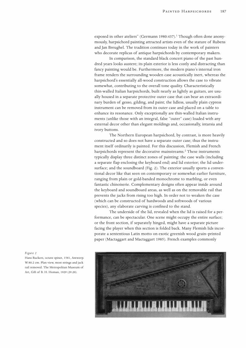
exposed in other ateliers” (Germann 1980:437).1 Though often done anony-mously, harpsichord painting attracted artists even of the stature of Rubensand Jan Breughel. The tradition continues today in the work of painterswho decorate replicas of antique harpsichords by contemporary makers.
In comparison, the standard black concert piano of the past hun-dred years looks austere; its plain exterior is less costly and distracting thanfancy painting would be. Furthermore, the modern piano’s internal ironframe renders the surrounding wooden case acoustically inert, whereas theharpsichord’s essentially all-wood construction allows the case to vibratesomewhat, contributing to the overall tone quality. Characteristically thin-walled Italian harpsichords, built nearly as lightly as guitars, are usu-ally housed in a separate protective outer case that can bear an extraordi-nary burden of gesso, gilding, and paint; the lidless, usually plain cypressinstrument can be removed from its outer case and placed on a table toenhance its resonance. Only exceptionally are thin-walled Italian instru-ments (unlike those with an integral, false “outer” case) loaded with anyexternal decor other than elegant moldings and, occasionally, intarsia andivory buttons.
The Northern European harpsichord, by contrast, is more heavilyconstructed and so does not have a separate outer case; thus the instru-ment itself ordinarily is painted. For this discussion, Flemish and Frenchharpsichords represent the decorative mainstreams.2 These instrumentstypically display three distinct zones of painting: the case walls (includinga separate flap enclosing the keyboard end) and lid exterior; the lid under-surface; and the soundboard (Fig. 2). The exterior usually sports a conven-tional decor like that seen on contemporary or somewhat earlier furniture,ranging from plain or gold-banded monochrome to marbling, or evenfantastic chinoiserie. Complementary designs often appear inside aroundthe keyboard and soundboard areas, as well as on the removable rail thatprevents the jacks from rising too high. In order not to weaken the case(which can be constructed of hardwoods and softwoods of variousspecies), any elaborate carving is confined to the stand.
The underside of the lid, revealed when the lid is raised for a per-formance, can be spectacular. One scene might occupy the entire surface;or the front section, if separately hinged, might have a separate picturefacing the player when this section is folded back. Many Flemish lids incor-porate a sententious Latin motto on exotic greenish wood grain–printedpaper (Mactaggart and Mactaggart 1985). French examples commonly
187P H
Figure 2
Hans Ruckers, octave spinet, 1581, Antwerp.
W:80.2 cm. Plan view, most strings and jack
rail removed. The Metropolitan Museum of
Art, Gift of B. H. Homan, 1929 (29.20).
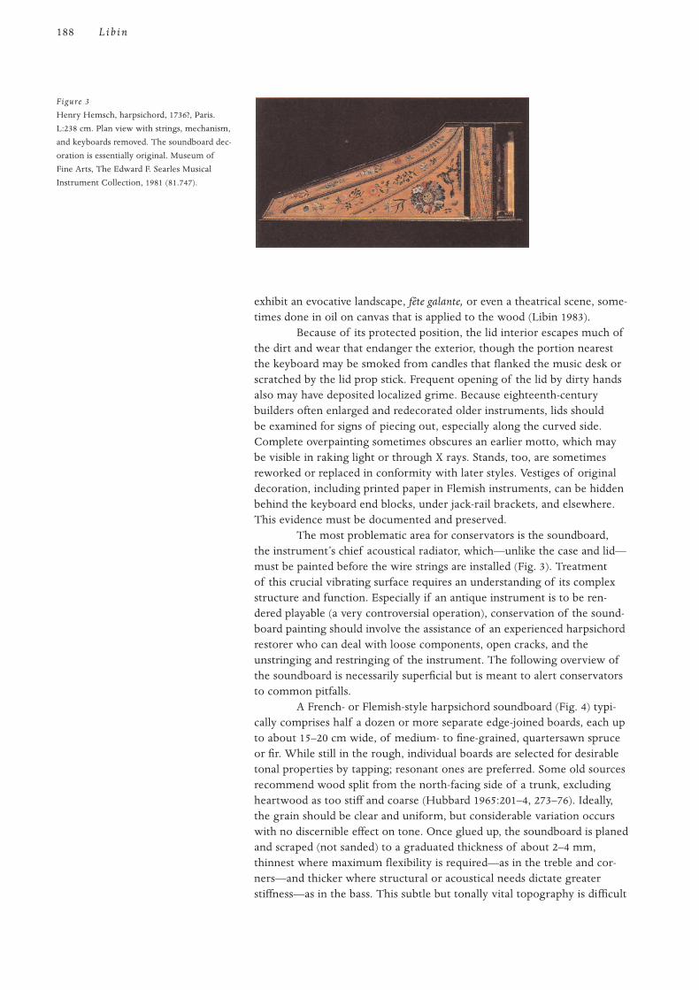
exhibit an evocative landscape, fête galante, or even a theatrical scene, some-times done in oil on canvas that is applied to the wood (Libin 1983).
Because of its protected position, the lid interior escapes much ofthe dirt and wear that endanger the exterior, though the portion nearestthe keyboard may be smoked from candles that flanked the music desk orscratched by the lid prop stick. Frequent opening of the lid by dirty handsalso may have deposited localized grime. Because eighteenth-centurybuilders often enlarged and redecorated older instruments, lids shouldbe examined for signs of piecing out, especially along the curved side.Complete overpainting sometimes obscures an earlier motto, which maybe visible in raking light or through X rays. Stands, too, are sometimesreworked or replaced in conformity with later styles. Vestiges of originaldecoration, including printed paper in Flemish instruments, can be hiddenbehind the keyboard end blocks, under jack-rail brackets, and elsewhere.This evidence must be documented and preserved.
The most problematic area for conservators is the soundboard,the instrument’s chief acoustical radiator, which—unlike the case and lid—must be painted before the wire strings are installed (Fig. 3). Treatmentof this crucial vibrating surface requires an understanding of its complexstructure and function. Especially if an antique instrument is to be ren-dered playable (a very controversial operation), conservation of the sound-board painting should involve the assistance of an experienced harpsichordrestorer who can deal with loose components, open cracks, and theunstringing and restringing of the instrument. The following overview ofthe soundboard is necessarily superficial but is meant to alert conservatorsto common pitfalls.
A French- or Flemish-style harpsichord soundboard (Fig. 4) typi-cally comprises half a dozen or more separate edge-joined boards, each upto about 15–20 cm wide, of medium- to fine-grained, quartersawn spruceor fir. While still in the rough, individual boards are selected for desirabletonal properties by tapping; resonant ones are preferred. Some old sourcesrecommend wood split from the north-facing side of a trunk, excludingheartwood as too stiff and coarse (Hubbard 1965:201–4, 273–76). Ideally,the grain should be clear and uniform, but considerable variation occurswith no discernible effect on tone. Once glued up, the soundboard is planedand scraped (not sanded) to a graduated thickness of about 2–4 mm,thinnest where maximum flexibility is required—as in the treble and cor-ners—and thicker where structural or acoustical needs dictate greaterstiffness—as in the bass. This subtle but tonally vital topography is difficult
188 Lib in
Figure 3
Henry Hemsch, harpsichord, 1736?, Paris.
L:238 cm. Plan view with strings, mechanism,
and keyboards removed. The soundboard dec-
oration is essentially original. Museum of
Fine Arts, The Edward F. Searles Musical
Instrument Collection, 1981 (81.747).

to discern once the soundboard is installed, since the enclosed bottom ofthe case blocks access for measurement. Removing an intact bottomshould be avoided.
Various structures are applied to the soundboard before its instal-lation, commonly in dry winter weather. These include the thin, curvedhardwood bridge, which bears the strings and conducts their vibration tothe soundboard; and the ribs and transverse cut-off bar, which reinforcethe soundboard from beneath and help define its vibrating modes (Fig. 5)(Kottick 1985). The shape, mass, and placement of these elements criti-cally affect the soundboard’s elasticity and nodal lines, and hence theinstrument’s tone. The ribs, which transect the soundboard’s grain, mustbe strong enough to inhibit its tendency to warp and crack yet light andflexible enough not to damp vibration. The heavier, more rigid transversecut-off bar prevents excessive deformation of the soundboard forward ofthe bridge and, in so doing, isolates a triangular portion of the soundboardsurrounding the sound hole.
To provide tonal and dynamic variety, most harpsichords havetwo or three sets of strings, commonly including one set roughly half thelength of the other(s) and pitched an octave higher. These higher, so-calledfour-foot strings pass over a separate bridge and hitch onto pins embeddedthrough the soundboard into a stiff rail attached beneath. The four-foothitch-pin rail acts like the cut-off bar to further define the vibrating areaaround the bridges. The longer, so-called eight-foot strings hitch to pinsin an elevated rail that edges the soundboard along the curved side andangled tail; this hitch-pin rail and corresponding molding along thestraight side or spine help secure the soundboard to liners beneath. Thefront edge of the soundboard fastens to the belly rail, of which the insidetop edge may be partly cut away in the extreme treble to afford morevibrating area.
Obviously, correct stringing and string tension are fundamental totone quality and duration, but these factors leave the maker’s control oncean instrument is sold. A common defect in harpsichords that have beentoo heavily strung or pitched too high is wavy distortion of the sound-board caused by its sinking under the bridges and pulling up over the four-foot hitch-pin rail; this action simultaneously exerts excessive compressionand tension on different areas of the soundboard. In extreme cases, suchdistortion causes the four-foot strings to buzz against the soundboard. Thisdefect will not ordinarily correct itself, even if an instrument is properlyrestrung or even unstrung altogether. Bad as this seems, trying to remove
189P H
Figure 4
Louis Bellot, harpsichord, 1742, Paris. L:238.7
cm. Plan view with strings, tuning pins, key-
board, mechanism and bottom removed. The
Metropolitan Museum of Art, Crosby Brown
Collection of Musical Instruments, 1889
(89.4.1218).
Figure 5
Louis Bellot, harpsichord, as in Fig. 4. Bottom
view showing soundboard ribbing, transverse
cut-off bar, four-foot hitch-pin rail, and traces
of previous alterations.
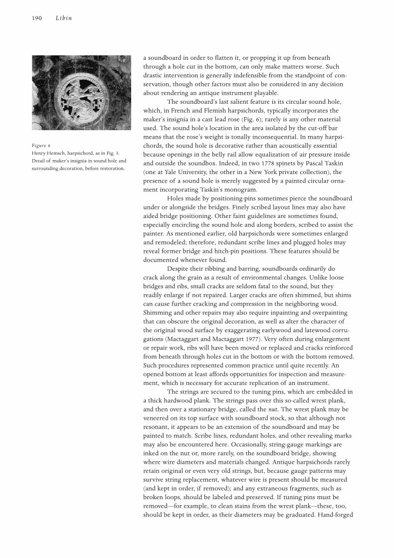
a soundboard in order to flatten it, or propping it up from beneaththrough a hole cut in the bottom, can only make matters worse. Suchdrastic intervention is generally indefensible from the standpoint of con-servation, though other factors must also be considered in any decisionabout rendering an antique instrument playable.
The soundboard’s last salient feature is its circular sound hole,which, in French and Flemish harpsichords, typically incorporates themaker’s insignia in a cast lead rose (Fig. 6); rarely is any other materialused. The sound hole’s location in the area isolated by the cut-off barmeans that the rose’s weight is tonally inconsequential. In many harpsi-chords, the sound hole is decorative rather than acoustically essentialbecause openings in the belly rail allow equalization of air pressure insideand outside the soundbox. Indeed, in two 1778 spinets by Pascal Taskin(one at Yale University, the other in a New York private collection), thepresence of a sound hole is merely suggested by a painted circular orna-ment incorporating Taskin’s monogram.
Holes made by positioning-pins sometimes pierce the soundboardunder or alongside the bridges. Finely scribed layout lines may also haveaided bridge positioning. Other faint guidelines are sometimes found,especially encircling the sound hole and along borders, scribed to assist thepainter. As mentioned earlier, old harpsichords were sometimes enlargedand remodeled; therefore, redundant scribe lines and plugged holes mayreveal former bridge and hitch-pin positions. These features should bedocumented whenever found.
Despite their ribbing and barring, soundboards ordinarily docrack along the grain as a result of environmental changes. Unlike loosebridges and ribs, small cracks are seldom fatal to the sound, but theyreadily enlarge if not repaired. Larger cracks are often shimmed, but shimscan cause further cracking and compression in the neighboring wood.Shimming and other repairs may also require inpainting and overpaintingthat can obscure the original decoration, as well as alter the character ofthe original wood surface by exaggerating earlywood and latewood corru-gations (Mactaggart and Mactaggart 1977). Very often during enlargementor repair work, ribs will have been moved or replaced and cracks reinforcedfrom beneath through holes cut in the bottom or with the bottom removed.Such procedures represented common practice until quite recently. Anopened bottom at least affords opportunities for inspection and measure-ment, which is necessary for accurate replication of an instrument.
The strings are secured to the tuning pins, which are embedded ina thick hardwood plank. The strings pass over this so-called wrest plank,and then over a stationary bridge, called the nut. The wrest plank may beveneered on its top surface with soundboard stock, so that although notresonant, it appears to be an extension of the soundboard and may bepainted to match. Scribe lines, redundant holes, and other revealing marksmay also be encountered here. Occasionally, string-gauge markings areinked on the nut or, more rarely, on the soundboard bridge, showingwhere wire diameters and materials changed. Antique harpsichords rarelyretain original or even very old strings, but, because gauge patterns maysurvive string replacement, whatever wire is present should be measured(and kept in order, if removed); and any extraneous fragments, such asbroken loops, should be labeled and preserved. If tuning pins must beremoved—for example, to clean stains from the wrest plank—these, too,should be kept in order, as their diameters may be graduated. Hand-forged
190 Lib in
Figure 6
Henry Hemsch, harpsichord, as in Fig. 3.
Detail of maker’s insignia in sound hole and
surrounding decoration, before restoration.
tuning pins often have rough surfaces, and their flattened tops may beunexpectedly soft or brittle; they must be extracted cautiously with asnugly fitting socket wrench called a tuning hammer, which may have to bespecially fabricated.
Unlike the exposed surface of a violin, a soundboard is not meantto be handled, and therefore, as a rule, protective varnish does not appearas an original feature of Northern European (excluding English) instru-ments. Although several eighteenth-century sources describe soundboardvarnish, even stating that it improves sound, this idea may be fanciful(Hubbard 1965:216, 219–20). At most, the builder might have primed theupper surface with a light coat of (preferably dewaxed) shellac, gum ara-bic, gum senegal, or dilute glue before delivering the unstrung instrumentto the soundboard painter, who might prefer to size just the areas to bepainted in order to keep the colors from bleeding. Due to differential dark-ening over time, any spot sizing not covered by paint, or old spot varnish-ing over the design, might now show up as an unintended halo around thedecoration. Varnish over an entire soundboard painting is probably a lateraddition. Varnished bridges are particularly suspect; the coating can grabthe strings, making tuning difficult, and can prevent firm string bearingagainst the bridge and pins. However, the acoustical effects of soundboardvarnishing have not received scientific study, and the inherent risks ofremoval might outweigh potential benefits.
In the traditions under review, soundboard paintings usuallyinvolve two kinds of design elements: (1) multicolored flowers, leaves,fruits, and small fauna—such as birds and bugs—painted in flat gouache ina water-soluble binder, such as gum arabic (not in egg tempera, as is oftenstated [Mactaggart and Mactaggart 1979:60]); and (2) curvilinear blue bor-ders and arabesques, typically somewhat three-dimensional and containingsmalt. Borders and arabesques were likely executed first, then an opulentfloral ring around the rose, followed by the rest of the design, whichmight have been laid out first in chalk, with care taken in placement tocover blemishes in the wood. If, as Sheridan Germann suggests, the painterused mussel shells as containers for small quantities of paint, it would havebeen hard to keep the unused paint wet for long, hence the painter wouldprobably try to use as much of one color as possible at one time with littleblending: all the blue first (for borders and arabesques), then all the red,yellow, and so on. In contrast to lid paintings, the soundboard palette waslimited and work went quickly (Germann 1980:445, 447).3
Individual soundboard painters can often be characterized by theirdesign vocabularies and techniques, as these tend to remain consistentamong soundboards from the same painter, who may have worked forseveral builders over decades. Printed herbals and similar pattern booksprovided models for certain forms, some of which seem to have beensymbolic. Conventional images of resurrection—for example, a moth ora dead trunk sprouting new leaves—are not uncommon, though theirsignificance might be lost on most viewers (Fig. 7). Placement of cherriesnext to a cherrywood bridge, or of an insect near a woodworm hole, sug-gests a visual pun. In general, seventeenth-century soundboard paintingslook opaque, as though their crowded, rather stiff, self-contained, andflatly rendered flowers were applied as découpage; occasional whiteunderpainting reinforces this effect (Germann 1980:453). Except when imi-tating this style, as on an enlarged or faked Flemish soundboard, laterFrench soundboard painting typically looks more energetic, integrated,
191P H

and transparent—sometimes to the extent of revealing the underlyingwood (Germann 1994).
Because of its delicacy and tendency to bleed, such water-basedpaint preferably might be cleaned by dry methods without much rubbing.Liquids can raise the early growth grain of wood, which has been com-pressed by scraping, and thus alter the character of the original surface.Solvents can have unanticipated effects on resins in the wood, and thepossible acoustical effects of solvent penetration in soundboards have notbeen studied.
In the past, restorers often overpainted worn areas of decorationand altered the size and location of painted elements to cover soundboardrepairs; for example, a leaf or the feathers of a bird might have been elon-gated to cover a shim. Shims and patches reflect light differently fromtheir surroundings if the grain of the wood is not properly oriented, andsanded wood accepts paint differently from scraped wood. To hide suchdiscrepancies, inexpert soundboard repairs often involve wholesale stain-ing and varnishing, which, like bad overpainting, can be reduced orremoved if technically feasible and aesthetically necessary. Any such inter-vention must be considered in relation to conservation of the wholeinstrument—whether returning it to its presumed original state or to alater state, to which some past alterations might be integral. The interven-tion must also be considered in light of the instrument’s significance andintended function.4
The author thanks Walter Burr and Berta Burr, Sheridan Germann,Pamela Gladding, Grant O’Brien, and A. Hardy Schlick for valuable adviceand suggestions.
1 See also Germann 1981.
2 For a historical outline of various schools of harpsichord making and for further explanation
of technical terms, see Hubbard 1965.
3 See also Germann and Odell 1978.
4 A fuller discussion of the conservation issues raised in this article can be found in Barclay 1993.
Notes
Acknowledgments
192 Lib in
Figure 7
Henry Hemsch, harpsichord, as in Fig. 3.
Detail of soundboard painting adjoining
bridges and four-foot hitch pins, before
restoration.
Barclay, R., ed.
1993 Recommendations for Conservation of Musical Instruments: An Annotated Bibliography.
Comité International des Musées et Collections d’Instruments de Musique Publications
No. 1. Paris: International Council of Museums.
Germann, S.
1980 Monsieur Doublet and his confreres: The harpsichord decorators of Paris, 1. Early
Music 8(4):435–53.
1981 Monsieur Doublet and his confreres: The harpsichord decorators of Paris, 2. Early
Music 9(2):192–212.
1994 The dance of flowers: The expression of gesture and energy in 18th-century French
harpsichord decoration. Midwestern Historical Keyboard Society Newsletter 9(1):6–7.
Germann, S., and S. Odell
1978 Pleasing to eye and ear alike—The Jean Mari Dedeban harpsichord of 1770. In The
William A. Clark Collection, 96–104. Exhibition catalogue. Washington, D.C.: Corcoran
Gallery of Art.
Hubbard, F.
1965 Three Centuries of Harpsichord Making. Cambridge, Mass.: Harvard University Press.
Kottick, E. L.
1985 The acoustics of the harpsichord: Response curves and modes of vibration. Galpin
Society Journal 38:55–77.
Libin, L.
1983 A rediscovered portrayal of Rameau and Castor et Pollux. Early Music 11(4):510–13.
Mactaggart, A., and P. Mactaggart
1977 Some problems encountered in cleaning two harpsichord soundboards. Studies in
Conservation 22(2):73–84.
1979 Tempera and decorated keyboard instruments. Galpin Society Journal 32:59–65.
1985 The colour of Ruckers lid papers. Galpin Society Journal 38:106–11.
O’Brien, G.
1990 Ruckers: A Harpsichord and Virginal Building Tradition. Cambridge: Cambridge
University Press.
References
193P H

194
T in New York has in its col-lection of American furniture a particularly strong representationof case pieces from the early decades of the eighteenth century
that are ornamented with decorative painting—a total of fifteen examplesfrom New York and New England. In conjunction with research for a col-lection catalogue of early Colonial furniture, these objects became thefocus of a special project to investigate the technical aspects of the paint-ing, an area largely unexplored in the study of such furniture. The authorfelt that a knowledge of the materials and methods used in the decorationwas essential for a better understanding of these pieces. One aim was todetermine as closely as possible the original appearance of the painted sur-faces, which we see today in a more or less deteriorated and altered state.Another aim was to learn to what extent ornamentation belonging to vari-ous distinct stylistic groups differed in the paint and techniques used.
Furniture decorated solely or primarily with ornamental painting,which in most instances featured floral designs, first appeared in Americaaround the turn of the eighteenth century. At that time, pieces withcarved or applied decoration in the Mannerist style were being outmodedby furniture in the newer, early Baroque fashion. On seventeenth-centuryMannerist furniture, paint formed only part of the decorative scheme; itwas applied selectively to distinguish particular elements of the carved orapplied ornament. Thus, furniture with floral painting was novel, and itappears to have had great appeal as a colorful, cheaper alternative to highstyle, early Baroque japanned or veneered pieces.
The most elaborate decorative scheme of any piece studied is on a chestof four drawers from the Boston area; this piece combines graining withfloral ornamentation that is contained within simulated panels on thedrawers (Fig. 1). With its drawer fronts divided by and built up with deepmitered and beveled moldings, this joined chest of drawers is a late exampleof the Mannerist applied-ornament style as it evolved in and around Boston,after being introduced by London-trained joiners in the 1630s. The lateexpression of that style is indicated by the incorporation of certain newerdesign elements, such as the surrounding of the drawer openings with anapplied astragal molding—a feature that reflects the influence of earlyBaroque case furniture, which was first produced in Boston in the late
A Chest of Drawers fromthe Boston Area
Floral Painting on Early Eighteenth-CenturyAmerican Furniture at The Metropolitan Museum of Art
Frances Gruber Safford

1690s. It is the most elaborate example from a group of more than twentychests of a similar format.1
Design
The painted ornamentation appears to have been influenced by earlyBaroque furniture, with the exception of the undulating vine motif on theshallow drawers, which has a long tradition of usage in the seventeenthcentury and earlier. A striking feature of this newer style is its expanses ofhighly figured veneers. The bright graining on the drawer fronts suggestssuch veneers, although it may be drawing upon an earlier tradition ofsimulating in paint the exotic woods that were favored on Mannerist fur-niture at the highest level of production. Dark semicircles painted on theside panels recall the round or oval figure of so-called oyster shell veneer,unknown on American furniture but found on English pieces of the lastthree decades of the seventeenth century. (Probate inventories indicatethat by the mid-1690s, inlaid furniture was present in New England, whichmeans it must have been imported.) This type of veneer—which is oftenquite light in color, except for its dark figuring—is frequently found onEnglish furniture in conjunction with brightly colored floral marquetry setagainst a dark ground. The decoration on the chest of drawers was appar-ently meant to evoke such fashionable furniture both in its designs and inthe tones of the backgrounds on the drawers.
The three leaves at the base of the painted sprigs may well repre-sent a misunderstood fleur-de-lis, particularly as they are drawn on the topdrawer. Variations in the execution of the sprigs, such as in the shape andnumber of petals in the flowers, suggest that a basic pattern may havebeen drawn or scribed to serve as a general guide, but it was not followedcarefully in the painting. The left and right sides of each of the two centerdrawers are mirror images of one another; the vines on these drawers aresimilar in configuration but vary in decorative detail and color. As thesetwo drawers are structurally interchangeable, both have been in the upperposition; the arrangement originally intended is not entirely certain, but
195F P E E -C A F
Figure 1
Chest of drawers, 1700–1720. H:102 cm.
Massachusetts, Boston area. The proper right
side is partially cleaned. The Metropolitan
Museum of Art, Gift of Mrs. J. Insley Blair,
1948 (48.158.11).
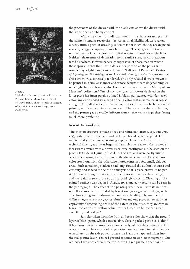
the placement of the drawer with the black vine above the drawer withthe white one is probably correct.
While the vines—a traditional motif—must have formed part ofthe painter’s regular repertoire, the sprigs, in all likelihood, were takendirectly from a print or drawing, as the manner in which they are depictedcertainly suggests copying from a line design. The sprays are entirelyoutlined in black, and colors are applied within the confines of the lines.Neither this manner of delineation nor a similar spray motif is encoun-tered elsewhere. Flowers generally suggestive of those that terminatethese sprigs, in that they have a dark inner portion of the petals sur-rounded by a light band, can be found in Stalker and Parker’s A Treatiseof Japaning and Varnishing (1960:pl. 13 and others), but the flowers on thischest are more distinctively rendered. The only related flowers known tobe painted in a similar manner and whose designs resemble japanning areon a high chest of drawers, also from the Boston area, in the MetropolitanMuseum’s collection.2 One of the two types of flowers depicted on thelatter piece has inner petals outlined in black, punctuated with dashes ofcolor, and surrounded by a band of solid color that in some instances, asin Figure 2, is filled with dots. What connection there may be between thepainting on these two pieces is unknown. There are no other similarities,and the painting is by totally different hands—that on the high chest beingmuch more proficient.
Scientific analysis
The chest of drawers is made of red and white oak (frame, top, and draw-ers), eastern white pine (side and back panels and certain applied ele-ments), and yellow pine (remaining applied elements). At the time thetechnical investigation was begun and samples were taken, the painted sur-faces were covered with a heavy, discolored coating (as can be seen on theproper left side in Figure 1).3 Bold lines of graining were partly visiblewhere the coating was worn thin on the drawers, and specks of intensecolor stood out from the otherwise muted tones in a few small, chippedareas. Such tantalizing evidence had long aroused the author’s interest andcuriosity, and indeed the scientific analysis of this piece proved to be par-ticularly rewarding. It revealed that the decoration under the coating,and overpaint in several areas, was surprisingly colorful. Cleaning of thepainted surfaces was begun in August 1994, and early results can be seen inthe photograph. The effect of this painting when new—with its multicol-ored floral motifs, surrounded by bright orange or green moldings, withall colors strong and fresh—must have been dazzling. The number ofdifferent pigments is the greatest found on any one piece in the study. Inapproximate descending order of the extent of their use, they are carbonblack, iron-earth red, yellow ochre, red lead, lead white, copper green,vermilion, and realgar.4
Samples taken from the front and rear stiles show that the groundlayer of black paint, which contains fine, closely packed particles, is thin.5
It has flowed into the wood pores and closely follows the contours of thewood surface. The same black appears to have been used to paint the pat-tern of arcs on the side panels, where the black overlaps and mixes intothe red ground layer. The red ground contains an iron-earth pigment. Thisred may have once covered the top, as well; a red pigment that has not
196 Saffo rd
Figure 2
High chest of drawers, 1700–25. H:131.4 cm.
Probably Boston, Massachusetts. Detail
of drawer fronts. The Metropolitan Museum
of Art, Gift of Mrs. Russell Sage, 1909
(10.125.709).

been analyzed was detected under magnification in some of the woodpores across the entire surface.
On the top and bottom drawers, iron-earth red, which appearsto be the same as that on the case sides, forms the ground coat of thepanels with the sprig design. It also colors the center plaques holding theescutcheons, and it was used for the graining. Wavy, “trial” brushstrokes ofthis red appear on an unexposed surface of the bottom drawer. Conceivably,they were made just prior to the application of the red wavy lines of grain-ing on the mitered and beveled strips of the two deep drawers. The groundof those bevels is yellow ochre, and the red of the graining mixes into theyellow background layer. The center plaques on the two middle drawerswere also originally yellow ochre, but were later overpainted with red. Trialswirls of yellow ochre were applied to the back of the chest, where theynever received a coating. This indicates that this paint was initially lighterand less brown than it now appears on the drawer fronts. Both the yellowochre and the iron-earth red ground layers are considerably thicker than theblack on the frame. Orange applied moldings mediate between the yellowbeveled strips and the red panels. The orange consists of red lead mixedwith lead white. Because of extensive paint losses, the original brightnessof those moldings is hardly discernible in the photograph.
On the two shallow drawers, the ground of the floral decorationis orange—the same red lead and lead white mixture found on the mold-ings of the deep drawers—and was later overpainted with red. The appliedmoldings surrounding the orange panels are painted with a copper green,possibly verdigris. A cross section shows blue-green particles in a binderthat looks slightly yellow. The green paint—originally strong and bright—has suffered considerable losses and appears almost entirely black. This isdue, in part, to the discoloration of the pigment and binder, but is also dueto the fact that only a few areas of the deteriorated and discolored coatingabove the paint had been removed at that point in the treatment.
In the floral elements, green is employed only for buds and flowercenters in the sprigs on the top and bottom drawers, and for leaves on thebottom drawer. Prior to cleaning, this green was virtually indistinguishablefrom black. The dark lines in the sprigs, the dark vine on a shallow drawer,and the dots on the white vine are black paint; it is similar to the black onthe frame but applied much more thickly. The red decorative accents inboth the sprigs and the vines are vermilion, and the orange ones are real-gar. The realgar must have differed in hue and intensity from the orangemade from red lead and lead white in order to warrant the use of this nox-ious pigment.6
Conclusion
The artisan who decorated the chest of drawers worked with commer-cially available pigments at the basic level of a painter-stainer.7 This personwas adept at graining, and had a good sense of color and design, butmay not have had much practice in rendering flowers. This individualmay or may not have been the joiner who built the piece. The artisan wasengaged in a level of production that in an urban context such as Boston,provided a cheaper, more conservative alternative to fashionable veneered,inlaid, or japanned pieces, and in a rural environment might have been themost stylish available.
197F P E E -C A F
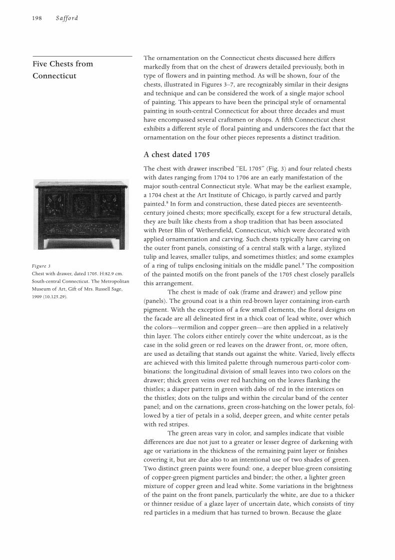
The ornamentation on the Connecticut chests discussed here differsmarkedly from that on the chest of drawers detailed previously, both intype of flowers and in painting method. As will be shown, four of thechests, illustrated in Figures 3–7, are recognizably similar in their designsand technique and can be considered the work of a single major schoolof painting. This appears to have been the principal style of ornamentalpainting in south-central Connecticut for about three decades and musthave encompassed several craftsmen or shops. A fifth Connecticut chestexhibits a different style of floral painting and underscores the fact that theornamentation on the four other pieces represents a distinct tradition.
A chest dated 1705
The chest with drawer inscribed “EL 1705” (Fig. 3) and four related chestswith dates ranging from 1704 to 1706 are an early manifestation of themajor south-central Connecticut style. What may be the earliest example,a 1704 chest at the Art Institute of Chicago, is partly carved and partlypainted.8 In form and construction, these dated pieces are seventeenth-century joined chests; more specifically, except for a few structural details,they are built like chests from a shop tradition that has been associatedwith Peter Blin of Wethersfield, Connecticut, which were decorated withapplied ornamentation and carving. Such chests typically have carving onthe outer front panels, consisting of a central stalk with a large, stylizedtulip and leaves, smaller tulips, and sometimes thistles; and some examplesof a ring of tulips enclosing initials on the middle panel.9 The compositionof the painted motifs on the front panels of the 1705 chest closely parallelsthis arrangement.
The chest is made of oak (frame and drawer) and yellow pine(panels). The ground coat is a thin red-brown layer containing iron-earthpigment. With the exception of a few small elements, the floral designs onthe facade are all delineated first in a thick coat of lead white, over whichthe colors—vermilion and copper green—are then applied in a relativelythin layer. The colors either entirely cover the white undercoat, as is thecase in the solid green or red leaves on the drawer front, or, more often,are used as detailing that stands out against the white. Varied, lively effectsare achieved with this limited palette through numerous parti-color com-binations: the longitudinal division of small leaves into two colors on thedrawer; thick green veins over red hatching on the leaves flanking thethistles; a diaper pattern in green with dabs of red in the interstices onthe thistles; dots on the tulips and within the circular band of the centerpanel; and on the carnations, green cross-hatching on the lower petals, fol-lowed by a tier of petals in a solid, deeper green, and white center petalswith red stripes.
The green areas vary in color, and samples indicate that visibledifferences are due not just to a greater or lesser degree of darkening withage or variations in the thickness of the remaining paint layer or finishescovering it, but are due also to an intentional use of two shades of green.Two distinct green paints were found: one, a deeper blue-green consistingof copper-green pigment particles and binder; the other, a lighter greenmixture of copper green and lead white. Some variations in the brightnessof the paint on the front panels, particularly the white, are due to a thickeror thinner residue of a glaze layer of uncertain date, which consists of tinyred particles in a medium that has turned to brown. Because the glaze
Five Chests fromConnecticut
198 Saffo rd
Figure 3
Chest with drawer, dated 1705. H:82.9 cm.
South-central Connecticut. The Metropolitan
Museum of Art, Gift of Mrs. Russell Sage,
1909 (10.125.29).
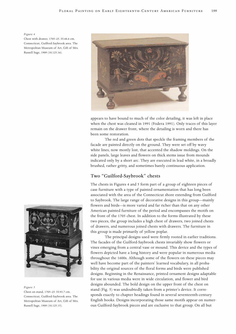
appears to have bound to much of the color detailing, it was left in placewhen the chest was cleaned in 1991 (Fodera 1991). Only traces of this layerremain on the drawer front, where the detailing is worn and there hasbeen some restoration.
The red and green dots that speckle the framing members of thefacade are painted directly on the ground. They were set off by wavywhite lines, now mostly lost, that accented the shadow moldings. On theside panels, large leaves and flowers on thick stems issue from moundsindicated only by a short arc. They are executed in lead white, in a broadlybrushed, rather gritty, and sometimes barely continuous application.
Two “Guilford-Saybrook” chests
The chests in Figures 4 and 5 form part of a group of eighteen pieces ofcase furniture with a type of painted ornamentation that has long beenassociated with the area of the Connecticut shore extending from Guilfordto Saybrook. The large range of decorative designs in this group—mainlyflowers and birds—is more varied and far richer than that on any otherAmerican painted furniture of the period and encompasses the motifs onthe front of the 1705 chest. In addition to the forms illustrated by thesetwo pieces, the group includes a high chest of drawers, two joined chestsof drawers, and numerous joined chests with drawers. The furniture inthis group is made primarily of yellow poplar.
The principal designs used were firmly rooted in earlier traditions.The facades of the Guilford-Saybrook chests invariably show flowers orvines emerging from a central vase or mound. This device and the types offlowers depicted have a long history and were popular in numerous mediathroughout the 1600s. Although some of the flowers on these pieces maywell have become part of the painters’ learned vocabulary, in all proba-bility the original sources of the floral forms and birds were publisheddesigns. Beginning in the Renaissance, printed ornament designs adaptablefor use in various media were in wide circulation, and flower and birddesigns abounded. The bold design on the upper front of the chest onstand (Fig. 5) was undoubtedly taken from a printer’s device. It corre-sponds exactly to chapter headings found in several seventeenth-centuryEnglish books. Designs incorporating those same motifs appear on numer-ous Guilford-Saybrook pieces and are exclusive to that group. On all but
199F P E E -C A F
Figure 5
Chest on stand, 1705–25. H:93.7 cm.
Connecticut, Guilford-Saybrook area. The
Metropolitan Museum of Art, Gift of Mrs.
Russell Sage, 1909 (10.125.15).
Figure 4
Chest with drawer, 1705–25. H:48.6 cm.
Connecticut, Guilford-Saybrook area. The
Metropolitan Museum of Art, Gift of Mrs.
Russell Sage, 1909 (10.125.16).
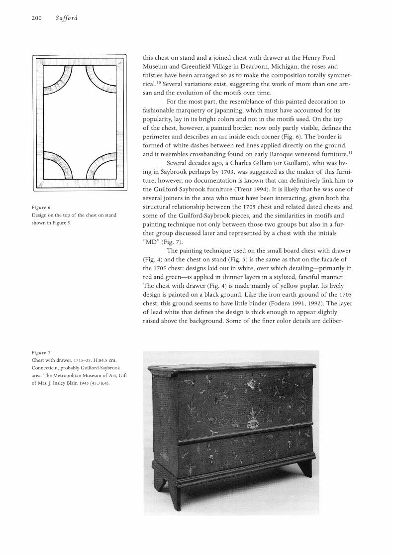
this chest on stand and a joined chest with drawer at the Henry FordMuseum and Greenfield Village in Dearborn, Michigan, the roses andthistles have been arranged so as to make the composition totally symmet-rical.10 Several variations exist, suggesting the work of more than one arti-san and the evolution of the motifs over time.
For the most part, the resemblance of this painted decoration tofashionable marquetry or japanning, which must have accounted for itspopularity, lay in its bright colors and not in the motifs used. On the topof the chest, however, a painted border, now only partly visible, defines theperimeter and describes an arc inside each corner (Fig. 6). The border isformed of white dashes between red lines applied directly on the ground,and it resembles crossbanding found on early Baroque veneered furniture.11
Several decades ago, a Charles Gillam (or Guillam), who was liv-ing in Saybrook perhaps by 1703, was suggested as the maker of this furni-ture; however, no documentation is known that can definitively link him tothe Guilford-Saybrook furniture (Trent 1994). It is likely that he was one ofseveral joiners in the area who must have been interacting, given both thestructural relationship between the 1705 chest and related dated chests andsome of the Guilford-Saybrook pieces, and the similarities in motifs andpainting technique not only between those two groups but also in a fur-ther group discussed later and represented by a chest with the initials“MD” (Fig. 7).
The painting technique used on the small board chest with drawer(Fig. 4) and the chest on stand (Fig. 5) is the same as that on the facade ofthe 1705 chest: designs laid out in white, over which detailing—primarily inred and green—is applied in thinner layers in a stylized, fanciful manner.The chest with drawer (Fig. 4) is made mainly of yellow poplar. Its livelydesign is painted on a black ground. Like the iron-earth ground of the 1705chest, this ground seems to have little binder (Fodera 1991, 1992). The layerof lead white that defines the design is thick enough to appear slightlyraised above the background. Some of the finer color details are deliber-
200 Saffo rd
Figure 6
Design on the top of the chest on stand
shown in Figure 5.
Figure 7
Chest with drawer, 1715–35. H:84.5 cm.
Connecticut, probably Guilford-Saybrook
area. The Metropolitan Museum of Art, Gift
of Mrs. J. Insley Blair, 1945 (45.78.4).
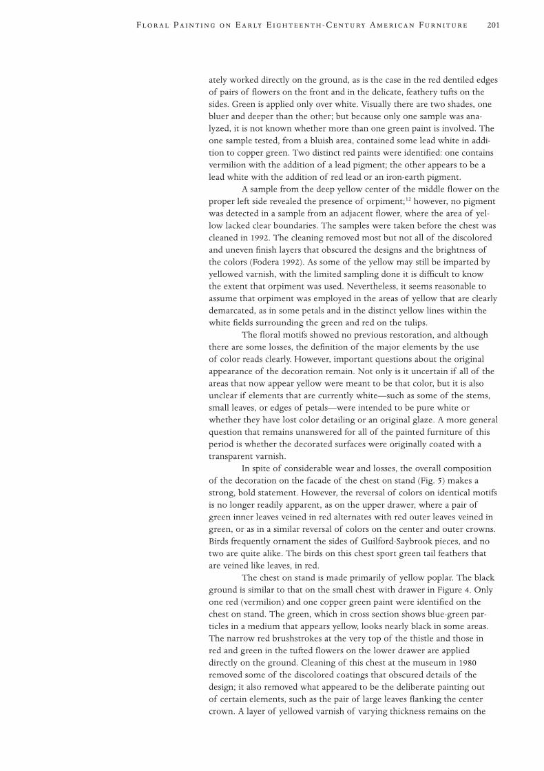
ately worked directly on the ground, as is the case in the red dentiled edgesof pairs of flowers on the front and in the delicate, feathery tufts on thesides. Green is applied only over white. Visually there are two shades, onebluer and deeper than the other; but because only one sample was ana-lyzed, it is not known whether more than one green paint is involved. Theone sample tested, from a bluish area, contained some lead white in addi-tion to copper green. Two distinct red paints were identified: one containsvermilion with the addition of a lead pigment; the other appears to be alead white with the addition of red lead or an iron-earth pigment.
A sample from the deep yellow center of the middle flower on theproper left side revealed the presence of orpiment;12 however, no pigmentwas detected in a sample from an adjacent flower, where the area of yel-low lacked clear boundaries. The samples were taken before the chest wascleaned in 1992. The cleaning removed most but not all of the discoloredand uneven finish layers that obscured the designs and the brightness ofthe colors (Fodera 1992). As some of the yellow may still be imparted byyellowed varnish, with the limited sampling done it is difficult to knowthe extent that orpiment was used. Nevertheless, it seems reasonable toassume that orpiment was employed in the areas of yellow that are clearlydemarcated, as in some petals and in the distinct yellow lines within thewhite fields surrounding the green and red on the tulips.
The floral motifs showed no previous restoration, and althoughthere are some losses, the definition of the major elements by the useof color reads clearly. However, important questions about the originalappearance of the decoration remain. Not only is it uncertain if all of theareas that now appear yellow were meant to be that color, but it is alsounclear if elements that are currently white—such as some of the stems,small leaves, or edges of petals—were intended to be pure white orwhether they have lost color detailing or an original glaze. A more generalquestion that remains unanswered for all of the painted furniture of thisperiod is whether the decorated surfaces were originally coated with atransparent varnish.
In spite of considerable wear and losses, the overall compositionof the decoration on the facade of the chest on stand (Fig. 5) makes astrong, bold statement. However, the reversal of colors on identical motifsis no longer readily apparent, as on the upper drawer, where a pair ofgreen inner leaves veined in red alternates with red outer leaves veined ingreen, or as in a similar reversal of colors on the center and outer crowns.Birds frequently ornament the sides of Guilford-Saybrook pieces, and notwo are quite alike. The birds on this chest sport green tail feathers thatare veined like leaves, in red.
The chest on stand is made primarily of yellow poplar. The blackground is similar to that on the small chest with drawer in Figure 4. Onlyone red (vermilion) and one copper green paint were identified on thechest on stand. The green, which in cross section shows blue-green par-ticles in a medium that appears yellow, looks nearly black in some areas.The narrow red brushstrokes at the very top of the thistle and those inred and green in the tufted flowers on the lower drawer are applieddirectly on the ground. Cleaning of this chest at the museum in 1980removed some of the discolored coatings that obscured details of thedesign; it also removed what appeared to be the deliberate painting outof certain elements, such as the pair of large leaves flanking the centercrown. A layer of yellowed varnish of varying thickness remains on the
201F P E E -C A F
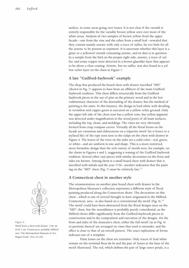
surface, in some areas going over losses. It is not clear if the varnish isentirely responsible for the variable brown yellow seen over most of thewhite areas. Analysis of two samples of brown yellow from the upperfacade—one from the vine and the other from a small leaf—revealed thatthey contain mainly arsenic with only a trace of sulfur, far too little for allthe arsenic to be present as orpiment. It is uncertain whether this layer is aglaze or a yellowed varnish containing arsenic, and its date is in question.In a sample from the bird on the proper right side, arsenic, a trace of sul-fur, and some copper were detected in a brown glazelike layer that appearsto be above a clear coating. Arsenic, but no sulfur, was also found in a yel-low ochre layer on the chest in Figure 7.
A late “Guilford-Saybrook” example
The shop that produced the board chest with drawer inscribed “MD”(shown in Fig. 7) appears to have been an offshoot of the main Guilford-Saybrook tradition. This chest differs structurally from the Guilford-Saybrook pieces in the use of pine as the primary wood and in the lessrudimentary character of the dovetailing of the drawer, but the method ofpainting is the same. In this instance, the design in lead white with detailingin vermilion and copper green is executed on a yellow ochre ground. Onlythe upper left side of the chest now has a yellow tone, but yellow pigmentwas detected under magnification in the wood pores of all main surfaces,including the top, cleats, and moldings. The vines are very obviouslyformed from crisp compass curves. Virtually all the floral forms on thefacade are variations and elaborations on a tripartite motif (be it leaves or astylized lily) of the type seen next to the tulips on the chest with drawer inFigure 4. The leaves of the trees on the sides are a solid color—red, green,or white—and are uniform in size and shape. This is a more restricted,more formulaic design than the rich variety of motifs seen, for example, onthe chests in Figures 4 and 5, suggesting a waning of the Guilford-Saybrooktradition. Several other case pieces with similar decoration on the front andsides are known. Among them is a small board chest with drawer that isinscribed with initials and the year 1730—another indication that the paint-ing on the “MD” chest (Fig. 7) must be relatively late.13
A Connecticut chest in another style
The ornamentation on another pine board chest with drawer in theMetropolitan Museum’s collection represents a different style of floralpainting produced along the Connecticut shore. The decoration on thischest—which is one of several thought to have originated in the Milford,Connecticut, area—is also based on a conventional lily motif (Fig. 8).14
The motif could have been abstracted from the floral designs seen on the“MD” chest, but the resemblance is probably purely coincidental, as theMilford chests differ significantly from the Guilford-Saybrook pieces inconstruction and in the composition and execution of the designs. On thefront and sides of the museum’s chest, either the full motif (as in Fig. 8)or portions thereof are arranged on vines that tend to meander, and theeffect is close to that of an overall pattern. The exact replication of formsindicates use of a template.
Paint losses on the chest are extensive. Only traces of lead whiteremain on the terminal fleur-de-lis and the pair of leaves at the base of themotif illustrated. The red, which defines the pair of large outer petals, is a
202 Saffo rd
Figure 8
Motif from a chest with drawer, 1720–40.
H:92.7 cm. Connecticut, probably Milford
area. The Metropolitan Museum of Art,
Rogers Fund, 1934 (34.128).
mixture of red lead and lead white applied directly to the ground. The col-ored dots that decorated the white center petal appear to have been greenon the front and red on the sides. The green has not been identified; nocopper was detected in the one sample analyzed. The thin, dark groundcoat on this piece is a mixture of black and red particles—probably a car-bon black with a red-iron pigment and red lead. Whether this type ofground is peculiar to this piece or is characteristic of all the chests withsimilar decoration remains an open question until the paint on relatedchests in other collections has been analyzed.
The investigation of the technical aspects of the ornamental painting onthe Metropolitan Museum of Art’s early eighteenth-century Americanfurniture proved fruitful. As the body of knowledge initiated by this proj-ect is enlarged, it should become an increasingly valuable tool in the fur-ther study of such furniture. The project achieved two broad goals. First,it identified the pigments used in the painting, making it possible to muchmore accurately determine the original colors of the decoration on eachpiece. The analysis of the chest of drawers from the Boston area (Fig. 1)was especially rewarding in this respect. It brought to light a color schemefar more vivid than imagined, for one is accustomed to seeing paintedornamentation that is discolored and muted through age and later coat-ings. Second, the project demonstrated that individual schools of orna-mentation appear to be defined not only by the nature of the designs butalso by the technical aspects of the painting.
The floral painting on the aforementioned chest of drawers pro-vides a marked contrast to that on the Connecticut chests, both in the typeof flowers represented and in the manner of their delineation. While thetype of floral ornament seen on this piece appears to be a unique survival,the flowers in the sprigs do bear some affinity to those seen in japanning.The general influence of professional Boston japanners on the painter-stainers and joiners of the area has yet to be assessed (as little research hasbeen done on painted furniture from eastern Massachusetts), but it doesappear to have had some effect on the depiction of flowers in this instance.
In the case of the four Connecticut chests painted in the samedistinctive manner, one can speak of a recognizable school of painting,whose shop practices can be clearly differentiated from those that pro-duced the ornament on the fifth Connecticut chest discussed. Althoughthe group of four represents the work of several hands in their construc-tion and ornament, they appear to be diverse expressions of the same orrelated tradition of painting. However, the exact source of this form ofpainting and the artisan who actually introduced it to south-centralConnecticut are questions that remain to be answered.
The author is greatly indebted to present and past members of theDepartment of Objects Conservation for the scientific investigation ofthe objects discussed in this article. Thanks go to Antoine M. Wilmeringfor spearheading the project on the painted surfaces and for supporting itthroughout; Mark T. Wypyski for the pigment analyses; Keith Bakkerfor the macro-examination of the surfaces, the sampling, and the cross-sectional microscopy; and Mark D. Minor for additional helpful observa-tions. The drawings are by Edward Di Farnecio.
Acknowledgments
Conclusion
203F P E E -C A F
1 For the chest’s fielded and painted side panels, see Schwartz (1976:15) and Safford (1980:353,
pl. 1). The most ornate of the related chests is one at the Brooklyn Museum, Brooklyn, New
York, which has fleurs-de-lis and small birds painted in black on a red or white ground, in
addition to graining (Peirce 1976:1292); and one at the Henry Francis du Pont Winterthur
Museum, Winterthur, Delaware (acc. no. 56.10.3), which retains only graining.
2 The high chest is also illustrated in Lockwood (1926:fig. 59).
3 For the technical analysis, cross sections were examined microscopically in visible and ultra-
violet light, and pigments were identified by energy dispersive X-ray spectrometry. Virtually
no identification of binders was undertaken. Conservation reports, including drawings of the
cross sections, are in the object files of the Department of American Decorative Arts.
4 Realgar is an orange-red sulfide of arsenic and is poisonous. It is a mineral found in natural
deposits and is related to orpiment (see note 12). See Harley (1982:125).
5 The black was not tested for all pieces in the study. Those samples that were analyzed did not
give a reading and were assumed to be an organic pigment.
6 See note 4.
7 See Cummings (1971) for painter-stainers and 1684 painter’s inventory, and Fairbanks and
Trent (1982:449–53) for pigments identified in seventeenth-century Boston portraits.
8 For the dated chests at the Art Institute of Chicago, the Connecticut Historical Society
(Hartford, Connecticut), and the Museum of Fine Arts, Boston, see Kirk (1967:nos. 18, 43, 45).
The last chest in the group mentioned—at the East Hampton Historical Society (East
Hampton, New York)—is illustrated in Graybeal and Kenny (1987:336).
9 For a typical carved chest, see Lockwood (1926:340). Through the years the author has exam-
ined all five painted chests and numerous carved ones to establish the structural relationship.
This relationship recently has been examined in detail in Willoughby (1994). For an overall
view of the Blin group and its attribution, see Schoelwer (1989).
10 For an example of the chapter heading and the chest at the Henry Ford Museum, see Fales
(1972:figs. 23, 28).
11 For another chest with banding, see Fales (1972:fig. 27).
12 Orpiment is a yellow sulfide of arsenic. It is a mineral occurring in natural deposits in Europe
and Asia and was known since ancient times. It is closely related to realgar and was disliked
because of its noxious fumes. See Harley (1982:93–94).
13 The 1730 chest is in a private collection and unpublished.
14 The Metropolitan Museum’s chest is unpublished. A chest with closely related decoration, at
Historic Deerfield, Inc., in Deerfield, Massachusetts, is in Fales (1976:fig. 382). The attribution
of this group to Milford is based on chests with a history in that area of Connecticut. See Kirk
(1967:nos. 49, 50).
Cummings, A. L.
1971 Decorative painters and house painting at Massachussets Bay, 1630–1725. In American
Painting to 1776: A Reappraisal, ed. I. M. G. Quimby, 71–125. Charlottesville, Va.:
University Press of Virginia.
Fairbanks, J. L., and R. F. Trent
1982 New England Begins: The Seventeenth Century. Vol. 3. Boston: Museum of Fine Arts.
Fales, D. A., Jr.
1972 American Painted Furniture, 1660–1880. New York: E. P. Dutton and Co.
1976 The Furniture of Historic Deerfield. New York: E. P. Dutton and Co.
Fodera, Peter
1991 Treatment report for Fodera Fine Art Conservation, Ltd., 23 October, New York.
References
Notes
204 Saffo rd
1992 Treatment report for Fodera Fine Art Conservation, Ltd., 27 July, New York.
Graybeal, J. A., and P. M. Kenny
1987 The William Efner Wheelock collection at the East Hampton Historical Society.
Antiques 132(2):328–39.
Harley, R. D.
1982 Artists’ Pigments c. 1600–1835. London: Butterworth Scientific.
Kirk, J. T.
1967 Connecticut Furniture, Seventeenth and Eighteenth Centuries. Hartford, Conn.: Wadsworth
Atheneum.
Lockwood, L. V.
1926 Colonial Furniture in America. Vol. 1. New York: Charles Scribner’s Sons.
Peirce, D. C.
1976 American painted furniture at the Brooklyn Museum, 1675–1875. Antiques
110(6):1292–99.
Safford, F. G.
1980 Seventeenth-century American furniture at The Metropolitan Museum of Art. Apollo
111(219):348–53.
Schoelwer, S. P.
1989 Connecticut sunflower furniture: A familiar form reconsidered. Yale University Art
Gallery Bulletin (spring):21–37.
Schwartz, M. D.
1976 American Furniture of the Colonial Period. New York: Metropolitan Museum of Art.
Stalker, John, and George Parker
1960 A Treatise of Japaning and Varnishing. 1688. Reprint, London: Alec Tiranti.
Trent, R. F.
1994 A Channel Islands parallel for the early eighteenth-century Connecticut chests
attributed to Charles Guillam. Studies in the Decorative Arts 2(1):75–91.
Willoughby, M. H.
1994 From carved to painted: Chests of central and coastal Connecticut, c. 1675–1725.
Master’s thesis, University of Delaware.
205F P E E -C A F
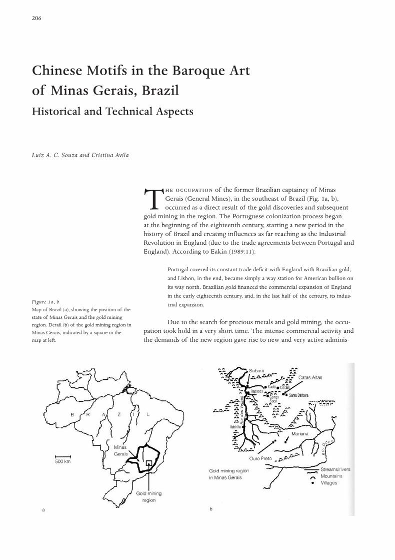
206
T of the former Brazilian captaincy of MinasGerais (General Mines), in the southeast of Brazil (Fig. 1a, b),occurred as a direct result of the gold discoveries and subsequent
gold mining in the region. The Portuguese colonization process beganat the beginning of the eighteenth century, starting a new period in thehistory of Brazil and creating influences as far reaching as the IndustrialRevolution in England (due to the trade agreements between Portugal andEngland). According to Eakin (1989:11):
Portugal covered its constant trade deficit with England with Brazilian gold,
and Lisbon, in the end, became simply a way station for American bullion on
its way north. Brazilian gold financed the commercial expansion of England
in the early eighteenth century, and, in the last half of the century, its indus-
trial expansion.
Due to the search for precious metals and gold mining, the occu-pation took hold in a very short time. The intense commercial activity andthe demands of the new region gave rise to new and very active adminis-
Chinese Motifs in the Baroque Art of Minas Gerais, BrazilHistorical and Technical Aspects
Luiz A. C. Souza and Cristina Avila
Figure 1a, b
Map of Brazil (a), showing the position of the
state of Minas Gerais and the gold mining
region. Detail (b) of the gold mining region in
Minas Gerais, indicated by a square in the
map at left.
trative centers. The political climate in the region was of permanentconflict between the several social groups in Minas and the rigorous andoppressive Portuguese administration.
Even the Catholic religion adapted and became more devoted toits functions as an agent of social integration, virtually ignoring its mis-sionary objectives. Religious practices were directed toward the externalmanifestations of the faith, as opposed to the understanding of theCatholic doctrine. As a result of these adaptations, most of the religiousceremonies were performed in a much more conspicuous manner, as evi-dent in the processions and pilgrimages and in the decoration of thechapels and Baroque sculptures. Among other measures, the Portugueseefforts to control gold production and traffic resulted in the prohibition ofCatholic religious orders, which were in Minas Gerais. This aspect of thetown’s history is particularly relevant when one observes the astonishingnumber of churches in small towns such as Ouro Preto (Black Gold)—which has twenty-three churches; and Sabará, which also has several. Eachchapel was built by a different fraternity or brotherhood, and this resultedin intensive and competitive building and ornamentation of the numerousreligious buildings in the mining regions.
At the beginning of the Portuguese occupation of Minas Gerais, religiousarchitecture was very primitive, and consisted only of small chapels withstraw-covered roofs and walls built of wattle and daub. These buildingsusually consisted of a nave as the main room, with a small altar for thesaint of devotion.
In general, one of the biggest problems art historians now face instudying the art history of this region is the lack of documentation on theconstruction of the churches and on their interior decoration. However,detailed observations of the architectural features of the chapels hasallowed scholars such as Avila (1984) to propose a chronology of their sty-listic development. The proposed chronology is divided into three phases,following changes in building construction and style. The first phase isfrom 1700 to 1730, a period characterized by initial settlement and forma-tion of the first villages. The Chapel of Our Lady of O (1717–20) (Fig. 2)and the Chapel of Our Lady of Soledade (1727), both in Sabará, are fromthis first phase. The second phase, from 1730 to 1755, is characterized bythe introduction of regional materials, such as soapstone and quartzite,for structural and decorative uses. The third and last phase, from 1755 to1785, is characterized by the widespread use of stone as a structural mate-rial in the religious and government buildings. Numerous churches werebuilt during this phase, mainly because of the competition between severalfraternities and brotherhoods.
A few chapels are decorated with Asian-style motifs, such as Chinese lifescenes, pagodas, birds, elephants, rabbits, and so on. The traditional explana-tion for these Asian-influenced motifs in Minas Gerais is the Portuguesediscovery of the maritime route to the Far East at the end of the fifteenthcentury, which certainly influenced the styles and techniques of Portugueseartists. On the origin of these motifs, the Brazilian author Andrade (1978)surmises that a Portuguese artisan may have learned the technique in China,
Interior Decorationof the Churches
Evolution of the ReligiousArchitecture
207C M B A M G , B

or even that a Chinese or Indian painter might have traveled to Minas Geraisand painted the motifs directly. Either explanation is historically plausible, asthe Portuguese had established a maritime empire in the Far East beginningin the late fifteenth century from the base provided by their earlier explo-ration of the African coast. Portugal’s colonies in the East Indies and Asiaincluded Goa, Ceylon, Malacca, and Macao (Severy 1992).
Technical studies of the Asian-style motifs in Minas Gerais show,however, that the technique is perfectly in accordance with the Europeantechnique for chinoiserie, a practice that was already well known inparts of Europe after 1660 and that arrived in Portugal after 1720 (Smith1962:117–18). The bookshelves at the library of the University of Coimbra,for example, are all painted in chinoiserie. The person who painted thesedecorations is known to be the Portuguese artist Manuel da Silva, whosigned a contract in 1723 to do the paintings.
Asian motifs in the interior decoration of the churches
Decorations with Asian motifs are present in Sabará (Figs. 2, 3), Mariana(Fig. 4), and Catas Altas (Fig. 5), which were very important mining vil-lages during the eighteenth century. None of these cases have documen-tary evidence regarding the authorship of the motifs. In the churchinteriors, the motifs appear as bright figures over red or green back-grounds. In addition to the gilding, there is also extensive use of silver leaf,usually to represent human faces or the bodies of birds. The borders ofthe gilded or silvered parts are well defined with a black line, which is alsosometimes used over the gilding to create contouring. In Minas Gerais, sil-
208 Souza and Av i la
Figure 2
Exterior of the Chapel of Our Lady of O in
Sabará, Minas Gerais, 1717–20. Notice the
Chinese influence on the tiles at the corners
on the upper roof. The interior of this church
is particularly rich in panels with Asian
painted and gilded motifs (Fig. 3).
Figure 3
Detail of the interior decoration in the Chapel
of Our Lady of O.
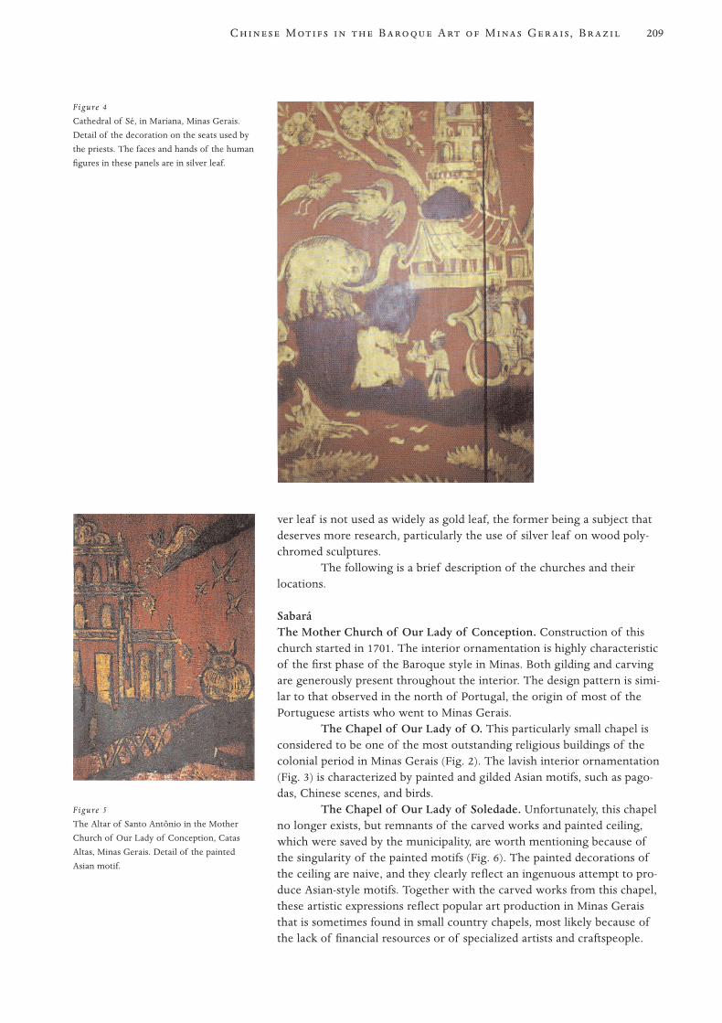
ver leaf is not used as widely as gold leaf, the former being a subject thatdeserves more research, particularly the use of silver leaf on wood poly-chromed sculptures.
The following is a brief description of the churches and theirlocations.
SabaráThe Mother Church of Our Lady of Conception. Construction of thischurch started in 1701. The interior ornamentation is highly characteristicof the first phase of the Baroque style in Minas. Both gilding and carvingare generously present throughout the interior. The design pattern is simi-lar to that observed in the north of Portugal, the origin of most of thePortuguese artists who went to Minas Gerais.
The Chapel of Our Lady of O. This particularly small chapel isconsidered to be one of the most outstanding religious buildings of thecolonial period in Minas Gerais (Fig. 2). The lavish interior ornamentation(Fig. 3) is characterized by painted and gilded Asian motifs, such as pago-das, Chinese scenes, and birds.
The Chapel of Our Lady of Soledade. Unfortunately, this chapelno longer exists, but remnants of the carved works and painted ceiling,which were saved by the municipality, are worth mentioning because ofthe singularity of the painted motifs (Fig. 6). The painted decorations ofthe ceiling are naive, and they clearly reflect an ingenuous attempt to pro-duce Asian-style motifs. Together with the carved works from this chapel,these artistic expressions reflect popular art production in Minas Geraisthat is sometimes found in small country chapels, most likely because ofthe lack of financial resources or of specialized artists and craftspeople.
209C M B A M G , B
Figure 5
The Altar of Santo Antônio in the Mother
Church of Our Lady of Conception, Catas
Altas, Minas Gerais. Detail of the painted
Asian motif.
Figure 4
Cathedral of Sé, in Mariana, Minas Gerais.
Detail of the decoration on the seats used by
the priests. The faces and hands of the human
figures in these panels are in silver leaf.
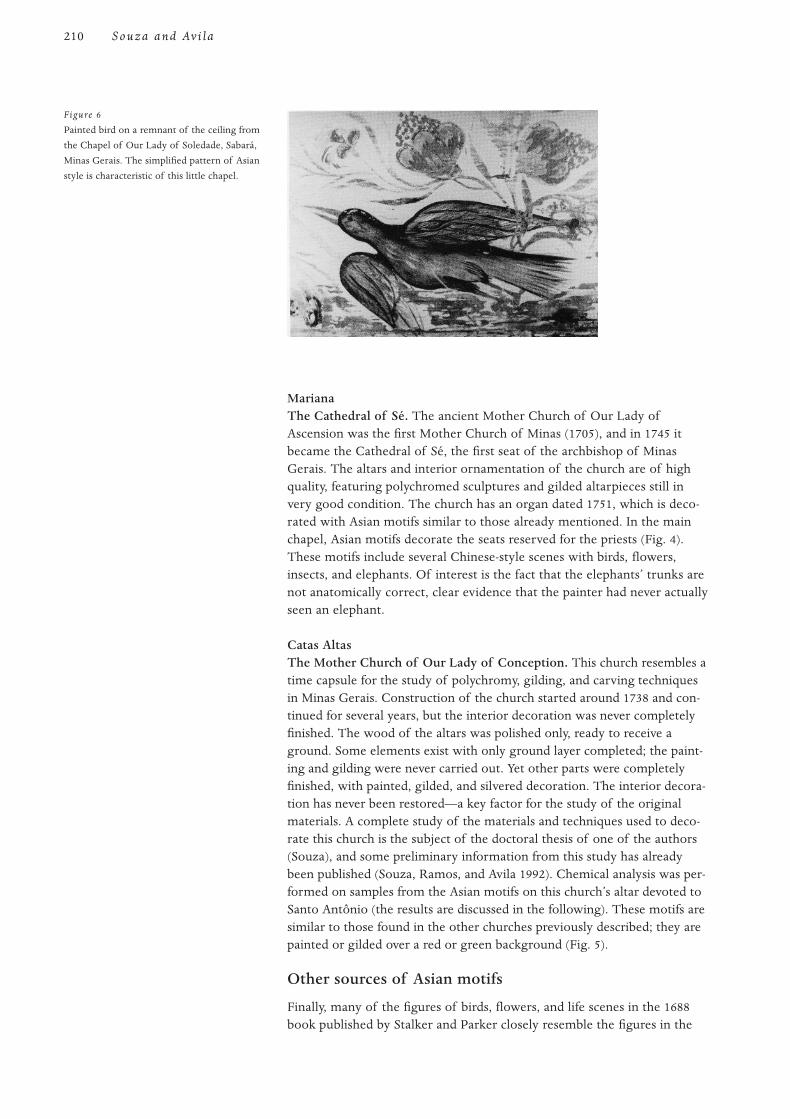
MarianaThe Cathedral of Sé. The ancient Mother Church of Our Lady ofAscension was the first Mother Church of Minas (1705), and in 1745 itbecame the Cathedral of Sé, the first seat of the archbishop of MinasGerais. The altars and interior ornamentation of the church are of highquality, featuring polychromed sculptures and gilded altarpieces still invery good condition. The church has an organ dated 1751, which is deco-rated with Asian motifs similar to those already mentioned. In the mainchapel, Asian motifs decorate the seats reserved for the priests (Fig. 4).These motifs include several Chinese-style scenes with birds, flowers,insects, and elephants. Of interest is the fact that the elephants’ trunks arenot anatomically correct, clear evidence that the painter had never actuallyseen an elephant.
Catas AltasThe Mother Church of Our Lady of Conception. This church resembles atime capsule for the study of polychromy, gilding, and carving techniquesin Minas Gerais. Construction of the church started around 1738 and con-tinued for several years, but the interior decoration was never completelyfinished. The wood of the altars was polished only, ready to receive aground. Some elements exist with only ground layer completed; the paint-ing and gilding were never carried out. Yet other parts were completelyfinished, with painted, gilded, and silvered decoration. The interior decora-tion has never been restored—a key factor for the study of the originalmaterials. A complete study of the materials and techniques used to deco-rate this church is the subject of the doctoral thesis of one of the authors(Souza), and some preliminary information from this study has alreadybeen published (Souza, Ramos, and Avila 1992). Chemical analysis was per-formed on samples from the Asian motifs on this church’s altar devoted toSanto Antônio (the results are discussed in the following). These motifs aresimilar to those found in the other churches previously described; they arepainted or gilded over a red or green background (Fig. 5).
Other sources of Asian motifs
Finally, many of the figures of birds, flowers, and life scenes in the 1688book published by Stalker and Parker closely resemble the figures in the
210 Souza and Av i la
Figure 6
Painted bird on a remnant of the ceiling from
the Chapel of Our Lady of Soledade, Sabará,
Minas Gerais. The simplified pattern of Asian
style is characteristic of this little chapel.
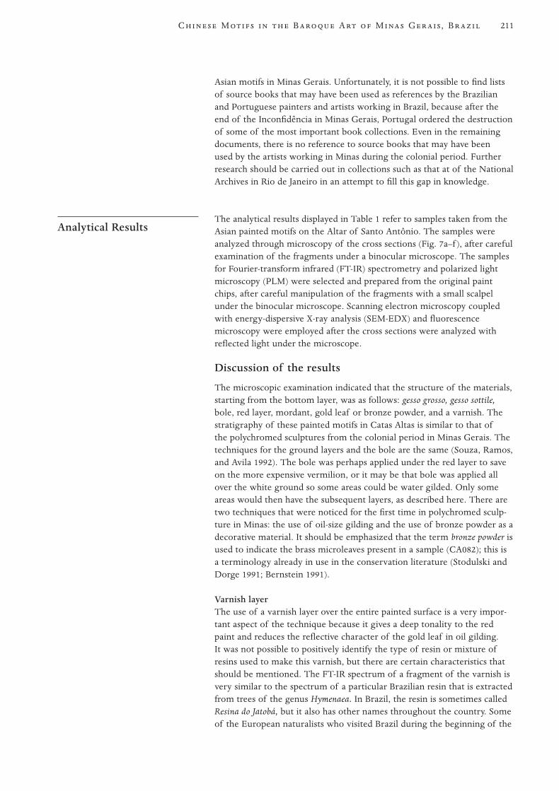
211C M B A M G , B
Asian motifs in Minas Gerais. Unfortunately, it is not possible to find listsof source books that may have been used as references by the Brazilianand Portuguese painters and artists working in Brazil, because after theend of the Inconfidência in Minas Gerais, Portugal ordered the destructionof some of the most important book collections. Even in the remainingdocuments, there is no reference to source books that may have beenused by the artists working in Minas during the colonial period. Furtherresearch should be carried out in collections such as that at of the NationalArchives in Rio de Janeiro in an attempt to fill this gap in knowledge.
The analytical results displayed in Table 1 refer to samples taken from theAsian painted motifs on the Altar of Santo Antônio. The samples wereanalyzed through microscopy of the cross sections (Fig. 7a–f ), after carefulexamination of the fragments under a binocular microscope. The samplesfor Fourier-transform infrared (FT-IR) spectrometry and polarized lightmicroscopy (PLM) were selected and prepared from the original paintchips, after careful manipulation of the fragments with a small scalpelunder the binocular microscope. Scanning electron microscopy coupledwith energy-dispersive X-ray analysis (SEM-EDX) and fluorescencemicroscopy were employed after the cross sections were analyzed withreflected light under the microscope.
Discussion of the results
The microscopic examination indicated that the structure of the materials,starting from the bottom layer, was as follows: gesso grosso, gesso sottile,bole, red layer, mordant, gold leaf or bronze powder, and a varnish. Thestratigraphy of these painted motifs in Catas Altas is similar to that ofthe polychromed sculptures from the colonial period in Minas Gerais. Thetechniques for the ground layers and the bole are the same (Souza, Ramos,and Avila 1992). The bole was perhaps applied under the red layer to saveon the more expensive vermilion, or it may be that bole was applied allover the white ground so some areas could be water gilded. Only someareas would then have the subsequent layers, as described here. There aretwo techniques that were noticed for the first time in polychromed sculp-ture in Minas: the use of oil-size gilding and the use of bronze powder as adecorative material. It should be emphasized that the term bronze powder isused to indicate the brass microleaves present in a sample (CA082); this isa terminology already in use in the conservation literature (Stodulski andDorge 1991; Bernstein 1991).
Varnish layerThe use of a varnish layer over the entire painted surface is a very impor-tant aspect of the technique because it gives a deep tonality to the redpaint and reduces the reflective character of the gold leaf in oil gilding.It was not possible to positively identify the type of resin or mixture ofresins used to make this varnish, but there are certain characteristics thatshould be mentioned. The FT-IR spectrum of a fragment of the varnish isvery similar to the spectrum of a particular Brazilian resin that is extractedfrom trees of the genus Hymenaea. In Brazil, the resin is sometimes calledResina do Jatobá, but it also has other names throughout the country. Someof the European naturalists who visited Brazil during the beginning of the
Analytical Results
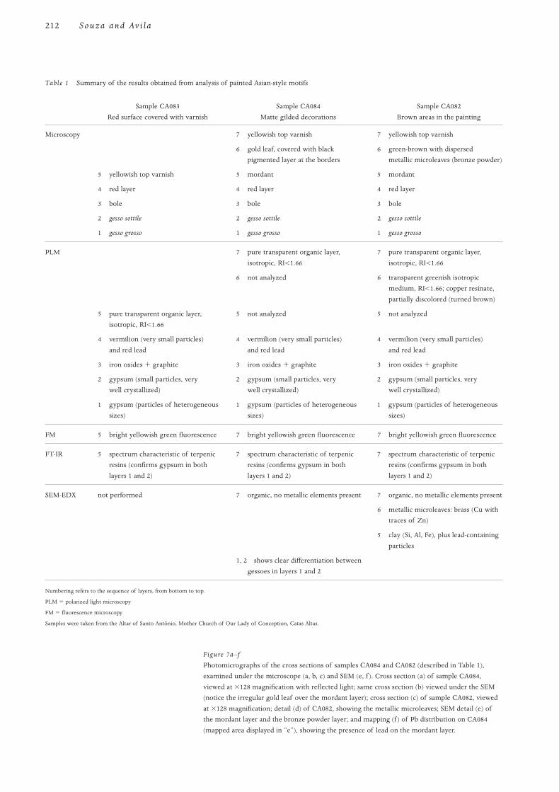
212 Souza and Av i la
Table 1 Summary of the results obtained from analysis of painted Asian-style motifs
Sample CA083 Sample CA084 Sample CA082
Red surface covered with varnish Matte gilded decorations Brown areas in the painting
Microscopy 7 yellowish top varnish 7 yellowish top varnish
6 gold leaf, covered with black 6 green-brown with dispersed
pigmented layer at the borders metallic microleaves (bronze powder)
5 yellowish top varnish 5 mordant 5 mordant
4 red layer 4 red layer 4 red layer
3 bole 3 bole 3 bole
2 gesso sottile 2 gesso sottile 2 gesso sottile
1 gesso grosso 1 gesso grosso 1 gesso grosso
PLM 7 pure transparent organic layer, 7 pure transparent organic layer,
isotropic, RI<1.66 isotropic, RI<1.66
6 not analyzed 6 transparent greenish isotropic
medium, RI<1.66; copper resinate,
partially discolored (turned brown)
5 pure transparent organic layer, 5 not analyzed 5 not analyzed
isotropic, RI<1.66
4 vermilion (very small particles) 4 vermilion (very small particles) 4 vermilion (very small particles)
and red lead and red lead and red lead
3 iron oxides 1 graphite 3 iron oxides 1 graphite 3 iron oxides 1 graphite
2 gypsum (small particles, very 2 gypsum (small particles, very 2 gypsum (small particles, very
well crystallized) well crystallized) well crystallized)
1 gypsum (particles of heterogeneous 1 gypsum (particles of heterogeneous 1 gypsum (particles of heterogeneous
sizes) sizes) sizes)
FM 5 bright yellowish green fluorescence 7 bright yellowish green fluorescence 7 bright yellowish green fluorescence
FT-IR 5 spectrum characteristic of terpenic 7 spectrum characteristic of terpenic 7 spectrum characteristic of terpenic
resins (confirms gypsum in both resins (confirms gypsum in both resins (confirms gypsum in both
layers 1 and 2) layers 1 and 2) layers 1 and 2)
SEM-EDX not performed 7 organic, no metallic elements present 7 organic, no metallic elements present
6 metallic microleaves: brass (Cu with
traces of Zn)
5 clay (Si, Al, Fe), plus lead-containing
particles
1, 2 shows clear differentiation between
gessoes in layers 1 and 2
Numbering refers to the sequence of layers, from bottom to top.
PLM 5 polarized light microscopy
FM 5 fluorescence microscopy
Samples were taken from the Altar of Santo Antônio, Mother Church of Our Lady of Conception, Catas Altas.
Figure 7a–f
Photomicrographs of the cross sections of samples CA084 and CA082 (described in Table 1),
examined under the microscope (a, b, c) and SEM (e, f ). Cross section (a) of sample CA084,
viewed at 3128 magnification with reflected light; same cross section (b) viewed under the SEM
(notice the irregular gold leaf over the mordant layer); cross section (c) of sample CA082, viewed
at 3128 magnification; detail (d) of CA082, showing the metallic microleaves; SEM detail (e) of
the mordant layer and the bronze powder layer; and mapping (f ) of Pb distribution on CA084
(mapped area displayed in “e”), showing the presence of lead on the mordant layer.
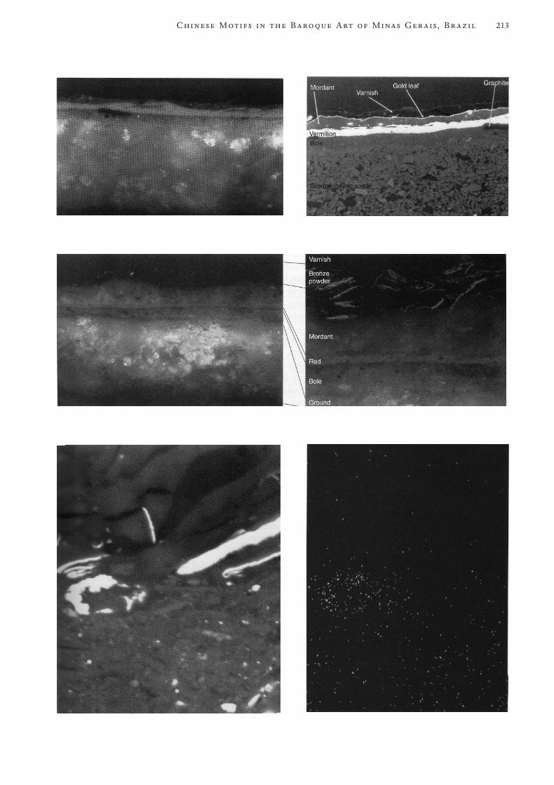
213C M B A M G , B
nineteenth century have already provided a description of the resin (Spixand Martius 1981:184; de Saint-Hilaire 1975:177). It is also mentioned byNieuhoff (1813), a Dutch traveler who was in the north of Brazil duringthe Dutch occupation of that part of the country in the sixteenth century.According to Spix and Martius (1981:184):
In the forests we observed many of those trees from which comes the resin
anime (Hymenaea courbario L.). Here they call it jatoba or jataí. Between the
shelf and the wood of this tree, which is similar to our elm, there are rela-
tively few spaces filled with liquid resin; the major portion of resin comes
from the axial roots of the tree, when injured, which generally happens
when the tree is cut. Behind the old trees it is possible to find some round
balls, of clear-yellow, weighing about six to eight pounds, formed by the con-
tinuous dripping of the liquid resin. The purity and color of this substance
depends mostly on the kind of soil where the balls are formed, because it
impregnates the resin with certain soluble substances which don’t exist in a
dry soil, argillous or sandy. The finest resin is, however, the one which comes
from the shell, mostly at the end of the dry season, during September and
October; the indigenous people collect the resin by drops, which are then
melted over the fire.
The same resin is referred to as anima by Watin in his treatise onvarnishes (1808). He mentions the Hymenaea trees from South America asits source. Watin also affirms that this resin was imported to Europe fromSouth America during the eighteenth century. It is surprising to find thatStalker and Parker (1960:10) also quote this anima resin in one of theirrecipes for varnishes, but without mentioning its source or other commonor scientific name. João Manso Pereira, a Brazilian chemist who lived inRio de Janeiro (ca. 1750–1820) was famous for being able to prepare porce-lain, varnish, and lacquering as perfect as the best from India (Santos1942:490). The main ingredient of the varnish is cited as the resin fromJatobá trees, dissolved in very strong aguardente—an alcoholic drink popu-lar in Brazil, produced by the fermentation and distillation of sugar-canejuice. To date, there are insufficient analytical results to prove that theresina do jatobá was actually used in the formulation of the varnish for theAsian motifs in Catas Altas, but the information collected thus far may behelpful for future researchers addressing this subject.
Mordant layerAnalysis by SEM-EDX clearly shows that there are lead-containing par-ticles in the mordant layer, together with clay and iron oxides; this is atraditional technique for preparing oil size for gilding.
Bronze powderThe SEM-EDX analysis of the resinous medium surrounding the metallicleaves shows the presence of copper in the material, which leads to theconclusion—confirmed by the PLM observations—that there is copperresinate in the resinous medium in which the metallic plates are dispersed.It is not clear, however, whether this copper resinate was originally appliedto the surface or if it is there as a degradation product of the brass par-ticles in contact with the resin. The brown superficial aspect of these areasin the painting is certainly due to the discoloration of the copper resinate,
214 Souza and Av i la
as can be observed through PLM analysis of particles taken from thegreenish layer.
Contrary to the general art historical approach for the authorship of theAsian painted motifs in Minas Gerais, the authors conclude that the artistswho created these decorations were either Portuguese or Brazilianpainters who used the European technique for imitating the Chinese style.These motifs in Minas Gerais can, therefore, be called chinoiserie becausethey are in perfect accordance with the definition of this term (Impey1977:9) as referring to a European imitation of the Asian style.
The varnish used as a finishing layer on the chinoiserie in MinasGerais may contain the Brazilian resin previously referred to as resina dojatobá, also known as anima.
This research was partially funded by the CNPq—the Brazilian NationalResearch Council. Luiz Souza undertook the research during a two-yearfellowship at the Getty Conservation Institute (then in Marina del Rey,California), and the authors are grateful to Miguel Angel Corzo, directorof the Institute, who kindly provided support for Souza’s attendance at thePainted Wood Symposium. Particular thanks are due to the following: thestaff of the Getty Conservation Institute Scientific Program (Dusan Stulik,Michael Schilling, Michele Derrick, Eric Doehne, and Arie Wallert);Valerie Dorge, program chair of the Painted Wood Symposium, for herinterest in our work; and Brian Considine and Gordon Hanlon at theJ. Paul Getty Museum, for the very fruitful discussions on the subject ofthis article. We are grateful to Adriano Ramos of the Grupo Oficina deRestauro in Brazil for his invaluable discussions regarding the subject ofchinoiserie in Minas Gerais, and to the Brazilian Institute of CulturalProperties for allowing us to take samples in Catas Altas.
Andrade, R. M. F.
1978 A pintura colonial em Minas Gerais. Revista do Patrimônio Histórico e Artístico Nacional
18:11–47.
Avila, A.
1984 Iniciação ao barroco mineiro. São Paulo: Nobel.
Bernstein, J.
1991 Microscopy-based characterization of gilded decoration on furniture. In Seventeenth
Annual Conservation Training Programs Conference, 138–150. New York: Conservation
Center, Institute of Fine Arts.
de Saint-Hilaire, A.
1975 Viagem pelas províncias do Rio de Janeiro e Minas Gerais. Trans. Vivaldi Moreira. São
Paulo: University de São Paulo; Belo Horizonte: Itatiaia.
Eakin, M. C.
1989 British Enterprise in Brazil—The St. John d’el Rey Mining Company and the Morro Velho Gold
Mine, 1830–1960. Durham, N.C., and London: Duke University Press.
References
Acknowledgments
Conclusion
215C M B A M G , B
Impey, O.
1977 Chinoiserie—The Impact of Oriental Styles in Western Art and Decoration. New York:
Charles Scribner’s Sons.
Nieuhoff, J.
1813 Voyages and travels into Brazil with a particular account of all the remarkable passages
that happened during the author’s stay of nine years in Brazil. In A General Collection of
the Best and Most Interesting Voyages and Travels in All Parts of the World. Vol. 14, ed.
J. Pinkerton, 697–877. London: Longman.
Santos, F. M. dos
1942 Artistas do Rio de Janeiro colonial. In Anais do Terceiro Congresso de História Nacional.
Vol. 7, 489–94. Rio de Janeiro: Instituto Histórico e Geográfico Brasileiro.
Severy, M.
1992 Portugal’s sea road to the East. National Geographic 182(5):56–92.
Smith, R.
1962 A Talha em Portugal. Lisbon: Livros Horizonte.
Souza, L. A. C., A. R. Ramos, and C. Avila
1992 The Matriz of Catas Altas, Minas Gerais, Brazil: Techniques, materials and style. In
Conservation of the Iberian and Latin American Cultural Heritage, ed. H. M. W. Hodges,
John S. Mills, and Perry Smith, 154–57. London: International Institute for
Conservation of Historic and Artistic Works.
Spix, J. B. von, and C. F. P. von Martius
1981 Viagem pelo Brasil 1817–1820. Vol. 1, trans. Lucia Furquim Lehmeyer, rev. B. F. R. Galvão
and B. de G. E. Winkler. São Paulo: University de São Paulo; Belo Horizonte: Itatiaia.
Stalker, J., and G. Parker
1960 A Treatise of Japaning and Varnishing. 1688. Reprint, London: Alec Tiranti.
Stodulski, L. P., and V. Dorge
1991 Analysis of materials from a late 15th–early 16th-century polychromed wood sculpture.
In Materials Issues in Art and Archaeology II, ed. Pamela B. Vandiver, James Druzik, and
George Segan Wheeler, 151–75. Materials Research Society Symposium Proceedings,
vol. 185. Pittsburgh: Materials Research Society.
Watin, M.
1808 L’art du peintre, doreur, vernisseur, et du fabricant de couleurs. 6th ed. Paris: Belin.
216 Souza and Av i la
217
W has been a ubiquitous decoration for exte-rior and interior architecture, it was also used to decoratesome of the highest style furnishings of the eighteenth cen-
tury. White-painted looking-glass frames, carved wall brackets, and furni-ture were produced in Philadelphia during the eighteenth century—beginning the decade before the Revolution—but they are quite rare inAmerica’s decorative arts collections.1 At that time, the wealthy patronsof Philadelphia (perhaps the most cosmopolitan colonial city) soughtboth imported and locally produced carved furnishings and decorationin the latest London fashion. London craftsmen, like their counterpartsin other urban centers of Europe, were inspired by the asymmetrical,carved, painted, and gilded decoration of the French Rococo style. Thismanner of decoration had been popular in the 1750s and 1760s amongEnglish cabinetmakers, who produced frames and furniture in this style(Gloag 1968).
White-painted decoration continued to be fashionable inPhiladelphia even as the city became the capital of the new republic,and the city’s patrons and craftsmen embraced the new Classical taste ofLondon and Paris. The simplicity of Classical designs, many of whichwere based on motifs from the rediscovery of the ancient Roman cities ofHerculaneum and Pompeii, made a compelling new fashion, in direct con-trast to the exuberance of curvilinear Rococo design. For example, Englisharchitect Robert Adam’s frescolike palette with white and gold decorationand symmetrical foliage swags, revived Classicism in English interiors andbecame synonymous with the English national taste during the last thirdof the eighteenth century (Fowles and Cornforth 1979:26–27, 32).
Unfortunately, the few surviving white-painted surfaces of fur-nishings attributed to Philadelphia have been mistakenly gilded or other-wise obliterated and restored with surfaces that do not visually representthis subtle type of decoration. Recent investigations of several of thesefurnishings have provided an opportunity to reexamine the materials andtechniques of this often misunderstood painted decoration. Treatises fromthis period document techniques for white-painted decoration and canprovide insight for reinterpreting these surfaces. These treatises, combinedwith accurate identification of the constituent paint materials, make it pos-sible to better understand and preserve white-painted objects.
A Short Primer on the White-Painted Furnishingsof Eighteenth-Century Philadelphia
Chris A. Shelton
Treatises on painting produced in London and Paris have provided awealth of information about the materials, techniques, and aesthetics ofeighteenth-century workmanship. While many important accounts dealingwith gilding and japanning were produced throughout the seventeenthand eighteenth centuries, two major works stand out as resources forunderstanding period paint technology, and more specifically, white-painted decoration on wood.
The first is the 1773 guidebook, L’art du peintre, doreur, vernisseurby Jean Félix Watin (reprinted in 1977). A master gilder who graduatedfrom the Académie de Saint Luc, Watin set up shop in the Bonne-Nouvelledistrict of Paris, where he became a dealer in prints and also sold colors,gilding supplies, and varnish (Pallot 1989:39). His treatise is one of themost exhaustive examinations of gilding in the eighteenth century andprovides an excellent summary of painting practices. In 1803, the Englishcabinetmaker Thomas Sheraton produced the second important guide-book, Thomas Sheraton’s Cabinet Dictionary (Sheraton 1970b). In additionto illustrating furnishings and advising on their use and placement, thistreatise includes an extensive supplement regarding geometry, perspective,and all types of painting.
Paint is a complex material made of a film-forming binder (suchas oils, resins, gums, or hide glue) and a finely divided colorant, the pig-ment. As Sheraton (1970b:415) observed in 1803, “there are various meth-ods for priming, coating, and giving the finishing lay of plain surfaces . . .in point of durability, cheapness, facility and beauty . . . whether in oil,varnish or water colors (distemper).” The binder chosen to formulate apaint determines many of its working properties and its subsequent dura-bility. For instance, white paints made with drying oils, such as linseed oil,have often been used for exterior architecture because they form durableand largely water-resistant protection for the wood. In interior settings,where weathering is minimal, paints formulated with various animal-hideglues—known today as size or distemper paints—were used. They had theadvantage of being fast-drying and not having the turpentine fumes associ-ated with oil-based paints.
Much of the appearance of a paint is determined by the choice ofpigment. In addition to color and texture, consideration must be given tothe differences in optical and physical properties of pigments. Light isrefracted (that is, bent) as it passes through the binder, and it is furtherrefracted, reflected, or transmitted through the pigment particles. Theseinteractions lend varying degrees of opacity to paints. For instance, chalk(a common white pigment) and various drying oils have very similarrefractive qualities that result in a very translucent white oil paint. Bycontrast, lead white, the highly refractive pigment created by grindingthe flakes of corrosion product scraped from lead sheet, produces a veryopaque white oil paint.2
The steps involved in producing a finely painted wood surfaceare simple. The wood is first sealed with oil or a coat of hide glue andthen is coated with a suitable primer to fill the pores and produce a uni-form surface. One or two coats of the desired paint are then applied. Amore saturated, glossy surface is created by applying a varnish over thepaint. Although this practice was used for oil-bound paints, both Sheratonand Watin suggest it is particularly useful for distemper paints, since itprovides a layer of protection for the water-sensitive distemper.
Review of PeriodLiterature
218 She l ton

White-painted surfaces with a range of surface qualities could becreated using just a few pigments, glue or oil, and varnish, depending onhow the paint was formulated and layered. Indeed, the character of thispainted surface is one of the most important considerations for white-painted decoration.
Matte white surfaces were also popular in the eighteenth century.Watin (1977:83) explains that such a surface could be created using hideglue and a dense lead white pigment that came to be known as “the King’swhite” because the French king’s apartments were painted this matte whitecolor. To prepare the surface, the wood is first sealed with glue size andthen primed with gesso (a mixture of a strong glue size and chalk). One ortwo coats of the paint made with strong glue size and lead white pigmentwould produce the desired delicate matte appearance. Watin (1977:83)notes that “this white, according to the workers, is friendly to gold; that isto say the gold shines by its beautiful matte quality.” Unfortunately, it waseasily spoiled by the pigment’s darkening or being burnished by wear.
Sheraton, in discussing “the fine dead whites sometimes used indomestic painting,” details a similar matte white surface produced with oilpaints. For this technique, however, the wood was primed not with gessobut with glue size and lead white pigment. This lead-based primer wasthen coated with a leanly bound lead white oil paint. Sheraton (1970b:418)explains that “the deadnes of the white will partly depend upon the coatsof size given, which, if substantial, partly absorbs the oil colour, and ren-ders it dead.” Because it remained unvarnished, this oil-bound, mattewhite surface would present many of the same problems of discoloringand uneven wear as the glue-bound technique.
A more saturated or glossy white surface is created by applyinga varnish. Distemper-painted surfaces were also frequently varnished toincrease their durability. Varnished white-painted surfaces are described byboth authors as a refined surface for paneling and decoration. Chipolin, avarnished distemper paint, is described by Watin (1977:76) and given veryhigh regard:
Nothing is so magnificent for a drawing room or a suite of rooms as a superb
paneling painted in this manner. One can offer the ostentatious richer, more
sumptuous embellishments, but one cannot present to the wise a more
noble, more economical, and durable decoration. This paint has the bril-
liance and freshness of porcelain.
The wood is first sealed with a glue size containing a fungicide, usuallygarlic and leaf extracts; then the surface is primed with gesso made fromstrong parchment size and chalk or white clay. The smoothed and primedsurface is painted with strong glue size mixed with lead white pigmentand clay (with a small amount of indigo or black to counter any yellowishcolor in the mixture). The painted surface is then sealed with a final washof glue size and given several coats of clear alcohol-soluble varnish (Watin1977:79–83).
Although there are many other possible permutations, these threetechniques for white-painted decoration reveal the sophistication of theeighteenth-century craftsman. Not only were oil and distemper paints—often containing lead white—used to create these subtle surfaces, but bothmatte and porcelainlike surfaces were desirable.
219S P W -P F
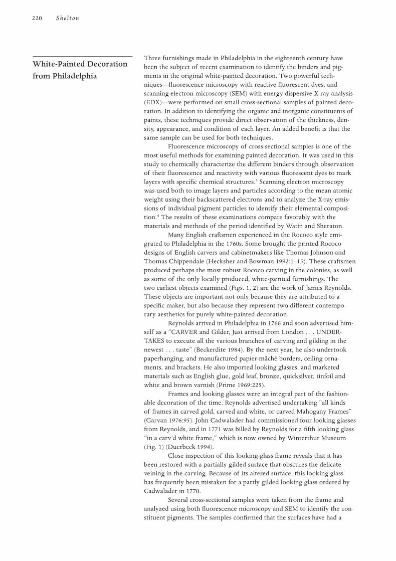
Three furnishings made in Philadelphia in the eighteenth century havebeen the subject of recent examination to identify the binders and pig-ments in the original white-painted decoration. Two powerful tech-niques—fluorescence microscopy with reactive fluorescent dyes, andscanning electron microscopy (SEM) with energy dispersive X-ray analysis(EDX)—were performed on small cross-sectional samples of painted deco-ration. In addition to identifying the organic and inorganic constituents ofpaints, these techniques provide direct observation of the thickness, den-sity, appearance, and condition of each layer. An added benefit is that thesame sample can be used for both techniques.
Fluorescence microscopy of cross-sectional samples is one of themost useful methods for examining painted decoration. It was used in thisstudy to chemically characterize the different binders through observationof their fluorescence and reactivity with various fluorescent dyes to marklayers with specific chemical structures.3 Scanning electron microscopywas used both to image layers and particles according to the mean atomicweight using their backscattered electrons and to analyze the X-ray emis-sions of individual pigment particles to identify their elemental composi-tion.4 The results of these examinations compare favorably with thematerials and methods of the period identified by Watin and Sheraton.
Many English craftsmen experienced in the Rococo style emi-grated to Philadelphia in the 1760s. Some brought the printed Rococodesigns of English carvers and cabinetmakers like Thomas Johnson andThomas Chippendale (Hecksher and Bowman 1992:1–15). These craftsmenproduced perhaps the most robust Rococo carving in the colonies, as wellas some of the only locally produced, white-painted furnishings. Thetwo earliest objects examined (Figs. 1, 2) are the work of James Reynolds.These objects are important not only because they are attributed to aspecific maker, but also because they represent two different contempo-rary aesthetics for purely white-painted decoration.
Reynolds arrived in Philadelphia in 1766 and soon advertised him-self as a “CARVER and Gilder, Just arrived from London . . . UNDER-TAKES to execute all the various branches of carving and gilding in thenewest . . . taste” (Beckerdite 1984). By the next year, he also undertookpaperhanging, and manufactured papier-mâché borders, ceiling orna-ments, and brackets. He also imported looking glasses, and marketedmaterials such as English glue, gold leaf, bronze, quicksilver, tinfoil andwhite and brown varnish (Prime 1969:225).
Frames and looking glasses were an integral part of the fashion-able decoration of the time. Reynolds advertised undertaking “all kindsof frames in carved gold, carved and white, or carved Mahogany Frames”(Garvan 1976:95). John Cadwalader had commissioned four looking glassesfrom Reynolds, and in 1771 was billed by Reynolds for a fifth looking glass“in a carv’d white frame,” which is now owned by Winterthur Museum(Fig. 1) (Duerbeck 1994).
Close inspection of this looking-glass frame reveals that it hasbeen restored with a partially gilded surface that obscures the delicateveining in the carving. Because of its altered surface, this looking glasshas frequently been mistaken for a partly gilded looking glass ordered byCadwalader in 1770.
Several cross-sectional samples were taken from the frame andanalyzed using both fluorescence microscopy and SEM to identify the con-stituent pigments. The samples confirmed that the surfaces have had a
White-Painted Decorationfrom Philadelphia
220 She l ton
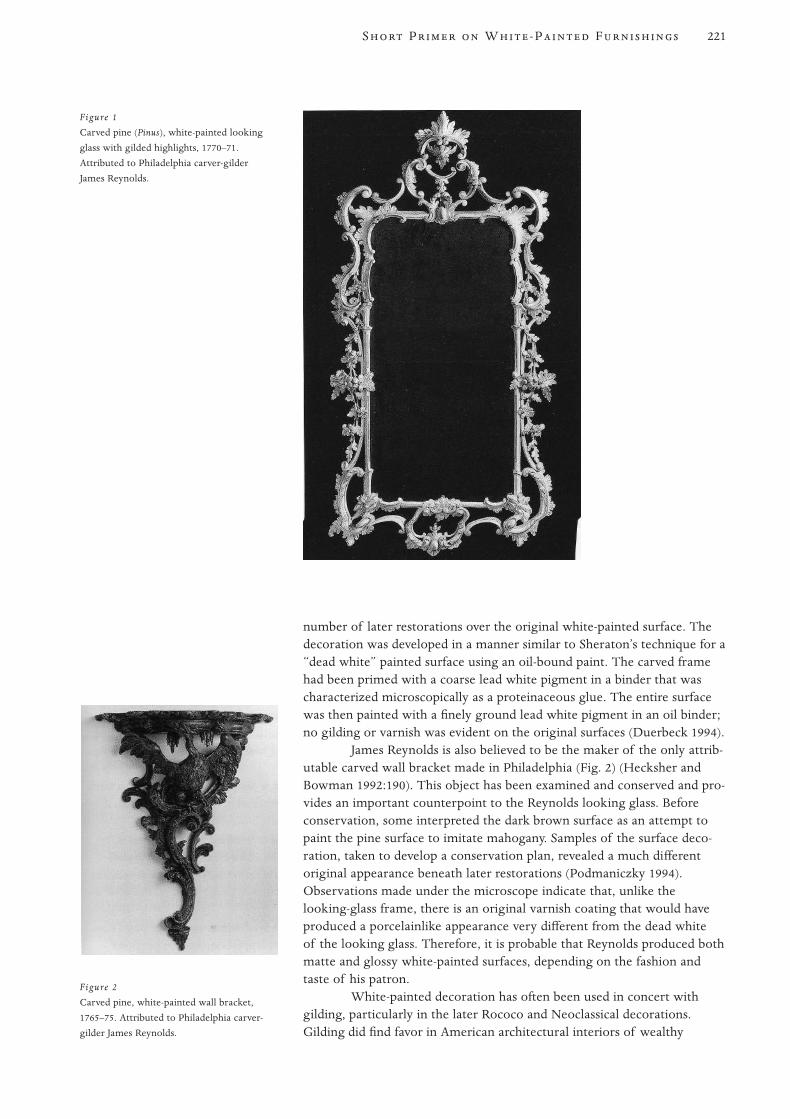
number of later restorations over the original white-painted surface. Thedecoration was developed in a manner similar to Sheraton’s technique for a“dead white” painted surface using an oil-bound paint. The carved framehad been primed with a coarse lead white pigment in a binder that wascharacterized microscopically as a proteinaceous glue. The entire surfacewas then painted with a finely ground lead white pigment in an oil binder;no gilding or varnish was evident on the original surfaces (Duerbeck 1994).
James Reynolds is also believed to be the maker of the only attrib-utable carved wall bracket made in Philadelphia (Fig. 2) (Hecksher andBowman 1992:190). This object has been examined and conserved and pro-vides an important counterpoint to the Reynolds looking glass. Beforeconservation, some interpreted the dark brown surface as an attempt topaint the pine surface to imitate mahogany. Samples of the surface deco-ration, taken to develop a conservation plan, revealed a much differentoriginal appearance beneath later restorations (Podmaniczky 1994).Observations made under the microscope indicate that, unlike thelooking-glass frame, there is an original varnish coating that would haveproduced a porcelainlike appearance very different from the dead whiteof the looking glass. Therefore, it is probable that Reynolds produced bothmatte and glossy white-painted surfaces, depending on the fashion andtaste of his patron.
White-painted decoration has often been used in concert withgilding, particularly in the later Rococo and Neoclassical decorations.Gilding did find favor in American architectural interiors of wealthy
221S P W -P F
Figure 1
Carved pine (Pinus), white-painted looking
glass with gilded highlights, 1770–71.
Attributed to Philadelphia carver-gilder
James Reynolds.
Figure 2
Carved pine, white-painted wall bracket,
1765–75. Attributed to Philadelphia carver-
gilder James Reynolds.
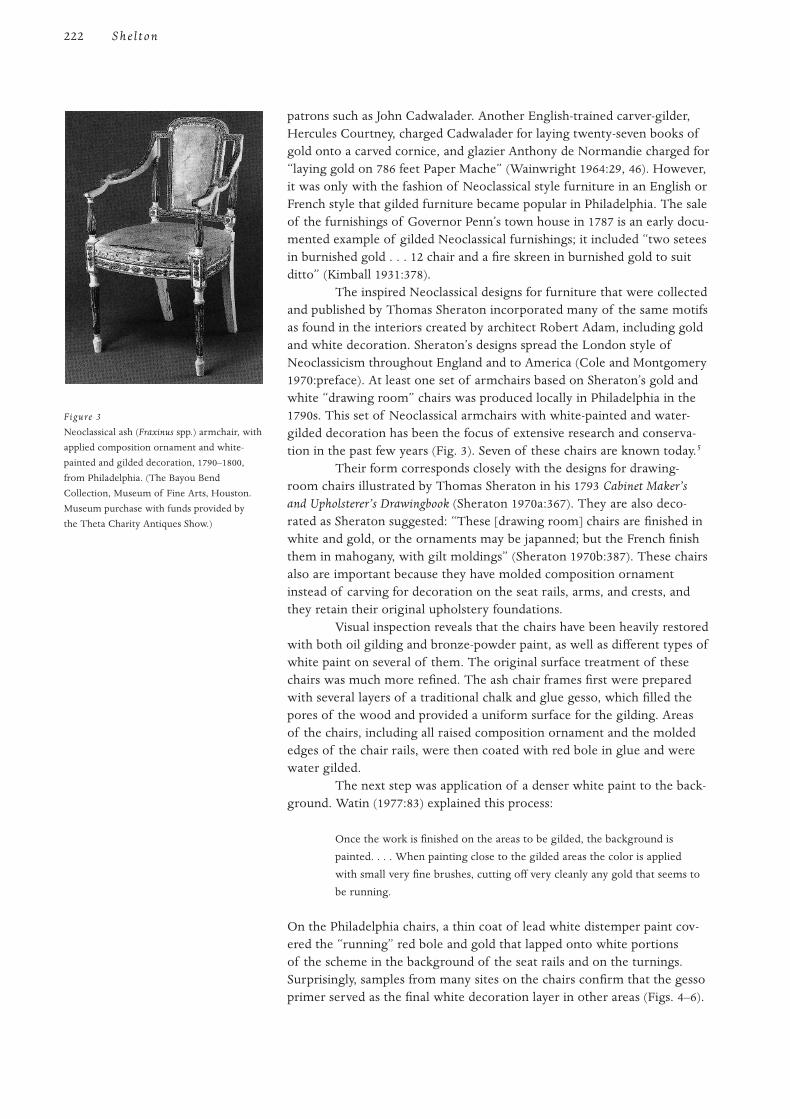
patrons such as John Cadwalader. Another English-trained carver-gilder,Hercules Courtney, charged Cadwalader for laying twenty-seven books ofgold onto a carved cornice, and glazier Anthony de Normandie charged for“laying gold on 786 feet Paper Mache” (Wainwright 1964:29, 46). However,it was only with the fashion of Neoclassical style furniture in an English orFrench style that gilded furniture became popular in Philadelphia. The saleof the furnishings of Governor Penn’s town house in 1787 is an early docu-mented example of gilded Neoclassical furnishings; it included “two seteesin burnished gold . . . 12 chair and a fire skreen in burnished gold to suitditto” (Kimball 1931:378).
The inspired Neoclassical designs for furniture that were collectedand published by Thomas Sheraton incorporated many of the same motifsas found in the interiors created by architect Robert Adam, including goldand white decoration. Sheraton’s designs spread the London style ofNeoclassicism throughout England and to America (Cole and Montgomery1970:preface). At least one set of armchairs based on Sheraton’s gold andwhite “drawing room” chairs was produced locally in Philadelphia in the1790s. This set of Neoclassical armchairs with white-painted and water-gilded decoration has been the focus of extensive research and conserva-tion in the past few years (Fig. 3). Seven of these chairs are known today.5
Their form corresponds closely with the designs for drawing-room chairs illustrated by Thomas Sheraton in his 1793 Cabinet Maker’sand Upholsterer’s Drawingbook (Sheraton 1970a:367). They are also deco-rated as Sheraton suggested: “These [drawing room] chairs are finished inwhite and gold, or the ornaments may be japanned; but the French finishthem in mahogany, with gilt moldings” (Sheraton 1970b:387). These chairsalso are important because they have molded composition ornamentinstead of carving for decoration on the seat rails, arms, and crests, andthey retain their original upholstery foundations.
Visual inspection reveals that the chairs have been heavily restoredwith both oil gilding and bronze-powder paint, as well as different types ofwhite paint on several of them. The original surface treatment of thesechairs was much more refined. The ash chair frames first were preparedwith several layers of a traditional chalk and glue gesso, which filled thepores of the wood and provided a uniform surface for the gilding. Areasof the chairs, including all raised composition ornament and the moldededges of the chair rails, were then coated with red bole in glue and werewater gilded.
The next step was application of a denser white paint to the back-ground. Watin (1977:83) explained this process:
Once the work is finished on the areas to be gilded, the background is
painted. . . . When painting close to the gilded areas the color is applied
with small very fine brushes, cutting off very cleanly any gold that seems to
be running.
On the Philadelphia chairs, a thin coat of lead white distemper paint cov-ered the “running” red bole and gold that lapped onto white portionsof the scheme in the background of the seat rails and on the turnings.Surprisingly, samples from many sites on the chairs confirm that the gessoprimer served as the final white decoration layer in other areas (Figs. 4–6).
222 She l ton
Figure 3
Neoclassical ash (Fraxinus spp.) armchair, with
applied composition ornament and white-
painted and gilded decoration, 1790–1800,
from Philadelphia. (The Bayou Bend
Collection, Museum of Fine Arts, Houston.
Museum purchase with funds provided by
the Theta Charity Antiques Show.)
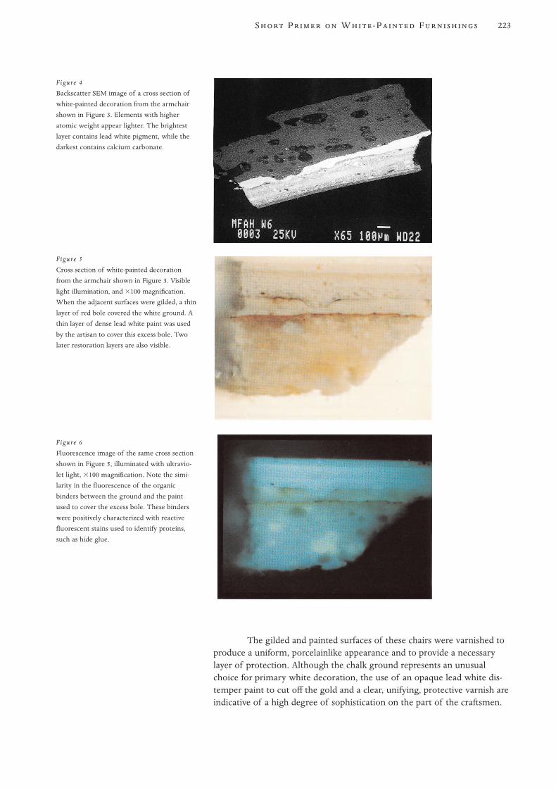
The gilded and painted surfaces of these chairs were varnished toproduce a uniform, porcelainlike appearance and to provide a necessarylayer of protection. Although the chalk ground represents an unusualchoice for primary white decoration, the use of an opaque lead white dis-temper paint to cut off the gold and a clear, unifying, protective varnish areindicative of a high degree of sophistication on the part of the craftsmen.
223S P W -P F
Figure 4
Backscatter SEM image of a cross section of
white-painted decoration from the armchair
shown in Figure 3. Elements with higher
atomic weight appear lighter. The brightest
layer contains lead white pigment, while the
darkest contains calcium carbonate.
Figure 5
Cross section of white-painted decoration
from the armchair shown in Figure 3. Visible
light illumination, and 3100 magnification.
When the adjacent surfaces were gilded, a thin
layer of red bole covered the white ground. A
thin layer of dense lead white paint was used
by the artisan to cover this excess bole. Two
later restoration layers are also visible.
Figure 6
Fluorescence image of the same cross section
shown in Figure 5, illuminated with ultravio-
let light, 3100 magnification. Note the simi-
larity in the fluorescence of the organic
binders between the ground and the paint
used to cover the excess bole. These binders
were positively characterized with reactive
fluorescent stains used to identify proteins,
such as hide glue.
White-painted decoration was widely used in Europe in the eighteenthcentury, both in the French inspired Rococo style and later in theNeoclassical style. The treatises of Watin and Sheraton suggest that bothoil and distemper paints were acceptable for interior white-painted sur-faces. Furthermore, by utilizing varnish coatings, surfaces ranging frommatte to porcelainlike could be made. Thorough examinations of white-painted surfaces with cross-sectional microscopy and scanning electronmicroscopy can allow for characterization of binders and pigments, mak-ing it possible to better understand the material and cultural context ofthese eighteenth-century objects and the original details of their primarysurfaces, so that their conservation may be directed.
1 For a more complete discussion of the Rococo style, see Fiske 1943 and Pallot 1989.
2 The refractive index (n) of a medium is the ratio of the sines of the angles of incidence and
refraction of a ray of light passing from one medium (usually air) into the given medium. For
linseed oil, the refractive index is n51.47. Chalk has a refractive index of n51.51—very close
to linseed oil—while lead white has a refractive index of n51.94.
3 Small samples of the decoration were cast in Bioplastic brand polyester-polystyrene resin. Each
sample was ground perpendicular to the outer surface and polished with Stoddard’s solvent on
400 and 600 grit wet/dry abrasive papers and with 1 micron alumina powder. Samples were
viewed using a Nikon Labophot-pol microscope fitted with fiber-optic lamps and an episcopic-
fluorescence attachment, which allows the sample to be exposed to normal white light and
ultraviolet (UV) light for examination of the fluorescent characteristics of the sample. The UV
light is passed through a series of filters, either (1) in a violet cube block (Nikon V-2B) with the
following specifications: excitation, 380–425; dichroic mirror, 430; barrier filter, 450 (Nm); or
(2) in a blue cube block (Nikon B-2A) with the following specifications: excitation, 450–490;
dichroic mirror, 510; barrier filter, 520. Fluorochrome dyes were used to microchemically char-
acterize specific types of artists’ materials. Three fluorescent dyes were applied to each sample
and observed under UV illumination: triphenyltetrazolium chloride (TTC) in a 4% solution in
ethanol to react with carbohydrates; fluorescein isothiocyanate (FITC) in a 0.2% solution of
acetone to react with free amino groups commonly found in proteins and in some modern
emulsion paints; Rhodamine B (RHOB) to mark lipid structures, such as in drying oils.
4 Scanning electron microscopy was performed at Exxon Research and Production Facility,
Houston, Texas, by Bob Klimentidis. The samples were coated with carbon to provide a con-
ductive surface.
5 In addition to the armchair owned by the Bayou Bend Collection of the Museum of Fine Arts,
Houston, six others have been located. Two of the armchairs are owned by the H. F. DuPont
Winterthur Museum; see Montgomery (1966:142–44). Another pair is privately owned by
Joseph and June Hennage. One chair is owned by George and Linda Kaufman; see Flanigan
(1986:130–31). The seventh chair is in the collection of the Yale University Art Gallery.
Beckerdite, Luke
1984 Philadelphia carving shops part 1: James Reynolds. Antiques 125(5):1120–33.
Cole, Wilford P., and Charles Montgomery, eds.
1970 Preface to Thomas Sheraton’s Cabinet Dictionary, by Thomas Sheraton. New York:
Praeger Publishers.
Duerbeck, Deborah
1994 Report on object no. 52.261. Winterthur Museum, 31 January.
Flanigan, J. Michael
1986 American Furniture from the Kaufman Collection. Washington, D.C.: National Gallery
of Art.
References
Notes
Conclusion
224 She l ton
Fowles, John, and John Cornforth
1979 English Decoration in the 18th Century. London: Barrie and Jenkins.
Garvan, Beatrice
1976 Three Centuries of American Art. Philadelphia: Philadelphia Museum of Art.
Gloag, J.
1968 English furniture in the French taste, part 1. Antiques 64(3):355–62.
Hecksher, M., and L. Bowman
1992 American Rococo. New York: Metropolitan Museum of Art.
Kimball, Fiske
1943 The Creation of the Rococo. Philadelphia: Philadelphia Museum of Art.
Kimball, M. G.
1931 The furnishings of Governor Penn’s town house. Antiques 19(6):378.
Montgomery, Charles F.
1966 American Furniture: The Federal Period. New York: Viking Press.
Pallot, G. B.
1989 The Art of the Chair in Eighteenth Century France. Paris: ACR-Gismondi.
Podmaniczky, Michael
1994 Report on object no. 58.2242. Winterthur Museum, 15 May.
Prime, Alfred
1969 The Arts and Crafts in Philadelphia, Maryland, and South Carolina, 1721–1785. 1929.
Reprint, New York: Da Capo Press.
Sheraton, Thomas
1970a Cabinet Maker’s and Upholsterer’s Drawingbook. London, 1793. Reprint, New York:
Praeger Publishers.
1970b Thomas Sheraton’s Cabinet Dictionary. London, 1803. Reprint, New York: Praeger
Publishers.
Wainwright, Nicholas B.
1964 Colonial Grandure in Philadelphia: The House and Furniture of General John Cadwalader.
Philadelphia: Historical Society of Pennsylvania.
Watin, Jean Félix
1977 L’art du peintre, doreur, vernisseur. 1773. Reprint, Paris: Leonce Laget.
225S P W -P F
226
T of flower pollens in Neanderthal burialsindicates that humankind’s attraction to brightly colored flowersand plant materials predates Homo sapiens. It is not surprising
then, that humans have identified and modified the botanical colorants,among other colored substances, in order to decorate themselves, theirclothes, and their surroundings. The quest for dyes has motivated tradeand exploration for thousands of years, and descriptions of textile dyesand technologies are found in our earliest literature. Dyes have also beenimportant in the decoration of wood, in ways that are both obvious andunexpected.
The functions that dyes fulfill in the decoration of wood can be brokendown into the following five categories:
1. Dyes: When woods are actually soaked or boiled in dye solu-tions with appropriate fixing chemicals, or mordants, as wascommon practice in the dyeing of textiles, they can be saidto function as true dyes. Thin wood veneers were commonlydyed during the periods when pictorial marquetry was fashion-able. Such dyed veneers are more or less colored throughouttheir entire thickness.
2. Stains: A superficial application of a colorant or color-producingreagent to wood is commonly called staining. Stains are nor-mally applied to completely assembled furniture and wood-work, and penetrate into the wood a short distance only.
3. Colorants for varnishes and glazes: Soluble extracts ofdyestuffs, as well as colored resins, were often completely dis-solved in drying oils, spirit varnishes, and oil-resin varnishes.When used in this way, they color the medium but are not dis-tributed as particles, except on a molecular level.
4. Lakes: Dyes can be made into insoluble pigments in a varietyof ways, and as such are termed lakes. These pigments haveparticle sizes in the range of other ground pigments. Lakes aregenerally quite transparent in their media, due to low refrac-tive indexes, and were commonly used in oil-medium glazesand colored varnishes. Modern pigments based on reasonablystable synthetic dyes have acquired a legitimate place in the
The Use of Dyes inWood Polychromy
The Use of Dyes and Colored Varnishes in Wood Polychromy
Jonathan Thornton
production of commercial paints, and a few may even be con-sidered permanent.
5. Adulterants: Dyes have long had a leading role in the adultera-tion of paints and pigments. They have been used to produceoutright fakes of more esteemed and expensive pigments, aswell as to brighten the colors of paints that have been extendedby the addition of inert white fillers.
The categories of use described above may be combined. Solubledyes, colored resins, and pigments were often incorporated into varnishand stain recipes, or combined on the object as separate procedures.
Definition and description
Dyes are organic (carbon-containing) compounds that selectively absorbsome wavelengths of visible light. Those wavelengths not absorbed areperceived as color by the viewer. Dyes have always been most important inhuman technologies as colorants for textiles, and it is from this literaturethat most of the information regarding them is drawn. In order to be aneffective dye, an organic substance must stain or fix well to the substrate,produce a bright color, and retain that color to a reasonable degree. Thevast majority of compounds that give rise to color in nature do not satisfythese criteria, and over the centuries the potential plant and animalsources have been winnowed down to relatively few.
Chemistry and terminology
Most dyes are aromatic organic molecules, based on the six-carbon ringstructure of benzene. Attached to this benzene ring are the various func-tional groups that characterize particular dyes. Molecular structures thatabsorb light and give rise to colors are termed chromophores, “color bear-ers.” Typical chromophores for the natural red dyes are aromatic mole-cules classed as quinones, of varied individual structure. Quinonoidcompounds are quite stable, and some red dyes—such as madder, fromthe roots of the madder plant, whose major colorant has been identifiedas alizarin—are as lightfast as a natural dye can be.
By contrast, most yellow dyes are flavinoid compounds, havinglesser stability, and natural yellow dyes are notoriously fugitive. The mostpermanent of these is luteolin, from the stems and leaves of the weldplant. However, one of the most fugitive—quercitrin, from oak (Quercus)bark—has been most frequently found in historic textiles, probably becauseof low cost. Chemists have determined that many natural dyestuffs donot yield a single compound, but are mixtures of several compounds; forexample, alizarin, purpurin, and pseudopurpurin are the major chromo-phoric compounds in natural madder (Mills and White 1994). Because dyecompounds have varying degrees of stability, natural dyes that are mixtureswill often shift in hue, as well as lose overall intensity, as they fade.
Dyes bind to their substrates in a variety of ways that areclassified according to their chemical interactions as being direct, acid, vat,mordant, et cetera. Most of these interactions are specific to various textilefibers and are outside the scope of this article, although two, mordant anddirect, are sufficiently relevant to be commented on briefly. Most naturaldyes are mordant dyes, and these have particular relevance to pigment
Definition, Description,Chemistry, andTerminology
227U D C V W P
production. Mordants (from the Latin verb mordere, “to bite”) are metalsalts, such as alum, which bind with the dye and form an insoluble com-plex as they are made to precipitate out of solution. This precipitate canbe formed on the surface of a fiber (as in textile dyeing) or can be settledout, washed, filtered, and dried to create a pigment. Such dye-based pig-ments are called lakes. Direct (also called substantive) dyes are much lesscommon. They bind to polar sites on the substrate without any specialtreatment. The direct dyes saffron and turmeric, for example, are effectivethough fugitive dyes for cellulosic fibers such as cotton. They will also dyeand stain wood,1 as it consists mostly of cellulose. Alkanet is another directdye that has been used extensively as a stain (Moore 1882:271).
One dyestuff will often yield different colored complexes whendifferent metallic salts are used as mordants. Such dyes are termed poly-genetic. Madder, for instance, can be made rust-red with aluminum; violetwith iron; orange with tin; maroon with chromium; and yellow with cop-per. Cochineal is another polygenetic dye.
The color afforded by some dyes, such as archil and litmus, bothderived from lichens, is pH dependent. The light-absorbing characteristicsof the particular chromophore formed will depend on whether the dye-bath is alkaline or acidic, and a variety of reds and purples can be madeby manipulating the pH of the dyebath.
The natural dyes and tannins present in many woods can be madedarker or brighter, or can be altered in shade by the application of variousreagents. For lack of a better term, these internally produced colors havebeen called chemical stains, to indicate that the color has been produced bya chemical reaction between the stain and the materials in the object.Examples of such stains include solutions of salts of metals, such as ironand copper. The metal ions react with the phenolic groups of tannins andlignins in the wooden object to form intensely colored complexes. Similarchemistry is involved in an iron and oak-gall stain, prepared separatelyand applied to wood to “ebonize” it, or in an iron-mordanted logwood(Haematoxylon campechianum) extract, used to dye textiles black. In theseand other cases, the term chemical stain provides a useful distinctionbetween processes but not chemical products. Other chemical stainsinclude oxidants such as nitric acid (aquafortis) (Dossie 1758:509), thechromates, and a base such as ammonia—which is used in the gaseousform to give fumed oak (Hayward 1946:15) its characteristic appearance.The oxidants presumably convert phenolic materials in the wood to moreintensely colored quinone structures, while the ammonia may catalyze avariety of oxidation and condensation reactions resulting in the formationof chromophores. Other stains in the chemical class include the use ofverdigris (basic copper acetate) as a green stain for light-colored woods,bone, and ivory. In this case, probably the only chemistry involved is thebinding of the copper ion to the cellulose or protein.
Natural dyes and colored resins
The naturally occurring dyestuffs are either botanical or animal in originand are obtained from the roots, stems, flowers, or fruits of plants, orfrom the exudate (e.g., lac) or actual bodies of insects (e.g., cochineal,kermes). The famous Tyrian Purple that decorated the togas of Romansenators was extracted from Murex mollusks of the family Muricidae.
Origins of RelevantColorants
228 T hor nton

Both natural and synthetic dyes have been used in wood poly-chromy, but natural dyestuffs have, by far, the longest history of use.Because of this important history, as well as the problems of permanencethat have been caused by their use, they are described in greater detail inthe appendix at the end of this article. A number of colored resins thatwere soluble in oils, alcohol, or turpentine were also important in woodpolychromy, primarily for the production of clear but colored glazes andvarnishes.
Synthetic dyes
Beginning in the mid–nineteenth century, chemists began to explore thechemical constituents and properties of coal tar, the black and gooey by-product of the processes of making coke and flammable gas from coal. In1856, an eighteen-year-old chemistry student, Henry Perkin, was trying tosynthesize quinine from one of the component fractions of coal tar (ani-line) and inadvertently produced a bright purple-colored material. Thissynthetic dye, the first to become commercially available, was marketedas Tyrian Purple and Aniline Purple in 1857 (Knecht and Loewenthal1910:496). Manufacture was subsequently taken up by the French, whocalled the color Mauveine (Allen 1971:8). Although Perkin’s Mauve, as itcame to be called, proved to be quite fugitive, more and better dyes soonfollowed—Magenta in 1858, Rosaniline Blue and Aniline Black in 1860,Methyl Violet in 1861, Aldehyde Green (the first synthetic green) in 1862,and Hoffman’s Violet in 1863, to name a few important ones (Cain andThorpe 1913:202–4).
In 1865, the benzene ring structure was proposed by AugustKekulé (McLaren 1986:15); and, in 1868, the first intentional synthesisof a dye based on this new theoretical understanding produced alizarin,which is one of the most stable and widely used synthetic dyes to thisday. Another important class of dyes, the azo compounds, began to besynthesized in 1876. By 1910, dye chemistry was well understood andsynthetics had replaced all but the most permanent of the natural dyes.The synthetic dye revolution made available new and brighter colors;after the early experimental years, chemists produced synthetic dye colorswith far greater permanence than the natural dyes. A few modern syn-thetic pigments, notably the pthalocyanine and quinacridone colors, havebeen placed by Winsor and Newton in their second, “durable” categoryand may well belong in category one, “extremely permanent” (Thomson1978:11–12).
There is extensive documentary evidence for the use of dyes in a widevariety of the decorative arts, including painted wood. The earliest relevanttreatises of a practical nature—such as the Mappae Clavicula, a ninth-centurycompilation (Smith and Hawthorn 1974); and the Strassburg Manuscript,attributed to either the fourteenth or fifteenth century (Borradaile 1966)—contain recipes for dye-based colors, but difficulties of translation and inter-pretation make it hard to say how these recipes were used. Among the dyecolors intended for painters mentioned in the Mappae Clavicula, parts ofwhich can be traced back to ancient Greek and Roman sources, are indigo,woad, lac, “earth vermilion that grows on the leaves of the turkey-oak”(kermes), and a “broth made from boiling down Murex.”
History of Use
229U D C V W P
The evidence is discussed in greater detail in the following,according to the categories of use already described.
Dyes and stains
Early treatises rarely distinguish between the use of natural colorants astrue penetrating dyes and as superficial stains, and in practice most can beused in either way. The mid–eighteenth century saw an increase in techni-cal treatises describing actual current practice. One of the best of these,Robert Dossie’s Handmaid to the Arts (1758), contains a lengthy section onstains for wood, including: “tincture of turmeric” (a tincture is an alco-holic solution) and stains based on brazilwood, indigo, madder, fustic, “yel-low berries” (buckthorn berries), dragon’s blood, and logwood. Anothereighteenth-century manual describes a stain made by propping the freshestpossible horse manure up on little sticks and collecting the drippings,which would “penetrate [the wood] so as to never fade or vanish” (Smith1799:267). This, no doubt, had the advantage of a plentiful supply of theraw material.
In 1803, Thomas Sheraton stated that “the art of staining woodwas more in use at the time when inlaying was in fashion” and that redand black were the colors currently in use (Sheraton 1970:308). Manualsof the nineteenth century continued to list a wide variety of stain recipes,among the most common of which were those based on barberry andalkanet roots, logwood and brazilwood, indigo, and iron/insect-gall com-plexes. By the early twentieth century, synthetic dyes replaced natural dyesfor all but the most stubbornly traditional artisans. Coal tar dyes, as theywere still often called, were available in the form of dry crystals that wereeither water or oil soluble. Water-soluble stains offered a wider range ofcolors but were somewhat less fast than those soluble in oil (which wereusually the highly stable azo dyes).
Colorants for varnishes and glazes
Many dyes are soluble in oils or alcohol and can be used to form brightand transparent media for decorative painting. Most of these early recipeswere intended for use over white metal leafs (silver, tin) to give them theappearance of gold. Such changing varnishes, as they were sometimescalled, are included in many formularies. One from the Mappae Claviculawas composed of saffron, gum, linseed oil, and orpiment. Annatto is anoil-soluble dye that was widely used in this way, and in fact its chief mod-ern uses are in the coloring of butter, cheese, and margarine, and in cos-metics. The dyewoods were also commonly included in such recipes. Earlycraftsmen were often aware of the limitations of dye colorants. Dossie(1758:119) said that annatto was not fast in oil or water media but was fastin “varnish painting.” The most common use of dye colorants, however,was in the form of lakes used to produce translucent glazes for fine anddecorative painting.
Lakes
Lakes probably originated as the insoluble dye-vat scums and sedimentsleft over from the mordant dyeing of textiles, but they were intentionallymade as pigments as early as the Roman period. The name itself camefrom lac, the red dye washed from shellac resin, but was later generalized
230 T hor nton
to encompass all dye-based pigments. An earlier term for lakes in Englishwas pinks, hence the confusing name of dutch pink for a yellow lake madefrom buckthorn berries (Harley 1970:97).
In addition to their attractive, bright colors, the transparency oflakes made them popular with artists for the vehicle-rich paints calledglazes. Lakes had a solid place in the fine arts but were particularly impor-tant in decorative and commercial painting. Such decorative products asjapanned “tin” wares (made from tinned sheet iron) and papier-mâchéused colored glazes extensively, often over metal leafs and mother-of-pearlinlays. Of the colors listed in one Victorian manual for amateur decorativepainters, many are lakes (Art Recreations 1866:156, 188). An early twentieth-century writer on paint technology stated that “automobile and carriagepainters use lakes extensively for high class work, and decorative artistsalso use them.” Of the colors listed as “decorators’ glaze colors,” wellover half are lakes (Vanderwalker 1924:25, 52). In the painting of woodenvehicles, lakes were traditionally used as glazes over similar colors—carmine over red lead, and yellow lake over ochre, to give two examples(Schriber 1910:24).
With the development of the synthetic dyes, the number of paintsbased on dyes skyrocketed. An early-twentieth-century authority com-plained that “there are on the market today a great many unnecessary col-ors . . . many aniline or dye colors, titled with misleading or alluringnames, which mean nothing, but serve only to attract the unsuspectingbuyer” (Weber 1923:3).
Adulteration
The confused state of nomenclature alone meant that artists were oftenunaware of what they were actually using. This was particularly trueowing to the widespread adulteration of colors by manufacturers and deal-ers. An excellent recent article by Leslie Carlisle (1993) on the adulterationof pigments places these practices in the context of a time when even thedealers in foodstuffs thought nothing of faking or “improving” their prod-ucts with deadly poisons. It seems that merchants of the eighteenth cen-tury would have regarded themselves as rubes if they did not engage inthe “sophistication” (faking) of their wares.
These shady practices were so prevalent that, in his extensivedescriptions of the properties and preparation of pigments, Dossie(1758:43–143) included information on how they were commonly adulter-ated and how this could be found out by the careful craftsperson. Hedescribed three modes of pigment adulteration: dilution with cheapermaterials, color enhancement, and outright substitution. He warned thatwhatever is added to Prussian blue to “sophisticate it” (probably logwoodlake) “will always render it more foul and purple.” Smalt was added toultramarine. Even a cheap pigment such as ochre didn’t escape having itsbrightness boosted up by the addition of fugitive dutch pink. Indigo,verditer, chalk, “and other cheap substances” were substituted for bice;and fugitive logwood lakes were sold as the expensive carmine madefrom cochineal.
Adulteration and substitution continued to be common enough inthis century for various writers to issue warnings. Among them were F. W.Weber in his book Artists’ Pigments (1923:18, 26, 78). He lists “Americanvermilion . . . with many fanciful synonyms” as consisting of red lead and
231U D C V W P

the highly fugitive synthetic dye eosin. The already fugitive “brown pink”(formerly made from buckthorn berries) consisted of the still more fugi-tive quercitron, but only if “genuine.” While the cheaper lakes were oftenused to adulterate other pigments, they themselves were extended by theaddition of starch.
When the synthetics were well established, it became standardpractice to use them in paint manufacture. Weber (1923:45) stated, “Whensome of the more permanent lake pigments . . . are used in admixture . . .they can not be looked upon as adulterants but are safe combinations pro-ducing a more colorful pigment.” This view was apparently not universallyaccepted. Maximilian Toch, in his Materials for Permanent Painting (1911:87),along with other warnings against synthetics, said that alizarin greens weremade from coal-tar dyes that “readily decompose when mixed with ironoxide colors.” It was generally accepted, however, that cheap and poten-tially fugitive colors had their place. Ralph Mayer (1940:92) argued that“nobody expects the paints used in ordinary wall decoration to last fifteenyears,” and a wagon painter said that “on cheap work munich lake is substi-tuted for carmine and few can tell the difference” (Schriber 1910:49). ThePainting and Decorating Craftsman’s Manual and Textbook (1949:31) listed roselake as sufficiently permanent for interior work, tinting, glazing, and stains.Thus we see that the paints used on much of our material heritage may beeither less permanent than intended or not intended to be permanent.
Technical discussion
Dye chemistry is highly complex, and the mechanisms of degradation varywith molecular structure. A few generally agreed-upon statements can bemade, however.
Dyes fade in direct proportion to the total light energy theyreceive. They will not be protected from damage by the maintenance oflow light levels but only damaged more slowly. The reciprocity law tells usthat decreasing total illuminance by half will cut the rate of damage byhalf. It is also true that halving the time of exposure under the full level ofilluminance will cut the damage by half. The rate of fading, however, hasan exponential relationship to exposure, with the most damage happeninginitially and decreasing in rate over time (Thomson 1978:22).
For most materials, the damage caused by light increases as wave-length decreases. The blue and violet end of the spectrum is more damag-ing than the red because more photochemistry is initiated by these higherenergy photons. In the museum display of sensitive objects, it is both prac-tical and advantageous to exclude damaging ultraviolet light because itcontributes nothing to illumination, but the visible light is equally damag-ing to many dyes and cannot be removed except by colored filters, whichare aesthetically unacceptable. Highly light-sensitive dyes are damagedmost by the wavelengths they absorb most strongly (McLaren 1956), andit is precisely this selective absorption that makes them colored.
While light is the primary factor in the degradation of dyes, itis not the only one. The chemical mechanisms of fading are many andvaried and are not prone to generalization. The longevity of most dyescan be prolonged by a reduction in humidity level. Reduction of oxygenconcentration will reduce the fading of most but not all pigments anddyes (Arney, Jacobs, and Newman 1979). Prussian blue, to cite just one
Aging and Permanence of Dyes
232 T hor nton
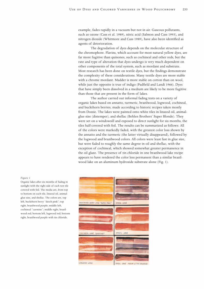
example, fades rapidly in a vacuum but not in air. Gaseous pollutants,such as ozone (Cass et al. 1989), nitric acid (Salmon and Cass 1993), andnitrogen dioxide (Whitmore and Cass 1989), have also been identified asagents of deterioration.
The degradation of dyes depends on the molecular structure ofthe chromophore. Flavins, which account for most natural yellow dyes, arefar more fugitive than quinones, such as cochineal and other reds, but therate and type of alteration that dyes undergo is very much dependent onother components of the total system, such as mordant and substrate.Most research has been done on textile dyes, but the findings demonstratethe complexity of these considerations. Many textile dyes are more stablewith a chrome mordant. Madder is more stable on cotton than on wool,while just the opposite is true of indigo (Padfield and Landi 1966). Dyesthat have simply been dissolved in a medium are likely to be more fugitivethan those that are present in the form of lakes.
The author carried out informal fading tests on a variety oforganic lakes based on annatto, turmeric, brazilwood, logwood, cochineal,and buckthorn berries, made according to historic recipes taken mostlyfrom Dossie. The lakes were painted onto white tiles in linseed oil, animal-glue size (distemper), and shellac (Behlen Brothers’ Super Blonde). Theywere set on a windowsill and exposed to direct sunlight for six months, thetiles half-covered with foil. The results can be summarized as follows: Allof the colors were markedly faded, with the greatest color loss shown bythe annatto and the turmeric (the latter virtually disappeared), followed bythe logwood and brazilwood colors. All colors were least fast in glue size,but were faded to roughly the same degree in oil and shellac, with theexception of cochineal, which showed somewhat greater permanence inthe oil glaze. The presence of tin chloride in one brazilwood lake recipeappears to have rendered the color less permanent than a similar brazil-wood lake on an aluminum hydroxide substrate alone (Fig. 1).
233U D C V W P
Figure 1
Organic lakes after six months of fading in
sunlight with the right side of each test tile
covered with foil. The media are, from top
to bottom on each tile, linseed oil, animal-
glue size, and shellac. The colors are, top
left, buckthorn berry “dutch pink”; top
right, brazilwood purple; middle left,
cochineal “carmine”; middle right, brazil-
wood red; bottom left, logwood red; bottom
right, brazilwood purple with tin chloride.
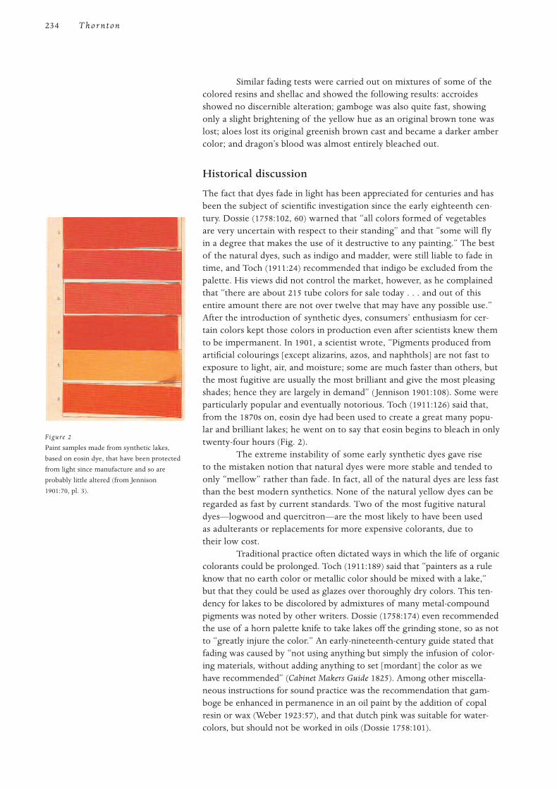
Similar fading tests were carried out on mixtures of some of thecolored resins and shellac and showed the following results: accroidesshowed no discernible alteration; gamboge was also quite fast, showingonly a slight brightening of the yellow hue as an original brown tone waslost; aloes lost its original greenish brown cast and became a darker ambercolor; and dragon’s blood was almost entirely bleached out.
Historical discussion
The fact that dyes fade in light has been appreciated for centuries and hasbeen the subject of scientific investigation since the early eighteenth cen-tury. Dossie (1758:102, 60) warned that “all colors formed of vegetablesare very uncertain with respect to their standing” and that “some will flyin a degree that makes the use of it destructive to any painting.” The bestof the natural dyes, such as indigo and madder, were still liable to fade intime, and Toch (1911:24) recommended that indigo be excluded from thepalette. His views did not control the market, however, as he complainedthat “there are about 215 tube colors for sale today . . . and out of thisentire amount there are not over twelve that may have any possible use.”After the introduction of synthetic dyes, consumers’ enthusiasm for cer-tain colors kept those colors in production even after scientists knew themto be impermanent. In 1901, a scientist wrote, “Pigments produced fromartificial colourings [except alizarins, azos, and naphthols] are not fast toexposure to light, air, and moisture; some are much faster than others, butthe most fugitive are usually the most brilliant and give the most pleasingshades; hence they are largely in demand” ( Jennison 1901:108). Some wereparticularly popular and eventually notorious. Toch (1911:126) said that,from the 1870s on, eosin dye had been used to create a great many popu-lar and brilliant lakes; he went on to say that eosin begins to bleach in onlytwenty-four hours (Fig. 2).
The extreme instability of some early synthetic dyes gave riseto the mistaken notion that natural dyes were more stable and tended toonly “mellow” rather than fade. In fact, all of the natural dyes are less fastthan the best modern synthetics. None of the natural yellow dyes can beregarded as fast by current standards. Two of the most fugitive naturaldyes—logwood and quercitron—are the most likely to have been usedas adulterants or replacements for more expensive colorants, due totheir low cost.
Traditional practice often dictated ways in which the life of organiccolorants could be prolonged. Toch (1911:189) said that “painters as a ruleknow that no earth color or metallic color should be mixed with a lake,”but that they could be used as glazes over thoroughly dry colors. This ten-dency for lakes to be discolored by admixtures of many metal-compoundpigments was noted by other writers. Dossie (1758:174) even recommendedthe use of a horn palette knife to take lakes off the grinding stone, so as notto “greatly injure the color.” An early-nineteenth-century guide stated thatfading was caused by “not using anything but simply the infusion of color-ing materials, without adding anything to set [mordant] the color as wehave recommended” (Cabinet Makers Guide 1825). Among other miscella-neous instructions for sound practice was the recommendation that gam-boge be enhanced in permanence in an oil paint by the addition of copalresin or wax (Weber 1923:57), and that dutch pink was suitable for water-colors, but should not be worked in oils (Dossie 1758:101).
234 T hor nton
Figure 2
Paint samples made from synthetic lakes,
based on eosin dye, that have been protected
from light since manufacture and so are
probably little altered (from Jennison
1901:70, pl. 3).
The conclusive identification of dyes is complicated in both theory andpractice, and has been briefly summarized by Mills and White (1994:129).In some cases no method has yet been developed for unequivocal identifi-
cation. Success is dependent not only on choosing the appropriate methodbut also on considerable skill and experience in carrying out the analyses,as well as interpreting the results. The techniques most often used includechromatographic techniques that separate the sample into its componentparts, such as thin-layer chromatography (TLC) and high-pressure liquidchromatography (HPLC), as well as spectrophotometric techniques thatrely on comparing the spectral absorption, reflectance, or fluorescence ofan unknown with reference samples of known composition and structure.These include ultraviolet-visible spectroscopy (UV/Vis) and Fourier-transform infrared (FT-IR) spectroscopy (Gillard et al. 1992).
Recent experience at the Conservation Department of BuffaloState College indicates that TLC offers an excellent and reasonably simpleand inexpensive method of identifying dye colorants, even in extremelysmall samples. Best results have been achieved with polyamide TLC platesexamined after development under ultraviolet light. This technique givesdistinctive “fingerprints” of unknowns. Simple visual comparison ofknown substances treated in the same way will usually identify theunknown colorant, but results can be confused by the presence of degra-dation products or other materials extracted into a coating film from theunderlying wood.
In a few instances, there are even simpler identification tech-niques. Some dyes fluoresce strongly and distinctively in ultravioletlight. Lac fluoresces orange; madder, orange-red; and dutch pink, yellow.Microchemical tests are available for many dyes. Dye analysis has beenextensively discussed in the literature, most notably in the work of HelmutSchweppe (1963:12; 1977; 1987) and Judith Hofenk de Graaff (1969;1974:54; Hofenk de Graaff and Roelofs 1978).
Organic dyes have long been important components in colored coatingsystems such as paints, glazes, and colored varnishes, which differ fromone another only in binder-to-colorant ratios. The artists’ preoccupationwith immediate effect, as opposed to permanence, is nothing new. Paintershave used dye-based colorants for their often stunning brilliance, as well asfor the broader palette and the transparent effects they offer. This disre-gard for permanence was especially true in the so-called decorative arts,due to the lower status accorded to these objects in Western culture,whereas the products of fine artists were expected to last. The inclusionof dye-based colorants, however, was often outside the artist’s or artisan’scontrol, due to the common practices of dilution, adulteration, and out-right fakery carried on by manufacturers and merchants.
Most of the natural dyestuffs are so fugitive that the historic liter-ature is a better guide to actual practice than the present appearance ofthe objects themselves. The original appearance of many historic paintedsurfaces can only be surmised, but the knowledge that the current appear-ance is likely to be a muted shadow of the original, and that fugitive mate-rials may be present on the most unexpected objects, can add greatly toour understanding of period taste and practice. This understanding shouldinform our decisions with regard to preservation, conservation, andrestoration.
Conclusion
Identification
235U D C V W P

The author would like to thank his colleagues Judy Bischoff and ChrisTahk for helpful comments on sections of the manuscript dealing withchemistry, and former student Scott Nolley for information drawn fromhis research project (under the direction of Judy Bischoff) on thin-layerchromatography as a method of identifying organic dyes in coatings.
Tables 1 and 2 list common natural materials known from the literatureto have been used in stains, paints, and glazes. It is likely that many morehave had a limited and local use in the decoration of wood than are listedhere because thousands of plants have been used to make colorants. Thislist concentrates on those that were widely traded or propagated world-wide. Most of these would have been available from apothecary shopsand were sometimes called dyer’s drugs. The most common name for thedyestuff is given first, followed by a few synonyms (including the names oflakes made from it), and then the source (seed, root, etc.) and taxonomy.Many of the popular names are drawn from Gettens and Stout (1942), andMayer (1940).
The currently accepted botanical name is shown in boldface, andthe authority given. Superseded names are listed in parentheses. Where noauthority can be found the name may still be listed (but not in boldface) asa cross reference and may be either a superseded synonym or a valid namethat could not be confirmed from the sources consulted (Bailey and Bailey1972; Stafleu 1972; Uphof 1968; Willis 1973). More complete treatises onnatural dyes have been published, but these works contain obsolete orunconfirmed botanical nomenclature (Liles 1990; Hofenk de Graaff 1969;Perkin and Everest 1918). Because of the polygenetic nature of many ofthese dyes, the color classification is somewhat arbitrary.
Table 1 Natural dyes
Common name Synonyms Source
Yellows and Browns
annatto arnato Seeds, or pod surrounding seeds, of Bixa orellana L.
roucou
orange lake
barberry Bark, stems, and root wood of Berberis vulgaris L.
buckthorn berries yellow carmine Berries from various species of the Rhamnus (buckthorn) genus, such as
avignon berries R. amygdalinus, R. oleoides, R. saxatilis Jacq., R. cartharticus L., R. alaternus L.,
yellow berries and R. infectoria L. (“Persian berries”). The berries were used to make the lakes
french berries known as dutch pink (also called “brown pink” and “Italian pink”), and to make
Stil de Grain.
fustic old fustic Wood of Clorophora tinctoria L. Gaudich.
dyer’s mulberry
yellow wood
cuba wood
galls gall nuts Abnormal growths caused by insects on various oaks (Quercus spp.), such as
Quercus infectoria.
madder brown madder Made by partially charring madder lake (see madder under “Reds and Purples”).
burnt carmine
Rubens madder
onions Outer husks of onion bulbs, Allium cepa L.
Appendix
Acknowledgments
236 T hor nton
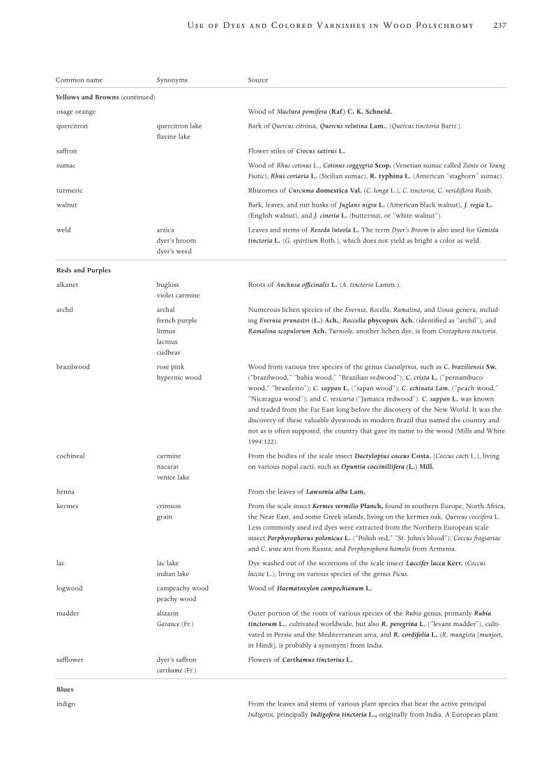
237U D C V W P
Common name Synonyms Source
Yellows and Browns (continued)
osage orange Wood of Maclura pomifera (Raf ) C. K. Schneid.
quercitron quercitron lake Bark of Quercus citrinia, Quercus velutina Lam., (Quercus tinctoria Bartr.).
flavine lake
saffron Flower stiles of Crocus sativus L.
sumac Wood of Rhus cotinus L., Cotinus coggygria Scop. (Venetian sumac called Zante or Young
Fustic), Rhus coriaria L. (Sicilian sumac), R. typhina L. (American “staghorn” sumac).
turmeric Rhizomes of Curcuma domestica Val. (C. longa L.), C. tinctoria, C. veridiflora Roxb.
walnut Bark, leaves, and nut husks of Juglans nigra L. (American black walnut), J. regia L.
(English walnut), and J. cineria L. (butternut, or “white walnut”).
weld arzica Leaves and stems of Reseda luteola L. The term Dyer’s Broom is also used for Genista
dyer’s broom tinctoria L. (G. spartium Roth.), which does not yield as bright a color as weld.
dyer’s weed
Reds and Purples
alkanet bugloss Roots of Anchusa officinalis L. (A. tinctoria Lamm.).
violet carmine
archil archal Numerous lichen species of the Evernia, Rocella, Ramalina, and Usnea genera, includ-
french purple ing Evernia prunastri (L.) Ach., Roccella phycopsis Ach. (identified as “archil”), and
litmus Ramalina scopulorum Ach. Turnsole, another lichen dye, is from Crozophora tinctoria.
lacmus
cudbear
brazilwood rose pink Wood from various tree species of the genus Caesalpinia, such as C. braziliensis Sw.
hypernic wood (“brazilwood,” “bahia wood,” “Brazilian redwood”); C. crista L. (“pernambuco
wood,” “braziletto”); C. sappan L. (“sapan wood”); C. echinata Lam. (“peach wood,”
“Nicaragua wood”); and C. vesicaria (“Jamaica redwood”). C. sappan L. was known
and traded from the Far East long before the discovery of the New World. It was the
discovery of these valuable dyewoods in modern Brazil that named the country and
not as is often supposed, the country that gave its name to the wood (Mills and White
1994:122).
cochineal carmine From the bodies of the scale insect Dactylopius coccus Costa. (Coccus cacti L.), living
nacarat on various nopal cacti, such as Opuntia coccinillifera (L.) Mill.
venice lake
henna From the leaves of Lawsonia alba Lam.
kermes crimson From the scale insect Kermes vermilio Planch, found in southern Europe, North Africa,
grain the Near East, and some Greek islands, living on the kermes oak, Quercus coccifera L.
Less commonly used red dyes were extracted from the Northern European scale
insect Porphyrophorus polonicus L. (“Polish red,” “St. John’s blood”); Coccus fragiariae
and C. uvae ursi from Russia; and Porphyrophora hamelii from Armenia.
lac lac lake Dye washed out of the secretions of the scale insect Laccifer lacca Kerr. (Coccus
indian lake laccae L.), living on various species of the genus Ficus.
logwood campeachy wood Wood of Haematoxylon campechianum L.
peachy wood
madder alizarin Outer portion of the roots of various species of the Rubia genus, primarily Rubia
Garance (Fr.) tinctorum L., cultivated worldwide, but also R. peregrina L. (“levant madder”), culti-
vated in Persia and the Mediterranean area, and R. cordifolia L. (R. mungista [munjeet,
in Hindi], is probably a synonym) from India.
safflower dyer’s saffron Flowers of Carthamus tinctorius L.
carthame (Fr.)
Blues
indigo From the leaves and stems of various plant species that bear the active principal
Indigotin, principally Indigofera tinctoria L., originally from India. A European plant
Common name Synonyms Source
Blues (continued)
yielding indigo was Woad (Isatis tinctoria L.). The indigo-yielding plant Polygonum
tinctoria Ait. was used in Korea and Japan.
Greens
Most greens were made by combining blue and yellow dyes.
chinese green indigo Berries of Rhamnus chlorophora Decne.
sap green Juice from unripe buckthorn berries (see “Persian berries”), particularly Rhamnus
cathartica L., used primarily in watercolor painting as a lake pigment, or as a concen-
trated extract.
Table 2 Colored resins and resinous woods
Colored Resins
accroides Red resin from various species of the grass tree genus Xanthorrhoea, such as
X. hastilis R. Br. native to Australia.
aloes Yellow-brown resin from various members of the Aloe genus, such as A. vera L.,
A. ferox Mill. (“cape aloes,” “Hepatic aloes”), and A. perryi Baker (“Socotran aloes”).
dragon’s blood Red resins from various species of the genus Dracaena in the Liliaceae family were
probably first used in Europe as “dragon’s blood.” These included D. draco L.
(“dragon’s blood,” “Sanguis Draconis”); D. cinnabari Balf. f. (“Socotra dragon’s
blood”) from the island of Socotra; and D. schizantha Baker (“Arabian dragon’s
blood,” “Socotra dragon’s blood”). More recently it has been derived from various
species of the Daemonorops genus in the Palmae family, such as Daemonorops draco
Blume (D. propinquus may be a synonym).
gamboge gummigut Yellow resin from Garcinia hanburyi Hook. f.
seedlac Raw product of the lac insects, still often brightly colored after an initial washing to
remove most of the dye. Other grades of “shellac” and “button lac” may also be
brightly colored, due in part to natural colorants but also to the common addition of
cinnabar or orpiment in India.
Resinous woods
Some dyewoods are termed insoluble because the colored resins are not water soluble. They have been used primarily to color lacquers and varnishes.
camwood camewood Wood of Baphia nitida Lodd. “Barwood” is probably a synonym for camwood,
kambe wood for it, too, has been identified as B. nitida.
eagle wood agal wood Wood from Aquilaria agallocha Roxb. (Aloepaticum citrinum may be another name).
calambac
aloes wood
red sandalwood red saunders wood Wood of Pterocarpus santalinus L. f. Related woods containing brightly colored
sanders wood padauk resins are P. draco L. (“West Indian dragon’s blood”) and P. soyauxii Taub. (“African
padauk”).
1 For the dyeing and staining of wood with saffron and with turmeric, see Baird (1886:393) and
Dossie (1758:508), respectively.
Allen, R. L. M.
1971 Colour Chemistry. New York: Appleton-Century-Crofts.References
Note
238 T hor nton

Arney, J. S., A. J. Jacobs, and R. Newman
1979 The influence of oxygen on the fading of organic colorants. Journal of the American
Institute for Conservation 18(2):108–17.
Art Recreations
1866 Boston: J. E. Tilton.
Bailey, L. H., and Z. B. Bailey
1972 Hortus Third: A Concise Dictionary of Plants Cultivated in the U.S. and Canada. New York:
Macmillan.
Baird, H. C., ed.
1886 The Techno-Chemical Receipt Book. Philadelphia: Henry Carey Baird.
Borradaile, V.
1966 The Strassburg Manuscript: A Medieval Painter’s Handbook. Trans. R. Borradaile. New
York: Transatlantic Arts.
Cabinet Makers Guide, The
1825 London: Knight and Lacy.
Cain, J. C., and F. J. Thorpe
1913 The Synthetic Dyestuffs and Intermediate Products from Which They Are Derived. London:
Charles Griffin.
Carlisle, L.
1993 Authenticity and adulteration: What were 19th century artists really using? The
Conservator (17):56–60.
Cass, G. R., J. R. Drusik, D. Grosjean, W. W. Nazaroff, P. M. Whitmore, and
C. L. Wittman
1989 Protection of Works of Art from Atmospheric Ozone. Marina del Rey, Calif.: Getty
Conservation Institute.
Dossie, R.
1758 The Handmaid to the Arts. Vol. 1. London: J. Nourse Bookseller.
Gettens, R. J., and G. L. Stout
1942 Painting Materials: A Short Encyclopedia. New York: D. Van Nostrand.
Gillard, R. D., S. M. Hardman, R. G. Thomas, and D. E. Watkinson
1992 The detection of dyes by FTIR microscopy. Studies in Conservation 39(3):187–92.
Harley, R. D.
1970 Artist’s Pigments, c. 1600–1835. New York: Elsevier.
Hayward, C. H.
1946 Staining and Polishing. London: Evans Brothers.
Hofenk de Graaff, J. H.
1969 Natural Dyestuffs: Origin, Chemical Constitution, Identification. Amsterdam: International
Council of Museums (ICOM) Committee for Conservation.
1974 A simple method for the identification of indigo. Studies in Conservation 19(1):54–55.
Hofenk de Graaff, J. H., and W. G. Th. Roelofs
1978 The analysis of flavinoids in natural yellow dyestuffs occurring in ancient textiles. In
ICOM Committee for Conservation 5th Triennial Meeting. Zagreb.
Jennison, F. H.
1901 The Manufacture of Lake Pigments from Artificial Colours. London: Scott, Greenwood.
239U D C V W P
Knecht, E., C. Rawson, and R. Loewenthal
1910 A Manual of Dyeing. Vol. 2. London: Charles Griffin.
Liles, J. N.
1990 The Art and Craft of Natural Dyeing. Knoxville: University of Tennessee Press.
Mayer, R.
1940 The Artist’s Handbook. New York: Viking Press.
McLaren, K.
1956 The spectral regions of daylight which cause fading. J. Society of Dyers Colourists
72:86–99.
1986 The Colour Science of Dyes and Pigments. Bristol: Adam Hilger.
Mills, J. S., and R. White
1994 The Organic Chemistry of Museum Objects. 2d ed. London: Butterworths.
Moore, R.
1882 The Universal Assistant and Complete Mechanic. New York: R. Moore.
Padfield, T., and S. Landi
1966 The light-fastness of the natural dyes. Studies in Conservation 11(4):181–95.
Painting and Decorating Craftsman’s Manual and Textbook
1949 New York: Theo. Audel.
Perkin, A. G., and A. E. Everest
1918 The Natural Organic Colouring Matters. New York: Longmans, Green.
Salmon, L. G., and G. R. Cass
1993 The fading of artist’s colorants by exposure to atmospheric nitric acid. Studies in
Conservation 38(2):73–91.
Schriber, F.
1910 The Complete Carriage and Wagon Painter. New York: M. T. Richardson.
Schweppe, H.
1963 Qualitative analysis of organic pigments. Paint Technology 27(8):12–19.
1977 Thin layer chromotography. Chap. 2 in Analytical Chemistry of Synthetic Dyes,
ed. K. Venkataram. New York: John Wiley and Sons.
1987 Practical Information for the Identification of Early Synthetic Dyes. Washington, D.C.:
Conservation Analytical Laboratory, Smithsonian Institution.
Sheraton, T.
1970 Cabinet Dictionary. 1803. Reprint, New York: Praeger.
Smith, C. S., and J. G. Hawthorn, eds.
1974 Mappae Clavicula: A Little Key to the World of Medieval Techniques. Transactions of the
American Philosophical Society. Vol. 64, pt. 4. Philadelphia: American Philosophical
Society.
Smith, G.
1799 The Laboratory or School of Arts. 1740. Reprint, London: C. Whittingham.
Stafleu, Frans Antonie, ed.
1972 International Code of Botanical Nomenclature. Utrecht: Oosthoek.
240 T hor nton

241U D C V W P
Thomson, G.
1978 The Museum Environment. London: Butterworths.
Toch, M.
1911 Materials for Permanent Painting. New York: D. Van Nostrand.
Uphof, J. C. Th.
1968 Dictionary of Economic Plants. 2d ed. Lehre: Verlag Von J. Cramer.
Vanderwalker, F. N.
1924 The Mixing of Colors and Paints. Chicago: Frederick J. Drake.
Weber, F. W.
1923 Artists’ Pigments. New York: D. Van Nostrand.
Whitmore, P., and G. R. Cass
1989 The fading of artist’s colorants by exposure to atmospheric nitrogen dioxide. Studies in
Conservation 34(2):85–97.
Willis, J. C .
1973 A Dictionary of the Flowering Plants and Fern. 8th ed., rev. H. K. A. Shaw. Cambridge:
Cambridge University Press.
242
T verte antique, or antique verte, is commonly used todayto describe a diverse set of faux painting and gilding techniquesintended to make wood, plaster, or metal appear like naturally
patinated or corroded bronze castings. James Pilkington described theintent in his 1841 publication, The Artist’s Guide and Mechanic’s Own Book(1856:99), as follows: “Bronze of good quality acquired, by oxidation, afine green tint, called patina antiqua. Corinthian brass received in this way,a beautiful clear green color. This appearance is imitated by an artificialprocess called bronzing.”1 While the term verte antique is found in late-eighteenth- and early-nineteenth-century documents, it appears that itwas not the most commonly used term in the period. Other names suchas bronzing, bronzing in gold or copper, sea green, and patina antiqua are foundin printed and manuscript sources of the period. Verte antique does notappear to have been adopted as a term until much later in the nineteenthcentury, but it is the name most frequently used today and therefore willbe used throughout this study.
It is commonly assumed that verte antique techniques were firstdeveloped in France, and later adapted in England and the United States,paralleling an increased interest in the Neoclassical. A search of late-eighteenth-century French sources revealed no references to the actualterm verte antique. Jean-Félix Watin (1776) does not use the term in hisinfluential volume, L’art du peintre, doreur et vernisseur, but he does describebronzage, or bronzing, on brass and steel, which was the use of a tinted,baked varnish to make baser metals appear like gold. André Jacob Roubo,writing in 1769–75, does not mention the term verte antique in his definitiveencyclopedic review of the French woodworking trades of the 1760s and1770s, L’art du menuisier (1977:pt. 3, sect. 3).
The vast majority of American furniture with verte antique decorationcan be documented or reasonably attributed to Philadelphia or New York.Isolated examples have been attributed to Providence, Rhode Island, andCharleston, South Carolina, as will be seen in cases discussed later; butPhiladelphia and New York also were the principal cities to which French-born and trained artisans immigrated. The consensus among furniture his-torians is that most had fled the excesses of the French Revolution and theDirectorate. Prominent among these craftspersons were Charles Honoré
Transmission ofTechniques to America
Verte Antique Decoration on American FurnitureHistory, Materials, Techniques, Technical Investigations
Robert D. Mussey Jr.
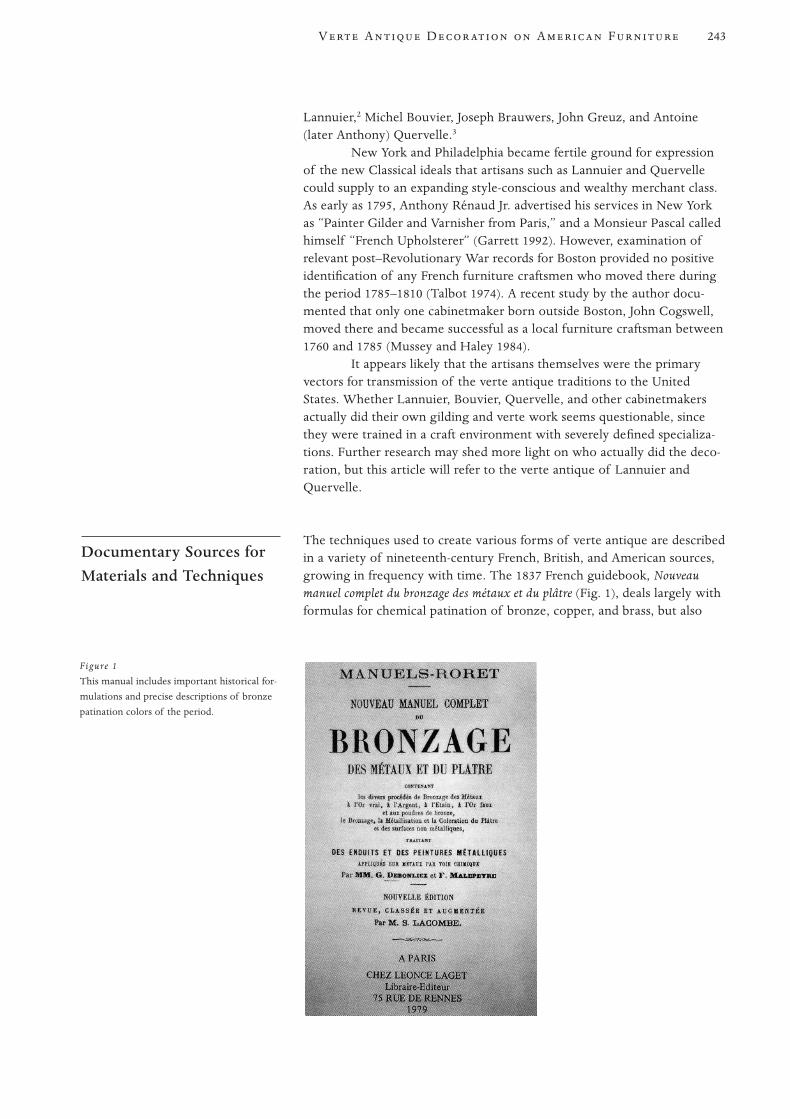
Lannuier,2 Michel Bouvier, Joseph Brauwers, John Greuz, and Antoine(later Anthony) Quervelle.3
New York and Philadelphia became fertile ground for expressionof the new Classical ideals that artisans such as Lannuier and Quervellecould supply to an expanding style-conscious and wealthy merchant class.As early as 1795, Anthony Rénaud Jr. advertised his services in New Yorkas “Painter Gilder and Varnisher from Paris,” and a Monsieur Pascal calledhimself “French Upholsterer” (Garrett 1992). However, examination ofrelevant post–Revolutionary War records for Boston provided no positiveidentification of any French furniture craftsmen who moved there duringthe period 1785–1810 (Talbot 1974). A recent study by the author docu-mented that only one cabinetmaker born outside Boston, John Cogswell,moved there and became successful as a local furniture craftsman between1760 and 1785 (Mussey and Haley 1984).
It appears likely that the artisans themselves were the primaryvectors for transmission of the verte antique traditions to the UnitedStates. Whether Lannuier, Bouvier, Quervelle, and other cabinetmakersactually did their own gilding and verte work seems questionable, sincethey were trained in a craft environment with severely defined specializa-tions. Further research may shed more light on who actually did the deco-ration, but this article will refer to the verte antique of Lannuier andQuervelle.
The techniques used to create various forms of verte antique are describedin a variety of nineteenth-century French, British, and American sources,growing in frequency with time. The 1837 French guidebook, Nouveaumanuel complet du bronzage des métaux et du plâtre (Fig. 1), deals largely withformulas for chemical patination of bronze, copper, and brass, but also
Documentary Sources forMaterials and Techniques
243V A D A F
Figure 1
This manual includes important historical for-
mulations and precise descriptions of bronze
patination colors of the period.

with faux-bronze decorating techniques for metal, plaster, and wood.4 Theforward includes a detailed and important history of the craft (Debonliezand Malepeyre 1887:1–2):
Bronzing, which forms today one of the bronze manufacturing branches, . . .
has only existed as a specialty for forty years, and was not as widespread then
as it is today. . . . Up until 1825 only one tint of bronzing was known, which
was vert antique or vert à l’eau [author’s translation: sea green], which . . .
sought to imitate, as closely as possible, bronze exposed to corrosion of the
weather . . . or again like Florentine bronzes, in which the color was altered
by time or interior vapors.
The authors then relate a succession of vogues for chemical pati-nation colors for bronze that followed each other rapidly. These includeone they called a “brown green. . . . [T]his color was made more or lessgreen or brown according to the desires of the worker.” Other stylish col-ors are said to be “Lafleur’s Florentine bronze, a fumed Florentine tint, ofa softer and more elegant color.” Then an artistic verte predominated, thecolor of pale green ashes, followed by bronze medaille, a later greenishcolor with yellowish highlights. Still later, blacks with more-or-less reddishhighlights were favored, using bronze powder in spirit varnish, followed bya surface dusting of a soft greenish bronze powder that gave the look ofthe iridescent throat of pigeon.
Work done in blacks and browns then became popular, also acolor called bronzed iron, which consisted of a black foundation relievedwith pewter powder in imitation of the armor of warriors. The authorsdescribe others including a so-called waxed bronze, a leather bronze, and afly-wing bronze. This last had a black base with highlights of copper pow-der, with rosy glazes of hematite (Debonliez and Malepeyre 1887:2–5).The descriptions imply that these vogues followed rapidly one after theother, but they may well have overlapped.
They also discuss a method of “bronzing” wood, porcelain, glass,and metal. This consisted of the application of fine bronzing powders ofdifferent colors in a 30% solution of an extremely glossy tree resin froman unidentified source, prepared with potassium or potassium silicate(Debonliez and Malepeyre 1887:136):5
After the objects are coated with a thin uniform coating of this glassy solu-
tion applied with a small brush, the bronzing powder is dispersed on the
objects with a sifter. One allows them to dry completely at a medium tem-
perature of light reheated air, and one then removes the bronze powder with
a large soft brush which has not been absorbed by the varnish vehicle. The
layer of bronze powder adheres tenaciously to the glassy resin, so that it can-
not be removed either by washing with alcohol, ether or water. It lends itself
to being polished with a burnisher of agate or steel.
It is unfortunate that the description is not more detailed about specificmaterials.
It is especially important to note that this guidebook documentsthat the preference of artists and artisans for faux-patination colors appar-ently changed radically over time in the intense competition among Parisartisans. This poses great difficulty for conservators and curators in deter-
244 Mussey
mining exactly what colors were intended and, by extension, what Britishand American artisans sought to imitate. Problems with accurate colorinterpretation are compounded by the difficulty of translating the subtletyof color described in published sources and the change over interveningcenturies in the meaning of words used to describe colors.
In the earliest published American reference located in this study,James Cutbush wrote in The American Artist’s Manual (1814:22):
Bronze color, in imitation of the metal, is much used by the colourmen of
Paris, who prepare two sorts of it, namely the red bronze and the yellow,
or golden. The latter is made solely of the finest and brightest copper dust, the
former is prepared of the same material, by adding a small portion of well
pulverized red ochre. Both are applied with varnishes, to the outside of sub-
stances, as gold leaves are in gilding. But to prevent it from turning green, the
bronzed work should, as soon as laid on, be carefully dried over a chafing dish.
By this time, there was a several-centuries-long tradition of var-nishing metals with tinted “changeing lackers” (usually based on shellac)and baking them at high temperature, primarily to change their appear-ance to that of a more noble metal. Cutbush’s methods clearly derive fromthis tradition.
An important London book, Nathaniel Whittock’s The DecorativePainters’ and Glaziers’ Guide (1827:57), described a technique for imitatingantique verte that is actually a marbleizing technique using paint to imi-tate a superb green marble. Traditional techniques are described for creat-ing a figured ground using variegated white and black pigments in oil ordistemper, with varied overglazes of Prussian blue, raw sienna, and leadwhite pigments in oil. Alternate glazes in distemper (animal-glue medium)are described. Both were to be followed by second glazes of whitingground in milk, and dark veins in Prussian blue.
Whittock’s ensuing discussion of the mineral green pigments thencommercially available is important for this study (Whittock 1827:12):
All the mineral greens [verdigris and other copper greens] are worked with
great difficulty in oil, as they are not opaque colors, and require to be mixed
with white lead to give them body. The minerals in both of these oppose
each other, and in a short time destroy the work [i.e., react chemically,
darken, discolor, and degrade]. Greens both in oil or water colours are there-
fore best formed of mixtures of yellow and blue that agree together in their
bases [are chemically compatible].
For this reason, we probably cannot expect to identify mineral green pig-ments in work by experienced artisans.
Pilkington gives a similar set of directions for creating a simplepainted imitation of “patina antique” on wood (1856:21). “For bronzingsculptures of wood, plaster figures and C. [etc.] a composition of YellowOchre, Prussian Blue, and Lamp Black, dissolved in glue water, isemployed.”
The most important and complete American source located todate is The Painter, Gilder, and Varnisher’s Companion (1836:121), based onearlier London editions. The editor and publisher, William Jackson, in dis-cussing “bronzing,” stated:
245V A D A F
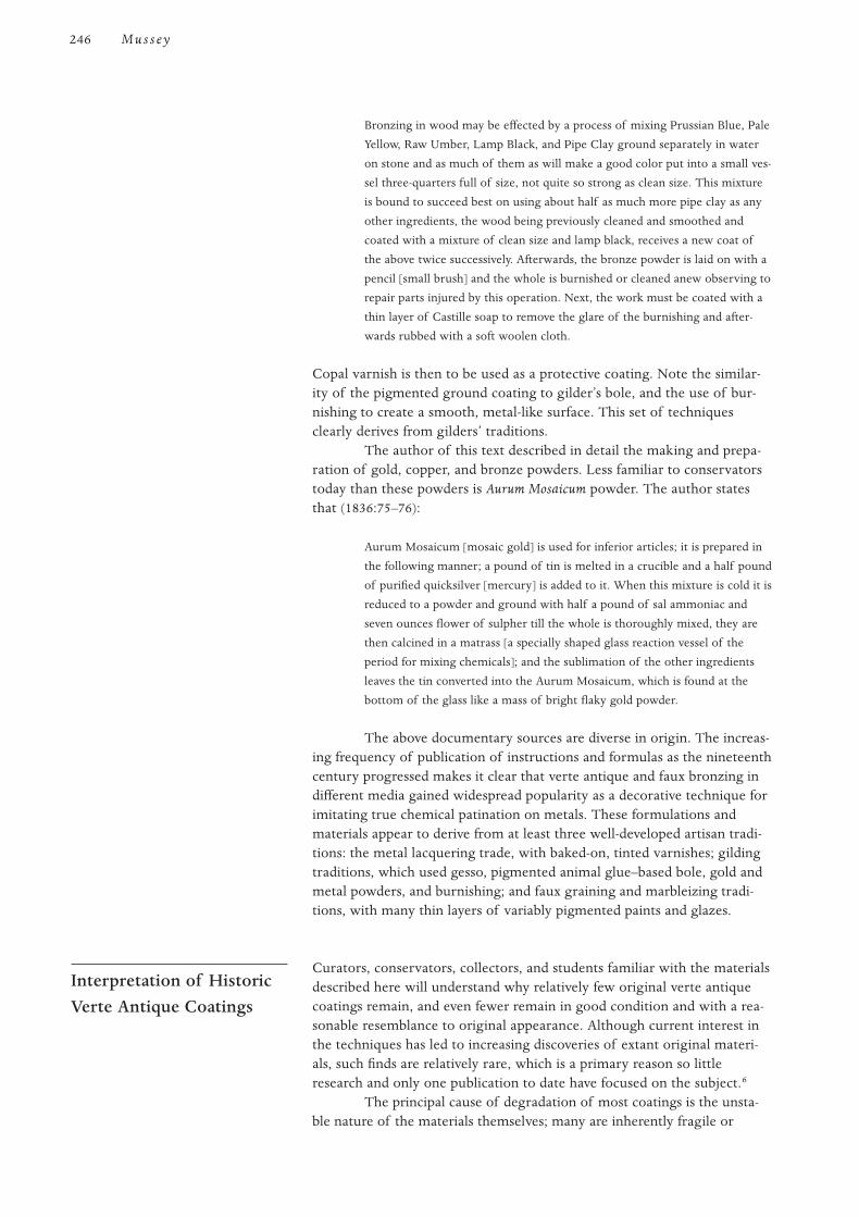
Bronzing in wood may be effected by a process of mixing Prussian Blue, Pale
Yellow, Raw Umber, Lamp Black, and Pipe Clay ground separately in water
on stone and as much of them as will make a good color put into a small ves-
sel three-quarters full of size, not quite so strong as clean size. This mixture
is bound to succeed best on using about half as much more pipe clay as any
other ingredients, the wood being previously cleaned and smoothed and
coated with a mixture of clean size and lamp black, receives a new coat of
the above twice successively. Afterwards, the bronze powder is laid on with a
pencil [small brush] and the whole is burnished or cleaned anew observing to
repair parts injured by this operation. Next, the work must be coated with a
thin layer of Castille soap to remove the glare of the burnishing and after-
wards rubbed with a soft woolen cloth.
Copal varnish is then to be used as a protective coating. Note the similar-ity of the pigmented ground coating to gilder’s bole, and the use of bur-nishing to create a smooth, metal-like surface. This set of techniquesclearly derives from gilders’ traditions.
The author of this text described in detail the making and prepa-ration of gold, copper, and bronze powders. Less familiar to conservatorstoday than these powders is Aurum Mosaicum powder. The author statesthat (1836:75–76):
Aurum Mosaicum [mosaic gold] is used for inferior articles; it is prepared in
the following manner; a pound of tin is melted in a crucible and a half pound
of purified quicksilver [mercury] is added to it. When this mixture is cold it is
reduced to a powder and ground with half a pound of sal ammoniac and
seven ounces flower of sulpher till the whole is thoroughly mixed, they are
then calcined in a matrass [a specially shaped glass reaction vessel of the
period for mixing chemicals]; and the sublimation of the other ingredients
leaves the tin converted into the Aurum Mosaicum, which is found at the
bottom of the glass like a mass of bright flaky gold powder.
The above documentary sources are diverse in origin. The increas-ing frequency of publication of instructions and formulas as the nineteenthcentury progressed makes it clear that verte antique and faux bronzing indifferent media gained widespread popularity as a decorative technique forimitating true chemical patination on metals. These formulations andmaterials appear to derive from at least three well-developed artisan tradi-tions: the metal lacquering trade, with baked-on, tinted varnishes; gildingtraditions, which used gesso, pigmented animal glue–based bole, gold andmetal powders, and burnishing; and faux graining and marbleizing tradi-tions, with many thin layers of variably pigmented paints and glazes.
Curators, conservators, collectors, and students familiar with the materialsdescribed here will understand why relatively few original verte antiquecoatings remain, and even fewer remain in good condition and with a rea-sonable resemblance to original appearance. Although current interest inthe techniques has led to increasing discoveries of extant original materi-als, such finds are relatively rare, which is a primary reason so littleresearch and only one publication to date have focused on the subject.6
The principal cause of degradation of most coatings is the unsta-ble nature of the materials themselves; many are inherently fragile or
Interpretation of HistoricVerte Antique Coatings
246 Mussey
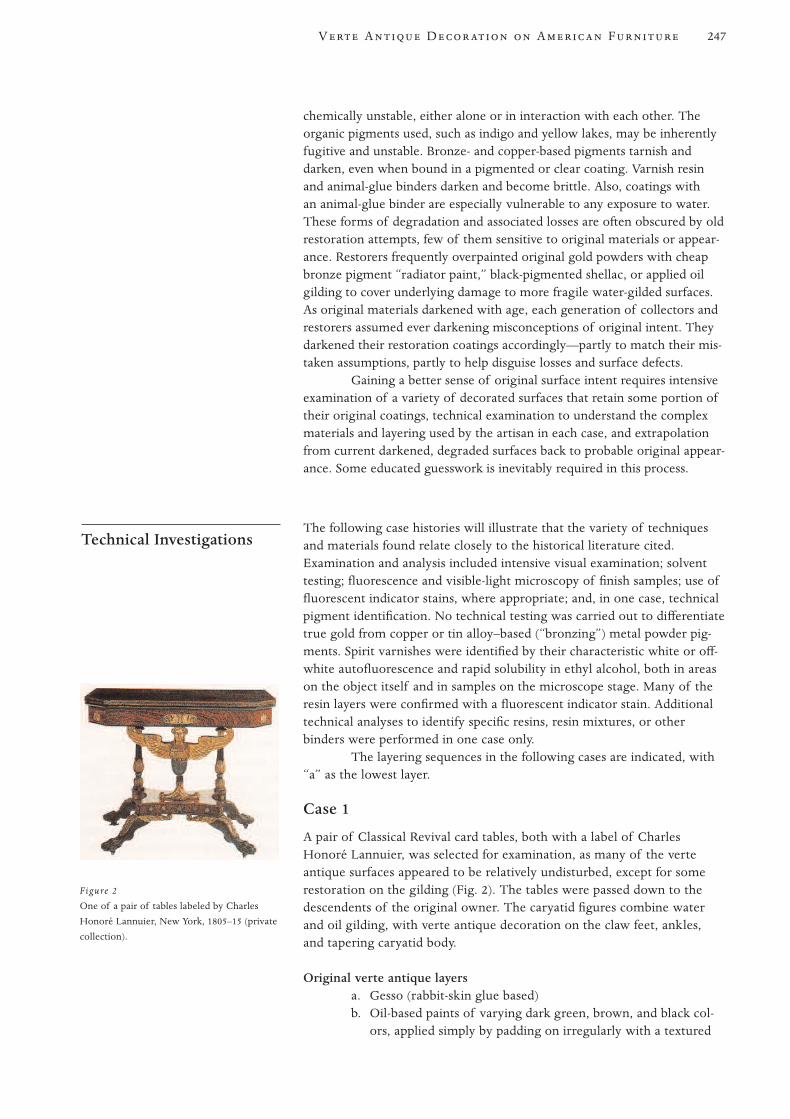
chemically unstable, either alone or in interaction with each other. Theorganic pigments used, such as indigo and yellow lakes, may be inherentlyfugitive and unstable. Bronze- and copper-based pigments tarnish anddarken, even when bound in a pigmented or clear coating. Varnish resinand animal-glue binders darken and become brittle. Also, coatings withan animal-glue binder are especially vulnerable to any exposure to water.These forms of degradation and associated losses are often obscured by oldrestoration attempts, few of them sensitive to original materials or appear-ance. Restorers frequently overpainted original gold powders with cheapbronze pigment “radiator paint,” black-pigmented shellac, or applied oilgilding to cover underlying damage to more fragile water-gilded surfaces.As original materials darkened with age, each generation of collectors andrestorers assumed ever darkening misconceptions of original intent. Theydarkened their restoration coatings accordingly—partly to match their mis-taken assumptions, partly to help disguise losses and surface defects.
Gaining a better sense of original surface intent requires intensiveexamination of a variety of decorated surfaces that retain some portion oftheir original coatings, technical examination to understand the complexmaterials and layering used by the artisan in each case, and extrapolationfrom current darkened, degraded surfaces back to probable original appear-ance. Some educated guesswork is inevitably required in this process.
The following case histories will illustrate that the variety of techniquesand materials found relate closely to the historical literature cited.Examination and analysis included intensive visual examination; solventtesting; fluorescence and visible-light microscopy of finish samples; use offluorescent indicator stains, where appropriate; and, in one case, technicalpigment identification. No technical testing was carried out to differentiatetrue gold from copper or tin alloy–based (“bronzing”) metal powder pig-ments. Spirit varnishes were identified by their characteristic white or off-white autofluorescence and rapid solubility in ethyl alcohol, both in areason the object itself and in samples on the microscope stage. Many of theresin layers were confirmed with a fluorescent indicator stain. Additionaltechnical analyses to identify specific resins, resin mixtures, or otherbinders were performed in one case only.
The layering sequences in the following cases are indicated, with“a” as the lowest layer.
Case 1
A pair of Classical Revival card tables, both with a label of CharlesHonoré Lannuier, was selected for examination, as many of the verteantique surfaces appeared to be relatively undisturbed, except for somerestoration on the gilding (Fig. 2). The tables were passed down to thedescendents of the original owner. The caryatid figures combine waterand oil gilding, with verte antique decoration on the claw feet, ankles,and tapering caryatid body.
Original verte antique layersa. Gesso (rabbit-skin glue based)b. Oil-based paints of varying dark green, brown, and black col-
ors, applied simply by padding on irregularly with a textured
Technical Investigations
247V A D A F
Figure 2
One of a pair of tables labeled by Charles
Honoré Lannuier, New York, 1805–15 (private
collection).
rag. (The texture is plainly visible without magnification. Nogold or metal powders were used.)
c. Natural resin spirit varnish as a sealing coat. (The resin or resinmixture was not identified.)
No further analysis was carried out.These specific techniques and materials have been found by the
author only on this pair of tables by Lannuier, although others may exist.7
ConclusionLannuier’s relatively simple technique of ragging thinly pigmented varicol-ored oil paints onto a gesso ground seems to fall into the faux painting tra-dition best illustrated in Whittock (1827).
Case 2
A series of finish samples were studied from a Classical Revival sofa withfeet carved into dragons’ heads, then decorated with verte antique andgilding. Other elements of the sofa include gilt stenciling and carving.Long attributed on the basis of family descent to prominent Providencecabinetmakers Joseph Rawson and Son, its secondary woods, carving,and finish suggest it was more likely to have been made in Philadelphia(ca. 1815–25). The sofa was selected as a superb example of verte antiquein apparently original condition, although the surface is markedly dark-ened. Based on unaided visual inspection, decoration consists of greenbase paint; gold or bronze powder on protruding highlight portions of thecarving; and final transparent, lightly pigmented overglazes. The dragons’mouths and ears are painted red.
Original verte antique layers on dragons’ heads, based on ultraviolet(UV) microscopy of eight samples
a. Clear spirit varnish sealer 8
b. Spirit varnish–based pigmented coating (blue, yellow, green,umber, deep red)
c. Spirit varnish sized. Scattered, discontinuous gold (or bronze) powders laid directly
on the sealer-size. (It was found only on highlight portions ofthe carvings. In some areas it appears more uniformly denseand very thin with metal flakes closely overlapping, as thoughthe powder had been burnished after application and drying.)
e. One or two layers of lightly pigmented spirit varnish, tintedwith brown, dark red, and black pigments. (It was not analyzedfurther. The pigmented tinting glazes are discontinuous, withconsiderable variation in thickness and number of coats fromlocation to location. This probably indicates the artisan wasdabbing on variably colored layers of thin varnish-glaze to givea patinated appearance and to tone down the reflectivity of theburnished metal powder.)
f. Sealer coat of clear resin spirit varnish
Layers in a dragon’s mouth, based on microscopy of two samplesa. Clear spirit varnish sealer coat
248 Mussey

b. Green-pigmented spirit varnish paintc. Clear spirit varnish sealerd. Deep red–pigmented spirit varnish, with extensive metallic
powder mixed randomly throughout the entire thickness ofthe layer
e. Clear spirit varnish sealer
ConclusionThe spirit-soluble resins used in every layer meant that the artisan couldwork quickly, since each layer dried rapidly. The materials and techniquesare quite similar to Philadelphia work of the period analyzed by theauthor; and the design, carving, and secondary woods strongly suggestit is a Philadelphia-made sofa, despite the attribution to the Rawsons.The use of metal powder mixed with other pigments in the red paint issingular in the author’s experience, but may represent a common periodtechnique. It was probably intended to give sparkle and additionalgolden brilliance. Future researchers should look for its presence inother examples.
Case 3
A Classical Revival pier table from a private collection was examined andtreated by the author (Fig. 3). This elaborately decorated piece is attrib-uted to Quervelle, based on stylistic similarities to labeled and docu-mented examples of his work. The other table of the pair in the collectionof the Winterthur Museum has identical decorative motifs.9
Before treatment by the author in 1991, the verte antique portionsof the dolphin supports and the pilasters generally were extremely dark,with black-pigmented coatings over gilded highlights. Extensive prelimi-nary investigation revealed that the dolphins and leafage had been entirelystripped of original finishes, and only the feet retained their original verteantique decoration essentially intact (Fig. 4).10 Microscopy of a secondseries of samples from the feet revealed the strata and character of theoriginal coatings, which compared very closely to samples of undisturbedoriginal finish on the other table.
249V A D A F
Figure 3
Pier table attributed to Anthony Quervelle,
Philadelphia, ca. 1815–25 (collection of
Randall Scrimsher). Verte antique was re-
created based on extensive microscopy of
samples of remaining original finish on this
and the second of the pair at the Winterthur
Museum.
Figure 4
A typical finish sample cross section of origi-
nal verte antique coatings from a foot of the
pier table in Figure 3. The magnification is
3200 on an ultraviolet microscope. From the
bottom up: two-layer base coating of green
pigmented paint in natural resin binder; scat-
tered flakes of gold powder directly on the
upper paint surface; thick, white-fluorescing
midzone, composed of five to seven thin lay-
ers of natural resin varnish-glaze, with thin
pigmentation on some upper layer bound-
aries; discontinuous dark pigmented restora-
tion overpaint; and clear shellac coating,
fluorescing light orange.

Original verte antique materials, based on UV microscopy of forty samplesa. Two layers of green-pigmented paint in a spirit varnish vehicle.
(The darker green bottom layer was applied evenly, and lightergreen applied in varying thickness over it.)
b. Clear spirit varnish sizec. Gold powder on highlights only. (It was discontinuous and
irregular, applied directly to the surface of the underlyingspirit varnish. This was not found in recesses or backgroundareas.)
d. One to five layers of thinly pigmented glaze in a spirit varnishvehicle (dark red, umber, blue, and yellow pigmentation),applied irregularly
e. Clear spirit varnish sealer
ConclusionThe variegated and mottled green base coats with gold powder dustedirregularly on the surface, sometimes burnished on high points to createsmoother, glossier gold highlights, would have more accurately simulatednatural wear on bronze statuary. This is the most sophisticated and com-plicated decorative scheme analyzed in the study, but it appears to be typi-cal of Philadelphia work in the exclusive use of spirit-soluble coatings. Theactual original appearance of the mottled green base coats was dramati-cally lighter and more intense in chroma than is visible in the degradedcoatings on the other table in the pair.
Case 4
Other historical techniques are represented on a Grecian sofa made inNew York (ca. 1815–25). It is an example of the finest work of the period,featuring carved paw feet and legs with verte antique decoration, goldstenciling, and water and oil gilding.11 Examination of the sofa indicatedthat all gilded and paint-decorated surfaces were covered with a thick layerof restoration bronze-pigmented paint that had discolored and consider-ably darkened. UV microscopy revealed that original verte antique and giltlayers were surprisingly intact under these restoration coatings.
Extant original materialsa. Gesso, with a protein binder (probably rabbit-skin glue)b. Base paint, water soluble, with black and green pigments
(probably including considerable clay content)c. Gold powderd. Clear spirit varnish, probably original
ConclusionThe verte antique decoration is simpler than the Quervelle example above.The overall techniques and materials derive from gilders’ traditions andare most similar to those described in The Painter, Gilder, and Varnisher’sCompanion (1836), and they are most frequently found in the work of NewYork artisans.
Case 5
Variations on bole-type verte antique are illustrated by a drop-leaf sofatable attributed to Charles Honoré Lannuier, in the collection of the White
250 Mussey
House, Washington, D.C. The design incorporates two gilded-wingedcaryatid supports with verte antique bodies, legs, and paw feet, withscrolled leafage on the legs and gilded monopodium terminals. Examinationrevealed that all surfaces had extensive restoration painting and gildingwith diverse materials that obscured the varied and sophisticated originalcoatings. Extensive initial microscopy confirmed that the legs and feethad lost most of their original verte antique coatings; however, enoughremained to allow accurate characterization of the decoration.
Original materials, based on UV microscopy of twenty-eight samplesa. Gesso, animal glue basedb. Two to three layers of water-soluble distemper paint (probably
with extensive clay inclusions); dark green on the body, black-brown with green on legs and feet. (Colorants on the bodyidentified were indigo, orpiment—a yellow arsenic trisulfide—and possibly a yellow lake. Original surfaces were too damagedto establish whether the surface had originally been burnished.)
c. Gold powder, sparsely appliedd. Clear spirit varnish sealer
ConclusionThe layers again represent gilders’ techniques for creating verte antiquethrough the use of a modified, pigmented gilders’ bole and gold powder.Originally, they probably were selectively burnished to further define thesurface. Lannuier’s use of two different colors of bole (dark green for thebody, black for the legs), coupled with traditional water and oil gilding andpierced metal inlay, is reflective of his familiarity with French prototypes.
Case 6
A worktable with both a brand and a label of Samuel Carter, New York, inthe collection of the White House, represents possibly the simplest verteantique treatment found to date. The overall original surface decorationincludes highly refined and developed metal powder stenciling on varioussurfaces, including the turned central support shaft and colonnettes thatsupport the case top. Original verte antique decoration remains on the legsand carved paw feet.
Examination revealed that considerable flaking and loss of layershad occurred on the legs. To hide the losses, the entire table base had beenvarnished with a black-pigmented coating, probably shellac. Although nottotally opaque, the coating largely obscured the delicate stenciling andfaux-bronze decoration.
Original materials, based on UV microscopy of ten samples and on sol-vent tests
a. Clear spirit varnish (not covering all surfaces)b. Green paint in a spirit varnish mediumc. Clear spirit varnish sealer. (This layer is uneven and does not
cover all areas of the green base paint.)d. Gold powder applied sparsely and unevenly only on the high-
lights of the legs, feet, and clawse. Thinly pigmented spirit varnish glazef. Clear spirit varnish sealer
251V A D A F
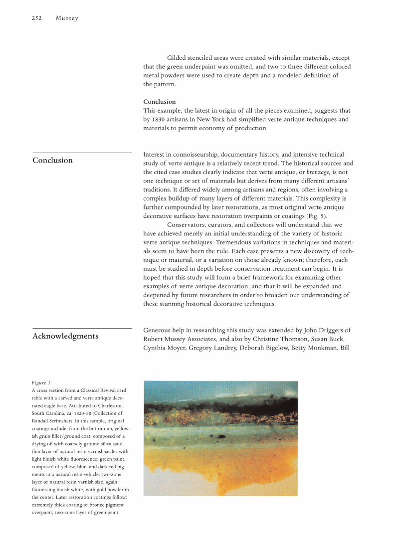
Gilded stenciled areas were created with similar materials, exceptthat the green underpaint was omitted, and two to three different coloredmetal powders were used to create depth and a modeled definition ofthe pattern.
ConclusionThis example, the latest in origin of all the pieces examined, suggests thatby 1830 artisans in New York had simplified verte antique techniques andmaterials to permit economy of production.
Interest in connoisseurship, documentary history, and intensive technicalstudy of verte antique is a relatively recent trend. The historical sources andthe cited case studies clearly indicate that verte antique, or bronzage, is notone technique or set of materials but derives from many different artisans’traditions. It differed widely among artisans and regions, often involving acomplex buildup of many layers of different materials. This complexity isfurther compounded by later restorations, as most original verte antiquedecorative surfaces have restoration overpaints or coatings (Fig. 5).
Conservators, curators, and collectors will understand that wehave achieved merely an initial understanding of the variety of historicverte antique techniques. Tremendous variations in techniques and materi-als seem to have been the rule. Each case presents a new discovery of tech-nique or material, or a variation on those already known; therefore, eachmust be studied in depth before conservation treatment can begin. It ishoped that this study will form a brief framework for examining otherexamples of verte antique decoration, and that it will be expanded anddeepened by future researchers in order to broaden our understanding ofthese stunning historical decorative techniques.
Generous help in researching this study was extended by John Driggers ofRobert Mussey Associates, and also by Christine Thomson, Susan Buck,Cynthia Moyer, Gregory Landrey, Deborah Bigelow, Betty Monkman, Bill
Acknowledgments
Conclusion
252 Mussey
Figure 5
A cross section from a Classical Revival card
table with a carved and verte antique deco-
rated eagle base. Attributed to Charleston,
South Carolina, ca. 1820–30 (Collection of
Randall Scrimsher). In this sample, original
coatings include, from the bottom up, yellow-
ish grain filler/ground coat, composed of a
drying oil with coarsely ground silica sand;
thin layer of natural resin varnish-sealer with
light bluish white fluorescence; green paint,
composed of yellow, blue, and dark red pig-
ments in a natural resin vehicle; two-zone
layer of natural resin varnish size, again
fluorescing bluish white, with gold powder in
the center. Later restoration coatings follow:
extremely thick coating of bronze pigment
overpaint; two-zone layer of green paint.
Allman, Michael Flanigan, Randall Scrimsher, Brian Considine, AlfonsoNarvaez, Stuart Feld, and Wendy Cooper. Librarians at the following insti-tutions gave invaluable assistance: the Fine Arts Library at HarvardUniversity; the Dibner Library of the Smithsonian Institution; and theRare Books and Manuscripts Library at the Winterthur Museum.
1 While Pilkington refers to a chemical patination produced by natural processes, his imitative
techniques employed pigments, varnishes, and metal powders.
2 There is extensive but scattered literature on Lannuier. An upcoming (1998) exhibition and
catalogue at the Metropolitan Museum of Art in New York will focus on this important
craftsman.
3 Quervelle’s work is summarized in Smith (1973; 1974a; 1974b).
4 Augmented editions were also published, including the 1887 edition cited here. (The author’s
translations of this text are used throughout.) A reprint of this title was published by Leonce
Laget (Paris) in 1979.
5 “M. Bottger” is said to be the authors’ source.
6 There is only one recent publication in the conservation or art historical literature
(Loescher 1994).
7 The author has examined approximately three dozen pieces to date.
8 Most spirit varnish recipes of the period called for a mixture of spirit-soluble resins, including
shellac in various forms, copal, dammar, mastic, animé, and sandarac. The term spirit varnish
is used in this generic sense (a resin mixture), without further attempt to identify the specific
resin or resins used. For a complex history of spirit varnish formulations, see Mussey 1987.
9 The author extends special thanks to the owner, Randall Scrimsher, and to Michael Flanigan.
Gregory Landrey of the Winterthur Museum generously shared his insights and written
report on microscopic examination of the museum table and provided finish samples for fur-
ther microscopy by the author. Both tables are illustrated in Cooper (1993:150–51).
10 During examination, a scrap of newspaper with the date 1973 was found hidden on the rear of
one leaf bracket. Restoration was probably done just prior to the table’s publication on the
cover of the magazine Antiques May 1973, 103(5) .
11 This sofa is in the collection of the Baltimore Museum of Art (Acc. #BMA 1991.147), and is
illustrated and discussed in Cooper (1993:124–25). It was examined and conserved by Christine
Thomson and Susan Buck at the Society for the Preservation of New England Antiquities,
Waltham, Massachusetts. Comments in the text are based on their generous sharing of records.
Cooper, W. A.
1993 Classical Taste in America, 1800–1840. New York: Baltimore Museum of Art and
Abbeville Press.
Cutbush, J.
1814 The American Artist’s Manual. Philadelphia: Johnson and Warner.
Debonliez, G., and F. Malepeyre
1887 Nouveau manuel complet du bronzage des métaux et du plâtre. Paris: Roret, 1837. Reprint,
Paris: M. S. Lacombe.
Garrett, Wendell
1992 Letter to author, 22 October.
Loescher, Wolfgang
1994 Uber eine besondere Fassungstechnik—Die Imitation von painierten
Bronzebeschlagenan an Sesseln des 19. Jahrhunderts. Restauro 3:340–43.
References
Notes
253V A D A F
Mussey, R. D., Jr., ed.
1987 The First American Furniture Finisher’s Manual. Originally published as The Cabinetmaker’s
Guide, Concord, N.H.: Jacob B. Moore, 1827. Reprint, with a new Introduction and
Glossary of Terms, New York: Dover Publications.
Mussey, R., and A. Haley
1984 John Cogswell and Boston bombé furniture: 35 years of revolution in politics and
design. American Furniture (2):73–105.
Painter, Gilder, and Varnisher’s Companion, The
1836 New York: William Jackson.
Pilkington, J.
1856 The Artist’s Guide and Mechanic’s Own Book. A.V. Blake: n.p., 1841. Reprint, Boston:
Sanborn, Carter and Bazin.
Roubo, André Jacob
1977 L’art du menuisier ébeniste. Vol 3. 1769–75. Reprint, Paris: Leonce Laget.
Smith, R. C.
1973 The furniture of Anthony G. Quervelle: The pier tables. Antiques 103(5):984–94.
1974a The furniture of Anthony G. Quervelle: The pedestal tables. Antiques 104(1):90–99.
1974b The furniture of Anthony G. Quervelle: The worktables. Antiques 104(2):260–68.
Talbot, P.
1974 The furniture industry in Boston, 1810–1835. Ph.D. diss., University of Delaware.
Watin, J. F.
1776 L’art du peintre, doreur et vernisseur. Paris: Durand.
Whittock, N.
1827 The Decorative Painters’ and Glaziers’ Guide. London: Isaac Taylor Hinton.
254 Mussey
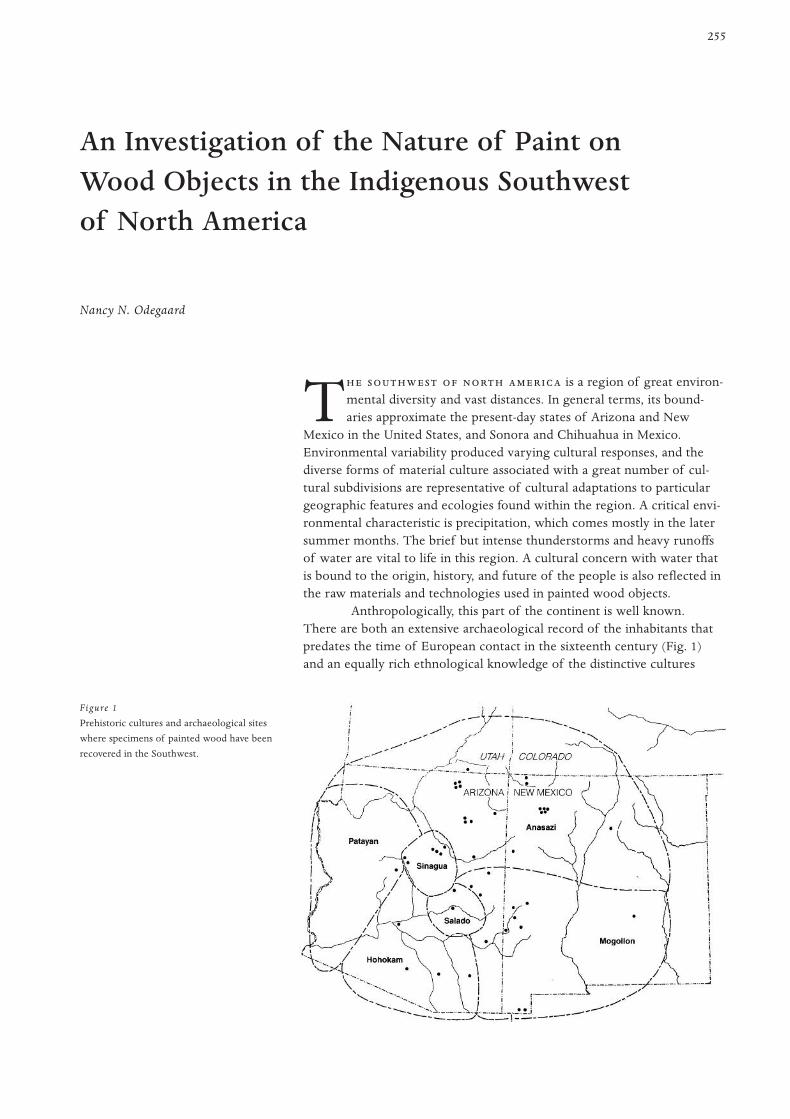
255
T is a region of great environ-mental diversity and vast distances. In general terms, its bound-aries approximate the present-day states of Arizona and New
Mexico in the United States, and Sonora and Chihuahua in Mexico.Environmental variability produced varying cultural responses, and thediverse forms of material culture associated with a great number of cul-tural subdivisions are representative of cultural adaptations to particulargeographic features and ecologies found within the region. A critical envi-ronmental characteristic is precipitation, which comes mostly in the latersummer months. The brief but intense thunderstorms and heavy runoffsof water are vital to life in this region. A cultural concern with water thatis bound to the origin, history, and future of the people is also reflected inthe raw materials and technologies used in painted wood objects.
Anthropologically, this part of the continent is well known.There are both an extensive archaeological record of the inhabitants thatpredates the time of European contact in the sixteenth century (Fig. 1)and an equally rich ethnological knowledge of the distinctive cultures
An Investigation of the Nature of Paint on Wood Objects in the Indigenous Southwest of North America
Nancy N. Odegaard
Figure 1
Prehistoric cultures and archaeological sites
where specimens of painted wood have been
recovered in the Southwest.
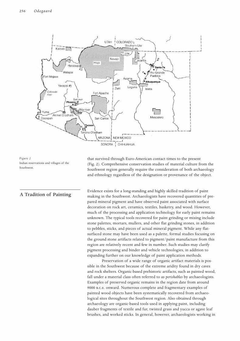
that survived through Euro-American contact times to the present (Fig. 2). Comprehensive conservation studies of material culture from theSouthwest region generally require the consideration of both archaeologyand ethnology regardless of the designation or provenance of the object.
Evidence exists for a long-standing and highly skilled tradition of paintmaking in the Southwest. Archaeologists have recovered quantities of pre-pared mineral pigment and have observed paint associated with surfacedecoration on rock art, ceramics, textiles, basketry, and wood. However,much of the processing and application technology for early paint remainsunknown. The typical tools recovered for paint grinding or mixing includestone palettes, mortars, mullers, and other flat grinding stones, in additionto pebbles, sticks, and pieces of actual mineral pigment. While any flat-surfaced stone may have been used as a palette, formal studies focusing onthe ground stone artifacts related to pigment/paint manufacture from thisregion are relatively recent and few in number. Such studies may clarifypigment processing and binder and vehicle technologies, in addition toexpanding further on our knowledge of paint application methods.
Preservation of a wide range of organic artifact materials is pos-sible in the Southwest because of the extreme aridity found in dry cavesand rock shelters. Organic-based prehistoric artifacts, such as painted wood,fall under a material class often referred to as perishables by archaeologists.Examples of preserved organic remains in the region date from around9000 ... onward. Numerous complete and fragmentary examples ofpainted wood objects have been systematically recovered from archaeo-logical sites throughout the Southwest region. Also obtained througharchaeology are organic-based tools used in applying paint, includingdauber fragments of textile and fur, twisted grass and yucca or agave leafbrushes, and worked sticks. In general, however, archaeologists working in
A Tradition of Painting
256 Odegaard
Figure 2
Indian reservations and villages of the
Southwest.
the Southwest have not carried out extensive studies of organic materialsbecause of inadequate recovery tools, techniques, and conservation exper-tise that would prevent object loss during the excavation process.
When considering the nature of paints, it is clear that the relationshipbetween any surface coating and its substrate is extremely important.Obviously, the physical requirements of paint that is formulated for appli-cation to wood is different from that for other substrates, such as rock, ani-mal skin, or ceramic. Conservators should remember that while the use ofcertain pigments and binders may be associated with a culture, they mayor may not be associated with use on wood. Trader Mark Bahti (1993) hasobserved that there seems to be a cultural logic in indigenous painting thatfollows a “like with like” in the manufacture of objects. From this perspec-tive, an animal-based binder media would not harmonize with a woodsubstrate.
There are also cultural differences in the method of paint applica-tion, the way in which the paint cures, the preparation of the substrate,and the conditions of object use. For example, Hartman Lomawaima(1994), a Hopi scholar, has noted that some Pueblo objects are specificallypainted more carefully, using finer materials and techniques, and that theseobjects are given special care that ensures their preservation. For this rea-son, many religious objects are said to remain in “perfect” condition afterseveral centuries of use.
Another consideration is that some objects that are made to be“used up” do not share these same permanent paint characteristics. Forinstance, gifts such as kachina dolls given to Pueblo children are tradition-ally used in play and therefore experience a use wear that is foreseen andexpected. The loss of the paint may even hold spiritual meaning; forexample, the flaking of blue paint in some cultures symbolized the fallingof rain (Lomawaima 1994). In earlier times, it was not uncommon for suchitems to be collected and repainted after they had worn out or been dis-carded (Sekaquaptewa 1993). Also, kachina dolls and other painted gifts ofthe Kachinas may be taken from a child secretly, freshened up, and thenreturned. This process helps remind the child that the Kachinas are alwayswith them (Lomawaima 1994).
There are meanings and restricted uses for the natural materialsthat make up cultural objects; these differ depending on the context in aparticular culture or in a particular activity. In the manufacture of paintedwood objects, there are many examples where the artist’s ability ormemory, convenience, and materials at hand have resulted in aspects oftechnological change (Dockstader 1985). It would seem that cultural tradi-tions may be respected and at the same time be flexible.
With greater attention from scientific investigators and collectorsaround the turn of the century, Indian groups in the Southwest wereencouraged to increase the quantity and change the quality of their manu-factures. Many ethnologists requested that legitimate duplicates or repli-cas be made of worn-out, obsolete, or unavailable specimen types; thispractice created objects that were not made for their original purpose.Instead, more emphasis was placed on aesthetic appeal and salability(Dockstader 1985). Today, the creation of many forms of painted woodspecifically for commercial use allows many Native American men andwomen to make a living.
Cultural Issues and Ethics
257I N P W O I S
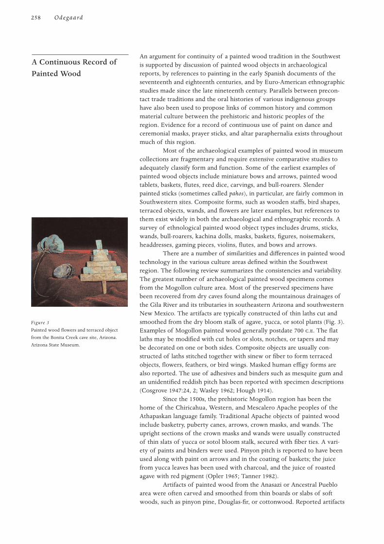
An argument for continuity of a painted wood tradition in the Southwestis supported by discussion of painted wood objects in archaeologicalreports, by references to painting in the early Spanish documents of theseventeenth and eighteenth centuries, and by Euro-American ethnographicstudies made since the late nineteenth century. Parallels between precon-tact trade traditions and the oral histories of various indigenous groupshave also been used to propose links of common history and commonmaterial culture between the prehistoric and historic peoples of theregion. Evidence for a record of continuous use of paint on dance andceremonial masks, prayer sticks, and altar paraphernalia exists throughoutmuch of this region.
Most of the archaeological examples of painted wood in museumcollections are fragmentary and require extensive comparative studies toadequately classify form and function. Some of the earliest examples ofpainted wood objects include miniature bows and arrows, painted woodtablets, baskets, flutes, reed dice, carvings, and bull-roarers. Slenderpainted sticks (sometimes called pahos), in particular, are fairly common inSouthwestern sites. Composite forms, such as wooden staffs, bird shapes,terraced objects, wands, and flowers are later examples, but references tothem exist widely in both the archaeological and ethnographic records. Asurvey of ethnological painted wood object types includes drums, sticks,wands, bull-roarers, kachina dolls, masks, baskets, figures, noisemakers,headdresses, gaming pieces, violins, flutes, and bows and arrows.
There are a number of similarities and differences in painted woodtechnology in the various culture areas defined within the Southwestregion. The following review summarizes the consistencies and variability.The greatest number of archaeological painted wood specimens comesfrom the Mogollon culture area. Most of the preserved specimens havebeen recovered from dry caves found along the mountainous drainages ofthe Gila River and its tributaries in southeastern Arizona and southwesternNew Mexico. The artifacts are typically constructed of thin laths cut andsmoothed from the dry bloom stalk of agave, yucca, or sotol plants (Fig. 3).Examples of Mogollon painted wood generally postdate 700 .. The flatlaths may be modified with cut holes or slots, notches, or tapers and maybe decorated on one or both sides. Composite objects are usually con-structed of laths stitched together with sinew or fiber to form terracedobjects, flowers, feathers, or bird wings. Masked human effigy forms arealso reported. The use of adhesives and binders such as mesquite gum andan unidentified reddish pitch has been reported with specimen descriptions(Cosgrove 1947:24, 2; Wasley 1962; Hough 1914).
Since the 1500s, the prehistoric Mogollon region has been thehome of the Chiricahua, Western, and Mescalero Apache peoples of theAthapaskan language family. Traditional Apache objects of painted woodinclude basketry, puberty canes, arrows, crown masks, and wands. Theupright sections of the crown masks and wands were usually constructedof thin slats of yucca or sotol bloom stalk, secured with fiber ties. A vari-ety of paints and binders were used. Pinyon pitch is reported to have beenused along with paint on arrows and in the coating of baskets; the juicefrom yucca leaves has been used with charcoal, and the juice of roastedagave with red pigment (Opler 1965; Tanner 1982).
Artifacts of painted wood from the Anasazi or Ancestral Puebloarea were often carved and smoothed from thin boards or slabs of softwoods, such as pinyon pine, Douglas-fir, or cottonwood. Reported artifacts
A Continuous Record ofPainted Wood
258 Odegaard
Figure 3
Painted wood flowers and terraced object
from the Bonita Creek cave site, Arizona.
Arizona State Museum.
generally date from the Pueblo III period (1100–1300 ..). The flat carvedsurfaces may be decorated on one or both sides; and effigy forms, includ-ing birds, dragonflies, and human faces, are recognizable by the use ofpaint color and outline. Composite forms are usually joined with fiberties or sinew. Vivian observes that “the concept of assembling flat carvedpieces to produce three-dimensional representations of life forms andother symbols appears to be a successful adjustment to the material,rather then a limitation imposed by it” (Vivian, Dodgen, and Hartman1978:17). Paints appear to have been primarily applied after constructionor assembly of pieces in composite forms. Pinyon pitch and mesquite gumare the reported adhesives; while a range of binder sources has been sur-mised, only pinyon resin has actually been identified in archaeologicalmaterials (Vivian, Dodgen, and Hartman 1978; Kidder and Guernsey 1919;Bandelier 1892).
When the Spanish entered the area of northern Arizona and NewMexico in the sixteenth century, they found farmers who lived in multi-room structures, or pueblos. The Pueblo peoples include the Hopi, Zuni,and Acoma, as well as several groups to the east, often referred to collec-tively as the Rio Grande Pueblos. Extensive ethnographic, linguistic, andmaterial culture studies have been carried out with these groups since theend of the last century. The tradition of paint on wood is extremely richamong these people. Painted wood objects are represented by manyforms, including headdresses, effigies, ceremonial altars, wands, prayersticks, and dolls. Larger items are usually made of cottonwood root(Populus fremontii) or red cedar ( Juniperus communis), and prayer sticks havebeen derived from a wide variety of woody plants. Slats may be cut fromyucca (Yucca sp.) or sotol (Dasylirion wheeleri) flower stalk and are oftenassembled with fiber ties. Many painted wood objects have a white groundlayer (kaolin) below the pigmented layer, and the paint has a characteristicmatte appearance. The reported adhesive, varnish, and binder media usedwith painted wood include yucca leaf juice (Yucca angustissima), yuccasyrup (Yucca baccata), pinyon resin (Pinus edulis), and masticated seeds(Cucurbitaceae) (Hough 1902; Parsons 1939; Stephen 1898; Stephen 1936;Stevenson 1904; Stevenson 1915).
Few painted wood specimens have been recovered from sites inthe Hohokam prehistoric culture area. A notable exception is a group ofsix wooden artifacts found in central Arizona and believed to date froma Salado occupation before 1400 .. (Haury 1945). The well-preservedand nearly complete figures include four effigy pahos made of agave stalkand one masked effigy carved of cottonwood. Many archaeologists believethat a tradition of painting on wood among the Hohokam may be inferredbecause of the abundant amount of pigments and palettes recovered(Haury 1976).
The Tohono O’Odham and Akimal O’Odham presently inhabitthe lower desert area of the Southwest region. Painted wood traditionsinclude basketry, bows and arrows, masks, bull-roarers, calendar sticks,effigies, wands, prayer sticks, and bowls. Reported wood sources includesaguaro ribs (Carnegiea gigantea), gourd (Cucurbitaceae), pine (Pinus spp.),ocotillo (Fouquieria splendens), and greasewood (Sarcobatus vermiculatus).The adhesives and binders traditionally used include mesquite gum(Prosopis juliflora) and an insect lac (Tachardiella larrea) that is found onthe creosote bush (Larrea tridentata) (Castetter and Underhill 1935; Ebling1986; Lumholtz 1976; Sutton 1990).
259I N P W O I S
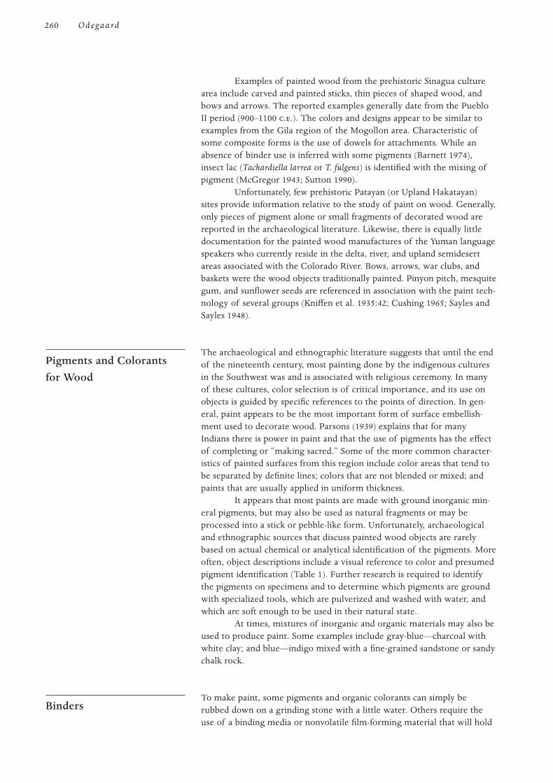
Examples of painted wood from the prehistoric Sinagua culturearea include carved and painted sticks, thin pieces of shaped wood, andbows and arrows. The reported examples generally date from the PuebloII period (900–1100 ..). The colors and designs appear to be similar toexamples from the Gila region of the Mogollon area. Characteristic ofsome composite forms is the use of dowels for attachments. While anabsence of binder use is inferred with some pigments (Barnett 1974),insect lac (Tachardiella larrea or T. fulgens) is identified with the mixing ofpigment (McGregor 1943; Sutton 1990).
Unfortunately, few prehistoric Patayan (or Upland Hakatayan)sites provide information relative to the study of paint on wood. Generally,only pieces of pigment alone or small fragments of decorated wood arereported in the archaeological literature. Likewise, there is equally littledocumentation for the painted wood manufactures of the Yuman languagespeakers who currently reside in the delta, river, and upland semidesertareas associated with the Colorado River. Bows, arrows, war clubs, andbaskets were the wood objects traditionally painted. Pinyon pitch, mesquitegum, and sunflower seeds are referenced in association with the paint tech-nology of several groups (Kniffen et al. 1935:42; Cushing 1965; Sayles andSayles 1948).
The archaeological and ethnographic literature suggests that until the endof the nineteenth century, most painting done by the indigenous culturesin the Southwest was and is associated with religious ceremony. In manyof these cultures, color selection is of critical importance, and its use onobjects is guided by specific references to the points of direction. In gen-eral, paint appears to be the most important form of surface embellish-ment used to decorate wood. Parsons (1939) explains that for manyIndians there is power in paint and that the use of pigments has the effectof completing or “making sacred.” Some of the more common character-istics of painted surfaces from this region include color areas that tend tobe separated by definite lines; colors that are not blended or mixed; andpaints that are usually applied in uniform thickness.
It appears that most paints are made with ground inorganic min-eral pigments, but may also be used as natural fragments or may beprocessed into a stick or pebble-like form. Unfortunately, archaeologicaland ethnographic sources that discuss painted wood objects are rarelybased on actual chemical or analytical identification of the pigments. Moreoften, object descriptions include a visual reference to color and presumedpigment identification (Table 1). Further research is required to identifythe pigments on specimens and to determine which pigments are groundwith specialized tools, which are pulverized and washed with water, andwhich are soft enough to be used in their natural state.
At times, mixtures of inorganic and organic materials may also beused to produce paint. Some examples include gray-blue—charcoal withwhite clay; and blue—indigo mixed with a fine-grained sandstone or sandychalk rock.
To make paint, some pigments and organic colorants can simply berubbed down on a grinding stone with a little water. Others require theuse of a binding media or nonvolatile film-forming material that will hold
Binders
Pigments and Colorants for Wood
260 Odegaard
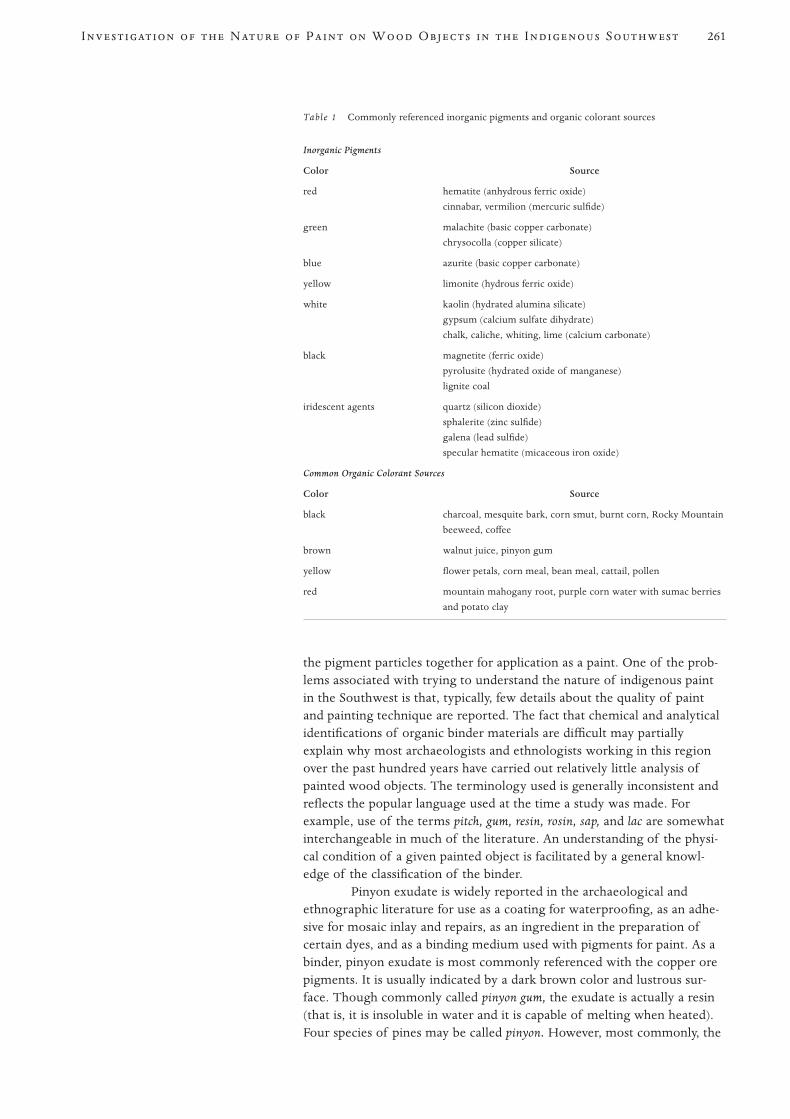
the pigment particles together for application as a paint. One of the prob-lems associated with trying to understand the nature of indigenous paintin the Southwest is that, typically, few details about the quality of paintand painting technique are reported. The fact that chemical and analyticalidentifications of organic binder materials are difficult may partiallyexplain why most archaeologists and ethnologists working in this regionover the past hundred years have carried out relatively little analysis ofpainted wood objects. The terminology used is generally inconsistent andreflects the popular language used at the time a study was made. Forexample, use of the terms pitch, gum, resin, rosin, sap, and lac are somewhatinterchangeable in much of the literature. An understanding of the physi-cal condition of a given painted object is facilitated by a general knowl-edge of the classification of the binder.
Pinyon exudate is widely reported in the archaeological andethnographic literature for use as a coating for waterproofing, as an adhe-sive for mosaic inlay and repairs, as an ingredient in the preparation ofcertain dyes, and as a binding medium used with pigments for paint. As abinder, pinyon exudate is most commonly referenced with the copper orepigments. It is usually indicated by a dark brown color and lustrous sur-face. Though commonly called pinyon gum, the exudate is actually a resin(that is, it is insoluble in water and it is capable of melting when heated).Four species of pines may be called pinyon. However, most commonly, the
261I N P W O I S
Table 1 Commonly referenced inorganic pigments and organic colorant sources
Inorganic Pigments
Color Source
red hematite (anhydrous ferric oxide)
cinnabar, vermilion (mercuric sulfide)
green malachite (basic copper carbonate)
chrysocolla (copper silicate)
blue azurite (basic copper carbonate)
yellow limonite (hydrous ferric oxide)
white kaolin (hydrated alumina silicate)
gypsum (calcium sulfate dihydrate)
chalk, caliche, whiting, lime (calcium carbonate)
black magnetite (ferric oxide)
pyrolusite (hydrated oxide of manganese)
lignite coal
iridescent agents quartz (silicon dioxide)
sphalerite (zinc sulfide)
galena (lead sulfide)
specular hematite (micaceous iron oxide)
Common Organic Colorant Sources
Color Source
black charcoal, mesquite bark, corn smut, burnt corn, Rocky Mountain
beeweed, coffee
brown walnut juice, pinyon gum
yellow flower petals, corn meal, bean meal, cattail, pollen
red mountain mahogany root, purple corn water with sumac berries
and potato clay
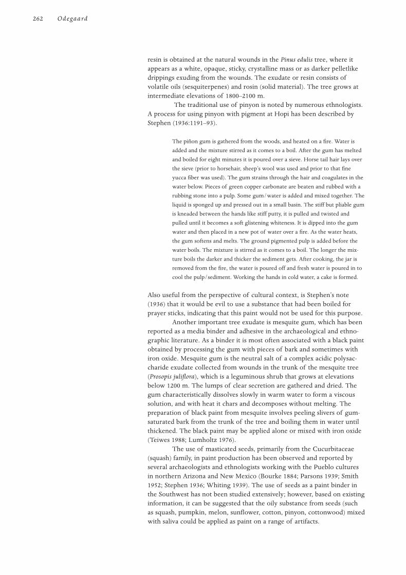
resin is obtained at the natural wounds in the Pinus edulis tree, where itappears as a white, opaque, sticky, crystalline mass or as darker pelletlikedrippings exuding from the wounds. The exudate or resin consists ofvolatile oils (sesquiterpenes) and rosin (solid material). The tree grows atintermediate elevations of 1800–2100 m.
The traditional use of pinyon is noted by numerous ethnologists.A process for using pinyon with pigment at Hopi has been described byStephen (1936:1191–93).
The piñon gum is gathered from the woods, and heated on a fire. Water is
added and the mixture stirred as it comes to a boil. After the gum has melted
and boiled for eight minutes it is poured over a sieve. Horse tail hair lays over
the sieve (prior to horsehair, sheep’s wool was used and prior to that fine
yucca fiber was used). The gum strains through the hair and coagulates in the
water below. Pieces of green copper carbonate are beaten and rubbed with a
rubbing stone into a pulp. Some gum/water is added and mixed together. The
liquid is sponged up and pressed out in a small basin. The stiff but pliable gum
is kneaded between the hands like stiff putty, it is pulled and twisted and
pulled until it becomes a soft glistening whiteness. It is dipped into the gum
water and then placed in a new pot of water over a fire. As the water heats,
the gum softens and melts. The ground pigmented pulp is added before the
water boils. The mixture is stirred as it comes to a boil. The longer the mix-
ture boils the darker and thicker the sediment gets. After cooking, the jar is
removed from the fire, the water is poured off and fresh water is poured in to
cool the pulp/sediment. Working the hands in cold water, a cake is formed.
Also useful from the perspective of cultural context, is Stephen’s note(1936) that it would be evil to use a substance that had been boiled forprayer sticks, indicating that this paint would not be used for this purpose.
Another important tree exudate is mesquite gum, which has beenreported as a media binder and adhesive in the archaeological and ethno-graphic literature. As a binder it is most often associated with a black paintobtained by processing the gum with pieces of bark and sometimes withiron oxide. Mesquite gum is the neutral salt of a complex acidic polysac-charide exudate collected from wounds in the trunk of the mesquite tree(Prosopis juliflora), which is a leguminous shrub that grows at elevationsbelow 1200 m. The lumps of clear secretion are gathered and dried. Thegum characteristically dissolves slowly in warm water to form a viscoussolution, and with heat it chars and decomposes without melting. Thepreparation of black paint from mesquite involves peeling slivers of gum-saturated bark from the trunk of the tree and boiling them in water untilthickened. The black paint may be applied alone or mixed with iron oxide(Teiwes 1988; Lumholtz 1976).
The use of masticated seeds, primarily from the Cucurbitaceae(squash) family, in paint production has been observed and reported byseveral archaeologists and ethnologists working with the Pueblo culturesin northern Arizona and New Mexico (Bourke 1884; Parsons 1939; Smith1952; Stephen 1936; Whiting 1939). The use of seeds as a paint binder inthe Southwest has not been studied extensively; however, based on existinginformation, it can be suggested that the oily substance from seeds (suchas squash, pumpkin, melon, sunflower, cotton, pinyon, cottonwood) mixedwith saliva could be applied as paint on a range of artifacts.
262 Odegaard
Stephen’s (1936) description of several processes of squash seedpreparation indicates that after a small number of seeds have been chewedand then spat into a shallow metate, some pigment is rubbed down, then alittle water is added to make a paint. When discussing the mixture ofbright blue copper carbonate with squash seeds, it was observed that if toomany squash seeds were used, the pigment became too dark; if none wereused, it became drab or off-color. Smith (1952:31) quotes a Hopi who saidthat “saliva arising from seed-chewing causes the pigments mixed with itto adhere to the painted object and this practice has the purport of avotive offering.”
Yucca extracts are referred to widely in the ethnographic litera-ture as a source for binding media, varnish, or adhesive (Bunzel 1932;Opler 1965; Robbins, Peabody, and Freire-Marreco 1916; Tschopik 1941).These media produce a glossy effect and may originate from a syrup pre-pared from the fruit of Yucca baccata, a juice from the leaves of Yuccaglauca, or possibly from a soapy extract in the roots. The juice that poolsin the agave plant, after the leaves are removed to expose the heart, is verypotent and could possibly be a binding material (Madsen 1994). Variousyucca plants grow throughout the region at a wide range of elevations,from sea level to more than 2400 m.
In her study at Zuni, Stevenson (1904) reported the use of a pastemade by mixing water (that had yucca syrup added) with pigments groundin stone mortars. Yucca syrup was made from the fruit and involved alengthy process of chewing the fruit, cooking it without water, formingand working the mass into pats, and storing until firm (Stevenson 1915).
Honey and lac are insect-based substances sometimes linkedwith indigenous paint technology. A clear reddish secretion of insects(Tachardiella larrea) that infest the creosote plant (Larrea tridentata) isreported as an adhesive and in a mixture with specular iron pigment(McGregor 1943; Sutton 1990). The sticky material is collected when theinsects encrust the stems in compact masses. The use of honey is alsomentioned as a fixative with pigments (Parsons 1939) and as a possiblebinder (Bahti 1993; Lomawaima 1994; Tenakhongva 1993).
The use of animal-based binding media in the Southwest ismentioned in the ethnographic literature, but primarily in reference tobody paint or to coloring on hide-based articles. Deer grease, mutton fat,human mother’s milk, cow’s milk, and eagle eggs are specific examples ofingredients used, but they are normally not referenced with painted woodartifacts (Bahti 1993; Russell 1975; Spier 1970; White 1932).
During the period of Spanish influence, 1540–1848, many new dyes, tools,and ideas were introduced in the Southwest. Trade invoices of the 1600srecord the importation of indigo dye from Mexico (Kent 1982), and pig-ment analysis of several churches in the Southwest indicate the use ofnonindigenous paints, such as vermilion and Prussian blue (Gettens andTurner 1951). By 1880, the Denver and Rio Grande and the Atchison,Topeka, and Santa Fe Railroads had entered the Southwest, and commer-cial paints and aniline dyes were becoming available to indigenous peoples(Kent 1982). By the turn of this century, many explorers, ethnologists,archaeologists, religious missionaries, and government agents had madeink, bluing, watercolors, tempera paints, and house paints available to the
Impact of Trade and Euro-American Contact
263I N P W O I S
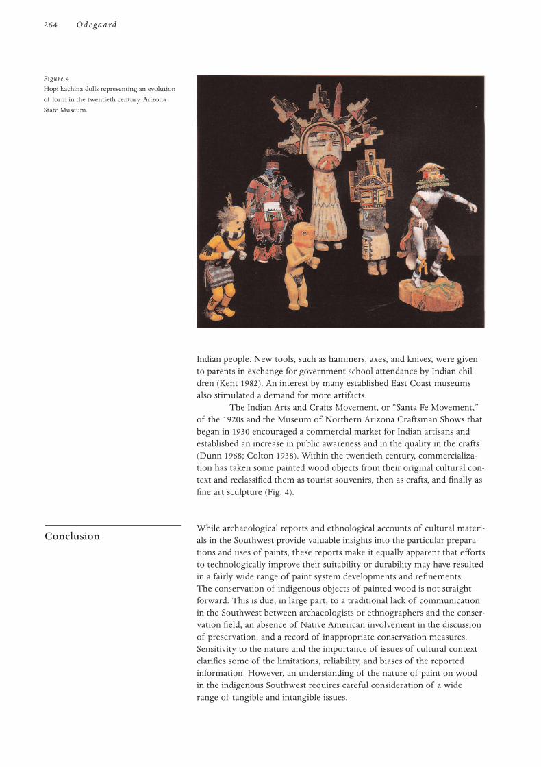
Indian people. New tools, such as hammers, axes, and knives, were givento parents in exchange for government school attendance by Indian chil-dren (Kent 1982). An interest by many established East Coast museumsalso stimulated a demand for more artifacts.
The Indian Arts and Crafts Movement, or “Santa Fe Movement,”of the 1920s and the Museum of Northern Arizona Craftsman Shows thatbegan in 1930 encouraged a commercial market for Indian artisans andestablished an increase in public awareness and in the quality in the crafts(Dunn 1968; Colton 1938). Within the twentieth century, commercializa-tion has taken some painted wood objects from their original cultural con-text and reclassified them as tourist souvenirs, then as crafts, and finally asfine art sculpture (Fig. 4).
While archaeological reports and ethnological accounts of cultural materi-als in the Southwest provide valuable insights into the particular prepara-tions and uses of paints, these reports make it equally apparent that effortsto technologically improve their suitability or durability may have resultedin a fairly wide range of paint system developments and refinements.The conservation of indigenous objects of painted wood is not straight-forward. This is due, in large part, to a traditional lack of communicationin the Southwest between archaeologists or ethnographers and the conser-vation field, an absence of Native American involvement in the discussionof preservation, and a record of inappropriate conservation measures.Sensitivity to the nature and the importance of issues of cultural contextclarifies some of the limitations, reliability, and biases of the reportedinformation. However, an understanding of the nature of paint on woodin the indigenous Southwest requires careful consideration of a widerange of tangible and intangible issues.
Conclusion
264 Odegaard
Figure 4
Hopi kachina dolls representing an evolution
of form in the twentieth century. Arizona
State Museum.
The author would like to thank R. Gwinn Vivian for his helpful suggestions.
Bahti, Mark
1993 Conversation with the author, Bahti Indian Arts, Tucson, Arizona.
Bandelier, A. F. A.
1892 Final Report of Investigations among the Indians of the Southwestern United States, Carried
on Mainly in the Years from 1880 to 1885. Papers of the Archaeological Institute of
America, American Series, vols. 3, 4. Cambridge, Mass.: Harvard University Press.
Barnett, F.
1974 Excavation of Main Pueblo at Fitzmaurice Ruin. Special publication. Flagstaff: Museum of
Northern Arizona.
Bourke, J. G.
1884 The Snake-Dance of the Moquis of Arizona. New York: Charles Scribner’s Sons.
Bunzel, R.
1932 Zuni katcinas. In Bureau of American Ethnology, 47th Annual Report, 837–1086.
Washington, D.C.: Government Printing Office.
Castetter, E. F., and R. M. Underhill
1935 The ethnobiology of the Papago Indians. University of New Mexico Bulletin, Biological
Series 4(3):275.
Colton, M. R.
1938 The arts and crafts of the Hopi Indians: Their future and the work of the museum for
the maintenance of Hopi art. Museum Notes 11:3–24.
Cosgrove, C. B.
1947 Caves of the Upper Gila and Hueco areas. In Papers of the Peabody Museum of American
Archaeology and Ethnology, Harvard University. Vol. 24, no. 2. Cambridge, Mass: Harvard
University Press.
Cushing, F. H.
1965 The nation of the willows. Atlantic Monthly 50:362–74, 541–59. 1882. Reprint, Flagstaff,
Ariz.: Northland Press.
Dockstader, F. J.
1985 The Kachina and the White Man. Bloomfield Hills, Mich.: Cranbrook Institute of
Science.
Dunn, D.
1968 American Indian Painting of the Southwest and Plains Areas. Albuquerque: University of
New Mexico Press.
Ebling, W.
1986 Handbook of Indian Foods and Fibers of Arid America. Berkeley: University of
California Press.
Gettens, R. J., and E. H. Turner
1951 The materials and methods of some religious paintings of early 19th century New
Mexico. El Palacio 58(1):3–16.
Haury, E. W.
1945 The excavation of Los Muertos and neighboring ruins in the Salt River Valley,
Southern Arizona. In Papers of the Peabody Museum of American Archaeology and
Ethnology. Vol. 24, no. 1. Cambridge, Mass.: Harvard University Press.
References
Acknowledgment
265I N P W O I S
1976 The Hohokam, Desert Farmers and Craftsmen: Excavations at Snaketown, 1964–1965.
Tucson: University of Arizona Press.
Hough, W.
1902 A collection of Hopi ceremonial pigments. In United States National Museum Annual
Report for 1900, 463–71. Washington, D.C.: Government Printing Office.
1914 Culture of the ancient Pueblos of the Upper Gila. In United States National Museum
Bulletin. Vol. 87. Washington, D.C.: Government Printing Office.
Kent, K. P.
1982 Pueblo Indian Textiles. Santa Fe: School of American Research.
Kidder, A. V., and S. J. Guernsey
1919 Archaeological explorations in northeastern Arizona. In Bureau of American Ethnology
Bulletin. Vol. 65. Washington, D.C.: Government Printing Office.
Kniffen, F., G. MacGregor, R. McKennan, S. Mekeel, and M. Mook
1935 Walapai ethnography. In Memoirs of the American Anthropological Association. Vol. 42,
ed. A. L. Kroeber. Menasha, Wis.: American Anthropological Association.
Lomawaima, H.
1994 Conversation with the author, Arizona State Museum, Tucson.
Lumholtz, C.
1976 New Trails in Mexico. New York: Charles Scribner’s Sons, 1912. Reprint, Tucson:
University of Arizona Press.
Madsen, J.
1994 Interview with the author, Arizona State Museum, Tucson.
McGregor, J. C.
1943 Burial of an Early American magician. Proceedings of the American Philosophical Society
86(2):270–98.
Opler, M. E.
1965 An Apache Life-Way. Chicago: University of Chicago Press, 1941. Reprint, Cooper
Square Publications, New York.
Parsons, E. C.
1939 Pueblo Indian Religion. 2 vols. Chicago: University of Chicago Press.
Robbins, W. W., H. S. Peabody, and B. Freire-Marreco
1916 Ethnobotany of the Tewa Indians. In Bulletin of the Bureau of American Ethnology.
Vol. 55. Washington, D.C.: Government Printing Office.
Russell, F.
1975 The Pima Indians. Reprint, with Introduction, Citation Sources, and Bibliography by
B. L. Fontana. Tucson: University of Arizona Press.
Sayles, G., and T. Sayles
1948 The pottery of Ida Redbird. Arizona Highways ( January):28–31.
Sekaquaptewa, E.
1993 Kachinas vs. kachina dolls: The significance of Kachinas in Hopi religion. Notes from a
lecture presented to the Arizona Archaeological and Historical Society.
Smith, W.
1952 Kiva mural decorations at Awatovi and Kawaika-a with a survey of other wall paintings
in the Pueblo Southwest. In Papers of the Peabody Museum of American Archaeology and
Ethnology. Vol. 37. Cambridge, Mass.: Harvard University Press.
266 Odegaard

Spier, L.
1970 Yuman Tribes of the Gila River. Chicago: University of Chicago Press, 1933. Reprint,
New York: Cooper Square Press.
Stephen, A. M.
1898 Pigments in ceremonials of the Hopi. Archives of the International Folk-Lore Association
1:260–65.
1936 Hopi Journal of Alexander M. Stephen. Ed. E. C. Parsons. Columbia University
Contributions to Anthropology. Vol. 23. New York: Columbia University Press.
Stevenson, M. C.
1904 The Zuni Indians: Their mythology, esoteric fraternities and ceremonies. In Bureau
of American Ethnology, 23rd Annual Report, 1–608. Washington, D.C.: Government
Printing Office.
1915 Ethnobotany of the Zuni Indians. In 30th Annual Report of the Bureau of American
Ethnology for the Years 1908–09, 31–102. Washington, D.C.: Government Printing Office.
Sutton, M. Q.
1990 Notes on creosote lac scale insect resin as a mastic and sealant in the Southwestern
Great Basin. Journal of California and Great Basin Anthropology 12(2):262–68.
Tanner, C. L.
1982 Apache Indian Baskets. Tucson: University of Arizona Press.
Teiwes, H.
1988 The art of Rupert Angea, contemporary Papago potter. Masterkey 62(1):3–11.
Tenakhongva, C.
1993 Interview with the author, Arizona State Museum, Tucson.
Tschopik, H.
1941 Navaho pottery making. In Papers of the Peabody Museum of American Archaeology and
Ethnology. Vol. 17, no. 1. Cambridge, Mass.: Harvard University Press.
Vivian, R. G., D. N. Dodgen, and G. H. Hartman
1978 Wooden ritual artifacts from Chaco Canyon, New Mexico: The Chetro Ketl collection.
In Anthropological Papers of the University of Arizona. Vol. 32. Tucson: University of
Arizona Press.
Wasley, W. W.
1962 A ceremonial cave on Bonita Creek, Arizona. American Antiquity 27(3):380–94.
White, L. A.
1932 The Acoma Indians. In 47th Annual Report of the Bureau of American Ethnology for the
Years 1929–30, 17–192. Washington, D.C.: Government Printing Office.
Whiting, A. F.
1939 Ethnobotany of the Hopi. Museum of Northern Arizona Bulletin 15.
267I N P W O I S
268
I required to rebuild a large metropolisfrom scratch. Following the disaster of the earthquake and fire of 1906in San Francisco, which virtually leveled the city, this monumental task
confronted its citizens. As a leader in the civic arts community, Arthur Mathews applied
himself to facilitating the reconstruction of the city according to the highartistic and aesthetic standards of the prevailing Arts and Crafts movement.Arthur and his wife, Lucia, founded the small Philopolis Press and usedits periodical, Philopolis (love of the city), to disseminate these ideas.With partner John Zeile, they established a shop to construct furniturefor homes and businesses destroyed by the quake, manifesting their idealsof interior design and incorporating their artistic training and talents.Following the evolution of the furniture and decorative arts created in thisshop and the Mathewses’ elevation of applied arts to fine art status, wesee the emergence of a new and unique expression of the Arts and Craftsmovement, referred to as the “California Decorative Style” ( Jones 1985:32).
Born in a family of talented architects in Wisconsin, ArthurMathews distinguished himself in his teens by winning national architec-tural competitions while still an apprentice in his father’s San Franciscoarchitectural firm. Turning from architecture to fine arts, he became anillustrator and, at age twenty-five, entered the Académie Julian in Parisfor formal training, where he received the Grand Gold Medal for distinc-tion. The artistic environment in Paris offered him influences rangingfrom new trends in French Neoclassical art, as practiced by muralistPuvis de Chavannes, to Japanese woodblock prints with their flat colorplanes and different use of perspective. Arthur returned to San Franciscoin 1889 and taught art at the California School of Design, where he soonbecame director.
Lucia Kleinhans Mathews, a native of San Francisco, attended thecity’s public schools, which, at that time in California, “were strongly com-mitted to manual arts education, teaching students the principal tenets ofthe Arts and Crafts movement, particularly the belief that the union ofhand, head and heart in handicraft yielded therapeutic value” (Trapp1993:9). After briefly attending Mills College, she enrolled at the MarkHopkins Institute of Art. Her artistic talents rapidly won her recognition,not only in the school, but with her instructor Arthur Mathews. She mar-ried Arthur in 1894 and traveled with him to Europe in 1899, studyingpainting in Paris under James McNeill Whistler at his Académie-Carmen.
The Painted Furniture and Wooden DecorativeArts of Lucia and Arthur Mathews
Mark A. Harpainter and Christopher C. Augerson
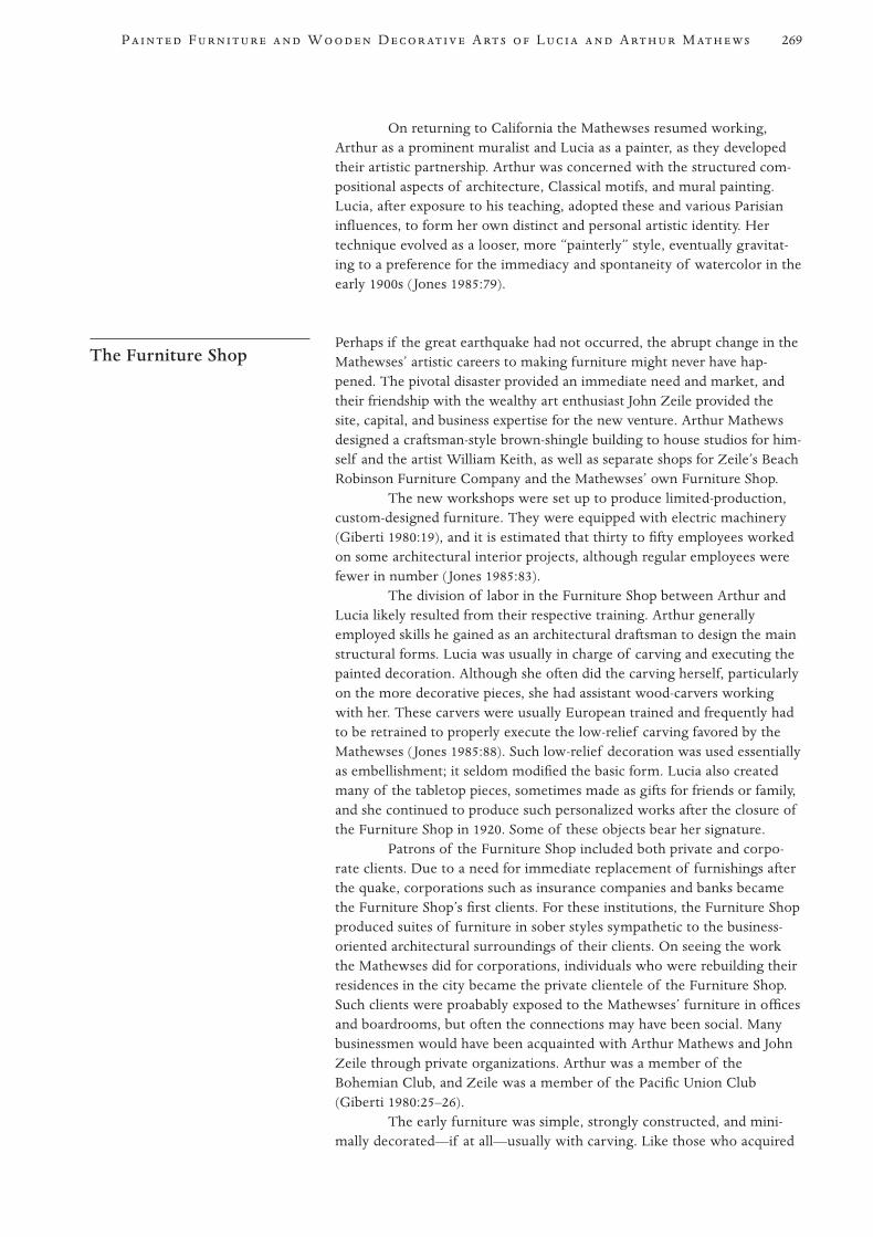
On returning to California the Mathewses resumed working,Arthur as a prominent muralist and Lucia as a painter, as they developedtheir artistic partnership. Arthur was concerned with the structured com-positional aspects of architecture, Classical motifs, and mural painting.Lucia, after exposure to his teaching, adopted these and various Parisianinfluences, to form her own distinct and personal artistic identity. Hertechnique evolved as a looser, more “painterly” style, eventually gravitat-ing to a preference for the immediacy and spontaneity of watercolor in theearly 1900s ( Jones 1985:79).
Perhaps if the great earthquake had not occurred, the abrupt change in theMathewses’ artistic careers to making furniture might never have hap-pened. The pivotal disaster provided an immediate need and market, andtheir friendship with the wealthy art enthusiast John Zeile provided thesite, capital, and business expertise for the new venture. Arthur Mathewsdesigned a craftsman-style brown-shingle building to house studios for him-self and the artist William Keith, as well as separate shops for Zeile’s BeachRobinson Furniture Company and the Mathewses’ own Furniture Shop.
The new workshops were set up to produce limited-production,custom-designed furniture. They were equipped with electric machinery(Giberti 1980:19), and it is estimated that thirty to fifty employees workedon some architectural interior projects, although regular employees werefewer in number ( Jones 1985:83).
The division of labor in the Furniture Shop between Arthur andLucia likely resulted from their respective training. Arthur generallyemployed skills he gained as an architectural draftsman to design the mainstructural forms. Lucia was usually in charge of carving and executing thepainted decoration. Although she often did the carving herself, particularlyon the more decorative pieces, she had assistant wood-carvers workingwith her. These carvers were usually European trained and frequently hadto be retrained to properly execute the low-relief carving favored by theMathewses ( Jones 1985:88). Such low-relief decoration was used essentiallyas embellishment; it seldom modified the basic form. Lucia also createdmany of the tabletop pieces, sometimes made as gifts for friends or family,and she continued to produce such personalized works after the closure ofthe Furniture Shop in 1920. Some of these objects bear her signature.
Patrons of the Furniture Shop included both private and corpo-rate clients. Due to a need for immediate replacement of furnishings afterthe quake, corporations such as insurance companies and banks becamethe Furniture Shop’s first clients. For these institutions, the Furniture Shopproduced suites of furniture in sober styles sympathetic to the business-oriented architectural surroundings of their clients. On seeing the workthe Mathewses did for corporations, individuals who were rebuilding theirresidences in the city became the private clientele of the Furniture Shop.Such clients were proabably exposed to the Mathewses’ furniture in officesand boardrooms, but often the connections may have been social. Manybusinessmen would have been acquainted with Arthur Mathews and JohnZeile through private organizations. Arthur was a member of theBohemian Club, and Zeile was a member of the Pacific Union Club(Giberti 1980:25–26).
The early furniture was simple, strongly constructed, and mini-mally decorated—if at all—usually with carving. Like those who acquired
The Furniture Shop
269P F W D A L A M
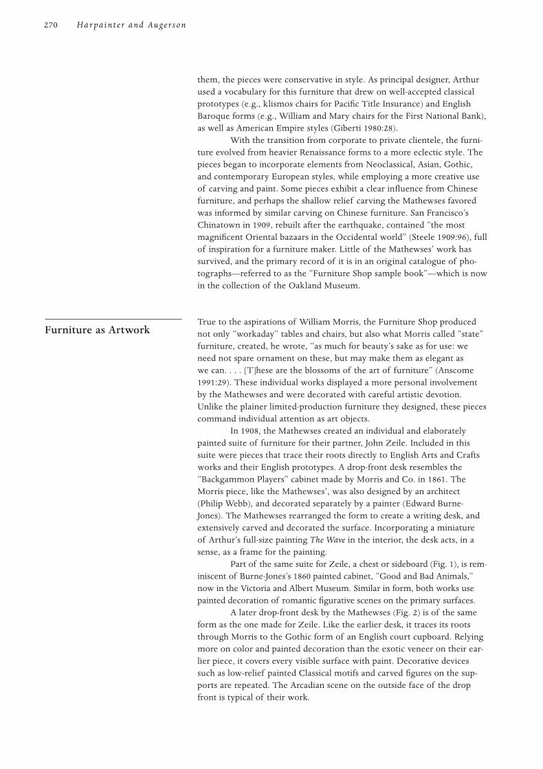
them, the pieces were conservative in style. As principal designer, Arthurused a vocabulary for this furniture that drew on well-accepted classicalprototypes (e.g., klismos chairs for Pacific Title Insurance) and EnglishBaroque forms (e.g., William and Mary chairs for the First National Bank),as well as American Empire styles (Giberti 1980:28).
With the transition from corporate to private clientele, the furni-ture evolved from heavier Renaissance forms to a more eclectic style. Thepieces began to incorporate elements from Neoclassical, Asian, Gothic,and contemporary European styles, while employing a more creative useof carving and paint. Some pieces exhibit a clear influence from Chinesefurniture, and perhaps the shallow relief carving the Mathewses favoredwas informed by similar carving on Chinese furniture. San Francisco’sChinatown in 1909, rebuilt after the earthquake, contained “the mostmagnificent Oriental bazaars in the Occidental world” (Steele 1909:96), fullof inspiration for a furniture maker. Little of the Mathewses’ work hassurvived, and the primary record of it is in an original catalogue of pho-tographs—referred to as the “Furniture Shop sample book”—which is nowin the collection of the Oakland Museum.
True to the aspirations of William Morris, the Furniture Shop producednot only “workaday” tables and chairs, but also what Morris called “state”furniture, created, he wrote, “as much for beauty’s sake as for use: weneed not spare ornament on these, but may make them as elegant aswe can. . . . [T]hese are the blossoms of the art of furniture” (Anscome1991:29). These individual works displayed a more personal involvementby the Mathewses and were decorated with careful artistic devotion.Unlike the plainer limited-production furniture they designed, these piecescommand individual attention as art objects.
In 1908, the Mathewses created an individual and elaboratelypainted suite of furniture for their partner, John Zeile. Included in thissuite were pieces that trace their roots directly to English Arts and Craftsworks and their English prototypes. A drop-front desk resembles the“Backgammon Players” cabinet made by Morris and Co. in 1861. TheMorris piece, like the Mathewses’, was also designed by an architect(Philip Webb), and decorated separately by a painter (Edward Burne-Jones). The Mathewses rearranged the form to create a writing desk, andextensively carved and decorated the surface. Incorporating a miniatureof Arthur’s full-size painting The Wave in the interior, the desk acts, in asense, as a frame for the painting.
Part of the same suite for Zeile, a chest or sideboard (Fig. 1), is rem-iniscent of Burne-Jones’s 1860 painted cabinet, “Good and Bad Animals,”now in the Victoria and Albert Museum. Similar in form, both works usepainted decoration of romantic figurative scenes on the primary surfaces.
A later drop-front desk by the Mathewses (Fig. 2) is of the sameform as the one made for Zeile. Like the earlier desk, it traces its rootsthrough Morris to the Gothic form of an English court cupboard. Relyingmore on color and painted decoration than the exotic veneer on their ear-lier piece, it covers every visible surface with paint. Decorative devicessuch as low-relief painted Classical motifs and carved figures on the sup-ports are repeated. The Arcadian scene on the outside face of the dropfront is typical of their work.
Furniture as Artwork
270 Har pain t e r and Augerson
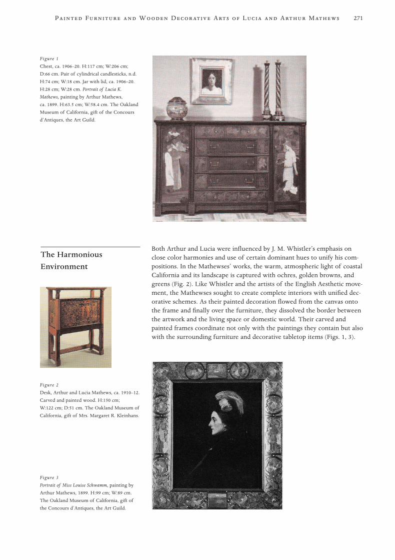
Both Arthur and Lucia were influenced by J. M. Whistler’s emphasis onclose color harmonies and use of certain dominant hues to unify his com-positions. In the Mathewses’ works, the warm, atmospheric light of coastalCalifornia and its landscape is captured with ochres, golden browns, andgreens (Fig. 2). Like Whistler and the artists of the English Aesthetic move-ment, the Mathewses sought to create complete interiors with unified dec-orative schemes. As their painted decoration flowed from the canvas ontothe frame and finally over the furniture, they dissolved the border betweenthe artwork and the living space or domestic world. Their carved andpainted frames coordinate not only with the paintings they contain but alsowith the surrounding furniture and decorative tabletop items (Figs. 1, 3).
The HarmoniousEnvironment
271P F W D A L A M
Figure 1
Chest, ca. 1906–20. H:117 cm; W:206 cm;
D:66 cm. Pair of cylindrical candlesticks, n.d.
H:74 cm; W:18 cm. Jar with lid, ca. 1906–20.
H:28 cm; W:28 cm. Portrait of Lucia K.
Mathews, painting by Arthur Mathews,
ca. 1899. H:63.5 cm; W:58.4 cm. The Oakland
Museum of California, gift of the Concours
d’Antiques, the Art Guild.
Figure 2
Desk, Arthur and Lucia Mathews, ca. 1910–12.
Carved and painted wood. H:150 cm;
W:122 cm; D:51 cm. The Oakland Museum of
California, gift of Mrs. Margaret R. Kleinhans.
Figure 3
Portrait of Miss Louise Schwamm, painting by
Arthur Mathews, 1899. H:99 cm; W:89 cm.
The Oakland Museum of California, gift of
the Concours d’Antiques, the Art Guild.
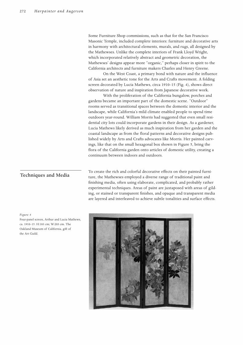
Some Furniture Shop commissions, such as that for the San FranciscoMasonic Temple, included complete interiors: furniture and decorative artsin harmony with architectural elements, murals, and rugs, all designed bythe Mathewses. Unlike the complete interiors of Frank Lloyd Wright,which incorporated relatively abstract and geometric decoration, theMathewses’ designs appear more “organic,” perhaps closer in spirit to theCalifornia architects and furniture makers Charles and Henry Greene.
On the West Coast, a primary bond with nature and the influenceof Asia set an aesthetic tone for the Arts and Crafts movement. A foldingscreen decorated by Lucia Mathews, circa 1910–15 (Fig. 4), shows directobservation of nature and inspiration from Japanese decorative work.
With the proliferation of the California bungalow, porches andgardens became an important part of the domestic scene. “Outdoor”rooms served as transitional spaces between the domestic interior and thelandscape, while California’s mild climate enabled people to spend timeoutdoors year-round. William Morris had suggested that even small resi-dential city lots could incorporate gardens in their design. As a gardener,Lucia Mathews likely derived as much inspiration from her garden and thecoastal landscape as from the floral patterns and decorative designs pub-lished widely by Arts and Crafts advocates like Morris. Her painted carv-ings, like that on the small hexagonal box shown in Figure 5, bring theflora of the California garden onto articles of domestic utility, creating acontinuum between indoors and outdoors.
To create the rich and colorful decorative effects on their painted furni-ture, the Mathewses employed a diverse range of traditional paint andfinishing media, often using elaborate, complicated, and probably ratherexperimental techniques. Areas of paint are juxtaposed with areas of gild-ing, or stained or transparent finishes, and opaque and transparent mediaare layered and interleaved to achieve subtle tonalities and surface effects.
Techniques and Media
272 Har pain t e r and Augerson
Figure 4
Four-panel screen, Arthur and Lucia Mathews,
ca. 1910–15. H:183 cm; W:203 cm. The
Oakland Museum of California, gift of
the Art Guild.

During an NEA-funded conservation project, approximately sev-enteen of the Mathewses’ painted and decorated wood objects in the col-lection of the Oakland Museum were examined and treated. These rangedfrom decorated frames for paintings to small decorative art objects to largefurniture pieces. Cross-section paint samples were taken from most of thedecorative art pieces and examined, using visible-light, fluorescence, andFT-IR microscopy.1 In general, these microscopic analyses revealed fewsigns of later alteration or reworking, and it seems that most of the sur-faces are likely the work of Lucia Mathews. Staining the samples viewedin ultraviolet light2 revealed the presence of oil in both paint and varnishlayers. Staining for protein showed its presence not only in discrete layersor thinly dispersed between layers but also in some of the oil-containinglayers. FT-IR analysis confirmed the presence of some of these media, pri-marily resin-oil mixtures and protein layers. The resin spectra most closelymatched those of copal and sandarac. Other individual components weredifficult to identify. Some of the cross-section samples had curious struc-tures (e.g., with different media twisted in and out of adjacent layers;bleeding from one layer to another; or lean oil mixtures over richer onesto produce craquelure).
The two cross sections of finish from the hexagonal box (Fig. 5)revealed up to nine layers of different media. From the lowest layer, theseinclude a ground layer, which tested negative for protein; oil-resin paintand varnish layers; another ground, which tested positive for protein; thenanother succession of oil-resin paint and varnish layers, some of whichcontained protein. This suggests a major adjustment or change of theartist’s mind, as none of the layers seemed separated by a clear layer ofdirt or use. Unfortunately, the sampling was limited by budget and timeconstraints. More sampling and analysis is clearly needed to unravel suchcomplicated and idiosyncratic surface structures, but a general pattern ofpainterly approach and experimentation in the decoration of the surfacesseems clear.
Perhaps the most interesting and challenging phenomenon foundon the Mathewses’ painted works is the wide variety of darkening andcrazing or craquelure from varnishes and glazes, which reveals a probableintent in creating the aged and timeworn effects and tonalities theseartists valued. These cracked surfaces range from transparent amber oryellow varnish with very slight crazing to dark molasses-colored finishesthat have pulled up into discrete islands on the surface of the paint layer—with many shades and variations in between. These surfaces are particu-larly visible on many of the smaller decorative objects, such as the jarshown in Figure 1 and the clock in Figure 6. The painted decorationof one jar was almost completely obscured by darkened varnish. Difficultdecisions were faced as to how the jar might be returned to exhibitablecondition without intruding into what seemed to be an orginal, or at leastnot fully understood, surface structure. It was decided that microabrasivesunder magnification would be used to reduce the varnish. This allowedthe underlying painted scene to be read without altering the varnishcraquelure pattern. Microabrasives were also used for a pair of urns, onareas of varnish that previously had been damaged by water. All othertreatments of the Oakland Museum pieces involved only simple surfacecleaning and the filling and inpainting of losses, using standard techniquesand materials.3
273P F W D A L A M
Figure 5
Hexagonal box, Arthur and Lucia Mathews,
n.d. Carved and painted wood. H:28 cm;
W:18 cm. The Oakland Museum of California,
gift of the Concours d’Antiques, the Art Guild.
Figure 6
Clock, Lucia Mathews, ca. 1906–15. Painted
and gilded wood, metal, enameled face, and
glass clockwork. H:37.5 cm; W:15.2 cm;
D:10.1 cm. The Oakland Museum of
California, gift of the Art Guild.
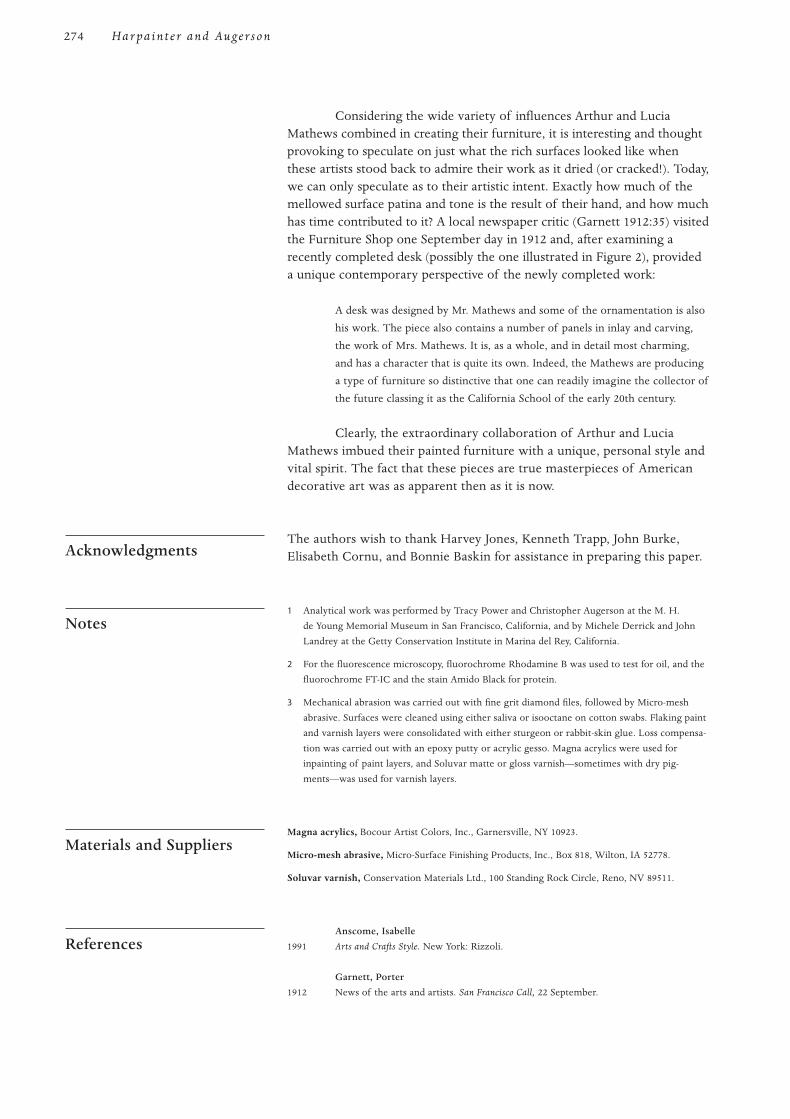
Considering the wide variety of influences Arthur and LuciaMathews combined in creating their furniture, it is interesting and thoughtprovoking to speculate on just what the rich surfaces looked like whenthese artists stood back to admire their work as it dried (or cracked!). Today,we can only speculate as to their artistic intent. Exactly how much of themellowed surface patina and tone is the result of their hand, and how muchhas time contributed to it? A local newspaper critic (Garnett 1912:35) visitedthe Furniture Shop one September day in 1912 and, after examining arecently completed desk (possibly the one illustrated in Figure 2), provideda unique contemporary perspective of the newly completed work:
A desk was designed by Mr. Mathews and some of the ornamentation is also
his work. The piece also contains a number of panels in inlay and carving,
the work of Mrs. Mathews. It is, as a whole, and in detail most charming,
and has a character that is quite its own. Indeed, the Mathews are producing
a type of furniture so distinctive that one can readily imagine the collector of
the future classing it as the California School of the early 20th century.
Clearly, the extraordinary collaboration of Arthur and LuciaMathews imbued their painted furniture with a unique, personal style andvital spirit. The fact that these pieces are true masterpieces of Americandecorative art was as apparent then as it is now.
The authors wish to thank Harvey Jones, Kenneth Trapp, John Burke,Elisabeth Cornu, and Bonnie Baskin for assistance in preparing this paper.
1 Analytical work was performed by Tracy Power and Christopher Augerson at the M. H.
de Young Memorial Museum in San Francisco, California, and by Michele Derrick and John
Landrey at the Getty Conservation Institute in Marina del Rey, California.
2 For the fluorescence microscopy, fluorochrome Rhodamine B was used to test for oil, and the
fluorochrome FT-IC and the stain Amido Black for protein.
3 Mechanical abrasion was carried out with fine grit diamond files, followed by Micro-mesh
abrasive. Surfaces were cleaned using either saliva or isooctane on cotton swabs. Flaking paint
and varnish layers were consolidated with either sturgeon or rabbit-skin glue. Loss compensa-
tion was carried out with an epoxy putty or acrylic gesso. Magna acrylics were used for
inpainting of paint layers, and Soluvar matte or gloss varnish—sometimes with dry pig-
ments—was used for varnish layers.
Magna acrylics, Bocour Artist Colors, Inc., Garnersville, NY 10923.
Micro-mesh abrasive, Micro-Surface Finishing Products, Inc., Box 818, Wilton, IA 52778.
Soluvar varnish, Conservation Materials Ltd., 100 Standing Rock Circle, Reno, NV 89511.
Anscome, Isabelle
1991 Arts and Crafts Style. New York: Rizzoli.
Garnett, Porter
1912 News of the arts and artists. San Francisco Call, 22 September.
References
Materials and Suppliers
Notes
Acknowledgments
274 Har pain t e r and Augerson
Giberti, Bruno
1980 Rooms for a renaissance: Interior decorations as practiced by Arthur and Lucia
Mathews at the Furniture Shop, 1906–1920. Master’s thesis, University of California at
Berkeley.
Jones, Harvey
1985 Mathews, Masterpieces of the California Decorative Style. New York: Gibbs and Smith and
Oakland Museum.
Steele, Rufus
1909 The City That Is: The Story of the Rebuilding of San Francisco in Three Years. San Francisco:
A. M. Robertson.
Trapp, Kenneth, ed.
1993 Introduction to The Arts and Crafts Movement in California: Living the Good Life. New
York: Oakland Museum and Abbeville Press.
275P F W D A L A M