overall presentation multiplatform_ux_patterns
TRANSCRIPT

Multiplatform UX PatternsSimona Cremonesi, Rosanna Bivona

Summary❖ User Experience (UX) definitions❖ Navigation Patterns❖ Antipatterns❖ Dark Patterns

What is UX?
UX stands for User eXperience
Everyone knows what it is, yet the definition doesn’t come out easily!
- It is subjective!
3

The definition by the book
“a person's perceptions and responses that result from the use or anticipated use of a product, system or service”ISO 9241-210
4

So, what is it?
what
when
where
why
how
someone uses a product
5

How to measure the UX?
6
Would owning a Ferrari make a toddler feel better than a cool tricycle?

“Everything has a user experience. Our job is not to create the user experience. It is our job to make it good.”
7
-- Joel Marsh, in “UX Crash course”

How can we Design a good UX for an app?


What elements?● Anatomy of the mobile app
○ how to organize the content?
“A design pattern is a repeatable solution to a software engineering problem”
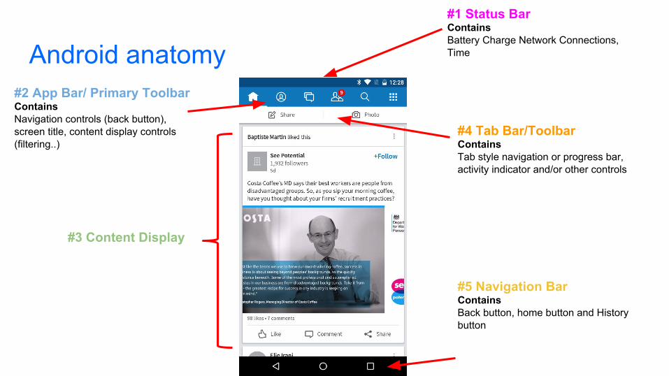
Android anatomy
#1 Status BarContainsBattery Charge Network Connections, Time
#2 App Bar/ Primary ToolbarContainsNavigation controls (back button), screen title, content display controls (filtering..)
#3 Content Display
#4 Tab Bar/ToolbarContainsTab style navigation or progress bar, activity indicator and/or other controls
#5 Navigation BarContainsBack button, home button and History button

iOS anatomy#1 Status BarContainsBattery Charge Network Connections, Time
#3 Content Display
#2 Navigation Bar ContainsUpp button, app icon, spinner
#4 Action Bar Tabs ContainsTab Style navigation

Windows Phone anatomy#1 Status BarContainsBattery Charge, Network Connections, Time
#3 Content Display
#4 App barContainsMost common app tasks as icon buttons

How to navigate and interact with your app?● Side Drawer (Hamburger Menu)● Secondary Drawer● Tab Menu

Side Drawer / Hamburger menu

Secondary action drawer

Tab Menu

Browse control patterns❖ Lists
➢ Item level drawers➢ more control
❖ Grids or Gallery❖ Cards❖ Carousels❖ Swimlanes

Lists
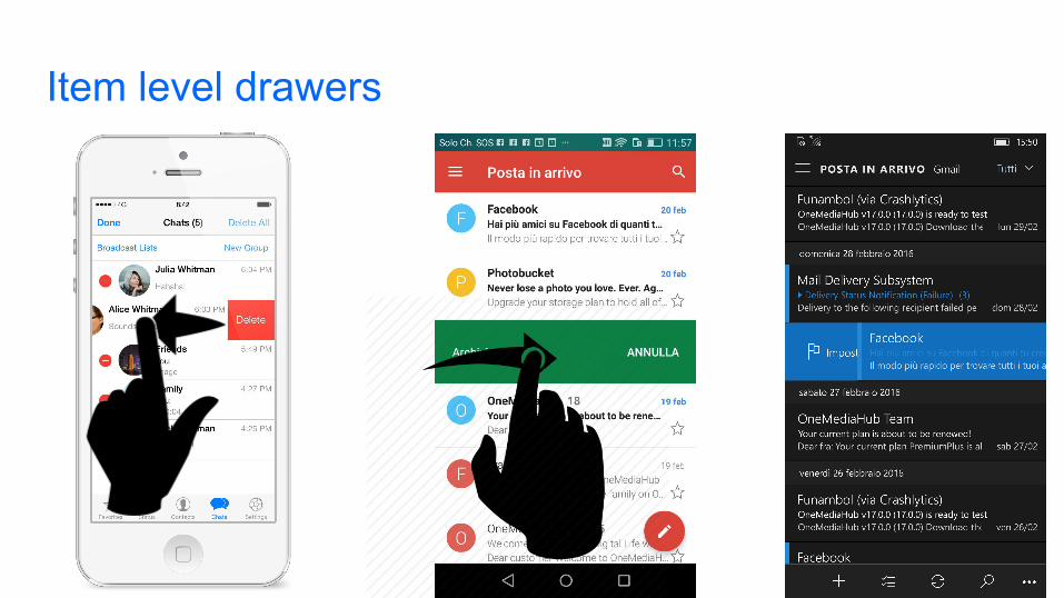
Item level drawers

More...controls - iOS

More...controls - Android

More...controls - Windows phone
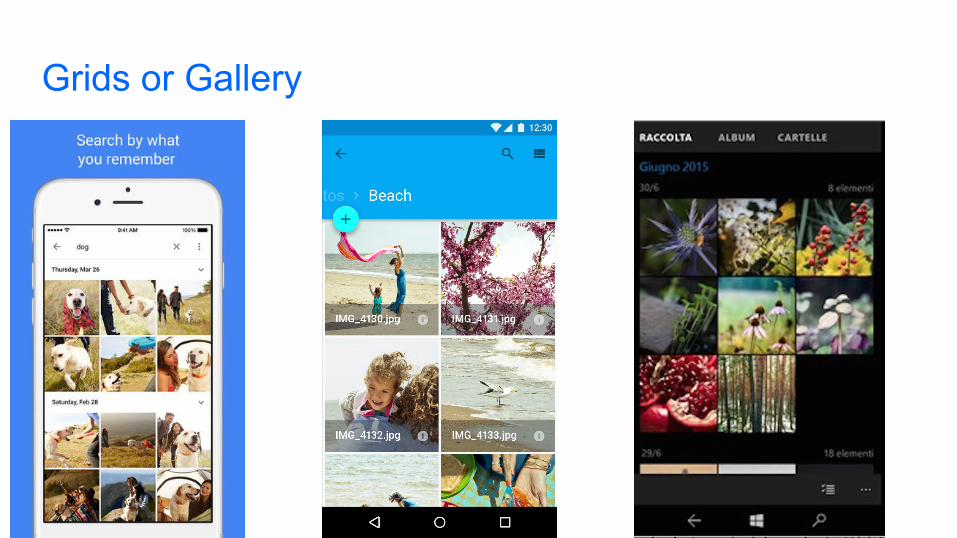
Grids or Gallery

Cards

Cards

Screen carousels pattern

Content carousels

Content carousels
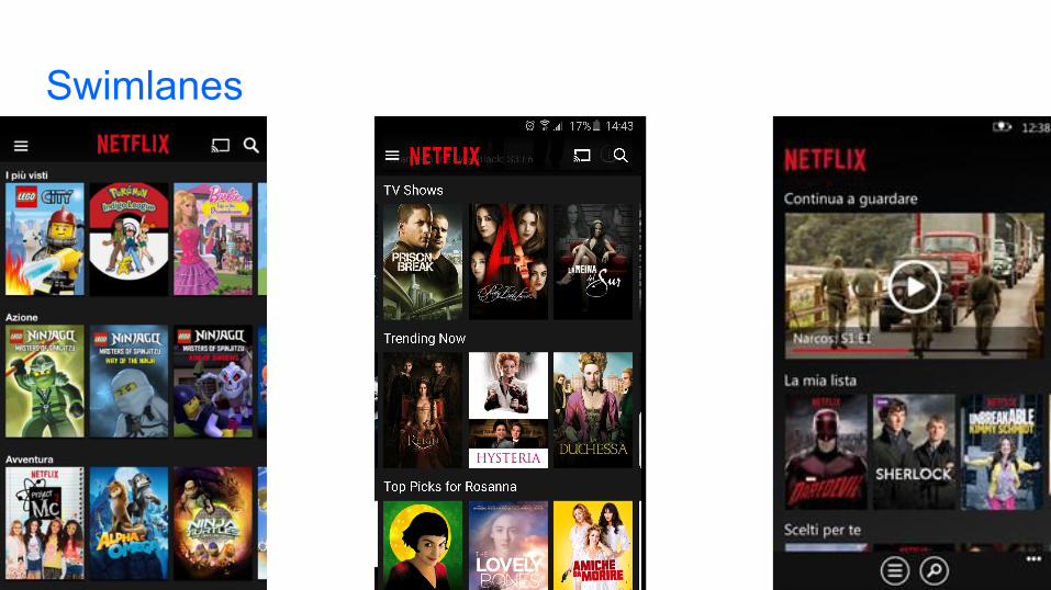
Swimlanes

Summarizing...When use it?

A pattern describes the way from a problem to a valid solution, an antipattern describes the way from a problem to a poor solution.

Antipatterns
“An antipattern is something that looks like a good idea, but which backfires badly when applied.”Jim Coplien

Antipatterns: where is the value

Antipatterns during first run of the app
❖ Splash screen❖ Force user to register❖ Ask too much information during signup ❖ Username as only way to register/login❖ Insert the password twice

Starting and stopping because of splash screen
Anything that slows down customers after they download your app is a bad thing.

Starting and stopping because of splash screen
As much as possible, avoid displaying a splash screen or other startup experience.

Forcing registration without offering value
❖ Users have little to no idea of what the value of using your site or app is

Registration
Uninstall the app
Forcing registration without offering value

This approach shows users what they will get in the app and offers them a reason to register.
Forcing registration without offering value: solution

Too much information during the signup

❖ Ask for the minimum information and allow users to login with an external account
Too much information during the signup: solution

❖ Since usernames have to be unique, users end up registering with a new username that they are never going to remember
Username as only way to complete the registration
❖ Users have many different usernames for various websites

❖ Use email address or phone number!
Username as only way to complete the registration: solution

❖ Imprecise fingers and small screens make it even harder to accurately input complex characters into a password field
❖ It's an extra field to fill in therefore it takes extra time to complete sign up
Require users to insert their password twice

❖ Let users see their password
❖ This is especially useful for mobile login pages, as getting the wrong key is all too easy on a fiddly mobile keyboard.
Require users to insert their password twice: solution

Antipatterns navigating through the app
❖ Hover and Cover antipattern❖ Hamburger menu navigation❖ Hamburger menu position❖ Door slam❖ Confirmation messages

Hover and Cover
❖ It is hard to see the content and even navigate through it
❖ This forces the user to explore the interface with his mouse

Hover and Cover: solution
❖ Don't make users hover over your tools in order to figure out what they mean.
❖ Place the hover in a manner that does not cover up content
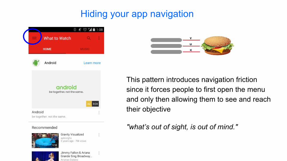
Hiding your app navigation
"what’s out of sight, is out of mind."
This pattern introduces navigation friction since it forces people to first open the menu and only then allowing them to see and reach their objective

Hamburger button Tab bar
Hiding your app navigation: solution

Hamburger menu: position
The hamburger button on the top left is difficult to reach for most of users and the navigation
becomes tedious
easy to reach
difficult to reach
acceptable

easy to reach
difficult to reach
acceptable
Hamburger menu - position: it depends on the size
Right Handed

Hamburger menu - position: solutionDifficult to reach Easy to reach

Door Slam Antipattern
It occurs when you try to follow a link or otherwise visit a site, but all you get is a huge full-page request to download the site's mobile app.

Door Slam Antipattern: solution
Best practice is to give the user the content that she requested
immediately

Confirmations announcing the obvious
❖ Confirmations work only if they are unexpected. If confirmations are offered in routine places, user dismisses them without a glance.
Well, yeah, that’s why I tapped the button.

Confirmations announcing the obvious: solution
❖ Just don’t ask and provide the ability to easily revert unintended actions

UI Antipatterns
❖ “Click here” antipattern❖ Clickable elements which are not recognizable❖ Elements which seem clickable even if they are not❖ Icons, icons everywhere❖ Low contrast

“Click here” Antipattern
❖ Using ‘click here’ for a link forces users to read around the link to find out what they should actually be clicking for.
❖ "Click here" doesn't really tell the user what is going to happen afterwards

“Click here” Antipattern: solution
❖ The user should be able to clearly see what the link does by reading the anchor text.

Clickable elements which are not recognizable

Elements which seem clickable even if they are not
❖ Is the orange box a button? The answer is: No. The shape and label make the element look like a button when it’s not.

❖ Non clickable elements shouldn’t look like the clickable ones
❖ Clickable element should be clearly visible
It seems obvious but it is not...

Icons, icons everywhere
❖ Users don’t want to spend extra time exploring and learning uncommon icons.

Icons, icons everywhere: solution
❖ Some icons are obvious for users but text labels never fail!

❖ Low-contrast text is harder to read and harder to find
Low Contrast

Contrasts do work
❖ Even though the first version might be more attractive to one’s tastes, it is the contrasting version that achieved the goal, which is a click on the Register button.

Dark Patterns

Dark Patterns are User Interfaces that are designed to trick people.

Misdirection

The phone number underneath the hotel is not the hotel’s phone number but rather hotels.com phone number
Bait and Switch

Trick questions

Hidden costs

Sneak into Basket

Sneak into Basket


- Antipatterns - https://sourcemaking.com/antipatterns - iOS Human Interface Guidelines https://developer.apple.
com/library/ios/documentation/UserExperience/Conceptual/MobileHIG/StartingStopping.html
- 10 tips for a better login page and process http://www.uxforthemasses.com/login-page/
- Are you sure? How to write effective confirmations http://www.uxdesignedge.com/2010/06/are-you-sure-how-to-write-effective-confirmations/
- Beyond Blue Links: Making Clickable Elements Recognizable https://www.nngroup.com/articles/clickable-elements/
- Mobile UX antipatterns - http://www.slideshare.net/kollinz/misused-mobile-ux-patterns
- UX Antipatterns: Hidden Traps in Sites and Apps http://www.lauradhamilton.com/ux-antipatterns-hidden-traps-sites-apps
- http://darkpatterns.org/

- UI patterns: http://ui-patterns.com - How to create an app for ios, Android and Windows Phone: http://www.pcmag.com/article2/0,
2817,2476480,00.asp - Book “Mobile Design Pattern Gallery, 2nd Edition” Theresa Neil- Book “About Face - The Essentials of Interaction Design” Alan Cooper, Robert Reimann, David
Cronin, Christopher Noessel- Design Library for Windows Phone: https://msdn.microsoft.com/en-
us/library/windows/apps/hh202915(v=vs.105).aspx- Android Design Guideline:
- https://www.google.com/design/spec/layout/structure.html- https://www.google.com/design/spec/components/lists.html- https://www.google.com/design/spec/components/cards.html - https://www.google.com/design/spec/components/grid-lists.html#grid-lists-behavior- https://www.google.com/design/spec/patterns/navigation.html
- iOS Guideline: https://designcode.io/iosdesign-guidelines

- Hamburger Menu:
- https://medium.com/2015-in-writing/your-problem-goes-beyond-hamburgers-e0aae6a1576#.dz51vvt70
- The Hamburger Menu Doesn't Work - Deep Design- Why and How to Avoid Hamburger Menus - Louie A ...
- A Tale of Two Platforms: Designing for Both Android and iOS: http://webdesign.tutsplus.com/articles/a-tale-of-two-platforms-designing-for-both-android-and-ios--cms-23616
- Nozioni di base sulla progettazione di una Universal Windows Platform app (UWP): https://dev.windows.com/it-it/design/design-basics
- Carousel Pattern: http://4ourth.com/wiki/Carousel- Design Patterns: http://ui-patterns.com/patterns - Design inspiration for your Android app: http://www.android-app-patterns.com/site?page=1 - Google Design: https://design.google.com - Android UI Patterns: http://www.androiduipatterns.com - A Definitive Guide To The Android Carousel Design Pattern: https://www.smashingmagazine.
com/2013/02/android-carousel-design-pattern/ - Android Patterns: http://unitid.nl/androidpatterns/