optimizing responsive websites for users and search engines
TRANSCRIPT
OPTIMIZING RESPONSIVE WEBSITES FOR USER EXPERIENCE
AND SEARCH ENGINESRob Johnson
@robkellaslinkedin.com/in/robkellas
CASE STUDY
DESERETBOOK.COM
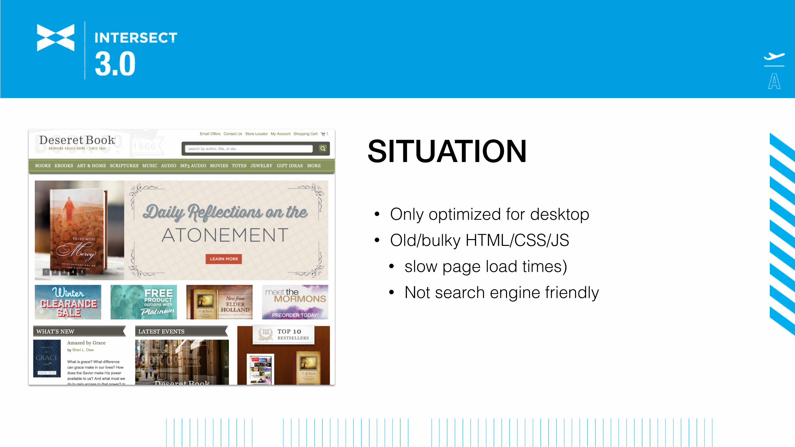
SITUATION
• Only optimized for desktop • Old/bulky HTML/CSS/JS
• slow page load times) • Not search engine friendly

RESPONSIVE DESIGN IMPLEMENTATION GOALS• Retain parity with current desktop design • Improve the mobile user experience • Improve page load times • Make pages more search engine friendly
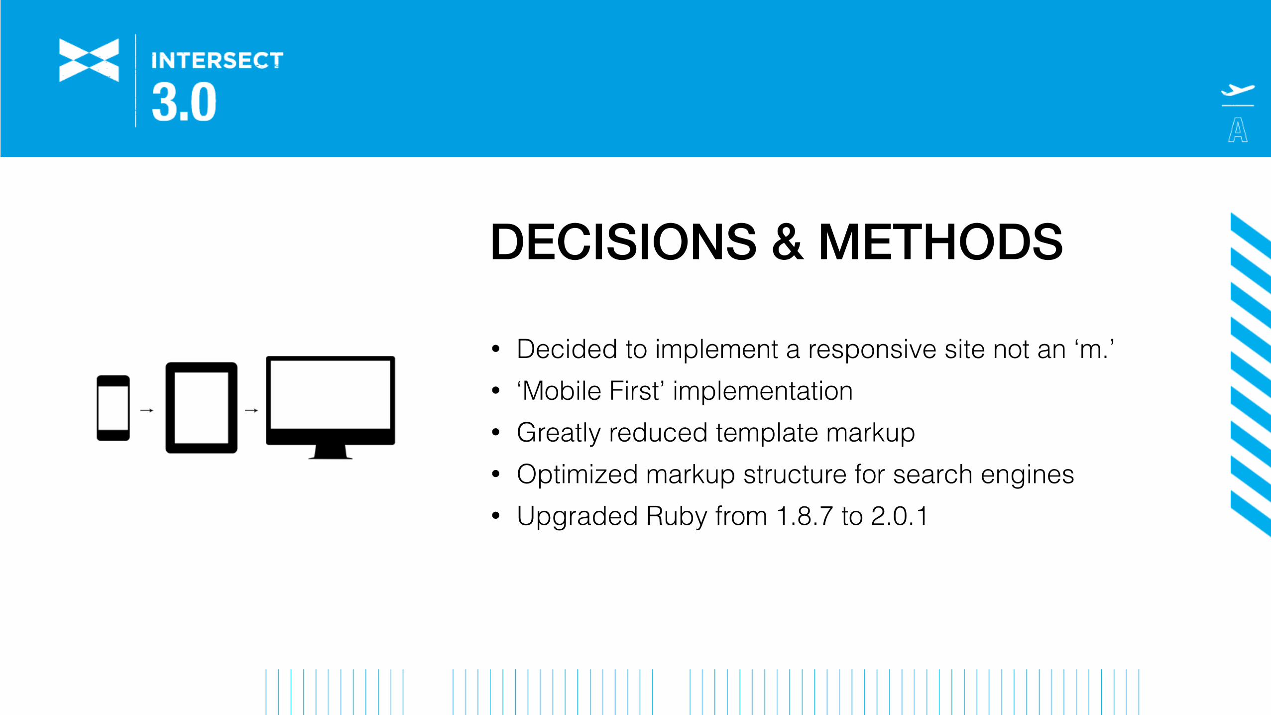
DECISIONS & METHODS
• Decided to implement a responsive site not an ‘m.’ • ‘Mobile First’ implementation • Greatly reduced template markup • Optimized markup structure for search engines • Upgraded Ruby from 1.8.7 to 2.0.1
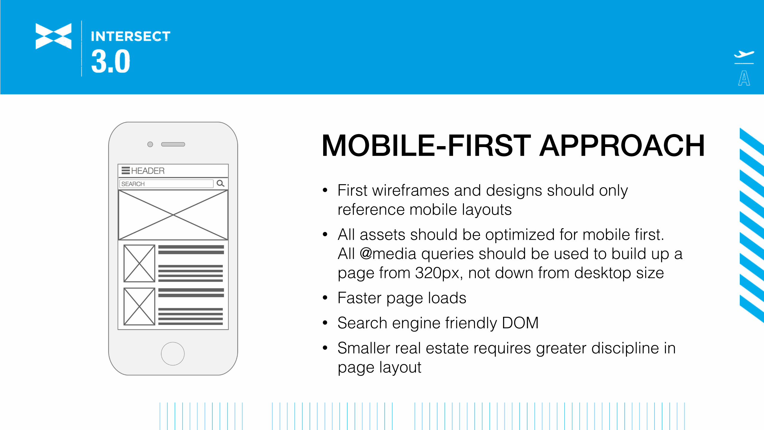
MOBILE-FIRST APPROACH• First wireframes and designs should only
reference mobile layouts • All assets should be optimized for mobile first.
All @media queries should be used to build up a page from 320px, not down from desktop size
• Faster page loads • Search engine friendly DOM • Smaller real estate requires greater discipline in
page layout
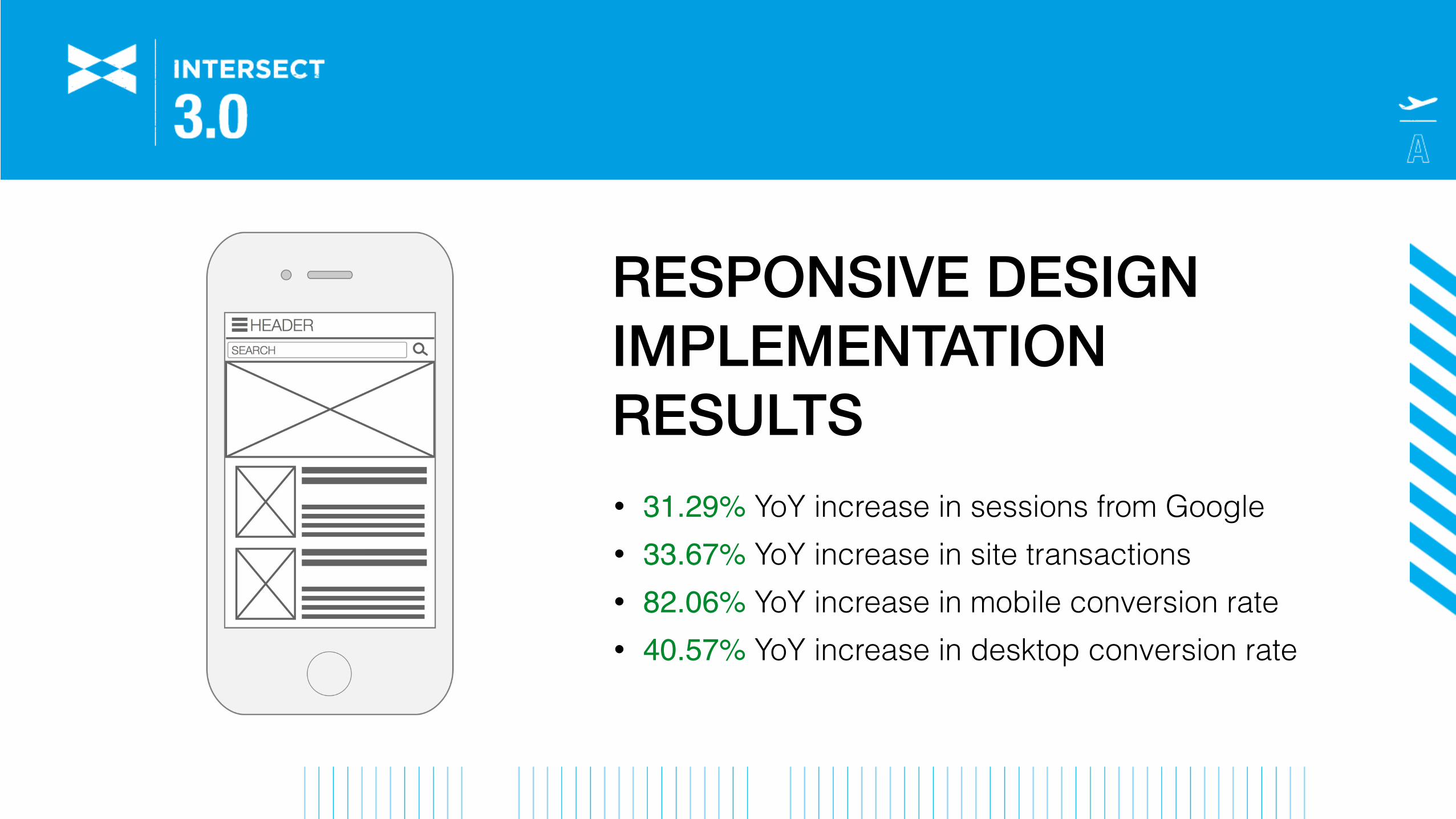
RESPONSIVE DESIGN IMPLEMENTATION RESULTS• 31.29% YoY increase in sessions from Google • 33.67% YoY increase in site transactions • 82.06% YoY increase in mobile conversion rate • 40.57% YoY increase in desktop conversion rate
REDESIGNING FOR LARGE-SCALE WEBSITES
• Minimize risk • Measure success/failure • Minimize customer frustration
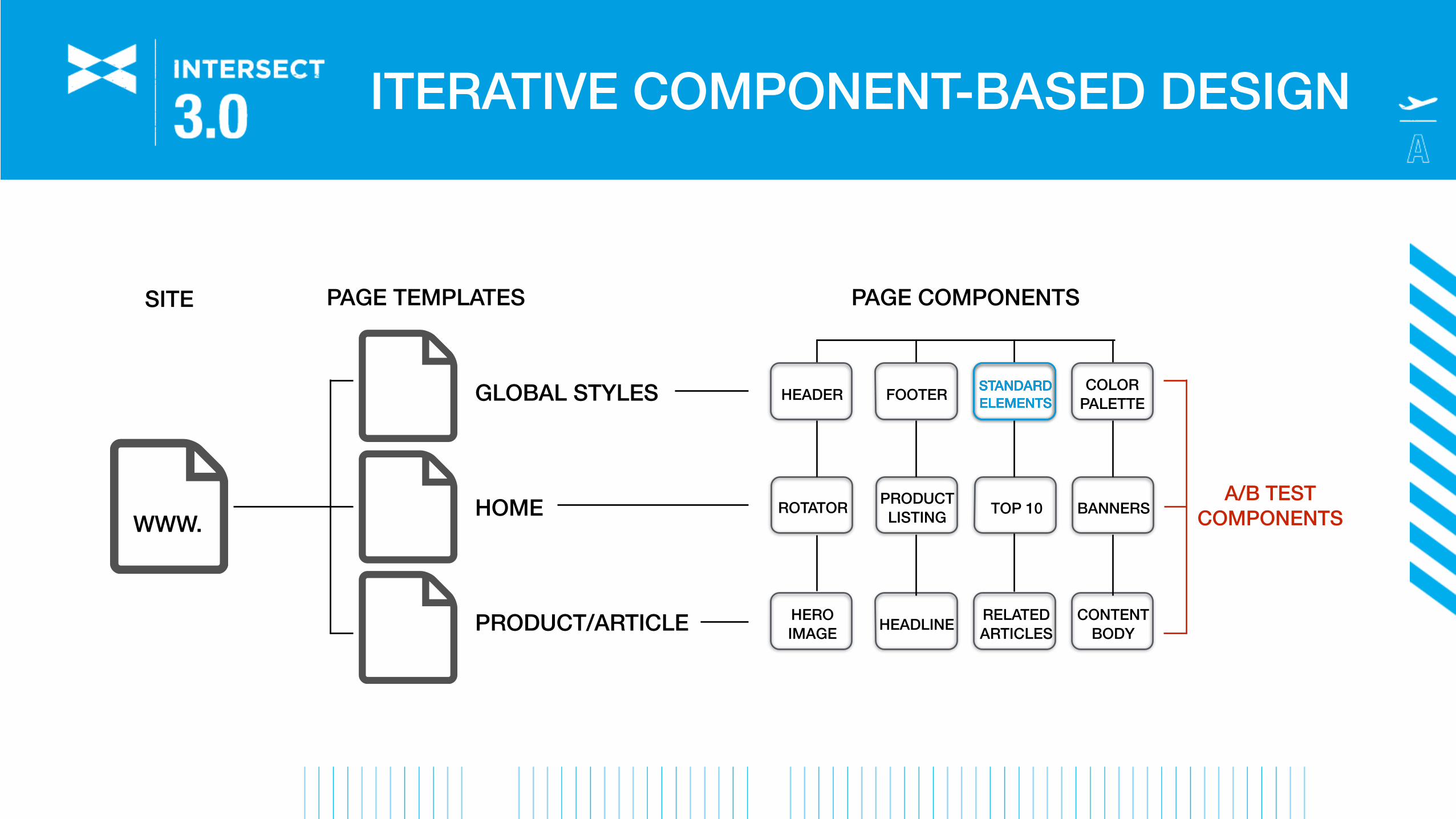
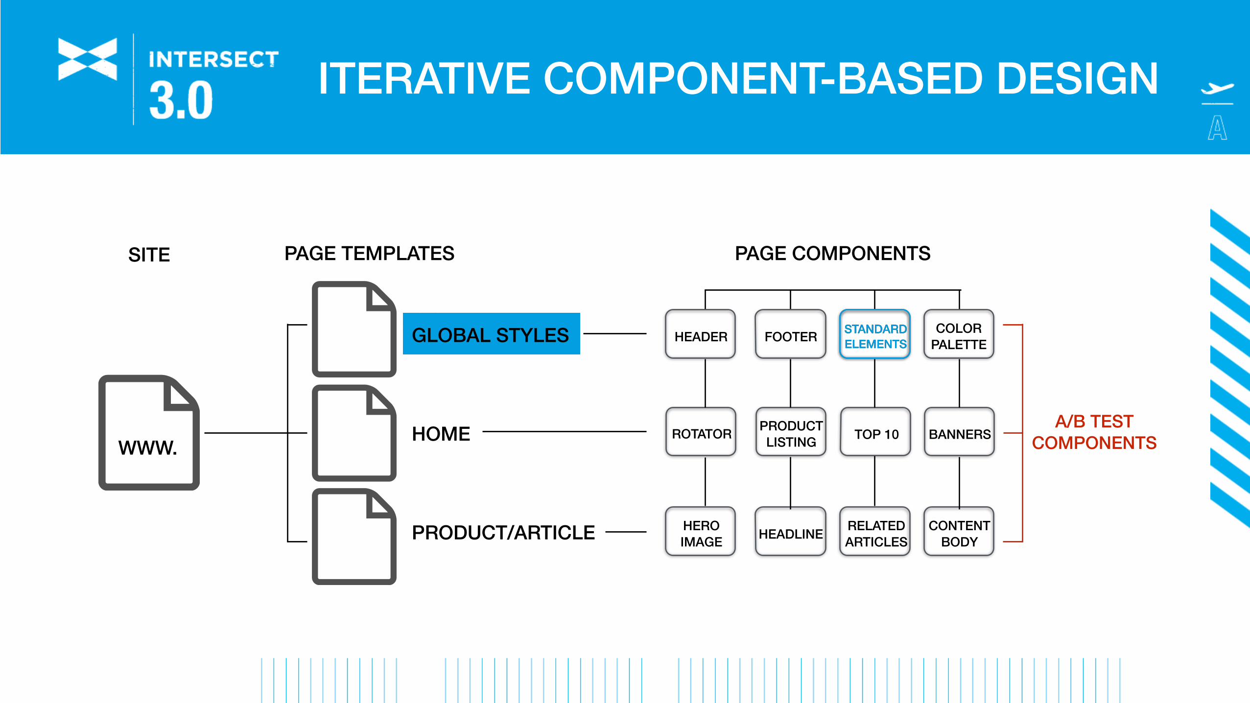
WWW.
GLOBAL STYLES
HOME
PRODUCT/ARTICLE
PAGE COMPONENTS
ROTATOR PRODUCT LISTING
HEADER FOOTER STANDARD ELEMENTS
COLOR PALETTE
TOP 10 BANNERS
HERO IMAGE HEADLINE RELATED
ARTICLESCONTENT
BODY
A/B TEST COMPONENTS
PAGE TEMPLATESSITE
STANDARD ELEMENTS
ITERATIVE COMPONENT-BASED DESIGN
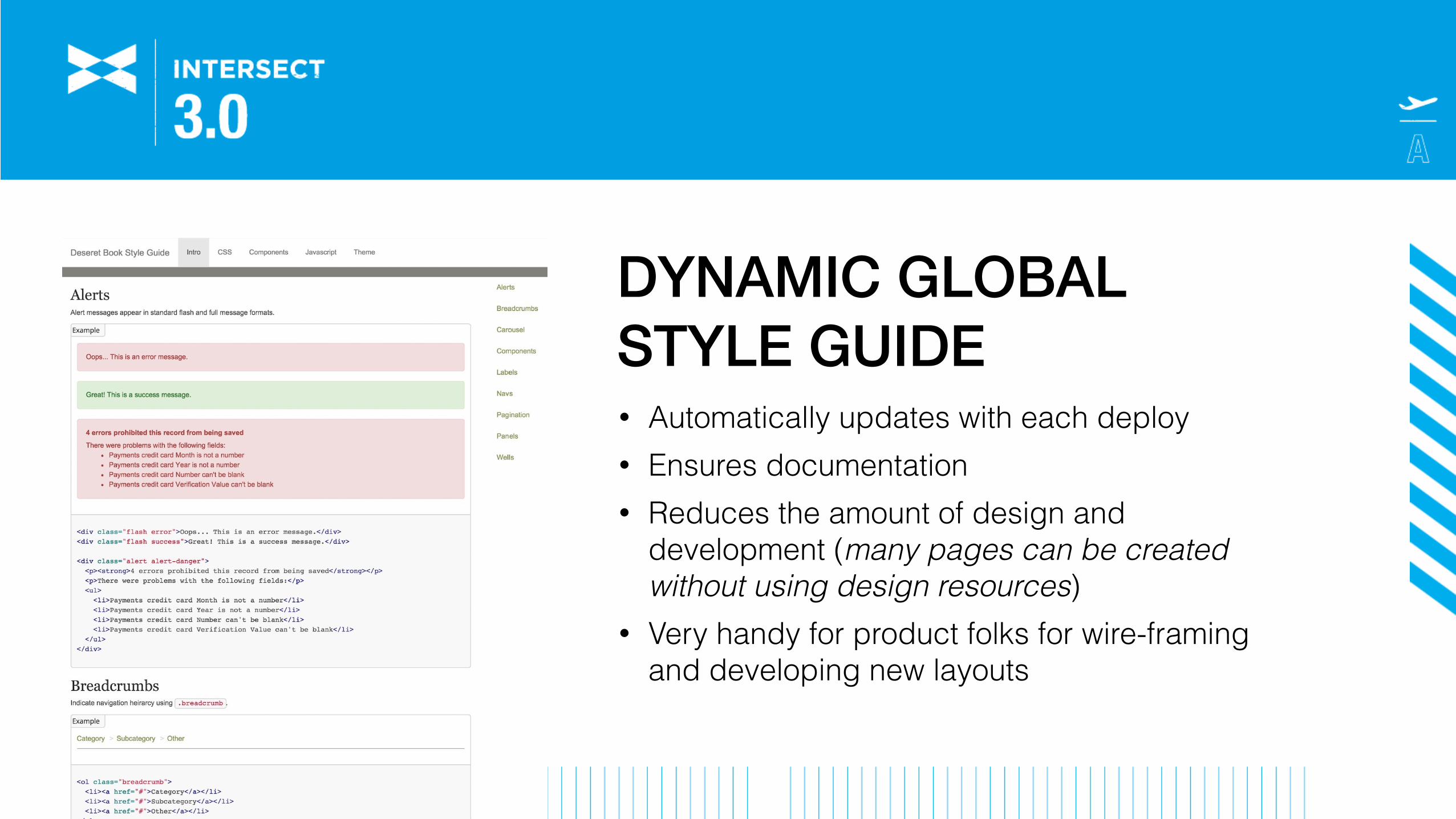
DYNAMIC GLOBAL STYLE GUIDE• Automatically updates with each deploy • Ensures documentation • Reduces the amount of design and
development (many pages can be created without using design resources)
• Very handy for product folks for wire-framing and developing new layouts
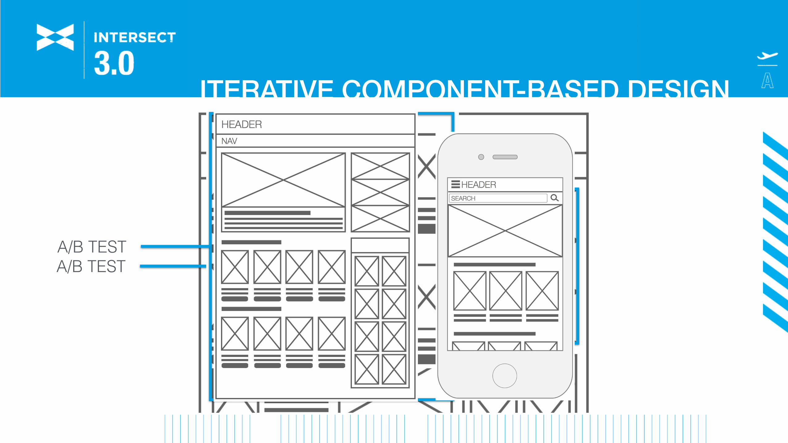
A/B TESTA/B TEST
ITERATIVE COMPONENT-BASED DESIGN
WWW.
GLOBAL STYLES
HOME
PRODUCT/ARTICLE
PAGE COMPONENTS
ROTATOR PRODUCT LISTING
HEADER FOOTER STANDARD ELEMENTS
COLOR PALETTE
TOP 10 BANNERSA/B TEST
COMPONENTS
PAGE TEMPLATESSITE
STANDARD ELEMENTS
HERO IMAGE HEADLINE RELATED
ARTICLESCONTENT
BODY
ITERATIVE COMPONENT-BASED DESIGN

REDESIGNING FOR LARGE-SCALE WEBSITES
• Minimize risk • Measure success/failure • Minimize customer frustration
CASE STUDY
DESERETNEWS.COM

SITUATION• Incorrect markup • Poorly written headlines • Not optimized for Google News
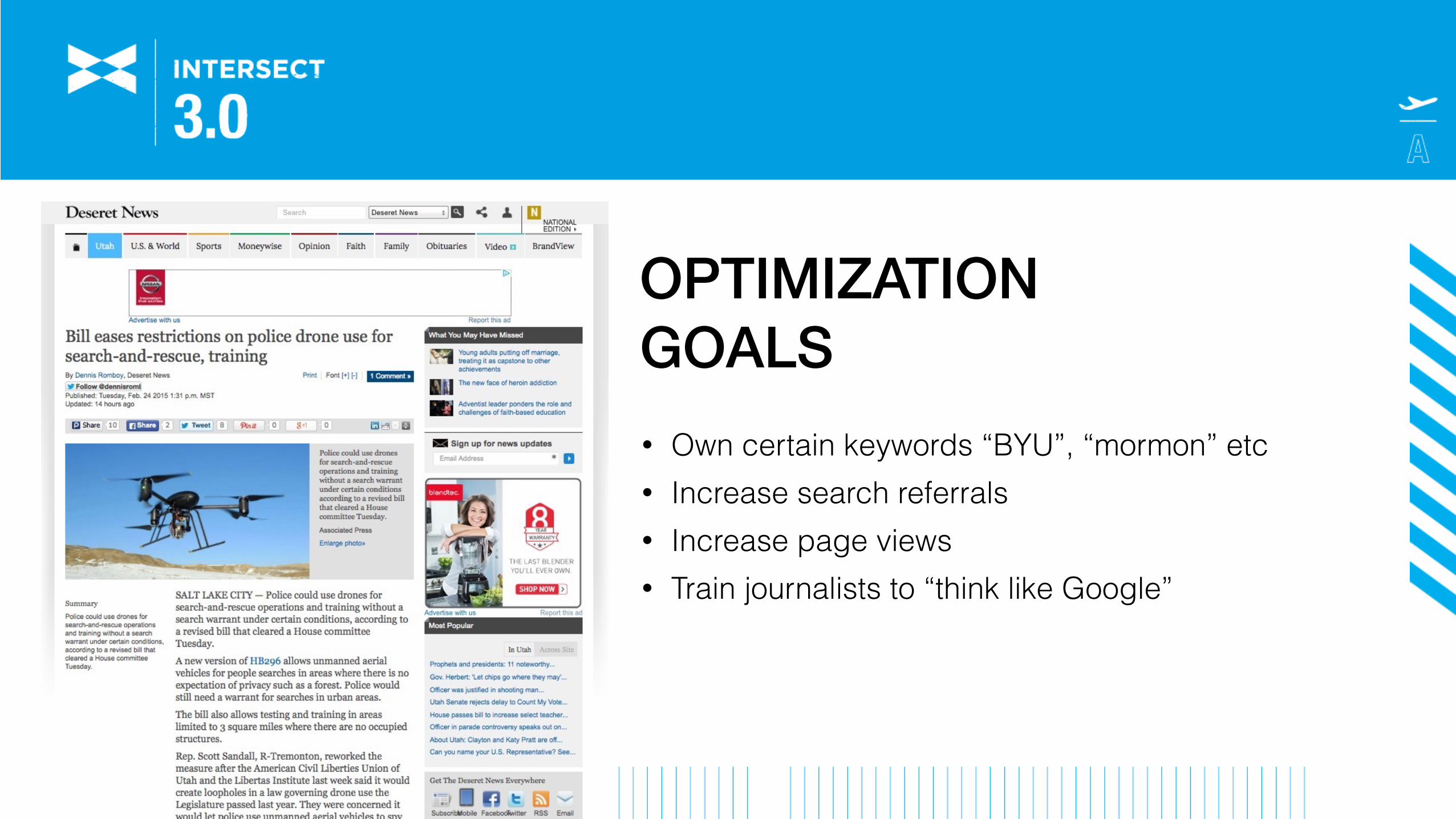
OPTIMIZATION GOALS• Own certain keywords “BYU”, “mormon” etc • Increase search referrals • Increase page views • Train journalists to “think like Google”
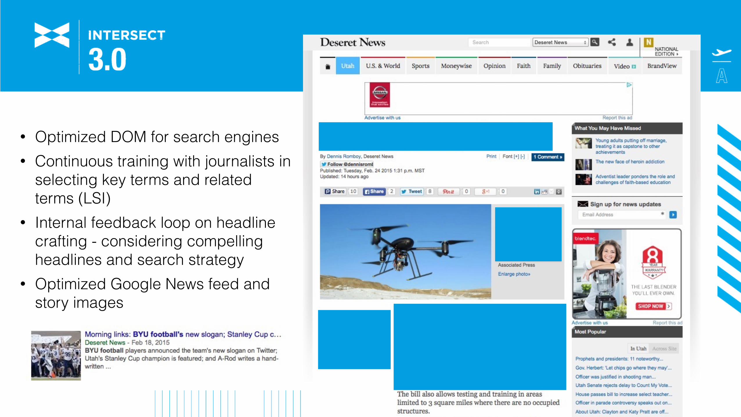
• Optimized DOM for search engines • Continuous training with journalists in
selecting key terms and related terms (LSI)
• Internal feedback loop on headline crafting - considering compelling headlines and search strategy
• Optimized Google News feed and story images
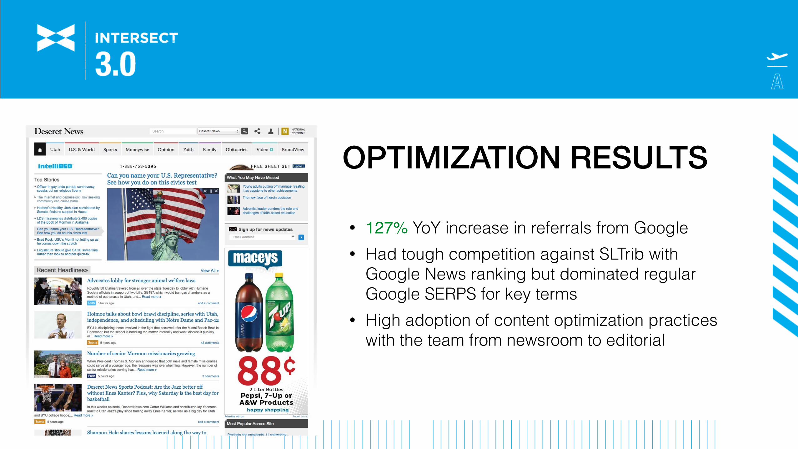
OPTIMIZATION RESULTS
• 127% YoY increase in referrals from Google • Had tough competition against SLTrib with
Google News ranking but dominated regular Google SERPS for key terms
• High adoption of content optimization practices with the team from newsroom to editorial
CHEERS!Rob Johnson
@robkellaslinkedin.com/in/robkellas