music magazine analysis in detail q
TRANSCRIPT
Music magazine analysis in detail
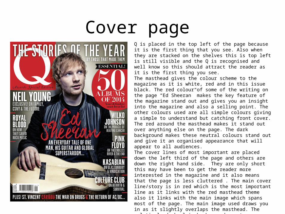
Cover page Q is placed in the top left of the page because it is the first thing that you see. Also when they are stacked on the shelves this is top left is still visible and the Q is recognised and well know so this should attract the reader as it is the first thing you see. The masthead gives the colour scheme to the magazine as it is white, red and in this issue black. The red colour of some of the writing on the page “Ed Sheeran” makes the key feature of the magazine stand out and gives you an insight into the magazine and also a selling point. The other colours used are all simple colours giving a simple to understand but catching front cover. The red around the masthead makes it stand out over anything else on the page. The dark background makes these neutral colours stand out and give it an organised appearance that will appear to all audiences. The cover lines of most important are placed down the left third of the page and others are down the right hand side. They are only short this may have been to get the reader more interested in the magazine and it also means that the page is less cluttered . The main cover line/story is in red which is the most important line as it links with the red masthead theme also it links with the main image which spans most of the page. The main image used draws you in as it slightly overlaps the masthead. The relatively dark plain background creates a clear background giving it a uncluttered and neutral feel. Most of the text used on the cover page is simple, clear and to the point while giving enough of an insight and information for viewers to want to buy the magazine. The balance between getting enough information on the page without getting the main image cluttered and too messy. The artists names are all in capitals as it is the first thing you see and a selling point.
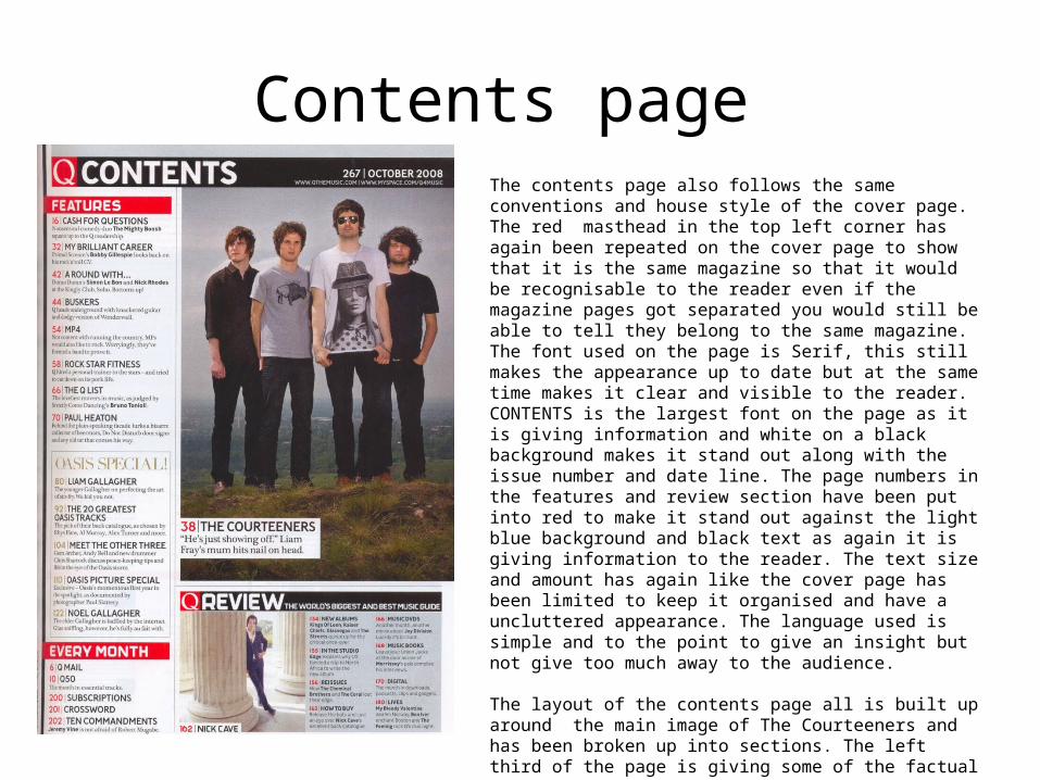
Contents page The contents page also follows the same conventions and house style of the cover page. The red masthead in the top left corner has again been repeated on the cover page to show that it is the same magazine so that it would be recognisable to the reader even if the magazine pages got separated you would still be able to tell they belong to the same magazine. The font used on the page is Serif, this still makes the appearance up to date but at the same time makes it clear and visible to the reader. CONTENTS is the largest font on the page as it is giving information and white on a black background makes it stand out along with the issue number and date line. The page numbers in the features and review section have been put into red to make it stand out against the light blue background and black text as again it is giving information to the reader. The text size and amount has again like the cover page has been limited to keep it organised and have a uncluttered appearance. The language used is simple and to the point to give an insight but not give too much away to the audience.
The layout of the contents page all is built up around the main image of The Courteeners and has been broken up into sections. The left third of the page is giving some of the factual information on page numbers and the review is another block. This means that is all clear and easy to process. The image they use may also be used to give away one of the main stories and give the musical genre of the magazine.
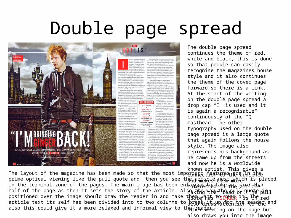
Double page spreadThe double page spread continues the theme of red, white and black, this is done so that people can easily recognise the magazines house style and it also continues the theme of the cover page forward so there is a link. At the start of the writing on the double page spread a drop cap “I” is used and it is again a recognisable continuously of the “Q” masthead. The other typography used on the double page spread is a large quote that again follows the house style. The image also represents his background as he came up from the streets and now he is a worldwide known artist. This gives a connection to the audience and makes them more interested in the article making them read on. The pull quote has “GINGER” is in red also draws attention to the other writing on the page but also draws you into the image and then you see his hair.
The layout of the magazine has been made so that the most important features are in the prime optical viewing like the pull quote and then you see the article next which is placed in the terminal zone of the pages. The main image has been enlarged to take up more than half of the page as then it sets the story of the article. Also the way the pull quote is positioned over the image should draw the reader in and make them want to read on. The article text its self has been divided into to two columns to break it up for the reader and also this could give it a more relaxed and informal view to the reader.