mobile app configuration - configure.it
DESCRIPTION
Mobile app development platform - Build mobile apps by using developer tools available for iOS, iPhone and others.TRANSCRIPT

1 | P a g e
Mobile App Configuration

2 | P a g e
1) Basic Overview Configuration
Table Of Contents
Basic Overview Of Configuration Panel
Login
After Logged in Screen
Create New Project

3 | P a g e
Basic Overview Of Configuration Panel
Login
Default Login Screen
● Enter your username and password to login into your account.
After Logged in Screen

4 | P a g e
1) Menu
There are five tabs in menu after logging in.
Description of the tabs on top right side.
Displays recently projects that you have created as well as allows you to create
or search project.
Allows you to edit your profile.

5 | P a g e
For queries you can have live chat.
For any new updates you will notified by the notifications tab.
To logout from your account.
2) Create New Project
● Enter the unique title for your project and just tap on create to add new project. Detail description about creating project is give below in the document.
3) Search New Project
● Search application from your already created applications.
4) Manage your Project

6 | P a g e
Description of the above screen buttons :-
1) Settings :- To modify the settings of the project.
2) Edit :- To change the configuration of the app. This action will direct to the configuration
screen.
3) Preview :- To download or mail the .ipa file for the registered devices in this section.
4) Clone :- To create the clone of the existing project.
5) Data :- To manage the back - end of the project. For more info refer this Link
6) Delete :- To delete the project alongwith back - end.
7) Title :- Displays the title of the app along with creation date and time.
5) Your recently created project

7 | P a g e
1) Manage App :- You can manage your app configuration from here. Detail description of all
these functionalities is given above.
2) Next - Previous :- Tap on the next previous buttons to view projects that you had created in
past.
Now lets take a look on how to create project in detail.
Create New Project
1) Name :- Enter unique title for your project.
2) Create :- Tap this to create the project.
Next Screen after Adding Title for the application.

8 | P a g e
1) Start With Blank Template :- Select this option to create application to create project with
your own design and configuration.
2) Category :- Select the category for the template.
3) Template :- Select the template to view the screens of the related template.
4) Search Template :- Search the template from all the categories.
5) Screens of Selected Template :- Tap on screen to view in detail.
6) Use Template :- Tap on this to create app with the selected template.
7) Import App :- Import any of the old app code that you have previously downloaded using
Configure.IT. This option is useful in case your app is deleted accidentally from your account.
Screen after choosing template.

9 | P a g e
1) Name :- Modify the name of your app.
2) Category :- Modify the category for the application.
3) Library :- Choose the image from the provided collection of images for splash/logo.
4) Upload :- Upload your own image for splash/logo.
5) Link :- Add link of the image for splash/logo.
6) Duration :- Set duration for the splash image to be displayed before app starts.
7) Orientation :- Set the orientation of your application.
8) Device :- Choose your targeted device type for which you want to do configuration.
9) Image File :- Upload the zip of the folder containing all the images for your application.
Note :- Folder should contain only images not hierarchy of folder containing images. Images
should be of retina size only.
10) PSD File :- Upload PSDs to create screen for the app. Follow this Link to how to upload
psds.
11) Save :- Save all the settings related to your app and return back to your main page.
12) Save and Next :- Save all the settings related to your app and start configuring your app.
13) Export App :- Export any of the app that you have configured on Configure.IT.Clicking on
this button will download a folder which will be containing some files that will be needed at
time of importing app(Restoration of complete app).This option is useful in case your app is
deleted accidentally or any of your screen of any app is deleted accidentally from your
account.

10 | P a g e
First screen after creating project successfully. This screen is for complete configuration of the
app.
Abstract description about the above screen is given below.
1) Left Panel of Configuration screen.

11 | P a g e
1) Add Screen :- This will open up the option to add the type of screen .
2) App Flow :- Use this option to see the all the screens at one place along with the flow of the
app from one screen to another screen.
3) Screen List :- Tapping on this will open the screen list on the left side.
4) Tab Setting :- Use this option to add and modify settings of the tabbar in the app.
5) Other Setting :- Use this option to modify configurations of splash,first screen of app, slide
panel pull to refresh, alertview, loading view and status bar.
2) Right Panel of the Configuration Screen

12 | P a g e
1) Objects :- To view the objects hierarchy in the current screen.
2) Data Source :- To configure the database for the current screen to display data on the UI
objects.
3) Properties :- To view properties of the of the selected object from the object hierarchy or
from the screen.
4) Page Layout :- To apply same attributes to all controls of same type in the current screen.
5) Application Layout :- To apply same attributes to common controls in the app in the all the
screens.
6) Third Party :- To integrate third party apis into the app.For e.g. Facebook,Flurry,Paypal,etc.
7) Option :- This will open panel at the bottom of the screen to switch to another projects or to
undo the last changes in the current screen.
3) Central Area of the Configuration Screen

13 | P a g e
1) Themes :- Choose the theme to be applied to the current screen.
2) Controls :- Opens up the library of controls that can be directly dragged and dropped to the
current screen to be used in the app. Controls tab includes all the controls that are provided by
Apple UIKit as well as additional custom controls.
3) Resources :- To view all the images/video of the app.
4) My Controls :- Opens the library of custom controls which are made of from collection
controls. A user can see his/her own created custom controls.
5) Search :- Option to search an item from themes/controls/resources/my custom controls.
6) Current Screen :- The screen on which you can do configuration.

14 | P a g e
2) Action Configuration Table Of Contents Action Management
Conditions
Actions
WS Call
Redirect
Change Object Properties
Call
SMS
Open URL
Back
Add Contact
Show Contact
Get Contacts
Edit Contact
Start Location
Stop Location
Remove Session
Change Table Properties
Show Alert
Barcode
Show Actionsheet
Save in Session Temporarily
Save in Session Permanently
Show Direction On the Map
Show Image Picker
Add Animation
Remove Animation
Slide Panel Properties
Play Video
Change Tabbar Properties
Set Badge Number On Application
Google+
Add or Edit Event
Add or Edit Reminder
Remove Reminder

15 | P a g e
Action Management
Tapping on any event will open up the window as shown above.
Lets discuss about how to configure cases in the action window.
1) Action Name :- Inside the square brackets the action name is displayed.
2) Case :- Case number will be displayed over here.
3) Add Case :- Add further cases in the current event.
4) Reorder Case :- Reorder the cases in the action window as per the priority.
5) Add Conditions :- Depending on the condition configured in this case the actions will be
called under this case.Tapping on add will show following window:-
Conditions

16 | P a g e
Lets discuss about Conditions internal components:-
1. Satisfy :- You are given two options All or Any. In this All stands for AND condition and Any stand for OR condition. If you have added two Param and you have chosen All condition then equation will be Param1 AND Param2. Both conditions need to be satisfied.
2. Operand 1 Input Param : - Select any value from the drop down list. Following are the list of options available :-
a. Static b. Previous Page c. Session d. Form Object e. Response f. Device Info
Above options are explained in detail in the Datasource Management document.
Please refer that document as how to set value and params for Operand 1.
3. Operator : - Operator is required to compare Operand 1 with Operand 2. As per requirement choose any of the below options:-
a. equals : - Check equality between the Operand 1 and Operand 2. b. contains :- Check if Operand 1 value contains a part of Operand 2. c. does not equal :- Check if Operand 1 value contains a part of Operand 2
value. d. does not contains :- Check if Operand 1 value does not contains part of
Operand 2 value. e. is less than :- Check if Operand 1 value is less than Operand 2 value. f. is less or equal :- Check if Operand 1 value is less or equal to Operand 2
value. g. is greater than :- Check if Operand 1 value is greater than Operand 2
value. h. is greater or equal :- Check if Operand 1 value is greater or equal to
Operand 2 value.

17 | P a g e
4. Operand 2 : - Select any value from the drop down list. Following are the list of options available :-
a. Static b. Previous Page c. Session d. Form Object e. Response f. Device Info
Above options are explained in detail in the Datasource Management document.
Please refer that document as how to set value and params for Operand 1.
5. Clone :- Option to clone the Param alongwith chosen input params and values. 6. Delete :- Delete the params. 7. Add Param :- Add Param in the case. 8. Remove Conditions :- Delete all the conditions in the case.
6) Clone Case :- Clone the whole case alongwith the actions and conditions.
7) Remove Case :- Delete the whole case alongwith actions and conditions
8) Add Action :- Add action in the case.
9) Action Number :- This will display the action number in the case.
10)Select Action :- This option will allow you to choose the action from a number of actions.
11) Reorder Action :- Reorder the action in the case as per the priority.
12) Clone Action :- Clone the whole action along with the params and values.
13) Delete Action :- Delete the action.
Lets discuss about the actions in detail as how to configure them .
Actions
As per the actions the parameters will added in the parameter list. Let look at the description
and configuration.
WS Call
● Used to call web service. Configure required web service and select that web service.
Params
1. Objects :- Select web service name to be called.
● Used for Facebook sharing.
Params
1. Text :- Set text which should be shared on facebook.

18 | P a g e
2. Image :- Set image which should be shared on facebook. 3. URL :- Set URL which should be shared on facebook.
● Used for Twitter sharing.
Params
1. Text :- Set text which should be shared on twitter. 2. Image :- Set image which should be shared on twitter. 3. URL :- Set URL which should be shared on twitter.
Redirect
● Used for redirection(Push, Pop) from one screen to other screen.
Params
1. Animation Type :- Define animation type while redirection. 2. Animation On Screen :- Set Screen name on which redirection should be done. 3. Pop if loaded :- A Boolean value to define if any screen is already loaded(in navigation
stack) then it should “POP”(remove from navigation stack) rather than redirecting. 4. Animation Required :- A Boolean value to define weather animation is required or not.
Change Object Properties
● To change the object properties on any event in the app
Params
1. Object Param :- Choose object id of the control from the drop down list. 2. Property :- Choose property of the control that you want to modify. As per the chosen
control the properties will appear in the drop down list. 3. Sources & Values :- As per the chosen property the source and values will appear
under this. 4. Clone :- Clone the param alonwith object, property and Source & Values. 5. Delete :- Delete the param.

19 | P a g e
6. Add Params :- Add new param.
Call
● Used to call a number from iOS device.
Params
1. Call To :- Select number to call.
SMS
● Used to send SMS to a number.
Params
1. Send To :- Select number to send SMS. To send SMS to multiple numbers comma separated value of recipient should be given.
2. SMS text :- Set text to send.
● Used to send Email.
Params
1. Email From :- Set sender email id. 2. Email To :- Set recipient email id. 3. CC :- Set recipient email id as CC 4. BCC :- Set recipient email id as BCC 5. Email subject :- Set subject of email. 6. Email Body : - Write down text to be sent.
Open URL
● Used to open any URL within app or outside of app (in Safari browser of iPhone/iPad).
Params
1. Type :- Select type weather URL should open within app or outside. 2. URL :- Set URL to open.
Back
● Used to provide back(pop)redirection from child to parent.(Redirection in backward)
Params
1. Animation on screen :- Set screen name where navigation should be done. 2. Pop To Root View :- A Boolean value to navigate on root screen. 3. Animation Required :- A Boolean value to define weather animation is required or not.
Add Contact
● Used to add contacts to address book.

20 | P a g e
Params
1. Contact Image :- Set image of contact person. 2. Email Address :- Set email address of contact. 3. First Name :- Set first name of contact. 4. Last Name :- Set last name of contact. 5. Mobile Number :- Set mobile number of contact. 6. Add with Default UI :- A boolean value to define default UI or customised UI should
open.
Show Contact
● Used to show contacts of address book (It will open Addressbook)
Get Contacts
● Used to get contacts of address book.
Params
1. Cache Contacts :- A Boolean value to define caching is required or not.
Edit Contact
● Used to edit existing contact of address book.
Params
1. Edit with Default UI :- A boolean to define default UI or customised UI should open. 2. Contact name or index :- Specify index or contact name on which editing will be done. 3. First Name :- Set first name of contact. 4. Last Name :- Set last name of contact. 5. Email Address :- Set email address of contact. 6. Mobile Number :- Set mobile number of contact. 7. Contact Image :- Set image of contact person.
Start Location
● Used to get current location.
Stop Location
● Used to stop location update.
Remove Session
● Used to remove any variable from session.
Params
1. Parameter Name :- Define variable name which should be removed from session.

21 | P a g e
Change Table Properties
● Used to access table view properties.
Params
1. Reload Type :- Set reload type of table view. 2. Reload Key :- Set key based on which reload should be done. 3. Reload Table :- Select table view object on which selected property should be
performed. 4. Reload Value :- Used to set value for a “Key” which should set after reload.
Show Alert
● To display alert on the screen.
Params
1. AlertTitle :- Set title of the alert. 2. AlertMessage :- Set descriptive text that provides more details than the title. 3. AlertButton Title :- Set button title of the alert. To add more buttons add title seperated
by comma. For Example :- Ok, Cancel. 4. AlertType :- The kind of alert displayed to the user. Following are the styles of alert
available to you :- a. Default :-A standard alert. b. Security TextInput :- An alert that allows the user to enter text. The text field is
obscured. c. PlainTextInput :- An alert that allows the user to enter text. d. LoginandPassword Input :- An alert that allows the user to enter a login identifier
and password. 5. Alert Placeholders :- Placeholder text for the textfield in the alert. 6. Alert Textfield Text :- Set text for the textfield in alert. Choose from the input params
from the dropdown list to provide value to the text of the textfield.
Note :- To access or to pass text of the textfield to any button or any webservice you need
to select Response from input params and in the value part select Other as shown in below
image. Pass static value “alert_text_1” considering there is only one textfield in the alert . For
more text in the alert access it like alert_text_2.
Barcode
● To access barcode details on the tap of barcode button.
Params

22 | P a g e
1. Barcode Image :- Set control object id where you want to show scanned image. 2. Barcode Text :- Set control object id where you want to show scanned text.
Show Actionsheet
● To show actionSheet to the user with a set of alternatives for how to proceed with a given task.
Params
1. Cancel Button Index :- The index of the cancel button in the actionsheet . 2. Destructive Button Index :- The index of the desctructive button in the actionsheet . 3. Action titles :- Set button title of the actionsheet. To add more buttons add title
seperated by comma. For Example :- Ok, Cancel. 4. Action Images :- Set images on the button of the actionsheet. To add more images
add image name seperated by comma. For Example :- a.png, b.png.
Save in Session Temporarily
● To save the data in the app until the app is running in the device. You can save any data like webservice response , textinput from user or from any control, etc.
Params
1. Parameter Name :- The name of the parameter which will be used to access the value . 2. Source Value :- The source for the parameter.
Save in Session Permanently
● To save the data in the app until the app is deleted from the device. You can save any data like webservice response , textinput from user or from any control, etc.
Params
1. Parameter Name :- The name of the parameter which will be used to access the value . 2. Source Value :- The source for the parameter.
Show Direction On the Map
● To show direction between the two locations.
Params
1. Source Location Latitude :- The latitude of the source location . 2. Source Location longitude :- The longitude of the source location . 3. Destination Location Latitude :- The latitude of the destination location . 4. Destination Location longitude :- The longitude of the destination location . 5. Destination Location :- The address of the destination location . 6. Map View ID:- The address of the source location .
Show Image Picker
● To show image picker to pick images,video or audio.
Params
1. isMultipleImagePicker :- If set to YES, then user will be able to select multiple images from picker.

23 | P a g e
2. isImageSourceCamera :- If set to YES, then user will be able to capture images. 3. isImageSourceAlbum :- If set to YES, then picker will open in gallery mode. 4. isCaptureTypeVideo :- If set to YES, then user will be able to capture video. 5. isVideoPicker :- If set to YES, then user will be able to pick videos. 6. isAudioPicker :- If set to YES, then user will be able to pick audio. 7. isAllowCropping :- If set to YES, then user will be able to crop captured images. 8. RecordingViewControllerNibName :- Set the object ID of the control where you want to
show recording view. 9. Image Quality :- Choose one of the options for the image quality of the selected image.
Add Animation
● To add animation on any view that is currently visible in the view.
Params
1. Animation Duration :- The duration of the animation on the view. 2. Animation view :- Set the object ID of the control on which you want to show animation. 3. Animation Type :- Choose the type of animation from the drop down list. Following is
the list of animations:- a. Frame :- To change frame with animation b. Transform :- To provide scale effect from the middle of the screen. c. Fade :- To fade in the view with animation. d. Pushing :- To push in the view with animation(moving the view from left to right
or right to left). e. Reveal :- To reveal in the view with animation. f. Cube :- To rotate view with cube animation. g. Suck :- To provide suck effect on the view . h. Flip :- To flip the view with animation. i. Ripple :- To provide ripple effect on the view . j. Curl :- To curl the view . k. Un-Curl :- To uncurl the view with animation. l. Rotate :- To rotate view with animation.
4. Start Frame :- The starting frame of the view. 5. End Frame :- The ending frame where you want to display view through animation. 6. SuperView :- Set the Object ID of the superview of the view. 7. Animation Direction :- The direction of the animation. Choose from the following options
:- a. Top b. Left c. Right d. Bottom
8. Rotation angle :- The angle at which you want to rotate the view.
Remove Animation
● To remove view with animation from the superview.
Params
7. Animation Duration :- The duration of the animation on the view. 8. Animation view :- Set the object ID of the control on which you want to show animation. 9. Animation Type :- Choose the type of animation from the drop down list. Following is
the list of animations:- a. Frame :- To change frame with animation b. Transform :- To provide scale effect from the middle of the screen.

24 | P a g e
c. Fade :- To fade in the view with animation. d. Pushing :- To push in the view with animation(moving the view from left to right
or right to left). e. Reveal :- To reveal in the view with animation. f. Cube :- To rotate view with cube animation. g. Suck :- To provide suck effect on the view . h. Flip :- To flip the view with animation. i. Ripple :- To provide ripple effect on the view . j. Curl :- To curl the view . k. Un-Curl :- To uncurl the view with animation. l. Rotate :- To rotate view with animation.
10. Start Frame :- The starting frame of the view. 11. End Frame :- The ending frame where you want to display view through animation. 12. SuperView :- Set the Object ID of the superview of the view. 13. Animation Direction :- The direction of the animation. Choose from the following options
:- a. Top b. Left c. Right d. Bottom
14. Rotation angle :- The angle at which you want to rotate the view.
Slide Panel Properties
● To set the slide panel properties like changing the center panel from left side screen, showing right panel, showing left panel ,etc.
Params
1. Action Type :- Choose the action that you want to perform. Choose from the following :- a. Show Right Menu b. Show Left Menu c. Hide Center Menu d. Change Center Panel e. Change Gesture State
2. Is Full Screen :- Set this property to YES, to let slide panel work in full screen mode. 3. Screen Name :- Choose the screen for center or left or right panel as per the action
type chosen. 4. Is Disable Center Panel Gesture :- If set to YES, then user will be able to slide center
panel to show left or right screen using gesture.
Play Video
● To play video in the screen.
Params
1. Video URL :- Set the URL of the video. 2. Play in Landscape Mode Only :- If set to YES, then video will be played in the
landscape mode. If set to NO, then video will be played in portrait mode only.
Change Tabbar Properties
● To change tabbar properties of the tabbar control.
Params
1. Tabbar Property :- Choose the property that you want to change from the drop down

25 | P a g e
list. Following is the list of options :- a. Change Badge :- Change the value of badge that appears in the top right corner
of the tab icon. b. Change Index :- To change the index of the tab of taqbbarcontroller. c. Change RootViewController :- Change the first screen of the tabbarcontroller. d. Hide Tabbar :- To hide tabbar or unhide tabbar. e. Pop RootviewController :- To move back from tabbarcontroller to the previous
control that was loaded before tabbarcontroller. 2. Hidden Tabbar :- If set to YES, then tabbar will be hidden. 3. Tab Index :- Set the index of the tab whose properties you want to change. 4. Screen name for root :- Set this property only when you want to change the rootview
controller. Choose any screen from the drop down list.
Set Badge Number On Application
● To change the badge number on application when push notification arrives.
Params
1. Badge Number On Application :- Set the number of badge in this property.
Google+
● Used for Google+ sharing.
Params
1. URL :- Set url which should be shared on google+. 2. Image :-Set image which should be shared on google+. 3. Prefill Text :- Set text which should be shared on google+. 4. Deep Link ID:- Set deep link id of the post shared on google+. 5. Title :- Set title of the post which should be shared on google+.
● To share post on Linkedin.
Params
1. Title :- Set title of the post which should be shared on Linkedin. 2. Description :-Set description of post which should be shared on google+. 3. Image URL :- Set url of the image which should be shared on google+. 4. Comment :- Set text which should be shared on google+. 5. URL :- Set the url which should be shared on google+.
Add or Edit Event
● To add or edit any event in the calendar app through your app.
Params
1. Title :- Set title of the event. 2. Start Date :-Set the start date of the event. 3. End Date :-Set the end date of the event. 4. Date Format :- Set date format of the start date and end date. This property is well
explained in Controls - 5 Pickers in DatePicker control.

26 | P a g e
5. Set Alarm :- If set to YES, then alarm will ring when the event will start. 6. Identifier :- Set uniques identifier for the event to modify or delete in future using this 7. Should add or edit with default UI :- If set to YES, then default UI as given by iOS will be
displayed to add or edit the event. 8. Event Location :- To set the location of the event. 9. URL :- Set URL related to event. 10. Notes :- Add notes related to event.
Add or Edit Reminder
● To add or edit any reminder in the calendar app through your app.
Params
1. Title :- Set title of the reminder. 2. Start Date :-Set the start date of the reminder. 3. End Date :-Set the end date of the reminder. 4. Date Format :- Set date format of the start date and end date. This property is well
explained in Controls - 5 Pickers in DatePicker control.
5. Set Alarm :- If set to YES, then alarm will ring when the event will start. 6. Identifier :- Set uniques identifier for the reminder to modify or delete in future using this 7. Should add or edit with default UI :- If set to YES, then default UI as given by iOS will be
displayed to add or edit the reminder. 8. Event Location :- To set the location of the reminder. 9. URL :- Set URL related to reminder. 10. Notes :- Add notes related to reminder.
Remove Reminder
● To delete reminder in the calendar app through your app.
Params
1. Identifier :- Set identifier of the reminder.

27 | P a g e
3) Interface Area
Table Of Contents
Interface Designing and Managing UI Controls
Interface Builder
Change the position of the control or controls.
Object Hierarchy
Right Options for control
How to make use of right options control ?
ToolBox

28 | P a g e
Interface Designing and Managing UI Controls
Interface Builder
Interface Builder is a visual design editor that’s integrated into this tool. Use Interface Builder to
create the user interfaces of your apps by assembling views, controls, menus, and other
elements from the library of controls. Below figure shows the interface area where you can
design your screen. The orange bordered area is interface area where we can design our
screen.
The blue colored area in the above screen is said to be the Main_View in the current screen.
You can drag any control from control panel on top and drop into the blue coloured area to
design your screen.
Change the position of the control or controls.
● Select the any control in the Main_View which you want to move in the Main_View area. ● You can even select multiple controls at a time to move in the area using Ctrl/CMD to
select. ● You can make use of two options to move the selected control/controls. They are :-
1)Drag using mouse 2) Using keyboard arrow keys. ● Drag the selected control/controls in the Main_View area wherever you want to move.
● Make use of keys to move the control/controls up, down, right, left.
Note while using arrow keys don’t make use of any other key while moving the
control/controls .
Object Hierarchy

29 | P a g e
Managing view hierarchies is a crucial part of building your application’s user interface. The
positioning of your views influences both the visual appearance of your application and how
your application responds to changes and events.
Below figure shows an example of how the organization of views creates the desired visual
effect for an application. In the case of the Template application, the view hierarchy is
composed of a mixture of views derived from different sources.
As shown in above figure, Main_View is the main parent view in the screen. You can add any
control from the control panel under Main_View as a child control. In Main_View hierarchy the
child control can be moved up and down with reference to some other control.
For e.g. As shown in above figure, we can drag IMAGE_VIEW5 under TEXTFIELD3 or move
up above IMAGE_VIEW4. You can even select multiple controls at a time and can move up
and move down together in the hierarchy.
Description of above screen:-
1) Screen :- This is the screen that is selected from ScreenList.
2) Objects Hierarchy :- This is said to be Object Hierarchy Window. It is used to view the
complete hierarchy of the current selected screen’s Main_View and to manage parent with child
along with their sub child. Tapping on objects buttons in the right panel will open up this
window as shown in the below image.
3) Main_View :- The parent child in the hierarchy.
4) Sub-Control/Child-Control :- The sub control in the objects hierarchy.

30 | P a g e
5) Sub-Control :- The sub control under a sub control in the hierarchy. You can add unlimited
number of child controls in hierarchy .
6) Selected Control :- The selected control is displayed in turquoise color. Tapping on any
control will show its property in the property window.
7) Hide:- Select any control from the objects hierarchy window and tap on this button. It will
hide that particular control visually but it will be properly seen at the runtime of the app.
Right Options for control
Select any control in the Main_View of current selected screen. Right click on mouse will open
up the right options for any control.
How to make use of right options control ?
1)Remove :- Use this option to remove selected control from the current selected screen.
2) Clone :- Use this option to clone same control in the same screen. The cloned control will be
added in top left corner of the screen.
3) Save as Control :- Use this option to create your own custom control using a single or
multiple controls together. Select one or more controls in the Main_View and right click on the
screen and tap on Save as Control will open up following screen.
1. Add name of the control. 2. Add description of the control. 3. Press on add to save the control in the MyControls Panel.

31 | P a g e
You can make use of this control in multiple screens as well as multiple apps.
Configure once and use it again and again.
4) Same Size :- Use this option to make the height and width of selected controls of equal
pixels.
5) Same Height :- Use this option to make the height of selected controls of equal pixels.
6) Same Width :- Use this option to make the width of selected controls of equal pixels.
7) Vertical Align :- Use this option to align vertically two or more controls (Same X-position).
8) Embed in View :-This option will be used to embed current selected control into a view. For
e.g. Hierarchy of objects changes as shown below:-
→ Main_View
→ IMAGE_VIEW5
→ IMAGE_VIEW6
Changes to
→ Main_View
→VIEW1
→ IMAGE_VIEW5
→ IMAGE_VIEW6
This option provides way to create UI of the app conveniently.
9) Horizontal Align :- Use this option to align horizontally two or more controls (Same X-
position).
10) Select Parent :- This option will be used to select the parent view of the object.
ToolBox

32 | P a g e
Figure 1 Figure 2
Toolbox shows buttons based on the type of control currently selected. In Figure 1 Main_View
of type View is selected and in Figure 2 Button is selected.
Description of all the buttons as per Figure 2 is given below:-
1) Settings :- Tap on this to hide and show all the buttons.
2) Font :- To change the font style and color of the text. Taping on this button will show below
screen.
1. Choose font color of the text of the selected control. 2. Choose font name of the text of the selected control. 3. Choose font size of the text of the selected control. 4. Apply alignment to the text of the selected control
3) Arrange :- Taping on this button or hovering mouse over this button will show the following
screens.

33 | P a g e
Figure 1 Figure 2
Figure 1 and Figure 2 both have same buttons with only one difference Background color
option.
Figure1 will appear when you tap on Arrange button and Figure 2 will appear when you hover
mouse over this button.
Description of about Figure 1 screen is given below
1. Tapping on Background color will open the following screen.

34 | P a g e
Choose the color from the color picker. Tap on to apply the background color to the
current selected control.
Description of about Figure 2 screen is given below
1. To align selected control on the top with full width i.e. 320. 2. To align selected control in the center of the screen with full width i.e. 320. 3. To align selected control in the bottom of the screen with full width i.e. 320. 4. To align selected control in the left of the screen with full height i.e. 480 or 568
depending on device type. 5. To align selected control in the center of the screen with full height i.e. 480 or 568
depending on device type. 6. To align selected control in the right of the screen with full height i.e. 480 or 568
depending on device type. 7. To provide selected control full width i.e. 320. 8. To provide selected control full height i.e. 480 or 568. 9. To provide selected control full height i.e. 320x480 or 320x568. 10. To hide all the buttons.
4) Edit :- Hovering mouse on this button will open up the following screen.
1. To save one or more controls as a custom control in MyControls as discussed above in
Right Options for Control. 2. To cut the one or more selected controls together to paste in the same screen or in
other screen at different position . 3. To copy the selected control or controls. 4. To paste the selected control in the current screen or in the other screen. 5. To hide all the buttons.
5) Link :- This option will provide you shortcut to attach any action to the selected control.
Clicking on this will open the window as shown in figure:-

35 | P a g e
The detail description of each action event of the control will be discussed in detail later.
6) Delete :- This option will delete the current selected control.

36 | P a g e
4) Screen Management
Table Of Contents
Managing Screens in the app
Add Screen in your app
App Flow
How to make Flow of the App?
Screen List
How to reorder the screen?

37 | P a g e
Managing Screens in the app
Add Screen in your app
After successfully creating project, you are directed to the configuration page where you have
to do all the management of screens.
Tapping on Add Screen will open up the following screen.

38 | P a g e
1) Screen Name :- Enter the unique name for the screen in the current configuring app.
2) Blank Screen :- Choose this option to create you own screen with blank template to customize as per
your own wish.
3) Template Category :- This action will add UI controls as per your need in the screen as displayed in
selected template category. Use this option to get variety of screens which have UI controls placed in
different way. Follow the below screen after choosing this option.
4) Count :-This option tells the number of templates available in each category template.
5) Display :- This option will show preview of the selected template.
6) PSD :- This option will allow to choose the PSD zip file that you must have created formerly.
7) PSD Help ? :- This option will redirect you to process to create PSD zip file for uploading on this to
create screens.
8) Add :- Adds the screen straightaway into the app with blank template/Selected Template/Chosen PSD
zip file.
Screen After choosing template category.

39 | P a g e
1) Screen Design :- Choosing this option will let you create screen like shown in the thumbnail.
The UI controls as displayed in the thumbnail image will be placed in same way in the screen.
2) Title :-Displays the name of the selected template.
3) Display :- This option will show preview of the selected template.
4) Description :- This option will show description of the selected template.
5) Add :- Adds the screen straightaway into the app with blank template/Selected
Template/Chosen PSD zip file.
6) Home :- This option will redirect you back to the categories of templates.
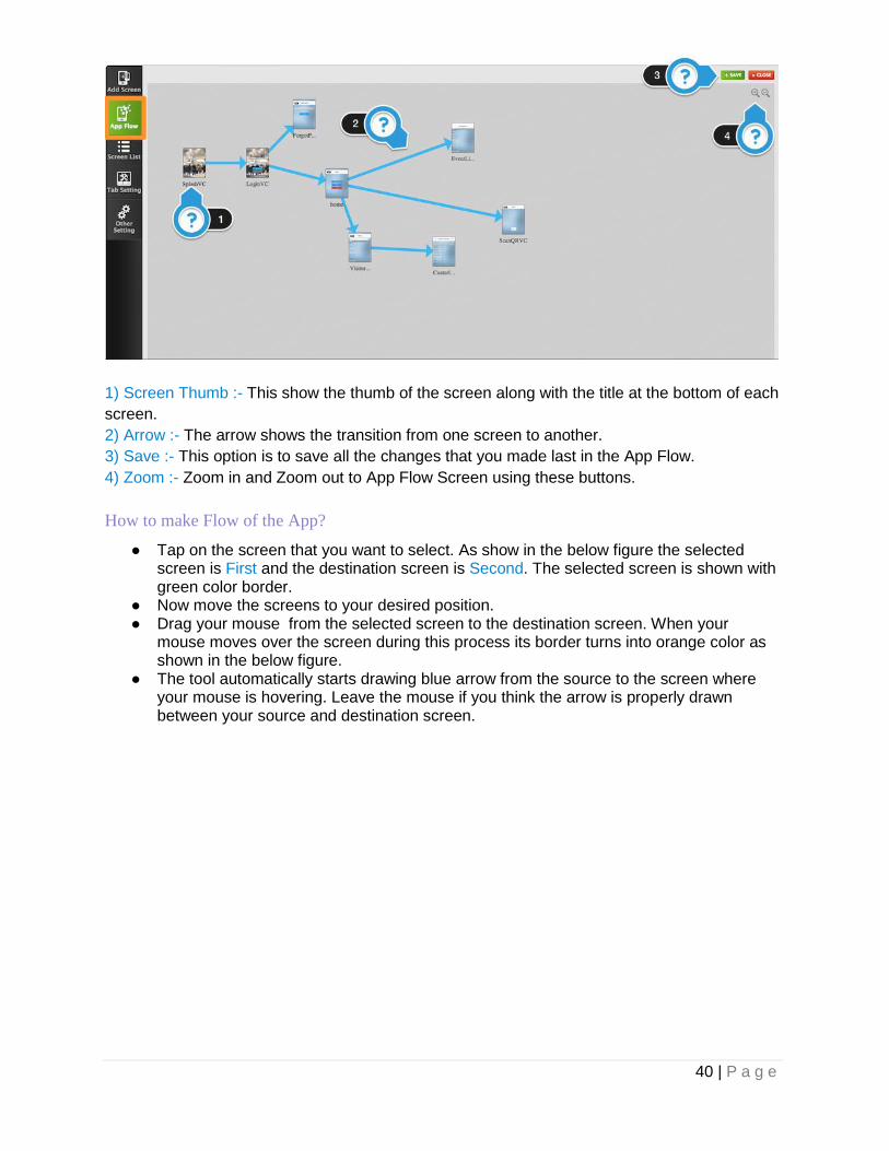
App Flow
App flow is a visual representation of the user interface of an application, showing thumb
images of screens and the connections between those screens. In App flow is mainly used to
design the flow of the app or to add a new screen in the app. App flow is composed of thumb
images of screens, each of which represents a view and its controls, screens are connected
by the arrow , which represent a transition between two screens.
40 | P a g e
1) Screen Thumb :- This show the thumb of the screen along with the title at the bottom of each
screen.
2) Arrow :- The arrow shows the transition from one screen to another.
3) Save :- This option is to save all the changes that you made last in the App Flow.
4) Zoom :- Zoom in and Zoom out to App Flow Screen using these buttons.
How to make Flow of the App?
● Tap on the screen that you want to select. As show in the below figure the selected screen is First and the destination screen is Second. The selected screen is shown with green color border.
● Now move the screens to your desired position. ● Drag your mouse from the selected screen to the destination screen. When your
mouse moves over the screen during this process its border turns into orange color as shown in the below figure.
● The tool automatically starts drawing blue arrow from the source to the screen where your mouse is hovering. Leave the mouse if you think the arrow is properly drawn between your source and destination screen.

41 | P a g e
You can add more screens and create the complete flow of the app.
Screen List
● Screen list is a option to view all the screens in the app.

42 | P a g e
Screen List Panel
1) Selected Screen :- Tap on any screen in the panel to select the screen for configuration it in
the interface area.
2) Title :- Title is positioned at the bottom of the screen. Double tap on it to edit the screen title.
Tap enter or press green tick mark image besides text field to alter the title.
3) Switch :- Use these options to switch from ipad to iphone or iphone to ipad screen
configuration in the interface area.
4) Move Up :- Use this option to move up the screen in the panel from the current position.
5) Save :- Use this option to save this screen as my screen.Tapping on this option will open the
below screen. This option will save this screen into the template category My Screens. This
option is useful when you want to add same type of screen in multiple apps or in the same app.

43 | P a g e
1. Add name of the screen. 2. Add description of the screen. 3. Press on add to save the screen in the template.
6) Clone :- Use this option to clone the screen in the same app.
7) Delete :- Use this option to delete the screen from the same app.
8) Move Down :- Use this option to move down the screen in the panel from the current
position.
9) Search :- Use this option to search screen using its Title from the list of screens in the app.
10)Reorder :-Tap on the button which will open the figure as shown below.
How to reorder the screen?
1. Tap on any screen to select . As shown in figure the selected screen’s border turns to green. Now drag the screen at the desired position, while other screens will
44 | P a g e
automatically pushed down or up depending on the selected screen’s position. 2. Tap on save to save the order of the screen in the screen list to manage the priority of
the screen.

45 | P a g e
5) Views
Table Of Contents
Views
Properties
Object
Display/Advanced Text
Advanced
Display
Custom Border
HB Custom Properties
Action
ImageView
Properties
Object
Advanced
Display
Custom Border
Display/Image
HB Custom Properties
Action
WebView
Properties
Object
Display/Advanced Text
Advanced
Display
Display
Advanced
Object
HB Custom Properties
Action
Ad View
Properties
Object
Display/Advanced Text
Display
HB Custom Properties
Action
Navigation Bar
Properties
Object
Display/Advanced Text

46 | P a g e
Advanced
Display
Custom Border
Display/Image
Action
Activity Indicator View
Properties
Object
Display/Advanced Text
Display
Action
Tool Bar
Properties
Object
Display/Advanced Text
Display
HB Custom Properties
Action

47 | P a g e
In this document we mainly will cover different types of views. Lets take a look at the controls.
Views
The View control defines a rectangular area on the screen and the interfaces for managing
the content in that area.
Now we will discuss in detail related to properties and actions of the view. Tapping on any
view will open the following window as shown below.
● In properties tab you can change any property of view and even can easily search using
the search bar. ● To configure various events related to view tap on action and configure it.
Properties
Object
Xpos
● To change X position of the view with respect to the superview.
Value - float
● Values can vary from -37282702 to 37282702 (width of iPhone screen).
Ypos
● To change Y position of the view with respect to the superview.
Value - float

48 | P a g e
● Values can vary from -37282702 to 37282702 (width of iPhone screen).
Width
● To change width of the view.
Value - float
● Values can vary from -37282702 to 37282702 (width of iPhone screen).
Height
● To change height of the view.
Value - float
● Values can vary from -37282702 to 37282702 (width of iPhone screen).
Object ID
● Set the unique ID of the object in the current selected screen to make use of this for future purpose.
Value - String
● Select any value from the drop down list.
Key Name to Data
● To display data coming from server.
Value - String
● Clicking on this property ‘s drop down list will give you option to select the web service key of the web service that you have successfully configured in the Data Source panel.
Object Parent ID
● Clicking on this will open the drop down list of all the views inside the Main_View which are on child level 1.
Value - String
● Select any value from the drop down list.
Display/Advanced Text
Hide
● To hide/Unhide the view in the current selected screen.
Value - Bool
● Enable this to hide the selected view.
Advanced
● To change the autoresizing mask of the view as per the superview. Clicking on this button will open the following window as show below.

49 | P a g e
1. Allows expanding or shrinking a view in the direction from the top margin. 2. Allows expanding or shrinking a view in the direction from the left margin. 3. Allows expanding or shrinking a view in the direction from the bottom margin. 4. Allows expanding or shrinking a view in the direction from the right margin. 5. Allows expanding or shrinking a view’s width. 6. Allows expanding or shrinking a view’s height. 7. As per the selection of NSV flags the reflection will be displayed in the square area. 8. Tap on save to save the settings.
Advanced
Clip Subviews
● A Boolean value that determines whether subviews are confined to the bounds of the view.
Value - bool
● Enable this to clip the subviews of the current selected.
Display
Background Color
● To change the background color of the view. Clicking on the box will open the picker as shown below.

50 | P a g e
● Choose the color and tap on OK to change the background color of the view. ● Choose none to apply clear color to the background of the view.
User Interaction
● A Boolean value that determines whether user events are ignored and removed from the event queue.
Value - bool
● When set to NO, user events—such as touch and keyboard for the view are ignored. When set to YES events are received normally by the view. The default value of this property is YES.
Alpha
● The view’s alpha value.
Value - float
● The value of this property is a floating-point number in the range 0.0 to 1.0, where 0.0 represents totally transparent and 1.0 represents totally opaque. This value affects only the current view and does not affect any of its embedded subviews.
Custom Border
Border Width
● To change the width of the border of the selected view.
Value - float
● When this value is greater than 0.0, the tool will draw the border around the view. The default value of this property is 0.0.
Border Color
● To change the border color of the view. Clicking on the box will open the picker as shown above.

51 | P a g e
Border Corner Radius
● The radius to use when drawing rounded corners for the view’s background.
Value - float
● When this value is greater than 0.0, the tool will draw the border around the view. The default value of this property is 0.0.
Dashed Width For Dashed Border
● To change the width of the dash which is bordered around the view.
Value - float
● When this value is greater than 0.0, the tool will draw the dashed border around the view. The default value of this property is 0.0.
Space between dashes for dashed border
● To change space width between the dashes on the border of your view.
Value - float
● When this value is greater than 0.0, the tool will show dashed border around the view. The default value of this property is 0.0.
HB Custom Properties
Has Navigation Detail
● A boolean value to determine whether there is any navigation from current screen to any other screen.The main purpose of this property is to transfer data from current screen to next screen.
Value - Bool
● The default value is NO.
Scrolling View Id for vertical Navigation
● Set View ID of the view that you want to scroll in the current selected view. This current view will act as template for the other views that will be displayed in the center of the current selected view.
Value
● Select any object ID of the control in the current selected view from the drop down list.
Header View ID
● Set View ID of the view that you want to scroll in the current selected view. This current view will act as template for the other views that will be displayed in the header of the current selected view.
Value
● Select any object ID of the control in the current selected view from the drop down list.
Footer View ID
● Set View ID of the view that you want to scroll in the current selected view. This current view will act as template for the other views that will be displayed in the footer of the current selected view.
Value

52 | P a g e
● Select any object ID of the control in the current selected view from the drop down list.
Header Animating Image Identifier
● Set View ID of the view that will animate when user will scroll up in the current selected view. This current view will act as pull to refresh view.
Value
● Select any object ID of the imageview in the current selected view from the drop down list.
Footer Animating Image Identifier
● Set View ID of the view that will animate when user will scroll down in the current selected view. This current view will act as pull to refresh view.
Value
● Select any object ID of the imageview in the current selected view from the drop down list.
Enable Vertical Scrolling
● A boolean value to enable the view work as a vertical scrollview.
Value
● The default value is NO.
Transform Angle
● Angle to rotate the object when it is loaded in the current screen.
Value
● The default value is 0.0.
Action

53 | P a g e
1) Number of events having actions.
2) Number of actions configured in the event.
● Tapping on action tab will open the window as shown above. ● Double tap on any action in the above screen will open following window as shown
below.
● You can configure action for any event in this window. Action related to the event will be called off when that events occurs by user interaction or by system interaction. As

54 | P a g e
shown in figure in this window you can add different cases and depending on the case you will add as many actions as many you want.
We will be discussing later about the configuration of the cases and adding actions.
Lets discuss about the events that we can configure in actions tab.
On Double Finger Pan
● The action related to this event will be called when user pan on the screen with two fingers.
Location Error
● The action related to this event will be called when the location services failed to update.
On Single Finger Swipe
● The action related to this event will be called when user swipe on the screen with single finger.
Location Success
● The action related to this event will be called when the location services successfully updated.
Double Finger Triple Tap
● The action related to this event will be called when user triple taps on the screen with two fingers.
Double Finger Double Tap
● The action related to this event will be called when user double taps on the screen with two fingers.
On Double Finger Swipe Up
● The action related to this event will be called when user swipe on the screen with two fingers.
On Single Finger Swipe Up
● The action related to this event will be called when user swipe up on the screen with one finger.
Load
● The action related to this event will be called when system loads the screen.
On Double Finger Swipe Right
● The action related to this event will be called when user swipe right on the screen with two fingers.
Double Finger Single Tap
● The action related to this event will be called when user single tap on the screen with two fingers.
Single Finger Triple Tap
● The action related to this event will be called when user single tap on the screen with single finger.
On Double Finger Swipe Left
● The action related to this event will be called when user swipe left on the screen with two fingers.
On Single Finger Swipe Down
● The action related to this event will be called when user swipe down on the screen with one finger.
Single Finger Double Tap
● The action related to this event will be called when user double taps on the screen with

55 | P a g e
single finger.
Single Finger Single Tap
● The action related to this event will be called when user single tap on the screen with single finger.
On Single Finger Long Press
● The action related to this event will be called when user single long press on the screen with single finger.
On Double Finger Long Press
● The action related to this event will be called when user single long press on the screen with two fingers.
On Single Finger Swipe Right
● The action related to this event will be called when user swipe right on the screen with single finger.
Animation Completed
● The action related to this event will be called when animation gets completed which is configured in the add action window.
ImageView
An image view object provides a view-based container for displaying a single image.
Properties
Object
Below properties are explained in detail in View Control. Please refer above.
1. Xpos 2. Ypos 3. Width 4. Height 5. Object ID 6. Key Name to Data 7. Object Parent ID
Advanced
Below properties are explained in detail in View Control. Please refer above.
1. Clip Subviews
Display
Below properties are explained in detail in View Control. Please refer above.
1. Background Color 2. User Interaction 3. Alpha
Custom Border
Below properties are explained in detail in View Control. Please refer above.
1. Border Width 2. Border Color 3. Border Corner Radius

56 | P a g e
4. Dashed Width For Dashed Border 5. Space between dashes for dashed border
Display/Image
Image
● Choose the image from the resources to display image in the imageview.
Tapping on will open up the image as shown below.
● Choose any image from the list and tap on save to apply image to the imageview object.
● Choose upload and then tap on save to save apply image to the imageview object and save in the resources.
Display
Highlighted Image
● The highlighted image displayed in the image view.
Value
● Choose the image from the resources to display image in the imageview.
Tapping on will open up the image as shown above.
Highlighted
● A Boolean value that determines whether the image is highlighted.
Value - bool
● This property determines whether the regular or highlighted images are used. When highlighted is set to YES, imageview will use the highlighted Image property. If both of those properties are set to nil or if highlighted is set to NO, it will use the image.

57 | P a g e
Content-Mode
● A mode used to determine how a view lays out its content when its bounds change.
Value
● Click on the drop down list and choose any value from the list.
HB Custom Properties
Placeholder Image
● To display image while the original image is getting downloaded from the server.
Value - Image
● Choose the image from the resources to display image in the imageview.
Tapping on will open up the image as shown above.
Enable Image Detailing
● To allow user to view image in full screen, when user will tap on the imageview.
Value -Bool
● Enabling this property will allow user to view image in full screen as well as user can zoom in and out the image.
Key Name To Detailing
● To display higher resolution or different image when user will tap on the imageview.
Value -Bool
● Clicking on this property ‘s drop down list will give you option to select the web service key of the web service that you have successfully configured in the Data Source panel.
Below property are explained in detail in View Control. Please refer above.
1. TransformAngle
Action

58 | P a g e
As shown in above figure the Image View's actions are almost similar to View ‘s actions
which are discussed above. Please refer description of all the actions of ImageView as
given above.
WebView
Use the WebView control to embed web content in your application.
Properties
Object
Below properties are explained in detail in View Control. Please refer above.
1. Xpos 2. Ypos 3. Width 4. Height 5. Object ID 6. Key Name to Data 7. Object Parent ID
Display/Advanced Text
Below properties are explained in detail in View Control. Please refer above.
1. Hide 2. Advanced
Advanced
Below properties are explained in detail in View Control. Please refer above.

59 | P a g e
1. Clip Subviews
Display
Below properties are explained in detail in View Control. Please refer above.
1. Background Color 2. User Interaction 3. Alpha
Custom Border
Below properties are explained in detail in View Control. Please refer above.
1. Border Width 2. Border Color 3. Border Corner Radius 4. Dashed Width For Dashed Border 5. Space between dashes for dashed border
Display
Detection
● The types of data converted to clickable URLs in the web view.
Value
● You can use this property to specify the types of data (phone numbers, http links, and so on) that should be automatically converted to clickable URLs in the webview. When clicked, the text view opens the application responsible for handling the URL type and passes it the URL.
Advanced
Opaque
● A Boolean value that determines whether the view is opaque.
Value - bool
● This property provides a hint to the drawing system as to how it should treat the view. If set to YES, the drawing system treats the view as fully opaque, which allows the drawing system to optimize some drawing operations and improve performance. If set to NO, the drawing system composites the view normally with other content. The default value of this property is YES.
Object
Scales page to fit
● A Boolean value determining whether the webpage scales to fit the view and the user can change the scale.
Value - bool
● If YES, the webpage is scaled to fit and the user can zoom in and zoom out. If NO, user zooming is disabled. The default value is NO.
HB Custom Properties
Should Open Link
● To open any link embedded in the html content in the webview.

60 | P a g e
Value - bool
● If YES, the webview will open any link in the safari app . If NO, the webview will redirect internally to the link.
Below property are explained in detail in View Control. Please refer above.
1. TransformAngle
Action
There are no actions related to this control.
Ad View
The AdView control provides a view that displays banner advertisements to the user. When
the user taps a banner view, the view triggers an action programmed into the
advertisement. For example, an advertisement might show a movie, present a modal
advertisement, or launch Safari to show a webpage. Your application is notified when an
action starts and stops, but does not otherwise interact with the advertisement. You receive
revenue when users see new advertisements or trigger their actions.
Properties
Object
Below properties are explained in detail in View Control. Please refer above.
1. Xpos 2. Ypos 3. Width 4. Height 5. Object ID 6. Key Name to Data 7. Object Parent ID
Display/Advanced Text
Below properties are exp lained in detail in View Control. Please refer above.
1. Hide 2. Advanced
Display
Background Color
● The property is explained in detail in View Control. Please refer above.
HB Custom Properties
Ad Type
● To choose the type of Ad that you want to show in the view.
Value
● Four types of ads you can show in the Ad view. They are :- 1)iAD 2)Google AdMob
Settings that you need to do to configure the Ads:-
1. iAD :- You don’t have to do anything with iAD.

61 | P a g e
2. Google AdMob :- You have to provide Api key in the Third Party Configuration in the right panel. For Api Key you need to follow this Link.
Action
Lets discuss about the events that we can configure in actions tab.
Adv Success
● The action related to this event will be called when ad view starts successfully receiving ads.
Adv Error
● The action related to this event will be called when ad view fails receiving ads.
Navigation Bar
The Navigation Bar is a kind of bar, typically displayed at the top of the screen, containing
buttons for navigating within a hierarchy of screens. The primary properties are a left (back)
button, a center title, and an optional right button. You can use a navigation bar as a
standalone object.
Properties
Object
Below p roperties are explained in detail in View Control. Please refer above.
1. Xpos 2. Ypos 3. Width 4. Height 5. Object ID 6. Key Name to Data 7. Object Parent ID
Display/Advanced Text
Below properties are explained in detail in View Control. Please refer above.
1. Hide 2. Advanced

62 | P a g e
Advanced
Below properties are explained in detail in View Control. Please refer above.
1. Clip Subviews Below property are explained in detail in ImageView Control. Please refer above.
1. Opaque
Display
Below properties are explained in detail in View Control. Please refer above.
1. Background Color 2. User Interaction 3. Alpha
Below property are explained in detail in ImageView Control. Please refer above.
1. Content Mode
Custom Border
Below properties are explained in detail in View Control. Please refer above.
1. Border Width 2. Border Color 3. Border Corner Radius 4. Dashed Width For Dashed Border 5. Space between dashes for dashed border
Display/Image
Below property are explained in detail in ImageView Control. Please refer above.
1. Image
Action
There are no actions related to this control.
Activity Indicator View
Use an activity indicator to show that a task is in progress. An activity indicator appears as a
“gear” that is either spinning or stopped.
Properties
Object
Below properties are explained in detail in View Control. Please refer above.
1. Xpos 2. Ypos 3. Object ID 4. Object Parent ID
Style
● The visual style of the progress indicator.
Value

63 | P a g e
● Choose any of the style for the indicator :-
1. Large White :- The large white style of indicator. 2. White :- The standard white style of indicator (the default). 3. Gray :- The standard gray style of indicator.
Display/Advanced Text
Below properties are explained in detail in View Control. Please refer above.
1. Hide 2. Advanced
Hides when stop
● A Boolean value that controls whether the receiver is hidden when the animation is stopped.
Value
● If the value of this property is YES (the default), the superview sets its hidden property to YES when receiver is not animating. If the hidesWhenStopped property is NO, the receiver is not hidden when animation stops. You stop an animating progress indicator with the stopAnimating method.
Display
Below properties are explained in detail in View Control. Please refer above.
1. Background Color 2. User Interaction 3. Alpha
Color
● The color of the activity indicator.
Value
● If you set a color for an activity indicator, it overrides the color provided by the activityIndicatorViewStyle property.
Action
There are no actions related to this control.
Tool Bar
A toolbar is a control that displays one or more buttons, called toolbar items. A toolbar
momentarily highlights or does not change the appearance of an item when tapped.
Properties
Object
Below properties are explained in detail in View Control. Please refer above.
1. Xpos 2. Ypos

64 | P a g e
3. Width 4. Object ID 5. Object Parent ID
Bar Style
● The toolbar style that specifies its appearance.
Value
● Choose from the following style:- 1. Default :- Use the default style normally associated with the given view.
For example, navigation bars typically use a white background with dark content.
2. Black Opaque :- Use a black background with light content.
Display/Advanced Text
Below properties are explained in detail in View Control. Please refer above.
1. Hide 2. Advanced
Custom Border
Below properties are explained in detail in View Control. Please refer above.
1. Border Width 2. Border Color 3. Border Corner Radius 4. Dashed Width For Dashed Border 5. Space between dashes for dashed border
Display
Tint Color
● The tint color to apply to the bar button items.
Value
● To change the background color of the toolbar. Clicking on the box will open the color picker .
Below properties are explained in detail in View Control. Please refer above.
1. Background Color 2. User Interaction 3. Alpha
HB Custom Properties
Background Image
● Sets the image to use for the background in toolbar.
Value
● Choose the image from the resources to display image in the imageview.
Tapping on will open up the image as shown above.

65 | P a g e
Below properties are explained in detail in View Control. Please refer above.
1. TransformAngle
Action
As shown in above figure the Toolbar’s action is almost similar to View ‘s action which is
discussed above. Please refer description of action of Toolbar as given above.

66 | P a g e
6) Text Controls
Table Of Contents
Label
Properties
Object
Display/Advanced Text
Advanced
Display/Text
Display
Custom Border
HB Custom Properties
Action
Textfield
Properties
Object
Display/Advanced Text
Display/Text
Display/Image
Display
Custom Border
HB CustomProperties
Action
Textview
Properties
Object
Display/Advanced Text
Display/Text
Action
Auto Complete Textfield
Properties
Object
HB Custom properties
Display/Image
Display/Text
Display/Advanced Text
Action
Autocomplete textview
Properties
Object
Display/Advanced Text
Display/Text
67 | P a g e
HB Custom properties
Action
Searchbar
Properties
Object
Display
Action
In this document we mainly will cover different types of text fields. Let’s take a look at the
controls.
Label
The Label control implements a read-only text view. You can use this control to draw one or
multiple lines of static text, such as those you might use to identify other parts of your user
interface.

68 | P a g e
Now we will discuss in detail related to properties and actions of the label. Tapping on label will
open the following window as shown below.
● In properties tab, you can change any property of label and even can easily search
using the search bar. ● To configure various events related to label tap on action and configure it.
Properties
Object
Below properties are explained in detail in View Control. Please refer Controls - 1 Views
document.
1. Xpos 2. Ypos 3. Width 4. Height 5. Object ID 6. Key Name to Data 7. Object Parent ID
Display/Advanced Text
Below properties are explained in detail in View Control. Please refer Controls - 1 Views
document.
1. Hide 2. Advanced

69 | P a g e
Advanced
Label Text Vertical Alignment
● The technique to use for aligning the text vertically.
Value - String
● Choose any option from center, top, bottom in the drop down list to align respectively.
Display/Text
Text Color
● To change the text color of the label. Clicking on the box will open the picker as shown below.
● Choose the color and tap on OK to change the background color of the view. ● Choose none to apply clear color to the background of the view.
Text
● The text displayed by the label.
Value - String
● This string is nil by default.
Font - Family
● The font of the text.
Value
● The default value of this property is Helvetica-Bold. Tapping on will open the following window as shown below.

70 | P a g e
Tapping on any of the font style in the list will set the font of the text of selected label.
Font - Size
● The font size of the text displayed by the label.
Value - float
● The size (in points) to which the font is scaled. This value must be greater than 0.0.
Minimum Font - Size
● The size of the smallest permissible font with which to draw the label’s text.When drawing text that might not fit within the bounding rectangle of the label, you can use this property to prevent the receiver from reducing the font size to the point where it is no longer legible.
Value - float
● The size (in points) to which the font is scaled. This value must be greater than 0.0.
Shadow Color
● The color of the label’s shadow.
Value - float
● The default value of this property is clear color.
Shadow Offset X
● The offset (in points)in X - direction of the label’s shadow.
Value - float
● The default value of this property is 0.0.
Shadow Offset Y
● The offset (in points)in Y - direction of the label’s shadow.
Value - float
● The default value of this property is 0.0.

71 | P a g e
Text Alignment
● The technique to use for aligning the text.
Value - float
● The default value of this property is left. You can choose left, right and center from the drop down list.
Number of Lines
● The maximum number of lines to use for rendering text.
Value - int
● This property controls the maximum number of lines to use in order to fit the label’s text into its bounding rectangle. The default value for this property is 1. To remove any maximum limit, and use as many lines as needed, set the value of this property to 0.
Line break mode
● The technique to use for wrapping and truncating the label’s text.
Value
● Choose following options for the alignment:-
1. Word Wrap :- Wrapping occurs at word boundaries, unless the word itself doesn’t fit on a single line.
2. Char Wrap :- Wrapping occurs before the first character that doesn’t fit. 3. Clip :- Lines are simply not drawn past the edge of the text container. 4. Truncate Head :- The line is displayed so that the end fits in the container and the
missing text at the beginning of the line is indicated by an ellipsis glyph. Although this mode works for multiline text, it is more often used for single line text.
5. Truncate Tail :- The line is displayed so that the beginning fits in the container and the missing text at the end of the line is indicated by an ellipsis glyph. Although this mode works for multiline text, it is more often used for single line text.
6. Truncate Middle :- The line is displayed so that the beginning and end fit in the container and the missing text in the middle is indicated by an ellipsis glyph. Although this mode works for multiline text, it is more often used for single line text.
Adjust Font Size
● A Boolean value indicating whether the font size should be reduced in order to fit the title string into the label’s bounding rectangle.
Value - int
● The default value for this property is NO. If you change it to YES, you should also set an appropriate minimum font size by modifying the minimum FontSize property.
Display
Enabled
● A Boolean value that determines whether user events are ignored and removed from the event queue.
Value - bool
● The default value for this property is NO. If you change it to YES, then events related to Label will be received by the app.
Highlighted
● A Boolean value indicating whether the receiver should be drawn with a highlight.
Value - bool

72 | P a g e
● Setting this property causes the receiver to redraw with the appropriate highlight state. This control can be used as button control with proper highlight settings.
Highlighted Color
● The highlight color applied to the label’s text.
Value - Color
● This color is applied to the label automatically whenever the highlighted property is set
to YES. Tapping on will open the color picker. Choose appropriate color from picker apply it on the label’s highlighted text.
Below properties are explained in detail in View Control. Please refer Controls - 1 Views
document.
1. Background Color 2. User Interaction 3. Alpha
Custom Border
Below properties are explained in detail in View Control. Please refer Controls - 1 Views
document.
1. Border Width 2. Border Color 3. Border Corner Radius 4. Dashed Width For Dashed Border 5. Space between dashes for dashed border
HB Custom Properties
Dynamic height for label
● A Boolean value indicating whether the label ‘s height should increase as per the content.
Value - bool
● Setting this to YES will automatically resize the label depending on the text on the label.
Enable Marquee
● A Boolean value indicating whether marquee is enabled for the label.
Value - bool
● Setting this to YES will allow move text horizontally .
Note :- This will only work if the length of text of label is greater than the rect area of the
label.
Text Scrolling speed on label
● A float value to determine the speed at which the label text is moving.
Value - int
● The default value is 0.0. Text will only move if the value is greater than 0.0.
Enable Html Label

73 | P a g e
● A boolean value to enable label to behave same as webview(without scroll).
Value - bool
● The default value is NO. If set to YES, label will handle the HTML data.
Enable Underline
● A bool value to allow underline under the text displayed in the label.
Value - bool
● The default value is NO. If set to YES, the complete text in the label will be underlined.
Action
● As shown in above figure the Label’s actions are almost similar to View ‘s actions which
are discussed Controls - 1 Views . Please refer document of all the actions .
Textfield
A text field is a control that displays editable text. You typically use this control to gather small
amounts of text from the user and perform some immediate action, such as a search operation,
based on that text.
Properties

74 | P a g e
Object
Below properties are explained in detail in View Control. Please refer Controls - 1 Views
document.
1. Xpos 2. Ypos 3. Width 4. Height 5. Object ID 6. Key Name to Data 7. Object Parent ID
Display/Advanced Text
Below properties are explained in detail in View Control. Please refer Controls - 1 Views
document.
1. Hide 2. Advanced
Display/Text
Placeholder
● The string that is displayed when there is no other text in the text field.
Value - String
● This value is nil by default. The placeholder string is drawn using a 70% grey color.
Below properties are explained in detail in Label Control. Please refer above.
1. Text 2. Text Alignment 3. Text Color 4. Font Family 5. Font Size 6. Minimum Font Size 7. Adjust Font Size
Display/Image
Background
● The image that represents the background appearance of the text field when it is enabled.
Value -image
● When set, the image referred to by this property replaces the standard appearance controlled by the borderStyle property. Background images are drawn in the border rectangle portion of the text field. Images you use for the text field’s background should be able to stretch to fit. This property is set to nil by default.
Disabled Background
● The image that represents the background appearance of the text field when it is disabled.
Value -image
● Background images are drawn in the border rectangle portion of the text field. Images

75 | P a g e
you use for the text field’s background should be able to stretch to fit. This property is ignored if the background property is not also set.
Display
Border Style
● The border style used by the text field.
Value
● Choose following options for the style:-
1. Round Rect :- Displays a rounded-style border for the text field. 2. Solid Line :- Displays a bezel-style border for the text field. This style is typically
used for standard data-entry fields. 3. Normal Line :- Displays a thin rectangle around the text field. 4. None :- Displays text field with no border.
Clears on Begin
● A Boolean value indicating whether the text field removes old text when editing begins.
Value - bool
● If this property is set to YES, the text field’s previous text is cleared when the user selects the text field to begin editing. If NO, the text field places an insertion point at the place where the user tapped the field.
Auto Capitalization Type
● The auto-capitalization style for the text object.
Value
● Choose following options for the style:-
1. None :- Do not capitalize any text automatically. 2. Words :- Capitalize the first letter of each word automatically. 3. Sentences :- Capitalize the first letter of each sentence automatically. 4. All Characters :- Capitalize all characters automatically.
AutoCorrection Type
● The auto-correction style for the text object.
Value
● Choose following options for the type:-
1. Yes :- Choose an appropriate auto-correction behavior for the current script system.
2. No :- Disable auto-correction behavior. 3. Default :- Enable auto-correction behavior.
Keyboard Type
● The keyboard style associated with the text object.
Value
● Choose following options for the type:-
1. Default :- Use the default keyboard for the current input method. 2. Ascii Capable :- Use a keyboard that displays standard ASCII characters. 3. Number and Punctuation :- Use the numbers and punctuation keyboard.
76 | P a g e
4. URL :- Use a keyboard optimized for URL entry. This type features “.”, “/”, and “.com” prominently.
5. Number Pad :- Use a numeric keypad designed for PIN entry. This type features the numbers 0 through 9 prominently. This keyboard type does not support auto-capitalization.
6. Phone Pad :- Use a keypad designed for entering telephone numbers. This type features the numbers 0 through 9 and the “*” and “#” characters prominently. This keyboard type does not support auto-capitalization.
7. Name Phone Pad :- Use a keypad designed for entering a person’s name or phone number. This keyboard type does not support auto-capitalization.
8. Email :- Use a keyboard optimized for specifying email addresses. This type features the “@”, “.” and space characters prominently.
Keyboard Appearance
● The appearance style of the keyboard that is associated with the text object
Value
● Choose following options for the appearance:-
1. Default :- Use the default keyboard for the current input method. 2. Alert :- Use a keyboard that is suitable for an alert panel.
Return Type
● The contents of the “return” key.
Value
● Choose following options for the type:-
1. Default :- Set the text of the return key to “return”. 2. Go :- Set the text of the return key to “Go”. 3. Google :- Set the text of the return key to “Google”. 4. Join :- Set the text of the return key to “Join”. 5. Next :- Set the text of the return key to “Next”. 6. Route :- Set the text of the return key to “Route”. 7. Search :- Set the text of the return key to “Search”. 8. Send :- Set the text of the return key to “Send”. 9. Yahoo :- Set the text of the return key to “Yahoo”. 10. Done :- Set the text of the return key to “Done”. 11. Emergency :- Set the text of the return key to “Emergency”.
Enable Return Key
● A Boolean value indicating whether the return key is automatically enabled when text is entered by the user.
Value
● The default value for this property is NO. If you set it to YES, the keyboard disables the return key when the text entry area contains no text. As soon as the user enters any text, the return key is automatically enabled.
Secure Text Entry
● Identifies whether the text object should hide the text being entered.
Value
● This property is set to NO by default. Setting this property to YES creates a password-style text object, which hides the text being entered.
77 | P a g e
Below properties are explained in detail in View Control. Please refer Controls - 1 Views
document.
1. Background Color 2. User Interaction 3. Alpha
Custom Border
Below properties are explained in detail in View Control. Please refer Controls - 1 Views
document.
1. Border Width 2. Border Color 3. Border Corner Radius 4. Dashed Width For Dashed Border 5. Space between dashes for dashed border
Advanced
Is Growing Textfield
● A boolean value to enable text field to increase its height as per the content.
Value
● If YES, the text field ‘s height will get bigger as the user types the content in it. The default value is NO.
HB CustomProperties
Text Entry Restrictions
● The restriction on the user’s entry of text in the text field.
Value
● Restrict the number of characters than can be entered in the text field by the user. You can even set the minimum character that should be entered in the text field.
How to use?
max_length(int) :- To insert maximum number of character in the text field. For e.g
max_length(12) will allow to enter 12 maximum character in the text field.
min_length(int) :- To insert minimum number of character in the text field. For e.g
max_length(12) will allow to enter 12 minimum character in the text field.
To use max and min together
Example:- min_length(10),max_length(12).
Text Field Number Format
● The formatting of the number entered by the user in the textfield .
Value
● To formate the phone number , credit card number or debit card number by making use of some special characters.
How to use?
***-***-*** :- Here “*“ indicates the number and “-” special character that we can insert in
between the numbers. For e.g., if the format is something like that ***-***-**** then number will
be formatted like this 123-456-7890.

78 | P a g e
Input Accessory View ID
● The control that will be displayed in the toolbar above keyboard when user will start entering data in the text field.
Value
● Set any object ID of any control that is in the Main_View.
Text field Left View Id
● The overlay view displayed on the left side of the text field.
Value
● Set any object ID of any control that is in the Main_View.
Text field Right View Id
● The overlay view displayed on the right side of the text field.
Value
● Set any object ID of any control that is in the Main_View.
Left View Mode
● Controls when the left overlay view appears in the text field.
Value
● Choose following options for the mode:-
1. UITextFieldViewModeNever :- The overlay view never appears. 2. UITextFieldViewModeWhileEditing :- The overlay view is displayed only while
text is being edited in the text field. 3. UITextFieldViewModeUnlessEditing :- The overlay view is displayed only when
text is not being edited. 4. UITextFieldViewModeAlways :- The overlay view is always displayed.
Right View Mode
● Controls when the right overlay view appears in the text field.
Value
● Choose following options for the mode:-
1. UITextFieldViewModeNever :- The overlay view never appears. 2. UITextFieldViewModeWhileEditing :- The overlay view is displayed only while
text is being edited in the text field. 3. UITextFieldViewModeUnlessEditing :- The overlay view is displayed only when
text is not being edited. 4. UITextFieldViewModeAlways :- The overlay view is always displayed.
hbInputViewID
● The view that will be displayed instead of keyboard.
Value
● Set any object ID of any control that is in the Main_View.
Action

79 | P a g e
As shown in above figure the Text Field’s actions description is given below.
Load
● The action related to this event will be called when system loads the texfield.
Done Clicking
● The action related to this event will be called when user has tapped done button in the toolbar above keyboard is clicked .
End Editing
● The action related to this event will be called when user has completed editing the text in the texfield.
Begin Editing
● The action related to this event will be called when user has starts typing the text in the texfield.
Textview
The TextView control implements the behavior for a scrollable , multi line text region. The class
supports the display of text using custom style information and also supports text editing. You
typically use a textview to display multiple lines of text, such as when displaying the body of a
large text document.
Properties
Object
Below properties are explained in detail in View Control. Please refer Controls - 1 Views
document.

80 | P a g e
1. Xpos 2. Ypos 3. Width 4. Height 5. Object ID 6. Key Name to Data 7. Object Parent ID
Display/Advanced Text
Below properties are explained in detail in View Control. Please refer Controls - 1 Views
document.
1. Hide 2. Advanced
Display
Below property are explained in detail in ImageView Control. Please refer Controls - 1
Views document.
1. Content Mode
Below property are explained in detail in View Control. Please refer Controls - 1 Views
document.
1. Background Color 2. User Interaction 3. Alpha
Below property are explained in detail in WebView Control. Please refer Controls - 1 Views
document.
1. Detection Below property are explained in detail in Text field Control. Please refer above
1. Auto capitalization Type 2. AutoCorrection Type 3. Keyboard Type 4. Keyboard Appearance 5. Return Key Type 6. Enable Return Key
Show Horizontal Scroll
● A Boolean value that controls whether the horizontal scroll indicator is visible.
Value
● The default value is YES. The indicator is visible while tracking is underway and fades out after tracking.
Show Vertical Scroll
● A Boolean value that controls whether the horizontal scroll indicator is visible.
Value
● The default value is YES. The indicator is visible while tracking is underway and fades out after tracking.
Scroll Enabled
● A Boolean value that determines whether scrolling is enabled.
Value - bool
● If the value of this property is YES , scrolling is enabled, and if it is NO , scrolling is disabled. The default is YES. When scrolling is disabled, the textview does not accept

81 | P a g e
touch events; it forwards them up the view behind textview.
Paging Enabled
● A Boolean value that determines whether paging is enabled for the scroll view.
Value - bool
● If the value of this property is YES, the scrollview stops on multiples of the scroll view’s bounds when the user scrolls. The default value is NO.
Bounces
● A Boolean value that controls whether the scroll view bounces past the edge of content and back again.
Value - bool
● If the value of this property is YES, the scroll view bounces when it encounters a boundary of the content. Bouncing visually indicates that scrolling has reached an edge of the content. If the value is NO, scrolling stops immediately at the content boundary without bouncing. The default value is YES.
Always Bounce Horizontal
● A Boolean value that determines whether bouncing always occurs when horizontal scrolling reaches the end of the content view.
Value - bool
● If this property is set to YES and bounces is YES, horizontal dragging is allowed even if the content is smaller than the bounds of the textview. The default value is NO.
Always Bounce Vertical
● A Boolean value that determines whether bouncing always occurs when vertical scrolling reaches the end of the content view.
Value - bool
● If this property is set to YES and bounces is YES, vertical dragging is allowed even if the content is smaller than the bounds of the textview. The default value is NO.
Custom Border
Below property are explained in detail in View Control. Please refer Controls - 1 Views
document.
1. Border Width 2. Border Color 3. Border Corner Radius 4. Dashed Width For Dashed Border 5. Space between dashes for dashed border
HB Custom Properties
Below property are explained in detail in Text field control. Please refer above.
1. Text Entry Restrictions 2. Input Accessory View Id 3. HbInputViewID 4. Placeholder Text
Maximum Character Count

82 | P a g e
● The counter of characters that is displayed at bottom right corner in the textview. The counter will decrement as the user types the character in the textview.
Value - int
● By default it will be nil. If the counter is greater than 0 then the value will be displayed at the bottom.
Enable Character Count
● A Boolean value to show number of characters that can be type in the textview.
Value - bool
● If this property is set to YES then the counter value will be displayed at the bottom right corner of the textview.
Display/Text
Below properties are explained in detail in Label Control. Please refer above.
1. Text 2. Text Alignment 3. Text Color 4. Font Family 5. Font Size 6. Minimum Font Size 7. Adjust Font Size
Action
As shown in above figure the textview actions are almost similar to View ‘s actions which are
discussed above. Please refer description of all the actions of textview as given above.
Autocomplete Text field
An autocomplete text field is a control that displays editable text. You can use this control to
give user suggestions that he/she use to automatically enter in the text field, when user taps
on suggestions . The suggestions will be displayed in the horizontal scrollview above the

83 | P a g e
keyboard. To provide input to this control we need to configure datasource to display data
coming from the web service. For data source configuration, please refer Datasource
document.
Note :- Add the action of the webservice call on the load event of the autocomplete
textfield.
Properties
Object
Below properties are explained in detail in View Control. Please refer Controls - 1 Views
document.
1. Xpos 2. Ypos 3. Width 4. Height 5. Object ID 6. Key Name to Data 7. Object Parent ID
Key to Data Index
● To get related data(id, image) as output to any other control or to the web service from the selected data from the suggestions in the text field.
Value - String
● Clicking on this property ‘s drop down list will give you option to select the web service key of the web service that you have successfully configured in the Data Source panel.
Key to Data Source
● Set the webserver key when there is multi level data in the webservice response.
Lets take the following example. In response we get json data somthing like given below:-
data : {
Parent1 : [
{
child:”SomeValue1”;
}
],
Parent2 : [
{
child:”SomeValue2”;
}
]
},
In this case we need to set Key To Data Source as Parent1 and Key Name to Data as Child.
Value - String
● Clicking on this property ‘s drop down list will give you option to select the web service key of the web service that you have successfully configured in the Datasource panel.

84 | P a g e
HB Custom properties
Below properties are explained in detail in Text field Control. Please refer above.
1. Text Entry Restrictions 2. Textfield Number Format 3. Input Accessory Veiw ID 4. TextField Left View ID 5. TextField Right View ID
Suggestions View BG Color
● The background color of the suggestions view that will appear below textfield.
Value - Color
● To change the background color of the view. Clicking on the box will open the color picker form where you can choose the color.
Suggestions Text Color
● The text color of the text of the labels in the suggestions view.
Value -Color
● To change the background color of the view click on the box will open the color picker form where you can choose the color.
Suggestions Text Size
● The font size of the text of the labels in the suggestions view.
Value - float
● The default font size is 12.
Separator for multi selection
● The character to be added after the selection of any suggestion from the suggestions list. This will work as a separator between the two suggestions that are selected from the list
Value - String
● Enter any character as input for separator.
Should allow multi selection
● The boolean value allowing the user to select multiple values from the suggestions.
Value - Bool
● If set to YES , will allow the user to select multiple values from the suggestions.
Display/Image
Below properties are explained in detail in Label Control. Please refer above.
1. Background 2. Disabled Background
Display/Text
Below property are explained in detail in Textfield Control. Please refer above
1. BorderStyle 2. Clears on begin 3. Clear button Mode

85 | P a g e
4. Autocapitalizationtype 5. AutoCorrection Type 6. Keyboard Type 7. Keyboard Appearance 8. Return Key Type 9. Enable Return Key 10. Secure Text Entry 11. Content Vertical Alignment
Below properties are explained in detail in View Control. Please refer Controls - 1 Views
document.
1. Background Color 2. User Interaction 3. Alpha
Display/Advanced Text
Below properties are explained in detail in View Control. Please refer Controls - 1 Views
document.
1. Hide 2. Advanced
Allow duplicate
● The boolean value allowing the data to enter duplicate values from the suggestions.
Value - Bool
● If set to YES , will allow the user to enter duplicate values from the suggestions.
Custom Border
Below property are explained in detail in View Control. Please refer Controls - 1 Views
document.
1. Border Width 2. Border Color 3. Border Corner Radius 4. Dashed Width For Dashed Border 5. Space between dashes for dashed border
Action

86 | P a g e
As shown in above figure the autocomplete textfield actions are almost similar to View ‘s
actions which are discussed above. Please refer description of all the actions of autocomplete
textfield as given above.
Autocomplete textview
An autocomplete textview is a control that displays editable text. You can use this control to
give user suggestions that he/she use to automatically enter in the textview, when user taps on
suggestions . The suggestions will be displayed in the horizontal scrollview above the
keyboard. To provide input to this control we need to configure datasource to display data
coming from the web service. For datasource configuration please refer Datasource
document.
Note :- Add the action of the webservice call on the load event of the autocomplete
textview.
Properties
Object
Below properties are explained in detail in View Control. Please refer Controls - 1 Views
document.
1. Xpos 2. Ypos 3. Width 4. Height 5. Object ID 6. Key Name to Data 7. Object Parent ID

87 | P a g e
Below properties are explained in detail in Auto complete Texfield Control. Please refer above.
1. Key to Data Index 2. Key to Data Source
Display/Advanced Text
Below properties are explained in detail in View Control. Please refer Controls - 1 Views
document.
1. Hide 2. Advanced
Custom Border
Below property are explained in detail in View Control. Please refer Controls - 1 Views
document.
1. Border Width 2. Border Color 3. Border Corner Radius 4. Dashed Width For Dashed Border 5. Space between dashes for dashed border
Display
Below property are explained in detail in Textfield Control. Please refer above
1. Autocapitalizationtype 2. AutoCorrection Type 3. Keyboard Type 4. Keyboard Appearance 5. Return Key Type 6. Enable Return Key
Below properties are explained in detail in View Control. Please refer Controls - 1 Views
document.
1. Background Color 2. User Interaction 3. Alpha
Below properties are explained in detail in Imageview Control. Please refer Controls - 1
Views document.
1. ContentMode
Below properties are explained in detail in TextView Control. Please refer Controls - 1
Views document.
1. Scroll Enabled 2. Show Horizontal Scroll 3. Show Vertical Scroll 4. Scroll Enabled 5. Paging Enabled 6. Bounces 7. Always Bounce Horizontal 8. Always Bounce Vertical
Delays Content Touches
● A boolean value to give delay time after the selection of any value from the list.
Value - bool
● By default it is NO. If set to YES, after selection of any value there will be a delay of

88 | P a g e
one second.
Display/Text
Below properties are explained in detail in Label Control. Please refer above.
1. Text 2. Text Alignment 3. Text Color 4. Font Family 5. Font Size 6. Minimum Font Size 7. Adjust Font Size
HB Custom properties
Below properties are explained in detail in Textfield Control. Please refer above.
1. TextField Right View ID 2. Background Image
TextView Remove Image
● An image to be displayed for the delete button besides the text of the selected value in the textview.
Value - image
● Choose the image from the resources to display image in the delete button. Tapping on
will open up the resource manager.
TextView Divider Image
● An image to be displayed between the two selected values in the textview.
Value - image
● Choose the image from the resources to display image in the delete button. Tapping on
will open up the resource manager.
TextView Divider Color
● The color of the divider between the two selected values in the textview.
Value - color
● To change the divider color of the textview, click on the box will open the color picker and choose the color.
Dropdown Table Text Color
● The color of the text of the labels displayed in the tableview.
Value - color
● To change the text color of the text, click on the box will open the color and choose the color.
Dropdown Table Background Color
● The color of the background of the tableview displayed at the bottom of the textview.
Value - color
● To change the background color of the text, click on the box will open the color and choose the color.
Dropdown Table Background Image
● An image to be displayed in the background of the tableview .

89 | P a g e
Value - image
● Choose the image from the resources to display image in the background of tableview.
Tapping on will open up the resource manager.
Dropdown Table Separator Color
● The color of the separator between the two values in the tableview displayed at the bottom of the textview.
Value - color
● To change the separator color of the tableview click on the box will open the color and choose the color.
Remove button required
● A boolean value to hide or show the delete button besides the text in the textview.
Value - bool
● If set to YES, it will display the delete button besides the text in the textview.
Dropdown Table Separator Image
● An image to be displayed in the separator of the tableview .
Value - image
● Choose the image from the resources to display image in the separator of tableview.
Tapping on will open up the resource manager.

90 | P a g e
Action
1) Number of events having actions.
2) Number of actions configured in the event.
The action related to the events displayed in the above image is explained in the Controls - 1
Views document. Please refer that document.
Searchbar
The SearchBar control implements a text field control for text-based searches. The control
provides a text field for entering text, a search button, a bookmark button, and a cancel button.
The searchbar can be implemented with a tableview or gridview depending on the requirement.
The searchbar searches the text in the from the data that is displayed in the tableview or
gridview.
Properties
Object
Below properties are explained in detail in View Control. Please refer Controls - 1 Views
document.
1. Xpos 2. Ypos 3. Width 4. Height 5. Object ID

91 | P a g e
Key Name To Data
● Set the key based on which you need to do search in the tableivew data or gridview data.
Value - String
● Clicking on this property ‘s drop down list will give you option to select the web service key of the web service that you have successfully configured in the Datasource panel.
Placeholder
● The string that is displayed when there is no other text in the text field.
Value - String
● The default value is nil.
Show search results button
● A Boolean value indicating whether the search results button is displayed.
Value - bool
● The default value is NO.
Show Bookmark Button
● A Boolean value indicating whether the bookmark button is displayed.
Value - bool
● The default value is NO.
Show Cancel Button
● A Boolean value indicating whether the cancel button is displayed.
Value - bool
● The default value is NO.
Object Parent ID
● The object ID of either tableview or gridivew.
Value - color
● Set the object ID of tableview or gridivew from the drop down list.
Note :- Without setting this property the current control will not work.
Display
Prompt
● A single line of text displayed at the top of the search bar.
Value - String
● The default value is nil.
Search bar Style
● A search bar style that specifies the search bar’s appearance.
Value
● Choose the following style for the searchbar:-
1. Default :-The search bar has the default style. 2. Black Opaque :- The search bar has a translucent background, and the search field is
opaque. 3. Black Transculent :- The search bar has no background, and the search field is

92 | P a g e
translucent.
Tint Color
● The tint color to apply to key elements in the search bar.
Value - color
● To change the tint color of the components in the searchbar click on the box will open the color and choose the color.
Below property are explained in detail in Textfield Control. Please refer above
1. Autocapitalizationtype 2. AutoCorrection Type 3. Keyboard Type
Below property are explained in detail in View Control. Please refer Controls - 1 Views
document.
1. Background Color 2. User Interaction 3. Alpha
Custom Border
Below property are explained in detail in View Control. Please refer Controls - 1 Views
document.
1. Border Width 2. Border Color 3. Border Corner Radius 4. Dashed Width For Dashed Border 5. Space between dashes for dashed border
Display/Advanced Text
Search Text Color
● The color of the text in the search bar.
Value - color
● To change the text color, click on the box will open the color and choose the color.
Text
● The current or starting search text.
Value
● The default value is nil.
Search Icon Image
● The icon image that will be displayed in place of the default icon in the middle of the search bar.
Value - image
● Choose the image from the resources to display image in the middle of searchbar.
Tapping on will open up the resource manager.
Below properties are explained in detail in View Control. Please refer Controls - 1 Views
document.
1. Hide 2. Advanced
HB Custom Properties

93 | P a g e
Enable Online Search
● A boolean value to allow search bar to search data from the web server data instead of the cached data.
Value - bool
● If set to YES, the data will be search from the online data. The default value is NO.
Cancel button Background Color
● The color of the background color of the cancel button that appears on searchbar when user starts typing in the text area of searchbar.
Value - color
● To change the cancel button background color, click on the box will open the color and choose the color.
Search Textfield Background Image
● The background image for the search bar.
Value - Image
● Choose the image from the resources to display image in the background of searchbar.
Tapping on will open up the resource manager.
Search Type
● A condition based on which searching will be executed.
Value
● Choose the options for the condition:- 1. Begins With :- Search will be executed if the starting characters of the text matches with
the key data coming from the server. 2. Anywhere :- Search will be executed based on characters of the text.
Clear Icon Image
● The image for the clear button that appears when user starts typing in the searchbar.
Value - Image
● Choose the image from the resources to display image in place of default clear icon of
searchbar. Tapping on will open up the resource manager.
Bookmark Icon Image
● The image for the bookmark button that appears in the right side of the searchbar.
Value - Image
● Choose the image from the resources to display image in bookmark button of
searchbar. Tapping on will open up the resource manager. Also keep the Show Bookmark Icon enabled.
Result List Image Icon
● The image for the results button that appears in the right side of the searchbar.
Value - Image
● Choose the image from the resources to display image in bookmark button of
searchbar. Tapping on will open up the resource manager. Also keep the Show Search Results Icon enabled.
Cancel Icon Image
● The image for the cancel button that appears in the right side of the searchbar.
Value - Image
● Choose the image from the resources to display image in bookmark button of
searchbar. Tapping on will open up the resource manager.

94 | P a g e
Action
As shown in above figure the Searchfield’s actions description is given below.
Search Cancelled
● The action related to this event will be called when user taps on the cancel button.
Text Cleared
● The action related to this event will be called when user has taps on the clear button in the textfield of the searchbar .
Search Clicked
● The action related to this event will be called when user taps on the search button that appears in the keyboard .

95 | P a g e
7) Button Controls
Table Of Contents
Button
Properties
Object
Display/Advanced Text
Display
Display/Text
Display
Custom Border
HB Custom Properties
Action
Bar Button
Properties
Object
Display
Display/Image
Action
Navigation Button
Properties
Object
Action
Bar Code Button
Properties
HB Custom Properties
Action
Radio Button
Properties
Object
Action
Segment Control
Properties
Object
Action
Switch
Properties
Object
Display
HB Custom Properties
Action
Stepper

96 | P a g e
Properties
Object
Display/Advanced Text
Display
Action
Slider
Properties
Object
Display/Advanced
Display
HB Custom Properties
Action
Image Picker
Properties
Action
Video Player
Properties
Object
Display/Advanced Text
Action
Rate View
Properties
Object
Display/Advanced Text
HB Custom Properties
Action
In this document we mainly will cover different types of buttons. Lets take a look at the controls.
Button

97 | P a g e
A button control implements a button on the touch screen. A button receives touch events and
executes the action configured related to the events. This control provides options for setting
the title, image, and other appearance properties of a button. By using these properties, you
can specify a different appearance for each button state.
Now we will discuss in detail related to properties and actions of the button. Tapping on button
will open the following window as shown below.
● In properties tab you can change any property of button and even can easily search
using the search bar. ● To configure various events related to button tap on action and configure it.
Properties
Object
Below properties are explained in detail in View Control. Please refer Controls - 1 Views
document.
1. Xpos 2. Ypos 3. Width 4. Height 5. Object ID 6. Key Name to Data 7. Object Parent ID

98 | P a g e
Display/Advanced Text
Below properties are explained in detail in View Control. Please refer Controls - 1 Views
document.
1. Hide 2. Advanced
Display
Button State
● A value indicates the state of the button.
Value - String
● Choose any option from the following:-
1. Normal :- The normal, or default state of a control—that is, enabled but neither selected nor highlighted.
2. Selected :- Selected state of a control. 3. Highlighted :- Highlighted state of a control. A button control enters this state when a
touch enters and exits during tracking and when there is a touch up event. 4. Disabled :- Disabled state of a control. This state indicates that the control is currently
disabled.
Normal/Background/Highlighted/Disabled Title
● The title to use for the selected state.
Value - String
● The state that uses the specified title. If button state is Normal then button will display the value in title set in this property(Normal Title) .
Normal/Background/Highlighted/Disabled Image
● Sets the background image to use for the specified button state.
Value - image
● The image to use for the specified state. If button state is Normal then button will display the value in image as set in this property(Normal Image) .Choose the image from the
resources to display image in the button. Tapping on will open up the resource manager.
Normal/Background/Highlighted/Disabled Background Image
● Sets the image to use for the specified state.
Value - image
● The backgrounf image to use for the specified state. If button state is Normal then button will display the value in image as set in this property(Normal Background Image) .Choose the image from the resources to display image in the button. Tapping on
will open up the resource manager.
Normal/Background/Highlighted/Disabled Title Color
● Sets the color of the title to use for the specified state.
Value - color
● The state that uses the specified color. If button state is Normal then button will display

99 | P a g e
the value in title color set in this property(Normal Title Color) .
Normal/Background/Highlighted/Disabled Title Shadow Color
● Sets the color of the title shadow to use for the specified state.
Value - color
● The state that uses the specified title shadow color. If button state is Normal then button will display the value in title shadow color set in this property(Normal Title Shadow color) .
Selected
● A boolean value to set the state of the button to Selected.
Value - bool
● If set to YES, then the properties(image, title, title color, etc.) related to Selected state will be applied to button.
Enabled
● A boolean value to set the state of the button to Normal.
Value - bool
● If set to YES, then the properties(image, title, title color, etc.) related to Normal state will be applied to button.
Highlighted
● A boolean value to set the state of the button to Highlighted.
Value - bool
● If set to YES, then the properties(image, title, title color, etc.) related to Highlighted state will be applied to button.
Tint Color
● The tint color to apply to the button title and image.
Value - color
● To change the tint color, click on the box will open the color and choose the color.
Highlighted Color
● The highlight color applied to the label’s text.
Value - color
● This color is applied to the label automatically whenever the highlighted property is set
to YES. Tapping on will open the color picker. Choose appropriate color from picker apply it on the label’s highlighted text.
Below properties are explained in detail in View Control. Please refer Controls - 1 Views
document.
1. Background Color 2. User Interaction

100 | P a g e
3. Alpha
Display/Text
Below properties are explained in detail in Label Control. Please refer Controls - 2 Text
Controls document.
1. Font Family 2. Font Size 3. LineBreak Mode
Custom Border
Below properties are explained in detail in View Control. Please refer Controls - 1 Views
document.
1. Border Width 2. Border Color 3. Border Corner Radius 4. Dashed Width For Dashed Border 5. Space between dashes for dashed border
Advanced
Show Touches when highlighted
● A Boolean value that determines whether tapping the button causes it to glow.
Value - bool
● If YES, the button glows when tapped; otherwise, it does not. The image and button behavior is not changed by the glow. The default value is NO.
Adjusts Image when highlighted
● A Boolean value that determines whether the image changes when the button is highlighted.
Value - bool
● If YES, the image is drawn lighter when the button is highlighted. The default value is YES.
Adjusts Image when disabled
● A Boolean value that determines whether the image changes when the button is disabled.
Value - bool
● If YES, the image is drawn darker when the button is disabled. The default value is YES.
Reverse Title when Highlighted
● A Boolean value that determines whether the title shadow changes when the button is highlighted.
Value - bool

101 | P a g e
● If YES, the shadow changes from engrave to emboss appearance when highlighted. The default value is NO.
Edge
● Any internal component of button that you want to provide insets.
Value - bool
● Choose the following options :-
1. Image :- The image of the button 2. Title :- The title of the button. 3. Content :- Content includes both title and image.
Top Content/Title/Image Edge Insets
● To insert the space from the top.
Value - float
● The number of pixels that can be added on the top of Content/Title/Image. The default value is 0.0.
Bottom Content/Title/Image Edge Insets
● To insert the space from the bottom.
Value - float
● The number of pixels that can be added on the bottom of Content/Title/Image. The default value is 0.0.
Left Content/Title/Image Edge Insets
● To insert the space from the left.
Value - float
● The number of pixels that can be added on the left of Content/Title/Image. The default value is 0.0.
Right Content/Title/Image Edge Insets
● To insert the space from the right.
Value - float
● The number of pixels that can be added on the right of Content/Title/Image. The default value is 0.0.
Below properties are explained in detail in label Control. Please refer Controls - 2 Text
Control document.
1. Title Shadow Offset X named as Shadow Offset X in label. 2. Title Shadow Offset X named as Shadow Offset Y in label.
HB Custom Properties
Is Toggle Button
● A boolean value to enable button to behave as toggle button.
Value - bool

102 | P a g e
● If set to YES then button will toggle from Normal to Selected and Selected to Normal.
Transform angle for Selected State
● To rotate the button in the selected state .
Value - float
● The default value is 0.0.
Transform angle for Selected State
● To rotate the button in the selected state .
Value - float
● The default value is 0.0.
Action
As shown in above figure the Buttons’s actions description is given below.
Click
● The action related to this event will be called when user clicks on the the button.
Why to configure for SMS, Phone Contacts, Action Sheet,Alert and Email in the action
events of button?
Consider on the click event of the button you configured to open SMS picker. To configure the
actions of the buttons in the picker we have to configure actions on the button action.
So following events will be called by the control buttons in the picker or alert.

103 | P a g e
Remove popover
● The action related to this event will be called when popover is removed.
Email Sent
● The action related to this event will be called when email is sent successfully.
Email Cancelled
● The action related to this event will be called when email is cancelled by the user.
Email Saved
● The action related to this event will be called when email is saved in drafts by the user.
Location Error
● The action related to this event will be called when the location services failed to update.
Location Success
● The action related to this event will be called when the location services successfully updated.
Email Failed
● The action related to this event will be called when email is failed to be sent.
SMS Sent
● The action related to this event will be called when SMS is sent successfully.
SMS Cancelled
● The action related to this event will be called when SMS is cancelled by user.
SMS Failed
● The action related to this event will be called when SMS is failed to deliver.
Alert Button Click
● The action related to this event will be called when any of the button in the alert view clicked.
Phone Contact Added
● The action related to this event will be called when the phone contact gets added successfully.
Phone Contact Selected
● The action related to this event will be called when the user selects any contact in the phone contact picker.
Phone Contact Edited
● The action related to this event will be called when the user edits any contact in the contact picker.
Action Sheet Selected
● The action related to this event will be called when the user clicks on any button of the action sheet.
Sharing Done
● The action related to this event will be called when the user successfully shared on Facebook/Twitter.
Saved to Album
● The action related to this event will be called when the user saves the image to the album.
Bar Button

104 | P a g e
A bar button item is a button specialized for placement on a Toolbar or NavigationBar control. It
inherits basic button behavior.
Properties
Object
Below properties are explained in detail in View Control. Please refer Controls - 1 Views
document.
1. Width 2. Height 3. Object ID 4. Key Name to Data 5. Object Parent ID
Style
● The style of the bar button.
Value
● Choose from the following style :-
1. Plain :- Glows when tapped. The default item style. 2. Bordered :- A simple button style with a border. 3. Done :- The style for a done button—for example, a button that completes some task
and returns to the previous view.
System Item Identifier
● Defines system-supplied images for bar button items.
Value - Color
● Choose from the following style :-
1. Done :-The system Done button.
2. Cancel :- The system Cancel button. 3. Edit :- The system Edit button.
4. Save :- The system Save button.
5. Add :- The system add button. 6. Flexible Space :- Blank space to add between other items. The space is distributed
equally between the other items. Other item properties are ignored when this value is
set.Add :- The system add button. 7. Fixed Space :- Blank space to add between other items. Only the width property is used
when this value is set.
8. Compose :-The system Compose button.
9. Reply :- The system Reply button.
10. Action :-The system Action button.
11. Organize :- The system Organize button.
12. Bookmarks :-The system Compose button.
13. Search :- The system Reply button.
14. Refresh :-The system Action button.
15. Stop :- The system Organize button.
16. Camera :-The system Camera button.

105 | P a g e
17. Trash :- The system Trash button.
18. Play :- The system Reply button.
19. Pause :-The system Action button.
20. Rewind :- The system Organize button.
21. FastForward :-The system Camera button.
22. Undo :- The system Trash button.
23. Redo :- The system Trash button.
24. Page curl :- The system Trash button.
Bar Button Title
● The title of the button item.
Value - Color
● The default value is nil.
Display
Tint Color
● The tint color to apply to the button item.
Value - Color
● To change the tint color of the bar button click on the box will open the color picker.
Enabled
● A Boolean value that determines whether the receiver is enabled.
Value - bool
● The default value is YES.
Display/Image
Below properties are explained in detail in Imageview Control. Please refer Controls - 1
Views document.
1. Image
Action

106 | P a g e
● As shown in above figure the bar button’s actions are almost similar to buttons ‘s actions which are discussed above.
Navigation Button
A navigation button is typically use to provide next previous functionality in gridview or
photogallery control.
Properties
Object
Navigation Button Forward
● A boolean value to set the button as the forward button.
Value - bool
● If set to YES, then the button works as forward button. If set to NO, then the button works as backward button. The default value is NO.
Object Parent ID
● Set the Parent ID to Gridview control’s Object ID or PhotoGallery control’s Object ID.
Value
● Select any value from the drop down list.
Other Properties of this control are similar to the Button control’ property. Please refer above.
Action
There are no action related to this control.

107 | P a g e
Bar Code Button
A bar code button is mainly used to scan any bar code image in order to get code out the bar
code image. It also can be used to generate bar code image in the app.
Properties
HB Custom Properties
Bar Code Image Id
● An Imageview where you will be displaying the encoded bar code image.
Value
● Select the imageview control’s object id from the drop down list.
Bar Code Text Id
● A textfield where you will be displaying the encoded bar code image.
Value
● Select the textfield control’s object id from the drop down list.
Action
As shown in above figure the bar code button’s actions are almost similar to Buttons ‘s actions
which are discussed above. Please refer description of all the actions of bar code button as
given above.

108 | P a g e
Radio Button
Radio buttons are used when you want to let the user select one - and just one - option from a
set of alternatives. Each radio button is normally accompanied by a label describing the choice
that the radio button represents.
Properties
Object
Group Name
● A static identifier to identify the group of buttons .
Value - String
● Any string you can enter for the group of buttons.
Note :- Provide same identifier for the all the buttons. By default there will be two but you
can add more buttons but for those buttons too the identifier should be same.
Radio Button will toggle from Normal state to Selected state. Set Image/Title/Background
color/Background Image depending on the state.
Other properties of radio button are similar to the button. Please refer above.

109 | P a g e
Action
As shown in above figure the radio buttons ‘s actions description is given below.
Click
● The action related to this event will be called when user clicks on the button.
Value Changed
● The action related to this event will be called when state of button changes from selected to normal or normal to selected.
Segment Control
A Segment Control is a horizontal control made of multiple segments, each segment
functioning as a discrete button. A segmented control affords a compact means to group
together a number of controls. A segmented control can display a title or an image. The
UISegmentedControl object automatically resizes segments to fit proportionally within their
superview unless they have a specific width set.

110 | P a g e
Properties
Object
Below properties are explained in detail in View Control. Please refer Controls - 1 Views
document.
1. Xpos 2. Ypos 3. 0Width 4. Height 5. Object ID
Display/Advanced Text
Below properties are explained in detail in View Control. Please refer Controls - 1 Views
document.
1. Hide 2. Advanced
Custom Border
Below property are explained in detail in View Control. Please refer Controls - 1 Views
document.
1. Border Width 2. Border Color 3. Border Corner Radius 4. Dashed Width For Dashed Border 5. Space between dashes for dashed border
Display
Segment Control Style
● The styles of the segmented control.
Value
● Choose from the following style:-
1. Plain :- The large plain style for segmented controls. This style is the default. 2. Bordered :- The large bordered style for segmented controls. 3. Bar :- The small toolbar style for segmented controls. Segmented controls in this style
can have a tint color. 4. Bezeled :- The large bezeled style for segmented controls. Segmented controls in this
style can have a tint color.
Number of Segments
● The number of segments in the segment control.
Value
● The default value is 2.0.
Momentry
● A Boolean value that determines whether segments in the receiver show selected state.
Value - bool
● The default value of this property is NO. If it is set to YES, segments in the control do not show selected state and do not update the value of selectedSegmentIndex after tracking ends.

111 | P a g e
Tint Color
● The tint color of the segmented control.
Value - color
● The default property is clear color.
Segment Number
● The index number identifying the selected segment on which following properties will be applied.
Value - int
● The default property is 1.
1) Segment Title
● The title of the segment.
Value - String
● The default property is 1.
2) Segment Image
● The image of the segment.
Value - Image
● The default property is nil.
3) Segment Widths
● The width of the segment.
Value - Float
● The default property is 0.
4) Segment Content offset Top
● To insert the space from the top.
Value - Float
● The default property is 0.
5) Segment Content offset Left
● To insert the space from the left.
Value - Float
● The default property is 0.
6) Segment Enabled
● Enables the specified segment.
Value -bool
● The default property is YES.
6) Selected
● Set the segment selected.
Value -bool
● The default property is YES.
Below properties are explained in detail in View Control. Please refer Controls - 1 Views
Controls document.
1. Background Color 2. Alpha 3. User Interaction Enabled
HB Custom Properties
Divider Image
112 | P a g e
● The image for the divider between the two segments.
Value - image
● Choose the image from the resources to display image in the divider of the segment
control. Tapping on will open up the resource manager.
Selected Background Color
● Set the color of the selected segment.
Value - color
● To change the background color of the selected segment click on the box will open the color picker.
UnSelected Background Color
● Set the color of the unselected segment.
Value - color
● To change the background color of the selected segment click on the box will open the color picker.
Selected Background Image
● Set the background image of the selected segment.
Value - image
● Choose the image from the resources to display image in the selected segment of the
segment control. Tapping on will open up the resource manager.
Unselected Background Image
● Set the background image of the unselected segment.
Value - image
● Choose the image from the resources to display image in the selected segment of the
segment control. Tapping on will open up the resource manager.
Selected Font Color
● Set the font color of the text of the selected segment.
Value - color
● To change the font color of the text of the segment click on the box will open the color picker form where you can choose the color.
Unselected Font Color
● Set the font color of the unselected segment.
Value - color
● To change the font color of the text of the segment click on the box will open the color picker form where you can choose the color.
Selected Font Size
● Set the font size of the text of the selected segment.
Value - float
● The default font size of the 0.0.
UnSelected Font Size
● Set the font size of the text of the unselected segment.
Value - float
● The default font size of the 0.0.
Selected Font Name
● Set the font name of the text of the selected segment.

113 | P a g e
Value -
● The default style is Helvetica-Bold.
Unselected Font Name
● Set the font name of the unselected segment.
Value
● The default style is Helvetica-Bold.
Action
As shown in above figure the Segment control’s actions description is given below.
Click
● The action related to this event will be called when user clicks on the segment.
Value Changed
● The action related to this event will be called when user selects any segment. The segment state will change from unselected to selected.
Switch
You use the switch control to create and manage the On/Off buttons used, for example, in the
Settings app for options such as Airplane Mode and Bluetooth. These objects are known as
switches.

114 | P a g e
The switch control declares a property and a method to control its on/off state. As with Slider
control, when the user manipulates the switch control (“flips” it) a Value Changed event is
generated, which results in the control (if properly configured) sending an action message.
Properties
Object
Below properties are explained in detail in View Control. Please refer Controls - 1 Views
document.
1. Xpos 2. Ypos 3. Width 4. Height 5. Object ID 6. Key name to data 7. Object Parent ID
On
● A Boolean value that determines the off/on state of the switch.
Value - bool
● The default value is YES.
On Tint Color
● The color used to tint the appearance of the switch when it is turned on.
Value - Color
● To change the tint color, click on the box will open the color picker and choose the color.
Display/Advanced Text
Below properties are explained in detail in View Control. Please refer Controls - 1 Views
document.
1. Hide 2. Advanced
Display
Below properties are explained in detail in Label Control. Please refer Controls - 1 Views
Controls document.
1. Background Color 2. Alpha 3. User Interaction Enabled
HB Custom Properties

115 | P a g e
Switch Off Tint Color
● The tint color of the switch in the off position.
Value - Color
● To change the tint color of the switch, click on the box will open the color picker and choose the color.
Switch Thumb Tint Color
● The color used to tint the appearance of the thumb.
Value - Color
● To change the tint color of the switch thumb, click on the box will open the color picker and choose the color.
On Text
● The text to be displayed in the switch in the on position.
Value - String
● The default value is nil.
Off Text
● The text to be displayed in the switch in the off position.
Value - String
● The default value is nil.
On Image
● The image to be displayed in the switch in the on position.
Value - String
● The default value is nil.
Off Image
● The image to be displayed in the switch in the on position.
Value - String
● The default value is nil.
Action
As shown in above figure the Switch control’s action description is given below.
Value Changed
● The action related to this event will be called when user switches from on to off position or vice-versa.

116 | P a g e
Stepper
A stepper control provides a user interface for incrementing or decrementing a value.
A stepper displays two buttons, one with a minus (“–”) symbol and one with a plus (“+”) symbol.
The bounding rectangle for a stepper matches that of a Switch control.
Properties
Object
Below properties are explained in detail in View Control. Please refer Controls - 1 Views
document.
1. Xpos 2. Ypos 3. Object ID 4. Key name to data 5. Object PArent ID
Key to Maximum Value
● Set the maximum value of the stepper through the data coming from server.
Value
● Clicking on this property ‘s drop down list will give you option to select the web service key of the web service that you have successfully configured in the Datasource panel.
Key to Minimum Value
● Set the minimum value of the stepper through the data coming from server.
Value
● Clicking on this property ‘s drop down list will give you option to select the web service key of the web service that you have successfully configured in the Datasource panel.
Key to Stepper Value
● Set the step value of the stepper for increment or dcrement through the data coming from server.
Value
● Clicking on this property ‘s drop down list will give you option to select the web service key of the web service that you have successfully configured in the Datasource panel.
Display/Advanced Text
Value
● The numeric value of the stepper.
Value - float
● When the value changes, the stepper sends the message to Event ValueChanged flag to its action.
Continuous
● The continuous or noncontinuous state of the stepper.
Value - bool

117 | P a g e
● If YES, value change events are sent immediately when the value changes during user interaction. If NO, a value change event is sent when user interaction ends.
Minimum Value
● The lowest possible numeric value for the stepper.
Value - float
● Must be numerically less than maximumValue. If you attempt to set a value equal to or greater than maximumValue, the system raises an exception.
Maximum Value
● The highest possible numeric value for the stepper.
Value - float
● Must be numerically less than maximumValue. If you attempt to set a value equal to or greater than maximumValue, the system raises an exception.
Auto Repeats
● The automatic or nonautomatic repeat state of the stepper.
Value - bool
● If YES, the user pressing and holding on the stepper repeatedly alters value.
Wrap
● The wrap vs. no-wrap state of the stepper.
Value - bool
● If YES, incrementing beyond maximumValue sets value to minimumValue; likewise, decrementing below minimumValue sets value to maximumValue. If NO, the stepper does not increment beyond maximumValue nor does it decrement belowminimumValue but rather holds at those values.
Step Value
● The step, or increment, value for the stepper.
Value - float
● Must be numerically greater than 0. If you attempt to set this property’s value to 0 or to a negative number, the system raises an exception.
Display
Below properties are explained in detail in View Control. Please refer Controls - 1 Views
Controls document.
1. Background Color 2. Alpha 3. User Interaction Enabled
Custom Border
Below property are explained in detail in View Control. Please refer Controls - 1 Views
document.
1. Border Width 2. Border Color 3. Border Corner Radius 4. Dashed Width For Dashed Border 5. Space between dashes for dashed border
HB Custom Properties
Plus On Image
● The image to be displayed on the plus side when the button is pressed.

118 | P a g e
Value - Image
● Choose the image from the resources to display image in the plus side of the stepper
control. Tapping on will open up the resource manager.
Minus On Image
● The image to be displayed on the minus side when the button is pressed.
Value - Image
● Choose the image from the resources to display image in the minus side of the stepper
control. Tapping on will open up the resource manager.
Plus Off Image
● The image to be displayed on the plus side in the normal state of the button.
Value - Image
● Choose the image from the resources to display image in the plus side of the stepper
control. Tapping on will open up the resource manager.
Minus Off Image
● The image to be displayed on the minus side in the normal state of the button.
Value - Image
● Choose the image from the resources to display image in the minus side of the stepper
control. Tapping on will open up the resource manager.
Action
As shown in above figure the Switch control’s action description is given below.
Click
● The action related to this event will be called when user clicks on plus button or minus button.

119 | P a g e
Slider
A Slider is a visual control used to select a single value from a continuous range of values.
Sliders are always displayed as horizontal bars. An indicator, or thumb, notes the current value
of the slider and can be moved by the user to change the setting.
Properties
Object
Below properties are explained in detail in View Control. Please refer Controls - 1 Views
document.
1. Xpos 2. Ypos 3. Width 4. Object ID 5. Key name to data 6. Object Parent ID
Below properties are explained in detail in Stepper Control. Please refer above.
1. Key to maximum value 2. Key to minimum value
Minimum Value
● Contains the minimum value of the receiver.
Value - float
● The default value of this property is 1.0.
Maximum Value
● Contains the maximum value of the receiver.
Value - float
● The default value of this property is 0.0.
Display/Advanced
Maximum Value Image
● Contains the image that is drawn on the side of the slider representing the maximum value.
Value - Image
● This default value of this property is nil. Choose the image from the resources to display
image in the slider control. Tapping on will open up the resource manager.
Minimum Value Image
● Contains the image that is drawn on the side of the slider representing the minimum value.
Value - Image
● This default value of this property is nil. Choose the image from the resources to display
image in the slider control. Tapping on will open up the resource manager.

120 | P a g e
Minimum Tint Color
● The color used to tint the standard minimum track images.
Value - Color
● To change the tint color, click on the box will open the color picker and choose the color. Setting this property removes any custom minimum track images associated with the slider.
Maximum Tint Color
● The color used to tint the standard minimum track images.
Value - Color
● To change the tint color, click on the box will open the color picker and choose the color.Setting this property removes any custom minimum track images associated with the slider.
Thumb Tint Color
● The color used to tint the standard thumb images.
Value - Color
● To change the tint color , click on the box will open the color picker and choose the color.Setting this property removes any custom minimum track images associated with the slider.
Value
● Contains the receiver’s current value.
Value - Float
● The default value is 0.0.
Continuous
● Contains a Boolean value indicating whether changes in the slider's value generate continuous update events
Value - bool
● If YES, the slider sends update events continuously to the associated action. If NO, the slider only sends an action event when the user releases the slider’s thumb control to set the final value.
Below properties are explained in detail in View Control. Please refer Controls - 1 Views
document.
1. Hide 2. Advanced
Display
Below properties are explained in detail in View Control. Please refer Controls - 1 Views
Controls document.
1. Background Color 2. Alpha 3. User Interaction Enabled
121 | P a g e
HB Custom Properties
Show popover with slider while slider moves
● A boolean value to display popover with value of slider in label.
Value - bool
● If set YES, then the popover will appear as the slider value changes.
Slider popover background color
● The color that will be displayed in the background of the popover.
Value - color
● To change the background color of popover, click on the box will open the color picker and choose the color.
Slider popover label text color
● The color of the text of the label in the popover.
Value - color
● To change the background color of popover, click on the box will open the color picker and choose the color.
Slider thumb image
● Assigns a thumb image to the slider.
Value - image
● Choose the image from the resources to display image in the thumb of slider control.
Tapping on will open up the resource manager.
Slider thumb image
● Assigns a thumb image to the slider when the user taps on the slider.
Value - image
● Choose the image from the resources to display image in the thumb of slider control in
highlighted state. Tapping on will open up the resource manager.
Enable Scaling
● A boolean value to enable the slider work like stepper , incrementing or decrementing on specific step value.
Value - bool
● If set to YES then slider will work like stepper.
Step Value
● The step, or increment, value for the slider.
Value - float
● Must be numerically greater than 0.
Maximum Track Image
● Contains the image that is drawn on the side of the slider representing the maximum value.
Value - image
● Choose the image from the resources to display image in the thumb of slider control in
highlighted state. Tapping on will open up the resource manager.
Minimum Track Image
● Contains the image that is drawn on the side of the slider representing the minimum value.
Value - image
● Choose the image from the resources to display image in the thumb of slider control in

122 | P a g e
highlighted state. Tapping on will open up the resource manager.
Custom Border
Below property are explained in detail in View Control. Please refer Controls - 1 Views
document.
1. Border Width 2. Border Color 3. Border Corner Radius 4. Dashed Width For Dashed Border 5. Space between dashes for dashed border
Action
As shown in above figure the slider control’s action description is given below.
Value Changed
● The action related to this event will be called when user slides the thumb of the slider.
Image Picker
An image picker is a one kind of button use to access photos and videos of the user.Tapping
on this button will open the default or customized image picker to pick images.
Properties
The properties of the Image Picker button are same as the normal button please refer it for
detail description. Below only HB Custom Properties are described in detail.
HB Custom Properties
Multiple Image Selection
● A boolean value to allow user to select multiple images from the picker.
Value - image
● If set to YES, custom picker will open up to pick image. If set to NO, the default picker that is available in the device will open up.
Is Image Source Camera

123 | P a g e
● A boolean value to allow user to capture images using default camera picker that is available in the IOS Library.
Value - image
● If set to YES, camera will open this button tap.
Is Image Source album
● A boolean value to allow user to fetch images using default image picker that is available in the IOS Library.
Value - image
● If set to YES, image library will open this button tap.
Should Capture video
● A boolean value to allow user to capture video using default camera picker that is available in the IOS Library.
Value - image
● If set to YES, camera will open this button tap to capture video.
Is Video Picker
● A boolean value to allow user to pick video using default image picker that is available in the IOS Library.
Value - bool
● If set to YES, camera will open this button tap to fetch video.
Is Audio Picker
● A boolean value to allow user to pick audio using default media library that is available in the IOS Library.
Value - bool
● If set to YES, media picker will open this button tap to fetch audio.
Enable Cropping
● A boolean value to allow user to crop image after successfully picking image from camera or image library.
Value - bool
● If set to YES, media picker will open this button tap to fetch audio.
Audio Recording View Nib Name
● An object ID of the recording view for audio .
Value
● The default value is nil.
ImageQuality
● The quality of the that will be received after successfully picking from library .
Value
● The default value is medium.
Below property are explained in detail in View Control. Please refer Controls - 1 Views
Controls document.
1. Transform Angle
Below property are explained in detail in Imageview Control. Please refer Controls - 1
Views Controls document.
1. PlaceHolder Image

124 | P a g e
Below property are explained in detail in Button Control. Please refer Controls - 1 Views
Controls document.
1. Is Toggle Button
Action
As shown in above figure the slider control’s action description is given below.
Click
● The action related to this event will be called when user slides tap on the button.
Image Picked
● The action related to this event will be called when user successfully selected image or video or audio.
Video Player
A video player manages the playback of a movie from a file or a network stream. Playback
occurs in a view owned by the video player and takes place fullscreen. You can incorporate a
movie player’s view into a view hierarchy owned by your app.
Properties
Object
Below properties are explained in detail in View Control. Please refer Controls - 1 Views
document.
1. Xpos 2. Ypos 3. Width 4. Object ID 5. Key name to data 6. Object Parent ID
Video Source
● Source type for the video player from where the video will be player .
Value
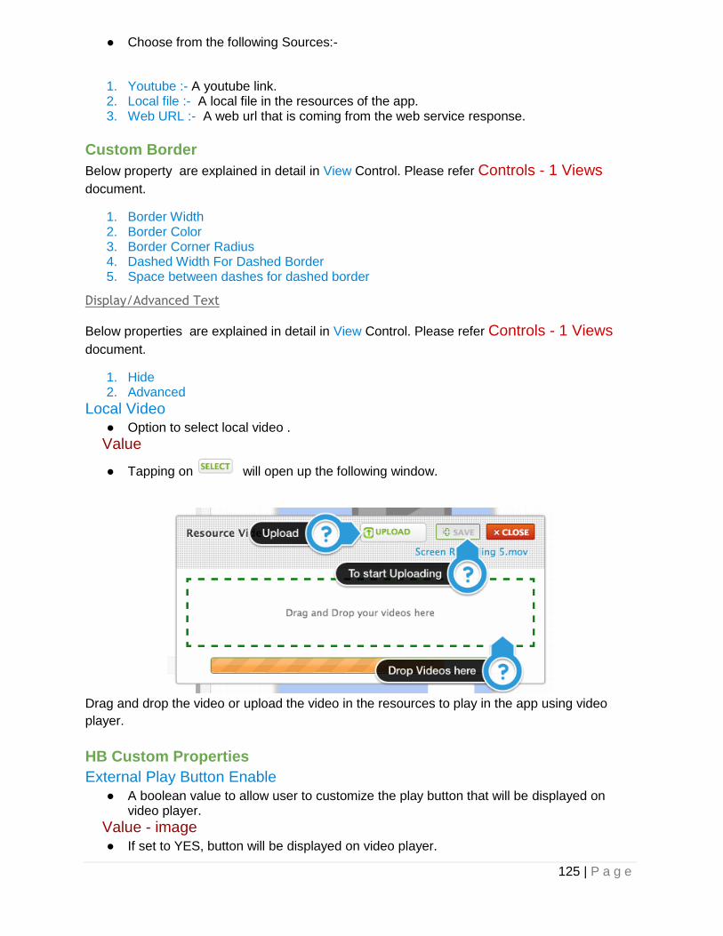
125 | P a g e
● Choose from the following Sources:-
1. Youtube :- A youtube link. 2. Local file :- A local file in the resources of the app. 3. Web URL :- A web url that is coming from the web service response.
Custom Border
Below property are explained in detail in View Control. Please refer Controls - 1 Views
document.
1. Border Width 2. Border Color 3. Border Corner Radius 4. Dashed Width For Dashed Border 5. Space between dashes for dashed border
Display/Advanced Text
Below properties are explained in detail in View Control. Please refer Controls - 1 Views
document.
1. Hide 2. Advanced
Local Video
● Option to select local video .
Value
● Tapping on will open up the following window.
Drag and drop the video or upload the video in the resources to play in the app using video
player.
HB Custom Properties
External Play Button Enable
● A boolean value to allow user to customize the play button that will be displayed on video player.
Value - image
● If set to YES, button will be displayed on video player.

126 | P a g e
External Play Button Image
● An image to be displayed in the button in the middle of the video player.
Value - image
● Choose the image from the resources to display image in the button. Tapping on will open up the resource manager.
Should Play video in MPMoviePlayer
● A boolean value to allow user to play video in MPMoviPlayer (customized frame).
Value - image
● If set to YES, video player can be played in MPMovieplayer.
Action
As shown in above figure the video player control’s action description is given below.
Load
● The action related to this event will be called when video player will be loaded in the screen.
Rate View
A rate view is basically used to provide user to rate any article or video or image or any
information. The rate view consists of buttons whose state change from selected to unselected
or unselected to selected. As per the state the buttons change the image.
Properties
Object
Below properties are explained in detail in View Control. Please refer Controls - 1 Views
document.
1. Xpos 2. Ypos 3. Width 4. Object ID

127 | P a g e
5. Key name to data 6. Object Parent ID
Initial Rating Value
● Set the default value of the rate view .
Value - int
● The default value is 3.
Display/Advanced Text
Selected Image
● The image to be displayed in the selected state of the rating view.
Value - Image
● Choose the image from the resources to display image in the in selected state of the
star. Tapping on will open up the resource manager.
UnSelected Image
● The image to be displayed in the unselected state of the rating view.
Value - Image
● Choose the image from the resources to display image in the in unselected state of the
star. Tapping on will open up the resource manager.
Below properties are explained in detail in View Control. Please refer Controls - 1 Views
document.
1. Hide 2. Advanced
HB Custom Properties
Padding
● The minimum space between the two stars or two images.
Value - int
● The default value is 2 pixel.
Enable Editing
● A boolean value to allow user to rate any information.
Value - bool
● The default value is YES.
Number of Stars
● The total number of stars or the total rating out of which user will be giving rating.
Value - bool
● The default value is 5.0.

128 | P a g e
Action
As shown in above figure the rating view control’s action description is given below.
Value Changed
● The action related to this event will be called when the button’s state in the rating view changes from selected to unselected or vice - versa.

129 | P a g e
8) Maps
Table Of Contents
Map View
Properties
Object
Display/Advanced Text
Display
Custom Border
HB Custom Properties
Action
Map Annotation View
Properties
Object
Display/Advanced Text
Display
Advanced
Custom Border
HB Custom Properties
Action

130 | P a g e
In this document we mainly will cover MapView. Lets take a look at the controls.
Map View
An MapView control provides an embeddable map interface, similar to the one provided by the
Maps application. You use this control as-is to display map information and to manipulate the
map contents from your application. You can center the map on a given coordinate, specify the
size of the area you want to display, and annotate the map with custom information.
To display annotation and details related to annotation you need to configure the webservice
for the maps and call the web service on the load of the view.
Now we will discuss in detail related to properties and actions of the mapview. Tapping on
mapview will open the following window as shown below.
● In properties tab you can change any property of mapview and even can easily search
using the search bar. ● To configure various events related to map view tap on action and configure it.
Properties

131 | P a g e
Object
Below properties are explained in detail in View Control. Please refer Controls - 1 Views
document.
1. Xpos 2. Ypos 3. Width 4. Height 5. Object ID 6. Key Name to Data 7. Object Parent ID
Map Function
● Define how the map will work.
Value - String
● Choose any option from the following:-
1. Default :- This will normally display the map and will show annotation if configured. 2. Address Locator :- This will display your current location . 3. Global Location Search :- This option will be used to search any location globally using
search bar control. 4. Local Search :- This option will be used to search particular annotation from the group
of annotations using search bar control.
Display/Advanced Text
Below properties are explained in detail in View Control. Please refer Controls - 1 Views
document.
1. Hide 2. Advanced
Display
Map Type
● The type of data displayed by the map view.
Value - String
● Changing the value in this property may cause the receiver to begin loading new map content. For example, changing from Standard Type to Satellite Type might cause it to begin loading the satellite imagery needed for the map.Choose any option from the following:-
1. Standard :- Displays a street map that shows the position of all roads and some road names.
2. Satellite :- Displays satellite imagery of the area. 3. Hybrid :- Displays a satellite image of the area with road and road name information
layered on top.
Show user location
● A Boolean value indicating whether the map should try to display the user’s location.
Value - bool

132 | P a g e
● The default value of this property is NO.
Zoom Enabled
● A Boolean value that determines whether the user may use pinch gestures to zoom in and out of the map.
Value - bool
● This property controls only user interactions with the map. If you set the value of this property to NO, you may still change the zoom level programmatically by changing the value in the region property.
Scroll Enabled
● A Boolean value that determines whether the user may scroll around the map.
Value - bool
● This property controls only user interactions with the map. If you set the value of this property to NO, you may still change the zoom level programmatically by changing the value in the region property.
Below properties are explained in detail in View Control. Please refer Controls - 1 Views
document.
1. Background Color 2. User Interaction 3. Alpha
Custom Border
Below properties are explained in detail in View Control. Please refer Controls - 1 Views
document.
1. Border Width 2. Border Color 3. Border Corner Radius 4. Dashed Width For Dashed Border 5. Space between dashes for dashed border
HB Custom Properties
Key Name to Location Latitude
● Set the latitude value of the annotation through the data coming from server.
Value
● Clicking on this property ‘s drop down list will give you option to select the web service key of the web service that you have successfully configured in the Datasource panel.
Key Name to Location Longitude
● Set the longitude value of the annotation through the data coming from server.
Value
● Clicking on this property ‘s drop down list will give you option to select the web service key of the web service that you have successfully configured in the Datasource panel.

133 | P a g e
Direction Path Color
● The color of the path between two annotations.
Value
● To change the path color, click on the box will open the color picker and choose the color.
Key Name to Location Title
● Set the location title of the annotation through the data coming from server.
Value
● Clicking on this property ‘s drop down list will give you option to select the web service key of the web service that you have successfully configured in the Datasource panel.
Key Name to Location Description
● Set the location description of the annotation through the data coming from server.
Value
● Clicking on this property ‘s drop down list will give you option to select the web service key of the web service that you have successfully configured in the Datasource panel.
Pin Color
● Set the pin color of the annotation or give custom annotation image name.
Value
● Choose any of the below options:-
1. Color :- Set the color of the annotation. For e.g., red, green and purple. 2. Image :- Set the image of the annotation. For e.g., annotation.png.
Annotation View Nib Name
● The object id of the view that will be displayed when tapped on the annotation.
Value - String
● Set the object ID of the annotation view that is inside the mapview.
Should show all annotations
● A boolean value to allow to display all annotations.
Value - bool
● The default value is NO.
Show detail disclosure buttons
● A boolean value to display button on the annotation view.
Value - bool
● The default value is NO.
Left Call out accessory view id

134 | P a g e
● The view to be displayed on the left side of the callout view.
Value - bool
● Select any option from the dropdown list.
Right Call out accessory view id
● The view to be displayed on the right side of the callout view.
Value - bool
● Select any option from the dropdown list.
Below property are explained in detail in View Control. Please refer Controls - 1 Views
Controls document.
1. Transform Angle
Action
As shown in above figure the Map view’s actions description is given below.
Load
● The action related to this event will be called when map view is loaded.
Detail Disclosure Tapped
● The action related to this event will be called when detail disclosure button on the callout view will tapped.
Map Annotation View
The AnnotationView control is responsible for presenting annotations visually in a map view.
When an annotation’s coordinate point is in the visible region, the map view displays a
corresponding annotation view.
Annotation views support the concept of a selection state, which determines whether the view
is unselected, selected, or selected and displaying a standard callout view. The user toggles
between the selection states through interactions with the annotation view. In the unselected
state, the annotation view is displayed but not highlighted. In the selected state, the annotation
is highlighted but the callout is not displayed. And finally, the annotation can be displayed both

135 | P a g e
with a highlight and a callout. The callout view displays additional information such as a title
string and controls for viewing more information. The title information is provided by the
annotation object but your annotation view is responsible for providing any custom controls.
Properties
Object
Below properties are explained in detail in View Control. Please refer Controls - 1 Views
document.
1. Xpos 2. YPos 3. Width 4. Height 5. Object ID 6. Key Name to Data
Display/Advanced Text
Below properties are explained in detail in View Control. Please refer Controls - 1 Views
document.
1. Hide 2. Advanced
Display
Below properties are explained in detail in View Control. Please refer Controls - 1 Views
document.
1. Background Color 2. User Interaction 3. Alpha
Advanced
Below properties are explained in detail in View Control. Please refer Controls - 1 Views
document.
1. Clip Subviews
Custom Border
Below properties are explained in detail in View Control. Please refer Controls - 1 Views
document.
1. Border Width 2. Border Color 3. Border Corner Radius 4. Dashed Width For Dashed Border 5. Space between dashes for dashed border
HB Custom Properties

136 | P a g e
Below property are explained in detail in View Control. Please refer Controls - 1 Views
Controls document.
1. Transform Angle
Action
● As shown in above figure the Map Annotation view’s actions are almost similar to
view‘s actions which are discussed in Controls - 1 Views document.

137 | P a g e
9) Pickers
Table Of Contents
PickerView
Properties
Object
Display/Advanced Text
Display
Custom Border
Display/Text
HB Custom Properties
Toolbar Customization
Popover Customization
Action
Date Picker
Properties
Object
Display/Advanced Text
Display
Custom Border
Display/Text
HB Custom Properties
Toolbar Customization
Popover Customization
Action
MultiDataSource Picker
Properties
Object
Action
MultiSelection Picker
Properties
HB Custom Properties
Action

138 | P a g e
In this document we mainly will cover different types of pickers. Lets take a look at the controls.
PickerView
The PickerView control is basically a kind of button. Tapping on it will open a picker which
contains a spinning-wheel or slot-machine metaphor to show one or more sets of values. Users
select values by rotating the wheels so that the desired row of values aligns with a selection
indicator.
Now we will discuss in detail related to properties and actions of the picker. Tapping on picker
will open the following window as shown below.
● In properties tab you can change any property of picker and even can easily search
using the search bar. ● To configure various events related to picker tap on action and configure it.
Properties
Object

139 | P a g e
Below properties are explained in detail in View Control. Please refer Controls - 1 Views
document.
1. Xpos 2. Ypos 3. Width 4. Height 5. Object ID 6. Key Name to Data 7. Object Parent ID
Picker Selection Receiver IDs
● The view in which results of the picker will be displayed.
Value
● Select any view from the drop down list but preferably any text control in which text can be displayed.
Picker Numerical Bounds String
● The string used to display the picker values in particular range of numerical values.
Value - String
● The string should be like minimum value - maximum value. For e.g :- 0 - 100 where 0 being minimum value and 100 being maximum value.
Step value for picker Numerical Values
● The step, or increment, value for the numerical values that will be displayed in the picker.
Value - int
● The default value is 0.0.
Should picker data source load after click
● A boolean value to enable the load of data from web server on the click of the picker button.
Value - bool
● The default value is NO.
Shows selection indicator
● A Boolean value that determines whether the selection indicator is displayed.
Value - bool
● If the value of the property is YES, the picker view shows a clear overlay across the current row. The default value of this property is NO.
Display/Advanced Text
Below properties are explained in detail in View Control. Please refer Controls - 1 Views
document.
1. Hide 2. Advanced

140 | P a g e
Display
Below properties are explained in detail in Button Control. Please refer Controls - 2 Button
document.
1. Button State 2. Normal/Background/Highlighted/Disabled Title 3. Normal/Background/Highlighted/Disabled Image 4. Normal/Background/Highlighted/Disabled Background Image 5. Normal/Background/Highlighted/Disabled Title Color 6. Normal/Background/Highlighted/Disabled Title Shadow Color 7. Enabled 8. Highlighted 9. Tint Color 10. Highlighted Tint Color
Below properties are explained in detail in View Control. Please refer Controls - 1 Views
document.
1. Background Color 2. User Interaction 3. Alpha
Custom Border
Below properties are explained in detail in View Control. Please refer Controls - 1 Views
document.
1. Border Width 2. Border Color 3. Border Corner Radius 4. Dashed Width For Dashed Border 5. Space between dashes for dashed border
Display/Text
Below properties are explained in detail in Label Control. Please refer Controls - 2 Text
Controls document.
1. Font Family 2. Font Size 3. LineBreak Mode
Advanced
Below properties are explained in detail in Button Control. Please refer Controls - 3 Button
Control document.
1. Show Touches when highlighted 2. Adjusts Image when highlighted 3. Adjusts Image when disabled 4. Reverse Title when Highlighted 5. Edge

141 | P a g e
6. Top Content/Title/Image Edge Insets 7. Bottom Content/Title/Image Edge Insets 8. Left Content/Title/Image Edge Insets 9. Right Content/Title/Image Edge Insets
Below properties are explained in detail in label Control. Please refer Controls - 2 Text
Control document.
1. Title Shadow Offset X named as Shadow Offset X in label. 2. Title Shadow Offset X named as Shadow Offset Y in label.
HB Custom Properties
Picker First Option Title
● A value to be displayed as the first value of the picker.
Value - String
● Set any string value.
Enable Search
● A boolean value to allow search in picker.
Value - bool
● The default value is NO. If set to YES, searchbar will be displayed on the top of the picker.
Bar Button Tint Color
● The tool bar button tint color that is displayed on the toolbar above picker .
Value - color
● To change the tint color, click on the box will open the color and choose the color.
Toolbar Customization
Picker Tool Bar Style
● The style of toolbar.
Value - String
● Choose From the following style:- 1. Default :- Use the default style normally associated with the given view. For example,
navigation bars typically use a white background with dark content. 2. Black Opaque :- Use a black background with light content.
Picker Toolbar Title
● The text to be displayed in the title of the toolbar.
Value - string
● Enter any text for the title.
Picker Toolbar Title Color
● The color of the title that is displayed on the toolbar .
Value - color
● To change the title color, click on the box will open the color and choose the color.

142 | P a g e
Picker Toolbar Tint Color
● The tint color to apply to the toolbar background.
Value - color
● To change the title color, click on the box will open the color and choose the color.
Popover Customization
Popover border width
● The width of the border of the popover in which picker will be displayed in iPad.
Value - float
● When this value is greater than 0.0, the tool will draw the border around the popover. The default value of this property is 0.0.
Popover shadow enable
● A boolean value to display shadow behind the popover.
Value - string
● The default value is NO.
Popover arrow width
● The width of the arrow that will be displayed above popover view .
Value - float
● The default value is 0.0.
Popover arrow height
● The height of the arrow that will be displayed above popover view .
Value - float
● The default value is 0.0..
Picker Arrow image
● The image to be displayed in the arrow.
Value - image
● Choose the image from the resources to display image in the picker arrow. Tapping on
will open up image picker.
Picker Background image
● The image to be displayed in the picker background.
Value - image
● Choose the image from the resources to display image in the picker background.
Tapping on will open up image picker.
Action

143 | P a g e
As shown in above figure the Picker’s actions description is given below.
Load
● The action related to this event will be called when the picker will be loaded in the view.
Click
● The action related to this event will be called when user clicks on the the button.
Picker Done
● The action related to this event will be called when user clicks on the the done button on the toolbar displayed above picker.
Date Picker
The DatePicker control implements multiple rotating wheels to allow users to select dates and
times.When properly configured, a DatePicker sends an message when a user finishes rotating
one of the wheels to change the date or time; the associated receiver control will receives the
message and updates the information appropriately.
Properties
Object
Below properties are explained in detail in View Control. Please refer Controls - 1 Views
document.
1. Xpos 2. Ypos 3. Width 4. Height 5. Object ID 6. Key Name to Data 7. Object Parent ID
Date Display Format
● The format in which date that user has chosen will be displayed in the receiver control.
Value -String
● Choose from the following components to display date as per your format :- 1. d :- To display date in single digit or double digit. e.g., 1,2,12,13 2. dd :- To display date in double digit. e.g., 01,02,12,13 3. MM :- To display month in double digit. e.g., 01,02,03,12 4. MMM :- To display month in three alphabet word. e.g., Jan,Feb 5. MMMM :- To display month name in complete form . e.g.,
January,February,March,etc.

144 | P a g e
6. yy :- To display year in double digit. For e.g. 2012 will be displayed as 12 7. yyyy :- To display year in four digit, For e.g. 2012,2013,2014 8. hh :- To display hour in 12 hour format. 9. mm :- To display minutes in two digit format. For eg. 01,02,12,etc. 10. ss :- To display second in two digit format. For e.g. 01,02,55,59,etc. 11. E :- To display week day in three letter word. For e.g. Mon,Tue,etc. 12. EEE :- To display week day in full form.For e.g. Monday,Tuesday,etc. 13. a :- To display AM or PM in 12 hour format..
Lets have a look at few example : -
1) dd-MM-yyyy : - The date will be displayed as 12-03-2014.
2) dd-MM-yy hh:mm:ss a : - The date will be displayed as 12-03-2014 01:12:56 PM .
3) dd-MM-yy HH:mm:ss : - The date will be displayed as 12-03-2014 13:12:56.
Date Picker Mode
● The mode of the date picker.
Value - String
● Choose from the following modes :- 1. DatePickerModeTime :- The date picker displays hours, minutes, and (optionally) an
AM/PM designation. The exact items shown and their order depend upon the locale set. An example of this mode is [ 6 | 53 | PM ].
2. DatePickerModeDate :- The date picker displays months, days of the month, and years. The exact order of these items depends on the locale setting. An example of this mode is [ November | 15 | 2007 ].
3. DatePickerModeDateAndTime :- The date picker displays dates (as unified day of the week, month, and day of the month values) plus hours, minutes, and (optionally) an AM/PM designation. The exact order and format of these items depends on the locale set. An example of this mode is [ Wed Nov 15 | 6 | 53 | PM ].
4. DatePickerModeDateAndTime :- The date picker displays hour and minute values, for example [ 1 | 53 ]. The application must set a timer to fire at the proper interval and set the date picker as the seconds tick down.
Minimum Date
● The minimum date that a date picker can show.
Value
● Enter the date with same format as the display date format.
Maximum Date
● The maximum date that a date picker can show.
Value -
● Enter the date with same format as the display date format.
Locale
● Sets the locale for the receiver.
Value - String
● Enter the locale value like en_us(English USA) , es(Spanish) . Refer this Link for more values.
Minimum Interval
● The interval at which the date picker should display minutes.
Value - int

145 | P a g e
● You can use this property to set the interval displayed by the minutes wheel (for example, 15 minutes). The interval value must be evenly divided into 60; if it is not, the default value is used. The default and minimum values are 1; the maximum value is 30.
Display/Advanced Text
Below properties are explained in detail in View Control. Please refer Controls - 1 Views
document.
1. Hide 2. Advanced
Display
Below properties are explained in detail in Button Control. Please refer Controls - 2 Button
document.
1. Button State 2. Normal/Background/Highlighted/Disabled Title 3. Normal/Background/Highlighted/Disabled Image 4. Normal/Background/Highlighted/Disabled Background Image 5. Normal/Background/Highlighted/Disabled Title Color 6. Normal/Background/Highlighted/Disabled Title Shadow Color 7. Enabled 8. Highlighted 9. Tint Color 10. Highlighted Tint Color
Below properties are explained in detail in View Control. Please refer Controls - 1 Views
document.
1. Background Color 2. User Interaction 3. Alpha
Custom Border
Below properties are explained in detail in View Control. Please refer Controls - 1 Views
document.
1. Border Width 2. Border Color 3. Border Corner Radius 4. Dashed Width For Dashed Border 5. Space between dashes for dashed border
Display/Text
Below properties are explained in detail in Label Control. Please refer Controls - 2 Text
Controls document.
1. Font Family 2. Font Size 3. LineBreak Mode
Advanced

146 | P a g e
Below properties are explained in detail in Button Control. Please refer Controls - 3 Button
Control document.
1. Show Touches when highlighted 2. Adjusts Image when highlighted 3. Adjusts Image when disabled 4. Reverse Title when Highlighted 5. Edge 6. Top Content/Title/Image Edge Insets 7. Bottom Content/Title/Image Edge Insets 8. Left Content/Title/Image Edge Insets 9. Right Content/Title/Image Edge Insets
Below properties are explained in detail in label Control. Please refer Controls - 2 Text
Control document.
1. Title Shadow Offset X named as Shadow Offset X in label. 2. Title Shadow Offset X named as Shadow Offset Y in label.
HB Custom Properties
Below property are explained in detail in View Control. Please refer Controls - 1 Views
Controls document.
1. Transform Angle Below property are explained in detail in PickerView Control. Please refer above.
1. Bar Button Tint Color
Selected Date Format
● The format in which the date format that can be passed to the web service.
Value - String
● The description of this is well explained in Date Display Format property. Please refer above.
Toolbar Customization
Below property are explained in detail in PickerView Control. Please refer above.
1. Picker Tool Bar Style 2. Picker Toolbar Title 3. Picker Toolbar Title Color 4. Picker Toolbar Tint Color
Popover Customization
Below property are explained in detail in PickerView Control. Please refer above.
1. Popover border width 2. Popover shadow enable
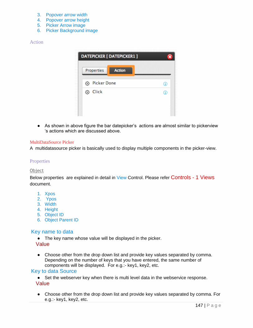
147 | P a g e
3. Popover arrow width 4. Popover arrow height 5. Picker Arrow image 6. Picker Background image
Action
● As shown in above figure the bar datepicker’s actions are almost similar to pickerview ‘s actions which are discussed above.
MultiDataSource Picker
A multidatasource picker is basically used to display multiple components in the picker-view.
Properties
Object
Below properties are explained in detail in View Control. Please refer Controls - 1 Views
document.
1. Xpos 2. Ypos 3. Width 4. Height 5. Object ID 6. Object Parent ID
Key name to data
● The key name whose value will be displayed in the picker.
Value
● Choose other from the drop down list and provide key values separated by comma. Depending on the number of keys that you have entered, the same number of components will be displayed. For e.g.:- key1, key2, etc.
Key to data Source
● Set the webserver key when there is multi level data in the webservice response.
Value
● Choose other from the drop down list and provide key values separated by comma. For e.g.:- key1, key2, etc.

148 | P a g e
More description on this topic is given in Controls - 2 Text document. Please refer that
document as to how this property can be used.
Key name to data index
● The key name whose value can be send input to the webservice .
Value
● Choose other from the drop down list and provide key values separated by comma as per the number of components. If there are two components data is displayed in the picker then only two values should be entered in this property. For e.g.:- key1, key2, etc.
Other properties of this control is same as the PickerView ‘s property. Please refer above.
Action
● As shown in above figure the bar multidatasource picker’s actions are almost similar to
pickerview ‘s actions which are discussed above.
MultiSelection Picker
A multiselection picker is basically used to select multiple values from the picker view.
Properties
HB Custom Properties
Enable All Options
● A boolean value to display a option which will allow user to select all values in the picker.
Value - bool
● The default value is NO.
Select All Option Title
● The text to be displayed in the all option title in the picker view.
Value - String
● The default value is All. You can set any string value in this property.
Multiple Selection Indicator Image
● The image to be displayed when user selects any value in the picker.

149 | P a g e
Value - String
● Choose the image from the resources to display image in the picker view. Tapping on
will open up image picker.
Multiple DeSelection Indicator Image
● The image to be displayed when user deselects any value in the picker.
Value - String
● Choose the image from the resources to display image in the picker view. Tapping on
will open up image picker. Other properties of this control is same as the PickerView ‘s property. Please refer above.
Action
As shown in above figure the multi selection picker view’s actions are almost similar to Button‘s
actions which are discussed above. Please refer description of all the actions of bar code
button as given above.

150 | P a g e
10) List Type Of Controls
Table Of Contents
TableView
Properties
Custom Border
Row Animation
HB Custom Properties
HB Custom Properties
Display
Object
Display / Advance Text
Actions
TableCell
Properties
HBCustom Custom Properties
Advanced
Display
Object
Actions
HBExpandable TableView
Properties
HB Custom Properties
Actions
GridView
Properties
Row Animation
Actions
Grid Cell
Actions
Animated Photo Gallery
Properties
Object
Display/Advanced Text
Display
Custom Border
HB Custom Properties
Action
Photo Gallery Cell
Scroll View
Properties

151 | P a g e
HB Custom Properties
Display
Object
Custom Border
Actions
Page Control
Properties
HB Custom Properties
Display
Object
Custom Border
Actions
TableView
A table view displays a list of items in a single column. table view allows users to scroll through
the table, although it allows vertical scrolling only. The cells comprising the individual items of
the table are table view cell objects; table view uses these objects to draw the visible rows of
the table. Cells have content—titles and images—and can have, near the right edge, accessory
views. Standard accessory views are disclosure indicators or detail disclosure buttons; the
former leads to the next level in a data hierarchy and the latter leads to a detailed view of a
selected item. Accessory views can also be framework controls, such as switches and sliders,
or can be custom views. Table views can enter an editing mode where users can insert, delete,
and reorder rows of the table.
Now we will discuss in detail related to properties and actions of the table view. Tapping on
table view will open the following window as shown below.
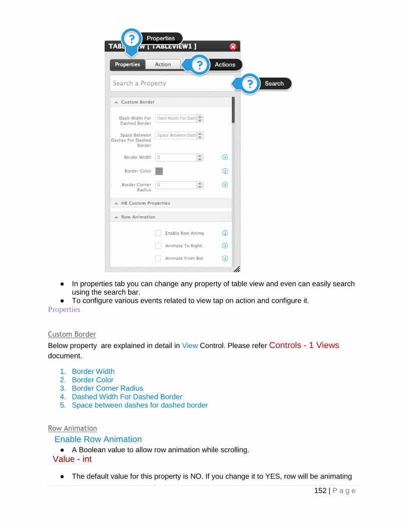
152 | P a g e
● In properties tab you can change any property of table view and even can easily search using the search bar.
● To configure various events related to view tap on action and configure it.
Properties
Custom Border
Below property are explained in detail in View Control. Please refer Controls - 1 Views
document.
1. Border Width 2. Border Color 3. Border Corner Radius 4. Dashed Width For Dashed Border 5. Space between dashes for dashed border
Row Animation
Enable Row Animation
● A Boolean value to allow row animation while scrolling.
Value - int
● The default value for this property is NO. If you change it to YES, row will be animating

153 | P a g e
with animation type “Curl”.
Animate To Right
● A Boolean value to allow row animation while scrolling from right to left.
Value - int
● The default value for this property is NO.
Animate From Bottom
● A Boolean value to allow row animation while scrolling from bottom to top.
Value - int
● The default value for this property is NO.
Animate To Back
● A Boolean value to allow row animation while scrolling from right to left.
Value - int
● The default value for this property is NO.
Row Animation Start Position
● X Position value from where to start animation.
Value - int
● The default value for this property is 0.
Animation Duration
● Time duration to complete animation
Value - int
● The default value for this property is 0.
Row Animation Type
● Different types of animations are available, listed as below : 1. Curl 2. Fade 3. Fan 4. Flip 5. Helix 6. Tilt 7. Wave
Transform Angle
● Apply transform angle to table view
Value - int
● The default value for this property is 0.
HB Custom Properties
Empty Data Representation View Id
● Any control which will be displayed when there are no data available in table view like “No data found”
Value
● Select any value from the drop down list.
Key Name To Sort
● Any output key from web service based on which sorting should be done.

154 | P a g e
Value
● Select any key from the drop down list.
Single Selection View Id
● Control object by which single selection should be done.
Value
● Select any control from the drop down list.
Should Index Titles Match Section Titles
● A Boolean value to have indexing(A-z) with matches to section title. i.e. if data are for A and B only then indexing will be from A-B. (Prerequisite - “Indexing Enable” should be Enabled. )
Value - int
● The default value for this property is 0.
Disable Sorting
● A Boolean value to disable sorting.
Value - int
● The default value for this property is 0.
Swipe Delete Button Title
● Title to be displayed on delete button which comes when swipe on cell.
Value - String
● This string is nil by default.
Multiple Selection View Id
● A control object for multiple cell selection.
Value
● Select any control object from drop down list.
Sections Enable
● A Boolean value to have sectional table.
Value
● The default value for this property is 0.
Section Key
● A output key of web service which should be displayed as section title.
Value
● Select any key from drop down list.
Section Header View Id
● Section id of header.
Section Header Color
● set background color of section header.
Value
● Select color from color wheel pop up.
Section Header Background Image

155 | P a g e
● Set background image of section
Value
● Select image from resources.
Section Header Background Image
● Set background image of section
Value
● Select image from resources.
Section Footer View Id
● Set view in table footer.
Value
● Select a control object from drop down.
Section Corner Radius Enable
● Set background image of section
Value
● Select image from resources.
Sectional Data Is Single Character
● A Boolean value to have single character as section title in case of Indexing.
Value - Int
● The default value for this property is 0.
Dynamic Height Enable
● A Boolean value to have dynamica height of cell.
Value - Int
● The default value for this property is 0.
Page Token Id
● A output key from Web service for next page data (In case of paging web service).
Value
● Select key(ex:next_page) from drop down list.
Page Load Indicator View Id
● A control object id which will visible on page load.
Value
● Select object Id from drop down list.
User Interaction is required for page load
● A Boolean value to have “Load more” button at the bottom of table view.To fetch Next page data, click “Load more” button.
Value - Int
● Default value of this property is 0.
HB Custom Properties
Allows Selection

156 | P a g e
● A Boolean value to select any row.
Value - Int
● Default value of this property is 0.
Allows Selection During Editing
● A Boolean value to select any row while table view is in editing mode.
Value
● Default value of this property is 0.
Section Index Minimum Display Row Count
● Set number of rows to be displayed in section.
Value - Int
● Default value of this property is 0.
Display
Row Height
● Set height of cell.
Value - Int
● Default value of this property is 44.
Section Header Height
● Set height of section header.
Value - Int
● Default value of this property is 22.
Section Footer Height
● Set height of footer.
Value - Int
● Default value of this property is 22.
Scroll Enabled
● A Boolean value to enable or disable scrolling.
Value - Int
● Default value of this property is 1
Indicator Style
● Set scroll indicator style.
Value
● Select any style from drop down list.
Shows Vertical Scroll Indicator
● A Boolean value to set vertical scroll indicator visible or invisible.
Value - Int
● Default value of this property is 1.
Always Bounce Vertical
● A Boolean value to enable or disable bounce of table view.
Value - Int

157 | P a g e
● Default value of this property is 1.
Background Color
● Set background color of table view.
Value
● Select color from color wheel.
User Interaction Enabled
● A Boolean value to enable or disable user interaction.
Value - Int
● Default value of this property is 1.
Alpha
● Set transparency of control object. Its range from 0 to 1.
Value - Float
● Default value of this property is 1.
Bounces
● A Boolean value to enable or disable bounce.
Value - Int
● Default value of this property is 0.
Always Bounce Horizontal
● A Boolean value to enable or disable horizontal bounce.
Value - Int
● Default value of this property is 0.
Shows horizontal scroll indicator
● A Boolean value to set horizontal scroll visible or invisible.
Value - Int
● Default value of this property is 0.
Paging Enabled
● A Boolean value to enable or disable paging.
Value - Int
● Default value of this property is 0.
User Interaction Enabled
● A Boolean value to enable or disable user interaction.
Value - Int
● Default value of this property is 1.
Object
Below properties are explained in detail in View Control. Please refer Controls - 1 Views
document.
1. Key to Data Source 2. Xpos 3. Ypos

158 | P a g e
4. Width 5. Height 6. Object ID 7. Key name to data 8. Object Parent ID
Style
● Set style either Plain or Grouped.
Value
● Set value from drop down list.
Separate Style
● Set separate style of cell to differentiate among cells.
Value
● Set value from drop down list.
Separate Color
● Set separate color of cell to differentiate among cells.
Value
● Select color from color wheel.
Cell View Id
● This is auto generated field of table cell.
Separate Color
● Set separate color of cell to differentiate among cells.
Value
● Select color from color wheel.
Display / Advance Text
Below properties are explained in detail in View Control. Please refer Controls - 1 Views
document.
1. Hide 2. Advanced
Section Index Color
● In case of paging, set text color of paging characters(A-Z).
Value
● Select color from color wheel.
Section Index Background Color
● In case of paging, set background color of paging control.
Value
● Select color from color wheel.
Section Keys
● Set output keys from web service, which should be saved when cell will be selected. Set keys by comma separated for multiple keys.

159 | P a g e
Value
● Enter output keys from web services.
Multiple Selection Session Key
● Set session name to be get selected values.
Value
● Enter session name.
Actions
As shown in above figure the Tableview’s actions description is given below.
Load
● The action related to this event will be called when tableview is loaded.
Table Select Row
● The action related to this event will be called when user taps on the tableviewcell.
Table Swipe Delete
● The action related to this event will be called when user taps on swipe delete button.

160 | P a g e
Table Pull to Refresh
● The action related to this event will be called when user pull to refresh view.
Note :- Pull to refresh will be added in the tableview control only when this event is
configured.
Table Loaded Successfully
● The action related to this event will be called when all the data in the cells is loaded completely.
Table Swipe Left Animation
● The action related to this event will be called when user left swipes the cell.
Table Swipe Right Animation
● The action related to this event will be called when user right swipes the cell.
Table Load Next Page
● The action related to this event will be called when user scroll down the tableview. This action is required when you need to provide “Load More” option to the user.
Alert Button Click
● The action related to this event will be called when user taps on any button of the alert.
Table Cell Will Load
● The action related to this event will be called when the cell is loaded. This action is required when you need to use option of multiple cells in a single tableview control depending on requirement.
TableCell
Table Cell is the one that appear in Table view objects. This class includes properties and
methods for setting and managing cell content and background (including text, images, and
custom views), managing the cell selection and highlight state, managing accessory views, and
initiating the editing of the cell contents.
Now we will discuss in detail related to properties and actions of the TableCell. Tapping on
TableCell will open the following window as shown below.

161 | P a g e
Properties
HBCustom Custom Properties
Enable Cell Left Swipe Animation
● A Boolean value to show customised view in left swipe animation on cell.
Value - Int
● Default value of this property is 0.
Cell Left Swipe View Id
● Control object id to see in cell, while left swipe animation.
Value
● Select control object id from drop down list.
Cell Right Swipe View Id
● Control object id to see in cell, while right swipe animation.
Value - Int
● Default value of this property is 0.
Right Swipe First Icon Image
● Image to be displayed on right swipe animation.
Value

162 | P a g e
● Select image from resources.
Right Swipe Second Icon Image
● Image to be displayed on right swipe animation followed by first icon image.
Value
● Select image from resources.
Left Swipe First Icon Image
● Image to be displayed on left swipe animation.
Value
● Select image from resources.
Left Swipe Second Icon Image
● Image to be displayed on left swipe animation followed by first icon image.
Value
● Select image from resources.
Right Swipe First Color
● color to be displayed on right swipe animation.
Value
● Select color from color wheel.
Right Swipe Second Color
● Second color to be displayed on right swipe animation followed by first color.
Value
● Select color from color wheel..
Left Swipe First Color
● color to be displayed on left swipe animation.
Value
● Select color from color wheel.
Left Swipe Second Color
● Second color to be displayed on left swipe animation followed by first color.
Value
● Select color from color wheel.
Background View
● Set background color of tablecell.
Value
● Choose color from color wheel.
Cell Right Swipe View Id
● Set background color of tablecell on selected mode.
Value
● Choose color from color wheel.
Dynamic Height Enable in Cell
● A Boolean value to enable dynamic height of cell dependant upon content of cell controls.

163 | P a g e
Value
● Default value of this property is 0.
Dynamic Cell Base Id
● A control object based on which height of cell will be dynamic. (Prerequisite - “Dynamic Height Enable in Cell” should be enabled.)
Value
● Select control object id from drop down list.
Advanced
Indentation Level
● A control object based on which height of cell will be dynamic. (Prerequisite - “Dynamic Height Enable in Cell” should be enabled.)
Value
● Select control object id from drop down list.
Indentation Width
● A control object based on which height of cell will be dynamic. (Prerequisite - “Dynamic Height Enable in Cell” should be enabled.)
Value
● Select control object id from drop down list.
Display
Below properties are explained in detail in View Control. Please refer Controls - 1 Views
document.
1. Background Color 2. User Interaction 3. Alpha
Object
Below properties are explained in detail in View Control. Please refer Controls - 1 Views
document.
1. Width 2. Height 3. Object Id 4. Key Name to Data 5. Object Parent Id 6. Hide 7. Advance
Style
● Set style of tablecell.
Value
● Select control object id from drop down list.

164 | P a g e
Reuse Identifier
● A identifier of cell to reuse in table view. It will reduce memory allocation.
Value - String
● Enter cell identifier.
Selection Style
● Set style of cell when tapped.
Value
● Select style from drop down list.
Accessory Type
● Set accessory type to cell.
Value
● Select style from drop down list.
Editing Accessory Type
● Set accessory type to cell in editing mode.
Value
● Select style from drop down list.
Actions

165 | P a g e
● As shown in above figure the Label’s actions are almost similar to View ‘s actions which
are discussed Controls - 1 Views and Controls - 2 Buttons . Please refer
documents of all the actions .
HBExpandable TableView
HBExpandable Table View is the custom control by Configure.It. It is used to expand / collapse
table view.
Properties
HB Custom Properties
Show All Opened Sections
● A Boolean value to see all sections opens.
Value - Int
● Default value of this property is 0.
Initial Open Section Index
● Set section number to be expanded(Open) when table view appeared.
Value - Int
● Default value of this property is 0.
Expand Button Identifier
● Select Button object id, clicking on which table view can be expand and collapse. (This button should be Toggle enabled.)

166 | P a g e
Value
● Select Button object id from table cell.
Other properties of this control is same as the Tableview ‘s property. Please refer above.
Actions
● As shown in above figure the ExpandableTableview ’s actions are almost similar to
tableview ‘s actions which are discussed above. GridView
GridView is the custom control provided by Configure.It. It is used to show data in grid just like
collection view.
Properties
Row Animation
Padding
● Set padding to give space from Top / Left / Right / Bottom.
Value - Int
● Default value of this property is 0.
Space Between Grid Tiles
● Set required pace between two grids(tiles).
Value - Int
● Default value of this property is 5.
Tile Selected Border Color
● Set border color of grid when tapped.
Value
● Select color from color wheel.
Tile Normal Border Color
167 | P a g e
● Set border color of grid.
Value - Int
● Select color from color wheel.
Enable Deletion On Long Press
● A Boolean value to delete single grid on long press.
Value - Int
● Default value of this property is 0.
Enable Deletion Of All Tiles On Long Press
● A Boolean value to delete multiple grid on long press.
Value - Int
● Default value of this property is 0.
Tile Delete Button Image
● An image of delete button.
Value
● Select image from resources.
Tile Delete Button X Offset
● The offset of deleted button from X position 0.
Value - Int
● Default value of this property is 5.
Tile Delete Button Y Offset
● The offset of deleted button from Y position 0.
Value - Int
● Default value of this property is -5.
HB Custom Properties
Load More View Id
● Control Object Id to see as “Load more” in case of paging.
Value
● Select control object id from drop down list.
Display
Can Cancel Content Touches
● A Boolean value to enable / disable touches of content.
Value - Int
● Default value of this property is 1.
Delays Content Touches
● A Boolean value to provide delay in touches gesture.
Value - Int

168 | P a g e
● Default value of this property is 1.
Directional Lock Enable
● A Boolean value to enable / disable scrolling in particular direction.
Value - Int
● Default value of this property is 0.
Other properties of this control is same as the Tableview ‘s property. Please refer above.
Actions
Let’s discuss about events of gridview :-
Delete On Grid Item
● The action related to this event will be called when the user will click on delete button on the gridview cell.
As shown in above figure the Gridview ’s actions are similar to tableview ‘s actions which are
discussed above. Please refer above for other actions.
Grid Cell
A Grid Cell object presents the content for a single data item when that item is within the Grid
View’s visible bounds.
Other properties of this control is same as the TableviewCell ‘s property. Please refer above.

169 | P a g e
Actions
● As shown in above figure the GridCell’s actions are almost similar to View ‘s actions
which are discussed Controls - 1 Views . Please refer document of all the actions .
Animated Photo Gallery
Animated Photo Gallery is a custom control provided by ConfigureIT. It is used to show views
with horizontal scroll with different animations.
Properties
Object
Below properties are explained in detail in View Control. Please refer Controls - 1 Views
document.
1. Xpos 2. Ypos 3. Width 4. Height 5. Object ID 6. Key Name to Data 7. Object Parent ID

170 | P a g e
Below properties are explained in detail in TextView Control. Please refer Controls - 2 Text
document.
1. Key To Data Source
Display/Advanced Text
Below properties are explained in detail in View Control. Please refer Controls - 1 Views
document.
1. Hide 2. Advanced
Slide Show Time Interval
● A value that will determine the time duration of slide show
Value - Int
● The default value is 1 and user can increase and decrease to change slide change time of slide show.
Enable Slide Show
● A boolean value to enable/disable slide show in animated photo gallery.
Value - Bool
● Defaultly it will be in disable state.User can change as per requirement.
Display
Below properties are explained in detail in View Control. Please refer Controls - 1 Views
document.
1. Background Color 2. User Interaction 3. Alpha
Custom Border
Below properties are explained in detail in View Control. Please refer Controls - 1 Views
document.
1. Border Width 2. Border Color 3. Border Corner Radius 4. Dashed Width For Dashed Border 5. Space between dashes for dashed border
Advanced
Below properties are explained in detail in Imageview Control. Please refer Controls - 1
Views document.
1. Clip Subviews

171 | P a g e
HB Custom Properties
Below property are explained in detail in View Control.Please refer Controls - 1 Views
document.
1. TransformAngle
Cell View Id
● A unique identifier for photogallerycell
Value - String
● Value is automatically taken. User will have to change if cell is changed in any case.
Animation Type
● An animation type with which rows will be animated in gallery control
Value
● User can select animation type from following.
1. Linear 2. Rotary 3. Inverted Rotary 4. Cylinder 5. Inverted Cylinder 6. Wheel 7. Inverted Wheel 8. Cover Flow 9. Cover Flow2 10. Time Machine 11. Inverted Time Machine 12. Custom
Show Tool Bar
● A bool value to show and hide toolbar to change animation type and speed
Value - bool
● By default it is off.User can change its value to show toolbar at bottom
Space Between Items
● Integer value to set space between two items in gallery.
Value - int
● Default value is nil. User can increase and decrease to vary the space between two items
Minimum Space Between Items
● Integer value to set minimum value between items.
Value - int
● Default value is nil. User can increase and decrease to vary the minimum space between two items
Maximum Space Between Items
● Integer value to set maximum value between items.
Value - int

172 | P a g e
● Default value is nil. User can increase and decrease to vary the maximum space between two items
Should Repeat Item
● A boolean value to enable and disable circular data display.
Value - bool
● Default value is false. User can change it to provide repetitive circular data.Ex: If records are displayed like 1 to 10 then after 10 navigation won’t stop.It will again start from 1 to 10.
Action
● As shown in above figure the AnimatedPhoto Gallery ’s actions are almost similar to tableview ‘s actions which are discussed above.
Photo Gallery Cell
A photo gallery cell control presents the content for a single data item when that item is within
the photo gallery’s visible bounds.
Other properties of this control is same as the TableviewCell ‘s property. Please refer above.
Scroll View
The scrollview provides support for displaying content that is larger than the size of the
application’s window. It enables users to scroll within that content by making swiping gestures,
and to zoom in and back from portions of the content by making pinching gestures.
Scrollview comes with a view with it. Add controls to that view.
Properties
HB Custom Properties
Zooming View Id
● Set control object which should be zoom in / zoom out.
173 | P a g e
Value
● Select control object from drop down list.
Scroll To Top
● A Boolean value that controls whether the scroll-to-top gesture is enabled.
Value - Int
● Default value for this property is 1.
Deceleration Rate
● A floating-point value that determines the rate of deceleration after the user lifts their finger.
Value - float
● Default value for this property is 0.
Initial Zoom Scale
● A floating-point value that determines the control with zoom in / zoom out effect.
Value - float
● Default value for this property is 1.
Below properties are explained in detail in View Control. Please refer Controls - 1 Views
document.
1. TransformAngle
Display
Indicator Style
● The style of the scroll indicators.
Value - int
● Choose from the following style :-
1. Default :- The default style of scroll indicator, which is black with a white border. This style is good against any content background.
2. Black :- A style of indicator which is black and smaller than the default style. This style is good against a white content background.
3. White :- A style of indicator is white and smaller than the default style. This style is good against a black content background.
Paging Enabled
● A Boolean value that determines whether paging is enabled for scrollview.
Value - int
● Default value for this property is 0.
Minimum Zoom Scale
● A floating-point value that specifies the minimum scale factor that can be applied to the scroll view's content.
Value - float
● Default value for this property is 1.

174 | P a g e
Maximum Zoom Scale
● A floating-point value that specifies the maximum scale factor that can be applied to the scroll view's content.
Value - float
● Default value for this property is 1.
Can Cancel Touches
● A Boolean value that controls whether touches in the content view always lead to tracking.
Value - bool
● If the value of this property is YES and a view in the content has begun tracking a finger touching it, and if the user drags the finger enough to initiate a scroll, the view receives a message and the scroll view handles the touch as a scroll. If the value of this property is NO, the scroll view does not scroll regardless of finger movement once the content view starts tracking.
Delays Cancel Touches
● A Boolean value that determines whether the scroll view delays the handling of touch-down gestures.
Value - bool
● If the value of this property is YES, the scroll view delays handling the touch-down gesture until it can determine if scrolling is the intent.
Paging Enabled
● A Boolean value that determines whether paging is enabled for scrollview.
Value - int
● Default value for this property is 0.
Directional Enabled
● A Boolean value that determines whether scrolling is disabled in a particular direction.
Value - float
● If this property is NO, scrolling is permitted in both horizontal and vertical directions. If this property is YES and the user begins dragging in one general direction (horizontally or vertically), the scroll view disables scrolling in the other direction. If the drag direction is diagonal, then scrolling will not be locked and the user can drag in any direction until the drag completes. The default value is NO.
Below properties are explained in detail in View Control. Please refer Controls - 2 Text
document.
1. Show Horizontal Scroll 2. Show Vertical Scroll 3. Scroll Enabled 4. Paging Enabled 5. Bounces 6. Always Bounce Horizontal 7. Always Bounce Vertical
Below properties are explained in detail in View Control. Please refer Controls - 1 Views
document.
1. Background Color 2. User Interaction

175 | P a g e
3. Alpha
Display/Advanced Text
Content Size Width
● A integer value that specifies the width of scroll view. It is used when content of scrollview covers more width than application window width.
Value - Int
● Default value for this property is same as scrollview width.
Content Size Height
● A integer value that specifies the height of scroll view. It is used when content of scrollview covers more height than application window height.
Value - Int
● Default value for this property is same as scrollview height.
ContentOffset X
● A integer value that specifies X offset of scroll view.
Value - Int
● Default value for this property is 0.
ContentOffset Y
● A integer value that specifies Y offset of scroll view.
Value - Int
● Default value for this property is 0.
Below properties are explained in detail in View Control. Please refer Controls - 1 Views
document.
1. Hide 2. Advanced
Object
Below properties are explained in detail in View Control. Please refer Controls - 1 Views
document.
1. Xpos 2. Ypos 3. Width 4. Height 5. Object ID 6. Key Name to Data 7. Object Parent ID
Custom Border
Below properties are explained in detail in View Control. Please refer Controls - 1 Views
document.
1. Border Width 2. Border Color 3. Border Corner Radius

176 | P a g e
4. Dashed Width For Dashed Border 5. Space between dashes for dashed border
Actions
● As shown in above figure the scrollview ’s actions are almost similar to View ‘s actions.
Please refer Controls - 1 Views document for all actions
Page Control
Page control used to create and manage page controls. A page control displays a horizontal
series of dots, each of which corresponds to a page.
Properties
HB Custom Properties
Page Control On Image
● Set image to be displayed as selected(on) dot of page control.
Value - image

177 | P a g e
● Select image from resources.
Page Control Off Image
● Set image to be displayed as non-selected(Off) dot of page control.
Value - image
● Select image from resources.
Below properties are explained in detail in View Control. Please refer Controls - 1 Views
document.
1. TransformAngle
Display
Below properties are explained in detail in View Control. Please refer Controls - 1 Views
document.
1. Background Color 2. User Interaction 3. Alpha 4. Enabled
Object
Below properties are explained in detail in View Control. Please refer Controls - 1 Views
document.
1. Xpos 2. Ypos 3. Width 4. Height 5. Object ID 6. Key Name to Data 7. Object Parent ID
Numbers of pages
● Set numbers of pages(dots) control can have.
Value - Int
● Default value for this property is 3.
Current Page
● Set which page(dot) should display as selected.
Value - Int
● Default value for this property is 0.
Hides for Single Page
● A Boolean to hide page control if there is only page.
Value - Boolean
● Default value for this property is 0.
Defers Current Page Display

178 | P a g e
● A Boolean value that controls when the current page is displayed.
Value - Int
● Default value for this property is 0.
Page Control Tint Color
● Set tint color of Page Control.
Value
● Select color from color wheel.
Display/Advanced Text
Below properties are explained in detail in View Control. Please refer Controls - 1 Views
document.
1. Hide 2. Advanced
Current Page Indicator Tint Color
● Set tint color of selected page(dot).
Value - Int
● Select color from color wheel.
Custom Border
Below properties are explained in detail in View Control. Please refer Controls - 1 Views
document.
1. Border Width 2. Border Color 3. Border Corner Radius 4. Dashed Width For Dashed Border 5. Space between dashes for dashed border
Actions
As shown in above figure the slider control’s action description is given below.
Load
● The action related to this event will be called when the page control will be loaded in the screen.
Value Changed
● The action related to this event will be called when user switch from one page to

179 | P a g e
another in the page control.
180 | P a g e
11) General Configurations
Table Of Contents
Page Layout, Application Layout and Third Party
Page Layout
Text Property
Button
Picker
Application Layout
Base Navigation Bar
Navigation Button
Navigation Label
Text Property
Button
Page Settings
Picker
Third Party
Push Notification
Switch project and Rollback
Page Layout, Application Layout and Third Party

181 | P a g e
In this document we mainly will right panel options.
Page Layout
Page Layout mainly used to apply same property to all the screen controls.
In right panel tapping on page layout will open up the following window.

182 | P a g e
1) Apply to screen’s all objects :-Enabling this will give you option to change only those
properties that are changed in this window.
Tapping on save will apply all the properties to all the controls.
2) Properties :- Different control’s property is given in this window to be apply on the controls.
Lets discuss about the properties.
Text Property
Below properties are explained in detail in Label Control. Please refer Controls - 2 Text
document.
1. Font Face 2. Font Size 3. Color
Button
Below properties are explained in detail in button Control. Please refer Controls - 3
Buttons Controls document.
1. BackgroundColor 2. Font Size 3. Button State

183 | P a g e
4. Title Color for all states 5. Image for all states
Picker
Below properties are explained in detail in button Control. Please refer Controls - 3
Buttons document.
1. BackgroundColor 2. Font Size 3. Button State 4. Title Color for all states 5. Image for all states
Application Layout
Application Layout mainly used to apply same property to all controls of all the screens of the
app .
In right panel tapping on application layout will open up the following window.

184 | P a g e
1) Apply to all screen objects :- Enabling this will give you option to change only those
properties that are changed in this window.
Tapping on save will apply all the properties to all the controls.
2) Properties :- Only those common controls properties are available that are available in all the
screen.
Base Navigation Bar
Below properties are explained in detail in Navigation Bar Control. Please refer Controls - 1
View document.
1. Background Color 2. Background Image
Navigation Button
Below properties are explained in detail in Navigation button Control. Please refer Controls -
3 Button document.
1. Background Color 2. Background Image 3. Font Face 4. Font Size 5. Button State 6. Title Color for all states

185 | P a g e
7. Image for all states
Navigation Label
Below properties are explained in detail in Label Control. Please refer Controls - 2 Text
document.
1. Font Face 2. Font Size 3. Color
Text Property
Below properties are explained in detail in Label Control. Please refer Controls - 2 Text
Controls document.
1. Font Face 2. Font Size 3. Color
Button
Below properties are explained in detail in button Control. Please refer Controls - 3
Buttons Controls document.
1. BackgroundColor 2. Font Size 3. Button State 4. Title Color for all states 5. Image for all states
Page Settings
Below properties are explained in detail in View Control. Please refer Controls - 1 View
document.
1. Background Color
Picker
Below properties are explained in detail in button Control. Please refer Controls - 3
Buttons Controls document.
1. BackgroundColor 2. Font Size 3. Button State 4. Title Color for all states 5. Image for all states
Third Party

186 | P a g e
To integrate third party apis you need to do few configuration in Third party Option in right side
panel.
Tapping on Third Party will open up the following window.
Clicking on Add button will open up the following window:-

187 | P a g e
A number of third party apis are provided here. You can make use of search to search the api.
Following are the list of Api that are provided in this window:-
1. Facebook 2. Twitter 3. Flurry 4. Paypal 5. AdMob 6. Google+ 7. Linkedin 8. Dropbox
Tap on done to add any of the above Api. In this document we will show the example of
Facebook and Twitter .
Select on facebook and twitter and tap on done to configure the facebook and twitter api in the
app.
As per the selection FB Application ID, Twitter OAuth and Twitter App URL need to be
provided.
Tap on Save button to save all the configuration.

188 | P a g e
This is very important while configuring the facebook or twitter or any other api in the app.
You need to provide proper data related to apis in this window for successful configuration in
the app.
Push Notification
As the name itself suggests its a one kind of notification from any app that gives updates about
any event in the app.
In the right panel there is a option to configure push notification in the app.
Tapping on the push notification will open up the following window:-

189 | P a g e
Tap on Add Push Notification to configure data source for the app to receive push notification.
Following window will open where you can configure data source for push notification.
Note :- Only those data source will available that are having push notification module.
After successful configuration of the data source for the push notification you will get
something like this in push notification window as shown in below image :-

190 | P a g e
1) Edit :- Edit the configured data source.
2) Settings :- This option will be used to configure actions when the push notification event wil
be received. Tapping on this will open the following window:-
Push Notification View
● The action related to this event will be called when user taps on the view button of the alert of the push notification or slides out the notification on the home screen of the device or taps on the view from the Notification tray.
Double tap to add any action on this event.
Switch project and Rollback
This option is used to switch project and rollback the changes in the screen.
Tapping on this will open up the following panel at the bottome :-
Lets discuss about above image :-

191 | P a g e
You can search the apps from the list of apps. To switch on to other project tap on any of the
projects in the list. After tapping whole configuration of the selected project will be loaded in the
window.
In this tool the summary of the last change of the UI of the current screen can be trace through
this option.
You can revert back to previous change on the screen by tapping on this Dot button.
You can go back forth on this slider of changes by tapping on the dot button.
After refreshing the page you won’t be able to trace the changes.

192 | P a g e
12) Tab Setting and Other Settings
Table Of Contents
Tab Setting And Other Setting
Adding Tab Control in your app
Properties
Tab Setting
Application button Tab setting
Configuring Other Settings in the app
Loading View Configuration
Properties
Loading View Configuration
Splash Screen Configuration
Properties
Splash Screen Configuration
Side Panel Configuration
Properties
Side Panel Configuration
Pull To Refresh Configuration
Properties
Pull to Refresh Configuration
Alert View Configuration
Properties
Alert View Configuration
Default Page Configuration
Properties
Default Page Configuration
Status Bar Configuration
Properties
Status Bar Configuration
Map Configuration
Properties
Map Configuration
Push Notification Configuration
Properties
Push Notification Configuration

193 | P a g e
Tab Setting And Other Setting
Adding Tab Control in your app
Tapping on Tab Setting will open up the following window:-

194 | P a g e
To add tab in your app you need to enable in this window first.
After enabling following screen comes up:-
Let ‘s discuss the properties of the Tab Setting
Properties
Tab Setting
Background Image
● The image that will be displayed in the tabbar background.
195 | P a g e
Value - image
● Choose the image from the resources to display image in the background of tabbar.
Tapping on will open up image picker.
Total Tabs
● The number of tabs that will be displayed in the tabbar.
Value - int
● The default value is 2.
Default Tab Selected
● The index of the tab that will be displayed selected when the tabbar is loaded in the app.
Value - int
● The default value is 1.0. By default, the first tab will be selected in the tabbar control.
Application button Tab setting
Tab Hover Image
● The image to be displayed in the selected state of the tab .
Value - image
● Choose the image from the resources to display image in the tab of tabbar. Tapping on
will open up image picker.
Tab Normal Image
● The image to be displayed in the normal state of the tab .
Value - image
● Choose the image from the resources to display image in the tab of tabbar. Tapping on
will open up image picker.
Load Screen
● The screen that you want to display in the tab .
Value
● Select the screen from the list of already created screens.
You need to configure these three above properties for all the tabs.
Tap on Save button to save all the settings of the app.
Configuring Other Settings in the app

196 | P a g e
Tapping on the Other Setting in the left panel will open up the following window:-
The above image shows various types of configuration that we can do in Miscellaneous
Settings or Other Settings.
Lets discuss about each configuration:-
Loading View Configuration
In loading view configuration you can modify the properties of the loading indicator that
appears when you do two finger swipe on the screen or when the web service call occurs in the
app.
Tapping on the loading view configuration will show the following screen:-

197 | P a g e
Lets discuss about the properties of the Loading View Configuration:-
Properties
Loading View Configuration
Activity Color
● The color of the activity indicator that is displayed in the middle of the loading view.
Value - color
● To change the color of activity indicator, click on the box will open the color and choose the color.
Background Color
● The color of the background of the loading view that appears on two finger swipe.
Value - color
● To change the color of background of the indicator, click on the box will open the color and choose the color.
Loading Text
● The text to be displayed below the indicator during the web service call.
Value - String
● Set any string value in this property. The default property is nil.
Loading Type
● The type of the indicator displayed in the loading view during web service call.
Value - String
● Choose from the following type :-
1. Default :- The activity indicator control will be displayed in the loading view. 2. Animating :- The circular rotating indicator will be displayed in the loading view.

198 | P a g e
After configuring all the properties save the configuration by tapping on Save button.
Splash Screen Configuration
In splash screen configuration you can modify the properties of the splash that will be
displayed when the app starts.
Tapping on the splash screen configuration will show the following screen:-
Lets discuss about the properties of the Splash Screen Configuration:-
Properties
Splash Screen Configuration
Splash Screen Type
● The type of media that will be displayed as a splash in the screen.
Value
● Choose from the following type :- 1. Image :- The image will be displayed in the splash screen. 2. Video :- The video will be played in the splash screen. 3. xib :- The screen will be displayed in the splash screen.
Splash Source
● The name of the screen/image/video in the resources.
Value - string
● Provide the proper name of screen/image/video.For eg:- video→ myvideo.mov, image→

199 | P a g e
myImage.png, screen → MySplash.
Splash Duration
● The duration for which splash should be displayed.
Value - int
● The default value is 5.
After configuring all the properties save the configuration by tapping on Save button.
Side Panel Configuration
In side panel configuration you can modify the properties of the screens that will be displayed
in the side panel.
Modifying the properties of side panel is only needed when you want to add side panel in your
app.
Tapping on the side panel configuration will show the following screen:-
Lets discuss about the properties of the Splash Screen Configuration:-
Properties
Side Panel Configuration
Left Panel Xib
● The screen that will be displayed on the left side of the side panel.
Value
● Choose any screen from the drop down list that you have created.

200 | P a g e
Center Panel Xib
● The screen that will be displayed on the center of the side panel.
Value
● Choose any screen from the drop down list that you have created.
Right Panel Xib
● The screen that will be displayed on the right side of the side panel.
Value
● Choose any screen from the drop down list that you have created.
Left Panel Animation Type
● The animation on the left view that will be displayed while sliding the center screen from left to right.
Value
● Choose any of the type.
1. Swinging door 2. Parallax 3. Slide 4. Slide_Scale
Right Panel Animation Type
● The animation on the right view that will be displayed while sliding the center screen from right to left.
Value
● Choose any of the type.
1. Swinging door 2. Parallax 3. Slide 4. Slide_Scale
Right Panel Max Width
● The distance between the center screen’s right edge and the right view ‘s right edge.
Value - int
● The default value is 270.
Left Panel Max Width
● The distance between the center screen’s left edge and the left view ‘s left edge.
Value - int
● The default value is 270.
Disable Center Panel
● A boolean value to stop sliding of center panel with gestures.
Value - int
● The default value is NO. After configuring all the properties save the configuration by tapping on Save button.
Pull To Refresh Configuration
In pull to refresh configuration you can modify the properties of the pull to refresh that appears
when table view is pulled down to display pull to refresh view.
Tapping on the pull to refresh configuration will show the following screen:-

201 | P a g e
Lets discuss about the properties of the Splash Screen Configuration:-
Properties
Pull to Refresh Configuration
Release to Refresh Text
● The text that will be displayed in the pull to refresh view when the tableview is released after pulling.
Value - string
● Set any string that depicts the current status of the data loading.
Pull down to Refresh Text
● The text that will be displayed in the pull to refresh view when the tableview is pulled down.
Value - string
● Set any string that depicts the current status of the data loading.
Loading text
● The text that will be displayed in the pull to refresh view when the tableview is in static position and data is downloading from the server.
Value
● Set any string that depicts the current status of the data loading.
Background Color
● The color of the background of the pull to refresh view.
Value - color

202 | P a g e
● To change the color of background of the pull to refresh view, click on the box will open the color and choose the color.
Background Image
● The image to be displayed in the background of the pull to refresh view.
Value - image
● Choose the image from the resources to display image in the background of tabbar.
Tapping on will open up image picker.
Pull to Refresh Image
● The image to be displayed in the pull to refresh view which will be animating while that data is loading.
Value - image
● Choose the image from the resources to display image in the pull refresh view. Tapping
on will open up image picker.
Text Color
● The color of the loading text.
Value - int
● The default value is 270.
Left Panel Max Width
● The distance between the center screen’s left edge and the left view ‘s left edge.
Value - int
● The default value is 270.
Disable Center Panel
● A boolean value to stop sliding of center panel with gestures.
Value - int
● To change the color of text of the loading, click on the box will open the color and choose the color.
After configuring all the properties save the configuration by tapping on Save button.
Alert View Configuration
In pull to refresh configuration you can modify the properties of the alerts in the app. These
properties will be applied to all the alerts that will be displayed in the app when some error
comes in webservice response or error comes in web service input.
Tapping on the alert view configuration will show the following screen:-

203 | P a g e
Lets discuss about the properties of the Alert View Configuration:-
Properties
Alert View Configuration
Validation Alert Title
● The text that will be displayed in the alert title.
Value - string
● Set any string for the title.
Validation Alert Button Title
● The text that will be displayed in the button tile of the alert.
Value - string
● Set any string for the button title. For more than one button add titles separated by comma. for e.g.:- OK,Cancel,Next which will add three buttons OK, Cancel, Next.
After configuring all the properties save the configuration by tapping on Save button.
Default Page Configuration
In default page configuration you can modify first screen that will be displayed after splash
screen.
Tapping on the alert view configuration will show the following screen:-
Lets discuss about the properties of the Alert View Configuration:-

204 | P a g e
Properties
Default Page Configuration
Default Page
● The text that will be displayed as the first screen.
Value
● Choose any screen from the drop down list.
After configuring all the properties save the configuration by tapping on Save button.
Status Bar Configuration
In status bar configuration you can modify properties of status bar that appears in all the
screen.
Tapping on the status bar configuration will show the following screen:-
Lets discuss about the properties of the Status Bar Configuration:-
Properties
Status Bar Configuration
Status Bar Style
● The current style of the status bar.
Value - string
● Choose from the following style:- 1. UIStatusBarStyleDefault :- A dark status bar, intended for use on light backgrounds. 2. UIStatusBarStyleLightContent:- A light status bar, intended for use on dark
backgrounds.
Hide Status Bar
● A boolean value to hide status bar in the app.
Value - string
● If set to YES, then the status bar is hidden in the app. After configuring all the properties save the configuration by tapping on Save button.
Map Configuration

205 | P a g e
In status bar configuration you can modify properties of map view that will be displayed in your
app.
Tapping on the map view configuration will show the following screen:-
Lets discuss about the properties of the Map View Configuration:-
Properties
Map Configuration
Google Map Enabled
● A boolean value to display google maps instead of apple maps.
Value - bool
● If set to YES, then google maps will be displayed in the app.
Google Map API Key
● A key to enable google maps in your app.
Value - string
● Register your app on https://code.google.com/apis/console/?noredirect and add the key in this property.
After configuring all the properties save the configuration by tapping on Save button.
Push Notification Configuration
In push notification configuration you can modify properties of push notifications.
Tapping on the push notification configuration will show the following screen:-
Lets discuss about the properties of the Status Bar Configuration:-

206 | P a g e
Properties
Push Notification Configuration
Push Notification
● A boolean value to enable push notifications in the app.
Value - bool
● If set to YES, the app will start the push notification in the app. After configuring all the properties save the configuration by tapping on Save button.
207 | P a g e
13) Data Source Management
Table Of Contents
Data Source Management
Managing DataSources for the current screen

208 | P a g e
Data Source Management
Managing DataSources for the current screen
The datasource option is available you in the right panel of the Configure.IT page.
Tapping on DataSource will open up the following window:-
As shown in above image currently there is no datasource configured for the screen.

209 | P a g e
After adding the datasource for the current screen.
Lets discuss about the above window :-
1) Add New :- To add new datasource in the current screen.
2) Added DataSource :- After properly configuring the datasource, the datasource will be
displayed in this area.
3) Edit Datasource :- Select the datasource from the datasources that you want to edit and tap
on this button to edit the datasource.
4) Settings :- Configure actions after successful completion of webservice call.
5) Delete :- Select the datasource that you want to delete and tap on this button to delete.
Now lets discuss about How to add datasource in the app?
Tapping on Add New button in the above shown window will display the following window:-
Lets discuss about the above window :-
1) Input Params :- The above window displays the parameters of the Input Params.
2) Output Params :- Tap on this to view output parameters.

210 | P a g e
3) Third Party :- Switch to enable and disable the third party usage in the data source. Switch
on this switch if you want to add third party datasource in the current screen. Currently it is in
switched off state for configuring the webservices.
4) Select DataSource :- Select the web service which you want to use to get data for the
current screen.
Note :- Only those web services will be available that are already created in the Admin Panel
of the current project.
Tapping on the drop down list will open up the following window :-
Tapping on the button will open up the webservices list. Select any of the webservice that you
want to configure for the current screen. As per the selected web service the input params will
appear in which you have to provide proper input to the webservice. You can even search the
webservice from the list of the webservices.
5) Input Parameter Name :- The name of the key for which you want to enter the input data.
6) Param Source :- Tapping on this button will open up the drop down list of options which are
displayed in the below window.

211 | P a g e
Lets discuss about these drop down options in detail as how we can use them to pass value as
input parameters for webservice.
1. Static :- In static you can enter any string value or integer value depending on your requirement.
2. Previous Page :- In previous page you need to provide the key of webservice that is loaded in the previous screen that was loaded before this screen. For Example :- There are two screens in the app FirstScreen and SecondScreen. In
FirstScreen you loaded a web service with name “CountryList” having keys with name
“ID” and “Name”. Now you want to pass data of web service to next screen. At this point
you can use previous page webservice key as input to the SecondScreen webservice.
The input to the webservice will be either “ID” or “Name” as per your requirement.
3. Session :- Session is very important thing to understand in configure tool. You can save data temporarily or permanently in the app. Temporary data will be deleted after app gets closed and Permanent data will remain permanently until app is deleted from the device. Choosing session will open up the list of options where you have saved data or the default data.
a. Lets Discuss about the default data that is available to you in the session:- i. current_location_latitude :- To get current location latitude. ii. temp_audio_path :- To get audio path of the recorded audio. iii. Device_UUID :- To get unique device ID. iv. temp_video_path :- To get video path of the recorded video. v. temp_image_path :- To get image path of the captured image. vi. APP_LANGUAGE :- To get the current used language in the device. vii. current_location_longitude :- To get current location longitude. viii. Device_Token :- To get device token. ix. current_location_postal_code :- To get current location postal code. x. current_location_country :- To get current location‘s country. xi. current_location_address :- To get current location address. xii. current_location_state :- To get current location state
4. Form Object :- In form object you need to set control’s Object ID in the Value field. The tool will automatically takes it ‘s data value as input for the webservice.
5. Response :- In response you need to set the key of the webservice that is already loaded/executed in the current screen.
6. Device Info P:- If you want to pass any data related to device as input to the web service you can choose this option .
a. Lets discuss about the options that is available to you in the device info:- i. Device_UUID :- To get unique device ID. ii. Device Name :- To get device name that is kept by the device owner. iii. Device Model :- To get names of the device models that user will be
using. iv. Device Battery State :- To obtain the current status of the battery of
device. v. Device Type :- To obtain the device type whether it's iphone or ipad?. vi. Device_Token :- To get device token. vii. Device Language :- To get device’s language. viii. Device TimeZone :- To get device’s current time zone. ix. Device country Code :- To get device’s current country code. x. Device Current Year :- To get current year from the device. xi. Device Current DateTime :- To get current date and time of the device.
212 | P a g e
xii. Device IP Address :- To get IP address of the device. xiii. Device Mac Address :- To get Mac address of the device xiv. Device Total Memory :- To get total memory of the device. xv. Device Free Memory :- To get free memory of the device. xvi. Device Total Usage :- To get total usage of the device. xvii. Device Total User Usage :- To get total user usage of the device. xviii. Device Total System Usage :- To get total system usage of the device. xix. Device CPU Idle:- To get idle time of the device.
7) Value :- As per the param source you need to provide the values .
8) Delete :- To delete the key.
9) Validation :- Add validation for the input value that user will give for the web service.
a. Lets discuss about the options that is available to you in the validation:-
I. Required :- Validation for the user to enter non-empty values II. Min - length :- Validation for the minimum characters to be entered for the input. III. Max - length :- Validation for the maximum characters to be entered for the
input. IV. IsEqual :- Validation for the equality of the input with the static value with which
you want to compare. V. URL:- Validation for the input value is a proper URL or not.
VI. Phone Number :- Validation for the input value is a valid Phone Number or not. VII. Numbers : - Validation for the input value is a valid Number or not.
VIII. Alphanumeric :- Validation for the input value is a combination of letter and alphabets or not.
IX. Alphanumeric Exclusive : - Validation for the input value is not a combination of letter and alphabets.
After adding validations a button appears besides the text field. Tapping on that as per
the selected validations the fields appear as shown in below window:-

213 | P a g e
We have selected multiple validation for the input value but you can select as per your
requirement.
Depending on your requirement you can provide your value and messages for the validations.
For example in max length you provide value 10, as per that if the user tries to enter more than
10 characters as input for the key then the alert message will be displayed that you have set in
this window.
Tap on the out area of window to save these validations.
10) Add :- To add any new key as input for the webservice.
11) Datasource URL :- When you select the datasource from the list of the datasources, the url
of the selected datasource gets set in this field.
12) Execute :- Execute the webservice to get the proper output keys in the OutPut params
section.

214 | P a g e
13) Save :- To save the webservice settings.
After choosing the datasource following window comes up:-
As shown in above image after selecting datasource input parameters will automatically gets
added as per added in the web panel for the webservice.
Validations also gets added if the validation is added on the web panel side in the webservice.
You need to set the proper values to execute the web service in this window.
After successful execution you will get proper output parameter in the Output Params window.

215 | P a g e
Lets discuss about the output params tab :-
1) Output Param Name :- The output param name of the executed webservice.
2) Output Type :- The object where you want to save or where you want to display data. Taping
on select param source gives you two options:-
1. Form Object :- Set the Object ID of the control where you wish to display data. 2. Session :- Set the static value which you can use further as input to another webservice.
Finally tap on Save button to save all the settings in Input and Output params tab.
Configuring actions after successful completion webservice call. Tapping on settings button will
open the following window :-
Lets discuss about the actions :-
1) Data Source Loaded :- The actions related to this event will be called when web service call
ends.

216 | P a g e
2) Alert Button Click :- The action related to this event will be called on the button click of
alertview that is configured in the actions of DataSourceLoaded event.
Double tap on the events to configure actions. Please refer Actions Management for
more details.
Lets discuss about the third party datasources that can be integrated in the app.
Switch on Third Party switch for integration of third party api for the current screen.
After switch on you will get a list of Api that you can integrate in the app.
Following are the list of Api that available:-
1. Facebook a. Friend List b. User Details
2. Twitter a. HashTag List b. Follower List c. Following List d. User Details e. Get Tweets
3. Google + a. Get User Details b. Get Friends c. Get Moments
4. Linkedin

217 | P a g e
a. Login User Details b. Details of User connection c. Get Friends List d. Get Company Info e. Get jobs posted by company f. Network updates of Logged User g. Search Companies
5. Drop Box a. Get Account Details b. Get File Heirarchy c. Get Data From File d. Get String From File e. Get Folders List
Based on the chosen api the out parameters will be added in Output Params tab for further
configuration.

218 | P a g e
14) Importing PSDs to Create
Screens
Folder structure
● First level of the folder hierarchy will be the screen
list. eg. Screen List : Home (folder)
Login (folder)
SignUp (folder)
● Each screen will consist of various folders, these folders will be treated
as different controls as per their naming convention. eg. Screen list with Controls
Home Screen (folder)
lbl_title Control (folder) img_back Control(folder)
Login Screen (folder) lbl_title Control (folder) btn_submit Control (folder) txt_email Control (folder) txt_password Control (folder)
SignUp Screen (folder) lbl_title Control (folder) btn_submit Control (folder) txt_email Control (folder) txt_password Control (folder)

219 | P a g e

220 | P a g e
● Each control will have its respective layers . eg
. Controls and its respective layers.
Login Screen (folder) lbl_title Control (folder)
layer 1 (layer)
layer 2 (layer)
btn_submit Control (folder) layer 1 (layer)
layer 2 (layer)
layer 3 (layer)

221 | P a g e
● Controls can consist of other controls as its child
control. eg. Parent child concept in controls. Login Screen (folder)
view_mainview :: Parent control (folder) lbl_title Child control
(folder) layer 1 (layer) layer 2 (layer) btn_submit
Child control (folder) layer 1 (layer)
layer 2 (layer)
layer 3 (layer)
layer 4 (layer)
● The dimensions (height x width) of the control will be dependant on the
combination of the layers and the child controls it confins. Make sure to insert
a layer to provide the actual dimensions of the parent control, if required.
(Mandatory if the control consists of only a TEXT layer)
● Layers outside screen list will be ignored.
eg . Screen List :
Login (folder)

222 | P a g e
SignUp (folder) layer 1 (layer) , this layer will be ignored.
Naming convention
● Screen name should be unique.
● Control name should start with a prefix followed by a underscore "_" and then the
control name. List of the prefixes as per controls is mentioned later in the doc.
eg . naming convention for a control: ➢ btn_submit : "btn" is control prefix and "submit" is control name. ➢ view_mainview : "view" is control prefix and "mainview" is
control name.
● Same screen cannot consist of two controls with same name.
● State of the control can be mentioned as below. In this case the name of
control will remain same just the state will be changed. No need to provide
state if there is only one state for that control. If a control has multiple states, it
is mandatory to provide state name.
eg .Control with different state
Login Screen (folder)
btn_submitselected button with state selected layer 1
btn_submithighlighted button with state
highlighted layer 1 btn_login no state
mentioned layer 1
● For Controls with multiple image layers , we need to mention the type of
image as the prefix in the layer name. Image layer with no prefix will be
considered as background image. eg. Layer prefix Login
Screen (folder)
btn_submit Control (folder) normal_layer2 (layer) normal image.
background_layer3 (layer) background image.
srchbar_search background_layer 2 (layer) background image. clear_layer 1 (layer) clear icon image.
search_layer 2 (layer) search icon image.

223 | P a g e
Special Controls
Necessary parent child relationships :
Control Name Parent Control Required? Child Control Required?
Table View Table Cell or Section Header Expandable Table View
Grid View Grid Cell
Scroll View View
Map View Map Annotation View
HB Photo Animated Gallery Detail Photo Gallery Cell
Tab Bar Image View
Segment Controller Segment Controller
Table Cell Table View or Expandable
Section Header Table View
Grid Cell Grid View
Map Annotation View Map View
Photo Gallery Cell HB Photo Animated Gallery
Detail

224 | P a g e
Control Name Prefix Possible States Image Prefix (if Can be a Parent
applicable) Control?
LABEL lbl normal(default) NA No
highlighted
IMAGE_VIEW img normal(default) background No
highlighted
BUTTON btn enabled(default) normal No selected background
highlighted
disabled
TEXTVIEW txtview NA NA No
TEXTFIELD txt NA background No
PICKERVIEW pickview enabled(default) normal No selected background
highlighted
disabled
WEBVIEW wbview NA NA No
VIEW view NA NA Yes
SEGMENTCONTROLLER segcon NA normal No
background
DATEPICKER dtpick enabled(default) normal No selected background
highlighted
disabled
TABLEVIEW tbl NA NA Yes
TABLECELL tblcel NA NA Yes
ACTIVITY_INDICATOR_VIEW actview NA NA No
SWITCH_CONTROL swtch NA on No
off
SLIDER sld NA min (minval) No

225 | P a g e
max (maxval)
mintrack
maxtrack
thumb
MAPVIEW mpview NA NA Yes
SCROLLVIEW scrlview NA NA Yes
SEARCH_BAR srchbar NA search No clear
cancel
text
background
TOOL_BAR tlbar NA background Yes
BAR_BUTTON_ITEM bbitem NA background No
PROGRESS_VIEW prgview NA track No
progress
PAGE_CONTROL pgcon NA on No
off
GRID_VIEW grdview NA NA Yes
IMAGE_PICKER imgpick enabled(default) normal No selected background
highlighted
disabled
RATTING_VIEW rtng NA sel No
unsel
STEPPER step NA pon (plus on) No poff (plus off)
mon (minus on)
moff (minus off)
VIDEO_PLAYER vidplay NA NA No
NAVIGATION_BAR navbar NA background Yes
HBMultiDataSourcePicker mdspick enabled(default) normal No selected background
highlighted

226 | P a g e
disabled
HBBarCodeButton brcdbtn enabled(default) normal No selected background
highlighted
disabled
HBMultipleSelectionPicker mslpick enabled(default) normal No selected background
highlighted
disabled
HBPhotoAnimatedGalleryDe phtogal NA NA No tail
AD_VIEW adview NA NA No
HBExpandableTableView extbl NA NA Yes
HBNavigationButton navbtn enabled(default) normal No selected background
highlighted
disabled
HBRadioButton rdobtn enabled(default) normal No selected background
highlighted
disabled
HBAutoCompleteTextField autotxt NA NA No
GRIDCELL grdcel NA NA Yes
PHOTOGALLERYCELL phtogalcel NA NA Yes
MAP_ANNOTATION_VIEW mpantvie NA NA Yes
w
TABBAR tbbar NA hover Yes normal
background
HBSelectionPicker slpick enabled(default) normal No selected background
highlighted
disabled

Basic Overview Documentation | 227 of 228
HBCustomViewPicker custpick enabled(default) normal No selected background
highlighted
disabled
HBUnderlinedButton ulbtn enabled(default) normal No selected background
highlighted
disabled
SECTION_HEADER sechead NA NA Yes
Example for parent child folder structure :
The following structure is applicable for controls which can be a parent control
(i.e., Can be a Parent Control? = YES) :
The following structure is applicable for controls which cannot be a parent control
(i.e., Can be a Parent Control? = NO). Such controls can consist of only layers and
not folders:
Correct Structure:

Basic Overview Documentation | 228 of 228
Incorrect structure:
Extra images
● Images such as splash screens of various dimensions, icons and some pin images
(used in mapview), which are required but will not be processed in any screen can
be processed using this feature. ● Screen with the suffix “extra” will be processed for extra images. ● Each subfolder in this main folder will be converted to image.
Prerequisites
● Screen Size
Permissible size of the individual screens is 640x960 or 320x480 for iPhone and
1024x768 or 2048x1536 for iPad.
● Photoshop Version Works for CS5 and above