magazine article analysis
TRANSCRIPT
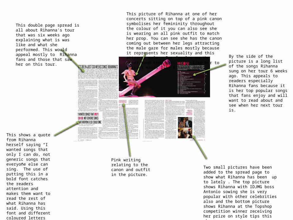
This picture of Rihanna at one of her concerts sitting on top of a pink canon symbolises her femininity throughout the colour of it you can also see she is wearing an all pink outfit to match her prop. You can see she has the canon coming out between her legs attracting the male gaze for males mostly because it represents her sexuality and this attracts males. For females on the other hand they want to be like her to attract males like Rihanna does.
By the side of the picture is a long list of the songs Rihanna sung on her tour 6 weeks ago. This appeals to readers especially Rihanna fans because it is her top popular songs that fans enjoy and will want to read about and see when her next tour is.
This double page spread is all about Rihanna's tour that was six weeks ago explaining what is was like and what she performed. This would appeal mostly to Rihanna fans and those that saw her on this tour.
This shows a quote from Rihanna herself saying “I wanted songs that only I can do, not generic songs that everyone else can sing.” The use of putting this in a bold font catches the readers attention and makes them want to read the rest of what Rihanna has said. Using this font and different coloured letters creates a more interesting cover instead of just using black small writing this makes the readers bored.
Two small pictures have been added to the spread page to show what Rihanna has been up to lately . The top picture shows Rihanna with IDJMG boss Antonio sowing she is very popular with other celebrities also and the bottom picture shows Rihanna at the Topshop competition winner receiving her prize on style tips this shows
Pink writing relating to the canon and outfit in the picture.

The main thing focused on this double page spread in the magazine “Billboard” is the picture of Miley Cyrus sitting alone in a corner. They have made her look upset in the picture and this sad eye contact with the camera drawing in the readers. This double page spread contains little writing only a paragraph of what Miley Cyrus has been doing while she’s been famous. The picture takes up both the pages standing out for the readers creating an interesting page.
There is little writing contained on this page but it gives most of the information in a brief way and you can see at the end of the paragraph there is three small arrows pointing to the right showing there is more information on the next page and that this page is more of an advertisement of what the story is about.
The headline cover most of the page. It shows Miley Cyrus growing up from being a girl on Disney programmes to realising songs that have hit the charts. They have highlighted the word girl in pink representing a girly colour then when it is talking about her being a woman it changes to black.
Advertising Miley Cyrus has realised a new song that has hit the top charts called “cant be tamed” which mirrors herself as she is growing up because she is acting more like a young adult.
The background for the double page spread is very plain and slightly distressed mirroring Miley Cyrus in this case. She is sitting by herself in a corner showing that she is maturing by herself and realising all these new songs by herself.
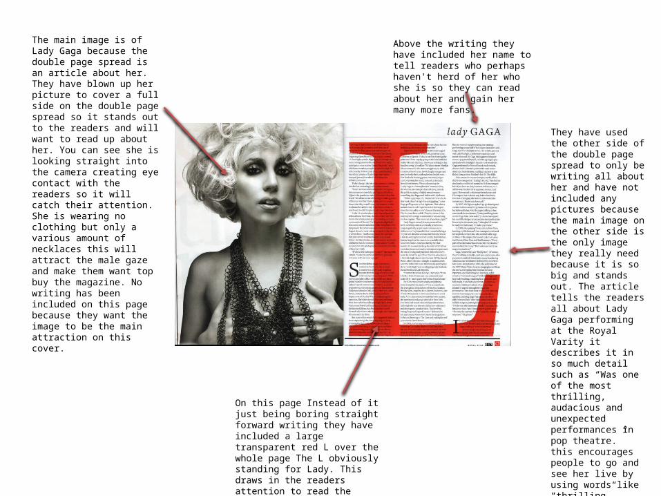
The main image is of Lady Gaga because the double page spread is an article about her. They have blown up her picture to cover a full side on the double page spread so it stands out to the readers and will want to read up about her. You can see she is looking straight into the camera creating eye contact with the readers so it will catch their attention. She is wearing no clothing but only a various amount of necklaces this will attract the male gaze and make them want top buy the magazine. No writing has been included on this page because they want the image to be the main attraction on this cover.
They have used the other side of the double page spread to only be writing all about her and have not included any pictures because the main image on the other side is the only image they really need because it is so big and stands out. The article tells the readers all about Lady Gaga performing at the Royal Varity it describes it in so much detail such as “Was one of the most thrilling, audacious and unexpected performances in pop theatre.” this encourages people to go and see her live by using words like “thrilling” because people will want to experience it. This also advertises Lady Gaga to get more fans to go to her concerts.
On this page Instead of it just being boring straight forward writing they have included a large transparent red L over the whole page The L obviously standing for Lady. This draws in the readers attention to read the article instead of just looking at the picture and turning to the next page.
Above the writing they have included her name to tell readers who perhaps haven't herd of her who she is so they can read about her and gain her many more fans.