lo2
TRANSCRIPT

Unit 13 – Planning & Pitching a Print Based Media Product

Contents
• Mind map 1• Mood board 1
• Mood board explanation 1• Mast head ideas + connotations
• Font Ideas For Masthead• Summary of ideas (A.I.R)
• Mind map 2• Mood board 2
• Mood board explanation 2• Summary of ideas (Simpatico)• Summary of Ideas Continued• Hand drawn drafts (A.I.R)
• Hand drawn drafts (Simpatico)• conclusion

Mind Map
My Magazine Ideas
Target audience- my targeted audience is going to be similar to the NME audience, men between the ages of 17-30 and other people such as girls who are interested in new music and the bands specified and involved.
Frequency- my magazine would be published every week with a monthly special.
Masthead ideas-
• A.I.R (alternative, Indie, rock)
• Clash• Simpatico• Pacifier • PPF (Past, present,
future)
Genre- the genre of my magazine is similar to the NME magazine, indie, rock and alternative.
Colour scheme(s)The colour scheme I will be using will be similar to the NME style by using bold writing. Red, black, white, blue and yellow
Logo in every page corner for consistency

Mood board 1

Mood Board Explanation
• My first mood board supports my A.I.R idea. I chose these images because they represent the genre of the magazine I want to produce and that I am copying (NME). The genres that I tried to match pictures with are indie, rock and alternative. By experience of being the target audience myself to NME magazine I used my experience and knowledge to chose appropriate images that suits all three of the genres and the magazine itself.

Mast head ideas + connotations
• A.I.R (alternative, Indie, rock)- I like this abbreviation of ‘AIR’ for my magazines masthead because it perfectly links in with the genre of indie, rock and alternative. This would suit my magazine because I am running along the same line as NME masthead and theme which has three letters as an abbreviation.
• Clash- I like this idea for a name of the masthead of my magazine because it shows the subject and the music inside, clashes with other current magazines such as pop, classic, R&B and other ‘indie, rock and alternative genres. This is because they are outgoing and like to be different and view there opinions, much like NME.
• Simpatico- I chose this to be an option for the masthead and name of my magazine because it’s a catchy name which would be remembered, it also symbolises that the magazine is easy and chilled like the music specified, that everyone loves and wants to buy and read about.
• Pacifier- ‘someone who tries to bring peace’ this would be good for the masthead and name of my magazine because the bands that are interviewed and talked about in ‘NME’ and my magazine are calming and peaceful, they aren't too out there or disturbing, which is like there fans and the target audience.
• PPF (Past, present, future)- this abbreviation would be a good name for my magazine and masthead because like the ‘AIR’ idea it links perfectly in with the genre and slogan, which interests my targeted audience and could expand who wants to buy the magazine because it specifies what it actually involves.

Font Ideas For Masthead

NME is a music magazine which targets mainly men aged between17-30. It also appeals to people with an interest in new music and artist and/or people in a band, so with A.I.R magazine I want to have similar if not the same target audience and subjects buying and having an interest in my magazine as much as NME and other rival magazines such as Q and Kerrang.Because both of my magazine ideas are virtually the same they have the same targets audience, Katz, Marlow and Hartley.
Summary of ideas 1

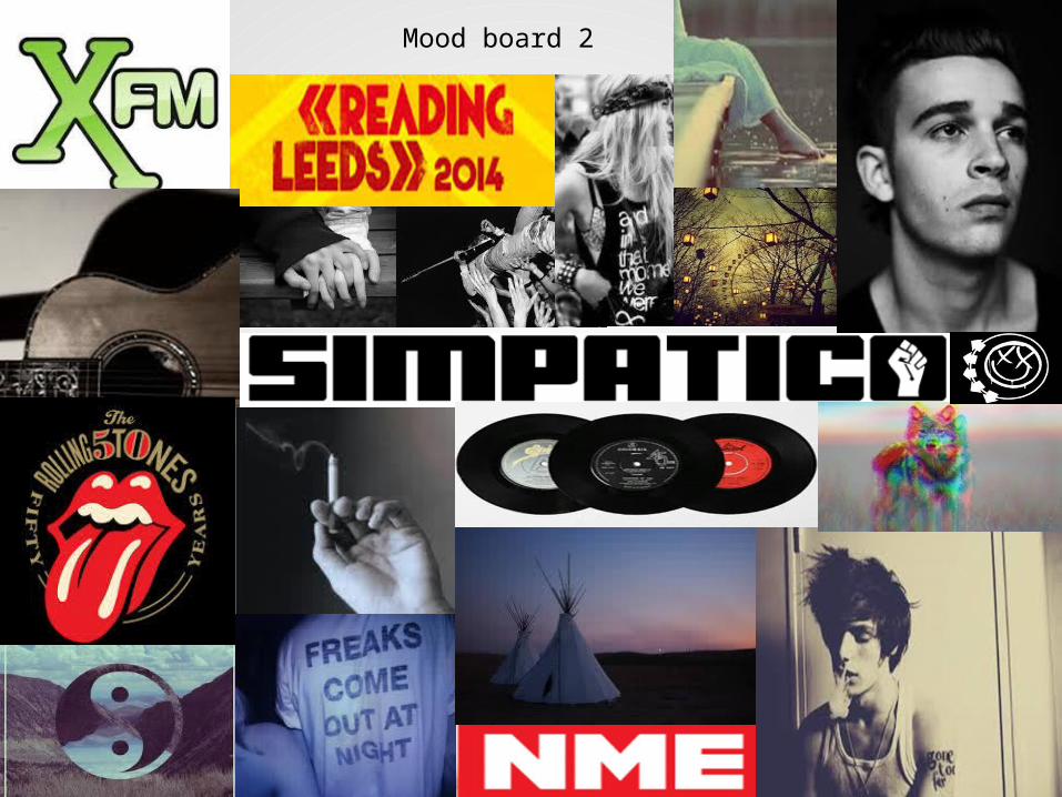
Mood board 2

Mood Board Explanation
• My second mood board that supports my simpatico idea, is very similar to my fist idea of A.I.R. this is because the genre of my music and the original magazine I am copying, NME , is all very much the same, and has the same taste, target audience and design. notice there is a lot of grey, black and white. These colours are used a lot in this genre because it emphasizes the images and create an intense connection with the audience through emotion, making them interested. I am also a fan things stand out more.
For both of my ideas of a magazine, A.I.R and Simpatico its crucial I meet the expectations of a well known, popular and professional magazine that already exists.
Katz- in NME magazine the audience learns information about the bands involved and written about inside that they may not know in every day to day business. They also learn what sort of people the band members can be and whop they really and their values, they may even get to ‘know’ them on a different and personal level because they may have the same issues as one another or the audience may look up to the people featured out of admiration. Maslow- NME magazine would come under the survivors and explores hierarchy. This is because when you buy an NME magazine you know full well that they will cover everything you need to know about the subject of the interview and who are featured in the magazine. I know this because in my addition of September the 6th 2014 ‘Interpol’ there is a whole double page spread on them and the quote ‘there was never a conversation about quitting’. NME magazine also comes under explorers because they are influenced by social change and this could attract explorers because they cover past, present and future music, allowing the audience of explorers to find out everything the need on specific bands and occasions upcoming.Hartley- the genre of NME magazine NME is indie/ rock/ alternative. the age range of the magazine is men around 17-30 and girls of an interest in the band members and alternative music.
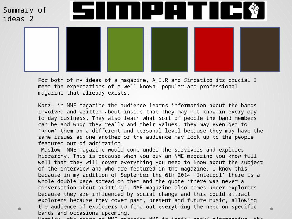
Summary of ideas 2

Summary of Ideas Continued
The similarities between NME magazine and my very own magazine (A.I.R) will not differ that much in design or format. I will be using similar font styles (bold and in capitals) because they are eye catching and stand out. This font style links into my chosen genre of indie, rock and alternative because it bold and out there which makes it stand out from the others and connotes its individuality.


Conclusion• In conclusion the magazine I chose to be creating
in A.I.R magazine. I chose this name because its more relevant to the genre ‘A-alternative. I- indie. R-rock.’ I also chose this abbreviation because its very similar to the NME magazines. My audience that I will be targeting is men aged between17-30, also people with an interest in new music and artist and/or people in a band. The colour scheme is mainly black, white and red with other colours such as yellow and blue to highlight certain aspects.