introduction… · this is not a bad infographic. but it’s not great. it’s your basic...
TRANSCRIPT

HOW TO CREATE AND USE BEAUTIFUL INFOGRAPHICS
IN YOUR MARKETING
Introduction
Infographics are nothing new; why, then, does it seem like in the last 5 years marketers have been
using them to promote content that spreads like wildfire? Well, because infographics work. They’re
great as standalone blog posts, they dazzle readers of ebooks and content all over the internet, and
they’re easily shareable because the brain processes visuals 60,000x faster than text [ Click to
Tweet this! ]. The brain loves visuals, especially when they’re in the form of a beautiful data-telling
story.
As marketers adopt the inbound marketing methodology of writing and sharing exceptional content to
attract and delight customers, infographics have weaved themselves into the threads of a business’s
content strategy. Sharing these beautiful data presentations is easy; the challenging part is how to
create your own, manipulate your own company’s data, and translate that into a beautiful, shareable,
informative and engaging piece of content that will increase traffic and leads to your business.
In this ebook, Venngage and HubSpot have joined forces to teach you everything you need to know
about creating visually stimulating and informative infographics to use in your marketing efforts. You’ll
also learn how and where to promote infographics, measure their performance, and ensure you’re
seeing ROI.
Table of Contents
Chapter 1: Deciding What Data to Represent
Chapter 2: How to Visualize Your Story
1. Statistical Infographics
2. Timeline Infographics (Time-Oriented)
3. Process Infographics
4. Informational Infographics
5. Geographic Infographics
6. Compare/Contrast Infographics
7. Hierarchical Infographics
8. Research-Based Infographics
9. Interactive Infographics
10. Word Cloud Infographics
Chapter 3: Choosing Charts and Finding Data
Chapter 4: Elements of Beautifully Designed Infographics
Chapter 5: How to Market Your Infographic
Conclusion & Additional Resources

CHAPTER 1: DECIDING WHAT DATA TO REPRESENT
(Hint: Don’t Use It as a Starting Point)
The #1 mistake most people make when they want to create infographics is to use their data as the
starting point [ Click to Tweet this! ].
Readers don’t exactly care about your data, they care about the story you are telling. Creating a great
infographic is about answering questions and solving problems people have. Using your data to think
about infographic stories will impede you in the selection of interesting topics and inevitably bias you
towards what Venngage calls a “data for the sake of data infographic.”
Try not to brainstorm with your data first. In fact, do the opposite - take your data and lock it up. Don’t
look at it. Forget about your data for now. Think about what you want people to learn and take away
after they look at your infographic.
The infographic below is a great example of how a large non-profit organization fighting Malaria in
Africa would use an infographic to get the word out about the dire effects of Malaria and how they are
progressing against it. The data they have is what you would expect: baseline data on how terrible
the disease is, the funds they have raised, the number of medication they provided to children, the
number of doctors per population size, the number of Malaria cases/deaths and their locations and so
on.
Let’s say we do what most people do and start with this data set to design our infographic. We might
be tempted to create an infographic with the following storyline: Malaria kills a lot people, and our
efforts against it is showing great results as evident in our numbers – the decrease in cases/deaths,
the improvement in the number of doctors, better treatment, and perhaps some economic impact.
Here’s what it would look like. It’s a very run of the mill type of infographic.


This is not a bad infographic. But it’s not great. It’s your basic data-driven infographic. The problem is,
this infographic tries too hard to fit all the great data the non-profit had collected and did not focus on
what the potential audience would be interested in learning. A great infographic not only answers
questions that people are curious about, it reframes them in an unconventional way. It challenges us
and sparks new insights to old problems. It should have an impact, and leave you pondering on your
existence, not unlike a good book or a good movie.
So, how would we create that infographic on Malaria? Fortunately, the talented people from the Gates
Foundation did exactly that. They created an infographic entitled, “World’s Deadliest Animals”. I’ll let
the infographic speak for itself.

In this infographic, there’s no question the story being told isn’t about data. It’s about the impact of
how it’s represented in a story: the animals we think are killers aren’t even close to comparing deaths
caused by mosquitos.
CHAPTER 2: HOW TO VISUALIZE YOUR STORY
You’ve got your story. Now you have to choose the type of infographic you want to use. There are
loosely 10 different types of infographics (listed below with examples). Based off of the story you are
telling, one of these types of infographics should jump out at you and you’ll know that’s the type of IG
that will best represent your story. Remember: the story comes first, data always comes second.
If you’re stuck on two types of infographics to tell your story, go with a simpler version. Venngage’s
Pinterest Research study showed that Pinterest users liked and shared more infographics that were
simpler and had less colors. But we’ll get to this later!
Below are the 10 types of infographics to help you visualize your story.
1) STATISTICAL INFOGRAPHICS
This infographic shows a summary or overview of data with one or more graphs, tables or lists.

2) TIMELINE INFOGRAPHICS

These time-oriented infographics show progress of information over a chronological time period.
3) PROCESS INFOGRAPHICS

These infographics demonstrate a linear or branching process. They teach the workings of an object
or flow chart showing choices in a decision process.

4) INFORMATIONAL INFOGRAPHICS
These infographics are most likely a poster that summarizes topic with some extra bits of
information.

5) GEOGRAPHIC INFOGRAPHICS
These infographics display data with a location map.

6) COMPARE/CONTRAST INFOGRAPHICS

These infographics illustrate notable similarities or differences as a “this versus that” infographic or as
a table or simple list.

7) HIERARCHICAL INFOGRAPHICS
This type of infographic demonstrates a chart with levels.


8) RESEARCH-BASED INFOGRAPHICS
These infographics are similar to statistical infographics, but based on research. These can be used
to compare unlike items with popular sets of data.
9) INTERACTIVE INFOGRAPHICS
This type of infographic gives viewers the control to modify the infographic and is web-based.


10) WORD CLOUD INFOGRAPHICS
These infographics display a cluster of words to show associations between words and concept.

After you’ve decided on a story to tell and the best type of infographic that will showcase that story,
it’s time to turn to your data points and representing them in charts.
CHAPTER 3: CHOOSING CHARTS AND FINDING DATA
One of the most important steps in creating infographics is choosing the right charts to tell your story.
How do you pick the best charts to represent your data in a unique and eye-catching way to
successfully deliver your message? What are the techniques you can use to visualize your
information so that your data speaks for itself? Here are some tried and true tips from the frontlines:
How to Convey a Single Important Number
Sometimes, you just want to convey a single data point. A very important number. Like breaking
100m world record in 9.2s. Or reaching the 1M users milestone on your new iPhone app. Or winning
a record 10th World Championship.
How to do tell this story? This is the time to employ the “Go Big or Go Home” technique. And by that I
mean go big with your fonts or text.

Use large fonts and labels
There is no need for fancy charts here. Plain old text works the best. Make your fonts and labels big.
Make them stand out compared to the other text on the infographic. Big numbers usually look
impressive by themselves. Like Slack’s infographic above, the label is what draws your attention as it
dominates over the line chart. Here are other examples:
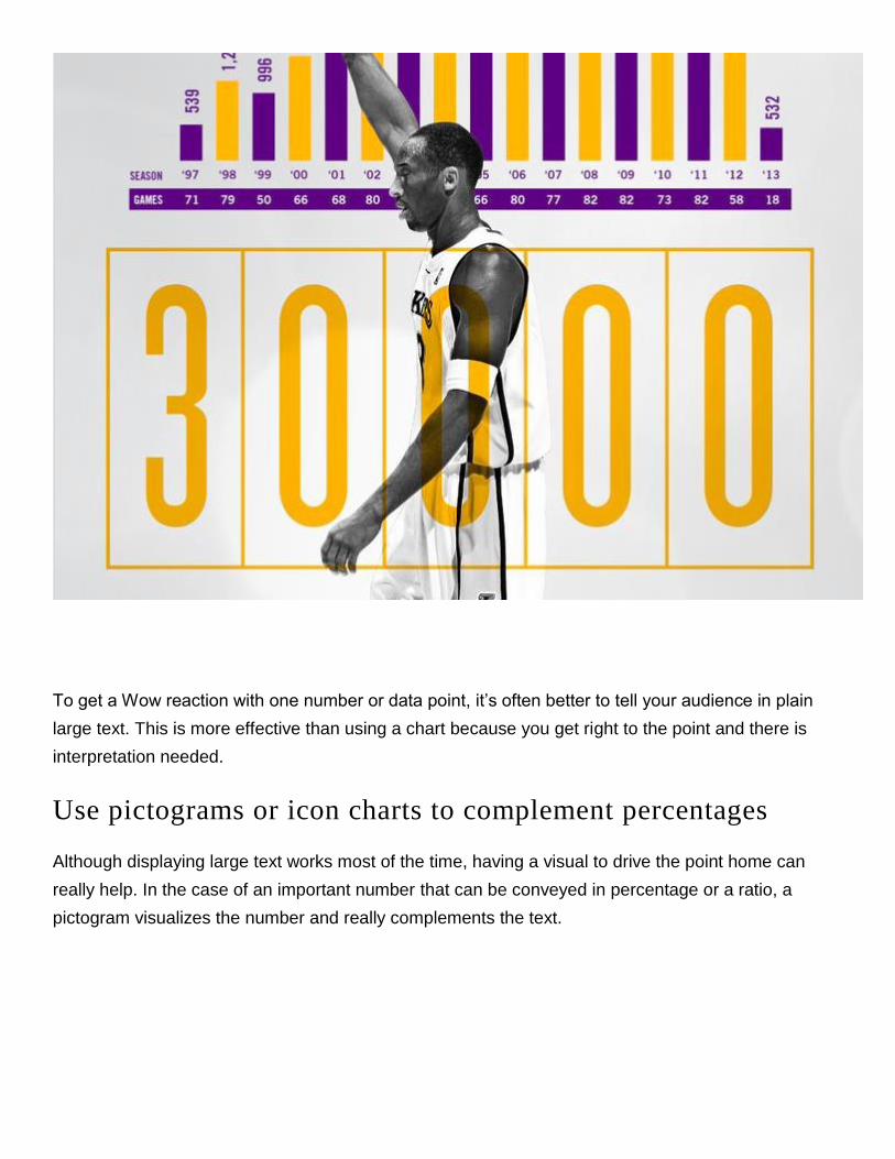
To get a Wow reaction with one number or data point, it’s often better to tell your audience in plain
large text. This is more effective than using a chart because you get right to the point and there is
interpretation needed.
Use pictograms or icon charts to complement percentages
Although displaying large text works most of the time, having a visual to drive the point home can
really help. In the case of an important number that can be conveyed in percentage or a ratio, a
pictogram visualizes the number and really complements the text.

Similarly, you can use an icon chart – which is just an icon that has two different color tones. The
percentage or height of one color represents the percentage or ratio. All of these charts are available
in the Venngage’s free infographic maker.
How to Compare Multiple Numbers or Things
The majority of data visualization deals with comparing a set of data points. There are many different
charts you can use to show comparisons and which one you pick depends on your goal and what you
want to emphasize. Let’s go over some of these options:
Use a bar or column chart for basic comparisons
99% of the time, you can use a bar or column chart to show comparisons of different discrete things
or categories. Most multiple choice survey answers can be visualized using a bar/column chart.
Anything that can be counted and categorized can be easily visualized using a bar or column chart.
For example, the total twitter followers of different hockey teams, the total sales of different products
you sell, the number of windows in each room,..etc.

Use a bubble chart or tree map to highlight outliers
What if you want to emphasize a particular value that is an outlier? Or you have one value that is so
much larger or smaller that you essentially want to compare it to all the other values in one
visualization? Use an area based chart such as a bubble chart or a treemap (which uses area to
visualize the value as opposed to height or length as in the case of a bar or column chart). Using
areas to visualize numbers brings out the contrast when there is a dominant category or value. This
only works if there is an outlier, whose value is a lot larger than the others. Edward Tufte has
famously dismissed 2D (area based) charts as an ineffective means to visualize data as we cannot
discern area differences accurately. If all your values only vary by a little bit, then stick to the bar or
column chart. But if you have an outlier, then visualizing the area differences really amplifies the
contrast.
Here is an example of a famous infographic comparing disease deaths and funding that uses a
bubble chart to show the contrast of the how much we donate vs the actual diseases that kill us:

Here is another example using a modified treemap. In this case, it’s showing how big of a fine Pfizer
has to pay compared to its profits.

How to Show Trends Over Time
The most common chart to display time series data is the line chart. If you have many data points,
the line chart is the most effective chart to show trends over time.

Use a column chart to emphasize distinct values
You can also use a column chart if there are not too many data points in the time series, especially if
you want to emphasize the values (as opposed to the trending over time)

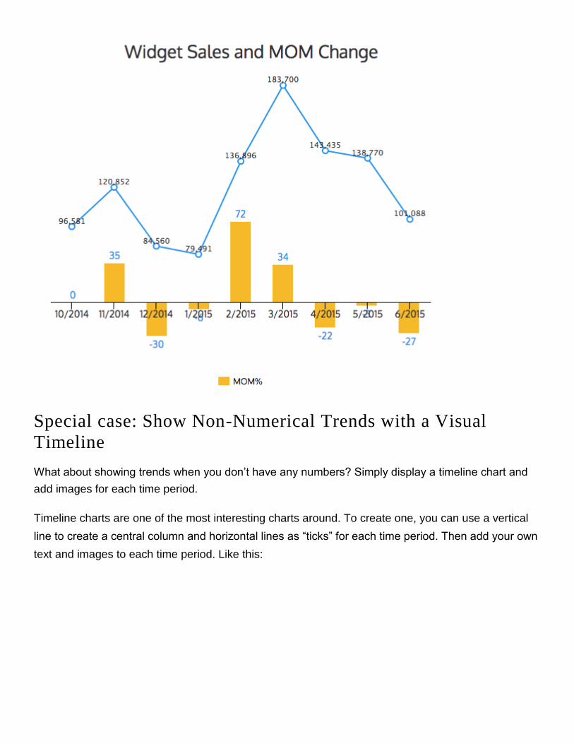
Special case: showing periodical changes
In business reports, it is common to show month over month (MOM) or year over year (YOY)
changes. In fact, for many data visualizations absolute numbers are meaningless without the
percentage of change or some other point of reference. How do you do a simple periodical
comparison? First, you have to aggregate your data into months or years. Then you will need to
calculate the MOM/YOY changes.
The table will look like this. The MOM% column is merely the change from the current month vs the
previous month (the quick formula is current/previous -1)
The way I like to display this is to just overlay both charts on top of each other. In the example below,
I’ve used a column chart to display the MOM% and a line chart to display the monthly widget sales.
Here you can see that the month over month sales fluctuates drastically.
Special case: Show Non-Numerical Trends with a Visual
Timeline
What about showing trends when you don’t have any numbers? Simply display a timeline chart and
add images for each time period.
Timeline charts are one of the most interesting charts around. To create one, you can use a vertical
line to create a central column and horizontal lines as “ticks” for each time period. Then add your own
text and images to each time period. Like this:

You can also create a horizontal timeline using a column chart as a base. Simply add all the time
labels with 0 as values and turn on the Y axis. Then add your images and text:

How to Show Comparison or Share of Total
How do you show the share of one value compared to all other values? There are 3 basic charts you
can use:
Use pie chart for most compositions
Despite its detractors, the pie chart or its cousin, the donut chart is one of the most recognizable
charts today and can be easily interpreted by most people. Use labels and show percentages if you
want to convey the actual values.

Or a Column/Bar Chart
The universally useful column and bar chart is perfect for this scenario. You can stack em or you not.
In fact, not stacking them improves readability when the values are close to each other as you can
compare the dimensions easily with a single glance.

How to Display Rankings or Order
The most simple way of displaying categories that are ranked or ordered is with a bar chart (with the
categories sorted). For example, here’s the top 10 travel review sites:
You can also use a simple list or table or a combination of a list and a bar chart, like the example
below for the top paying engineering majors:

How to Emphasize Patterns or Relationships
Most experts will tell you to use a scatterplot or a line chart or something more complex like a network
chart or chord diagram to show relationships in your data. My take on this is that most people will find
it really difficult to discover relationships themselves in any chart. Your audience will likely give your
chart a two second glance, which isn’t enough time to figure out what you’re trying to say. You cannot
expect your audience to interpret the relationships that your charts are conveying. Unless it’s really
obvious, who can really recognize patterns looking at a hundreds or thousands of plot points? My
unconventional advice is that the best way to convey a pattern or relationship between two variables
is to just explain it in plain language, in a label or heading. It works a lot better.
Here’s an example of two line charts to show gender and credits earned and grade point average in
math and science. Can you tell me what the relationship is between gender and performance in math

and science? (Keep in mind, this example only has 4 data points. Most line/scatterplots have many
more points)
Now look at the same chart with the relationships explained in plain English below. Is it much clearer?
In fact, you should just display the 4 data points in a table and it wouldn’t matter. People will read the
text and then look at the chart to reaffirm what they read, not the other way around. From my
experience, it’s best to just tell your readers what the pattern is.

How to Show Distribution
There are two general ways of showing distribution: Column chart (or a Histogram) and a Scatterplot.
Use a scatterplot when you have unaggregated data points
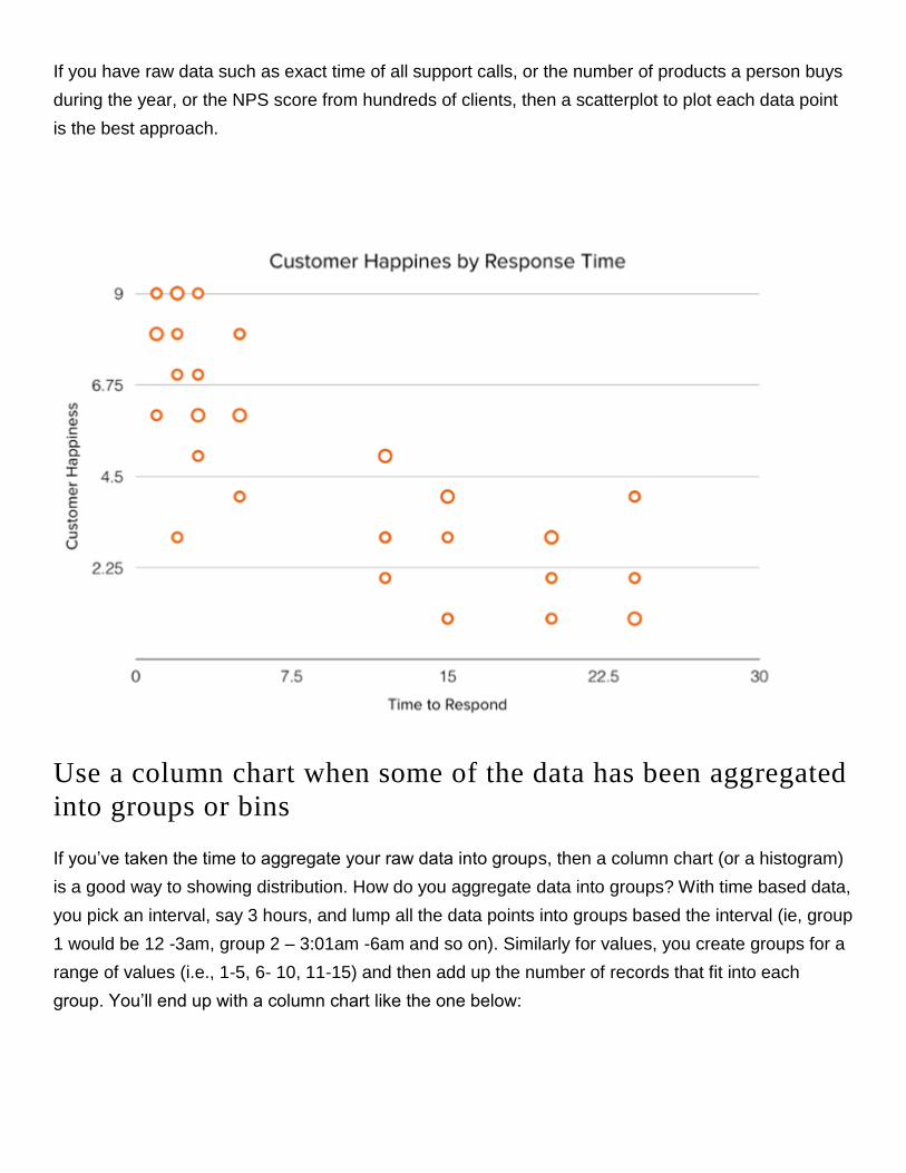
If you have raw data such as exact time of all support calls, or the number of products a person buys
during the year, or the NPS score from hundreds of clients, then a scatterplot to plot each data point
is the best approach.
Use a column chart when some of the data has been aggregated
into groups or bins
If you’ve taken the time to aggregate your raw data into groups, then a column chart (or a histogram)
is a good way to showing distribution. How do you aggregate data into groups? With time based data,
you pick an interval, say 3 hours, and lump all the data points into groups based the interval (ie, group
1 would be 12 -3am, group 2 – 3:01am -6am and so on). Similarly for values, you create groups for a
range of values (i.e., 1-5, 6- 10, 11-15) and then add up the number of records that fit into each
group. You’ll end up with a column chart like the one below:

As with the previous point – if there is a clear pattern in the distribution, you should write it down and
not leave it to the reader to interpret. For example, most support calls occur late in the afternoon. You
should add a label in plain language for your reader. The text complements the chart together to
reemphasize the pattern
Insight in plain text + chart is far more effective than just displaying the chart.
Avoid Complex Charts
Lastly, if you’re ever tempted to incorporate a very complex chart, or if the marketing agency or
consultant you’ve hired tells you that you need a large and complex chart, stop. While large complex
charts may look “cool” or beautiful, you should keep readability in mind. How many people can
actually understand a chord diagram or a sunburst chart with thousands of data points?

Keep it simple. Summarize your data into a bite size that is easily readable. Stick to standard charts
that a 6th grader will understand. (Incidentally, newspaper writers usually write at a 5th-7th grade
literacy level.) Unless your audience are academics or researchers, our general recommendation is to
use standard charts and to use labels to interpret the charts as much as possible. Rule of thumb – if
you need to zoom in to look at a chart and its legends more than once to understand what’s going on,
it’s probably too complicated.
How to Get Relevant Data to Tell Your Story
There are 3 approaches to getting your data to make your infographic.
1. Your own data – if you took the data driven approach to infographics, you are probably using
your own data. Even if you didn’t, your organization or company may have data on the subject
or story you want to write about. Ask around. Send some emails.
2. Original research - OC (original content) is king! Nothing beats OC. You don’t need a research
team or a data scientist for this. And unless you’ve got a big budget don’t even think of paying
a research or marketing firm for this. You can roll your own survey research with a tool
like survey monkey or Google Forms. Or with manual coding of data. We’re writing an article
about how we do our own research. I’ll add a link to it here once it’s done.
3. Data sources – there are plenty of public and private data sources out there. Here is a short
list:

Data.gov – this is the US government’s open data website. You can search for all kinds of
public data from healthcare data to economic data. It takes a bit of digging to get the datasets,
but worth exploring.
UN data – UN data is international/world data on a variety of subjects such as employment,
poverty, population, export/import numbers, growth,..etc. There are 34 databases in total and
you can filter by country.
Google Public Data – Google has a search engine specifically for searching publicly available
data. This is a good place to start as you can search a large amount of datasets in one place.
Pew Research Data - Pew Research is think tank that does a lot of research and polling in the
areas of public interest such as internet, science and technology trends, global attitudes,
religion and public life, and social and demographic trends. This is one of my favorite places to
visit. They also publish excellent reports and make all their datasetsavailable for download.
World Bank – The World bank has a lot of financial and economic data. Great if you want high
level data.
World Economic Forum – WE forum has more nuanced data on a variety of topics. Their data
are embedded in their reports.
Statista – this is data aggregator that has thousands of data sets. It is a paid service though
you do get some interesting data sets unavailable publicly.
The rough guide here is to find at least one data set or number per story point. At the end of this step,
you should have all the data you need to start putting your infographic together.
CHAPTER 4: ELEMENTS OF BEAUTIFULLY DESIGNED
INFOGRAPHICS
Ok – you’ve got the story, the type of infographic and the data. Now you can put them all together into
an attractive looking infographic. For a non-designer, creating a beautiful infographic from scratch is
not easy. How do you get better? By looking and copying the best infographics out there, and by
using ready made templates.

OR here’s a hack:
1. Go to Pinterest and search for “Infographics”.
2. Go to the Templates page of Venngage (you have to be logged in).
3. Pick one or a few you like. Then use that as the base style.
4. Create an outline of the infographic with all the charts and elements (on paper)
5. Create the infographic on a tool like Venngage (using the outline and template)
6. Change the color, fonts and other elements to create your own style derivative.
On color schemes:
The best way to pick a good color scheme is to look at other infographics for inspiration. Or if you like
a particular color, you can use Color Lovers to find color schemes that match a particular color. It’s a
great tool. I use it all the time.
On fonts:
I’m not a big fan of using many different fonts. Two is often enough. Stick to one type of font – either
Sans Serif types or Serif type fonts, for consistency.What’s the difference?
A lot of people will tell you to use Sans Serif fonts for a more modern digital look and Serif fonts
for more traditional print look. I think it depends on what you want and your style. My go-to font is
Helvetica or Arial but that is because I’m a minimalist. But I recently read an article on the NYT about
how Sans Serif fonts makes us believe something is true. People trust old school fonts more for
conveying information. Go figure.
On layouts:
Pick a layout and put everything together. Stick with a simple grid for symmetry and ease of reading.
I’m a stickler for symmetry and uneven margins bother me more than they should. The infographic
should be well balanced. If you stick to a grid system, you should be fine. If you’ve created an outline
or picked a template, you should just follow that layout.

On chart types (see chapter 2 for extensive list of chart types)
Most people have the tendency to think that data visualization has to be big and complex in order to
deliver an impact. How many people actually know how to interpret a dense network diagram or
something like a chord diagram?
On outlines:
Before you dive into actually creating the infographic, it is a good idea to create an outline on
paper. It helps with organizing the flow of the story. Here’s an example of one we recently did. (This
one has a bit more detail than the usual outline, but you get the point)

Lastly, you use a digital tool to get it all together, with a proper headline, sub headers and additional
information such as sources and a call to action. For example, from the outline above, we created this
(click on it to see the full infographic):


CHAPTER 5: HOW TO MARKET YOUR INFOGRAPHIC
Chances are, if you’re reading this, you’re creating an infographic to use on social media or a
marketing campaign. If you’re creating the infographic for marketing purposes, you’ve got one more
step, and that’s promoting it. After all, there is no point creating content if no one sees it, is there?
Here are some methods on how to promote your infographics:
Make it into a blog post and share on all your social channels
Send out an email newsletter. Check out how to make emails more engaging with infographics
here.
Ask your advocates to share explicitly.
Post it on social discovery sites like Stumbled Upon, Reddit, Imgur..etc.
Outreach – find bloggers who will benefit from sharing your infographic.
If you’re not a big brand with a large following, you’ll get limited mileage on most of these methods
without determined effort on outreach. Outreach is an unavoidable necessity. It’s like cold calling and
door to door selling. It works, but usually not how you would expect it to. You have to start small, at
the bottom of the influencer pyramid and work your way up.
With so much content on Pinterest, how do you make your infographic stand out? What are the
characteristics of highly pinned and liked Pinterest infographics? To answer these questions,
Venngage looked at over 200 popular Pinterest infographics and evaluated them based on a series of
qualitative and quantitative characteristics. The results? A comprehensive guide to what types of

infographics get more “likes” than others. Based on their research, 6 factors were identified for a great
Pinterest infographic.
Topic
Does the topic or subject matter of your infographic matter? Yes, it does. On Pinterest, the top topics
were travel, food and marketing. This is not really surprising if you use Pinterest regularly. Travel and
food images do extremely well on Pinterest given the demographic of their users. These three topics
performed a lot better than all the other topics.
Here are some examples of top infographics from the travel, food and marketing categories:


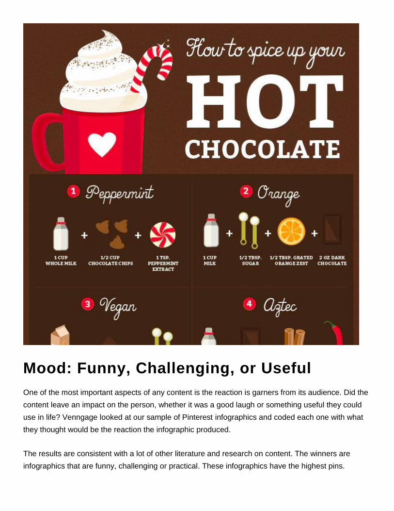
Mood: Funny, Challenging, or Useful
One of the most important aspects of any content is the reaction is garners from its audience. Did the
content leave an impact on the person, whether it was a good laugh or something useful they could
use in life? Venngage looked at our sample of Pinterest infographics and coded each one with what
they thought would be the reaction the infographic produced.
The results are consistent with a lot of other literature and research on content. The winners are
infographics that are funny, challenging or practical. These infographics have the highest pins.

Information is Funny OR Useful OR Interesting = Higher Pins & Likes [ Click to Tweet this! ].
Simplicity of Information
One of the biggest misconceptions out there is that you need to have a lot of data and a complex
infographic for it to be shared and liked a lot. Venngage’s research shows that simple infographics,
such as informational and text based infographics, perform the best. Simple = Win.

The other characteristic examined was the dominant style of the infographic. Venngage classified IG
style into one of 5 styles – text based, image based, illustration based, or a combination. The results
showed text based infographics performed the best.

Serif Fonts
While the majority of infographic fonts were sans serif types (the more modern looking font), serif
fonts perform better. Why? Here is one plausible reason: people believe text written in serif fonts
more than those written in sans serif. There was a popular study highlighted by the New York Times
about howpeople tend to find statements written in serif fonts more credible. [ Click to Tweet
this! ].

2-3 Colors
Colors have an effect on people. Marketers know this and have been using it to increase sales and
conversions for a long time. It turns out when we looked at the number of colors used in top
infographics and which primary colors are dominant, we see a very distinct pattern.

Less is more. Infographics with only 2 colors performed the most. Infographics that have more than 5
were the worst. [ Click to Tweet this! ].

Longform vs. Shortform
If you group the infographics based on their length to width ratio (a ratio is used since infographics
have varying dimensions) and chart the distribution, you’ll notice that while shorter infographics do
well, the ones that performed really well had between 5-9 length to width ratio (the infographics’
length were 5-9 times longer that its width). I guess that is consistent with other longform content
such as blog articles. But too long is not necessarily a good thing – as you go beyond the 9x ratio, the
performance drops. So don’t over do it.

CONCLUSION & ADDITIONAL RESOURCES
Infographics are certainly a great way to market your brand and the story your company is telling.
This ebook is a guideline for you to use when thinking about or revamping your marketing strategy to
incorporate infographics - use it as a reference and inspiration to start creating beautiful infographics
and promoting your brand through informational, interesting, and engaging imagery.
We hope you take these best practices, tips and tricks to making and using infographics in your
marketing to generate more leads, business, and happy customers!
