four ways finance creates value with visual analytics · vp finance, tableau. ... or still dump hr...
TRANSCRIPT
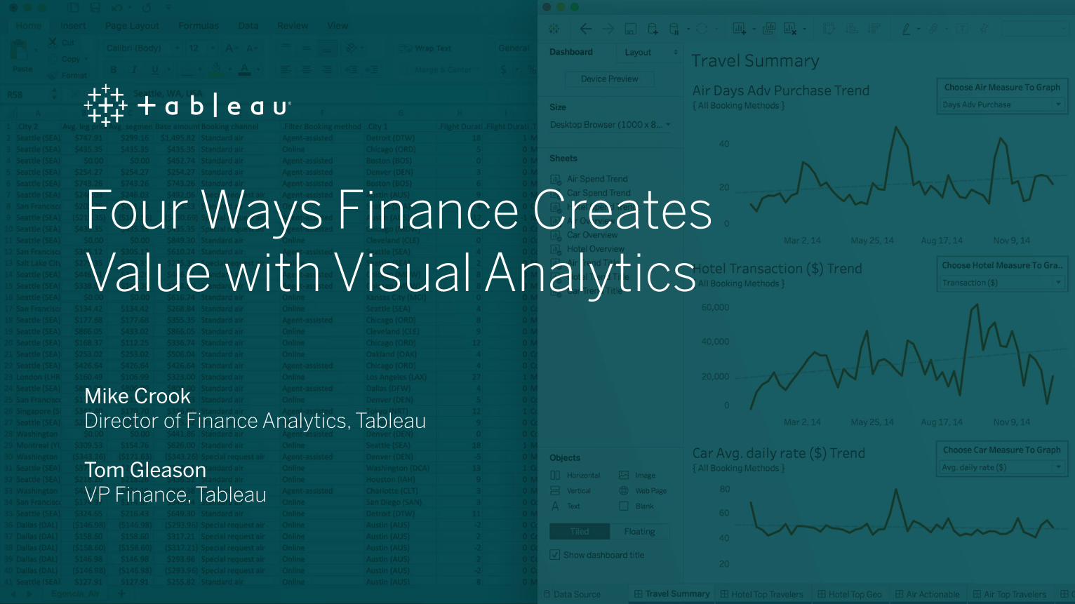
Four Ways Finance Creates Value with Visual Analytics
Mike CrookDirector of Finance Analytics, Tableau
Tom GleasonVP Finance, Tableau

C O N T R O L F ( I N D ) : T I M E
Every day millions of finance professionals extract data from
different platforms and reporting systems into spreadsheets
to ask and answer thousands of questions. For many obvious
reasons—like the need to dump and compile data and/or
perform calculations within a specific data set—Excel is often
the go-to tool of choice for piecing a data puzzle together, and
performing deeper analysis. But this leads to using limited
subsets of data for ad-hoc analysis, which only yields a
glimpse of the answers you seek, and puts you in perpetual,
repetitive rebuild and query cycles. It’s clear: the primary
hardship with this engrained manual routine is, of course,
time.

As financial analytics processes and technologies continue
to evolve with tools like Anaplan, Salesforce, and NetSuite,
modern finance departments must improve speed to insight
with resources that can prevent manual dumping and static
reporting. They must find faster and more accurate ways to
unify all of their data, and glean insights in real time. And now
more than ever, they must scale their existing investments in
technology and people to improve communication and impact
throughout the enterprise.
According to a recent Deloitte report, 61 percent of CFOs say
the disrupter most impacting long-term business strategy
is the availability of new data, and improving the ability to
synthesize data for business decisions.
61%CFOs say the disrupter most
impacting their long-term business strategy is availability of new data
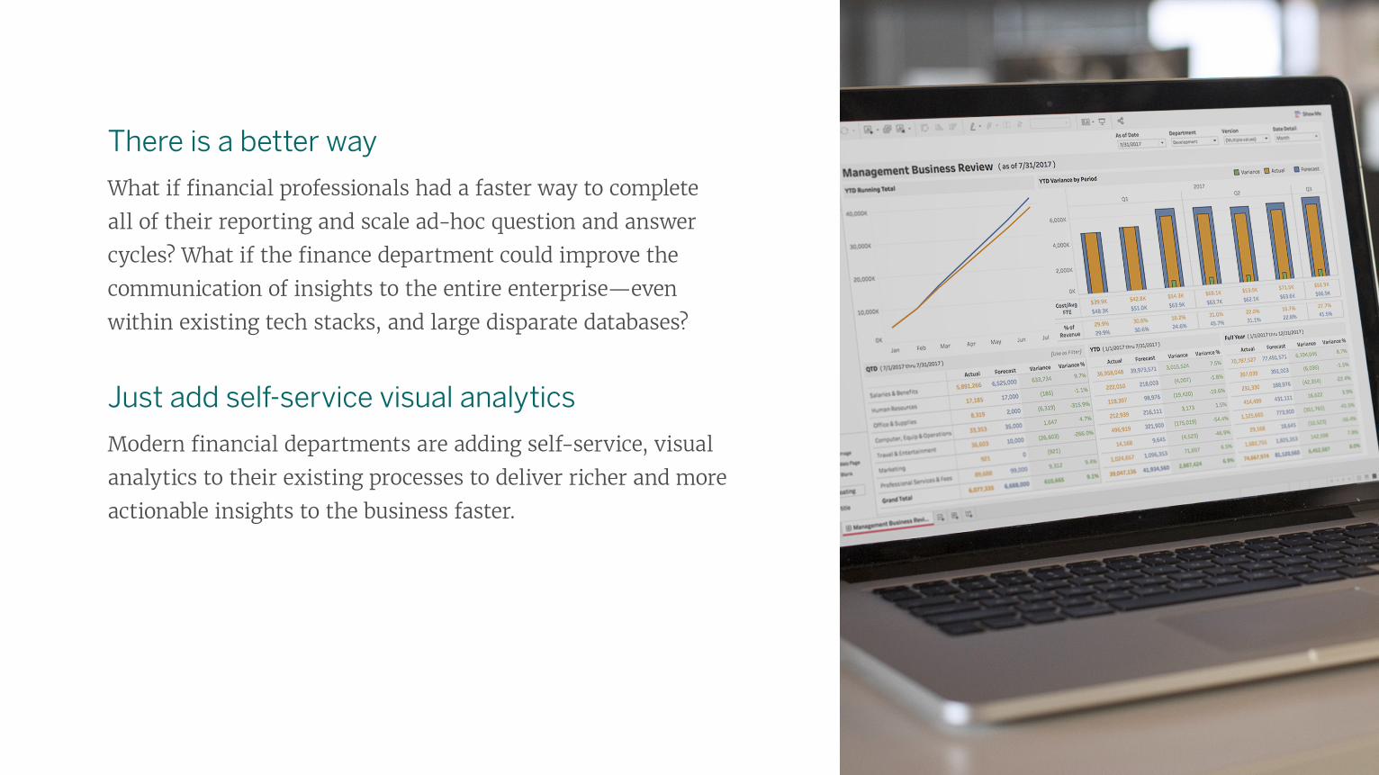
There is a better way
What if financial professionals had a faster way to complete
all of their reporting and scale ad-hoc question and answer
cycles? What if the finance department could improve the
communication of insights to the entire enterprise—even
within existing tech stacks, and large disparate databases?
Just add self-service visual analytics
Modern financial departments are adding self-service, visual
analytics to their existing processes to deliver richer and more
actionable insights to the business faster.

A Quick Visual Example
This Management Business Review (MBR)
dashboard uses Full-Time Equivalent (FTE),
Expense and Revenue data from live data sources
containing actuals and forecasts from completely
different systems. Instead of a Financial
Planning & Analysis (FP&A) team conducting
manual analysis for separate departments within
the organization, visual analytics provides a
common place, in real-time, where people can
ask and answer questions about all departmental
data, on the fly, in just a few clicks. Anyone can
explore key metrics and KPIs without having to
start their analysis over, or run new numbers
each time there’s a new question. Click on the
dashboard to try it yourself.

As useful as spreadsheets can be, there are ways visual analytics can be additive to improve financial analysis
and save significant time across many use cases and finance teams; here are four:
1. UNIFY AND USE ALL OF YOUR DATA
2. SCALE AND REPEAT ANALYSIS FASTER
3. INTERACTIVE, AD-HOC ANALYTICS REVEAL DATA OUTLIERS
4. IMPROVE ORGANIZATIONAL COMMUNICATION OF INSIGHTS

1 . UNIFY AND USE ALL OF YOUR DATA
Regardless of the size of your organization, there’s financial data everywhere—and a lot of it. Whether you want to analyze live enterprise resource planning (ERP) data living in a warehouse, or transactional data living in the cloud, or still dump HR and CRM data into different spreadsheets, you can combine any and all of it within a single, visual analytics platform, and blend it on a common field to see more accurate, holistic views of your data. And you’re not going to be limited on the number of data points because of a spreadsheet.
Here’s how
For the finance department, unifying data might seem easier
said than done. Don’t worry, you can actually still use your
existing infrastructure and data sources. Here’s a quick
tutorial on how to blend your data on a common field.

More time for analysis
Once you have your data connected and unified with a
visual analytics platform, not only will you be able to
select specific data sets on-the-fly, and choose which
metrics to work with, you’ll spend way more time
doing deeper analysis in a visual setting. And you can
still use all of the same formulas and functions you
already know and love to perform calculations— like
LOOKUP or IF/THEN —which means you’ll do your job
a lot faster.
1 . UNIFY AND USE ALL OF YOUR DATA

A Real World Reporting Challenge: Zedi’s Excel Bottleneck
Zedi, a leading oil and gas technology and services company,
needed to unify all of their financial data, including Microsoft
Dynamics GP, to create a single source of truth.
Because product managers are responsible for profit, loss, and
financial reporting on different lines of business and solutions,
the finance team needed to extract data out of Microsoft
Dynamics. Thus, bringing it into Microsoft Access and finally,
Excel to find insights.
This arduous process led to long reporting cycles of up to two
days per month for each of Zedi’s seven product owners.
1 . UNIFY AND USE ALL OF YOUR DATA

Additionally, the data “was inconsistent, and everybody had their
own different graphs, and they had their own different filters,”
recalls Doug Watt, a Senior Technology Product Manager at Zedi.
This led to confusion between product managers and the finance
team, and ultimately created distrust in the data.
Zedi Reduces Finance Reporting by Two Weeks Per Month
With unified data and visual analytics dashboards, Zedi’s finance
team now acts as a single source of truth for financial reporting
for the whole company. “[The finance team] controls how they
pull that data out, when they pull that data out, and what data
needs to be in there,” Doug said.
With visual analysis and more accurate data, Zedi reduced
reporting time by two weeks per month, allowing employees to
focus on more strategic projects that move the business forward.
“[The finance team] controls how they pull that data out, when they pull that data out, and what data needs to be in there.”
Doug Watt
Senior Technology Product Manager, Zedi
1 . UNIFY AND USE ALL OF YOUR DATA

2. SCALE AND REPEAT ANALYSIS FASTER
Whether you’ve been filling your spreadsheets to the
breaking point, working with smaller data sets, or running
sophisticated macros and calculations in spreadsheets, you’re
often left waiting and miserable. You are too busy to spend
cycle-after-cycle sorting out which set of data you can live
without, or carving out extra time to refresh your calculations.
You just need to iterate your existing analysis more quickly—
you need to be able to ask and answer your data questions
without having to start over every time. Once you’ve unified
your data, you’re ready to take your analysis to the next level
with visual analytics.

Outlier Management with Visual Analytics
Because our brains are hard-wired to see and understand
visuals in seconds, adding them to your financial analytics
process will bring speed to things as simple as finding and
managing outliers.
Visual analytics will quickly reveal and isolate outliers,
discover hidden patterns, show geographical locations, see
trends, and model the future so you can anticipate results.
2. SCALE AND REPEAT ANALYSIS FASTER

Real World Example: Travel and Expense Outliers
Here’s a dashboard using travel and expense
data from Egencia that shows Saturday night
hotel stays. Not only can users quickly hover
and identify outliers, they can click on the
actual mark to drill down into the details of
the data to find exact dates for each night
stayed, location, hotel name, and costs
incurred.
Learn more about using visual analytics with
travel and expense data.
2. SCALE AND REPEAT ANALYSIS FASTER

PepsiCo Spots Outliers and Trends Faster
PepsiCo used to churn out sales forecasts that
required the Collaborative Planning, Forecasting
and Replenishment (CPFR) team to build a tool in
Microsoft Access that combined retailers’ sales data
and PepsiCo supply data; a process that could take up
to six months.
The team primarily relied on Excel for analysis,
creating large quantities of messy data. And the
team had no efficient way to spot errors, leading to
potentially costly outcomes. For example, a missing
product from a report could result in inaccurate
forecasts and lost revenue.
2. SCALE AND REPEAT ANALYSIS FASTER
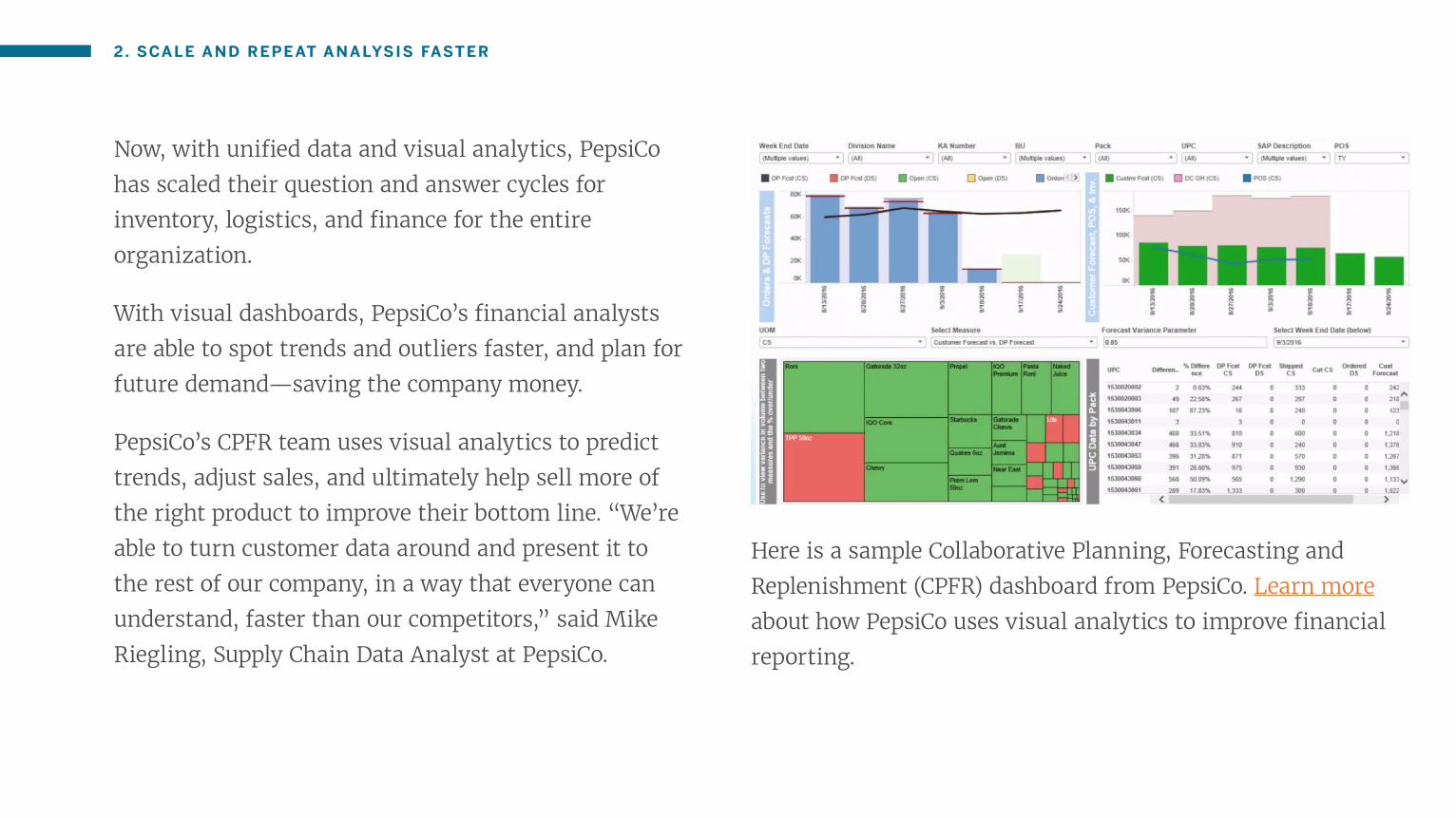
Now, with unified data and visual analytics, PepsiCo
has scaled their question and answer cycles for
inventory, logistics, and finance for the entire
organization.
With visual dashboards, PepsiCo’s financial analysts
are able to spot trends and outliers faster, and plan for
future demand—saving the company money.
PepsiCo’s CPFR team uses visual analytics to predict
trends, adjust sales, and ultimately help sell more of
the right product to improve their bottom line. “We’re
able to turn customer data around and present it to
the rest of our company, in a way that everyone can
understand, faster than our competitors,” said Mike
Riegling, Supply Chain Data Analyst at PepsiCo.
Here is a sample Collaborative Planning, Forecasting and
Replenishment (CPFR) dashboard from PepsiCo. Learn more
about how PepsiCo uses visual analytics to improve financial
reporting.
2. SCALE AND REPEAT ANALYSIS FASTER

3. INTERACTIVE, AD-HOC ANALYTICS REVEAL DATA OUTLIERS
Visual analytics are not chart wizards—they’re
interactive, can connect to live data sources, and offer
an ever-changing analysis of what’s happening now,
not last week or last month. Visual analytics can take
static reports and turn them into automated and
interactive dashboards that anyone can access for the
most accurate insights at any time.
Everyone in the finance department will spend less
time dealing with broken formulas, human error, and
more time interacting with data in a dynamic way to
explore and reveal critical insights coming from data
outliers.
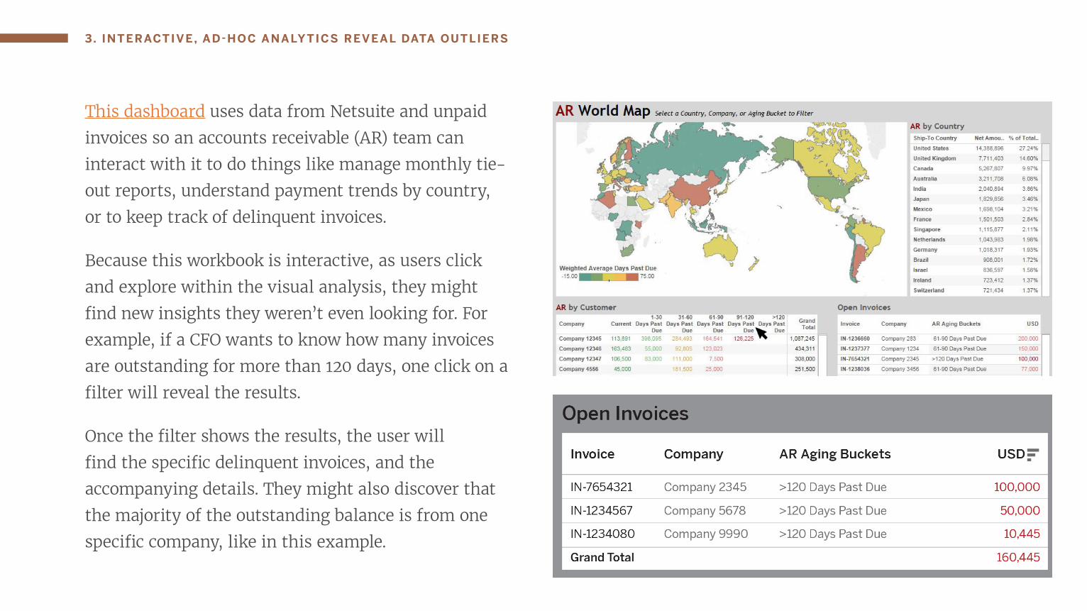
This dashboard uses data from Netsuite and unpaid
invoices so an accounts receivable (AR) team can
interact with it to do things like manage monthly tie-
out reports, understand payment trends by country,
or to keep track of delinquent invoices.
Because this workbook is interactive, as users click
and explore within the visual analysis, they might
find new insights they weren’t even looking for. For
example, if a CFO wants to know how many invoices
are outstanding for more than 120 days, one click on a
filter will reveal the results.
Once the filter shows the results, the user will
find the specific delinquent invoices, and the
accompanying details. They might also discover that
the majority of the outstanding balance is from one
specific company, like in this example.
3. INTERACTIVE, AD-HOC ANALYTICS REVEAL DATA OUTLIERS

This insight only spawns more questions. The
accountant might ask “So, what’s going on with this
company that’s causing these late payments?” Because
visual analytics are also connected to the organization’s
CRM data, it’s possible for the same user to perform
more ad-hoc analysis to discover more insights about
what’s going on. The CRM data may reveal that the
company has several more unresolved questions—
hypothetically, maybe it’s because the company was
recently acquired, creating the payment delays.
What started out as a high-level question about aged
invoices, snowballed into a more systemic problem that
no one knew about. Revealing the data outliers with
accessible, ad-hoc, visual analysis can be the game
changer or ‘aha’ moment in many everyday finance and
business decisions.
3. INTERACTIVE, AD-HOC ANALYTICS REVEAL DATA OUTLIERS

4. IMPROVE ORGANIZATIONAL COMMUNICATION OF INSIGHTS
Excel is great tool for detailed financial modeling. But
what happens when the finance department needs
to share these details with stakeholders in other
departments?
Because most workers seated within any organization
don’t readily understand Excel models, adding
visual analytics to the mix will facilitate greater
understanding and more productive conversations for
everyone. Additionally, if you share an Excel report
or a static PDF, there’s no way for stakeholders to ask
follow-up questions in real time.

With visual and interactive dashboards, collaboration
is built in as an integral step in the organization’s cycle
of analytics. There are no additional configurations or
add-ons required to share or collaborate with data, and
because users can ask and answer their own questions
directly in the dashboard, there are fewer redundant
emails and requests to run more numbers.
Finance users can simply publish and share dashboards
online, to a server, or directly with the people
with whom they want to collaborate, and they can
immediately see how often reports are being viewed
and used. And with live data connections, reports aren’t
instantly out of date—which is often the case with
static Excel reports. Learn more about streamlining
reporting for the enterprise in this demo.
4. IMPROVE ORGANIZATIONAL COMMUNICATION OF INSIGHTS

Swedish Medical Improves Organizational Reporting Collaboration
In late 2012, Swedish Medical was looking to improve
the impact of financial and other departmental
analytics throughout the entire organization. “We
wanted our solution to be accessible and effective for
everyone in the organization, not just analysts,” said
David Delafield, CFO of Swedish Medical Group.
When the initial, visual dashboards debuted and shared
with small audiences in the organization, the demand
for access went viral.
“We had a lot of emails each week from people wanting to get access... Now we’re to the point where we’re bringing a lot of new users onto the platform each week and we know it’s having a big impact around business alignment and simplification. Our focus now will be on expanding views and answering new business questions.”
David Delafield
CFO, Swedish Medical Group
4. IMPROVE ORGANIZATIONAL COMMUNICATION OF INSIGHTS

About TableauTo find more time and make a bigger impact in your
financial analysis, you don’t have to ditch your spreadsheets
and existing processes all together. Integrating all of your
data sources with visual analytics is easier than you think.
Tableau helps people see and understand their financial data,
no matter how big it is or where it’s stored.
You can quickly connect, blend, clean, visualize and analyze
your data the way you want– no programming skills
required. Learn more about using visual analytics for finance
data and start your free trial of Tableau today.