foundations for data science - stephen davies
TRANSCRIPT
Foundations for Data ScienceDATA 219 Course notes
version 1.3
Stephen Davies, Ph.D.Data Science Program DirectorUniversity of Mary Washington

2

Contents
1 Intermission and review 1
2 Navigating the Spyder’s web 3
3 EDA: review and extensions 7
4 KDEs and distributions 27
5 Random value generation 35
6 Synthetic data sets 43
7 JSON (1 of 2) 61
8 JSON (2 of 2) 73
9 LOWESS 85
10 Data fusion 93
11 Long, wide, and “tidy” data 103
12 Dates and times 111
i

ii CONTENTS
13 Using logarithms 123
14 Accessing databases 133
15 Screen scraping (1 of 2) 139
16 Screen scraping (2 of 2) 153
17 Probabilistic reasoning 165
18 Causality 177
19 ML classifiers: Naïve Bayes (1 of 3) 189
20 ML classifiers: Naïve Bayes (2 of 3) 195
21 ML classifiers: Naïve Bayes (3 of 3) 203
22 APIs 211
23 ML classifiers: kNN (1 of 2) 223
24 ML classifiers: kNN (2 of 2) 233
25 Two key ML principles 243
26 Feature selection 253
27 Association Analysis 263
28 “Special” data types 269

Chapter 1
Intermission and review
This is a new text! Although we’ll do some review, I’m assuming you’re good on thefollowing items from DATA 101:
• Data stuff– Contingency tables– Scatterplots– Histograms– Boxplots– Quantiles
• Python stuff– NumPy arrays– for loops– Modifying in-place vs. returning a copy– Pandas Series & DataFrames
∗ Reading from a .csv file∗ The “index”∗ .iloc vs. .loc vs. neither∗ Single ints/labels vs. slices vs. lists∗ Queries
1

2 CHAPTER 1. INTERMISSION AND REVIEW
Chapter 2
Navigating the Spyder’s web
We’ll be using Spyder this semester: a Python-based data analysis environmentwritten especially for Data Science and scientific programming.
It comes with the Anaconda distribution, as does pretty much everything else we’lluse this semester (scikit-learn, NumPy, SciPy, Pandas, Matplotlib, etc.) Downloadit from here: https://www.anaconda.com/download.
Note: make sure to get Python 3.*, not 2.*!! (They are not mutually compatible.)The number(s) after the dot don’t matter so much. But before the dot must be a“3” .
Don’t worry: all the stuff you learned using Python Jupyter Notebooks still applies!The only difference is that using an IDE (Integrated Development Environment)like Spyder is not Web-based: it’s entirely offline, responsive, and more powerful.Instead of a Notebook, you’ll be creating your own Python source code files (each ofwhich has a .py extension) and executing them directly.
As with a Notebook, a Python source code file (.py) can have English text as wellas Python code. However, the English text must be “commented” by prefixing eachnon-code line with a hashtag (“#”). This tells Spyder that the line in question is notintended to be parsed and executed when the program is run.
3
4 CHAPTER 2. NAVIGATING THE SPYDER’S WEB
2.1 The Spyder tutorial
First, download the latest version of Anaconda for your platform from https://www.anaconda.com/distribution/. This will take a while, after which you shouldbe able to start the Spyder IDE (details depend on your operating system).
Spyder comes with a nice tutorial, so it would be duplicative for me to reiterate thoseinstructions here. As of this writing, you can access it by choosing “Spyder Tutorial”from the “Help” menu once you start Spyder. Make sure to click on each little greenarrow to expand it as you go. (Btw, I don’t recommend clicking on links in thistutorial, since it brings you to the linked section but then gives you no obvious wayto get back where you were. Perhaps I’m missing how.)
You can skip over the following tutorial sections:
• “PEP 8”• “Automatic Symbolic Python”• “Other observations”• “Documentation string formatting”
We won’t be using any of those features in this course or this book.
There are a few concepts you’ll encounter in this tutorial which were not covered inthe previous book. They include:
• The concept of the “IPython console,” the pane in the lower-right of the Spyderscreen with which you can interact and see output. This is somewhat different(but better) than the way Jupyter Notebooks acts with its cells and printed-output-of-each-cell. Get very comfortable with using the console.
• The concept of a “docstring,” which is text enclosed in triple-double-quotes(""") immediately after a function definition, which then shows up in theconsole if you type help(that_functions_name). This is mildly useful.
• The concept of an interactive debugger, which can be a very useful IDE feature.
2.2 Configuration
Finally, a couple of settings you should change before we crack our knuckles. Theseare on the “Preferences” page, which you can get to these via “Tools > Preferences”in Linux or Windows, or via “Python/Spyder > Preferences” on MacOS:
2.3. A NOTE ABOUT FOLDERS/DIRECTORIES 5
1. Under “Editor,” find the “Source Code” tab, and make sure that the “Indenta-tion characters” is set to “4 spaces.”
2. Under “IPython console,” find the “Graphics” tab, and set the “Graphics back-end” to “Inline.” Make sure that after doing this, you can type a graphicscommand like this into the console:
import pandas as pdpd.Series([4,9,8],index=['bill','kevin','jane']).plot(kind='bar')
and see the resulting plot on the “Plots” pane of the upper-right window.
2.3 A note about folders/directories
One common gotcha I’ll mention that plagues many new Spyderers has to do withwhere files are stored on your computer. You probably know that your computerstores its information in a cascading hierarchy of files and folders (also calleddirectories). A file is a single unit of information, which can be opened by anapplication; it might contain text, a song, an image, or even video. A folder, on theother hand, is a container of files (and often, other directories).
Perhaps you’re the kind of person who likes to arrange their information in a sensibleway, using directories as an expressive organizational mechanism. Or perhaps you’rethe kind who just plops everything down wherever, knowing you can search for itlater. Either way, what’s important to know is that Python, when it tries to read afile (say, with pd.read_csv()) is going to look in a certain folder/directory in orderto find it. If it doesn’t find it there, it throws up its hands.
This is frustrating for students who download data (maybe a .csv file) from a web-site, but don’t really understand where their browser put this file on their hard drive.They then write a Python program – undoubtedly saving that .py file to a differentfolder than the one the .csv file is in – which attempts to open it and comes upempty.
The solution is actually really simple: store your data files in the same folder as yourPython files.
Right now, you should create a folder to hold all your code and data for this course.Name it something sensible, and remember how to navigate to it. Then:

6 CHAPTER 2. NAVIGATING THE SPYDER’S WEB
U Whenever you create a new Python program, “Save as...” the .py file into thisfolder.
U Whenever you download a data file, store it in this folder.1
Onward!
1If your browser automatically stores downloads in a “Downloads” folder of some kind, eitherreconfigure your browser to prompt you for a location when it downloads, or else manually copythe files that you download into your new folder.
Chapter 3
EDA: review and extensions
In this chapter, we’ll review the EDA (Exploratory Data Analysis) material youlearned in DATA 101, and also present a few additional techniques.
Remember, when you’re first exploring some data, the first and most basic questionsto ask are:
1. Is the data univariate or bivariate (or multivariate)?1
2. Is it categorical or numerical?2
The answers to these questions determines what kind of statistic is relevant, andwhat kind of plot is appropriate.
1“Univariate” data means that you’re looking at only one variable, even if there are many obser-vations of that variable. A bunch of people’s SAT scores comprises a univariate data set, as doesa bunch of political affiliations, salaries, or declared majors. “Bivariate” data contains two piecesof information for each observation: if I have data about both the SAT score and the college GPAfor each of a bunch of students, that’s a bivariate data set. Another example: a data set with boththe gender and the salary for each of a bunch of adults.
2Recall that a “categorical” variable is qualitative, typically chosen from a set of possible values.Gender, political affiliation, and declared major are all examples. “Numerical” variables are (duh)numbers: salary, GPA, SAT score. Numerical variables can further be refined by their scale of mea-sure (ordinal, interval, ratio), although that often doesn’t affect the appropriate type of exploratorystatistics and plots too much.
7
8 CHAPTER 3. EDA: REVIEW AND EXTENSIONS
Example: let’s say we’re exploring a data set of great works of literature:
books.iloc[0:5,:]
gender year lang words chapsnameJane Eyre F 1847 English 183858 38The Brothers Karamazov M 1879 Russian 364153 92Anna Karenina M 1877 Russian 349736 219The Inferno M 1320 Italian 45750 34Huck Finn M 1884 English 109571 43
For each book, we have the gender of the author, the year and language in which itwas written, and the total number of words and chapters it contains. Clearly genderand lang are categorical variables, while year, words, and chaps are numeric.
3.1 Case 1 – univariate data: categorical
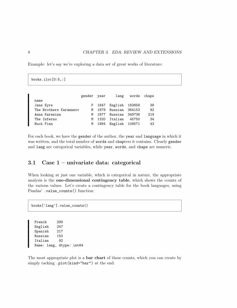
When looking at just one variable, which is categorical in nature, the appropriateanalysis is the one-dimensional contingency table, which shows the counts ofthe various values. Let’s create a contingency table for the book languages, usingPandas’ .value_counts() function:
books['lang'].value_counts()
French 299English 247Spanish 217Russian 150Italian 92Name: lang, dtype: int64
The most appropriate plot is a bar chart of these counts, which you can create bysimply tacking .plot(kind="bar") at the end:
3.2. CASE 2 – UNIVARIATE DATA: NUMERIC 9
books['lang'].value_counts().plot(kind="bar")
3.2 Case 2 – univariate data: numeric
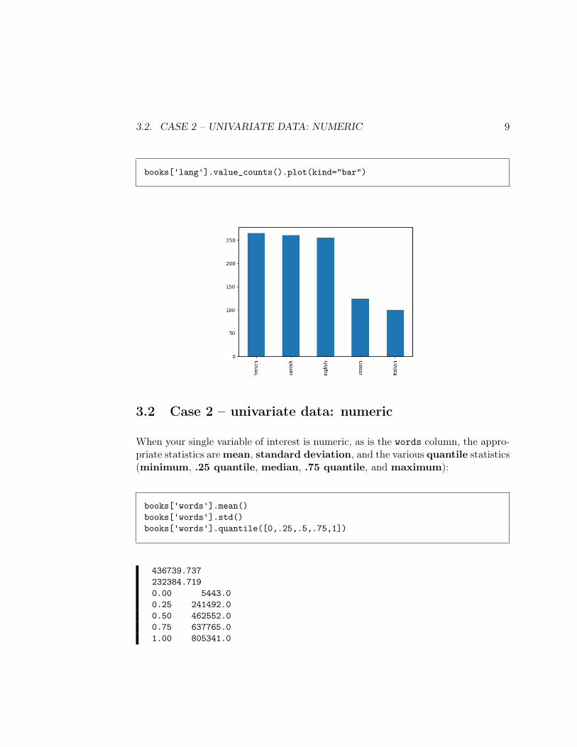
When your single variable of interest is numeric, as is the words column, the appro-priate statistics aremean, standard deviation, and the various quantile statistics(minimum, .25 quantile, median, .75 quantile, and maximum):
books['words'].mean()books['words'].std()books['words'].quantile([0,.25,.5,.75,1])
436739.737232384.7190.00 5443.00.25 241492.00.50 462552.00.75 637765.01.00 805341.0
10 CHAPTER 3. EDA: REVIEW AND EXTENSIONS
Translation: on average, the books in our data set each have about 436,739 words,and if distributed normally (which we haven’t checked yet) about 2
3rds of them arein the range 436,739 ± 232,384 (or between 204355 and 669123 words). The shortestbook has 5443 words, the longest a whopping 805,341, and half the books in thedata set have 462,552 or less. A quarter of the books have fewer than 241,492 words,and three quarters have fewer than 637,765.
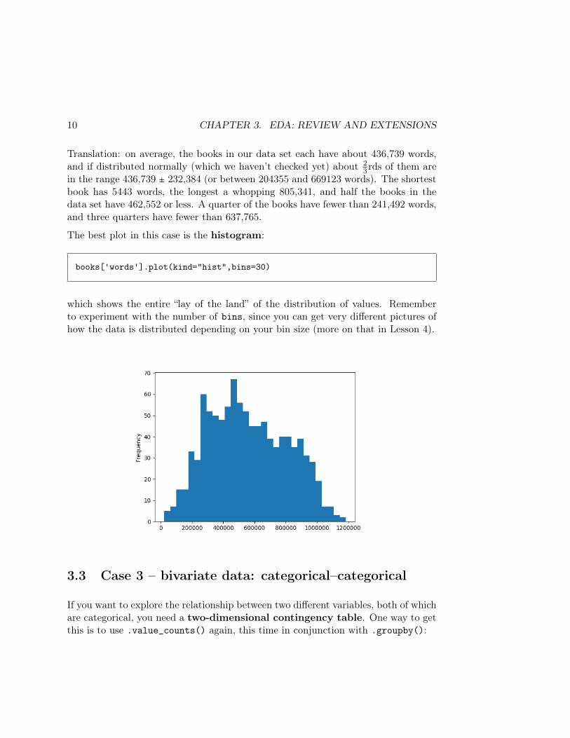
The best plot in this case is the histogram:
books['words'].plot(kind="hist",bins=30)
which shows the entire “lay of the land” of the distribution of values. Rememberto experiment with the number of bins, since you can get very different pictures ofhow the data is distributed depending on your bin size (more on that in Lesson 4).
3.3 Case 3 – bivariate data: categorical–categorical
If you want to explore the relationship between two different variables, both of whichare categorical, you need a two-dimensional contingency table. One way to getthis is to use .value_counts() again, this time in conjunction with .groupby():
3.3. CASE 3 – BIVARIATE DATA: CATEGORICAL–CATEGORICAL 11
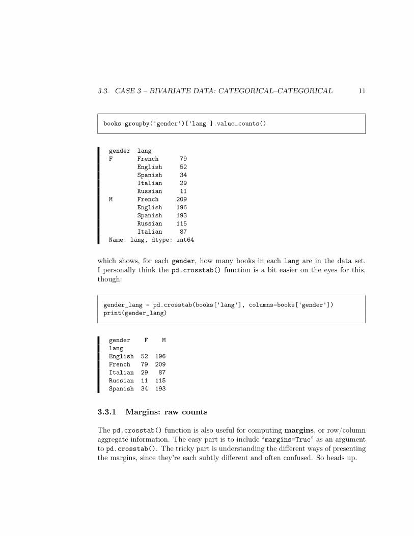
books.groupby('gender')['lang'].value_counts()
gender langF French 79
English 52Spanish 34Italian 29Russian 11
M French 209English 196Spanish 193Russian 115Italian 87
Name: lang, dtype: int64
which shows, for each gender, how many books in each lang are in the data set.I personally think the pd.crosstab() function is a bit easier on the eyes for this,though:
gender_lang = pd.crosstab(books['lang'], columns=books['gender'])print(gender_lang)
gender F MlangEnglish 52 196French 79 209Italian 29 87Russian 11 115Spanish 34 193
3.3.1 Margins: raw counts
The pd.crosstab() function is also useful for computing margins, or row/columnaggregate information. The easy part is to include “margins=True” as an argumentto pd.crosstab(). The tricky part is understanding the different ways of presentingthe margins, since they’re each subtly different and often confused. So heads up.
12 CHAPTER 3. EDA: REVIEW AND EXTENSIONS
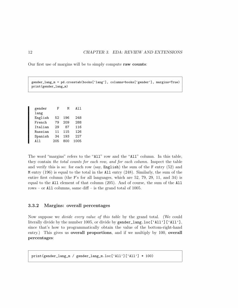
Our first use of margins will be to simply compute raw counts:
gender_lang_m = pd.crosstab(books['lang'], columns=books['gender'], margins=True)print(gender_lang_m)
gender F M AlllangEnglish 52 196 248French 79 209 288Italian 29 87 116Russian 11 115 126Spanish 34 193 227All 205 800 1005
The word “margins” refers to the “All” row and the “All” column. In this table,they contain the total counts for each row, and for each column. Inspect the tableand verify this is so: for each row (say, English) the sum of the F entry (52) andM entry (196) is equal to the total in the All entry (248). Similarly, the sum of theentire first column (the F’s for all languages, which are 52, 79, 29, 11, and 34) isequal to the All element of that column (205). And of course, the sum of the Allrows – or All columns, same diff – is the grand total of 1005.
3.3.2 Margins: overall percentages
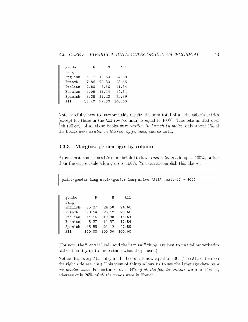
Now suppose we divide every value of this table by the grand total. (We couldliterally divide by the number 1005, or divide by gender_lang.loc['All']['All'],since that’s how to programmatically obtain the value of the bottom-right-handentry.) This gives us overall proportions, and if we multiply by 100, overallpercentages:
print(gender_lang_m / gender_lang_m.loc['All']['All'] * 100)
3.3. CASE 3 – BIVARIATE DATA: CATEGORICAL–CATEGORICAL 13
gender F M AlllangEnglish 5.17 19.50 24.68French 7.86 20.80 28.66Italian 2.89 8.66 11.54Russian 1.09 11.44 12.54Spanish 3.38 19.20 22.59All 20.40 79.60 100.00
Note carefully how to interpret this result: the sum total of all the table’s entries(except for those in the All row/column) is equal to 100%. This tells us that over15th (20.8%) of all these books were written in French by males, only about 1% ofthe books were written in Russian by females, and so forth.
3.3.3 Margins: percentages by column
By contrast, sometimes it’s more helpful to have each column add up to 100%, ratherthan the entire table adding up to 100%. You can accomplish this like so:
print(gender_lang_m.div(gender_lang_m.loc['All'],axis=1) * 100)
gender F M AlllangEnglish 25.37 24.50 24.68French 38.54 26.12 28.66Italian 14.15 10.88 11.54Russian 5.37 14.37 12.54Spanish 16.59 24.12 22.59All 100.00 100.00 100.00
(For now, the “.div()” call, and the “axis=1” thing, are best to just follow verbatimrather than trying to understand what they mean.)
Notice that every All entry at the bottom is now equal to 100. (The All entries onthe right side are not.) This view of things allows us to see the language data on aper-gender basis. For instance, over 38% of all the female authors wrote in French,whereas only 26% of all the males were in French.
14 CHAPTER 3. EDA: REVIEW AND EXTENSIONS
3.3.4 Margins: percentages by row
We can do the corresponding process on a by-row basis by changing our syntax tothis:
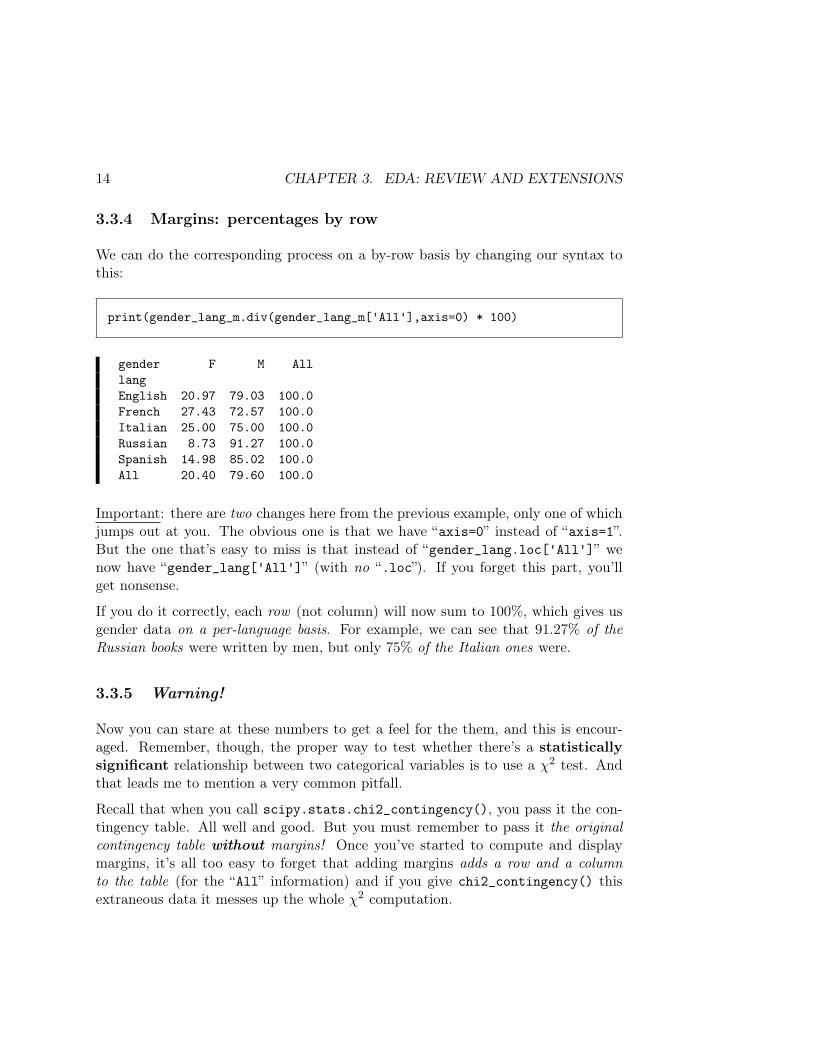
print(gender_lang_m.div(gender_lang_m['All'],axis=0) * 100)
gender F M AlllangEnglish 20.97 79.03 100.0French 27.43 72.57 100.0Italian 25.00 75.00 100.0Russian 8.73 91.27 100.0Spanish 14.98 85.02 100.0All 20.40 79.60 100.0
Important: there are two changes here from the previous example, only one of whichjumps out at you. The obvious one is that we have “axis=0” instead of “axis=1”.But the one that’s easy to miss is that instead of “gender_lang.loc['All']” wenow have “gender_lang['All']” (with no “.loc”). If you forget this part, you’llget nonsense.
If you do it correctly, each row (not column) will now sum to 100%, which gives usgender data on a per-language basis. For example, we can see that 91.27% of theRussian books were written by men, but only 75% of the Italian ones were.
3.3.5 Warning!
Now you can stare at these numbers to get a feel for the them, and this is encour-aged. Remember, though, the proper way to test whether there’s a statisticallysignificant relationship between two categorical variables is to use a χ2 test. Andthat leads me to mention a very common pitfall.
Recall that when you call scipy.stats.chi2_contingency(), you pass it the con-tingency table. All well and good. But you must remember to pass it the originalcontingency table without margins! Once you’ve started to compute and displaymargins, it’s all too easy to forget that adding margins adds a row and a columnto the table (for the “All” information) and if you give chi2_contingency() thisextraneous data it messes up the whole χ2 computation.
3.3. CASE 3 – BIVARIATE DATA: CATEGORICAL–CATEGORICAL 15
This is why in all the examples above, I deliberately changed my variable name forthe “margined” table from gender_lang to gender_lang_m (m stands for “margins.”)This is a nice visual reminder that I don’t want to pass this table as an argument toscipy.stats.chi2_contingency(): instead, I want to pass the vanilla, margin-lesstable gender_lang. I suggest you do the same.
3.3.6 Plotting multiple categorical variables
Finally, what about plots for multiple categorical variables? One choice that is(rarely) used for this is called a mosaic plot, but they’re so difficult to interpretthat I don’t really recommend them. A more common choice is a heat map, whichcan be both beautiful and effective.
This brings us to our next import statement, this time of the Seaborn graphicalvisualization library:
import seaborn as sns
Seaborn is a terrific package that is widely used by Pythonistas in the Data Sciencecommunity. It provides great support for several important kinds of plots that aren’timplemented (or are implemented suckily) in base Python and the other librarieswe’ve used. One such plot is the heat map, which you can create simply by passingthe Seaborn function a contingency table:
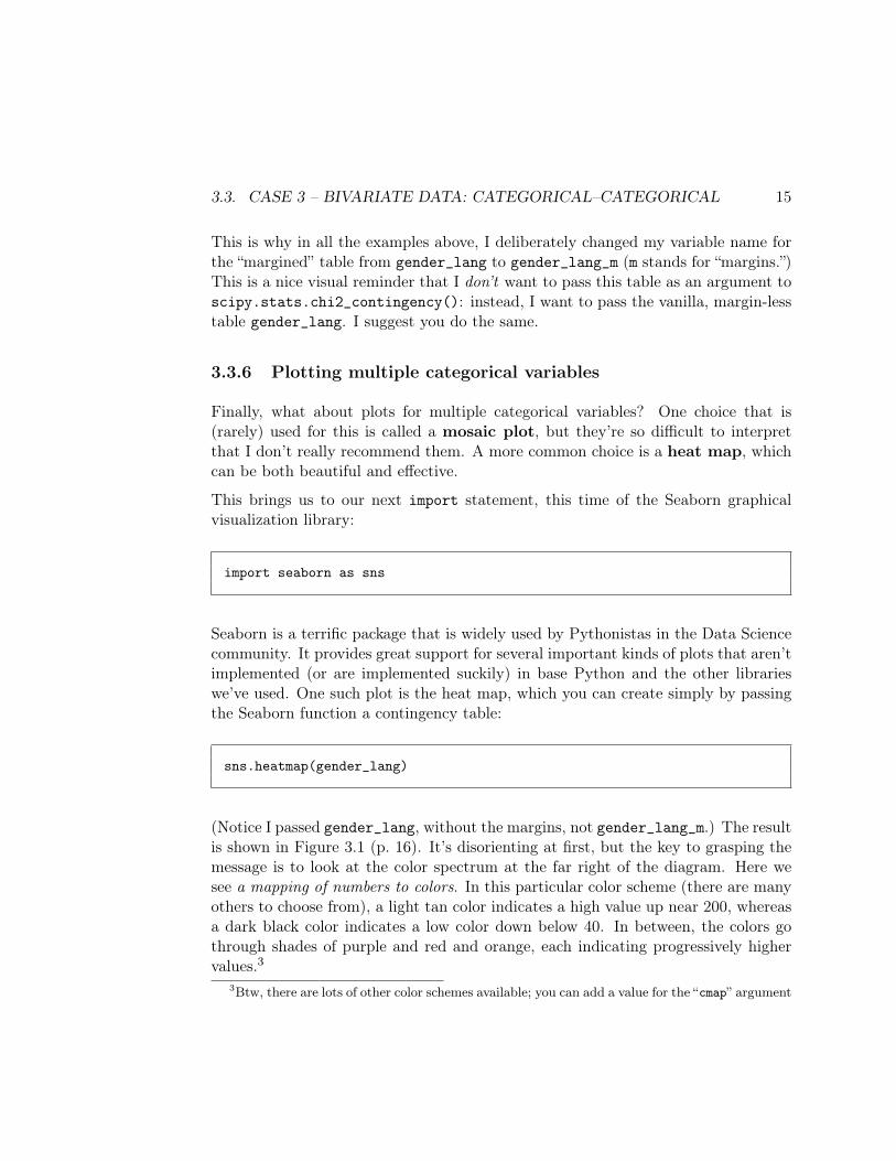
sns.heatmap(gender_lang)
(Notice I passed gender_lang, without the margins, not gender_lang_m.) The resultis shown in Figure 3.1 (p. 16). It’s disorienting at first, but the key to grasping themessage is to look at the color spectrum at the far right of the diagram. Here wesee a mapping of numbers to colors. In this particular color scheme (there are manyothers to choose from), a light tan color indicates a high value up near 200, whereasa dark black color indicates a low color down below 40. In between, the colors gothrough shades of purple and red and orange, each indicating progressively highervalues.3
3Btw, there are lots of other color schemes available; you can add a value for the “cmap” argument
16 CHAPTER 3. EDA: REVIEW AND EXTENSIONS
Figure 3.1: A heatmap of two categorical variables.
With that firmly in mind, look now at the main part of the image. You’ll seethere are two “axes,” one for gender and one for lang, just like in our gender_langcontingency table. And there are ten rectangles, one for each combination of valuesof those two categorical variables. In fact, you’ll see that this heat map is really justa pictorial representation of this table:
print(gender_lang)
lang English French Italian Russian SpanishgenderF 48 84 15 10 28M 205 197 82 129 207
A heat map is like looking at a table “from above.” Looking down on gender_lang,we see that the highest peaks are English and Spanish males, with French males
to your heatmap() call giving the color scheme’s name. I personally like the “seismic” one since itmakes it extremely clear which colors go with high vs. low values. You can get a list of the availableones by passing cmap="list" as the second argument to heatmap().
3.4. CASE 4 – BIVARIATE DATA: CATEGORICAL–NUMERICAL 17
close behind. French writers stand out among the females, who otherwise havelower quantities across the board. If you glance back and forth between the tableand the heat map, you’ll see that the heat map has brighter/more-light-tan rectanglesin exactly the places where the table has a high value, and darker rectangles for lowervalues. Sanity check that just as the numbers 84 (French females) and 82 (Italianmales) are almost identical in magnitude, so the two corresponding rectangles arealmost exactly the same shade of purple.
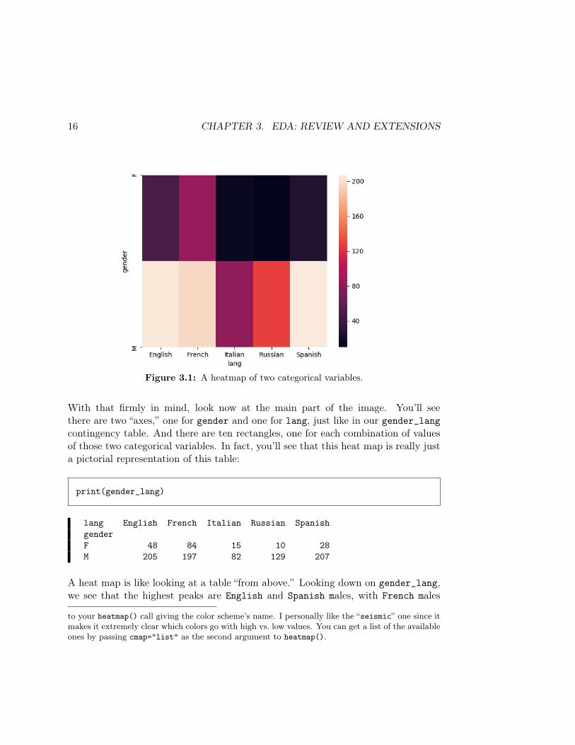
3.4 Case 4 – bivariate data: categorical–numerical
Suppose the two variables you’re interested in are one categorical and one numerical.For instance, maybe you’re wondering whether men or women have contributed morerecent literary works, or which languages tend to have longer longer books.
The right plot here is the box plot, since it allows you to easily compare groups.For the language vs. length example:
books.boxplot(column='words', by='lang')
Apparently Italian works are a bit shorter than the other languages (especiallyFrench), but it’s hard to tell whether there’s any truly significant difference be-
18 CHAPTER 3. EDA: REVIEW AND EXTENSIONS
tween the averages among the various groups. Recall that one way to find this outis a t-test for the difference of means, using scipy.stats.ttest_ind().
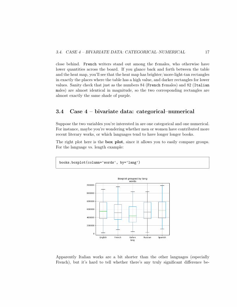
Here’s another way. You can use a notched boxplot:
books.boxplot(column='words', by='lang', notch=True)
As long as your group sizes are big enough, this visually indicates whether or notthere is a stat sig diff between groups, based on whether the notched areas overlap. Inthe above case, the English and French notches overlap, which means we can concludenothing reliable about English works being longer than French ones. However, theEnglish and Italian notches do not overlap, which means we should feel confidentabout declaring that on average, English works are longer than Italian ones.
3.5 Case 5 – bivariate data: numerical–numerical
Finally, the case where our two variables of interest are both numerical. The obviousplot type here is the scatter plot, which shows one point for each observation, with
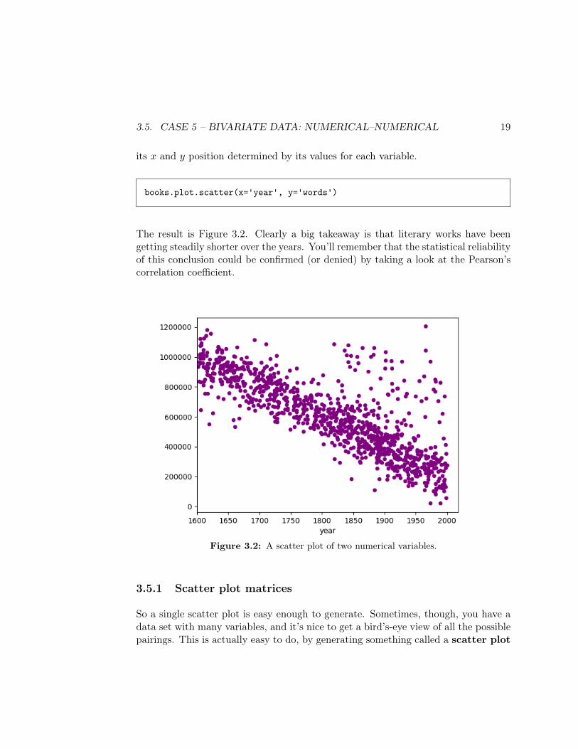
3.5. CASE 5 – BIVARIATE DATA: NUMERICAL–NUMERICAL 19
its x and y position determined by its values for each variable.
books.plot.scatter(x='year', y='words')
The result is Figure 3.2. Clearly a big takeaway is that literary works have beengetting steadily shorter over the years. You’ll remember that the statistical reliabilityof this conclusion could be confirmed (or denied) by taking a look at the Pearson’scorrelation coefficient.
Figure 3.2: A scatter plot of two numerical variables.
3.5.1 Scatter plot matrices
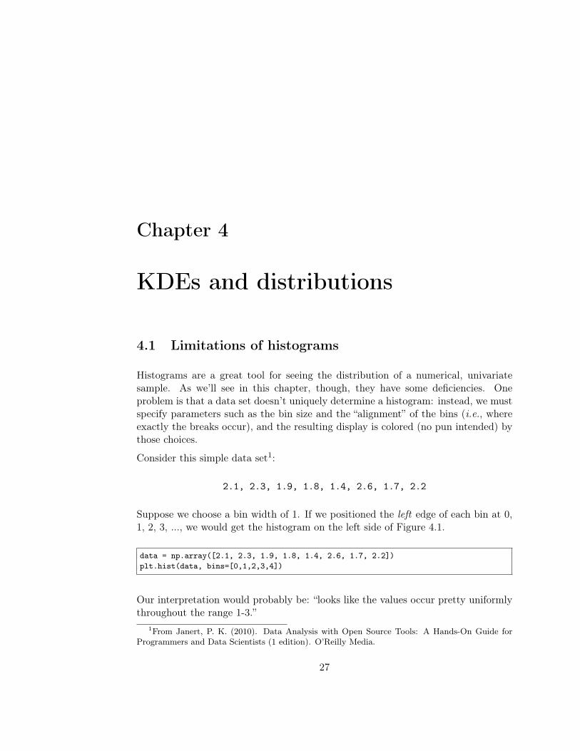
So a single scatter plot is easy enough to generate. Sometimes, though, you have adata set with many variables, and it’s nice to get a bird’s-eye view of all the possiblepairings. This is actually easy to do, by generating something called a scatter plot
20 CHAPTER 3. EDA: REVIEW AND EXTENSIONS
matrix. Scatter plot matrices look pretty “busy,” but that’s because there’s a lot ofinformation there, so let’s give them a go.
First, we’re going to make sure that only do the analysis on the numeric columns.I’ll create a new variable called books_num (for “books: numeric”) to hold just thenumeric variables:
books_num = books[['year','words','chaps']]
(Mind the double boxies!)
And now, the scatter plot matrix:
pd.plotting.scatter_matrix(books_num, alpha=1)
Don’t worry about the alpha part for the moment. The result of this command isin Figure 3.6 (end of the chapter, p. 25). As I said, it’s busy: almost too much tolook at. You’ll understand it when we go through the components, though.
First, notice that the overall figure is a 3×3 grid of smaller figures, and remember thatwe passed scatter_matrix() a DataFrame with three columns. Each little figure inthis grid depicts two of the DataFrame variables scatter-plotted against each other.
Take the left-middle grid square on the side for starters. This grid square is labeled“words” on the left and “year” on the bottom. It is therefore a scatter plot of wordsvs. year – exactly the same plot as in Figure 3.2 (take a moment to visually comparethese). And the upper-middle grid square also involves the same two variables,although this time it’s year vs. words; it contains the same information as themiddle-left, but the axes are reversed.
If you look at the lower-left and upper-right corners of the grid, you’ll see the result ofa chaps vs. year (and year vs. chaps) scatter plot. And the bottom-middle/right-middle squares plot words vs. chaps. Every pairwise combination of variables ispresent here (twice).
What about the upper-left to lower-right diagonal? These are grid squares whichshould ostensibly have a scatter plot of “year vs. year”, “words vs. words,” etc.Obviously that doesn’t make sense – a scatter plot of a variable against itself would
3.5. CASE 5 – BIVARIATE DATA: NUMERICAL–NUMERICAL 21
be useless (think out why this is true). So Pandas does us a favor and at least showsus something in these squares that’s useful. And the useful thing it shows is ourfavorite plot for univariate numeric data: the histogram. The upper-left corner isa histogram of the year variable by its lonesome, the middle square is a histogramof words, and the bottom-right is a histogram of chaps. This lets you see thedistribution of each of your variables in isolation, right alongside their correlationwith every other variable in the set. Neat.
Scatter plot matrices can be a powerful tool for EDA, so you can quickly identifywhat variable pairings might be of interest (i.e., might have associations). They’renot usually used for a final presentation of analysis results, since they really containtoo much information to be effective for that.
The trick to using a scatter plot matrix for EDA is to run your eyeballs over theplots, looking for straight-ish lines (as opposed to amorphous clouds). In the bookscase, all three of our variables are pretty strongly correlated, but you can see fromFigure 3.6 that the words-year association is the most pronounced. The year andchaps variables, although somewhat correlated with each other (you can see a down-ward trend in the bottom-left grid square) are more “noisy,” meaning that the linkbetween them isn’t as precise and predictive.
3.5.2 Transparency
The “alpha” parameter we skipped over earlier has to do with scatter plots thathave too many points to see clearly. You’ve probably had experience with scatterplots that look like a big blue cloud: there are so many points plotting next toand on top of each other that you can get any sense of where they’re most concen-trated. One solution to this is to add the marker="." parameter to your call todf.plot.scatter(): this tells Python to use a tiny dot instead of a larger circle.
There are limitations to this, though, especially for a truly huge number of points.A better solution is to use transparency, which is what the alpha parameter – ona scale of 0.0 to 1.0 – controls. When alpha is set all the way to 1.0, dots are plottedthe way you normally see them: all the way opaque. By reducing this number, eachdot gets plotted in a partially transparent way, so that only if lots of dots are plottedin the same general area will they become fully dark and visible.
22 CHAPTER 3. EDA: REVIEW AND EXTENSIONS
3.6 Case 6 – multivariate data
All of the previous examples involved either one or two variables. But what if youhave more than that? How do you plot them?
It gets tricky when you try and make sense of too many different entangled variablesat once. However, it can be done, in most circumstances, if you’re on your game interms of interpretation.
Let’s talk about the three-variable case in particular. First off, it helps a lot if atleast one of the variables is categorical. If all three are numeric, then you essentiallyneed a three-dimensional plot (such as a 3-d scatter plot, contour plot, or a wireframeplot) which are difficult to interpret. (Humans just aren’t very good, it turns out,at visualizing things in three dimensions. Most people, however, are quite good attwo dimensions.)
3.6.1 Grouped scatter plots
Suppose one of your variables is categorical and the other two numeric. In thiscase, sometimes a good option is to use a grouped scatter plot which depicts thecategorical values via different styles of point: different colors are the most common,but different shapes can be used too.
The Seaborn library lets us do this with its pairplot() function. It has a lot ofparameters, but see if you can make sense of it:
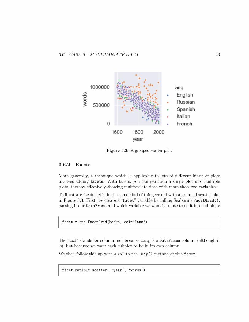
sns.pairplot(data=books, x_vars=["year"], y_vars=["words"], hue="lang")
The data=books parameter tells pairplot() which DataFrame we want to use. Thex_vars and y_vars parameters are lists, notice (in boxies) of what we want on thex and y axis of our plot. (I almost always use just one-element lists.) Finally, thehue="lang" bit tells Seaborn which variable we want the color – or “hue” – to bebased on.
The result is in Figure 3.3. From it, we can see that (in our fictitious data set)although books seem to have been getting shorter over time, this isn’t true of theRussian books, which are staying more a constant size. This observation wasn’treally possible without involving all three variables in the plot, which is why agrouped scatter plot was valuable here.
3.6. CASE 6 – MULTIVARIATE DATA 23
Figure 3.3: A grouped scatter plot.
3.6.2 Facets
More generally, a technique which is applicable to lots of different kinds of plotsinvolves adding facets. With facets, you can partition a single plot into multipleplots, thereby effectively showing multivariate data with more than two variables.
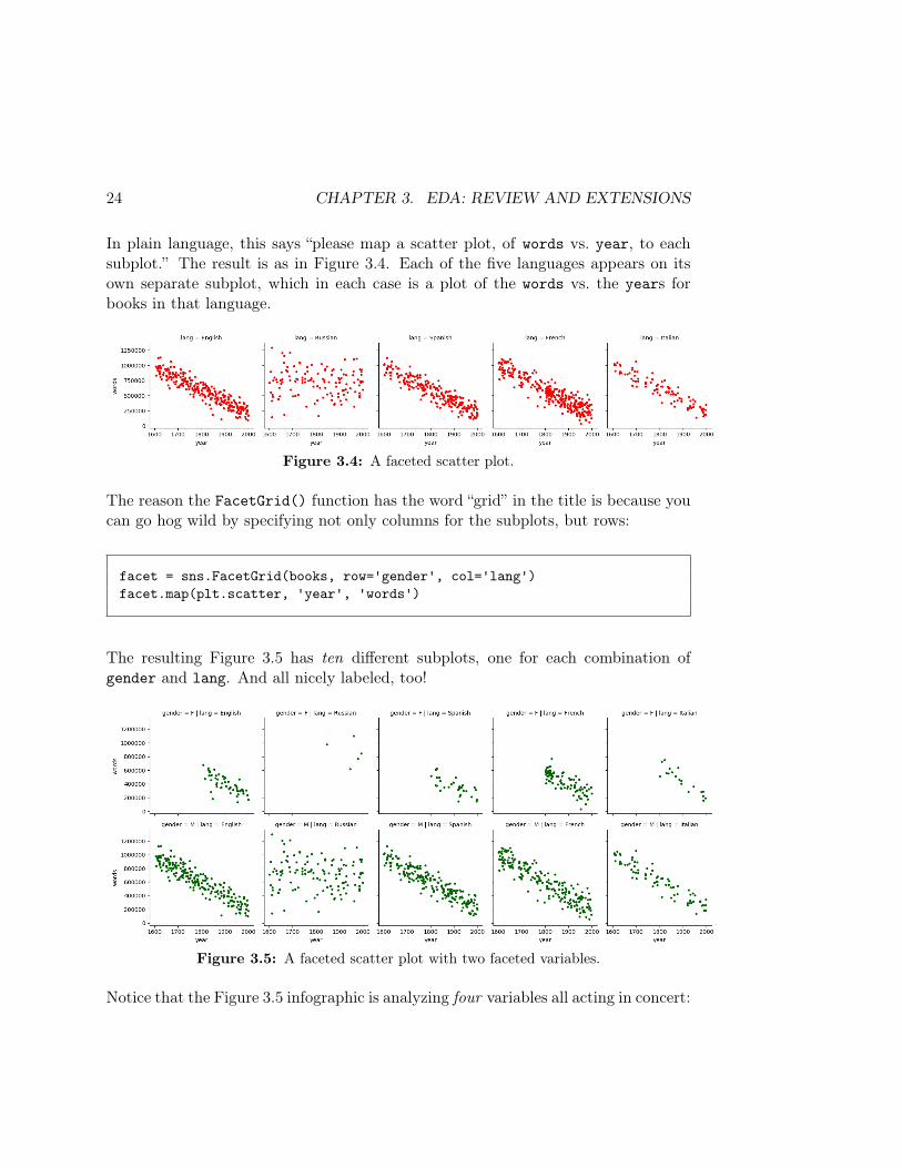
To illustrate facets, let’s do the same kind of thing we did with a grouped scatter plotin Figure 3.3. First, we create a “facet” variable by calling Seaborn’s FacetGrid(),passing it our DataFrame and which variable we want it to use to split into subplots:
facet = sns.FacetGrid(books, col='lang')
The “col” stands for column, not because lang is a DataFrame column (although itis), but because we want each subplot to be in its own column.
We then follow this up with a call to the .map() method of this facet:
facet.map(plt.scatter, 'year', 'words')
24 CHAPTER 3. EDA: REVIEW AND EXTENSIONS
In plain language, this says “please map a scatter plot, of words vs. year, to eachsubplot.” The result is as in Figure 3.4. Each of the five languages appears on itsown separate subplot, which in each case is a plot of the words vs. the years forbooks in that language.
Figure 3.4: A faceted scatter plot.
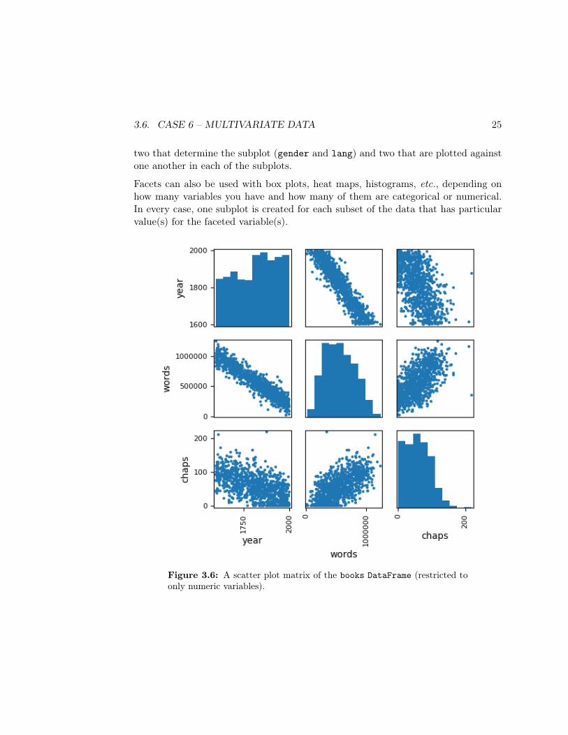
The reason the FacetGrid() function has the word “grid” in the title is because youcan go hog wild by specifying not only columns for the subplots, but rows:
facet = sns.FacetGrid(books, row='gender', col='lang')facet.map(plt.scatter, 'year', 'words')
The resulting Figure 3.5 has ten different subplots, one for each combination ofgender and lang. And all nicely labeled, too!
Figure 3.5: A faceted scatter plot with two faceted variables.
Notice that the Figure 3.5 infographic is analyzing four variables all acting in concert:
3.6. CASE 6 – MULTIVARIATE DATA 25
two that determine the subplot (gender and lang) and two that are plotted againstone another in each of the subplots.
Facets can also be used with box plots, heat maps, histograms, etc., depending onhow many variables you have and how many of them are categorical or numerical.In every case, one subplot is created for each subset of the data that has particularvalue(s) for the faceted variable(s).
Figure 3.6: A scatter plot matrix of the books DataFrame (restricted toonly numeric variables).

26 CHAPTER 3. EDA: REVIEW AND EXTENSIONS
Chapter 4
KDEs and distributions
4.1 Limitations of histograms
Histograms are a great tool for seeing the distribution of a numerical, univariatesample. As we’ll see in this chapter, though, they have some deficiencies. Oneproblem is that a data set doesn’t uniquely determine a histogram: instead, we mustspecify parameters such as the bin size and the “alignment” of the bins (i.e., whereexactly the breaks occur), and the resulting display is colored (no pun intended) bythose choices.
Consider this simple data set1:
2.1, 2.3, 1.9, 1.8, 1.4, 2.6, 1.7, 2.2
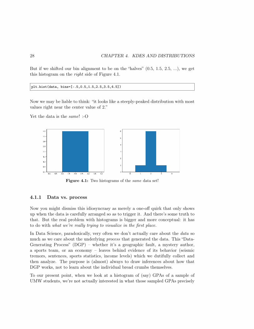
Suppose we choose a bin width of 1. If we positioned the left edge of each bin at 0,1, 2, 3, ..., we would get the histogram on the left side of Figure 4.1.
data = np.array([2.1, 2.3, 1.9, 1.8, 1.4, 2.6, 1.7, 2.2])plt.hist(data, bins=[0,1,2,3,4])
Our interpretation would probably be: “looks like the values occur pretty uniformlythroughout the range 1-3.”
1From Janert, P. K. (2010). Data Analysis with Open Source Tools: A Hands-On Guide forProgrammers and Data Scientists (1 edition). O’Reilly Media.
27
28 CHAPTER 4. KDES AND DISTRIBUTIONS
But if we shifted our bin alignment to be on the “halves” (0.5, 1.5, 2.5, ...), we getthis histogram on the right side of Figure 4.1.
plt.hist(data, bins=[-.5,0.5,1.5,2.5,3.5,4.5])
Now we may be liable to think: “it looks like a steeply-peaked distribution with mostvalues right near the center value of 2.”
Yet the data is the same! :-O
Figure 4.1: Two histograms of the same data set!
4.1.1 Data vs. process
Now you might dismiss this idiosyncrasy as merely a one-off quirk that only showsup when the data is carefully arranged so as to trigger it. And there’s some truth tothat. But the real problem with histograms is bigger and more conceptual: it hasto do with what we’re really trying to visualize in the first place.
In Data Science, paradoxically, very often we don’t actually care about the data somuch as we care about the underlying process that generated the data. This “Data-Generating Process” (DGP) – whether it’s a geographic fault, a mystery author,a sports team, or an economy – leaves behind evidence of its behavior (seismictremors, sentences, sports statistics, income levels) which we dutifully collect andthen analyze. The purpose is (almost) always to draw inferences about how thatDGP works, not to learn about the individual bread crumbs themselves.
To our present point, when we look at a histogram of (say) GPAs of a sample ofUMW students, we’re not actually interested in what those sampled GPAs precisely

4.1. LIMITATIONS OF HISTOGRAMS 29
are, strange as that may sound. We’re instead interested in what they tell us aboutUMW student GPAs in general. We want to draw conclusions about the populationby looking at the sample.2
Let’s say we hung out at the fountain on campus walk, and asked unsuspectingvolunteers to let us measure how tall they were. The histogram of the result mightlook like Figure 4.2.
Figure 4.2: A histogram of a sample of UMW student heights.
The histogram is using “1 inch” as a bin size. By inspecting it, we can see thatthe shortest person in our sample was 62 inches tall (or 5-foot-2), the tallest was78 inches (6-foot-6), and the most common height was 65 inches (5-foot-5), amongother things.
But consider this. Our sample had five students who were 5-foot-5, three who were5-foot-7, but none who were 5-foot-6. This is perfectly possible with samples, ofcourse – you’re only getting a random set of students, and there are bound to belittle quirks like this. But on what basis do we label it a “quirk?”
If you’re like me, your inclination is to say, “yeah, okay, in this particular sample wehappened to be missing any 5-foot-6 people, but it’s not like we’re going to draw anygrand conclusions from that fact. We’re not going to deduce that ‘UMW studentsare almost never 5-foot-6 – they’re almost always either a tad shorter or a tad tallerthan that.’ Such a conclusion would be ludicrous!”
I sympathize and agree. But really, we only know this because we bring background
2If you haven’t encountered these words before, the “population” is the entire set of relevantobjects of study that are out there in the world, most of which we’ll never get a direct measurementfor because they’re just too numerous. The “sample” is the small subset of the population that wedid get a measurement for. A classic example is political polling: we don’t really care that muchhow the 2,000 people in our telephone poll are going to vote for President; what we care about ishow the country as a whole will vote for President. So we assume that the sample is reflective ofthe population, and reason accordingly using statistical tests as our guide.
30 CHAPTER 4. KDES AND DISTRIBUTIONS
knowledge to the problem. We’ve all seen lots of people of various heights, andwe know something about how genetics and nutrition and other factors play intoa person’s height, and it just screams “wrong!” to think that there’s some magic“missing height” out there, right in the middle of otherwise quite common heights,that for some reason is virtually unattainable.
Think about it, though: if we were studying an unknown phenomenon, about whichwe had no previous experience, it would be pretty audacious for us to infer theexistence of lots of “66’s” which we never actually observed, simply on the groundsthat there were lots of 65’s and 67’s in our sample. My point is not to forsake yourbackground knowledge: quite the opposite, you should make good use of it! Mypoint is only to draw attention to the justification we’re using to infer the existenceof plenty of 66-inch-tall (5-foot-6) people in the population, even though we neveractually observed any.
So my main point is this. Although we look at a histogram like this one in orderto see “the lay of the land” – to see which values of the numeric variable are morefrequent, and which are less frequent – if we’re smart we can’t help but recognize twodifferent aspects to the figure. Some of the histogram’s features are generalizable,and indicative of what the population probably looks like: we’d (correctly) gatherthat many or most UMW students were between 60 and 80 inches tall, with themajority in the 65-ish to 75-ish range. But some of its features we’d (correctly)characterize as mere artifacts of this particular sample, like the weird fact that wehappen to have several 65-inchers and 67-inchers but no 66-inchers.
What we’d really like is a plot that obscures (or “smooths over”) the second kind ofthing, while still revealing the first kind of thing. In other words, we’d like a plotthat shows us the features of the data that are probably generalizable, while hidingthe individual nooks and crannies. Such a plot is coming right up in Section 4.2,below.
Just to finish venting, I’ll list yet another couple of problems with histograms:
• They inherently lose information, since by definition data points with specific,precise values are munged into “the nearest bin.”
• They don’t handle outliers very well. A single outlier way outside the normalrange forces us to either (a) include a lot of empty cells in the middle, or (b)choose an unreasonably wide bin width that doesn’t work for the majority ofpoints.
4.2. KERNEL DENSITY ESTIMATES (KDES) 31
4.2 Kernel Density Estimates (KDEs)
One solution to these unfortunate histogram problems is a more advanced techniquecalled a Kernel Density Estimate, or a KDE.
A “density” (or “probability density”) is defined as a single, strongly-peakedfunction that has an area under its curve of exactly 1. It indicates how likely certainvalues of a numeric variable are to occur: values for which the density is high are moreprobable. Probability densities play a starring role in understanding the tendenciesof both real and randomly-generated data.
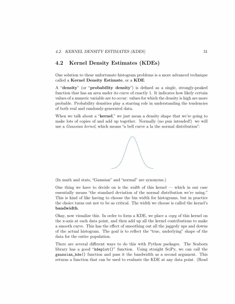
When we talk about a “kernel,” we just mean a density shape that we’re going tomake lots of copies of and add up together. Normally (no pun intended!) we willuse a Gaussian kernel, which means “a bell curve a la the normal distribution”:
(In math and stats, “Gaussian” and “normal” are synonyms.)
One thing we have to decide on is the width of this kernel — which in our caseessentially means “the standard deviation of the normal distribution we’re using.”This is kind of like having to choose the bin width for histograms, but in practicethe choice turns out not to be as critical. The width we choose is called the kernel’sbandwidth.
Okay, now visualize this. In order to form a KDE, we place a copy of this kernel onthe x-axis at each data point, and then add up all the kernel contributions to makea smooth curve. This has the effect of smoothing out all the jaggedy ups and downsof the actual histogram. The goal is to reflect the “true, underlying” shape of thedata for the entire population.
There are several different ways to do this with Python packages. The Seabornlibrary has a good “kdeplot()” function. Using straight SciPy, we can call thegaussian_kde() function and pass it the bandwidth as a second argument. Thisreturns a function that can be used to evaluate the KDE at any data point. (Read
32 CHAPTER 4. KDES AND DISTRIBUTIONS
that sentence again: a function that returns a function? It can be confusing.) Then,we can plot it by creating a range of values to evaluate the KDE at, and plottingthose values against the KDE’s values.
It’s easier than it sounds when you run the actual code:
import scipy.statskde = scipy.stats.gaussian_kde(data,bw_method=.5)x_vals = np.arange(0,10,.1)plt.plot(x_vals,kde(x_vals))
The “data” argument to gaussian_kde() is the array you’re working with, and“bw_method” (a dumb name) gives the kernel’s bandwidth. (x_vals is an array ofthe x coordinates you want to plot the KDE for, and should cover the range.)
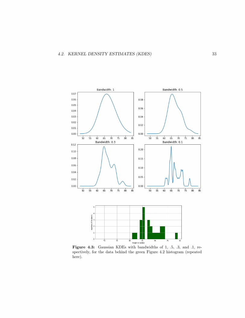
Now stare at the four plots in Figure 4.3. These are all KDEs for the green Fig-ure 4.2 histogram, but each one uses a different bandwidth. Choosing a larger kernelbandwidth effectively smooths out the KDE more, spreading the contribution ofeach point quite a bit farther from its original position. Choosing a narrower kernelfocuses each data point’s contribution more precisely at its actual value, making theplot choppier.
In practice, it’s another parameter to play with. If the data follows a smooth distri-bution, you can use a wider bandwidth which will “blur” each data point more andgive a more intuitive view of the general distribution characteristics. If the distribu-tion is more wiggly, though, you need a narrower bandwidth to see all the relevantdetail. Which of the Figure 4.3 bandwidths do you think best captures the “true”distribution of the points in the histogram?
Like most things in Data Science (and in life), there’s no one true hard-and-fastright answer. There is instead a range of points of view, many of which may beilluminating.
4.2. KERNEL DENSITY ESTIMATES (KDES) 33
Figure 4.3: Gaussian KDEs with bandwidths of 1, .5, .3, and .1, re-spectively, for the data behind the green Figure 4.2 histogram (repeatedhere).

34 CHAPTER 4. KDES AND DISTRIBUTIONS
Chapter 5
Random value generation
One very useful skill is the ability to quickly create synthetic (artificial; generatedby your own code and random-number generators) data sets that have certain prop-erties. Sometimes we use such data to sanity check the results of our code with“idealistic” (simplified and known) inputs. Sometimes we use synthetic data as abaseline with which to compare real-world data sets that we suspect have similarcharacteristics. And sometimes we simply don’t have access to relevant real-worlddata but we need inputs into some simulation process.
This chapter and the next will teach you the essentials of this process.
5.1 Setting the seed
Generating random numbers (and other random values) is an activity we per-form surprisingly often in Data Science. “Random numbers,” as it turns out, aren’ttruly random, because the programming language uses a bizarre – but deterministicand repeatable – algorithm to come up with them. This is nice, because we canguarantee that each time we run a program we’ll get the same sequence of randomnumbers. We do this by setting the random number generator’s seed to a particularvalue. It helps us in debugging our code, because otherwise, a shifting sequence ofnumbers would be a frustrating moving target.
NumPy provides a really nice library for all this, all of which is in the namespacenp.random. To set the random number generator’s seed, all you do is call its seed()function and pass it your favorite number:
35
36 CHAPTER 5. RANDOM VALUE GENERATION
np.random.seed(13)
(I chose 13 because that was my little league baseball jersey number as a kid.) Irecommend you put this line of code (with any positive integer you like) near thetop of any .py file in which you do random value generation. If you want a differentsequence of random values later, you can either change the integer to somethingdifferent, or comment out the line altogether by prepending a “#” character.
5.2 Generating random numbers
To actually generate a random number value, you first have to figure out whatdistribution you want it to come from. Think of a distribution as a KDE from lastchapter: it’s a way of specifying which values are more common and which are less.The two standard distributions we’ll use most are:
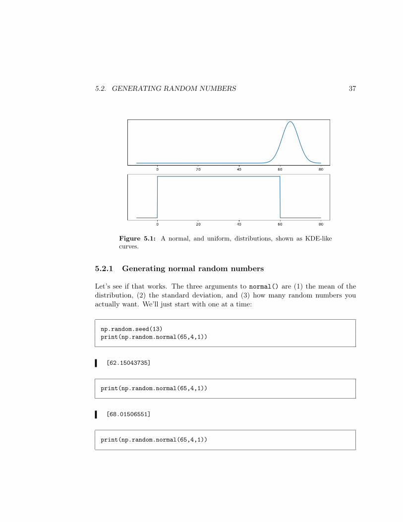
• Normal/Gaussian. As mentioned on p. 31, a “normal” distribution is astandard bell curve with a central mean and a standard deviation thatdetermines how wide the curve is. The Gaussian distribution with mean 65and standard deviation 4 (perhaps representing the speed of various cars onthe highway) is shown on the top half of Figure 5.1.
• Uniform. A uniform distribution specifies that every value within a certainrange (a min and a max) should be equally likely. An example for a min of 0and a max of 60 (perhaps representing the minute past the hour that variousbabies in a maternity ward were born) is shown on the bottom of the samefigure.
If you’re interpreting Figure 5.1 correctly, you can see that if we generate randomnumbers from the top distribution, the majority will be between 60-ish and 70-ishmiles per hour, with many near 65 mph and almost never anything lower than 50or greater than 80. If we generate them from the bottom distribution, however, thebabies’ birth minutes will all be between 0 and 60 but with no particular tendencytowards any value in that range more than any other.
5.2. GENERATING RANDOM NUMBERS 37
Figure 5.1: A normal, and uniform, distributions, shown as KDE-likecurves.
5.2.1 Generating normal random numbers
Let’s see if that works. The three arguments to normal() are (1) the mean of thedistribution, (2) the standard deviation, and (3) how many random numbers youactually want. We’ll just start with one at a time:
np.random.seed(13)print(np.random.normal(65,4,1))
[62.15043735]
print(np.random.normal(65,4,1))
[68.01506551]
print(np.random.normal(65,4,1))

38 CHAPTER 5. RANDOM VALUE GENERATION
[64.82198769]
print(np.random.normal(65,4,1))
[66.80724935]
True to form. We keep getting numbers quite close to 65 mph, with a little bitof variation. Note that if we reset the seed to our original value, our next call tonormal() gives an identical result to the first one, above:
np.random.seed(13)print(np.random.normal(65,4,1))
[62.15043735]
And of course it’s easy to generate many speeds at a time (say, eight):
print(np.random.normal(65,4,8))
[60.81849148 61.8440439 59.95357622 67.25138714 64.02669499 68.6549628266.26940369 65.50921312]
Notice that each time we call normal(), we get an array back (even if it has only asingle value).
By the way, we should sure expect that if we generate many random speeds, andtake their average, it should be pretty darn close to 65 mph:
print(np.random.normal(65,4,1000).mean())
65.01577962051226
Yep.

5.2. GENERATING RANDOM NUMBERS 39
5.2.2 Generating uniform random numbers
Uniform random values can be generated the same way, but with the uniform()function, which takes as its arguments (1) the min, (2) the max, and (3) the numberof desired values:
np.random.seed(13)print(np.random.uniform(0,60,1))
[46.66214463]
This synthetic baby was born at 46.6 minutes past the hour. What about the nextone?
print(np.random.uniform(0,60,1))
[14.2524732]
And the next one?
print(np.random.uniform(0,60,1))
[49.45671196]
And the next eleven?
print(np.random.uniform(0,60,11))
[57.94495188 58.35606683 27.20695485 36.54254777 46.53159088 38.4968006943.32109377 2.10219145 17.90696825 3.51074951 51.42365656]
Of course, resetting the seed gives us our original sequence back:
40 CHAPTER 5. RANDOM VALUE GENERATION
print(np.random.uniform(0,60,5))
[46.66214463 14.2524732 49.45671196 57.94495188 58.35606683]
(Check those numbers with the previous ones to convince yourself.)
And finally, let’s sanity check the average:
print(np.random.uniform(0,60,1000).mean())
29.2049841447296
Yay. “On average,” our thousand synthetic babies are born at about half past thehour, which is what we’d expect.
5.3 Generating categorical random values
NumPy also provides a way to generate categorical values with certain frequencies,through its choice() function. You give it an array of the possible values, and itchooses one:
np.random.seed(13)np.random.choice(['Steelers','Redskins','Giants'])
'Giants'
np.random.choice(['Steelers','Redskins','Giants'])
'Steelers'
(As always, resetting the seed will restart the same sequence of random team choicesfrom the beginning.)
5.3. GENERATING CATEGORICAL RANDOM VALUES 41
Other useful arguments to choice() include:
• size – the number of elements you want in the resulting array.• replace – if False, the elements will be drawn from your list without replace-ment (meaning once a value is chosen, it will not be chosen again). This isoften useful.
• p – a list of probabilities (in the range 0 to 1) specifying how likely each elementin the list is to be chosen. (Note these must sum to 1; and NumPy, stupidly,will not normalize it for you.)
To illustrate:
print(np.random.choice(['Steelers','Redskins','Giants'], size=14, p=[.3,.6,.1]))
['Steelers' 'Redskins' 'Redskins' 'Redskins' 'Giants' 'Steelers' 'Steelers''Redskins' 'Redskins' 'Steelers' 'Redskins' 'Giants' 'Steelers' 'Redskins']
We asked for 14 random teams, and we told it to give us Steelers 30% of the time,Redskins 60%, and Giants only 10%. I think you’ll agree that the resulting arraywas pretty faithful to that. (Of course, you’ll get a different random array eachtime.)
Finally, let’s test a large random array and verify that the requested percentages areapproximately correct:
pd.Series(np.random.choice(['Steelers','Redskins','Giants'], size=1000,p=[.3,.6,.1])).value_counts()
Redskins 584Steelers 319Giants 97dtype: int64
Our friend the .value_counts() method confirms that it pretty much checks out.

42 CHAPTER 5. RANDOM VALUE GENERATION
Chapter 6
Synthetic data sets
Last chapter we learned the basic skills for generating arrays of random values –both numeric and categorical. Now let’s apply these to creating synthetic datasets that contain more than one variable.
We’ll concentrate here on the two-variable case, but the idea is easily extended tothree or more. The important new question, now that we know how to generate singlearrays in isolation, is: to what degree do we want our pair of synthetic variables tobe correlated, and how do we make them so?
6.1 Two numeric variables
Let’s start with the case of two numeric variables. As you know from DATA 101,there can be an association, or not, between them. The Pearson’s correlation co-efficient measures this: if its p-value is less than our α setting (typically .05), thenwe deem there to be a meaningful association, and the r value tells us whether thecorrelation is positive or negative.
6.1.1 Uncorrelated numeric variables
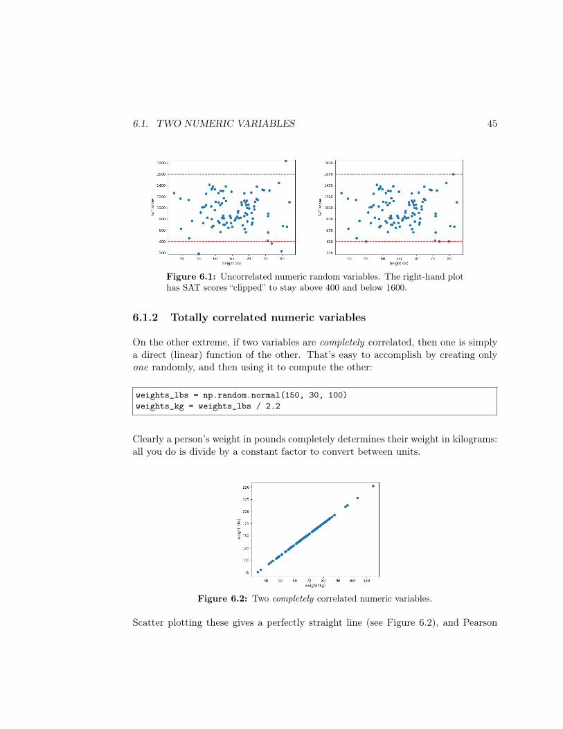
On one extreme, let’s say you wanted to create a data set with two completelyuncorrelated numeric variables – like the heights (in inches) and the SAT scores of agroup of college applicants. Then you’d just generate two arrays, one at a time:
43
44 CHAPTER 6. SYNTHETIC DATA SETS
heights = np.random.normal(65, 8, 100)sat_scores = np.random.normal(1000, 300, 100)
How did I choose those particular means and standard deviations? I made them up.And I played with them until they looked reasonable.
Scatter plotting these (see left side of Figure 6.1, p. 45), and running a Pearsoncorrelation, should reveal they are independent of each other:
plt.scatter(heights, sat_scores)plt.xlabel("height (in)")plt.ylabel("SAT score")print(scipy.stats.pearsonr(heights,sat_scores))
(-0.025053425275878834, 0.8045806864145338)
A p-value of .8046 says “nope, not significantly correlated.” And of course there’sno reason why they should be: we just generated two different random arrays, fordifferent ranges.
Incidentally, you might be troubled by the fact that a few of our SAT scores areoutside the legal range:
print("min: , max: ".format(sat_scores.min(), sat_scores.max()))
min: 304.29, max: 1618.35
Real SAT scores are supposed to range between 400 and 1600, the Internet tells me.We could fix this by using the NumPy .clip() method, which imposes a high andlow cutoff as its arguments:
sat_scores = sat_scores.clip(400,1600)print("min: , max: ".format(sat_scores.min(), sat_scores.max()))
min: 400.0 max: 1600.0
The revised scatter plot is shown on the right side of Figure 6.1.
6.1. TWO NUMERIC VARIABLES 45
Figure 6.1: Uncorrelated numeric random variables. The right-hand plothas SAT scores “clipped” to stay above 400 and below 1600.
6.1.2 Totally correlated numeric variables
On the other extreme, if two variables are completely correlated, then one is simplya direct (linear) function of the other. That’s easy to accomplish by creating onlyone randomly, and then using it to compute the other:
weights_lbs = np.random.normal(150, 30, 100)weights_kg = weights_lbs / 2.2
Clearly a person’s weight in pounds completely determines their weight in kilograms:all you do is divide by a constant factor to convert between units.
Figure 6.2: Two completely correlated numeric variables.
Scatter plotting these gives a perfectly straight line (see Figure 6.2), and Pearson
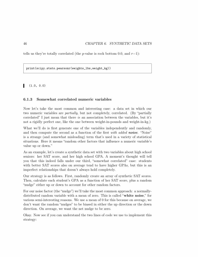
46 CHAPTER 6. SYNTHETIC DATA SETS
tells us they’re totally correlated (the p-value is rock bottom 0.0, and r=1):
print(scipy.stats.pearsonr(weights_lbs,weight_kg))
(1.0, 0.0)
6.1.3 Somewhat correlated numeric variables
Now let’s take the most common and interesting case: a data set in which ourtwo numeric variables are partially, but not completely, correlated. (By “partiallycorrelated” I just mean that there is an association between the variables, but it’snot a rigidly perfect one, like the one between weight-in-pounds and weight-in-kg.)
What we’ll do is first generate one of the variables independently and randomly,and then compute the second as a function of the first with added noise. “Noise”is a strange (and somewhat misleading) term that’s used in a variety of statisticalsituations. Here it means “random other factors that influence a numeric variable’svalue up or down.”
As an example, let’s create a synthetic data set with two variables about high schoolseniors: her SAT score, and her high school GPA. A moment’s thought will tellyou that this indeed falls under our third, “somewhat correlated” case: studentswith better SAT scores also on average tend to have higher GPAs, but this is animperfect relationships that doesn’t always hold completely.
Our strategy is as follows. First, randomly create an array of synthetic SAT scores.Then, calculate each student’s GPA as a function of her SAT score, plus a random“nudge” either up or down to account for other random factors.
For our noise factor (the “nudge”) we’ll take the most common approach: a normally-distributed random variable with a mean of zero. This is called “white noise,” forvarious semi-interesting reasons. We use a mean of 0 for this because on average, wedon’t want the random “nudges” to be biased in either the up direction or the downdirection. On average, we want the net nudge to be zero.
Okay. Now see if you can understand the two lines of code we use to implement thisstrategy:
6.1. TWO NUMERIC VARIABLES 47
sat_scores = np.random.normal(1000, 300, 100)gpas = sat_scores * (2.5 / 1400) + np.random.normal(0, 1, 100)
The sat_scores line is the same one we had before. We’re then modeling the highschool GPA of a student as somewhat correlated with his SAT score. The “ 2.5
1400 ”multiplier is an attempt to quantify the relationship between the two variables,which of course are measured on completely different scales. We’re guestimatingthat a 1400 on the SAT would kinda sorta equate to about a 2.5 GPA. Notice thatthe second component of gpas is a normally distributed noise component with zeromean. (Why a standard deviation of 1? Just a guess. We can tweak it later if wedon’t like the results.)
Now this is a good first attempt. Notice two assumptions/limitations, though:
1. We’re assuming that the relationship between the two variables is linear —namely, that “the first value times a constant” is a good estimate for the secondvalue. In reality, of course, the relationship is often more complex: it might bebetter modeled as the square of the first value, for instance, or “e to the” firstvalue, or the cube root of the first value, etc.
2. We’re assuming that the “zero point” for the two variables coincide: in otherwords, a zero for one value would on average roughly correspond to a zero forthe other. In the above case, we’re assuming that a person who got a 0 onthe SAT would have, on average, a 0 GPA. If this isn’t appropriate, we shouldadd an intercept term (a constant) to our generative formula. This takesour generated second variable and just shifts it, wholesale, to a new region ofthe number range.
We’ll stick with the first assumption (linearity) for the moment, but be more flexibleabout the second. If we include an intercept term, our formula for generating thedependent variable boils down to:
dep_variable = m ⋅ indep_variable + b + np.random.normal(0, σ, n)
which is the familiar equation for a line (y = mx + b) with a noise term added in(with σ standard deviation). Now we have to estimate decent values for m, b, andσ. How should we do this?
48 CHAPTER 6. SYNTHETIC DATA SETS
My preferred approach is to identify a “high-ish” value of the first variable, andestimate a (roughly, on average) corresponding value of the second variable. Thendo the same for a “low-ish” value. Then, plug those into the y =mx + b formula andsolve for the slope and intercept.
Example: let’s generate a synthetic data set of two variables: the number of hoursa person has practiced playing the Dance Dance Revolution (DDR) videogame intheir lifetime, and the score they achieved in a DDR contest (on the song Kakumei).Clearly, there should be some (positive) relationship between the two quantities:when num_hrs is high, you’d expect score to also be high. If you’re familiar withthe game, though, you know that the zero points for these variables do not coincide:even if you’ve never ever played at all, you’ll still manage to stumble through thesong, learn how to play as you go, and get a positive score.
Based on my knowledge of the game (which I suck at, by the way), I estimate:
• A decent player who has practiced for 100 hours might get a score of around60 million.
• A sucky-ish player who has practiced for only 10 hours might get a score ofaround 30 million.
Running the algebra1, I get:
60 =m ⋅ 100 + b
30 =m ⋅ 10 + b
1Linear algebra fans can avoid doing all the mechanical steps by noting that our two equationsform the following matrix equation:
[100 110 1
] ⋅ [mb] = [
6030
]
NumPy can solve this for m and b like so:
X = np.array([[100,1],[10,1]])Y = np.array([60,30])print(np.linalg.solve(X,Y))
[ 0.33333333 26.66666667]
But only if you’re feeling lazy.
6.2. TWO CATEGORICAL VARIABLES 49
. . . insert algebra here . . .m = .333, b = 26.667
Thus we get back-of-the-envelope estimates of m and b.
Now how to estimate σ, the standard deviation of the noise term? Play with it. Thelarger it is, the more your second variable will deviate from the perfectly straightline we would predict solely from the y = mx + b. Remember that with the normaldistribution, two-thirds of your data points will fall within one standard deviationfrom the mean. I think two-thirds of my 100-hour practicers might get between 50and 70 million. So I’ll go with a σ of 10 and see how that looks.
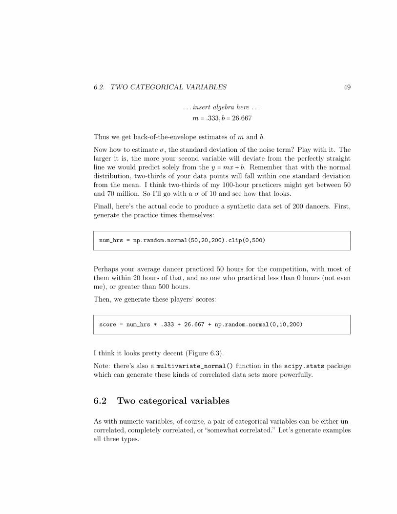
Finall, here’s the actual code to produce a synthetic data set of 200 dancers. First,generate the practice times themselves:
num_hrs = np.random.normal(50,20,200).clip(0,500)
Perhaps your average dancer practiced 50 hours for the competition, with most ofthem within 20 hours of that, and no one who practiced less than 0 hours (not evenme), or greater than 500 hours.
Then, we generate these players’ scores:
score = num_hrs * .333 + 26.667 + np.random.normal(0,10,200)
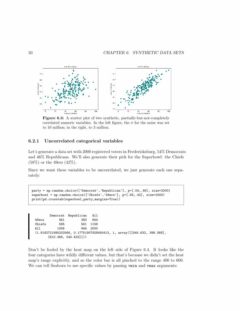
I think it looks pretty decent (Figure 6.3).
Note: there’s also a multivariate_normal() function in the scipy.stats packagewhich can generate these kinds of correlated data sets more powerfully.
6.2 Two categorical variables
As with numeric variables, of course, a pair of categorical variables can be either un-correlated, completely correlated, or “somewhat correlated.” Let’s generate examplesall three types.
50 CHAPTER 6. SYNTHETIC DATA SETS
Figure 6.3: A scatter plot of two synthetic, partially-but-not-completelycorrelated numeric variables. In the left figure, the σ for the noise was setto 10 million; in the right, to 3 million.
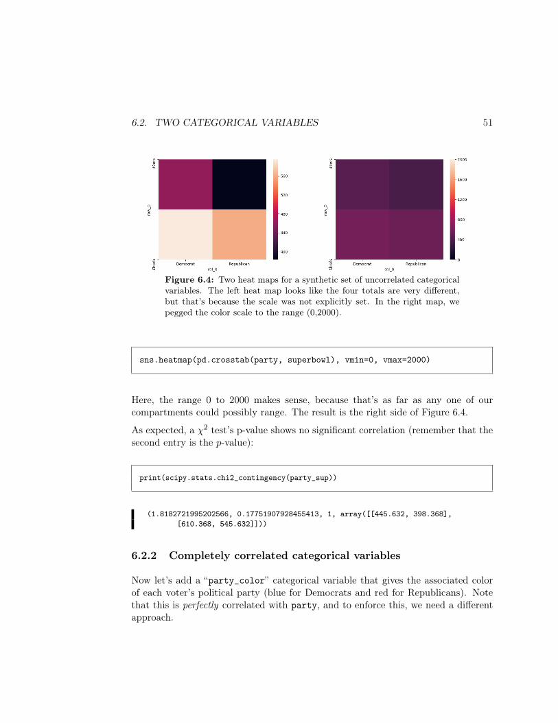
6.2.1 Uncorrelated categorical variables
Let’s generate a data set with 2000 registered voters in Fredericksburg, 54% Democratsand 46% Republicans. We’ll also generate their pick for the Superbowl: the Chiefs(58%) or the 49ers (42%).
Since we want these variables to be uncorrelated, we just generate each one sepa-rately:
party = np.random.choice(['Democrat','Republican'], p=[.54,.46], size=2000)superbowl = np.random.choice(['Chiefs','49ers'], p=[.58,.42], size=2000)print(pd.crosstab(superbowl,party,margins=True))
Democrat Republican All49ers 461 383 844Chiefs 595 561 1156All 1056 944 2000(1.8182721995202566, 0.17751907928455413, 1, array([[445.632, 398.368],
[610.368, 545.632]]))
Don’t be fooled by the heat map on the left side of Figure 6.4. It looks like thefour categories have wildly different values, but that’s because we didn’t set the heatmap’s range explicitly, and so the color bar is all pinched to the range 400 to 600.We can tell Seaborn to use specific values by passing vmin and vmax arguments:
6.2. TWO CATEGORICAL VARIABLES 51
Figure 6.4: Two heat maps for a synthetic set of uncorrelated categoricalvariables. The left heat map looks like the four totals are very different,but that’s because the scale was not explicitly set. In the right map, wepegged the color scale to the range (0,2000).
sns.heatmap(pd.crosstab(party, superbowl), vmin=0, vmax=2000)
Here, the range 0 to 2000 makes sense, because that’s as far as any one of ourcompartments could possibly range. The result is the right side of Figure 6.4.
As expected, a χ2 test’s p-value shows no significant correlation (remember that thesecond entry is the p-value):
print(scipy.stats.chi2_contingency(party_sup))
(1.8182721995202566, 0.17751907928455413, 1, array([[445.632, 398.368],[610.368, 545.632]]))
6.2.2 Completely correlated categorical variables
Now let’s add a “party_color” categorical variable that gives the associated colorof each voter’s political party (blue for Democrats and red for Republicans). Notethat this is perfectly correlated with party, and to enforce this, we need a differentapproach.
52 CHAPTER 6. SYNTHETIC DATA SETS
NumPy’s where() function comes in handy here. It’s tricky but powerful. np.where()takes three arguments – an array of booleans (Trues and Falses), and two other ar-guments which are used as substitutions. It produces an array that includes thesecond argument in every position where the first is true, and the third argumenteverywhere it’s false. In the current example, we’re saying “for every place that theparty array has a 'Democrat' value, put 'blue' in this new array you’re makingfor me, and put 'red' everywhere else.”
The code looks like this:
party_color = np.where(party=='Democrat','blue','red')
As will be the case nearly every time we use where(), the first argument – the “arrayof booleans” – comes from a query. Remember that when we say something like“party=='Democrat'”, we actually get back an array of Trues and Falses, one foreach element in party:
print(party)print(party=='Democrat')
['Republican' 'Republican' 'Democrat' ... 'Democrat' 'Democrat' 'Republican'][False False True ... True True False]
So, our call to where() effectively said “wherever party=='Democrat', gimme a True(and thus take the second argument’s value), otherwise gimme a False (and thustake the third argument’s value). If we look at the first few values of our new array,we see that it worked:
print(party)print(party_color)
['Republican' 'Republican' 'Democrat' ... 'Democrat' 'Democrat' 'Republican']['red' 'red' 'blue' ... 'blue' 'blue' 'red']
Thus, we get perfect correlation between our two variables:
6.2. TWO CATEGORICAL VARIABLES 53
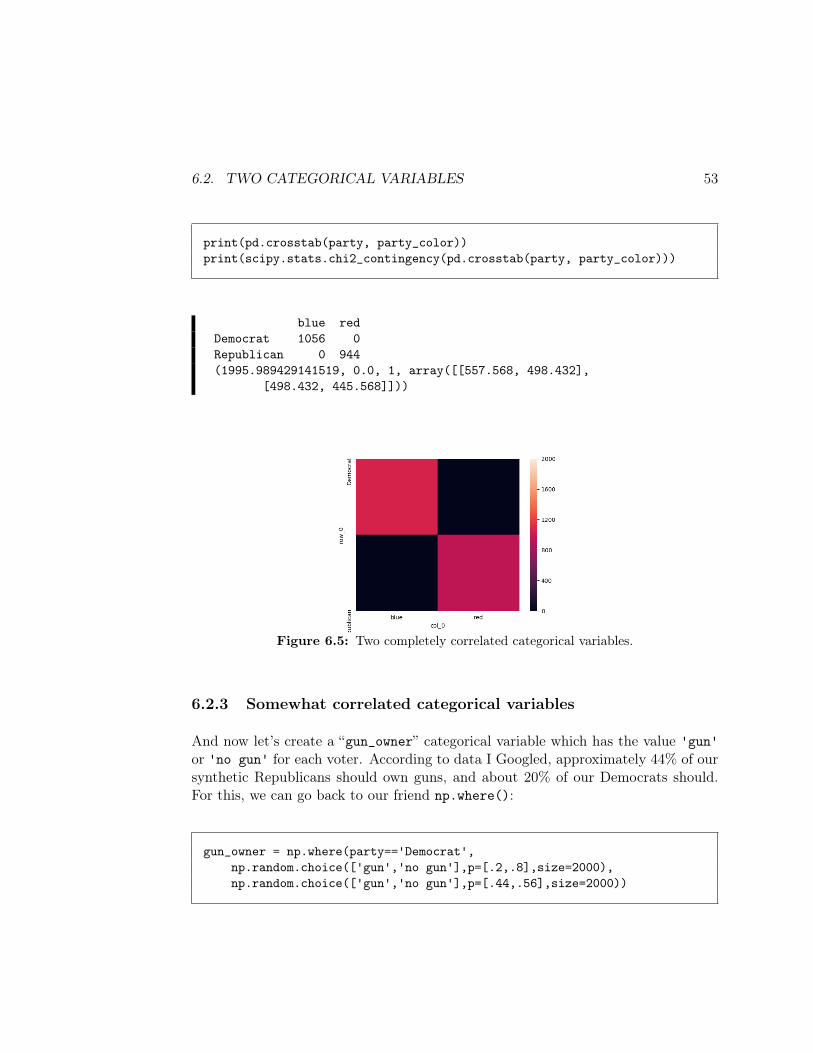
print(pd.crosstab(party, party_color))print(scipy.stats.chi2_contingency(pd.crosstab(party, party_color)))
blue redDemocrat 1056 0Republican 0 944(1995.989429141519, 0.0, 1, array([[557.568, 498.432],
[498.432, 445.568]]))
Figure 6.5: Two completely correlated categorical variables.
6.2.3 Somewhat correlated categorical variables
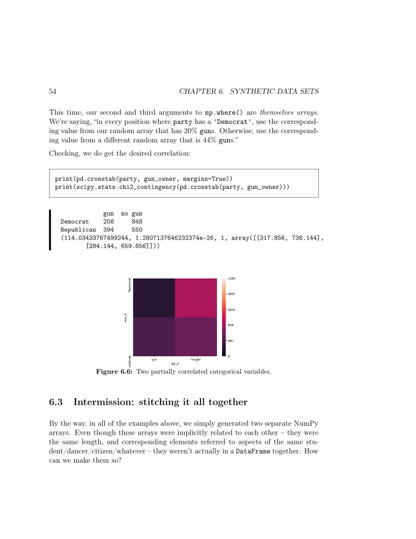
And now let’s create a “gun_owner” categorical variable which has the value 'gun'or 'no gun' for each voter. According to data I Googled, approximately 44% of oursynthetic Republicans should own guns, and about 20% of our Democrats should.For this, we can go back to our friend np.where():
gun_owner = np.where(party=='Democrat',np.random.choice(['gun','no gun'],p=[.2,.8],size=2000),np.random.choice(['gun','no gun'],p=[.44,.56],size=2000))
54 CHAPTER 6. SYNTHETIC DATA SETS
This time, our second and third arguments to np.where() are themselves arrays.We’re saying, “in every position where party has a 'Democrat', use the correspond-ing value from our random array that has 20% guns. Otherwise, use the correspond-ing value from a different random array that is 44% guns.”
Checking, we do get the desired correlation:
print(pd.crosstab(party, gun_owner, margins=True))print(scipy.stats.chi2_contingency(pd.crosstab(party, gun_owner)))
gun no gunDemocrat 208 848Republican 394 550(114.03433767499244, 1.2807137646232374e-26, 1, array([[317.856, 738.144],
[284.144, 659.856]]))
Figure 6.6: Two partially correlated categorical variables.
6.3 Intermission: stitching it all together
By the way, in all of the examples above, we simply generated two separate NumPyarrays. Even though these arrays were implicitly related to each other – they werethe same length, and corresponding elements referred to aspects of the same stu-dent/dancer/citizen/whatever – they weren’t actually in a DataFrame together. Howcan we make them so?
6.4. ONE CATEGORICAL AND ONE NUMERIC VARIABLE 55
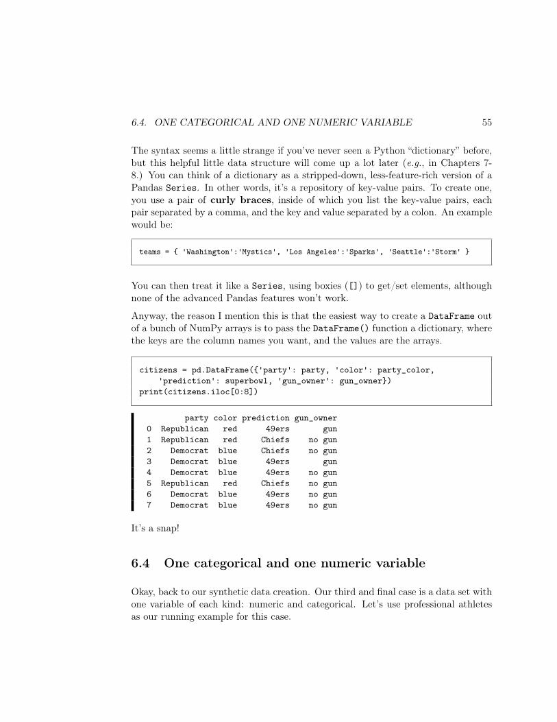
The syntax seems a little strange if you’ve never seen a Python “dictionary” before,but this helpful little data structure will come up a lot later (e.g., in Chapters 7-8.) You can think of a dictionary as a stripped-down, less-feature-rich version of aPandas Series. In other words, it’s a repository of key-value pairs. To create one,you use a pair of curly braces, inside of which you list the key-value pairs, eachpair separated by a comma, and the key and value separated by a colon. An examplewould be:
teams = 'Washington':'Mystics', 'Los Angeles':'Sparks', 'Seattle':'Storm'
You can then treat it like a Series, using boxies ([]) to get/set elements, althoughnone of the advanced Pandas features won’t work.
Anyway, the reason I mention this is that the easiest way to create a DataFrame outof a bunch of NumPy arrays is to pass the DataFrame() function a dictionary, wherethe keys are the column names you want, and the values are the arrays.
citizens = pd.DataFrame('party': party, 'color': party_color,'prediction': superbowl, 'gun_owner': gun_owner)
print(citizens.iloc[0:8])
party color prediction gun_owner0 Republican red 49ers gun1 Republican red Chiefs no gun2 Democrat blue Chiefs no gun3 Democrat blue 49ers gun4 Democrat blue 49ers no gun5 Republican red Chiefs no gun6 Democrat blue 49ers no gun7 Democrat blue 49ers no gun
It’s a snap!
6.4 One categorical and one numeric variable
Okay, back to our synthetic data creation. Our third and final case is a data set withone variable of each kind: numeric and categorical. Let’s use professional athletesas our running example for this case.
56 CHAPTER 6. SYNTHETIC DATA SETS
6.4.1 Completely uncorrelated
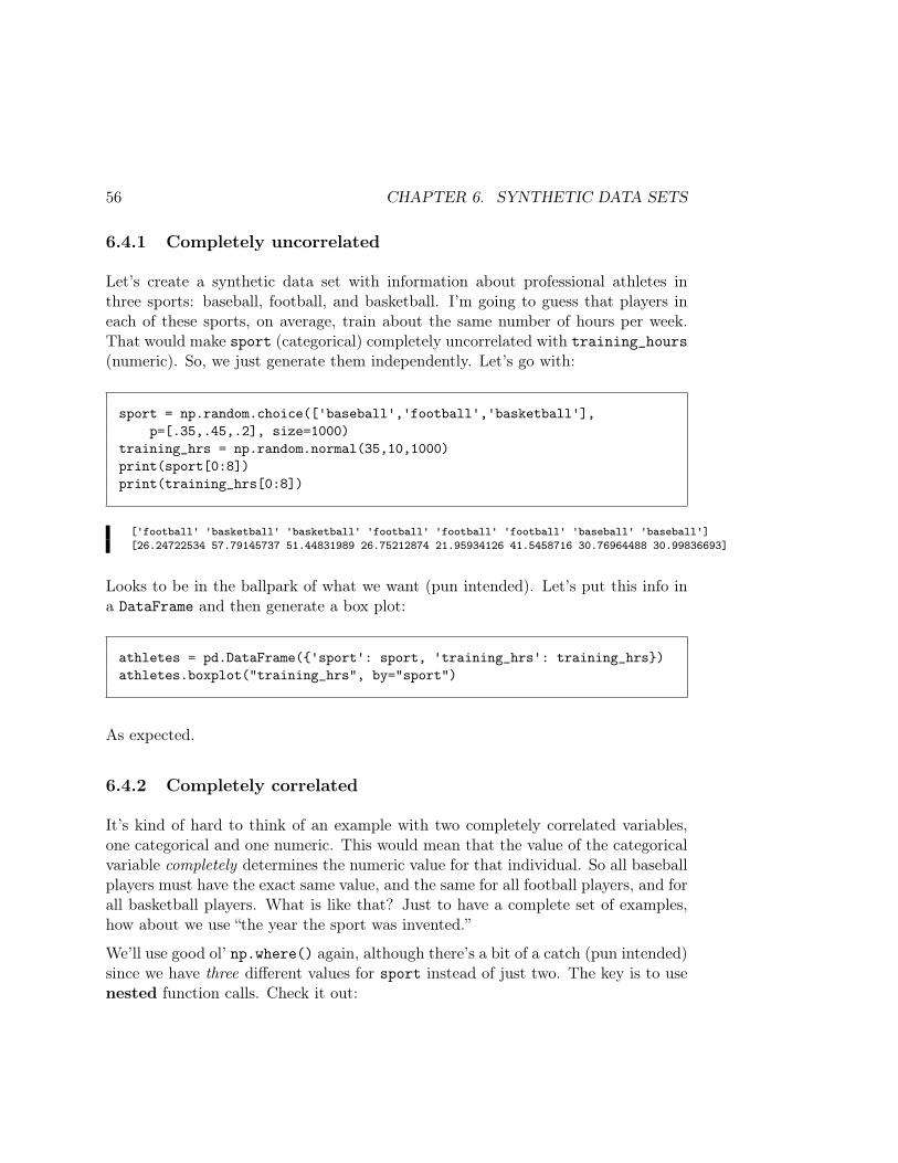
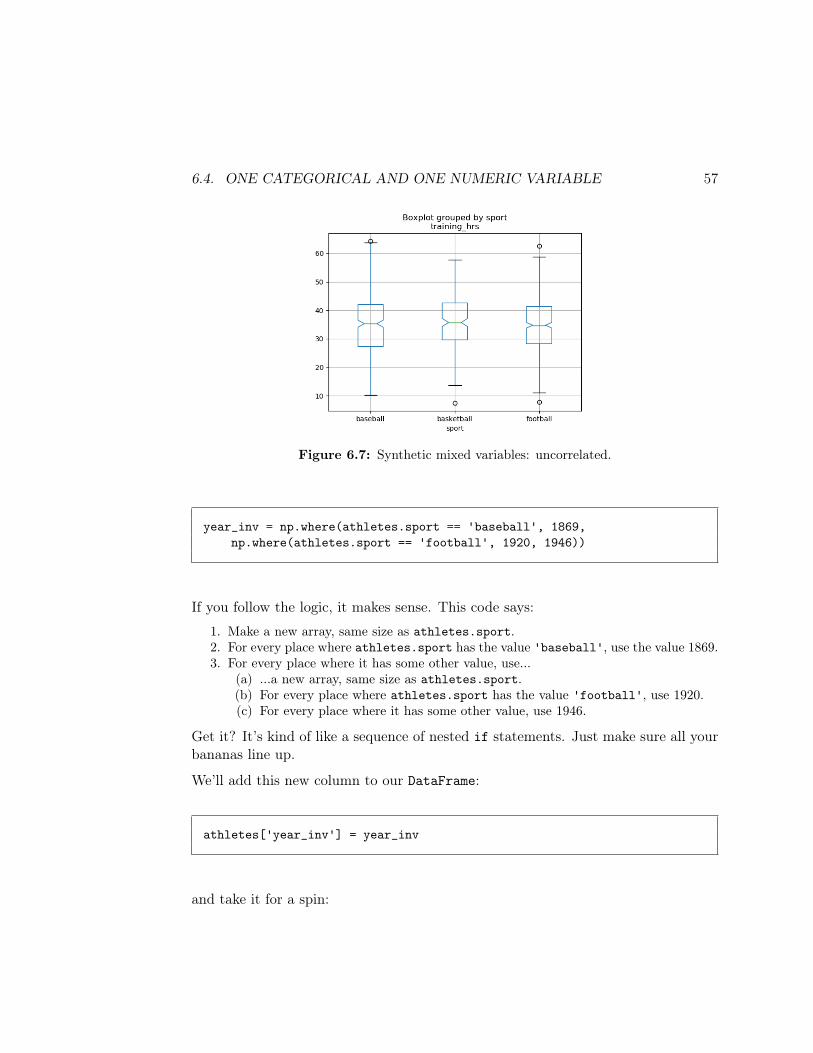
Let’s create a synthetic data set with information about professional athletes inthree sports: baseball, football, and basketball. I’m going to guess that players ineach of these sports, on average, train about the same number of hours per week.That would make sport (categorical) completely uncorrelated with training_hours(numeric). So, we just generate them independently. Let’s go with:
sport = np.random.choice(['baseball','football','basketball'],p=[.35,.45,.2], size=1000)
training_hrs = np.random.normal(35,10,1000)print(sport[0:8])print(training_hrs[0:8])
['football' 'basketball' 'basketball' 'football' 'football' 'football' 'baseball' 'baseball'][26.24722534 57.79145737 51.44831989 26.75212874 21.95934126 41.5458716 30.76964488 30.99836693]
Looks to be in the ballpark of what we want (pun intended). Let’s put this info ina DataFrame and then generate a box plot:
athletes = pd.DataFrame('sport': sport, 'training_hrs': training_hrs)athletes.boxplot("training_hrs", by="sport")
As expected.
6.4.2 Completely correlated
It’s kind of hard to think of an example with two completely correlated variables,one categorical and one numeric. This would mean that the value of the categoricalvariable completely determines the numeric value for that individual. So all baseballplayers must have the exact same value, and the same for all football players, and forall basketball players. What is like that? Just to have a complete set of examples,how about we use “the year the sport was invented.”
We’ll use good ol’ np.where() again, although there’s a bit of a catch (pun intended)since we have three different values for sport instead of just two. The key is to usenested function calls. Check it out:
6.4. ONE CATEGORICAL AND ONE NUMERIC VARIABLE 57
Figure 6.7: Synthetic mixed variables: uncorrelated.
year_inv = np.where(athletes.sport == 'baseball', 1869,np.where(athletes.sport == 'football', 1920, 1946))
If you follow the logic, it makes sense. This code says:
1. Make a new array, same size as athletes.sport.2. For every place where athletes.sport has the value 'baseball', use the value 1869.3. For every place where it has some other value, use...
(a) ...a new array, same size as athletes.sport.(b) For every place where athletes.sport has the value 'football', use 1920.(c) For every place where it has some other value, use 1946.
Get it? It’s kind of like a sequence of nested if statements. Just make sure all yourbananas line up.
We’ll add this new column to our DataFrame:
athletes['year_inv'] = year_inv
and take it for a spin:
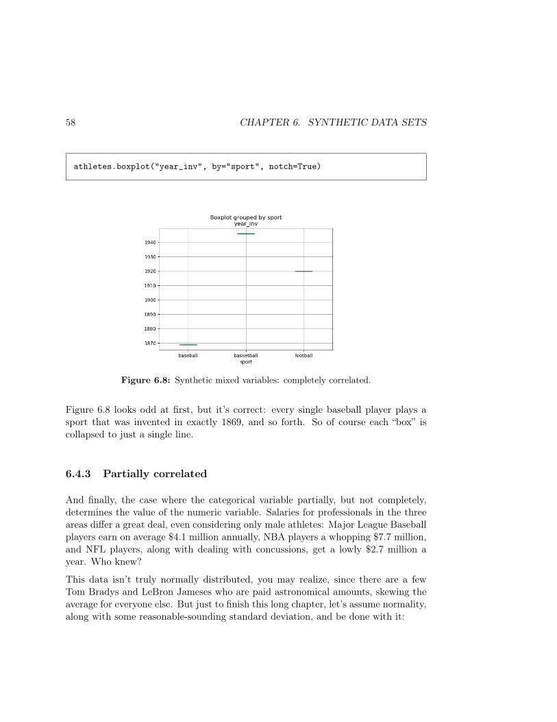
58 CHAPTER 6. SYNTHETIC DATA SETS
athletes.boxplot("year_inv", by="sport", notch=True)
Figure 6.8: Synthetic mixed variables: completely correlated.
Figure 6.8 looks odd at first, but it’s correct: every single baseball player plays asport that was invented in exactly 1869, and so forth. So of course each “box” iscollapsed to just a single line.
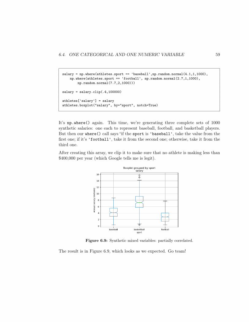
6.4.3 Partially correlated
And finally, the case where the categorical variable partially, but not completely,determines the value of the numeric variable. Salaries for professionals in the threeareas differ a great deal, even considering only male athletes: Major League Baseballplayers earn on average $4.1 million annually, NBA players a whopping $7.7 million,and NFL players, along with dealing with concussions, get a lowly $2.7 million ayear. Who knew?
This data isn’t truly normally distributed, you may realize, since there are a fewTom Bradys and LeBron Jameses who are paid astronomical amounts, skewing theaverage for everyone else. But just to finish this long chapter, let’s assume normality,along with some reasonable-sounding standard deviation, and be done with it:
6.4. ONE CATEGORICAL AND ONE NUMERIC VARIABLE 59
salary = np.where(athletes.sport == 'baseball',np.random.normal(4.1,1,1000),np.where(athletes.sport == 'football', np.random.normal(2.7,1,1000),
np.random.normal(7.7,2,1000)))
salary = salary.clip(.4,100000)
athletes['salary'] = salaryathletes.boxplot("salary", by="sport", notch=True)
It’s np.where() again. This time, we’re generating three complete sets of 1000synthetic salaries: one each to represent baseball, football, and basketball players.But then our where() call says “if the sport is 'baseball', take the value from thefirst one; if it’s 'football', take it from the second one; otherwise, take it from thethird one.
After creating this array, we clip it to make sure that no athlete is making less than$400,000 per year (which Google tells me is legit).
Figure 6.9: Synthetic mixed variables: partially correlated.
The result is in Figure 6.9, which looks as we expected. Go team!

60 CHAPTER 6. SYNTHETIC DATA SETS
Chapter 7
JSON (1 of 2)
JSON (pronounced like the name “Jason”) is a simple, human-readable text fileformat that is very commonly used for information storage and interchange. (Itstands for “JavaScript Object Notation,” but don’t be fooled: it doesn’t have muchto do with the JavaScript language except historically. Any language, includingPython, can read/write JSON data.)
In this chapter, we’ll learn about how to read and navigate through JSON data.First, though, a word about a couple of Python essentials I omitted from DATA 101for brevity and simplicity.
7.1 Lists and dictionaries
Last semester, we spent a lot of time learning how to use NumPy ndarrays andPandas Serieses. These are the preferred implementations of arrays, and associativearrays, respectively, in the Python Data Science ecosystem. As you know, a NumPyarray holds a numbered sequence of items (indexed starting from 0), and a Seriesholds a set of key-value pairs.
For any serious data work, you want to use those tools, because they are lightning-fast, super-efficient, feature-rich, and optimized to the task.
As it turns out, plain-ol’ Python has stripped-down, feature-poor, but easy-to-typeversions of these data structures as well, which are baked in to JSON and alsoimportant to know about in their own right. They’re called lists and dictionaries.
61
62 CHAPTER 7. JSON (1 OF 2)
7.1.1 Lists
If, instead of writing this:
crew = np.array(["Ed", "Kelly", "Alara", "Bortus", "John", "Claire"])
you simply wrote this:
crew = ["Ed", "Kelly", "Alara", "Bortus", "John", "Claire"]
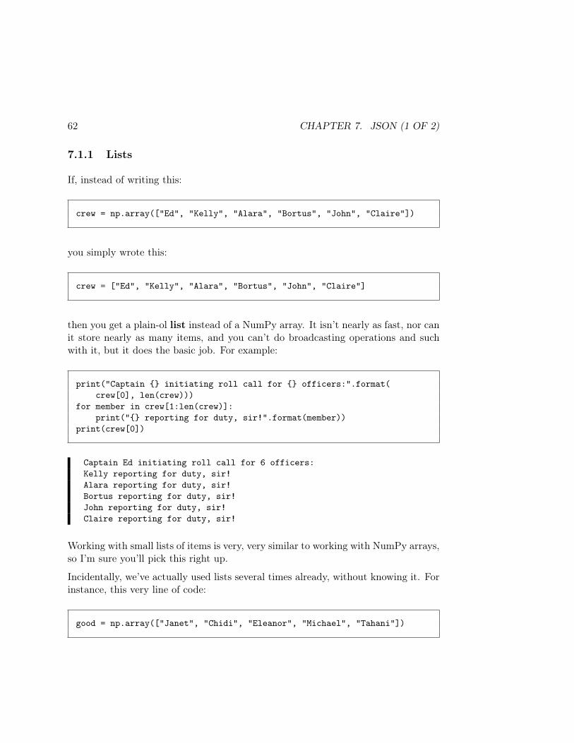
then you get a plain-ol list instead of a NumPy array. It isn’t nearly as fast, nor canit store nearly as many items, and you can’t do broadcasting operations and suchwith it, but it does the basic job. For example:
print("Captain initiating roll call for officers:".format(crew[0], len(crew)))
for member in crew[1:len(crew)]:print(" reporting for duty, sir!".format(member))
print(crew[0])
Captain Ed initiating roll call for 6 officers:Kelly reporting for duty, sir!Alara reporting for duty, sir!Bortus reporting for duty, sir!John reporting for duty, sir!Claire reporting for duty, sir!
Working with small lists of items is very, very similar to working with NumPy arrays,so I’m sure you’ll pick this right up.
Incidentally, we’ve actually used lists several times already, without knowing it. Forinstance, this very line of code:
good = np.array(["Janet", "Chidi", "Eleanor", "Michael", "Tahani"])
7.1. LISTS AND DICTIONARIES 63
is actually first creating a list, and then passing that list as an argument to np.array().And this code:
alter_egos = pd.Series(['Hulk','Spidey','Iron Man','Thor'],index=['Bruce','Peter','Tony','Thor'])
creates two separate lists, one for the data and one for the index, and passes thoseto pd.Series() to build a Series out of them. Lists are super-lightweight andsuper-common.
7.1.2 Dictionaries
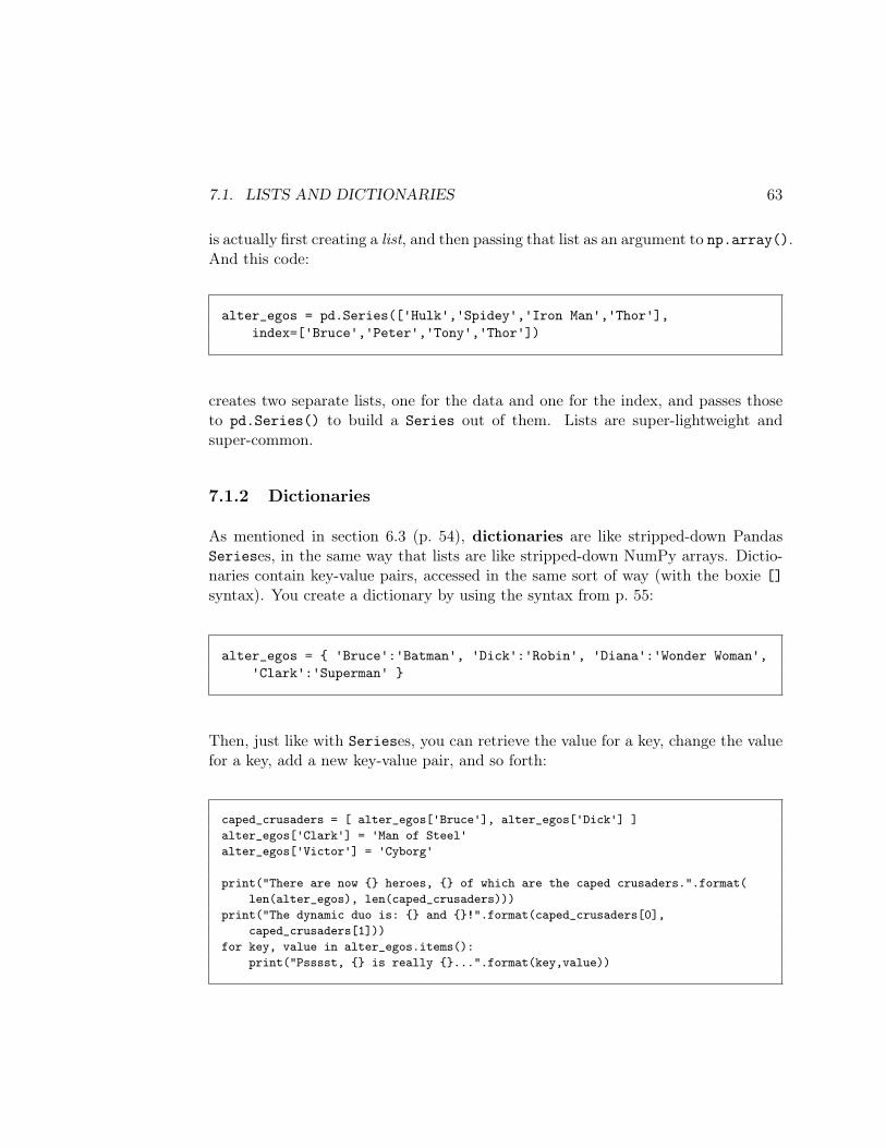
As mentioned in section 6.3 (p. 54), dictionaries are like stripped-down PandasSerieses, in the same way that lists are like stripped-down NumPy arrays. Dictio-naries contain key-value pairs, accessed in the same sort of way (with the boxie []syntax). You create a dictionary by using the syntax from p. 55:
alter_egos = 'Bruce':'Batman', 'Dick':'Robin', 'Diana':'Wonder Woman','Clark':'Superman'
Then, just like with Serieses, you can retrieve the value for a key, change the valuefor a key, add a new key-value pair, and so forth:
caped_crusaders = [ alter_egos['Bruce'], alter_egos['Dick'] ]alter_egos['Clark'] = 'Man of Steel'alter_egos['Victor'] = 'Cyborg'
print("There are now heroes, of which are the caped crusaders.".format(len(alter_egos), len(caped_crusaders)))
print("The dynamic duo is: and !".format(caped_crusaders[0],caped_crusaders[1]))
for key, value in alter_egos.items():print("Psssst, is really ...".format(key,value))
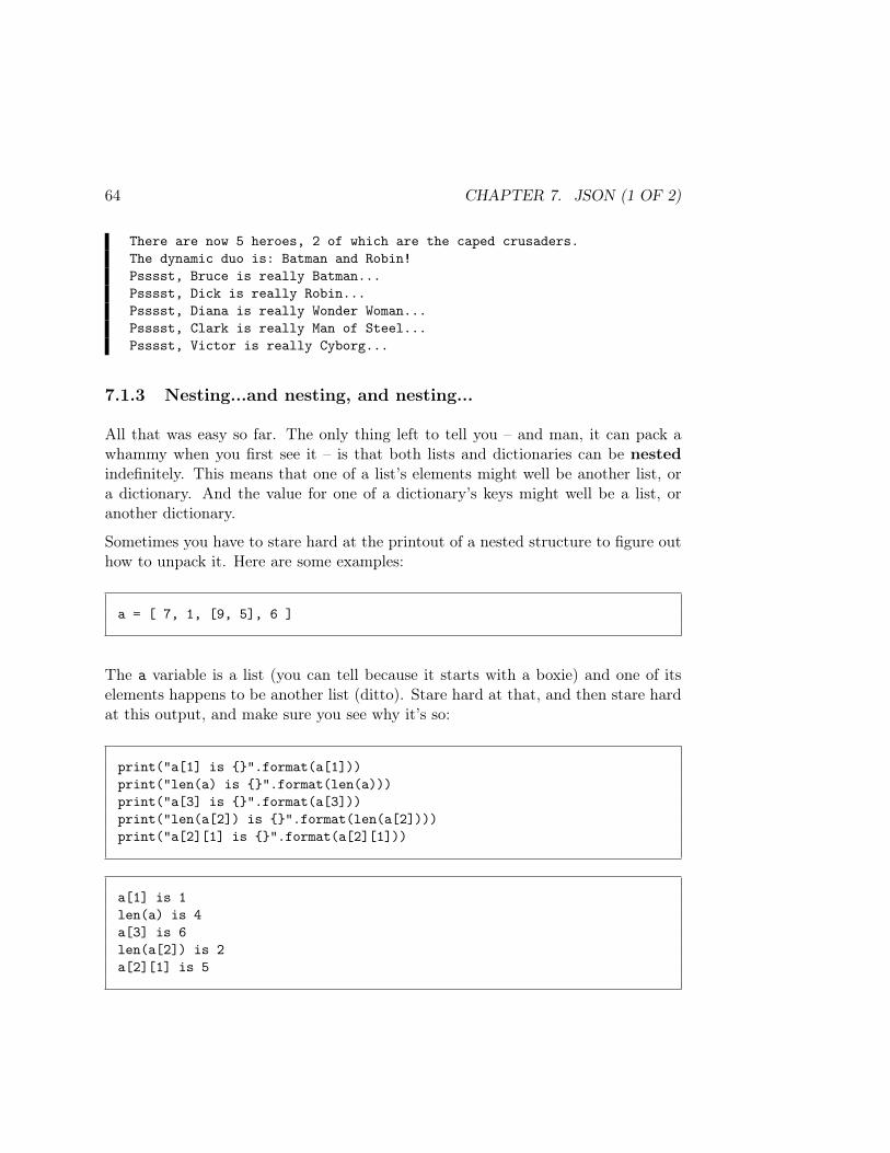
64 CHAPTER 7. JSON (1 OF 2)
There are now 5 heroes, 2 of which are the caped crusaders.The dynamic duo is: Batman and Robin!Psssst, Bruce is really Batman...Psssst, Dick is really Robin...Psssst, Diana is really Wonder Woman...Psssst, Clark is really Man of Steel...Psssst, Victor is really Cyborg...
7.1.3 Nesting...and nesting, and nesting...
All that was easy so far. The only thing left to tell you – and man, it can pack awhammy when you first see it – is that both lists and dictionaries can be nestedindefinitely. This means that one of a list’s elements might well be another list, ora dictionary. And the value for one of a dictionary’s keys might well be a list, oranother dictionary.
Sometimes you have to stare hard at the printout of a nested structure to figure outhow to unpack it. Here are some examples:
a = [ 7, 1, [9, 5], 6 ]
The a variable is a list (you can tell because it starts with a boxie) and one of itselements happens to be another list (ditto). Stare hard at that, and then stare hardat this output, and make sure you see why it’s so:
print("a[1] is ".format(a[1]))print("len(a) is ".format(len(a)))print("a[3] is ".format(a[3]))print("len(a[2]) is ".format(len(a[2])))print("a[2][1] is ".format(a[2][1]))
a[1] is 1len(a) is 4a[3] is 6len(a[2]) is 2a[2][1] is 5
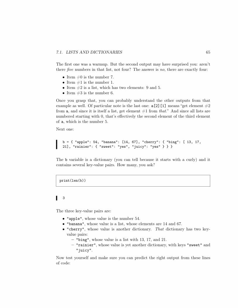
7.1. LISTS AND DICTIONARIES 65
The first one was a warmup. But the second output may have surprised you: aren’tthere five numbers in that list, not four? The answer is no, there are exactly four:
• Item #0 is the number 7.• Item #1 is the number 1.• Item #2 is a list, which has two elements: 9 and 5.• Item #3 is the number 6.
Once you grasp that, you can probably understand the other outputs from thatexample as well. Of particular note is the last one: a[2][1] means “get element #2from a, and since it is itself a list, get element #1 from that.” And since all lists arenumbered starting with 0, that’s effectively the second element of the third elementof a, which is the number 5.
Next one:
b = "apple": 54, "banana": [14, 67], "cherry": "bing": [ 13, 17,21], "rainier": "sweet": "yes", "juicy": "yes"
The b variable is a dictionary (you can tell because it starts with a curly) and itcontains several key-value pairs. How many, you ask?
print(len(b))
3
The three key-value pairs are:
• "apple", whose value is the number 54.• "banana", whose value is a list, whose elements are 14 and 67.• "cherry", whose value is another dictionary. That dictionary has two key-
value pairs:– "bing", whose value is a list with 13, 17, and 21.– "rainier", whose value is yet another dictionary, with keys "sweet" and
"juicy".
Now test yourself and make sure you can predict the right output from these linesof code:
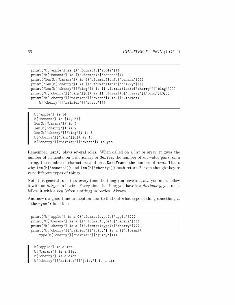
66 CHAPTER 7. JSON (1 OF 2)
print("b['apple'] is ".format(b['apple']))print("b['banana'] is ".format(b['banana']))print("len(b['banana']) is ".format(len(b['banana'])))print("len(b['cherry']) is ".format(len(b['cherry'])))print("len(b['cherry']['bing']) is ".format(len(b['cherry']['bing'])))print("b['cherry']['bing'][0]) is ".format(b['cherry']['bing'][0]))print("b['cherry']['rainier']['sweet']) is ".format(
b['cherry']['rainier']['sweet']))
b['apple'] is 54b['banana'] is [14, 67]len(b['banana']) is 2len(b['cherry']) is 2len(b['cherry']['bing']) is 3b['cherry']['bing'][0]) is 13b['cherry']['rainier']['sweet']) is yes
Remember, len() plays several roles. When called on a list or array, it gives thenumber of elements; on a dictionary or Series, the number of key-value pairs; on astring, the number of characters; and on a DataFrame, the number of rows. That’swhy len(b[’banana’]) and len(b[’cherry’]) both return 2, even though they’revery different types of things.
Note this general rule, too: every time the thing you have is a list, you must followit with an integer in boxies. Every time the thing you have is a dictionary, you mustfollow it with a key (often a string) in boxies. Always.
And now’s a good time to mention how to find out what type of thing something is– the type() function:
print("b['apple'] is a ".format(type(b['apple'])))print("b['banana'] is a ".format(type(b['banana'])))print("b['cherry'] is a ".format(type(b['cherry'])))print("b['cherry']['rainier']['juicy'] is a ".format(
type(b['cherry']['rainier']['juicy'])))
b['apple'] is a intb['banana'] is a listb['cherry'] is a dictb['cherry']['rainier']['juicy'] is a str
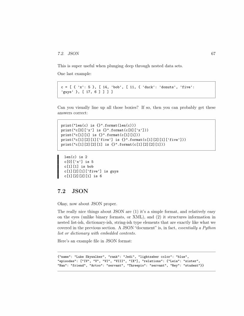
7.2. JSON 67
This is super useful when plunging deep through nested data sets.
One last example:
c = [ 'x': 5 , [ 14, 'bob', [ 11, 'duck': 'donuts', 'five':'guys' , [ 17, 6 ] ] ] ]
Can you visually line up all those boxies? If so, then you can probably get theseanswers correct:
print("len(c) is ".format(len(c)))print("c[0]['x'] is ".format(c[0]['x']))print("c[1][1] is ".format(c[1][1]))print("c[1][2][1]['five'] is ".format(c[1][2][1]['five']))print("c[1][2][2][1] is ".format(c[1][2][2][1]))
len(c) is 2c[0]['x'] is 5c[1][1] is bobc[1][2][1]['five'] is guysc[1][2][2][1] is 6
7.2 JSON
Okay, now about JSON proper.
The really nice things about JSON are (1) it’s a simple format, and relatively easyon the eyes (unlike binary formats, or XML), and (2) it structures information innested list-ish, dictionary-ish, string-ish type elements that are exactly like what wecovered in the previous section. A JSON “document” is, in fact, essentially a Pythonlist or dictionary with embedded contents.
Here’s an example file in JSON format:
"name": "Luke Skywalker", "rank": "Jedi", "lightsaber color": "blue","episodes": ["IV", "V", "VI", "VIII", "IX"], "relations": "Leia": "sister","Han": "friend", "Artoo": "servant", "Threepio": "servant", "Rey": "student"
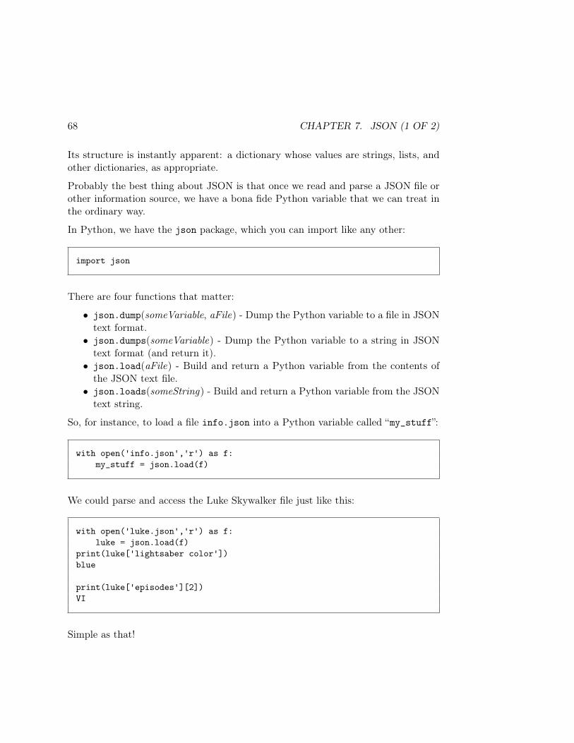
68 CHAPTER 7. JSON (1 OF 2)
Its structure is instantly apparent: a dictionary whose values are strings, lists, andother dictionaries, as appropriate.
Probably the best thing about JSON is that once we read and parse a JSON file orother information source, we have a bona fide Python variable that we can treat inthe ordinary way.
In Python, we have the json package, which you can import like any other:
import json
There are four functions that matter:
• json.dump(someVariable, aFile) - Dump the Python variable to a file in JSONtext format.
• json.dumps(someVariable) - Dump the Python variable to a string in JSONtext format (and return it).
• json.load(aFile) - Build and return a Python variable from the contents ofthe JSON text file.
• json.loads(someString) - Build and return a Python variable from the JSONtext string.
So, for instance, to load a file info.json into a Python variable called “my_stuff”:
with open('info.json','r') as f:my_stuff = json.load(f)
We could parse and access the Luke Skywalker file just like this:
with open('luke.json','r') as f:luke = json.load(f)
print(luke['lightsaber color'])blue
print(luke['episodes'][2])VI
Simple as that!
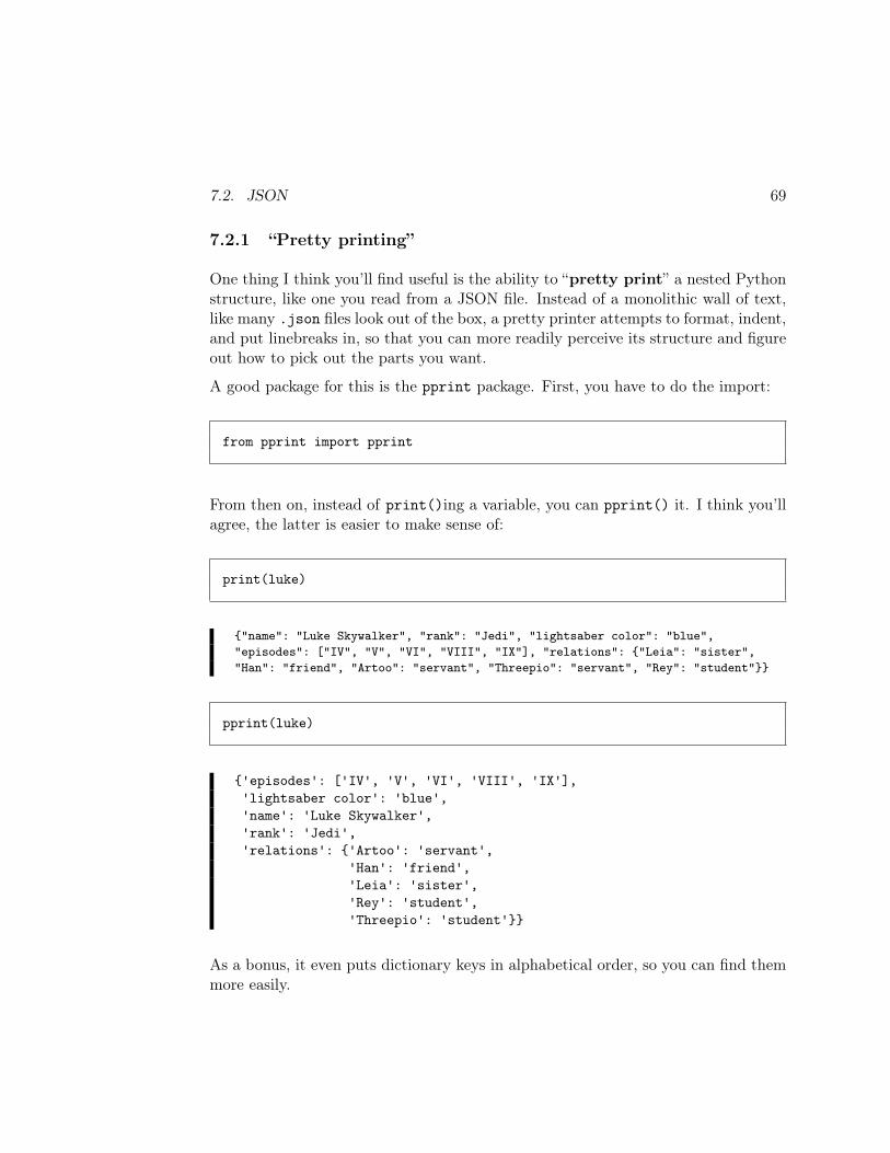
7.2. JSON 69
7.2.1 “Pretty printing”
One thing I think you’ll find useful is the ability to “pretty print” a nested Pythonstructure, like one you read from a JSON file. Instead of a monolithic wall of text,like many .json files look out of the box, a pretty printer attempts to format, indent,and put linebreaks in, so that you can more readily perceive its structure and figureout how to pick out the parts you want.
A good package for this is the pprint package. First, you have to do the import:
from pprint import pprint
From then on, instead of print()ing a variable, you can pprint() it. I think you’llagree, the latter is easier to make sense of:
print(luke)
"name": "Luke Skywalker", "rank": "Jedi", "lightsaber color": "blue","episodes": ["IV", "V", "VI", "VIII", "IX"], "relations": "Leia": "sister","Han": "friend", "Artoo": "servant", "Threepio": "servant", "Rey": "student"
pprint(luke)
'episodes': ['IV', 'V', 'VI', 'VIII', 'IX'],'lightsaber color': 'blue','name': 'Luke Skywalker','rank': 'Jedi','relations': 'Artoo': 'servant',
'Han': 'friend','Leia': 'sister','Rey': 'student','Threepio': 'student'
As a bonus, it even puts dictionary keys in alphabetical order, so you can find themmore easily.
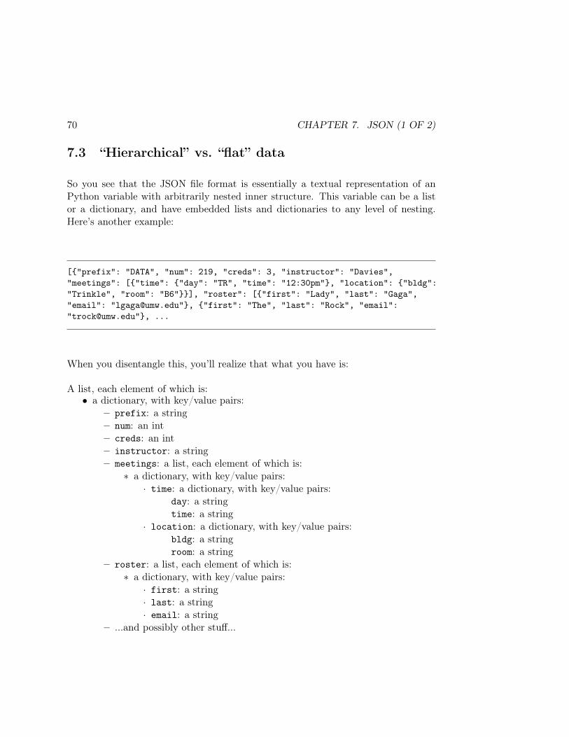
70 CHAPTER 7. JSON (1 OF 2)
7.3 “Hierarchical” vs. “flat” data
So you see that the JSON file format is essentially a textual representation of anPython variable with arbitrarily nested inner structure. This variable can be a listor a dictionary, and have embedded lists and dictionaries to any level of nesting.Here’s another example:
["prefix": "DATA", "num": 219, "creds": 3, "instructor": "Davies","meetings": ["time": "day": "TR", "time": "12:30pm", "location": "bldg":"Trinkle", "room": "B6"], "roster": ["first": "Lady", "last": "Gaga","email": "[email protected]", "first": "The", "last": "Rock", "email":"[email protected]", ...
When you disentangle this, you’ll realize that what you have is:
A list, each element of which is:• a dictionary, with key/value pairs:
– prefix: a string– num: an int– creds: an int– instructor: a string– meetings: a list, each element of which is:
∗ a dictionary, with key/value pairs:· time: a dictionary, with key/value pairs:
day: a stringtime: a string
· location: a dictionary, with key/value pairs:bldg: a stringroom: a string
– roster: a list, each element of which is:∗ a dictionary, with key/value pairs:
· first: a string· last: a string· email: a string
– ...and possibly other stuff...
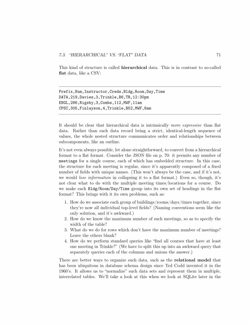
7.3. “HIERARCHICAL” VS. “FLAT” DATA 71
This kind of structure is called hierarchical data. This is in contrast to so-calledflat data, like a CSV:
Prefix,Num,Instructor,Creds,Bldg,Room,Day,TimeDATA,219,Davies,3,Trinkle,B6,TR,12:30pmENGL,286,Rigsby,3,Combs,112,MWF,11amCPSC,305,Finlayson,4,Trinkle,B52,MWF,8am
It should be clear that hierarchical data is intrinsically more expressive than flatdata. Rather than each data record being a strict, identical-length sequence ofvalues, the whole nested structure communicates order and relationships betweensubcomponents, like an outline.
It’s not even always possible, let alone straightforward, to convert from a hierarchicalformat to a flat format. Consider the JSON file on p. 70: it permits any number ofmeetings for a single course, each of which has embedded structure. In this case,the structure for each meeting is regular, since it’s apparently composed of a fixednumber of fields with unique names. (This won’t always be the case, and if it’s not,we would lose information in collapsing it to a flat format.) Even so, though, it’snot clear what to do with the multiple meeting times/locations for a course. Dowe make each Bldg/Room/Day/Time group into its own set of headings in the flatformat? This brings with it its own problems, such as:
1. How do we associate each group of buildings/rooms/days/times together, sincethey’re now all individual top-level fields? (Naming conventions seem like theonly solution, and it’s awkward.)
2. How do we know the maximum number of such meetings, so as to specify thewidth of the table?
3. What do we do for rows which don’t have the maximum number of meetings?Leave the others blank?
4. How do we perform standard queries like “find all courses that have at leastone meeting in Trinkle?” (We have to split this up into an awkward query thatseparately queries each of the columns and unions the answer.)
There are better ways to organize such data, such as the relational model thathas been ubiquitous in database schema design since Ted Codd invented it in the1960’s. It allows us to “normalize” such data sets and represent them in multiple,interrelated tables. We’ll take a look at this when we look at SQLite later in the

72 CHAPTER 7. JSON (1 OF 2)
course. Some irregular structures defy even the relational model, however, which iswhy some newer database paradigms (like NoSQL databases) have been developedto get around its limitations.
One important fact to grasp, however, is that at the present state of technology,almost all machine learning algorithms are based on a flat data structure. Thereare some quite advanced, cutting-edge exceptions to this, but really the field ofmining hierarchical (and other non-flat) data formats is still in its infancy. Lots ofopportunity to make a name for yourself here!
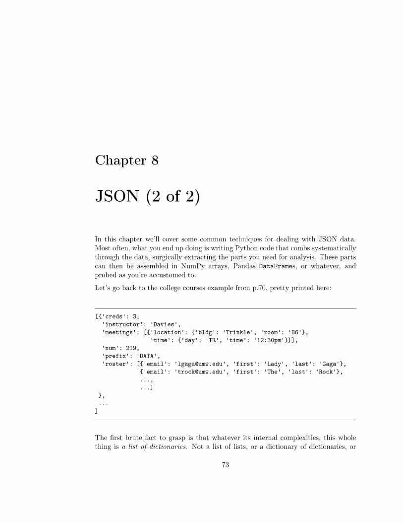
Chapter 8
JSON (2 of 2)
In this chapter we’ll cover some common techniques for dealing with JSON data.Most often, what you end up doing is writing Python code that combs systematicallythrough the data, surgically extracting the parts you need for analysis. These partscan then be assembled in NumPy arrays, Pandas DataFrames, or whatever, andprobed as you’re accustomed to.
Let’s go back to the college courses example from p.70, pretty printed here:
['creds': 3,'instructor': 'Davies','meetings': ['location': 'bldg': 'Trinkle', 'room': 'B6',
'time': 'day': 'TR', 'time': '12:30pm'],'num': 219,'prefix': 'DATA','roster': ['email': '[email protected]', 'first': 'Lady', 'last': 'Gaga',
'email': '[email protected]', 'first': 'The', 'last': 'Rock',...,...]
,...
]
The first brute fact to grasp is that whatever its internal complexities, this wholething is a list of dictionaries. Not a list of lists, or a dictionary of dictionaries, or
73
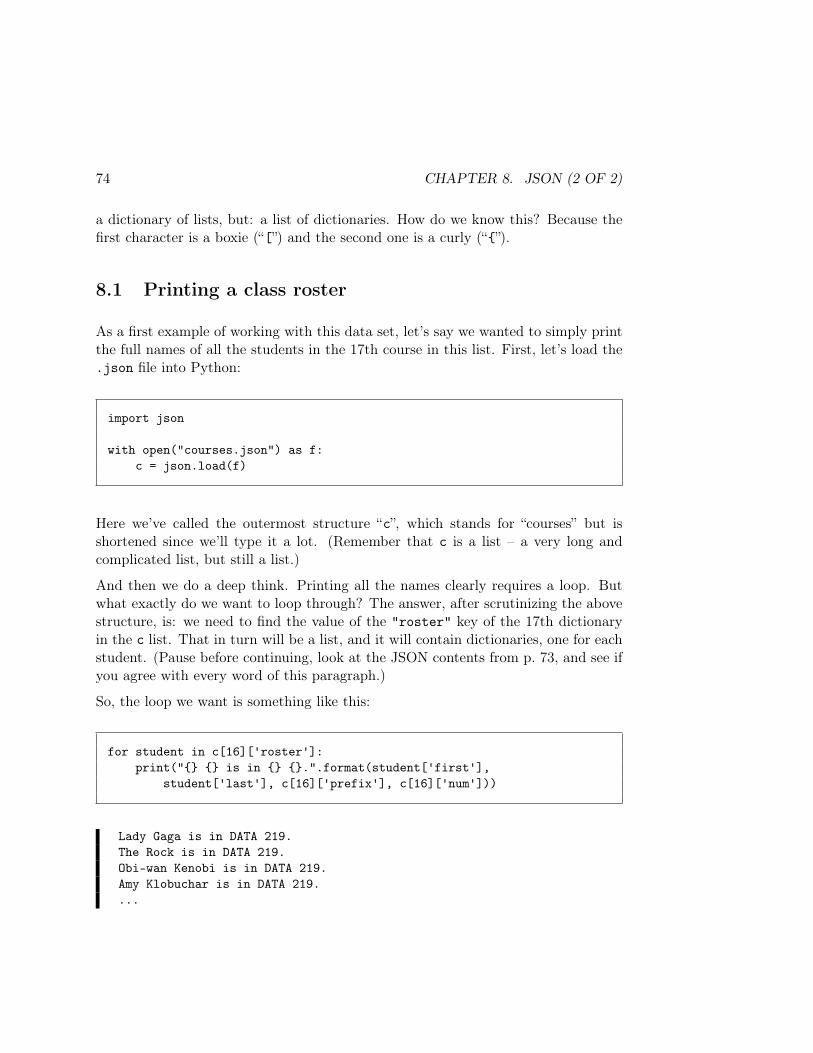
74 CHAPTER 8. JSON (2 OF 2)
a dictionary of lists, but: a list of dictionaries. How do we know this? Because thefirst character is a boxie (“[”) and the second one is a curly (“”).
8.1 Printing a class roster
As a first example of working with this data set, let’s say we wanted to simply printthe full names of all the students in the 17th course in this list. First, let’s load the.json file into Python:
import json
with open("courses.json") as f:c = json.load(f)
Here we’ve called the outermost structure “c”, which stands for “courses” but isshortened since we’ll type it a lot. (Remember that c is a list – a very long andcomplicated list, but still a list.)
And then we do a deep think. Printing all the names clearly requires a loop. Butwhat exactly do we want to loop through? The answer, after scrutinizing the abovestructure, is: we need to find the value of the "roster" key of the 17th dictionaryin the c list. That in turn will be a list, and it will contain dictionaries, one for eachstudent. (Pause before continuing, look at the JSON contents from p. 73, and see ifyou agree with every word of this paragraph.)
So, the loop we want is something like this:
for student in c[16]['roster']:print(" is in .".format(student['first'],
student['last'], c[16]['prefix'], c[16]['num']))
Lady Gaga is in DATA 219.The Rock is in DATA 219.Obi-wan Kenobi is in DATA 219.Amy Klobuchar is in DATA 219....
8.2. PRINTING ALL THE CLASS ROSTERS 75
Success. (Don’t worry if you don’t get this loop right the first time; it often takessome tweaking and refinement before it works.) Notice how this code operates:
1. We dig fairly deep into c (which is a list), finding its 17th element (at index16 of course), which is a dictionary. Then we get the value of that dictionary’s"roster" key. As you can see above, that key’s value is a list.
2. Every time through the loop, the “student” variable is set equal to the nextelement of this list. And that element, as you can see above, is a dictionary.The dictionary has two items of interest: "first" and "last". We then printthe values of these two keys, plus the course prefix and number. (Note thatthe course prefix and number come directly from the c[16] dictionary itself,whereas the first and last names come from keys of the elements of the inner"roster" list that we’re iterating through.)
8.2 Printing all the class rosters
That printed the roster for one class. What about printing the roster for all theclasses?
If you think about it, the structure is much the same – except that instead of merelyiterating through class #17’s list of dictionaries, we want to do it for every class.
You’ll probably realize that this necessitates another. All the stuff we did for class#17, we now want to do for all the classes, one after another. So in essence, we wrapthe previous code in a nested, outer loop which will perform it once for each course.Check out the following:
for course in c:roster = course['roster']for student in roster:
print(" is in .".format(student['first'],student['last'], course['prefix'], course['num']))
Observe the nested structure (a for within a for), and the use of a temporaryhelper variable ("roster") to make the code clearer. Also notice how the print()statement includes information from both the student and course variables, asappropriate.
This is just the right thing. However, when we run it, we get an error after a while:
76 CHAPTER 8. JSON (2 OF 2)
Lady Gaga is in DATA 219.The Rock is in DATA 219.Obi-wan Kenobi is in DATA 219....Elizabeth Jennings is in PSCI 401.Stan Beeman is in PSCI 401.Phillip Jennings is in PSCI 401....Tyrion Lannister is in ENGL 101.Jon Snow is in ENGL 101.Daenerys Targaryen is in ENGL 101....Han Solo is in CHEM 211.Poe Dameron is in CHEM 211.---------------------------------------------------------------------------KeyError Traceback (most recent call last)
77 for student in roster:78 print(" is in .".format(student['first'],
---> 79 student['last'], course['prefix'], course['num']))80
KeyError: 'last'
Whoaaaa, what’s dat?
8.2.1 Encountering erroneous/missing data
This kind of error will happen all the time when you’re working with JSON. Thefirst step is not to panic. The second step is to calmly observe that apparently,everything was working fine up to a point...and then it suddenly broke. The thirdstep is to look at that error message and see if you can make sense out of it. (Often,you can.) And the fourth step is to introduce some tactical debugging messages intoyour code, so that you can narrow down the source of the error.
I assume you’ve done those first two steps. On to the third: the error message. Itsays, quote:
KeyError: 'last'
and it evidently happened on line 79, which was in the middle of the print() state-ment. Put 2 and 2 together and you’ll realize that when we attempted to extract
8.2. PRINTING ALL THE CLASS ROSTERS 77
the value of the "last" key for one of the dictionaries, it wasn’t there. That’s what“KeyError” turns out to mean: you asked for a particular key but there wasn’t onein the dictionary.
The fourth step is crucial. It marks the difference between fledgling, flailing novicesand cool, critical-thinking experts. We need to insert (temporarily) one or moreprint() statements into our loop, so that right before the program crashes, we getsome crucial insight into what was about to go wrong.
This takes some practice and some intuition, but in this case let me simply observewhat it makes sense to do. If we were about to access a non-existent key from adictionary, it might illuminate things if we printed out the dictionary immediatelybefore trying that stunt. That way, we’ll see the state of affairs just before the error.
Here’s the key line, inserted into the inner loop:
for course in c:roster = course['roster']for student in roster:
print("The dict is: ".format(student))print(" is in .".format(student['first'],
student['last'], course['prefix'], course['num']))
Now look at the revised output, below:
The dict is: 'email': '[email protected]', 'first': 'Han', 'last': 'Solo'Han Solo is in CHEM 211.The dict is: 'email': '[email protected]', 'first': 'Poe', 'last': 'Dameron'Poe Dameron is in CHEM 211.The dict is: 'email': '[email protected]', 'first': 'Yoda'---------------------------------------------------------------------------KeyError Traceback (most recent call last)
78 print("The dict is: ".format(student))79 print(" is in .".format(student['first'],
---> 80 student['last'], course['prefix'], course['num']))81
KeyError: 'last'
Aha! Our problem is Yoda, a student in CHEM 211 who doesn’t have a last name.
78 CHAPTER 8. JSON (2 OF 2)
It takes practice and experience to get a feel for where to insert meaningful debuggingstatements. The key question to ask is: “what do I wish I had known right beforethe error occurred?” Add lines of code to shed light on that question.
8.2.2 Dealing with erroneous/missing data
Once you’ve discovered the absence of something you were looking for, you need toask yourself what the implications are of it being missing. Sometimes it’s a bonafide data error that means you need to investigate the source of the information,discard some data points, or something else. Other times (as in the Yoda case) it’sinnocuous – not everyone has a last name, after all – but you still have to deal withthe problem somehow so your program can continue.
In the case of a missing key which you can sensibly ignore, you can code around itas follows:
for course in c:roster = course['roster']for student in roster:
if 'last' in student:print(" is in .".format(student['first'],
student['last'], course['prefix'], course['num']))else:
print(" is in .".format(student['first'],course['prefix'], course['num']))
The important line is the fourth one: “if 'last' in student:”. The “in” keywordchecks to see whether a dictionary has a certain key or not. In this case, if there isno "last" key, we want to simply print the first name and go on, not crash. Theoutput is now satisfactory:
...Han Solo is in CHEM 211.Poe Dameron is in CHEM 211.Yoda is in CHEM 211.Emperor Palpatine is in CHEM 211.Chewie is in CHEM 211.Rey is in CHEM 211....
8.3. ANALYZING CLASS SIZES 79
The appropriate way to deal with an error like this varies depending on the situation.This is why you need to back away from the keyboard, take a walk, and ask yourself,“what does it mean when this value is absent or corrupt? Does that imply that Ineed to throw out that data point? Or that something deep and sinister is goingon? Or is there a way to safely ignore it?”
8.3 Analyzing class sizes
Let’s end this chapter with a real-life analysis example. At universities (includingour own) administrators keep close tabs on class sizes, for two reasons: classes thatare too small are an inefficient drain on teaching resources, and classes that are toolarge diminish students’ learning outcomes.
Suppose we were in the Provost’s office, and had this JSON data set at our disposal.How could we use it to answer the following question: “how do class sizes compareamong the various disciplines?”
You could answer this lickety-split if you only had a DataFrame with prefix andsize columns. You’d just create a box plot with prefix as your categorical variableand size as your numeric one. The question is how to get such a DataFrame fromthis complex, hierarchical JSON data set?
It’s really the same kind of thing we did in the previous examples: you create loopsto sift through the data, extracting exactly what you want. In this case, for eachcourse in the list, we simply need two things:
1. its prefix, and2. the length of its roster list.
for course in c:roster = course['roster']for student in roster:
print(" is in .".format(student['first'],student['last'], course['prefix'], course['num']))
Now you’ll recall from back in section 6.3 (p. 54) that if you have two NumPy arrays,you can stitch them together into a DataFrame by using a dictionary that names eacharray as a column. So our challenge boils down to the problem of creating two arrays:one with the prefix of each class, and the other with the size of each roster.
80 CHAPTER 8. JSON (2 OF 2)
In this case, we start out knowing exactly how many elements these arrays will have;namely, however long our c list is. The best thing to do is create two initially-emptyarrays, and then fill them up with values in the loop. Here we go:
prefixes = np.empty(len(c), dtype=object)sizes = np.empty(len(c), dtype=int)
The NumPy empty() function says “make me an array of the right type but with noparticular initial values, because I’m going to fill them up myself with what I want.”You may remember that “dtype” stands for “data type,” and that “object” is theway we say “strings, please.” (Props if you do.)
Then, we write a loop that iterates through all the courses, setting each prefixesvalue to the "prefix" key of the corresponding course, and each sizes value to itsroster size. See if you can follow this code which does that:
for x in np.arange(0,len(c)):prefixes[x] = c[x]['prefix']sizes[x] = len(c[x]['roster'])
Remember that “np.arange()” is a way of generating all the successive from oneextreme to another. In this case, we want x to go from 0 (the first time through theloop) to len(c)-1 (the last time). For each value of x (0, 1, 2, ..., 200) we extractthe appropriate part of the c structure and fill in our two arrays’ values.
Printing these verifies it worked:
print(prefixes)
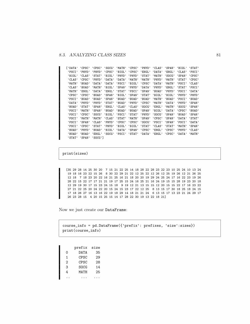
8.3. ANALYZING CLASS SIZES 81
['DATA' 'CPSC' 'CPSC' 'SOCG' 'MATH' 'CPSC' 'PHYD' 'CLAS' 'SPAN' 'BIOL' 'STAT''PSCI' 'PHYD' 'PHYD' 'CPSC' 'BIOL' 'CPSC' 'ENGL' 'DATA' 'ENGL' 'CLAS' 'PSCI''BIOL' 'CLAS' 'STAT' 'BIOL' 'PHYD' 'PHYD' 'STAT' 'MATH' 'SOCG' 'SPAN' 'CPSC''CLAS' 'CPSC' 'PHYD' 'DATA' 'DATA' 'MATH' 'MATH' 'PHYD' 'MATH' 'STAT' 'CPSC''MATH' 'BUAD' 'DATA' 'DATA' 'PSCI' 'BIOL' 'CPSC' 'DATA' 'MATH' 'PSCI' 'CLAS''CLAS' 'BUAD' 'MATH' 'BIOL' 'SPAN' 'PHYD' 'DATA' 'PHYD' 'ENGL' 'STAT' 'PSCI''MATH' 'ENGL' 'DATA' 'ENGL' 'STAT' 'PSCI' 'SPAN' 'BUAD' 'PHYD' 'PSCI' 'DATA''CPSC' 'CPSC' 'BUAD' 'SPAN' 'BIOL' 'SPAN' 'STAT' 'BIOL' 'BIOL' 'PHYD' 'PHYD''PSCI' 'BUAD' 'BUAD' 'SPAN' 'BUAD' 'BUAD' 'BUAD' 'MATH' 'BUAD' 'PSCI' 'BUAD''DATA' 'PHYD' 'PHYD' 'STAT' 'BUAD' 'PHYD' 'CPSC' 'MATH' 'DATA' 'PHYD' 'SPAN''BUAD' 'STAT' 'SPAN' 'ENGL' 'CLAS' 'CLAS' 'SOCG' 'ENGL' 'MATH' 'SOCG' 'SPAN''PSCI' 'MATH' 'SPAN' 'BUAD' 'BUAD' 'BUAD' 'SPAN' 'BIOL' 'DATA' 'CPSC' 'BUAD''PSCI' 'CPSC' 'SOCG' 'BIOL' 'PSCI' 'STAT' 'PHYD' 'SOCG' 'SPAN' 'BUAD' 'SPAN''PSCI' 'MATH' 'MATH' 'CLAS' 'STAT' 'MATH' 'SPAN' 'CPSC' 'SPAN' 'DATA' 'STAT''PSCI' 'SPAN' 'CLAS' 'PHYD' 'CPSC' 'CPSC' 'SOCG' 'PSCI' 'SPAN' 'PSCI' 'DATA''PSCI' 'CPSC' 'STAT' 'PHYD' 'BIOL' 'BIOL' 'STAT' 'CLAS' 'STAT' 'MATH' 'SPAN''BUAD' 'PHYD' 'BUAD' 'BIOL' 'DATA' 'SPAN' 'CPSC' 'ENGL' 'CPSC' 'PHYD' 'CLAS''BUAD' 'BUAD' 'ENGL' 'SOCG' 'PSCI' 'STAT' 'DATA' 'ENGL' 'CPSC' 'DATA' 'MATH''STAT' 'SPAN' 'SOCG']
print(sizes)
[35 29 28 14 25 30 20 7 15 21 22 25 14 18 28 22 28 23 22 23 10 25 24 10 13 2419 18 16 23 22 15 26 8 30 22 29 21 22 12 25 22 12 26 12 25 19 26 12 21 26 2512 18 7 18 23 20 22 16 21 25 16 21 18 20 20 19 29 24 25 24 17 16 22 23 19 2628 22 15 22 17 17 21 21 19 17 25 15 24 16 25 21 16 24 19 15 15 28 19 23 20 1812 29 19 30 17 15 23 24 15 18 9 19 12 21 13 15 15 12 20 15 15 22 17 16 23 2227 21 22 25 20 24 22 20 15 24 15 23 17 22 12 25 8 13 15 17 30 18 25 18 24 1517 18 26 27 16 13 16 22 19 18 29 14 18 21 21 24 6 13 15 17 13 23 21 24 29 1726 23 28 15 4 20 15 25 15 14 17 28 22 30 19 13 22 18 21]
Now we just create our DataFrame:
course_info = pd.DataFrame('prefix': prefixes, 'size':sizes)print(course_info)
prefix size0 DATA 351 CPSC 292 CPSC 283 SOCG 144 MATH 25.. ... ...
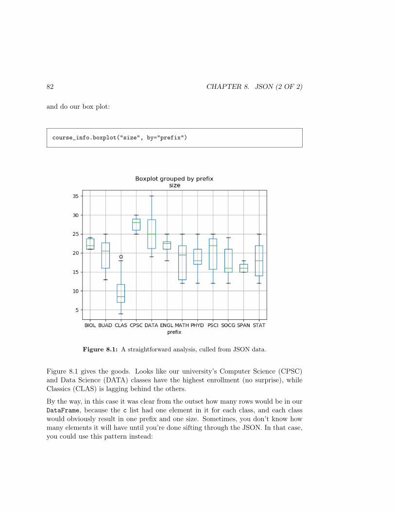
82 CHAPTER 8. JSON (2 OF 2)
and do our box plot:
course_info.boxplot("size", by="prefix")
Figure 8.1: A straightforward analysis, culled from JSON data.
Figure 8.1 gives the goods. Looks like our university’s Computer Science (CPSC)and Data Science (DATA) classes have the highest enrollment (no surprise), whileClassics (CLAS) is lagging behind the others.
By the way, in this case it was clear from the outset how many rows would be in ourDataFrame, because the c list had one element in it for each class, and each classwould obviously result in one prefix and one size. Sometimes, you don’t know howmany elements it will have until you’re done sifting through the JSON. In that case,you could use this pattern instead:

8.3. ANALYZING CLASS SIZES 83
prefixes = np.empty(0, dtype=object)sizes = np.empty(0, dtype=int)
for course in c:prefixes = np.append(prefixes, course['prefix'])sizes = np.append(sizes, len(course['roster']))
You see how this works: instead of starting off with arrays of the proper length, westart off with zero length, and simply append() a value to each of them as we go.Warning, however: this approach is way slower if the data size is large. Doing abunch of appends forces Python to create a whole new array each time through theloop, copying the contents! It’s always faster to pre-allocate arrays of the properlength – or perhaps, of a safe “large enough” length which we can then truncate atthe end with a slice – than to do this repeated-appending approach.
Bottom line: once you get your data into a DataFrame, you can bring all your powersto bear upon it. Getting it into one is largely a matter of looping and selectivelyextracting.

84 CHAPTER 8. JSON (2 OF 2)
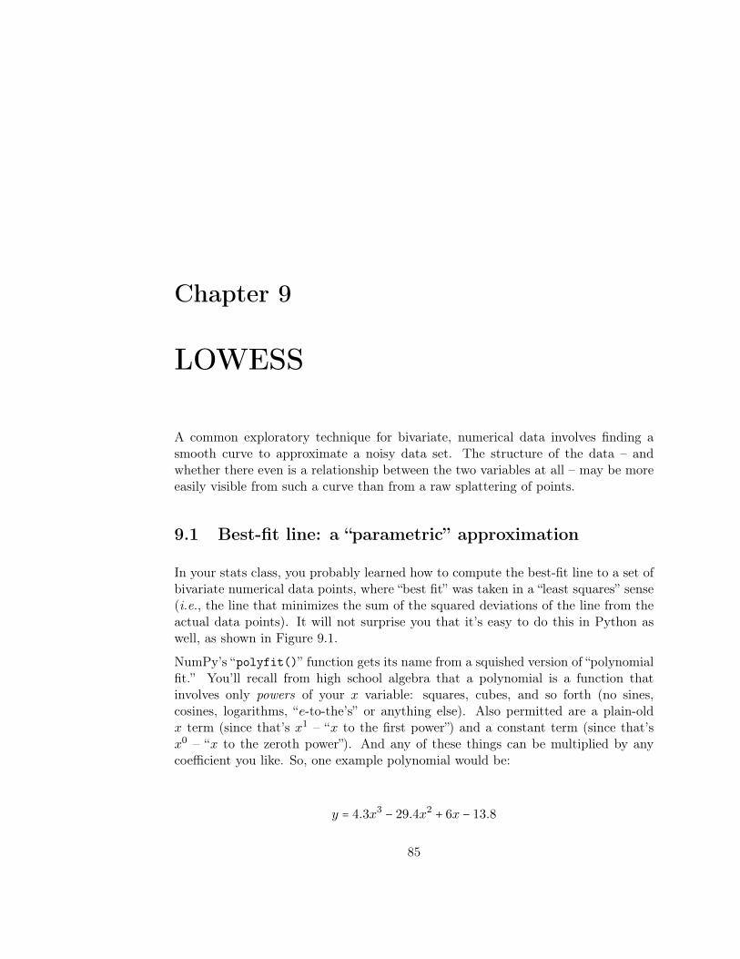
Chapter 9
LOWESS
A common exploratory technique for bivariate, numerical data involves finding asmooth curve to approximate a noisy data set. The structure of the data – andwhether there even is a relationship between the two variables at all – may be moreeasily visible from such a curve than from a raw splattering of points.
9.1 Best-fit line: a “parametric” approximation
In your stats class, you probably learned how to compute the best-fit line to a set ofbivariate numerical data points, where “best fit” was taken in a “least squares” sense(i.e., the line that minimizes the sum of the squared deviations of the line from theactual data points). It will not surprise you that it’s easy to do this in Python aswell, as shown in Figure 9.1.
NumPy’s “polyfit()” function gets its name from a squished version of “polynomialfit.” You’ll recall from high school algebra that a polynomial is a function thatinvolves only powers of your x variable: squares, cubes, and so forth (no sines,cosines, logarithms, “e-to-the’s” or anything else). Also permitted are a plain-oldx term (since that’s x1 – “x to the first power”) and a constant term (since that’sx0 – “x to the zeroth power”). And any of these things can be multiplied by anycoefficient you like. So, one example polynomial would be:
y = 4.3x3 − 29.4x2 + 6x − 13.8
85

86 CHAPTER 9. LOWESS
# Create some random x points and some crazy, noisy y function of them.x = np.random.uniform(0,100,100)x.sort()y = 4*x - .2 * x**2 + np.random.normal(0,120,100)
# Get the slope and intercept of the best-fit line.m, b = np.polyfit(x, y, 1)
# Heck, while we're at it, let's find the best-fit quadratic, too.a1, a2, a3 = np.polyfit(x, y, 2)
# Plot the points and the approximations.plt.scatter(x,y)plt.plot(x, m*x + b,color="green")plt.plot(x, a1*x**2 + a2*x + a3,color="purple")
Figure 9.1: Finding and plotting the best-fit (least-squares) line. (Notethat we have to .sort() the x points since we draw line plots based onthem, and you get crazy zig-zags if you don’t sort your x values first.)
0 20 40 60 80 100
1500
1250
1000
750
500
250
0
250
Figure 9.2: The best-fit line, and best-fit quadratic, to the set of pointsgenerated by the code in Figure 9.1.
9.1. BEST-FIT LINE: A “PARAMETRIC” APPROXIMATION 87
The degree of a polynomial is the highest exponent it contains; the above examplehas degree 3.
Now the polyfit() function asks: which polynomial can I pick (of a given degree)that will get the closest to the data points – i.e., minimize the squared distancesbetween the polynomial’s value and the points? It takes three arguments: an arrayof x values, an array of y values, and the degree. It returns the coefficients for thebest-fit polynomial of that degree. So in the Figure 9.1 code, when we said
m, b = np.polyfit(x, y, 1)
we were saying “please give me the coefficients of the best-fit 1-degree polynomialto these x and y points.” Since a 1-degree polynomial is a straight line, we got twocoefficients back, which we named m and b, as is traditionally done. Plotting theactual line was accomplished with this code:
plt.plot(x, m*x + b,color="green")
which says “For each x value in the data set, plot x versus mx + b.” And that, ofcourse, plots the line with slope m and y-intercept b. Similar code plots the best-fitquadratic function (2-degree polynomial), or any degree we like.
No matter what degree we use, these approximations are called parametric modelsbecause they’re based on (global) parameters: a slope and an intercept, say, or threecoefficients in the case of the quadratic. In each case, we assume the data fit anoverall particular “functional form” (like a line, or a quadratic) and say, “given thatwe feel like these data are ‘really’ a line, what parameters that describe a line wouldgive us the best line?”
Figure 9.2 shows the best-fit line and best-fit quadratic (function with an x2 term)for the points generated by the code in Figure 9.1.
88 CHAPTER 9. LOWESS
9.2 LOWESS: a “non-parametric” approximation
Now a more sophisticated technique for this task is called “LOWESS” (some-times “LOESS”1), which (sorta) stands for “Locally Weighted Estimated ScatterplotSmoothing.” LOWESS tries to capture the overall trend of a messy set of data –but what distinguishes it from a best-fit line is that it operates locally rather thanglobally. When you crunch the numbers to find the best-fit least-squares line to adata set, you’re asking, “what values of slope and intercept for a single line acrossthe entire data set will give me the lowest overall deviation from the points?” (Thesame is true for a best-fit quadratic, cubic, etc.) In other words, you’re attemptingto fit a single model over the entire range of data, and penalizing inaccuracies equallyeverywhere.
By contrast, the LOWESS technique approximates the data locally. This means thatit weights the data points in such a way that points close to the location of interestcontribute more strongly than do data points farther away. It does this by fittinga linear (or polynomial) regression to each x point of interest, but using a weightedcontribution from only the nearby points.
Here’s how it works. We start with a bunch of (x, y) points, and we want to computea “locally smoothed” y for every one of the x’s.
First, we have a parameter α that specifies what fraction of the data to take intoaccount (at all) for each estimate. This can be any value from 0 to 1. You mightguess that the smaller it is, the more wiggly it’ll allow our smoothed estimate to be,since we’ll be considering only a small number of points. This is true, as we’ll see.
Then, once we’ve fixed α, we’re going to find a bunch of best-fit, least-squares lines,one at each x value. This is just like in regular old linear regression. The catch isthat instead of minimizing the sum of squared differences, we’re going to minimizethe weighted sum. And we’ll place a greater weight on the errors for x points closeto the one we’re evaluating. This will have the effect of allowing the curve to bendclosely to our actual data points while ignoring stuff that’s far away.
Written in equations, the ordinary best-fit line approach finds an m and b thatminimize the overall sum of squared deviations (or “residual sum of squares”):
1Some authors make a very fine distinction between the LOESS and the LOWESS techniques,which is too nitpicky to even get into here. We’ll treat the two terms as synonymous.
9.2. LOWESS: A “NON-PARAMETRIC” APPROXIMATION 89
RSS =∑i
(yi − (mxi + b))2
But with LOWESS, we calculate this separately for every x point, and we weightthis with a weight function w:
RSS(x) =∑i
w(x − xi) ⋅ (yi − (mxi + b))2
Note how the weight function is given the distance between the x value of interestand the locations of the actual data points. Since we want to weight close-by pointsmore heavily, the w should be higher for values closer to zero.2
This is non-parametric because when we’re done, if somebody asked, “hey, I likeyour LOWESS curve – what parameters did you use for it?” the answer would be“uh...there really aren’t any parameters.” The curve is a messy combination of abunch of different shifting approximations that we calculated as we went throughthe whole data set. We didn’t choose parameters to plug into a particular model; infact, we didn’t really have a model.
Like KDEs, this technique wasn’t computationally possible until the age of comput-ers. Hence it’s one of the newer kids on the block. Here’s how to do it in Pythonwith the statsmodel library:
from statsmodels.nonparametric.smoothers_lowess import lowess
l = lowess(y,x,frac=1/3)plt.plot(l[:,0],l[:,1],color="red")
The “frac” parameter is our α. The resulting curve for two different values of α isshown in Figure 9.3. Notice how α = 1
3 gives a much smoother line than α = 110 , since
2 If you’re really on your game, you might observe that the weight function is much like thekernel for KDEs: in fact, it really is basically a kernel. Thus we can use a Gaussian for it, just likewe did for KDEs, although it’s more common with LOWESS to use the so-called “tri-cube” kernel:w(∆x) = (1 − ∣∆x∣3)3 for ∣x∣ < 1 (and 0 otherwise).
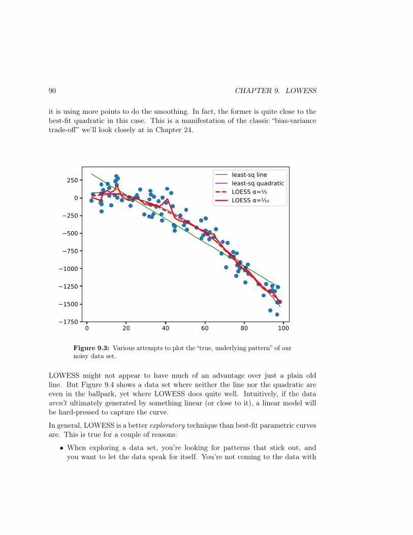
90 CHAPTER 9. LOWESS
it is using more points to do the smoothing. In fact, the former is quite close to thebest-fit quadratic in this case. This is a manifestation of the classic “bias-variancetrade-off” we’ll look closely at in Chapter 24.
0 20 40 60 80 1001750
1500
1250
1000
750
500
250
0
250least-sq lineleast-sq quadraticLOESS =LOESS =
Figure 9.3: Various attempts to plot the “true, underlying pattern” of ournoisy data set.
LOWESS might not appear to have much of an advantage over just a plain oldline. But Figure 9.4 shows a data set where neither the line nor the quadratic areeven in the ballpark, yet where LOWESS does quite well. Intuitively, if the dataaren’t ultimately generated by something linear (or close to it), a linear model willbe hard-pressed to capture the curve.
In general, LOWESS is a better exploratory technique than best-fit parametric curvesare. This is true for a couple of reasons:
• When exploring a data set, you’re looking for patterns that stick out, andyou want to let the data speak for itself. You’re not coming to the data with

9.2. LOWESS: A “NON-PARAMETRIC” APPROXIMATION 91
0 20 40 60 80 100
1000
0
1000
2000
3000
4000least-sq lineleast-sq quadraticLOESS =LOESS =
Figure 9.4: A decidedly non-linear data set, for which LOWESS (andparticularly LOWESS with a low α) does quite well.
a pre-established model choice and wanting to fit it. LOWESS lets you bemodel-agnostic and yet see the forest instead of just trees.
• LOWESS (and non-parametric methods in general) are “robust,” meaning theyaren’t as adversely affected by outliers. Consider fitting a least-squares lineto a set of data, and then introducing a couple of outliers near one of thefar ends. This is going to force your global-error-minimizing best-fit line toswing radically away from the bulk of the data (which it may describe fairlyadequately) in order to try and reach those outliers. Clearly this isn’t a goodfit for the data! LOWESS, however, will only “reach” for those outliers in thex range when it gets near those outliers.
By the way, although we fit a linear function to each local point, we could fit aquadratic, cubic, or anything else. Here’s something to think about: if we replacedthe linear “mx+ b” function with just a constant “b”, then LOWESS becomes simply

92 CHAPTER 9. LOWESS
a weighted moving average. Oooo, deep.
Finally, remember to play with the α parameter just as you played with the kernelwidth and bin size in other exploratory techniques. Remember: changing this willgive you different views on the data, and different views are good.
Chapter 10
Data fusion
In this chapter we’ll introduce the sexy-sounding technique of data fusion. Datafusion means combining and integrating multiple data sources into a single data set.This can give you richer, more useful information than any of the individual datasets could on their own.
10.1 Merge operations
On the ground, data fusion usually necessitates merging multiple tables together.As we’ve learned, the lingua franca of the data science world is the rectangular tableperfectly reflected by a CSV file: it has (heterogeneous) rows, it has (homogeneous)columns, and is otherwise flat. In Pandas we speak of this structure as a DataFrame,of course.
More complicated data sets sometimes consist of multiple such tables. This is espe-cially true if there are different aspects to the data, each of which is deserving of itsown table. The tables are often implicitly related, as we’ll see, through some pieceof common information that links them together logically.
Moreover, there will be times in your career when you want to integrate multipledifferent data sets in some way, perhaps because each gives you information on somerelated aspect of a common phenomenon. Imagine if you found a data source givingvote totals for various political candidates, and a different data source documentingthe financial donations that their campaigns received. An obvious question would be:“to what extent do a candidate’s contributions relate to his/her vote count?” This
93
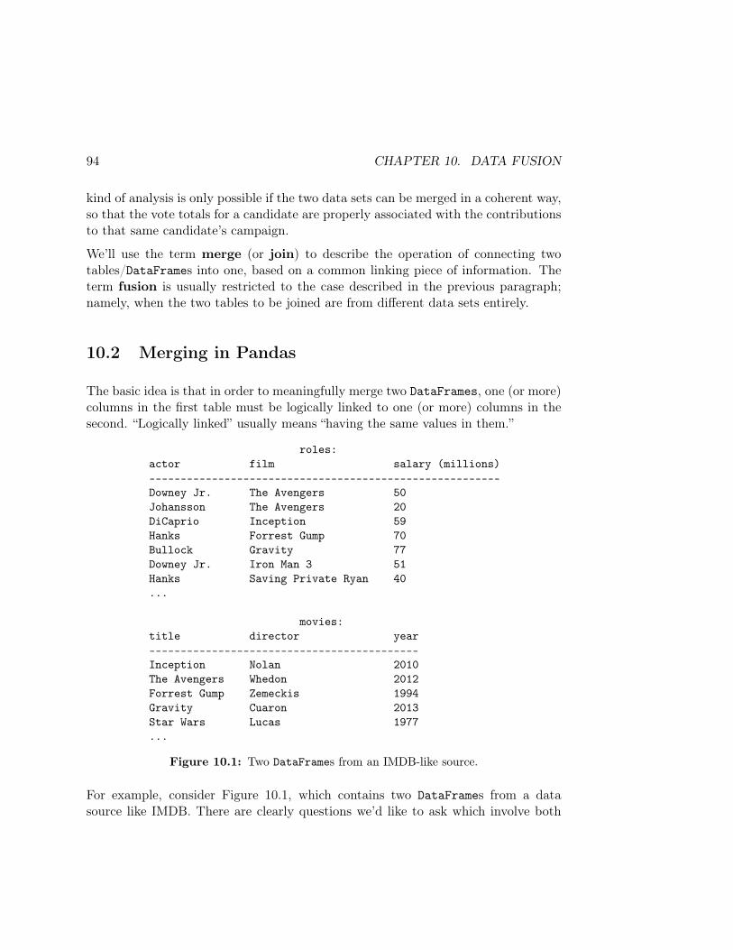
94 CHAPTER 10. DATA FUSION
kind of analysis is only possible if the two data sets can be merged in a coherent way,so that the vote totals for a candidate are properly associated with the contributionsto that same candidate’s campaign.
We’ll use the term merge (or join) to describe the operation of connecting twotables/DataFrames into one, based on a common linking piece of information. Theterm fusion is usually restricted to the case described in the previous paragraph;namely, when the two tables to be joined are from different data sets entirely.
10.2 Merging in Pandas
The basic idea is that in order to meaningfully merge two DataFrames, one (or more)columns in the first table must be logically linked to one (or more) columns in thesecond. “Logically linked” usually means “having the same values in them.”
roles:actor film salary (millions)--------------------------------------------------------Downey Jr. The Avengers 50Johansson The Avengers 20DiCaprio Inception 59Hanks Forrest Gump 70Bullock Gravity 77Downey Jr. Iron Man 3 51Hanks Saving Private Ryan 40...
movies:title director year-------------------------------------------Inception Nolan 2010The Avengers Whedon 2012Forrest Gump Zemeckis 1994Gravity Cuaron 2013Star Wars Lucas 1977...
Figure 10.1: Two DataFrames from an IMDB-like source.
For example, consider Figure 10.1, which contains two DataFrames from a datasource like IMDB. There are clearly questions we’d like to ask which involve both

10.2. MERGING IN PANDAS 95
DataFrames together, rather than each in isolation. For instance, “have actor salariesbeen going up over time?” or “how often have various actors worked with specificdirectors?”
Merging here is simple: we simply identify the common column which unites rowsfrom the two tables. Clearly, it’s the film title: we know that Scarlett Johanssonwas directed by Joss Whedon because a Johansson row in the roles table has thesame film name as a Whedon row in the movies table.
In database parlance, we call the title column of the movies table its primarykey (PK), and we call the film column of the roles table a foreign key (FK). Theprimary key / foreign key relationship is supposed to suggest that for every row inthe roles table, its film value will appear in one row of the movies table (namely,in that row’s title column).
To “join” these two DataFrames all in one fell swoop, we execute a command likethis:
roles_movies = pd.merge(roles, movies, left_on="film", right_on="title")
This produces a new DataFrame that contains (1) all the columns of the two, and(2) a row for each pair of original rows that match on their movie title. Notice wehad to specify two arguments (besides the table names) to pd.merge(): “left_on”(for the name of the merging column in the first DataFrame) and “right_on” (forthe second). If these two columns had the same name, we could just specify a singleargument called “on” for the two.
The roles_movies table will look like this:
roles_movies:actor film salary (millions) title director year--------------------------------------------------------------------------Bullock Gravity 77 Gravity Cuaron 2013DiCaprio Inception 59 Inception Nolan 2010Johansson The Avengers 20 The Avengers Whedon 2012Downey Jr. The Avengers 50 The Avengers Whedon 2012....

96 CHAPTER 10. DATA FUSION
(The sequence of the rows is not in general reliable, and you should not depend onthem being in the order you expect.) This DataFrame can be used to answer eitherof the questions we posed above, and others.
Note that our new table has some redundant information (the film and titlecolumns are identical) which you can remove using normal Pandas operations ifyou wish.
10.3 Odds and ends
1. Sometimes we want to merge on more than one column; for instance:
df = pd.merge(votes, contribs, left_on=['first_name','last_name'],right_on=['candidate_first','candidate_last'])
This gives us rows in the result only when the values in both the first_nameand last_name columns of votesmatch the candidate_first and candidate_lastcolumns of contribs.
2. If we’re lucky, the name(s) of the column(s) we want to merge on are namedexactly the same in both DataFrames. In this case, we actually don’t haveto specify on, left_on, or right_on: we can just do the merge() with twoarguments:
merged_df = pd.merge(df1, df2)
This is called a “natural join,” and also has the benefit of only including thejoined column(s) once in the result, rather than preserving duplicates.
3. The default merge operation we’ve been doing so far is sometimes called an“inner join”. This means that if there is no corresponding match for a rowin one of the DataFrames, there will be no associated row in the result. Thisis normally what we want. In the movies example, if we don’t have a row inthe movies table for a particular film, then we don’t know the year for thatfilm, and it’s (perhaps) pointless to include any of the actors in that film inthe resulting merged DataFrame.
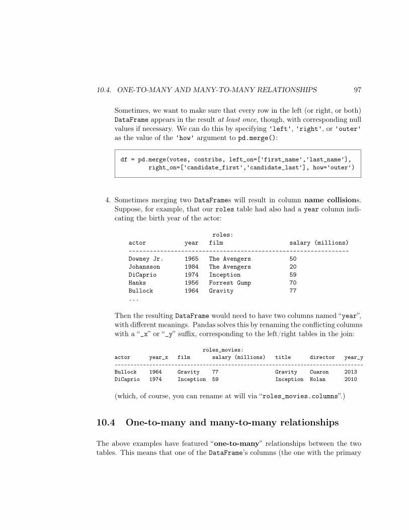
10.4. ONE-TO-MANY AND MANY-TO-MANY RELATIONSHIPS 97
Sometimes, we want to make sure that every row in the left (or right, or both)DataFrame appears in the result at least once, though, with corresponding nullvalues if necessary. We can do this by specifying 'left', 'right', or 'outer'as the value of the 'how' argument to pd.merge():
df = pd.merge(votes, contribs, left_on=['first_name','last_name'],right_on=['candidate_first','candidate_last'], how='outer')
4. Sometimes merging two DataFrames will result in column name collisions.Suppose, for example, that our roles table had also had a year column indi-cating the birth year of the actor:
roles:actor year film salary (millions)---------------------------------------------------------------Downey Jr. 1965 The Avengers 50Johansson 1984 The Avengers 20DiCaprio 1974 Inception 59Hanks 1956 Forrest Gump 70Bullock 1964 Gravity 77...
Then the resulting DataFrame would need to have two columns named “year”,with different meanings. Pandas solves this by renaming the conflicting columnswith a “_x” or “_y” suffix, corresponding to the left/right tables in the join:
roles_movies:actor year_x film salary (millions) title director year_y-------------------------------------------------------------------------------Bullock 1964 Gravity 77 Gravity Cuaron 2013DiCaprio 1974 Inception 59 Inception Nolan 2010
(which, of course, you can rename at will via “roles_movies.columns”.)
10.4 One-to-many and many-to-many relationships
The above examples have featured “one-to-many” relationships between the twotables. This means that one of the DataFrame’s columns (the one with the primary

98 CHAPTER 10. DATA FUSION
key) has only one row for each matching value: many actors star in one movie, forinstance. But sometimes we have a “many-to-many” relationship, in which bothDataFrames can have multiple rows with values that match the other. Consider theHalloween costumes data set below, with costumes and children tables:
print(costumes)
accessory costume0 crown Princess1 wand Princess2 dress Princess3 helmet Darth Vader4 boots Darth Vader5 lightsaber Darth Vader6 cape Darth Vader7 cape Elsa8 wand Elsa9 lightsaber Rey10 utility belt Batman11 boots Batman12 cape Batman13 mask Batman14 cape Anna15 wig Anna16 boots Anna17 sack Ghost18 pointy hat Wizard19 wand Wizard
print(children)
child age costume0 Allison 12 Elsa1 Kiara 8 Princess2 Mason 12 Batman3 Jenny 12 Wizard4 Wendell 11 Student5 Betty Lou 10 Princess6 Hermione 11 Wizard7 Faith 13 Wizard8 Julie 11 Elsa
In order to represent all these children in their chosen costumes, we need multi-
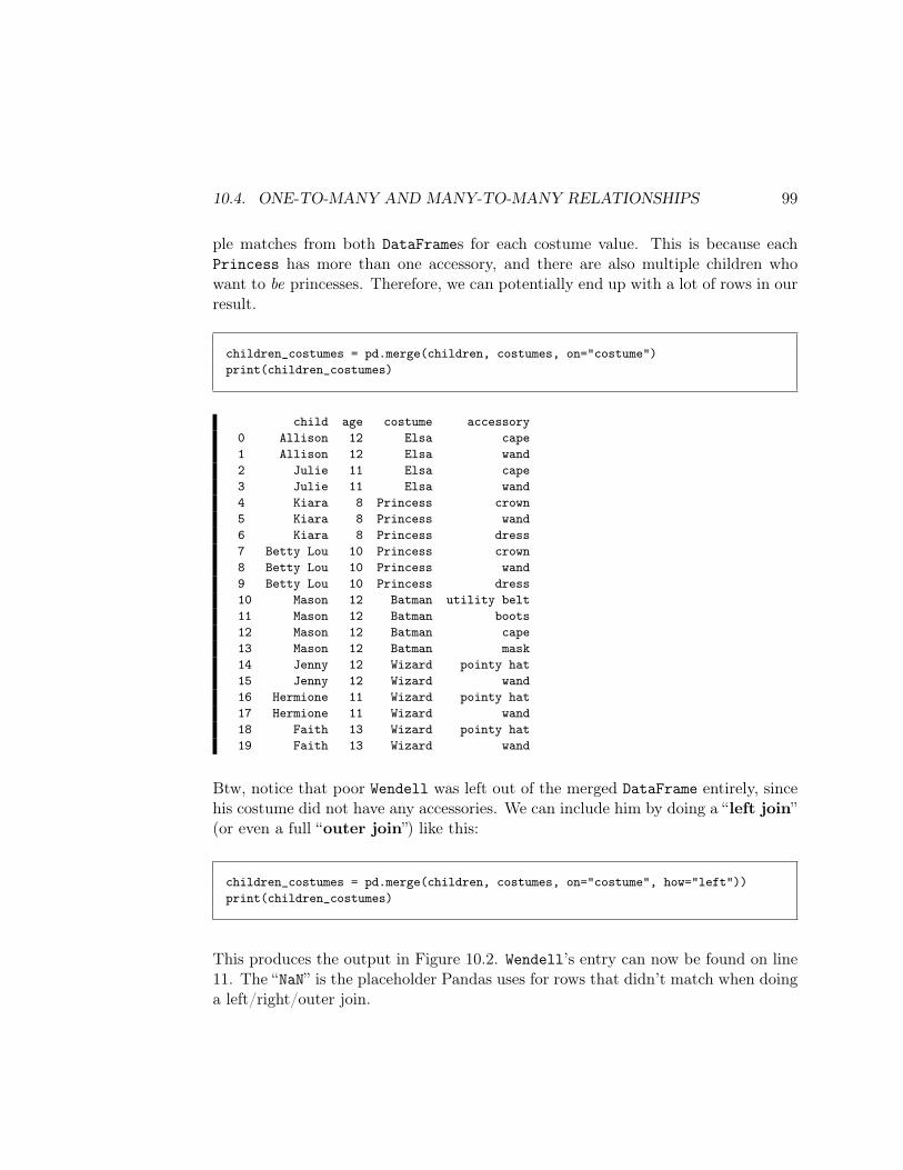
10.4. ONE-TO-MANY AND MANY-TO-MANY RELATIONSHIPS 99
ple matches from both DataFrames for each costume value. This is because eachPrincess has more than one accessory, and there are also multiple children whowant to be princesses. Therefore, we can potentially end up with a lot of rows in ourresult.
children_costumes = pd.merge(children, costumes, on="costume")print(children_costumes)
child age costume accessory0 Allison 12 Elsa cape1 Allison 12 Elsa wand2 Julie 11 Elsa cape3 Julie 11 Elsa wand4 Kiara 8 Princess crown5 Kiara 8 Princess wand6 Kiara 8 Princess dress7 Betty Lou 10 Princess crown8 Betty Lou 10 Princess wand9 Betty Lou 10 Princess dress10 Mason 12 Batman utility belt11 Mason 12 Batman boots12 Mason 12 Batman cape13 Mason 12 Batman mask14 Jenny 12 Wizard pointy hat15 Jenny 12 Wizard wand16 Hermione 11 Wizard pointy hat17 Hermione 11 Wizard wand18 Faith 13 Wizard pointy hat19 Faith 13 Wizard wand
Btw, notice that poor Wendell was left out of the merged DataFrame entirely, sincehis costume did not have any accessories. We can include him by doing a “left join”(or even a full “outer join”) like this:
children_costumes = pd.merge(children, costumes, on="costume", how="left"))print(children_costumes)
This produces the output in Figure 10.2. Wendell’s entry can now be found on line11. The “NaN” is the placeholder Pandas uses for rows that didn’t match when doinga left/right/outer join.
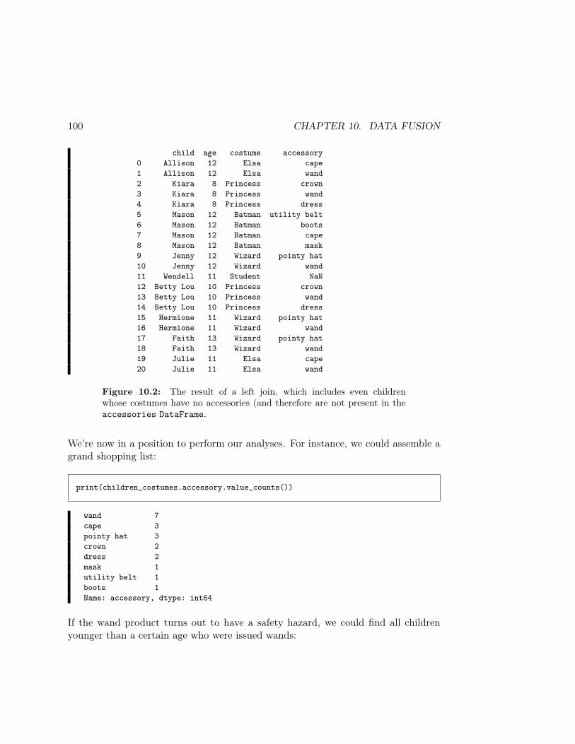
100 CHAPTER 10. DATA FUSION
child age costume accessory0 Allison 12 Elsa cape1 Allison 12 Elsa wand2 Kiara 8 Princess crown3 Kiara 8 Princess wand4 Kiara 8 Princess dress5 Mason 12 Batman utility belt6 Mason 12 Batman boots7 Mason 12 Batman cape8 Mason 12 Batman mask9 Jenny 12 Wizard pointy hat10 Jenny 12 Wizard wand11 Wendell 11 Student NaN12 Betty Lou 10 Princess crown13 Betty Lou 10 Princess wand14 Betty Lou 10 Princess dress15 Hermione 11 Wizard pointy hat16 Hermione 11 Wizard wand17 Faith 13 Wizard pointy hat18 Faith 13 Wizard wand19 Julie 11 Elsa cape20 Julie 11 Elsa wand
Figure 10.2: The result of a left join, which includes even childrenwhose costumes have no accessories (and therefore are not present in theaccessories DataFrame.
We’re now in a position to perform our analyses. For instance, we could assemble agrand shopping list:
print(children_costumes.accessory.value_counts())
wand 7cape 3pointy hat 3crown 2dress 2mask 1utility belt 1boots 1Name: accessory, dtype: int64
If the wand product turns out to have a safety hazard, we could find all childrenyounger than a certain age who were issued wands:
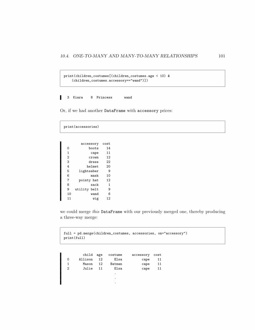
10.4. ONE-TO-MANY AND MANY-TO-MANY RELATIONSHIPS 101
print(children_costumes[(children_costumes.age < 10) &(children_costumes.accessory=="wand")])
3 Kiara 8 Princess wand
Or, if we had another DataFrame with accessory prices:
print(accessories)
accessory cost0 boots 141 cape 112 crown 123 dress 224 helmet 205 lightsaber 96 mask 107 pointy hat 128 sack 19 utility belt 910 wand 611 wig 12
we could merge this DataFrame with our previously merged one, thereby producinga three-way merge:
full = pd.merge(children_costumes, accessories, on="accessory")print(full)
child age costume accessory cost0 Allison 12 Elsa cape 111 Mason 12 Batman cape 112 Julie 11 Elsa cape 11
.
.
.
102 CHAPTER 10. DATA FUSION
Now we could, say, compute the total cost of clothing these trick-or-treaters:
print("These kids will cost a total of $.".format(full.cost.sum()))
These kids will cost a total of $212.
Ouch.
10.5 “By the way...why?”
At this point you may be asking, “if we just have to merge the DataFrames to doour analysis, why were they stored that way in the first place? Why not just haveeverything in one big CSV file?”
The answer has to do with redundancy of information. Consider the mergedtable on p. 95. It’s not the most compact way of expressing the information, becausecertain pieces of data are repeated unnecessarily.
For instance, The Avengers was released in 2012. Our data source needs to recordthat. But in the merged table, this year would be repeated for every actor/actress inthe movie. The same is true for the director of the film. By performing the merge,we have duplicated lots of values. In database terms, the data set has becomeunnormalized. This isn’t always a bad thing, and in terms of performing standardML (machine learning) algorithms, it’s necessary. But you can see why we wouldn’twant the data permanently stored that way. It consumes extra storage, plus it opensa Pandora’s Box of possible contradictions: what if Downey Jr.’s Avengers row said2012, while Johansson’s said 2014. Who would we believe?
Database normalization is a larger topic than we have time to fully cover in this class,but the basics are very simple. Conceptually: each piece of information should bestored in one and only one place. Generally speaking, when that’s true, you have anormalized data set, which is most appropriate for storage and for communicationto other potential users. Analysts will proceed to unnormalize select parts of it inorder to perform certain analyses.
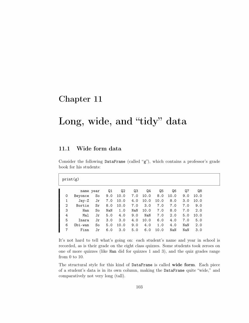
Chapter 11
Long, wide, and “tidy” data
11.1 Wide form data
Consider the following DataFrame (called “g”), which contains a professor’s gradebook for his students:
print(g)
name year Q1 Q2 Q3 Q4 Q5 Q6 Q7 Q80 Beyonce So 9.0 10.0 7.0 10.0 8.0 10.0 9.0 10.01 Jay-Z Jr 7.0 10.0 4.0 10.0 10.0 8.0 3.0 10.02 Bortis Sr 8.0 10.0 7.0 3.0 7.0 7.0 7.0 9.03 Han So NaN 1.0 NaN 10.0 7.0 8.0 7.0 2.04 Mal Jr 5.0 4.0 9.0 NaN 7.0 2.0 5.0 10.05 Inara Jr 3.0 3.0 4.0 10.0 6.0 4.0 7.0 5.06 Obi-wan So 5.0 10.0 9.0 4.0 1.0 4.0 NaN 2.07 Finn Jr 6.0 3.0 5.0 6.0 10.0 NaN NaN 3.0
It’s not hard to tell what’s going on: each student’s name and year in school isrecorded, as is their grade on the eight class quizzes. Some students took zeroes onone of more quizzes (like Han did for quizzes 1 and 3), and the quiz grades rangefrom 0 to 10.
The structural style for this kind of DataFrame is called wide form. Each pieceof a student’s data is in its own column, making the DataFrame quite “wide,” andcomparatively not very long (tall).
103
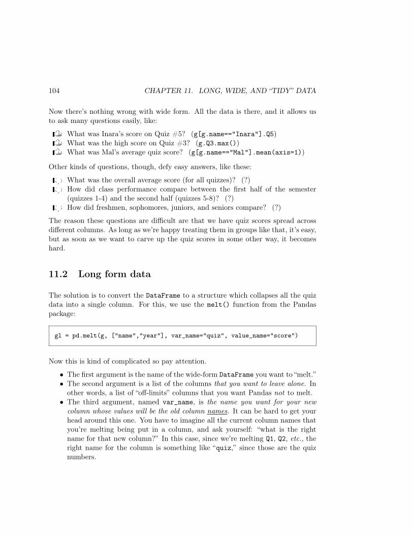
104 CHAPTER 11. LONG, WIDE, AND “TIDY” DATA
Now there’s nothing wrong with wide form. All the data is there, and it allows usto ask many questions easily, like:
U What was Inara’s score on Quiz #5? (g[g.name=="Inara"].Q5)U What was the high score on Quiz #3? (g.Q3.max())U What was Mal’s average quiz score? (g[g.name=="Mal"].mean(axis=1))
Other kinds of questions, though, defy easy answers, like these:
D What was the overall average score (for all quizzes)? (?)D How did class performance compare between the first half of the semester
(quizzes 1-4) and the second half (quizzes 5-8)? (?)D How did freshmen, sophomores, juniors, and seniors compare? (?)
The reason these questions are difficult are that we have quiz scores spread acrossdifferent columns. As long as we’re happy treating them in groups like that, it’s easy,but as soon as we want to carve up the quiz scores in some other way, it becomeshard.
11.2 Long form data
The solution is to convert the DataFrame to a structure which collapses all the quizdata into a single column. For this, we use the melt() function from the Pandaspackage:
gl = pd.melt(g, ["name","year"], var_name="quiz", value_name="score")
Now this is kind of complicated so pay attention.
• The first argument is the name of the wide-form DataFrame you want to “melt.”• The second argument is a list of the columns that you want to leave alone. In
other words, a list of “off-limits” columns that you want Pandas not to melt.• The third argument, named var_name, is the name you want for your newcolumn whose values will be the old column names. It can be hard to get yourhead around this one. You have to imagine all the current column names thatyou’re melting being put in a column, and ask yourself: “what is the rightname for that new column?” In this case, since we’re melting Q1, Q2, etc., theright name for the column is something like “quiz,” since those are the quiznumbers.

11.2. LONG FORM DATA 105
• Finally, the fourth argument, named value_name, is the name you want foryour new column whose values will be the old column’s values. You have to askyourself: “what are those ’things’ that are currently values in the Q1, Q2, etc.columns?” A reasonable answer would be “score,” since each one is a quizscore.
We set the result of the melt() call to a variable called gl (where “l” stands for“long.”) Here’s what it looks like:
print(gl)
name year quiz score0 Beyonce So Q1 9.01 Jay-Z Jr Q1 7.02 Bortis Sr Q1 8.03 Han So Q1 NaN4 Mal Jr Q1 5.05 Inara Jr Q1 3.06 Obi-wan So Q1 5.07 Finn Jr Q1 6.08 Beyonce So Q2 10.09 Jay-Z Jr Q2 10.010 Bortis Sr Q2 10.011 Han So Q2 1.012 Mal Jr Q2 4.013 Inara Jr Q2 3.014 Obi-wan So Q2 10.015 Finn Jr Q2 3.016 Beyonce So Q3 7.017 Jay-Z Jr Q3 4.018 Bortis Sr Q3 7.019 Han So Q3 NaN20 Mal Jr Q3 9.021 Inara Jr Q3 4.022 Obi-wan So Q3 9.023 Finn Jr Q3 5.0
. . .60 Mal Jr Q8 10.061 Inara Jr Q8 5.062 Obi-wan So Q8 2.063 Finn Jr Q8 3.0

106 CHAPTER 11. LONG, WIDE, AND “TIDY” DATA
This is called long form, for obvious reasons. We now have one row for every singlequiz score. It might seem wordy, and I’ll admit it’s not as easy to locate and eyeballa single result. However, all our “hard” questions from above can be easily answered:
U What was the overall average score (for all quizzes)? (gl.score.mean())U How did class performance compare between the first half of the semester
(quizzes 1-4) and the second half (quizzes 5-8)?(gl[gl.quiz.isin(["Q1","Q2","Q3","Q4"])].mean())
U How did freshmen, sophomores, juniors, and seniors compare?(gl.groupby("year").score.mean())
Turning what were column headings into values gave us all the flexibility we needed.We can still treat all the scores individually by quiz if we want to, but we can alsotreat them as a whole, or aggregate them in other ways (like by school year).
As an aside, one thing I’d probably do to this DataFrame is get rid of the leading“Q” before each quiz value, and convert that column to integers to boot:
gl.quiz = gl.quiz.str[1]gl.quiz = gl.quiz.astype(int)print(gl)
name year quiz score0 Beyonce So 1 9.01 Jay-Z Jr 1 7.02 Bortis Sr 1 8.03 Han So 1 NaN4 Mal Jr 1 5.05 Inara Jr 1 3.06 Obi-wan So 1 5.07 Finn Jr 1 6.08 Beyonce So 2 10.09 Jay-Z Jr 2 10.010 Bortis Sr 2 10.011 Han So 2 1.012 Mal Jr 2 4.013 Inara Jr 2 3.014 Obi-wan So 2 10.015 Finn Jr 2 3.016 Beyonce So 3 7.017 Jay-Z Jr 3 4.018 Bortis Sr 3 7.0
The “.str” suffix, you’ll recall, lets us perform standard string operations (likelen(), contains(), or indexing) on entire DataFrame columns. Here, by saying
11.3. “TIDY” DATA 107
“gl.quiz.str[1]”, we’re requesting only the second character (character #1) ofeach string, which extracts the “1” from “Q1” and so forth.
Treating quiz numbers like the integers they are is conceptually correct, and alsoallows us to do things like query for things like “quizzes after quiz #3” instead ofhaving to list a bunch of categorical values.
11.3 “Tidy” data
The term “tidy” to describe a data set has sprung into prominence recently as aresult of the excellent paper by Hadley Wickham (of R fame) who neatly capturedthe perils of various data formatting choices. Hadley first defines these terms:
• variable – a category of something, for which individual objects have a value.Examples: name, height, gender, center field distance.
• value – an actual individual piece of data corresponding to a variable for oneobject. Examples: Kylo Ren, 5’6", female, 390 feet.
• observation – a particular measurement that comprises all the informationnecessary to interpret that measurement. Examples: Jeff’s weight was 165lbs., Jenny’s golf score at Field & Cross Links in the rain was 88. (In thefirst example, “all the information necessary” includes “Jeff” and “165”; in thesecond, it includes “Jenny”, “Field & Cross Links”, “rainy”, and “88”.)
• observational unit – a collection of all the observations of a particular type.(“Golf performances” would be an observational unit, separate from a “golfers”unit which contains information about golfers themselves, not their particularperformances.)
Then, he outlined one simple rule. A data set is considered tidy if and only if:
1. Each observational unit is in its own table.2. In each table, each observation forms a row.3. In each table, each column header is a variable, and the column contains values.
Point #1 is essentially the same as “normalized,” from section 10.5 (p.102). Points#2 and #3 are essentially “long form,” as described in the previous section. Hence,I usually think of “tidy” as meaning “normalized and long.”
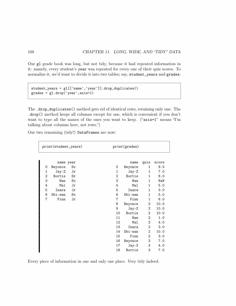
108 CHAPTER 11. LONG, WIDE, AND “TIDY” DATA
Our gl grade book was long, but not tidy, because it had repeated information init: namely, every student’s year was repeated for every one of their quiz scores. Tonormalize it, we’d want to divide it into two tables; say, student_years and grades:
student_years = gl[['name','year']].drop_duplicates()grades = gl.drop('year',axis=1)
The .drop_duplicates() method gets rid of identical rows, retaining only one. The.drop() method keeps all columns except for one, which is convenient if you don’twant to type all the names of the ones you want to keep. (“axis=1” means “I’mtalking about columns here, not rows.”)
Our two remaining (tidy!) DataFrames are now:
print(student_years) print(grades)
name year name quiz score0 Beyonce So 0 Beyonce 1 9.01 Jay-Z Jr 1 Jay-Z 1 7.02 Bortis Sr 2 Bortis 1 8.03 Han So 3 Han 1 NaN4 Mal Jr 4 Mal 1 5.05 Inara Jr 5 Inara 1 3.06 Obi-wan So 6 Obi-wan 1 5.07 Finn Jr 7 Finn 1 6.0
8 Beyonce 2 10.09 Jay-Z 2 10.010 Bortis 2 10.011 Han 2 1.012 Mal 2 4.013 Inara 2 3.014 Obi-wan 2 10.015 Finn 2 3.016 Beyonce 3 7.017 Jay-Z 3 4.018 Bortis 3 7.0
Every piece of information in one and only one place. Very tidy indeed.
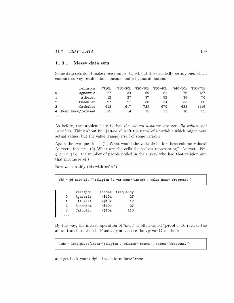
11.3. “TIDY” DATA 109
11.3.1 Messy data sets
Some data sets don’t make it easy on us. Check out this decidedly untidy one, whichcontains survey results about income and religious affiliation:
religion <$10k $10-20k $20-30k $30-40k $40-50k $50-75k0 Agnostic 27 34 60 81 76 1371 Atheist 12 27 37 52 35 702 Buddhist 27 21 30 34 33 583 Catholic 418 617 732 670 638 11164 Dont know/refused 15 14 15 11 10 35...
As before, the problem here is that the column headings are actually values, notvariables. Think about it: “$10-20k” isn’t the name of a variable which might haveactual values, but the value (range) itself of some variable.
Again the two questions: (1) What would the variable be for these column values?Answer: Income. (2) What are the cells themselves representing? Answer: Fre-quency. (i.e., the number of people polled in the survey who had that religion andthat income level.)
Now we can tidy this with melt():
tdf = pd.melt(df, ['religion'], var_name='income', value_name='frequency')
religion income frequency0 Agnostic <$10k 271 Atheist <$10k 122 Buddhist <$10k 273 Catholic <$10k 418
...
By the way, the inverse operation of “melt” is often called “pivot”. To reverse theabove transformation in Pandas, you can use the .pivot() method:
wide = long.pivot(index='religion', columns='income', values='frequency')
and get back your original wide form DataFrame.

110 CHAPTER 11. LONG, WIDE, AND “TIDY” DATA

Chapter 12
Dates and times
One of the most common categories of information you’ll ever deal with are thosedealing with various aspects of time. It turns out this is considerably more complexthan you might think at first. For one thing, the English word “time” can meanseveral different things – a point in time (12:05pm on Feb. 20, 2020), an abstractwall clock time (12:05pm), a duration of time (1 hour and 15 minutes), and possiblyother things.
For another, the clock and calendar systems that humans have devised are just plainweird. Why does the break between “am” and “pm” occur between 11 and 12 (11am,12pm, 1pm) instead of between 12 and 1 where any sane person would put it? Whydo some months have more days than others? Heck, they don’t even follow themoon. And why do some years have more days than others? And why doesn’t everymonth start over on a Monday? And so forth. There are good answers to some ofthese questions, and lousy answers to others, but they all make dealing with time amajor pain.
12.1 The datetime package
Python helps deal with the pain through the datetime package. You have to importit, of course, which I usually do via:
import datetime as dt
111
112 CHAPTER 12. DATES AND TIMES
The package has these goodies:
• The timedelta type. Variables of this type represent durations in time. Youcan create them like this:
one_semester = dt.timedelta(weeks=15)one_year = dt.timedelta(weeks=52)this_class = dt.timedelta(hours=1, minutes=15)finger_snap = dt.timedelta(seconds=.1)
You can also use days, milliseconds, and microseconds. Anything else isambiguous. (Ask yourself: why?)
Don’t think of the timedelta variable you create as being intrinsically “in” anyparticular unit – just think of it as an “amount of time,” which could then beexpressed in any units.
timedeltas can be positive or negative, by the way, and you can add or sub-tract them to/from each other to get other timedeltas:
print(one_semester - this_class)print(this_class + finger_snap)print(one_semester - one_year)
104 days, 22:45:001:15:00.100000-259 days, 0:00:00
After printing the number of whole days (if any), the rest of the output givestime in hours:minutes:seconds:microseconds. Note that the last of these threeoutputs is negative, since one_semester is obviously shorter than one_year.
• The date type. Each date variable represents a date in an idealized Gregoriancalendar. You can create them via:
election_day = dt.date(year=2020, month=11, day=3)primary_day = dt.date(year=2020, month=3, day=4)here_we_are = dt.date.today()
12.1. THE DATETIME PACKAGE 113
If you subtract two dates, you get a timedelta. If you add a date to atimedelta, you get another date.
print(type(election_day - primary_day))print(election_day - primary_day)print(type(primary_day + one_semester))print(primary_day + one_semester)
datetime.timedelta244 days, 0:00:00datetime.date2020-06-17
Note that if your timedelta has precision more granular than days, it is lostin these operations:
if dt.date.today() == dt.date.today() + finger_snap:print("It'll still be the same day a finger snap from now.")
if dt.date.today() == dt.date.today() + this_class:print("It'll still be the same day one lecture from now.")
if dt.date.today() == dt.date.today() + one_semester:print("It'll still be the same day one semester from now.")
It'll still be the same day a finger snap from now.It'll still be the same day one lecture from now.
You can also compare dates with comparison operators like < and >=:
if primary_day < election_day:print("The primary occurs before the election, duh!")
else:print("Wuuuut??")
The primary occurs before the election, duh!
• The time type. A “time,” by itself, represents an abstract wall clock time,independent of any particular day. It doesn’t mean “5pm this afternoon” butrather “5pm’s in general.”
114 CHAPTER 12. DATES AND TIMES
start_of_class = dt.time(hour=12, minute=30)dinner_time = dt.time(hour=18, minute=0)
These can also be compared in expected ways, but not added or subtracted(which actually wouldn’t make sense – why?)
• Finally, we have the datetime type, which as its name suggests, combinesfeatures of both dates and times. In fact, a datetime variable represents anabsolute, specific point in history. Creation options include:
this_exact_moment = dt.datetime.now()terrorist_attack = dt.datetime(2001, 9, 11, 10, 33)print("Right now it's: ".format(this_exact_moment))print("A horrible thing occurred at: ".format(terrorist_attack))
Right now it's: 2020-03-10 09:33:57.015432A horrible thing occurred at: 2001-09-11 10:33:00
We can also use the datetime’s .combine() method to put a date and a timetogether into a datetime:
todays_class = dt.datetime.combine(here_we_are, start_of_class)print("Today's lecture is at: ".format(todays_class))
Today's lecture is at: 2020-03-10 12:30:00
datetimes can be subtracted from each other, and timedeltas can be addedor subtracted to/from them to produce other datetimes. They can also becompared. Finally, .time() and .date()methods will produce the constituentparts as time or date variables, accordingly.
12.2 Parsing and formatting
Now most of the time we won’t be creating datetime variables using the techniquesabove. Instead, we’ll be parsing them from string data.
12.2. PARSING AND FORMATTING 115
There are a seemingly unlimited number of ways that dates and times can be ex-pressed in strings. Just consider a few possibilities:
• Feb. 29, 2020 4pm• Feb 29, 2020 4:00pm• Feb 29, 2020 4:00 P.M.• 4/29/19 4:00 P.M.• 4/29/19 16:00• 02/29/19 16:00:00• 29-Feb-2020 4:00pm• 2020-Feb-29 16:00:00• ...
and on it goes. It’s a testimony to the power of the human mind that we can lookat these and at a glance infer what date/time was intended. Getting a computer toautomatically do so is somewhat of a challenge.
12.2.1 Pandas’ auto-parsing
The great news is that in many cases, Pandas can auto-parse common date formatsand convert strings into the proper kinds of objects. There are two ways of doingthis: as you’re loading a file with read_csv(), and after the fact.
Parsing dates with read_csv()
With read_csv(), you can pass an argument called parse_dates, whose valueshould be a list of the columns you want it to auto-parse. Suppose we had a CSVfile that looked like this:
Donor,Date,Amt,PartyBarack X. Tyrell,Tue 09/05/17,$3370,IGandalf A. Trump,Tue 07/18/17,$70,RJay-Z G. Targaryen,18-Dec-2017,$170,DBrad T. Bolton,Thu 01/26/17,$1840,RLuke T. Obama,29-Sep-2017,$4230,DMatt Y. Kenobi,Sun 12/25/16,$3695,IGandalf Z. Pitt,07-Jun-2017,$6375,I
. . .
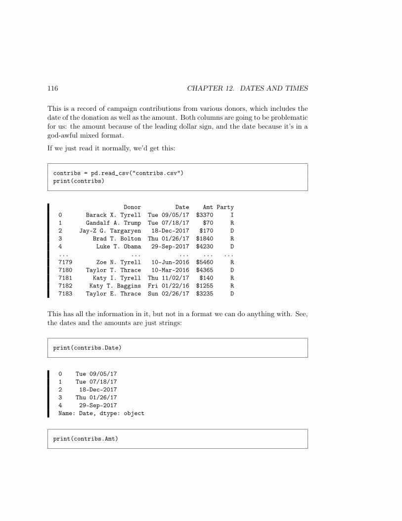
116 CHAPTER 12. DATES AND TIMES
This is a record of campaign contributions from various donors, which includes thedate of the donation as well as the amount. Both columns are going to be problematicfor us: the amount because of the leading dollar sign, and the date because it’s in agod-awful mixed format.
If we just read it normally, we’d get this:
contribs = pd.read_csv("contribs.csv")print(contribs)
Donor Date Amt Party0 Barack X. Tyrell Tue 09/05/17 $3370 I1 Gandalf A. Trump Tue 07/18/17 $70 R2 Jay-Z G. Targaryen 18-Dec-2017 $170 D3 Brad T. Bolton Thu 01/26/17 $1840 R4 Luke T. Obama 29-Sep-2017 $4230 D... ... ... ... ...7179 Zoe N. Tyrell 10-Jun-2016 $5460 R7180 Taylor T. Thrace 10-Mar-2016 $4365 D7181 Katy I. Tyrell Thu 11/02/17 $140 R7182 Katy T. Baggins Fri 01/22/16 $1255 R7183 Taylor E. Thrace Sun 02/26/17 $3235 D
This has all the information in it, but not in a format we can do anything with. See,the dates and the amounts are just strings:
print(contribs.Date)
0 Tue 09/05/171 Tue 07/18/172 18-Dec-20173 Thu 01/26/174 29-Sep-2017Name: Date, dtype: object
print(contribs.Amt)

12.2. PARSING AND FORMATTING 117
0 $33701 $702 $1703 $18404 $4230Name: Amt, dtype: object
(Recall that “object” – as we saw on p. 80 – is just a dumb way of saying “string.”Both these columns, therefore, are strings.)
It might not be obvious to you what the problem is with that. After all, isn’t str thecorrect type for text sequences like “Tue 07/18/17” and “$1840” and “18-Dec-2018”?
Sure it is, but realize that we can’t do anything interesting with dates or amounts ifthey’re in that format. For example, we can’t do any of the following:
D take the average or add up all the amounts (because they’re not numbers!)D sort the transactions chronologically (because you can’t simply alphabetize
strings like “Tue 07/18/17” and get chronological order!)D ask basic questions like “how did the average donation amount change before
and after the 2016 Presidential election?”D ...
The problem is that even though a human looks at a string like “Mon 05/14/19” andinstantly recognizes a date (and a string like “$1800” and recognizes a numericalamount in dollars), we don’t actually have dates or amounts to work with. We havesequences of characters.
So we fix all this in an instant by simply passing a parse_dates argument with thenames of the column(s) we want it to parse:
contribs = pd.read_csv("contribs.csv", parse_dates=['Date'])
Now, our Date column looks like this:
print(contribs.Date)
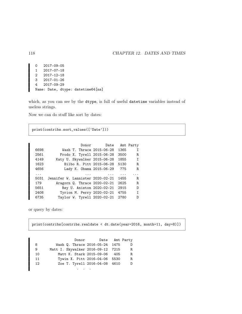
118 CHAPTER 12. DATES AND TIMES
0 2017-09-051 2017-07-182 2017-12-183 2017-01-264 2017-09-29Name: Date, dtype: datetime64[ns]
which, as you can see by the dtype, is full of useful datetime variables instead ofuseless strings.
Now we can do stuff like sort by dates:
print(contribs.sort_values(['Date']))
Donor Date Amt Party6698 Wash T. Thrace 2015-06-28 1365 I2561 Frodo X. Tyrell 2015-06-28 3500 R4149 Katy U. Skywalker 2015-06-28 1855 I1623 Bilbo R. Pitt 2015-06-28 5130 R4656 Lady K. Obama 2015-06-29 775 R... ... ... ... ...5031 Jennifer W. Lannister 2020-02-21 1455 R179 Aragorn Q. Thrace 2020-02-21 2625 R5651 Rey U. Aniston 2020-02-21 2915 D2408 Tyrion M. Perry 2020-02-21 4755 I6735 Taylor W. Tyrell 2020-02-21 2780 D
or query by dates:
print(contribs[contribs.realdate < dt.date(year=2016, month=11, day=8)])
Donor Date Amt Party8 Wash Q. Thrace 2016-05-24 1475 D9 Matt I. Skywalker 2016-09-12 7215 R10 Matt K. Stark 2015-09-06 405 R11 Tywin X. Pitt 2016-04-06 5530 R12 Zoe T. Tyrell 2016-04-08 4610 D
. . .
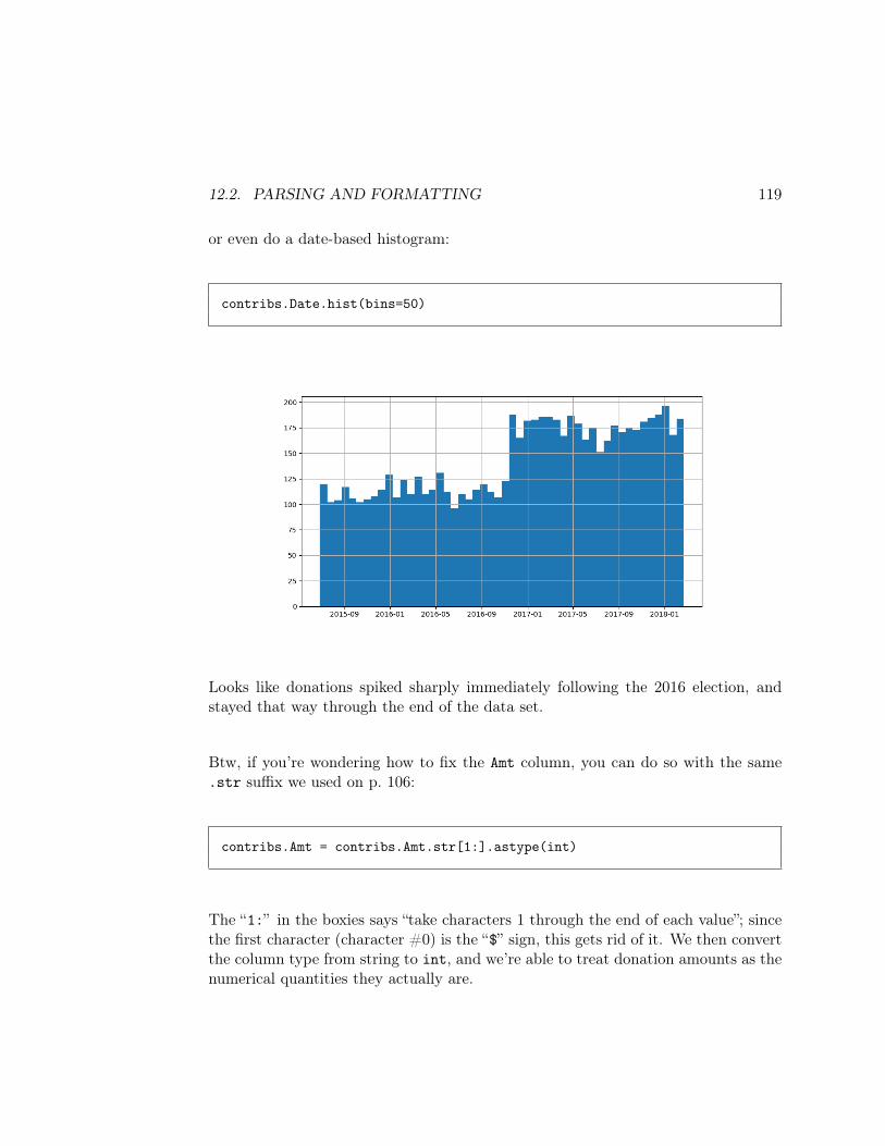
12.2. PARSING AND FORMATTING 119
or even do a date-based histogram:
contribs.Date.hist(bins=50)
Looks like donations spiked sharply immediately following the 2016 election, andstayed that way through the end of the data set.
Btw, if you’re wondering how to fix the Amt column, you can do so with the same.str suffix we used on p. 106:
contribs.Amt = contribs.Amt.str[1:].astype(int)
The “1:” in the boxies says “take characters 1 through the end of each value”; sincethe first character (character #0) is the “$” sign, this gets rid of it. We then convertthe column type from string to int, and we’re able to treat donation amounts as thenumerical quantities they actually are.
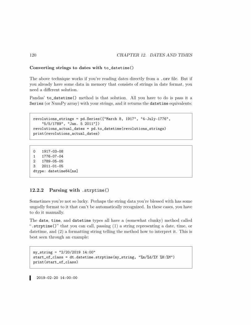
120 CHAPTER 12. DATES AND TIMES
Converting strings to dates with to_datetime()
The above technique works if you’re reading dates directly from a .csv file. But ifyou already have some data in memory that consists of strings in date format, youneed a different solution.
Pandas’ to_datetime() method is that solution. All you have to do is pass it aSeries (or NumPy array) with your strings, and it returns the datetime equivalents:
revolutions_strings = pd.Series(["March 8, 1917", "4-July-1776","5/5/1789", "Jan. 5 2011"])
revolutions_actual_dates = pd.to_datetime(revolutions_strings)print(revolutions_actual_dates)
0 1917-03-081 1776-07-042 1789-05-053 2011-01-05dtype: datetime64[ns]
12.2.2 Parsing with .strptime()
Sometimes you’re not so lucky. Perhaps the string data you’re blessed with has someungodly format to it that can’t be automatically recognized. In these cases, you haveto do it manually.
The date, time, and datetime types all have a (somewhat clunky) method called“.strptime()” that you can call, passing (1) a string representing a date, time, ordatetime, and (2) a formatting string telling the method how to interpret it. This isbest seen through an example:
my_string = "2/20/2019 14:00"start_of_class = dt.datetime.strptime(my_string, "%m/%d/%Y %H:%M")print(start_of_class)
2019-02-20 14:00:00
12.2. PARSING AND FORMATTING 121
This example demonstrates a full “round-trip” operation: we started with a string,parsed it into a datetime, and then printed it back to the screen as a string. Notethat the format of the printout didn’t match the format of “my_string”; this is okay.What matters internally to our program is that our date & time variables representthe right things, not that they are printed in certain ways.
Now what are all those funky percent signs and junk in the second argument to.strptime()? They all have a special meaning. Figure 12.1 shows some commonones (others are in the docs).
%a Weekday (abbreviated): Sun, Mon, etc.%A Weekday (full): Sunday, Monday, etc.%w Weekday (number): 0, 1, ..., 6%d Day of month (number): 0, 1, ..., 31%b Month (abbreviated): Jan, Feb, etc.%B Month (full): January, February, etc.%m Month (number): 01, 02, ..., 12%y Two-digit year: 00, 01, ..., 99%Y Four-digit year: ..., 1999, 2000, 2001, ...%H Hour on 24-hour clock: 01, 02, ..., 23%I Hour on 12-hour clock: 01, 02, ..., 12%p AM/PM (only used in conjunction with %I)%M Minute: 01, 02, ..., 59%S Second: 01, 02, ..., 59
Figure 12.1: Common date/time indicators used by .strptime() and.strftime().
You have to be really careful here and just go slow. Examine the date and/or timeinput that you have in your data set, and work out which bits of info, combined withwhich literal characters (like “/” and “:” in the example above), appear in whichorder.
12.2.3 Formatting with .strftime()
Complementary to .strptime() is “.strftime()”. (Note that the “p” stands for“parse,” while the “f” stands for “format.”) This is the reverse operation: given adate, time, or datetime variable, spit it out as a string of characters. This isn’tused nearly as often, but it occasionally is, and it’s useful to know as a translation

122 CHAPTER 12. DATES AND TIMES
mechanism.
print(start_of_class.strftime("%A, %B the %dth at %I%p."))
Tuesday, February the 20th at 02PM.
One common error: note that you call .strptime() directly on the type (date, time,or datetime), passing two arguments:
a_datetime = dt.datetime.strptime(my_birthday_string, "%m/%d/%Y %H:%M")
but you call .strftime() on the variable in question (a specific date, time, ordatetime variable), passing one argument:
a_string = my_birthday_datetime.strftime("%m/%d/%Y %H:%M")
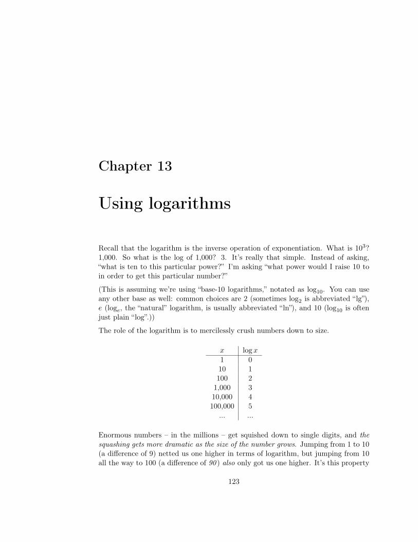
Chapter 13
Using logarithms
Recall that the logarithm is the inverse operation of exponentiation. What is 103?1,000. So what is the log of 1,000? 3. It’s really that simple. Instead of asking,“what is ten to this particular power?” I’m asking “what power would I raise 10 toin order to get this particular number?”
(This is assuming we’re using “base-10 logarithms,” notated as log10. You can useany other base as well: common choices are 2 (sometimes log2 is abbreviated “lg”),e (loge, the “natural” logarithm, is usually abbreviated “ln”), and 10 (log10 is oftenjust plain “log”.))
The role of the logarithm is to mercilessly crush numbers down to size.
x logx
1 010 1100 21,000 310,000 4100,000 5
... ...
Enormous numbers – in the millions – get squished down to single digits, and thesquashing gets more dramatic as the size of the number grows. Jumping from 1 to 10(a difference of 9) netted us one higher in terms of logarithm, but jumping from 10all the way to 100 (a difference of 90 ) also only got us one higher. It’s this property
123
124 CHAPTER 13. USING LOGARITHMS
that makes logarithms useful.
Another way to think of logarithms is “the logarithm of x is the order of magnitudeof x.”
One property of logarithms that is extremely important to know is this:
log(xy) = log(x) + log(y)
Thus logarithms effectively turn multiplications into additions. One practical impli-cation of this truth is leveraged in natural language processing systems: we oftenfind ourselves multiplying minuscule quantities (very close to zero). As we multiplythese, we get closer and closer to zero, and eventually Python doesn’t have enoughprecision to even represent a number that low. But by dealing with logarithms, we’readding instead of multiplying and avoid that problem completely.
A natural consequence of the above property is this one:
log(xa) = a log(x)
13.1 Logarithmic plots
A common plotting technique is to use not the raw values of the independent variableon the x axis, but rather their logarithms. If we do this, we have a semi-log plot.If we do this for both the x and the y axis, we have a log-log plot.
Why would we do this? There are three reasons:
1. It reins in large variations in the data. If some of our data points areorders of magnitude larger than others, the detail of the smaller points getscompletely swamped in trying to plot the larger points. Plotting orders-of-magnitude instead of raw values solves this problem, though you have to re-member you did this when interpreting the plot!Here’s a (fictitious) example of some American and British celebrities, andtheir total Instagram “likes”:
plt.plot(uk, linestyle='None', color="red", marker=".", label="UK")plt.plot(us, linestyle='None', color="green", marker=".", label="US")plt.yscale('log')plt.legend()plt.show()
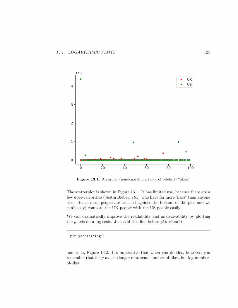
13.1. LOGARITHMIC PLOTS 125
0 20 40 60 80 100
0
1
2
3
4
1e9UKUS
Figure 13.1: A regular (non-logarithmic) plot of celebrity “likes.”
The scatterplot is shown in Figure 13.1. It has limited use, because there are afew uber-celebrities (Justin Bieber, etc.) who have far more “likes” than anyoneelse. Hence most people are crushed against the bottom of the plot and wecan’t (say) compare the UK people with the US people easily.
We can dramatically improve the readability and analyze-ability by plottingthe y axis on a log scale. Just add this line before plt.show():
plt.yscale('log')
and voila, Figure 13.2. It’s imperative that when you do this, however, youremember that the y-axis no longer represents number-of-likes, but log-number-of-likes.
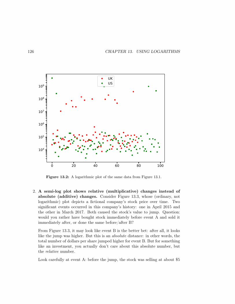
126 CHAPTER 13. USING LOGARITHMS
0 20 40 60 80 100
104
105
106
107
108
109
UKUS
Figure 13.2: A logarithmic plot of the same data from Figure 13.1.
2. A semi-log plot shows relative (multiplicative) changes instead ofabsolute (additive) changes. Consider Figure 13.3, whose (ordinary, notlogarithmic) plot depicts a fictional company’s stock price over time. Twosignificant events occurred in this company’s history: one in April 2015 andthe other in March 2017. Both caused the stock’s value to jump. Question:would you rather have bought stock immediately before event A and sold itimmediately after, or done the same before/after B?
From Figure 13.3, it may look like event B is the better bet: after all, it lookslike the jump was higher. But this is an absolute distance: in other words, thetotal number of dollars per share jumped higher for event B. But for somethinglike an investment, you actually don’t care about this absolute number, butthe relative number.
Look carefully at event A: before the jump, the stock was selling at about $5
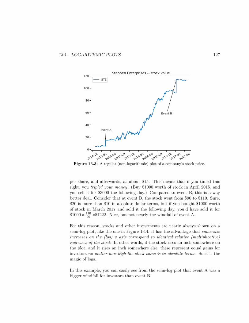
13.1. LOGARITHMIC PLOTS 127
2014-122015-03
2015-062015-09
2015-122016-03
2016-062016-09
2016-122017-03
2017-060
20
40
60
80
100
120
Event A
Event B
Stephen Enterprises -- stock valueSTE
Figure 13.3: A regular (non-logarithmic) plot of a company’s stock price.
per share, and afterwards, at about $15. This means that if you timed thisright, you tripled your money ! (Buy $1000 worth of stock in April 2015, andyou sell it for $3000 the following day.) Compared to event B, this is a waybetter deal. Consider that at event B, the stock went from $90 to $110. Sure,$20 is more than $10 in absolute dollar terms, but if you bought $1000 worthof stock in March 2017 and sold it the following day, you’d have sold it for$1000 × 110
90 =$1222. Nice, but not nearly the windfall of event A.
For this reason, stocks and other investments are nearly always shown on asemi-log plot, like the one in Figure 13.4. it has the advantage that same-sizeincreases on the (log) y axis correspond to identical relative (multiplicative)increases of the stock. In other words, if the stock rises an inch somewhere onthe plot, and it rises an inch somewhere else, these represent equal gains forinvestors no matter how high the stock value is in absolute terms. Such is themagic of logs.
In this example, you can easily see from the semi-log plot that event A was abigger windfall for investors than event B.
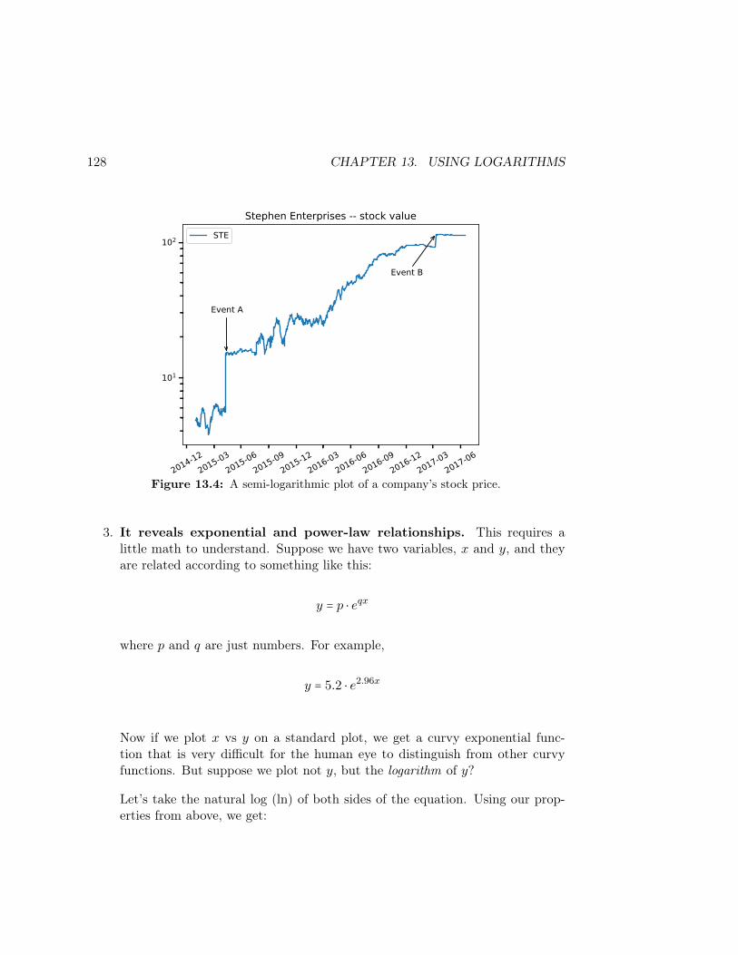
128 CHAPTER 13. USING LOGARITHMS
2014-122015-03
2015-062015-09
2015-122016-03
2016-062016-09
2016-122017-03
2017-06
101
102
Event A
Event B
Stephen Enterprises -- stock valueSTE
Figure 13.4: A semi-logarithmic plot of a company’s stock price.
3. It reveals exponential and power-law relationships. This requires alittle math to understand. Suppose we have two variables, x and y, and theyare related according to something like this:
y = p ⋅ eqx
where p and q are just numbers. For example,
y = 5.2 ⋅ e2.96x
Now if we plot x vs y on a standard plot, we get a curvy exponential func-tion that is very difficult for the human eye to distinguish from other curvyfunctions. But suppose we plot not y, but the logarithm of y?
Let’s take the natural log (ln) of both sides of the equation. Using our prop-erties from above, we get:
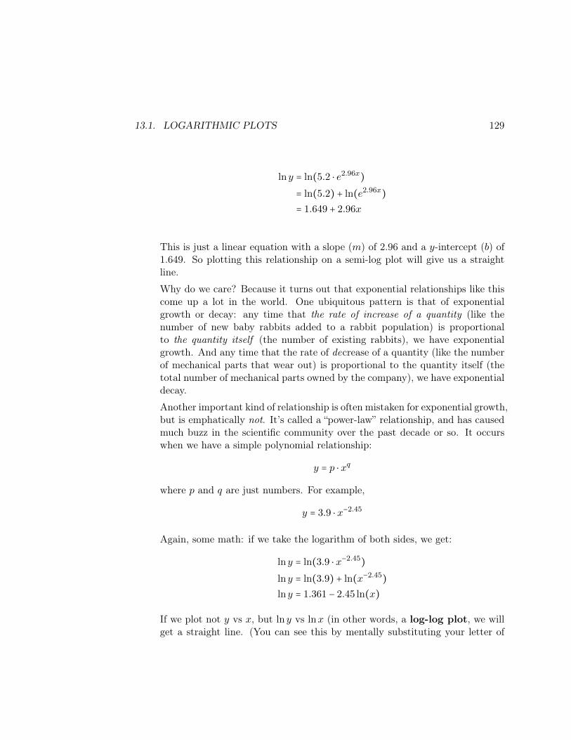
13.1. LOGARITHMIC PLOTS 129
ln y = ln(5.2 ⋅ e2.96x)
= ln(5.2) + ln(e2.96x)
= 1.649 + 2.96x
This is just a linear equation with a slope (m) of 2.96 and a y-intercept (b) of1.649. So plotting this relationship on a semi-log plot will give us a straightline.
Why do we care? Because it turns out that exponential relationships like thiscome up a lot in the world. One ubiquitous pattern is that of exponentialgrowth or decay: any time that the rate of increase of a quantity (like thenumber of new baby rabbits added to a rabbit population) is proportionalto the quantity itself (the number of existing rabbits), we have exponentialgrowth. And any time that the rate of decrease of a quantity (like the numberof mechanical parts that wear out) is proportional to the quantity itself (thetotal number of mechanical parts owned by the company), we have exponentialdecay.
Another important kind of relationship is often mistaken for exponential growth,but is emphatically not. It’s called a “power-law” relationship, and has causedmuch buzz in the scientific community over the past decade or so. It occurswhen we have a simple polynomial relationship:
y = p ⋅ xq
where p and q are just numbers. For example,
y = 3.9 ⋅ x−2.45
Again, some math: if we take the logarithm of both sides, we get:
ln y = ln(3.9 ⋅ x−2.45)
ln y = ln(3.9) + ln(x−2.45)
ln y = 1.361 − 2.45 ln(x)
If we plot not y vs x, but ln y vs lnx (in other words, a log-log plot, we willget a straight line. (You can see this by mentally substituting your letter of

130 CHAPTER 13. USING LOGARITHMS
choice for lnx and another letter of your choice for ln y. Now you have a plainold linear equation with a slope of -2.45 and an intercept of 1.361.)
To see how the logarithmic plots reveal this, consider Figure 13.5, each of whichis a plot of the same three synthetic data sets. The blue points are linear inx, the red points are exponential, and the green points are power-law (with anexponent of 6).
In the linear plot, the blue points can be seen to be a straight line. In thesemi-log plot, the red points are. In the log-log plot, the green points are. Thisis a powerful tool for recognizing these important kinds of relationships at aglance.
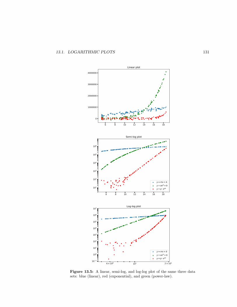
13.1. LOGARITHMIC PLOTS 131
6 8 10 12 14 16 18
0
1000000
2000000
3000000
4000000
Linear plot
6 8 10 12 14 16 18
101
102
103
104
105
106
Semi-log plot
y = mx + by = ax6 + by = p eqx
1016 × 100 2 × 10110 1
100
101
102
103
104
105
106
107Log-log plot
y = mx + by = ax6 + by = p eqx
Figure 13.5: A linear, semi-log, and log-log plot of the same three datasets: blue (linear), red (exponential), and green (power-law).

132 CHAPTER 13. USING LOGARITHMS
Chapter 14
Accessing databases
“Database” is a very loose term for “a repository of information that can be readilyaccessed.” When we use that term in Data Science, we mean a data source that ismanaged by a piece of software called a DBMS, or database management sys-tem. (True, plain-old lists, dictionaries, or Pandas DataFrames are also “repositoriesof information that can be accessed,” but when we use the term database we’re nottalking about that.)
There are principally two reasons to learn how to access data from databases:
• Sometimes, our data is simply available in that form only. We may want toimport it into Python/Pandas and deal with it using the techniques from thefirst half of the semester, but in order to get it in there, we need to (briefly)interface with the database and issue the proper commands.
• Sometimes, our data is just flat big. There’s a limit to how much data Spydercan store in memory and deal with on the spot. Suppose you had to analyzeall the eBay transactions over the past two years? Or all the tweets made inthe world over the last month? That stuff can’t remotely fit in your system’smemory. Hence, we have to access it through a database which will managethe sheer size and scope for us, and work with it a little at a time.
14.1 Two kinds of databases
There are essentially two kinds of databases in the world: relational, and NoSQL.
133

134 CHAPTER 14. ACCESSING DATABASES
Previously this semester, we’ve worked with data spread across multiple DataFramesthat we need to join together in some way. This structure is extremely common,so much so that most of traditional database schema theory is based directly on it.A relational database is a repository of information in which the data is storedin tables (a table is pretty much exactly a DataFrame in spirit), and on which thelanguage SQL1 can be used to query it and manipulate it. A software system thatenables a user to create and work with relational databases is called an RDBMS,or relational database management system.
There are many, many RDBMS’s out there: Oracle, Sybase, Microsoft SQL Server,MySQL, MariaDB, PostgreSQL, and literally dozens of others. They all work invery much the same way: they store data in tables, and they are manipulated viaSQL. Ever since Ted Codd invented the relational model in 1970, this organizationalparadigm has proven to be so powerful and computationally efficient that it hasdominated the database world. Only recently have some alternate paradigms gainedsome traction (so-called “NoSQL” databases), but even so, the majority of the world’sstructured data is all in relational databases of some sort.
Relational DBMS’s are much more similar to each other than NoSQL systems areto each other. The wide variety of NoSQL DBMS’s (Cassandra, MongoDB, Redis,Neo4j, etc.) means that learning how to use one doesn’t give you much knowledgeabout how to use one of the others. Some store key/value pairs; others store objectsand binary data; some store information as a graph (network). Part of the greatpower of the relational model is that SQL has proven to be a common, flexible,broadly-applicable query language that many different vendors have adopted andwhich suits many data needs.
14.2 SQLite
SQLite is a really slim, trim RDBMS that stores all of its data in a single file. Whenyou work with SQLite (or any RDBMS), though, you don’t think in terms of files,but in terms of tables. The fact that the tables are stored in file(s) in some strangeformat is invisible to you as the user of the data, and this is in fact one of the greatpowers of the relational model: separating the conceptual data from the storageimplementation.
1Some people pronounce the acronym SQL as the three letters “ess-queue-ell,” and others as theword “sequel.” Either one is acceptable (I do the former).
14.2. SQLITE 135
14.2.1 Interfacing to SQLite
“Connecting” to a relational database basically means establishing a communica-tion path over which you can talk SQL. In Python, this is pretty easy:
import sqlite3
conn = sqlite3.connect('my_local_file.db')
As indicated, SQLite-compatible files typically have a .db extension (for “database.”)
The return value from connect() that we’re calling conn is “a connection to thedatabase.” We’ll use it every time we want to perform an SQL query. SQL isa new language, but it’s not nearly as complex as something like Python becauseit’s not a programming language, but a query language. You don’t write entireprograms in it; you merely specify queries in it. This means that the range of thingsyou can do in SQL is much more restricted, and hence the language is easier to learn.
14.2.2 Browsing the tables
The first thing you’ll normally want to do is figure out which tables exist in thedatabase. You can run this command:
print(pd.read_sql("SELECT name FROM sqlite_master WHERE type='table'", conn))
to find out. If this were the output:
name0 songs1 albums2 artists3 labels
that would tell us that the SQLite database has four tables in it, named songs,albums, artists, and labels. Each one can be queried using SQL statements, orsimply imported wholesale into a Pandas DataFrame (see below).
136 CHAPTER 14. ACCESSING DATABASES
14.3 Querying the database
By far the most common thing you’ll do with a relational database like SQLite isexecute an SQL query, and get a DataFrame back:
df_name = pd.read_sql("YOUR SQL QUERY GOES HERE", conn)
The string inside the call to pd.read_sql() is called “an embedded SQL state-ment.” This means we have code in one language (SQL) “embedded” inside another(Python). Do not be alarmed at this.
14.3.1 The easy case: inhaling an entire table
Now if the data is small enough to load into memory, you don’t need to know muchSQL at all. You can simply use this one-liner:
df = pd.read_sql("SELECT * FROM table_name", conn)
This reads one of the database’s tables (whose names you learned from the com-mand in Section 14.2.2) into a new, fully-fledged DataFrame, with column names, areasonable guess at their types, etc.
That’s literally all you need to know about working with a (smallish) SQLite database.Just to connect to it, get all the table names, read each one into a DataFrame, andcontinue in Pandas Land, forgetting all about SQLite. You can then leverage all theknowledge you’ve learned up to this point. Bingo!
14.3.2 The harder case: more complex SQL
Sometimes, however, the data is too large to do this. So it’s worth learning a littleSQL so you can make the RDBMS do some of the heavy lifting, and give you trimmedresults for your Python program to work with.
The workhorse is the SQL SELECT statement. Here are some common variants:

14.3. QUERYING THE DATABASE 137
• To compute the number of rows, or individual values, without returning theentire result, use COUNT(*), MAX(), MIN(), etc.:
SELECT COUNT(*) FROM table_nameSELECT MAX(col1) FROM table_name
• To get only the first few rows (similar to Pandas’ .head() operation) tack ona “LIMIT” expression:
SELECT * FROM table_name LIMIT 10
• To get only certain columns, change the “*” to a comma-separated list ofcolumn names:
SELECT col1 FROM table_nameSELECT col1,col2,col3 FROM table_name LIMIT 10
• To get only certain rows, add a “WHERE clause” after the table name:
SELECT * FROM table_name WHERE col1==val1SELECT col2 FROM table_name WHERE col1==val1 AND col2>val2SELECT col1,col2 FROM table_name WHERE col1==val1 AND NOT col2>val2 LIMIT 10
(The usual boolean operations work with keywords AND, OR, and NOT, andparentheses for grouping.)
• The “IN” keyword can be useful in a WHERE clause for querying membership ina set:
SELECT * FROM table_name WHERE col1 IN (val1,val2)SELECT col1,col2 FROM table_name WHERE col1==val1 AND
NOT col2 IN (val1,val2,val3) LIMIT 10
• To get only unique rows (similar to Pandas’ .drop_duplicates() functional-ity) use the word DISTINCT before the column names:
SELECT DISTINCT * FROM table_nameSELECT col1,col2 FROM table_name WHERE not col1 in (val1,val2,val3) or
col2!=val4 LIMIT 5
The DISTINCT option is useful in conjunction with COUNT():
SELECT COUNT(DISTINCT col1) FROM table_name
138 CHAPTER 14. ACCESSING DATABASES
• You can have SQLite do sorting with “ORDER BY”:SELECT * FROM table_name ORDER BY col1SELECT DISTINCT col1,col2 FROM table_name WHERE col3==val1
ORDER BY col2,col1 DESC LIMIT 5
As you can see, you can sort on multiple columns, and sort in reverse orderwith the DESC keyword.
• SQL supports a “GROUP BY” operation very much like Pandas’ .groupby()method:SELECT col1,count(*) FROM table_name GROUP BY col1SELECT col1,max(col2) FROM table_name WHERE col3==val1 GROUP BY col2
ORDER BY col1 DESC LIMIT 5
• Finally, to do a merge/join operation, use the JOIN keyword:
SELECT * FROM table_1 join table_2 ON col1==col2SELECT col1,col2 FROM table_1 join table_2 ON table_1.x==table_2.q
WHERE col3>val1 LIMIT 5
The JOIN keyword supports LEFT, RIGHT, and OUTER options.
There are many, many other options as well. See the online documentation at https://www.sqlite.org/docs.html. Again, one of the great things about SQL is thatwith the exception of the initial commands to connect and to list all table names(p. 135), all relational databases use essentially identical syntax. So if you ever needto query an Oracle, Sybase, Informix, MySQL, PostgreSQL, or SQL Server database,you’ll discover that everything in this section applies nearly identically.
Chapter 15
Screen scraping (1 of 2)
Welcome to the worst of all possible worlds1: when the data you want to analyze ison a human-readable but machine-unfriendly website somewhere. It’s there, you cansee it...but getting it from a pretty web page into a Pandas DataFrame is a non-trivialproposition.
Usually this situation occurs when the provider of the data, and the designer of thewebsite, didn’t envision anyone using the data for any purpose other than viewing itthrough the website itself. Sometimes there is another reason: that the organizationwanted to deliberately make this operation difficult so that you couldn’t easily use itfor other purposes. Either way, though, as long as the data is accessible and visiblethrough your browser, it is at least theoretically extractable into the form we needto do our magic.
15.1 HTML
(Most) web pages look snazzy and colorful when you view them: the word “code”doesn’t jump immediately to mind. When you load a web page, though, what you’reactually getting from the server you specify is a plain-text file written in a languagecalled HTML, or hypertext markup language. It consists of a combination ofcontent and formatting/structural commands (or “markup”) to instruct the browserhow to render the page. (“Rendering” a page means “interpreting all that HTML
1Actually, the second-worst; the very worst is when the data you seek isn’t even in electronicform at all.
139
140 CHAPTER 15. SCREEN SCRAPING (1 OF 2)
formatting stuff and actually presenting a pretty page formatted the way it specifies.)
The first thing to be aware of is that HTML is not a programming language. (Thatis, you can’t write a program in it.) It’s strictly a formatting syntax for specifyinghow text and graphical elements should be laid out. If you ever ask someone whetherthey’ve done computer programming, and they say, “yeah, I’ve done programmingin HTML,” you know they’re lying.
The second thing to know is that it is hierarchical, not flat. This makes it more likeJSON than CSV. Even though every HTML file is a single sequence of characters,it encodes a tree-like structure in which elements can exist inside other elements,which can exist inside other elements, etc., with no limit to the amount of nesting.
The basic building block of HTML is the element, which is delimited by startingand ending tags. Tags are key words, most of which indicate something structuralor stylistic, enclosed in wakkas (“< ... >”). The ending tag has a slash (“/”)immediately before the keyword, showing that it matches the corresponding openingtag. So one pair of starting and ending tags might be “<title>” and “</title>”.
Note that the entire contents of the element is (1) the starting tag, (2) the endingtag, and (3) everything in between, which could be text in addition to other elements.
15.1.1 An example HTML file
Figure 15.1 shows a very simple, but complete, example. Lots going on there. Thefirst way to get your bearings is to start visually lining up starting tags with theircorresponding ending tags and perceive the structure. Notice that this entire pagebegins with “<html>” and ends with “</html>”. This is in essence the “root node” ofthe page’s entire hierarchical tree2 It has two immediate “children”: a head element,and a body element. Each of those have starting and ending tags as well. Inside thehead element is a title element, etc.
As you can guess, each of these tags is interpreted by the browser to mean a particularkind of structure/formatting. “h1” means “top-level heading” which in practicalitymeans “render it in a large font, with some extra space around it.” The “b” elementmeans to put something in boldface. The “table” element means to construct atable-like structure, with rows (“tr”) and cells within rows (“td”). Etc. HTML is in
2I’m using the term tree here in much the same way as the decision trees from volume I ofthis series. Remember that they start at the top with a root, and branch out wider and wider asthey are drawn down the page.

15.1. HTML 141
<html><head>
<title>All About Stephen</title><style>
img width:150px; td border-width:1px;
</style></head><body><h1>Stephen Davies, Esquire</h1>
<p>Deep in the bowels of<a href="http://buildings.umwblogs.org/trinkle-hall/">Trinkle Hall</a> resides acarbon-based life form known to outsiders only as <b>Stephen</b>. Thismysterious being fulfills several roles <u>not</u> widely known tohumankind.</p>
<p><i>Some</i> of these functions are delineated below. Please memorize themand then immediately destroy this page upon reading it.</p>
<h2>Areas of operation</h2>
<table border=2 cellpadding=15><tr><td class="pic"><img src="http://clipart.com/prof.jpg" width=200 /></td>
<td class="role">College professor</td><td class="description">Stephen teaches computer science and data science
to willing undergraduates, shaping them into the heroes of tomorrow. </td><td><ul><li>Super rewarding</li>
<li>Exciting</li><li>Ever-changing</li><li>Fun</li></ul></td>
<td><b>50%</b> of total time</td></tr><tr><td class="pic"><img src="http://clipart.com/dad.png" width=200 /></td>
<td class="role">Dad</td><td class="description"> With a wife, three teenagers, and two cats (one
of whom throws up a lot), Stephen's home life is a constant source of love,anxiety, and Hallmark moments.</td>
<td><ul><li>Amazing</li><li>Loving</li><li>Complicated</li><li>Surprising</li></ul></td>
<td><b>30%</b> of total time</td></tr>...
</table></body></html>
Figure 15.1: A sample HTML page.
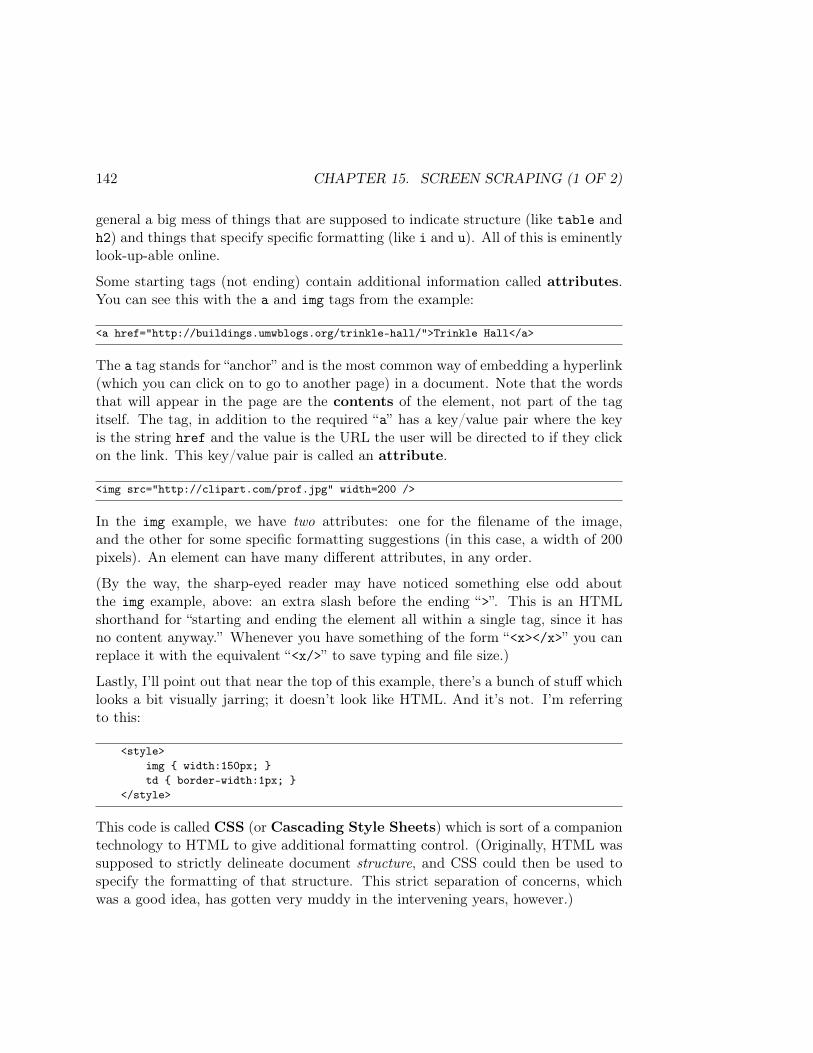
142 CHAPTER 15. SCREEN SCRAPING (1 OF 2)
general a big mess of things that are supposed to indicate structure (like table andh2) and things that specify specific formatting (like i and u). All of this is eminentlylook-up-able online.
Some starting tags (not ending) contain additional information called attributes.You can see this with the a and img tags from the example:
<a href="http://buildings.umwblogs.org/trinkle-hall/">Trinkle Hall</a>
The a tag stands for “anchor” and is the most common way of embedding a hyperlink(which you can click on to go to another page) in a document. Note that the wordsthat will appear in the page are the contents of the element, not part of the tagitself. The tag, in addition to the required “a” has a key/value pair where the keyis the string href and the value is the URL the user will be directed to if they clickon the link. This key/value pair is called an attribute.
<img src="http://clipart.com/prof.jpg" width=200 />
In the img example, we have two attributes: one for the filename of the image,and the other for some specific formatting suggestions (in this case, a width of 200pixels). An element can have many different attributes, in any order.
(By the way, the sharp-eyed reader may have noticed something else odd aboutthe img example, above: an extra slash before the ending “>”. This is an HTMLshorthand for “starting and ending the element all within a single tag, since it hasno content anyway.” Whenever you have something of the form “<x></x>” you canreplace it with the equivalent “<x/>” to save typing and file size.)
Lastly, I’ll point out that near the top of this example, there’s a bunch of stuff whichlooks a bit visually jarring; it doesn’t look like HTML. And it’s not. I’m referringto this:
<style>img width:150px; td border-width:1px;
</style>
This code is called CSS (or Cascading Style Sheets) which is sort of a companiontechnology to HTML to give additional formatting control. (Originally, HTML wassupposed to strictly delineate document structure, and CSS could then be used tospecify the formatting of that structure. This strict separation of concerns, whichwas a good idea, has gotten very muddy in the intervening years, however.)
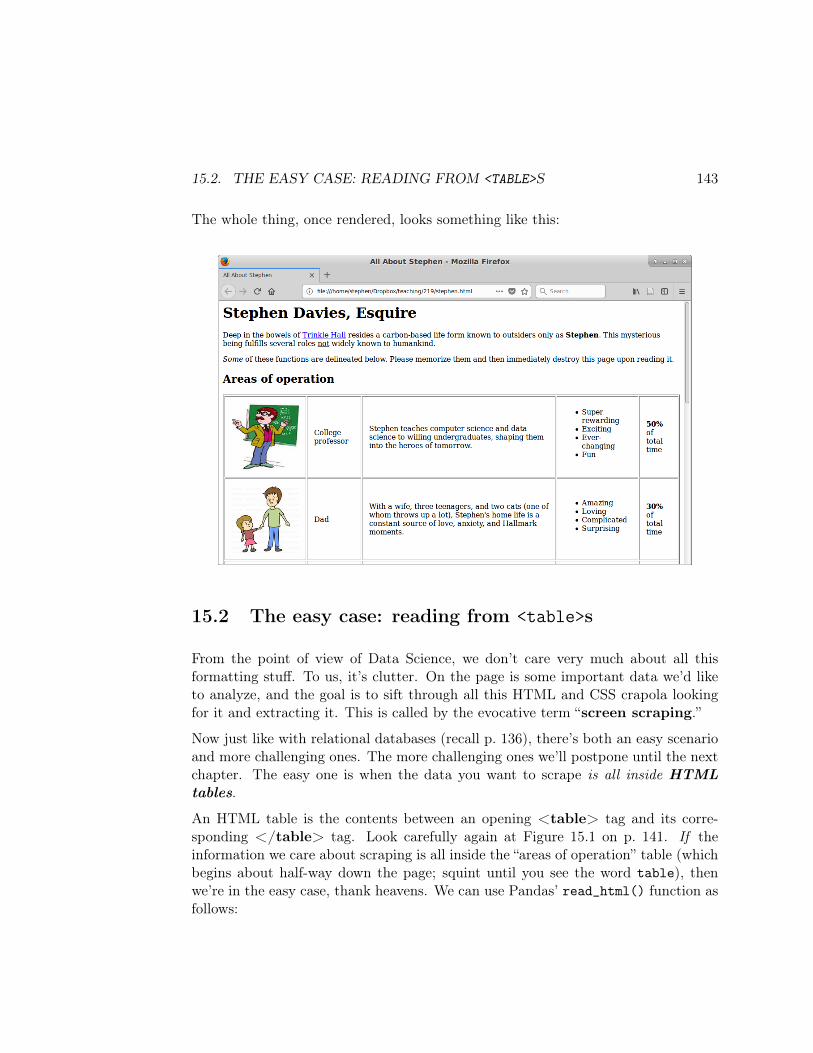
15.2. THE EASY CASE: READING FROM <TABLE>S 143
The whole thing, once rendered, looks something like this:
15.2 The easy case: reading from <table>s
From the point of view of Data Science, we don’t care very much about all thisformatting stuff. To us, it’s clutter. On the page is some important data we’d liketo analyze, and the goal is to sift through all this HTML and CSS crapola lookingfor it and extracting it. This is called by the evocative term “screen scraping.”
Now just like with relational databases (recall p. 136), there’s both an easy scenarioand more challenging ones. The more challenging ones we’ll postpone until the nextchapter. The easy one is when the data you want to scrape is all inside HTMLtables.
An HTML table is the contents between an opening <table> tag and its corre-sponding </table> tag. Look carefully again at Figure 15.1 on p. 141. If theinformation we care about scraping is all inside the “areas of operation” table (whichbegins about half-way down the page; squint until you see the word table), thenwe’re in the easy case, thank heavens. We can use Pandas’ read_html() function asfollows:
144 CHAPTER 15. SCREEN SCRAPING (1 OF 2)
the_tables = pd.read_html("http://theURLtoTheWebpageIWantToScrape.html")
This function takes just one argument: the URL of the page we want to scrape. (AURL – which stands for Uniform Resource Locator – is another word for a web page’saddress, or “link.”) Sometimes you’ll find it more convenient to first download thepage to your local computer, so that you’re not dependent on a network connection(and latency) while you’re working on scraping it. This will normally put a .html(or .htm) file on your computer, which you can store in the same directory/folderas your .py file, just as you do with .csv or .db files. You’ll then pass the simplefilename (like “allAboutStephen.htm”) as the argument to read_html().
The return value of this function is a list of DataFrames, one for each <table> on thepage. Read that sentence once again slowly. In particular, note that the return valueis not a DataFrame, which many students seem to expect. This is of course becausethe web page may well contain multiple <table>s, and therefore read_html() wouldneed to return multiple DataFrames.
Let’s try this approach with allAboutStephen.html:
the_tables = pd.read_html("http://stephendavies.org/allAboutStephen.html")print(len(the_tables))
1
There is apparently only one <table> on the page. Let’s put it in its own variable(“areas” for “Areas of operation”) and take a look at it:
areas = the_tables[0]print(areas)
0 ... 40 NaN ... 50% of total time1 NaN ... 30% of total time2 NaN ... 10% of total time3 NaN ... 5% of total time4 NaN ... 5% of total time
[5 rows x 5 columns]
15.2. THE EASY CASE: READING FROM <TABLE>S 145
This is a bit confusing at first, for several reasons. One is that the columns don’thave names, as we’re used to – just numbers. Another is that most of the informationis omitted from the display (with just “...” placeholders). Another is that the firstcolumn is entirely NaN values3.
The root causes of these conundrums are as follows:
1. The DataFrame columns don’t have names because HTML <table>s oftendon’t have header cells (delimited with <th> cells in the first <tr> row), andso read_html() has no idea what to name the columns.
2. Most columns are omitted from the print() output because they’re just toolong to fit. (Look at p. 143: that third column has paragraphs in it.)
3. The first column has NaNs because the first column of the <table> has imagesin it, not text (again see p. 143).
We can give the DataFrame meaningful column names with:
areas.columns = ['pic','role','description','adjectives','allocation']
and we can get rid of the columns we don’t care about (the image, and perhaps thedescriptions) with a Pandas operation:
areas = areas[['role','adjectives','allocation']]
Now we can see better what’s going on:
3The value NaN, you’ll recall, stands for “not a number.” But that phrase is misleading here. Ofcourse the value is not a number : why would we expect text on a web page to necessarily be anumber? Really it means “not a value Python could do anything with.”

146 CHAPTER 15. SCREEN SCRAPING (1 OF 2)
print(areas)
role adjectives allocation0 College professor Empowering Important Fun Cool All-enc... 50% of total time1 Dad Amazing Fun Important Challenging 30% of total time2 Kids Club Leader Cute Exhausting Character-building Imp... 10% of total time3 Secret Agent Thrilling High-impact Dangerous Cool ... 5% of total time4 Jedi Master Important Thrilling Challenging Daring... 5% of total time
15.2.1 Some text cleaning stuff
At this point, we’re out of screen-scraping-land and into ordinary-Python land. Whatwe do next depends on what we want to analyze. One interesting question I couldimagine asking is: “how much of Stephen’s total time does he spend doing ‘fun’things? ‘important’ things? ‘exhausting’ things?
To do this, we’ll have to deal with that messy adjectives column. I say it’s “messy”because all Pandas knew to do was take each bulleted list – comprised of a <ul> ele-ment (“unordered list”) and nested <li> elements (“list elements”) – and concatenateall the contents into a single string.
My strategy to dealing with it is to split these up, putting each role’s adjective inits own row of a new table that looks like this:
role adjectiveCollege professor EmpoweringCollege professor Important
Dad AmazingKids Club Leader Important
. . . etc . . .
We can do this with a loop. Since we don’t know at the beginning how many rowsthis table will have, we’ll use a slightly different technique than we did on p. 80.We’ll just create two zero-length NumPy arrays, and repeatedly append() to themfor each new adjective we encounter:
15.2. THE EASY CASE: READING FROM <TABLE>S 147
roles = np.array([], dtype=object)adjs = np.array([], dtype=object)
for row in areas.itertuples():for adjective in row.adjectives.split():
roles = np.append(roles, row.role)adjs = np.append(adjs, adjective)
Two other notable things about this code:
• It’s a nested for loop. This is because (1) we have to go through all the rowsof our areas DataFrame, and (2) for each of those rows, there will be multipleadjectives.
• We use the very handy .split() method here. When you call .split() on astring, you get back all its individual words in a list. You can also pass an ar-gument to .split() giving the string delimiter that you want it to divide thestring on. So calling "needles/yarn/scissors".split("/") would return thelist ["needles", "yarn", "scissors"], and calling "Stephen".split("e")would return the list ["St", "ph", "n"].
Now all we have to do is stitch together our arrays into a DataFrame, just like wedid on p. 54:
adjectives_df = pd.DataFrame('role':roles, 'adjective':adjs)
and voilà! The resulting adjectives_df is in Figure 15.2.
And now that we’ve done that, we can get rid of the old, awkward, separated-by-spaces column:
areas = areas[['role','allocation']]
Okay. The other thing we need to do is change those ridiculous human-readablestrings like “30% of total time” to integers like 30. We’ll use the .split()methodagain, this time passing a delimiter:

148 CHAPTER 15. SCREEN SCRAPING (1 OF 2)
role adjective0 College professor Empowering1 College professor Important2 College professor Fun3 College professor Cool4 College professor All-encompassing5 College professor Ever-changing6 Dad Amazing7 Dad Fun8 Dad Important9 Dad Challenging10 Kids Club Leader Cute11 Kids Club Leader Exhausting12 Kids Club Leader Character-building13 Kids Club Leader Important14 Secret Agent Thrilling15 Secret Agent High-impact16 Secret Agent Dangerous17 Secret Agent Cool18 Secret Agent Daring19 Jedi Master Important20 Jedi Master Thrilling21 Jedi Master Challenging22 Jedi Master Daring23 Jedi Master Cool24 Jedi Master Lit
Figure 15.2: The adjectives_df DataFrame we constructed with ournested for loop.
percentages = np.array([], dtype=int)
for row in areas.itertuples():percentages = np.append(percentages,
int(row.allocation.split("%")[0]))
areas.allocation = percentages
What does “int(row.allocation.split("%")[0])” mean? Let’s break it down.For each row, we first get the allocation column’s value (which is a string), then splitit on the “%” sign. This will give us a list of two values in each case, the first of whichhas digits like “30” and the second of which has the rest of the text (“of total
15.2. THE EASY CASE: READING FROM <TABLE>S 149
time”). Putting [0] after it gets the first element of this list. Then, by wrappingthe result in “int(...)”, we convert it from a string of digits to an actual number,which we can do something with.
The last step in that code was to reassign the DataFrame’s allocation column tobe our new percentages. The result is now:
print(areas)
role allocation0 College professor 501 Dad 302 Kids Club Leader 103 Secret Agent 54 Jedi Master 5
. . .
where the right-most column actually has numbers.
15.2.2 The analysis
Finally (whew!) we’re in a position to perform our analysis of Stephen’s time. Wehave two DataFrames – areas and adjectives_df – both of which are needed toanswer our key question. So it makes sense to merge them. It now sucks to have therole be the index of the areas DataFrame, so let’s make it a regular column againand then do the merge:
df = pd.merge(areas, adjectives_df)print(df)
role allocation adjective0 College professor 50 Empowering1 College professor 50 Important2 College professor 50 Fun3 College professor 50 Cool4 College professor 50 All-encompassing5 College professor 50 Ever-changing6 Dad 30 Amazing7 Dad 30 Fun
. . .

150 CHAPTER 15. SCREEN SCRAPING (1 OF 2)
And at last, after all this data cleaning, we can get the goods. The number ofdifferent roles Stephen plays that have various adjectives is as follows:
print(df.adjective.value_counts())
Important 4Cool 3Fun 2Thrilling 2Challenging 2Daring 2High-impact 1Amazing 1Ever-changing 1Cute 1Lit 1Exhausting 1Empowering 1All-encompassing 1Character-building 1Dangerous 1
And the percentage of time he spends with these adjectives is:
perc_of_time = df.groupby('adjective').allocation.sum()print(perc_of_time.sort_values(ascending=False))perc_of_time.plot(kind='bar')
Important 95Fun 80Cool 60Ever-changing 50Empowering 50All-encompassing 50Challenging 35Amazing 30Thrilling 10Exhausting 10Daring 10Cute 10Character-building 10Lit 5High-impact 5Dangerous 5
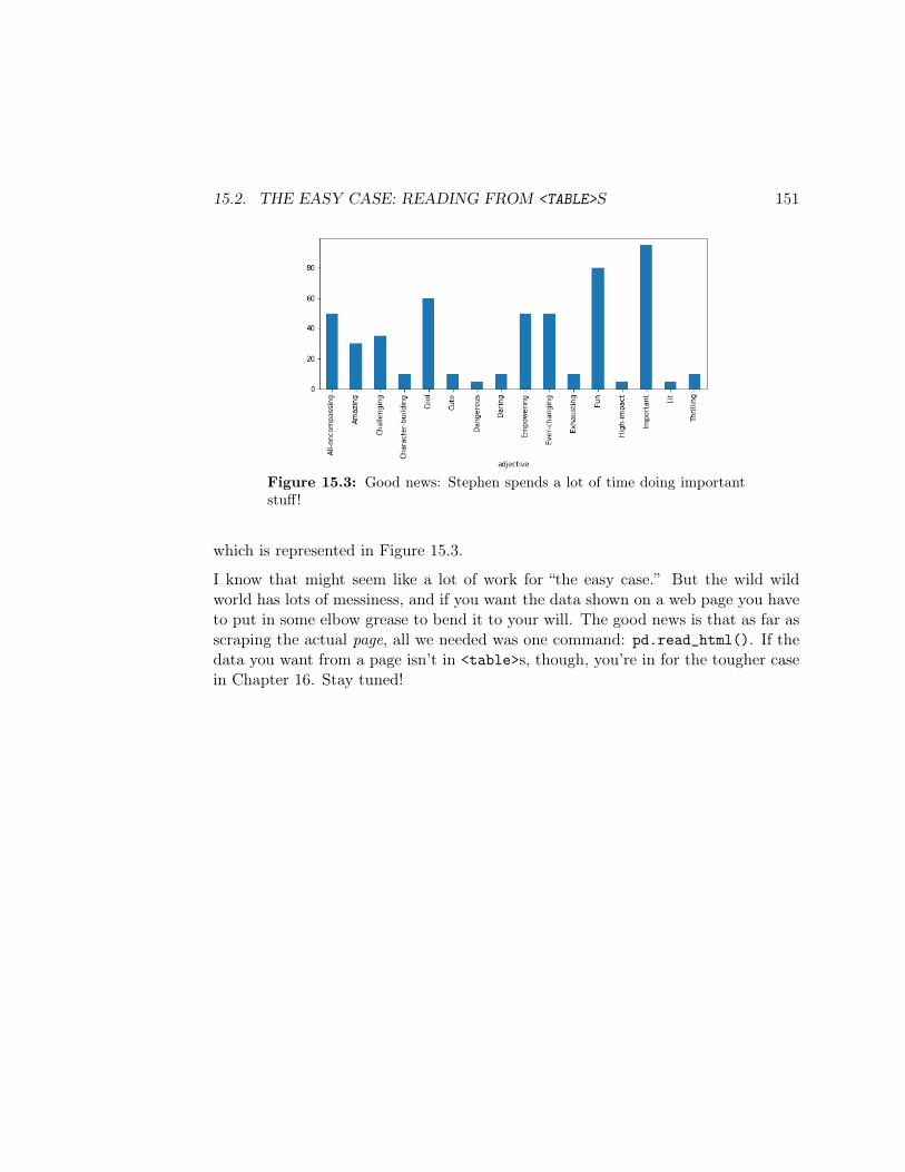
15.2. THE EASY CASE: READING FROM <TABLE>S 151
Figure 15.3: Good news: Stephen spends a lot of time doing importantstuff!
which is represented in Figure 15.3.
I know that might seem like a lot of work for “the easy case.” But the wild wildworld has lots of messiness, and if you want the data shown on a web page you haveto put in some elbow grease to bend it to your will. The good news is that as far asscraping the actual page, all we needed was one command: pd.read_html(). If thedata you want from a page isn’t in <table>s, though, you’re in for the tougher casein Chapter 16. Stay tuned!

152 CHAPTER 15. SCREEN SCRAPING (1 OF 2)
Chapter 16
Screen scraping (2 of 2)
16.1 The harder case: picking through the HTML tree
Chapter 15 was the “easy” screen scraping case: if the data on the web page thatyou want to import is in <table> rows, you can (relatively) simply use Pandas’read_html() function to suck it in to Python.
For anything else, you’ll have to comb through the HTML structure, figuring outhow to surgically extract what you seek. It’s a major pain, but there is a Pythonlibrary by the outrageous name “BeautifulSoup” which makes it just a little bit lesspainful. This chapter contains an overview of how to work with it.
16.2 Web Developer Tools
First, let me say that Firefox, Chrome, and several other browsers come equippedwith very sophisticated “web developer tools” that let you browse the HTML, CSS,and rendered page, and figure out what elements got rendered via which portions ofthe screen. They’re very handy, and when screen scraping you should get into thehabit of using them. In Firefox, they’re available via the “Tools | Web Developer |Toggle tools...” menu option. In Chrome, you go to the little three vertical dots,then choose “More Tools | Developer Tools.”
153
154 CHAPTER 16. SCREEN SCRAPING (2 OF 2)
16.3 Parsing with BeautifulSoup
As I mentioned on p. 144, it’s generally recommended to download the web pageyou want to parse rather than having Python read it for you over the network. Thiseliminates one more possible source of error. (Exception: if you need a Pythonprogram to act as a web crawler and read pages on demand as it discovers theirURLs. More on that later.) Note that you can still open the page in your browsereven after downloading it: just go to “File | Open File...” or the equivalent operationin your browser.
Once you’ve done this, and now have your HTML in a file called (say) “myfile.htm”,you can then parse it with BeautifulSoup using:
from bs4 import BeautifulSoupsoup = BeautifulSoup(open("myfile.htm"), "html.parser")
By convention, the variable for this parsed structure is called “soup”. The secondargument to the BeautifulSoup function tells it which parser we want to use toanalyze the code; there are other choices here, but stick with "html.parser" fornow.
One possibly useful command (though limited if your web page is large) is:
print(soup.prettify())
This “pretty prints” out the entire contents of the page, but in a way that is properlyindented according to the HTML’s structure, rather than how it was indented in theraw page. You may have noticed that the HTML file may or may not be physicallyindented and spaced in a way reflective of the structure. The BeautifulSoup parseris smart enough to discern the implied structure from the tag sequence, and thusprints it how it will “really” be seen by a browser.
At this point, I generally take one of two approaches: either I navigate the structuretop-down looking for where the data I’m interested in is situated, or I find the databy searching through the file, and use a bottom-up approach to get it from there.You typically have to combine the two approaches to get your screen-scraping dirtywork done.

16.3. PARSING WITH BEAUTIFULSOUP 155
16.3.1 The top-down approach
By using “soup.contents”, you get the immediate descendants of the root node ofthe HTML hierarchy. Each of these could be examined for its type, like this:
for child in soup.contents:print(type(child))
bs4.element.Tagbs4.element.NavigableString
So our entire document is composed of an element (misleadingly named “Tag” here,but w/e) and a “NavigableString” which essentially just means “string of literaltext”. For elements, it’s useful to print out their “.name”. For strings, it’s useful toprint them out verbatim. Here, we see:
print(soup.contents[0].name)print(soup.contents[1])
'html''\n'
So the first child is the entire html element in all its embedded glory, and this isfollowed by a single, pesky newline. Now you know.
Drilling down another level, we see:
html_children = soup.contents[0]for child in html_children:
print(type(child))
bs4.element.NavigableStringbs4.element.Tagbs4.element.NavigableStringbs4.element.Tagbs4.element.NavigableString
156 CHAPTER 16. SCREEN SCRAPING (2 OF 2)
Two tags, with three strings interleaved. Let’s examine them:
print(html_children.contents[0])print(html_children.contents[1].name)print(html_children.contents[2])print(html_children.contents[3].name)print(html_children.contents[4])
'\n''head''\n''body''\n'
You’re starting to see a pattern: a lot of the strings are just newline characters thatsplit up the HTML text file and make it more readable. What we really care aboutis the content under the tags. Let’s dig one deeper:
head_children = html_children.contents[1].contentsprint(head_children[0])print(head_children[1].name)print(head_children[2])print(head_children[3].name)print(head_children[4])
'\n''title''\n''style''\n'
Okay, you get the idea. We can drill down to whatever level we want just by followingthe appropriate children. To get the title of the page, we could do:
print(head_children[1].contents[0])
16.3. PARSING WITH BEAUTIFULSOUP 157
'All About Stephen'
(This is because the second element (element #1) of the <head> element is the<title> element, and its only child is the string 'All About Stephen'.)
Sometimes a quicker method to find your way through the forest is to use this syntax1
at the interactive console:
print([ x.name for x in body_children ])
[None, 'h1', None, 'p', None, 'p', None, 'h2', None, 'table', None]
You can better see at a glance what’s what. Now that we know the first “p” (para-graph) is element #3 of the body, we could find that hyperlink via:
print([ x.name for x in list(body_children)[3] ])
[ None, 'a', None, 'b', None, 'u', None]
and grab it via:
dat_hyperlink = list(list(body_children)[3])[1]
BeautifulSoup lets you access the attributes of an HTML element by treating theelement as a dictionary. Pretty cool. We can snag the actual link, then, with:
print(dat_hyperlink['href'])
'http://buildings.umwblogs.org/trinkle-hall/'1That thing in the boxies – “[ x.name for x in body_children ]” – is called a “list compre-
hension,” by the way, and is an advanced Python technique that is sometimes very useful.
158 CHAPTER 16. SCREEN SCRAPING (2 OF 2)
16.3.2 The bottom-up approach
Sometimes, when you try to dive from the top of the document all the way to whatyou want, you can find yourself in a tangled mess. In these cases it’s easier to searchfor the data you want using BeautifulSoup’s search facilities.
Let’s illustrate this by creating a simple DataFrame that contains each role and itspercentage allocation of Stephen’s time. We want df to look something like this:
role perc0 College professor 50.01 Dad 30.0
. . .
To find our way through the forest, we search through the HTML with developertools, locating one of the pieces of data we know is there – for instance, the number50, which we can see on the page is one of the percentages. When we click on this(or just search for it in a text file), we find ourselves in the middle of the HTMLcontent in Figure 16.1.
Looks like the role name we want is the text under a td element whose class2 is“role”. And it looks like the percentage we want is (*groan*) in a boldface (b) tag,underneath the last td tag of the row, which has no class.
BeautifulSoup’s .find_all() method makes this slightly less of a headache. Toquickly grab all the tr elements in the document, we can do this:
trs = list(soup.find_all("tr"))
The variable trs is now a list of elements (BeautifulSoup “Tag” objects) each ofwhich we can examine for (say) td children with a role class attribute. And youcan call .find_all() on any tag (to search from that point in the hierarchy down),not just on the top-level soup element. So:
2In HTML, a “class” is an attribute used to classify certain elements to be picked up by CSSformatting instructions. If this were a Web development textbook, it would talk about when andhow to use “class”. But for our purposes, it’s just one of many handy things we might hook on toin order to find our data in the morass.

16.3. PARSING WITH BEAUTIFULSOUP 159
...<table border=2 cellpadding=15><tr><td class="pic"><img src="a.jpg"></td>
<td class="role">College professor</td><td class="description">Stephen teaches computer science and data science to willing undergraduates,shaping them into the heroes of tomorrow.</td><td><ul><li>Super rewarding</li><li>Exciting</li><li>Ever-changing</li><li>Fun</li></ul></td><td><b>50%</b> of total time</td>
</tr>...
Figure 16.1: Using a bottom-up approach – locating the text “50” inthe HTML file (stare towards the bottom of that HTML text) and gettingone’s bearings regarding where it is in relation to other elements.
roles = np.array([], dtype=object)trs = soup.find_all("tr")for tr in trs:
tds = tr.find_all("td")for td in tds:
if "class" in td.attrs and "role" in td["class"]:...
The “.attrs” syntax gives us a dictionary of key-value pairs which represent theattributes of an element. So by saying “"class" in td.attrs” we’re first checkingwhether there is a class attribute in the current td element at all before thenattempting to get its value using the dictionary syntax mentioned on p. 157.
Btw, one slight surprise in the above if statement might be that we’re checkingwhether "role" is in td["class"] instead of simply being == to td["class"].
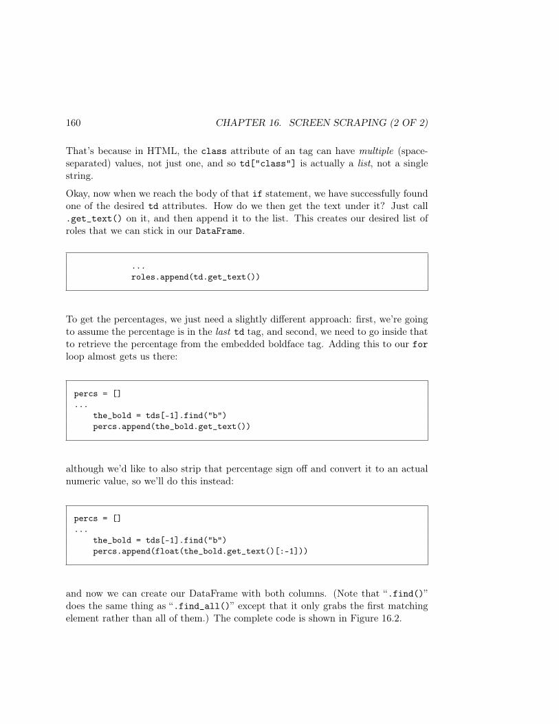
160 CHAPTER 16. SCREEN SCRAPING (2 OF 2)
That’s because in HTML, the class attribute of an tag can have multiple (space-separated) values, not just one, and so td["class"] is actually a list, not a singlestring.
Okay, now when we reach the body of that if statement, we have successfully foundone of the desired td attributes. How do we then get the text under it? Just call.get_text() on it, and then append it to the list. This creates our desired list ofroles that we can stick in our DataFrame.
...roles.append(td.get_text())
To get the percentages, we just need a slightly different approach: first, we’re goingto assume the percentage is in the last td tag, and second, we need to go inside thatto retrieve the percentage from the embedded boldface tag. Adding this to our forloop almost gets us there:
percs = []...
the_bold = tds[-1].find("b")percs.append(the_bold.get_text())
although we’d like to also strip that percentage sign off and convert it to an actualnumeric value, so we’ll do this instead:
percs = []...
the_bold = tds[-1].find("b")percs.append(float(the_bold.get_text()[:-1]))
and now we can create our DataFrame with both columns. (Note that “.find()”does the same thing as “.find_all()” except that it only grabs the first matchingelement rather than all of them.) The complete code is shown in Figure 16.2.
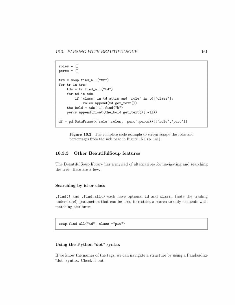
16.3. PARSING WITH BEAUTIFULSOUP 161
roles = []percs = []
trs = soup.find_all("tr")for tr in trs:
tds = tr.find_all("td")for td in tds:
if 'class' in td.attrs and 'role' in td['class']:roles.append(td.get_text())
the_bold = tds[-1].find("b")percs.append(float(the_bold.get_text()[:-1]))
df = pd.DataFrame('role':roles, 'perc':percs)[['role','perc']]
Figure 16.2: The complete code example to screen scrape the roles andpercentages from the web page in Figure 15.1 (p. 141).
16.3.3 Other BeautifulSoup features
The BeautifulSoup library has a myriad of alternatives for navigating and searchingthe tree. Here are a few.
Searching by id or class
.find() and .find_all() each have optional id and class_ (note the trailingunderscore!) parameters that can be used to restrict a search to only elements withmatching attributes.
soup.find_all("td", class_="pic")
Using the Python “dot” syntax
If we know the names of the tags, we can navigate a structure by using a Pandas-like“dot” syntax. Check it out:
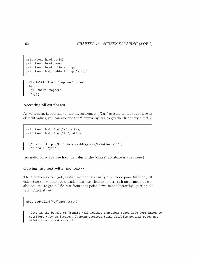
162 CHAPTER 16. SCREEN SCRAPING (2 OF 2)
print(soup.head.title)print(soup.head.name)print(soup.head.title.string)print(soup.body.table.td.img['src'])
<title>All About Stephen</title>title'All About Stephen''a.jpg'
Accessing all attributes
As we’ve seen, in addition to treating an element (“Tag”) as a dictionary to retrieve itselement values, you can also use the “.attrs” syntax to get the dictionary directly:
print(soup.body.find("a").attrs)print(soup.body.find("td").attrs)
'href': 'http://buildings.umwblogs.org/trinkle-hall/''class': ['pic']
(As noted on p. 159, see how the value of the “class” attribute is a list here.)
Getting just text with .get_text()
The aforementioned .get_text() method is actually a bit more powerful than justextracting the contents of a single plain text element underneath an element. It canalso be used to get all the text from that point down in the hierarchy, ignoring alltags. Check it out:
soup.body.find("p").get_text()
'Deep in the bowels of Trinkle Hall resides a\ncarbon-based life form known tooutsiders only as Stephen. This\nmysterious being fulfills several roles notwidely known to\nhumankind.'
16.3. PARSING WITH BEAUTIFULSOUP 163
Finding more than one tag name at once
You can pass a list to .find_all() to match more than one type of tag in a search:
soup.find_all(["td", "th", "p"])
And if you know how to use regular expressions (outside the scope of this class)you can use them as arguments to .find_all() and friends:
import resoup.find_all(re.compile("^q"))soup.find_all(re.compile("r"))soup.find_all(re.compile("s$"))
(finds all tags whose name begin with q, contain r, or end with s, respectively.)
CSS selectors
Finally, if you’re familiar with CSS selector syntax, you can do all that jazz by callingthe .select() method:
soup.select("div#master, tr td.data")

164 CHAPTER 16. SCREEN SCRAPING (2 OF 2)
Chapter 17
Probabilistic reasoning
Probability theory is an area of mathematics that deals with quantifying uncer-tainty. We may not be sure that something is going to happen, but we want to beprecise about how sure we are, given everything else we may know.
It turns out that probability theory is a crucial concept in Data Science. We’vealready used some of it in Chapters 5 and 6 when we generated random values fromdistributions. In this chapter, we’ll zoom out from programming language detailsand consider how to reason about the probabilities of various values occurring andthe relationships between random variables.
17.1 Terms
Some terms: an outcome is something that may (or may not) happen. This varieswidely depending on the domain: a child that’s born may or may not be male; anairline passenger may or may not have red hair; a customer may or may not buy aparticular product. “Male,” “red,” and “The Girl on the Train, hardback edition” areall outcomes in these examples.
An event, by contrast, is a set (group) of outcomes that we’re interested in. Oftenwe don’t care so much whether or not the customer specifically bought “The Girl onthe Train, hardback edition” as whether they bought any book by Paula Hawkins,or maybe any hardback book, or maybe any book at all (as opposed to a DVD).
Sometimes we’ll use the symbol Ω (“omega”) to refer to the sample space, which
165
166 CHAPTER 17. PROBABILISTIC REASONING
is simply the set of all possible outcomes. This will vary depending on what’s underconsideration; it might be male, female in one case and red, blond, brunette,bald, other in another case.
We’ll also use the notation (overbar) to mean “any outcome except something.”For instance, red means “the airline passenger had a hair color other than red.”
17.2 Probability measures
A probability measure is a function that tells us intuitively how likely an outcomeis to occur. We’ll use the simple notation “P(⋅)” for this1, read as “the probability of(something).” The probability of any outcome is always a number between 0 and 1.0 means it can never possibly occur, 1 means it will definitely occur, and there’s acontinuum in between. In our first example, we might say P(male) = .5, P(red) =.1, and P(The Girl on the Train, hardback edition) = .0001.
You can talk about the probability of an event too, of course, and it’s simply the sumof the outcome probabilities. P(male-or-female) = 1, P(red or blonde or bald) = .6,P(any hardcover book) = .08. We’ll say that P(Ω) will be 1: after all, somethinghas to happen, even if it’s “the customer didn’t buy anything,” an outcome to whichwe’ll assign a probability.
17.3 “Joint” probability
Very commonly, we’ll be considering the likelihood that two different events bothoccur. For instance, perhaps we’re interested in the probability that an airline pas-senger is a red-headed female. We’ll write this as P(red, female).2 The commasignals joint probability, which simply means that both of these outcomes/eventsmust occur in order for the combined event to be considered to have occurred. Ifwe wrote P(red, female), it would mean ‘the probability that the passenger is ared-headed non-female.”
If you think about it, you’ll realize that the joint probability cannot be greater thaneither of the two individual probabilities. Adding another condition (not female) tothe first (red-headed) can’t possibly increase the chance of it happening. Other than
1Some authors use “Pr()” instead of “P()” for this. Same diff.2You may also run across the notation “P(redˆfemale),” which means the same thing.
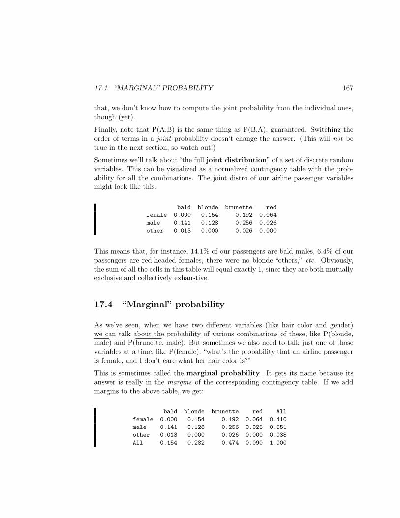
17.4. “MARGINAL” PROBABILITY 167
that, we don’t know how to compute the joint probability from the individual ones,though (yet).
Finally, note that P(A,B) is the same thing as P(B,A), guaranteed. Switching theorder of terms in a joint probability doesn’t change the answer. (This will not betrue in the next section, so watch out!)
Sometimes we’ll talk about “the full joint distribution” of a set of discrete randomvariables. This can be visualized as a normalized contingency table with the prob-ability for all the combinations. The joint distro of our airline passenger variablesmight look like this:
bald blonde brunette redfemale 0.000 0.154 0.192 0.064male 0.141 0.128 0.256 0.026other 0.013 0.000 0.026 0.000
This means that, for instance, 14.1% of our passengers are bald males, 6.4% of ourpassengers are red-headed females, there were no blonde “others,” etc. Obviously,the sum of all the cells in this table will equal exactly 1, since they are both mutuallyexclusive and collectively exhaustive.
17.4 “Marginal” probability
As we’ve seen, when we have two different variables (like hair color and gender)we can talk about the probability of various combinations of these, like P(blonde,male) and P(brunette, male). But sometimes we also need to talk just one of thosevariables at a time, like P(female): “what’s the probability that an airline passengeris female, and I don’t care what her hair color is?”
This is sometimes called the marginal probability. It gets its name because itsanswer is really in the margins of the corresponding contingency table. If we addmargins to the above table, we get:
bald blonde brunette red Allfemale 0.000 0.154 0.192 0.064 0.410male 0.141 0.128 0.256 0.026 0.551other 0.013 0.000 0.026 0.000 0.038All 0.154 0.282 0.474 0.090 1.000
168 CHAPTER 17. PROBABILISTIC REASONING
We can now look at the right margin and discover that the marginal probabilityP(male) is .551, and we can look at the bottom margin and see at a glance thatP(blonde) is .282. This sort of analysis illustrates that, for example:
P(female) = P(bald,female) + P(blonde,female) + P(brunette,female) + P(red,female)
and
P(brunette) = P(brunette,female) + P(brunette,male) + P(brunette,other)
To compute a marginal from the joint, we’re really just adding up all the differentcases. There are three different ways to be a brunette: you can be a female brunette,a male brunette, or some other kind of brunette. That’s all a marginal probabilityreally is.
17.5 “Conditional” probability
Another notion we’ll use a great deal is conditional probability, written witha “pipe” (vertical bar) like P(unemployed ∣ college degree). The pipe is normallypronounced “given.” So this expression is read “the probability that someone isunemployed given that they have a college degree.” We call this “conditioning on”college degree.
Or to return to our previous example, consider P(red ∣ female). This quantity is theanswer to the question: “if I know for a fact that the passenger is not female, what’sthe probability that they’re red-headed?”
Notice this is very different than the joint probability. With conditional probability,we’re assuming that the second event does occur, and then asking how that revisesour original prediction. Unlike with joint probability, adding a vertical bar can makethe answer increase.
Consider this example: what’s the probability that a random U.S. citizen has a Pin-terest account? Let’s estimate that as P(pinterest) = .15. But what if we learnedthat the chosen person was female? What is P(pinterest ∣ female)? Just to shame-lessly stereotype, I’m going to go out on a limb and say it’s higher; perhaps .26. Onthe other hand, what if we learned the person was male? What is P(pinterest ∣male)?I’ll say it’s more like .04. In both cases, we adjusted our estimated probability inlight of additional information: up in one case, and down in the other.
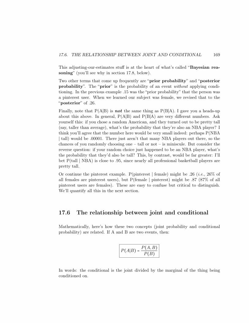
17.6. THE RELATIONSHIP BETWEEN JOINT AND CONDITIONAL 169
This adjusting-our-estimates stuff is at the heart of what’s called “Bayesian rea-soning” (you’ll see why in section 17.8, below).
Two other terms that come up frequently are “prior probability” and “posteriorprobability”. The “prior” is the probability of an event without applying condi-tioning. In the previous example .15 was the “prior probability” that the person wasa pinterest user. When we learned our subject was female, we revised that to the“posterior” of .26.
Finally, note that P(A∣B) is not the same thing as P(B∣A). I gave you a heads-upabout this above. In general, P(A∣B) and P(B∣A) are very different numbers. Askyourself this: if you chose a random American, and they turned out to be pretty tall(say, taller than average), what’s the probability that they’re also an NBA player? Ithink you’ll agree that the number here would be very small indeed: perhaps P(NBA∣ tall) would be .00001. There just aren’t that many NBA players out there, so thechances of you randomly choosing one – tall or not – is miniscule. But consider thereverse question: if your random choice just happened to be an NBA player, what’sthe probability that they’d also be tall? This, by contrast, would be far greater: I’llbet P(tall ∣ NBA) is close to .95, since nearly all professional basketball players arepretty tall.
Or continue the pinterest example. P(pinterest ∣ female) might be .26 (i.e., 26% ofall females are pinterest users), but P(female ∣ pinterest) might be .87 (87% of allpinterest users are females). These are easy to confuse but critical to distinguish.We’ll quantify all this in the next section.
17.6 The relationship between joint and conditional
Mathematically, here’s how these two concepts (joint probability and conditionalprobability) are related. If A and B are two events, then:
P (A∣B) =P (A,B)
P (B)
In words: the conditional is the joint divided by the marginal of the thing beingconditioned on.
170 CHAPTER 17. PROBABILISTIC REASONING
Let’s quantify this with our pinterest example. Here’s the four values in our jointdistribution:
pinterest pinterestmale .02 .48female .13 .37
We can compute the four marginals by summing rows / columns:
P (male) = .5P (female) = .5
P (pinterest) = .15
P (pinterest) = .85
And then, using our definition above, we can calculate all the conditionals:
P (male ∣ pinterest) =.02
.15= .003
P (male ∣ pinterest) =.48
.85= .565
P (female ∣ pinterest) =.13
.15= .867
P (female ∣ pinterest) =.37
.85= .435
P (pinterest ∣ male) =.02
.5= .04
P (pinterest ∣ female) =.13
.5= .26
P (pinterest ∣ male) =.48
.5= .96
P (pinterest ∣ female) =.37
.5= .74
17.7. THE LAW OF “TOTAL PROBABILITY” 171
It would be worth your while to double-check all the above calculations to reinforceyour understanding of how joint, conditional, and marginal probabilities all worktogether.
By the way, it’s frequently much easier to estimate the conditional probabilities thanit is to estimate joint probabilities. So we often run the equation at the start of thissection “backwards” and get joints from conditionals. Either way, it works, though.
17.7 The Law of “Total Probability”
Now if there are only two sexes of newborn babies possible, then it should be prettyobvious that:
P (male) + P (female) = 1
And if there are only three possible ice cream flavors to order at Carl’s, then theprobabilities for each customer’s order must add up to 1 as well:
P (vanilla) + P (chocolate) + P (strawberry) = 1
We don’t even need to know how likely vanilla is to know that the sum of the threemust equal 1. This is the simplest application of the Law of Total Probability.
Now the following is also obvious if you think it through, but maybe not so obviousat first glance. Suppose that each Carl’s customer orders a small, medium, or largeice cream cone, in one of the three flavors. The nine possibilities for a customer’sorder are thus:
A small vanilla coneA medium vanilla coneA large vanilla cone
A small chocolate coneA medium chocolate coneA large chocolate cone
A small strawberry coneA medium strawberry coneA large strawberry cone
Let’s say we knew all nine probabilities (which must add up to 1, of course). Now,how could we figure out the probability of a chocolate cone order, regardless of size?The answer is: you sum up all the mutually exclusive and collectively exhaustivecases which include chocolate as the flavor. In symbols:
P (chocolate) = P (chocolate, small) + P (chocolate, medium) + P (chocolate, large)

172 CHAPTER 17. PROBABILISTIC REASONING
In plain English: the probability of the next customer ordering a chocolate cone isthe probability they’ll order a small chocolate cone plus the probability they’ll ordera medium chocolate cone plus the probability they’ll order a large chocolate cone.
And what’s the probability that the customer will order a medium cone, regardlessof flavor? Clearly, it’s:
P (medium) = P (vanilla, medium) + P (chocolate, medium) + P (strawberry, medium)
It’s not rocket science – you just have to think about all the different cases. But itis pretty useful, since oftentimes we have joint probabilities and need the marginal.And if you think about it, in the one-variable case the Law of Total Probabilityreally just is computing the marginal.
Sometimes we have more than one variable we’re interested in computing the prob-ability of. Let’s say that Carl’s has an additional option: sprinkles on top. So now,there are these eighteen possible orders:
A plain small vanilla coneA plain medium vanilla coneA plain large vanilla cone
A plain small chocolate coneA plain medium chocolate coneA plain large chocolate coneA plain small strawberry cone
A plain medium strawberry coneA plain large strawberry cone
A small vanilla cone with sprinklesA medium vanilla cone with sprinklesA large vanilla cone with sprinkles
A small chocolate cone with sprinklesA medium chocolate cone with sprinklesA large chocolate cone with sprinklesA small strawberry cone with sprinkles
A medium strawberry cone with sprinklesA large strawberry cone with sprinkles
If we wanted to know (say) the probability of a small strawberry cone, we’d calculate:
P (strawberry, small) = P (strawberry, small, plain) + P (strawberry, small, sprinkles)
And if we wanted to know (say) the probability of the next customer wanting a largecone with sprinkles, we’d compute:
P (large, sprinkles) =P (vanilla, large, sprinkles)+P (chocolate, large, sprinkles)+P (strawberry, large, sprinkles)
You get the idea.

17.8. BAYES’ RULE 173
17.8 Bayes’ Rule
Knowing how joint and conditional probabilities are related, and knowing thatP(A,B) = P(B,A), it’s easy to derive the following law:
P (A∣B) =P (B∣A) ⋅ P (A)
P (B)
This is called Bayes’ Rule (sometimes Bayes’ Law or Bayes’ Theorem) after the18th-century Presbyterian minister Thomas Bayes. It is one of the most influential(and controversial, actually) statements in statistics and even all of mathematics. Itwill come up prominently in Chapter ??.
17.9 Independence
We need one more background concept before we’re ready to apply some of this stuff,and that is the independence of events. There are two flavors of independence:absolute, and conditional.
17.9.1 Absolute independence
Simply put, two events are absolutely independent if the value of one has nobearing either way on the value of the other. It does not mean the events are mutuallyexclusive. It means that the probability of each one of them occurring has nothingto do with the other.
It’s best seen through an example. Suppose I chose a random U.S. citizen, andI observe two things: whether or not they’re white, and whether or not they’refemale. If I asked you for your estimate of the “prior” for the race question, you’dprobably come up with something like P(white) = .6. Now I ask you: suppose,before observing their race, you learned your subject was female. Does this causeyou to update your “prior” estimate to a more accurate “posterior”?
The answer is no. Whether or not someone is white is independent of whetherthey’re female. If you thought the probability of this random person being whitewas .6 before, then you still think it’s .6 after learning she’s female. In symbols, youthought P(white) was .6, and you think P(white ∣ female) is also .6. The opposite was
174 CHAPTER 17. PROBABILISTIC REASONING
true in the pinterest example: your estimate of their pinterest status did change whenyou learned about their gender. Therefore, those two events are not independent.
I’m sure you realize that “independent” is pretty much the same concept as “notassociated.” The way to test a data set for two of its variables being independentis essentially to run the appropriate test (χ2, t-test, or Pearson’s) and see whetherthere’s a significant association or not. If there’s not, then we have no compellingevidence that they’re not independent, so we cautiously conclude they are.
Both of the following mathematical identities are true only if the events A and Bare independent:
P (A∣B) = P (A)
P (A,B) = P (A) ⋅ P (B)
The first of these is basically the definition of independence: if P(white ∣ female)= P(white), we say they’re independent. (And conversely, if P(male ∣ pinterest) ≠P(male), we say they’re associated and therefore not independent.)
The second one is a useful multiplicative shortcut, again only valid if the variablesin question are independent. It’s okay to compute P(white,female) as P(white) ⋅P(female) = .6 ⋅ .5 = .3 – yielding a 30% chance of randomly choosing a whitefemale – because we know that race and gender are independent. (Conversely, it’snot okay to compute P(pinterest,male) as P(pinterest) ⋅ P(male) = .15 ⋅ .5 = .075,because these two variables are not independent; as we saw on p.170, the true answerfor P(pinterest,male) is only .02.)
17.9.2 Conditional independence
And lastly, two variables can be conditionally independent given a third vari-able in addition to (or instead of) being absolutely independent.
What does this mean? Perhaps the best way to think of it is those confoundingfactors we learned about in the first volume of this text. You may rememberthat I had a different pinterest example in that one (Section 10.4.1) which featuredthree variables: a person’s hair length, their pinterest activity, and their gender.After noticing that hair was associated with pinterest, and jokingly speculatingas to whether long-hair caused pinterest-ness or vice versa, we hypothesized thatperhaps gender was a confounding variable that was actually influencing them both.This theory would explain why long hair and pinterest usage tended to go together,without either of them being the cause of the other.

17.9. INDEPENDENCE 175
In this case, we would say that although hair and pinterest were not absolutelyindependent, they nevertheless were conditionally independent given gender. Insymbols:
P (long hair ∣ pinterest) ≠ P (long hair) ← no absolute independenceP (long hair ∣ pinterest,female) = P (long hair ∣ female) ← conditional independence
In other words, once we know the subject is female, whether she’s on pinterest tellsus nothing further about whether or not she will have long hair. The informationin the pinterest variable that signals “strong possibility of long hair!” is completelysubsumed in the gender variable, and once that’s controlled for, the pinterest andhair variables are again independent.

176 CHAPTER 17. PROBABILISTIC REASONING
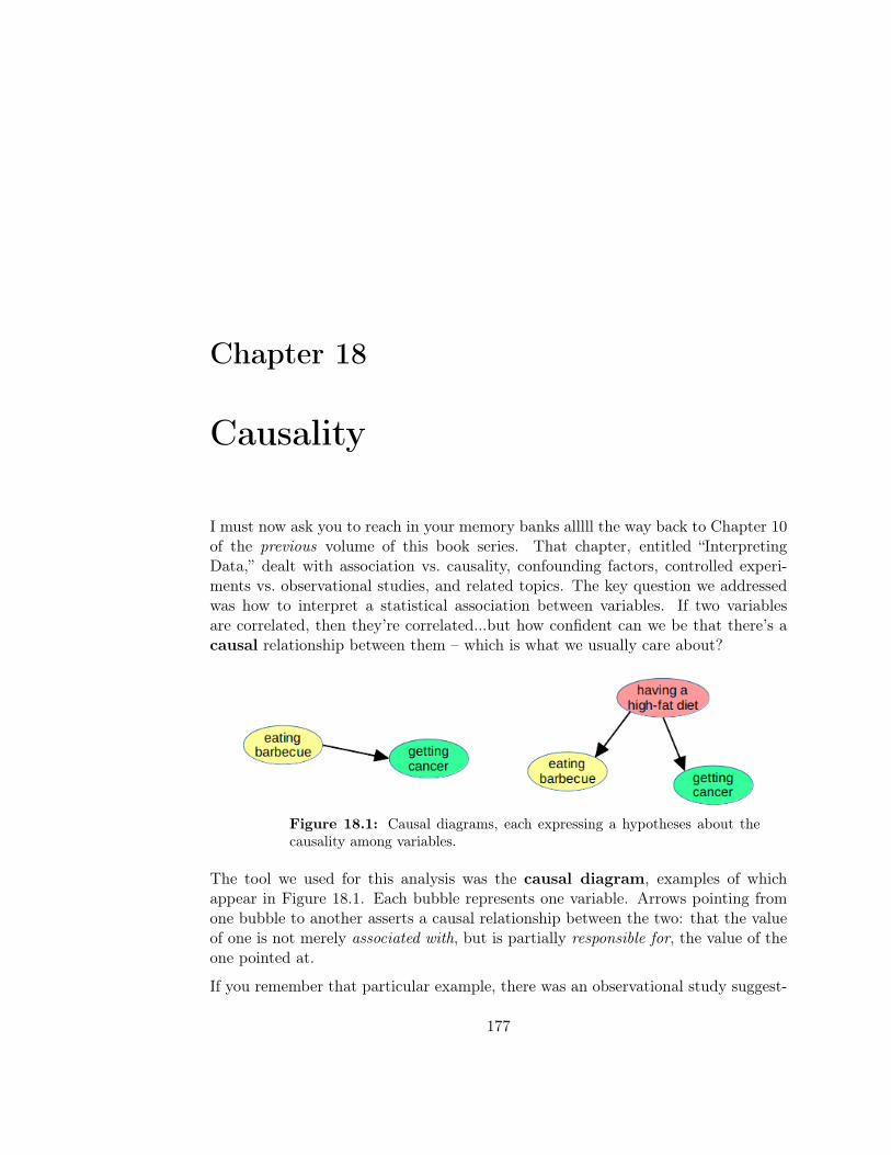
Chapter 18
Causality
I must now ask you to reach in your memory banks alllll the way back to Chapter 10of the previous volume of this book series. That chapter, entitled “InterpretingData,” dealt with association vs. causality, confounding factors, controlled experi-ments vs. observational studies, and related topics. The key question we addressedwas how to interpret a statistical association between variables. If two variablesare correlated, then they’re correlated...but how confident can we be that there’s acausal relationship between them – which is what we usually care about?
Figure 18.1: Causal diagrams, each expressing a hypotheses about thecausality among variables.
The tool we used for this analysis was the causal diagram, examples of whichappear in Figure 18.1. Each bubble represents one variable. Arrows pointing fromone bubble to another asserts a causal relationship between the two: that the valueof one is not merely associated with, but is partially responsible for, the value of theone pointed at.
If you remember that particular example, there was an observational study suggest-
177
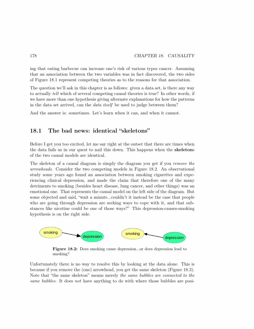
178 CHAPTER 18. CAUSALITY
ing that eating barbecue can increase one’s risk of various types cancer. Assumingthat an association between the two variables was in fact discovered, the two sidesof Figure 18.1 represent competing theories as to the reasons for that association.
The question we’ll ask in this chapter is as follows: given a data set, is there any wayto actually tell which of several competing causal theories is true? In other words, ifwe have more than one hypothesis giving alternate explanations for how the patternsin the data set arrived, can the data itself be used to judge between them?
And the answer is: sometimes. Let’s learn when it can, and when it cannot.
18.1 The bad news: identical “skeletons”
Before I get you too excited, let me say right at the outset that there are times whenthe data fails us in our quest to nail this down. This happens when the skeletonsof the two causal models are identical.
The skeleton of a causal diagram is simply the diagram you get if you remove thearrowheads. Consider the two competing models in Figure 18.2. An observationalstudy some years ago found an association between smoking cigarettes and expe-riencing clinical depression, and made the claim that therefore one of the manydetriments to smoking (besides heart disease, lung cancer, and other things) was anemotional one. That represents the causal model on the left side of the diagram. Butsome objected and said, “wait a minute...couldn’t it instead be the case that peoplewho are going through depression are seeking ways to cope with it, and that sub-stances like nicotine could be one of those ways?” This depression-causes-smokinghypothesis is on the right side.
Figure 18.2: Does smoking cause depression...or does depression lead tosmoking?
Unfortunately there is no way to resolve this by looking at the data alone. This isbecause if you remove the (one) arrowhead, you get the same skeleton (Figure 18.3).Note that “the same skeleton” means merely the same bubbles are connected to thesame bubbles. It does not have anything to do with where those bubbles are posi-

18.2. THE GOOD NEWS: DIFFERENT “SKELETONS” 179
tioned on the page.
Figure 18.3: The bad case: both causal diagrams have the same skeleton.
In this case, the only way to resolve which of the causal models is the true one isto investigate the phenomenon on the ground. We have to study the mechanisms –physical and societal – by means of which each of them might plausibly cause theother. Medical researchers could explore the effects of nicotine on the human brain,and determine whether there is a mechanism by which serotonin is reduced. Socialpsychologists could conduct surveys and focus groups and learn how often cigarettesare sought by victims of depression and why. But the data itself will not give averdict.
18.2 The good news: different “skeletons”
Often, though, the situation isn’t that dire. Consider the controversy raised in one ofmy recent freshman seminars. The class was discussing the invention of chopsticks,and the impact that may have had on eastern culture as well as culinary techniques.One student made a different kind of claim. He said, “this is why so many of the greatvideo game players in the world are from Asian countries! When kids from thoseregions grow up using chopsticks, it demands more attention to fine motor skills thanusing a fork would. And when they develop this terrific finger-eye coordination ata young age, it leads to greater expertise with a controller or keyboard. Thus theyare better equipped to compete in high-level gaming.”
Perhaps. But as I listened to this student, I couldn’t help remembering what myown boys told me: that many of the Asian countries place a higher cultural valueon video games than we do in the western world. Apparently, high-achieving videogame players are afforded the same fame and fortune in South Korea or Japan thatour NFL and NBA players are in the U.S. They are awarded lucrative contracts,perform paid testimonial advertising, give autographs to cheering throngs, and soforth. It stands to reason, then, that a culture which rewards excellent video game
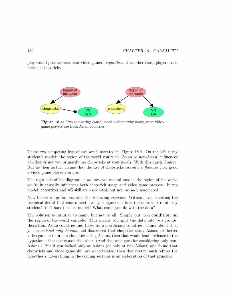
180 CHAPTER 18. CAUSALITY
play would produce excellent video gamers regardless of whether those players usedforks or chopsticks.
Figure 18.4: Two competing causal models about why many great videogame players are from Asian countries.
These two competing hypotheses are illustrated in Figure 18.4. On the left is mystudent’s model: the region of the world you’re in (Asian or non-Asian) influenceswhether or not you primarily use chopsticks at your meals. With this much, I agree.But he then further claims that the use of chopsticks causally influences how gooda video game player you are.
The right side of the diagram shows my own mental model: the region of the worldyou’re in causally influences both chopstick usage and video game prowess. In mymodel, chopsticks and VG skill are associated, but not causally associated.
Now before we go on, consider the following exercise. Without even knowing thetechnical detail that comes next, can you figure out how to confirm or refute mystudent’s (left-hand) causal model? What could you do with the data?
The solution is intuitive to many, but not to all. Simply put, you condition onthe region of the world variable. This means you split the data into two groups:those from Asian countries and those from non-Asians countries. Think about it: ifyou considered only Asians, and discovered that chopstick-using Asians are bettervideo gamers than non-chopstick-using Asians, then that would lend credence to thehypothesis that one causes the other. (And the same goes for considering only non-Asians.) But if you looked only at Asians (or only at non-Asians) and found thatchopsticks and video game skill are uncorrelated, then that pretty much refutes thehypothesis. Everything in the coming sections is an elaboration of that principle.
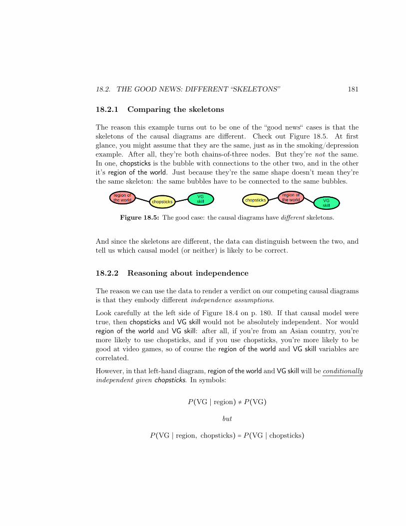
18.2. THE GOOD NEWS: DIFFERENT “SKELETONS” 181
18.2.1 Comparing the skeletons
The reason this example turns out to be one of the “good news“ cases is that theskeletons of the causal diagrams are different. Check out Figure 18.5. At firstglance, you might assume that they are the same, just as in the smoking/depressionexample. After all, they’re both chains-of-three nodes. But they’re not the same.In one, chopsticks is the bubble with connections to the other two, and in the otherit’s region of the world. Just because they’re the same shape doesn’t mean they’rethe same skeleton: the same bubbles have to be connected to the same bubbles.
Figure 18.5: The good case: the causal diagrams have different skeletons.
And since the skeletons are different, the data can distinguish between the two, andtell us which causal model (or neither) is likely to be correct.
18.2.2 Reasoning about independence
The reason we can use the data to render a verdict on our competing causal diagramsis that they embody different independence assumptions.
Look carefully at the left side of Figure 18.4 on p. 180. If that causal model weretrue, then chopsticks and VG skill would not be absolutely independent. Nor wouldregion of the world and VG skill: after all, if you’re from an Asian country, you’remore likely to use chopsticks, and if you use chopsticks, you’re more likely to begood at video games, so of course the region of the world and VG skill variables arecorrelated.
However, in that left-hand diagram, region of the world and VG skill will be conditionallyindependent given chopsticks. In symbols:
P (VG ∣ region) ≠ P (VG)
but
P (VG ∣ region, chopsticks) = P (VG ∣ chopsticks)
182 CHAPTER 18. CAUSALITY
Why is this? Because in the left-hand diagram, the only reason that knowing aperson’s region was of any use to predicting their VG skill was because it influencedhow likely it was that they used chopsticks. If you actually have the informationabout chopsticks directly, well then you can toss region out the window. It’s irrelevantat that point.
The right-hand side of Figure 18.4 is much different. Its independence assumptionsare that VG skill and chopsticks are conditionally independent given region. Namely:
P (VG ∣ region) ≠ P (VG) (again)
but
P (VG ∣ chopsticks, region) = P (VG ∣ region)
This is the flip side of the former case: now, although chopsticks can tell you some-thing useful about VG skill in a pinch, the primary influencer of gaming skill is notchopsticks, but region. Once you tell me what region of the world somebody is from,I have much better information about their possible video game use, and knowingwhether they use chopsticks is no longer of interest to me.
To sum up: both models agree that
P (VG ∣ region) ≠ P (VG).
But the left one (my student’s hypothesis) asserts:
P (VG ∣ region, chopsticks) = P (VG ∣ chopsticks)P (VG ∣ chopsticks, region) ≠ P (VG ∣ region),
while the right one (my own hypothesis) asserts:
P (VG ∣ region, chopsticks) ≠ P (VG ∣ chopsticks)P (VG ∣ chopsticks, region) = P (VG ∣ region).
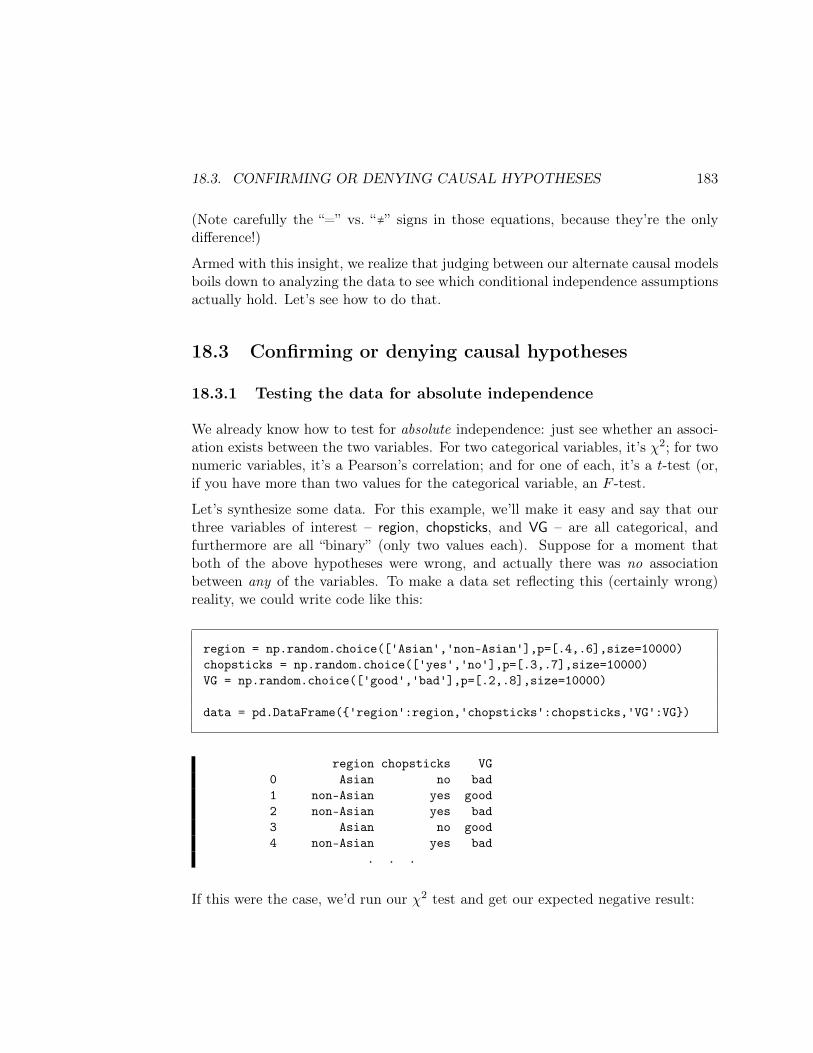
18.3. CONFIRMING OR DENYING CAUSAL HYPOTHESES 183
(Note carefully the “=” vs. “≠” signs in those equations, because they’re the onlydifference!)
Armed with this insight, we realize that judging between our alternate causal modelsboils down to analyzing the data to see which conditional independence assumptionsactually hold. Let’s see how to do that.
18.3 Confirming or denying causal hypotheses
18.3.1 Testing the data for absolute independence
We already know how to test for absolute independence: just see whether an associ-ation exists between the two variables. For two categorical variables, it’s χ2; for twonumeric variables, it’s a Pearson’s correlation; and for one of each, it’s a t-test (or,if you have more than two values for the categorical variable, an F -test.
Let’s synthesize some data. For this example, we’ll make it easy and say that ourthree variables of interest – region, chopsticks, and VG – are all categorical, andfurthermore are all “binary” (only two values each). Suppose for a moment thatboth of the above hypotheses were wrong, and actually there was no associationbetween any of the variables. To make a data set reflecting this (certainly wrong)reality, we could write code like this:
region = np.random.choice(['Asian','non-Asian'],p=[.4,.6],size=10000)chopsticks = np.random.choice(['yes','no'],p=[.3,.7],size=10000)VG = np.random.choice(['good','bad'],p=[.2,.8],size=10000)
data = pd.DataFrame('region':region,'chopsticks':chopsticks,'VG':VG)
region chopsticks VG0 Asian no bad1 non-Asian yes good2 non-Asian yes bad3 Asian no good4 non-Asian yes bad
. . .
If this were the case, we’d run our χ2 test and get our expected negative result:
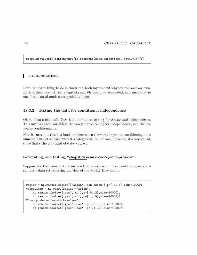
184 CHAPTER 18. CAUSALITY
scipy.stats.chi2_contingency(pd.crosstab(data.chopsticks, data.VG))[1]
0.5055960853810801
Here, the right thing to do is throw out both my student’s hypothesis and my own.Both of them predict that chopsticks and VG would be associated, and since they’renot, both causal models are probably bogus.
18.3.2 Testing the data for conditional independence
Okay. That’s old stuff. Now let’s talk about testing for conditional independence.This involves three variables: the two you’re checking for independence, and the oneyou’re conditioning on.
Now it turns out this is a hard problem when the variable you’re conditioning on isnumeric, but not so hard when it’s categorical. In our case, of course, it’s categorical,since that’s the only kind of data we have.
Generating, and testing, “chopsticks-cause-videogame-prowess”
Suppose for the moment that my student was correct. How could we generate asynthetic data set reflecting his view of the world? How about:
region = np.random.choice(['Asian','non-Asian'],p=[.4,.6],size=10000)chopsticks = np.where(region=='Asian',
np.random.choice(['yes','no'],p=[.8,.2],size=10000),np.random.choice(['yes','no'],p=[.1,.9],size=10000))
VG = np.where(chopsticks=='yes',np.random.choice(['good','bad'],p=[.5,.5],size=10000),np.random.choice(['good','bad'],p=[.1,.9],size=10000))

18.3. CONFIRMING OR DENYING CAUSAL HYPOTHESES 185
I’m guessing at the numbers, of course. But compare this code with the left-sidecausal model in Figure 18.4 (p. 180) and see if you agree that they coincide. First,we generate region independently. Then, we give Asians a much higher likelihoodof being chopstick users (80% as opposed to a mere 10% of non-Asians). Then, wemake many more of the chopstick users good video game players (50% of them) thanwe do non-chopstick users (only 10%).
Testing for conditional independence is just a matter of conditioning; i.e. treatingthe two conditioned groups separately.
My student predicted these two things, remember:
P (VG ∣ region, chopsticks) = P (VG ∣ chopsticks) student prediction #1P (VG ∣ chopsticks, region) ≠ P (VG ∣ region) student prediction #2
Let’s see if they’re true (with the synthetic data set that we know should have madethem true). The first one claims that VG and region are conditionally independentgiven chopsticks. If this is true, then χ2 tests on VG and region – if taken among onlythe chopstick users, or among only the non-chopstick users – should give us negativeresults. Do they?
choppers = data[data.chopsticks == "yes"]nonChoppers = data[data.chopsticks != "yes"]
scipy.stats.chi2_contingency(pd.crosstab(choppers.region, choppers.VG))[1]scipy.stats.chi2_contingency(pd.crosstab(nonChoppers.region, nonChoppers.VG))[1]
0.411498725654646150.3220502005397185
As expected, yes. The p-values are well above .05, which tells us that region andVG are not correlated – at least when we only look at chopstick users, and when weonly look at non-chopstick users.
Look at that code carefully. We first made two different data frames – choppers andnonChoppers – by taking a subset of the original data frame. Then, we subjected
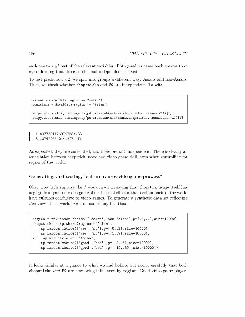
186 CHAPTER 18. CAUSALITY
each one to a χ2 test of the relevant variables. Both p-values came back greater thanα, confirming that these conditional independencies exist.
To test prediction #2, we split into groups a different way: Asians and non-Asians.Then, we check whether chopsticks and VG are independent. To wit:
asians = data[data.region == "Asian"]nonAsians = data[data.region != "Asian"]
scipy.stats.chi2_contingency(pd.crosstab(asians.chopsticks, asians.VG))[1]scipy.stats.chi2_contingency(pd.crosstab(nonAsians.chopsticks, nonAsians.VG))[1]
1.4977381776979758e-333.1074726542441227e-71
As expected, they are correlated, and therefore not independent. There is clearly anassociation between chopstick usage and video game skill, even when controlling forregion of the world.
Generating, and testing, “culture-causes-videogame-prowess”
Okay, now let’s suppose the I was correct in saying that chopstick usage itself hasnegligible impact on video game skill: the real effect is that certain parts of the worldhave cultures conducive to video games. To generate a synthetic data set reflectingthis view of the world, we’d do something like this:
region = np.random.choice(['Asian','non-Asian'],p=[.4,.6],size=10000)chopsticks = np.where(region=='Asian',
np.random.choice(['yes','no'],p=[.8,.2],size=10000),np.random.choice(['yes','no'],p=[.1,.9],size=10000))
VG = np.where(region=='Asian',np.random.choice(['good','bad'],p=[.4,.6],size=10000),np.random.choice(['good','bad'],p=[.15,.85],size=10000))
It looks similar at a glance to what we had before, but notice carefully that bothchopsticks and VG are now being influenced by region. Good video game players
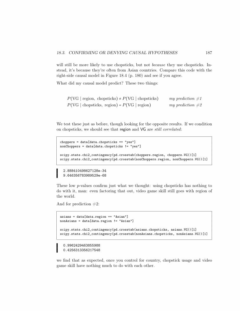
18.3. CONFIRMING OR DENYING CAUSAL HYPOTHESES 187
will still be more likely to use chopsticks, but not because they use chopsticks. In-stead, it’s because they’re often from Asian countries. Compare this code with theright-side causal model in Figure 18.4 (p. 180) and see if you agree.
What did my causal model predict? These two things:
P (VG ∣ region, chopsticks) ≠ P (VG ∣ chopsticks) my prediction #1P (VG ∣ chopsticks, region) = P (VG ∣ region) my prediction #2
We test these just as before, though looking for the opposite results. If we conditionon chopsticks, we should see that region and VG are still correlated :
choppers = data[data.chopsticks == "yes"]nonChoppers = data[data.chopsticks != "yes"]
scipy.stats.chi2_contingency(pd.crosstab(choppers.region, choppers.VG))[1]scipy.stats.chi2_contingency(pd.crosstab(nonChoppers.region, nonChoppers.VG))[1]
2.888410498627128e-349.646356783989529e-68
These low p-values confirm just what we thought: using chopsticks has nothing todo with it, man: even factoring that out, video game skill still goes with region ofthe world.
And for prediction #2:
asians = data[data.region == "Asian"]nonAsians = data[data.region != "Asian"]
scipy.stats.chi2_contingency(pd.crosstab(asians.chopsticks, asians.VG))[1]scipy.stats.chi2_contingency(pd.crosstab(nonAsians.chopsticks, nonAsians.VG))[1]
0.99624294638559880.4256313356217548
we find that as expected, once you control for country, chopstick usage and videogame skill have nothing much to do with each other.
188 CHAPTER 18. CAUSALITY
18.4 Taking a breath
Whew. That was a lot of number crunching, and subtle reasoning. It’s easy to getlost in the numbers and say, “wait...did I just confirm that? Or deny it? Whichhypothesis was I testing? Was my p-value too low? too high? Aggh!”
When you step back and take a breath, you’ll see the pattern. In both of thesecases, we stacked the deck, of course. We deliberately generated an artificial dataset to confirm the student’s hypothesis, and then generated one to confirm mine.Who knows what the real answer is? I don’t actually have any data on video gamecompetitions nor chopstick usage.
The important thing to see is that if the skeletons of two different causal theories aredifferent, then you don’t have to throw up your hands and say “correlation doesn’tequal causation! So I guess I know nothing!” The data often has a lot to say, andeven in observational studies, a careful analysis can reveal deep truths.
Chapter 19
ML classifiers: Naïve Bayes (1 of 3)
For some folks, the coolest and most exciting parts of Data Science are the machinelearning (ML) algorithms. These are the under-the-hood techniques for doingprediction and analytics. We’ll look at a few of them briefly in this class, and you’lldelve into them more fully in later courses.
Recall that a classifier is an algorithm/program to predict which of several labels(or classes) to assign to a data point. Perhaps we’re trying to predict what politicalparty someone is affiliated with, and our labels are “Democrat,” “Republican,” and“Green.” Perhaps we’re trying to predict whether someone will default on a loanwe’re considering giving them, and the labels are “safe” and “high-risk.”
There are many different algorithms for classification, but they all use a set of la-beled examples as “training data.” The idea is that by scrutinizing a bunch ofexamples for which we know the label, we can intelligently figure out what label toassign to new, unlabeled examples.
The attributes of our training data (and new data) that we’ll use for prediction aresometimes called features. If our training data is in a DataFrame, the features areessentially all the relevant columns except for one, which is the target. Our goal,given a new data point that has values for all the features, is to label its targetwith the label it’s most likely to have, assuming the training data are representativeexamples.
A classifier’s performance can be measured in several ways, but the most straight-forward is to score how many unlabeled examples it gives the correct label to. Thisof course begs the question: if the example is unlabeled, how can we know whether
189
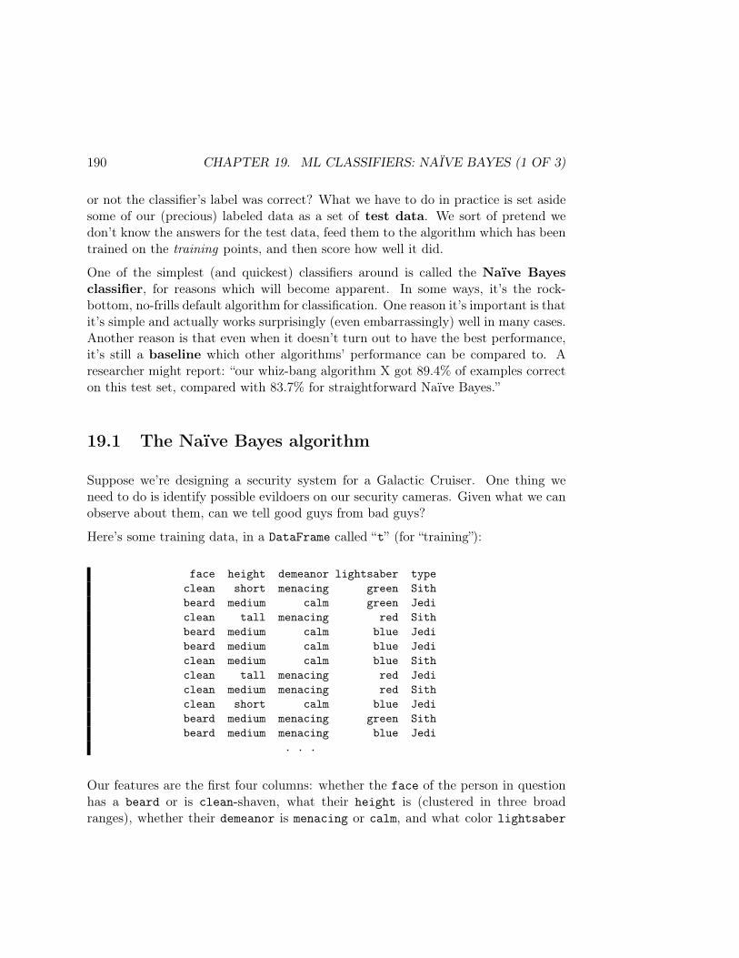
190 CHAPTER 19. ML CLASSIFIERS: NAÏVE BAYES (1 OF 3)
or not the classifier’s label was correct? What we have to do in practice is set asidesome of our (precious) labeled data as a set of test data. We sort of pretend wedon’t know the answers for the test data, feed them to the algorithm which has beentrained on the training points, and then score how well it did.
One of the simplest (and quickest) classifiers around is called the Naïve Bayesclassifier, for reasons which will become apparent. In some ways, it’s the rock-bottom, no-frills default algorithm for classification. One reason it’s important is thatit’s simple and actually works surprisingly (even embarrassingly) well in many cases.Another reason is that even when it doesn’t turn out to have the best performance,it’s still a baseline which other algorithms’ performance can be compared to. Aresearcher might report: “our whiz-bang algorithm X got 89.4% of examples correcton this test set, compared with 83.7% for straightforward Naïve Bayes.”
19.1 The Naïve Bayes algorithm
Suppose we’re designing a security system for a Galactic Cruiser. One thing weneed to do is identify possible evildoers on our security cameras. Given what we canobserve about them, can we tell good guys from bad guys?
Here’s some training data, in a DataFrame called “t” (for “training”):
face height demeanor lightsaber typeclean short menacing green Sithbeard medium calm green Jediclean tall menacing red Sithbeard medium calm blue Jedibeard medium calm blue Jediclean medium calm blue Sithclean tall menacing red Jediclean medium menacing red Sithclean short calm blue Jedibeard medium menacing green Sithbeard medium menacing blue Jedi
. . .
Our features are the first four columns: whether the face of the person in questionhas a beard or is clean-shaven, what their height is (clustered in three broadranges), whether their demeanor is menacing or calm, and what color lightsaber
19.2. USING BAYES’ RULE 191
they wield. The final column is our label: this person is known to be a Jedi (goodguy) or a Sith (bad guy).
A test point that we might want to evaluate looks like this:
face height demeanor lightsaber typebeard short menacing red ??
Operationally, a short, menacing, bearded person with a red lightsaber has justshowed up on security camera #305. Should we sound the alarm? That, of course,depends upon their (as yet unknown) type. We want to predict this based on ourpast examples.
The Naïve Bayes classification algorithm applies conditional probability to thisquestion. Really, what we’re asking is: “which of the following two quantities isgreater:
1. P(Jedi ∣ beard, short, menacing, red), or2. P(Sith ∣ beard, short, menacing, red)?”
Note that we’re combining joint and conditional probabilities here. Given that wehave the joint event “bearded, short, menacing, and red,” what’s the conditionalprobability of them being a Jedi (or Sith)? If we estimate the first as .8 and thesecond as .2, for instance, we won’t sound the alarm.
19.2 Using Bayes’ rule
With Bayes’ rule, we can rewrite these as:
(1) Estimated Jedi probability:
P(Jedi | beard, short, menacing, red) =P(beard, short, menacing, red | Jedi) ⋅P(Jedi)
P(beard, short, menacing, red)
and
(2) Estimated Sith probability:
P(Sith | beard, short, menacing, red) =P(beard, short, menacing, red | Sith) ⋅P(Sith)
P(beard, short, menacing, red)

192 CHAPTER 19. ML CLASSIFIERS: NAÏVE BAYES (1 OF 3)
Note that the two equations are identical except for the words “Jedi” and “Sith,”which are interchanged. We’ll first focus on equation (1).
Bayes’ Rule has allowed us to turn things on their head. In essence, instead of asking“if they have these physical features, would they likely be a Jedi?” we’re asking “ifthey’re a Jedi, would they be likely to have these physical features?”
The right-hand side of equation (1) has three parts: two in the numerator, and onein the denominator. Ignore the denominator for a moment. The second part ofthe numerator, P(Jedi), is our prior probability. That’s easy to estimate from thetraining data: we just count up what percentage of our samples are Jedi overall.
The first half of the numerator needs more work. It reads:
P (beard, short, menacing, red ∣ Jedi)
Now if it just so happened that those four features were independent of one another,this would actually be super easy to compute. We could just do this:
P (beard ∣ Jedi) ⋅ P (short ∣ Jedi) ⋅ P (menacing ∣ Jedi) ⋅ P (red ∣ Jedi)
Under this outrageous assumption, we’ve split the expression into each feature indi-vidually. This is called the Naïve Bayes assumption. Of course it’s probably nottrue that beardedness, height, demeanor, and lightsaber color are all independent ofeach other; for one thing, if some or all of these features are indicative of Jedi-ness(which we hope), then they certainly will vary together! But the Naïve Bayes clas-sifier says “aw heck, let’s just throw caution to the wind and see how things workout.”
All these components are now trivially obtainable from the training data. For ex-ample, what’s a good estimate of P(beard ∣ Jedi)? Simple: look at only the Jedi inthe training data, and count up how many “beards” and “cleans” there are. Thefraction that are beards is our estimate of P(beard ∣ Jedi).1
To make it concrete, in our training data on p. 190, there are a total of six Jedi(count them!), of whom four have beards (count them!). Therefore, our estimate forP(beard ∣ Jedi) is 4
6 =23 . In other words, based on this training data, we guesstimate
that if you’re a Jedi, it’s about 67% likely that you’re bearded.1If you have trouble seeing this, go back to the definition of conditional probability on p. 169.
We’re really calculatingP (beard,Jedi)
P (Jedi)here, which is “the number of bearded Jedi divided by the
number of total Jedi.”

19.3. A NUMERICAL EXAMPLE 193
19.3 A numerical example
Let’s work out the numerical answer (numerator only) for the training data listedearlier. First, considering only the five Jedi rows gives us our Jedi numerator:
P (beard∣Jedi) ⋅ P (short∣Jedi) ⋅ P (menacing∣Jedi) ⋅ P (red∣Jedi) ⋅ P (Jedi) =46 ⋅ 1
6 ⋅ 26 ⋅ 1
6 ⋅ 611 = .0034
Now let’s do the same thing for the five Sith rows to get the Sith numerator:
P (beard∣Sith) ⋅ P (short∣Sith) ⋅ P (menacing∣Sith) ⋅ P (red∣Sith) ⋅ P (Sith) =15 ⋅ 1
5 ⋅ 45 ⋅ 2
5 ⋅ 511 = .0058
Look very very carefully at the training data on p. 190 and confirm that you agreewith the above numbers. Using a pencil to write marks on the training data oftenhelps you to keep everything straight.
19.3.1 Throw away the denominator
Okay, those are the two numerators. To get true probabilities, we have to divide bythe denominators, of course. But the nice thing is: the denominators are the samein the two cases! For both expressions, we would need to divide by P(beard, short,menacing, red) (in words, “what’s the probability that any random person wouldbe a bearded, short, menacing person with a red lightsaber?”) This of course hasthe same value even if we compute it twice. For this reason, we throw away thedenominator since in the end all we really care about is “which is higher, P(Jedi ∣stuff ) or P(Sith ∣ stuff )?”
In this case, P(Sith ∣ stuff ) is the higher of the two quantities (.0058 vs. .0034) andso we boldly predict: “this person looks like a Sith! Sound the alarm.”
All that counting and dividing, of course, is a pain. So we’ll get Python to automateit for us. That’s the subject of the next chapter.

194 CHAPTER 19. ML CLASSIFIERS: NAÏVE BAYES (1 OF 3)
Chapter 20
ML classifiers: Naïve Bayes (2 of 3)
How can we automate the calculations of the previous chapter in Python? Let’sassume that our data is in a Pandas DataFrame called “t” (for “training”) as it wasin the last chapter (p. 190). Now imagine writing this function:
def predict(face, height, demeanor, lightsaber):...
This function takes as input a new (unlabeled) data point and returns a predictionfor it: either the word “Jedi” or the word “Sith.”
We’ll do most of the work outside the function, actually. We’ll read in the file andthen pre-compute all the probabilities that we’ll need for our calculations. This iseffectively the training stage: we’re “training” our classifier function on the data.
If you think it through, the calculations from Chapter 19 imply the need for thefollowing probabilities:
• P (label) for every one of the target labels (these are the “priors”)• P (value ∣ label) for every value in a column and every target label (the condi-
tionals)
In our case, this amounts to:
• Priors:– P (Jedi)– P (Sith)
195
196 CHAPTER 20. ML CLASSIFIERS: NAÏVE BAYES (2 OF 3)
• Conditionals:– P (clean ∣ Jedi) and P (clean ∣ Sith)– P (beard ∣ Jedi) and P (beard ∣ Sith)– P (tall ∣ Jedi) and P (tall ∣ Sith)– P (medium ∣ Jedi) and P (medium ∣ Sith)– P (short ∣ Jedi) and P (short ∣ Sith)– P (menacing ∣ Jedi) and P (menacing ∣ Sith)– P (calm ∣ Jedi) and P (calm ∣ Sith)– P (red ∣ Jedi) and P (red ∣ Sith)– P (green ∣ Jedi) and P (green ∣ Sith)– P (blue ∣ Jedi) and P (blue ∣ Sith)
These are all straightforward to compute with Pandas. I find it convenient to createa dictionary, called something like “probs,” to store all the probabilities. To computethe priors, all we have to do is figure out what fraction of the rows go with eachlabel:
probs = probs['Jedi'] = len(t[t.type=='Jedi'])/len(t)probs['Sith'] = len(t[t.type=='Sith'])/len(t)
For the conditionals like “P (calm ∣ Sith)”, we ask: considering only the rows thathave Sith labels, what fraction also have calm labels? That boils down to this:
probs['calm|Sith'] = (len(t[(t.type=='Sith') & (t.demeanor=='calm')]) /len(t[(t.type=='Sith')]))
The other 19 conditionals follow exactly the same pattern. (It may strike you thatwe’re repeating a lot of very similar code here, and making slight edits to eachone, and that there’s a better, more general way. You’re right. Stay tuned forSection 20.2.)
Now for the actual predict() function. All we have to do is multiply everything outper the above equations and see which of the two numerators is greater. The resultis in Figure 20.1. Stare carefully at it and convince yourself that it does preciselythe same calculations we did in Section 19.3 (p. 193). Note that we don’t use the tvariable inside this function at all. We’ve already computed all the probs, and once

20.1. ESTIMATING CONFIDENCE 197
def predict(face, height, demeanor, lightsaber):jediness = (probs[face+"|Jedi"] *
probs[height+"|Jedi"] *probs[demeanor+"|Jedi"] *probs[lightsaber+"|Jedi"] *probs["Jedi"])
sithness = (probs[face+"|Sith"] *probs[height+"|Sith"] *probs[demeanor+"|Sith"] *probs[lightsaber+"|Sith"] *probs["Sith"])
if jediness > sithness:return "Jedi"
else:return "Sith"
Figure 20.1: Our Naïve Bayes ML predict() function.
we’ve done that, the DataFrame and the data itself ceases to matter. We run thefunction just by passing it the values derived from our spycam:
print(predict("beard","tall","calm","blue"))print(predict("clean","tall","menacing","red"))
'Jedi''Sith'
20.1 Estimating confidence
Our predict() function, as written, just gives a binary answer: either Sith or Jedi.It may be useful to know how confident it is in its prediction for any given input. Allwe need to do is compute the correct ratio. Remember that jediness and sithnessare just the numerators of probabilities, and that those probabilities have the samedenominator. Therefore, in order to compute the true P (Jedi ∣ e), where e is all ourevidence (calm, beard, and so forth), we just need to compute:
198 CHAPTER 20. ML CLASSIFIERS: NAÏVE BAYES (2 OF 3)
P (Jedi ∣ e) =jediness
jediness + sithness
and similarly,
P (Sith ∣ e) =sithness
jediness + sithness
The denominator drops out when we divide the quantities anyway.
So let’s enhance our predict() function to return a list of two values: the prediction,and the confidence level (on a scale of .5 to 1, meaning “only 50% confident in ourprediction” all the way to “absolutely 100% confident in our prediction.” To wit:
def predict(face, height, demeanor, lightsaber):...if jediness > sithness:
return ["Jedi", jediness/(jediness+sithness)]else:
return ["Sith", sithness/(jediness+sithness)]
(We’re returning a list here, of the two values.) Taking it for a spin:
predict("clean","tall","menacing","red")predict("beard","tall","menacing","blue")
['Sith', 0.9760957241941071]['Jedi', 0.7298292697172792]
So we’re incredibly confident that our clean-shaven, tall, menacing, red-wielder is aSith, but not nearly so confident that our bearded, tall, menacing blue-wielder is aJedi.

20.2. CODING IT MORE GENERALLY 199
20.2 Coding it more generally
The above calculation of the probabilities left something to be desired, since it washardcoded and repetitive. We can improve on this by writing our code in a moregeneral way, rather than explicitly referring to problem-specific names like “Jedi”and “demeanor” and “blue.” Here’s one way to do all the training calculations:
t = pd.read_csv("...")
probs = features = t.columns[0:len(t.columns)-1]target = t.columns[len(t.columns)-1]
for label in t[target].drop_duplicates():
# Calculate priors.probs[label] = len(t[t[target] == label])/len(t)
# Calculate conditionals.for feature in features:
for value in t[feature].drop_duplicates():probs[value+"|"+label] = (
len(t[(t[target] == label) & (t[feature] == value)]) /len(t[t[target] == label]))
Lots going on here. First, after reading the data, we set features to be the namesof all the columns except the last one, and target to be the name of the last one.
Then we loop through all the different target labels (e.g., “Jedi” and “Sith”), cal-culating both priors and conditionals. The priors are straightforward: they’re justthe fraction of rows that match the label, like we did in the top box on p. 196.
We’re making an assumption when calculating conditionals: that all the values inthe columns are unique (i.e., that we won’t have, for example, an “out-of-state”column with some “beard” values and also have a “married” column with “beard”values.) As long as this is true, we know we have a unique string to use as a key(like “medium|Sith”) and it won’t have a name collision with any other conditional.
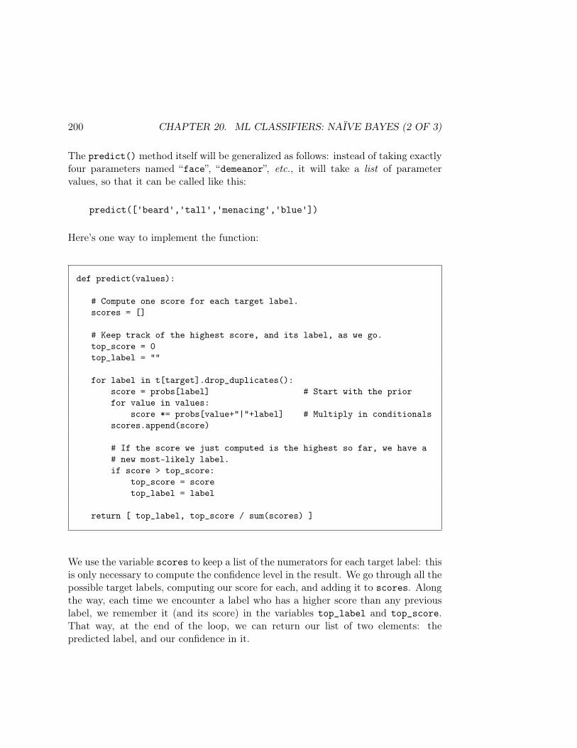
200 CHAPTER 20. ML CLASSIFIERS: NAÏVE BAYES (2 OF 3)
The predict() method itself will be generalized as follows: instead of taking exactlyfour parameters named “face”, “demeanor”, etc., it will take a list of parametervalues, so that it can be called like this:
predict(['beard','tall','menacing','blue'])
Here’s one way to implement the function:
def predict(values):
# Compute one score for each target label.scores = []
# Keep track of the highest score, and its label, as we go.top_score = 0top_label = ""
for label in t[target].drop_duplicates():score = probs[label] # Start with the priorfor value in values:
score *= probs[value+"|"+label] # Multiply in conditionalsscores.append(score)
# If the score we just computed is the highest so far, we have a# new most-likely label.if score > top_score:
top_score = scoretop_label = label
return [ top_label, top_score / sum(scores) ]
We use the variable scores to keep a list of the numerators for each target label: thisis only necessary to compute the confidence level in the result. We go through all thepossible target labels, computing our score for each, and adding it to scores. Alongthe way, each time we encounter a label who has a higher score than any previouslabel, we remember it (and its score) in the variables top_label and top_score.That way, at the end of the loop, we can return our list of two elements: thepredicted label, and our confidence in it.
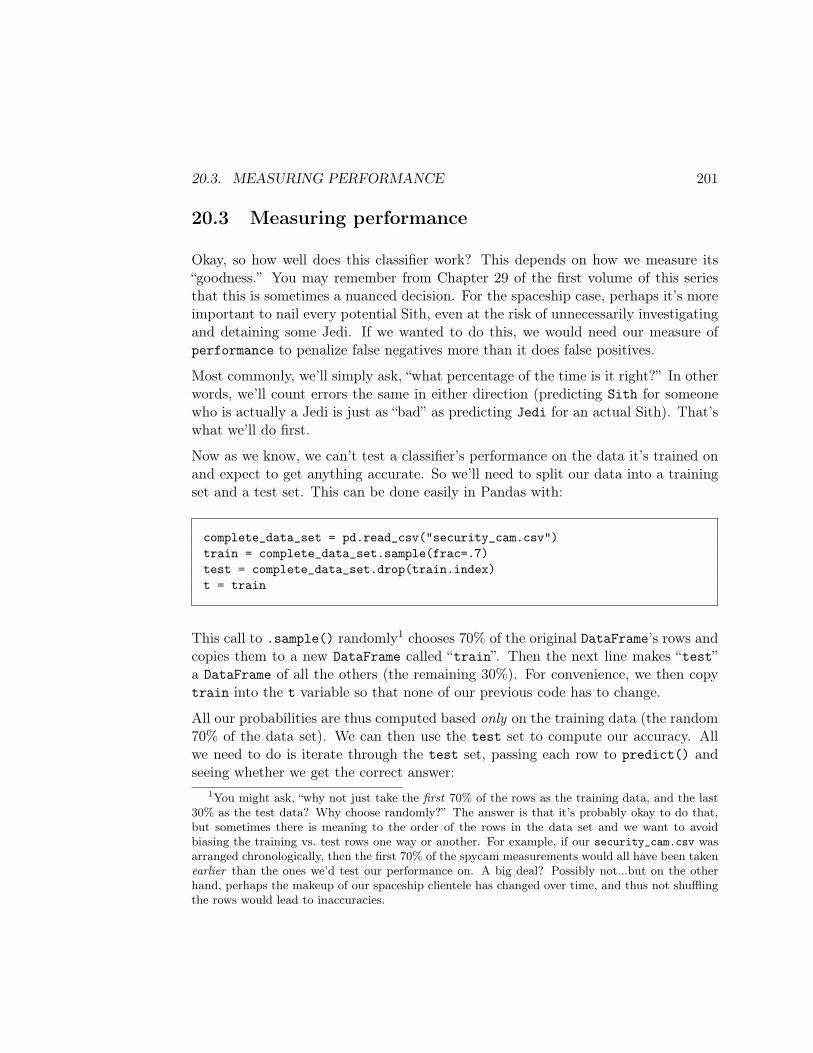
20.3. MEASURING PERFORMANCE 201
20.3 Measuring performance
Okay, so how well does this classifier work? This depends on how we measure its“goodness.” You may remember from Chapter 29 of the first volume of this seriesthat this is sometimes a nuanced decision. For the spaceship case, perhaps it’s moreimportant to nail every potential Sith, even at the risk of unnecessarily investigatingand detaining some Jedi. If we wanted to do this, we would need our measure ofperformance to penalize false negatives more than it does false positives.
Most commonly, we’ll simply ask, “what percentage of the time is it right?” In otherwords, we’ll count errors the same in either direction (predicting Sith for someonewho is actually a Jedi is just as “bad” as predicting Jedi for an actual Sith). That’swhat we’ll do first.
Now as we know, we can’t test a classifier’s performance on the data it’s trained onand expect to get anything accurate. So we’ll need to split our data into a trainingset and a test set. This can be done easily in Pandas with:
complete_data_set = pd.read_csv("security_cam.csv")train = complete_data_set.sample(frac=.7)test = complete_data_set.drop(train.index)t = train
This call to .sample() randomly1 chooses 70% of the original DataFrame’s rows andcopies them to a new DataFrame called “train”. Then the next line makes “test”a DataFrame of all the others (the remaining 30%). For convenience, we then copytrain into the t variable so that none of our previous code has to change.
All our probabilities are thus computed based only on the training data (the random70% of the data set). We can then use the test set to compute our accuracy. Allwe need to do is iterate through the test set, passing each row to predict() andseeing whether we get the correct answer:
1You might ask, “why not just take the first 70% of the rows as the training data, and the last30% as the test data? Why choose randomly?” The answer is that it’s probably okay to do that,but sometimes there is meaning to the order of the rows in the data set and we want to avoidbiasing the training vs. test rows one way or another. For example, if our security_cam.csv wasarranged chronologically, then the first 70% of the spycam measurements would all have been takenearlier than the ones we’d test our performance on. A big deal? Possibly not...but on the otherhand, perhaps the makeup of our spaceship clientele has changed over time, and thus not shufflingthe rows would lead to inaccuracies.
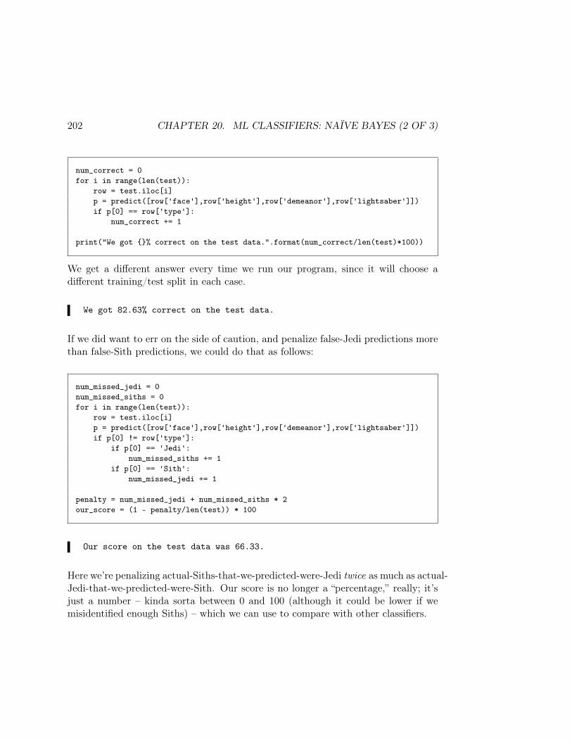
202 CHAPTER 20. ML CLASSIFIERS: NAÏVE BAYES (2 OF 3)
num_correct = 0for i in range(len(test)):
row = test.iloc[i]p = predict([row['face'],row['height'],row['demeanor'],row['lightsaber']])if p[0] == row['type']:
num_correct += 1
print("We got % correct on the test data.".format(num_correct/len(test)*100))
We get a different answer every time we run our program, since it will choose adifferent training/test split in each case.
We got 82.63% correct on the test data.
If we did want to err on the side of caution, and penalize false-Jedi predictions morethan false-Sith predictions, we could do that as follows:
num_missed_jedi = 0num_missed_siths = 0for i in range(len(test)):
row = test.iloc[i]p = predict([row['face'],row['height'],row['demeanor'],row['lightsaber']])if p[0] != row['type']:
if p[0] == 'Jedi':num_missed_siths += 1
if p[0] == 'Sith':num_missed_jedi += 1
penalty = num_missed_jedi + num_missed_siths * 2our_score = (1 - penalty/len(test)) * 100
Our score on the test data was 66.33.
Here we’re penalizing actual-Siths-that-we-predicted-were-Jedi twice as much as actual-Jedi-that-we-predicted-were-Sith. Our score is no longer a “percentage,” really; it’sjust a number – kinda sorta between 0 and 100 (although it could be lower if wemisidentified enough Siths) – which we can use to compare with other classifiers.
Chapter 21
ML classifiers: Naïve Bayes (3 of 3)
21.1 Numeric variables
In all the examples above, we had categorical features. Computing something like“P (calm ∣ Jedi)” is thus just a matter of counting the Jedi rows which (exactly)match the value calm. But what if we have a numeric feature, like a person’s age orsalary?
One quick-and-dirty way to deal with numeric features is to “bin” them, kind of like ahistogram. Note that this is actually what we already did with the “height” columnin the Jedi example: instead of heights like 4’9" and 6’6", we had values like shortand tall.
This has obvious drawbacks. For one, we’re throwing away all the detail present inthe measurement and treating different values exactly alike. For another, it’s up tous to somewhat arbitrarily choose how many bins to use and where the demarcationlines are. This has an ad hoc feel to it.
21.1.1 Gaussian Naïve Bayes
Better is to treat the continuous variable as what it really is: a number. GaussianNaïve Bayes is probably the most common way to deal with this in a principledfashion: we make the assumption that the numeric feature is distributed normally(“normal”==“Gaussian”), and estimate its mean and standard deviation from thetraining data. Then, to estimate P (value ∣ target_label) for any particular test data
203
204 CHAPTER 21. ML CLASSIFIERS: NAÏVE BAYES (3 OF 3)
point’s value, we choose the estimated value of its probability density (p. 31) anduse that.
Remember from Section 5.2 (p. 36) that if a variable is “distributed normally” itmeans that its values are “bell-curvy.” There’s some average value which occurs alot, and values farther and farther from that average are less and less likely to occur.
Now suppose we had a numeric height feature (measured in inches) instead of acategorical one. Our training data (in the “t” DataFrame) might look like this:
face height demeanor lightsaber typeclean 62.5 menacing green Sithbeard 68.3 calm green Jediclean 78.1 menacing red Sithbeard 63.9 calm blue Jedibeard 61.9 calm blue Jediclean 68.2 calm blue Sithclean 80.1 menacing red Jediclean 33.5 calm green Jedi
. . .
Our Gaussian Naïve Bayes assumption will be that for each class, the height featureis distributed normally. Given this assumption, we can characterize its normal distri-bution with just two parameters: its estimated mean and standard deviation. So wetake all the Jedi rows, and calculate their heights’ mean and standard deviation:
t[t.type=='Jedi'].height.mean()t[t.type=='Jedi'].height.std()
64.05714285714299.661931704216865
Performing the same calculation for the Sith rows gives us:
t[t.type=='Sith'].height.mean()t[t.type=='Sith'].height.std()
68.39021739130439.319673312968604
21.1. NUMERIC VARIABLES 205
Interesting. Looks like Sith Lords are a bit taller than Jedi in general, and slightlyless variable.
Now let’s say we’re doing a Jedi-vs.-Sith prediction for a person whose height (ac-cording to our security camera) is 69 inches. We’ll need to know the value of thedensity at x=69 for both our estimated Jedi and estimated Sith distributions. Usingthe SciPy library, we can get “frozen” distributions for each:
import scipy.statsjedi_height = scipy.stats.norm(64.0571428571429, 9.661931704216865)sith_height = scipy.stats.norm(68.3902173913043, 9.319673312968604)
Think of a frozen distribution as just a variable on which we can call a .pdf()method to find the height of its distribution at a particular value. Let’s see how highthe estimated Jedi and Sith densities are for a height of 69 inches:
jedi_height.pdf(69)sith_height.pdf(69)
0.0362306634862745170.042717943988373371
Not surprisingly, the Sith number comes out a fair bit higher, since according to ourestimated density, the average Sith’s height is taller than the average Jedi’s.
Keep in mind that the “.0362” and “.0427” numbers here are a bit hard to interpret.They are not “the probability that a Jedi/Sith is exactly 69 inches tall” – thatprobability, as with all continuous random variables, is zero. Instead, it’s “the valueof the density at x=69” which isn’t really in any units that make sense. It’s okay,though, since we are throwing away out denominator and doing relative comparisonsanyway.
By the way, there are also other useful things you can call on a frozen SciPy distri-bution, including .cdf() to get the value of the cumulative density function at anypoint, .ppf() to get a quantile, .rvs() to generate random values from it, ordinarystatistical things like .median(), .mean(), .std(), and other more exotic statisti-cal things like moments, confidence intervals, differential entropy, survival functions,etc. See the documentation for details.
206 CHAPTER 21. ML CLASSIFIERS: NAÏVE BAYES (3 OF 3)
21.1.2 Incorporating into the classifier
Let’s add this feature to our classifier. First, the training code for the not-so-generally-coded version (p. 196), which had lines like this:
probs['tall|Sith'] = (len(t[(t.type=='Sith') & (t.demeanor=='tall')]) /len(t[(t.type=='Sith')]))
Since height is now numeric, we need to replace all those height-related lines withcode like this:
sith_heights = t[t.type == 'Sith'].heightsith_height = scipy.stats.norm(sith_heights.mean(),sith_heights.std())jedi_heights = t[t.type == 'Jedi'].heightjedi_height = scipy.stats.norm(jedi_heights.mean(),jedi_heights.std())
“sith_height” and “jedi_height” are now our frozen distribution functions. Inpredict(), then, we simply use it as another multiplier:
def predict(face, height, demeanor, lightsaber):jediness = (probs[face+"|Jedi"] *
jedi_height.pdf(height) * <-- CHANGEDprobs[demeanor+"|Jedi"] *probs[lightsaber+"|Jedi"] *probs["Jedi"])
sithness = (probs[face+"|Sith"] *sith_height.pdf(height) * <-- CHANGEDprobs[demeanor+"|Sith"] *probs[lightsaber+"|Sith"] *probs["Sith"])
if jediness > sithness:return "Jedi"
else:return "Sith"
Squint at that code and notice the changed lines from Figure 20.1 (on p. 197). We’veremoved the “probs[height+"|Jedi"]” lines, since they’re no longer applicable:
21.1. NUMERIC VARIABLES 207
height is numeric now. Instead, we multiply our jediness/sithness by the valueof the corresponding class’s estimated density at that point.
To incorporate this numeric variable into the more general version of the code (p.199),we need to intelligently distinguish between numeric and categorical columns. Thiscan be done via the .dtype accessor on a DataFrame column:
print(t.lightsaber.dtype)print(t.height.dtype)
dtype('O')dtype('float64')
(The “O” stands for “object,” which is Pandas’ non-intuitive way of telling you thatthe column is something non-numeric, like a string.) You can directly compare theresult to a value like “np.dtype("float64")”, but the safer and preferred way is touse NumPy’s issubdtype() function which more intelligently detects any numerictype (ints, floats, etc., no matter the precision).
Our new generic implementation begins with:
probs = densities = target = t.columns[len(t.columns)-1]num_fs= [ c for c in t.columns[:-1] if np.issubdtype(t[c].dtype,np.number) ]cat_fs = [ c for c in t.columns[:-1] if not np.issubdtype(t[c].dtype,np.number) ]
We’re creating a densities dictionary, somewhat similar to our probs dictionary,to store feature-specific information for our numeric variables (probs will continueto store information for categorical variables). Instead of simple numeric values,densities will store frozen distribution functions. Additionally, instead of a singlefeatures list like we had on p. 199, we now have two lists – num_fs and cat_fs –for the names of the numeric and categorical features, respectively.
Something else in that code might be new to you: we’re using something called alist comprehension, which is just a sleek way of creating a list without the needfor a for loop. Notice the boxies after the equals signs for num_fs and cat_fs, and
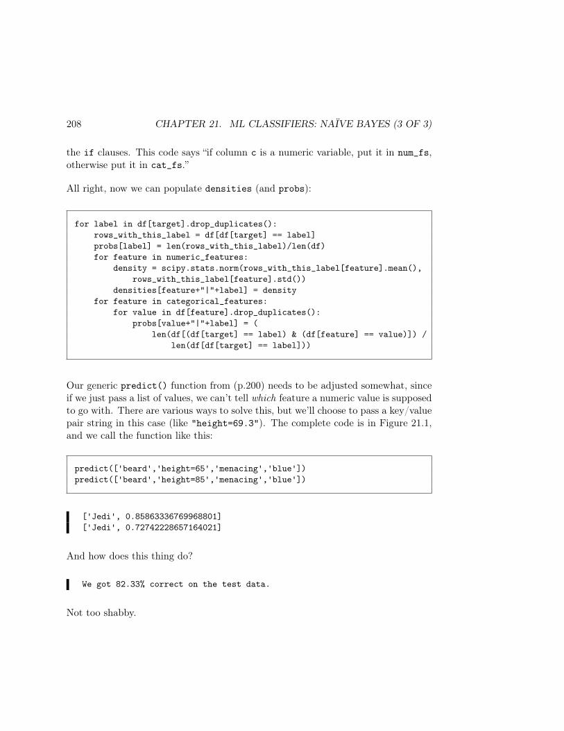
208 CHAPTER 21. ML CLASSIFIERS: NAÏVE BAYES (3 OF 3)
the if clauses. This code says “if column c is a numeric variable, put it in num_fs,otherwise put it in cat_fs.”
All right, now we can populate densities (and probs):
for label in df[target].drop_duplicates():rows_with_this_label = df[df[target] == label]probs[label] = len(rows_with_this_label)/len(df)for feature in numeric_features:
density = scipy.stats.norm(rows_with_this_label[feature].mean(),rows_with_this_label[feature].std())
densities[feature+"|"+label] = densityfor feature in categorical_features:
for value in df[feature].drop_duplicates():probs[value+"|"+label] = (
len(df[(df[target] == label) & (df[feature] == value)]) /len(df[df[target] == label]))
Our generic predict() function from (p.200) needs to be adjusted somewhat, sinceif we just pass a list of values, we can’t tell which feature a numeric value is supposedto go with. There are various ways to solve this, but we’ll choose to pass a key/valuepair string in this case (like "height=69.3"). The complete code is in Figure 21.1,and we call the function like this:
predict(['beard','height=65','menacing','blue'])predict(['beard','height=85','menacing','blue'])
['Jedi', 0.85863336769968801]['Jedi', 0.72742228657164021]
And how does this thing do?
We got 82.33% correct on the test data.
Not too shabby.

21.1. NUMERIC VARIABLES 209
def predict(values):
scores = []top_prob = 0top_answer = ""
for label in df[target].drop_duplicates():
prob = probs[label] # Start with the prior
for value in values:if "=" in value:
# Numeric feature.numeric_feature, numeric_value = value.split("=")numeric_value = float(numeric_value)prob *= densities[numeric_feature+"|"+label].pdf(numeric_value)
else:# Categorical feature.prob *= probs[value+"|"+label]
scores.append(prob)
if prob > top_prob:top_prob = probtop_answer = label
return [ top_answer, top_prob / sum(scores) ]
Figure 21.1: A general Naïve Bayes predict() function, enhancedto allow numeric features (which are passed as key/value strings like"height=51.5").

210 CHAPTER 21. ML CLASSIFIERS: NAÏVE BAYES (3 OF 3)
Chapter 22
APIs
Back in Chapter 15, I called the screen-scraping scenario “the worst of all possibleworlds.” Using an API, the subject of this lesson, is sort of the best. I say “sort of”because it’s certainly not the easiest. The easiest is when you have a ready-madeCSV file with exactly the data you want, and you suck it into a DataFrame, done.The thing is, much of the data you’ll be interested in analyzing as a Data Scientistwasn’t put together like that for you. Instead, it exists as part of a vast databasesomewhere, and you need flexibility and power to extract on demand exactly theparts you want. This is what a good API lets you do.
API actually stands for “Application Programming Interface,” which is a pretty unin-formative acronym. What it really means is “a set of functions someone has providedfor you to call in order to access their data, together with clean documentation tellingyou precisely what each of those functions do.” As you’ll see with experience, someAPIs are better designed than others, and make it easier to get what you want. Inthis chapter we’ll look at two examples and generalize some common principles fromthem.
22.1 REST APIs
Another strange pseudo-acronym you’ll encounter is “REST”1, which is a style ofAPI. REST APIs have the following characteristics:
1This sort of stands for “REpresentational State Transfer,” another utterly unhelpful phrase.
211
212 CHAPTER 22. APIS
• They’re designed to be used over the Web. (Although “over the Web” maynot mean what you think it means; for one, it doesn’t mean “using a browser.”Instead, it means “accessing the data using HTTP requests in the form ofstructured URLs/hyperlinks.” We’ll be writing Python code to retrieve whatappear to be pseudo-Web-pages outside our browser.)
• They’re simple and elegant. Unlike their predecessor (and competitor) proto-cols SOAP and RPC, REST was designed and promoted by people2 who didn’tlike clutter and who wanted communication to be streamlined and compactlyspecified. REST APIs are typically nice to use.
• They’re based directly on the HTTP protocol itself, and under the hood makeuse of the HTTP operations like GET, HEAD, POST, DELETE, PUT, etc. Becauseof this, different REST APIs tend to be pretty uniform in how they work.
• They’re “stateless,” as HTTP is itself. This means the server retains nomemory of the past requests from a client. (“Server” is a word meaning “amachine on the Internet that you want to access,” and “client” here essentiallymeans “your own computer, which makes requests of the server.”) This hassome limitations, but makes APIs quick and simple to use.
• The data they provide can come in a variety of formats, typically JSON orXML.
22.1.1 Other terms
APIs that conform to Roy Fielding’s original spec are known colloquially as – I kidyou not – “RESTful.”
You’ll also sometimes hear the buzzwords “Web services” or “SOA” (Service-oriented Architecture). Although these terms are a bit broader and communicatesomething subtly different than just “the use of Web-based APIs” (REST or oth-erwise), in practice you will see terms like this used jointly to refer to the sametechnologies. If you hear someone talking about “a Web services approach,” yourears should perk up and you should anticipate being able to apply at least some ofthe lessons in this module.
Finally, the term endpoint refers to a particular, addressable part of an API that isnormally defined by a base URL. For instance, the standard Twitter search API is athttps://api.twitter.com/1.1/search/tweets.json and the endpoint for getting
2Originally Roy Fielding in his 2000 Ph.D. dissertation from UC-Irvine.
22.2. RESTFUL APIS AND THE REQUESTS PACKAGE 213
full information about specific tweets is https://api.twitter.com/1.1/statuses/lookup.json. In general, an API will have many different endpoints, each of whichdefines its own parameters and is used for a particular type of information request.
22.2 RESTful APIs and the requests package
Python’s requests package is an easy way to make a call to an external API andget the results. It basically encapsulates the under-the-hood stuff that formulates,sends, and parses the results of an HTTP request.
HTTP defines various operations to communicate with a server such as GET, POST,and HEAD. The requests package bundles these up in functions like: requests.get(),requests.post(), etc. The most common method we’ll use in API access is the.get() command. It can actually be used to retrieve any Web-accessible page onthe network:
import requestsclass_home_page = requests.get("http://stephendavies.org/data219")print(class_home_page.content.decode('utf-8'))
That “.content.decode('utf-8')” thing is kind of a pain. The first part (.content)gives you the actual HTML code of the page itself (rather than a variable represent-ing the entire request/response sequence). The second part says to take that bigstring and interpret it as a format that can represent all Unicode characters. Uni-code and other character encodings are an interesting subject in their own right, butfor now, just get in the habit of calling the .content.decode('utf-8') method onevery packet of data you get from an API.
Anyway, if you run the above code, you’ll see the (gnarly) HTML code for the entirecourse web page on your screen as one big string. Seeing this emphasizes that whenwe execute RESTful API requests, we’re really not doing much more than accessing“web pages,” where “web page” here means a set of results that the server puts togetherfor us. This similarity to how browsers work is what makes RESTful APIs so simpleand powerful.
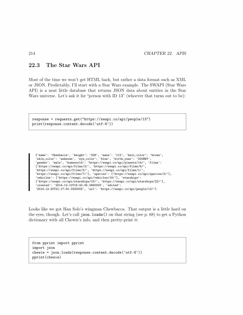
214 CHAPTER 22. APIS
22.3 The Star Wars API
Most of the time we won’t get HTML back, but rather a data format such as XMLor JSON. Predictably, I’ll start with a Star Wars example. The SWAPI (Star WarsAPI) is a neat little database that returns JSON data about entities in the StarWars universe. Let’s ask it for “person with ID 13” (whoever that turns out to be):
response = requests.get("https://swapi.co/api/people/13")print(response.content.decode('utf-8'))
'name': 'Chewbacca', 'height': '228', 'mass': '112', 'hair_color': 'brown','skin_color': 'unknown', 'eye_color': 'blue', 'birth_year': '200BBY','gender': 'male', 'homeworld': 'https://swapi.co/api/planets/14/', 'films':['https://swapi.co/api/films/2/', 'https://swapi.co/api/films/6/','https://swapi.co/api/films/3/', 'https://swapi.co/api/films/1/','https://swapi.co/api/films/7/'], 'species': ['https://swapi.co/api/species/3/'],'vehicles': ['https://swapi.co/api/vehicles/19/'], 'starships':['https://swapi.co/api/starships/10/', 'https://swapi.co/api/starships/22/'],'created': '2014-12-10T16:42:45.066000Z', 'edited':'2014-12-20T21:17:50.332000Z', 'url': 'https://swapi.co/api/people/13/'
Looks like we got Han Solo’s wingman Chewbacca. That output is a little hard onthe eyes, though. Let’s call json.loads() on that string (see p. 68) to get a Pythondictionary with all Chewie’s info, and then pretty-print it:
from pprint import pprintimport jsonchewie = json.loads(response.content.decode('utf-8'))pprint(chewie)

22.3. THE STAR WARS API 215
'birth_year': '200BBY','created': '2014-12-10T16:42:45.066000Z','edited': '2014-12-20T21:17:50.332000Z','eye_color': 'blue','films': ['https://swapi.co/api/films/2/',
'https://swapi.co/api/films/6/','https://swapi.co/api/films/3/','https://swapi.co/api/films/1/','https://swapi.co/api/films/7/'],
'gender': 'male','hair_color': 'brown','height': '228','homeworld': 'https://swapi.co/api/planets/14/','mass': '112','name': 'Chewbacca','skin_color': 'unknown','species': ['https://swapi.co/api/species/3/'],'starships': ['https://swapi.co/api/starships/10/',
'https://swapi.co/api/starships/22/'],'url': 'https://swapi.co/api/people/13/','vehicles': ['https://swapi.co/api/vehicles/19/']
Better. You can see that the API gave us a well-structured chunk of data, in adictionary, which we can explore and manipulate in all the usual ways. Notice Notethat some of the data consists of other REST URLs, which we could then choose tofurther query. This is a sign of a well-written API.
Let’s use the URL we got for Chewie’s home world and make another API call toretrieve that:
chewie = json.load(response.content.decode('utf-8'))pprint(json.loads(requests.get(chewie['homeworld']).content.decode('utf-8')))
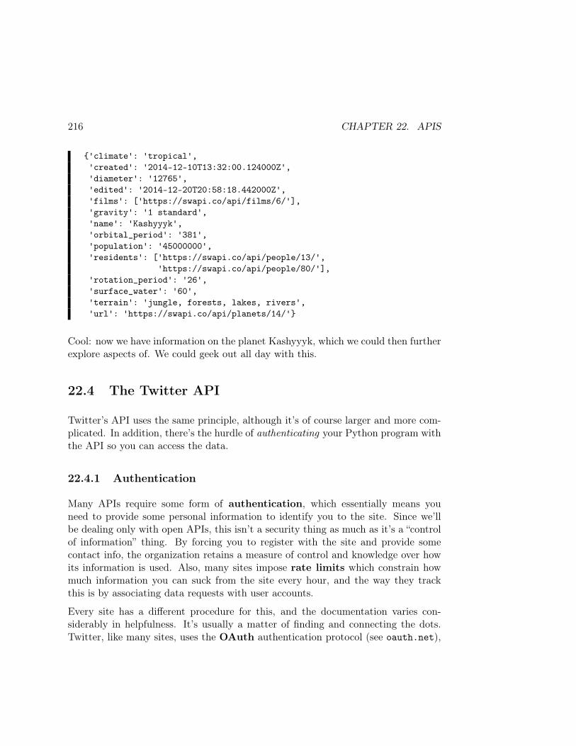
216 CHAPTER 22. APIS
'climate': 'tropical','created': '2014-12-10T13:32:00.124000Z','diameter': '12765','edited': '2014-12-20T20:58:18.442000Z','films': ['https://swapi.co/api/films/6/'],'gravity': '1 standard','name': 'Kashyyyk','orbital_period': '381','population': '45000000','residents': ['https://swapi.co/api/people/13/',
'https://swapi.co/api/people/80/'],'rotation_period': '26','surface_water': '60','terrain': 'jungle, forests, lakes, rivers','url': 'https://swapi.co/api/planets/14/'
Cool: now we have information on the planet Kashyyyk, which we could then furtherexplore aspects of. We could geek out all day with this.
22.4 The Twitter API
Twitter’s API uses the same principle, although it’s of course larger and more com-plicated. In addition, there’s the hurdle of authenticating your Python program withthe API so you can access the data.
22.4.1 Authentication
Many APIs require some form of authentication, which essentially means youneed to provide some personal information to identify you to the site. Since we’llbe dealing only with open APIs, this isn’t a security thing as much as it’s a “controlof information” thing. By forcing you to register with the site and provide somecontact info, the organization retains a measure of control and knowledge over howits information is used. Also, many sites impose rate limits which constrain howmuch information you can suck from the site every hour, and the way they trackthis is by associating data requests with user accounts.
Every site has a different procedure for this, and the documentation varies con-siderably in helpfulness. It’s usually a matter of finding and connecting the dots.Twitter, like many sites, uses the OAuth authentication protocol (see oauth.net),
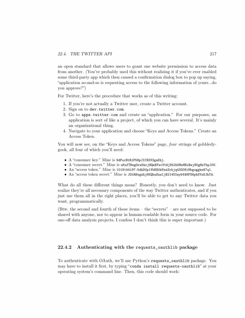
22.4. THE TWITTER API 217
an open standard that allows users to grant one website permission to access datafrom another. (You’ve probably used this without realizing it if you’ve ever enabledsome third-party app which then caused a confirmation dialog box to pop up saying,“application so-and-so is requesting access to the following information of yours...doyou approve?”)
For Twitter, here’s the procedure that works as of this writing:
1. If you’re not actually a Twitter user, create a Twitter account.2. Sign on to dev.twitter.com.3. Go to apps.twitter.com and create an “application.” For our purposes, an
application is sort of like a project, of which you can have several. It’s mainlyan organizational thing.
4. Navigate to your application and choose “Keys and Access Tokens.” Create anAccess Token.
You will now see, on the “Keys and Access Tokens” page, four strings of gobbledy-gook, all four of which you’ll need:
• A “consumer key.” Mine is 9dFucBtR1P58pJICXGV2gaKhj.• A “consumer secret.” Mine is uKufTBegOrw5hrjNQmXFwcVtWjSb2bUHsMEoBwjN5gHzTbpJ0U.• An “access token.” Mine is 1019144197-5dhD0p1VbE80kPnzZrhjq43G08iMbguggkn67q1.• An “access token secret.” Mine is JOtRHxgzhj6KQhuOuwljB214UImybVANFX6pbSYsDJhTd.
What do all these different things mean? Honestly, you don’t need to know. Justrealize they’re all necessary components of the way Twitter authenticates, and if youjust use them all in the right places, you’ll be able to get to any Twitter data youwant, programmatically.
(Btw, the second and fourth of those items – the “secrets” – are not supposed to beshared with anyone, nor to appear in human-readable form in your source code. Forone-off data analysis projects, I confess I don’t think this is super important.)
22.4.2 Authenticating with the requests_oauthlib package
To authenticate with OAuth, we’ll use Python’s requests_oauthlib package. Youmay have to install it first, by typing “conda install requests-oauthlib” at youroperating system’s command line. Then, this code should work:
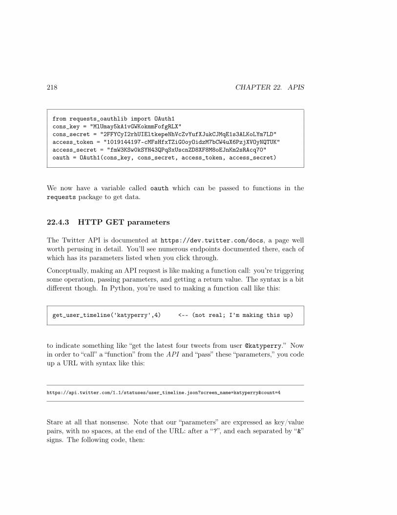
218 CHAPTER 22. APIS
from requests_oauthlib import OAuth1cons_key = "MlUmay5kA1vGWKokmmFofgRLX"cons_secret = "2FFYCyI2rhUIEltkepeNhVcZvYufXJukCJMqE1s3ALKoLYm7LD"access_token = "1019144197-cMFsHfxTZiG0oyOidzM7bCW4uX6PzjXVOyNQTUK"access_secret = "fmW3KSw0kSYH43QPqSxUscnZD8XF8M8oEJnKm2sRAcq70"oauth = OAuth1(cons_key, cons_secret, access_token, access_secret)
We now have a variable called oauth which can be passed to functions in therequests package to get data.
22.4.3 HTTP GET parameters
The Twitter API is documented at https://dev.twitter.com/docs, a page wellworth perusing in detail. You’ll see numerous endpoints documented there, each ofwhich has its parameters listed when you click through.
Conceptually, making an API request is like making a function call: you’re triggeringsome operation, passing parameters, and getting a return value. The syntax is a bitdifferent though. In Python, you’re used to making a function call like this:
get_user_timeline('katyperry',4) <-- (not real; I'm making this up)
to indicate something like “get the latest four tweets from user @katyperry.” Nowin order to “call” a “function” from the API and “pass” these “parameters,” you codeup a URL with syntax like this:
https://api.twitter.com/1.1/statuses/user_timeline.json?screen_name=katyperry&count=4
Stare at all that nonsense. Note that our “parameters” are expressed as key/valuepairs, with no spaces, at the end of the URL: after a “?”, and each separated by “&”signs. The following code, then:
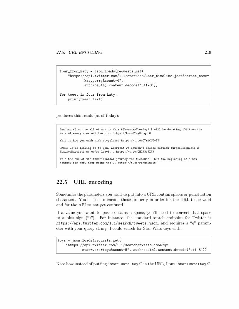
22.5. URL ENCODING 219
four_from_katy = json.loads(requests.get("https://api.twitter.com/1.1/statuses/user_timeline.json?screen_name=
katyperry&count=4",auth=oauth).content.decode('utf-8'))
for tweet in four_from_katy:print(tweet.text)
produces this result (as of today):
Sending <3 out to all of you on this #ShoesdayTuesday! I will be donating 10% from thesale of every shoe and handb... https://t.co/TsyHuFquc6
this is how you wash with styyylesss https://t.co/C7rlCUGv9Y
OMGEE We're leaving it to you, America! We couldn't choose between @GraceLeermusic &@LaurenMascitti so we're leavi... https://t.co/OH2X3o9XAV
It's the end of the #AmericanIdol journey for #DemiRae - but the beginning of a newjourney for her. Keep being the... https://t.co/P5Fqx2Q7l5
22.5 URL encoding
Sometimes the parameters you want to put into a URL contain spaces or punctuationcharacters. You’ll need to encode those properly in order for the URL to be validand for the API to not get confused.
If a value you want to pass contains a space, you’ll need to convert that spaceto a plus sign (“+”). For instance, the standard search endpoint for Twitter ishttps://api.twitter.com/1.1/search/tweets.json, and requires a “q” param-eter with your query string. I could search for Star Wars toys with:
toys = json.loads(requests.get("https://api.twitter.com/1.1/search/tweets.json?q=
star+wars+toys&count=5", auth=oauth).content.decode('utf-8'))
Note how instead of putting “star wars toys” in the URL, I put “star+wars+toys”.
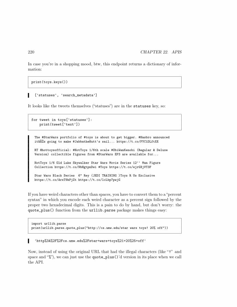
220 CHAPTER 22. APIS
In case you’re in a shopping mood, btw, this endpoint returns a dictionary of infor-mation:
print(toys.keys())
['statuses', 'search_metadata']
It looks like the tweets themselves (“statuses”) are in the statuses key, so:
for tweet in toys['statuses']:print(tweet['text'])
The #StarWars portfolio of #toys is about to get bigger. #Hasbro announceditâĂŹs going to make #JabbatheHutt's sail... https://t.co/FYC1DLftXX
RT @hottoysofficial: #HotToys 1/6th scale #ObiWanKenobi (Regular & DeluxeVersion) collectible figures from #StarWars EP3 are available for...
HotToys 1/6 Old Luke Skywalker Star Wars Movie Series 12'' Man FigureCollection https://t.co/NbHgtpnDwi #Toys https://t.co/ejrGXjVT3F
Star Wars Black Series 6" Rey (JEDI TRAINING )Toys R Us Exclusivehttps://t.co/ArxT9kPjZt https://t.co/lcLbp7pwjG
If you have weird characters other than spaces, you have to convert them to a “percentsyntax” in which you encode each weird character as a percent sign followed by theproper two hexadecimal digits. This is a pain to do by hand, but don’t worry: thequote_plus() function from the urllib.parse package makes things easy:
import urllib.parseprint(urllib.parse.quote_plus("http://cs.umw.edu/star wars toys! 20% off"))
'http%3A%2F%2Fcs.umw.edu%2Fstar+wars+toys%21+20%25+off'
Now, instead of using the original URL that had the illegal characters (like “!” andspace and “%”), we can just use the quote_plus()’d version in its place when we callthe API.
22.6. SPECIALIZED PACKAGES 221
22.6 Specialized packages
For many popular APIs, including Twitter, you may find Python packages writtento streamline and hide some of the protocol idiosyncrasies. These may be easier touse, depending on how well written and maintained they are. For Twitter, there arenumerous ones: python-twitter, TwitterAPI, tweepy, TweetPony, twython, andmore. This is a testimony to how powerful (and common) it is to be able to accessdata through external APIs.

222 CHAPTER 22. APIS
Chapter 23
ML classifiers: kNN (1 of 2)
Let’s return to the ML classification problem, for which Naïve Bayes and Friendsfrom Chapters 19–21 are so far our only solution.
In some ways the technique in this lesson is at the opposite extreme from NaïveBayes. Instead of very generally assuming that each of the features is an independentand separate indicator of a data point’s class (as the “Naïve Bayes assumption” did)the kNN (for “k-nearest neighbors”) algorithm assumes that a point’s featuresare very much bound together. In order to classify a point, a kNN classifier findsthe closest training points to it, and predicts the label that those points suggest(majority rules).
The parameter k in kNN is simply the number of “closest training points” we’llconsider. It is nearly always an odd number, so that in the two-class case there areno ties. Suppose we have a 7-NN classifier, and we’re asked to classify a particularperson as either Jedi or Sith. If we find the seven most similar training points toour person, and discover that four of them are Jedi and the other three are Sith,we’ll predict “Jedi.” The basic idea is that simple.
Figure 23.1 shows a visual example. Here we have training data that a bank usesto decide whether to extend home loans to applicants. The bank keeps track of twofeatures: how many years the potential customer has been at his/her current job,and the total amount of credit card debt he/she is carrying. The training points areshown on the plot as either red X’s (these customers defaulted on their loans in thepast) or green +’s (they repaid their loans).
Now suppose Mr. Blue Question Mark walks in. Should we approve his loan ap-
223
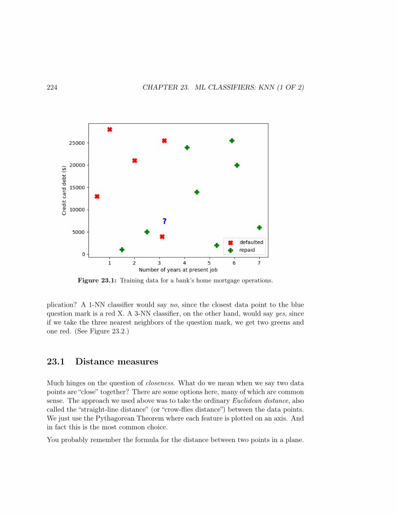
224 CHAPTER 23. ML CLASSIFIERS: KNN (1 OF 2)
Figure 23.1: Training data for a bank’s home mortgage operations.
plication? A 1-NN classifier would say no, since the closest data point to the bluequestion mark is a red X. A 3-NN classifier, on the other hand, would say yes, sinceif we take the three nearest neighbors of the question mark, we get two greens andone red. (See Figure 23.2.)
23.1 Distance measures
Much hinges on the question of closeness. What do we mean when we say two datapoints are “close” together? There are some options here, many of which are commonsense. The approach we used above was to take the ordinary Euclidean distance, alsocalled the “straight-line distance” (or “crow-flies distance”) between the data points.We just use the Pythagorean Theorem where each feature is plotted on an axis. Andin fact this is the most common choice.
You probably remember the formula for the distance between two points in a plane.
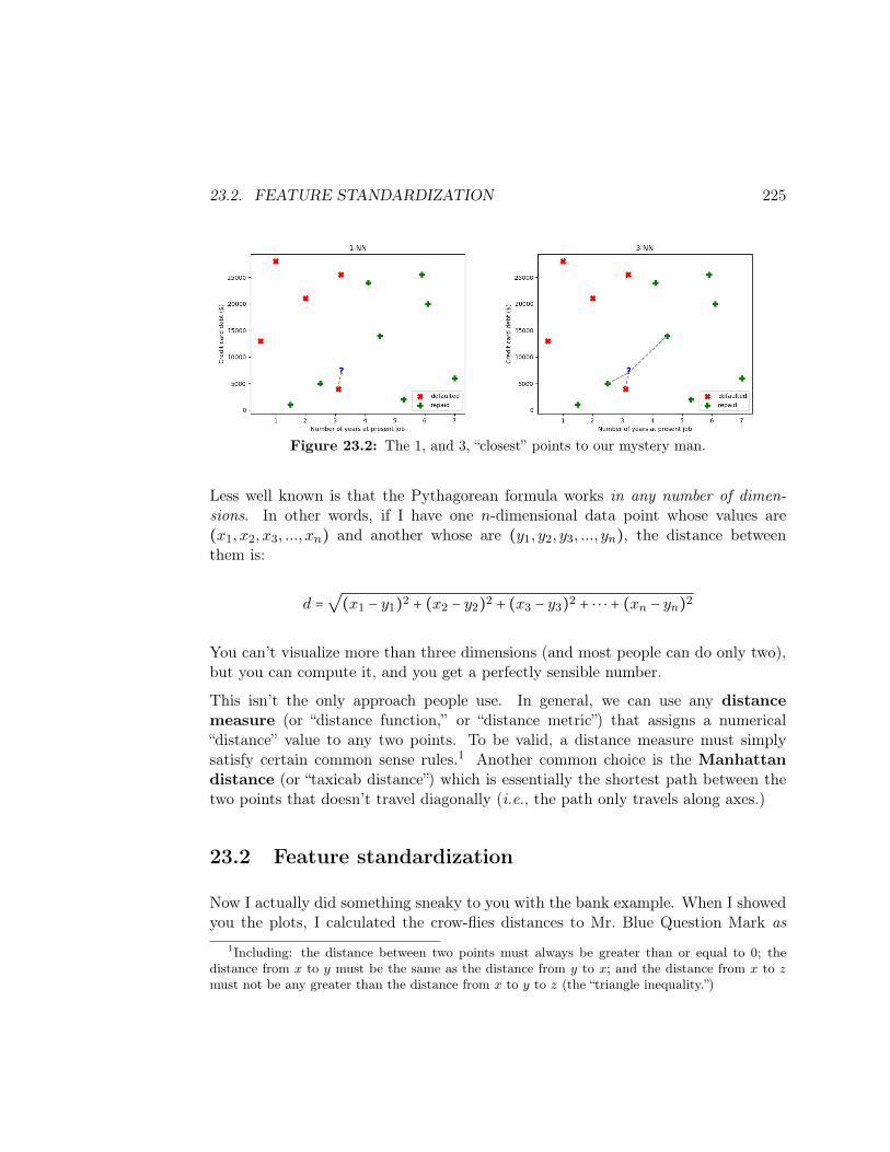
23.2. FEATURE STANDARDIZATION 225
Figure 23.2: The 1, and 3, “closest” points to our mystery man.
Less well known is that the Pythagorean formula works in any number of dimen-sions. In other words, if I have one n-dimensional data point whose values are(x1, x2, x3, ..., xn) and another whose are (y1, y2, y3, ..., yn), the distance betweenthem is:
d =√(x1 − y1)2 + (x2 − y2)2 + (x3 − y3)2 + ⋅ ⋅ ⋅ + (xn − yn)2
You can’t visualize more than three dimensions (and most people can do only two),but you can compute it, and you get a perfectly sensible number.
This isn’t the only approach people use. In general, we can use any distancemeasure (or “distance function,” or “distance metric”) that assigns a numerical“distance” value to any two points. To be valid, a distance measure must simplysatisfy certain common sense rules.1 Another common choice is the Manhattandistance (or “taxicab distance”) which is essentially the shortest path between thetwo points that doesn’t travel diagonally (i.e., the path only travels along axes.)
23.2 Feature standardization
Now I actually did something sneaky to you with the bank example. When I showedyou the plots, I calculated the crow-flies distances to Mr. Blue Question Mark as
1Including: the distance between two points must always be greater than or equal to 0; thedistance from x to y must be the same as the distance from y to x; and the distance from x to zmust not be any greater than the distance from x to y to z (the “triangle inequality.”)
226 CHAPTER 23. ML CLASSIFIERS: KNN (1 OF 2)
they appeared on the page. But if you look at the scales of those axes, you’ll re-alize I didn’t compute them right! These variables are on vastly different scales.In terms of absolute differences, the amount of credit card debt, measured in thetens of thousands, completely overwhelms the work history, which is at most a fewdecades. Taking the straightforward Euclidean distance between two people, then,would actually be quite a blunder: clearly a difference of $50 of credit card debt isn’tnearly as significant as a difference of 50 years in seniority!
To make this concrete, the underlying data for Figures 23.1 and 23.2 is here:
print(bank)
num_yrs cc_debt default0 1.0 28000 yes1 0.5 13000 yes2 1.5 1000 no3 2.0 21000 yes4 2.5 5000 no5 3.1 4000 yes6 3.2 25500 yes7 4.1 24000 no8 4.5 14000 no9 5.3 2000 no10 5.9 25500 no11 6.1 20000 no12 7.0 6000 no13 3.2 7500 maybe
Let’s compute the Euclidean distance from each of the points to Mr. Blue QuestionMark (row #13), and sort by that new column (remember that in Python, ** is usedfor “to-the-power-of”):
pts_dist = np.array([])for row in bank.itertuples():
pts_dist = np.append(pts_dist,np.sqrt((row.cc_debt - 7500)**2 + (row.num_yrs - 3.2)**2))
bank['dist'] = pts_distprint(bank.sort_values('dist'))
23.2. FEATURE STANDARDIZATION 227
num_yrs cc_debt default dist13 3.2 7500 maybe 0.00000012 7.0 6000 no 1500.0048134 2.5 5000 no 2500.0000985 3.1 4000 yes 3500.0000019 5.3 2000 no 5500.0004011 0.5 13000 yes 5500.0006638 4.5 14000 no 6500.0001302 1.5 1000 no 6500.00022211 6.1 20000 no 12500.0003363 2.0 21000 yes 13500.0000537 4.1 24000 no 16500.0000256 3.2 25500 yes 18000.00000010 5.9 25500 no 18000.0002020 1.0 28000 yes 20500.000118
It’s madness. The “closest” point to Mr. Blue is the one with a num_yrs of 7 and acc_debt of 6000...the green point that’s pegged all the way to the right side of theplot! (See Figure 23.1.)
If you think it through, you’ll realize why. Moving left-or-right on this plot is cheap;it’s differences in vertical position that generate large distances. The far-right greenplus really is very close to Mr. Blue, because her credit card debt is very close tohis ($6,000 vs. $7,500). Her 7 years of consecutive work history compared to his 3.2just isn’t a factor, because it’s measured in single digits.
This is a very common issue with data sets, and fortunately, there’s an easy wayaround it. Instead of using the absolute numbers in our Pythagorean formula cal-culation (or Manhattan distance calculation, or whatever), we first transform ourfeatures so they are all standardized (or “Z-score normalized2.”) All we have todo is take each feature, and:
1. subtract its mean from each point, then2. divide each point by its standard deviation.
This puts all features on the same level playing field, so to speak. If you rememberfrom your stats class, what we’ve done is compute the Z-score for each data point:the number of standard deviations above (or below) the mean it is. Now no featuregets an advantage in the distance calculation over any other feature, even if they’reon wildly different scales: 2.5 standard deviations is 2.5 standard deviations, no
2This definition of the term “normalized” has nothing to do with the normalization of data setswe learned about in Sections 10.5 and 11.3, btw.
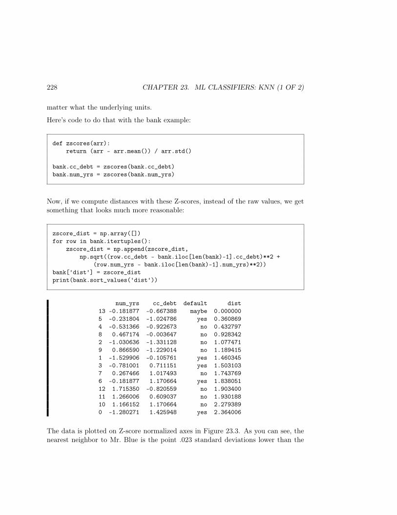
228 CHAPTER 23. ML CLASSIFIERS: KNN (1 OF 2)
matter what the underlying units.
Here’s code to do that with the bank example:
def zscores(arr):return (arr - arr.mean()) / arr.std()
bank.cc_debt = zscores(bank.cc_debt)bank.num_yrs = zscores(bank.num_yrs)
Now, if we compute distances with these Z-scores, instead of the raw values, we getsomething that looks much more reasonable:
zscore_dist = np.array([])for row in bank.itertuples():
zscore_dist = np.append(zscore_dist,np.sqrt((row.cc_debt - bank.iloc[len(bank)-1].cc_debt)**2 +
(row.num_yrs - bank.iloc[len(bank)-1].num_yrs)**2))bank['dist'] = zscore_distprint(bank.sort_values('dist'))
num_yrs cc_debt default dist13 -0.181877 -0.667388 maybe 0.0000005 -0.231804 -1.024786 yes 0.3608694 -0.531366 -0.922673 no 0.4327978 0.467174 -0.003647 no 0.9283422 -1.030636 -1.331128 no 1.0774719 0.866590 -1.229014 no 1.1894151 -1.529906 -0.105761 yes 1.4603453 -0.781001 0.711151 yes 1.5031037 0.267466 1.017493 no 1.7437696 -0.181877 1.170664 yes 1.83805112 1.715350 -0.820559 no 1.90340011 1.266006 0.609037 no 1.93018810 1.166152 1.170664 no 2.2793890 -1.280271 1.425948 yes 2.364006
The data is plotted on Z-score normalized axes in Figure 23.3. As you can see, thenearest neighbor to Mr. Blue is the point .023 standard deviations lower than the
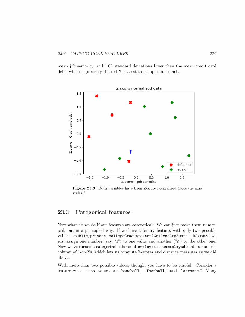
23.3. CATEGORICAL FEATURES 229
mean job seniority, and 1.02 standard deviations lower than the mean credit carddebt, which is precisely the red X nearest to the question mark.
Figure 23.3: Both variables have been Z-score normalized (note the axisscales)!
23.3 Categorical features
Now what do we do if our features are categorical? We can just make them numer-ical, but in a principled way. If we have a binary feature, with only two possiblevalues – public/private, collegeGraduate/notACollegeGraduate – it’s easy: wejust assign one number (say, “1”) to one value and another (“2”) to the other one.Now we’ve turned a categorical column of employed-or-unemployed’s into a numericcolumn of 1-or-2’s, which lets us compute Z-scores and distance measures as we didabove.
With more than two possible values, though, you have to be careful. Consider afeature whose three values are “baseball,” “football,” and “lacrosse.” Many
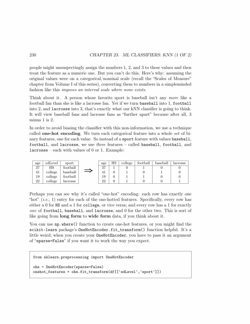
230 CHAPTER 23. ML CLASSIFIERS: KNN (1 OF 2)
people might unsuspectingly assign the numbers 1, 2, and 3 to these values and thentreat the feature as a numeric one. But you can’t do this. Here’s why: assuming theoriginal values were on a categorical/nominal scale (recall the “Scales of Measure”chapter from Volume I of this series), converting them to numbers in a simplemindedfashion like this imposes an interval scale where none exists.
Think about it. A person whose favorite sport is baseball isn’t any more like afootball fan than she is like a lacrosse fan. Yet if we turn baseball into 1, footballinto 2, and lacrosse into 3, that’s exactly what our kNN classifier is going to think.It will view baseball fans and lacrosse fans as “further apart” because after all, 3minus 1 is 2.
In order to avoid biasing the classifier with this non-information, we use a techniquecalled one-hot encoding. We turn each categorical feature into a whole set of bi-nary features, one for each value. So instead of a sport feature with values baseball,football, and lacrosse, we use three features – called baseball, football, andlacrosse – each with values of 0 or 1. Example:
age edLevel sport37 HS football41 college baseball19 college football22 college lacrosse
⇒age HS college football baseball lacrosse37 1 0 1 0 041 0 1 0 1 019 0 1 1 0 022 0 1 0 0 1
Perhaps you can see why it’s called “one-hot” encoding: each row has exactly one“hot” (i.e., 1) entry for each of the one-hotted features. Specifically, every row haseither a 0 for HS and a 1 for college, or vice versa; and every row has a 1 for exactlyone of football, baseball, and lacrosse, and 0 for the other two. This is sort oflike going from long form to wide form data, if you think about it.
You can use np.where() function to create one-hot features, or you might find thescikit-learn package’s OneHotEncoder.fit_transform() function helpful. It’s alittle weird; when you create your OneHotEncoder, you have to pass it an argumentof “sparse=False” if you want it to work the way you expect.
from sklearn.preprocessing import OneHotEncoder
ohe = OneHotEncoder(sparse=False)onehot_features = ohe.fit_transform(df[['edLevel','sport']])
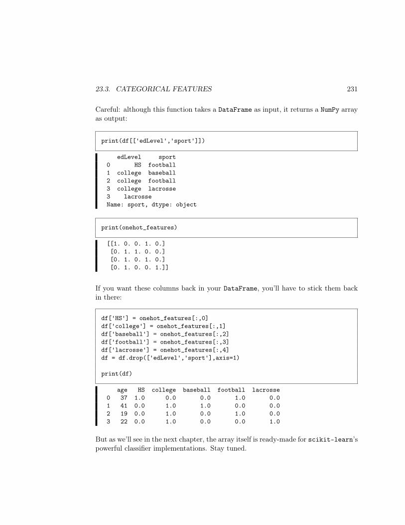
23.3. CATEGORICAL FEATURES 231
Careful: although this function takes a DataFrame as input, it returns a NumPy arrayas output:
print(df[['edLevel','sport']])
edLevel sport0 HS football1 college baseball2 college football3 college lacrosse3 lacrosseName: sport, dtype: object
print(onehot_features)
[[1. 0. 0. 1. 0.][0. 1. 1. 0. 0.][0. 1. 0. 1. 0.][0. 1. 0. 0. 1.]]
If you want these columns back in your DataFrame, you’ll have to stick them backin there:
df['HS'] = onehot_features[:,0]df['college'] = onehot_features[:,1]df['baseball'] = onehot_features[:,2]df['football'] = onehot_features[:,3]df['lacrosse'] = onehot_features[:,4]df = df.drop(['edLevel','sport'],axis=1)
print(df)
age HS college baseball football lacrosse0 37 1.0 0.0 0.0 1.0 0.01 41 0.0 1.0 1.0 0.0 0.02 19 0.0 1.0 0.0 1.0 0.03 22 0.0 1.0 0.0 0.0 1.0
But as we’ll see in the next chapter, the array itself is ready-made for scikit-learn’spowerful classifier implementations. Stay tuned.

232 CHAPTER 23. ML CLASSIFIERS: KNN (1 OF 2)
Chapter 24
ML classifiers: kNN (2 of 2)
Last chapter gave the theory of kNN classifiers. Now how to code one in Python?
Conceptually it’s pretty easy. We’ll want to Z-score normalize everything first, ofcourse. Then, for a new, unlabeled data point, we’ll compute the “distance” (viawhichever measure we choose) between it and every point in the training set. Then,we sort these points by distance, choose the k with the smallest distance, and takea majority vote.
We’ll use our bank loan example, but with a lot more rows. Let’s synthesize a dataset real quick:
NUM = 1000default = np.random.choice(['yes','no'], p=[.3,.7], size=NUM)cc_debt = np.where(default == 'yes',
np.random.normal(12000, 4000, NUM).clip(0, 40000).astype(int),np.random.normal(7000, 3000, NUM).clip(0, 40000).astype(int))
num_yrs = np.where(default == 'yes',np.random.uniform(0, 10, NUM).round(1),np.random.uniform(2, 12, NUM).round(1))
bank = pd.DataFrame('cc_debt':cc_debt, 'num_yrs':num_yrs,'default':default)[['cc_debt','num_yrs','default']]
In our simplistic, synthesized world, we’re assuming that 30% of our 1,000 peopledefault on their loans, and that those who do tend to have a bit more credit carddebt and somewhat fewer years at their current job. The resulting DataFrame looks
233
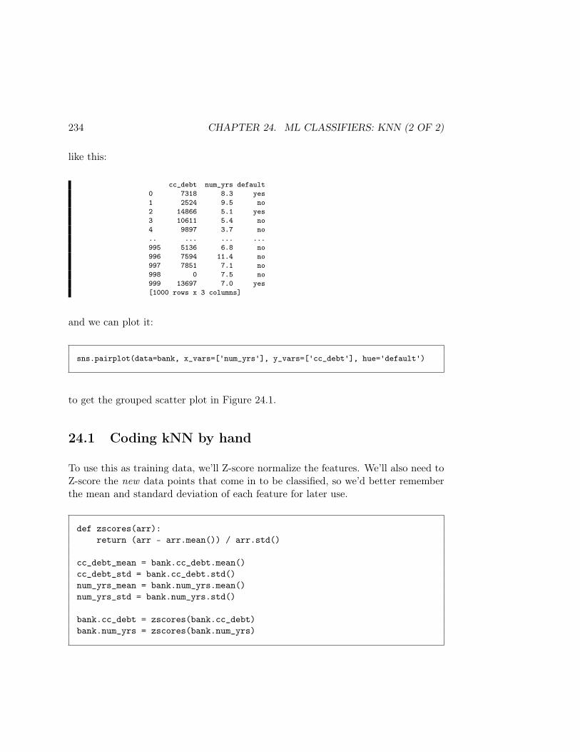
234 CHAPTER 24. ML CLASSIFIERS: KNN (2 OF 2)
like this:
cc_debt num_yrs default0 7318 8.3 yes1 2524 9.5 no2 14866 5.1 yes3 10611 5.4 no4 9897 3.7 no.. ... ... ...995 5136 6.8 no996 7594 11.4 no997 7851 7.1 no998 0 7.5 no999 13697 7.0 yes[1000 rows x 3 columns]
and we can plot it:
sns.pairplot(data=bank, x_vars=['num_yrs'], y_vars=['cc_debt'], hue='default')
to get the grouped scatter plot in Figure 24.1.
24.1 Coding kNN by hand
To use this as training data, we’ll Z-score normalize the features. We’ll also need toZ-score the new data points that come in to be classified, so we’d better rememberthe mean and standard deviation of each feature for later use.
def zscores(arr):return (arr - arr.mean()) / arr.std()
cc_debt_mean = bank.cc_debt.mean()cc_debt_std = bank.cc_debt.std()num_yrs_mean = bank.num_yrs.mean()num_yrs_std = bank.num_yrs.std()
bank.cc_debt = zscores(bank.cc_debt)bank.num_yrs = zscores(bank.num_yrs)
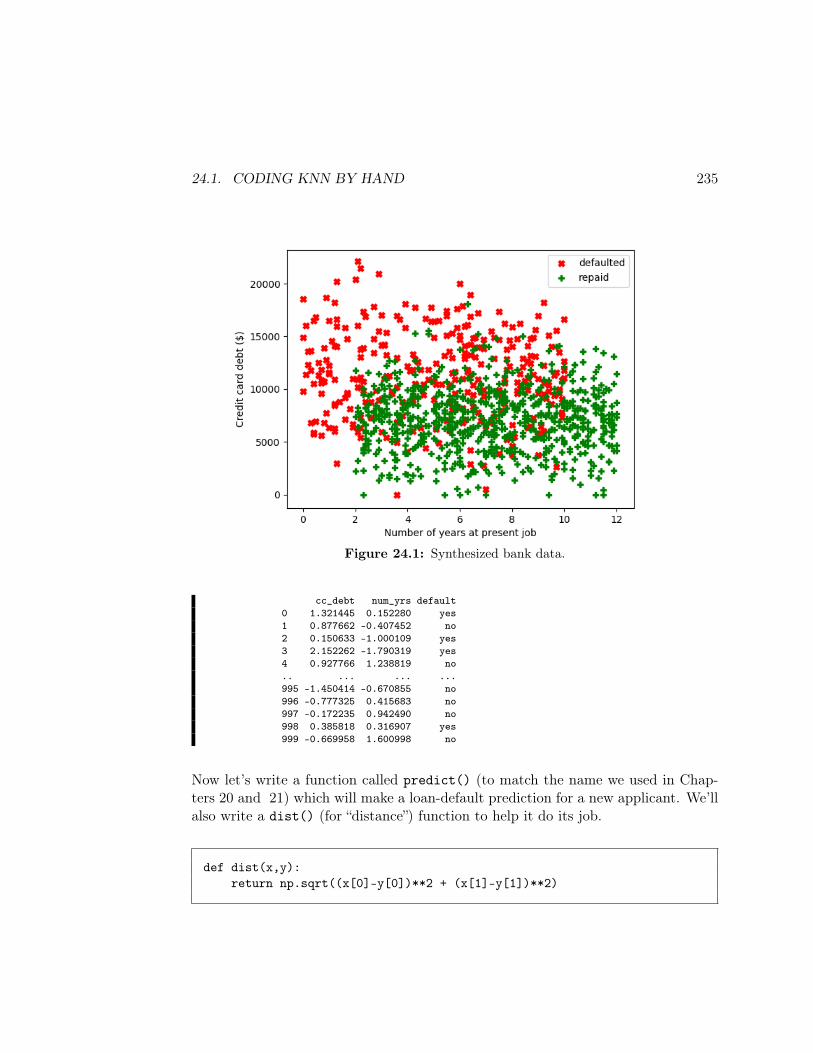
24.1. CODING KNN BY HAND 235
Figure 24.1: Synthesized bank data.
cc_debt num_yrs default0 1.321445 0.152280 yes1 0.877662 -0.407452 no2 0.150633 -1.000109 yes3 2.152262 -1.790319 yes4 0.927766 1.238819 no.. ... ... ...995 -1.450414 -0.670855 no996 -0.777325 0.415683 no997 -0.172235 0.942490 no998 0.385818 0.316907 yes999 -0.669958 1.600998 no
Now let’s write a function called predict() (to match the name we used in Chap-ters 20 and 21) which will make a loan-default prediction for a new applicant. We’llalso write a dist() (for “distance”) function to help it do its job.
def dist(x,y):return np.sqrt((x[0]-y[0])**2 + (x[1]-y[1])**2)
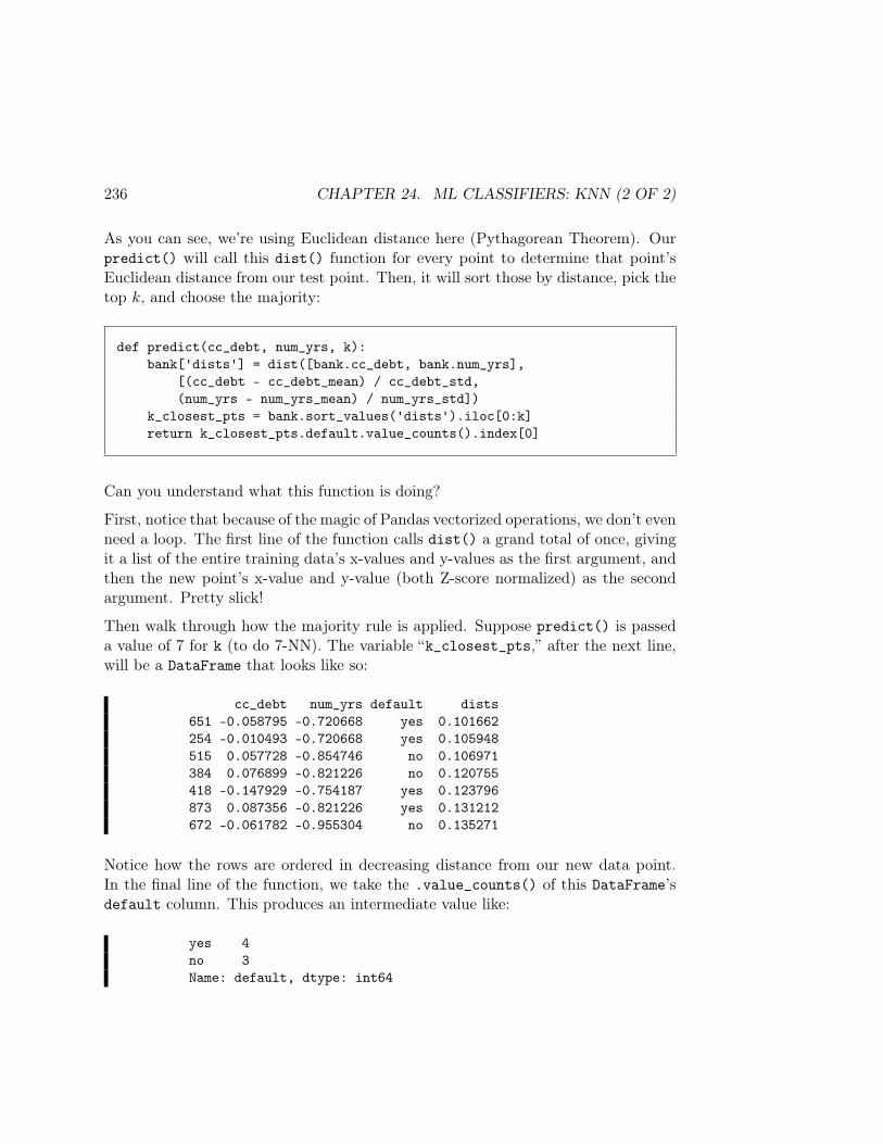
236 CHAPTER 24. ML CLASSIFIERS: KNN (2 OF 2)
As you can see, we’re using Euclidean distance here (Pythagorean Theorem). Ourpredict() will call this dist() function for every point to determine that point’sEuclidean distance from our test point. Then, it will sort those by distance, pick thetop k, and choose the majority:
def predict(cc_debt, num_yrs, k):bank['dists'] = dist([bank.cc_debt, bank.num_yrs],
[(cc_debt - cc_debt_mean) / cc_debt_std,(num_yrs - num_yrs_mean) / num_yrs_std])
k_closest_pts = bank.sort_values('dists').iloc[0:k]return k_closest_pts.default.value_counts().index[0]
Can you understand what this function is doing?
First, notice that because of the magic of Pandas vectorized operations, we don’t evenneed a loop. The first line of the function calls dist() a grand total of once, givingit a list of the entire training data’s x-values and y-values as the first argument, andthen the new point’s x-value and y-value (both Z-score normalized) as the secondargument. Pretty slick!
Then walk through how the majority rule is applied. Suppose predict() is passeda value of 7 for k (to do 7-NN). The variable “k_closest_pts,” after the next line,will be a DataFrame that looks like so:
cc_debt num_yrs default dists651 -0.058795 -0.720668 yes 0.101662254 -0.010493 -0.720668 yes 0.105948515 0.057728 -0.854746 no 0.106971384 0.076899 -0.821226 no 0.120755418 -0.147929 -0.754187 yes 0.123796873 0.087356 -0.821226 yes 0.131212672 -0.061782 -0.955304 no 0.135271
Notice how the rows are ordered in decreasing distance from our new data point.In the final line of the function, we take the .value_counts() of this DataFrame’sdefault column. This produces an intermediate value like:
yes 4no 3Name: default, dtype: int64
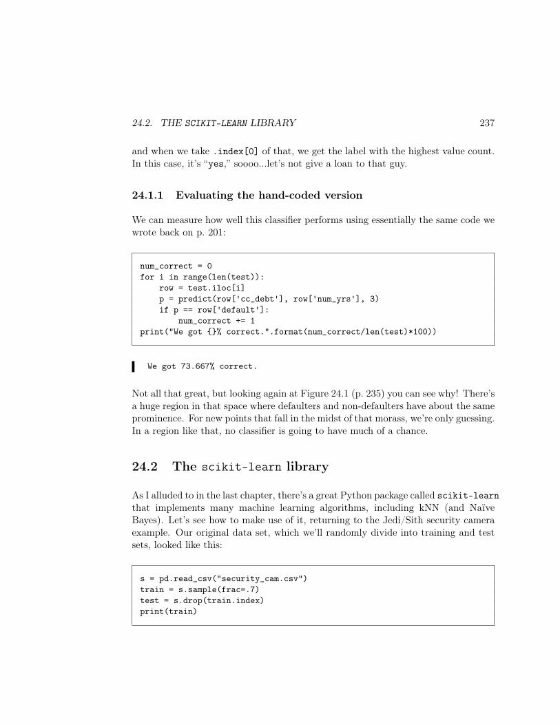
24.2. THE SCIKIT-LEARN LIBRARY 237
and when we take .index[0] of that, we get the label with the highest value count.In this case, it’s “yes,” soooo...let’s not give a loan to that guy.
24.1.1 Evaluating the hand-coded version
We can measure how well this classifier performs using essentially the same code wewrote back on p. 201:
num_correct = 0for i in range(len(test)):
row = test.iloc[i]p = predict(row['cc_debt'], row['num_yrs'], 3)if p == row['default']:
num_correct += 1print("We got % correct.".format(num_correct/len(test)*100))
We got 73.667% correct.
Not all that great, but looking again at Figure 24.1 (p. 235) you can see why! There’sa huge region in that space where defaulters and non-defaulters have about the sameprominence. For new points that fall in the midst of that morass, we’re only guessing.In a region like that, no classifier is going to have much of a chance.
24.2 The scikit-learn library
As I alluded to in the last chapter, there’s a great Python package called scikit-learnthat implements many machine learning algorithms, including kNN (and NaïveBayes). Let’s see how to make use of it, returning to the Jedi/Sith security cameraexample. Our original data set, which we’ll randomly divide into training and testsets, looked like this:
s = pd.read_csv("security_cam.csv")train = s.sample(frac=.7)test = s.drop(train.index)print(train)
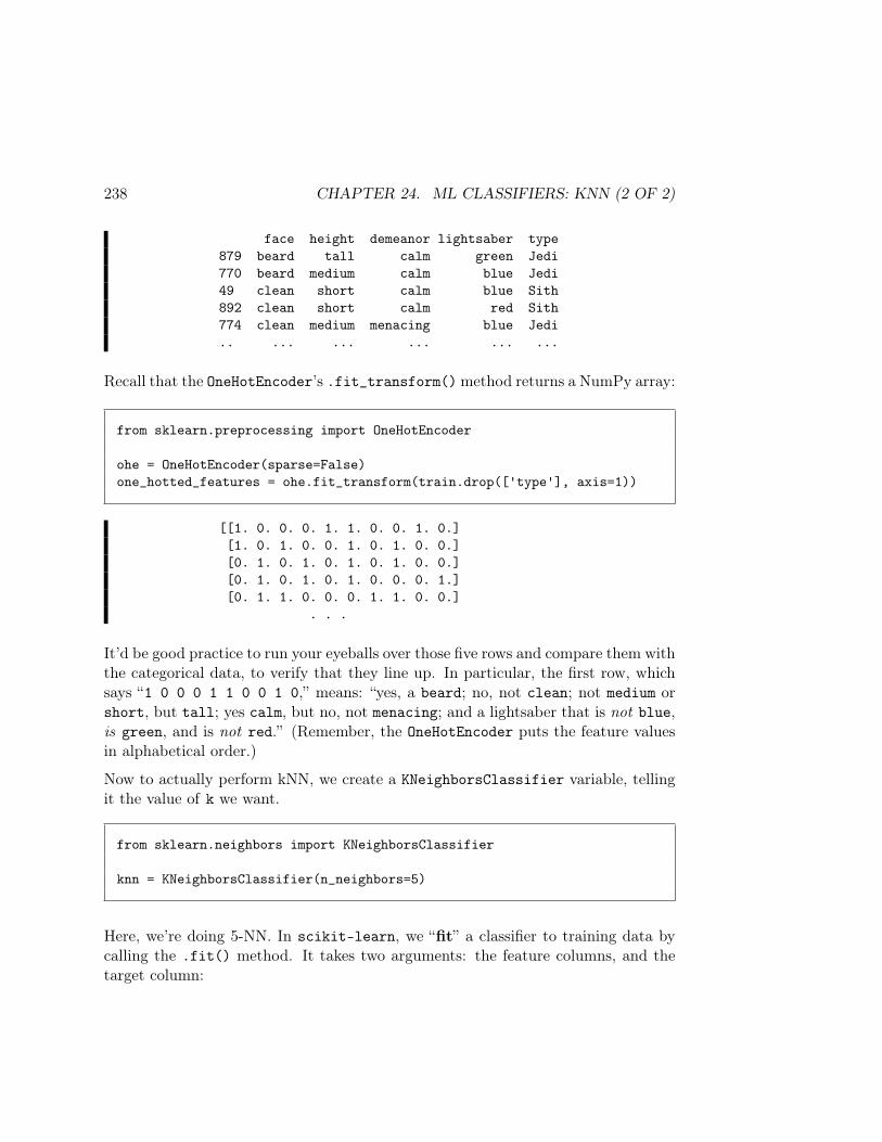
238 CHAPTER 24. ML CLASSIFIERS: KNN (2 OF 2)
face height demeanor lightsaber type879 beard tall calm green Jedi770 beard medium calm blue Jedi49 clean short calm blue Sith892 clean short calm red Sith774 clean medium menacing blue Jedi.. ... ... ... ... ...
Recall that the OneHotEncoder’s .fit_transform()method returns a NumPy array:
from sklearn.preprocessing import OneHotEncoder
ohe = OneHotEncoder(sparse=False)one_hotted_features = ohe.fit_transform(train.drop(['type'], axis=1))
[[1. 0. 0. 0. 1. 1. 0. 0. 1. 0.][1. 0. 1. 0. 0. 1. 0. 1. 0. 0.][0. 1. 0. 1. 0. 1. 0. 1. 0. 0.][0. 1. 0. 1. 0. 1. 0. 0. 0. 1.][0. 1. 1. 0. 0. 0. 1. 1. 0. 0.]
. . .
It’d be good practice to run your eyeballs over those five rows and compare them withthe categorical data, to verify that they line up. In particular, the first row, whichsays “1 0 0 0 1 1 0 0 1 0,” means: “yes, a beard; no, not clean; not medium orshort, but tall; yes calm, but no, not menacing; and a lightsaber that is not blue,is green, and is not red.” (Remember, the OneHotEncoder puts the feature valuesin alphabetical order.)
Now to actually perform kNN, we create a KNeighborsClassifier variable, tellingit the value of k we want.
from sklearn.neighbors import KNeighborsClassifier
knn = KNeighborsClassifier(n_neighbors=5)
Here, we’re doing 5-NN. In scikit-learn, we “fit” a classifier to training data bycalling the .fit() method. It takes two arguments: the feature columns, and thetarget column:
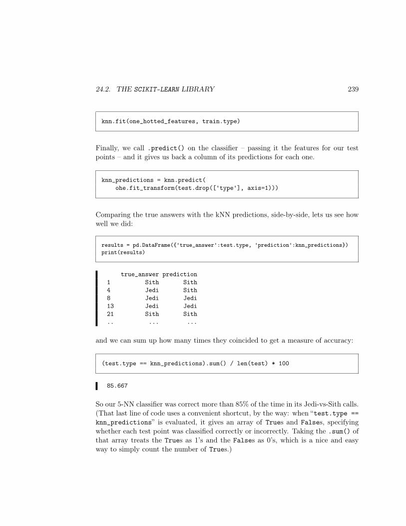
24.2. THE SCIKIT-LEARN LIBRARY 239
knn.fit(one_hotted_features, train.type)
Finally, we call .predict() on the classifier – passing it the features for our testpoints – and it gives us back a column of its predictions for each one.
knn_predictions = knn.predict(ohe.fit_transform(test.drop(['type'], axis=1)))
Comparing the true answers with the kNN predictions, side-by-side, lets us see howwell we did:
results = pd.DataFrame('true_answer':test.type, 'prediction':knn_predictions)print(results)
true_answer prediction1 Sith Sith4 Jedi Sith8 Jedi Jedi13 Jedi Jedi21 Sith Sith.. ... ...
and we can sum up how many times they coincided to get a measure of accuracy:
(test.type == knn_predictions).sum() / len(test) * 100
85.667
So our 5-NN classifier was correct more than 85% of the time in its Jedi-vs-Sith calls.(That last line of code uses a convenient shortcut, by the way: when “test.type ==knn_predictions” is evaluated, it gives an array of Trues and Falses, specifyingwhether each test point was classified correctly or incorrectly. Taking the .sum() ofthat array treats the Trues as 1’s and the Falses as 0’s, which is a nice and easyway to simply count the number of Trues.)
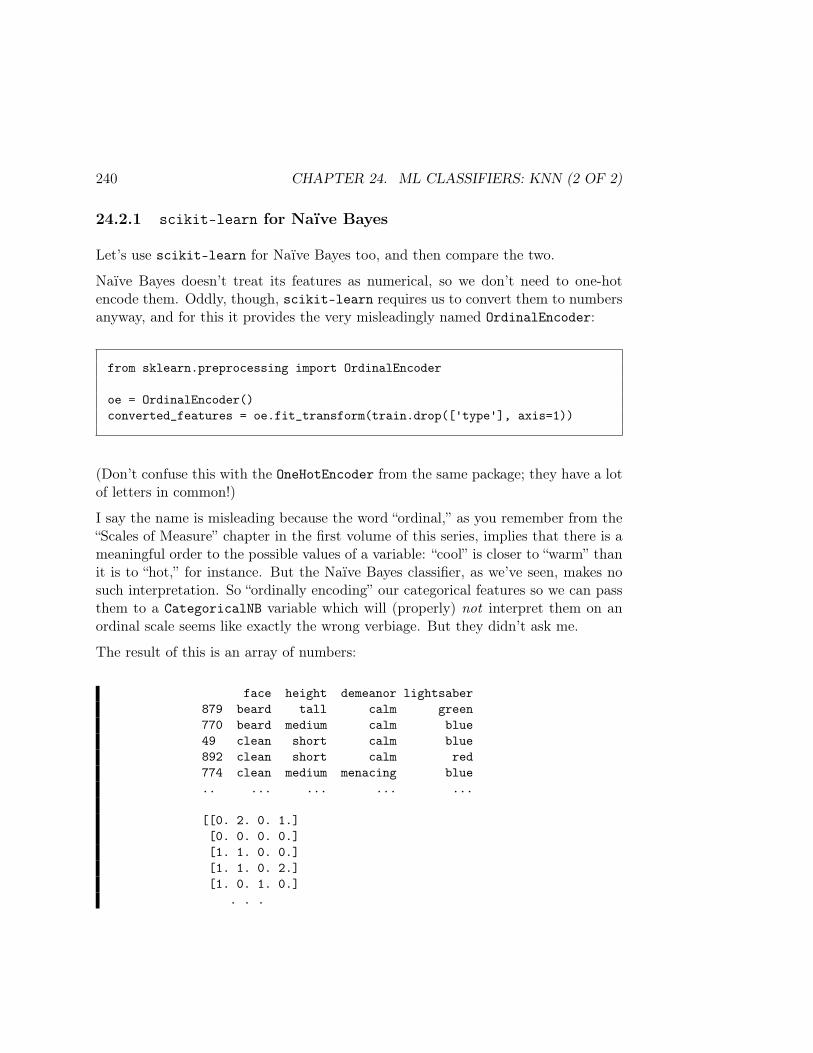
240 CHAPTER 24. ML CLASSIFIERS: KNN (2 OF 2)
24.2.1 scikit-learn for Naïve Bayes
Let’s use scikit-learn for Naïve Bayes too, and then compare the two.
Naïve Bayes doesn’t treat its features as numerical, so we don’t need to one-hotencode them. Oddly, though, scikit-learn requires us to convert them to numbersanyway, and for this it provides the very misleadingly named OrdinalEncoder:
from sklearn.preprocessing import OrdinalEncoder
oe = OrdinalEncoder()converted_features = oe.fit_transform(train.drop(['type'], axis=1))
(Don’t confuse this with the OneHotEncoder from the same package; they have a lotof letters in common!)
I say the name is misleading because the word “ordinal,” as you remember from the“Scales of Measure” chapter in the first volume of this series, implies that there is ameaningful order to the possible values of a variable: “cool” is closer to “warm” thanit is to “hot,” for instance. But the Naïve Bayes classifier, as we’ve seen, makes nosuch interpretation. So “ordinally encoding” our categorical features so we can passthem to a CategoricalNB variable which will (properly) not interpret them on anordinal scale seems like exactly the wrong verbiage. But they didn’t ask me.
The result of this is an array of numbers:
face height demeanor lightsaber879 beard tall calm green770 beard medium calm blue49 clean short calm blue892 clean short calm red774 clean medium menacing blue.. ... ... ... ...
[[0. 2. 0. 1.][0. 0. 0. 0.][1. 1. 0. 0.][1. 1. 0. 2.][1. 0. 1. 0.]
. . .

24.2. THE SCIKIT-LEARN LIBRARY 241
You can see that for the lightsaber feature, the OrdinalEncoder used 0 for blue,1 for green, and 2 for red (again in alphabetical order).
Similarly to kNN, we create a CategoricalNB variable, .fit(), it to the trainingdata, and then call its .predict() method:
from sklearn.naive_bayes import CategoricalNB
naive_bayes = CategoricalNB()naive_bayes.fit(converted_features, train.type)nb_predictions = naive_bayes.predict(
oe.fit_transform(test.drop(['type'], axis=1)))(test.type == nb_predictions).sum() / len(test) * 100
81.0
Naïve Bayes was the loser with this training set: only 81% accuracy as opposed to5-NN’s 85+%. However, that turns out to be far from the whole story. The fullstory will require another chapter.

242 CHAPTER 24. ML CLASSIFIERS: KNN (2 OF 2)
Chapter 25
Two key ML principles
25.1 “The bias-variance trade-off”
Earlier in the book (p. 89) I made a reference to something called “the bias-variancetrade-off.” This turns out to be one of the most important general principles in allof ML, and it’s now time to look at it in detail.
The bias-variance trade-off is a manifestation of the “no free lunch” principle.Classifiers that possess one advantage inherently have a counteracting disadvantage.Here are the two key terms:
• bias1 – the degree to which a model is expected to misclassify items, even thosein its own training set, because it just can’t “bend” enough to catch every datapoint.
• variance – the degree to which a model will differ based on the particulartraining set that is chosen, because it “bends” too much to try and catch everydata point.
1Tip: when thinking about this topic, try to erase your previous definitions for the word “bias”that you have running around in your brain. They probably don’t apply. The normal meaning ofthe word “bias” implies a systematic propensity to err in a particular direction. Like, “you’re biasedtowards thinking people are shorter than they are, because you’re tall.” But in this chapter, biasjust means “being ‘off’ in general, in whatever direction, and probably not the same direction eachtime.”
243
244 CHAPTER 25. TWO KEY ML PRINCIPLES
The basic theory is as follows. Suppose you have a very simple classifier that takes714 training points from a security camera and tries to identify a single, smooth,perfectly straight line roughly separating Jedi from Sith. Maybe our model says “justuse the lightsaber feature by itself, and call ‘Jedi’ or ‘Sith’ based on whether thetest point’s lightsaber value is more typical of the Jedi Knights or the Sith Lordsin the training set.”
This simple classifier can be said to have low variance. Why? Because if, insteadof those particular 714 training points chosen from the population, I had sampled adifferent 714 training points, the classification decisions I would make on new datawould be about the same. To see why this is the case, consider how different thetraining sets would have to be in order for me to make any different decisions. Let’ssay the lightsaber colors for my original 714 training points were:
Jedi Sithred 17 85blue 283 28green 299 2
Clearly, my very simple classifier is going to predict Sith for red-lightsaber wieldersand Jedi for anyone else. Now if I had collected a different training set, the numbersabove would be different, but they would have to be a lot different to change any ofmy future predictions. I’d have to have an additional 68 red Jedi, for instance, or255 additional blue Sith, or a whopping 297 additional green Sith. Not likely.
That’s the bright side. On the dark side, by classifying points in this way, this simplemodel is going to get a lot of data points wrong: 17 + 28 + 2 = 47 points incorrect inits own training set, in fact. This mean it’s a pretty high bias classifier.
It’s a tradeoff. In exchange for being virtually immune to the idiosyncrasies in thetraining sample, we’ve sacrificed some precision.
The other extreme can be seen by visualizing a 1-NN classifier. When given a newdata point, 1-NN will find the single nearest neighbor to it in the training set, andcall Jedi or Sith accordingly. This is very low bias – heck, we’re guaranteed toget every training point correct! 2 But it is also very high variance: swap out
2Think about it: if we go through the training points one by one, and treat them as new points,the “nearest neighbor” to each one will be itself! (Unless there are data points with identical featurevalues but different labels, in which case whatcha gonna do.)
25.1. “THE BIAS-VARIANCE TRADE-OFF” 245
the training set for another, and you’ll get many, many different classifications. Ourclassifier has essentially memorized a zillion individual examples, and will regurgitateall that intricate detail on command. But had we gotten a different random sample,the “single nearest neighbor” to a test point would have been totally different, andmight result in a different classification.
25.1.1 “Overfitting”
Another very important term to learn here is the word “overfitting.” That’s whatour 1-NN classifier is doing. When a model is overfitting, it means that it is allowingitself to be “too flexible” in its quest to bend exactly to its training points. It thusgets hyper-calibrated to a particular training set. Instead of locking on to the true,general, repeatable patterns of the underlying data-generating process, it’s lockingon to whatever idiosyncrasies were present in the particular data points it was given.And this will almost always lead to bad performance on new data.
There are formulas you can use to work out quantitatively what the estimated biasand variance are for a classifier. But I think this dichotomy is more important froma conceptual perspective. The main lesson is: the more your classifier “bends” (i.e.,has a very wiggly and flexible boundary between its ranges of predicted values) themore precise it potentially is in selectively labeling data points. However, this alsomeans that a lot of its decisions are going to hinge on the particular data sampleit was trained on, which means it will probably be overfitting: picking up noise inaddition to signal.
25.1.2 kNN vs. Naïve Bayes
Let’s compare how 3-NN and Naïve Bayes perform on these two dimensions. Fig-ure 25.3 at the end of the chapter (p. 251) defines two functions. One runs a NaïveBayes classifier on a security camera data set, using a random sample of 70% fortraining, and returns the percentage of the test set that it gets correct. The otherdoes the same for a kNN classifier (its second parameter is the value of k.)
We can then run the following code to test each classifier on 200 different randomtraining sets:
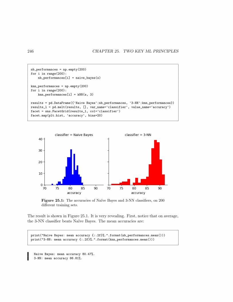
246 CHAPTER 25. TWO KEY ML PRINCIPLES
nb_performances = np.empty(200)for i in range(200):
nb_performances[i] = naive_bayes(s)
knn_performances = np.empty(200)for i in range(200):
knn_performances[i] = kNN(s, 3)
results = pd.DataFrame('Naive Bayes':nb_performances, '3-NN':knn_performances)results_l = pd.melt(results, [], var_name='classifier', value_name='accuracy')facet = sns.FacetGrid(results_l, col='classifier')facet.map(plt.hist, 'accuracy', bins=20)
Figure 25.1: The accuracies of Naïve Bayes and 3-NN classifiers, on 200different training sets.
The result is shown in Figure 25.1. It is very revealing. First, notice that on average,the 3-NN classifier beats Naïve Bayes. The mean accuracies are:
print("Naive Bayes: mean accuracy :.2f%.".format(nb_performances.mean()))print("3-NN: mean accuracy :.2f%.".format(knn_performances.mean()))
Naive Bayes: mean accuracy 80.47%.3-NN: mean accuracy 86.81%.

25.1. “THE BIAS-VARIANCE TRADE-OFF” 247
This tells us that 3-NN has lower bias, which is a good thing: good enough foranother 6%-ish prediction accuracy, in fact.
The second thing to notice, though, is that the performance of 3-NN is more variable.Its range is from 70-92, as opposed to Naïve Bayes’ 73-85. This means that on sometraining sets, its performance is actually lower than the worst of any of the NaïveBayes runs. The standard deviation bears this out:
print("Naive Bayes: standard deviation :.2f.".format(nb_performances.std()))print("3-NN: standard deviation :.2f.".format(knn_performances.std()))
Naive Bayes: standard deviation 2.04.3-NN: standard deviation 4.07.
So 3-NN has higher variance, which is a bad thing. If we get unlucky with ourtraining set, we’re going to have an inaccurate classifier. As I said, there’s no freelunch.
It’s tempting to think that high variance isn’t as bad as high bias. After all, eventhough we might get unlucky, shouldn’t we still choose the option with the highermean?
But the problem is that in real life, our training set and our new data are almost nevermeasured at the same time, and in exactly the same circumstances. We collecteddata at some point in the past, train our classifier on it in the present, and will run itto classify new data in the future. If the patterns in the data fluctuate at all betweenpast and future (as they invariably do), then a high-variance classifier will “lock on”to those (obsolete) patterns in the past and try to apply them to the future data.A low-variance classifier won’t make that mistake, since it’s not as ambitious: it’ssettling for less precise, but more generally applicable trends.
25.1.3 Varying k
Restricting our focus for the moment to just kNN classifiers, the question arises asto the optimal value of k. It may or may not surprise you to learn that there’s noeasy answer to this, and that it varies widely by data set and in fact even by thetraining set chosen.
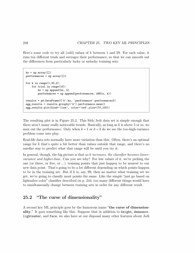
248 CHAPTER 25. TWO KEY ML PRINCIPLES
Here’s some code to try all (odd) values of k between 1 and 29. For each value, itruns ten different trials and averages their performance, so that we can smooth outthe differences from particularly lucky or unlucky training sets:
ks = np.array([])performances = np.array([])
for k in range(1,30,2):for trial in range(10):
ks = np.append(ks, k)performances = np.append(performances, kNN(s, k))
results = pd.DataFrame('k':ks, 'performance':performances)agg_results = results.groupby('k').performance.mean()agg_results.plot(kind='line', color='red',ylim=(70,100))
The resulting plot is in Figure 25.2. This Sith/Jedi data set is simple enough thatthere aren’t many really noticeable trends. Basically, as long as k is above 5 or so, wemax out the performance. Only when k = 1 or k = 3 do we see the too-high-varianceproblem come into play.
Real-life data sets normally have more variation than this. Often, there’s an optimalrange for k that’s quite a bit better than values outside that range, and there’s nosurefire way to predict what that range will be until you try it.
In general, though, the big picture is that as k increases, the classifier becomes lower-variance and higher-bias. Can you see why? For low values of k, we’re picking theone (or three, or five, or ...) training points that just happen to be nearest to ournew data point. That’s going to be a lot different depending on which points happento be in the training set. But if k is, say, 99, then no matter what training set weget, we’re going to classify most points the same. Like the simple “just go based onlightsaber color” classifier described on p. 244, too many different things would haveto simultaneously change between training sets in order for any different result.
25.2 “The curse of dimensionality”
A second key ML principle goes by the humorous name “the curse of dimension-ality.” It goes something like this. Suppose that in addition to height, demeanor,lightsaber, and face, we also have at our disposal many other features about Jedi
25.2. “THE CURSE OF DIMENSIONALITY” 249
Figure 25.2: The accuracy of a kNN classifier on the Sith/Jedi data, aswe fiddle with the number of nearest neighbors used.
& Sith: their ages, salaries, home planets, personality profiles, number of traffic tick-ets, etc. This is good news, right? It gives us more and more data to sift throughstatistically and discover potential correlations with, right? What’s not to like?
Yes, but there’s a catch. It turns out that as we increase the number of featuresmore and more (or, put another way, as we increase the “dimensionality” of theproblem from our original four dimensions to 5, 6, 7, ..., and up into the hundreds)we have a data sparsity problem. This means there aren’t enough training pointsto adequately cover all of this ground.
In terms of kNN classifiers, you can think of it this way: effectively, all the pointsbecome far apart. We want to find the 3 (or 15, or 77) “nearest neighbors,” butwhen we have so many features (many of which will turn out to be irrelevant for theproblem), we find that any two data points will differ on a large number of them.Essentially, our noise swamps our signal.
When we have tons of features, we need an enormous number of training samples in

250 CHAPTER 25. TWO KEY ML PRINCIPLES
order to guarantee that we have several samples with each combination of values (ortheir ranges). In our original problem, we didn’t need too much data to ensure thatwe’d have at least a few tall, green-lightsabered, menacing individuals with a cleanface. But how many training points will we need before we have several tall, green-lightsabered, menacing, 38-year-old, extroverted, abstract-thinking individuals fromTatooine with 4 traffic tickets and a beard who earn 6,000 Galactic credits annually?Answer: a lot. And if we don’t have that many, a kNN classifier trained on all thosefeatures is going to struggle trying to find “people like this one” in order to make aprediction.
The moral to the story is that we will often need to trim our set of features, sometimesaggressively, if we have too many. It feels wasteful – all this great data on all thesepeople, and we’re throwing it away! – but it’s the right thing to do. This process iscalled feature selection, and we’ll cover it more fully in the next chapter.
In the meantime, here are three useful principles for avoiding the curse:
1. By far the most important thing to recognize is that if you have additionalfeatures that are truly correlated with the target – and don’t simply repeatinformation contained in the features you already have – it’s okay to includethem. Adding more stuff that actually contains useful information for predic-tion isn’t generally a problem. The problem is when you add features that arelargely noise, since they will overwhelm the truly significant features if thereare too many of them.
2. A common rule of thumb is to make sure you have at least five trainingpoints for each combination of feature values. (In our Jedi example, withthree heights and three lightsaber values and two values for the other fea-tures, this would imply a training set of at least (3×3×2×2)×5 = 180 trainingpoints.)
3. When the size of the training set becomes too small, use parametric methods(like Naïve Bayes or linear regression) rather than instance-based methods (likekNN) because they suffer less from the curse.

25.2. “THE CURSE OF DIMENSIONALITY” 251
# Run Naive Bayes, and return the accuracy as a percentage.def naive_bayes(s):
train = s.sample(frac=.7)test = s.drop(train.index)
oe = OrdinalEncoder()converted_features = oe.fit_transform(train.drop(['type'], axis=1))
naive_bayes = CategoricalNB()naive_bayes.fit(converted_features, train.type)nb_predictions = naive_bayes.predict(
oe.fit_transform(test.drop(['type'], axis=1)))return (nb_predictions == test.type).sum() / len(test) * 100
## Run kNN, and return the accuracy as a percentage.def kNN(s, k):
train = s.sample(frac=.7)test = s.drop(train.index)
ohe = OneHotEncoder()one_hotted_features = ohe.fit_transform(train.drop(['type'], axis=1))
knn = KNeighborsClassifier(n_neighbors=k)knn.fit(one_hotted_features, train.type)knn_predictions = knn.predict(
ohe.fit_transform(test.drop(['type'], axis=1)))return (knn_predictions == test.type).sum() / len(test) * 100
Figure 25.3: Two functions, each of which chooses a random 70% of adata set’s rows for training, runs a classifier on the remaining rows, andreturns its percent accuracy. Note that every time either of these functionsis called, a different answer will be returned, since a new training set willbe chosen at random.

252 CHAPTER 25. TWO KEY ML PRINCIPLES

Chapter 26
Feature selection
The “curse of dimensionality” (p. 248) makes us inclined to actually use fewer featuresin our classifier than we have at our disposal. This is for two reasons:
• Many of the available features are likely to be “noisy,” meaning they are onlyloosely correlated with the target feature, if at all. Including noisy featureswill make it more difficult for any classifier to separate the wheat from thechaff: the features which truly are predictive will get drowned out by thosethat merely clutter the picture.
• Even for those features which do contain substantive, reliable informationabout the target, it’s not likely that they’re all independent of each other.If (say) five of our twenty features each furnished some unique and mean-ingful information about what the target label is likely to be, that soundsgreat...but it’s more likely that some (or even all) of these five are correlatedwith each other, and hence contain overlapping information. We’ll get a better-performing classifier if we avoid giving it redundant features that contain peskynoise to boot.
So how do we reduce the feature space? There are essentially three approaches:
1. Subset selection. We’ll simply choose a subset of the original features anduse those “as is” (after normalizing them or one-hot-encoding them, of course).
2. Shrinkage (a.k.a. “regularization”). Especially popular with linear models,we can essentially “tone down” some of the less important features by shrinking
253
254 CHAPTER 26. FEATURE SELECTION
their coefficients towards zero.
3. Transforming the feature space. In this case, we actually don’t use theoriginal features at all; instead, we form a set of new features out of parts ofthe original features. This may sound weird – especially since our new featuresdon’t have any obvious “meaning”; they’re just combinations of some of theoriginal ones – but it can be very powerful and informationally efficient.
I’ll say much more about the first of these, since the latter two require some advancedmath.
26.1 Subset selection
Let’s say we have four features in our original data set (call them F0, F1, F2,andF3,to stick with Python’s numbering convention.) As stated above, we may not wantto actually use all four. So which ones could we use?
It turns out we have 24 (which is 16) choices of different feature sets to use. Theyare:
• all four of them• just F0, F1 and F2
• just F0, F1 and F3
• just F0 and F1
• just F0, F2 and F3
• just F0 and F2
• just F0 and F3
• just F0
• just F1, F2 and F3
• just F1 and F3
• just F1 and F2
• just F1
• just F2 and F3
• just F2
• just F3
• none of them (just use the prior)
The way we get the number “24” is to reason as follows: “each feature can either beincluded, or excluded, in any feature set we choose. So for each of the four features,
26.1. SUBSET SELECTION 255
there are two independent choices (either take it or leave it) which leaves us with2 × 2 × 2 × 2 different possible sets of features.”
The one using all of the features is most likely to overfit, and the one using none ofthem is most likely to underfit. Often the best-fitting classifier (on new data! notthe original training data) will be one of the intermediate ones.
So...how do we find that best-fitting classifier then?
26.1.1 Consider all subsets
The obvious solution is to say “we’ve identified all possible subsets of features, let’stry ’em!” And indeed we can do this if the number of features is modest. Train aclassifier (whether Naïve Bayes, kNN, or anything else) using only the features ina given subset, compute the error rate, and then choose the subset with the lowesterror rate.
Figure 26.1 (p. 256) contains some code that does just that (for Naïve Bayes)1 Thesecurity_cam2.csv file we’re using here is the one from Chapter 20, with bothcategorical and numerical features in it.
The output I got when I ran this was:
beard,height,lightsaber: 93.87beard,demeanor,height,lightsaber: 93.40beard,demeanor,lightsaber: 93.20beard,lightsaber: 90.00demeanor,height,lightsaber: 90.00height,lightsaber: 90.00demeanor,lightsaber: 90.00lightsaber: 90.00beard,demeanor,height: 85.80beard,height: 85.60
By a hair, the feature set that excludes demeanor but includes everything else did thebest, with 93.87% accuracy. Right behind it was the full feature set. (If we ran thismultiple times, with different training set choices, our results would vary somewhat.)
1Notes: the is_numeric_dtype() function distinguishes between numeric and categorical vari-ables, so we can normalize one and one-hot the other. Also, on some versions of Pandas, you mayhave to call “.reshape(-1,1)” on the value of “df[feature].values” in the else branch of theprepare_this_puppy() method.

256 CHAPTER 26. FEATURE SELECTION
from sklearn.preprocessing import OneHotEncoderfrom sklearn.naive_bayes import CategoricalNBfrom pandas.api.types import is_numeric_dtype
w = pd.read_csv("security_cam2.csv")train = w.sample(frac=.7)test = w.drop(train.index)
# Given a DataFrame and a set of column headings to include, return a NumPy# matrix with all these features prepared and concatenated. "Prepared" means:# (1) for categorical variables, one-hot them, and (2) for numeric variables,# compute their Z-scores.def prepare_this_puppy(df, include):
ohe = OneHotEncoder(sparse=False)prepared_features = []for feature in include:
if is_numeric_dtype(df[feature].dtype):thing = df[feature]-df[feature].mean()/df[feature].std()prepared_features.append(np.array([thing.values]).transpose())
else:prepared_features.append(ohe.fit_transform(
df[feature].values.reshape(-1,1)))return np.concatenate(prepared_features, axis=1)
feature_sets = [ 'lightsaber,face,height,demeanor','lightsaber,face,height','lightsaber,face,demeanor','lightsaber,face','lightsaber,height,demeanor','lightsaber,height','lightsaber,demeanor','lightsaber','face,height,demeanor','face,height','face,demeanor','face','height,demeanor','height','demeanor' ]
scores = pd.Series()
for feature_set in feature_sets:train_features = prepare_this_puppy(train,feature_set.split(","))test_features = prepare_this_puppy(test,feature_set.split(","))naive_bayes = CategoricalNB()naive_bayes.fit(train_features,train.type.values)nb_predictions = naive_bayes.predict(test_features)scores[feature_set] = round(
sum(nb_predictions == test.type)/len(test)*100,2)
scores = scores.sort_values(ascending=False)[:10]for feature_set, score in scores.items():
print(": :.2f".format(feature_set,score))
Figure 26.1: Trying all possible feature subsets with Naïve Bayes.
26.2. “GREEDY” APPROACHES 257
This isn’t too surprising, since in this artificial data set, all of the features were prettyindicative of Jediness/Sithness, and they all were fairly independent of each other.
26.1.2 Sadly...
Now here’s the deal. Although we might think we could declare victory with this“consider all the possible subsets and choose the best” technique, it turns out thatexcept in very small cases, it’s absolutely impossible. Consider: what if instead offour features, we had forty? (Certainly not a large number of features by any means.)We would have had:
240 = 1,099,511,627,776
or over a trillion different possible sets of features. Even if we could train a thousanddifferent classifiers on our training data every second, here’s how long it would take:
1,099,511,627,776 ×1 second
1000 classifiers×
1 minute60 seconds
×1 hour
60 minutes×
1 day24 hours
×1 year
365 days= 34.9 years
Ouch. You probably haven’t even been alive for that long. And obviously thesituation gets worse the greater the number of features. If we had merely 100 features(also not an unreasonably large number at all), the universe will have long since diedof heat death by the time we’re finished considering subsets, even if we had everycomputer that had ever been made working non-stop on the problem.
26.2 “Greedy” approaches
So we have to find a way to choose a subset of features without considering everydifferent possibility. The most common way to do this is to use a greedy algorithm.(You may remember this term from the first volume of this series, when we talkedabout the “greedy” decision tree induction algorithm.) A greedy algorithm is aprocedure that finishes computing quickly because it repeatedly takes shortcuts.More precisely, a greedy algorithm always chooses the immediately best-looking optionand goes with it, ignoring the fact that if it took more time and considered furtherahead, it might have made an ultimately better choice.
(To further illustrate a greedy algorithm: imagine a chess program that always triedto take a piece if one was open to capture. It figures, “hey, taking the opponent’s
258 CHAPTER 26. FEATURE SELECTION
pieces is a good thing, and there’s a piece sitting there unprotected: why not takeit?” Obviously such an algorithm might play well against a newbie, but against evena modestly sophisticated player it would suck, since it would be easily lured intotraps. Without being able to consider the longer-term consequences of what it’sdoing, it would make many decisions that looked good in the near-term but whichwould soon be revealed as dumb.)
26.2.1 Forward selection
The most common greedy algorithm used for feature selection is called forwardselection:
Forward selection algorithm
1. Train p different one-feature classifiers, where p is the number of features, and seehow each one does. Choose as the winner the feature that works the best in isolation.
2. Now, for each of the p − 1 remaining features, train a classifier with your originalwinner plus the new one. Choose as the winner the “best”2 two-feature classifier.
3. Repeat this for each of the p− 2, p− 3, p− 4, . . . remaining features, finding the “best”three-feature, four-feature, five-feature, . . . classifier.
4. Your final answer is the best of the “best.” Out of the “best” one-feature, two-feature,etc. classifiers, choose the one with the best performance. This is the feature setyou’ll declare the winner.
Two things are important to see here. First, you’re training and considering a vastlysmaller number of classifiers than you are in the “best subset” approach we didpreviously. For the forty feature case, you’ll be considering:
forward selection ∶ 40 + 39 + 38 + ⋅ ⋅ ⋅ + 1 = 780 classifiers
best subset ∶ 240 = 1,099,511,627,776 classifiers
So the time it will take to do this has gone from 35 years to .78 seconds. Not bad.
The other thing to recognize is that we are not by any means guaranteed to get thebest possible set of features this way. In fact, we almost certainly won’t. To seethis, you have to realize that the feature that looks the best of all in isolation might
2I put “best” in quotes here because it may well not actually be the best two-feature classifierout of all possible two-feature classifiers, as we’ll see.
26.2. “GREEDY” APPROACHES 259
not be one of the pair of features that works best as a pair. And this phenomenoncontinues every iteration of our forward selection loop.
This can seem weird at first: if feature F26 gives us the best one-feature classifier of allforty, shouldn’t feature F26 plus another one be the best two-feature classifier? Theanswer is not necessarily. Much of the reason why has to do with the overlap betweenfeatures – recall that they will almost certainly contain redundant information amongthem, and so if you knew from the outset that you wanted a two-feature classifier,you might well choose F4 and F39 instead of F26, which was a great solo artist butdidn’t pair up as well with anyone else.
26.2.2 Backward selection
As you might have guessed, you can do this entire process “in reverse,” which isappropriately called backward selection:
Backward selection algorithm
1. Start by including every feature (instead of none of them).2. Train p different p−1-feature classifiers, each of which leaves out one feature. Choose
as the winner the one with the best performance.3. Now, repeatedly leave out another feature, and choose as a winner the best p − 2-
feature, p − 3-feature, p − 4-feature, . . . classifier.4. Your final answer is the best of the “best.” Out of the “best” p−1-feature, p−2-feature,
etc. classifiers, choose the one with the best performance. This is the feature set you’lldeclare the winner.
Backward selection has the same advantages and disadvantages as forward selection.Unsurprisingly, it will ordinarily not produce the same “best” feature set that for-ward selection does (nor that best-subset does). Often data scientists perform bothforward and backward selection and then spend some time scrutinizing the featuresets each came up with to decide on their final, best feature set.
26.2.3 Evaluating classifier “goodness”
By the way, I repeatedly referred to “best performance” in the description above.What does this mean in practice?
260 CHAPTER 26. FEATURE SELECTION
From the bias-variance trade-off, we know that more complex (“wiggly”) classifierswill tend to overfit a data set. Hence we can’t blindly use performance on a trainingset to choose between a four-feature classifier and a five-feature classifier, becausethe five-feature one will almost certainly win for the wrong reasons. If it has morefeatures to work with, it has more flexibility, and hence will surely “wiggle” closerto the points it trains on. This could be a blessing but also a curse, depending onwhether it’s really picking up signal or locking on to noise.
There are two different ways of dealing with this problem in order to “fairly” compareclassifiers of different complexities. I think of them as the math-oriented and thecomputer-science-oriented ways:
• The “math-oriented” way. If you use the entire data set to train on, youcan still adjust for the complexity factor by penalizing more complex modelsin a principled way. The details are outside the scope of this class, but I’llthrow the following buzzterms at you so that if you see them you’ll know whatcategory to file them under: “Mallows’ Cp” , AIC, BIC, and adjusted R2.All of these are ways of taking a model’s error rate and adjusting it in light ofhow complex that model is, and therefore how likely it is to overfit.
• The “computer-science-oriented” way. Just use a separate training setand test set, drrr. Any overfitting that a complex model might do will au-tomatically be penalized since it will perform poorly on the data it was nottrained on.
26.3 Shrinkage
For completeness, I briefly mention two other common methods of dealing withthe too-many-features problem. The first, most commonly used in linear regres-sion/classification, goes by the general term “shrinkage,” and its two most commonvariants are called ridge regression and lasso regression. These can both bethought of as ways of “partially including” features. Each of them has a parame-ter you can dial to control how aggressively they will “shrink” coefficients to zero.This helps when some of your features are correlated with others, since dialing downtheir influence will prevent them from jointly dominating the prediction. The math-ematics are subtle, although one point worth mentioning is that with lasso, featurecoefficients can actually be reduced all the way to zero, which effectively eliminatesthem and performs a kind of feature selection as in the previous section. (Ridgeregression does not have this property.)
26.4. TRANSFORMING THE FEATURE SPACE 261
26.4 Transforming the feature space
Finally, one of the coolest approaches to reducing the feature space is to transform itinto a different set of dimensions. This may sound heady, and it is: it involves somelinear algebra which you may know or learn someday. But the basic idea is that theraw features themselves, as given in the data set, may not be the most useful mea-surements of the data: perhaps some combinations of the features can give us moremileage. Instead of height, age, salary, and work experience, perhaps we can takesome mathematical function of height-and-age, and another mathematical functionof salary-and-work-experience, and work with those two combined features instead.(Often, the combined features will involve components of all the original features,not just in pairs as in this example.) The general term dimensionality reductionis what to look for in this area, together with specific techniques like principalcomponents analysis (PCA) and singular value decomposition (SVD).

262 CHAPTER 26. FEATURE SELECTION
Chapter 27
Association Analysis
Classification isn’t the only machine learning task. Another one is called associationanalysis, in which the goal isn’t to predict the class of new data items, but ratherto determine which features of a data set have “interesting” relationships. Usually,“interesting” means “correlated in a way that can be taken advantage of.”
The principles of association analysis are used in fields as diverse as bioinformatics,recommender systems, and cybersecurity intrusion detection. Another common ap-plication is market basket analysis, in which it can be employed to detect whichsets of products tend to be bought together. This information is useful, for instance,to retailers who seek optimal product placement and effective marketing campaigns.
27.1 Market basket analysis
All competitive grocery stores today keep track of their customers’ purchases as theycheck out. Even if they don’t have a rewards program to lure customers into getting astore-specific “VIP card,” they still know which sets of products were bought togetherin a single trip to the store. Each such trip, consisting of multiple products beingpurchased, is called a transaction.
This type of association analysis relies on a huge table (DataFrame) of 1’s and 0’s.Each row is a transaction, and each column is a product the store sells. A “1” inan entry indicates that at least one of that product was bought in that transaction.(Interestingly, quantities typically aren’t stored; just binary information about “didthis purchase contain at least one of that item or not?”) Here’s one such data set:
263
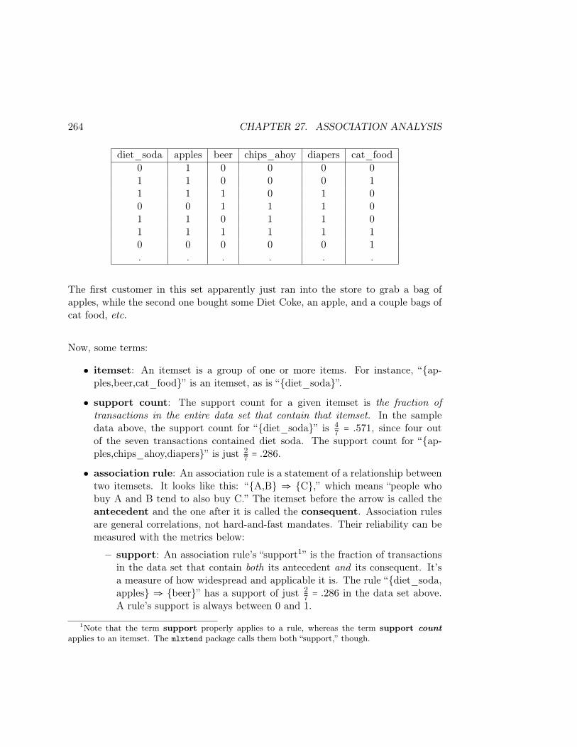
264 CHAPTER 27. ASSOCIATION ANALYSIS
diet_soda apples beer chips_ahoy diapers cat_food0 1 0 0 0 01 1 0 0 0 11 1 1 0 1 00 0 1 1 1 01 1 0 1 1 01 1 1 1 1 10 0 0 0 0 1. . . . . .
The first customer in this set apparently just ran into the store to grab a bag ofapples, while the second one bought some Diet Coke, an apple, and a couple bags ofcat food, etc.
Now, some terms:
• itemset: An itemset is a group of one or more items. For instance, “ap-ples,beer,cat_food” is an itemset, as is “diet_soda”.
• support count: The support count for a given itemset is the fraction oftransactions in the entire data set that contain that itemset. In the sampledata above, the support count for “diet_soda” is 4
7 = .571, since four outof the seven transactions contained diet soda. The support count for “ap-ples,chips_ahoy,diapers” is just 2
7 = .286.
• association rule: An association rule is a statement of a relationship betweentwo itemsets. It looks like this: “A,B ⇒ C,” which means “people whobuy A and B tend to also buy C.” The itemset before the arrow is called theantecedent and the one after it is called the consequent. Association rulesare general correlations, not hard-and-fast mandates. Their reliability can bemeasured with the metrics below:
– support: An association rule’s “support1” is the fraction of transactionsin the data set that contain both its antecedent and its consequent. It’sa measure of how widespread and applicable it is. The rule “diet_soda,apples ⇒ beer” has a support of just 2
7 = .286 in the data set above.A rule’s support is always between 0 and 1.
1Note that the term support properly applies to a rule, whereas the term support countapplies to an itemset. The mlxtend package calls them both “support,” though.
27.2. IMPLEMENTATION: THE MLXTEND LIBRARY 265
– confidence: An association rule’s “confidence,” on the other hand, is ameasure of its reliability. It’s the fraction of the times that it could applywhere it’s actually correct. In terms of support, it’s support(whole rule)
support_count(antecedent)
The rule “diet_soda,apples ⇒ beer” has a support of 24 = .5 in the
data set above, since out of the four times that diet soda and apples werepurchased together, beer was also purchased in two of them. A rule’sconfidence is always between 0 and 1.
– lift: Finally, an association rule’s “lift” is a numerical measure of howmuch predictive power it has. The key concept is that we want to knowhow likely the consequent is to be satisfied when the antecedent is satisfiedrelative to how likely the consequent is to be satisfied anyway. Quantita-tively, it’s confidence(whole rule)
support_count(consequent) . A rule’s lift is always between 1 and ∞.A lift of 1 means it’s essentially useless: knowing the antecedent is truedoesn’t really make the consequent any more likely.
If we crunch all the numbers, we want to look for association rules with high support,high confidence, and high lift. Which of those three end up being the greatest prioritydepends somewhat on the application. If a rule doesn’t have high support, it doesn’tcome up much, so it may not be very useful. If it doesn’t have high confidence, thenthe trend it signifies isn’t super reliable, and we need to be aware of that. And if itdoesn’t have high lift, then its antecedent doesn’t tell us a whole lot that we didn’talready know.
27.2 Implementation: the mlxtend library
Surprisingly, scikit-learn doesn’t seem to have an association analysis implemen-tation out of the box. (At least, Stephen couldn’t find one.) There is one in the opensource mlxtend library, though, by Sebastian Raschka & friends. You may need torun “conda install mlxtend” at the command line for Spyder to access it.
Let’s take it for a spin. First, we’ll generate a synthetic data set with a knownassociation. We’ll stock five items for sale in our pretend store, each of which willhave a different prior probability of being purchased (about 60% of all transactionswill have bananas, 80% will have pizza, etc.) However, we’ll ensure that in additionto 2,000 purely random ones, we’ll have a solid thousand transactions with bothbacon and eggs. This should guarantee that “bacon ⇒ eggs” comes out to be ameaningful association.2
2“...and eggs ⇒ bacon too, right?” you ask. Well, not necessarily, or at least not as strong:

266 CHAPTER 27. ASSOCIATION ANALYSIS
Here’s the code to synthesize this:
eggs = []bacon = []bananas = []pizza = []coffee = []
for i in range(2000):eggs.append(np.random.choice([1,0],p=[.7,.3]))bacon.append(np.random.choice([1,0],p=[.1,.9]))bananas.append(np.random.choice([1,0],p=[.6,.4]))pizza.append(np.random.choice([1,0],p=[.8,.2]))coffee.append(np.random.choice([1,0],p=[.3,.7]))
for i in range(1000):eggs.append(1)bacon.append(1)bananas.append(np.random.choice([1,0],p=[.6,.4]))pizza.append(np.random.choice([1,0],p=[.8,.2]))coffee.append(np.random.choice([1,0],p=[.3,.7]))
transactions = pd.DataFrame( 'eggs':eggs, 'bacon':bacon, 'bananas':bananas,'pizza':pizza, 'coffee':coffee)
Okay, let’s analyze. First, just for giggles, let’s shuffle the DataFrame’s rows sothey’re in a random order (not strictly necessary, but just on principle) and then letmlxtend do its work:
transactions = transactions.sample(frac=1)
from mlxtend.frequent_patterns import apriorifrom mlxtend.frequent_patterns import association_rules
itemsets = apriori(transactions, min_support=0.1, use_colnames=True)
(Note that passing frac=1 to the .sample() method says “give me all the rows,please; but in a shuffled order.)
since 70% of the random transactions have eggs anyway, and only 10% of them have bacon, we’regoing to get a lot of bacon-less egg-full transactions, which will dial down the confidence of thatassociation. But let’s wait and see what mlxtend says.
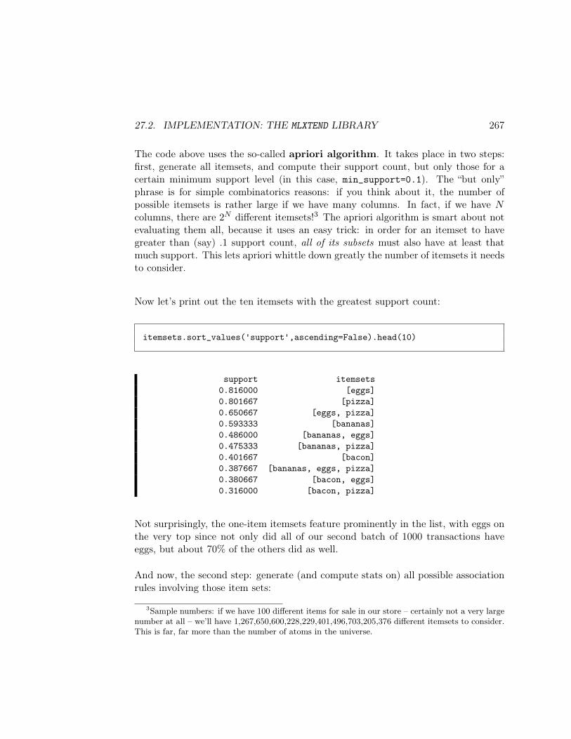
27.2. IMPLEMENTATION: THE MLXTEND LIBRARY 267
The code above uses the so-called apriori algorithm. It takes place in two steps:first, generate all itemsets, and compute their support count, but only those for acertain minimum support level (in this case, min_support=0.1). The “but only”phrase is for simple combinatorics reasons: if you think about it, the number ofpossible itemsets is rather large if we have many columns. In fact, if we have Ncolumns, there are 2N different itemsets!3 The apriori algorithm is smart about notevaluating them all, because it uses an easy trick: in order for an itemset to havegreater than (say) .1 support count, all of its subsets must also have at least thatmuch support. This lets apriori whittle down greatly the number of itemsets it needsto consider.
Now let’s print out the ten itemsets with the greatest support count:
itemsets.sort_values('support',ascending=False).head(10)
support itemsets0.816000 [eggs]0.801667 [pizza]0.650667 [eggs, pizza]0.593333 [bananas]0.486000 [bananas, eggs]0.475333 [bananas, pizza]0.401667 [bacon]0.387667 [bananas, eggs, pizza]0.380667 [bacon, eggs]0.316000 [bacon, pizza]
Not surprisingly, the one-item itemsets feature prominently in the list, with eggs onthe very top since not only did all of our second batch of 1000 transactions haveeggs, but about 70% of the others did as well.
And now, the second step: generate (and compute stats on) all possible associationrules involving those item sets:
3Sample numbers: if we have 100 different items for sale in our store – certainly not a very largenumber at all – we’ll have 1,267,650,600,228,229,401,496,703,205,376 different itemsets to consider.This is far, far more than the number of atoms in the universe.
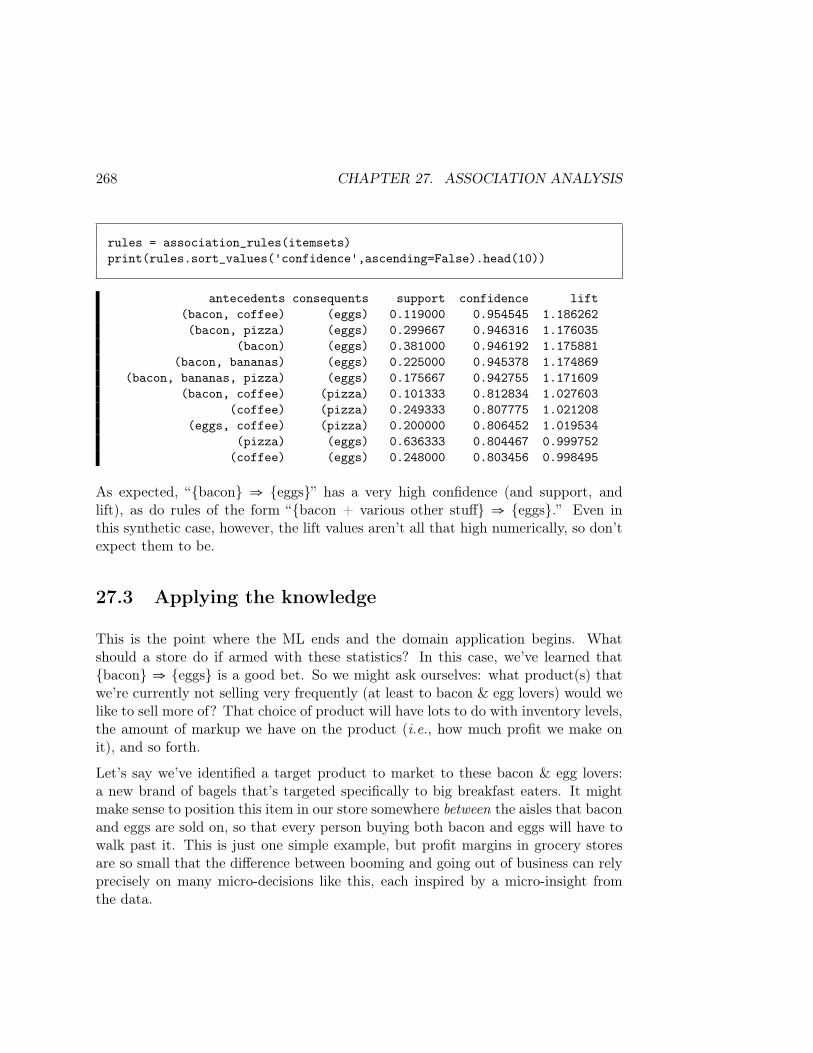
268 CHAPTER 27. ASSOCIATION ANALYSIS
rules = association_rules(itemsets)print(rules.sort_values('confidence',ascending=False).head(10))
antecedents consequents support confidence lift(bacon, coffee) (eggs) 0.119000 0.954545 1.186262(bacon, pizza) (eggs) 0.299667 0.946316 1.176035
(bacon) (eggs) 0.381000 0.946192 1.175881(bacon, bananas) (eggs) 0.225000 0.945378 1.174869
(bacon, bananas, pizza) (eggs) 0.175667 0.942755 1.171609(bacon, coffee) (pizza) 0.101333 0.812834 1.027603
(coffee) (pizza) 0.249333 0.807775 1.021208(eggs, coffee) (pizza) 0.200000 0.806452 1.019534
(pizza) (eggs) 0.636333 0.804467 0.999752(coffee) (eggs) 0.248000 0.803456 0.998495
As expected, “bacon ⇒ eggs” has a very high confidence (and support, andlift), as do rules of the form “bacon + various other stuff ⇒ eggs.” Even inthis synthetic case, however, the lift values aren’t all that high numerically, so don’texpect them to be.
27.3 Applying the knowledge
This is the point where the ML ends and the domain application begins. Whatshould a store do if armed with these statistics? In this case, we’ve learned thatbacon ⇒ eggs is a good bet. So we might ask ourselves: what product(s) thatwe’re currently not selling very frequently (at least to bacon & egg lovers) would welike to sell more of? That choice of product will have lots to do with inventory levels,the amount of markup we have on the product (i.e., how much profit we make onit), and so forth.
Let’s say we’ve identified a target product to market to these bacon & egg lovers:a new brand of bagels that’s targeted specifically to big breakfast eaters. It mightmake sense to position this item in our store somewhere between the aisles that baconand eggs are sold on, so that every person buying both bacon and eggs will have towalk past it. This is just one simple example, but profit margins in grocery storesare so small that the difference between booming and going out of business can relyprecisely on many micro-decisions like this, each inspired by a micro-insight fromthe data.
Chapter 28
“Special” data types
I’ll end this book by alluding to a number of “special” types of data that requiresomewhat different techniques to analyze that what we’ve learned so far.
One example is time series data, where observations are made at regular, fixedpoints in time and one might be interested in identifying overall trends (“stays atour hotel are going up!”), seasonal contributions within those trends (“summers havemore customers in general than winters do”), and noise components that may obscureboth effects (“we simply had a bad year last year.”) A whole body of literature hasarisen to treat time series with specialized techniques.
Another example is free-text data (a.k.a. free-form text, a.k.a. natural lan-guage data) where the “data” is comprised of actual written sentences in a lan-guage like English. This very unstructured stream can be analyzed using a bevy ofspecialized techniques, from simple word counts to sequences of words (“n-grams”)to full parsing of sentences. Often, techniques like stemming algorithms are usedto recognize that words like “jump,” “jumped,” and “jumping” all represent the samebasic concept. As with time series, the methods for working with natural languageare well studied, numerous, and form an entire subfield on their own.
Yet another example is geographic data (a.k.a. geospatial data, a.k.a. geodata)used to represent points or areas on Earth. Longitude and latitude, along with aset of transformational functions, can be used to annotate data about events andperform computations to learn from them.
All of these topics (and others) each deserve their own course(s), and can only behinted at here.
269
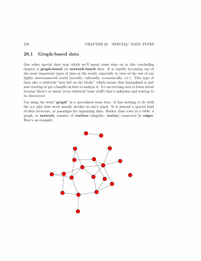
270 CHAPTER 28. “SPECIAL” DATA TYPES
28.1 Graph-based data
One other special data type which we’ll spend some time on in this concludingchapter is graph-based (or network-based data. It is rapidly becoming one ofthe most important types of data in the world, especially in view of the rise of ourhighly interconnected world (socially, culturally, economically, etc.) This type ofdata also a relatively “new kid on the block,” which means that humankind is justnow starting to get a handle on how to analyze it. It’s an exciting area to learn aboutbecause there’s so much (even relatively basic stuff) that’s unknown and waiting tobe discovered.
I’m using the word “graph” in a specialized sense here. It has nothing to do withthe x-y plot that word usually invokes in one’s mind. It is instead a special kindof data structure, or paradigm for organizing data. Rather than rows in a table, agraph, or network, consists of vertices (singular: vertex) connected by edges.Here’s an example:
28.1. GRAPH-BASED DATA 271
The circles are the vertices (also sometimes called nodes) and the lines are theedges (sometimes called links or arcs). This basic structure can be used to describeinnumerable kinds of things:
• People and the social ties between them.• Computers on a network and the connections that join them.• International banks and the transactions they’ve performed with one another.• Physical locations and the routes/roads that connect them.• The pages on a particular website, and which ones link to which others.• Scholarly research papers and the citations they make of one another.• Etc.
Part of what makes graph-based data so important and powerful is this plethora ofdifferent applications. Aristotle, in fact, thought that this vertex-and-edge thing wasso universal that essentially all the information we might want to conceive could bereduced to, and represent with, this structure.
28.1.1 Graph terms
A whole specialized vocabulary has sprung up for talking about graphs and theirproperties. Here are just a few common terms and their meanings:
• order and size – Colloquially, researchers sometimes refer to the number ofvertices in a graph as its order, and the number of its edges as its size. (Theratio of these quantities becomes a subject of interest as well.)
• to traverse – We use the verb “traverse” to mean “follow a link from onenode to another.” This often comes up in the context of searching for data inthe graph, or finding a path through the graph with certain features.
• directed/undirected – In the graph above, vertices are connected by simplelines. This is called an undirected graph, and means that there is no intrin-sic directionality to the edges: a pair of vertices simply either is, or is not,joined by an edge. Sometimes, we care about which “way” the edge goes – forinstance, if we represented a family tree, and the edges indicated parent/childrelationships. Saying “Sam is the daughter of Betty Lou” is very different thansaying “Betty Lou is the daughter of Sam.” For this kind of graph, we willadd arrowheads to the edges to show this. We typically say that one can onlytraverse directed links in the forwards direction (i.e., in the direction of thearrow).

272 CHAPTER 28. “SPECIAL” DATA TYPES
• a simple graph vs. a multigraph – With most graphs, there is at mostone edge between any two pairs of vertices. (Either the locations have a roadbetween them or not, either the two people are friends or they’re not, etc.)In some cases, though, we may allow multiple edges per vertex pair. Perhapsin our application we need to know how many roads connect two locations,or how many communications were sent from person A to person B. Graphsthat allow this are called multigraphs. Multigraphs are also typically allowedto have self-loops (an edge from a vertex to itself) which is not allowed in asimple graph.
• attributes – Both vertices and edges can be annotated with special piecesof information called attributes. If vertices represent people, perhaps wewant to attach age or gender information to each one. If edges representcommunications between companies, maybe we want to attach a date to eachedge indicating when that communication took place. We can depict attributeson the visual display (or not) through a variety of means: text annotations,color/shape/size of the vertex, the thickness of the line, and so on.
• weighted graphs – One particularly common type of edge attribute is anumber called the weight of the edge. This is often depicted visually as thenumber positioned closely to the middle of the edge itself. Typically this weightrepresents some sort of “cost” of “using” that edge – for instance, the distance(in feet) of the network cable between the two computers, or the travel time(in minutes) of using the route from one city to the other.
• the degree (of a vertex) – A vertex’s “degree” is simply the number of con-nections it has. In the diagram above, the bottom-most node has degree 1, theone on the far right has degree 0, and the one at far left has degree 2. For di-rected graphs, this notion expands to that of “in-degree” and “out-degree,”which give the number of incoming arrows and outgoing arrows, respectively.
• the degree sequence (of a graph) – If we take a census of the degrees of allthe vertices in a graph, and list them in descending order, we get the degreesequence of the entire graph: The degree sequence of the red graph on p. 270,as you can tediously verify, is:
6, 5, 4, 4, 4, 3, 3, 3, 3, 2, 2, 2, 2, 2, 1, 1, 1, 1, 1, 0
• the degree distribution (of a graph) – A graph’s “degree distribution”can be thought of as a histogram of its degree sequence: how many nodes arethere of degree 0? Of degree 5? Of degree 10? Etc. The degree distro can tell
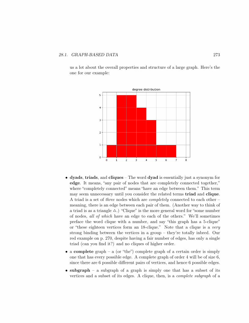
28.1. GRAPH-BASED DATA 273
us a lot about the overall properties and structure of a large graph. Here’s theone for our example:
• dyads, triads, and cliques – The word dyad is essentially just a synonym foredge. It means, “any pair of nodes that are completely connected together,”where “completely connected” means “have an edge between them.” This termmay seem unnecessary until you consider the related terms triad and clique.A triad is a set of three nodes which are completely connected to each other –meaning, there is an edge between each pair of them. (Another way to think ofa triad is as a triangle .) “Clique” is the more general word for “some numberof nodes, all of which have an edge to each of the others.” We’ll sometimespreface the word clique with a number, and say “this graph has a 5-clique”or “these eighteen vertices form an 18-clique.” Note that a clique is a verystrong binding between the vertices in a group – they’re totally inbred. Ourred example on p. 270, despite having a fair number of edges, has only a singletriad (can you find it?) and no cliques of higher order.
• a complete graph – a (or “the”) complete graph of a certain order is simplyone that has every possible edge. A complete graph of order 4 will be of size 6,since there are 6 possible different pairs of vertices, and hence 6 possible edges.
• subgraph – a subgraph of a graph is simply one that has a subset of itsvertices and a subset of its edges. A clique, then, is a complete subgraph of a
274 CHAPTER 28. “SPECIAL” DATA TYPES
certain order. Sometimes we refer to an induced subgraph of a graph: thisis where we take (1) some subset of the original graph’s vertices as the verticesof the induced subgraph, and then (2) all the edges in the original graph thatconnected vertices that we kept. In this way, specifying only the vertex subsetcompletely defines what the induced subgraph will be.
• connected – a graph is connected (sometimes called “fully connected,”which means the same thing) if every vertex is “reachable” from every othervertex by traversing its edges. The red example graph on p. 270 is not con-nected, because there’s a pair of vertices at the top of the page that don’tconnect to anything else (and also one lonely guy at the far right).
Now what does “connected” mean for a directed graph? There are two no-tions: “strongly connected” and “weakly connected.” A directed graph isstrongly connected only if you can reach every vertex from every other vertexonly be traversing edges in the directions indicated. (No going backwards ona one-way street.) It’s weakly connected, on the other hand, merely if it’sconnected once we ignore the directionality of the arrows.
• component – a component (also sometimes confusingly called a “cluster”)of a graph is a connected subgraph. Very simple. Every graph will contain oneor more components, each of which is a sort of island which can’t be reachedfrom the others. The red example on p. 270 has three components. A commonterm is “giant component” which is used to describe situations in which agraph is not fully connected...but almost is. The big mass of nodes which areall connected to each other is called the giant component to distinguish it fromthe onsie-twosie others that aren’t connected. Our example graph is of justthis type.
• community – in contrast to components, a community is a much vaguer,more nuanced concept. Unlike component-ness, which has a razor sharp cri-terion (all its nodes are reachable from each other, period) a community is anattempt to define a group of nodes that are “reasonably” connected to eachother, at least when compared to their connections with those outside thecommunity.
Imagine a small social network for a high school class in which most girlswere friends with most of the other girls, most boys were friends with mostof the other boys, but there was also the occasional boy-girl friendship. Wecould identify the set of girl nodes, and the set of boy nodes, as “communities”because they are relatively cohesive internally and relatively decoupled fromone another. Note that you can’t ever really definitively declare: “such-and-

28.1. GRAPH-BASED DATA 275
such a set of nodes is a community, whereas this set definitely isn’t.” It’smore subtle than that. There’s degrees of “community-hood” depending onhow dense the connections are within and outside the community.
The subfield of community detection is devoted to algorithms that willidentify such groups according to various criteria. It is a critical part of socialnetwork analysis.
• cycle – in a graph, a cycle is a group of nodes that are connected in a ring:you can start at one, traverse edges to the others, and then return to whereyou started.
28.1.2 Special kinds of graphs
Certain patterns arise often enough to deserve their own names. Here are somespecial kinds of graphs:
• tree – A tree is a directed, connected graph with no cycles. (A “family tree”for an asexually-reproducing organism is a good example of this, and often infact we use the terms parent and children to refer to the node that points toa particular vertex, and the nodes that vertex points to, respectively.) You’llremember these from the decision tree chapters in the first volume of thisseries: a decision tree is in fact a tree.
A tree has the interesting property that exactly one of its nodes will haveno parent (we call it the “root” of the tree) and that there is exactly onetraversable path from the root to any other node in the graph.
Trees are used to represent a myriad of recursive hierarchical structures, suchas organizational charts (The President supervises the VPs, each VP super-vises Directors, each Director supervises Managers...), building assemblies (theengine is composed of a piston assembly, a crankshaft, and a cylinder head,which are each composed of...), information storage (the C:\ drive containsMy Documents, My Computer, and My Pictures; My Documents contains DATA101, DATA 219 and love letters,...) and countless more.
• DAG – Certain kinds of directed graphs, even if they’re not trees, must inher-ently be cycle-free to even make sense. For instance, the graph of CPSC courseprerequisites at http://ianfinlayson.net/misc/cpsc.png (see below) mustbe cycle free because the edges indicate required prerequisites, and if there were
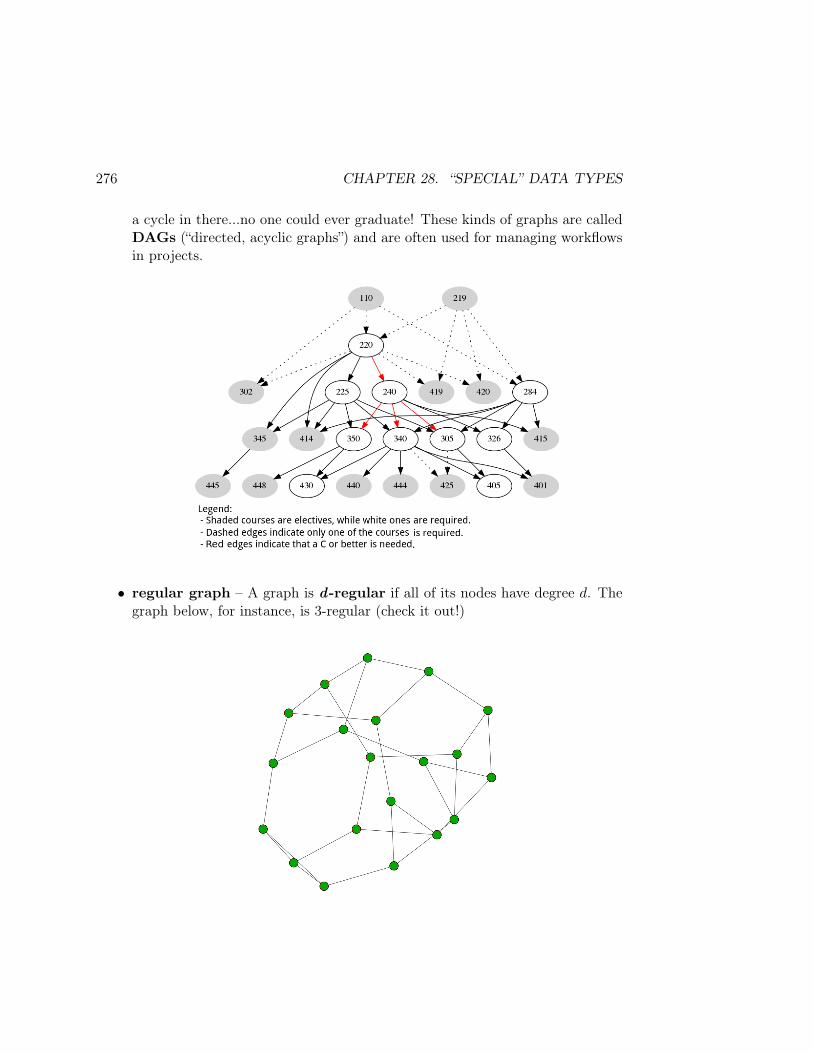
276 CHAPTER 28. “SPECIAL” DATA TYPES
a cycle in there...no one could ever graduate! These kinds of graphs are calledDAGs (“directed, acyclic graphs”) and are often used for managing workflowsin projects.
• regular graph – A graph is d-regular if all of its nodes have degree d. Thegraph below, for instance, is 3-regular (check it out!)
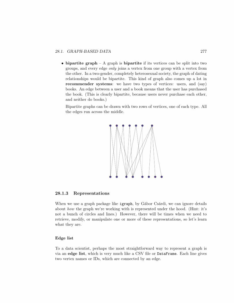
28.1. GRAPH-BASED DATA 277
• bipartite graph – A graph is bipartite if its vertices can be split into twogroups, and every edge only joins a vertex from one group with a vertex fromthe other. In a two-gender, completely heterosexual society, the graph of datingrelationships would be bipartite. This kind of graph also comes up a lot inrecommender systems: we have two types of vertices: users, and (say)books. An edge between a user and a book means that the user has purchasedthe book. (This is clearly bipartite, because users never purchase each other,and neither do books.)
Bipartite graphs can be drawn with two rows of vertices, one of each type. Allthe edges run across the middle.
28.1.3 Representations
When we use a graph package like igraph, by Gábor Csárdi, we can ignore detailsabout how the graph we’re working with is represented under the hood. (Hint: it’snot a bunch of circles and lines.) However, there will be times when we need toretrieve, modify, or manipulate one or more of these representations, so let’s learnwhat they are.
Edge list
To a data scientist, perhaps the most straightforward way to represent a graph isvia an edge list, which is very much like a CSV file or DataFrame. Each line givestwo vertex names or IDs, which are connected by an edge.
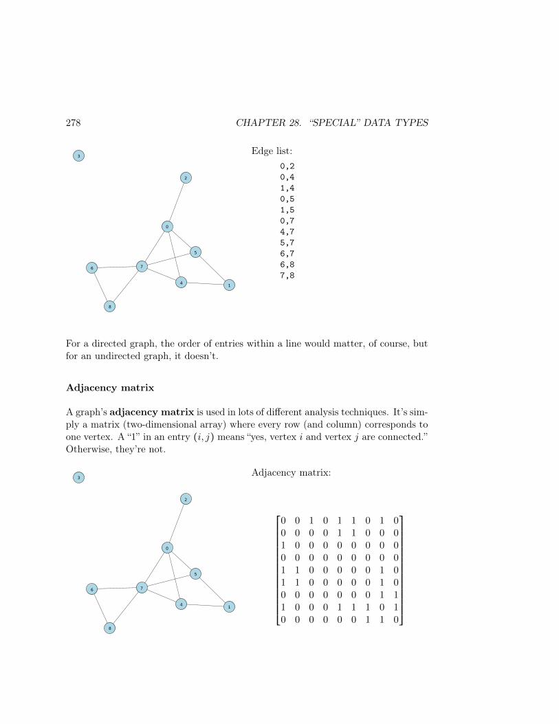
278 CHAPTER 28. “SPECIAL” DATA TYPES
0
1
2
3
4
5
6 7
8
Edge list:0,20,41,40,51,50,74,75,76,76,87,8
For a directed graph, the order of entries within a line would matter, of course, butfor an undirected graph, it doesn’t.
Adjacency matrix
A graph’s adjacency matrix is used in lots of different analysis techniques. It’s sim-ply a matrix (two-dimensional array) where every row (and column) corresponds toone vertex. A “1” in an entry (i, j) means “yes, vertex i and vertex j are connected.”Otherwise, they’re not.
0
1
2
3
4
5
6 7
8
Adjacency matrix:
⎡⎢⎢⎢⎢⎢⎢⎢⎢⎢⎢⎢⎢⎢⎢⎢⎢⎢⎢⎢⎣
0 0 1 0 1 1 0 1 00 0 0 0 1 1 0 0 01 0 0 0 0 0 0 0 00 0 0 0 0 0 0 0 01 1 0 0 0 0 0 1 01 1 0 0 0 0 0 1 00 0 0 0 0 0 0 1 11 0 0 0 1 1 1 0 10 0 0 0 0 0 1 1 0
⎤⎥⎥⎥⎥⎥⎥⎥⎥⎥⎥⎥⎥⎥⎥⎥⎥⎥⎥⎥⎦
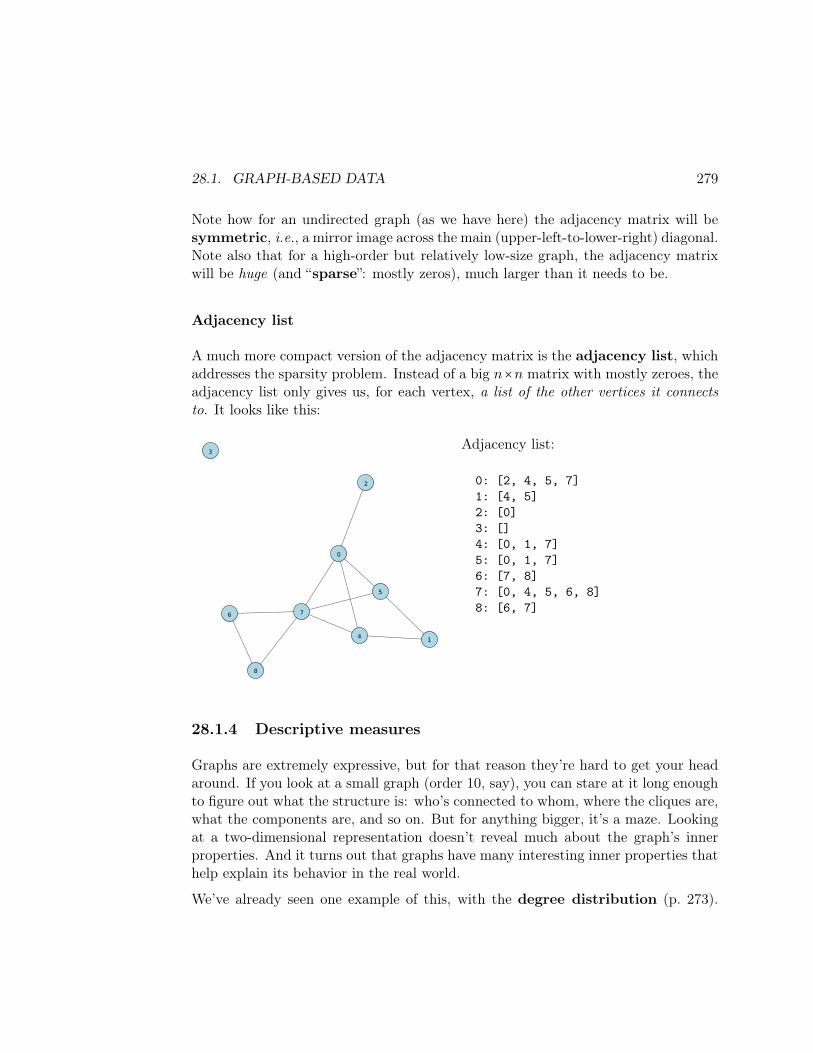
28.1. GRAPH-BASED DATA 279
Note how for an undirected graph (as we have here) the adjacency matrix will besymmetric, i.e., a mirror image across the main (upper-left-to-lower-right) diagonal.Note also that for a high-order but relatively low-size graph, the adjacency matrixwill be huge (and “sparse”: mostly zeros), much larger than it needs to be.
Adjacency list
A much more compact version of the adjacency matrix is the adjacency list, whichaddresses the sparsity problem. Instead of a big n×n matrix with mostly zeroes, theadjacency list only gives us, for each vertex, a list of the other vertices it connectsto. It looks like this:
0
1
2
3
4
5
6 7
8
Adjacency list:
0: [2, 4, 5, 7]1: [4, 5]2: [0]3: []4: [0, 1, 7]5: [0, 1, 7]6: [7, 8]7: [0, 4, 5, 6, 8]8: [6, 7]
28.1.4 Descriptive measures
Graphs are extremely expressive, but for that reason they’re hard to get your headaround. If you look at a small graph (order 10, say), you can stare at it long enoughto figure out what the structure is: who’s connected to whom, where the cliques are,what the components are, and so on. But for anything bigger, it’s a maze. Lookingat a two-dimensional representation doesn’t reveal much about the graph’s innerproperties. And it turns out that graphs have many interesting inner properties thathelp explain its behavior in the real world.
We’ve already seen one example of this, with the degree distribution (p. 273).
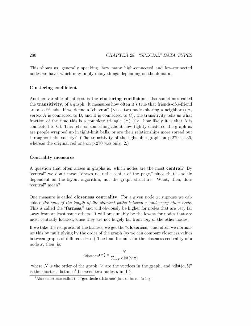
280 CHAPTER 28. “SPECIAL” DATA TYPES
This shows us, generally speaking, how many high-connected and low-connectednodes we have, which may imply many things depending on the domain.
Clustering coefficient
Another variable of interest is the clustering coefficient, also sometimes calledthe transitivity, of a graph. It measures how often it’s true that friends-of-a-friendare also friends. If we define a “chevron” (∧) as two nodes sharing a neighbor (i.e.,vertex A is connected to B, and B is connected to C), the transitivity tells us whatfraction of the time this is a complete triangle () (i.e., how likely it is that A isconnected to C). This tells us something about how tightly clustered the graph is:are people wrapped up in tight-knit balls, or are their relationships more spread outthroughout the society? (The transitivity of the light-blue graph on p.279 is .36,whereas the original red one on p.270 was only .2.)
Centrality measures
A question that often arises in graphs is: which nodes are the most central? By“central” we don’t mean “drawn near the center of the page,” since that is solelydependent on the layout algorithm, not the graph structure. What, then, does“central” mean?
One measure is called closeness centrality. For a given node x, suppose we cal-culate the sum of the length of the shortest paths between x and every other node.This is called the “farness,” and will obviously be higher for nodes that are very faraway from at least some others. It will presumably be the lowest for nodes that aremost centrally located, since they are not hugely far from any of the other nodes.
If we take the reciprocal of the farness, we get the “closeness,” and often we normal-ize this by multiplying by the order of the graph (so we can compare closeness valuesbetween graphs of different sizes.) The final formula for the closeness centrality of anode x, then, is:
ccloseness(x) =N
∑v∈V dist(v,x)
where N is the order of the graph, V are the vertices in the graph, and “dist(a, b)”is the shortest distance1 between two nodes a and b.
1Also sometimes called the “geodesic distance” just to be confusing.
28.1. GRAPH-BASED DATA 281
By this measure, the most central vertex in the light-blue graph is 7 (with a cclosenessof .444), followed by 0, 5, and 4. The “least central” is node 3, with a measly .111.
A different way to think about centrality is in terms of information flow. Supposethese vertices are actors in a social network. Which ones are most crucial to a pieceof news finding its way around to everyone?
One way to measure this is with betweenness centrality. For a given node x, weask, “of all the pairs of vertices a and b, how often is x on the shortest path froma to b?” If information is to travel from a to b, it’s probably most likely (thoughnot certain) that it will travel along the shortest path between those two nodes. Soif x is on a lot of such paths, it means it will be a common conduit of informationexchange between others. We define this mathematically as follows:
cbetweenness(x) = ∑a,b ∈ V
σ(a, b ∣ x)
σ(a, b)
where the notation “σ(a, b)” means “the number of shortest paths from a to b” (therecould be more than one of these, in case of a tie), and where the notation “σ(a, b ∣ x)”means “the number of shortest paths from a to b which pass through x.”2 The largerthis number is, the greater the chance that x will participate in an exchange ofinformation between any two nodes.
Perhaps not surprisingly, for the light-blue case the same nodes are central by boththese measures. Node 7 has a (normalized; see footnote) betweenness centralityof .184, followed by nodes 0, 5, and 4. One difference is between nodes 1 and 8:ccloseness(8) is higher than ccloseness(1) (.348 > .333), but cbetweenness(1) is higherthan cbetweenness(8) (.333 > 0). This is because although 8 is a bit closer to the heartof the action, he’s not on anyone’s shortest path to anyone else. (There’s nobodybetter than node 1, meanwhile, for getting info from 4 to 5.) Therefore, in terms ofinformation passing purposes, he’s kind of useless.
Finally, for those who have linear algebra in their arsenal, there are various waysof using eigenvectors of the adjacency matrix to measure centrality. One of thesealgorithms is called PageRank, which you may be familiar with since it madeGoogle famous and the number one search engine in the world. The idea is that themore central your neighbors are, the more central you’re likely to be. (In terms of
2Sometimes, we normalize this by dividing by (N − 1)(N − 2), to get it to be a number between0 and 1 like the closeness centrality is.
282 CHAPTER 28. “SPECIAL” DATA TYPES
playground drama: a popular person is not so much one with a lot of friends, butrather one with a lot of popular friends.)
The math involved is beyond the scope of this course, but if you’ve had some matrixalgebra it’s not too hard, and of course igraph can do the heavy lifting for us.
28.2 Conclusion
This has been nothing but a whirlwind tour to give you a taste of what graphsare and why they’re important. As I mentioned, they’re quite possibly the mostimportant type of data in our new ultra-networked century, and currently they’renot very well understood. They deserve an entire course (or two!) in their own right,and I hope to teach one someday!
Index
Ω (omega), 165χ2 test, 14, 51, 183∣ (pipe) (conditional probability), 166∧ (chevron), 280() (bananas), 57* (splat) (SQL), 136, (comma) (joint probability), 166<> (wakkas), 140[] (boxies), 20, 22, 54, 64, 67, 73, 207,
230 (curlies), 54, 65, 73
<a> (HTML tag), 142absolute independence (probability), 173absolute vs. relative changes, 126adjacency list, 279adjacency matrix, 278, 281adjectives, 146adjectives_df, 147, 149adjusted R2, 260AIC (Akaike Information Criterion), 260allAboutStephen.html, 144alpha (for transparency), 21amoeba, 275Anaconda, 3antecedent, 264API, 211append() (NumPy), 83, 146apple, 65apriori algorithm, 266arc (graph), 270
Aristotle, 271array() (NumPy), 146, 158asexually-reproducing organism, 275Asian countries, 179association, 43, 174, 265association analysis, 263association rule, 264associative array, 61attribute
of a graph edge or vertex, 272of an HTML element, 142, 157, 159
.attrs (BeautifulSoup), 159, 162authentication, 216The Avengers, 94axis argument, 108
<b> (HTML tag), 140, 158background knowledge, 29backward selection, 259bacon, 266, 268bagel, 268bald, 166banana (fruit), 65, 266bananas (parentheses), 57bandwidth, 31, 32barbecue, 177baseball, 229baseline, 190Bayes’ Rule (probability), 173, 191Bayes, Thomas, 173Bayesian reasoning, 168
283
284 INDEX
BeautifulSoup, 154“bell-curvy”, 31, 36, 203best-fit line, 85betweenness centrality, 281bias-variance trade-off, 89, 243, 259BIC (Bayesian Information Criterion), 260bing cherry, 65bipartite graph, 277bird’s-eye view, 19bivariate, 7blonds/blondes, 166<body> (HTML tag), 140books, 8, 20books_num, 20bottom-up navigation, 154box plot, 17
notched, 18boxies (square brackets), 20, 22, 54, 64,
67, 73, 207boys and girls, 274brunettes, 166bs4 (BeautifulSoup library), 154Bullock, Sandra, 94bw_method (for gaussian_kde()), 32
C:\ drive, 275cancer, 177Carl’s ice cream, 171Cassandra, 134categorical random value, 40, 49CategoricalNB, 240, 255causal diagram, 177causal relationship, 177celebrities, 124centrality measure, 280CHEM 211, 77cherry, 65chevron (∧), 280Chewbacca, 214
chi2_contingency() (SciPy), 14child (tree), 275chocolate, 171choice() (NumPy), 40, 49chopsticks, 179class (HTML/CSS attribute), 158class (ML classifiers), 189class size, 79class_ (BeautifulSoup), 161classifier, 189, 223client, 212.clip() method (NumPy), 44, 49clique, 273closeness centrality, 280cluster (of a graph), 274clustering coefficient, 280Codd, Ted, 134coefficients (of a polynomial), 87coffee, 266collectively exhaustive, 167, 171college degree, 168color scheme, 15.combine() method (datetime), 114community (graph), 274community detection, 275component (of a graph), 274“conda install” command, 217, 265conditional independence, 174, 181conditional probability, 168–170, 180, 181,
191, 195“conditioning on”, 168, 180, 185, 187confidence, 264confounding factor, 174, 180connect() (SQLite), 135connected (graph), 274consequent, 264console, 4.content (requests package), 213

INDEX 285
.contents (BeautifulSoup), 155contingency table, 8contradiction, 102controlled experiment, 177correlation coefficient, 19, 43, 44COUNT() (SQL), 137courses (JSON file), 70, 73crankshaft, 275.crosstab() (Pandas), 11crow-flies distance, 224Csárdi, Gábor, 277CSS, 142, 163CSV file, 71, 93, 102, 115, 140, 211, 277curlies (curly braces), 54, 65, 73“the curse of dimensionality”, 248, 253cycle, 275cylinder head, 275
DAG (directed, acyclic graph), 275Darth Vader, 99DATA 219, 73, 77data fusion, 93data sparsity, 249data-generating process (DGP), 28, 245database, 133, 211DataFrame (Pandas), 54, 93.date() method (datetime), 114date type (datetime), 112datetime package, 111datetime type (datetime), 114.db file, 135DBMS, 133decision tree, 257, 275.decode() (requests package), 213degree (of a graph vertex), 272degree (of a polynomial), 87degree distribution, 273, 279delimiter, 147denominator, 193
density, 31depression, 178DESC (“descending”) (SQL), 138DiCaprio, Leonardo, 94dictionary, 54, 63, 73, 157, 159, 162, 196,
215dimensionality reduction, 261directed graph, 271, 274, 278, 279directory (folder), 5, 144dist(), 235distance measure, 224, 225DISTINCT (SQL), 137distribution, 31, 36, 49, 165.div() (NumPy), 13, 14“double boxies”, 20, 108, 230Downey Jr., Robert, 94.drop() (Pandas), 108.drop_duplicates() (Pandas), 108, 199dtype, 118, 158, 207, 255DVD, 165dyad, 273
edge (graph), 270edge list, 277egg, 266, 268eigenvectors, 281element (HTML), 140, 142, 153“embedded” statement, 136endpoint, 212Euclidean distance, 224, 235event (probability), 165evidence, 197example, labeled vs. unlabeled, 189Exploratory Data Analysis (EDA), 7exponential relationship, 128extension (filename), 3, 135, 144
F -test, 183FacetGrid() (Seaborn), 23, 245

286 INDEX
facets, 23, 245family tree, 275“farness”, 280feature, 189, 190feature selection, 250, 253Fielding, Roy, 212file, 5.find() (BeautifulSoup), 160, 161.find_all() (BeautifulSoup), 158, 160,
161, 163Finlayson, Ian, 275.fit() method, 238fit_transform(), 230, 238, 255flat data, 70, 93folder, 5, 144football, 229foreign key (PK), 95forward selection, 258Fredericksburg, 171free text / free-form text, 269friend-of-a-friend, 280“FROM” clause (SQL), 135–137“frozen” distribution (SciPy), 205, 206
Gaussian (kernel), 31, 89Gaussian (normal) distribution, 36, 203,
204Gaussian Naïve Bayes, 203gaussian_kde() (SciPy), 31gender, 277gender_lang, 11, 14, 15gender_lang_m, 12, 14geodesic distance, 280geographic data, 269GET parameter (HTTP), 218get() function (requests), 213.get_text() (BeautifulSoup), 160, 162“giant component” (graph), 274Girl on the Train, The, 165
“given” ( ∣ ) (conditional probability), 168GPA, 46graph, 270graph (network), 134greedy (algorithm), 257GROUP BY (SQL), 138.groupby() (Pandas), 10, 138grouped scatter plot, 22, 234
<h1>, <h2>, ... (HTML tags), 140Hanks, Tom, 94hardback edition, 165Hawkins, Paula, 165<head> (HTML tag), 140, 157heat map, 15heatmap() (Seaborn), 15, 50heights, 43heterosexual society, 277hierarchical data, 70, 140histogram, 10, 20, 27HTML, 139, 213<html> (HTML tag), 140, 155html.parser (BeautifulSoup), 154HTTP, 218HTTP protocol, 212
<i> (HTML tag), 140ice cream, 171id (BeautifulSoup), 161IDE, 3igraph (package), 277, 282IMDB, 94<img> (HTML tag), 142import, 15, 69, 89, 111, 205, 213, 230,
266in, 78, 158“IN” keyword (SQL), 137in-degree, 272Inception, 94

INDEX 287
independence (probability), 173, 181, 192index, 61induced subgraph, 273Informix, 138intercept term, 47IPython, 4is_numeric_dtype(), 255issubdtype(), 207itemset, 264
Jedi, 190, 195, 203, 237, 243Johansson, Scarlett, 94join
inner, 93, 96JOIN (SQL), 138left, 96natural, 96outer, 96, 99right, 96, 99
joint distribution (probability), 167joint probability, 166, 169, 170JSON, 67, 140, 212.json file, 68, 73Jupyter Notebooks, 3
Kashyyyk, 216kdeplot() (Seaborn), 31kernel, 31, 89key, 95key-value pair, 54, 61, 63, 134, 142, 159,
208KeyError, 75KNeighborsClassifier, 238kNN (k-nearest neighbors), 223, 244
label, 189, 190labeled example, 189lacrosse, 229Lady Gaga, 73
lasso regression, 260least-squares line, 85len() function
for dictionaries, 63for lists, 62, 66
<li> (HTML tag), 146lift, 265“LIMIT” clause (SQL), 137line, best-fit / least-squares, 85linear algebra, 48, 261, 281link (graph), 270list, 62, 73, 104, 115, 147, 159, 163, 198
comprehension, 157, 207log-log plot, 124logarithms, 123long form, 106, 230loop, 74Los Angeles Sparks, 55love letter, 275
machine learning (ML), 189, 223, 263Mallows’ Cp, 260Manhattan distance, 225“many-to-many” relationship, 97marginal probability, 167, 170margins (of a contingency table), 11, 167MariaDB, 134, 138market basket analysis, 263matrix, 278MAX() (SQL), 137mean, 9, 205melt() (Pandas), 104, 245merge, 93, 149Microsoft SQL Server, 134, 138MIN() (SQL), 137min_support, 266mlxtend (package), 265MongoDB, 134mosaic plot, 15

288 INDEX
movies, 94Mr. Blue Question Mark, 223multigraph, 271multivariate, 7mutually exclusive, 167, 171, 173MVP card, 263My Computer, 275MySQL, 134, 138
n-grams, 269Naïve Bayes classifier, 190, 223name collision, 97NaN (“not a number”), 99, 145natural join, 96natural language data, 269NavigableString (BeautifulSoup), 155NBA, 169ndarray (NumPy), 61Neo4j, 134nested
data structures, 64function calls, 56loops, 75, 147
network connection, 144network-based data, 270“new kid on the block”, 270the “no free lunch” principle, 243, 247node (graph), 270noise, 46, 85Nolan, Christopher, 94normal() (NumPy), 37normal distribution, 31, 36, 203, 204normal random value, 37, 205normalized (data set), 102, 107normalized (variable), 227, 234NoSQL database, 133notched box plot, 18“nudge”, 46numerator, 192, 193
OAuth, 216“object” (a.k.a. str) dtype, 80, 117,
146, 207observational study, 177omega (Ω), 165one-hot encoding, 230“one-to-many” relationship, 97OneHotEncoder, 230, 238, 255Oracle, 134, 138order (of a graph), 271ORDER BY (SQL), 138order of magnitude, 124OrdinalEncoder, 240out-degree, 272outcome (probability), 165overfitting, 245, 259
<p> (HTML tag), 157p-value, 43, 51, 185PageRank algorithm, 281pairplot() (Seaborn), 22Pandas, 115Pandora’s Box, 102parametric model, 87, 250parent (tree), 275parse_dates argument (to read_csv()),
115, 117PCA (Principal Components Analysis),
261.pdf() method, 205Pearson correlation coefficient, 19, 43, 44pearsonr() (SciPy), 44, 46percent syntax, 220performance (of a classifier), 189, 201pinterest, 168piston assembly, 275pivot, 109pizza, 266plain-ol’ Python, 61
INDEX 289
polyfit() (NumPy), 85polynomial, 85posterior (probability), 169, 173PostgreSQL, 134, 138power-law relationship, 128, 129pprint() function, 69, 214pre-allocate, 83predict(), 195, 197, 206, 208, 235.prettify() (BeautifulSoup), 154“pretty printing”, 69, 73, 154, 214primary key (PK), 95Princess, 99print() function, 69prior (probability), 169, 173, 192, 195,
265probability, 165probability density, 31, 203probability measure, 166probs, 196Provost’s office, 79.py file (Python source code), 3Pythagorean Theorem, 224, 235
quantiles, 9, 205query (database), 135quote_plus() function (urllib), 220
rainier cherry, 65random number, 35random value, 35, 40, 49, 165, 205Raschka, Sebastian, 265rate limit, 216rate of increase, 129“raw” counts, 11RDBMS, 133, 134“reachable” vertex (graph), 274read_csv() (Pandas), 5, 115, 117read_html() (Pandas), 143read_sql() (Pandas), 135, 136
recommender system, 277redheads, 165, 166Redis, 134redundancy (of information), 102regex (regular expression), 163regular graph, 276regularization, 253relational database, 133relative vs. absolute changes, 126render (a web page), 139requests package, 213requests_oauthlib package, 217REST API, 211“RESTful” API, 212ridge regression, 260Rock, The, 73roles, 94root node (of an HTML file), 140, 155RPC, 212rule, association, 264
.sample() (Pandas), 201, 266sample space (probability), 165SAT, 46sat_scores, 43, 46Saving Private Ryan, 94scatter plot, 18
grouped, 22, 234logarithmic scale, 125matrix, 19
scatter_matrix() (Pandas), 20scikit-learn (package), 230, 237, 265screen scraping, 143, 153Seaborn, 15Seattle Storm, 55security camera, 190, 196, 205, 237, 243,
255security_cam.csv, 190, 201, 237security_cam2.csv, 255

290 INDEX
seed() (NumPy), 35seed (of a random generator), 35seismic (color scheme), 16.select() (BeautifulSoup), 163SELECT statement (SQL), 135, 136self-loop, 271semi-log plot, 124, 127Series (Pandas), 61, 63server, 212shrinkage, 253, 260Sith, 190, 195, 203, 237, 243size (of a graph), 271skeleton (of a causal diagram), 178, 181smoking, 178SOA (Service-Oriented Architecture), 212SOAP API, 212.sort() (NumPy), 85soup, 154sparse=False (OneHotEncoder), 230, 238sparse matrix, 230, 238, 279sparsity, 249.split(), 147sprinkles, 171spycam, 190, 196, 201, 205, 237, 243, 255Spyder, 3SQL, 133, 136SQLite, 134sqlite_master, 135sqrt() (NumPy), 226standard deviation, 9, 31, 205standardization, 227, 234Star Wars, 214stateless (protocol), 212statistical significance, 14, 18stemming, 269Stephen, Inc., 126stitching arrays together, 54, 147stock prices, 126
.str suffix (Pandas), 106, 119straight-line distance, 224strawberry, 171strongly connected (graph), 274.strftime() method (datetime), 121.strptime() method (datetime), 120Student, 99subgraph, 273subset selection, 253support, 264support count, 264SVD (Singular Value Decomposition), 261SWAPI (Star Wars API), 214Sybase, 134, 138symmetric matrix, 279synthetic data set, 35, 43, 183, 233, 265
t-test, 17, 183table
aggregate data type, 93contingency, 8, 11HTML element, 143relational database, 133, 135
<table> (HTML tag), 140, 143tag (HTML), 140, 142, 155, 162tall, 169target, 189, 190taxicab distance, 225<td> (HTML tag), 140, 158test data, 189, 201the easy case, 136, 143, 153throwing away the denominator, 193“tidy” data, 107.time() method (datetime), 114time type (datetime), 113“time”, 111time series, 269timedelta type (datetime), 112<title> (HTML tag), 140, 156, 157

INDEX 291
top-down navigation, 154<tr> (HTML tag), 140training data, 189, 190, 195transaction, 263transitivity, 280transparency, 21traversing (a graph), 271tree, 140, 257, 275triad, 273triangle (), 273, 280ttest_ind() (SciPy), 17type(), 66, 155
<u> (HTML tag), 140UK, 124<ul> (HTML tag), 146undirected graph, 271, 278, 279unemployed, 168Unicode, 213uniform() (NumPy), 39uniform random value, 39univariate, 7, 20unlabeled example, 189unnormalized (data set), 102URL, 144, 154, 211, 215urllib package, 220
.value_counts() (Pandas), 8, 10, 41, 236vanilla, 171“vectorized” operation, 236vertex (graph), 270video games, 179VIP card, 263VP, 275
wakkas (angle brackets), 140wall of text, 69Washington Mystics, 55weakly connected (graph), 274
web crawler, 154web developer tools, 153Web services, 212weighted graph, 272Wendell, 99Whedon, Joss, 94where() (NumPy), 51, 56“WHERE” clause (SQL), 137white noise, 46Wickham, Hadley, 107wide form, 103, 230“wiggly” classifiers, 245, 259windfall, 127WNBA, 55worst of all possible worlds, 139, 153
XML, 67, 212
y =mx + b, 47, 87Yoda, 77
Z-score, 227, 234