design & ux tips for maps · design & ux tips for maps author: esri subject: 2014...
TRANSCRIPT

Design & UXTips for MapsPatrick Arlt
Experience Developer - Esri Portland R&D Center
- @patrickarlt http://bit.ly/1h4kDld


Not Just Map Portals

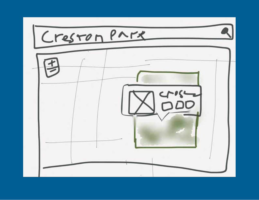
Lets go to the park… Not…

Some Real-World MetricsWeb Map Metrics From the City of Denver
More Web Analytics from the Field
WHy Map Portals Don't Work Part 1 of 5

Single-Topic maps get 3times the traffic of thetraditional Map Portal
LLession: Be consice your map should do one thing well.

People Actually Interactwith Balloon Content
LLession: Don't neglect your popups.
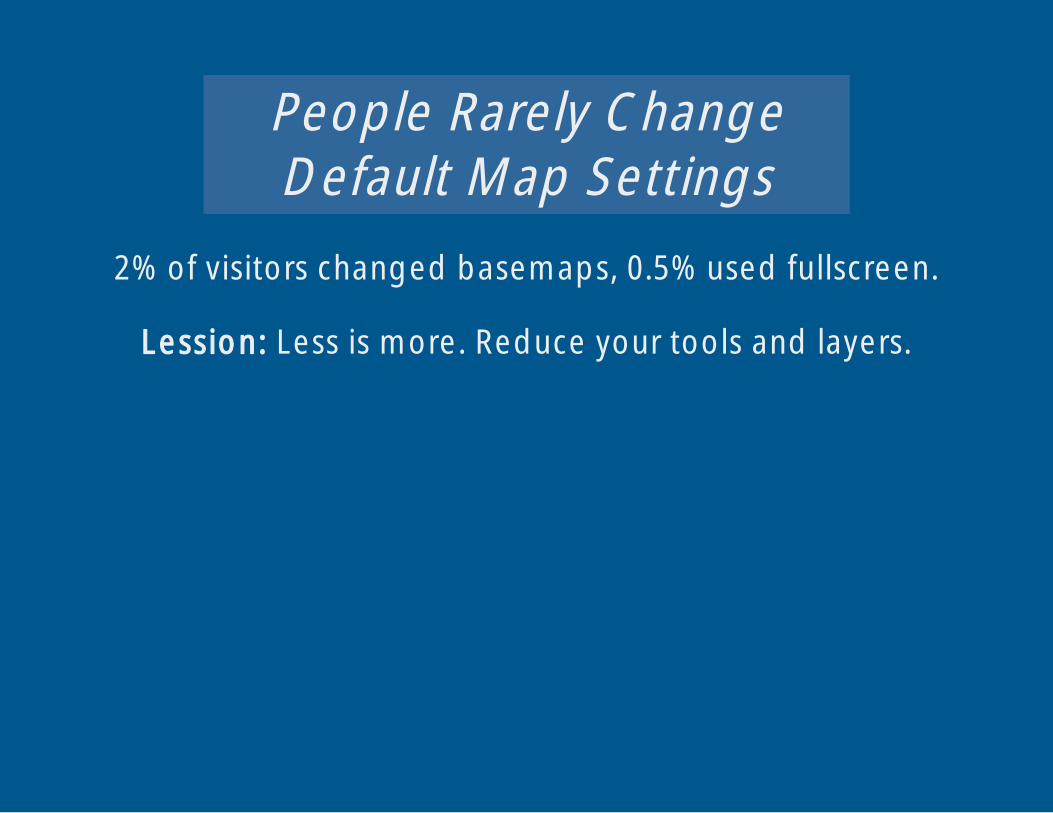
People Rarely ChangeDefault Map Settings
2% of visitors changed basemaps, 0.5% used fullscreen.
LLession: Less is more. Reduce your tools and layers.

People Look Up Info onMaps, and Leave
Auto completing search is key. Average visit was 1:43.
LLession: Get users in an out as fast as possible.

Only 12% of users browseinformation for more thanthree geographic features
during a single visit.
LLession: Users care about a single feature.

Reduce noise
Let there be search
Pages for individual features
In and out at NASCAR speed
Focus on a single topic

Treat EveryoneLike An Idiot
You
Your Users
Your Coworkers
Your Boss

Learn HowMuch
User Experience (UX) and User Interface (UI) Summit
1pm-6pm Wednesday
Santa Rosa/San Jacinto

Your design isC.R.A.P!

C is for Contrast


R is for RepetitionIf its good enough to put on the page once its good enough
to put on there again.
Show popups on hover AND click?
Filter a map AND and a list?
Introduce shortcuts and keyboard commands?

A is for AreaAre the biggest things the most important?

P is for ProximityHow far apart are important elements? How long will it take
a user to find them?

Design Is AllAbout Balance
Ugly is Good

Remember Me?

Good and Bad Pros
Single focused mission
Individual pages forfeatures
Search first design
ConsSearch is really hard
Maps are klugdy