create charts in excel charts in excel ... new microsoft office fluent user interface. ... data that...
TRANSCRIPT

Creating Excel Charts Training Session Handout Page 1 http://ict.maxwell.syr.edu/
Most topics came directly from Microsoft Excel Help. Check the Help section for additional info. re: creating charts.
Create Charts in Excel
Table of Contents
OVERVIEW OF CHARTING ............................................................................................................................................ 1
AVAILABLE CHART TYPES ............................................................................................................................................ 2 PIE CHARTS.......................................................................................................................................................................... 2
BAR CHARTS ........................................................................................................................................................................ 3
CREATING CHARTS IN EXCEL ..................................................................................................................................... 3 CREATE A CHART ................................................................................................................................................................ 3
HOW TO CHANGE THE LOCATION OF A CHART .................................................................................................................... 5
RESIZE A CHART .................................................................................................................................................................. 5
RENAME A CHART ............................................................................................................................................................... 5
CHANGE THE CHART TYPE .................................................................................................................................................. 6
CHANGE THE DATA SOURCE OF THE CHART ........................................................................................................................ 7
DISPLAY HIDDEN DATA AND EMPTY CELLS IN A CHART ..................................................................................................... 8
MODIFYING CHARTS ....................................................................................................................................................... 8 WHAT CAN I MODIFY? ......................................................................................................................................................... 8
WHAT CAN I FORMAT? ........................................................................................................................................................ 9
APPLYING PREDEFINED LAYOUTS AND STYLES ................................................................................................... 9 CHANGE THE LAYOUT OR STYLE OF A CHART ................................................................................................................... 10
CHANGE THE LAYOUT OF CHART ELEMENTS MANUALLY ................................................................................................. 10
CHANGE THE STYLE OF CHART ELEMENTS MANUALLY .................................................................................................... 11
REUSING CHARTS BY CREATING CHART TEMPLATES ..................................................................................... 12 SAVE A CHART AS A CHART TEMPLATE ............................................................................................................................. 12
HOW TO APPLY A CHART TEMPLATE ................................................................................................................................. 12
Overview of charting In Microsoft Office Excel 2007, it is easy to create professional-looking charts. Choose a chart type, a
chart layout, and a chart style, all of which are within easy reach on the Ribbon, a component of the
new Microsoft Office Fluent user interface. If you have Office Excel 2007 installed, you can also take
advantage of the powerful Excel charting functionality in other 2007 Microsoft Office system
programs, such as Microsoft Office PowerPoint 2007 and Microsoft Office Word 2007.

Creating Excel Charts Training Session Handout Page 2 http://ict.maxwell.syr.edu/
Most topics came directly from Microsoft Excel Help. Check the Help section for additional info. re: creating charts.
Available chart types Microsoft Office Excel 2007 supports numerous types of charts to help you display data in ways that
are meaningful to your audience. When you want to create a chart or change an existing chart, you can
choose from a wide range of chart subtypes. The following are a couple available chart types:
Pie charts
Data that is arranged in one column or row on a worksheet can only be plotted in a pie chart. Pie charts
show the size of items in one data series, proportional to the sum of the items. The data points in a pie
chart are displayed as a percentage of the whole pie.
Consider using a pie chart when:
You only have one data series that you want to plot.
None of the values that you want to plot are negative.
Almost none of the values that you want to plot are zero values.
You don't have more than seven categories.
The categories represent parts of the whole pie.
Creating Excel Charts Training Session Handout Page 3 http://ict.maxwell.syr.edu/
Most topics came directly from Microsoft Excel Help. Check the Help section for additional info. re: creating charts.
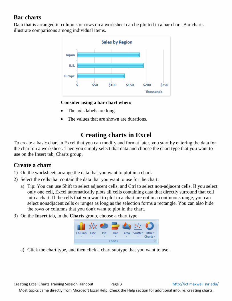
Bar charts
Data that is arranged in columns or rows on a worksheet can be plotted in a bar chart. Bar charts
illustrate comparisons among individual items.
Consider using a bar chart when:
The axis labels are long.
The values that are shown are durations.
Creating charts in Excel To create a basic chart in Excel that you can modify and format later, you start by entering the data for
the chart on a worksheet. Then you simply select that data and choose the chart type that you want to
use on the Insert tab, Charts group.
Create a chart
1) On the worksheet, arrange the data that you want to plot in a chart.
2) Select the cells that contain the data that you want to use for the chart.
a) Tip: You can use Shift to select adjacent cells, and Ctrl to select non-adjacent cells. If you select
only one cell, Excel automatically plots all cells containing data that directly surround that cell
into a chart. If the cells that you want to plot in a chart are not in a continuous range, you can
select nonadjacent cells or ranges as long as the selection forms a rectangle. You can also hide
the rows or columns that you don't want to plot in the chart.
3) On the Insert tab, in the Charts group, choose a chart type
a) Click the chart type, and then click a chart subtype that you want to use.

Creating Excel Charts Training Session Handout Page 4 http://ict.maxwell.syr.edu/
Most topics came directly from Microsoft Excel Help. Check the Help section for additional info. re: creating charts.
i) To see all available chart types, click a chart type, and then click All Chart Types to display
the Insert Chart dialog box. Use the scroll bar to scroll through all available chart types and
charts subtypes, and then click the one that you want to use.
Click a chart type to see
the subtypes.
Click
“All Chart Types…”
to display the
Insert Chart dialog box.
Tip: You can also click the Dialog Box Launcher next to
“Charts” in the Charts group to display the
Insert Chart dialog box.
ii) Tip: A ScreenTip displays the chart type name when you rest the mouse pointer over any
chart type or chart subtype.
iii) Tip: If you would like to create a default chart on a separate worksheet (a chart sheet), select
your data and hit F11.
4) The chart is placed on the worksheet as an embedded chart (Embedded charts are beneficial when
you want to view or print a chart with its source data or other information in a worksheet.). If you
want to place the chart in a separate chart sheet you can change its location. (A chart sheet is
beneficial when you want to view a chart separately from worksheet data.)

Creating Excel Charts Training Session Handout Page 5 http://ict.maxwell.syr.edu/
Most topics came directly from Microsoft Excel Help. Check the Help section for additional info. re: creating charts.
How to change the location of a chart
1) Click the embedded chart or the chart sheet to select it and to display the chart tools.
a) Tip: This displays the Chart Tools, adding the Design, Layout, and Format tabs.
2) On the Design tab, in the Location group, click Move Chart.
3) Under Choose where you want the chart to be placed, do one of the following:
a) To display the chart in a chart sheet, click New sheet.
i) Tip: If you want to replace the suggested name for the chart, you can type a new name in the
New sheet box.
b) To display the chart as an embedded chart in a worksheet, click Object in, and then click a
worksheet in the “Object in” box.
i) Tip: To quickly create a chart that is based on the default chart type, select the data that you
want to use for the chart, and then press ALT+F1 or F11. When you press ALT+F1, the chart
is displayed as an embedded chart; when you press F11, the chart is displayed on a separate
chart sheet.
c) If you use a specific chart type frequently when you create a chart, you may want to set that
chart type as the default chart type. After you select the chart type and chart subtype, in the
Insert Chart dialog box, click Set as Default Chart.
Resize a chart
To resize a chart, do one of the following:
1) Click the chart, and then drag the sizing handles to the size that you want.
2) On the Format tab, in the Size group, enter the size in the Shape Height and Shape Width box.
Rename a chart
When you create charts, Microsoft Office Excel assigns a default name to each chart by using the
following naming convention: Chart1, Chart2, and so on. However, you can change the name of each
chart to make it more meaningful to you.
1) Click the chart that you want to rename.
2) On the Layout tab, in the Properties group, click the Chart Name text box.
3) Type a new name.
4) Press ENTER.

Creating Excel Charts Training Session Handout Page 6 http://ict.maxwell.syr.edu/
Most topics came directly from Microsoft Excel Help. Check the Help section for additional info. re: creating charts.
Change the chart type
1) Do one of the following:
a) To change the chart type of the entire chart: click the chart area, or plot area, of the chart to
display the chart tools.
b) To change the chart type of a single data series: click that data series.
2) On the Design tab, in the Type group, click Change Chart Type.
3) In the Change Chart Type dialog box, do one of the following:
a) Click a chart type in the first box on the left, and then click the chart subtype that you want to
use in the second box on the right.
b) If you saved a chart type as a template, click Templates in the left box, and then click the chart
template that you want to use in the second box on the right.
i) Note: You can only change the chart type of one data series at a time. To change the chart
type of more than one data series in the chart, you must repeat all of the steps in this
procedure for each data series.
ii) Tip: If you use a specific chart type frequently when you create a chart, you may want to set
that chart type as the default chart type. After you select the chart type and the chart subtype
in the Change Chart Type dialog box, click Set as Default Chart.

Creating Excel Charts Training Session Handout Page 7 http://ict.maxwell.syr.edu/
Most topics came directly from Microsoft Excel Help. Check the Help section for additional info. re: creating charts.
Change the data source of the chart
1) Select your chart. On the Design tab, in
the Data group, click Select Data.
The Select Data Source dialog box opens.
2) Under Horizontal (Category) Axis Labels, click Edit and specify the worksheet range that you
want to use as category axis labels, or type the labels that you want to use, separated by commas,
for example: Division A, Division B, Division C.
a) Tip: You can also click the Collapse Dialog button at the right end of the Axis Label Range
box and then select the range that you want to use as category axis labels on the worksheet.
When you finish, click the Collapse Dialog button again to display the entire dialog box.
Note: If you type the label text in the Axis Label Range box, the category axis label text is no longer
linked to a worksheet cell.
3) To edit your series, under
Legend Entries (Series),
select a series and click Edit.
The Edit Series dialog box opens.
4) In the Edit Series Range box, specify the
worksheet cell that you want to use as a series
name – either by typing in the reference, or
using the Collapse Dialog button to select the
cell from your worksheet.
5) To change the series values that your name
refers to, type the range reference in the Series
values field, or use the Collapse Dialog button
to select the range from your worksheet.
6) Click OK to return to the Select Data Source
dialog box. Continue editing the Legend
entries, as needed, then click OK to return to
your worksheet.

Creating Excel Charts Training Session Handout Page 8 http://ict.maxwell.syr.edu/
Most topics came directly from Microsoft Excel Help. Check the Help section for additional info. re: creating charts.
Display hidden data and empty cells in a chart
By default, data that is hidden in rows and columns in the worksheet is not displayed in a chart, and
empty cells are displayed as gaps. You can, however, display the hidden data and change the way that
the empty cells are displayed. Rather than displaying gaps, you can display empty cells as zero values,
or you can span the gaps with a line.
1) Click a chart in which you want to display hidden data and empty cells.
2) On the Design tab, in the Data group, click Select Data.
3) Click Hidden and Empty Cells, and then do one of the following:
a) To define how empty cells are displayed in the chart, click Gaps, Zero, or Connect data points
with line.
b) To display hidden cells in the chart, select the Show data in hidden rows and columns check
box.
Modifying charts When you create a chart, the chart tools become available and the Design, Layout, and Format tabs are
displayed. You can use the commands on these tabs to modify the chart so that it presents the data the
way that you want. For example, use the Design tab to display the data series by row or by column,
make changes to the source data of the chart, change the location of the chart, change the chart type,
save a chart as a template, or select predefined layout and formatting options. Use the Layout tab to
change the display of chart elements such as chart titles and data labels, use drawing tools, or add text
boxes and pictures to the chart. Use the Format tab to add fill colors, change line styles, or apply
special effects.
What can I modify?
Change the display of chart axes: (An axis is a line bordering the chart plot area used as a frame of
reference for measurement. The y axis is usually the vertical axis and contains data. The x-axis is
usually the horizontal axis and contains categories.) You can specify the scale of axes and adjust the
interval between the values or categories that are displayed. To make your chart easier to read, you can
also add tick marks to an axis, and specify the interval at which they will appear. (Tick marks are small
lines of measurement, similar to divisions on a ruler that intersect an axis. Tick-mark labels identify the
categories, values, or series in the chart.)
Add titles and data labels to a chart: To help clarify the information that appears in your chart, you
can add a chart title, axis titles, and data labels (A data label provides additional information about a
data marker, which represents a single data point or value that originates from a datasheet cell.).
Add a legend: You can show or hide a legend, or change its location. (A legend is a box that identifies
the patterns or colors that are assigned to the data series or categories in a chart.)
Apply special options for each chart type: Special lines, such as high-low lines and trendlines, bars
(such as up-down bars and error bars), data markers, and other options are available for different chart
types.

Creating Excel Charts Training Session Handout Page 9 http://ict.maxwell.syr.edu/
Most topics came directly from Microsoft Excel Help. Check the Help section for additional info. re: creating charts.
What can I format?
Fill chart elements: You can use colors, textures, pictures, and gradient fills to help draw attention to
specific chart elements.
Change the outline of chart elements: You can use colors, line styles, and line weights to emphasize
chart elements.
Add special effects to chart elements: You can apply special effects, such as shadow, reflection,
glow, soft edges, bevel, and 3-D rotation to chart element shapes, which gives your chart a finished
look.
Format text and numbers: You can format text and numbers in titles, labels, and text boxes on a chart
as you would text and numbers on a worksheet. To make text and numbers stand out, you can even
apply WordArt styles.
Applying predefined layouts and styles Instead of manually adding or changing chart elements or formatting the chart, you can quickly apply a
predefined chart layout and chart style to your chart. Excel provides a variety of useful predefined
layouts and styles that you can choose from, but you can fine-tune a layout or style further, if needed,
by making manual changes to the layout and format of individual chart elements, such as the chart area
(the entire chart and all its elements), plot area (In a 2-D chart, the plot area is the area bounded by
the axes, including all data series. In a 3-D chart, the area bounded by the axes, including the data
series, category names, tick-mark labels, and axis titles.), data series (related data points that are
plotted in a chart. Each data series in a chart has a unique color or pattern and is represented in the
chart legend. You can plot one or more data series in a chart. Pie charts have only one data series.), or
legend of the chart.
When you apply a predefined chart layout, a specific set of chart elements (such as titles, a legend, a
data table, or data labels) are displayed in a specific arrangement in your chart. You can choose from a
variety of layouts that are provided for each chart type.
When you apply a predefined chart style, the chart is formatted based on the document theme (a
combination of theme colors, theme fonts, and theme effects.) that you have applied, so that your chart
matches your organization's or your own theme colors, theme fonts and theme effects.
Note: You cannot create your own chart layouts or styles, but you can create chart templates that
include the chart layout and formatting that you want.

Creating Excel Charts Training Session Handout Page 10 http://ict.maxwell.syr.edu/
Most topics came directly from Microsoft Excel Help. Check the Help section for additional info. re: creating charts.
Change the layout or style of a chart
You cannot save a custom layout or format, but if you want to use the same layout or format again, you
can save the chart as a chart template.
To select a predefined chart layout:
1) Click the chart that you want to format.
2) On the Design tab, in the Chart Layouts group, click the chart layout that you want to use.
a) Note: When the Excel window is reduced in size, chart layouts will be available in the Quick
Layout gallery in the Chart Layouts group.
b) Tip: To see all available layouts, click More .
To select a predefined chart style:
1) Click the chart that you want to format.
2) On the Design tab, in the Chart Styles group, click the chart style that you want to use.
a) Tip: To see all predefined chart styles, click More .
Change the layout of chart elements manually
1) Click the chart, or select the chart element for which you want to change the layout.
a) Tip: you can also select chart elements by using the drop down arrow next to the Chart Elements
box. (On the Format tab, in the Current Selection group, click the arrow next to the Chart
Elements box, and then click the chart element that you want.)
2) On the Layout tab, do one or more of the following:
a) In the Labels group, click the label layout option that you want.
b) In the Axes group, click the axis or gridline option that you want.
c) In the Background group, click the layout option that you want.
i) Note: The layout options that you select are applied to the element that you have selected.
For example, if you have the entire chart selected, data labels will be applied to all data
series. If you have a single data point selected, data labels will only be applied to the selected
data series or data point.

Creating Excel Charts Training Session Handout Page 11 http://ict.maxwell.syr.edu/
Most topics came directly from Microsoft Excel Help. Check the Help section for additional info. re: creating charts.
Change the style of chart elements manually
1) Click the chart.
2) Select the chart element you want to change by clicking it on the chart, or use the ribbon to select
the element. (On the Format tab, in the Current Selection group, click the arrow in the Chart
Elements box, and then select the chart element that you want to format.)
3) In the Current Selection group, click Format Selection, and then select the formatting options that
you want.
a) Tip: You can also apply a quick style to individual elements, or click Shape Fill, Shape Outline,
and Shape Effects in the Shape Quick Styles group on the Format tab, and then select the
formatting options that you want.

Creating Excel Charts Training Session Handout Page 12 http://ict.maxwell.syr.edu/
Most topics came directly from Microsoft Excel Help. Check the Help section for additional info. re: creating charts.
Reusing charts by creating chart templates If you want to reuse a chart that you customized to meet your needs, you can save that chart as a chart
template (*.crtx) in the chart templates folder. When you create a chart, you can then apply the chart
template just like you would any other built-in chart type. In fact, chart templates are true chart types,
and you can also use them to change the chart type of an existing chart.
If you use a chart template frequently, you can save it as the default chart type.
Note: Chart templates are not based on document themes. To use theme, theme fonts, and theme effects
in a chart that you create by using a chart template, you can apply a style to the chart. A chart style
resets the theme of a chart to the document theme.
Save a chart as a chart template
1) Click the chart that you want to save as a template.
2) On the Design tab, in the Type group, click Save As Template.
3) In the Save in box, make sure that the Charts folder is selected.
a) In the File name box, type an appropriate name for the chart template / Save
b) When you create a new chart or want to change the chart type of an existing chart, you can apply
the new chart template.
How to apply a chart template
1) Do one of the following:
a) To create a new chart based on the template: on the Insert tab, in the Charts group, click any
chart type, and then click All Chart Types.
i) Tip: You can also click the Dialog Box Launcher next to Charts in the Charts group on
the Insert tab.
b) To base the chart type of a selected chart on the template: on the Design tab, in the Type group,
click Change Chart Type.
2) In the dialog box, click Templates in the left pane (any templates you have saved will display on
the right), and then click the template that you want to use from the choices in the right pane.
a) Note: If you saved a chart template in a folder other than the Charts folder, click Manage
Templates, locate the chart template, and then copy or move it to the Charts folder under
Templates.