ms excel _working with charts
DESCRIPTION
working with chartsTRANSCRIPT

Copyright Trainedge, All Rights Reserved
Chapter 8: Working with Charts
Charts in Excel
Chart Tools Tabs
The Anatomy of a Chart
Creating Charts
Changing Chart Type
Exercise 1: Creating Charts
Editing Charts
Changing Data Source
Changing Chart Style / Appearance
Resizing Charts
Moving Charts
Changing Chart Layout
Managing Chart Labels
Managing Axes Layout
Adding a Trendline to Chart
Naming Your Chart
Formatting Chart Area and Labels
Exercise 2: Editing Charts

Copyright Trainedge, All Rights Reserved
Chapter 8: Working with Charts
In this chapter, you will learn how to create, manage and edit charts.
Charts are a visual representation of your data. You will learn about the different types of charts
in Excel, how to create & format charts and how to print charts in Excel 2010.
You will need the data files or workbooks that came with this course for some of the exercises in
this chapter. Please download the workbooks if you have not already done so.

Copyright Trainedge, All Rights Reserved
Charts in Excel
In Excel 2010, you can create many different types of charts to visually represent and analyze
your data. You can create charts in Excel from the Charts group on Insert tab.
Some of the common chart types in Excel are:
Column
You can plot data in columns or rows on a worksheet as a column chart. They are useful for
comparing data across time or between two or more items. In column charts, categories are
typically organized along the horizontal axis and values along the vertical axis.
Line
If you want to look for trend in your data, you can plot it in a line chart. Line charts can display
continuous data over time and are ideal for illustrating trends in data. In a line chart, category
data is distributed evenly along the horizontal axis, and all value data is distributed evenly along
the vertical axis.
Pie
You can use pie chart to represent a one-dimensional data, i.e., data which is arranged only in a
row or column. Each data point is represented as a percentage of the sum of all data points.
Bar
You can use a bar chart to display data arranged in columns or rows in a worksheet. It shows
comparisons among individual items. You should use a bar chart when the axis labels are long
or the values to be plotted are durations, not point values.
Copyright Trainedge, All Rights Reserved
Area
Use area charts to emphasize the magnitude of change over time or to highlight total value
across a trend. For example, data that represents profit over time can be plotted in an area
chart to highlight total profit. This chart also illustrates the relationship of parts to a whole.
Scatter
You use a scatter plot to show the relationships among the numeric values in several data
series, or plot two groups of numbers as one series of (x,y) coordinates. The plot shows one set
of numeric data along the horizontal axis (x-axis) and another along the vertical axis (y-axis). It
combines these values into single data points and displays them in irregular intervals, or
clusters. Scatter charts are typically used for displaying and analyzing scientific, statistical, and
engineering data. You should use a scatter chart when:
Values along the horizontal axis are not evenly spaced
There are too many data points on the horizontal axis making other plots difficult to use
Worksheet data includes pairs or grouped sets of values
There are similarities between large sets of data
Data is compared without regard to time
For a scatter chart, enter the x values (horizontal) in one row or column, and then enter the
corresponding y values (vertical) in the adjacent rows or columns.
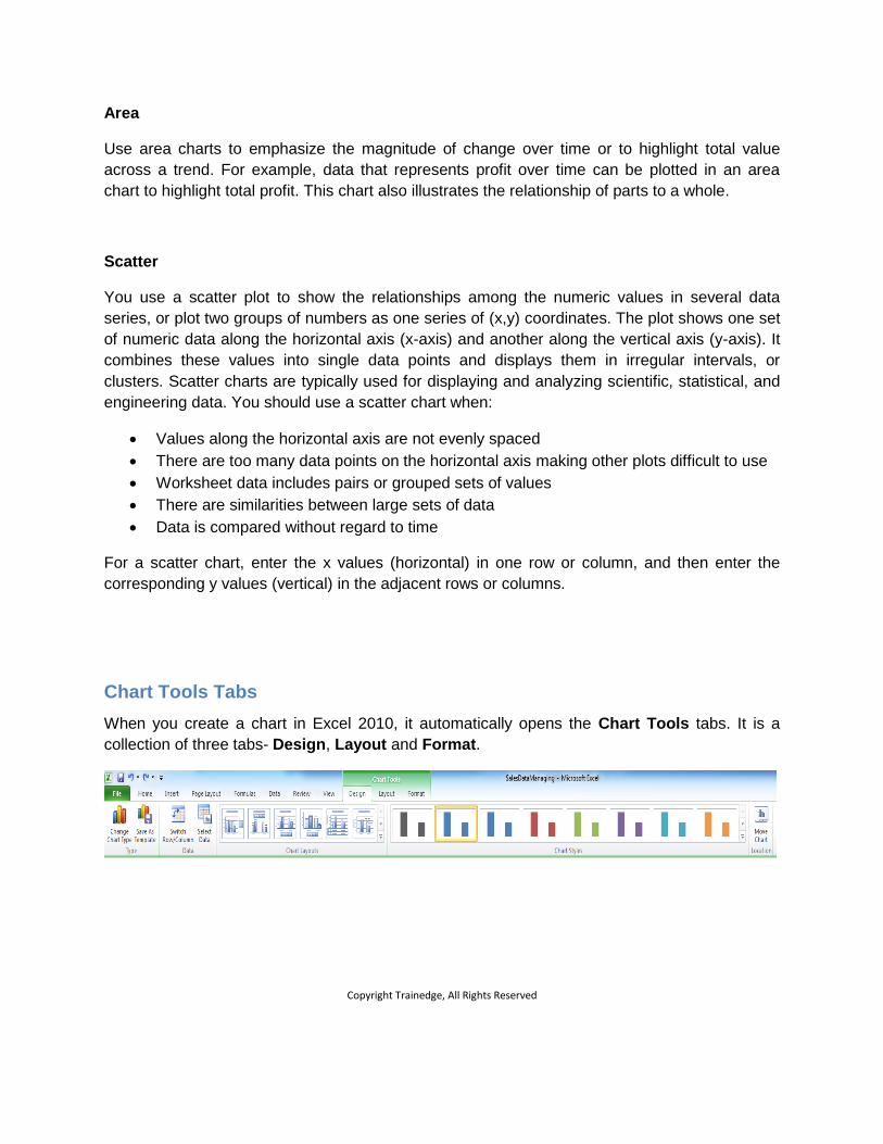
Chart Tools Tabs
When you create a chart in Excel 2010, it automatically opens the Chart Tools tabs. It is a
collection of three tabs- Design, Layout and Format.

Copyright Trainedge, All Rights Reserved
These are called contextual tabs. You use these tabs to change the appearance of your charts,
change chart type, chart legend, data source and text formatting in the chart, amongst others.
The Anatomy of a Chart
An Excel chart has many elements. The standard elements of a chart are:
The chart area which includes the chart itself and all other elements
A data marker that represents a single value in your data
The group of values used in the chart is called chart data series. Pie chart has only one
data series.
The axis of the chart is a reference line used to create the chart. A two dimensional
chart has two reference lines – X-axis (the horizontal axis) and Y-axis (the vertical axis).
Only Pie chart does not have an axis.
The axis is divided into small segments using a tick mark; much like centimeter or inch
marker is used on a Ruler.
Sometimes, you may draw straight lines through the tick marks to make it easier to read
the chart. The lines from the two axes will intersect each other and form a grid so these
lines are called Gridlines.
Every chart has some text to explain it. Typically, a chart will have two types of text –
Labels and Legends. Labels are titles used for the chart, axes or the data. Legends
define how to interpret the colours, symbols or patterns used in the chart.

Copyright Trainedge, All Rights Reserved
Creating Charts
You use charts to create a visual representation of your data.
Select the data you want to represent in the chart. On the Insert tab, in the Charts group, click
on the chart type you want to create. Excel inserts the chart in the current worksheet.

Copyright Trainedge, All Rights Reserved
Changing Chart Type
You can change the chart type anytime from the Chart Tools Design contextual tab.
Click on the Change Chart Type tool.
Excel displays the ‘Change Chart Type’ dialog box.
Select the new chart type and click OK.
Excel displays the new chart.

Copyright Trainedge, All Rights Reserved
Exercise 1: Creating Charts
In this exercise, you will learn how to create a chart in Excel.
You need the SalesDataManaging workbook located in your practice files for this exercise.
Open the file and follow the steps:
1. Select cells A3:F15. The cell contains data for charting
2. Click on the Column tool in the Charts group on the Insert tab.
3. Select 3-D Clustered Column (first option in second row) from the drop down list
4. Excel displays the column chart.
5. Click on the Change Chart Type tool on the Chart Tools Design contextual tab.
6. In the Change Chart Type dialog box, select the first option under Bar.
7. Click OK.
8. Excel displays a bar chart now in place of column chart.
9. Save and Close the workbook.

Copyright Trainedge, All Rights Reserved
Editing Charts
You can edit a chart if you do not like how it looks or if you need to change the data used for
charting.
Changing Data Source
Click the chart. Excel displays the contextual Chart Tools tabs. Click on Select Data tool in the
Data group on the Design tab.
Excel displays the Select Data Source dialog box.
The Chart data range input box shows the data range used for the chart. You can change the
data used for the chart by changing the cell references in this box.

Copyright Trainedge, All Rights Reserved
As you can see, Excel now displays only Sales in Kg as the data range was changed.
Switch Row/Column button flips the X and Y axes. Click this button if you want the data
currently on the X-axis (horizontal) to be on the Y-axis.

Copyright Trainedge, All Rights Reserved
As you can see, Excel has switched the axes in the chart.
You can also switch rows with columns by clicking the Switch Row/Column tool in Data group
on the contextual Design Chart Tools tab.
Legend Entries (Series) lists the data series to be plotted along the Y-axis. You can choose to
display all data or specific series. Select the series you do not want to display and click the
Remove button.

Copyright Trainedge, All Rights Reserved
The illustration below shows the same chart showing only Percentage of Total Sales data.
You can add a new data series by clicking on Add button.
To edit the data range or name of an existing series, click Edit button.
The Horizontal (Category) Axis Labels displays data category labels to be used along the X-
axis. You can edit the values or range by clicking on the Edit button.

Copyright Trainedge, All Rights Reserved
Changing Chart Style / Appearance
Excel has a number of predefined chart formats you can choose from the Chart Style gallery to
change the appearance of your chart.
Select the chart you want to format. Click the more Arrow in the Chart Styles group on the
Design Chart Tools contextual tab.
Excel displays the Chart Style gallery. Click the style you want to apply to your chart.
Resizing Charts
At times, you may want to increase / decrease the size of your chart. Making the chart bigger
makes it easier to read it. You may want to reduce the size if the chart makes it difficult to read
the data.

Copyright Trainedge, All Rights Reserved
Select one of the corners of the chart and drag it to make the chart bigger / smaller. Release the
mouse when you are happy with the size of the chart.
Moving Charts
You can move the chart to a different location in the same sheet or to a different sheet. When
you move the chart to a different sheet, only the chart is moved to the new sheet, not the
underlying data.
Select the chart you want to move.
To move it to another location in the same worksheet, simply drag it to the new location.
To move it to another worksheet, click the Move Chart tool in the Location group on the
Design Chart Tools contextual tab.
Excel displays the Move Chart dialog box.
If you want to move the chart to an existing worksheet, select the Object in radio button and
select the desired worksheet name in the drop down list.
If you want to move the chart to a new worksheet, select the New sheet radio button and type
the name of the new worksheet.

Copyright Trainedge, All Rights Reserved
Click OK button.
Changing Chart Layout
Excel has a number of predefined chart layouts you can choose from the Chart Layouts gallery
to change the layout of your chart.
Select the chart you want to format. Click the more Arrow in the Chart Layouts group on the
Design Chart Tools contextual tab.
Excel displays the Chart Layouts gallery. Click the style you want to apply to your chart.
Excel applies the layout to your chart.

Copyright Trainedge, All Rights Reserved
Managing Chart Labels
You manage chart labels with the tools in Labels group on the Chart Tools Layout contextual
tab.
You can add or remove chart title with the Chart Title tool.

Copyright Trainedge, All Rights Reserved
You can control placement and style axis titles with Axis Titles tool.
You can control the placement of Legends with the Legend tool.
Using the Data Labels tool, you can control where Excel displays the data labels in the chart.

Copyright Trainedge, All Rights Reserved
You can display the data table for the chart inside the chart using the Data Table tool.
Excel displays the data table inside the chart as shown in the illustration

Copyright Trainedge, All Rights Reserved
Managing Axes Layout
You manage axes labels with the tools in Axes group on the Chart Tools Layout contextual
tab.
With the Axes tool, you control how Excel displays the horizontal and vertical axes. With this
tool you can control how the axes are labeled and how data is displayed along the axes.

Copyright Trainedge, All Rights Reserved
You can turn horizontal and vertical gridlines off or on with the Gridlines tool.
For example, if you click the Major Gridlines option, Excel displays major gridlines along the
axis as illustrated below:

Copyright Trainedge, All Rights Reserved
Adding a Trendline to Chart
Trendlines show inherent trends in your data. For example, a Trendline in a chart showing the
price of a stock will show how the price of the stock has changed over time. It is a very powerful
tool for visually analyzing your data.
Select the chart you want to analyze with Trendline. Click the Trendline tool in the Analysis
group on Chart Tools Layout contextual tab.
Excel displays the options for the tool.

Copyright Trainedge, All Rights Reserved
Select the type of Trendline you want to add to your chart. The illustration below shows a Linear
Trendline for Sales in Rupees data series.
Naming Your Chart
You can give your chart a meaningful name to make it easier to remember what it represents.

Copyright Trainedge, All Rights Reserved
Select the chart you want to rename.
Click inside the Chart Name: text entry box in Properties group on the Chart Tools Layout
contextual tab.
Type the name you want and press ENTER.
Excel renames the chart.
Formatting Chart Area and Labels
You format any text like labels and legends in a chart the same way you format any other text in
Excel.
Select the desired formatting options from the Font and Alignment groups on the Home tab.
You can also format individual text elements in the chart using tools in the WordArt Styles
group on the Chart Tools Format contextual tab.
Select the text element you want to format in the chart. If you want to apply the effect to all text
elements, select the chart.
Click on the More Arrow in the WordArt Styles tool to display the predefined WordArt Style
gallery.

Copyright Trainedge, All Rights Reserved
Select the style you want to apply to your text.
To only change the colour of the text without applying any predefined style, click on the Text Fill
tool and select the desired colour.
To change the outline colour of the text without applying any predefined style, click on the Text
Outline tool and select the desired colour.
To apply special effects like shadow and reflection, click on the Text Effects tool and select the
desired effect.

Copyright Trainedge, All Rights Reserved
You can apply predefined styles to the chart area or a specific chart element with the help of
tools in the Shape Styles group on the Chart Tools Format contextual tab.
Select the chart element. If you want to apply the style to the area, select the chart.
Click on the More Arrow in the Shape Styles tool to display the predefined Shape Style
gallery.
Place the cursor over different styles to see a preview of how the chart or the element will look
with that style.

Copyright Trainedge, All Rights Reserved
Click on the style you want to apply. Excel applies the style to the element or the chart area.
To only change the colour of the element without applying any predefined style, click on the
Shape Fill tool and select the desired colour.
To change the outline colour of the element without applying any predefined style, click on the
Shape Outline tool and select the desired colour.

Copyright Trainedge, All Rights Reserved
To apply special effects like shadow and reflection, click on the Shape Effects tool and select
the desired effect.
Exercise 2: Editing Charts
In this exercise, you will learn how to change the appearance of a chart using Chart Tools
contextual tabs.
You need the SalesDataManaging workbook located in your practice files for this exercise.
Open the file and follow the steps:
1. Click on the chart you created in Exercise 1
2. Excel displays the contextual Chart Tools tabs. Click on Select Data tool in the Data
group on the Design tab.
3. In the Select Data Source dialog box, click the Chart data range input box.
4. Delete the existing cell range
5. Select cells A3:B15 and click OK. Excel displays only Sales Volume data series in the
chart.
6. Click on the chart you created in Exercise 1
7. Excel displays the contextual Chart Tools tabs. Click on Select Data tool in the Data
group on the Design tab.
8. In the Select Data Source dialog box, click the Chart data range input box.

Copyright Trainedge, All Rights Reserved
9. Delete the existing cell range
10. Select cells A3:F15 and click OK. Excel again displays all data series in the chart.
11. Click on Select Data tool in the Data group on the Design tab.
12. In the Select Data Source dialog box, in the Legend Entries (Series) list, select List
Price and click Remove button.
13. Repeat step 12 for Discount and Net Price data series. Notice that Excel removes
these data series from the chart as you click on the Remove button.
14. Click on Switch Row/Column button. Excel now changes the display. Click the button
again to revert to the original chart display.
10. Click on the Change Chart Type tool on the Chart Tools Design contextual tab.
11. In the Change Chart Type dialog box, select the fourth option under Line.
12. Click OK.
13. Excel displays a Line chart.
14. Click the fifth option, Layout 5, in the Chart Layouts group on the Chart Tools Design
contextual tab.
15. Excel changes the layout to show the data series in the chart.
15. Select the bottom right corner of the chart and drag it to make the chart bigger. Release
the mouse when the chart is big enough to clearly display all the elements.
16. Click on the text element Chart Title and type Monthly Sales Performance
17. Click on the chart to deselect the text box
18. Click the More Arrow in the Chart Styles group on the Design Chart Tools contextual
tab.
19. Click on any style you like in the Chart Styles gallery. Excel applies the style to the chart
20. Click on the Legend tool in Labels group on the Chart Tools Layout contextual tab.
21. Select Show Legend at Right option from the drop down list. Excel displays the legend
on the right side of the chart
22. Click on Gridlines in the Axes group on the Chart Tools Layout contextual tab.
23. Select Primary Horizontal Gridlines and then select Major Gridlines. Excel displays
horizontal gridlines
24. Click the Trendline tool in the Analysis group on Chart Tools Layout contextual tab.
25. Select the Linear Forecast Trendline from the drop down list.
26. Select Sales Volume in the Add Trendline dialog box and click OK
27. Excel adds a Trendline to your chart and extends the line in future to show expected or
forecasted sales volume for next month.
28. Select Chart Title text element
29. Click the More Arrow in the Shape Styles tool in Shape Styles group on the Chart
Tools Format contextual tab.
30. Select a style from the Style Gallery. Excel applies it to Chart Title text element.
31. Save and Close the workbook