color and design : dominant notes of the modern home
TRANSCRIPT

h MARCIA MEADOWS
Colonial Draperij Fabrics

COLOR AND design- dominant NOTES OF THE MODERN HOME
The Personality of Homes
HOME is most artistic and in finest taste when it expresses the
personality of its owner; when it extends the warmth of the
hostess’ welcome to guests and friends — when it is friendly
and hospitable, and shows this in every aspect. This is what we hope
to help you achieve — a home of friendly welcome to your friends — a
colorful, peaceful, artistic retreat for your family. Our endeavor is to
give you here the principles of harmonious color, balance and deco¬
rative effect which can be applied to the average home.
Today informality is the keynote — of dress, of
fellowship, of entertaining, and of interior decoration.
Lavish use of color, too, is another motif typical of today.
Design and artistic taste collectively and individually have
progressed far.
As you read over the principles of interior decoration
outlined in this book, select rooms to which you can apply
these rules, and visualize each step, bearing in mind several
important points:
1. The particular “type,” if any, of your home. Is it a period style, Colonial, Early English, Spanish—or is it a comfortable every¬ day American home? There are styles and colors of both furniture and draperies which adapt themselves beautifully and quite ideally to each of these types.
2. The size of the room — and the light that enters it. Is the room large or small? Dark or light? There is individual treatment for the small dark room and the small light room; for the large dark room and the large
Consider 12'xl7' as an average size living room; Il3^'xl5' as an average size dining room; 10'xl4' as an average size bedroom.
3. The proportion of the room. Proportion applies to both color and form, and includes floor, walls, ceiling, furniture and draperies.
4. Purpose of the room. Dining — Sleeping — Reading — Living.
Copyright 1928 Marshall Field & Company
Wholesale Departments of
Colonial Drapery Fabrics
light room.
£2}

5.
6.
The exposure of the room.
Do the windows face to the north or south, east or west? This should be the important factor in choosing the color scheme for a room, rather than one’s personal liking for a color.
Some materials and colors absorb light while others reflect it.
We must let this fact govern our choice of fabric for draperies and curtains. Remember, too, that colors have a tremendous emotional value, as is pointed out on page 28.
7. And lastly, the type of windows in the room. Are they high and narrow; deep and wide; are they hinged casements or the regu¬ lation check-rail type; single or in groups?
Many women do not realize that the windows of a room are per¬ haps the most important single feature of it. Windows can mar its cheer and comfort so easily — or they can give it the most entrancing, most friendly aspect! Everyone readily understands that the glory of a home or of a room often lies in the beautiful natural light — and the lights and shades created thereby — when it is admitted through windows artfully curtained.
Decorators place emphasis on the importance of
properly curtaining and draping windows, so as to set off to
best advantage the room and its contents. Because windows
play such an important part in the beauty of a room,
they should be dressed as fittingly, as charmingly and as artistically as
possible.
This book has been written especially to help women with average
homes — not for those who have palatial mansions and unlimited space
and means. We hope to show how easily new and perfectly charming
effects can be secured by simply rearranging the furniture, changing
the draperies, and taking advantage of the plain walls or unobtrusive
wall papers which form such attractive backgrounds for colorful acces¬
sories.
It is not possible for all of us to buy a new rug or new furniture
whenever we want it — even though what we have may not be as
colorful or inviting as we could wish. But we can “remake”
our rooms with comparatively small expenditure when we
learn the joy and “knack” of redressing the windows and
furniture. With a knowledge of the underlying principles
of the art of home decoration, reinforced by your own
good taste, your dreams of a beautiful home can be real¬
ized—a home that is a friendly, hospitable retreat.
a reflection of your own personality.
1:3}

(1^ /lyyyuxM.
-IMMAjoLc-totJ, ia^tUA^ 'YUKcL cuaJ xv-uf. ^ Jot''
^ "ujAJ yUi^'-. -*-f - i>- —,i><../_
VkL^
Problem of a Small Living Room
(^^^T^ARTICULARLY in the case of a small apartment, glass curtains / should be made of the same fabric. This applies to the over-draperies
as well. We observe this rule even when the room is large, provided it is all one room; in other words, it is only when rooms are separated by French doors or in some other manner, that windows are curtained and draped with different fabrics.
Small rooms can be charmingly decorated, as you will see by the photograph of the gay little living room on the opposite page. Because this room faced to the west and so received sunlight for a large part of the day, we selected a cool grayish beige for the wall paper; the woodwork is in ivory. The cool blue and green tones of the black-ground rug are harmoniously carried out in the painted green rush-seat chair and the silvery green vase. The glass curtains are sheer and soft, fashioned of Colonial Venetia Gauze, and over them are hung the delightful draperies which give such a joyous atmosphere to the room. For these a beautiful exotic floral pattern of Chinese Chippendale influence was selected. It is Colonial Town and Country Cretonne, quite apparently hand-printed, simulating wonderfully well the interesting hand-blocked linens of olden times. The little love seat is upholstered in the same material, and so provides a desirable note of unity. Colors of the accessories —• lamps of brown, ivory, blue . . . books with various hued backs—are in complete accord; and there is a final note of good taste in the mahogany furni¬ ture which so nicely contrasts and accents the greens and blues which are the dominant colors in the room.
There is an adequate, yet not at all excessive or too elaborate quantity of furniture—tea wagon, Windsor chair, Chippendale desk chair, lovely Governor Winthrop desk, and walnut gate-leg table.
Now let’s go back and pick up threads of this description, so to speak, and see wherein this living room, though limited in size, car¬ ries out the principles of good decoration and harmonious color combi¬ nations.
Being a west room, it required cool shades; witness the green and blue tones. To avoid monotony, spots of complementary color (the complements of each color and an explanation of them are given on page 28) were used in the reddish brown lamp shade, and the rose and ecru in draperies and love seat. The floor or foundation is darkest, the walls lighter, ceiling lightest, as they always should be to avoid a “top- heavy” or unbalanced effect. The pictures and small accessories are well placed, not confusing in arrangement; neither do they cause a crowded appearance.
In short, can you conceive a small living room decorated in a more livable, artistic manner?
£4}
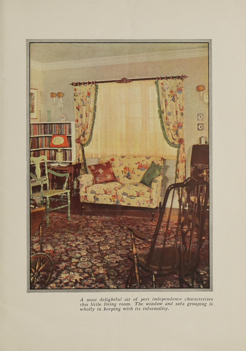
A most delightful air of pert independence characterizes this little living room. The window and sofa grouping is wholly in keeping with its informality.

Matters to Consider in Planning the Decoration
S you consider the decoration of a room, step back from it and study its proportions. Are the ceilings high or comparatively low? Is the room narrow and long, or almost square? If the ceilings
are low, an appearance of height can be effected by the use of a perpen¬ dicularly striped wall paper; if too high, remedy this by using an all- over pattern or a design which seems to have a horizontal feeling. If the room is oblong, decorating is simpler: arrange the furniture around the center of interest —• keeping the larger pieces always in line with the boundary or structural lines of the walls. A fireplace is a logical and delightful center of interest; but if the room has none, then create such a center. It may be a grand piano, a reading table with choice books and lamps, a group of windows. If the room is square, it is more diffi¬ cult to maintain an artistic balance. Lacking a fireplace, you can create a center of interest along one wall; then along the opposite wall have two smaller groups of furniture, of less interest, or perhaps only one group to provide balance and equilibrium.
After considering the proportions of the room, turn for a moment to the walls. They form the background and their large areas should not be dominant in color or design; otherwise the important features of the room will be minimized. Think of all the wall spaces as settings for the windows and doors which, when attractively and correctly treated with Colonial Drapery Fabrics, become beautiful pictures. Can you now see how much more restful and appropriate neutral-toned walls are than those with prominent patterns?
The next important matter is the room’s exposure. With win¬ dows facing north or east it receives little sunlight. So the ingenious decorator uses a scheme which dominates in warm colors, by this means introducing a cozy, bright and cheerful atmosphere despite the lack of brilliant light. Rooms which have a southern or western exposure, and are consequently flooded with natural light, need a color that contrasts this brilliance. To afford restfulness choose cool colors. “Warm” and “cool” colors are terms having definite meaning in the minds of decorators.
The foregoing are not the only points we must consider in deciding on the color keynote for a room. Its purpose — for dining, sleeping and resting, or general living — is equally important. In the dining room, where the family spends at most a few hours each day, we can introduce a greater amount of vivid colors and striking designs. In a living room
or a bedroom greater thought should be exercised to obtain the proper effect, in the one case, of easy relaxation; in the other, of restfulness.
The size of the room and the amount of light it receives enter largely into the decorative scheme. The appropriateness of design in fabrics selected should correspond to the char¬ acter of the room. Large or bold designs may be appropriate for a large room, but are out of
Incorrect Arrangement
[6}

keeping in a small one. In the smaller room designs should be con¬ fined to the smaller patterns in draperies, rugs and upholstery.
When fabrics of different designs are selected for the same room, discretion should be exercised in choosing patterns and colors. An excel¬ lent example of two happily combined fabrics entirely different in design, occurs in the Early American bedroom on page 21. Notice the side chair with slip-cover seat of Colonial Charlton Chintz, which provides a gracious variation from the Toile de Jouy draperies and bedspread.
If the room is dark, whether large or small, introduce as much light as possible; resort to the color of the sun: use yellow in its various values. If the room receives an abundance of natural light, temper it by offering contrast and relief through neutralized colors.
Absorption or reflection of light should play a most important role in the selection of fabrics for draperies and upholstery. This is affected materially by the texture as well as by the color. Naturally light colors reflect light; dark colors absorb light. While smooth textured fabrics, like cretonnes, chintzes and most damasks, reflect light, the pile fabrics, especially velvets and mohairs, absorb a great deal of light.
Therefore, if the room is small, refrain from using colors and fabrics which absorb light, and which therefore make the room seem darker and smaller. A maroon velvet would be a splendid choice for a large room, since it absorbs light, thereby making the room appear smaller ■— pulling it together, as it were. A chintz with cream ground and dainty sprigs of flowers, would serve ideally in a small room, because both the fabric and the color reflect light, and create an appearance of larger size.
One very important detail in planning a color scheme is to build from floor to ceiling. Floor and rug should be of the darkest color value, either plain or figured, to give a foundation to the room. The wall should be lighter, the ceilings lightest. As to whether ivory or mahogany, or a colored enamel is used for the woodwork, depends upon the color scheme to be followed.
In arranging furniture, large, heavy pieces should be placed parallel to the structural lines of the walls, though for a variation a small chair or table may be placed at an angle (see diagram of incorrect setting at left, the correct at right). The old-fashioned method of arranging the furniture diagonally to the walls is considered bad form, as it gives a distracting appearance to the room. You know how disorderly a room looks with davenport, long table, desk, piano, and rugs at “sixes and sevens.” Interest is added where the furniture is grouped about the most important feature of the room such as a fireplace or a large reading table.
When you have fixed in your mind these underlying principles of artistic effect in home decoration, they will not appear in the least confusing — for they are as sound as the rules by which you work out a mathematical problem.
Correct Arrangement

Treating a Spanish-tgpe Living Room In Its True Character
N GENERAL, the styles of homes most in favor today are the Early English, the Spanish and the Colonial types. Each of these has its distinct features, and each must be differently treated and decorated
in order to attain a harmonious and consistent effect. In these pages, we shall concern ourselves only with the outstanding characteristics of the interiors.
Being somewhat more foreign to us than the other two types, the Spanish-type home is a bit more sophisticated, but it has colorful and delightful possibilities of interior decoration which are adaptable to modern American needs. The Spanish style is distinguished by the lavish use of rich, deep reds, old blues, golden yellows and moss greens; walls usually of rough-finished plaster in cream or beige; high-backed, formal chairs of great dignity; tall windows heavily draped and curtained; stately wrought iron accessories; massive chests.
If you are planning a room or a home in this Latin style, the vista of the Spanish-type living room with sun room beyond will be interesting. The brilliant red and gold of the Colonial Winfield Damask draperies in an antique weave are extremely effective and the rug in sympathetic tans and red-browns is in true harmony. Typical wrought iron and copper accessories were used to carry out consistently the theme of the room.
Because the home as a whole should be unified in appearance, and particularly rooms in close proximity, the sun room carries the dominant color notes of the living room. In the late nineteenth century, when real atrocities of interior decoration were accepted, it was the general practice to decorate each room, both in color and style, without any thought of its neighbor. Today good decoration sponsors more harmony —■ fewer dis¬ tracting influences. We work for a unified whole in our homes, without bringing into the scheme so much similarity of color or line that uninter¬ esting monotony is the result. This sun room illustrates very well this principle of decoration. Here we used a Colonial Town and Country Cretonne—in gay colors on a linen-colored ground. Design Ravello — which contrasts nicely with the red tones of the living room, definitely re¬ lating the sun room to the major theme. The green of the design offers a complement, whereas the black repeats the color of the iron fern stand. The green of the ivy gives a further complementary color note and af¬ fords a charming touch of animation. Then there are the lovely reds and blues of the chair seats, and the parchment color of the lamp¬ shade, which is toned deeper than the walls.
Now, reviewing all this, we find that the living room is dis¬ tinctly a colorful, dignified Spanish style, while the sun room beyond is an entity too, although it follows the keynote set by the main room.

There is a charming and informal vista of the sun room through the arched doorway of this stately Spanish living room—each room is a distinct entity.

A Matter of Portieres, Window Seats, and Things
ERE is one problem that puzzles many a skilled home-maker
living in an apartment or house of average size. The answer is
definite. No, indeed — do not use the same pattern of fabric in
both rooms; treat each as a separate unit, but decorate each unit so that
it contributes harmoniously to the whole. If you are using a brilliantly-
hued cretonne of striking design for the dining room, then
you may select another cretonne or a chintz perhaps, of
entirely unlike design for the living room—or a damask.
The dominant color of the dining room draperies would
then be repeated in some part of the design of the living
room draperies. As for the glass curtains to cover the
French doors, they are not troublesome to make, and on
another page, you will find directions for them.
One question invariably raises another—this prob¬
lem immediately brings to mind the use of portieres
—when, and how, and why?
Sometimes we use portieres in lieu of a door, some¬
times to give the effect of a door when none is there, and
sometimes simply for effective decoration. The question
of what sort of material to use for them depends on the room. If you
have several windows in the room, hung with over-draperies of figured
cretonne, then it may be advisable to use a plain-colored fabric for your
portieres, to prevent a monotonous effect.
As for window seats, they are things of joy! To
ensconce one’s self in the depths of one of these nooks,
particularly if it is decoratively and colorfully adorned
is supreme comfort.
If you already have a cozy window seat in one of
your rooms, count yourself among the fortunate. And
if you have not, this can very easily be remedied.
Notice on next page an illustration of a shallow
bay, into which a seat with book shelves below has been
built. The draperies of Town and Country Printed Linen,
[10}

Design Ribbonrose, are in extremely good taste. The
single shaped valance gives continuity of line to the
bay and makes it definitely a part of the room.
In the illustration below, a window nook was
added in the home of a client when the house was
remodeled. Architecturally the room was much
improved by the addition of this seat, which was
placed in front of a group of two ordinary, every-day
windows. At the same time a long, low radiator in front of this group
was made a thing of beauty and utility instead of an unsightly necessity.
The installation of the window nook was a simple matter: a car¬
penter covered the length of the radiator with a board, lined with metal
to prevent danger during the winter months. At either end of this board,
narrow open-shelved bookcases were built, providing the end enclosures
which the seat needed. The windows were draped with the beautiful
curtains of Colonial Town and Country Newton Cretonne, in a modern¬
ized design named Bloomsquare. This made the delightful little window
nook you see at the bottom of the page. Attractive, isn’t it?
The bookcases and end seat were lacquered in walnut color to
harmonize with the furniture and woodwork of the room. We fashioned
a soft, deep seat-pad to fit exactly the size of the seat, and covered it in
a pert, water-proof Colonial Glazed Chintz. This was a particularly good
choice, as it could easily be sponged if the children curled up luxuriously
in the nook with no thought of damp and muddy feet. Pillows heaped
around made the seat more inviting still, and the finished effect was re¬
markably cozy, cheery and restful. So many homes could be made more
attractive with an idea of this kind.
The modern knife-pleated lamp shades of parchment with chintz
backing are interesting and so very simple to make—one might hesitate
about paying the high prices asked for these in the smart decorating
shops. Secure plain parchment paper, back it
with a transparent Colonial chintz suitable in
color and design for your room. This chintz is
fixed to the parchment with clear white shellac.
Pleat or have steam-pleated in about 1-inch
pleats, cut the lower edge into points, mount
on enameled wire frame, tie with black silk
cord and tassels, and presto!—you have a new
lamp shade, ultra-moderne, with all the “air”
of the Rue Rivoli.
[11}

COLOMlftL ftRCHED
Color and Good Taste Are Expressed in This Living Room eOLORFUL, comfortable, livable — that’s the sort of living room
most of us want in our homes. And when it is artistic and in good taste, cheerful enough to bring out the joy of living, restful enough
to give us the repose we need after strenuous days of activity, then it may well be viewed with pride, as a pleasant task well done. The present- day desire for color explains in great part why the use of cretonnes is so much advocated: they fit so charmingly and easily into our modern life — they offer such relief from the dull drab complexes of a few years ago. The warmth and brilliance of color in these cretonnes enliven our homes during wintry months . . . their radiant flowers and foliage and birds bring the glorious outdoor world into our rooms in all seasons.
The gracious, unpretentious type of living room on the opposite page is the sort the majority of us would like to have. Quiet, restful walls in ivory with panels of grayed ivory; a reproduction of a rare oriental rug in multi-colors, blending with the cretonne hangings. The striking Colonial Town and Country Cretonne draperies. Design Wygelia, won¬ derfully simulating the fine old-world hand-blocked cottons, set the color keynote of the room with their dominant rose-reds, greens and blues on black ground. Do you see how the green of them is unobtrusively picked up in the sofa of soft green damask? And how the large Queen Anne wing chair is slip-covered in cretonne, in which green predominates? The rose-red in the draperies is accented by the small upholstered armchair of rose color Colonial Pompadour satin-striped moire, and by the red parch¬ ment shade of the wrought iron lamp -— all warm tones which counteract the north light which the room receives.
Notice too, how the furniture, though not at all “matched,” is in harmony, each piece with the other. This is a principle of decoration which might well be followed generally. Complete sets are monotonous and not in good taste; but it is equally important that the various pieces used should all be of the same type, though the periods from which they have been chosen may be vastly different. For example, the light graceful types, such as Sheraton, Duncan Phyfe and Queen Anne, all combine well, while it would give an extremely bad effect to use with them a ponderous Jacobean or Elizabethan piece. These latter would combine well with the massive dignity of an Italian Renaissance piece of furniture.
In the room which is pictured, the walnut drum-top table of Duncan Phyfe style is most harmonious with the Georgian coffee table set with a real Wedgwood service. The Sheraton side chair is a lovely companion for the Queen Anne wing chair.
With these simple suggestions in mind, you will find it easy to achieve a harmonious, yet individual, charming home composed of in¬ teresting rooms.
Ciz}

This gay and amusing little room owes much of its vivacious air to the draperies with their ornamental edging.
About Curtains, Poles and Valances
ROM the many queries by women interested in
decorating their homes artistically, we find the
majority refer to window treatment of one sort or
another. The color of the draperies . . . the proper length of them . . .
the kinds of glass curtains that are best . . . when valances should be
used and when not . . . the style of poles in favor now . . . and so on.
Strangely enough, the selection of rugs and furniture does not offer the
vexatious problem to most women which the treatment of the windows
does. To help overcome this difficulty, we have treated windows and
their adornment more specifically, illustrating in this book many types
and styles of both windows and draperies. Now we come to several more
window accessories, such as poles, valances and curtains.
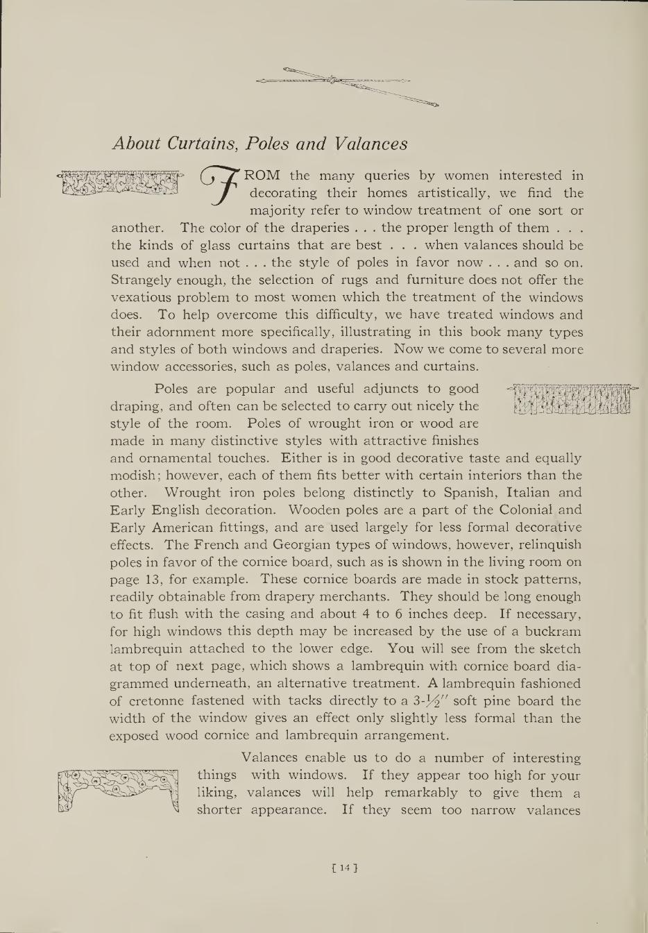
Poles are popular and useful adjuncts to good
draping, and often can be selected to carry out nicely the
style of the room. Poles of wrought iron or wood are
made in many distinctive styles with attractive finishes
and ornamental touches. Either is in good decorative taste and equally
modish; however, each of them fits better with certain interiors than the
other. Wrought iron poles belong distinctly to Spanish, Italian and
Early English decoration. Wooden poles are a part of the Colonial and
Early American fittings, and are used largely for less formal decorative
effects. The French and Georgian types of windows, however, relinquish
poles in favor of the cornice board, such as is shown in the living room on
page 13, for example. These cornice boards are made in stock patterns,
readily obtainable from drapery merchants. They should be long enough
to fit flush with the casing and about 4 to 6 inches deep. If necessary,
for high windows this depth may be increased by the use of a buckram
lambrequin attached to the lower edge. You will see from the sketch
at top of next page, which shows a lambrequin with cornice board dia¬
grammed underneath, an alternative treatment. A lambrequin fashioned
of cretonne fastened with tacks directly to a soft pine board the
width of the window gives an effect only slightly less formal than the
exposed wood cornice and lambrequin arrangement.
Valances enable us to do a number of interesting
things with windows. If they appear too high for your
liking, valances will help remarkably to give them a
shorter appearance. If they seem too narrow valances
CHI

will apparently add width. If the room is dark, and
the windows of only average size, it may be preferable
to omit the valances, as these may tend to exclude some
light. But they lend a most softening, gracious touch to
windows, and so we use them wherever possible.
Valances may be either pleated or shirred, but there are so many
styles which are appropriate and effective, that we are sketching several
to suit varied tastes. Valances, of course, are made of the same material
as the over-draperies. French pleated or shirred valances may be hung
from a rod.
Lambrequins are reserved for more formal treatment of windows,
and require extreme care in cutting, because they are always flat and
irregularities are easily discernible. Buckram, cotton flannel interlining,
and a sateen lining are necessary for the lambrequin, and it is advisable
to cut the pattern on these lining materials first. Some attractive patterns
for lambrequins are sketched.
Glass curtains should be used for all windows, with the possible
exception of casement windows which have small square or rectangular
panes of glass. These can be left uncurtained, using side-draperies only.
Glass curtains soften the light that enters, you know, and their colors
should be selected to harmonize with the tones of the wall, or the dominant
color of the draperies. They are loveliest when very simply made of sheer
transparent material, unless the plan is to use no side-draperies at all,
in which event the casement or glass curtains can be more elaborate.
Marquisette, voile, casement fabrics of silk, rayon and cotton, mohair
and cotton, or all cotton, grenadine, net, and gauze of rayon or silk
are considered most attractive for these curtains. Your choice of fabric
should depend on the texture of material you have selected for the dra¬
peries and other furnishings of the room. For example, silk or gauze are
more appropriate for an elaborately decorated room, while with cre¬
tonnes, chintzes, and linens. Opalescent Gauze voile, net or grenadine
is more suitable. As to the proper length for them, and simple direc¬
tions for the making, turn to page 30.
Draw-curtains as shown here are best when
made of casement cloth, as when drawn at night, they
allow artificial light within the room to be seen from
outside, without permitting passers-by to gaze into
the room. When draw curtains are used window
shades are generally dispensed with.
[15}
|i I I

The Rugged Charm of the Earlg English Room
a previous page, you remember we mentioned the Early English / type of home as being one of the styles much favored today. It
endears itself to us because of its quiet dignity and the substantial, rugged qualities of an earlier day. The English had need of strength and fortitude in their lives; they reflected it in their homes.
The characteristic interiors of Early English homes as they have been adapted to our modern needs, show walls of soft-toned wood paneling in place of plaster or paper— frequently beautifully finished oak — with heavy beamed ceilings. The furniture is massive for the most part, with an inclination to heaviness and intricate carving — witness the Eliza¬ bethan, Jacobean, and William and Mary types. The later English furni¬ ture, which we call as a group, Georgian, falls into four styles, with the Queen Anne in a transition period between the two groups. The later styles have lighter, more graceful lines — Chippendale, Hepplewhite, Adam, and Sheraton.
The popular and elegant Duncan Phyfe type of furniture, so much in favor today, does not belong to either of these groups. Duncan Phyfe was one of our own foremost American cabinetmakers and developed a graceful, chaste style of furniture. This type is erroneously classed, by some, as Early English.
The hangings of the Early English period were usually linens of natural color, heavily embroidered in bright and vari-colored wools, which came to be known as crewel embroideries. The types of fabric that are used to beautiful advantage in our modern adaptations of Early English rooms, are the lovely and colorful Colonial Town and Country Cre¬ tonnes, which simulate the Jacobean and Elizabethan patterns of these old crewel embroideries.
These Colonial Town and Country Cretonnes are printed by cylindrical wooden blocks, and their delightful irregularities are so nearly like the old-time linens printed by hand with wooden blocks that a fabric expert really cannot detect the difference. Many of these rich and colorful designs develop really enchanting effects in Early English rooms.
A dining room of dignity and richness in this Early English style is shown on the opposite page. Isn’t it simply brimming over with hearti¬ ness and hospitality? It is a north room; the color scheme to which the room has been keyed is found in the drapery fabric, a very happy choice. The deep browns of the oak paneling, the carved oak furniture, a rug in which red predominates, the warm brown leather of the armchair and the red slip seats of damask in the straight chairs, all are matched to colors in the window drapery. These draperies offer both analogous and complementary colors with their splotches of rose, red, green, gold and black on a linen colored ground. They are a Colonial Town and Country Cretonne, in a modernized Jacobean design, and help to form a balanced whole, a satisfying Early English dining room.
[16}

Draperies of modernized Jacobean design enhance the aspect of hearty good will and colorful richness of furnishing which characterize this dining room.
French Doors—
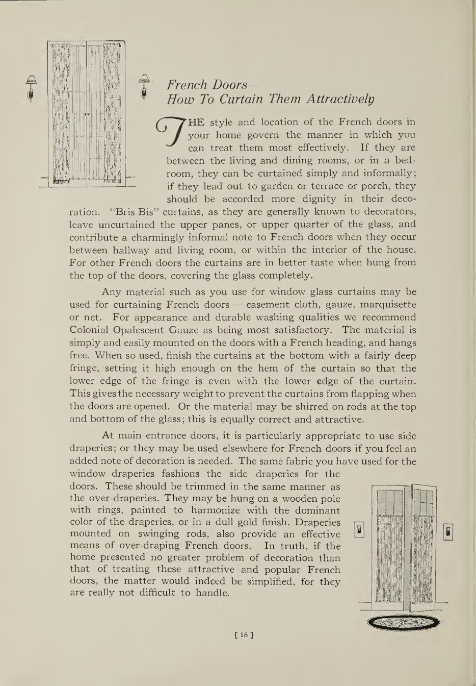
How To Curtain Them Attractively
9 HE style and location of the French doors in
your home govern the manner in which you
can treat them most effectively. If they are
between the living and dining rooms, or in a bed¬
room, they can be curtained simply and informally;
if they lead out to garden or terrace or porch, they
should be accorded more dignity in their deco¬
ration. “Bris Bis” curtains, as they are generally known to decorators,
leave uncurtained the upper panes, or upper quarter of the glass, and
contribute a charmingly informal note to French doors when they occur
between hallway and living room, or within the interior of the house.
For other French doors the curtains are in better taste when hung from
the top of the doors, covering the glass completely.
Any material such as you use for window glass curtains may be
used for curtaining French doors — casement cloth, gauze, marquisette
or net. For appearance and durable washing qualities we recommend
Colonial Opalescent Gauze as being most satisfactory. The material is
simply and easily mounted on the doors with a French heading, and hangs
free. When so used, finish the curtains at the bottom with a fairly deep
fringe, setting it high enough on the hem of the curtain so that the
lower edge of the fringe is even with the lower edge of the curtain.
This gives the necessary weight to prevent the curtains from flapping when
the doors are opened. Or the material may be shirred on rods at the top
and bottom of the glass; this is equally correct and attractive.
At main entrance doors, it is particularly appropriate to use side
draperies; or they may be used elsewhere for French doors if you feel an
added note of decoration is needed. The same fabric you have used for the
window draperies fashions the side draperies for the
doors. These should be trimmed in the same manner as the over-draperies. They may be hung on a wooden pole with rings, painted to harmonize with the dominant color of the draperies, or in a dull gold finish. Draperies mounted on swinging rods, also provide an effective means of over-draping French doors. In truth, if the home presented no greater problem of decoration than that of treating these attractive and popular French doors, the matter would indeed be simplified, for they are really not difficult to handle.

H Bedroom Conducive to Rest
would be! . . . But golden golden oak.
HY, oh why, will well-meaning relatives bequeath their fur¬ niture of the early nineties to
helpless, newly-married folks? If it were only Colonial mahogany, Chip¬ pendale or Louis XV how delightful it
oak!!! You need not despair even at
Decoration is in good taste when there are no confusing lines, no distracting influences, no inharmonious color arrangements; no over¬ powering effects of design, no stifling heaviness on one hand and incon¬ gruous, airy delicacy on the other. Most furniture of a generation or two ago had a very depressing effect; the rooms were usually arranged in a stuffy and uncomfortable manner. The furniture itself was poor in design.
Our advice is to cover golden oak atrocities with slip-covers of one of the many inimitable Town and Country Cretonnes or a cheery Colonial Charlton Chintz.
Slip-covers are really the saving grace of many an ugly piece of furniture. By their use quite dissimilar pieces of furniture may be brought harmoniously into the decorative scheme. They contribute a note of airy freshness and cleanliness to the room, and if they are made of cretonne or chintz, the colors can be charmingly keyed to the dominant color scheme.
These cretonnes and chintzes are decidedly appropriate for bed¬ rooms, and you will find that an effect equally as delightful as illustrated on page 21 may easily be attained. Specific directions for making slip¬
covers are given on pages 22 and 23.
Indeed, you will have discovered that I strongly favor cretonnes and chintzes, and this is for several reasons which I think you will agree are sound. In the first place, the colorings are truly inspiring with soft blendings of rose on gray, splashes of orange against intense black, or brilliant greens that may complement a deep red vase.
Whatever the color scheme, you can always find a cretonne or a
chintz to carry it out to perfection. More than that, the
designs produced in these fabrics are of the finest; world masterpieces of painting and architecture and carving
furnish inspiration; the whole world of nature is depicted.
Museums and galleries and palaces and treasure chests,
old and new, at home and abroad, have yielded their best
to the styling of Colonial Town and Country Cretonnes.
£19}

Tranquillity and Rest in a Bedroom of the Early American Type 7HE Early American or Colonial type of house is very dear to our
American hearts because of its close association with our early
days. Both the stately southern Colonial with its low veranda and
tall classic pillars, and the Salem Colonial, characterized always by
simplicity, sincerity and restraint, are much in vogue.
Roomy, comfortable, old-fashioned four-posters of mahogany;
shining white woodwork, frequently with mahogany doors; chintzes or
toiles at the windows and often on the upholstery; patchwork quilts;
wing or barrel type chairs; skirted dressing tables — all these belong to the
Colonial period, and develop charmingly bright, quaint and comfortable
rooms today.
This cheery, delightful Early American bedroom illustrated, with
northern exposure, carries out the motif of its period quite ideally. The
walls are papered in a grayed ivory tone, while the wainscoting, which is
also a distinguishing mark of the Colonial bedroom, and the woodwork,
are painted in ivory white. An all-over carpet of taupe covers the floor,
deeply accenting the wall tone, while here and there are Colonial braided
scatter rugs. Graceful simplicity of true Colonial character marks the
lines of the mahogany furniture. A joyous rosy touch is contributed by
the airy Colonial Toile de Jouy draperies, which show a scenic pattern
closely following the true manner of the artist J. B. Huet, of a century
and a half ago. These are patterned in rose on an ivory ground. The same
fabric has been used for the bedspread and upholstered chair, while for a
harmonious change the side chair has a box-pleated, slip-covered seat of
Colonial Charitpn Chintz, Design Rosebud. These Toiles de Jouy, by the
way, are adapted from the quaint old fabrics that originated in the little
French town of Jouy so many years ago. They were a distinct part of
window decoration in our Colonial days; recently they have come back
into popularity, and fit gracefully into the Early American rooms now
so much favored.
Have you noticed that the dominant color used in this room is a
warm one—rose; essential because of the east light it receives? And that
because of the light value of this color, there is no feeling of oppressive¬
ness or of crowded space.
{20}
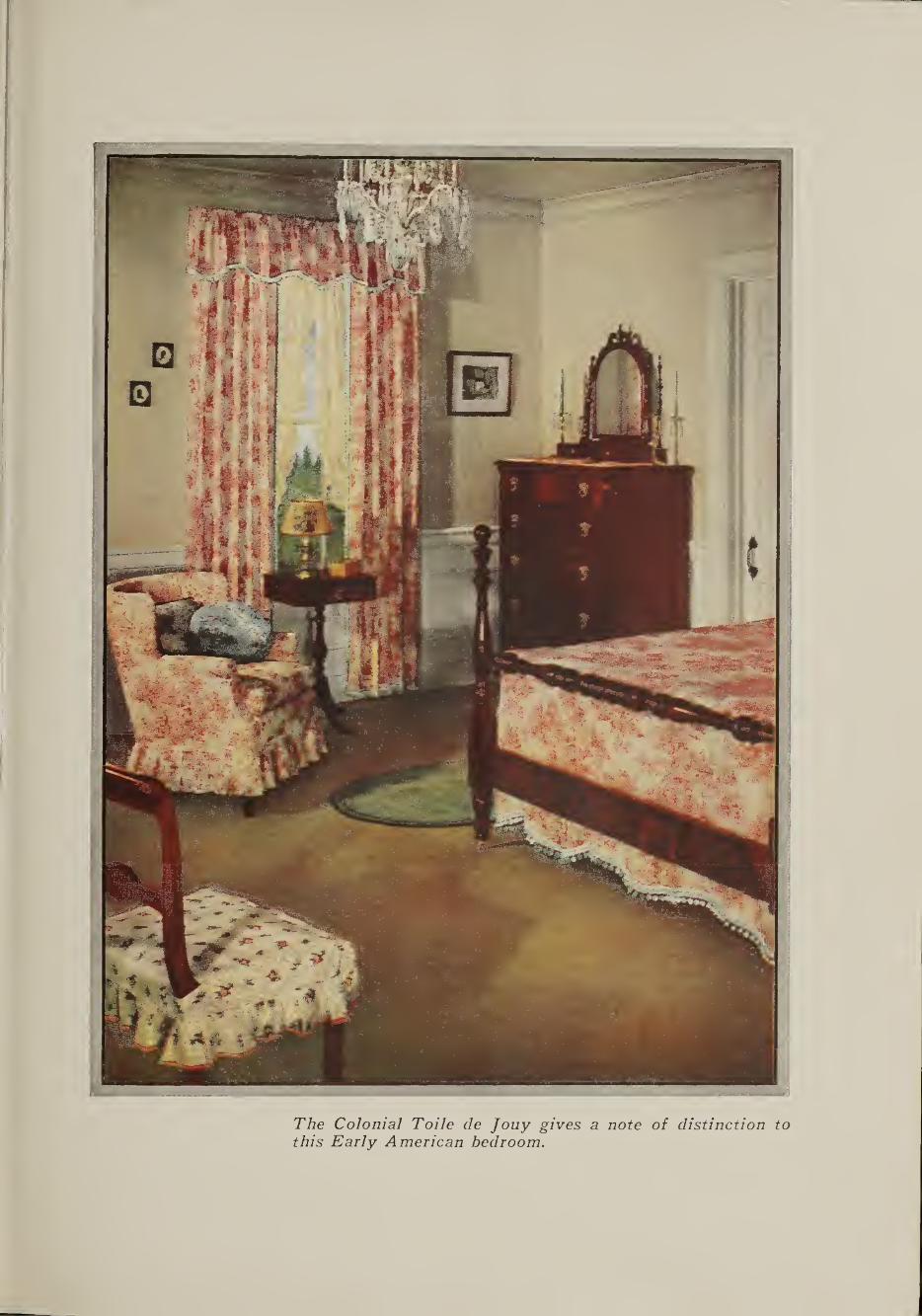
The Colonial Toile de Jouy gives a note of distinction to this Early American bedroom.
Slip-Covers
LIP-COVERS may be used decoratively and practically on all uphol¬ stered chairs, davenports, settees, side chairs, rockers, and footstools, — in living rooms, dining rooms, sun-parlors and bedrooms.
For decorative effect they do wonders. In refreshing a room or protecting furniture there is nothing to take the place of a colorful Colonial Cretonne slip-cover.
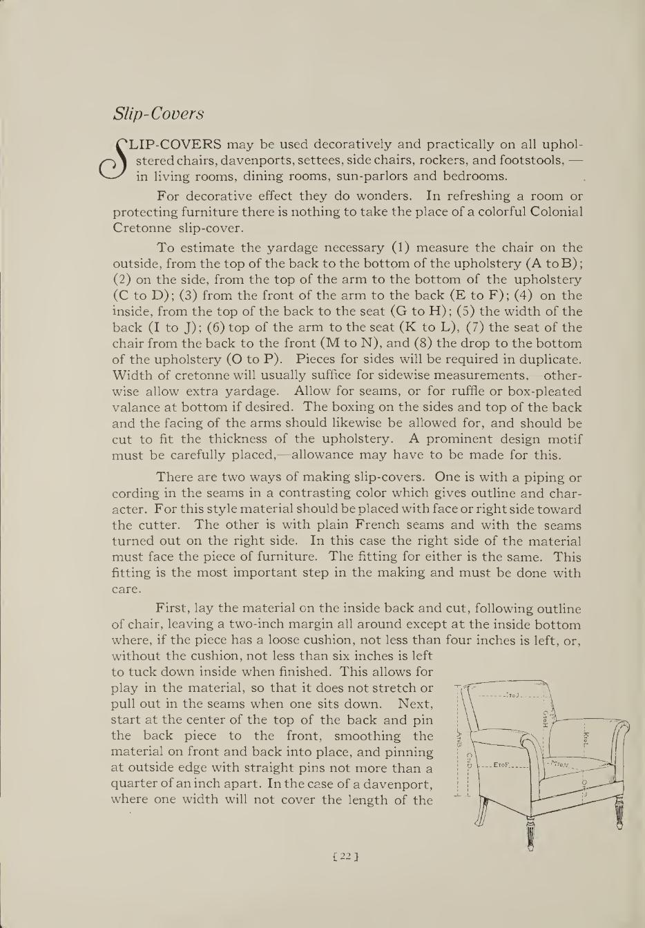
To estimate the yardage necessary (1) measure the chair on the outside, from the top of the back to the bottom of the upholstery (A toB); (2) on the side, from the top of the arm to the bottom of the upholstery (C to D); (3) from the front of the arm to the back (E to F); (4) on the inside, from the top of the back to the seat (G to H); (5) the width of the back (I to J); (6) top of the arm to the seat (K to L), (7) the seat of the chair from the back to the front (M to N), and (8) the drop to the bottom of the upholstery (O to P). Pieces for sides will be required in duplicate. Width of cretonne will usually suffice for sidewise measurements,—other¬ wise allow extra yardage. Allow for seams, or for ruffle or box-pleated valance at bottom if desired. The boxing on the sides and top of the back and the facing of the arms should likewise be allowed for, and should be cut to fit the thickness of the upholstery. A prominent design motif must be carefully placed,—allowance may have to be made for this.
There are two ways of making slip-covers. One is with a piping or cording in the seams in a contrasting color which gives outline and char¬ acter. For this style material should be placed with face or right side toward the cutter. The other is with plain French seams and with the seams turned out on the right side. In this case the right side of the material must face the piece of furniture. The fitting for either is the same. This fitting is the most important step in the making and must be done with care.
First, lay the material on the inside back and cut, following outline of chair, leaving a two-inch margin all around except at the inside bottom where, if the piece has a loose cushion, not less than four inches is left, or, without the cushion, not less than six inches is left to tuck down inside when finished. This allows for play in the material, so that it does not stretch or pull out in the seams when one sits down. Next, start at the center of the top of the back and pin the back piece to the front, smoothing the material on front and back into place, and pinning at outside edge with straight pins not more than a quarter of an inch apart. In the case of a davenport, where one width will not cover the length of the
122}

back, center the full width in the middle of the back and piece out to the necessary width on each side. Next the material is fitted to the in¬ side arm, then the outside arm pinned to it; the seams on the edges where the materials come together must come at the same place that the seam of the upholstery does. Finally comes the seat and front drop; at the back and the sides of the seat there must be left the same amount of material to tuck in for play of cover as was left at the base of the back; these edges are then pinned together; the sides of the seat pinned to the arms and the back edge of seat to lower edge of back; the front drop pinned to outside arm pieces, and the cover is then completely fitted. If there is a cushion, next fit the covering for it. Leave the opening at
the back of cushion.
The edges pinned together are now trimmed evenly, one-half inch out from the pins. For French seam finish, stitch about one-eighth inch from the edge on the wrong side all the way around. Next take out the pins, turn, and stitch about a quarter of an inch from the edge on the right side. Do not stitch in too far from the edge as this will make the cover fit too tightly.
For welt or corded seams cut strips on the bias, to cover number 60 white cotton cable cord, one and one-quarter inches wide, baste strips over the cording, insert the cording on the right side by taking out only a few inches of the pins at a
time, and baste the cording in with close stitches. The cover is then stitched on the machine. Here again be very careful to stitch inside the line where it was pinned. The raw edges of the fold on the cording and the cover are clipped off evenly leaving about a quarter of an inch and overcast.
In both styles, in the center of the back or on the left side, the cover is left open from the arm to the base and a placket set in to allow for putting cover on and removing. Snaps, buttons, or ties are sewn in and the cover is complete.
The slip-covers may be finished in several ways around the bottom, with a ruffle shirred on, or pleated. This may fall from the line of uphol¬ stery to the desired length. Two inches above the floor is generally accepted as correct. The bottom of the cover may be finished with a cording at the lower edge of the upholstery.
[23}

i A Note of Rose and Gold for an East Bedroom
MUST bring all our ingenuity into play when such a problem
J presents itself, and see that just as much light as possible enters
such a room. In cases like this it is preferable to forego valances
over the window, and use a very sheer, light-colored material for the
glass curtains. Also, select a drapery material which reflects light. Some
quaint, cheery Colonial Charlton Chintz in colors which repeat in some
part the colors of the small panes of glass would be charming. By intro¬
ducing sunny colors into the room as much as possible — for example, a
cream or ivory-colored ground in the chintz, and walls of cream —■ we se¬
cure a light, inviting atmosphere which counteracts the lack of natural
light due to the short windows.
In planning the color scheme for the bedroom pictured on the
opposite page we selected a rich, warm gold-colored taffeta as the key¬
note. As we have previously explained, the purpose and proportion as
well as the exposure of a room should be carefully considered. This being
a room of average size with eastern exposure, and receiving only a little
more sun than a room with northern exposure, gold and rose with blue
as a complement were considered a happy choice for the color scheme.
The walls were covered with a striped paper of quiet grey which
lends an appearance of height; the rug with its blue and tan tones picks
up the gold of the Colonial Jaspe Sylkenglo Taffeta bedspread and the
blue seat of the side chair. At the windows the quaintly patterned
draperies of Colonial Charlton Chintz—Design Vinetta, airy trailing
flower vines—apparently dominate the room and offer contrast to the
blue and gold, the rose color giving the necessary complement for relief.
These draperies were left unlined as the transparency of the colors was
thus emphasized. They were bound in plain rose-colored glazed chintz.
The gold theme is further repeated in other spots of color. The
lace shade at the window admits considerable light, and the whole effect is
softened by the ruffled curtains of Colonial Opalescent Gauze. A feel¬
ing of the French provincial is seen in the walnut furniture, and the lamp
affords a pleasant touch, as does the growing ivy in the corner. Aren’t
the pictures a pleasant diversion too?
124]

The hanging corner bracket Ends a fortunate setting in this cheerful sleeping room,to which a profusion of Bowers lends an intimate and joyous air.

Cretonnes Ma^ Be Washed Successfully How To Do It
"^OULD you like to have your cretonne or chintz draperies and slip- l U J covers retain their fresh, glowing colors season after season? Of
course—we all would, and here is one of the important reasons for your insistence on Colonials when buying them.
The producers of these attach to each piece, at the mill, a ticket telling candidly what you have a right to know.
There are those which are marked Firmaniline Colors, thoroughly washed before leaving the mill, and they will of course bear up well in any repeated reasonable washings which you may choose to give them.
Where there is to be exposure to a considerable amount of strong light it might be well to insist on Colonial Draperies in Superlizarine Colors, which possess exceptionally good lasting qualities. Years of ex¬ perience have plainly demonstrated to us that you need give them only reasonable care and you will have draperies and accessories that respond by growing old gracefully — beautifully — in years of service.
For continued exposure to sunlight there are Colonials in Guar¬ anteed Fast Colors, and plainly so marked, made to remain unchanged indefinitely.
If this book has helped you to insist on one of these better grades of colors — even if it has done no more — it has served you well.
Then all you need do in washing is to use warm water (not boiling), and any good bar soap or soap chips — rinse several times -— dry in the shade (not sun) — and iron while they are still damp. You will feel repaid for having taken a little care in washing your cretonne draperies, when you see the renewed colors and delightful freshness of them as they hang in your windows.
Cretonne Wall Plaques and Screens How To Antique Them
/^^y^ELIGHTFUL effects of rare old paintings or fabrics can be secured / J with little trouble and less expense, by applying an antique finish
to a wall plaque of cretonne or chintz. Also, you can make unique floor screens, portfolios, telephone screens, waste paper baskets, desk- sets or lamp shades. They are not difficult either, if you like making ex¬ periments, and are interested in producing unusual accessories for your own home or for gift purposes.
Attractively shaped floor screen frames and other sorts of frames may be purchased from almost any store carrying furniture. First, a foundation of unbleached muslin should be tacked tightly to the frame panels on both sides with small gimp tacks. Over this tack the cretonne or chintz you have chosen — some gaily patterned design which boasts a profusion of colors — taking care to see that the motif of the design
£26}

comes in the same place on every panel. Then you are ready to shellac the entire screen on both sides with the best quality white shellac. It is usually necessary to give the average cretonne- covered screen about three coats of shellac, occasionally even more. When this has been spread on evenly and dried thor¬ oughly, the screen or other article is ready for the antique
finish. This consists of burnt umber and Van Dyke brown mixed with brown Japan dryer to an oily flowing consistency. It is applied in a rotary and daubing sort of motion with cheesecloth, working the dark effect into the shadows of the design and keeping the high-lights only slightly tinted. If done carefully the finished article can be made to resem¬ ble many of the hand-painted leather articles and screens so popular just now, but which we find are very expensive to purchase ready-made.
The cretonne screens should be finished on the edges with furniture gimp, or it is possible to achieve most unusual and charmingly decorative effects by applying fancy brass-headed nails around the edges.
For the wall plaques, one of which is shown at the head of the page, buy ordinary wallboard and cut it into size and form best suited to the particular cretonne motif selected, at the same time suited to the space in which it is to be used. The cretonne is cut slightly larger than the wall- board form so that all edges may be turned in on the back. Pasting should be done with a good quality of glue so that it will be sure always to hold. When applying glue on the one side, it is important to apply it also at the same time on the entire reverse side, so as to avoid warp¬ ing of the wallboard. Allow the board to dry thoroughly, preferably over night. After being sure that all traces of moisture have disappeared, several coats of clear shellac should be applied. Five or six coats may be necessary. The first coat of shellac will be absorbed by the fabric to a considerable extent, and this first thorough coat should also be applied on the entire reverse side to be sure that future moisture is not absorbed and allowed to later warp the finished panel. Subsequent coats of shellac will dry very quickly. There should be enough coats of the shellac to form a uniform luster.
The antiquing material we have already mentioned is then applied all over the face and wiped away from the parts where the design is to come out strongest, being left to cover the parts where the design is to be faint. Even where it is wiped away as much as possible, a little of it seems to stay between the threads of the fabric and makes a very beautiful effect, while it still permits the design colors to show.
When all other work on the panel is completed the back should have plain paper covering pasted over the entire surface, but not quite up to the edge.
Equally as decorative and charming effects may be carried out with the many other articles mentioned, and the home decorator who takes the trouble to add this artistic touch will be well repaid for the little effort it will cost her.
[27}

Color—Its Emotional Value
"7^ '] E modern women have become so well versed in using delightful
J and harmonious color ensembles in our dress that we should learn
to apply this knowledge in introducing glorious color schemes
throughout all the rooms of our homes — they are just as enjoyable and
delightful there. The whole object of this book is to help you to use
your knowledge of color and design to make your home more beautiful
and more livable. It is not a complex matter either. A thorough understanding
of the essentials of color harmony is, however, of tremendous value. We
shall attempt to set these essentials down here very briefly, clearly and
simply.
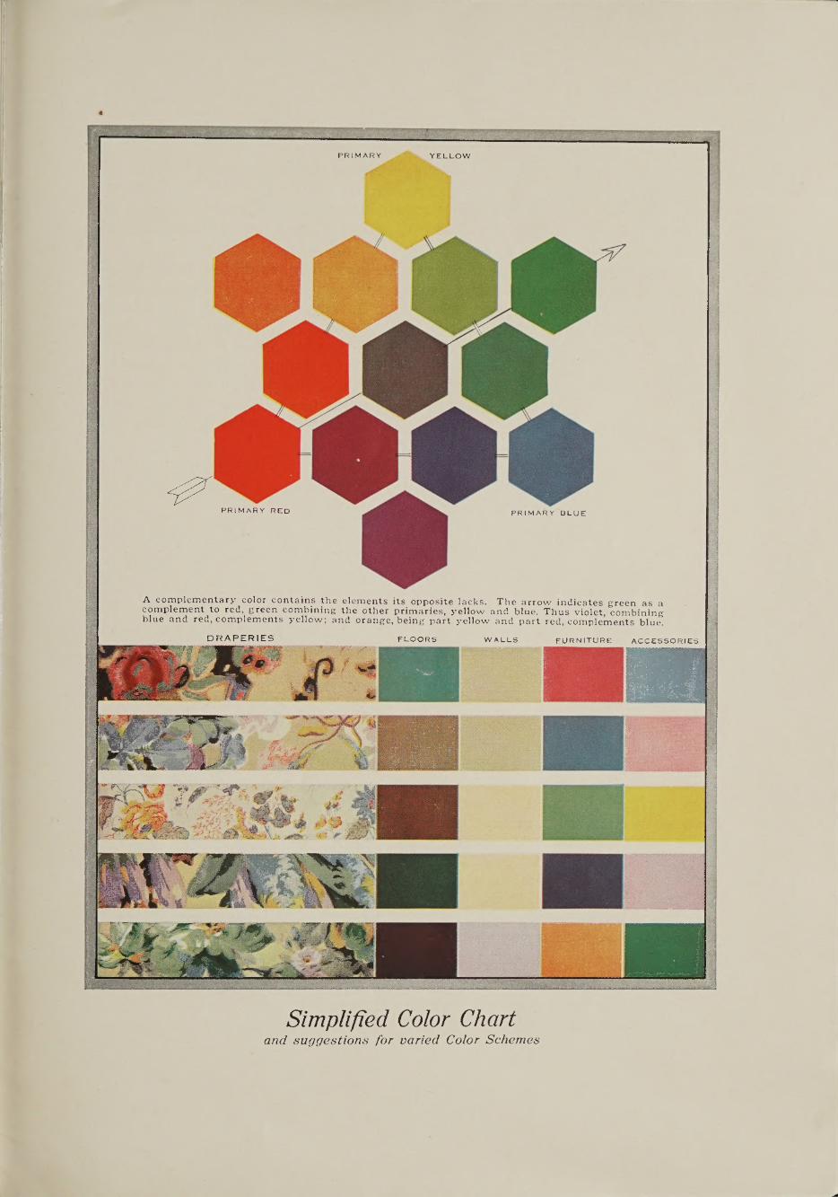
According to the generally accepted theory, there are three pri¬
mary colors — red, blue and yellow, as indicated in the chart. Second,
there are the binary colors, orange, green and violet, which are made by
combining two of the primaries: red and yellow making orange; blue and
yellow making green; blue and red making violet; as also indicated in
the chart. Then there is another range of shades in each of which there
is more of one primary than of another, such as the yellow-green having
more of the yellow than the blue; and the blue-green having more of
the blue than the yellow. We might consider neutral gray as a combina¬
tion of all the primary colors. Naturally, we would understand the addi¬
tion of white as making a lighter tint of any of these and black as making
a darker shade.
The Magic of Color Certain colors have power to make a room seem larger or smaller;
to make us feel irritable or restful; to make a room seem cool or warm.
So in selecting a material and a color for a room, it is wise to take into
consideration the psychological as well as the physical characteristics of
the persons who will frequent the room, as well as its exposure and purpose.
Yellow, the color of sunshine, is a warm tone, expressive of light
and gladness. Darkened city rooms, especially, should have yellow in¬
troduced into their color schemes; and in yellow we here include cream,
buff, ivory, corn color, lemon, and all these closer variations of the
primary hue.
Red is an aggressive color, dangerous when used in large quantities.
It has the power to create unrest and disturbance in our minds. Under
test, it can make a room seem as much as thirty per cent smaller than the
same room done all in blue. But red, skillfully used, is a most decorative
[28}
- ■ 0-X';. ■ ■:„.', rtt.i,-,-, u\ii.,a-v«-i
Simplified Color Chart and suggestions for varied Color Schemes
color, one that suggests warmth and friendly welcome — at times, rollick¬ ing good spirits.
Blue is the cold color — suggestive of space, perhaps because of its identity with the sky; suggestive too of water and ice. It induces restraint and repose — it serves as an admirable foil to both red and yellow. It has the faculty of making rooms seem larger, particularly in its higher values.
Orange combines yellow and red, and partakes of the qualities of both — that is, light and heat — cheer and aggressiveness. Used in large quantities, its effect is uncomfortable, but small spots of it produce delightful effects of colorful warmth.
Green combines yellow and blue — but it is more; it is nature’s choice color; used lavishly there in background and foreground. The grass — the trees — the foliage and shrubs are of this chosen binary. Therefore, its use is recommended because it induces rest and ease for jagged nerves; it brings the spacious coolness of outdoors into warm houses; it comforts tired eyes.
Violet is the color of dignity, of royalty, of pomp. Combining blue and red, it produces a mixture of emotions — perhaps awe and depression, the quiet of mysticism.
Put all this into practice. Plan your complete color scheme for the room you have been visualizing. Select a Colonial Drapery Fabric containing the principal color you desire to feature. Then plan the predominant colors for floor coverings, walls, painted or upholstered furniture, and colorful accessories such as pillows, lamps, books, or bric-a-brac. In the accompanying chart we have thus suggested schemes in which rose, blue, yellow, helio or green are the dominant drapery colors.
Measurements and Details for Making Various Hangings
^^^IRST ascertain exact yardage of fabric needed, making allowance ^ for matching of pattern, which may require additional material.
^ Securing proper placement of motif in all draperies of a room is essential, for giving a flnished custom-made appearance. Therefore, over-draperies should be properly matched, carefully considering the repeat of the design, so that they will appear balanced and symmetrical. If a window measures 9' in height and the repeat of the fabric design is 2' it is necessary to have each cut of material five full repeats or 10' long, so as to have sufficient length in each curtain and to have each length begin with the same design unit, preferably having the full motif begin at the bottom of each curtain. After allowing for lower hem turn the sur¬ plus into the heading to allow for possible later alterations.
Lining of over-draperies is usually done with plain sateen. Often, to get the full benefit of the wonderful color transparency in so many Colonial Chintzes, over-draperies of these materials are left unlined. Over¬ draperies are made with a l3^" to 2" tunnel at the top to allow for the
130}

rod, or brass rings may be sewed to the back, spaced about 4" apart, — the draperies being then hung from a solid rod. Pleats at the top are not necessary unless they are to be hung by wood or metal rings on decorative wood or wrought iron poles. In this case they would have French pleats, which are a form of pinched box-pleat, these at the very top or heading of each curtain.
In measuring valances take into consideration the full breadth of the window to the outside edges of the wood trim, measuring along the extreme top of the window trim. The outer edges of the finished valance must hang in a straight line with the outer edges of the over-draperies. Soft pleated or gathered valances may have tunnel heading or hooks sewed to the back for the rod. More formal lambrequins fashioned of buckram should be interlined with cotton flannel and lined with sateen. The heading should preferably be a wide cotton tape stitched to the back at the very top or a double fold of the lining material stitched in the same manner. This enables you to tack the lambrequin to a board wide and about thick fixed to the extreme upper edge of the window casing with angle irons, as illustrated at the top of page 15. It is preferable to allow about 31/2'' additional at each end of the lambrequin for a return to tack around each end of the valance board. Custom requires that the valance depth never be more than 1/5 of the curtain length. Good judgment should dictate this depth, but we usually favor a more shallow valance. It is essential to center the most important part of the design motif, equally piecing out at each side to the required width. Piecing should never be done in the center.
In measuring a doorway for portieres begin at the very top of the opening and measure to within 1" of the floor. This measurement should then be the exact finished length of your portieres. The width is governed by the size of the opening, 2 5 of the opening width being covered with portieres.
Casement or glass curtains are generally finished with a Wi" hem turned double on inner and lower edges, with 3" heading, outer edges requiring only a 1/4" hem. A rod may be run through this 3" heading. Glass curtains hang straight with weighted tape in the lower hems.
If you make draw-curtains they should be French pleated at the top, these pleats about 5" apart, with a brass ring sewed at the back of each pleat. Through these rings the rod and the cords for drawing are placed. This method is complicated and requires special hardware.
Over-draperies should have a finishing touch of trimming along the inner and bottom edges and along the lower edge of the valance. Favored trimmings are wool brush fringe, ball fringe, or bands of varied widths in plain glazed chintz, plain linen or sateen. An attractive and less expensive effect is obtained by the use of rayon and worsted brush edging. You will notice when planning the draperies illustrated in this book we have used these forms of trimming. In addition there are single and double box pleatings or single and double ruffles, — which are forms of trimming especially suitable for sleeping room draperies.
[31}

(lA RARE fragment of a genuine old Jouy
piece, printed from wood probably before 1830, furnished the in¬ spiration for this love¬ ly design Fleurjouy, a Colonial Cambridge Cretonne. Available in periwinkle blue, old red, raspberry, reseda green, and old gold,— all tinted in ivory.