modern art color concepts in upholstery textile printing
TRANSCRIPT

Noha Soultan 61
This work is licensed under a Creative Commons Attribution 4.0 International License
Modern art color concepts in upholstery textile printing designs
inspired by Islamic art Dr. Noha Ali Radwan Mohamed Soultan Lecturer , Textile printing, Dyeing and finishing Department , Faculty of Applied Arts, Beni-Suef University
Keywords: Abstract: Impressionism, chromatic dispersion, optical color mixing
This research deals with enriching the Aesthetic values of color in designs of printed furniture fabrics by a new color scheme for Islamic motifs in the light of modern art color application of the color separation which based on scientific theories emerged by the pioneers of impressionists from the beginning of the last century and how did that achieve a radical change in the artists vision of artwork formulation that which could be a rich source to innovate artistic designs for modern furniture. Hence the research question is how to benefit from the modern art color concept of chromatic dispersion in achieving a modern color scheme for Islamic ornaments to enrich the aesthetic values of color in designs of printed furniture fabrics? The study aims to achieve new aspect of color in printed fabric design by a new color scheme for Islamic motifs derived from the technique of color dispersion used in modern art.
Paper received 27th August 2018, Accepted 26th September 2018, Published 1st of October 2018
Introduction Islamic art is one of the art schools most open to the dialogue of civilizations, this came as a result of the mutual influence between it and the various arts in the East and West. This makes it conservative, while in the same time, open in spirit to modernity and development, this also makes it a contemporary artistic approach to the development of creative and innovative designs and novelty. This research deals with enriching the Aesthetic values of color in designs of printed furniture fabrics by a new color scheme for Islamic motifs in the light of modern art color application of the color separation which based on scientific theories emerged by the pioneers of impressionists from the beginning of the last century and how did that achieve a radical change in the artists vision of artwork formulation that which could be a rich source to innovate artistic designs for modern furniture Hence the research question is: How to benefit from the modern art color concept of chromatic dispersion in achieving a modern color scheme for Islamic ornaments to enrich the Aesthetic values of color in designs of printed furniture fabrics?
Objective: The study aims to achieve new aspect of color in printed fabric design by a new color scheme for Islamic motifs derived from the technique of color Dispersion used in modern art.
Significance: To enrich the artistic value of the printed upholstery, through the development of color techniques by benefit from the mutual influence between Islamic art and modern art.
Methodology: An analytical approach have done through: an artistic analyze of color dispersion in works of some pioneers of modern art to show its aesthetic values and the features of Islamic ornaments, An applied approach: by innovating designs of printed upholstery inspired from experiments of researcher in light of color dispersion.
Hypotheses: The study assumes the possibility of making use of some of the color concepts of modern art to create color schemes for Islamic ornaments with a contemporary vision to be applied in furniture fabric designs.
Delimitations: The temporal limit: The beginnings of the emergence of theories of modern art, in the early 19th century. The Objective limits: chromatic dispersion and its Applications in Islamic ornaments, in the design of furniture fabrics.
Theoretical framework: (I) Islamic ornaments: Islam has given the art of ornamentation a special significance, where it re-shaped forms of nature
62 Modern art color concepts in upholstery textile printing designs inspired by Islamic art
International Design Journal, Volume 8, Issue 4October 2018
and processed them by using several procedures such as transformation, simplification and reduction, due to the importance of floral and geometric elements that characterized Islamic art. "Floral ornaments are decorative elements that include plant elements and parts such as leaves, stems and flowers. The shapes of these elements are natural or have been modified to form fundamental symbols. Floral and plant ornaments are of the most important features that reflect Muslim artists’ aspiration to innovate rather than the simulation of nature and the true-life copy of its elements, where the transformation and distance from real-nature is the question. (Zaki Mohamed Hassan, 1999, P30). In addition to the geometric motifs that were built on the idea of abstraction, a core element in Islamic faith which had a great role in its existence as a style. Islamic art utilized abstract geometrical shapes and lines such as perpendicular lines, squares, rectangles, triangles, octagons, and circles and alternating polygons resulting from the intersections, to create extended rhythmic designs of simple geometry. These geometrical creations were the result precise calculation, which contained emotional meanings and philosophical ideas.(Ahmadal-Tayish, 2000,p.61).The characteristics of Islamic ornamentation can be summed up in some features including growth and procreation the creation of a new form of prefabricated form that carries some of the characteristics of the basic form through structural processes such as repetition, magnification and overlapping so that it is connected as one unit with a particular direction. The Islamic art of ornamentation originates from the creation of a first simple form of a single unit
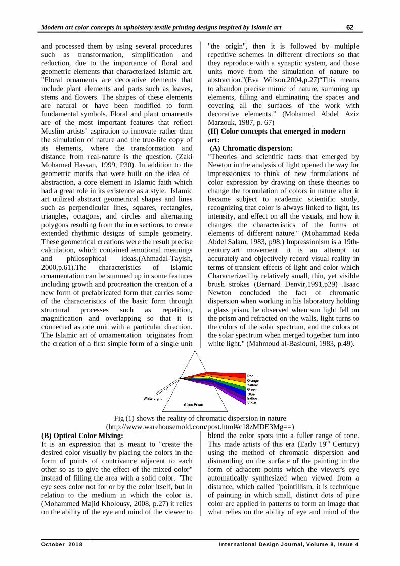
"the origin", then it is followed by multiple repetitive schemes in different directions so that they reproduce with a synaptic system, and those units move from the simulation of nature to abstraction."(Eva Wilson,2004,p.27)“This means to abandon precise mimic of nature, summing up elements, filling and eliminating the spaces and covering all the surfaces of the work with decorative elements.” (Mohamed Abdel Aziz Marzouk, 1987, p. 67) (II) Color concepts that emerged in modern art: (A) Chromatic dispersion: "Theories and scientific facts that emerged by Newton in the analysis of light opened the way for impressionists to think of new formulations of color expression by drawing on these theories to change the formulation of colors in nature after it became subject to academic scientific study, recognizing that color is always linked to light, its intensity, and effect on all the visuals, and how it changes the characteristics of the forms of elements of different nature." (Mohammad Reda Abdel Salam, 1983, p98.) Impressionism is a 19th-century art movement it is an attempt to accurately and objectively record visual reality in terms of transient effects of light and color which Characterized by relatively small, thin, yet visible brush strokes (Bernard Denvir,1991,p29) .Isaac Newton concluded the fact of chromatic dispersion when working in his laboratory holding a glass prism, he observed when sun light fell on the prism and refracted on the walls, light turns to the colors of the solar spectrum, and the colors of the solar spectrum when merged together turn into white light." (Mahmoud al-Basiouni, 1983, p.49).
Fig (1) shows the reality of chromatic dispersion in nature
(http://www.warehousemold.com/post.html#c18zMDE3Mg==) (B) Optical Color Mixing: It is an expression that is meant to "create the desired color visually by placing the colors in the form of points of contrivance adjacent to each other so as to give the effect of the mixed color" instead of filling the area with a solid color. "The eye sees color not for or by the color itself, but in relation to the medium in which the color is. (Mohammed Majid Kholousy, 2008, p.27) it relies on the ability of the eye and mind of the viewer to
blend the color spots into a fuller range of tone. This made artists of this era (Early 19th Century) using the method of chromatic dispersion and dismantling on the surface of the painting in the form of adjacent points which the viewer's eye automatically synthesized when viewed from a distance, which called "pointillism, it is technique of painting in which small, distinct dots of pure color are applied in patterns to form an image that what relies on the ability of eye and mind of the

Noha Soultan 63
This work is licensed under a Creative Commons Attribution 4.0 International License
viewer to blend the color spots into a fuller range of tones " (Wieaardt, 1997, p.39). The pioneers of impressionism are the first to implement this concept In their works, It is A technique based on "A quick recording of the moment and analyzing the color space into trembling color patches and lines in the form of rough, quick brush strokes" (Arnold Hauser,1971,p.42) Fig (2). Cezanne
emphasizes this technique of dealing with the colors in his paintings in his own words that “the painting is a set of separate colors that are placed on the canvas to be replaced by the automatic re-mix done by the eye of the viewer; the painting represents nothing but colors" (Ezzeddin Ismail, 1974, p 143 )
Fig (2) pointillism color wheel and the effect of colors juxtaposition
https://www.teacherspayteachers.comThe orange color consists of yellow + red. The artist places the two colors adjacent but the eye
mixes these spots and finally sees them in orange, Fig (3).
Fig (3) is an example to illustrate the concept optical color mixing
https://alvalyn.com/optical-color-mixing/ (C) The effect of Distance in the overall visualization of image While the details of the image appear from-close in the form of points of separate color spots above each other, but seeing the same image from a distance further gives a total form of its elements which conveys richness of color resulting from the visual combination of these adjacent color points as if they are integrated into color gradient, this allows the eye to simply move from one color space to another in a gradient.
"The minute color spots, if seen from a distance of one meter or more, are not seen in the form of separate dots but in the form of a color space provided that these chromatic dots are in the same degree of luminance. Distance and eye of the viewer, allow these color dots to appear separate from each other to some extent if we look at them from near, but if we move away, we will see them blended together because of the refractions of light on the air atoms that separate us from them."(Idris Faraj, P.84, 2008) .Fig (4)
Fig (4) the effect of distance between the viewer’s eye and the chromatic dots in the realization of the
visual combination of colors. https://alvalyn.com/optical-color-mixing/ (III) The Artistic Analytical Study: Through the previous theoretical background of some color concepts based on scientific foundations, the an artistic analytical study has hold to three selected pioneers of modern art achieved a creative vision for the advanced uses of color in the works of art
1- The Colors in painting to some pioneers of modern art
pioneers of modern art have benefited from the analysis of colors on the surface of the painting in this way, they used a technique of painting in which small, distinct dots of pure color are applied in patterns to form an image that what relies on the

64 Modern art color concepts in upholstery textile printing designs inspired by Islamic art
International Design Journal, Volume 8, Issue 4October 2018
ability of eye and mind of the viewer to blend the color spots into a fuller range of tones " (Eric Wieaardt, 1997, p.18)." this technique tries to express artist impressions and convey them to the viewer in a way that is far from the constraints of checking the details, with the expression of the
state of speed and instantaneous movement” ,2000,p 66) Richard R.Brettell (
Fig (5): Claude Monet Fig (6): George Seurat Fig (7): Paul Cezanne
Table (1) analytical study for artists color technique in modern arts 1:Artist color technique
1 Details from fig (5) : Claude Monet's Water Lilies (detail), Musee de L'Orangerie, Paris
The artist used the color in the form of colored spots which take the form of layers, contiguous and varying sizes to each other to convey its direct impact on the effect of light falling on the forms in nature and do so in a sequential manner which changes the distribution and intensity of these color spots depending on the effect of light Bernard Denvire,p338,1991)
2 Detail from fig (6) Seurat ,Grave lines Channel ,Munsee de LAnnonciade , France, 1890
Seurat relies on separating color in the form of explicit, dense, accurate points that are so close together enough to appear in the eye of the viewer as disjointed. "He depended on the subtraction of the colors that put the prismatic colors in the form of contiguous points in a precise system that eventually leads to the distance perception as if these dots were combined on the retina showing the image to be interpreted "Amani Ali,1997, p. 226"
3 Details from fig (7) Paul Cezanne, Compotier Glass And Apples Aka, (detail)
Cezanne's style is characterized by analysis of color on the surface of the painting in a variety of parallel strokes, varied in sizes, colors. The pure color simplification of his creative experience starts with the emergence of a sense of color, followed by the vision and use of the red, yellow and blue contrasts to represent the shadows, we cannot determine a uniform source of light, As if the colors in itself reflect the light (Mohsen Attia, p. 82)
Table (2) analytical study of the effect of juxtaposition of colors in modern arts II: Details of mixed colors Analytical study of the Artist style for optical
mixing color 1 Effect of
juxtaposition of colors used by Monet - Fig (8)
A number of green gradients are used for plants, Fig (A) in the form of contiguous strokes, mixed with yellow, blue and red, and are intertwined with each other in the eye of the viewer, giving vividness to the color spaces, as well as to the colors in the area of the blue river, Fig (B) with purple, blue and violet.

Noha Soultan 65
This work is licensed under a Creative Commons Attribution 4.0 International License
2 Effect of juxtaposition of colors used by, Seurat - Fig (9)
The expression of the blue color of the sea, Fig (A) was not the choice of a uniform level for the whole area, but the selection of colors that can be dismantled and analyzed into adjacent groups of color spots that blend in the eye of the distant viewer to reflect the degrees of light and the diverse shade of the color of the sea, Also, the colors of the beach – Fig (B),which includes several colors: blue, yellow and orange, depending on their density and size.
3
The analysis of the color of the green apples - Fig (A) is shown in a combination of green and yellow gradients according to the intensity of the light and the distribution of shadows, in the same manner, the oranges – Fig (B), which shows the color richness by analyzing the orange color to several other rich colors. These colors are contiguous in a way that brings about the rich orange color.
2-Color scheme in printing textile designs Color plan of printed textile design is one of the main axes that textile designer seeks to develop by creating innovative color methodologies that enrich the aesthetic value of the printed textile product. The previous analytical study of chromatic dispersion and optical color mixing as a color technique in modern art can be a rich introduction to develop innovative color
formations for Islamic decorative element in order to raise the aesthetic value of the designs of furniture textiles as one of the products that constitutes an aspect of the aesthetically pleasing environment surrounding us. In Fig (11) an example of researcher experiments to apply the concept of chromatic analysis on the units of plant ornaments of Islamic motifs in the design of textile printing we find that:
Fig (11) Islamic ornaments with the technique of color analysis
1: The technique of dismantling the colors and analysis of the color surfaces to groups of adjacent color points to apply the effect of the juxtaposition of colors, leads to a feeling of rich color resulting from the optical blending of these colors. "If the surface is dismantled into many smaller particles, each part can be of a separate color, yet if each color spot is located in relation to other color
spots, this will create a more vivid overall image. (Edris Farajallah, p. 84, 2008). This virtual appearance of the design appears to include an infinite number of colors, although the number of colors needed to perform the printing is less than what it looks in the final design which means an economical implementation in the production
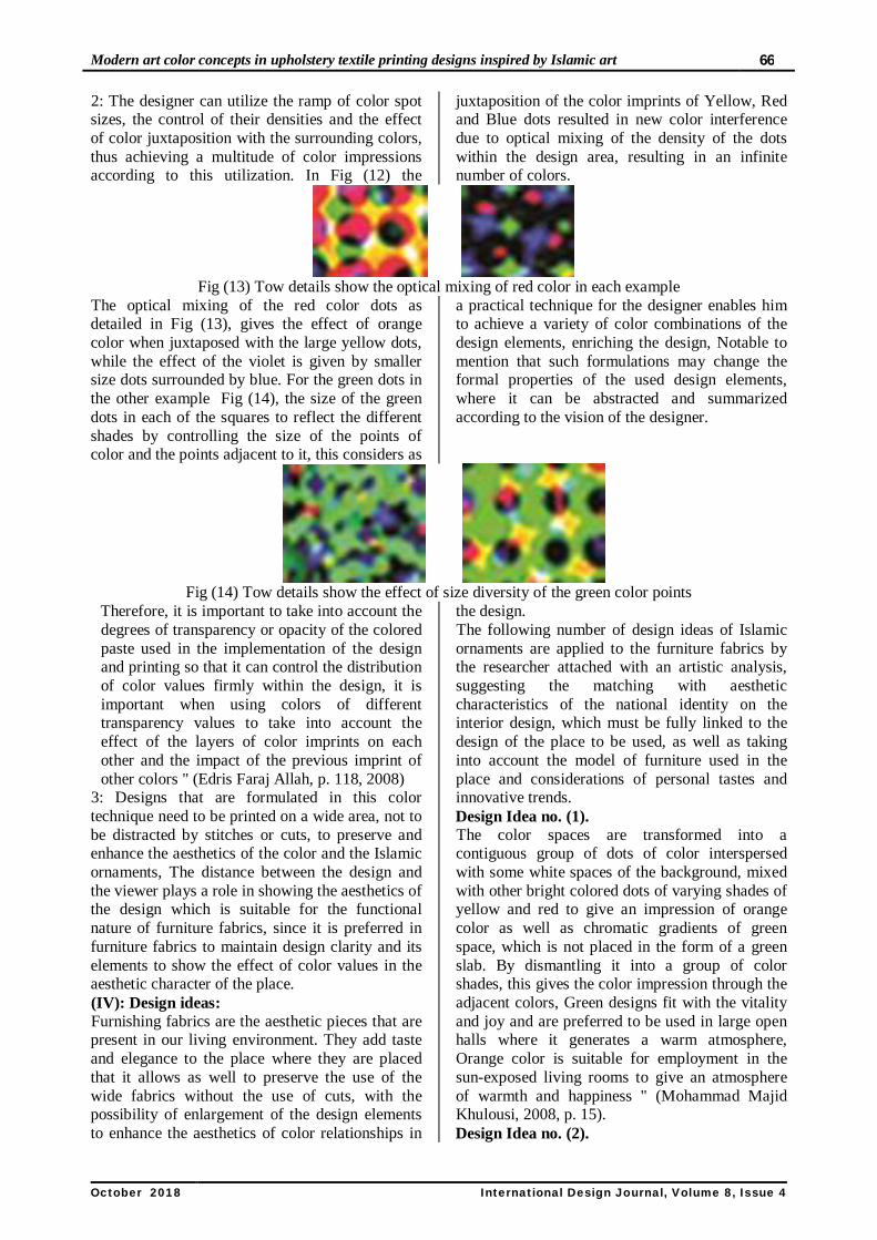
Fig (12) show the effect of optical color mixing for the overlapping of three dismantling colors used in a
textile printing design
66 Modern art color concepts in upholstery textile printing designs inspired by Islamic art
International Design Journal, Volume 8, Issue 4October 2018
2: The designer can utilize the ramp of color spot sizes, the control of their densities and the effect of color juxtaposition with the surrounding colors, thus achieving a multitude of color impressions according to this utilization. In Fig (12) the
juxtaposition of the color imprints of Yellow, Red and Blue dots resulted in new color interference due to optical mixing of the density of the dots within the design area, resulting in an infinite number of colors.
Fig (13) Tow details show the optical mixing of red color in each example
The optical mixing of the red color dots as detailed in Fig (13), gives the effect of orange color when juxtaposed with the large yellow dots, while the effect of the violet is given by smaller size dots surrounded by blue. For the green dots in the other example Fig (14), the size of the green dots in each of the squares to reflect the different shades by controlling the size of the points of color and the points adjacent to it, this considers as
a practical technique for the designer enables him to achieve a variety of color combinations of the design elements, enriching the design, Notable to mention that such formulations may change the formal properties of the used design elements, where it can be abstracted and summarized according to the vision of the designer.
Fig (14) Tow details show the effect of size diversity of the green color points
Therefore, it is important to take into account the degrees of transparency or opacity of the colored paste used in the implementation of the design and printing so that it can control the distribution of color values firmly within the design, it is important when using colors of different transparency values to take into account the effect of the layers of color imprints on each other and the impact of the previous imprint of other colors " (Edris Faraj Allah, p. 118, 2008)
3: Designs that are formulated in this color technique need to be printed on a wide area, not to be distracted by stitches or cuts, to preserve and enhance the aesthetics of the color and the Islamic ornaments, The distance between the design and the viewer plays a role in showing the aesthetics of the design which is suitable for the functional nature of furniture fabrics, since it is preferred in furniture fabrics to maintain design clarity and its elements to show the effect of color values in the aesthetic character of the place. (IV): Design ideas: Furnishing fabrics are the aesthetic pieces that are present in our living environment. They add taste and elegance to the place where they are placed that it allows as well to preserve the use of the wide fabrics without the use of cuts, with the possibility of enlargement of the design elements to enhance the aesthetics of color relationships in
the design. The following number of design ideas of Islamic ornaments are applied to the furniture fabrics by the researcher attached with an artistic analysis, suggesting the matching with aesthetic characteristics of the national identity on the interior design, which must be fully linked to the design of the place to be used, as well as taking into account the model of furniture used in the place and considerations of personal tastes and innovative trends. Design Idea no. (1). The color spaces are transformed into a contiguous group of dots of color interspersed with some white spaces of the background, mixed with other bright colored dots of varying shades of yellow and red to give an impression of orange color as well as chromatic gradients of green space, which is not placed in the form of a green slab. By dismantling it into a group of color shades, this gives the color impression through the adjacent colors, Green designs fit with the vitality and joy and are preferred to be used in large open halls where it generates a warm atmosphere, Orange color is suitable for employment in the sun-exposed living rooms to give an atmosphere of warmth and happiness " (Mohammad Majid Khulousi, 2008, p. 15). Design Idea no. (2).
Noha Soultan 67
This work is licensed under a Creative Commons Attribution 4.0 International License
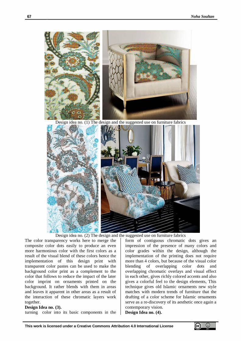
Design idea no. (1) The design and the suggested use on furniture fabrics
Design idea no. (2) The design and the suggested use on furniture fabrics
The color transparency works here to merge the composite color dots easily to produce an even more harmonious color with the first colors as a result of the visual blend of these colors hence the implementation of this design print with transparent color pastes can be used to make the background color print as a complement to the color that follows to reduce the impact of the later color imprint on ornaments printed on the background. It rather blends with them in areas and leaves it apparent in other areas as a result of the interaction of these chromatic layers work together. Design Idea no. (3). turning color into its basic components in the
form of contiguous chromatic dots gives an impression of the presence of many colors and color grades within the design, although the implementation of the printing does not require more than 4 colors, but because of the visual color blending of overlapping color dots and overlapping chromatic overlays and visual effect in each other, gives richly colored accents and also gives a colorful feel to the design elements, This technique gives old Islamic ornaments new style matches with modern trends of furniture that the drafting of a color scheme for Islamic ornaments serve as a re-discovery of its aesthetic once again a contemporary vision. Design Idea no. (4).

68 Modern art color concepts in upholstery textile printing designs inspired by Islamic art
International Design Journal, Volume 8, Issue 4October 2018
Design idea no. (3) The design and the suggested use on furniture fabrics
Design idea no. (4) The design and the suggested use on furniture fabrics
It was possible to achieve the rhythmic tones of the blue color with the turquoise by controlling the density of the points of color and the size of their dimensions to be influenced by the light on the flower on one side, while the fading light on the other elements as a result of the intensification of
color points of dark blue and turquoise and the white color of the background has an effect in showing the glow and shine colors White color boosts the color vividness and transparency. Design Idea no. (5).
Design idea no. (5) The design and the suggested use on furniture
touches of blue color used in varying shades covering all surfaces with adjacent dots of color, varying in sizes and gradient, interspersed with many other dots of color to appear dark in places
while the light is illuminated in other places, the dark confirm the balance of rhythm, and assuring simplicity of composition, In addition, diversity of color dots and the distribution of densities of color

Noha Soultan 69
This work is licensed under a Creative Commons Attribution 4.0 International License
rich design, also adds a visual texture to the areas of color.
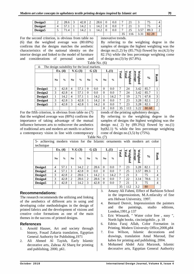
Results Previous designs have been judged through a questionnaire from seven professors of textile printing design at the faculty of applied arts the results showed that: For first criterion, is obvious from table no. (3) That the weighted average was (79.28%) confirms
the possibility of achieving innovative color scheme for the Islamic ornaments motifs by benefiting from color theories in modern art to enrich the printed furniture textile design. By referring to the weighting degree in the samples of designs the highest weighting was the design no. 1.4.5 by (82.14%) flowed by no.( 2,3) by (75%).
Table No. (3) 1- Chromatic color dispersion as a source to enrich the design color scheme
Ex. (4) V.G (3) G (2) L.(1) Total
Weigh
ted
Weigh
ted %
Rank
No % No % No % No %
Design1 3 42.8 3 42.8 1 14.2 0 0.0 7 23 3.28 82.14 1 Design2 4 57.1 3 42.8 0 0.0 0 0.0 7 21 3 75 3 Design3 2 28.6 3 42.8 2 28.6 0 0.0 7 21 3 75 3 Design4 3 42.8 3 42.8 1 14.2 0 0.0 7 23 3.28 82.14 2 Design5 3 42.8 3 42.8 1 14.2 0 0.0 7 23 3.28 82.14 1 15 14 6 0 35 111 3.17 79.28
For the second criterion, is obvious from table no (4) that the weighted average was (80.69%) confirms The effect of the juxtaposition of colors leads to a feeling of rich color resulting from the optical colors mixing and make the design appears to include an infinite number of colors, although the number of colors needed to perform the printing is less than what it looks in the final
design which means an economical implementation in the production. By referring to the weighting degree in the samples of designs the highest weighting was the design no.(2) by (89.2%)) flowed by no.(1) by (85.7%) while the less percentage weighting come of design no.3by (71.42%).
Table No. (4) 2- Effect of juxtaposition of colors to enrich textile printing design.
Ex. (4) V.G (3) G (2) L.(1) Total
Weighte
d Weighte
d
%
Rank
No % N
o % No % N
o %
Design1 4 57.1 2 28.6 1 14.2 0 0.0 7 24 3.42 85.7 2 Design2 4 57.1 3 42.8 0 0.0 0 0.0 7 25 3.5 89.2 1 Design3 2 28.6 3 42.8 1 14.2 1 0.0 7 20 2.85 71.42 5 Design4 3 42.8 1 14.2 3 42.8 0 0.0 7 21 3 75 4 Design5 3 42.8 3 42.8 1 14.2 0 0.0 7 23 3.2 82.14 3 35 113 3.22 80.69
For the third criterion, is obvious from table no (5) that the weighted average was (82.28%) confirms the role of Controlling the color points size to enrich the aesthetics of the design and enables the designer to achieve a variety of color combinations enriching the upholstery designs
printed on a wide area. By referring to the weighting degree in the samples of designs the highest weighting was the design no.(2) by (92.8%)) flowed by no.(5) by 89.3%) while the less percentage weighting come of design no.(3,4) by (75%).
Table No. (5) 3- Controlling the color points size to enrich the aesthetics of the design
Ex. (4) V.G (3) G (2) L.(1) Total
Weighted
Total
Weighted
average
%
Rank
No % No % No % No %
Design1 3 42.8 3 42.8 1 14.2 0 0.0 7 23 3.2 82 3 Design2 5 71.4 2 28.6 0 0.0 0 0.0 7 26 3.71 92.8 1
70 Modern art color concepts in upholstery textile printing designs inspired by Islamic art
International Design Journal, Volume 8, Issue 4October 2018
Design3 2 28.6 3 42.8 2 28.6 0 0.0 7 21 3 75 4 Design4 4 57.1 1 14.2 1 14.2 0 0.0 7 21 3 75 4 Design5 5 71.4 1 14.2 1 14.2 0 0.0 7 25 3.57 89.3 2 35 116 3.31 82.28
For the second criterion, is obvious from table no (6) that the weighted average was (80.69%) confirms that the designs matches the aesthetic characteristics of the national identity on the interior design and linked to the model of furniture and considerations of personal tastes and
innovative trends. By referring to the weighting degree in the samples of designs the highest weighting was the design no.(1,2) by (85.7%)) flowed by no.(4,5) by 82.1%) while the less percentage weighting come of design no.(3) by (67.8%).
Table No. (6) 4- The design suitability for the local markets.
Ex. (4) V.G (3) G (2) L.(1) Total
Weighted
Total
Weighted
average
%
Rank
No % No % No % No %
Design1 3 42.8 4 57.1 0 0.0 0 0.0 7 24 3.42 85.7 1 Design2 3 42.8 4 57.1 0 0.0 0 0.0 7 24 3.42 85.7 1 Design3 1 14.2 4 57.1 1 14.2 1 14.2 7 19 2.71 67.8 3 Design4 3 42.8 3 42.8 1 14.2 0 0.0 7 23 3.28 82.1 2 Design5 3 42.8 3 42.8 1 14.2 0 0.0 7 23 3.28 82.1 2 0 0.0 35 113 3.22 80.68
For the fifth criterion, is obvious from table no (7) that the weighted average was (80%) confirms the importance of taking advantage of the mutual influence between arts to rediscover the aesthetics of traditional arts and modern art motifs to achieve a contemporary vision in line with contemporary
trends of the printing upholstery designs. By referring to the weighting degree in the samples of designs the highest weighting was the design no.( 2) by (89.3%)) flowed by no.(1) by(82.1) % while the less percentage weighting come of design no.(3,5) by (75%).
Table No. (7) 5- achieving modern vision for the Islamic ornaments with modern art color technique Ex. (4) V.G (3) G (2) L.(1) T
otal
Weighted
Total
Weighted
average
%
Rank
No % No % No % No %
Design1 4 57.1 1 14.2 2 28.6 0 0.0 7 23 3.28 82.1 2 Design2 4 57.1 3 42.8 0 0.0 0 0.0 7 25 3.57 89.3 1 Design3 3 42.8 2 28.6 1 14.2 1 14.2 7 21 3 75 4 Design4 3 42.8 2 28.6 2 28.6 0 0.0 7 22 3.14 78.6 3 Design5 3 42.8 1 14.2 3 42.8 0 0.0 7 21 3 75 4 35 112 3.2 80
Recommendations: The research recommends the utilizing and linking of the aesthetics of different arts in using and developing color methodologies in the design of printed fabrics and the development of visions and creative color formations as one of the main themes in the success of printed designs.
References 1. Arnold Hauser, Art and society through
history, Fouad Zakaria translation, Egyptian General Authority for Publishing,1971
2. Ali Ahmed Al Tayish, Early Islamic decorative arts, Zahraa Al Sharq for printing and publishing, 2000, p61.
3. Amany Ali Fahmi, Effect of Barbizon School in the impressionism, M.A.mfaculty of fine arts Helwan University, 1997.
4. Bernard Denvir, Impressionism the painters and the paintings, studio editions, London,1991,p 137
5. Eric Wieaardt, " Water color free , easy ", North light books, cincintigohilo , p. 18
6. Edriss Faraj Allah, Color Formation in Printing, Modern University Office,2008,p84
7. Eva Wilson, Islamic decorations and drawings, translation Amal Maroud, Dar kabes for printing and publishing, 2004.
8. Mohamed Abdel Aziz Marzouk, Islamic decorative arts, Egyptian General Authority

Noha Soultan 71
This work is licensed under a Creative Commons Attribution 4.0 International License
for Publishing, 1987, p75. 9. Mohammed Majid Kholousy, Interior design
and colors, Helwan Press, 2008, p27. 10. Mohsen Mohammed Attieh, Trends in
Modern Art, Dar Al Ma'arif, Egypt, 1995, p60.
11. Mohamed Reda Abdel Salam, Color and its uses in modern art, M.A.mfaculty of fine arts Helwan University, 1983.
12. Mahmoud Bassiouni, Art in the Twentieth Century, Sharjah Intellectual Creation, 1983, p89.
13. Izz Aldin Ismail, Art and Man, Dar Al Qalam, Beirut, 1974, p143.
14. Richard R.Brettell, Impression painting quickly in France, Yale University press, New haven London, 2000.
15. Zaki Mohamed Hassan, the Islamic arts, Dar Nawabgh al fekr, 1999. p33.
Internet Sites: 16. https://wallpaper.istriku.site/monet-
desktop-wallpaper-free/ 17. http://www.slideshare.net/jgingerich/dot-
dot-georde-seurat 18. https;//www.paul-cezanne.org/compotier-
glass-and-apples-aka-still-life-with-compotier.html
19. https://www.teacherspayteachers.com 20. (http://www.warehousemold.com/post.ht
ml#c18zMDE3Mg==) 21. https://alvalyn.com/optical-color-mixing/