code clouds: qualitative geovisualization of geotweets
TRANSCRIPT
Code clouds: Qualitative geovisualization ofgeotweets
Jin-Kyu JungSchool of Interdisciplinary Arts and Sciences, University of Washington-Bothell
The popularity of geotagged social media has provided many research opportunities for geographers andGIScientists in the digital age. This article reviews innovative approaches to studying spatially linked socialmedia, and applies lessons taken from qualitative GIS and geographic visualization to improve theseapproaches. I introduce the idea of “code clouds” as a potential technique for the qualitative geovisualizationof spatial information. Code clouds can depict and visualize analytic codes, or codes identifying key ideas andthemes, that are generated through digital qualitative research. Rather than transforming qualitative formsof data into categories or numbers, code clouds attempt to preserve and represent the context of data as avisualized outcome of qualitative analysis. I use examples from an exploratory case study of geotweets in KingCounty, WA, to demonstrate how code clouds can be applied to the production of meanings through qualitativegeovisualization.
Keywords: code clouds, qualitative geovisualization, qualitative research, geotweets
Les nuages conceptuels : la géovisualisation qualitative des géogazouillis
À l’ère numérique, la popularité des médias sociaux géolocalisés ouvre la voie à de nombreuses possibilités derecherche pour les géographes et les spécialistes des SIG. Cet article passe en revue les nouvelles approchespour l’étude des médias sociaux fixés dans l’espace, puis tire des enseignements des SIG qualitatifs et de lavisualisation géographique en vue d’améliorer ces approches. La notion de « nuage conceptuel » est dépeintecomme une technique pouvant servir à la géovisualisation qualitative de l’information spatiale. Les nuagesconceptuels peuvent décrire et illustrer des codes analytiques ou des codes d’identification des idées et thèmesprincipaux qui se dégagent des études numériques privilégiant une approche qualitative. Plutôt que detransformer les bases de données qualitatives en des catégories ou des numéros, les nuages conceptuelstentent de préserver et de représenter le contexte de données en tant que résultat illustré à l’origine del’analyse qualitative. Je m’appuie sur des exemples tirés d’une étude de cas exploratoire menée sur desgéogazouillis dans le comté de King, État de Washington, afin de montrer de quelle manière les nuagesconceptuels peuvent soutenir la production de significations à travers la géovisualisation qualitative.
Mots clés : nuages conceptuels, géovisualisation qualitative, recherche qualitative, géogazouillis
Introduction
People are living in a world inundated with data, tosuch an extent that researchers have begun explor-ing the importance of concepts including digitalicebergs and Big Data (Gray 2007; Hey et al. 2007).Unprecedented quantities of data are instantly and
continuously created and shared. Social media suchas Twitter and Facebook contribute to these digitalicebergs and Big Data phenomena. Popular socialmedia seem to be the most effective way to getpeople interested in particular topics and events, orto get people to promote a product and stay incontact with distant friends and colleagues (Miller2011). In 2011 Twitter users numbered more than100 million, and they were posting 230 milliontweets per day (Reisinger 2011). A year later, in 2012,the number of daily tweets increased dramaticallyto 500 million (Terdiman 2012). The US Library of
Correspondence to/Adresse de correspondance: Jin-Kyu Jung,School of Interdisciplinary Arts and Sciences, University ofWashington-Bothell, 18115 Campus Way NE, Bothell, WA 98011-8246. Email/Courriel: [email protected]
The Canadian Geographer / Le Géographe canadien 2014, xx(xx): 1–17
DOI: 10.1111/cag.12133
© 2014 Canadian Association of Geographers / L’ Association canadienne des géographes
Congress also committed to archiving all publictweets, thereby acknowledging the importance ofsocial media for the study of social, cultural,economic, and political trends in contemporarysociety (Raymond 2010). However, the increasingamount and accessibility of Big Data also create achallenge for analyzing and representing them.Some researchers have approached this issue bydeveloping systematic and algorithmic ways ofanalyzing data (Thatcher 2014). However, questionsconcerning how to adequately extract meaning fromthese large andmessy data sources, and then how torepresent this meaning, still remain (MacEachrenet al. 2011).
Studying social media is a relatively new area forgeographers, but is emerging as an importantresearch focus (Miller 2011; Graham et al. 2013). Itis a timely interest considering the fact that manysocial media are now spatially linked throughgeoreferencing or geotagging. For example, Twitteris a popular microblog site for users to write a short140-character status update, and to build a profileincluding a photo, ID, biographic data, and website(Fitton et al. 2009). Geotagged tweets can bemappedin real time, leading scholars to explore the bestmethods for tracking, monitoring, and visualizingthis data (Erickson 2010; Kumar et al. 2011; Buttset al. 2012; Daraganova et al. 2012; Quercia et al.2012; Takhteyev et al. 2012; Gundersen 2013). Thesestudies demonstrate the potential implications ofgeographic data and spatial variability for the studyof social media. Twitter is representative of web 2.0desires to read, write, and share personal informa-tion (Schuurman 2009), and the association oflocational information with tweets makes the appli-cation a form of maps 2.0 in which map readers alsobecome map creators (Crampton 2009; Elwood2010a). If we could develop ways to visualizespatially embedded social networks, we might beable to represent the everyday experiences of peoplein real time (Livehoods 2012).
Many of the examples in this paper explore thisnew convergence of GIS, geovisualization, and socialmedia. Sui and Goodchild (2011) predicted that therapid growth of the geographic webs and location-based social media would present opportunities aswell as challenges for GIScientists and geographers.For instance, in the past GIScientists have tended tohave access to either what Manovich (2011a) refersto as surface data (large volumes of quantitativedata), or what he refers to as deep data (thick,
ethnographic data often associated with qualitativedata). Sui and Goodchild (2011) argue that socialmedia combines both volume and depth. While thisincreased access to rich and plentiful data bringsgreat opportunities, it also brings methodologicalchallenges. We must still use the proper methods toextract meaning from the appropriate type of data.The problem is no longer the acquisition of Big Data,but the selection of appropriate methods to effec-tively understand and analyze that data. As Sui andGoodchild (2011, 1741) wrote, this is the momentwhen we begin to reconsider the use of “deep datafor and about many.” Twitter data can be rich indetail about societal and spatial trends, but in orderto realize this potential, we need to critically reflectupon the methods we use to analyze, interpret, andvisualize them. I introduce the idea of “code clouds”as a method of analyzing and representing qualita-tive data (Big Data). Code clouds can depict andvisualize analytic codes that represent key ideasand repeated themes generated from qualitativeresearch. Rather than quantitatively transformingqualitative forms of data, code clouds represent thecontext of data as a visualized process and outcomeof qualitative analysis, and they have the potential tobe used with spatial information.
I begin in the following section with a review ofcurrent geographic approaches to mapping socialand spatial media. I will argue that these innovativeapproaches may not sufficiently capture the con-text of social media, and literature on qualitativemethods, geographic visualization, and qualitativeGIS might help us reconfigure these geographicapproaches to mapping social media. I then proposeand explain the concept and application of codeclouds as a method of integrating qualitativeresearch and geographic visualization. Code cloudswill be introduced to show the process and results ofqualitative research through the visualization ofanalytic and interpretive codes. Examples of codeclouds will then be presented from an exploratorycase study using a 5 percent sample of all geotweets1
in King County, Washington, during October 2012.These cases are not intended to show a full accountof code clouds, but rather to demonstrate how this
1Geotweets are geographically referenced tweets that includelocational information about where the tweet was authored.Leetaru et al. (2013) found that more than 3 percent of all tweetshave location information available since Twitter first allowedtweets to include geographic data in 2009.
The Canadian Geographer / Le Géographe canadien 2014, xx(xx): 1–17
2 Jin-Kyu Jung

approach is performed to explore and visualizequalitative aspects of spatially integrated socialmedia, and how it can foster discussions of qualita-tive geovisualization.
Geographic analysis of social mediaand qualitative geovisualization
New scholarship on social media has developed outof various theoretical and analytical sets of litera-ture. Scholars have paid greater attention to theincreasingly location-based nature of social media,2
and efforts have been made to develop new geo-spatial applications designed to research thesespatially linked social media (Kwak et al. 2010;Kumar et al. 2011; MacEachren et al. 2011; Sui andGoodchild 2011; Quercia et al. 2012; Tsou andYang 2012; Graham et al. 2013).
Politics is one area in which we clearly see theinfluence of social media. Recently, social mediahave become essential for successful campaigns,and their use can greatly boost a candidate’spopularity in politics (Sharif 2012). For instance,during the 2012U.S. Presidential election candidatesused social media to sell their campaigns to votersand to try to be more visible in online spaces.Seattle’s local newspaper described this phenome-non as a manifestation of the “Twitterverse,” wherepresidential debates came to resemble reality showsin which virtual audiences could cast ballots in theform of posting their opinions through social media(Parker 2012). Locally, the Seattle Times collectedtweets and created a graph of “Favorable tweetsabout Obama and Romney,” in which tweets favour-ing each presidential candidate were plotted andcompared based on data from the Seattle Metropol-itan area between 09/05/12 and 10/25/12. Thisgraph was meant to represent trends of favourabletweets about presidential candidates, but it was notentirely clear how a tweet came to be classified asfavourable during this process. ‘Favor’ is a highlysubjective word that can be difficult to interpret andanalyze.
Amajority of socialmedia researchhas focused onuser-generated keywords or hashtags. A hashtag isthe use of the ‘#’ symbol to mark keywords or topics
in a tweet, and it is often used to search, retrieve,and delineate information on social media sites(Small 2011; Tsou andYang 2012; Twitter). Hashtagsare central to finding key themes in tweets because itmakes it possible to filter tweets. Hashtags are usedon more than 70 percent of the Twitter accountsexamined (Small 2011), and websites like #hashtags(www.hashtags.org) even automatically track anddisplay hashtags in real-time. Small’s (2011)research on Canadian politics on Twitter demon-strates the effective use of hashtags to studypolitical conversations, political participation, andthe nature of tagged tweets. Hashtags present apowerful, efficient, and systematic way to researchsocial media; however, I will argue that we cannotfully see the contextual meanings of tagged/tweeteddata with only hashtags search.
Another key development in spatially linked socialmedia research entails the convergence of socialnetwork analysis, geographic analysis, and geo-graphic visualization. Billions of real-time tweetsare now captured, explored, and visualized throughnewly developed interfaces and applications. Tweetsare grouped by users, topics, times, and locations,and are drawn from local to global scales (Kwaket al. 2010; Bhattacharjee 2013; Gundersen 2013).Kwak and co-researchers (2010) crawled the entireTwitter site in Korea, and mapped more than 1.47billion social relations and thousands of trendingtopics for half a billion users. Geographic and socialrelationships are often computed together andvisualized, and these cases demonstrate the geo-graphic and geovisual turn in social network andsocial media research (Erickson 2010; Daraganovaet al. 2012; Quercia et al. 2012; Takhteyev et al.2012). Efforts to visualize socialmedia onmaps havealso incorporated temporal and topical perspec-tives. For instance, prototypes of web-based geo-visual analytic approaches have been developed toleverage Twitter in support of crisis management(Kumar et al. 2011; MacEachren et al. 2011). Tweet-Tracker3 by Humanitarian Aid and Disaster Relief(HADR), Ushahidi (http://www.ushahidi.com/), andSensePlace2 are all examples of visually enabledinterfaces which support the understanding ofspatial and temporal patterns identified through
2Many mainstream social media are now spatially linked (e.g.,Foursquare, Flickr, Twitter, Yelp, Facebook, etc.).
3There are also similar mashup applications such as TrendsMap(http://trendsmap.com/), Twitalyzer (http://twitalyzer.com/),and geotwitterous (http://ouseful.open.ac.uk/geotwitterous/).
The Canadian Geographer / Le Géographe canadien 2014, xx(xx): 1–17
Code clouds 3
the analysis of geo-located tweets (MacEachrenet al. 2011; Kumer et al. 2012). Most recently,Graham and co-workers (2013) extended the dis-cussion of spatial analysis of social media to“geographic visualization.” Their spatially awareTreemap (http://www.treemap.com) visualizesboth the number of tweets emanating from everycountry (by size), and the number of geocodedtweets as a proportion of that country’s Internetpopulation (by shaded colour), to demonstrate thedisparity among countries in terms of the use oftweets using the power of geographic visualizationand its engagement with social media.
Many efforts have been made to expand thegeographical analysis of social media beyond simplyplacing points of social media data on maps. We candetect the spatial distribution of tweets in relation toparticular topics or places, and search for anymeaningful spatial patterns/correlation with moreadvanced geographic analysis. However, the currentdiscussions of geographic analysis of social mediahave not fully included qualitative and interpretivemethods. Elwood (2009, 2010b) further argues thatan emerging need is the handling of qualitativeforms of spatial knowledge and human expressionof spatial relationship, and she suggests that weconsider adopting methods from works on criticalvisual methodologies.
Much of the research into visualization andgeovisualization is associated with quantitativedata, with fewer discussions of analyzing andvisualizing qualitative data. One obvious exceptionis that of Self-Organizing Maps (SOM). SOM is basedon an unsupervised learning algorithm using acollection of typically 2D nodes. Documents arelocated at these nodes, and the topological relation-ships between nodes are preserved. SOM allowsvisualizing 2D and 3D surfaces in order to reflecthow data are distributed (Chen 2004; Leutholdet al. 2007; Skupin and Borner 2007; Hipp et al.2012). SOM exemplifies the increasingly recognizedpower of visualization to highlight characteristicsof data and to spatialize non-spatial data (Skupinand Fabrikant 2003). Leuthold et al. (2007) offeranother example of the spatialization of non-spatial data with their generation of a 3D semanticspace that represents the political landscape ofSwitzerland.
Manovich (2011b) introduces a new method forthe visualization of media, called “direct visualiza-tion.” Direct visualization comes from his earlier
work on “meta-media” (Manovich 2005; Lapenta2012), in which a meta-media object contains boththe original media structure (e.g., an image of thecity) and the computer program that allows the userto generate descriptions of this structure (e.g., new3D navigable reconstructions of the city withimages). Manovich (2002) once defined visualizationas a transformation of quantified data, which byitself is not visual, into a visual representation.However, he later redefined visualization to includedata that are already visual such as text, photos, andvideos. He argues that we now “create new visualrepresentations of the ‘original’ (visual) data withouttranslating them into graphic signs” (Manovich2011b, 45). Direct visualization is visualizationwithout the reduction and abstraction of data, andit gives us a newway of navigating, experiencing, andrepresenting data, especially with an original form.Additionally, it offers a new possibility for qualita-tive geovisualization, and demonstrates the impor-tance of preserving the context of data in thevisualization process. It also shows us that visual-ized data need not be limited to numbers orgeometric primitives. Rather, the visualized datacould be multi-format qualitative data such as text,images, and video.
Code clouds: Integration of qualitativeresearch and geographic visualization
Code clouds function to reflect and represent thecontext of data as a visualizedoutcomeof qualitativeanalysis. While code clouds are related to contentclouds, the concept is also influenced by discussionsof qualitative GIS and geographic visualization.Qualitative GIS focuses on the integration of GISand the qualitative. This scholarship reconsidersthe importance of qualitative data and qualitativeapproaches with GIS by reconfiguring GIS itself(Cope and Elwood 2009; Knigge and Cope 2009;Wilson 2009). According to Cope and Elwood (2009),qualitative GIS does not simply incorporate non-numerical data, but includes rich descriptions ofdata, including data containing interpretations ofsituations and processes. Therefore, qualitative GISis constituted by the integration of GIS and geo-graphic visualizationwith situated, interpretive, andqualitative analysis. Qualitative GIS is associatedwith various qualitative methods including contentanalysis, grounded theory, discourse analysis, and
The Canadian Geographer / Le Géographe canadien 2014, xx(xx): 1–17
4 Jin-Kyu Jung
visual analysis (Pavlovskaya 2002; Cieri 2003; Ga-hegan and Pike 2006; Kwan 2007). We can extendthese discussions of qualitative GIS to qualitativegeovisualization with code clouds.
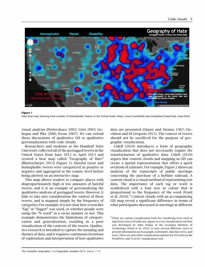
Researchers and students at the Humbolt StateUniversity collected all of the geotagged tweets in theUnited States from June 2012 to April 2013 andcreated a heat map called “Geography of Hate”(Bhattacharjee 2013) (Figure 1). Hateful racist andhomophobic tweets were categorized as positive ornegative and aggregated at the county-level beforebeing plotted on an interactive map.
This map allows readers to compare places withdisproportionately high or low amounts of hatefultweets, and it is an example of geovisualizing thequalitative analysis of geotagged tweets. However, itfails to take into consideration the context of thesetweets, and is mapped simply by the frequency ofcategories. For example, it is not clear howa term like“fag” or “faggot” was used, or whether people wereusing the “N word” in a racist manner or not. Thisexample demonstrates the limitations of categori-zation and generalization, resulting in a poorvisualization of the contexts of the tweets. Qualita-tive research is intended to capture themeaning andthemes of data, and it requires continuous iterationsof exploration and interpretation of how qualitative
data are presented (Glaser and Strauss 1967; Da-vidson and Di Gregorio 2011). The context of tweetsshould not be sacrificed for the purpose of geo-graphic visualization.
Cidell (2010) introduces a form of geographicvisualization that does not necessarily require thetransformation of qualitative data. Cidell (2010)argues that content clouds and mapping in GIS cancreate a spatial representation that offers a quickoverlook of a dataset. For example, Figure 2 shows ananalysis of the transcripts of public meetingsconcerning the purchase of a beltline railroad. Acontent cloud is a visual method of representing textdata. The importance of each tag or word issymbolized with a font size or colour that isproportional to the frequency of the word (Wardet al. 2010).4 Content clouds with an accompanyingGIS map reveal a significant difference in terms ofwhat participants discussed at meetings in different
Figure 1Hate heat map showing total number of homophobic tweets in the United States (http://users.humboldt.edu/mstephens/hate/hate_map.html)
4There are various visualization tools for visualizing texts such astagClowd.com orWordle.net. Jigsaw is a text visualization tool thatwas developed by John Stasko at the Georgina Institute ofTechnology (Ward et al. 2010). It uses several different views topresent information such as graph, scatterplot, time line views, andtexts. There are also other visualization options for text such as theWorldTree and TextArc visualization tool.
The Canadian Geographer / Le Géographe canadien 2014, xx(xx): 1–17
Code clouds 5
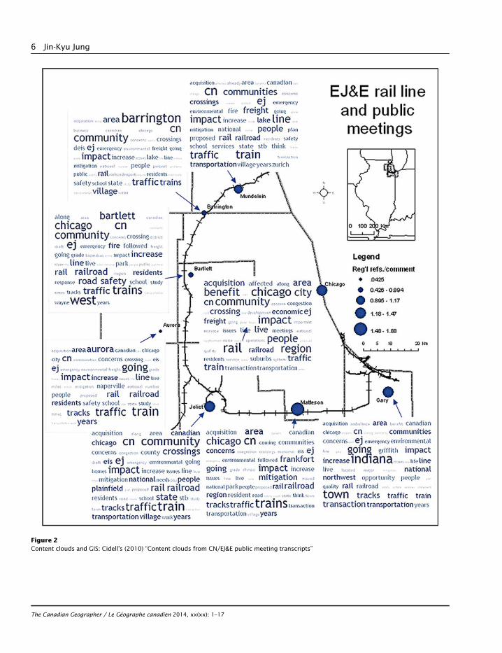
Figure 2Content clouds and GIS: Cidell’s (2010) “Content clouds from CN/EJ&E public meeting transcripts”
The Canadian Geographer / Le Géographe canadien 2014, xx(xx): 1–17
6 Jin-Kyu Jung
locations. This simple but inspiring integration ofcontent clouds with GIS provides a potential proto-type approach for integrating geovisualization,qualitative data, and qualitative analysis with spa-tially linked social media. Content clouds are alsoexamples of direct visualization (Manovich 2011b)because data (words) in content clouds are visual-ized with the original form of data without anytransformation.
Methodologically, content clouds are rooted incontent analysis.5 Content analysis is a techniquefor examining information in written or symbolicmaterials (Neuman 1997). It often refers to aquantitative measure of keywords that are typicallydeployed (Cidell 2010; Altheide and Schneider2013), but it can also be a practical methodfor exploring massive amounts of social mediaand e-research documents in a digital era (Ander-son and Kanuka 2003; Gray 2007; Hey et al. 2007).However, content clouds have several limitations.For example, content clouds are affective becausethey immediately make readers think that largeritems are the most important pieces of information.This may not be the case at all, because they onlyillustrate counts and frequencies of words. There-fore, content clouds are susceptible to representingthe most common words in a dataset, and notnecessarily the most important ones. The impor-tance of qualitative data lies in their potential toreveal context, and they should be “a source of well-grounded, rich descriptions, and explanations ofprocesses in identifiable local contexts” (Miles andHuberman1994, 1; Geertz 1973). Cope and Elwood’s(2009) understanding of qualitative GIS emphasizesthat qualitative data are important insofar as theyallowus to pull outmeaningful insights from them. Ibelieve that codes, and especially analytic codes, areimportant for the representation of the contexts ofqualitative data and the outcomes of qualitativeanalysis, and that they are an integral part of codeclouds.
The coding process is the heart of qualitativeanalyses, especially in grounded theory (Strauss andCorbin 1997). Grounded theory is amethodor theory
used to inductively generate theories from empiricaldata that have been systematically gathered. Theresearch begins with an area of study and allows“theory to emerge from the data” (Strauss andCorbin 1998, 12). Coding is a way of organizingand evaluating data to understand the contextualmeanings of qualitative data, and the coding processallows researchers to findmeanings of and relationsbetween data by differentiating and combining them(Cope 2003, 2005). Coding is a rigorous qualitativemethod. Different researchers have suggested dif-ferent coding procedures (Strauss 1987), but theygenerally follow two broad steps. The initial step isdescriptive coding, and the next is analytic coding.Descriptive coding can be thought of as applyingcategorical labels to the data, while the analyticcoding stage ismore interpretive. Therefore, analyticcodes are interpretive and reflective about thedescription of data (Cope 2003). Analytic codesshow the process and the result of qualitativeresearch better, and they can be a stepping-stonefor further qualitative analyses (e.g., identifyingemerging themes from analytic codes). Codingdoes not just entail continuously adding tags todata, but involves filtering data and developinggeneral ideas or key themes. As a result, researcherscan have a manageable dataset and deal with a hugeamount of information without losing its contextualimportance. Code clouds are designed to visualizeanalytic codes as a form of visualizing qualitativedata and analyses, so it is important to rememberthat qualitative analysis should have preceded thecreation of code clouds.
Technically, code clouds are generated in the samemanner as content clouds, but methodologicallythey differ in important ways. Content clouds do notaccurately represent qualitative data because theyuse input from unanalyzed and uncoded raw text. Incontrast, code clouds enable readers to see what thedata actually mean, and lead to further analysis andinterpretation. Code clouds therefore make use ofqualitative data transformation. We know that datatransformation (e.g., data reduction, simplification,generalization, etc.) is a necessary part of nearly allquantitative analysis in order to understand andanalyze the rawdata.However,we oftenoverlook thefact that data transformation is also an essential partof qualitative analysis. The purpose of qualitativeanalysis is not just showing the words themselves,but also the meanings they contain. Qualitativedata transformation is the ability that coding lends
5Content analysis is typically understood by qualitative researchersas a quantitative technique because it quantitatively measures keywords. However, it is often considered to be a qualitative techniqueby quantitative researchers because it works with qualitative datasuch as texts. Content analysis is the quantitative analysis ofqualitative data.
The Canadian Geographer / Le Géographe canadien 2014, xx(xx): 1–17
Code clouds 7
us to analyze and interpret raw qualitative data, andthat is what makes code cloud visualization asignificant methodological advancement over con-tent clouds.
Geotweet case study
This section presents two case studies that demon-strate the potential applications of code clouds tothe production of meanings from geotweets. Thestudy area is King County, themost populous countyin Washington State and the home of the state’slargest city, Seattle. This study uses a 5 percentsample of all geotweets generated in King County inOctober 2012. The original dataset was collected andprovided by the DOLLY (Data on Local Life and you)project6 at the University of Kentucky. A total of14,858 geotweets were collected, and the datasetcontains detailed information including user ID,user description, geographic coordinates, createddate and time, place type, and tweet text. Thegeographic coordinates of each tweet are used tomap them. I analyzed the main texts of the tweetsthrough a coding process, using the computer-aidedqualitative data analysis software (CAQDAS) calledATLAS.ti7 to manage and facilitate the qualitativeanalysis process. Technically, Wordle (www.wordle.net) was used to generate code clouds of analyticcodes. Other websites such as TagCrowd (http://tagcrowd.com), TwitScoop (www.twitscoop.com),and Twitter Trending Topics (twitter.com/trending-topics) all have the ability to generate a visual displayof words. However, Wordle was chosen for its moreflexible capabilities for visualizing text analysis (e.g.,word counting) and layout (e.g., placement andshape) (Steele and Iliinsky 2010). Although Wordleis not made for advanced textual analysis andvisualization, it generates code clouds well enoughto reflect the contextualized meanings of sourcetweets.
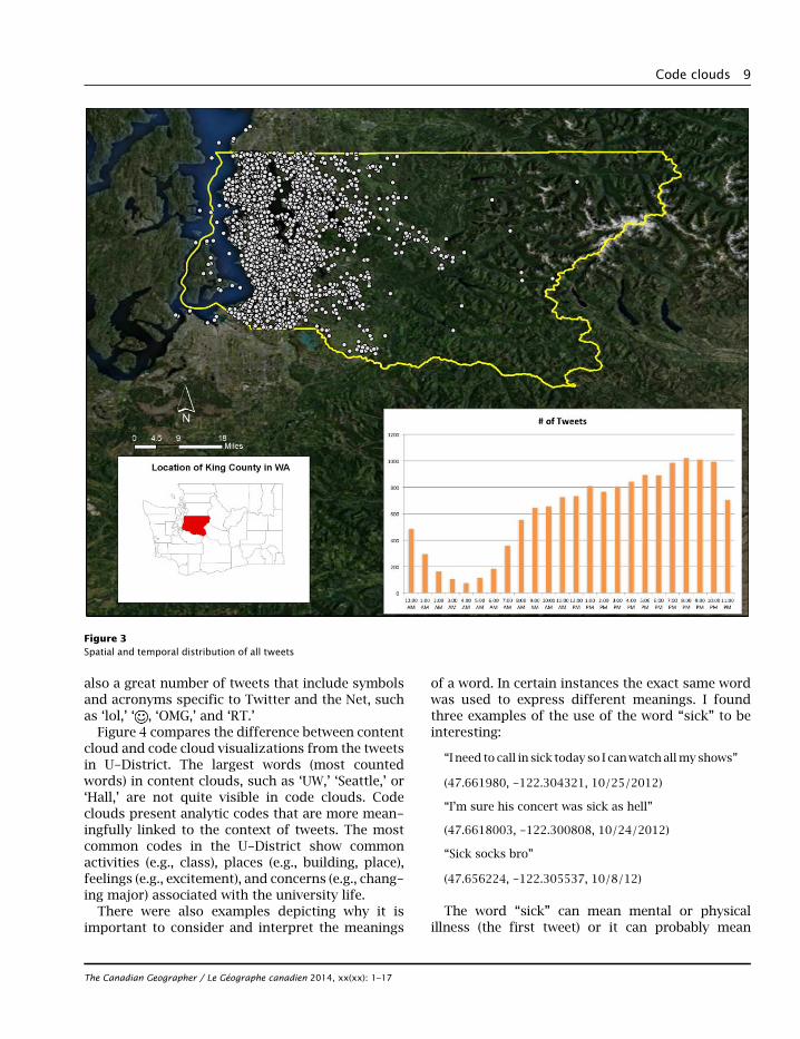
I began by mapping basic spatial and temporaldistribution of tweets, which is typical of quantita-tive analyses of geotweets. All tweets were mappedwith embedded geographic coordinates (i.e., latitudeand longitude) and grouped by tweet time. Tweets
were more concentrated in the western part of KingCounty, and more than half of the tweets weregenerated between late afternoon and midnight(Figure 3).
The next step was the coding process. I beganan inductive and iterative coding analysis withoutany pre-defined categories or themes. Instead,I explored multiple possibilities and interpretations,so that new analytic codes were naturally developedfrom the original texts. I read and coded each tweetone by one. Coding procedures provided me withanalytic tools for systematically and creativelyhandling masses of (raw) tweet data, and I startedto draw out geographically focused areas andrecurring themes. In particular I identified twothemes: theUniversityDistrict (U-District) in Seattle,and the debate around two candidates in the2012 U.S. Presidential election, Obama and Romney.The following discussions are based on these twothemes, and they demonstrate the potential useof code clouds as a qualitative geovisualizationapproach in studying geotweets.
Theme 1. U-District
Many tweets were located within the U-District.Identifying the specific areas in which tweets areconcentrated displays the potential for geographi-cally analyzing spatially linked social media. Itwould not be possible to identify these locations ifthe tweets were not geotagged. Geographicallyfocused tweets also prompt us to study specifictopics and themes occurring within particular area,and their relationships to one another.
The busiest time for Twitter activities in theU-Districtwas from11:00 a.m. to 2:00p.m.However,proportionally high numbers of tweets were gener-ated in the late night as well. For instance, one tweetwas generated at 3:00 a.m. at the University ofWashington library, and it says, “Still at the library. Ineed sleep Ugh.” A total of 218 analytic codes werecreated. Most common codes were generic, butclosely related to the academic and social life atthe University: ‘UW,’ ‘building,’ ‘place,’ ‘party,’ ‘food,’‘campus,’ ‘frat,’ ‘drink,’ and ‘excitement.’ There werealso many tweets complaining about courses, clas-ses, majors, instructors, and even TAs: ‘complaint,’‘professor,’ ‘struggle,’ ‘disappointment,’ ‘exam,’‘hate,’ ‘homework, ‘missing,’ and ‘changing major.’Seattle’s gloomy fall weatherwas oftenmentioned aswell: ‘weather,’ ‘weird,’ ‘coffee,’ and ‘rain.’Therewere
6http://www.floatingsheep.org7For further details of ATLAS.ti, see Friese (2012) and Lewins andSilver (2007). For examples of the parallel use of ATLAS.ti and GIS,see Jung and Elwood (2010).
The Canadian Geographer / Le Géographe canadien 2014, xx(xx): 1–17
8 Jin-Kyu Jung
also a great number of tweets that include symbolsand acronyms specific to Twitter and the Net, suchas ‘lol,’ ‘ , ‘OMG,’ and ‘RT.’
Figure 4 compares the difference between contentcloud and code cloud visualizations from the tweetsin U-District. The largest words (most countedwords) in content clouds, such as ‘UW,’ ‘Seattle,’ or‘Hall,’ are not quite visible in code clouds. Codeclouds present analytic codes that are more mean-ingfully linked to the context of tweets. The mostcommon codes in the U-District show commonactivities (e.g., class), places (e.g., building, place),feelings (e.g., excitement), and concerns (e.g., chang-ing major) associated with the university life.
There were also examples depicting why it isimportant to consider and interpret the meanings
of a word. In certain instances the exact same wordwas used to express different meanings. I foundthree examples of the use of the word “sick” to beinteresting:
“I need to call in sick today so I canwatch allmy shows”
(47.661980, -122.304321, 10/25/2012)
“I’m sure his concert was sick as hell”
(47.6618003, -122.300808, 10/24/2012)
“Sick socks bro”
(47.656224, -122.305537, 10/8/12)
The word “sick” can mean mental or physicalillness (the first tweet) or it can probably mean
Figure 3Spatial and temporal distribution of all tweets
The Canadian Geographer / Le Géographe canadien 2014, xx(xx): 1–17
Code clouds 9
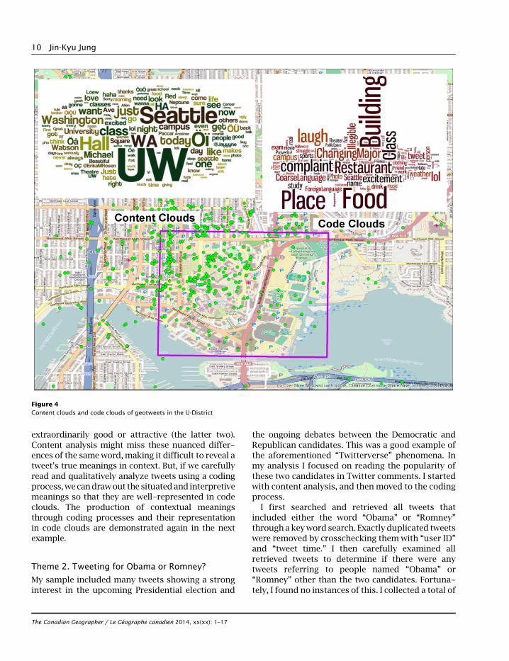
extraordinarily good or attractive (the latter two).Content analysis might miss these nuanced differ-ences of the same word, making it difficult to reveal atweet’s true meanings in context. But, if we carefullyread and qualitatively analyze tweets using a codingprocess,wecandrawout the situatedand interpretivemeanings so that they are well-represented in codeclouds. The production of contextual meaningsthrough coding processes and their representationin code clouds are demonstrated again in the nextexample.
Theme 2. Tweeting for Obama or Romney?
My sample included many tweets showing a stronginterest in the upcoming Presidential election and
the ongoing debates between the Democratic andRepublican candidates. This was a good example ofthe aforementioned “Twitterverse” phenomena. Inmy analysis I focused on reading the popularity ofthese two candidates in Twitter comments. I startedwith content analysis, and then moved to the codingprocess.
I first searched and retrieved all tweets thatincluded either the word “Obama” or “Romney”through akeyword search. Exactly duplicated tweetswere removed by crosschecking them with “user ID”
and “tweet time.” I then carefully examined allretrieved tweets to determine if there were anytweets referring to people named “Obama” or“Romney” other than the two candidates. Fortuna-tely, I found no instances of this. I collected a total of
Figure 4Content clouds and code clouds of geotweets in the U-District
The Canadian Geographer / Le Géographe canadien 2014, xx(xx): 1–17
10 Jin-Kyu Jung
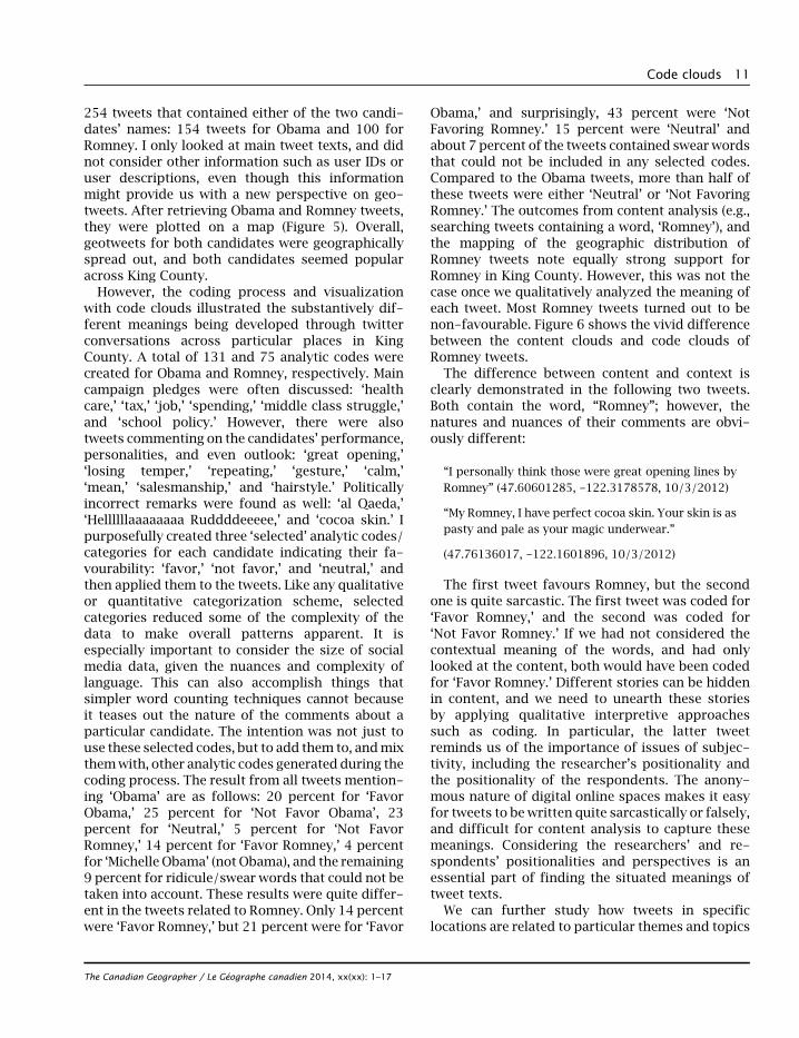
254 tweets that contained either of the two candi-dates’ names: 154 tweets for Obama and 100 forRomney. I only looked at main tweet texts, and didnot consider other information such as user IDs oruser descriptions, even though this informationmight provide us with a new perspective on geo-tweets. After retrieving Obama and Romney tweets,they were plotted on a map (Figure 5). Overall,geotweets for both candidates were geographicallyspread out, and both candidates seemed popularacross King County.
However, the coding process and visualizationwith code clouds illustrated the substantively dif-ferent meanings being developed through twitterconversations across particular places in KingCounty. A total of 131 and 75 analytic codes werecreated for Obama and Romney, respectively. Maincampaign pledges were often discussed: ‘healthcare,’ ‘tax,’ ‘job,’ ‘spending,’ ‘middle class struggle,’and ‘school policy.’ However, there were alsotweets commenting on the candidates’ performance,personalities, and even outlook: ‘great opening,’‘losing temper,’ ‘repeating,’ ‘gesture,’ ‘calm,’‘mean,’ ‘salesmanship,’ and ‘hairstyle.’ Politicallyincorrect remarks were found as well: ‘al Qaeda,’‘Hellllllaaaaaaaa Ruddddeeeee,’ and ‘cocoa skin.’ Ipurposefully created three ‘selected’ analytic codes/categories for each candidate indicating their fa-vourability: ‘favor,’ ‘not favor,’ and ‘neutral,’ andthen applied them to the tweets. Like any qualitativeor quantitative categorization scheme, selectedcategories reduced some of the complexity of thedata to make overall patterns apparent. It isespecially important to consider the size of socialmedia data, given the nuances and complexity oflanguage. This can also accomplish things thatsimpler word counting techniques cannot becauseit teases out the nature of the comments about aparticular candidate. The intention was not just touse these selected codes, but to add them to, andmixthemwith, other analytic codes generated during thecoding process. The result from all tweets mention-ing ‘Obama’ are as follows: 20 percent for ‘FavorObama,’ 25 percent for ‘Not Favor Obama’, 23percent for ‘Neutral,’ 5 percent for ‘Not FavorRomney,’ 14 percent for ‘Favor Romney,’ 4 percentfor ‘Michelle Obama’ (not Obama), and the remaining9 percent for ridicule/swear words that could not betaken into account. These results were quite differ-ent in the tweets related to Romney. Only 14 percentwere ‘Favor Romney,’ but 21 percent were for ‘Favor
Obama,’ and surprisingly, 43 percent were ‘NotFavoring Romney.’ 15 percent were ‘Neutral’ andabout 7 percent of the tweets contained swear wordsthat could not be included in any selected codes.Compared to the Obama tweets, more than half ofthese tweets were either ‘Neutral’ or ‘Not FavoringRomney.’ The outcomes from content analysis (e.g.,searching tweets containing a word, ‘Romney’), andthe mapping of the geographic distribution ofRomney tweets note equally strong support forRomney in King County. However, this was not thecase once we qualitatively analyzed the meaning ofeach tweet. Most Romney tweets turned out to benon-favourable. Figure 6 shows the vivid differencebetween the content clouds and code clouds ofRomney tweets.
The difference between content and context isclearly demonstrated in the following two tweets.Both contain the word, “Romney”; however, thenatures and nuances of their comments are obvi-ously different:
“I personally think those were great opening lines byRomney” (47.60601285, -122.3178578, 10/3/2012)
“My Romney, I have perfect cocoa skin. Your skin is aspasty and pale as your magic underwear.”
(47.76136017, -122.1601896, 10/3/2012)
The first tweet favours Romney, but the secondone is quite sarcastic. The first tweet was coded for‘Favor Romney,’ and the second was coded for‘Not Favor Romney.’ If we had not considered thecontextual meaning of the words, and had onlylooked at the content, both would have been codedfor ‘Favor Romney.’ Different stories can be hiddenin content, and we need to unearth these storiesby applying qualitative interpretive approachessuch as coding. In particular, the latter tweetreminds us of the importance of issues of subjec-tivity, including the researcher’s positionality andthe positionality of the respondents. The anony-mous nature of digital online spaces makes it easyfor tweets to be written quite sarcastically or falsely,and difficult for content analysis to capture thesemeanings. Considering the researchers’ and re-spondents’ positionalities and perspectives is anessential part of finding the situated meanings oftweet texts.
We can further study how tweets in specificlocations are related to particular themes and topics
The Canadian Geographer / Le Géographe canadien 2014, xx(xx): 1–17
Code clouds 11
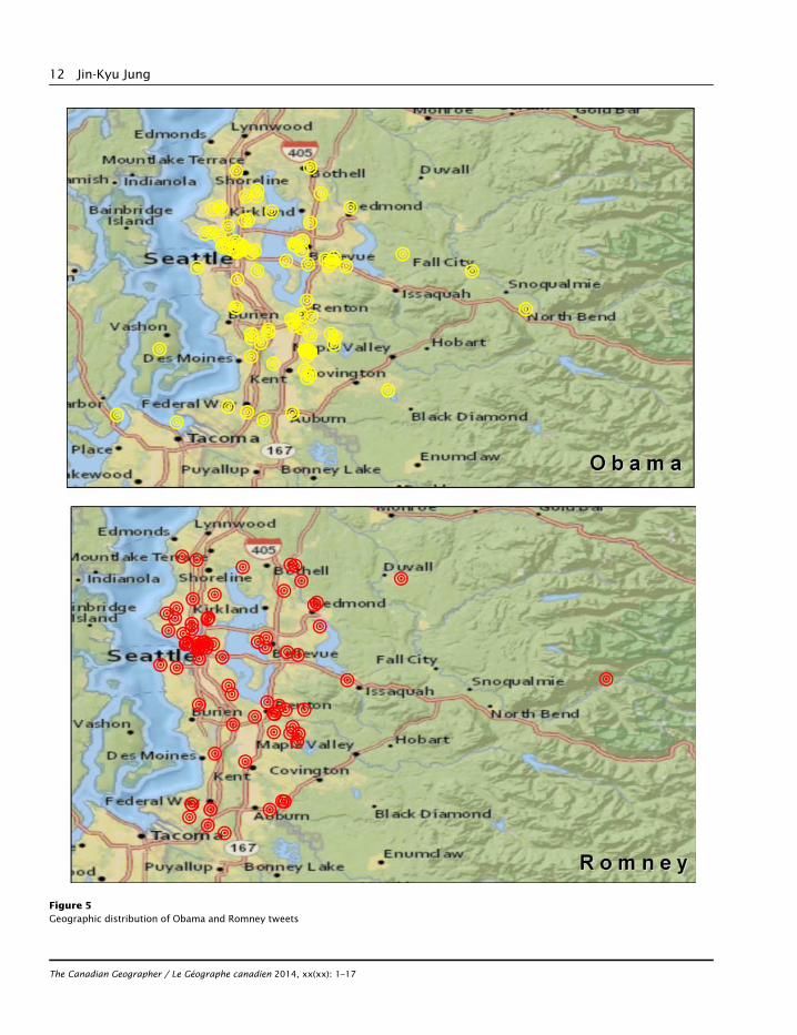
Figure 5Geographic distribution of Obama and Romney tweets
The Canadian Geographer / Le Géographe canadien 2014, xx(xx): 1–17
12 Jin-Kyu Jung
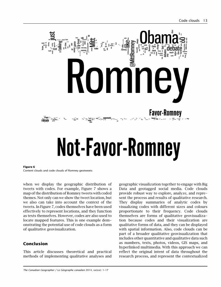
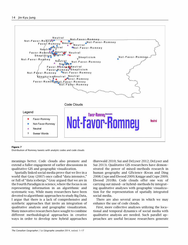
when we display the geographic distribution oftweets with codes. For example, Figure 7 shows amapof thedistribution ofRomney tweetswith codedthemes. Not only canwe show the tweet location, butwe also can take into account the context of thetweets. In Figure 7, codes themselves have been usedeffectively to represent locations, and they functionas texts themselves. However, codes are also used tolocate mapped features. This is one example dem-onstrating the potential use of code clouds as a formof qualitative geovisualization.
Conclusion
This article discusses theoretical and practicalmethods of implementing qualitative analyses and
geographic visualization together to engage with BigData and geotagged social media. Code cloudsprovide robust way to explore, analyze, and repre-sent the process and results of qualitative research.They display summaries of analytic codes byvisualizing codes with different sizes and coloursproportionate to their frequency. Code cloudsthemselves are forms of qualitative geovisualiza-tion because codes and their visualization arequalitative forms of data, and they can be displayedwith spatial information. Also, code clouds can bepart of a broader qualitative geovisualization thatincludes other quantitative and qualitative data suchas numbers, texts, photos, videos, GIS maps, andhyperlinked multimedia. With this approach we canreflect the original intent of data throughout theresearch process, and represent the contextualized
Figure 6Content clouds and code clouds of Romney geotweets
The Canadian Geographer / Le Géographe canadien 2014, xx(xx): 1–17
Code clouds 13
meanings better. Code clouds also promote andextend a fuller engagement of earlier discussions inqualitative GIS and geographic visualization.
Spatially linked socialmedia prove that we live in aworld that Gray (2007) once called “data intensive,”or full of “data icebergs.” Gray argued that we are inthe Fourth Paradigm in science, where the focus is onrepresenting information in an algorithmic andsystematic way. While many researchers have beendevoted to algorithmic approaches to study BigData,I argue that there is a lack of comprehensive andsynthetic approaches that invite an integration ofqualitative analysis and geographic visualization.Many innovative researchers have sought to combinedifferent methodological approaches in creativeways in order to develop new hybrid approaches
(Barewald 2010; Sui and DeLyser 2012; DeLyser andSui 2013). Qualitative GIS researchers have demon-strated the power of mixed-methods research inhuman geography and GIScience (Kwan and Ding2008; Cope and Elwood2009; Knigge andCope 2009;Elwood 2010b). Code clouds offer one way ofcarrying outmixed- or hybrid-methods by integrat-ing qualitative analyses with geographic visualiza-tion for the representation of spatially integratedsocial media.
There are also several areas in which we mayenhance the use of code clouds.
First, more collective analyses utilizing the loca-tional and temporal dynamics of social media withqualitative analysis are needed. Such parallel ap-proaches are useful because researchers generate
Figure 7Distribution of Romney tweets with analytic codes and code clouds
The Canadian Geographer / Le Géographe canadien 2014, xx(xx): 1–17
14 Jin-Kyu Jung
key themes through qualitative analysis, and theyconcurrently apply more advanced geospatial anal-yses. This article pointed out the lack of holisticapproaches that invite qualitative analyses andinterpretive methods in studying spatially linkedsocialmedia. However, this is notmeant to disregardthe importance of traditional, quantitative geo-graphic analyses. Many creative efforts have beenmade to expand geographic analyses to study BigData beyond simple mapping, and we shouldconsider combining these spatial analyticalmethodswith qualitative approaches.
Secondly, further engagements with various typesof qualitative analysis are desirable. To fully under-stand the significance of qualitative geovisualiza-tion, we need to look closely at what kinds of data aremapped and visualized, and what associated quali-tative data are collected, analyzed, and representedin the form of geovisualization. This article mainlyfocuses on qualitative analyses of textual data,especially the coding process. However, social mediaoften contain various other formsbesides texts, suchas multimedia and weblinks. Our focus should beexpanded from privileging textual analysis to in-clude other forms of qualitative analyses such asvisual methodologies (Rose 2001, 2003), meta-analysis (Gaber and Gaber 2007), discourse analyses(Dittmer 2010), and rhythmanalysis (Lefebvre 2004).These all represent various forms of qualitative datatransformation, and provide new ways of creatingandworkingwith qualitative geovisualization. Thesemethods therefore allow us to grapple with thequestions of qualitative data and various ways ofanalyzing them.
Thirdly, social media allows us to examine smallerand subtler changes in shorter periods of time(Altheide and Schneider 2013). We can track contin-uous communications, enabling us to experimentand to develop new applications for tracking dis-courses. Therefore, we at least need to continuepaying attention to the history and chronology ofsocial media. Tracing and analyzing Retweets (RT) inTwitter might be a good starting point to researchcontinuous conversation.
Fourthly, we should be aware of redundancy in thespatial data associated with social media. There aremany automatically generated tweets with location-based service providers. For example, unwantedautomatically generated Check-In data in Four-square are posted on Twitter whenever users visitplaces that are defined as favourite places. There is a
danger wemay end up having boundless and uselessredundant spatial and social data.
Lastly, in relation to Manovich’s (2011b) directvisualization, we can extend the power of codeclouds by generating clouds not only from the inputof texts, but also from the input of other forms ofdata such as visuals. For example, photographicimages themselves can be code and can be propor-tionally re-sized and visualized according to theirimportance.
Implementation of qualitative analysis and carefulconsideration of qualitative aspects of geovisuali-zation complement current Big Data and socialmedia research. Code clouds allow us to see andvisualize the meanings of geotagged social mediadata, and help us to research the fruitful contexts ofdiverse socio-spatial, cultural, political and techni-cal boundaries of knowledge.
Acknowledgements
I recognize the support of an organizer, Nadine Schuurman, andall the participants in the 2013 Alt.GIS conference on thedevelopment of earlier ideas of this article. I particularly thankSarah Elwood and Jason Young for their constructive andthoughtful feedback, and extend my gratitude to the editor, theanonymous reviewers, and the editorial assistant for theircontinuous help that improved this article greatly. I alsogratefully acknowledge the support for geotweet data from theDOLLY project at the University of Kentucky.
References
Altheide, D. L., and C. J. Schneider. 2013. Qualitative mediaanalysis. Thousand Oaks, CA: SAGE.
Anderson, T., and H. Kanuka. 2003. E-Research: Methods,strategies, and issues. Boston: MA: Allyn & Bacon.
Baerwald, T. J. 2010. Prospects for Geography as an interdisci-plinary discipline. Annals of Association of American Geogra-phers 100(3): 493––501.
Bhattacharjee, R. 2013. Hate heat map shows where racist,homophobic tweets come from. http://news.msn.com/us/hate-heat-map-shows-where-racist-homophobic-tweets-come-from.
Butts, C. T., R. M. Action, J. R. Hipp, and N. N. Nagle. 2012.Geographical variability and network structure. Social Net-works 34(1): 82––100.
Chen, C. 2004. Information visualization: Beyond the horizon.Singapore: Springer.
Cidell, J. 2010. Content clouds as exploratory qualitative dataanalysis. Area 42(4): 514––523.
Cieri, M. 2003. Between being and looking: Queer tourismpromotion and lesbian social space in Greater Philadelphia.ACME:An International E-Journal forCritical Geographies 2(2):147––166.
The Canadian Geographer / Le Géographe canadien 2014, xx(xx): 1–17
Code clouds 15
Cope, M. 2003. Coding transcripts and diaries. In Key Methods inGeography, ed. N. J. Clifford and G. Valentine. London: SAGE,445––459.
————. 2005. Coding qualitative data. In Qualitative researchmethods in human geography, ed. I. Hay. New York: OxfordUniversity Press, 310––324.
Cope, M., and S. Elwood. 2009. Qualitative GIS: A mixed methodsapproach. London: SAGE.
Crampton, J. 2009. Cartography: maps 2.0. Progress in HumanGeography 33(1): 91––100.
Daraganova, G., P. Pattison, J. Koskinen, B. Mitchell, A. Bill,M. Watts, and S. Baum. 2012. Networks and geography:Modelling community network structures as the outcomes ofboth spatial and network processes. Social Networks 34(1):6––17.
Davidson, J., and S. di Gregorio. 2011. Qualitative research andtechnology: In themidst of a revolution. In The SAGE handbookof qualitative research ed. N. K. Denzin and Y. S. Lincoln.Thousand Oaks, CA: SAGE, 627––644.
DeLyser, D., and D. Z. Sui. 2013. Crossing the qualitative-quantitative chasm II: Inventive approaches to big data, mobilemethods, and rhythmanalysis. Progress in Human Geography37(2): 293––305.
Dittmer, J. 2010. Textual and Discourse Analysis. In The SAGEHandbook of Qualitative Geography, ed. D. DeLyser, S. Herbert,S. Aitken, M. Crang, and L. McDowell. Thousand Oaks, CA:SAGE, 274––286.
Elwood, S. 2009. Geographic Information Science: New geo-visualization technologies—Emerging questions and linkageswith GIScience research. Progress in Human Geography 33(2):256––263.
————. 2010a. Geographic information science: Emergingresearch on the societal implications of the geospatial web.Progress in Human Geography 34(3): 349––357.
————. 2010b. Geographic information science: Visualization,visual methods, and the geoweb. Progress in Human Geogra-phy 34(3): 1––8.
Erickson, I. 2010. Geography and community: New forms ofinteraction among people and places. American BehavioralScientist 53(8): 1194––1207.
Fitton, L., M. E. Gruen, and L. Poston. 2009. Twitter for dummies.Indianapolis, IN: Wiley Publishing, Inc.
Friese, S. 2012. Qualitative data analysis with ATLAS.ti. London:SAGE.
Gaber, J., and S. Gaber. 2007. Qualitative analysis for planning &policy: Beyond the numbers. Chicago, IL: The AmericanPlanning Association.
Gahegan, M., and W. Pike. 2006. A situated knowledge represen-tation of geographical information. Transactions in GIS 10(5):727––750.
Geertz, C. 1973. The interpretation of cultures: Selected essays.New York: Basic Books.
Glaser, B. G., and A. Strauss. 1967. The discovery of groundedtheory: Strategies for qualitative research. New York: AldineTransaction.
Graham, M., M. Stephens, and S. Hale. 2013. Mapping the geoweb:a geography of Twitter. Environment and Planning A 45(1):100––102.
Gray, J. 2007. Jim Gray on eScience: a transformed scientificmethod. http://research.microsoft.com/en-us/collaboration/fourthparadigm/contents.aspx.
Gundersen, E. 2013. Visualizing 3 Billion Tweets. Map Box.June 19. http://www.mapbox.com/blog/visualizing-3-billion-tweets/.
Hey, T., S. Tansley, andK. Tolle. 2007.The fourth paradigm: Data-intensive scientific discovery. http://research.microsoft.com/en-us/collaboration/fourthparadigm/4th_paradigm_book_complete_lr.pdf.
Hipp, J. R., R. W. Faris, and A. Boessen. 2012. Measuring‘neighborhood’: Constructing network neighborhoods. SocialNetworks 34(1): 128––140.
Jung, J.-K., and S. Elwood. 2010. Extending the qualitativecapabilities of GIS: Computer-aided qualitative GIS. Trans-actions in GIS 14(1): 63––84.
Knigge, L., andM.Cope. 2009. Grounded visualization and scale: Arecursive analysis of community spaces. In Qualitative GIS: Amixed methods approach ed. M. Cope and S. Elwood. London:SAGE, 95––114.
Kumar, S., G. Barbier, M. Ali, and H. Liu. 2011. TweetTracker: Ananalysis took for humanitarian and disaster relief. Paperpresented at The Fifth International AAAI Conference onWeblogs and Social Media. http://www.aaai.org/ocs/index.php/ICWSM/ICWSM11/paper/view/2736.
Kwak, H., C. Lee, H. Park, and S. Moon. 2010. What is Twitter, asocial network or a news media? Paper presented at 19th
International conference on World Wide Web. http://an.kaist.ac.kr/traces/WWW2010.html.
Kwan, M.-P. 2007. Affecting geospatial technologies: Toward afeminist politics of emotion. Professional Geographer 59(1):22––34.
Kwan, M.-P., and G. Ding. 2008. Geo-Narrative: Extendinggeographic information systems for narrative analysis inqualitative and mixed-method research. The ProfessionalGeographer 60(4): 443––465.
Lapenta, F. 2012. Geomedia-based methods and visual research:Exploring the theoretical tenets of the localization andvisualization of mediated social relations with direct visuali-zation techniques. In Advances in visual methodology, ed. S.Pink. London: SAGE, 131––150.
Leetaru, K. H., S. Wang, G. Cao, A. Padanabhan, and E. Shook. 2013.Mapping the global Twitter heartbeat: The geography ofTwitter. First Monday 18(5): http://dx.doi.org/10.5210/fm.v18i5.4366.
Lefebvre, H. 2004. Rhythmanalysis: Space, time and everyday life,translated by S. Elden and G. Moore. London: Continuum.
Leuthold, H., M. Hermann, and S. I. Fabrikant. 2007. Making thepolitical landscape visible: Mapping and analyzing votingpatterns in an ideological space. Environment and PlanningB: Planning and Design 34(5): 785––807.
Lewins, A., and C. Silver. 2007. Using software in qualitativeresearch: A step-by-step guide. London: SAGE.
Livehoods. 2012. http://livehoods.org/.MacEachren, A. M., A. C. Robinson, A. Jaiswal, S. Pezanowski,
A. Savelyev, J. Blanford, and P. Mitra. 2011. Geo-Twitteranalytics: Applications in crisis management. Paper presentedat 25th International Cartographic Conference. http://www.geovista.psu.edu/publications/2011/MacEachren_ICC_2011.pdf.
Manovich, L. 2002. Data visualization as a new abstraction andanti-sublime. http://manovich.net/articles/.
————. 2005. Understanding Meta-Media, CTheory. http://ctheory.net/articles.aspx?id¼493.
The Canadian Geographer / Le Géographe canadien 2014, xx(xx): 1–17
16 Jin-Kyu Jung
————. 2011a. Trending: The promise and the challenges of bigsocial data. http://lab.softwarestudies.com/2011/04/new-article-by-lev-manovich-trending.html.
————. 2011b.What is visualisation?Visual Studies 26(1): 36––49.Miles, M. B., and A. M. Huberman. 1994. Qualitative data analysis:
An expanded sourcebook. Thousand Oaks, CA: SAGE.Miller, G. 2011. Social scientists wade into the tweet stream.
Science 333(6051): 1814––1815.Neuman, W. L. 1997. Social research methods, qualitative and
quantitative approaches. Boston: Allyn and Bacon.Quercia, D., L. Capra, and J. Crowcroft. 2012. The Social world of
twitter: Topics, geography, and emotions. Paper presented atThe Sixth International AAAI Conference on Weblogs andSocial Media. https://www.aaai.org/ocs/index.php/ICWSM/ICWSM12/paper/view/4612.
Parker, K. 2012. The social-media presidential campaign: Electionby Twitterverse. October 21. The Seattle Times. http://seattletimes.com/html/opinion/2019476817_parkercolumn-socialdebatexml.html.
Pavlovskaya, M. E. 2002. Mapping urban change and changing GIS:Other views of economic restructuring. Gender, Place andCulture 9(3): 281––289.
Raymond, M. 2010. Twitter donates entire tweet archive to libraryof congress. Library of Congress. http://www.loc.gov/today/pr/2010/10-081.html.
Reisinger, D. 2011. Twitter tallies 200 million tweets perday. CNET. July 1. http://news.cnet.com/8301-1350 6_3-20076022-17/twitter-tallies-200-million-tweets-per-day/.
Rose, G. 2001. Visual methodologies: An introduction to theinterpretation of visual materials. 2nd ed. London: SAGE.
———. 2003. On the need to ask how, exactly, is geography visual?Antipode, 35: 212––221.
Schuurman, N. 2009. The new Brave New World: Geography, GIS,and the emergence of ubiquitous mapping and data. Environ-ment and Planning D: Society and Space 27(4): 571––580.
Sharif, S. 2012. Obama vs. Romney on Twitter: Data proves socialmedia is critical for successful campaigns. Policymic. http://www.policymic.com/articles/8991/obama-vs-romney-on-twitter-data-proves-social-media-is-critical-for-success-ful-campaigns.
Skupin, A., and K. Borner. 2007. Guest editorial. Environment andPlanning B: Planning and Design 34(5): 765––766.
Skupin, A., and S. I. Fabrikant. 2003. Spatialization methods: Acartographic research agenda for non-geographic informationvisualization. Cartography and Geographic InformationScience 30(2): 99––119.
Small, T. A. 2011. What the hashtag? A content analysis ofCanadian politics on Twitter. Information, Communication &Society 14(6): 872––895.
Steele, J., andN. Iliinsky. 2010. Beautiful visualization. Sebastopol,CA: O’Reilly.
Strauss, A. 1987. Qualitative analysis for social scientists. Cam-bridge: Cambridge University Press.
Strauss, A., and J. Corbin. 1997. Grounded theory in practice.Thousand Oaks, CA: SAGE.
———. 1998. Basics of qualitative research: Techniques andprocedures for developing grounded theory. London: SAGE.
Sui, D. Z., and D. DeLyser. 2012. Crossing the qualitative-quantitative chasm I: Hybrid geographies, the spatial turn,and volunteered geographic information (VGI). Progress inHuman Geography 36(1): 111––124.
Sui, D. Z., and M. F. Goodchild. 2011. The convergence of GISand social media: Challenges for GIScience. InternationalJournal of Geographical Information Science 25(11): 1737––1748.
Takhteyev, Y., A. Gruzd, and B. Wellman. 2012. Geography ofTwitter networks. Social Networks 34(1): 73––81.
Terdiman, D. 2012. Twitter hits half a billion tweets a day. CNET.October 26. http://news.cnet.com/8301-1023 _3-57541566-93/report-twitter-hits-half-a-billion-tweets-a-day/.
Thatcher, J. 2014. Living on fumes: Digital footprints, data fumes,and the limitations of spatial big data. International Journal ofCommunication 8: 1765––1783.
Tsou, M.-H., and J.-A. Yang. 2012. Spatial analysis of social mediacontent (tweets) during the 2012 U.S. Republican presidentialprimaries. Extended Abstract at Seventh International Con-ference on Geographic Information Science. http://www.giscience.org/proceedings/proceedings-ext-name.html.
Ward, M., G. Grinstein, and D. Keim. 2010. Interactive datavisualization: Foundations, techniques, and applications.Natick, MA: A.K. Peters, Ltd.
Wilson, M. W. 2009. Towards a genealogy of qualitative GIS. InQualitative GIS: A mixed methods approach, ed. M. Cope and S.Elwood. London: SAGE, 156––170.
The Canadian Geographer / Le Géographe canadien 2014, xx(xx): 1–17
Code clouds 17