reactions to geovisualization: an experience from a ...geoanalytics.net/and/papers/ijgis06.pdf ·...
TRANSCRIPT
1
Reactions to Geovisualization: an Experience from a
European Project
Gennady Andrienko1, Natalia Andrienko1, Richard Fischer2, Volker Mues2, and
Andreas Schuck3
1 Fraunhofer Institute Autonomous Intelligent Systems,
Sankt Augustin, Germany
2 Federal Research Center for Forestry and Forest Products,
Hamburg, Germany
3 European Forest Institute,
Joensuu, Finland
Abstract
The paper is written jointly by two parties, computer scientists specializing in
geovisualization and experts in forestry, who cooperated within a joint project. The
authors tell a story about an attempt of the geovisualizers to introduce the foresters to
the concept and principles of exploratory data analysis and to the use of visualization
for systematic and comprehensive data exploration. This endeavor should be
considered as an informal experiment rather than a rigorous scientific study. Unlike
customary tests of the usability of specific tools and techniques, the geovisualizers did
not give the forestry specialists a series of tasks to carry out by applying
geovisualization tools and did not try to measure how well the foresters performed.
The idea of the geovisualizers was to demonstrate the principles and power of
exploratory data analysis to the foresters by an example. For this purpose, the
2
geovisualizers performed an exploration of a non-trivial dataset by themselves and
reported the procedure and the principles applied, the techniques used, and the
findings made to the foresters. The reaction of the forest experts uncovered a range of
fundamental issues that are relevant to geovisualization and information visualization
research. The authors analyze these issues from their perspective and formulate a set
of questions they would like to discuss with other researchers.
Keywords: geovisualization, exploratory data analysis
Prologue
This paper is written by two different parties, which worked together in a European
project NEFIS − Network for a European Forest Information Service. One of the
parties consists of computer scientists doing research in geovisualization and
developing techniques and tools for exploratory analysis of spatial and spatio-
temporal data. This party is further designated as “geovisualizers”. The other party
consists of experts in forestry and forest data analysis and, in fact, represents the body
of the NEFIS project community, which is further referred to as “foresters”.
It may be expected from such an introduction that the paper will report the results of
NEFIS (which can be undoubtedly qualified as a successful project) or tell how the
geovisualizers and the foresters cooperated (quite fruitfully) to achieve the project
goals. However, the topic of the paper is different. It describes a particular episode in
which the two parties were involved although it was not directly related to
accomplishing the goals of NEFIS. Nevertheless, some information about the project
is necessary for the understanding of the story.
In brief, the goal of NEFIS was to develop a framework for Web-based access of
diverse user categories to distributed sources of forest information and data such as

3
forestry statistics, forest resources assessment, and forest monitoring data. The
framework includes a metadata-based web service for data search and retrieval and a
data processing and visualization component referred to as the Visualization Toolkit
(VTK). A prototype implementation of the framework has been built on the basis of
existing software. The geovisualization system CommonGIS has been used in the role
of the VTK. Information about the system is available at the URLs http://www.ais.
fraunhofer.de/and/ (section “Demonstrators”) and http://www.commongis.com/. More
information concerning the background of NEFIS, the goals pursued, and the
approaches taken can be found on the project web site http://www.efi.fi/projects/nefis/
and in Schuck et al. (2005).
It is quite natural that the geovisualizers and foresters cooperating within a common
project had differing goals, interests, and opinions. In accord with the main objective
of the project, the foresters wished to define the requirements for data visualization
software intended for a broad community of users of forest data. Apparently, many of
them did not consider themselves as possible users of geovisualization. As one of the
foresters noted, “At least I did not primarily aim at getting trained in geovisualization
but wanted a tool to offer simplified data to the external world”. From this
perspective, the foresters saw the primary function of the VTK as providing a quick
and simple overview of data.
The geovisualizers had quite different ideas concerning the VTK: they believed this
should be a tool for exploratory data analysis (EDA). While EDA was not explicitly
mentioned in the official goals of NEFIS, the geovisualizers reasoned as follows.
Since forest-related data are to be provided to people through the Web, these people
will, naturally, wish to explore the data they find. They will appreciate the VTK not
being restricted to providing just a simple overview but rather enabling data
4
exploration. Hence, EDA as a means of getting acquainted with previously unknown
data is certainly relevant to the goals of the project. Moreover, the geovisualizers also
believed that exploratory tools could be useful not only for the target users of forest
data but also for the forest experts themselves, in particular, when they have to
analyze new, unfamiliar data.
It should be noted that the geovisualizers and foresters did not initially realize that
their ideas about the role and required capabilities of the VTK were not identical.
Only the sequence of events described in this story revealed the difference.
The events were triggered by an attempt of the geovisualizers to demonstrate to the
foresters how a comprehensive exploration of spatio-temporal data can be done using
the VTK. The geovisualizers undertook this endeavor on their own initiative. Their
aim was not just to stimulate the use of the tools they had developed. The
geovisualizers saw their mission much broader: to explain and promote the very
principles of exploratory data analysis (Tukey 1977) as a philosophy and discipline of
unbiased and open-minded examination of data contrasting with the application of
routine procedures and testing of pre-conceived hypotheses.
In order to fulfill their ambitions, the geovisualizers took a non-trivial forestry dataset,
which had been previously unknown to them, and tried to explore it comprehensively
in order to demonstrate the goals, principles, and power of EDA to the foresters by an
example. The overall exploration procedure, methods applied, and observations made
were described in a richly illustrated report. The report was sent to the foresters, who
were asked for feedback. The geovisualizers expected the foresters to assess the
validity of the observations and the appropriateness of the entire procedure and the
individual methods. However, the reaction of the foresters was quite surprising for the
geovisualizers. The report, apparently, did not convince the foresters that the
5
presented exploratory tools might be useful in their work. Moreover, it became clear
that they would not like to enable an uncontrolled exploration of (raw) forest data by
non-experts with the use of such techniques.
Having deliberated about the reaction of the foresters, the geovisualizers found that it
uncovers a range of fundamental issues relevant to the broad field of geovisualization
and information visualization research. Therefore, they deemed it appropriate to
communicate their experience to other researchers working in this field. So, the
geovisualizers decided to write this paper and invited the foresters to participate in
order to avoid a one-sided treatment of what had happened. As it should be clear, the
incident that motivated writing the paper was not a previously planned experiment;
otherwise, it would be good to have a totally neutral “third party” to observe the affair
right from the beginning and take part in the analysis.
Here are some details about the incident and its context. Before it happened, the
geovisualizers were successfully cooperating with the foresters in NEFIS for more
than two years. The project did not include any software development. The major goal
was to define and model a European-wide forest information system. For this purpose,
the project participants examined and evaluated existing forest information systems
and available software for data visualization. In particular, the project included a
methodical evaluation of the usability of CommonGIS as a VTK for forest data. A
report about the evaluation is publicly available (see Requardt and Köhl 2005).
However, it is not the usability of CommonGIS that is the topic of this paper. In the
episode discussed here, the foresters did not use the system by themselves but only
read the report produced by the geovisualizers. Hence, it was not an insufficient
usability of the tools that made the foresters skeptical about EDA.

6
The communication between the geovisualizers and the foresters after the report had
been circulated to all the NEFIS partners was done mainly by e-mail. There was only
one personal talk of the geovisualizers with one representative of the data owners,
which took place in about a week since the distribution of the report. This was a week
of intensive exchange of e-mail messages between the partners concerning the report.
During the personal meeting, the parties finally clarified their positions and agreed
about writing a paper.
The main goal of the paper is to reveal the possible reasons for the negative reaction
of the forest experts to geovisualization. Despite the lack of scientific rigor, the story
may still be interesting and informative for researchers in geovisualization and
information visualization. It does not deal with problems of using particular software
tools or visualization techniques but rather with the understandability of the general
principles of EDA and exploratory (geo)visualization to domain specialists and
acceptance of these principles for practical application. The authors hope that the
story can motivate systemic thinking of (geo)visualization researchers about the
general problems of visualization and EDA while inventing new techniques and
developing ingenious tools.
The remainder of the paper is organized as follows. The next section positions the
paper in relation to the research on the usability of geovisualization tools and
techniques. After that, the example dataset is introduced and the content of the report
that had triggered the events is briefly described. This information is important for
understanding the following discussion and the outcomes of the authors’ reflection,
which come at the end. The readers should not expect the paper to conclude with
suggesting solutions for the problems encountered; rather it puts a number of

7
questions that require further deliberation and discussion between researchers in
visualization.
Usability?
This paper does not deal with the usability of geovisualization in the usual sense.
There are two classical themes in the usability-related research as a whole and in the
research on the usability of geovisualization in particular (Fuhrmann et al. 2005):
user-centered design and evaluation of artifacts. Neither the former nor the latter is the
topic of this paper. This does not mean that the authors deny the value of the
conventional usability research. As it was already said, an evaluation of the usability
of CommonGIS for forest data was done within NEFIS. The geovisualizers were also
involved in an evaluation of selected tools from CommonGIS in one of their earlier
projects; the results are reported in (Andrienko et al. 2002). These two studies are
similar to those conducted by Harrower et al. (2000) who assessed interactive devices
for controlling map animation, MacEachren et al. (1998) who compared the use of
controls for map animation with the use of other interactive tools for map
manipulation, or by Tobón (2005) who analyzed the use of maps in combination with
other types of data displays supported by coupling a GIS with a software system for
data visualization.
In such studies, the researchers ask the test participants to complete tasks that
potential users of the system would want to accomplish and observe how the
participants perform. The experimenters usually strive at obtaining quantitative data
and for this purpose measure the performance times and error rates or count the
number of interactive operations made. This is often complemented with asking the
participants to express their subjective opinions concerning the tools they have used.

8
One of the problems such studies face is that “a clear specification of tasks (and
sometimes of users) is often not possible due to the exploratory and interactive nature
of geovisualization” (Slocum et al. 2001, p.71). Therefore, some researchers give the
test persons broadly stated tasks such as explore the available geographic data related
to the given area in order to gain insight into the geography of the area, as van
Elzakker (2004) did in his study on the use of maps in the exploration of geographic
data. Instead of measuring the performance times and error rates, such studies use
“think aloud” method, i.e. the test participants are asked to verbalize their thoughts in
the course of coping with the task. This provides information about the cognitive
processes that occur during problem solving (Fuhrman et al. 2005). Van Elzakker
advocates the use of the “think aloud” method in combination with videotaping the
participants and asking them to comment on the recordings in retrospect.
The current paper differs from all researches that study the use of either software tools
or geovisualization techniques in more general sense (e.g. animated maps in the
experiments of Koussoulakou and Kraak (1992) or even static paper maps in the study
of van Elzakker) in that the geovisualizers did not ask anybody else to explore the
data with the use of available tools but did this by their own. The potential users were
asked to evaluate the results and procedure of the exploration.
The user-centered design approach means designing a tool or a system on the basis of
an understanding of the potential users, in particular, their perceptual and cognitive
processes and mental models (Slocum et al. 2001, Ware and Plumlee 2005, Edsall and
Sidney 2005) and knowledge of the tasks that the users need to perform (e.g. Ahonen-
Rainio and Kraak, 2005). When a tool is created for a particular user group, the
specific needs and characteristics of those users are taken into account such as their
background knowledge and experiences, abilities and disabilities (Plaisant 2005).

9
Tools for collaborative work of a group of people should be designed with a proper
regard to the supposed ways of cooperation and communication, spatial and temporal
characteristics of the collaborative process, specific collaborative tasks, and types of
information to be exchanged (MacEachren and Brewer 2004, Fuhrmann and Pike
2005).
Like evaluation, user-centered design of exploratory (geo)visualization tools and
systems faces the problem of ill-defined tasks which are hard to capture through such
traditional methods of usability engineering as interviewing users, observing them at
work, or asking them to fill out questionnaires (Slocum et al. 2001). Fuhrmann et al.
(2005) suggest that this problem might be overcome with the help of participatory
design methods when designers are working in close contact with users. Another
challenge is that researchers in visualization and geovisualization usually strive at
designing generic tools and techniques rather than address specific users or specific
tasks. Still, it is advisable not to operate at the “general user” level but to sample
different geo-domain users (Fuhrmann et al. 2005).
CommonGIS was not designed purely in line with the user-centered approach;
however, it developed evolutionary through a sequence of European projects, which
involved either representative users or organizations wanting to communicate data
and provide data-related services to certain target users. In the first case, the designers
had an opportunity to interact with the users and learn their needs and characteristics.
In the second case, the designers applied an approach that may be called task-
centered: by analyzing the structure and properties of the data, they tried to anticipate
the tasks the target users would want to accomplish (Andrienko et al. 2005a). NEFIS
was a project of a different kind: no design of new tools took place but only the use of
existing software for defining requirements to a future forest information system.

10
Although tasks and user characteristics need to be taken into account in design, no
innovative tools and techniques would appear if the researchers simply asked the
users to describe the tools they want and implemented the tools according to the
specifications thus received. When an innovative tool or technique is created, it differs
from what the users have seen or utilized before and hence needs to be appropriately
introduced. This raises the problem of user guidance and instruction, which is
especially challenging when the developer cannot directly communicate with each
and every user to explain him/her how to operate the tool. Various approaches to user
guidance are discussed, for example, in Kang et al. (2003) and Plaisant (2005). While
these approaches are well suited to explaining users how to operate particular tools,
there is a problem they cannot solve: making the users understand when to apply what
tool. This problem is especially relevant to a system like CommonGIS.
As a result of the evolutionary process of the development of CommonGIS, the
system contains a great number of visualization techniques and other kinds of
exploratory tools oriented to various data types, tasks, and users. On the one hand,
having multiple tools in a single system gives clear advantages since various tools can
be easily used in combination and produce synergistic effects. On the other hand, this
creates the main usability problem of CommonGIS: while none of the individual tools
is too complex to understand or difficult to use, the entire system is. The usability
tests conducted in NEFIS confirmed this (Requardt and Köhl 2005). The foresters
who participated in the tests found the system too complex as a whole but at the same
time did not point out the complexity of any individual tool. They just had a feeling
that the tools are too numerous. However, the foresters could not say which of the
tools were excessive. For each tool, they could imagine a situation when exactly this
tool is necessary or serves in the best possible way. Hence, what the users need is
11
support in choosing appropriate tools, which would allow them to pay no attention to
the size and complexity of the toolkit as a whole. This is a challenging research
problem, and we shall return to it in the concluding part of the paper. However, this
problem is not in the focus of this paper. In the episode discussed, it was not the users
who applied CommonGIS but the geovisualizers who knew quite well all the tools
and when each of them should be used.
The problem that is more relevant to the topic of the paper is that users often do not
know how to approach a new, previously unknown dataset. Thus, various users (and
not only foresters) ask the geovisualizers from time to time, “How do you know what
to do with a given dataset and what tools to use? Are there any written instructions to
follow?” In fact, geovisualizer’s endeavor on performing and reporting an example
data exploration was meant to provide such an instruction. Let us now describe how
the geovisualizers did this.
The example dataset
Out of a larger number of data sets within the NEFIS project, forest condition data
were chosen. These data are collected and harmonized across Europe under the
International Cooperative Programme on the Assessment and Monitoring of Air
Pollution Effects in Europe (ICP Forests) operating under the UNECE Convention on
Long-range Transboundary Air Pollution in close cooperation with the European
Commission. The programme operates inter alia a large scale monitoring gridnet at
which around 6,000 so-called Level I plots (land parcels) are arranged on a systematic
grid of mostly 16x16 km throughout Europe. The monitoring program did not start
simultaneously on all the plots. This resulted in varied lengths of the observation
series, the longest being 17 years starting in 1987. At each plot, forest health is

12
annually assessed on several trees in terms of an indicator called defoliation. This is a
single tree-wise estimate for leaf or needle loss in comparison to a fully foliated tree.
A tree carrying a maximum of leaves or needles is rated with 0% defoliation, whereas
completely defoliated trees obtain the value of 100%.
The goals of the NEFIS project supposed that various forest-related data were made
accessible to the “external world”, i.e. a broad public. For this purpose, the
defoliation data were submitted in an aggregated form as mean defoliation values per
plot. Additionally, up to three dominant (most frequent) tree species were determined
for each plot. This aggregation was carried out to reduce data volume and to simplify
the structure, in order to make the data accessible to European citizens. Another
reason for the aggregation was the fear of the data owners that inexperienced public
would be prone to misinterpretations and wrong conclusions.
In fact, the averaging over diverse species was not an absolutely valid data
transformation since each particular species may react differently to the same set of
interrelated factors relevant to defoliation. However, the foresters who provided the
data did not consider this as a major problem since they prepared the data not for the
geovisualizers to explore but for external public to view. The data providers did not
expect anybody to carry out such detailed data analyses, and therefore the fitness of
the data for analyses was not their primary concern.
One of the people to whom we told this story has pointed out the social aspect of the
communication and use of information, which is clearly relevant to this case
(P.Fisher, personal communication). The foresters had processed their data to a point
they felt suitable for communication to relatively uninformed users who were
supposed to view the data passively. The processed data were a kind of “boundary

13
object” (Harvey and Chrisman 1998) between the communities of data providers and
data users.
What the geovisualizers demonstrated to the foresters
While the dataset provided by the foresters did not ideally suit the didactic purposes,
the geovisualizers decided to use it anyway since they wanted to introduce EDA by
means of a realistically complex example (with regard to the data volume and
dimensionality) rather than a “toy problem”. The geovisualizers did not plan to
impress the foresters by great discoveries and clever conclusions resulting from the
dataset exploration. The geovisualizers understood very well that they lacked the
necessary domain knowledge that would allow them to interpret correctly what they
might see.
The geovisualizers also realized that the data were not new to the foresters.
Investigations into the phenomenon of defoliation and scientific analyses of
defoliation-related data constitute a part of the usual job of the foresters. For these
studies, the foresters use statistical and geostatistical methods and other expert tools
rather than EDA techniques; see (Köhl and Gertner 1997, Seidling 2001, Fischer et al.
2005, Seidling and Mues 2005). Hence, the geovisualizers could not expect that the
application of the EDA techniques to the defoliation data would bring any findings
the foresters might appreciate as new and really interesting to them.
The intentions of the geovisualizers were different. They wished to demonstrate how
people previously unfamiliar with the data (such as the geovisualizers, for whom the
defoliation data were absolutely new) could grasp the principal features of the data
through a systematic application of exploratory geovisualization techniques in accord
with the principles of EDA.

14
Grasping the principal features of the data is not equivalent to gaining a full
understanding of the underlying phenomenon. The latter requires more in-depth,
scientific analysis with involvement of additional data and existing knowledge from
relevant domains. The principles and methods of EDA are not intended for this
purpose. Their task is to promote generation of hypotheses, which then should be
tested using statistics and other mathematics. Another task is to direct the choice of
appropriate methods and tools for analysis, which depends on peculiarities of the data.
Hence, EDA, with its primary tool being data visualization, is complementary to
computations-based in-depth analysis and, ideally, should precede it. However, it is
quite typical that various domain specialists are proficient in the latter but unfamiliar
with the former. That is why principles and methods of EDA as well as relevant tools
(in particular, geovisualization) need to be promoted among domain experts.
Given below is a brief review of the principles of data exploration the geovisualizers
wanted to convey to the foresters and the way in which these principles were
presented. The full set of principles the geovisualizers followed is defined in
Andrienko and Andrienko (2006). One can note a clear parallel with the Ben
Shneiderman’s Information Seeking Mantra: overview first, zoom and filter, and then
details-on-demand (Shneiderman 1996). The principles also incorporate ideas
expressed by Jacques Bertin (1967/1983), Rudolf Arnheim (1997), and other
scientists.
“See the whole”
This principle involves two sides, completeness and unification. Completeness means,
first, that all data items should be seen at once and, second, that the data should be
viewed from all possible aspects, which are determined by the structure of the dataset.

15
Unification means that one should strive at visualizing the data in such a way that
individual elements of the display stick perceptually into a coherent, holistic image
(further called “synoptic view”). These requirements are by no means absolute since it
is not always possible to fulfill them entirely. In particular, they could not be
completely fulfilled in the course of the exploration of the forest data.
To understand from what aspects the forest data should be considered, one needs to
review the structure of the data. In our case, the data consist of values of several
attributes (in particular, a numeric attribute representing the mean defoliation and a
qualitative attribute representing the dominant tree species) referring to places in the
geographical space (forest plots) and to moments in time (years). The space and time
can be viewed as dimensions forming a reference framework for the attribute values.
These two dimensions entail two possible aspects1:
1. How the pattern of the spatial distribution of the attribute values changes from
year to year.
2. How the local temporal behaviors of the attribute values are distributed over
space.
Fortunately, two aspects are not too many, and it is quite feasible to consider each of
them. Still, there is another difficulty: the data are rather voluminous. For the sake of
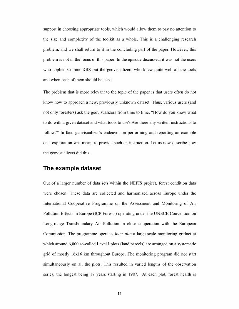
completeness, the data referring to all 6,000 plots should be represented in a visual
display. However, an attempt to represent all the plots, for example, on a map results
in enormous overlap of map symbols that makes the display completely illegible
(Figure 1). While zooming helps to fight the overlapping, it precludes seeing the
1 In general, a dataset with N dimensions entails N! (N-factorial, i.e. N×(N-1) ×(N-2) ×…×2×1) possible aspects. Adding a single dimension can tremendously increase the number of aspects. Thus, adding a third dimension to a two-dimensional dataset yields 6 possible aspects. Therefore, multi-dimensional data are generally very difficult to explore and analyze.
16
entire territory. Special measures should therefore be taken to handle large data
volumes; some of them are mentioned in the following sections.
Figure 1. On the left, the values of the defoliation index (i.e. the mean percentage of
the leaves or needles lost by the trees on a plot) in a single year are represented on a
map by colored circles. Due to symbol overlapping, the characteristic features of the
spatial distribution of the values are hard to grasp. An attempt to show the data for
more than one year would further aggravate the problem. The use of zooming (right)
reduces overlapping but precludes the overall view.
“Simplify and abstract”
The geovisualizers demonstrated the problems arising from the large data volume and
suggested some approaches to solve or at least diminish the problems. The approaches
were based on data aggregation. Because of the high spatial density of the plots, it
was reasonable to apply spatial aggregation. The general idea of spatial aggregation is
17
to use some division of the territory and group together the locations fitting in a
common unit of the division. On this basis, attributes of the division units are derived
by means of computing the statistics of the original attribute values associated with
the locations: the mean, the minimum, the maximum, the median, the mode, etc. Very
often it is recommendable to do spatial aggregation by dividing the territory in a
regular way, for example, into equal-size squares. So this is what the geovisualizers
did: they constructed a regular rectangular grid and aggregated the data by the cells of
the grid.
Since the geovisualizers had been warned that data referring to different species might
be incomparable, they performed the spatial aggregation procedure separately for
each dominant species. This means that the entire set of plots was divided into subsets
according to the dominant tree species (birch, oak, pine, etc.), and the aggregation was
applied individually to each subset.
The geovisualizers noted a high variability of the data and advised that not only the
average attribute values in the aggregates should be considered in such cases but also
at least the minimum and maximum values. The geovisualizers also explained the
impact of the granularity of the aggregation:
“When constructing a grid for spatial aggregation, different granularity (i.e. cell size)
can be chosen. The larger the cells are, the higher the degree of data aggregation. Our
grid is rather fine. In general, it is appropriate to try several different degrees of
aggregation and check whether a change of the granularity substantially affects the
spatial distribution properties being observed.”
The spatial aggregation allowed the geovisualizers to get a synoptic view of the
spatial distribution of the values of the defoliation index (i.e. the percentage of the

18
leaves or needles lost by the trees) in each year and observe the changes of the spatial
distribution pattern from year to year. For this purpose, the geovisualizers used
animated maps and map series, i.e. temporally or spatially arranged sequences of
maps showing the distribution in individual years (see Figure 2). In each map, cell
shading represented the corresponding index values (average, minimum, or
maximum). The visualization was applied separately to the data subsets referring to
different dominant species.
Figure 2. Changes of the spatial pattern of the index value distribution from year to
year can be explored using a series of maps where each map represents the
distribution in one year. For the illustration purpose, only three years from the 17-year
interval have been chosen.
This sort of visualization is suitable for looking at the temporal variation of the spatial
distribution pattern. However, it does not expose the other aspect of the spatio-
temporal variation, specifically, the spatial distribution of the patterns of the local
temporal behaviors. For the latter purpose, one needs a visualization that places some
suitable representations of the temporal behaviors in the spatial context, as, for
example, a map with superimposed barcharts representing the values in the
consecutive years by heights of the bars and thereby giving an idea of the value
19
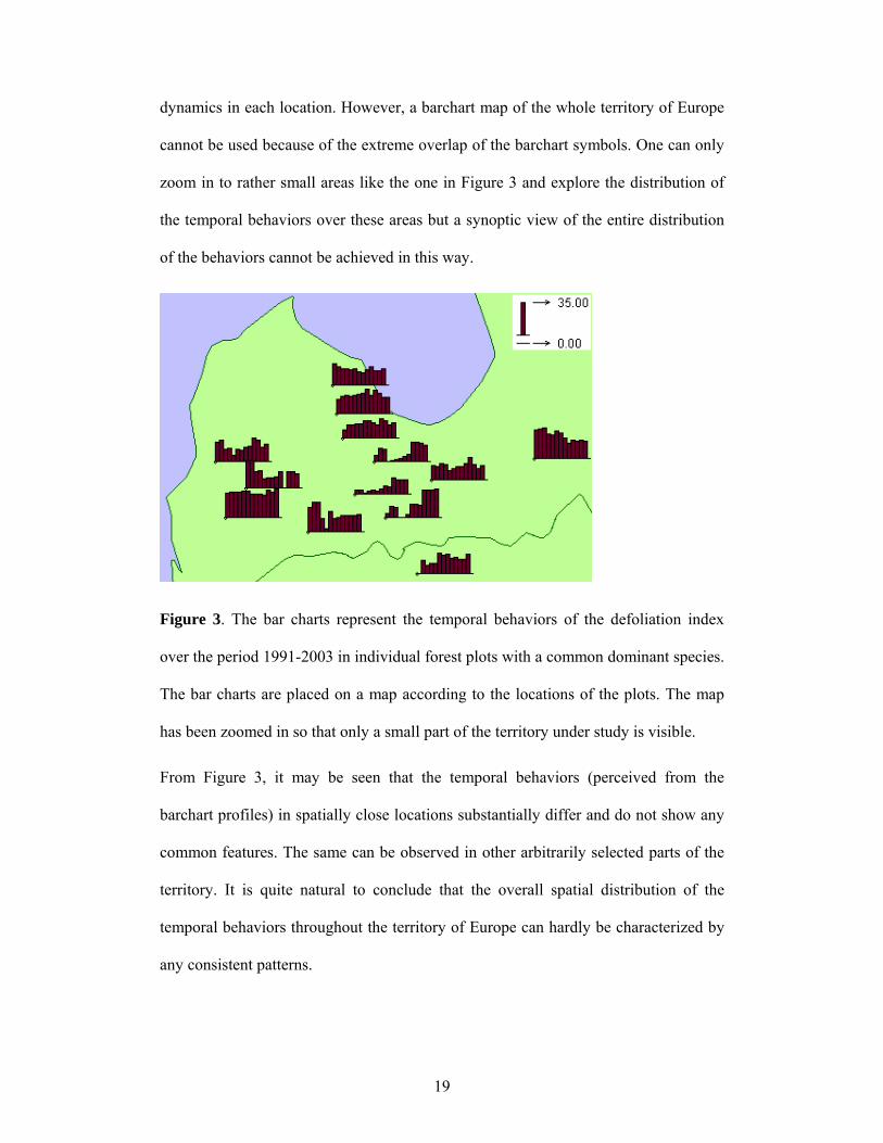
dynamics in each location. However, a barchart map of the whole territory of Europe
cannot be used because of the extreme overlap of the barchart symbols. One can only
zoom in to rather small areas like the one in Figure 3 and explore the distribution of
the temporal behaviors over these areas but a synoptic view of the entire distribution
of the behaviors cannot be achieved in this way.
Figure 3. The bar charts represent the temporal behaviors of the defoliation index
over the period 1991-2003 in individual forest plots with a common dominant species.
The bar charts are placed on a map according to the locations of the plots. The map
has been zoomed in so that only a small part of the territory under study is visible.
From Figure 3, it may be seen that the temporal behaviors (perceived from the
barchart profiles) in spatially close locations substantially differ and do not show any
common features. The same can be observed in other arbitrarily selected parts of the
territory. It is quite natural to conclude that the overall spatial distribution of the
temporal behaviors throughout the territory of Europe can hardly be characterized by
any consistent patterns.

20
While it is useful to have local temporal behaviors represented in the spatial context
whenever there is a reasonable way to do this, such a representation alone is not
sufficiently powerful. One of the problems is that it does not support a synoptic view
of the spatial distribution of the temporal behaviors since the symbols or diagrams
representing the individual behaviors, as in Figure 3, do not stick together in human’s
perception and do not produce a coherent image in human’s mind. Moreover, even
elementary tasks (i.e. tasks that do not require a synoptic view) such as the search for
behaviors with particular features or comparison of behaviors in various places are
quite difficult to perform since the explorer would need to scan the map and attend to
each and every diagram on it.
For these reasons, it is recommendable also to try other ways to visualize the temporal
behaviors including the techniques that represent the behaviors irrespective of the
space. For example, the behaviors can be represented as overlaid lines on a time graph
(Figure 4, A) where each line corresponds to one of the plots. However, this
visualization does not provide the desirable synoptic view because of the overplotting.
It is only possible to see selected individual behaviors. A kind of synoptic view can
only be achieved by means of aggregation.
21
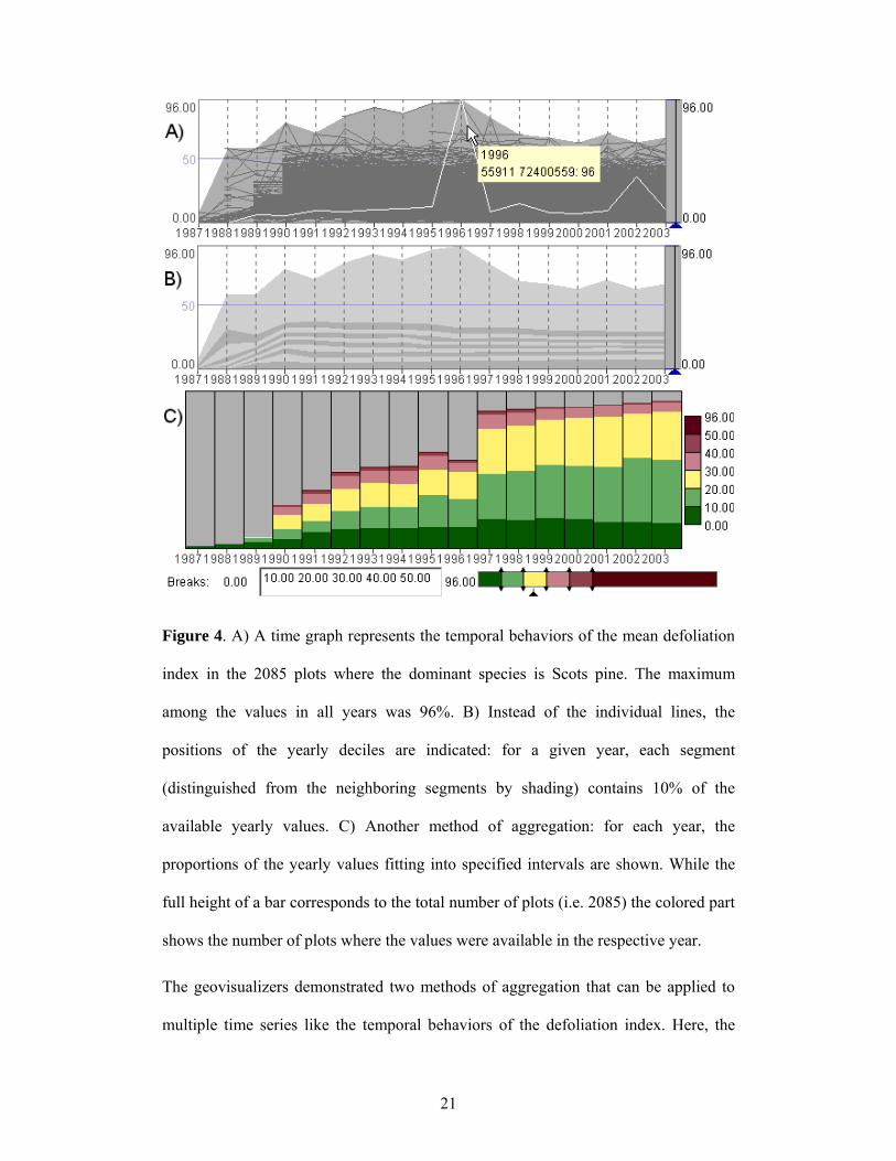
Figure 4. A) A time graph represents the temporal behaviors of the mean defoliation
index in the 2085 plots where the dominant species is Scots pine. The maximum
among the values in all years was 96%. B) Instead of the individual lines, the
positions of the yearly deciles are indicated: for a given year, each segment
(distinguished from the neighboring segments by shading) contains 10% of the
available yearly values. C) Another method of aggregation: for each year, the
proportions of the yearly values fitting into specified intervals are shown. While the
full height of a bar corresponds to the total number of plots (i.e. 2085) the colored part
shows the number of plots where the values were available in the respective year.
The geovisualizers demonstrated two methods of aggregation that can be applied to
multiple time series like the temporal behaviors of the defoliation index. Here, the
22
methods are explained briefly; more information can be found in Andrienko and
Andrienko (2005).
The first method is illustrated in the central part (part B) of Figure 4. It is based on the
use of positional statistical measures, i.e. such values that divide a given sequence of
ordered numbers in a specific proportion. A well-known example is the median, that
is, the value in the middle of an ordered sequence. The median divides a sequence of
values so that a half of all values are less than or equal to it and the rest are greater
than or equal to it. Quartiles divide a sequence of numbers into quarters, deciles into
tenths, or 10% portions, and percentiles into hundredths, or 1% portions.
In Figure 4B, the individual lines are removed from the time graph. Instead, the graph
area is divided into differently shaded stripes. The boundaries of the stripes result
from connecting the positions of corresponding positional measures (in this case,
deciles) computed for each year. For a better perception, the boundary lines are not
drawn but the areas between them are shaded in alternating light gray and dark gray.
Hence, the boundary between a dark gray area and an adjacent light gray area
corresponds to one of the deciles and shows the dynamics of this decile over time.
The display B in Figure 4 gives an idea of the statistical distribution of the values in
each year and shows how the distribution changes over time although the varying
number of available yearly values complicates the task. In general, one can observe
that, despite the variation of the sample size, the statistical distribution of the yearly
values is rather stable.
The second method of aggregation is shown in the bottom part (part C) of Figure 4.
The idea is that the user divides the value range of the attribute into intervals, and the
tool counts how many values fall in each year into each of the intervals. The counts
23
are represented by the heights of the colored segments of the bars where each bar
corresponds to one year.
Although this display is also somewhat difficult to use because of the differing
number of available values in the various years, it still allows one to extract useful
general information. Thus, it may be seen that the number of very high values (more
specifically, values greater than 50) was larger in the period 1991-1998 than in the
last 5 years. The number of values falling in the interval from 40 to 50 tended to
decrease during the period from 1997 to 2003. At the same time, the number of small
values (below 10) also decreased.
Hence, by examining the aggregated displays of the temporal variation of the index
values, the geovisualizers obtained some general-level knowledge about the
underlying phenomenon. This knowledge does not account for the spatial aspect of
the phenomenon since the displays that were used represent the data out of their
spatial context. Therefore, the time graph and its derivatives cannot substitute for
maps but should be used complementarily to maps.
“Divide and group”
As the geovisualizers explained in their report, after gaining a general understanding
of the variation of the attribute values with respect to the dimensions of the data (i.e.
space and time in the case of the example forest data), an explorer should look at
various subsets of data in a search for distinctive patterns, anomalies, or other
structure that is of interest. Potentially interesting subsets to look for are often defined
in the course of examining the dataset as a whole, when the explorer not only tries to
find commonalities and generalities but also notes the existing differences. Another
scenario is dividing the data on the basis of the explorer’s background knowledge: the
24
explorer may expect in advance that certain subsets may notably differ from other
data.
In the case of the forest condition data, the background knowledge (available to the
geovisualizers in the form of explanations received from the foresters) suggested that
the data be divided first of all according to the dominant species. This was actually
done from the very beginning. The geovisualizers grouped the forest plots according
to the dominant species and considered each group separately since they had been
advised on the fact of incomparability of the data referring to different species.
The next useful division, according to the information received from the foresters, is
by the age of the trees in a plot. This information was available in the form of the age
classes defined with a 20-year interval: up to 20 years (class 1), from 20 to 40 (class
2), and so on. Class 7 corresponded to the trees older than 120 years, and class 8
signified irregular stands. Partitioning according to the age class was applied to the
subsets of the forest plots defined earlier on the basis of the dominant species.
Besides these divisions, the geovisualizers also looked at geographically defined data
subsets. They considered the dynamics of the index in various countries and in
broader geographical regions such as northern or central Europe.
In the report, the geovisualizers demonstrated to the foresters the existing tools and
methods for dividing and grouping the data on the basis of various criteria.
“See in relation”
This principle, which complements “divide and group”, says that any subset of data
must not be analyzed in isolation but must be compared with the remaining data, with
the dataset as a whole, and with other subsets. The geovisualizers demonstrated how
such comparisons could be done using various visualization techniques. Thus, Figure

25
5 allows one to compare how the defoliation index behaves in the plots with
dominating oaks (left) and in locations where Scots pine prevails (right). The
comparison can be done separately for subgroups of plots with various ages of the
trees. Besides the cross-species comparisons, one can also compare the index
behaviors in the plots with the same dominant species but differing age classes of the
trees.
Figure 5. The dynamics of the defoliation index in various subsets of the forest plots
are compared using displays where time-series data are aggregated by value intervals.
The diagrams on the left correspond to the plots where the dominant species is oak.
On the right, the plots with dominating Scots pine are represented. From top to
bottom, the diagrams represent the age classes 1 (up to 20 years), 2 (from 20 to 40
years), and 7 (more than 120 years).
The principle “see in relation” also involves another aspect: an explorer should look
for possible relations between various attributes of the phenomenon under study and
between this phenomenon and other phenomena. Such an investigation, however,
26
requires a rich dataset. Since various environmental factors may contribute to
defoliation, information concerning these factors is necessary for a proper
investigation into the existing relations. Such information was not available in the
particular dataset that was explored. Besides the defoliation index, there were only a
few additional attributes.
Nevertheless, in order to introduce the principle “see in relation”, the geovisualizers
used what was available, i.e. the attributes characterizing the age of the trees and the
soil properties. They demonstrated how to search for relations between attributes
using various visual and interactive tools such as scatterplots, linked histograms,
dynamic selection, and dynamic filtering. The geovisualizers also explained that,
whenever a correlation between some attributes is noted, the explorer should also pay
attention to the instances that contradict it and try to explain the discrepancy by
involving other attributes or background knowledge. This touches upon the principle
“attend to particulars”, which is discussed next.
“Attend to particulars”
Data aggregation is used as a means to handle a large data volume and get a synoptic
view of the major features of the data. However, it should be borne in mind that
aggregation involves substantial information loss. Therefore, it is inappropriate to
look only at aggregated data. Individual data items should be given proper regard.
While it is impossible to consider each individual data item, various “particulars”
such as outstanding attribute values, atypical temporal behaviors, or incongruities
encountered in a spatial distribution require the explorer’s attention.
When non-aggregated data are visualized, “particulars” often “pop up” and do not
require additional effort in order to be detected. However, any extraordinary thing can
27
be lost completely in a mass of overlapping graphical marks, as in Figure 4A. In such
cases, an explorer has to use displays of aggregated data. Since aggregation usually
hides particulars, special techniques are needed to allow them to be detected.
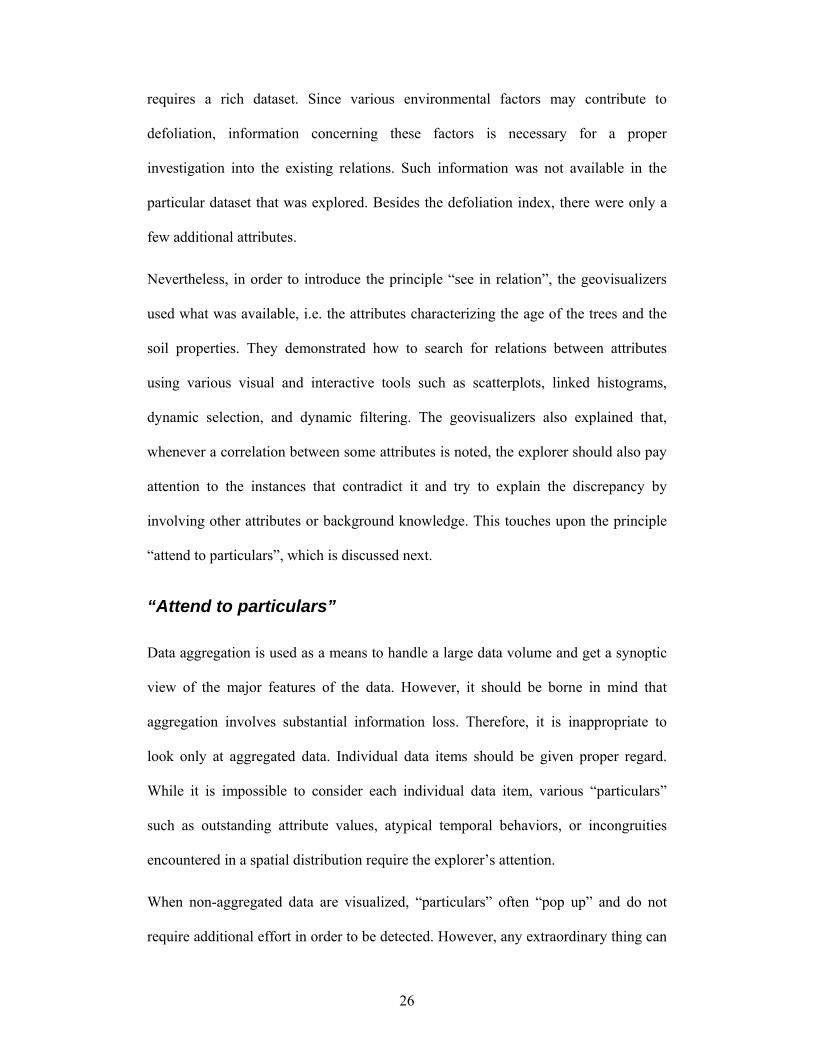
Such particulars as atypically high or atypically low values can be spotted when the
explorer looks at maximum and minimum values in the aggregates in addition to the
average values. In Figure 6, for example, where the series of images corresponds to
five consecutive years, color encoding represents the maximum values in the grid
cells. Green shades are used for values below 25 and red shades represent values
above 25. Owing to the chosen parameters of the color encoding (a diverging color
scale with a suitable midpoint value), high values appear as salient red spots
contrasting with the mostly green surrounding. A viewer can easily notice not only
occasional rises of values in particular years and particular places but also detect
persistent presence of high values in some places, which, probably, deserve additional
examination.
Figure 6. An example of spatial “particulars”: persistent small clusters of high values
(marked on the rightmost image) interfere with mostly low values throughout the
particular part of the territory under consideration. Since the values higher than 50 do
28
not occur in this part, the color scale has been adjusted to represent only the range
from 0 to 50. The values below 25 are shown in green and the values above 25 in red.
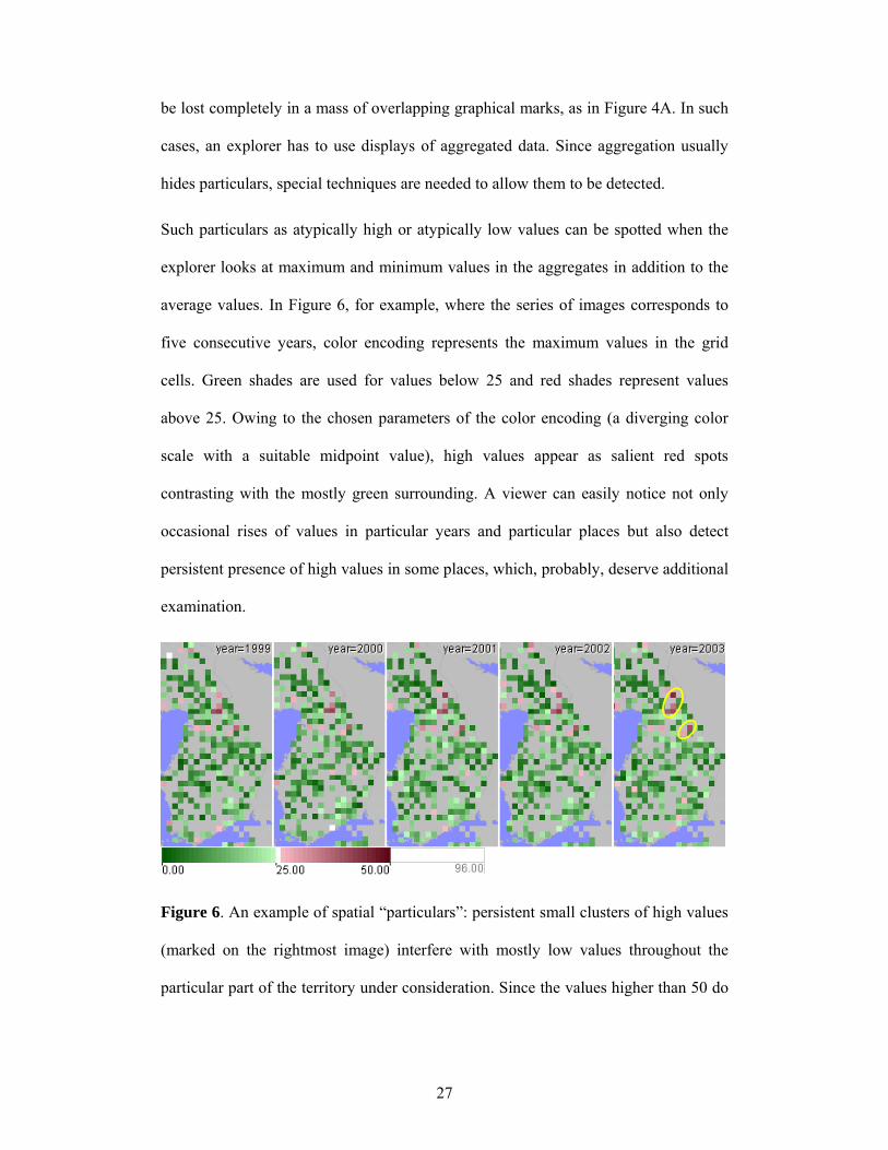
The time series visualization tool shown in Figure 4 can be enhanced with special
techniques that allow the user to segregate temporal behaviors with various
characteristic features for specific consideration. The features that can be looked for
include extreme changes, high or low fluctuation, stable increasing or decreasing
trends, etc. For example, Figure 7 shows how extreme changes can be detected by
means of a particular transformation of the time graph: instead of the original values,
the graph shows the differences between the values in successive years. To keep the
size of the paper in reasonable limits, we shall not demonstrate all existing
possibilities. Some additional examples (with different data) are available in
Andrienko and Andrienko (2005, 2006).
Figure 7. A) The transformed time graph represents the differences between the
values in successive years instead of the original yearly values. Using this display, the
behaviors with extremely high value increase (more than 25%) in 2002 are selected.
29
B) The selected behaviors can be observed on a time graph without transformation. C)
The selected behaviors are shown on a map at the locations where they occurred.
Besides the principles presented above, the geovisualizers also applied and illustrated
a few other principles, which will not be discussed in detail here. Interested readers
can be referred to Andrienko and Andrienko (2006).
As it was previously stated, the example exploration reported to the foresters was
meant primarily for the demonstration of the goals, principles, and tools of EDA.
However, the principles were not named explicitly but introduced by examples. The
geovisualizers did not want their report appear excessively didactic to the foresters; it
was rather conceived as a story telling about the “detective work” (Tukey 1977, p. 1)
of people exploring a dataset previously unfamiliar to them.
How the foresters reacted
Prior to the NEFIS project, the reporting activities within the ICP Forests monitoring
program mainly relied on scientific evaluations and publications in various media
ranging from Internet pages and printed reports to scientific publications. Modern
visualization techniques that allow for user-driven data compilation had never been
applied before. Therefore, the foresters highly appreciated the variety of opportunities
provided by the diverse visualization tools and interactive techniques. However, their
ideas concerning the purposes for which such tools and techniques could and should
be used differed from the ideas of the geovisualizers. As it was mentioned in the
introduction, the foresters thought about effective visual communication of
information from forest experts to end users while the geovisualizers were sure that
both the experts and the end users needed first of all tools for data exploration.

30
Surprisingly, this discrepancy remained unnoticed by both sides until the
geovisualizers undertook and reported their example exploration. This does not mean
that the collaboration between the foresters and the geovisualizers throughout the
project was insufficient or ineffective. The partners not only communicated via e-mail
but also regularly met. At the meetings, the geovisualizers demonstrated the
application of various visualization techniques to examples of forest data. They
gained an understanding of the data from explanations given by the domain experts.
This allowed the geovisualizers to choose appropriate tools and appropriate ways to
apply the tools and indicated directions for improvement and further advancement of
existing techniques. So the partners exchanged their knowledge and experiences for
the mutual benefit and for the success of the project.
At the same time, people tend to interpret what they see according to their
expectations and mental schemata. Therefore, the foresters interpreted what the
geovisualizers showed them as novel approaches to information communication, and
the geovisualizers did not realize this being led by their own expectations and
schemata. They were preoccupied with the ideas of EDA and exploratory
visualization, and it could not come to their minds that these ideas were not evident to
the foresters.
Hence, the demonstration of the capabilities of individual geovisualization tools could
not properly convey the ideas of EDA. Only the example of a more systematic data
exploration helped the foresters to notice a contradiction to their expectations and
understand the intended purposes of the geovisualization techniques. Likewise, only
the foresters’ reaction helped the geovisualizers to broaden their vision of what
potential users might really need.

31
An immediate response of the foresters was that the data used for this experiment
were not meant for “digging so deep”. As it was explained at the beginning, these
were secondary data resulting from a severe aggregation of original measurements.
The aggregation was done intentionally in order to prevent uncontrollable distribution
of the original data for the fear of possible misinterpretations and misuses. Besides,
the foresters did not consider providing the original data to the geovisualizers as they
did not expect that the geovisualizers would attempt to undertake such a systematic
investigation.
Further comments of the foresters indicated that the demonstration of the capabilities
of the exploratory approaches and tools was not sufficiently convincing to them. The
foresters noted that the exploration performed by the geovisualizers could not
compete with what they called an in-depth scientific evaluation. In particular, they
mentioned: “e.g. multivariate statistical evaluations would be necessary, kriging is
more advanced than just adding values into grid cells...” However, the foresters did
not recommend enhancing the VTK with techniques for multivariate statistical
analyses and for kriging. They pointed out that the experts in forestry already have
their specific software and do not need any additional analytical facilities.
Rather than a powerful toolkit for “visual analytics” the foresters would prefer to have
“a tool to offer simplified data to the external world”. This corresponds to what is
stated in the NEFIS evaluation report (Requardt and Köhl 2005). It should be
explained that the geovisualizers had not been involved in the evaluation study (to
preclude their influence on the users’ opinions) and received the report about the
study a few days after sending their exploration report to the foresters.
The conclusions from the evaluation study say that the VTK requires improvements
towards a better support of reporting. This can be understood in two ways: (i) either

32
that the time needed for the foresters themselves to prepare high-quality presentations
can be reduced or (ii) that the broader audience such as internet users can extract
relevant information themselves. In the foresters’ opinion, the current VTK has a clear
potential to develop into a good reporting tool. However, besides optimizing the
system for the purposes of reporting, the usability issues must be solved.
The foresters saw the key problem in the complexity of the toolkit that makes it
difficult to use. The complexity results from the variety of visual and interactive
techniques and numerous possibilities for combining them. However, as the foresters
believe, this variety is superfluous, as the VTK anyway cannot substitute the
statistical packages, GIS, and domain-specific tools being traditionally used by
domain experts for genuine scientific analyses. Therefore, the VTK should be seen as
“a tool for a broader audience and for that reason it should rather be easily applicable
than fully exhaustive” (Requardt and Köhl 2005, p.60). In the case of providing
access to forest data through the Web an extensive training of the users seems to be
unrealistic.
On the other hand, most of the foresters that cooperated in the project liked various
particular tools of the VTK. For example, in a talk with the geovisualizers, one of the
foresters appreciated the possibility of uncovering various “particulars” and admitted
that finding such things using a GIS would take tremendous time. None of the present
features was recommended for removal from the system.
As a solution to this contradiction, the foresters suggested creating two versions of the
system: a simple version for new users and for those who do not need sophisticated
functions and an advanced version for experienced users. It may be expected that, as a
user becomes more experienced with the simple version, he/she will want more
features. In that case, it should be possible to switch to a more advanced version.
33
User friendliness is a crucial requirement to both simple and advanced versions. For
this purpose, not only the user interface of the current VTK needs to be improved but
also an appropriate guidance to the user should be provided. As it is stated in the user
study report, “Some better guidance for getting started as a new user is much more
important than to delete available features to a minimum” (Requardt and Köhl 2005,
p.60).
To summarize, the foresters clearly indicated that they do not need a comprehensive
toolkit for EDA. What they do need is a simple and user-friendly tool for reporting,
which may optionally include, in addition to the basic functions, some fancy facilities
for advanced users.
Reflections of the geovisualizers
The example data exploration performed by the geovisualizers was meant for teaching
the principles and techniques of exploratory data analysis. The reaction of the
foresters showed that the geovisualizers failed to convince them of the utility of these
principles and techniques. While it cannot be claimed that the teaching was perfect,
this was definitely not the only problem. Contemplating the reaction of the foresters
uncovers a range of issues that appear quite fundamental and relevant to the state of
the art and the directions of the further research in (geo)visualization.
“The data were not meant for digging so deep”
The forest experts worried that the data they provide to others could be misinterpreted
and misused. Therefore, they would prefer to preclude the possibility of
uncontrollable analysis of the data. The geovisualizers demonstrated them how people
unfamiliar with the data and, moreover, having no background in forestry could apply
34
exploratory tools to make their own observations and come to their own conclusions.
This could not make the foresters happy. In this connection, the question arises:
should (geo)visualization scientists pay attention to worries of experts about possible
misinterpretations of data or can they rather treat this problem as irrelevant to their
research?
The following considerations show that the problem should not be ignored.
Application of the traditional tools for data analysis such as statistical methods and
GIS functions requires certain knowledge and skills. Since only educated specialists
can do data analysis, the probability of misinterpretation and coming to wrong
conclusions may be deemed as quite small. The data visualization tools, on the
contrary, are oriented to a broad community of users, which are not specifically
educated. Any computer-literate user can relatively easily obtain some (default) data
visualization. Although the visualization systems typically provide more facilities for
analysis than just a single display, many users may feel comfortable with the first
visualization they get and may not even bother to try to look at the data from a
different perspective (this observation is pointed out in Chen 2005). On the basis of
this single display, which is not necessarily correct, the users may try to make their
judgments and draw conclusions about the data.
The relative ease of using data visualization tools, on the one hand, and the general
illiteracy in the principles of using these tools for data analysis, on the other hand,
make a fertile ground for various misinterpretations and misuses. Hence, the fears of
the experts are well justifiable as well as their opinion that developers of visualization
tools should not aspire to acceptance of these tools as instruments for analysis but
rather should focus on reporting.
35
“We have our own tools”
The foresters are completely right in saying that the geovisualization tools cannot
compete with the traditional tools for in-depth scientific analysis. What they do not
realize is that the exploratory geovisualization tools are not at all intended to compete
with their traditional tools and methods since exploratory data analysis is meant to
complement rather than substitute for in-depth analysis. The purpose of EDA is to
discover patterns and arrive at hypotheses; statistics and various domain-specific
methods should then be applied to verify the discoveries, elaborate the patterns, and
test the hypotheses.
We admit that there is a tendency to skip the exploratory stage of data analysis and
start immediately with computational methods according to customary approaches
and procedures. This tendency entails significant dangers, however. First, without
knowing the features of a dataset to be analyzed, the analyst may apply unsuitable
methods and come to wrong conclusions. Thus, the methods involving data
smoothing are not applicable to highly variable data lacking spatial and/or temporal
continuity. In general, most of the statistical methods are based on certain
assumptions concerning the data, and EDA is needed at least for checking whether
these assumptions are fulfilled. Second, computational methods often have specific
features that make particular types of results more likely to occur than others, and
analysts are not always aware of this or they do not always try to compensate for the
bias by applying other methods. For example, Brimicombe (2005) notes the
popularity of the kernel density estimation approach in crime analysis, which
unfortunately tends to conceal localized peaks of criminality in favor of regional
patterns. Another problem is the boundary effects around the edge of a data set: the
method fails to reveal concentrations of crime incidents that exist at boundaries. As a

36
result, “police analysts tend not to find ‘hot spots’ at the edge of their jurisdictions”.
Looking at an appropriate visualization of the data prior to applying the computations
certainly would be helpful.
The exploratory stage of analysis is neglected not only because experts are
insufficiently familiar with the concept of EDA. There is also a fault of the developers
of EDA tools since they suggest their tools as standalone software systems and do not
provide a bridge from hypothesis generation to hypothesis testing. This produces an
impression of assumed self-sufficiency, which may irritate experienced data analysts
and mislead inexperienced people, who may tend to draw hasty conclusions just from
what they see, without any verification.
“Give us a convenient tool for reporting”
One of the problems encountered by the users of geovisualization tools is that the
observations and discoveries they make cannot be conveniently captured for later
recall and for communication to others. Results of data exploration with the use of
visual displays come in the form of visual impressions, which are hard to verbalize or
express in any other form without referring to the images from which they originate.
Thus, in order to report to the foresters about their data exploration, the geovisualizers
used numerous screenshots incorporated in the text since there was no other way to
communicate what they had observed. It was a laborious and time-consuming job to
make the screenshots, post-process them in a graphical editor in order to cut off
unnecessary parts or arrange several images in a single figure, and then comment the
figures in the text of the report. When a comment referred to a certain part of an
image, it was not always clear how to indicate this part verbally. It was necessary to
37
draw marks on top of the image, as in Figure 6, and the geovisualizers had to use a
graphical editor for this purpose.
The difficulty of recording and reporting the findings may be a serious obstacle to
wide recognition and use of geovisualization tools. Time is a precious commodity for
data analysts; they cannot afford spending a great deal of their time producing reports
similar to the one made by the geovisualizers for didactic purposes. Hence, it is the
duty of geovisualizers to support properly the capture of observations and reporting of
findings.
“It is too complex”
Complexity is one more factor limiting the use of geovisualization toolkits. This, in
turn, is a multifaceted problem. It certainly relates to the user interface issues such as
ill-organized menus, intricate GUI controls, and inadequate help. Another aspect is
the variety of techniques and the multitude of possibilities to combine them. The users
seem to like the idea of having the minimum tool combination covering their needs.
The problem is that both data and user needs vary (even the needs of one and the
same user at different times), and what is sufficient in one case may be insufficient or
even inappropriate in another case.
There is yet another constituent of the complexity problem. It is the complexity of
exploratory data analysis as such, which requires an analyst to look at data from
various perspectives and at various scales, from “seeing the whole” to “attending to
particulars”. The analyst is also supposed to “see in relation”, i.e. make numerous
comparisons. This inherent complexity is multiplied by the complexity of the data that
is explored and analyzed. The complex, multi-dimensional structure and
heterogeneous components of most contemporary datasets necessitate a combined use
38
of multiple techniques and approaches. There is no single visualization capable to
show “the whole”. The analyst has to decompose this whole into parts, examine these
parts, and then try to synthesize the whole picture from the partial views, analogous to
reconstructing a complex three-dimensional shape from a set of projections and slices.
Because of large data volumes, no visualization is simultaneously capable of
providing an overall view and exposing various “particulars”. Looking for
“particulars” requires therefore different techniques than “seeing the whole”.
Hence, the multitude and variety of techniques is indispensable for comprehensive
EDA. This means that even a perfect user interface and extreme ease of use of every
technique separately and of several techniques jointly would not solve the complexity
problem. Complexity remains in the necessity to remember which techniques are
available and for what purposes and to what data each of them can be applied.
Complexity also remains in the necessity to decompose a data exploration problem
into subproblems and to understand how to do this properly and effectively in each
particular case. Complexity is also involved in the need to merge fragmentary
knowledge resulting from the application of multiple tools into a consistent
conception of the data and underlying phenomena.
What seems clear is the need to educate people to do exploratory data analysis and to
use visualization and other exploratory techniques. It seems desirable that researchers
in geovisualization and information visualization propose adequate educational
materials for various user categories. This may be not enough, however. Thus, the 54-
page report with 56 figures that the geovisualizers produced for educating their
partners in the NEFIS project might not seem sufficiently encouraging to the
addressees. A reader of such an instructive text may be overwhelmed by the multitude

39
of aspects that must be cared of, irrespective of whether complex or simple tools are
used for these purposes.
Therefore, the researchers should also try to find ways to alleviate the complexities.
For example, is it possible to build a geovisualization system that is sufficiently
powerful and flexible but appears light and simple to the user? Is it possible to find
the principles and develop the methods of building “sufficient minimum” tool
configurations complying with data specifics and user demands? Can geovisualization
systems configure themselves automatically (once being connected to a particular data
collection) so as to propose the user only the sufficient minimum number of
techniques and functions? Can geovisualization systems guide inexperienced users
through the process of data exploration and analysis: help them to examine the
structure of the data and decompose the problem, suggest right tools at right moments,
attract attention to potentially important or “strange” things? Can geovisualization
systems simplify and advance the work of experienced users, for example, by learning
typical scenarios of data exploration and re-playing these scenarios when appropriate?
Can geovisualization systems support not only analytical but also synthetic activities,
i.e. uniting fragmentary knowledge into an overall model?
These questions are put here because of their direct relation to the complexity
problem, which is discussed above. At the same time, they also fit in the context of
the following section where a broader list of questions is proposed to geovisualization
and information visualization scientists for thinking and discussion.
Questions for discussion
We believe that the problems indicated in this paper are not specific for the NEFIS
project, or for the particular groups of foresters and geovisualizers that carried out this

40
project, or for the whole community of forest specialists, or for CommonGIS, or for
any particular software system. Still, our observations and conclusions from them
may appear quite subjective. Therefore, we would like to engage the visualization-
related research community in a discussion concerning the problems touched upon.
We propose the following list of questions to discuss:
1. Do apparent simplicity and visual appeal of graphical tools promote incompetent
use? Can this harm the reputation of these tools among domain experts and
contribute to their reluctance to use visualization? If so, can researchers find ways
to minimize misuses of graphics as well as one-sided and superficial
investigations? Can (and should) a visualization system actively promote
comprehensive exploration?
2. Should users of visualization tools be prompted to verify the observations they
make and hypotheses they arrive at by means of confirmatory techniques? If so,
how do we accomplish this in such a way that the user can appreciate it but not
feel offended or annoyed? How can exploratory and confirmatory tools be
organically integrated?
3. Does visualization require as much expertise to use effectively as statistics and
other “genuinely scientific” methods of data analysis? If so, how can this expertise
be effectively conveyed to users?
4. Is data exploration inherently complex irrespective of the tools being used? If so,
can scientists find ways to alleviate this complexity?
5. Is it possible to conceal the indispensable complexity of software for EDA behind
a well-designed user interface and intelligent behavior? In particular, can a
software system recognize which instruments make a minimum combination
41
appropriate to analyze a specific data collection and simplify itself by hiding
unnecessary tools and arranging the necessary ones in a way convenient for the
user? (See also the other questions listed in the previous section)
6. How do we enable users to record, comment, organize, browse, and report the
findings they obtain while using visualization? How do we support the capture of
observations so that the user is not distracted from the process of data exploration?
7. Do domain experts really need exploratory tools as a complement to their
customary tools for data analysis? If so, what are the right ways to promote EDA
and visualization as the primary instrument for exploration among domain
specialists?
Epilogue
From the episode that occurred in NEFIS, the geovisualizers have learned that the
foresters are primarily interested in the use of visualization for communication
purposes, that is, for exhibiting data to public (so that the exhibitor can be sure that
the public will interpret the data exactly as supposed and will not obtain anything
extra beyond what the exhibitor wants to convey) and for reporting. While visual
communication of information is an interesting and important area of research, the
geovisualization and information visualization communities are traditionally focused
on visualization as an “instrument for ideation” (Andrienko et al. 2005b). It seems
that the scientists (at least some of them) tend to believe that the value of exploratory
techniques is self-evident to everyone; hence, the major task is to supply people with
convenient, well-designed exploratory tools and properly instruct them in using these
tools.

42
Accordingly, the geovisualizers who worked in NEFIS wanted to demonstrate to their
project partners how to use visualization for ideation and in this way encourage them
to utilize visual exploratory techniques in their own work. However, the foresters’
comments indicated that they have not been fully convinced of the usefulness of these
techniques. The problems that have been revealed and discussed in this paper include
the high probability of improper use of visualization tools by uneducated people, the
insufficiency of visualization for a full analysis and the absence of links to
complementary methods, the difficulty of recording and reporting observations and
related ideas, and the complexity of the toolkits for EDA, which apparently reflects
the inherent complexity of EDA as such. The paper does not propose any solutions to
these problems. However, the authors believe that appropriate solutions can be found
through focused joint efforts of multiple researchers.
The incident with the demonstrative data exploration has been very consequential for
the geovisualizers. They have better understood the needs and problems of potential
users and started to think of issues they had never thought before. The experience has
been also useful for the foresters. They have recognized that visualizing data does not
end at producing images for illustrative purposes. They have better understood the
intended purposes of exploratory tools. However, further steps are required to make
these tools fully accepted and appreciated. Data providers should recognize EDA
techniques as an important means for data users to gain an understanding of the data
and to build trust in the data and its potentials. Moreover, the use of EDA tools can
stimulate the interaction of the end users with the data providers, who may utilize
users’ feedback for improving the data and broadening the user base.
It is very encouraging for the geovisualizers that the foresters are willing to work
together with them on finding the best approaches to promote a wider acceptance and
43
use of exploratory geovisualization. The foresters acknowledge that this will depend
on the use of exploratory tools by the forest experts themselves. Only if the domain
experts are using the VTK and only if they themselves rely on it, they will have a
sustained interest in maintaining the system and in keeping it updated. On this basis, a
simplified version could be open to the broad public.
The foresters want to communicate more closely and regularly with the
geovisualization experts so that they could have an influence upon the further
development of the portfolio of geovisualization tools towards comprehensive
exploration opportunities and, at the same time, improved usability. However, the
foresters would like the geovisualizers not to forget how important it is to support
information presentation and communication and to do research and development
work also in this direction.
References
(Ahonen-Rainio and Kraak 2005) Ahonen-Rainio, P., and Kraak, M.-J. Towards
Multi-variate Visualization of Metadata Describing Geographic Information,
In: Exploring Geovisualization, ed. by Dykes, J., MacEachren, A., Kraak, M.-
J. (Elsevier, Oxford 2005) pp. 611-626
(Andrienko et al. 2002) Andrienko, N., Andrienko, G., Voss, H., Bernardo, F.,
Hipolito, J., and Kretchmer, U. Testing the Usability of Interactive Maps in
CommonGIS, Cartography and Geographic Information Science, Vol. 29, No.
4, 2002, pp. 325-342
(Andrienko and Andrienko 2005) Andrienko, G., and Andrienko, N. Visual
exploration of the spatial distribution of temporal behaviours, In Banissi, E. et
al (eds.) Proceedings of the 9th International Conference on Information

44
Visualization IV 2005, 6-8 July 2005, London, UK, IEEE Computer Society,
Los Alamitos, California, 2005, pp. 799-806
(Andrienko et al. 2005a) Andrienko, N., Andrienko, G., and Gatalsky, P. Impact of
data and Task Characteristics on Design of Spatio-Temporal Data
Visualization Tools. In: Exploring Geovisualization, ed. by Dykes, J.,
MacEachren, A., Kraak, M.-J. (Elsevier, Oxford 2005) pp. 103-125
(Andrienko et al. 2005b) Andrienko, G., Andrienko, N., Dykes, J., Gahegan, M.,
Mountain, D., Noy, P., Roberts, J., Rodgers, P. Theus, M.: Creating instru-
ments for ideation: software approaches to geovisualization. In: Exploring
Geovisualization, ed. by Dykes, J., MacEachren, A., Kraak, M.-J. (Elsevier,
Oxford 2005) pp. 103-125
(Andrienko and Andrienko 2006) Andrienko, N., and Andrienko, G. Exploratory
Analysis of Spatial and Temporal Data. A Systematic Approach, Springer,
Berlin, 2006
(Arnheim 1997) Arnheim, R. Visual Thinking, University of California Press,
Berkeley 1969, renewed 1997
(Bertin 1967/1983) Bertin, J. Semiology of Graphics. Diagrams, Networks, Maps,
University of Wisconsin Press, Madison 1983; translated from Bertin, J.
Sémiologie graphique, Gauthier-Villars, Paris 1967
(Brimicombe 2005) Brimicombe, A.J. Detecting Clusters in Spatially Repetitive Point
Event Data Sets, In: Proceedings of International Conference on Spatial
Analysis and Geomatics SAGEO’2005, Avignon, France, June 20-23, 2005
(CD-ROM)
45
(Chen 2005) Chen, C. Top 10 Unsolved Information Visualization Problems, IEEE
Computer Graphics and Applications, July/August 2005, pp. 12-16
(Edsall and Sidney 2005) Edsall, R.M., and Sidney, L.R. Aplications of a Cognitively
Informed Framework for the Design of Interactive Spatio-temporal
Representations, In Exploring Geovisualization, ed. by Dykes, J.,
MacEachren, A., Kraak, M.-J. (Elsevier, Oxford 2005), pp. 577-590
(Elzakker 2004) Elzakker, C.P.J.M. van. The Use of Maps in the Exploration of
Geographic Data, PhD dissertation, Netherlands Geographical studies 326,
Utrecht/Enschede 2004
(Fischer et al. 2005) Fischer, R.; Bastrup-Birk, A.; Becker, R.; Catalayud, V.;
Dietrich, H.-P.; Diese, N.; Dobbertin, M.; Graf-Pannatier E.; Gundersen, P.
Haussmann, T.; Hildingsson, A.; Lorenz, M.; Müller, J.; Mues, V.; Pavlenda,
P.; Petriccione, B.; Raspe, S.; Sanchez-Peňa, S.; Sanz, M.; Ulrich, E.; Volz,
R.; Wijk, S.:. The Condition of Forests in Europe. 2005 Executive Report.
Geneva. UNECE, 33 p.
(Fuhrmann et al. 2005) Fuhrmann, S., Ahonen-Rainio, P., Edsall, R.M., Fabrikant,
S.I., Koua, E.L., Tobón, C., Ware, C., and Wilson, S. Making Useful and
Useable Geovisualization: Design and Evaluation Issues, In: Exploring
Geovisualization, ed. by Dykes, J., MacEachren, A., Kraak, M.-J. (Elsevier,
Oxford 2005), pp. 553-566
(Fuhrmann and Pike 2005) Fuhrmann, S., and Pike, W. User-centered Design of
Collaborative Geovisualization Tools, In: Exploring Geovisualization, ed. by
Dykes, J., MacEachren, A., Kraak, M.-J. (Elsevier, Oxford 2005) pp. 591-610
46
(Harrower et al. 2000) Harrower, M., MacEachren, A.M., and Griffin, A.L.
Developing a geographic visualization tool to support Earth science learning.
Cartography and Geographic Information Science 27(4), 2000, pp. 279-93.
(Harvey and Chrisman 1998) Harvey, H., and Chrisman, N. Boundary objects and the
social construction of GIS technology, Environment and planning, 1998, v.30,
pp. 1683-1694
(Kang et al. 2003) Kang, H., Plaisant, C., and Shneiderman, B. New Approaches to
Help Users Get Started with Visual Interfaces: Multi-Layered Interfaces and
Integrated Initial Guidance, In: Proc. of the Digital Government Research
Conference, May 18-21, 2003, Boston, MA, USA, pp. 141-146,
http://www.dgrc.org/dgo2004
(Köhl and Gertner 1997) Köhl, M., and Gertner, G.: Geostatistics in evaluating forest
damage surveys: considerations on methods for describing spatial
distributions. Forest Ecology and Management 95 (1996), pp. 131-140
(Koussoulakou and Kraak 1992) Koussoulakou, A., and Kraak, M. J. Spatio-temporal
maps and cartographic communication. The Cartographic Journal 29, 1992,
pp. 101-108
(MacEachren et al. 1998) MacEachren, A.M., Boscoe, F.P., Haug, D., and Pickle,
L.W. Geographic visualization: Designing manipulable maps for exploring
temporally varying georeferenced statistics. In: Proceedings of the IEEE
Symposium on Information Visualization (InfoVis’98), October 19-20, 1998,
Research Triangle Park, North Carolina USA, IEEE Computer Society, Los
Alamitos, California. pp. 87-94.
47
(MacEachren and Brewer 2004) MacEachren, A.M., and Brewer, I. Developing a
Conceptual Framework for Visually-Enabled Geocollaboration, Int. J.
Geographical Information Science, Vol. 18, No. 1, 2004, pp. 1-34
(Plaisant 2005) Plaisant, C. Information Visualization and the Challenge of Universal
Usability, In: Exploring Geovisualization, ed. by Dykes, J., MacEachren, A.,
Kraak, M.-J. (Elsevier, Oxford 2005) pp. 53-82
(Requardt and Köhl 2005) Requardt, A., and Köhl, M. NEFIS Evaluation Report,
EFI-NEFIS-WP5-D10-2005, internal document EC Accompanying Measure
NEFIS 2003-2005 (Contract No. QLK5-CT-2002-30638),
http://www.efi.fi/projects/nefis/deliverable.html, 2005, 106
(Schuck et al. 2005) A. Schuck , G. Andrienko, N. Andrienko, S. Folving, M. Kohl, S.
Miina, R. Paivinen, T. Richards, and H. Voss. The European Forest
Information System - an Internet Based Interface between Information
Providers and the User Community, Computers and Electronics in
Agriculture, 2005, v.47 (3), pp. 185-206
(Seidling 2001) Seidling W.: Integrative Studies on Forest Ecosystem Conditions.
Multivariate Evaluations on Tree Crown Condition for two Areas with distinct
Deposition Gradients. 2001. UN/ECE & European Commission & Flemish
Community. Geneva, Brussels, Gent.
(Seidling and Mues 2005) Seidling, W., and Mues, V.: Statistical and Geostatistical
Modelling of Preliminarily Adjusted Defoliation on an European Scale.
Environmental Monitoring and Assessment 101 (2005), pp.
(Shneiderman 1996) Shneiderman, B.: The Eyes Have It: A Task by Data Type
Taxonomy for Information Visualizations. In: Proceedings of the 1996 IEEE

48
Symposium on Visual Languages, ed. by Burnett, M., Citrin, W. (IEEE
Computer Society Press, Piscataway 1996) pp.336−343
(Slocum et al. 2001) Slocum, T.A., Blok, C., Jiang, B., Koussoulakou, A., Montello,
D.R., Fuhrmann, S., and Hedley, N.R. Cognitive and Usability Issues in
Geovisualization, Cartography and Geographic Information Science, Vol. 28,
No. 1, 2001, pp. 61-75
(Tobón 2005) Tobón, C. Evaluating Geographic Visualization Tools and Methods: An
Approach and Experiment Based upon User Tasks, In Exploring
Geovisualization, ed. by Dykes, J., MacEachren, A., Kraak, M.-J. (Elsevier,
Oxford 2005), pp. 645-666
(Tukey 1977) Tukey, J.W.: Exploratory Data Analysis, Addison-Wesley, Reading
MA, 1977
(Ware and Plumlee 2005) Ware, C., and Plumlee, M. 3D Geovisualization and the
Structure of Visual Space, In Exploring Geovisualization, ed. by Dykes, J.,
MacEachren, A., Kraak, M.-J. (Elsevier, Oxford 2005), pp. 567-576