book layout
DESCRIPTION
Page layout experiments in a book setting.TRANSCRIPT

1
t bla CONTE N
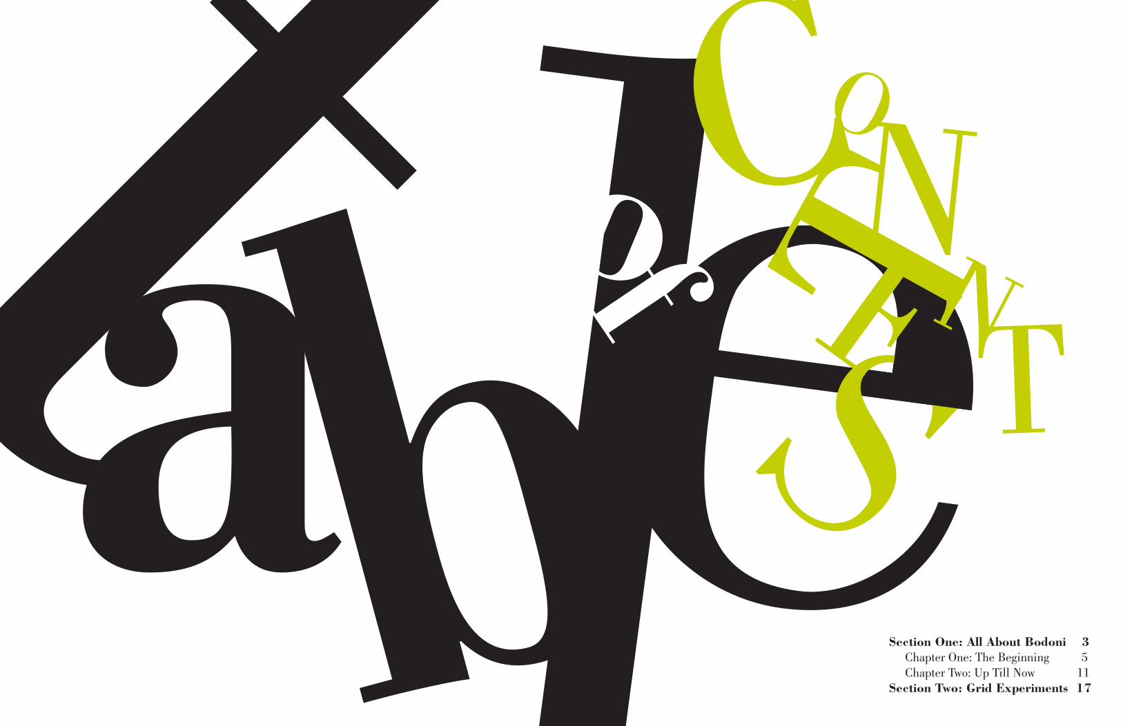
TSSection One: All About Bodoni 3 Chapter One: The Beginning 5 Chapter Two: Up Till Now 11Section Two: Grid Experiments 17
of
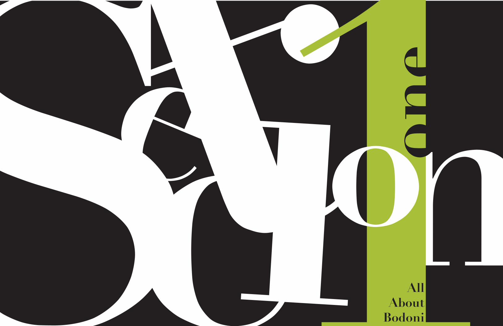
Sectin1one
oAll
About Bodoni

oneThe Beginning
Bodoni is a series of serif typefaces first designed by Giambattista Bodoni (1740–
1813) in 1798. The typeface is classified as Didone modern. Bodoni followed the
ideas of John Baskerville, as found in the printing type Baskerville, that of in-
creased stroke contrast and a more vertical, slightly condensed, upper case, but
taking them to a more extreme conclusion. Bodoni had a long career and his de-
signs evolved and differed, ending with a typeface of narrower underlying structure
with flat, unbracketed serifs, extreme contrast between thick and thin strokes, and
an overall geometric construction. Though these later designs are rightfully called
“modern”, the earlier designs are “transitional”.
Early years and the VaticanBodoni came from a printmaking background, his father and grandfather both be-
ing in that trade. He worked for a time as an apprentice in the Vatican’s Propaganda
Fide printing house in Rome. There, it was said he impressed his superiors so
much with his eagerness to learn, studiousness in mastery of ancient languages
and types, and energy of effort, that he was allowed to place his own name on his
first books, a Coptic Missal and a version of the Tibetan alphabet.
Working for prominent familiesAfter a battle of malaria put Bodoni out of commission for a while, he was hired by
the Duke Ferdinand of Bourbon-Parma to organize a printing house in Parma, to
be one of the great houses of Italy, called la Stamperia Reale. Bodoni got to work
publicizing the house with the creation of specimen books, which were very well
received amongst the upper classes of European capitals. Soon, fine editions of
classical and respected works followed, such as Homer’s works and Gerusalemme
Liberata of Torquato Tasso. Eventually his success was such that he was permitted
to open a printing house under his own name, Officina Bodoni.
Bodoni achieved an unprecedented level of technical refinement, allowing him
to faithfully reproduce letterforms with very thin “hairlines”, standing in sharp
contrast to the thicker lines constituting the main stems of the characters. He be-
came known for his designs of pseudoclassical typefaces and highly styled editions
some considered more apt “to be admired for typeface and layout, not to be studied
or read.” His printing reflected an aesthetic of plain, unadorned style, combined
with purity of materials. This style attracted many admirers and imitators, sur-
passing the popularity of French typographers such as Philippe Grandjean and
Pierre Simon Fournier.
Unflagged by his famous rivalry with Didot, in his life Bodoni designed and per-
sonally engraved 298 typefaces, and the various printing houses he managed
produced roughly 1,200 fine editions.[3] After his death at Parma, 1813, his
widow published Il Manuale tipografico (The Manual of Typography), presenting
373 characters, 34 Greek and 48 Oriental or exotic ones.
Bodoni admired the work of John Baskerville and studied in detail the designs of
French type founders Pierre Simon Fournier and Firmin Didot. Although he drew
inspiration from the work of these designers,[citation needed] above all from Didot,
no doubt Bodoni found his own style for his typefaces, which deservedly gained
worldwide acceptance among printers.
All
Abo
ut B
odon
i
8 9
Chapter O
ne: The B
eginning
The fonts of the Italian printer have been copied, revived and interpreted hundreds
of times, although not always with success. Bodoni fonts are also some of the most
difficult to imitate. The first hurdle facing a type designer wishing to draw a “new”
Bodoni is selecting which cut of Bodoni’s typefaces to use as a foundation for the
revival. He created over 140 roman fonts, a corresponding number of italic designs,
more than 115 titling and script fonts, a large number of ornaments and several
non- Latin scripts. Much of the strength and beauty of Bodoni’s printing is a result
of his ability to use absolutely the right design for any given application. If Bodoni
wanted to use the equivalent of a 71⁄2 point font, he had that type at his fingertips.
If he wanted something of just slightly condensed proportions, or a font minutely
lighter than previous lines, he had those also.
The Art of BodoniBodoni’s typefaces and typography were studied efforts meant to be seen as well
as read. His books, royal announcements and pamphlets were large, regal efforts
meant to be looked upon and appreciated as works of art, rather than mere pieces
of communication. The typography Bodoni produced is still regarded as some
of the most refined and structured printing ever produced. But then, he had the
luxury of virtually limitless time, money and effort to spend on any given project.
Bodoni once confided to a friend that he agonized for more than six months and
produced thousands of trial proofs in the process of choosing just the right type for
the title page in one of his books.
Bodoni’s lifestyle harmonized with his aristocratic typefaces and typography.
History has given him the title of “the king of typographers and the typographer
of kings.” After a relatively short apprenticeship, Bodoni almost immediately be-
came the director of the royal press belonging to the Duke of Parma. A few years
later, when Napoleon drove the Austrian governors out of northern Italy, Bodoni
was able to continue his work – except under French imperial patronage.
Evolutionary Bodoni TypesAs striking as Bodoni’s types are, however, he was no revolutionary. When he was
young, the work of John Baskerville served as his ideal; when Bodoni opened his
first printing office for the Duke of Parma, he did so with type from Fournier, the
French printer and publisher. In later years, the work of his great Parisian com-
petitor, François Didot, influenced him dramatically. Bodoni was always, in some
manner, dependent on the work of other, bolder contemporaries.
Some may think that Bodoni was too influenced by Didot. While there are dis-
tinct similarities in the two designers’ work, and it is clear that Bodoni studied
Didot’s designs carefully, a close examination reveals that the weight transitions
of Bodoni’s designs are more gradual, and serifs still maintain a slight degree of
bracketing. There is even a hint of old style traits in Bodoni’s fonts. Didot designs,
however, are quintessential neoclassical fonts with geometrically precise hairline
serifs and a rigid vertical stroke stress.
All
Abo
ut B
odon
i
10 11
Chapter O
ne: The B
eginning

twoUp Till Now
The first modern revival of Bodoni’s work was drawn for the American Type
Founders Company in 1910 and was one of Morris Fuller Benton’s first designs as
the company’s director of typographic development. In his research for the project,
Benton tried to choose the best qualities from several examples of books printed
by Bodoni. As a result, Benton’s Bodoni is not a replication of the Parma printer’s
work, but more ofan interpretation. Benton’s design was an instant success, and,
carrying on the tradition of typeface-design emulation, it served as the founda-
tion for virtually every new Bodoni to follow for more than 80 years. Linotype
produced an interpretation of the ATF design in 1914, followed in the 1920s and
30s by Monotype, Haas, Stempel and Berthold. These designs were either direct
copies or close interpretations of Benton’s work. The only exceptions to the lineage
were the Bauer BodoniTM design, released in 1926, and Ludlow Bodoni Trueface,
created in 1928.
All of the Bodonis drawn before the late 1900s, however, suffer from two major
flaws: they all have the cold, uncompromising hairline serifs that are caricatures
of Bodoni’s (albeit minutely) softer, friendlier designs, and none capture the spirit
of Bodoni’s original italics. Most are hybrid adaptations of Didot’s more rigid
and geometric designs.
Better InterpretationsThe Bodoni Old FaceTM design, drawn by G. G. Lange for Berthold in 1983, took
the first steps toward a true representation of Bodoni’s original typefaces. Based
on the little-known Bodoni Modern, designed by R. H. Middleton in the 1930s for
the Ludlow type foundry, Lange’s design faithfully captures many of the character
shapes and proportions of Bodoni’s designs. Its serifs, however, lack bracketing
and are as straight as a die.
Late in the 1980s, Tom Carnase – assisted by Massimo Vignelli as design director
– collaborated on WTC Our Bodoni for World Typeface Corporation. This version
was also constructed along the lines of the ATF style – with one major difference.
It was designed specifically to set well with the Helvetica® typeface. Vignelli is
famous for his use of just two typefaces: Helvetica and Bodoni. The problem was
that he could not find a Bodoni that was the same size and proportions as Helvetica
for those instances when he wanted to use the two typefaces together. The goal of
WTC Our Bodoni was to solve that problem.
More recently, the Bodoni Classic, ITC BodoniTM, Filosophia, FB Detroit Bodoni,
Lanston Bodoni, ParmaTM and Linotype GianottenTM typefaces have been added
to the list of new Bodoni designs. There are also large Bodoni offerings with ex-
tended multilingual character sets from URW++ and Elsner+Flake (E+F). The
more notable of these newer designs are Bodoni Classic and ITC Bodoni.
Bodoni ClassicDrawn by Gert Wiescher after 10 years of on-and-off research and design, Bodoni
Classic is one of the closest interpretations of Bodoni’s original roman. The face
includes several characteristics normally not found in previous revivals. The ball
All
Abo
ut B
odon
i
14 15
Chapter Tw
o: Up T
ill Now

serif on the tail of the cap “R” is a good example. Authenticity is also exhibited in
italic lowercase letters such as the “v,” “w,” “x,” and “y,” in which cursive strokes
replace the more common straight diagonals. Bodoni Classic also sports the softer
serif designs found in the original 18th-century original.
ITC BodoniITC Bodoni is one of the most carefully researched and accurate interpretations of
Bodoni’s typefaces ever attempted. The process involved two trips to Parma, Italy,
hundreds of hours of research, and thousands more hours carefully designing fonts
using one of the original copies of Bodoni’s 1818 Manuale Tipografico (a collection
of Bodoni’s type-design work published posthumously by his widow in 1818), as a
benchmark for accuracy. (There were several copies printed of the book.)
A Pilgrimage to ParmaThe first step was a trip to Parma, Italy, in the summer of 1991. Members of the
design team traveled there to examine and photograph Bodoni’s original steel
punches. They also visited the Museo Bodoniana and examined numerous speci-
mens from the Manuale Tipografico.
The Bodoni design team included Janice Prescott Fishman, Holly Goldsmith, Jim
Parkinson and Sumner Stone. After Parma, the band of type pilgrims returned
home to draw letters. The romans were first. The small size, based on the font that
Bodoni called Filosofia, required a lot of interpretation. The challenge was to pre-
serve the feeling and gesture of the original Bodoni letters sculpted on the end of
a bar of steel, without making the type a mock-antique design incorporating every
bump and lump.
The large design was based on Bodoni’s Papale (“the Pope’s type”). Here the
challenge was different. The goal was to capture the engraved elegance that
the 18th-century master put into his work without reducing characters into
oversimplified geometric shapes.
Bodoni in Three SizesOnce preliminary sketches had been made for the foundational charac- ters in the
two designs, the design team returned to Parma to confirm that the chosen design
direction was the right one. Subtle modifica tions were made on the spot, and the
rewarding but arduous process of drawing the complete collection of characters in
roman and italic began. The interpretation of Filosofia became ITC Bodoni 6, and
that of Papale became ITC Bodoni 72. The design that represents the middle size
of Bodoni’s originals was developed, in part through an interpolation of the large
and small designs, and is called ITC Bodoni 12.
Using BodoniBodoni is not easy to use. Its extreme contrast in stroke weight and hairline serifs
make for a typeface that is, in many circumstances, difficult to read. When used
well, however, Bodoni almost always creates a favorable impression. For best re-
sults, column width should be kept moderate.
All
Abo
ut B
odon
i
16 17
Chapter Tw
o: Up T
ill Now
section2Grid Experimentstwo
abcdefghijklmnopqrstuvwxyzabcdefghijklmnopqrstuvwxyzabcdefghijklmnopqrstu
Chatacter count: 73
Column Width: 24 picas
Bodoni Std Book 9pt/13
Subheads: Bodoni Std Bold: 10pt/13
Running info: Bodoni Std Roman 8pt/10
All
Abo
ut B
odon
i
20 21
Chapter N
umber: C
hapter Nam
e