blog analysis - sage media
TRANSCRIPT
Blog Analysis-In this section I will be analysing the blog production of other
AS-Level students to take inspiration and gain understanding of what makes or defines an accomplished blog.
‘Innovative’ – Bill Gates
‘Let the analysis, meet the amazing’- Paddy McGuiness
‘The moment I saw this piece I fell for it’ – Callum Knighton
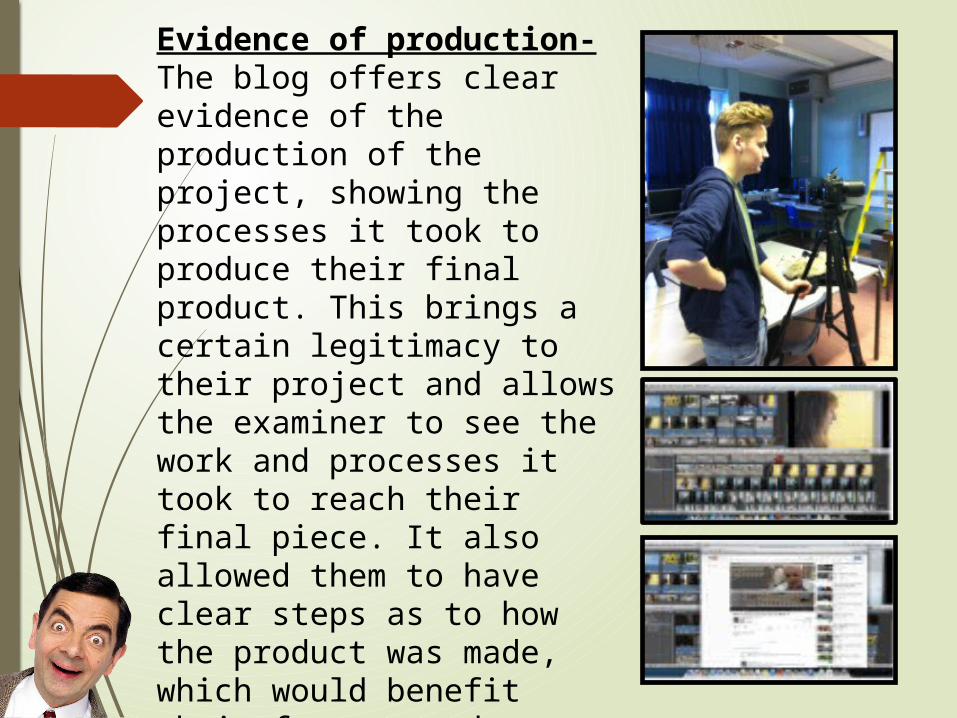
Evidence of production- The blog offers clear evidence of the production of the project, showing the processes it took to produce their final product. This brings a certain legitimacy to their project and allows the examiner to see the work and processes it took to reach their final piece. It also allowed them to have clear steps as to how the product was made, which would benefit their future products as they have their techniques and plan to film and edit.
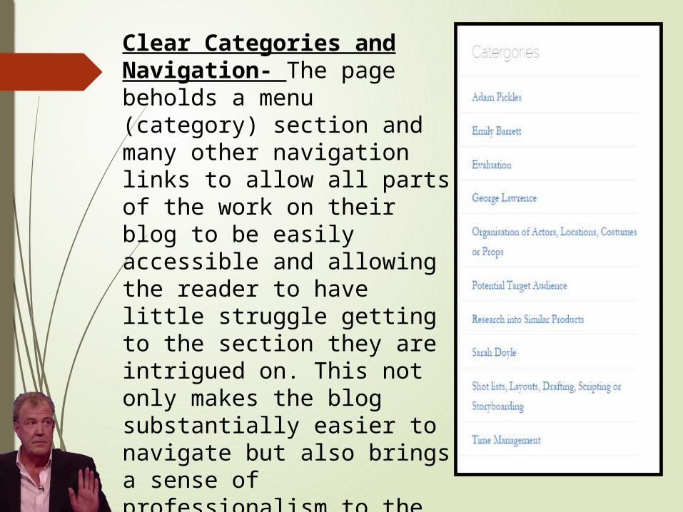
Clear Categories and Navigation- The page beholds a menu (category) section and many other navigation links to allow all parts of the work on their blog to be easily accessible and allowing the reader to have little struggle getting to the section they are intrigued on. This not only makes the blog substantially easier to navigate but also brings a sense of professionalism to the work; with the organisation and quality.
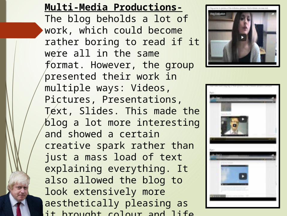
Multi-Media Productions- The blog beholds a lot of work, which could become rather boring to read if it were all in the same format. However, the group presented their work in multiple ways: Videos, Pictures, Presentations, Text, Slides. This made the blog a lot more interesting and showed a certain creative spark rather than just a mass load of text explaining everything. It also allowed the blog to look extensively more aesthetically pleasing as it brought colour and life to the page, this would captivate more attention from the examiner than just a static, colourless page.
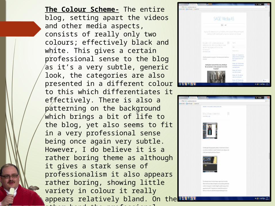
The Colour Scheme- The entire blog, setting apart the videos and other media aspects, consists of really only two colours; effectively black and white. This gives a certain professional sense to the blog as it’s a very subtle, generic look, the categories are also presented in a different colour to this which differentiates it effectively. There is also a patterning on the background which brings a bit of life to the blog, yet also seems to fit in a very professional sense being once again very subtle. However, I do believe it is a rather boring theme as although it gives a stark sense of professionalism it also appears rather boring, showing little variety in colour it really appears relatively bland. On the other hand the professional approach may be appreciated by examiners, but I don’t particularly enjoy this layout, I feel it lacks a certain personality to it and spark.
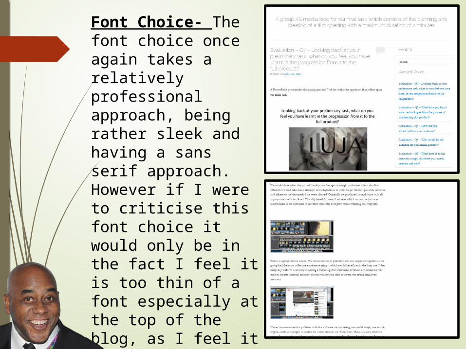
Font Choice- The font choice once again takes a relatively professional approach, being rather sleek and having a sans serif approach. However if I were to criticise this font choice it would only be in the fact I feel it is too thin of a font especially at the top of the blog, as I feel it lacks in the ability to captivate attention.
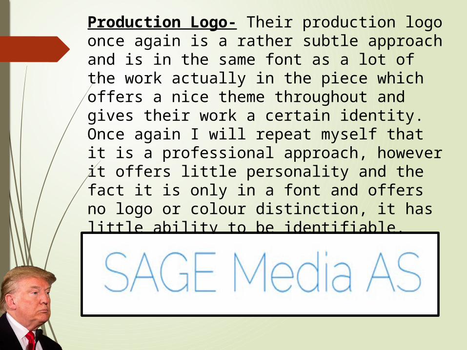
Production Logo- Their production logo once again is a rather subtle approach and is in the same font as a lot of the work actually in the piece which offers a nice theme throughout and gives their work a certain identity. Once again I will repeat myself that it is a professional approach, however it offers little personality and the fact it is only in a font and offers no logo or colour distinction, it has little ability to be identifiable.

FIN…
Hope y
ou en
joyed
… All the best…

Happy
Holi
days