analytics dashboards
TRANSCRIPT
Analytics Dashboards
Getting Started
& Introduction to the Basics Training Guide
v1.1 October 2021
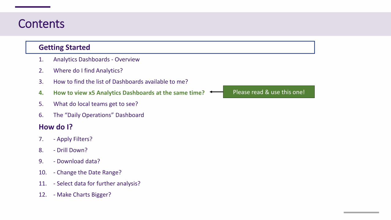
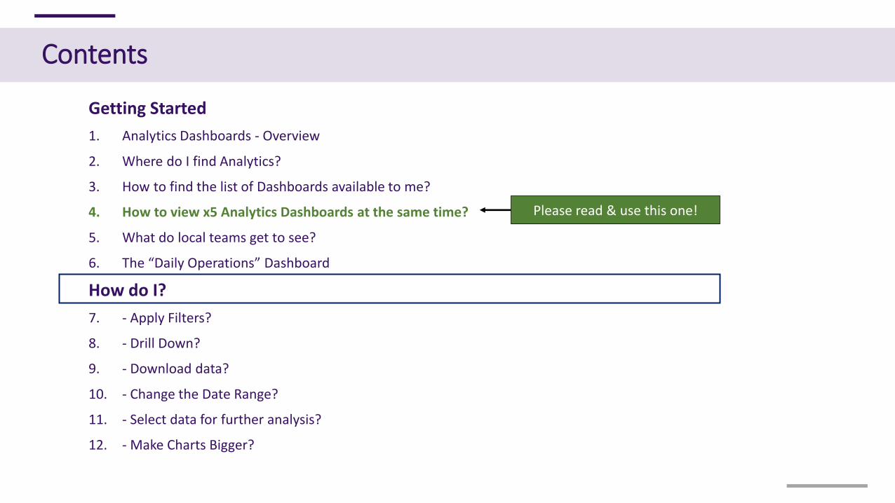
Contents
Getting Started
1. Analytics Dashboards - Overview
2. Where do I find Analytics?
3. How to find the list of Dashboards available to me?
4. How to view x5 Analytics Dashboards at the same time?
5. What do local teams get to see?
6. The “Daily Operations” Dashboard
How do I?
7. - Apply Filters?
8. - Drill Down?
9. - Download data?
10. - Change the Date Range?
11. - Select data for further analysis?
12. - Make Charts Bigger?
Please read & use this one!
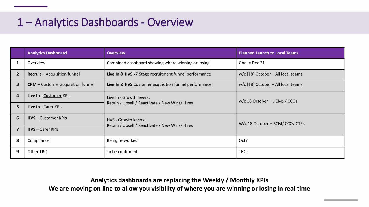
1 – Analytics Dashboards - Overview
Analytics Dashboard Overview Planned Launch to Local Teams
1 Overview Combined dashboard showing where winning or losing Goal = Dec 21
2 Recruit - Acquisition funnel Live In & HVS x7 Stage recruitment funnel performance w/c [18] October – All local teams
3 CRM – Customer acquisition funnel Live In & HVS Customer acquisition funnel performance w/c [18] October – All local teams
4 Live In - Customer KPIs Live In - Growth levers:Retain / Upsell / Reactivate / New Wins/ Hires w/c 18 October – LICMs / CCOs
5 Live In - Carer KPIs
6 HVS – Customer KPIs HVS - Growth levers: Retain / Upsell / Reactivate / New Wins/ Hires W/c 18 October – BCM/ CCO/ CTPs
7 HVS – Carer KPIs
8 Compliance Being re-worked Oct?
9 Other TBC To be confirmed TBC
Analytics dashboards are replacing the Weekly / Monthly KPIsWe are moving on line to allow you visibility of where you are winning or losing in real time
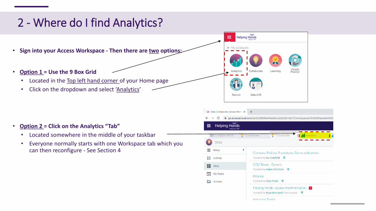
• Sign into your Access Workspace - Then there are two options:
• Option 1 = Use the 9 Box Grid
• Located in the Top left hand corner of your Home page
• Click on the dropdown and select ‘Analytics’
• Option 2 = Click on the Analytics “Tab”
• Located somewhere in the middle of your taskbar
• Everyone normally starts with one Workspace tab which you can then reconfigure - See Section 4
2 - Where do I find Analytics?
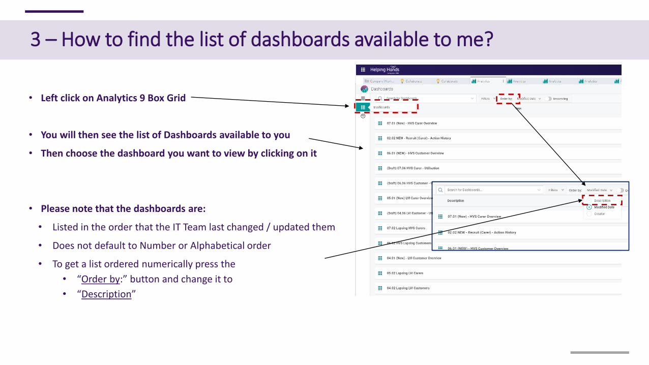
• Left click on Analytics 9 Box Grid
• You will then see the list of Dashboards available to you
• Then choose the dashboard you want to view by clicking on it
• Please note that the dashboards are:
• Listed in the order that the IT Team last changed / updated them
• Does not default to Number or Alphabetical order
• To get a list ordered numerically press the
• “Order by:” button and change it to
• “Description”
3 – How to find the list of dashboards available to me?
4 – How to View x5 Analytics dashboards at the same time
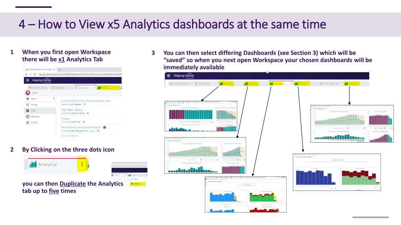
1 When you first open Workspace there will be x1 Analytics Tab
3 You can then select differing Dashboards (see Section 3) which will be “saved” so when you next open Workspace your chosen dashboards will be immediately available
2 By Clicking on the three dots icon
you can then Duplicate the Analytics tab up to five times
5 – What do the local teams get to see?
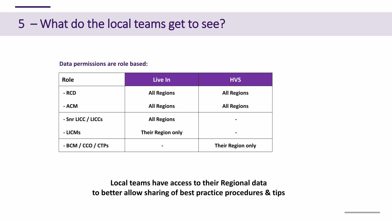
Local teams have access to their Regional datato better allow sharing of best practice procedures & tips
Role Live In HVS
- RCD All Regions All Regions
- ACM All Regions All Regions
- Snr LICC / LICCs All Regions -
- LICMs Their Region only -
- BCM / CCO / CTPs - Their Region only
Data permissions are role based:
6 – The Daily Operations Dashboard [not Analytics & from November]
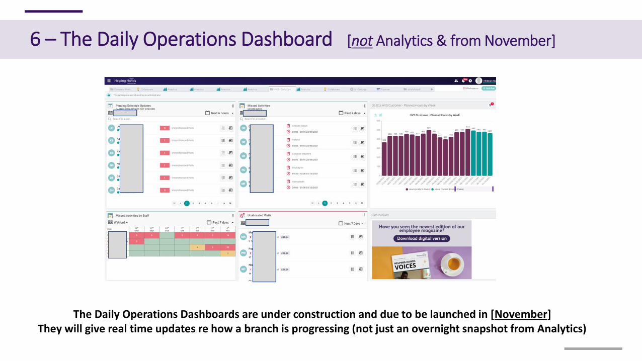
The Daily Operations Dashboards are under construction and due to be launched in [November]They will give real time updates re how a branch is progressing (not just an overnight snapshot from Analytics)
Contents
Getting Started
1. Analytics Dashboards - Overview
2. Where do I find Analytics?
3. How to find the list of Dashboards available to me?
4. How to view x5 Analytics Dashboards at the same time?
5. What do local teams get to see?
6. The “Daily Operations” Dashboard
How do I?
7. - Apply Filters?
8. - Drill Down?
9. - Download data?
10. - Change the Date Range?
11. - Select data for further analysis?
12. - Make Charts Bigger?
Please read & use this one!
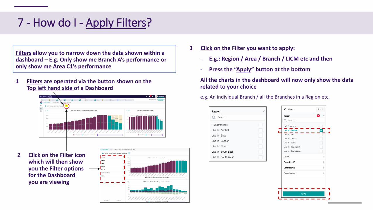
Filters allow you to narrow down the data shown within a dashboard – E.g. Only show me Branch A’s performance or only show me Area C1’s performance
1 Filters are operated via the button shown on the Top left hand side of a Dashboard
3 Click on the Filter you want to apply:
- E.g.: Region / Area / Branch / LICM etc and then
- Press the “Apply” button at the bottom
All the charts in the dashboard will now only show the data related to your choice
e.g. An individual Branch / all the Branches in a Region etc.
7 - How do I - Apply Filters?
2 Click on the Filter iconwhich will then show you the Filter options for the Dashboard you are viewing
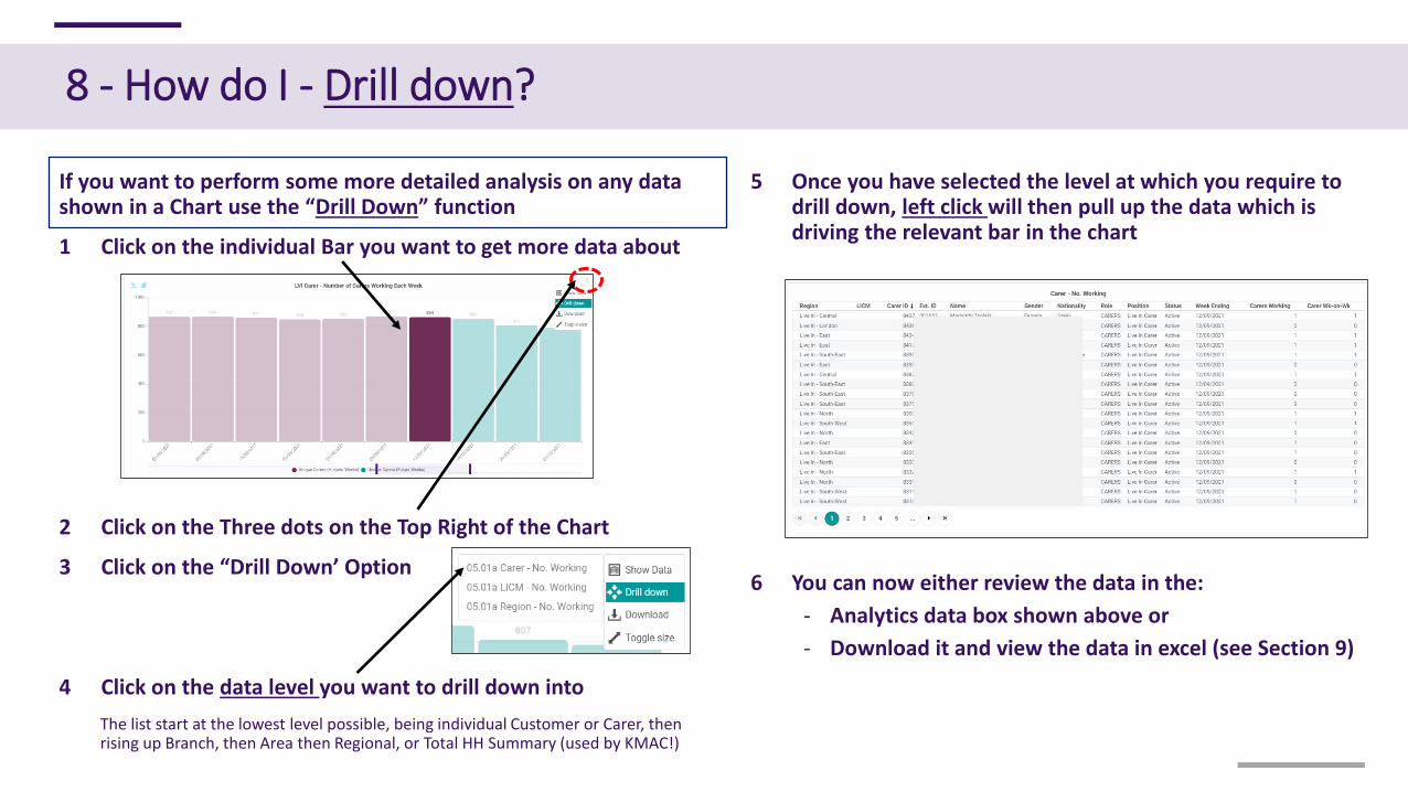
If you want to perform some more detailed analysis on any data shown in a Chart use the “Drill Down” function
1 Click on the individual Bar you want to get more data about
2 Click on the Three dots on the Top Right of the Chart
3 Click on the “Drill Down’ Option
4 Click on the data level you want to drill down into
The list start at the lowest level possible, being individual Customer or Carer, then rising up Branch, then Area then Regional, or Total HH Summary (used by KMAC!)
5 Once you have selected the level at which you require to drill down, left click will then pull up the data which is driving the relevant bar in the chart
8 - How do I - Drill down?
6 You can now either review the data in the:
- Analytics data box shown above or
- Download it and view the data in excel (see Section 9)
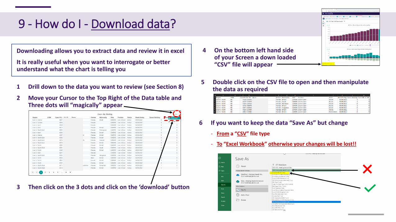
Downloading allows you to extract data and review it in excel
It is really useful when you want to interrogate or better understand what the chart is telling you
1 Drill down to the data you want to review (see Section 8)
2 Move your Cursor to the Top Right of the Data table and Three dots will “magically” appear
4 On the bottom left hand side of your Screen a down loaded “CSV” file will appear
9 - How do I - Download data?
3 Then click on the 3 dots and click on the ‘download’ button
5 Double click on the CSV file to open and then manipulate the data as required
6 If you want to keep the data “Save As” but change
- From a “CSV” file type
- To “Excel Workbook” otherwise your changes will be lost!!
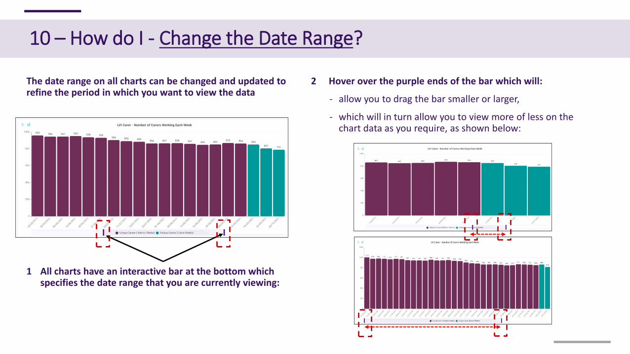
The date range on all charts can be changed and updated to refine the period in which you want to view the data
1 All charts have an interactive bar at the bottom which specifies the date range that you are currently viewing:
2 Hover over the purple ends of the bar which will:
- allow you to drag the bar smaller or larger,
- which will in turn allow you to view more of less on the chart data as you require, as shown below:
10 – How do I - Change the Date Range?
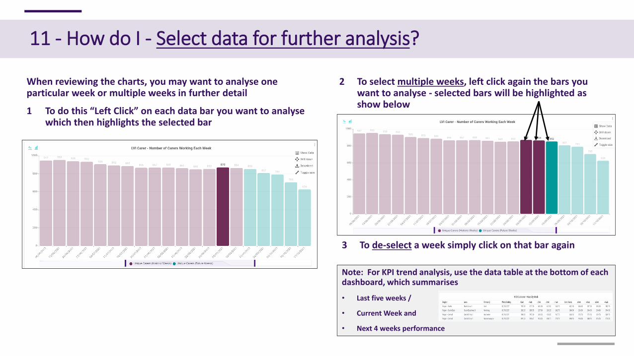
Note: For KPI trend analysis, use the data table at the bottom of each dashboard, which summarises
• Last five weeks /
• Current Week and
• Next 4 weeks performance
When reviewing the charts, you may want to analyse one particular week or multiple weeks in further detail
1 To do this “Left Click” on each data bar you want to analyse which then highlights the selected bar
2 To select multiple weeks, left click again the bars you want to analyse - selected bars will be highlighted as show below
11 - How do I - Select data for further analysis?
3 To de-select a week simply click on that bar again
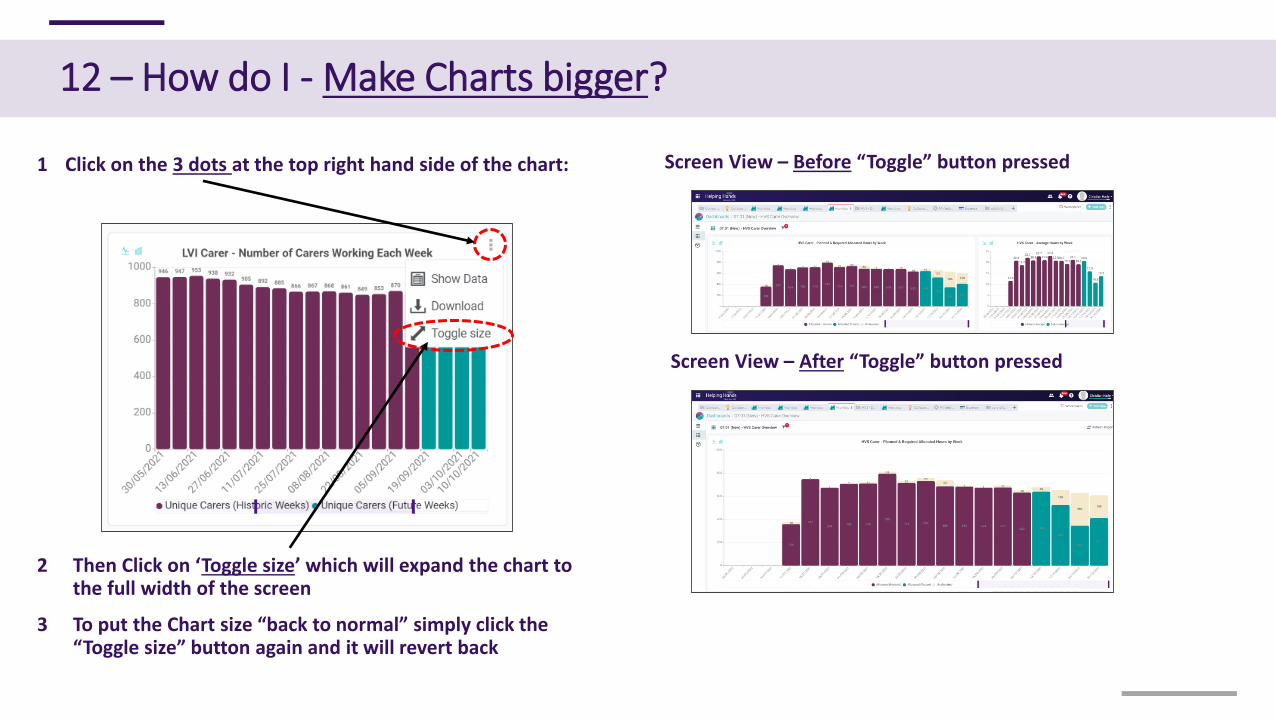
1 Click on the 3 dots at the top right hand side of the chart:
2 Then Click on ‘Toggle size’ which will expand the chart to the full width of the screen
3 To put the Chart size “back to normal” simply click the “Toggle size” button again and it will revert back
12 – How do I - Make Charts bigger?
Screen View – Before “Toggle” button pressed
Screen View – After “Toggle” button pressed