9/23/2015slide 1 published reports of research usually contain a section which describes key...
TRANSCRIPT

04/19/23 Slide 1
• Published reports of research usually contain a section which describes key characteristics of the sample included in the study.
• The “key” characteristics included in the report depend upon the context of the research, but often include demographics like sex, age, race, education, etc.
• When the characteristic is measured by a qualitative variable, we summarize the data with frequency distributions and contingency tables.

04/19/23 Slide 2
• The frequency distribution provides a profile of an individual categorical variable: the number and percent that fall in each category. In SPSS, a frequency distribution looks like the following:
The categories of the variable are listed in the first column. I prefer to list both code numbers and value labels.
The counts are listed in the second column, but counts communicate less information that percentages because we don’t know how to translate the number in the count to the population from which our sample was drawn.
The third and fourth columns both show percents. The third column includes the missing data in the total. The fourth column shows percentages when missing cases are excluded. We generally report the percentage from the fourth column.

04/19/23 Slide 3
• The percentage in a category is often reported as the proportion of cases in that category.
• The percentage is also the probability that an individual subject fell in a specific category.
• Based on the number or percentage, we can describe one category as the most likely (the modal category).
• Based on the numbers or percentages across categories, we can describe one category as more probable or more likely than another.

04/19/23 Slide 4
• Based on the numbers or percentages across categories, we can also describe the odds of falling in one category or another, e.g. subjects were about 1.4 times more likely to be religiously moderate rather than fundamentalist.
• The odds are computed by dividing the number in one category (e.g. 101) by the number in the second category (e.g. 71). The odds of being in the first category rather than the second is 1.4 to 1.

04/19/23 Slide 5
• Odds are generally expressed as some number to 1, and the “to 1” is not stated.
• The odds of being in the second category rather than the first are: 0.70 to 1 (71÷101). Note that the odds in opposite directions are reciprocals, i.e. 1 ÷ 1.4 = .70 and 1 ÷ .70 = 1.4.
• If the odds are greater than 1, we characterize it as “more likely.” If the odds are less than 1, we characterize it as “less likely.” If the odds are very close to 1, we characterize it as “equally likely.”

04/19/23 Slide 6
• It is easier to communicate odds that are more likely rather than less likely, so we should change the direction of the odds when we have a result that is less than one.
• While odds may seem out of place in a context other than betting on horse races, it is a construct of increasing importance in social and behavioral research because it gives us a strategy for predicting which category a subject is likely to belong to, using techniques like logistic regression (which we cover in spring).

04/19/23 Slide 7
The introductory statement in the question indicates:• The data set to use (GSS200R)• The statistic to use (Frequency distribution)• The variable to analyze (degree)
04/19/23 Slide 8
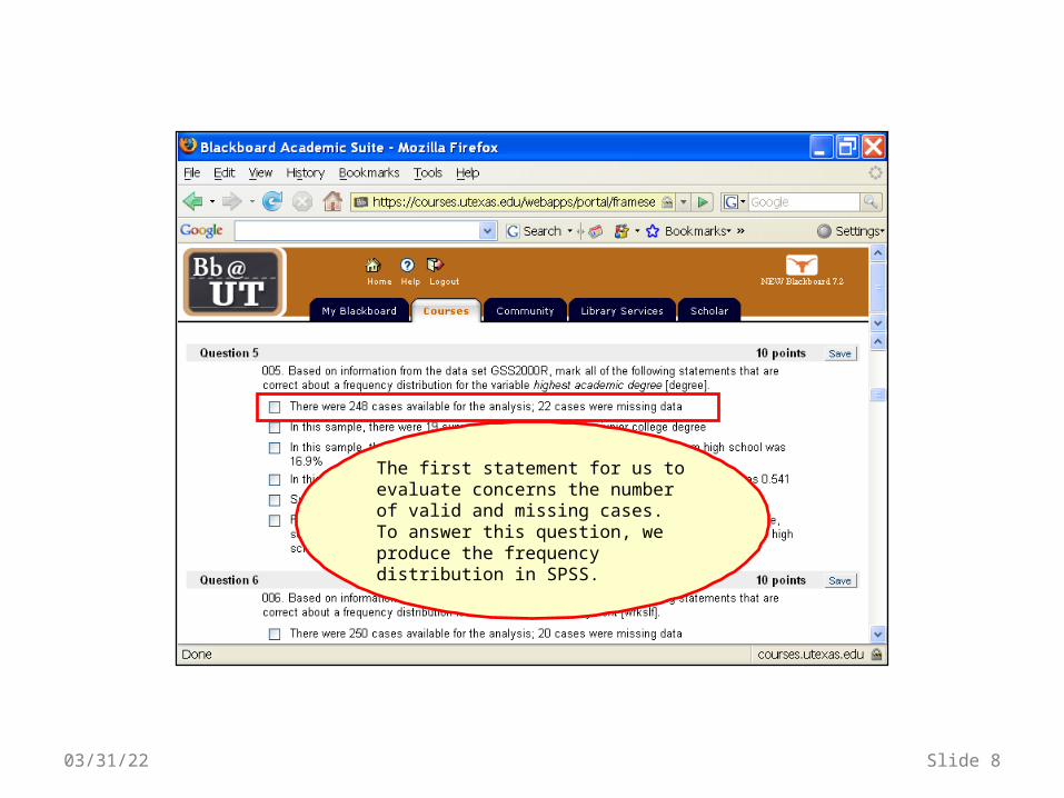
The first statement for us to evaluate concerns the number of valid and missing cases. To answer this question, we produce the frequency distribution in SPSS.

To compute a frequency distribution in SPSS, select the Descriptive Statistics > Frequencies command from the Analyze menu.
04/19/23 Slide 9

First, in the Frequencies dialog box, scroll down the list of variables and click on degree.
Second, click on the arrow button to move degree to the list box for variables.
04/19/23 Slide 10
The OK button is inactive because we have not yet provided enough information to compute the statistic.

Though we don’t need it to solve the problem, we will request a bar chart to display the variable. We can use the bar chart to confirm the statistical facts that we are including in our description. For example, it we describe one category as being the most likely, it should have the tallest bar in the chart. If we say that one category is twice as likely as another, its bar should look twice as tall as the other.
04/19/23 Slide 11
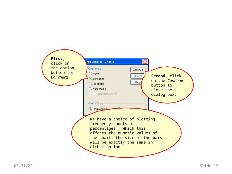
First, click on the option button for Bar charts.
Second, click on the Continue button to close the dialog box.
04/19/23 Slide 12
We have a choice of plotting frequency counts or percentages. Which this affects the numeric values of the chart, the size of the bars will be exactly the same in either option.

Click on the OK button to obtain the output.When one or more variables are
included in the Variable(s) list box, the OK button becomes active.
04/19/23 Slide 13

More respondents had a Bachelor degree than a Junior College degree.
Clearly, the most frequent response was a High School degree.
04/19/23 Slide 14
Before we start answering the questions in the problem, we will look at the statements that are supported by the bar chart.
It looks like respondents were about twice as likely to have a Bachelor degree than a Junior College degree.
We will check the numeric results to make more precise statements.

The output for the Frequencies command consists of two tables.
The second table shows the count and percents for each of the values of the variable.
04/19/23 Slide 15
The first table lists the statistics for N, the number of cases. The number of valid cases and the number of cases with missing data are included. Missing cases can be either “System” missing (the data was not entered into SPSS) or “user-defined” missing data (the researcher designated certain codes as representing missing data, e.g. 9 for NA.

The information about the number of cases missing data appears in two places in the output.
First, in the statistics table, the total number of cases with Missing data is listed as 3.
Second, the number and codes for missing data are listed at the bottom of the frequency table. If there were any “System” missing data, it would also be listed here.
04/19/23 Slide 16
If there were no missing data, the Missing number would be 0 and there would be no entry for Missing in the frequency table.
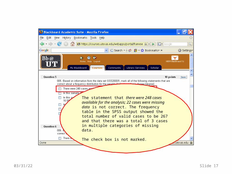
The statement that there were 248 cases available for the analysis; 22 cases were missing data is not correct. The frequency table in the SPSS output showed the total number of valid cases to be 267 and that there was a total of 3 cases in multiple categories of missing data.
The check box is not marked.
04/19/23 Slide 17

The next statement indicates the frequency count for the number of subjects with a junior college degree.
04/19/23 Slide 18

The third row of the frequency table shows the number of subjects with a junior college degree to be 19.
04/19/23 Slide 19

The statement that in this sample, there were 19 survey respondents who had a junior college degree is correct. In the frequency table, the count of cases in the 'Frequency' column for JUNIOR COLLEGE was 19.
The statement is correct, so the check box is marked.
04/19/23 Slide 20

The next statement indicates the proportion or percentage of respondents who had not graduated from high school.
04/19/23 Slide 21

The percent of cases in the first row of the table for less than high school under the Valid Percent column is 16.9%.
Remember that we use the Valid Percent column and not the Percent column.
04/19/23 Slide 22

The check box for this statement is marked.
The statement that in this sample, the proportion of survey respondents who had not graduated from high school was 16.9% is correct. In the frequency table, the percent of cases in the 'Valid Percent' column for LT HIGH SCHOOL was 16.9
04/19/23 Slide 23
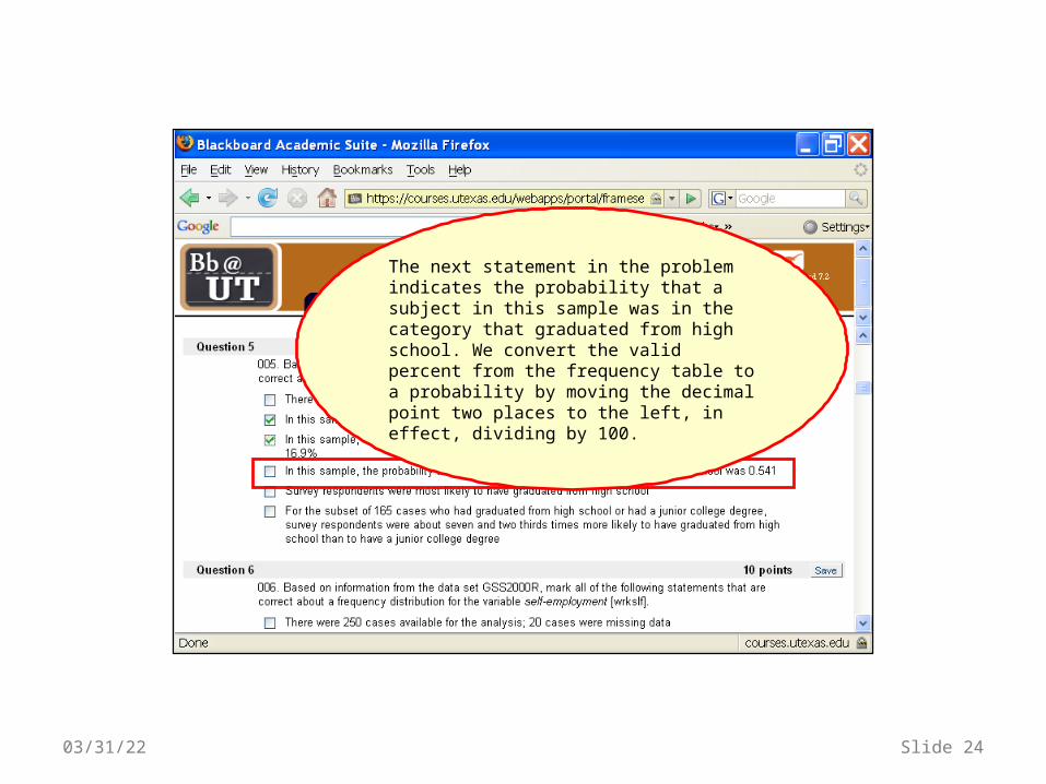
The next statement in the problem indicates the probability that a subject in this sample was in the category that graduated from high school. We convert the valid percent from the frequency table to a probability by moving the decimal point two places to the left, in effect, dividing by 100.
04/19/23 Slide 24

The valid percent for the High School category is 54.7. Moving the decimal two place to the left results in a probability of 0.547.
We could have produced the same result by dividing by 100: 54.7 ÷ 100 = 0.547.
04/19/23 Slide 25

The statement that in this sample, the probability that a survey respondent had graduated from high school was 0.541 is not correct. In the frequency table, the percent of cases in the 'Valid Percent' column for HIGH SCHOOL was 54.7, not 54.1. The probability is computed by dividing this percent by 100 (54.7÷100=0.547.
Note: 0.541 was computed by incorrectly using the entry in the Percent (54.1) column instead of the Valid Percent column (54.7)
The check box for the statement is not marked.
04/19/23 Slide 26

The next statement in the problem requires us to identify the category with the largest number or percentage.
The largest category is also identified as the mode of the distribution. The mode is the preferred measure of central tendency for nominal level variables.
04/19/23 Slide 27
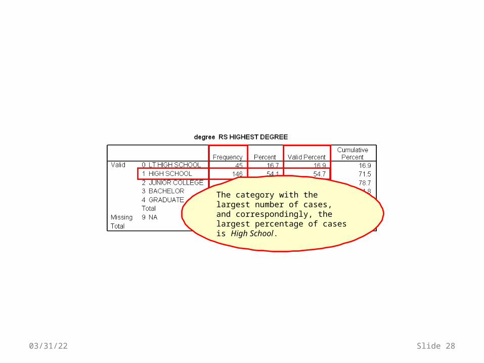
The category with the largest number of cases, and correspondingly, the largest percentage of cases is High School.
04/19/23 Slide 28

Note: it is possible for a distribution to have more than one mode, i.e. several categories can have the same number of cases that is larger than the number for all other categories. The distribution would be called bi-modal or multi-modal and the check box would not be marked because the statement ignores an important fact about the distribution.
The statement that Survey respondents were most likely to have graduated from high school is correct. The category HIGH SCHOOL had the largest percentage of cases (54.7%), making it the modal category.
The check box for the statement is marked.
04/19/23 Slide 29

The final question asks us to compute the odds of being in one category (graduated from high school) versus another (graduated from junior college). The odds are the ratio of the two percentages or numbers. We interpret odds as the likelihood of being in one category rather than the other.
Since there are more than two categories for this variable, the problem also identifies that only 165 cases are used to compute the odds instead of the entire 267 cases.
04/19/23 Slide 30

First, we can sum the number of cases in the high school and junior college categories to make certain the number of cases in the subset is stated correctly: 146 + 19 = 165
04/19/23 Slide 31
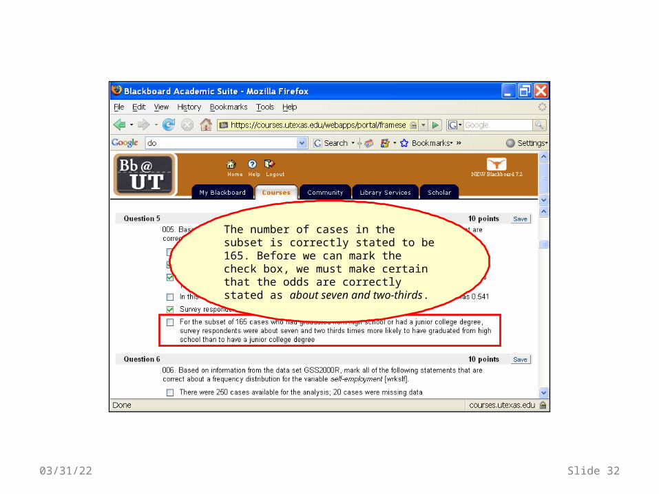
The number of cases in the subset is correctly stated to be 165. Before we can mark the check box, we must make certain that the odds are correctly stated as about seven and two-thirds.
04/19/23 Slide 32

We can use Excel to compute the ratio of the number of cases in the two groups. The numerator for the ratio is the number for the group that is mentioned first, i.e. high school. The number for the group mentioned second is the denominator.
04/19/23 Slide 33

In Excel, I enter the formula =146/19 in cell A1 and press the enter key.
The result appears in cell A1.
With cell A1 selected, the formula appears in the formula bar, so I can double check that I entered the correct numbers.
You could, of course, have used the computer calculator or a hand calculator to do the arithmetic.
04/19/23 Slide 34

The difference between the two answers is due to the fact the percents have been rounded (i.e. 54.7 and 7.1). Dividing the frequency numbers avoids the problem with rounding and provides a more precise answer.
I could have used the percents from the Valid Percent column and gotten a similar answer.
04/19/23 Slide 35

The ratio which we computed was 7.68, which is very close to seven and two-thirds (7.67).
The number of cases in the subset (165) used for the analysis is correct. The statement that for the subset of 165 cases who had graduated from high school or had a junior college degree, survey respondents were about seven and two thirds times more likely to have graduated from high school than to have a junior college degree is correct. The odds are computed by dividing the 'Frequency' for HIGH SCHOOL by the 'Frequency' for JUNIOR COLLEGE (146÷19=7.68).
Since both the number of cases in the subset and the odds are correct, we mark the check box for the statement.
04/19/23 Slide 36

04/19/23 Slide 37
The homework problems translate some of the decimal fractions for odds and odds ratios from numbers to text. The following table shows the translations used.
If the odds are: Homework problems will describe the likelihood as: Examples:
0.95 through 1.05 about equally likely 0.95,0.96,0.97,0.98,0.99,1.00,1.01,1.02,1.03,1.04,1.05
1.95 through 2.05 about twice as likely 1.95,1.96,1.97,1.98,1.99,2.00,2.01,2.02,2.03,2.04,2.05
2.95 through 3.05 about three times as likely 2.95,2.96,2.97,2.98,2.99,3.00,3.01,3.02,3.03,3.04,3.05
3.95 through 4.05 about four times as likely 3.95,3.96,3.97,3.98,3.99,4.00,4.01,4.02,4.03,4.04,4.05
4.95 through 5.05 about five times as likely 4.95,4.96,4.97,4.98,4.99,5.00,5.01,5.02,5.03,5.04,5.05
5.95 through 6.05 about six times as likely 5.95,5.96,5.97,5.98,5.99,6.00,6.01,6.02,6.03,6.04,6.05
6.95 through 7.05 about seven times as likely 6.95,6.96,6.97,6.98,6.99,7.00,7.01,7.02,7.03,7.04,7.05
7.95 through 8.05 about eight times as likely 7.95,7.96,7.97,7.98,7.99,8.00,8.01,8.02,8.03,8.04,8.05
8.95 through 9.05 about nine times as likely 8.95,8.96,8.97,8.98,8.99,9.00,9.01,9.02,9.03,9.04,9.05
9.05 through 10.05 about ten times as likely 9.95,9.96,9.97,9.98,9.99,10.00,10.01,10.02,10.03,10.04,10.05
and so on…

04/19/23 Slide 38
If the decimal fraction for the odds is:
Homework problems will describe the likelihood as: Examples:
0.20 through 0.30 and a quarter times more likely 3.21 three and a quarter times
more likely
Greater than 0.30 and less than 0.37 and a third times more likely 3.36 three and a third times
more likely
0.45 through 0.55 and a half times more likely 3.49 three and a half times more likely
Greater than 0.63 and less than 0.70
and two thirds times more likely 3.69 three and two thirds times
more likely
0.70 through 0.80 and three quarter times more likely 3.70 three and three quarters
times more likely
otherwise reported as a number rounded to one decimal place 3.42 3.4 times more likely
The homework problems translate some of the decimal fractions for odds and odds ratios from numbers to text. The following table shows the translations used.

To save the answers we have marked for the question, click on the Save button.
04/19/23 Slide 39
We have now evaluated all of the questions for this problem.

When we have finished all of the questions, we click on the Submit at the bottom of the assignment.
04/19/23 Slide 40

After BlackBoard grades the assignment, it will give you an option to review the results.
For this problem, we received the full 10 points because we marked all of the correct answers and did not mark any of the incorrect answers. Note: this version of BlackBoard does not give partial credit.
04/19/23 Slide 41

The feedback after the graded answer explains what the correct answer should have been.
04/19/23 Slide 42