4 steps to better dashboard design - zingchart
TRANSCRIPT

4 Steps to BetterDashboard Design

2
Steps inspired by:
4 Steps to Better Dashboard Design
● Data Science for Dummies
● By Lillian Pierson
● Chapter on data dashboards

3
Dashboard design is best kept simple
4 Steps to Better Dashboard Design
https://www.flickr.com/photos/7960563@N07/6964596021/Georg Sander

4
Step 1: Have a plan.
4 Steps to Better Dashboard Design
● Do you believe dashboards are simply a collection of charts?
● Do you think fussing over dashboard design is a waste of time?

5
You probably haven’t encountered a dashboard lacking design forethought!
4 Steps to Better Dashboard Design

6 4 Steps to Better Dashboard Design
“Bad design is usually the direct result of poorly
scoped purpose.”
-Lillian Pierson-

7
Step 1: Have a plan.
4 Steps to Better Dashboard Design
• A dashboard, like a recipe, should have an end goal defined at the start.
• It should have specific purpose for a specific audience.
How do you set these goals and purposes?

8
Step 2: Know Your Audience And Their Needs
4 Steps to Better Dashboard Design
1. Who is your audience?Example: Emma, a small business owner who sells cat toys.
2. What does the audience need to know?She needs to see key performance indicators (KPIs) for each part of her business.

9 4 Steps to Better Dashboard Design
“If the insights aren’t actionable, your target audience won’t adopt the
dashboard a decision-support instrument.”
-Lillian Pierson-

10
Step 2: Know Your Audience And Their Needs
4 Steps to Better Dashboard Design
Actionable insight suggestions:• Marketing
• Website traffic
• Top traffic sources
• Sales
• Sales by region
• Conversion rate
• Top sellers
• Accounting
• Revenue vs. expenses
• Product margins

11
Step 3: Choose the Right Charts
4 Steps to Better Dashboard Design
• Selecting chart types is the next important step.
• You don’t need to use solely bar charts.http://findaccountingsoftware.com/expert-advice/7-alternatives-to-the-bar-graph-and-when-to-use-them-in-bi-reporting/
• You don’t need to use traditional charts

12
Step 3: Choose the Right Charts
4 Steps to Better Dashboard Design
• Sometimes the best way to visualize data is a table or list.
• In the case of Emma, the top traffic sources are easiest to read in a table or grid.

13 4 Steps to Better Dashboard Design
“Graphs are useful when a picture of the data makes meaningful relationships visible (patterns, trends,
and exceptions) that could not be easily discerned from a table of the
same data.”
-Stephen Few-

14
Step 3: Choose the Right Charts
4 Steps to Better Dashboard Design
• The dashboard and individual charts should flow.• In the example of Emma, bullet graphs visualize
conversion and cart abandonment rates.• Quickly ID if a particular stat is a positive or negative
outlier, e.g. in the “danger zone”.

15
Step 3: Choose the Right Charts
4 Steps to Better Dashboard Design
• Charts can make decisions easier• Example: Ring chart with drill down interactive
feature• Allows the user to drill down and learn more about
other successful products

16
Step 4: Keep the Big Picture in Mind
4 Steps to Better Dashboard Design
• Use key annotations but don’t overwhelm
• Use only the most important information
• Use plenty of whitespace to allow for focus
• Rows help for flow and organization

17
Step 4: Keep the Big Picture in Mind
4 Steps to Better Dashboard Design
Visit http://www.zingchart.com/demos/ecommerce-dashboard/ to access the fully interactive demo
18
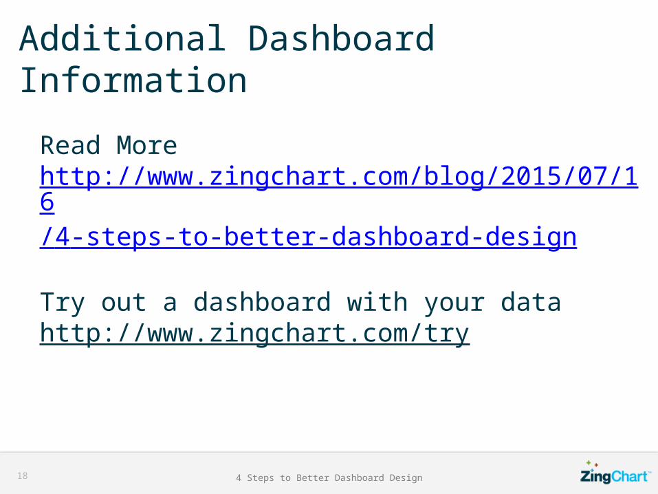
Additional Dashboard Information
4 Steps to Better Dashboard Design
Read Morehttp://www.zingchart.com/blog/2015/07/16/4-steps-to-better-dashboard-design/
Try out a dashboard with your datahttp://www.zingchart.com/try