2d artist magazine 006
TRANSCRIPT

issu
e001
janu
ary
2006
$4
/ €3.
25 /
£2.2
5
ArtistConcept Art, Digital & Matte Painting Magazine
Issue006 June 2006 $4 / €3.25 / £2.25
InterviewsVinegar
Kim Taylor
TutorialsKing Kong, Pier Duty
Elements Fire & Smoke& Fiery Explosion
Making Ofs‘So, you really think i’m too fat?’,
‘Lord Fredrickson’ & Digital Art Masters ‘Masquerade’
GalleriesFeaturing Ken Wong, Graven
Tung, Waheed Nasir, Philip Straub, Michael Hideux, Marek
Hlavaty, Daniela Uhlig, Kuang Hong, Benita Winckler & Andrew
Hou
CompetitionWin Photoshop CS books!

This issuesContents
Issue 006 June 2006www.2dartistmag.com page2
Matte painter for the Moving Picture Co. in London
Kim Taylor22 year old female art student from Warsaw, Poland
VinegarAnother 10 of the best images from around the world
GalleriesDigital Painting Tutorial from 2DArtist Regular ‘Adonihs’
King Kong part 1 of 3Digital Painting Tutorial by Graven Tung
Pier DutyElements Digital Painting Tutorial by Richard Tilbury
Fire & SmokeElements Digital Painting Alyn Hunter
Fiery ExplosionElements Digital Painting Tutorial by Adonihs
Fire & SmokeMaking of by Daniela Uhlig
So, you really think im too fat...Making of by Dominus Elf
Lord FredricksonMaking of by Egil Paulsen - from ‘Digital Art Masters’
MasqueradeCompetition sponsored by Thomson Learning
Photoshop CS BooksAffiliates & Info
Zoo Publishing
014
006
021
029
037
046
051
055
066
069
075
078
080
INTERVIEW
INTERVIEW
GALLERIES
TUTORIAL
TUTORIAL
TUTORIAL
TUTORIAL
TUTORIAL
PROJECT OVERVIEW
PROJECT OVERVIEW
PROJECT OVERVIEW
COMPETITION
ABOUT US
2DARTISTwww.2dartistmag.com
EDITORBen Barnes
ASSISTANT EDITORChris Perrins MARKETINGLynette Clee
CONTENT MANAGER Warin Pismoke
DESIGNERSMatt Lewis
Martin Shaw Alex Price
INTERVIEWSVinegar
Kim Taylor
TUTORIALSAdonihs
Graven TungRichard Tilbury
Alyn HunterAdonihs
Daniela UhligDominus ElfEgil Paulsen
GALLERIESKen Wong
Graven TungWaheed NasirPhilip Straub
Michael HideuxMarek HlavatyDaniela UhligKuang Hong
Benita WincklerAndrew Hou
welcomeEditorial
Issue 006 June 2006www.2dartistmag.com page3
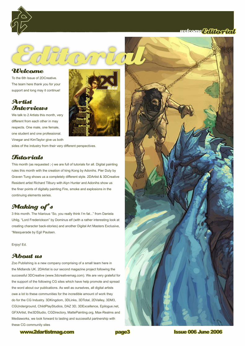
WelcomeTo the 6th Issue of 2DCreative.
The team here thank you for your
support and long may it continue!
Artist Interviews We talk to 2 Artists this month, very
different from each other in may
respects. One male, one female,
one student and one professional.
Vinegar and KimTaylor give us both
sides of the industry from their very different perspectives.
TutorialsThis month (as requested ;-) we are full of tutorials for all. Digital painting
rules this month with the creation of king Kong by Adonihs. Pier Duty by
Graven Tung shows us a completely different style. 2DArtist & 3DCreative
Resident artist Richard Tilbury with Alyn Hunter and Adonihs show us
the finer points of digitally painting Fire, smoke and explosions in the
continuing elements series.
Making of’s3 this month. The hilarious “So, you really think I’m fat...” from Daniela
Uhlig, “Lord Frederickson” by Dominus elf (with a rather interesting look at
creating character back-stories) and another Digital Art Masters Exclusive,
“Masquerade by Egil Paulsen.
Enjoy! Ed.
About usZoo Publishing is a new company comprising of a small team here in
the Midlands UK. 2DArtist is our second magazine project following the
successful 3DCreative (www.3dcreativemag.com). We are very grateful for
the support of the following CG sites which have help promote and spread
the word about our publications. As well as ourselves, all digital artists
owe a lot to these communities for the incredible amount of work they
do for the CG Industry. 3DKingdom, 3DLinks, 3DTotal, 2DValley, 3DM3,
CGUnderground, ChildPlayStudios, DAZ 3D, 3DExcellence, Epilogue.net,
GFXArtist, the3DStudio, CGDirectory, MattePainting.org, Max-Realms and
Mediaworks, we look forward to lasting and successful partnership with
these CG community sites
issu
e001
janu
ary
2006
$4
/ €3.
25 /
£2.2
5
ArtistConcept Art, Digital & Matte Painting Magazine
Issue006 June 2006 $4 / €3.25 / £2.25
InterviewsVinegar
Kim Taylor
TutorialsKing Kong, Pier Duty
Elements Fire & Smoke& Fiery Explosion
Making Ofs‘So, you really think i’m too fat?’,
‘Lord Fredrickson’ & Digital Art Masters ‘Masquerade’
GalleriesFeaturing Ken Wong, Graven
Tung, Waheed Nasir, Philip Straub, Michael Hideux, Marek
Hlavaty, Daniela Uhlig, Kuang Hong, Benita Winckler & Andrew
Hou
CompetitionWin Photoshop CS books!
Editorial

this monthsContributing Artists
Issue 006 June 2006www.2dartistmag.com page4
Every month, many artists from around the
world contribute to 2DArtist Magazine. This
month, we would like to thank the following for
their time, experiences and inspiration.
Contributors
Vinegar Freelance Illustrator / Concept
Artist > Warsaw, Poland. My
serious interest in drawing began
around 2003 when I found vast
possibilities in digital media.
Since then I started working hard on my drawing
skills, learning from my own mistakes. I started work-
ing in the field of Computer Graphics around 2004
when I had my first serious commission. Over the last
two years my work has featured in many formats, and
I’m drawing for books and games doing Illustrations
and Concept Art.
[email protected] www.vinegaria.com
Richard TilburyHave had a passion for drawing
since being a couple of feet
tall. Studied Fine Art and
eventually was led into the
realm of computers several
years ago. My brushes have slowly been dissolving
in white spirit since the late nineties and now alas
my graphics tablet has become their successor.
Still sketch regularly and now balance my time
between 2 and 3D although drawing will always be
closest to my heart.
Daniela UhligBerlin, Germany.
I “suffered” from school for 13
years until I finally graduated,
then I was educated for a job
(that I won’t mention now) for 3
years, which was even worse than school. However,
I now have been working as a graphics designer/
illustrator for 2 years now and I might eventually
study art sooner or later. So - to keep it short - I love
painting since I can hold a pen in my hand and so it
can be described as being my passion.
http://www.du-artwork.de
Dominus Elf2D illustrator / Concept artist >
Freelancer > Romania
I studied traditional art at
Haricleea Darcle high school in
Braila, after that I began to use
the computer for creating my artworks; then started
using Photoshop about 6 years ago and learning
almost everything from the almighty internet. Since
then, I’ve been working as a freelancer doing concept
art and illustration for several movies and games.
/wwww.pandemoniumart.net
Kim TaylorMatte Painter/Texture Artist/
Concept Artist. London,
England > In 2003, straight out
of university, I started working
at MPC, London, as a Matte
Painter. I have since worked on many amazing
projects including Xmen 3. I,m currently working on
a tv adaptation of Terry Pratchetts ‘Hogfather’, doing
texturing, matte painting and concepts. I love to paint
and to create.
www.sketchling.com

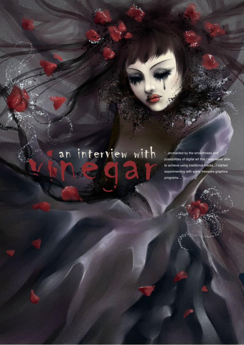
“...enchanted by the smoothness and
possibilities of digital art that I was never able
to achieve using traditional media...I started
experimenting with some freeware graphics
programs....”

an interview withVinegar
Issue 006 June 2006www.2dartistmag.com page�
Can you please give our readers a little
introduction about yourself; your age, location,
current projects etc.?...
I’m a 22 year old female living in Warsaw,
Poland. I’m the kind of girl who sits in a cafe
sipping black coffee and always doodling in
her sketchbook. I’m currently studying at two
universities; a Master’s degree in History of Art
in Warsaw and I’ve just started Graphics in Lodz
city. The rest of the time I work as a freelance
artist. As for my current private projects, there
are always plenty and I hardly finish any of
them! Some of them I have been working on
for many, many years, and they are mostly
sketches, doodles and notes which I rarely
unveil. I think the best description I can give
of me would be to describe my work-place; a
bit messy, coffee stains everywhere, yet pretty
organised (I can always tell what is where and
can’t work in total chaos). Okay, now you know
it all... I think!
Now, a little background history; when did it
all start for you? You are self-taught, but what
exactly was it that motivated you to start taking
your drawing seriously?
I’ve been doodling since I was a kid. I always
thought I was pretty good at it, but actually I was
wrong! Around summer 2003, when I had to
study for my first session of exams at university,
I couldn’t focus so I started browsing the Internet
and found lots of websites with digital artworks. I
was pretty amazed that these illustrations could
be done on my own computer. I had always
used colour pencils, pastels and paints (acrylics
and oils) to colour my drawings and I got
enchanted by the smoothness and possibilites of
digital art that I was never able to achieve using
tradtional media. So I started experimenting with
some freeware graphics programs, showed my
drawings in a few places and… failed miserably!
Of course, my doodles were quite nice and had
some potential, but when compared to other
artists’ drawings I saw how much I lacked in my
technique and anatomy-drawing skills. That’s
why I started working hard on all my flaws and
still, to this very day, the better I get the more
mistakes I see in my drawings. So I think my
main motivation was (and still is) to achieve a
technical level as good as my favourite artists
(both old masters and contemporary ones).
“...I got enchanted by the smoothness and possibilities of digital art that I was never
able to achieve using traditional media...”
Issue 006 June 2006www.2dartistmag.com
An interview withVinegar
page�
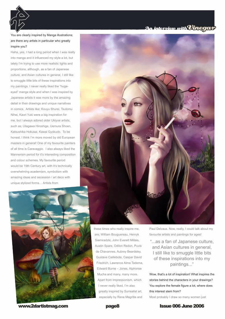
You are clearly inspired by Manga illustrations;
are there any artists in particular who greatly
inspire you?
Haha, yes, I had a long period when I was really
into manga and it influenced my style a lot, but
lately I’m trying to use more realistic lights and
proportions, although, as a fan of Japanese
culture, and Asian cultures in general, I still like
to smuggle little bits of these inspirations into
my paintings. I never really liked the “huge-
eyed” manga style and when I was inspired by
Japanese artists it was more by the amazing
detail in their drawings and unique narratives
in comics. Artists like; Kouyu Shurei, Tsutomu
Nihei, Kaori Yuki were a big inspiration for
me, but I always adored older Ukiyoe artists,
such as; Utagawa Hiroshige, Uemura Shoen,
Katsushika Hokusai, Kawai Gyokudo. To be
honest, I think I’m more moved by old European
masters in general! One of my favourite painters
of all time is Caravaggio. I also always liked the
Mannerism period for it’s interesting composition
and colour schemes. My favourite period
would be 19th Century art, with it’s technically
overwhelming academism, symbolism with
amazing ideas and secession / art deco with
unique stylized forms… Artists from
these times who really inspire me,
are; William Bouguereau, Henryk
Siemiradzki, John Everett Millais,
Austin Spare, Odilon Redon, Puvis
de Chavannes, Aubrey Beardsley,
Gustave Caillebote, Caspar David
Friedrich, Lawrence Alma Tadema,
Edward Burne – Jones, Alphonse
Mucha and many, many more.
Apart from Impressionism, which
I never really liked, I’m also
greatly inspired by Surrealist art,
especially by Rene Magritte and
Paul Delvaux. Now, really, I could talk about my
favourite artists and paintings for ages!
Wow, that’s a lot of inspiration! What inspires the
stories behind the characters in your drawings?
You explore the female figure a lot, where does
this interest stem from?
Most probably I draw so many women just
“...as a fan of Japanese culture, and Asian cultures in general, I still like to smuggle little bits of these inspirations into my
paintings...”

an interview withVinegar
Issue 006 June 2006www.2dartistmag.com page�
because I am one! I find the female body
beautiful and inspiring and it also usually works
better for my ideas. As for inspiration – it’s hard
to say. I guess everything inspires me; from
books (I read a lot! I always have problems
trying to find something new that I haven’t
already read!), music and films to everything
I see. I like to catch little details which I try to
remember to later create a story or a character
design from it. I tend to wander a lot and very
often I just go out with my dog whilst listening
to music at the same time. These walks are
always feeding me lots of ideas for everything.
The same happens when I’m driving a car or
riding on a bus – somehow when I’m moving I
get ideas… That sounds a little weird, doesn’t
it? Also, I like to look at other artists’ concepts
and illustrations. So basically, everything could
be my inspiration, I just never directly copy
other peoples’ ideas as I believe art should be
as original as possible! I actually think no artist
would be able to give you a strict answer to this
question…
Ok, so you work with a lot of artistic media; both digital and traditional. Is
there any medium you prefer above all the rest, and why?
Yes, that would be pencil. I still find it the most universal medium, the best
tool to make sketches and usually I “think” my ideas in pencil, then later
try to bring them to life in colour. I like playing with paints (acrylics mostly,
but I also like to touch up my traditional paintings with pastels) but what I
create this way is different to digital media, because I tend to experiment
with it more. When I’m using digital tools I’m usually aiming for more
realism.
You work with a lot of digital software; how do you decide which is the best
tool(s) to use when you’re starting a new piece of work?
Basically when I’m doing a commercial work or drawing my own comic-
“I’m the kind of girl who sits in a cafe sipping black coffee and always doodling in her
sketchbook.”

Issue 006 June 2006www.2dartistmag.com
An interview withVinegar
page10
book projects, I choose digital media, because I
can achieve more realistic results this way and
I prefer digital colouring for the smoothness and
vivid lights that I can achieve quickly. But when
I’m doing real life portraits, I prefer pencils,
as they depict a person with more personal
character. That’s just my opinion though! I
also like to sketch landscapes with pastels and
experiment with traditional tools for my more
abstract projects. I’m still developing my style
(I don’t really think I’ll ever say “yes, this is it!”)
so experimenting with different media is always
an interesting experience for me. Sometimes
the tools I choose depend on the mood I’m
in, for example, one of my comics was done
completely in Photoshop, but another one was
created 100% in the traditional way, with some
grunge effects, and I used a variety of tools like;
toothbrush, comb, ink, pencils, pens… and in
the end I think I got a more emotional result.
How do you know when a piece of work is
finished?
I don’t actually. I tend to overwork some pieces
and leave some others unfinished. That’s why
I always find so many flaws in my artworks. I
usually stop painting the picture when I see what
“I enjoy doing concept arts which include designing
characters, their background, clothes and such.”

an interview withVinegar
Issue 006 June 2006www.2dartistmag.com page11
You work on a variety of single commissions;
from illustrations to tattoos designs, to
photographic manipulations, but what is your
favourite commission type to work on?
This is a tricky question, actually. I have to say
it depends on the topic and employer. Usually,
I enjoy doing concept arts which include
designing characters, their background, clothes
and such. I like to have some strict rules at the
beginning from which I can start to end up with
something original and characteristic. I like
doing whole illustrations too, but it depends on
the people I work with. I had some nightmarish
experiences when doing illustrations for an
employer who was completely undecided and
with no imagination/taste at all! Then I had
I’m doing is beginning to look pointless.. So it’s
hard to say and I think it’s one of my biggest
problems – to know when to stop painting!
You are still very young and you seem to have
achieved alot already as an artist; what do you
feel has been your greatest accomplishment so
far?
Thank you, but I don’t think I have achieved
that much already. I really still consider myself
as a beginner, especially when compared to
other digital artists (just to name few already
featured in 2D Artist Magazine like; Matt Dixon,
Kuang Hong or Natascha Roeoesli). As for my
greatest accomplishment, I think being featured
in both Exotique and Painter books by Ballistic
Publishing proved to me that I had achieved
some ‘proper’ level (but still, looking at these
books left me feeling like I still have so much to
work on!). Also, getting more recognition and
commissions in general is also something I’m
proud of – knowing that some people like what
I do.
“I find the female body beautiful and inspiring and it also usually
works better for my ideas...”

Issue 006 June 2006www.2dartistmag.com
An interview withVinegar
page12
some uninteresting commissions at first which
actually turned out great because of the people
I worked with – like designs for a few companies
(websites, logos etc) or doing illustrations for
mobile games.
Do you find it easy to always stay motivated?
What drives you as an artist?
Lack of coffee. I could do everything for a cup
of black coffee with no sugar! Just kidding!
No seriously, it depends. If I’m working on a
commissioned project my motivation is not
to fail the people I work with/for. That’s why I
always stay motivated; meeting deadlines and
guidelines as best I can. When it comes to
my private illustrations, sometimes I lose my
motivation easily when I think what I’m working
on isn’t turning out as I expected, so I have
many, many unfinished pieces…
If you hadn’t started seriously drawing, what do
you think you’d be doing right now? What did
you imagine, when you were a child, that you’d
grow up to be?
I’m still unsure if I’m seriously drawing! I’d love
to, but I’m afraid there are so many better artists
in the industry that I just won’t make it for real.
Not to mention that living in central–eastern
Europe isn’t really helpful, as there is no such
industry here and moving to another country is
still an idea I’m not sure about. As a cautious
person, I have to have a guarantee that such
a move will work out. Actually, I have no idea
what I’d be doing right now if I wasn’t working
as a freelancer. I think I might try to become an
art-historian, but that’d be hard as well. Working
partly as an art-historian at the university and
as a freelancer at the same time would be
my dream plan I guess. Unless I was offered
some amazing graphics job of course! When
I was a child… I don’t think I had a dream of
who I wanted to be when I grew up. Being an
artist was always something I liked the idea of,
although as a kid and a teenager I had more
success writing rather than drawing.
So, if you could choose a ‘dream’ project to work
on, what would it be, and why?
Oh, I have so many dream projects! I would
love to make costumes and stage desings for
theatres, and also do concept arts for cRPG
games. Developing my own graphic novel is
also something I’d like to do!
Finally, if you could pass on one piece of advice
to any aspiring artists, what would it be?
I’m afraid I’m going to be so unoriginal; just
practice! Talent is important too, but everyone
can learn how to draw when they practice.
I really do mean everybody! I saw many
people who had never drawn before and after
a few years of practice they became great!
Studying other artists’ work and experimenting
with various techniques is also something I’d
recommend!
That’s fantastic, thanks so much for your time!
VinegarYou can see more of this artists work at:
www.vinegaria.com
and contact them via:
Interview by :
Lynette Clee
“...I also like to sketch landscapes with pastels and
experiment with traditional tools for my more abstract projects”.

issu
e001
janu
ary
2006
$4
/ €3.
25 /
£2.2
5
Zoo Publishing presents the new issue of 3dcreativemagazine: a downloadable monthly magazine for concept art, digital & matte painting for only $4US
visit www.3dcreativemag.com to download the free ‘lite’ issue, the full issue, subscription offers and to purchase back issues.
issue010 June 2006 $4 / €3.25 / £2.25
theEndofSummer
In an abandoned city, before a tropical storm, we take a look at the animated short, ‘Fin d’ete’.
Adel AdiliManaging Director of Taharan, and about to start Leda Animation Studios, Adel finds the time to talk to us
Erick Miller>>on his career and new book
SwordMasterFollow our new ‘step by step’ tutorial to create ‘SwordMaster’ from head to armour, 8 months in a row! This month Part 2 Modeling the Torso
Making Of’s1954 Mercedes-Benz 300SL Gullwing by Hrvoje Rafael & Roof Garden by Lukasz Szeflinski
ArticleTexturing Masterclass - Low poly character texturing part 1Richard Tilbury, Alpine A443 - Part 2 of 3 by d’Ettorre Olivier-Thomas & Rigging for Moosah & Chub by Adam Scott
Galleries10 of the best images from around the world featuring Soa Lee, André HolzmeisterGreg Petchkovsky, chokata, Laurent Ménabé, Sebastien SONET , Ali Ismail, Julian, Johnson-Mortimer & Johnny Pham.
>>More of the latest 3D inspiring art such as this cover image by Sebastian Schoellhammer
>>Deconstructing the Gallery images, and written by the artists.
>>Luma, Sci-Fi spectacular Studio Reveals it’s mastery of Creatures and 3D Environments
>>continuing Texturing series, this month texturing a humna head part 1 of 2
>>VFS Graduate and now Creature Modeling on Next Gen games for Propaganda...
>>Brazilian freelancer with ambitions...
>>win a copy of Shade 8.0 and find the perfect CG industry Job!
Masterclass>>Texturing a scene part 1
Project Overviews>>3 more making of’s from our past gallery images
André Kutscherauer>> 3D Visualisation Artist interview.
Eden Lab>>Turin based 3D Studio & Car render wizards interview
issue008 april 2006 $4 / €3.25 / £2.25
>> Head of 3D at Redrover Animation Studios, Canada, & Director of the short film “Plumber”
Joan of Arc>>This month we complete the mammoth tutorial series
Digtial Compositing>> More from our compositing Guru, Hasraf Dulull.
richardRosenman
SwordMaster
Fred Bastide>> Self taught CG artist and monster obsessed!
Juan Siquier>> 3d Modeler & Texture Painter
Texturing Masterclass>> Texturing a scene part 2 by Richard Tilbury
Project Overviews>> ’Nintendo’ by Michael Knap & ‘Furniturecluster’ by Mathias Koehler
issue009 May 2006 $4 / €3.25 / £2.25
>> Follow our new ‘step by step’ tutorial to create ‘SwordMaster’ (this months cover image) from head to armour, 8 months in a row! >>
Eve Online>>CCP’ s Kari Gunnarsson talks to us about the online gaming pheonomenon>>
Digital Art Masters>>more exclusive content from this new and amazing digital art overview book>>

“In 2003, straight out of university, I
started working at MPC, london as a
Matte Painter. I have since worked on
many amazing projects including
Xmen 3. Im currently working on a tv
adaptation of Terry Pratchetts ‘Hogfather’,
doing texturing, matte painting and
concepts. I love to paint and to create.”

an interview withKim Taylor
Issue 006 June 2006www.2dartistmag.com page15
Hi Kim, you are now working at The Moving
Picture Company in London, can you tell us
a little, about your path that led you to this
company?
Believe it or not, this is my first full time job! I
was always passionate about art, so after
school, I studied graphic design and illustration
at Stellenbosch University in South Africa. When
faced with finding a job 4 years later, I decided
to forego web design and come to London
to seek work in the games or entertainment
industry, though I had no idea how! During
the search, I arranged to have a chat with Lee
Danskin, the deputy creative head of 3D in
commercials here at MPC. He suggested I try
my hand at matte painting. I really enjoyed it
and after showing the result, was soon given a
4 day contract to do some bits and pieces... I
never left!
Well that’s a nice story! Finding that first job
can be very hard, did you spend a lot of time
preparing a portfolio and researching companies
or did you just dive straight in?
I spent two months mailing off my portfolio,
making a website and trying my luck. I pretty
much exclusively tried to get into games
companies as this was my dream, though I’m
very happy I went the route I did. Still, I would
love to try my hand at concept art in games. I
was extremely lucky in that my brother let me
camp in a spare room till I found a job. In fact
“...I will first eradicate the white canvas with a mass of brush
strokes, ensuring that the final image...”

Issue 006 June 2006www.2dartistmag.com
An interview withKim Taylor
page16
getting in touch with MPC was his idea as he
had a friend working there. At the end of the day
emailing cv’s only gets you so far!
Looking at your portfolio I am particularly taken
with the lighting you create in your images, can
you tell us some more about the dramatic back
lighting style you use so often?
I guess I have always been taken by the strong
silhouettes and dramatic effect of backlit scenes.
Also, the background environment is usually my
prime concern so I tend to ‘expose’ for it, leaving
the characters in the foreground darker and
creating the photographic quality I enjoy.
So you tend to work from the background to the
foreground? What’s a typical set up with your
layers for each image?
When I make textures or matte paintings, I have
set routines I do as I have just found them to
be the most effective. When I paint my own
thing for fun it’s often a completely different
story... I love to experiment and try new ways of
generating shapes, textures and compositions. I
like to start very lose and gestural and let happy
accidents suggest things. That said, when I
already have a specific image in mind, such
as a room in perspective, I have to be far more
disciplined and in control.
In those cases I will first eradicate the white
canvas with a mass of brush strokes, ensuring
that the final image will have a variety of subtle
colours and a sense of ‘history’. I then block
in the big areas of tones and colours quickly,
working outwards towards the darkest and
lightest tones and finally the highlights and
reflections. I try to keep the values in an overall
hierarchy that reads well and conveys a sense
of space.
“I spent two months mailing off my portfolio, making a website
and trying my luck...”

an interview withKim Taylor
Issue 006 June 2006www.2dartistmag.com page1�
Sometimes, if I have a distinct object in the
foreground, like a character or something, I will
either paint it on a different layer, or save a
selection so I can go back and quickly paint
without worrying about messing up the
silhouette.
The second thing that strikes me is the limited
use of colours in each image, please tell us
more about this style, is this use of similar tones
something you have been taught or developed
yourself?
I remember using a limited palette long before
I was properly taught, though I have since
learned more about why it works. I try to pick
two or three main colours and then move
from there. If I add an orange to a red, I try to
add some blue to any green in the scene and
balance the colours that way. If you are careful
with colour choices they will sing in harmony
otherwise you get a colouring-box effect with
every colour shouting at you at once. Unless
that is exactly what you are trying to achieve.
“...It is small, simple, gorgeous and it does real media better
than anything else, in my opinion.”

Issue 006 June 2006www.2dartistmag.com
An interview withKim Taylor
page1�
When you start out, do you have a clear idea of
what colours you are going to use and what the
end result of the image will be?
Hmmm.... Tough question. Id say both yes
and no. Sometimes I have a palette in mind or
am referring to the palette of some reference
material, other times the colours evolve as I
paint. Each image has its own needs I guess. At
the end of the day, its the black and white tonal
value of the painting that is the most essential
part. Without that, all the brilliant colour choices
in the world can only do so much.
Can you tell us what your current digital painting
set-up is (software, hardware etc) and any particular
likes/dislikes with it?
I work entirely in Photoshop. I’ve worked with it
since version 2.4.5 or something and I love it!
My only gripe is that the big colour picker has no
shortcut...everything else does!!! I also often play in
Artrage, as it is a lot of fun to break the mould and
think in a completely different way...it acts far more
like real paint. As for hardware, at work, I have a
very nice dual 2.6ghz BOXX machine with 2 gigs of
ram and a 21” and 19” Flat screen side by side. At
home I have a Motion Le1600 tablet PC... which is
basically a really expensive sketchbook when mixed
with Artrage. I love it, especially since I can sit and
paint in a coffee shop!
We don’t hear about Artrage much, it sounds like
you enjoy it, would you recommend others to try
it too?
Oh yes! It is small, simple, gorgeous and it does
real media better than anything else, in my
opinion. The reason I love playing with it is that it
forces me to break out of a digital mindset It
requires, to some extent, the discipline of
traditional paint and that has taught me a lot. You
can’t just shove stuff together or you get mud.
Would I use it for a final piece? Most likely not,
as I’m better and far faster in PS, though there is
no reason that should stop anyone else! Try it, its
great fun!
“...I have a palette in mind or am referring to the palette of some
reference material...”
an interview withKim Taylor
Issue 006 June 2006www.2dartistmag.com page1�
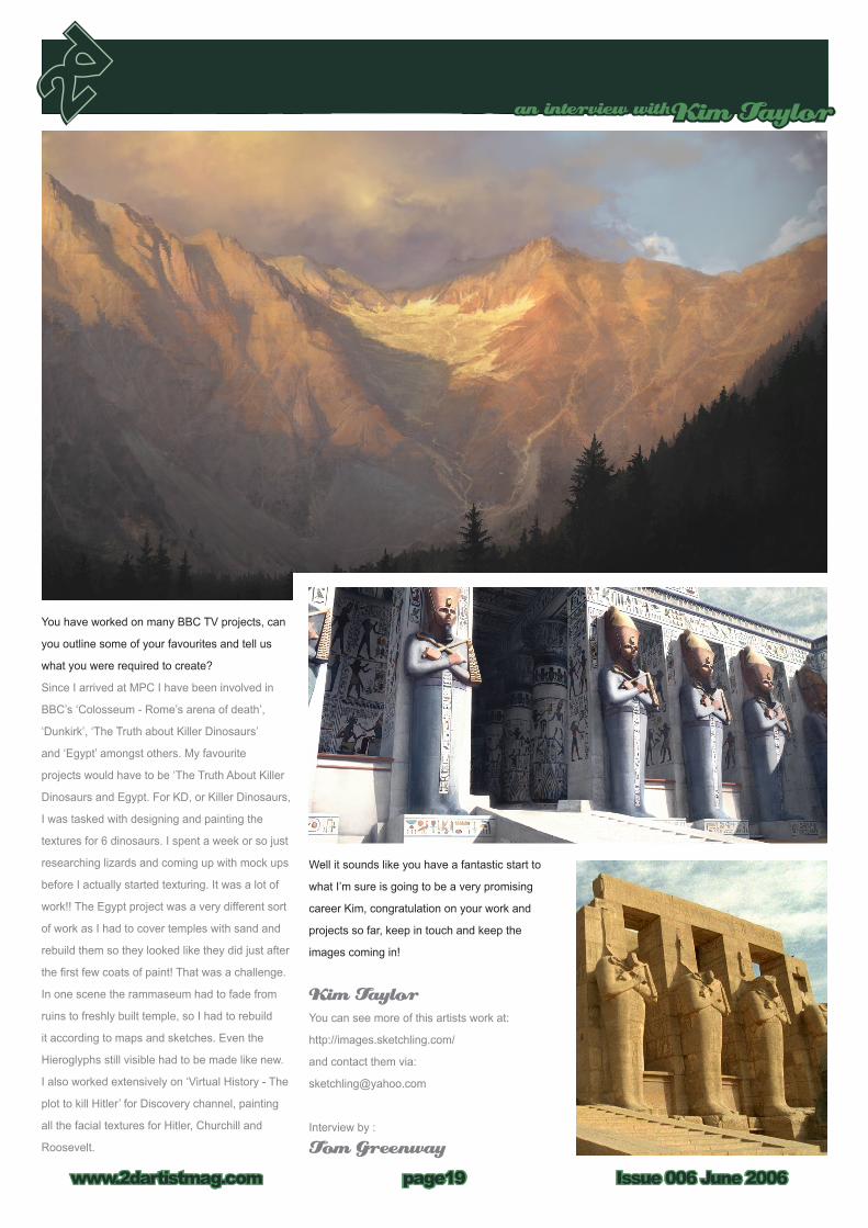
You have worked on many BBC TV projects, can
you outline some of your favourites and tell us
what you were required to create?
Since I arrived at MPC I have been involved in
BBC’s ‘Colosseum - Rome’s arena of death’,
‘Dunkirk’, ‘The Truth about Killer Dinosaurs’
and ‘Egypt’ amongst others. My favourite
projects would have to be ‘The Truth About Killer
Dinosaurs and Egypt. For KD, or Killer Dinosaurs,
I was tasked with designing and painting the
textures for 6 dinosaurs. I spent a week or so just
researching lizards and coming up with mock ups
before I actually started texturing. It was a lot of
work!! The Egypt project was a very different sort
of work as I had to cover temples with sand and
rebuild them so they looked like they did just after
the first few coats of paint! That was a challenge.
In one scene the rammaseum had to fade from
ruins to freshly built temple, so I had to rebuild
it according to maps and sketches. Even the
Hieroglyphs still visible had to be made like new.
I also worked extensively on ‘Virtual History - The
plot to kill Hitler’ for Discovery channel, painting
all the facial textures for Hitler, Churchill and
Roosevelt.
Well it sounds like you have a fantastic start to
what I’m sure is going to be a very promising
career Kim, congratulation on your work and
projects so far, keep in touch and keep the
images coming in!
Kim TaylorYou can see more of this artists work at:
http://images.sketchling.com/
and contact them via:
Interview by :
Tom Greenway


Issue 006 June 2006www.2dartistmag.com
TheGalleries
page22
www.2dartistmag.com/gallery
Blue DragonAndrew Hou
www.andrewhou.com
You can see the making of ‘Blue Dragon’ in next months issue of 2DArtist
BlueKen Wong
http://www.kenart.net/
You can see the making of ‘Blue’ in next months issue of 2DArtist

TheGalleries
Issue 006 June 2006www.2dartistmag.com page23
www.2dartistmag.com/gallery
SnowGraven Tung
http://www.artofgt.com
Pirates of Southern SkiesMarek Hlavaty
http://artillery.sk/prasa/

Issue 006 June 2006www.2dartistmag.com
TheGalleries
page24
www.2dartistmag.com/gallery
Nature - StreamWaheed Nasir
http://www.waheednasir.com
MonolithPhilip Straub
www.philipstraub.com

TheGalleries
Issue 006 June 2006www.2dartistmag.com page25
www.2dartistmag.com/gallery
Aion UndergroundBenita Winckler
http://www.dunkelgold.de

Issue 006 June 2006www.2dartistmag.com
TheGalleries
page26
www.2dartistmag.com/gallery
Shrunken HeadDaniela Uhlig
http://www.du-artwork.de
Petite FilleMichael Hideux
http://pixelgraph2.free.fr/digitalia/news.php

TheGalleries
Issue 006 June 2006www.2dartistmag.com page2�
www.2dartistmag.com/gallery
Forbidden AreaKuang Hong
http://www.zemotion.net/


Issue 006 June 2006www.2dartistmag.com
tutorialKing Kong
page30
Introduction:Hello! Over the course of three separate parts,
I will teach you how to paint my version of
‘Beauty and the Beast’ This is a much sought
after tutorial, and will require experience in
Photoshop. As I move through it, I will teach you
some of my tricks, short-cuts, and helpful hints
to achieve photo quality work. It will definitely
not be easy, but I’ll try my best to help each and
every one of you through this. Remember, this
picture took me a week to do, 10 hrs. each day,
so don’t think you can fly through this one. Shall
we begin?
The Sketch: Now with each new painting, I always start off
with a quick sketch (mostly a scribble, it’s been
said in all of my tutorials, it’s just how I do it). I
work on a canvas size of 500x900 and sketch
away and for this King Kong image, I wanted
to base it on a wallpaper I saw, from the official
King Kong movie website. I wanted to achieve
photo-realism with this painting, and I put every
ounce of detail I could into the piece to achieve
that. So after my quick sketch, I grabbed the
photo of Kong, matched up the proportions
with a grid, and started to detail away. You can
also lay a blank layer over the original photo
and trace it if it’s too hard to draw. There’s no
shame in that, just don’t smudge the photo now!
To start it off, resize your original scribble to a
higher resolution, in the thousands. Then create
a blank white layer over the scribble, turn it’s
opacity down to 80%, and create another layer
over the Blank Layer which will be your line art
layer (1).
Once you have your sketched out piece, which
is above (1), make sure you have every tiny
detail in there. It is definitely going to help later
during the painting to have all those creases,
wrinkles, and scars. Make sure you study that
photo and get every bit of character out of it; you
want to basically have a line copy of the original
movie poster. You shouldn’t worry about the hair
just make a little line for where it’s going to start/
end. As for the female character, Ann Darrow,
do the same as you did with Kong. Make sure
you get those proportions down, you want to
get her to look as close as you can. Why? The
smallest error or flaw in her face will make her
look completely different. Once you have Ms.
Darrow down and drawn (remember, on your
line art layer), create a new layer underneath the
Line Art, but over the Blank Layer. This is where
the fun begins.

tutorialKing Kong
Issue 006 June 2006www.2dartistmag.com page31
Colouring, Laying Down the Blobs:This is where the fun begins, but the difficulty
starts. It’s easier than it could have been if we
were working from our imagination. Simply, use
the Eye Drop Tool (Short-cut in Photoshop CS 2,
“I) on the poster, and select the most dominant
colours on King Kong. What you’re aiming for is
to grab the basic blue that’s on his skin. You can
see it overwhelming all the other colours in the
second picture (2). Here you’re going to lay down
a flat blue underneath the line art. When that is
done, start to lay down some of the other colours,
such as the greens, greys, darker blues, browns
and other choices as shown in the Splodges.
On the line art, where the wrinkles are, try to
add some tiny bit of depth to them. It’s nothing
yet, but it will change eventually. Form shadows
underneath the nose, around it and also under his
brow and eyelids. The scar tissue will obviously
be the source of the pink colours, so fill those in.
Remember, we’re just laying down blobs, nothing
more. Don’t go too overboard and try to paint it all
right here; start small as I did.
Sub Tutorial, King Kong’s Eye:There isn’t a full tutorial for his eye, but I will take
you through it. Paint in the overall colour for his
eye ball. Put in the different shades of orange
and do not highlight yet. Let the black line art take
over and round off the eye in itself. Once that is
done, smudge it around with the brush (3). As for
Ann, don’t even start on her yet. She won’t get
to her until you’re ready (as I did), or until Kong
is finished and you want to finish the picture with
painting her.
Colouring, Step 1 of Refining (eye socket)This is where we start to bring our character to
life (4). We want to start developing the wrinkles
formed around Kong’s eye, add some highlight
to the eyeball, and bring out that thick/yet worn
texture on his skin. Use the smudge brush, with
strength of 65% and just start to merge those
thick colours together. Make it a bit messy, so the

Issue 006 June 2006www.2dartistmag.com
tutorialKing Kong
page32
skin looks rough and tattered. Once you have a
some what messy look, use a smaller brush (a
size 3) and start to dab in those tiny details. You
can also use the Dodge tool to bring out a higher
dynamic highlight to the skin tones.
Colouring, Step 2 of Refining (eyebrow & nose)Here is where we start to focus on the eyebrow.
This part can be tricky and somewhat confusing
to some beginners. What you basically want to
start doing is overlaying your colours, getting
those right tones in there. Once you have the
applied tones that you are okay with, you will
start to smudge them softly into each other.
You can either smudge, or set your pen to
Pressure Sensitive (Which can be found in
the Help, or in the Brush Options under Other
Dynamics>Control>Pen Pressure). I suggest
the smudge tool, so you can get in those rough
marks easier. Once you have the basic colour
mesh/bulk all set up on his eye brows, start to
paint in the darker blues, purples or yellows to
create more depth to the deep thickness of the
skin. Where the eyebrow folds down into the
socket, closest to the eye, you will want to make
the black less harsh against the yellow/blue.
Again you can either smudge or colour over it
with pressure controlled dabs. Once you have
the eyebrow taken care of (in its beginner stage
5.), we can now start the work on King Kong’s
nose. Our main light source is hitting from our
left or his right. Most of the yellow differences
will be on our left side of his nose and then start
to flow into a blue tone, mixed with magentas
and soft lavender. This will take a similar
approach to Kong’s eyebrow. You’re going to
want to fill in that pink scar too, so you don’t
go over it in any other colour. The trick with the
nose is that it’s going to be one of the lengthiest
parts to paint, surprisingly because there’s a
ton of tiny details that will need to be explained
to make the texture look spot on. So firstly,
as I said, you’re going to need to mesh those
patterns together. Mark in a few dark splodges
for indentations, grooves or bumps. You’ll see in
(6) where those marks basically are. Once you
have that done, you can begin to lay down your
highlight colours: bright yellows, beiges, blues
and other forms of these colours. Use textured

tutorialKing Kong
Issue 006 June 2006www.2dartistmag.com page33
brushes to achieve rougher skin, mostly the
brushes with a chalky feel, nothing soft though.
Leave it how it is, and now we can move to the
hair.
Colouring, Step 3, Hair and MouthThis will be one of the toughest parts of the
tutorial. The hair, it’s all on how you really want
to approach it. It can either be hell to do, or be a
piece of cake. This is how I do it: I first lay down
my colours that I want for his hair such as seen
in (7). I make basic strokes, where it should be
light and where it should be dark.
After you have those blocks in place (don’t do
too many, start slow), you’ll want to move onto
his mouth again laying down the basic colours
for him, lights, darks, etc. Once you are ready,
you can start off on your basic painting of the
skin. I use a charcoal brush in Photoshop (you
can tell by the way it looks in the brush selector,
Charcoal. jpg). After you have blended the
colours together on Kong’s mouth and everything
looks somewhat decent to you, start to blend
the upper lip in with the rest of the mouth. You’ll
want to smudge (Strength 75%) thin lines from
the lip up to create the stretch marks and other
indentations. After you have completed this step,
you will begin the texture. Set the flow to 80%
and the opacity to 50% on the Charcoal Brush
and start to mark over Kong’s mouth. Go over it
first in a dark shadow tone, then go over it with a
brighter tone to give the bumps or indents depth.
After this, you can now start your highlights over
it. I use a mix of a basic high contrast yellow, set
to a low opacity, or I go around it with a Dodge
tool. If you use the Dodge tool, set it to a low 25-
35% and loosely brush over it, even if it’s going
over the spot in a size 3 brush and just creating
little pores or bumps. Don’t be too harsh or
over-brighten the mouth or it will have too much
contrast . After that, I will add some pinks to the
skin, which will be the fleshy part of the lip. (8)

Issue 006 June 2006www.2dartistmag.com
tutorialKing Kong
page34
Colouring, Step 4, (Kong’s Left) Eye Socket So now let’s begin on Kong’s left eye socket,
the unfinished one. Here we want to lay down
the basic colours, except this time obviously
a little darker as it’s not being hit directly by a
light source. We’ll start to do the basic painting
in, dark blues, greens and a TAD of black in
the shadowed areas. The part above his actual
eye ball, will require you to draw in creases with
the black. After you have your colours together,
roughly smudge it in. Just get those colours all
blended together. What I did, to keep my place
in the picture was to Clone tool some of the
texture on the brow, and start to mark it just so
I felt more comfortable with my picture, rather
than just use blatant colours. The side of the
cheek is going to progress from left to right, left
being lightest, right being the darkest (our right
and left). Once you have what you need (9) we’ll
start to clone more texture, with a lower opacity
over the smudged in colours and combine them.
This process is mostly to achieve somewhat of
a texture feel to his skin, rather than having it be
smooth or drawing in little scratches and bunches. Remember when you
clone the texture (if you do) start with a low opacity, around 30% will do to
cover it. After that, set your normal brush to Multiply using a blue-tone and
start to faintly go over your darker areas. You’ll want to hit those shadowy
areas with the multiply brush; add creases easily with it as shown in (10).
Also on the cut on his eye, not the big pink one, but the thinner one,
darken one side with multiply and highlight the other with a bright blue. It’s
mostly common sense if you know your light and darks. You can apply the
same task to the nose scrunch between his eyes.

tutorialKing Kong
Issue 006 June 2006www.2dartistmag.com page35
As for the final step in this tutorial (11), it’s
simple; this is more of a cliffhanger than
anything. We want to block in those hair
patches, just with a black for now. As for his
left eye, you’re going to want to texture that up,
detail it and so forth. It’s up to you, as the artist:
you can either relate to your source image, or
you can be creative and do your own (which I
suggest). I wouldn’t worry about the lips and so
on for now because when the next part of this
tutorial is released I will be discussing more on
this then..
Ok well this is the end of part one so make sure
you catch the next part for more on painting
King Kong.
Thanks for reading.
Tutorial by:
Adonihs More work from this artist can be found at
http://adonihs.deviantart.com/
and contact them via:
Part 2:
Hair Tutorial, Lighting on Hair, Ape Skin Texture
Part 3: Painting Ann Darrow (Naomi Watts), Human Hair, Human Skin Tones/
techniques, refining the Overall Picture

This particular piece is a simple study
that will hopefully explain some of the
thoughts and techniques during my
painting process. I’m usually not in the
habit of questioning myself why I do
things a certain way. In fact this is the
first time I’m asked to paint for a tutorial,
so bear with me here.

Issue 006 June 2006www.2dartistmag.com
tutorialPier Duty
page3�
My name is Graven Tung. This particular piece
is a simple study that will hopefully explain
some of the thoughts and techniques during my
painting process. I’m usually not in the habit of
questioning myself on why I do things a certain
way. In fact this is the first time I’ve been asked
to paint for a tutorial, so bear with me here.
I started off by Googling for some ideas. I try
to avoid jumping into a painting without at least
having a general direction. This is to prevent
myself from falling into the “safe zone’ and
repeating similar subjects over and over. So I
dug up few interesting shots after some random
image searchs (image 01 & image02). There’s
something cool about those waves crashing on
the pier. I haven’t done anything like that before,
and it looks like fun.
Before we start, here are the 2 brushes I often
use, especially for blocking in rough sketches.
As you can see they’re simply the 2 default
chalk brushes that come with Photoshop cs,
with a little change in settings (Brush 1 & Brush
2). Some people ask why I only have the
“opacity” set on pen pressure and not the “size”
as well. It’s simply a personal preference. I tend
to adjust the brush size with the “[“and “]” keys
anyway, so it all works out.
by Graven Tung
tutorialPier Duty
Issue 006 June 2006www.2dartistmag.com page3�
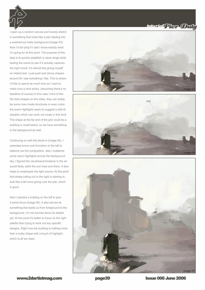
I open up a random canvas and loosely sketch
in something that looks like a pier leading into
a washed-out misty background (image 03).
Now I’d be lying if I said I know exactly what
I’m going for at this point. The purpose of this
step is to quickly establish a value range while
testing the scene to see if it actually captures
the right mood. It’s almost like giving myself
an inkblot test. I just push and shove shapes
around till I see something I like. This is where
I’d like to spend as much time as I want to
make sure a shot works. (assuming there’s no
deadline of course) In this case I kind of like
the dark shapes on the sides, they can easily
be some man-made structures or even rocks,
the warm highlights seem to suggest a side-lit
situation which can work out nicely in this shot.
The shape at the far end of the pier could be a
building or small island, so we have something
in the background as well.
Continuing on with the block-in (image 04). I
extended some rock formation to the left to
balance out the composition, also I scattered
some warm highlights across the background
sky. I figured the cloud/wave/moisture in the air
would likely catch the sun here and there. It also
helps to emphasize the light source. At this point
that shape jutting out to the right is starting to
look like a tall wave going over the pier, which
is good.
Next I planted a building on the left to give
it some focus (image 05). It also serves as
something that leads us from foreground to the
background. I’m not worried about its details
yet. At this point it’s better to focus on the right
palette than trying to work out any specific
designs. Right now the building is nothing more
than a bulky shape with a touch of highlight,
which is all we need.
Issue 006 June 2006www.2dartistmag.com
tutorialPier Duty
page40
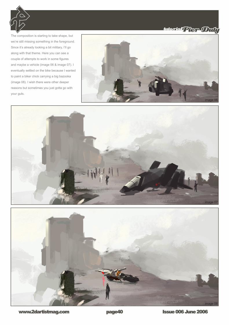
The composition is starting to take shape, but
we’re still missing something in the foreground.
Since it’s already looking a bit military, I’ll go
along with that theme. Here you can see a
couple of attempts to work in some figures
and maybe a vehicle (image 06 & image 07). I
eventually settled on the bike because I wanted
to paint a biker chick carrying a big bazooka
(image 08). I wish there were other deeper
reasons but sometimes you just gotta go with
your guts.

tutorialPier Duty
Issue 006 June 2006www.2dartistmag.com page41
Now is a good time to clean up the background
building on the far right. I put in another building
on the left to give it more depth (image 09).
I spent some time working out a simple design
of the main building. Again still looks rough but
we’ll get back to that later (image 10).
Time for some weather effects. This place
needs a good strong side wind. I opened up a
new layer and quickly indicated some moisture
being blown across in front of the main building,
as well as adding some puddles on the ground
(image 11). The good thing about doing this on
a layer is that I can still use a big textured chalk
brush to lay down a large shape, and come back
with a small eraser and erase into that shape to
carve out the details. I also threw in a little bit of
highlight on the building in the back to make it
look like that wave is casting a shadow over the
structure. Perhaps the wave is getting a little off
scale here. I mean that thing is like…250 feet
tall. We’ll have to fix that later.

Issue 006 June 2006www.2dartistmag.com
tutorialPier Duty
page42
The sketch is coming along nicely for the most
part, but the sky still seems a little too flat. I was
hoping to keep it simple and have everything to
blend into the misty atmosphere, however right
now it’s just not creating enough eye movement.
To fix this I opened up a new layer, and put
down a subtle gradient using a large airbrush
(image 12a). Then changed the layer option to
“multiply” (image 12b). This helped to tone down
the background value and emphasize the light
source.
Next I flipped the canvas to check the
composition (image 13). I also decided to crop in
on the 2 characters, sort of bring them closer to
the center and make them the focus (image 14).
The standing figure can be a guard, the shape
to the right can be his booth or something, and I
sort of like the potential drama between him and
the biker chick. Of course the composition would
have to be adjusted since cropping in kind of
killed some of the depth the piece had before,
but at this point the basic “staging” is done.
From now on it’s just a matter of detailing it out
till I can call it done.

tutorialPier Duty
Issue 006 June 2006www.2dartistmag.com page43
Here’s the image after some polishing (image
15) The actual rendering process can seem
quite dull even on a loose piece such as this
one. I was pretty much moving all over the
place, sampling colours and working on things in
no particular order. But it’s really nothing special,
just the same old things I did during the block-in,
only repeated on a finer scale. I’ll do my best to
sum up some key steps.
Simply raised the structure and added some
minimum details. I indicated a path leading up
to the building to add some interest. If you look
closer at the waves at the bottom you can see
I actually used the default maple leaf brush to
mimic scattered waves, and went back in with
a smudge tool to kill a few hard edges here and
there (image 16a).
Toned down the killer wave. It still looks tall but
at least not like some tsunami from hell. Other
than that I simply laid down patches of textured
shapes with a large brush on a layer and carved
out the details with a small eraser (image 16b).
(as mentioned before)

Issue 006 June 2006www.2dartistmag.com
tutorialPier Duty
page44
Further detailed out the main structure. Added
windows and a flag, also threw in a soldier on
the balcony to make it more interesting. Refined
the building in the back, and popped that flying
thing up there just for kicks (image 16c).
Made the booth larger so it looks like the
guard can fit in there. The rest is pretty straight
forward, just detail out the characters and the
bike with a small brush. The chick’s gotta have
some insane strength to lift that cannon, but
I actually like it that way. Who knows, maybe
she’s a cyborg (image 16d).
The painting was almost done. I gave it a once
over just to clean up some minor areas that
were still bugging me. Threw in a layer of smoke
effect in front of the bike, adjusted the levels,
sharpened it with filter, and the thing is finished
(image 17)!
Of course there is always room for
improvements and revisions, but for now the
piece does what it needs to do. I hope some
of you find this helpful. It was great to do
something outside of work just for fun.
Tutorial by:
Graven TungMore work from this artist can be found at
www.artofgt.com
and contact them via:

MAXON‘s new MoGraph module introduces motion graphics artists to a new dimension...
...beyond merely transitioning from 2D to 3D. A new dimension of unparalleled speed and simplicity with which breathtaking animations can be created.
MoGraph‘s easy to use toolset makes it a snap to put your ideas in motion. Objects can be arranged and transitioned in a myriad of ways, with astonishing speed. They can be made to move to the rhythm of a beat – with a natural motion, thanks to such automatic effects as overshoot and inheritance, without having to animate the objects manually!
MoGraph for CINEMA 4D is the ideal 3D supplement for your current MAXON software pallette. Perfect connectivity to leading compositing applications such as Adobe After Effects, Apple Final Cut Pro, Autodesk Combustion and many more guarantees that the look and coloration of your project can be matched exactly.
Want to know more? Then visit us online and download your free Windows* or Macintosh* demoversion at:
WWW.MAXON.NET
*MAXON Software is available for Windows32-bit und 64-bit and for Macintosh. Macintosh versions also available as Universal Binary for PowerPC and Intel processors.
MoGraph
A new dimension
for MOTION GRAPHICS

by Richard Tilbury
digital painting tutorial series
The ‘elements’ series is a guide to basic 2D Digital painting and can be
followed in most software packages supporting paintbrushes and layers.
Each month 2 or 3 professional artists will cover a specific theme or
‘element’, resulting in 2 or 3 different styles and techniques which can be
viewed side by side. This month we cover Fire & Smoke
Subjects:
Issue 06 : June 06 : part 6 : Fire & Smoke Issue 07 : July 06 : part 7 : Fur & Hair
Issue 08 : August 06 : part 8 : EyesIssue 04 : September 09 : part 9 : Skin
Issue 10 : November 06 : part 10 : Flesh Wounds

elementsFire and Smoke
Issue 006 June 2006www.2dartistmag.com page4�
Digital Painting: Fire and SmokeThis month sees us tackling the subject of fire
and smoke, another rather tricky element to
deal with. The main problem with this topic is
that both fire and smoke are very ethereal in
essence and have no tangible form and can be
neither touched nor examined. As they do not
have any real volume to speak of it is hard to
set any concrete rules as to how they should
look. Similar to last month’s tutorial on water,
fire and smoke are also dependant on a number
of factors that are interrelated. The colour of
smoke depends entirely on what is burning and
the shape it adopts relates to the intensity of the
fire and off course weather conditions as does
fire. For the purpose of this tutorial I am going
to keep the actual fire reasonably small and
concentrate on the smoke aspect.
1. The first step is to get rid of the white
background and put in a gradient that blends
from a pale to a mid grey with the lightest area
being the sky (Fig01).
2. I decided to place the fire at the base of
the image so as to provide plenty of room for
the smoke. I chose a near white to represent
the center of the fire and blended this with a
pale orange to show the flames (fig02). What
also helps the intensity is duplicating the white
section and setting to an Overlay mode on
a separate layer which is what I did here. To
create the sensation of movement apply a
Gaussian Blur in order that the lines are not too
sharp or alternatively you could use the smudge
tool.
3. With the fire blocked in it is time to make a
start on the smoke. To begin with I have decided
on a rather nondescript grey colour. It is then
a case of using a soft airbrush with a light and
dark tone to create roughly spherical shaped
volumes (Fig03). Whilst doing this remember
where the light source is (in this case the top
right), as this will have an effect on the apparent
volume of the smoke plume.

Issue 006 June 2006www.2dartistmag.com
elementsFire and Smoke
page4�
4. We now have both the fire and smoke in the
picture but they somehow feel a little unrelated.
The way to connect the two is by using a pale
orange colour in some of the smoke which will
serve to echo the warmth of the fire and unify
the image. In Fig04 you can see the effect of
this on a new layer set to overlay.
5. We began this tutorial with a gradient so as
to very vaguely suggest a land mass and sky as
a background but now we have the fire in place
it looks as if it is floating in a void somewhat.
To rectify this we are going to increase the
contrast of the gradient and add some rough
brush work at the base to help “root” the flames
(Fig05). The background can remain hazy as it
will contribute towards the sensation of a smoke
screen. On the smoke layer I also added some
definition to the shapes using a smaller brush
and emphasized the orange glow. You will also
notice that the fire is now more intense due to
an additional layer set to overlay which you can
see in Fig06. The flames can be seen in normal
mode in the upper half of the picture.
elementsFire and Smoke
Issue 006 June 2006www.2dartistmag.com page4�
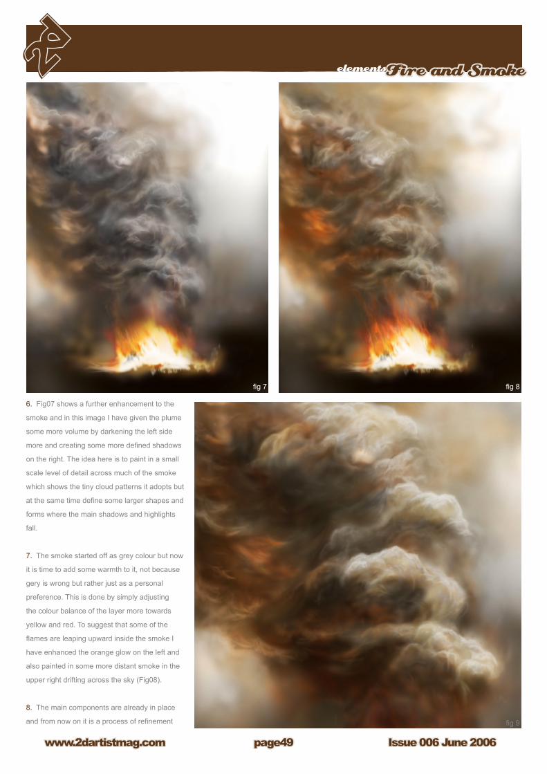
6. Fig07 shows a further enhancement to the
smoke and in this image I have given the plume
some more volume by darkening the left side
more and creating some more defined shadows
on the right. The idea here is to paint in a small
scale level of detail across much of the smoke
which shows the tiny cloud patterns it adopts but
at the same time define some larger shapes and
forms where the main shadows and highlights
fall.
7. The smoke started off as grey colour but now
it is time to add some warmth to it, not because
gery is wrong but rather just as a personal
preference. This is done by simply adjusting
the colour balance of the layer more towards
yellow and red. To suggest that some of the
flames are leaping upward inside the smoke I
have enhanced the orange glow on the left and
also painted in some more distant smoke in the
upper right drifting across the sky (Fig08).
8. The main components are already in place
and from now on it is a process of refinement

Issue 006 June 2006www.2dartistmag.com
elementsFire and Smoke
page50
and adding more detail. I am reasonably
happy with the glow on the underside of
the smoke but it does at present lack a little
definition unlike the right side and so I have
added more detail here. I also wished to
exaggerate the thickness of the smoke and
so have added a new layer which is set
to multiply and uses a mid grey brown to
increase the darkness of the shadows (Fig09).
In response to this I have also added another
layer which I have named “Highlights” and set
to normal mode. Here I have painted in lighter
accents across the right side to reflect the
sunlight filtering in from the right corner, also
adding some more drama and contrast.
That about concludes this tutorial and
hopefully it will help you paint your own
versions of the subject. There are a few
changes that could further improve the picture
such as integrating the flames better with the
smoke and painting in some finer details in
the plume but most of the crucial stages have
been covered I think. You can see the final
version below.
Tutorial by
Richard Tilbury

by Alyn Hunter
digital painting tutorial series
The ‘elements’ series is a guide to basic 2D Digital painting and can be
followed in most software packages supporting paintbrushes and layers.
Each month 2 or 3 professional artists will cover a specific theme or
‘element’, resulting in 2 or 3 different styles and techniques which can be
viewed side by side. This month we cover Fire & Smoke
Subjects:
Issue 06 : June 06 : part 6 : Fire & Smoke Issue 07 : July 06 : part 7 : Fur & Hair
Issue 08 : August 06 : part 8 : EyesIssue 04 : September 09 : part 9 : Skin
Issue 10 : November 06 : part 10 : Flesh Wounds

Issue 006 June 2006www.2dartistmag.com
elementsFiery Explosion
page52
2. The next step is still simple, duplicate you initial brushed fire shape
layer, and set a new layer to “overlay”. Then, hit ctrl+u, and check
“colourize”, using the following settings.
Hue = 35
Saturation = 25 (default)
Lightness = -50
This should give you a similar effect to image 2.
Fiery ExplosionThis Tutorial will teach you how to create a fire
effect that I stumbled across whilst making an
image. It’s fairly simple and requires only basic
knowledge of blending modes. This will work if
your using Photoshop 6 upwards.
So, in we go.
1. First of all ensure you have a black
background, as the end result does vary quite
considerably depending on the choice of colour
used. You will need to brush out a fiery shape
with a white brush set to 100% thickness.
Having some debris flying around randomly
does help add to the effect as sparks. Also
having some pre-made brushes will help you.
But to give you a rough example, check image
1.

elementsFiery Explosion
Issue 006 June 2006www.2dartistmag.com page53
3. Another simple step is to just duplicate your
overlay layer and set it to colour burn as you can
see in image 3.
4. In this step we will be going over what we’ve done before. So follow
steps 2 and steps 3 through one more time, duplicating your layer, overlay,
hue, duplicate, burn, new set, merge down etc. Just follow 2 and 3 again
with this new layer and all is well. Hopefully you should achieve this messy
object, which is all you want really as seen in image 4.
The following step will show you the finished product! Now you could
leave it there, if you want to ( merge all layers, except black layer, and
set to hard light), however I continued. Since the effect can be enhanced.
Create a layer set using the folder icon at the bottom of the layers box. In
the correct order, put the three layers you have into the set. Select the set,
and hit “ctrl+e” thus making one new layer.

Issue 006 June 2006www.2dartistmag.com
elementsFiery Explosion
page54
5. Set your final layer to “hardlight” and that’s
pretty much it, the mess vanishes, and you
have yourself a nifty explosion. It works well
for space effects, impact scenes etc (image
5). To give an example of how you may use
it, check image 6, a snippet of the “Goodbye”
remix image I’m working on.
Alyn Huntercontact via:

by Daniel LuVisi
digital painting tutorial series
The ‘elements’ series is a guide to basic 2D Digital painting and can be
followed in most software packages supporting paintbrushes and layers.
Each month 2 or 3 professional artists will cover a specific theme or
‘element’, resulting in 2 or 3 different styles and techniques which can be
viewed side by side. This month we cover Fire & Smoke
Subjects:
Issue 06 : June 06 : part 6 : Fire & Smoke Issue 07 : July 06 : part 7 : Fur & Hair
Issue 08 : August 06 : part 8 : EyesIssue 04 : September 09 : part 9 : Skin
Issue 10 : November 06 : part 10 : Flesh Wounds

Issue 006 June 2006www.2dartistmag.com
elementsFire& Smoke
page56
Introduction – Hello and welcome to
my Fire and Smoke Tutorial! This one is pretty
easy and should be able to be finished within
minutes if you get used to it enough. In this
tutorial, I will show you how to paint fire, embers,
add glow, and how to render smoke. Now the
tutorial this will be referring to will be the image
of the Beast head, not the full “Fire on Black”
image, that’s just to show how I progress. Now
let’s begin!
Step 1 – (image 1) First, you want to create
a character. What breathes fire? Well a lot of
fantasy creatures could, even hobbits! But what
really breathes fire are those creepy creatures
that lay on the bottom of the planet: dragons,
Balrogs, Demons, Lucifer, Dark Angels, Hydras
and etc. I could go on and on but it’s up to you,
as the artist to discover what you want to range
fire from its dangerous mouth, hands, back or
face. In this image, I have a creature I created
a while ago, who is actually a good creature but
I’m going to turn into a villain. Now all set aside the design of the creature,
you can see inside his mouth is an orange glow. We start this by bringing
up a soft brush from our brush selector and turning the Opacity down to
a low 15-20 %. Once you have the bright orange, you’re going to want to
turn the settings on the brush to Overlay. Softly go over the spot of the
creature’s mouth until you have nice warmth to its cover. After that, you
will want to darken the orange a bit so you don’t get too harsh of a glow on
the next step. So bring it down to a mild orange and reset your settings on
the brush to Screen, repeat and go over until you have something similar
to my image, or to your taste.
Step 2 – (image 2) This step is pretty easy, it’s just creating it’s
overlapping glow from the heat. Turn the brush up again a higher orange
and set the settings on the brush to Normal, but 10% opacity. Once you
have that done, just damply go over the edges of the creatures (body part)
so it seems as those the fire is sticking out, or at least its heat glow.

elementsFire & Smoke
Issue 006 June 2006www.2dartistmag.com page5�
Step 3 – (image 3) Now you’re going to
want to darken that spot in the center of your
main focal point on the fire. To do this, you’re
going to again change the colour of your orange,
going for a warmer tone now. Something a
bit bolder than before, and set the opacity to
5% and settings to Multiply, go over the small
part with a soft brush again till it’s a deeper
orange/red. Once you have that done, you’re
going to want to use the Smudge Tool, with its
strength to 60%, and start to bring the warmer
orange upwards towards the red colour. Make
sure it blends in smoothly; you don’t want harsh
strokes, because fire is obviously very smooth
and ethereal. Use reference shots of fire if you
have any.
Step 4 – (image 4) Once you have these colours blended in, you’re
going to use the Dodge Tool. For this part, the most important key note to
take here is DO NOT GO OVERBOARD. There is a reason why people
don’t suggest using the dodge tool at time, because so many novice
Photoshop artists abuse it to no end. Change the opacity from its harsh
strength to 20% and make sure it’s set to highlight and not Shadows or
Mid tones (important). Once that is all done and set, you can start to ignite
this fire within the inside. Start out by dodging some blobs into it, smudge
those and blend, then go over it a little more with a smaller brush.

Issue 006 June 2006www.2dartistmag.com
elementsFire& Smoke
page5�
Step 5 - (image 5) Now that you have your
basic fire, which is barely detailed at this point,
you can go over it again with an Overlay soft
brush with a dark red. Make sure the opacity is
very low, I’d even say go with 5% or 10%. That’s
all really for this step, just make sure you don’t
go too overboard and wash out the orange.
Step 6 – (image 6) Now with step 6 you’re going to start to paint in
some jumping flames. This is up to you as the artist; I can’t teach you
much here rather than use references! They always help, but what I can
offer is some tips on fire. Usually the inner flames consist of solid smooth
strokes, rising upwards. Sometimes they curl and other times they buckle
and bend, it’s usually the harder, fiercer fire that bends.

elementsFire & Smoke
Issue 006 June 2006www.2dartistmag.com page5�
Step 7 – (image 7) Another easy part!
Feel lucky, this part is small. Basically this only
step is just adding lighting to the upper and
side ridges of the creature’s mouth with a warm
yellow, easy huh?
Step 8 – (image 8) This is where you start to detail the fire some
more by adding yellows and oranges to the mixture. Once you have your
colours laid out in front of you, you’ll want to blend them some more,
then repeat the step by going over and detailing it again. Turn on the Pen
Pressure (Brush Controls, Other Dynamics, Control: Pen Pressure) and
go softly over it with a soft small brush.

Issue 006 June 2006www.2dartistmag.com
elementsFire& Smoke
page60
Step 9 – (image 9) Now you’ll add a glow
of light around the main fire attraction. Another
easy step, just pick a high bright orange, with it
leading off with a yellow, and turn it to Screen,
Opacity 20% and go over it all with a soft brush.
Nothing too much, again.
Step 10 & 11 – (image 10 and 11) Here
we will add some heat waves to the fire. You’re
going to use the Magic Lasso tool and draw a
line, like in the image, around the left side of his
mouth (our left), once you have your shape you
can let it connect. Then right click it, and go to
Layer Via Copy. After you have done this, go
to Filters (which I never use, but this one looks
good), then go to Distort, then to Ripple. Set the
Ripple to something that fits your want, nothing
too powerful but enough to give it that blurry
look. After you have that, lower the opacity on
that layer to about 50, so it moulds in with the
rest of it but still distorts.
elementsFire & Smoke
Issue 006 June 2006www.2dartistmag.com page61
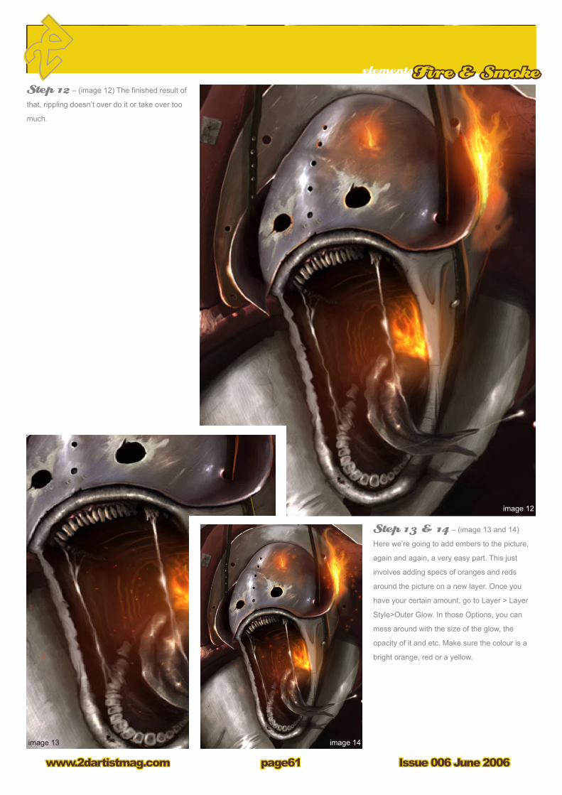
Step 12 – (image 12) The finished result of
that, rippling doesn’t over do it or take over too
much.
Step 13 & 14 – (image 13 and 14)
Here we’re going to add embers to the picture,
again and again, a very easy part. This just
involves adding specs of oranges and reds
around the picture on a new layer. Once you
have your certain amount, go to Layer > Layer
Style>Outer Glow. In those Options, you can
mess around with the size of the glow, the
opacity of it and etc. Make sure the colour is a
bright orange, red or a yellow.
Issue 006 June 2006www.2dartistmag.com
elementsFire& Smoke
page62
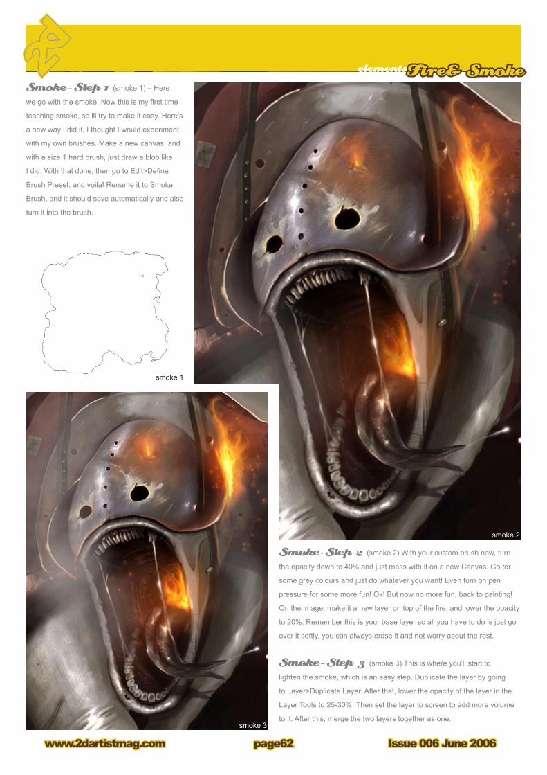
Smoke – Step 1 (smoke 1) – Here
we go with the smoke. Now this is my first time
teaching smoke, so ill try to make it easy. Here’s
a new way I did it, I thought I would experiment
with my own brushes. Make a new canvas, and
with a size 1 hard brush, just draw a blob like
I did. With that done, then go to Edit>Define
Brush Preset, and voila! Rename it to Smoke
Brush, and it should save automatically and also
turn it into the brush.
Smoke - Step 2 (smoke 2) With your custom brush now, turn
the opacity down to 40% and just mess with it on a new Canvas. Go for
some grey colours and just do whatever you want! Even turn on pen
pressure for some more fun! Ok! But now no more fun, back to painting!
On the image, make it a new layer on top of the fire, and lower the opacity
to 20%. Remember this is your base layer so all you have to do is just go
over it softly, you can always erase it and not worry about the rest.
Smoke – Step 3 (smoke 3) This is where you’ll start to
lighten the smoke, which is an easy step. Duplicate the layer by going
to Layer>Duplicate Layer. After that, lower the opacity of the layer in the
Layer Tools to 25-30%. Then set the layer to screen to add more volume
to it. After this, merge the two layers together as one.

elementsFire & Smoke
Issue 006 June 2006www.2dartistmag.com page63
Smoke – Step 4 (smoke 4) Since
smoke is kind of transparent, you’re going to
be able to see the lighting from the fire popping
through. Grab your custom smoke brush again
and change its colour to a mild orange. Make
sure your opacity is low (just to make the record,
when doing smoke; make sure the opacity is
ALWAYS low) and start to dab the orange softly
onto the smoke layer. You should be able to
make the smoke turn from a pasty white, to a
white-orange mist.
Smoke – Step 5 (smoke 5) This part I started to cut around
the smoke, breaking it down so it doesn’t get too thick. I used my custom
smoke tool as an eraser and started to slowly just itch away at the smoke.
You should turn down the flow and opacity at 45% when erasing, and just
dab at it. Don’t put in hard strokes and totally deplete the smoke.

Issue 006 June 2006www.2dartistmag.com
elementsFire& Smoke
page64
Smoke – Step 6 (smoke 6) Almost
done! Again with the adding volume to it, rework
your spots with a very low opacity Smoke
brush, just add mists, little pockets of dry smoke
leaving his mouth.
Smoke – Step 7 (smoke 7) Now your final step. A quick way to
end it off! All that has to be done here is a repeat of Step 5, just to clean it
up again. But one more thing, in the heat waves, to give it more effect, add
some thin lines of fire rippling through. This can be achieved with a size
3 hard brush on pen pressure, and just make some nice thin orange lines
riding the heat waves. And there you have it! Done
Daniel LuVisiMore work from this artist can be found at
http://adonihs.deviantart.com/
and contact them via:


The making ofToo Fat
Issue 006 June 2006www.2dartistmag.com page6�
Hello everybody. This making of is going to
show how I created ‘So, you really think I´m too
fat?’
Let’s go!
To start with, I first opened up a new document,
approximately 3000 wide x 2600 high and
around 300 - 500 dpi. Then made a preliminary
sketch (image 01).
Then I decided upon a basic colour tone for
the respective animals and filled in the outlines
(image 02).
As the image progresses the sketch goes and
the final outlines are drawn in. (image 03)
Then I approached the lighting. I set the dodge
tool’s range to “Highlights” and picked a soft
brush. With these settings, I started to dodge the
areas on the animals that are especially round
(image 04).
Afterwards, a new layer is created and the
layer with the base tone is masked so that I
don’t paint over it. With a soft brush, I paint in
the shadows. When that is done, it’s off to the
final touches. On the shadow-layer, using the
Smudge tool (hard brush set to 50 - 70%), I
smear the colours into the folds and creases,
e.g. around the ears, on the belly and on the
face (image 05).

Issue 006 June 2006www.2dartistmag.com
The making ofToo Fat
page6�
It’s only details from now on. By adding details
this or that can be changed, or anything that
need to be adjusted, for example wrong placed
highlights (image 06) can be done.
I painted all the feaures of the animals in the
same way as I painted the body: Dodge tool set
to highlights and some darker colours for the
shadowing.
Finally, I picked a fitting background colour and
simply drew a gradient . After that, the animals
are masked and, on a layer under the animals,
shadows are painted (image 07)
I hope this making of is useful. Thanks for
reading!
Daniela Uhlig More work from this artist can be found at
www.du-artwork.de
and contact them via:

making of

Issue 006 June 2006www.2dartistmag.com
The making ofLord Fredrickson
page�0
Hello everyone!
This is my first tutorial, so please be gentle.
Here I`m going to explain my basic process of
painting in Photoshop. This piece was done
for the CHOW #13 “Character of the Week”
challenge on ConceptArt.org and this was the
brief:
Historical Fiction
“Lord George Henry Fredrickson. Mid to
late 1800’s. Lord Fredrickson is a Lich
hunter & Master of the Occult of some
quiet acclaim in certain discerning
circles. By nature he is a reserved man,
brutally intelligent, quick in thought and
often in action, but never reckless.
Cursed more than a century ago by an
Egyptian Lich, Lord Fredrickson walks the
twilight between the true light of life and
the enternal darkness of death. He can
not die, though he can not really live
either.
“With each Lich Lord Fredrickson
dispatches, he desperately searches for a
counter curse to his affliction, but none have
been found, much to his continued
frustration. Over the past few decades,
his searches have turned more desperate,
as madness is slowly claiming him. In his
more lucid moments, he fears for those
he cares for, but holds little hope of
changing his fortunes. Isabelle, his wife,
has been instructed in the art of horcrux
destruction, and how to kill a Lich, but as
Lord Fredrickson has no known horcrux, it is
feared that all efforts will be futile.”
ConceptI begin with a sketch. At this
moment I don`t have something clear
in my mind, just a vague idea so I
start to do some sketches on paper,
because I feel more comfortable
sketching with my pen. I want to do
something creepy, but not too horrific,,
something mysterious - I want him to
look noble (Fig 1).

The making ofLord Fredrickson
Issue 006 June 2006www.2dartistmag.com page�1
Right, now I`m not sure which face I like more,
so I scan the sketches, open them in Photoshop
and begin to add some colours to see how they
look. For colour I use my Wacom Volito tablet,
not the best out there but it works for me, but I
recommand a Wacom Graphire (Fig 2). Well, I
decide to go on with this one. I like his expresion
and and also the stripes on his face, probably
inspired by Prince of Persia – Warrior Within
concepts, I don`t know. I think of those glowing
stripes as a mark of the curse that is upon him.
Now I need to finish the clothes, for this i`m
using some reference, so I open Google and
search for some appropiate images; then I
select a few and combine the elements I like
from each one into one original costume. This is
where the magic happens ;) (Fig 3).

Issue 006 June 2006www.2dartistmag.com
The making ofLord Fredrickson
page�2
I allways try to do something new and never
seen before something that pushes the limits,
almost to exaggeration, yet credible.. So here is
the final concept, also done in the classic way,
with pen on paper (Fig 4).
Now, at this stage I`m usually inking my
sketches, I like to have a clear (comicbook-like)
line, but not this time because i`ll paint over the
drawing. So now I scan the drawing, then in
Photoshop I adjust the Levels and the Threshold
to make a thin line and get rid of the unwanted
pencil (Fig 5).
Now, here is where I start to paint. First I set the
layer with the drawing (let`s call it L1) to multiply,
then I create a new layer (L2) and fill it with a
mid grey, then drag the first layer (L1) above the
second (L2) like in this picture (Fig 6).
Now, I begin painting on the second layer (L2)
by blocking down the silhouette and applying the
basic values with one of my favourite brushes
“Airbrush Pen Opacity Flow”. This stage is
important, because here you define the values,
the depth and part of the mood of the painting,
so I try to focus on this one. I found it quite fun
to do (Fig 7).

The making ofLord Fredrickson
Issue 006 June 2006www.2dartistmag.com page�3
If you decide to come up with something new
but don`t want to do the drawing again, you can
add it right here with your tablet, just create a
new layer (L3) and place it above all other layers
– this way you will paint over the lineart (Fig 8).
Next I begin to add some colour to the picture
using a large brush. I`m not concerned with
the details too much, just trying to pick the right
colours to fit the mood I want, and here I want
something that looks unreal, dream-like…yet
grandiose. This part can be rather long…
sometimes I start over to see other variations…
but now i`m going to stick to this one because I
like the dramatic light from above and the fire-
like light coming from behind the character. I’m
also being careful with the colour balance (Fig
9).
After I set the colours I begin to add details,
dabbing with a large soft brush (with different
opacity) and refining with a smaller hard brush.
Since I have an idea of the exact palette and
mood, it’s time to start to refine my painting.
I start correcting my shapes, cleaning up the
values, the colours, and try to retain as much of
the block in as I can (Fig 10).

Issue 006 June 2006www.2dartistmag.com
The making ofLord Fredrickson
page�4
Well, I keep doing this untill I`m happy with
the result. I start with large brushes and use
smaller ones at the very end. This is another
thing that keeps me loose and makes my
work go faster.
In the end I do a small adjusting of the Levels,
add some final details, correcting here and
there… DONE! Now I can go out and drink
some beers, happy with my achievement.
Hope this helped, if you have any questions
concerning this tutorial, I`ll be happy to
answer, just drop me an email. Good luck!
Making Of By:
Dominus [email protected]
http://www.dominus.haos.ro
We have exclusive chapters from 3DTotal.
com’s new book ‘Digital Art Masters’. The book
is more than just an artwork book as not only
does it feature full colour, full page images,
each artist has described the creation process
in their own words, and exclusively for this
book. This month we feature:
‘Masquerade’ by Egil Paulsen

These Shots of the book
pages are full resolution and
can be read by zooming in.
3DCreative readers can purchase Digital Art Masterswith a special 15% Discount.
To claim your discount purchase the book using this link:
http://www.3dtotal.com/services/shop/discount_book.asp
(If a security Dialogue box apears, tick ‘Remember’ then click ‘Allow’)


competitionPhotoshop CS Books
Issue 006 June 2006www.2dartistmag.com page��
Complete Photoshop CS2 for Digital PhotographersThis book is packed with updated coverage and tutorials on the new features of CS2. As with the
first edition, this book is designed and written especially for digital photographers. It teaches how
to organize, enhance, correct, and retouch images; how to do creative things with those images;
and how to output them. To help photographers master these tools, the book teaches professional
techniques for overcoming the many challenges they’ll face and by using these techniques, they’ll be
able to bring out the best from any photo, while establishing an efficient workflow. This is the resource
needed to truly understand and master Photoshop CS2 for digital photography.
Advanced Photoshop CS2 Trickery & FXThis beautifully illustrated book takes digital artists to the next level of creativity by teaching them how
to blend their artistic talent seamlessly with the powerful tools of Photoshop CS2. The book assumes
a fundamental level of skill with Photoshop and builds upon those skills by helping the digital photog-
rapher learn how and why Photoshop does what it does. With this knowledge, digital artists will be
ready to take on new challenges and work through the practical, fun tutorials throughout the book.
For your chance to win simply answer this question:
What does the ‘CS’ in Photoshop CS stand for?Email your entry to [email protected] including the words ‘Photoshop’ competition
in the subject line. All entries received by 1st November will be entered into a prize draw. The two
winners will be notified by e-mail.
Rules: Zoo Publishing decision is final and there are no cash alternatives. No other correspondence
will be entered into. Any entry that is late, illegible, incomplete or otherwise does not comply with the
rules may be deemed invalid at the sole discretion of Zoo Publishing. Your details will be held on
record by Zoo Publishing but will not be passed on to 3rd parties.
2 top Photoshop CS2 Books
Competition Sponsor www.thomson.com

next month
InterviewsRavadits Kornel
Riana Miller
Massive Black Studio
Stephan Stolting
ArticlesMatte Painting (part 1 of 2)
by Pierfilippo Siena
Concept Art.org & Massive Black’s
Post Workshop Review
TutorialsKing Kong – Part 2 of 3
by Adonihs
Budapest Matte painting
by Kornél Ravadits
Elements - Fur by
by Richard Tilbury
Elements - Hair
by Shane Madden
Making of’sBlue Dragon Photoshop Tutorial
by Andrew Hou
The making of ‘Blue’
by Ken Wong
Digital Art Masters : Breath by
Drazenka Kimpel
PlusGalleries
Competitions
Reviews
All for only $4! go to www.2dartistmag.com for full
details and to purchase current, back
issues and 6 & 12 month subscriptionsImage by Riana Miller

about usZoo Publishing
issue 000 month 2006www.2dartistmag.com page�0
PartnersIf you have a CG Community website, and would be interested in reselling
2DArtist or 3DCreative magazine please contact
2dartistis supported by:
Zoo Publishing is a new Company, publishing downloadable online magazines. It is
based in the West Midlands in the UK. Zoo currently produces two online
downloadable magazines, 3DCreative and 2DArtist. Zoo’s intention is to
make each issue as full of great articles, images, reviews, interviews, im-
ages and tutorials as possible. If you would like more information on Zoo
Publishing or It’s magazines, or you have a question for our staff, please
use the links below.
www.zoopublishing.com
www.3dcreativemag.com
www.2dartistmag.com
Editor > Ben Barnes
Assistant Editor > Chris Perrins
Marketing > Lynette Clee
Content Manager > Warin Pismoke