yearbook design trends - jostensyearbookavenue.jostens.com/dynamiccontent/docs/yb design...
TRANSCRIPT

Design TrendsYearbook

Fads come and go; trends stand the test of time.Great design that focuses on the reader’s wants and needs will last the test of time. Incorporating fad-driven design choices can sometimes prematurely date your project.
The designer’s challenge is simple:Give contextIt is the designer’s job to take the information collected andpresent it to the reader. Consider the concept, the tone andthe mood being set.
Inspire readersBy carefully packaging the information a reader will be drivento dive into the details of the content. This step creates thevisual components of the project.
Create a visionVisual appeal is the hook that catches readers and ties theentire project together. Pulling it all together in one awesomepiece is the creation aspect.
1996 Arrow, Southern Nazarene University, Bethany, OK
Is this an experience everyone can relate to?
Good design is timeless. Contrast, dominance,
readability and attention to visual entry shows that this 10-year-old spread
maintains its reader appeal.
1

The best designs are a perfect blending of your concept, design tools, creative ideas, content quality and most importantly the benefit to the audience.
Begin any project with a brainstorming session to determine who the audience is, what they want and need, and how to best relate your material to the reader.
Carefully plan your ladder so that it logically flows from spread to spread—taking into consideration deadlines and printing needs.
Many of us look to prior yearbooks for creative direction
Students at Central High
Reader traits
Get to know the audienceat my school.
Don’t let someone else create your creative point of view.
fast readers
visually driven
trendy
high tech
not stuck on tradition
2

A designer has to understand what type of content is going to be used before a good design can begin.
Brainstorm the content for your spread by focusing on the people involved and what it is they do. Once you have exhausted your own frame of reference, you can get more detail through one-on-one interviewing and information gathering.
Then and now
Story assignment: Vacations
Old way — same quote/transition story with 6–7 photos
Who’s involved What do they do? How will it look?
New way— many entry points for reader with variety of visuals, many photos and relevant interactive information
then now
students who don’t go anywhere
traveling with family
traveling with friends
quotes-storytimelines-listingphotosphotos-quotes
too brokework too much
go to poolsummer school
quotes-timelinequotesphotos-listingphotos-quotes
listingphotos-surveyquotestimeline
long tripsfamily reunions
campingthe last family trip
campsout of country
dorm livingmission trips
3

Today’s readers rely on a variety of verbal and visual packaging solutions. Evaluate your content and determine what formatshould be used in order to present the information most accurately.
Visual solutions
4

Creative graphics and visuals can help establish the tone and mood of your project as well as help the reader quickly move through the content.
Color can both help and hinder a reader trying to navigate the content of a spread. The color should always compliment the content of the spread.Color photos should be the first elements noticed on a page.
funky
playful
trendy
techno
bright
moving
surprising
reflective
dynamic
clean
fundamental
utilitarian
repetitive
pleasant
harmony
symmetry
static
reliable
Use one time on the spread to directly tie the content of thephotos to a verbal content module.
Three levels of color use
Process color, also called full-color or 4-color, is created by using 4 colors on the printing press (cyan, magenta, yellow and black). This varies from what you see on your computer screen which represents colors in RGB (red, green and blue). Spot color is a singlecolor, sometimes Pantone, used on ablack and white page.
A great trend in graphic design involvesusing analogous colors in design.Analogous colors are those that sit
right next to each other onthe color wheel.Try this—determine whatthe dominant coloris in the photosand use analogous colors
to accent the spread. Complimentary colors often create a clash that makes it tough for readers to quickly movethrough content.
Color 101
Primary
Tone and mood
Choose an analogous color to repeat 2-4 times on the spread.
SecondaryUse the color as an accent in simple graphics like lines and caption lead-ins.
Accent
brightgreen
pink
powderblue
orange
cyan
magenta
black
red
metallics
green
earth tones
classiccolors
5
(fad-driven)

Choosing the right typeface is important.Recently designers have moved toward humanist or handwritten fonts in their designs.These fonts add a sense of personality to designs. Another trend in graphic design is the use of one font family throughout a project. By choosing one type family, a designercan create a consistent look throughout the publication. Consider choosing a base font and an accent font. Many designers are usingsans serif fonts in their designs.
Choosing the right font
serifTimes
which Q r u?
sans serifHelvetica
scriptAYT Calypso Script
ornamentalwebdings
humanistAYT Sleepwalker
Helvetica Bold
AYT Calypso Script
Helvetica Light Condensed
type mixing
Times AYT Olive Oil AYT Action AYT Chelsea Stencil
6

Hot visual trends in design revolve around photography.
Photo trends
Try this:
TransparencyThe transparency effect works well for including verbal content with a photo.
DuotonesCreate a unique look by adding a singlecolor to a black and white photo.
MovementSlow the shutter on a camera or use Photoshop effects to create movement.
Extreme CropEnlarge a photo to highlight or emphasize an area of the photo creating emotion.
Color MixingFor visual appeal use Adobe®
Photoshop to create a photo thatuses both color and black and white.
7

In addition to type, color and photos,supporting graphics include:
Supporting graphics
BackgroundsSome designers choose a pattern for the entire background of their page. A trend in design is to use a photo as a background and adjust its transparency so that it is “ghosted”in the background.
Background found in Page Surfer Color ModsPattern offered in Page Surfer
LinesVariety of line sizes and styles.A hot fad in design uses thin lines.
ScreensPatterns and screens are often used for the background in a content module.
White spaceMore designers are relying onwhite space to direct a readeraround the spread.
thin line
dashed
thick line
thin lines
dotted
in 5 outthin lines
simple patterns
white as dominant color
random lines placed on the spread
backgrounds with no visual link to content
using many colors on the spread
minutes ago
dotted or dashed lines
complex pattern backgrounds
black page backgrounds
8

Consider starting with a pre-designedlayout, then redesign each area piece-by-piece based on your brainstorming of the spread content.
A basic spread shows 5-7 photographs and a basic copy block consisting of a quote/transition story.
The dominant photo becomes a dominant collection providing for more photo coverage opportunities.
Building a better spread
Two single photos move into the photo collection which frees up room for a survey and 6 more photo opportunities
9
The redesigned spread has many entry points and contains 14 photos.

The term modular design relates to the different content areas on thepage. Content areas include photos,text and graphics.
By working with one module at a time, a designer can focus on relatingrelevant content. Consider each module its own mini-layout.
Building a better spread
A calendar is used to collect content. For this spread aweekly timeline shows the events of students helping apublic service project during their vacation.
Instead of redesigning many modules, a staff mightchoose to redesign and emphasize the copy module.This design includes a postcard with text.
10

Visual repeat theory suggests that adesigner should repeat like elements at least 3 times on the spread. Noticehow the colors are repeated consistently.The use of the cut out background photo (COB) adds to the design. Byredesigning each content area, thedesigners have now included 18 photoson the spread as well as maintaining the traditional copy module.
Many designers might include a drop cap letter. This spread highlights a dropword to lead in to the copy block.
Building a better spread
11

Typographic icons such as punctuationmarks have been popular for the last few years. Bay High School incorporatesthese graphics throughout the book.
The contrast created between clean and fringe graphics and fonts works to relate the theme of “Plan B.”
Bay High School, Bay Village, OH
Real examples
Students at Episcopal High School maximized the iPod fad by mimicking andpersonalizing the look of the commercials.
Using fad-driven colors cyan and magenta,the staff creates a cohesive theme look.The silhouette photos can be found in many advertisements in the past year.The bright green is a very fad-driven color.
Episcopal High School, Bellaire, TX
12
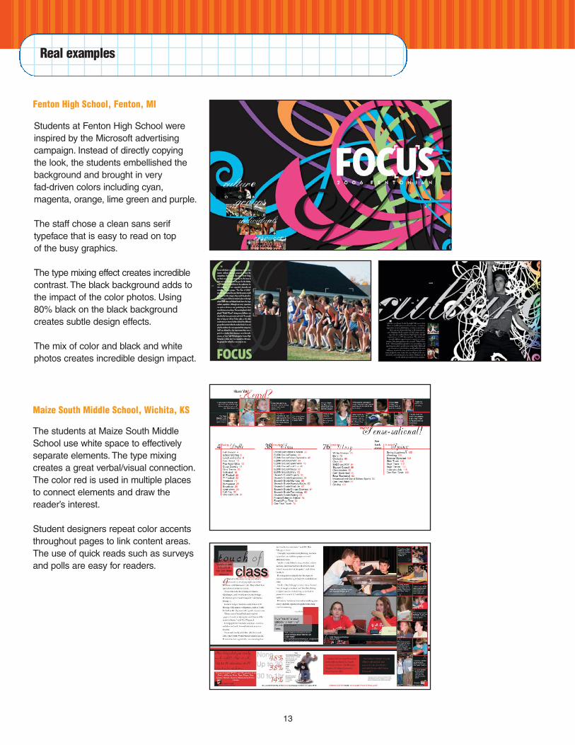
Students at Fenton High School wereinspired by the Microsoft advertisingcampaign. Instead of directly copying the look, the students embellished thebackground and brought in very fad-driven colors including cyan, magenta, orange, lime green and purple.
The staff chose a clean sans serif typeface that is easy to read on top of the busy graphics.
The type mixing effect creates incrediblecontrast. The black background adds tothe impact of the color photos. Using80% black on the black background creates subtle design effects.
The mix of color and black and whitephotos creates incredible design impact.
Fenton High School, Fenton, MI
Real examples
The students at Maize South MiddleSchool use white space to effectively separate elements. The type mixingcreates a great verbal/visual connection.The color red is used in multiple places to connect elements and draw the reader’s interest.
Student designers repeat color accentsthroughout pages to link content areas.The use of quick reads such as surveysand polls are easy for readers.
Maize South Middle School, Wichita, KS
13

Father Ryan High School students broke tradition and created a chronological yearbook. The studentsused the school’s calendar to set uptheir yearbook ladder and deadlines.Chronological coverage is great fordeadline planning.
By keeping the color simple and using a gold color, the September spreadremains readable. Throughout eachspread and each section, the studentsused a timeline as a sidebar. The students realized there were thousandsof coverage opportunities by focusing onwhat happened each day in their school.
Father Ryan High School, Nashville, TN
Real examples
Students at Pine Castle ChristianAcademy found that the theme “Greaterthan” worked well with the visual element. The colors that are on the coverrepeat throughout the book. The use ofphotos on the cover adds to the visualappeal. Using transparency, the theme is repeated across the cover.
The theme repeats verbally with sections like Bolder than, Closer than,Tougher than and Deeper than. The contrast between the typefaces adds tothe visual appeal. The divider pagesecho the graphics and color scheme created on the cover and endsheets.
Pine Castle Christian Academy, Orlando, FL
14

15
San Clemente High School studentsfocused on the location of their school,right on the San Diego and OrangeCounty border, to create a theme of “Onthe Edge.”
The dividers sample color out of the dominant photo and take the type off thebaseline to create a sense of movement.A rail of white space opens the photo barfrom the rest of the content.
Oversized numbers are used throughoutthe pages to develop the content.
San Clemente High School, San Clemente, CA
Real examples
© 2006 Jostens, Inc. 06-0700 (2005)