wsdot graphic brand standard and style guide...1 wsdot graphic brand standard and stye guide our...
TRANSCRIPT

W S D O T G R A P H I C B R A N D S T A N D A R D A N D S T Y L E G U I D E
GRAPHIC BRANDSTANDARD & STYLEGUIDE
WSDOT’S VISUAL IDENTIT YN O V E M B E R 2 0 1 8

W S D O T G R A P H I C B R A N D S T A N D A R D A N D S T Y L E G U I D E
CONTENTSOUR VISUAL IDENTITY ............................................................................................................................................1
LOGOS ...........................................................................................................................................................................2
RULES FOR LOGO SIZE AND POSITIONING ................................................................................................3
LOGOS: STANDARDS AND GUIDELINES ......................................................................................................4
RULES FOR CO-BRANDED INTERNAL LOGO USE ....................................................................................5
LOGOS: EXCEPTIONS ........................................................................................................................................6
LOGOS: EXCEPTIONS ........................................................................................................................................7
COLORS .........................................................................................................................................................................8
PRIMARY WSDOT COLOR PALETTE ..............................................................................................................8
COLOR PALETTES: EXCEPTIONS ....................................................................................................................9
CHART STYLES AND COLOR ORDER .................................................................................................................10
COLOR ORDER ...................................................................................................................................................10
PIE CHARTS..........................................................................................................................................................10
BAR CHARTS .......................................................................................................................................................11
LINE CHARTS ...................................................................................................................................................... 12
AREA CHARTS .................................................................................................................................................... 12
ICONS .......................................................................................................................................................................... 13
INFOGRAPHICS ...................................................................................................................................................... 13
MAPS ............................................................................................................................................................................14
TYPOGRAPHY...........................................................................................................................................................17
IMPORTANCE OF WHITE SPACE ........................................................................................................................ 18
GRAPHIC IDENTITY EXAMPLES ..........................................................................................................................19
PHOTOS ..................................................................................................................................................................... 20
GENERAL DESIGN DOS AND DON’TS .............................................................................................................. 22
POWERPOINT PRESENTATIONS ........................................................................................................................ 23
AGENCY VIDEO STANDARDS AND BEST PRACTICES .................................................................................24
ADA AND TITLE VI INFORMATION ................................................................................................................... 27
1
W S D O T G R A P H I C B R A N D S T A N D A R D A N D S T Y L E G U I D E
OUR VISUAL IDENTITYThe brand is an idea in the consumer’s mind about a product, a service, a company or in our case, an agency. We continue to build a strong brand that stands out and builds a positive reputation.
A WSDOT brand portrays the idea of service delivery, accountability and transportation benefits.
It is important to use every opportunity to strengthen the WSDOT brand within our agency and with the public, stakeholders and the Legislature.
WSDOT’s graphic identity is the visual expression of a brand. Branding begins with the name and brand mark or logo which serves as a base for communication tools that increase awareness and provide consistency.
The brand is reinforced through the consistent use of logo, fonts, layout, color and art. Deviation from these guidelines dilutes our overall message to the people we serve as an agency.
Following the agency guidelines for logo usage, maps, photos and color theory strengthens the WSDOT brand and makes it easier for the public, media and elected officials to get the information they desire and understand our business.
2
W S D O T G R A P H I C B R A N D S T A N D A R D A N D S T Y L E G U I D E
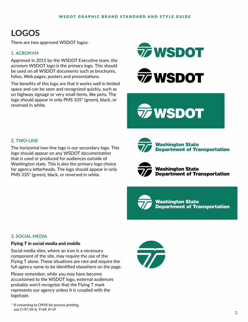
LOGOSThere are two approved WSDOT logos: 1. ACRONYMApproved in 2015 by the WSDOT Executive team, the acronym WSDOT logo is the primary logo. This should be used on all WSDOT documents such as brochures, folios, Web pages, posters and presentations. The benefits of this logo are that it works well in limited space and can be seen and recognized quickly, such as on highway signage or very small items, like pens. The logo should appear in only PMS 335* (green), black, or reversed in white.
2. TWO-LINEThe horizontal two-line logo is our secondary logo. This logo should appear on any WSDOT documentation that is used or produced for audiences outside of Washington state. This is also the primary logo choice for agency letterheads. The logo should appear in only PMS 335* (green), black, or reversed in white.
3. SOCIAL MEDIAFlying T in social media and mobileSocial media sites, where an icon is a necessary component of the site, may require the use of the Flying T alone. These situations are rare and require the full agency name to be identified elsewhere on the page. Please remember, while you may have become accustomed to the WSDOT logo, external audiences probably won’t recognize that the Flying T mark represents our agency unless it is coupled with the logotype.
*IfconvertingtoCMYKforprocessprinting, useC=97,M=6,Y=69,K=19
3
W S D O T G R A P H I C B R A N D S T A N D A R D A N D S T Y L E G U I D E
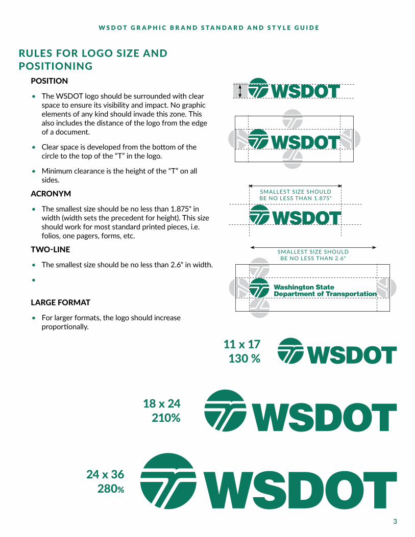
RULES FOR LOGO SIZE AND POSITIONING
POSITION
• The WSDOT logo should be surrounded with clear space to ensure its visibility and impact. No graphic elements of any kind should invade this zone. This also includes the distance of the logo from the edge of a document.
• Clear space is developed from the bottom of the circle to the top of the “T” in the logo.
• Minimum clearance is the height of the “T” on all sides.
ACRONYM
• The smallest size should be no less than 1.875" in width (width sets the precedent for height). This size should work for most standard printed pieces, i.e. folios, one pagers, forms, etc.
TWO-LINE
• The smallest size should be no less than 2.6" in width.
•
LARGE FORMAT
• For larger formats, the logo should increase proportionally.
SMALLEST SIZE SHOULD BE NO LESS THAN 1.875"
24 x 36 280%
11 x 17 130 %
18 x 24 210%
SMALLEST SIZE SHOULD BE NO LESS THAN 2.6"

4
W S D O T G R A P H I C B R A N D S T A N D A R D A N D S T Y L E G U I D E
• Set logo on an angle or rearrange the logo and text.
• Combine other elements with the logo.
• Add a drop shadow to the logo
• Place logo on low contrasted background image
• Add other words to the logotype (for exceptions, see Rules for co-branded logo use. For internal use only!—pg 7)
DO NOT• Re-typeset the logotype Washington State
Department of Transportation or substitute any other typeface, font weight or style in the logotype.
• Change the size relationship of the logo elements.
• Squeeze, stretch or condense the logo out of proportion.
• Print the logo in more than one color unless specifically noted in the standards for that logo.
• Outline the logo.
WSDOT
Helping you get home safely
LOGOS: STANDARDS AND GUIDELINES
Below are examples of what cannot be done to the approved WSDOT logos/logotypes.
Washington State Department of Transportation

5
W S D O T G R A P H I C B R A N D S T A N D A R D A N D S T Y L E G U I D E
RULES FOR CO-BRANDED INTERNAL LOGO USE
The purpose of internal branding is to provide our offices, modes, and divisions their own unique identifiers while at the same time maintaining constancy of our ONE DOT look and feel. WSDOT internal branding is an in-the-family version of the WSDOT’s external branding. Internal branding for an office, mode, or division must be created by the Graphics office only at the request of a division director and must adhere to usage guidelines outlined below:
They can ONLY be used for INTERNAL: They are NOT to be used for EXTERNAL:
• Word documents • Publications or documents• PowerPoint presentations (i.e. training) • PowerPoint presentations• Folios • Folios or one-pagers• Posters • Posters• Miscellaneous internal collateral • Websites
• Use on both internal and external web pages The logo lockup has vertical and horizontal options. A request for a co-branded logo should be made to WSDOT Graphics at [email protected].
LEAN OFFICE
EMPLOYEE DEVELOPMENT
SAFETY &HEALTH SERVICES
SAFETY &HEALTH SERVICES
EMPLOYEE DEVELOPMENT
LEAN OFFICE
LEAN OFFICE
EMPLOYEE DEVELOPMENT

6
W S D O T G R A P H I C B R A N D S T A N D A R D A N D S T Y L E G U I D E
LOGOS: EXCEPTIONS AMTRAK Amtrak Cascades is a joint service paid for and managed by WSDOT and the Oregon Department of Transportation (ODOT). The two states contract with Amtrak to operate the service. This relationship with ODOT and Amtrak means some design standards for Amtrak-related materials deviate from WSDOT-specific style.
• The Amtrak Cascades service has its own logo—with the copyright owned by Amtrak—that is used on trains, publications and marketing.
• It features the words Amtrak Cascades with a stylized mountain range between the words.
• The fonts are Helvetica Bold and Bauer Bodoni.
• The color palette is Cascade Evergreen (PMS 560C) and Cascade Nugget (PMS 730C).
• The logo may appear in white or black as needed.
Amtrak Cascades’ marketing campaigns may deviate from WSDOT design-specific standards based on specific promotions or campaigns, but items still must adhere to the agency’s overall professional and ethical standards.
All publications by WSDOT’s rail, freight and ports division, such as folios, presentation boards, PowerPoint presentations and news releases, will follow WSDOT graphic design standards.

7
W S D O T G R A P H I C B R A N D S T A N D A R D A N D S T Y L E G U I D E
LOGOS: EXCEPTIONS WASHINGTON STATE FERRIESRules for WSF logo use
• The logo should appear in only PMS 335* (green), black, PMS 314** (blue), or reversed in white.
• The screened areas of the logo are 30% of the one color printed.
• The logo can also be used without the tinted stripes.
• The logotype Washington State Ferries should never be re-typeset.
• Do not use the ferry symbol by itself.
* IfconvertingtoCMYKforprocessprinting, useC=97,M=6,Y=69,K=19
** IfconvertingtoCMYKforprocessprinting, useC=100,M=5,Y=14,K=17
Clear space
A clear space equal to the height of the center text bar should be maintained around the entire logo. This helps to preserve the integrity of the identity and to prevent other forms from being incorporated into the logo.
CONNECTING WASHINGTON Funding packages such as Connecting Washington and initiatives directed by the Governor’s office such as Results WSDOT are examples of customized branding with their own unique logo.
Pantone 335 WSF Logo
Pantone 314 WSF Logo

8
W S D O T G R A P H I C B R A N D S T A N D A R D A N D S T Y L E G U I D E
COLORSWSDOT’s color palette is a group of colors approved for use on agency publications and marketing materials. Consistent use of the color palette is necessary to maintain the integrity of our graphic identity. Certain programs within WSDOT will have different colors palettes, including: Connecting Washington, Tolling, Alaskan Way Viaduct and Replacement Program, SR 520 Bridge Replacement and HOV Program, and Washington State Ferries. The graphic designer assigned to your project will select the colors from the approved palettes that most appropriately represent the purpose of the document and its intended audience.Refer to the color palettes on the following page for the approved agency colors. The palettes also include tints (screens) of the ink colors (80%, 60%, and 40%). The primary color for WSDOT is PMS 335. If converting to CMYK for process printing use C=100, M=0, Y=65, K=30. These approved color palettes should also be followed for other media, including video and electronic materials.
PRIMARY WSDOT COLOR PALETTE
PMS 433 CMYK: 90, 68. 41, 90 RGB: 29, 37, 45HEX: 1D252D
PMS 7722 CMYK: 89, 0, 45, 72 RGB: 0, 81, 81HEX: 005151
PMS 335 - PRIMARY CMYK: 100, 0, 65, 30 RGB: 0, 123, 95HEX: 007B5F
RGB: 74, 81, 87 HEX: 4A5157
RGB: 119, 124, 129 HEX: 777C81
RGB: 165, 168, 171 HEX: A5A8AB
RGB: 51, 116, 116 HEX: 337474
RGB: 102, 151, 151 HEX: 669797
RGB: 153, 185, 185 HEX: 99B9B9
RGB: 51, 149, 127 HEX: 33957F
RGB: 102, 176, 159 HEX: 66B09F
RGB: 153, 202, 191 HEX: 99CABF
PMS 354 CMYK: 81, 0, 92, 0 RGB: 0, 177, 64HEX: 00B140
PMS 375 CMYK: 46, 0, 90, 0 RGB: 151, 215, 0HEX: 97D700
PMS 577 CMYK: 35, 2, 58, 0 RGB: 169, 196, 127HEX: A9C47F
RGB: 51, 193, 102 HEX: 33C166
RGB: 102, 208, 140 HEX: 66D08C
RGB: 153, 224, 179 HEX: 99E0B3
RGB: 172, 223, 51 HEX: ACDF33
RGB: 193, 231, 102 HEX: C1E766
RGB: 213, 239, 153 HEX: D5EF99
RGB: 186, 208, 153 HEX: BAD099
RGB: 203, 220, 178 HEX: CBDCB2
RGB: 221, 231, 204 HEX: DDE7CC

9
W S D O T G R A P H I C B R A N D S T A N D A R D A N D S T Y L E G U I D E
CONNECTING WASHINGTON
PMS 7722 CMYK: 89, 0, 45, 72 RGB: 0, 81, 81HEX: 005151
PMS 335 CMYK: 100, 0, 65, 30 RGB: 0, 123, 95HEX: 007B5F
PMS 354 CMYK: 81, 0, 92, 0 RGB: 0, 177, 64HEX: 00B140
TOLLING
PMS 519 CMYK: 65, 95, 9, 40 RGB: 89, 49, 95HEX: 59315F
PMS 335 CMYK: 97, 6, 69, 19 RGB: 0, 123, 95HEX: 007B5F
PMS 375 CMYK: 46, 0, 90, 0 RGB: 151, 215, 0HEX: 97D700
ALASKAN WAY VIADUCT AND REPLACEMENT PROGRAM
PMS Black CMYK: 0, 0, 0, 100 RGB: 0, 0, 0HEX: 000000
PMS 1585 CMYK: 0, 61, 97, 0 RGB: 255, 106, 19HEX: FF6A13
PMS 447 CMYK: 50, 30, 40, 90 RGB: 55, 58, 54HEX: 373A36
SR 520 BRIDGE REPLACEMENT AND HOV PROGRAM
PMS 335 CMYK: 100, 0, 65, 30 RGB: 0, 123, 95HEX: 007B5F
PMS 433 CMYK: 90, 68. 41, 90 RGB: 29, 37, 45HEX: 1D252D
PMS 447 CMYK: 50, 30, 40, 90 RGB: 55, 58, 54HEX: 373A36
WASHINGTON STATE FERRIES
PMS 335 CMYK: 100, 0, 65, 30RGB: 0, 123, 95HEX: 007B5F
PMS 375 CMYK: 46, 0, 90, 0 RGB: 151, 215, 0HEX: 97D700
PMS 3125 CMYK: 84, 0, 18, 0 RGB: 0, 174, 199HEX: 00AEC7
PMS 314 CMYK: 100, 5, 14, 17 RGB: 0, 127, 163 HEX: 007FA3
PMS 1585 CMYK: 0, 61, 97, 0 RGB: 255, 106, 19HEX: FF6A13
COLOR PALETTES: EXCEPTIONS

10
W S D O T G R A P H I C B R A N D S T A N D A R D A N D S T Y L E G U I D E
CHART STYLES AND COLOR ORDERWSDOT’s chart styles should be clean, well-organized and easy-to-read. Where possible, there is a specified order that the colors should appear on each chart. The order of the colors have been chosen to provide a balanced palette that alternates darker and lighter colors for better readability. Font size should be no less than 8 pts and no more than 10 pts. Lines should be .5 pt PMS 447 or 80% black. Grid lines behind graphics should be 20% black or 40% white in front of graphics. The white lines in pie charts should be 1 pt.
PANTONE 335
PANTONE 375
PANTONE 3125
PANTONE 447 (80%)
PANTONE 354
PANTONE 314
PANTONE 577
PANTONE 519
1
2
3
4
5
6
7
8
LoremXX%
LoremXX%
LoremXX%
LoremXX%
LoremXX%
LoremXX%
LoremXX%
LoremXX%
ROADS
FERRIES
AVIATION
RAIL
$786 M$796 M
$114 M$118 M
$50 M$78 M
$101 M$104 M
ORDER SLICES
CORRECTLY
DONUTStylistic variation of a pie chart that enables the inclusion of a total value or design element in the center.
Pie charts are used for MAKING PART-TO-WHOLE comparisons with discrete or continuous data. Theyare most impactful with a small data set.
Start the largest section at 12 o’clock, going clockwise.
Place remaining sections in descending order, going clockwise.
LOREMIPSUM
COLOR ORDER
PIE CHARTS

11
W S D O T G R A P H I C B R A N D S T A N D A R D A N D S T Y L E G U I D E
0
100
200
300
400
500
600
700
800
MAR APR
125
250
100
PAGE VIEWS, BY MONTH
500450
750
Traffic Web cams Passes0 100 200 300 400 500 600 700 800
CONTENT PUBLISHED, BY CATEGORY
MONTHLY TRAFFIC, BY SOURCE PERCENTAGE OF CONTENT PUBLISHED, BY MONTH
Safety Awareness
Emergency Operations
Maintenance & Preservation
0
200
400
600
800
1000
1200
Email Marketing
Organic Search
Paid Search
Web Advertising
Maintenance
Tolling
Project Pages
MAR APR MAY
VERTICAL (COLUMN CHART)Used for CHRONOLOGICAL DATA (time-series should always run left to right).
HORIZONTALUsed for data with LONG CATEGORY LABELS.
STACKEDUsed when there is a need to compare MULTIPLE PART-TO-WHOLE relationships.
100% STACKEDUsed when the total value of each category is unimportant and PERCENT-AGE DISTRIBUTION OF SUBCATEGORIES is the primary message.
500
650
750
0
20
40
60
80
100
MAR APR MAY
BAR CHARTS

12
W S D O T G R A P H I C B R A N D S T A N D A R D A N D S T Y L E G U I D E
Line charts are used to show TIME-SERIES relationships with continuous data. They help show trend, acceleration, deceleration, and volatility.
AREA CHARTS
PAGEVIEWS, BY MONTH
700
600
500
400
300
200
100
0JAN FEB MAR APR MAY JUN JUL AUG
HOME PAGE
PROJECT PAGE
PROJECT MAP
70
60
50
40
30
20
10
0100 150 200 250 300 350 400 450
70
60
50
40
30
20
10
0100 150 200 250 300 350 400 450
62.4
39.5
LINE CHARTS
AREA CHARTSAn area chart displays QUANTITATIVE data. Area charts are most commonly used to show overall trends in data over time.
$0
$500
$1,000
$1,500
$2,000
$2,500
$3,000
$3,500
$4,000
2031-332029-312027-292025-272023-252021-232019-212017-192015-172013-152011-132009-112007-092005-072003-052001-031999-01
$4,500 CURRENT BIENNIUM
Biennium
WSDOT Highway Maintenance and Construction Programs with Revenue Packages2018 Governor’s Supplemental Budget Request18GOV001 (Excludes sub-programs 16 and 17)
Tacoma HOV
SR 520 Bridge Replacement
I-405 Corridor Improvements
Alaskan Way Viaduct
Remaining Nickel and TPAprojects - Legislatively directed
Projects funded exclusively by base gas tax and federal
funds (PEF) – Primarily reservation and safety
Maintenance on State System
Dol
lars
in M
illio
ns
I-90 Snoqualmie Pass - Widen to Easton
I-5 JBLM Corridor Improvements
US 395 North Spokane Corridor
I-405 Renton to Lynnwood - Corridor Widening
SR 520 Seattle Corridor Improvements - West End
SR 167/SR 509 Puget Sound Gateway
Remaining 2015 Connecting Washington Package
13
W S D O T G R A P H I C B R A N D S T A N D A R D A N D S T Y L E G U I D E
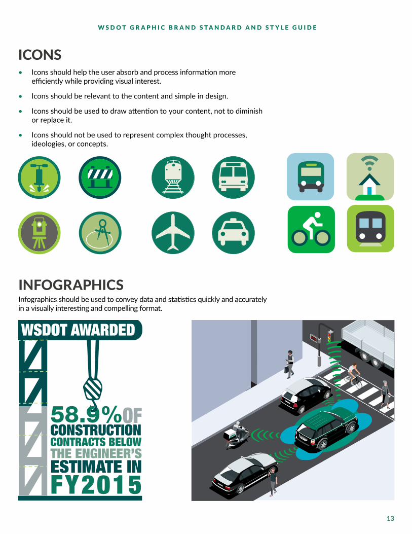
ICONS• Icons should help the user absorb and process information more
efficiently while providing visual interest.
• Icons should be relevant to the content and simple in design.
• Icons should be used to draw attention to your content, not to diminish or replace it.
• Icons should not be used to represent complex thought processes, ideologies, or concepts.
CONSTRUCTIONTHE ENGINEER’SESTIMATE INFY2015
CONTRACTS BELOW
WSDOT AWARDED
58.9%OF
INFOGRAPHICS Infographics should be used to convey data and statistics quickly and accurately in a visually interesting and compelling format.

14
W S D O T G R A P H I C B R A N D S T A N D A R D A N D S T Y L E G U I D E
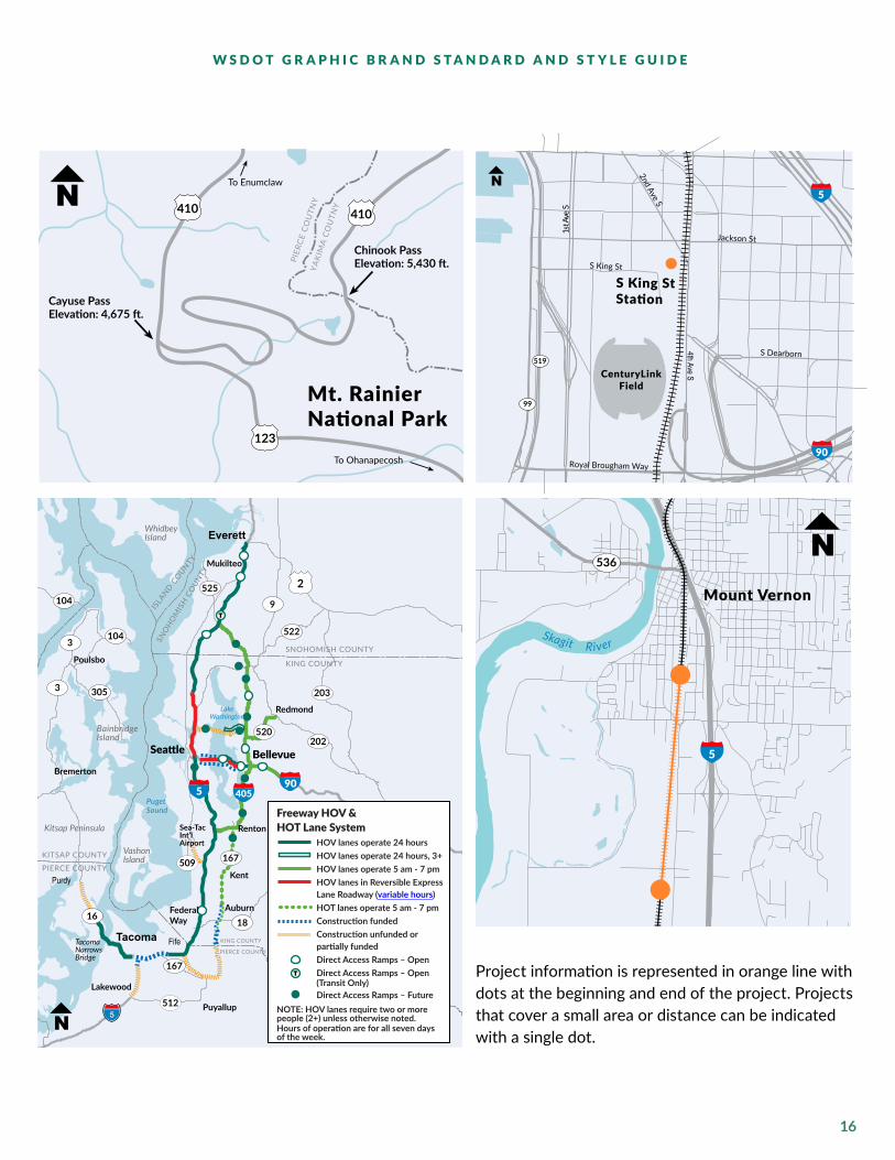
MAPSUsing maps is an important way to illustrate details about your project location, phases, etc. WSDOT has developed map standards so readers know what to expect when viewing maps.
OREGON
BRITISH COLUMBIA
IDAHO
Pasco
Tacoma
Yakima
Cheney
PullmanOthello
Olympia
Shelton
SeattleSpokane
Everett
Aberdeen
Okanogan
Colville
Vancouver
Toppenish
Ritzville
Wenatchee
Davenport
Ellensburg
Moses Lake
Bellingham
Walla Walla
Port Angeles
Friday Harbor
90
82
5
2
97
195
12
730
101
101
2
97
5
TacomaS Tacoma Way
N
Center St
Pacific Ave
Puyallup Ave
LEGENDAlternate route from Eastbound SR 16 to Northbound I-5
16
509
7
5
5
LAND CMYK: 6, 3, 0, 0
WATER CMYK: 42, 3, 13, 0
PROJECT CMYK: 0,59, 90, 0
ROADS CMYK: 0, 0, 0, 40
NON-STATE CMYK: 56,46,45,11
DETOUR CONSTRUCTION
CLOSURE
124
PMS Red 32 PMS 7549
PMS 335 PMS 375
PMS 2415
PMS 368dash: 1pt | gap: 4.5pt
rounded cap
PMS 3125
PMS Process Bluedash: 2pt | gap: 2pt
butt cap
PMS Process Bluedash: 3pt | gap: 6pt
rounded cap
PMS 7549dash: 1pt | gap: 1pt
butt cap
5 1672
SHIELDS
ARROWEXITS
COLORS
MAP SYMBOLS
ALTERNATE ROUTE COLORS
RAILROAD TRACKS
Two strokes stackedstroke 1: solid stroke 2: 6pt dash: .5 | gap 4pt
FERRY ROUTES
PMS Process Bluedash: 5.5pt | gap: 2.5pt
butt cap

15
W S D O T G R A P H I C B R A N D S T A N D A R D A N D S T Y L E G U I D E
Puget Sound
American Lake
DuPont
5
Tillicum
Lakewood
LewisNorth
Joint BaseLewis McChord
CampMurray
LewisMain
119
116
122
123
124
119
122
123
Exit 119: Steilacoom-DuPont Road interchange.
116 Exit 116: Mounts Road interchange.
Exit 122: Rebuild Berkeley Street interchange.
Exit 123: Rebuild Thorne Lane interchange.
124 Exit 124: Gravelly Lake Drive interchange.
An additional through lane will be added northbound from Steilacoom-DuPont Road to Thorne lane (Exit 123.)n.
Gravelly-Thorne Connector
Bicycle/Pedestrian Path
PROPOSED OPTIONS:
An additional through lane will be added southbound from Thorne Lane (Exit 123) to Steilacoom-DuPont Rd. (Exit 119).
16
W S D O T G R A P H I C B R A N D S T A N D A R D A N D S T Y L E G U I D E
Chinook PassElevation: 5,430 ft.
Cayuse PassElevation: 4,675 ft.
Mt. RainierNational Park
410 410N To Enumclaw
To Ohanapecosh
PIER
CE
CO
UTN
YYA
KIM
A C
OU
TNY
123
CenturyLinkField
Jackson St
S King St
S King StStation
© 2012 Tele Atlas B.V. 0280-12-03
S evA
ht4
2nd Ave S
S Dearborn
Royal Brougham Way
S evA ts1
5
90
519
99
5
Seattle Bellevue
Everett
Tacoma
Renton
Kent
Auburn
Puyallup
Lakewood
FederalWay
Mukilteo
Poulsbo
Bremerton
Purdy
Fife
Redmond
PIERCE COUNTY
PIERCE COUNTY
KITSAP COUNTY
KING COUNTY
KING COUNTY
SNOHOMISH COUNTY
Kitsap Peninsula
VashonIsland
BainbridgeIsland
Puget Sound
LakeWashington
WhidbeyIsland
Sea-TacInt’lAirport
TacomaNarrowsBridge
SNO
HO
MIS
H C
OUN
TY
ISLA
ND COUNTY
2
905 405
3
1618
167
104
9
525
202
509
512
522
203
520
104
3 305
167
Freeway HOV & HOT Lane System HOV lanes operate 24 hours HOV lanes operate 24 hours, 3+ HOV lanes operate 5 am - 7 pm HOV lanes in Reversible Express Lane Roadway (variable hours) HOT lanes operate 5 am - 7 pm Construction funded Construction unfunded or partially funded Direct Access Ramps – Open Direct Access Ramps – Open (Transit Only) Direct Access Ramps – FutureNOTE: HOV lanes require two or more people (2+) unless otherwise noted.Hours of operation are for all seven days of the week.
T
T
Mount Vernon
Skagit R iver
5
536
Project information is represented in orange line with dots at the beginning and end of the project. Projects that cover a small area or distance can be indicated with a single dot.

17
W S D O T G R A P H I C B R A N D S T A N D A R D A N D S T Y L E G U I D E
TYPOGRAPHYConsistent use of type is vital for a strong graphic identity.
WEB-USE: LATOThis is a highly readable font and should be used on all web publications.
PRINT-USE: LATOIt should be used in documents produced in desktop publishing programs such as InDesign. It is also available in Regular, Italic, Bold and Bold Italic.
Additional options within this font family can be used with discretion. These are: Medium, Semi-bold, Heavy, and Black. Due to poor readability, Hairline, Thin, and Light should not be used.
Exception: Arial should be used in desktop programs such as Microsoft Word or PowerPoint.
TYPE SIZEThe WSDOT standard paragraph style for publications is 11-point type with 14-point spacing between the lines. If readability is an issue, a larger font size is necessary. We suggest a font size no larger than 14 point and a font size no smaller than 9 point.
ITALIC AND BOLD TYPEUse italic type appropriately — in small doses. A large amount of italic text is hard to read. Bold type should be used primarily for headlines and headings. In body copy, bold type should emphasize a point — multiple sentences or a full paragraph of bold text has the effect of shouting at your audience and will reduce receptivity to the message.
Italic type should not be used on websites due to poor readability. Text that is bold italic and underlined is overkill.
UNDERLINED TYPEDo not underline text as this is reserved for hyperlinks.
LATO
AaBbCcDd 12345678ABCDEFGHIJKLMN OPQRSTUV W X YZ
abcdefghijklmn pqrstuvwxyz
1234567890
To be used for Web documents and documents produced in desktop publishing programs such as InDesign.
ARIAL
AaBbCcDd 12345678ABCDEFGHIJKLMN OPQRSTUVWXYZ
abcdefghijklmn opqrstuvwxyz
1234567890
To be used for documents produced in Microsoft Word and PowerPoint.

18
W S D O T G R A P H I C B R A N D S T A N D A R D A N D S T Y L E G U I D E
WHY WHITE SPACE IS USED
1. It separates elements on a page. This is the fundamental reason to use white space. Without it, your page looks cluttered and messy. Readers won’t be able to tell what words relate to the images, and it is hard to read (so it probably wouldn’t be read). Used properly, white space allows the reader’s eye to take a break from content.
2. It improves readability and comprehension.
3. White space between paragraphs and around blocks of text actually helps people understand what they are reading better. According to research in 2004, this kind of white space increases comprehension by almost 20%. http://www.humanfactors.com/newsletters/yeah_but_can_you_give_me_a_reference.asp
4. It helps to create balance and therefore increase attention.
White space can be a powerful way of drawing the users attention to a particular screen element. To a non-designer, the most obvious way to make something stand out is to make it bigger. However, often surrounding the item with whitespace can be just as effective. Additionally, white space gives the document, poster or presentation a fresh, modern feel.
IMPORTANCE OF WHITE SPACEProfessional designers actively employ white space. It’s not just the space left over after everything has been placed on the page; it’s a separate, vital design element.

19
W S D O T G R A P H I C B R A N D S T A N D A R D A N D S T Y L E G U I D E
GRAPHIC IDENTITY EXAMPLESThe examples that follow show publications using the graphic identity. The results are an attractive, consistent design, usable across all programs in the agency to reinforce WSDOT’s identity.
North Cascades Highway
MOTORCYCLE SAFETY & RIDER AWARENESS ALONG WASHINGTON STATE ROUTE 20 MOTORCYCLE CRASH TRENDS & CHARACTERISTICS BETWEEN SEDRO-WOOLLEY & OKANOGAN
WSDOT’S COMMITMENT TO REDUCING MOTORCYCLE CRASHES ALONG SR 20Motorcycles are involved in twenty percent of all crashes along the North Cascades Highway.*
Each year, 14 motorcycles are involved in an accident along the route, 4 of these involve either incapacitating injuries or fatalities.*
To keep motorcyclists safe, we urge everyone to share the road and be alert, and we are reminding motorcyclists to make themselves visible, to use DOT-compliant motorcycle helmets, to utilize scenic turnouts when fatigued, and to always ride sober.
In addition, WSDOT is implementing several safety improvements along the route that were identified in a 2016 study.
CONTACT USWashington State Department of TransportationNorth Central Region Traffic Office (Road Safety Audit Team)1551 N Wenatchee AvenueWenatchee, WA 98801
Washington Pass Overlook – Milepost 162.3
* Statistical data over a 5-year period from 2011 to 2016
Americans with Disabilities Act (ADA) Information: This material can be made available in an alternate format by emailing the Office of Equal Opportunity at [email protected] or by calling toll free, 855-362-4ADA(4232). Persons who are deaf or hard of hearing may make a request by calling the Washington State Relay at 711. Title VI Notice to Public: It is the Washington State Department of Transportation’s (WSDOT) policy to assure that no person shall, on the grounds of race, color, national origin or sex, as provided by Title VI of the Civil Rights Act of 1964, be excluded from participation in, be denied the benefits of, or be otherwise discriminated against under any of its federally funded programs and activities. Any person who believes his/her Title VI protection has been violated, may file a complaint with WSDOT’s Office of Equal Opportunity (OEO). For additional information regarding Title VI complaint procedures and/or information regarding our non-discrimination obligations, please contact OEO’s Title VI Coordinator at (360) 705-7090.
The assistance of the Federal Highway Administration and the Washington State Patrol in the development of the Road Safety Audit is gratefully acknowledged.
PLEASE RIDE SAFELY.
17-11-0461
This document reports on the Washington State Department of Transportation’s cultural resource activities within the following projects:
• I-5: Portland Avenue to Port of Tacoma Road - Northbound HOV, and subcontracts:
1. Stage 12. Clear Creek Mitigation Site
• I-5: Portland Avenue to Port of Tacoma Road - Southbound HOV
WSDOT provides this information on a quarterly basis to the Puyallup Tribe of Indians pursuant to the Memorandum of Agreement.
For more information, contact:
Lone Moody Acting Project [email protected]
Americans with Disabilities Act (ADA) Information: This material can be made available in an alternate format by emailing the Office of Equal Opportunity at [email protected] or by calling toll free, 855-362-4ADA (4232). Persons who are deaf or hard of hearing may make a request by calling the Washington State Relay at 711.
Title VI Notice to Public: It is the Washington State Department of Transportation’s (WSDOT) policy to assure that no person shall, on the grounds of race, color, national origin and sex, as provided by Title VI of the Civil Rights Act of 1964, be excluded from participation in, be denied the benefits of, or be otherwise discriminated against under any of its federally funded programs and activities. Any person who believes his/her Title VI protection has been violated, may file a complaint with WSDOT’s Office of Equal Opportunity (OEO). For additional information regarding Title VI complaint procedures and/or information regarding our non-discrimination obligations, please contact OEO’s Title VI Coordinator at (360) 705-7090.
EXCAVATION CONTINUES ON HOV CONSTRUCTION PROJECTSNo Cultural Resources Found
Crews working for the Washington State Department of Transportation excavated at the job site for numerous activities. Per WSDOT’s agreement with the Tribe, archaeological monitors were present during the work.
Excavation activities within the monitoring areas this quarter include:
• Removal of old retaining walls• Excavation for scour protection on south levee• Excavation for retaining wall• Removal of fill materials placed for construction access
Excavation activities outside the monitoring areas this quarter include:
• Excavation for sidewalk and roadway on 27th Street• Excavation for drainage structures in Fife
No new cultural resources were encountered or recorded during this period.
OCTOBER–DECEMBER 2017REPORT NO. 32
Tacoma/Pierce County HOV ProgramWSDOT CULTURAL RESOURCE SUMMARY PREPARED FOR THE PUYALLUP TRIBE OF INDIANS
18-01-0016
FREIGHT INVESTMENT PL ANThe 2017 Washington State Freight Investment Plan was included as Appendix A to the 2017 Washington State Freight System Plan. It was developed to guide investments that benefit freight transportation in Washington and to track recent freight funding investments. It describes key funding sources, networks eligible for funding, and projects identified on those networks.
National Highway Freight ProgramIncludes a list of priority, financially constrained projects and describes how available National Highway Freight Program (NHFP) funds would be invested and matched in Washington• Provides Washington with an estimated $89
million from federal fiscal years 2016 to 2020 – not including the required match.
• Leverages nearly $240 million in additional funding for freight related projects
• Identifies NHFP eligible projects that benefit the freight transportation system, aligned with federal and state transportation goals
• Designates Critical Urban Freight Corridor limit in Washington – 81.66 miles
• Designates Critical Rural Freight Corridor limit in Washington – 163.31 miles
W ashington is the second most trade-dependent state per capita in the country. The freight system supports 1.41 million
jobs in freight-dependent industries in Washington, with a gross business income of $550.5 billion. It is vital to the economy of our state and country as it enhances our state and national economies, backs national defense support systems, directly sustains hundreds of thousands of jobs, and delivers the necessities of life to residents on a daily basis.
The Washington State Department of Transportation developed the 2017 Washington State Freight System Plan to ensure that the transportation system supports the continued development of trade and sustains economic growth through efficient freight movement. The plan incorporates recent freight planning efforts by WSDOT and partners, and meets federal and state planning requirements.
The plan provides:
• Details about the importance of freight to state, regional, and local economies
• Freight analysis of volumes and forecasts
• Performance measures
• Major freight trends, issues, and needs
• Strategies
• Investment plan
Freight and Trade Drive Washington’s EconomyWashington is the second most trade-dependent state in the nation
• 11,352 small and medium-sized goods exporters
• $126.8 billion in total imports and exports value
Freight-dependent industries have a major economic effect• 1.41 million jobs in freight-dependent industries
(wholesale/retail, manufacturing, construction, transportation, agriculture, forest products)
• $550.5 billion in gross business income for freight-dependent sectors
The Freight Transportation System in Washington is MultimodalGoods are shipped into, out of, within, and through Washington via:
2017 Washington State Freight System Plan
DECEMBER 2017
KEEPING WASHINGTON VITAL AND COMPETITIVE THROUGH FREIGHT
MORE INFORMATION Ron Pate Rail, Freight, and Ports Division Director [email protected]://www.wsdot.wa.gov/freight/
Americans with Disabilities Act (ADA) Information: This material can be made available in an alternate format by emailing the Office of Equal Opportunity at [email protected] or by calling toll free, 855-362-4ADA(4232). Persons who are deaf or hard of hearing may make a request by calling the Washington State Relay at 711. Title VI Notice to Public: It is the Washington State Department of Transportation’s (WSDOT) policy to assure that no person shall, on the grounds of race, color, national origin or sex, as provided by Title VI of the Civil Rights Act of 1964, be excluded from participation in, be denied the benefits of, or be otherwise discriminated against under any of its federally funded programs and activities. Any person who believes his/her Title VI protection has been violated, may file a complaint with WSDOT’s Office of Equal Opportunity (OEO). For additional information regarding Title VI complaint procedures and/or information regarding our non-discrimination obligations, please contact OEO’s Title VI Coordinator at (360) 705-7090.
17-11-0493
Washington state National Highway Freight Program Investments, FFY 2016-2020
Project Name Project Owner NHFP Total Project Funding
Multimodal ProjectsSouth Terminal Modernization Project Phase II Port of Everett $1,812,000 $39,477,000Port Community Technology System Northwest Seaport Alliance $1,500,000 $3,000,000Big Pasco Intermodal Rail Reconstruction Port of Pasco $1,300,000 $1,700,000State ProjectsI-90/Adams Co Line to Spokane Co Line Bridge Repairs WSDOT - Eastern Region $11,515,000 $11,750,000I-5 SB 88th St to SR 531 SB On Ramp Vicinity - Paving WSDOT - Northwest Region $3,650,000 $3,725,000I-90 / 468th Ave SE to W Summit Rd EB -Rehab Concrete WSDOT - South Central Region $22,308,000 $27,709,000I-90/Floating Bridges - Replace Anchor Cables WSDOT - Northwest Region $5,929,000 $7,759,000SR 501/I-5 to SW 26th St Ext Vic Including Couplet - Paving WSDOT - Southwest Region $1,769,000 $2,096,000Local/Regional ProjectsS Lander St Grade Separation and Railway Safety Project City of Seattle $3,000,000 $123,000,000Pacific Highway E/54th Ave E Intersection Improvements City of Fife $2,000,000 $9,262,000142nd Ave & 24th St. City of Sumner $4,707,000 $6,418,000Bigelow Gulch - Forker Road Connecter Spokane County $5,872,000 $9,684,000Taylor Way Rehabilitation City of Tacoma $8,895,000 $21,386,000Union Gap Regional Beltway Connector City of Union Gap $1,990,000 $7,331,000SR 432 Corridor Improvements - Phase II City of Longview $5,300,000 $9,500,000Barker Road/BNSF Grade Separation Project City of Spokane Valley $6,000,000 $18,738,000US395/Ridgeline Drive Interchange City of Kennewick $1,944,000 $23,750,000
Total Investment $89,491,000 $326,285,000
• highways and roadways
• railroads
• waterways
• airports
• pipelines

20
W S D O T G R A P H I C B R A N D S T A N D A R D A N D S T Y L E G U I D E
PHOTOSDigital photos are composed of tiny dots called pixels. The more dots per one-inch line, the sharper the image. An image that is 3” x 5” in size, at 72 dots per inch (dpi), is composed of 216 x 360 pixels. It may look reasonable at 5 inches wide, but if you enlarge it to 7 inches wide it still contains the same 216 x 360 dots but now there are only 51 dots per inch.
GENERAL PHOTO GUIDELINESUsing low-resolution photos for print can result in photos appearing out of focus or fuzzy. Digital cameras have a number of resolution settings that affect the quality of a digital image. Make sure your camera is set at a high-resolution and make any adjustments to photo resolution on a duplicate copy of your photo in photo manipulation software. High-resolution photos can always be converted to low-resolution photos, but the reverse is not true without a drastic loss in image quality. For instance, a large photo can be sized down, but a very small photo simply cannot be made large.If you are taking a photograph to be used in a publication, turn off the date and time stamp feature on your camera; otherwise, your material will become quickly dated and removing the stamp through Photoshop requires additional time and effort.
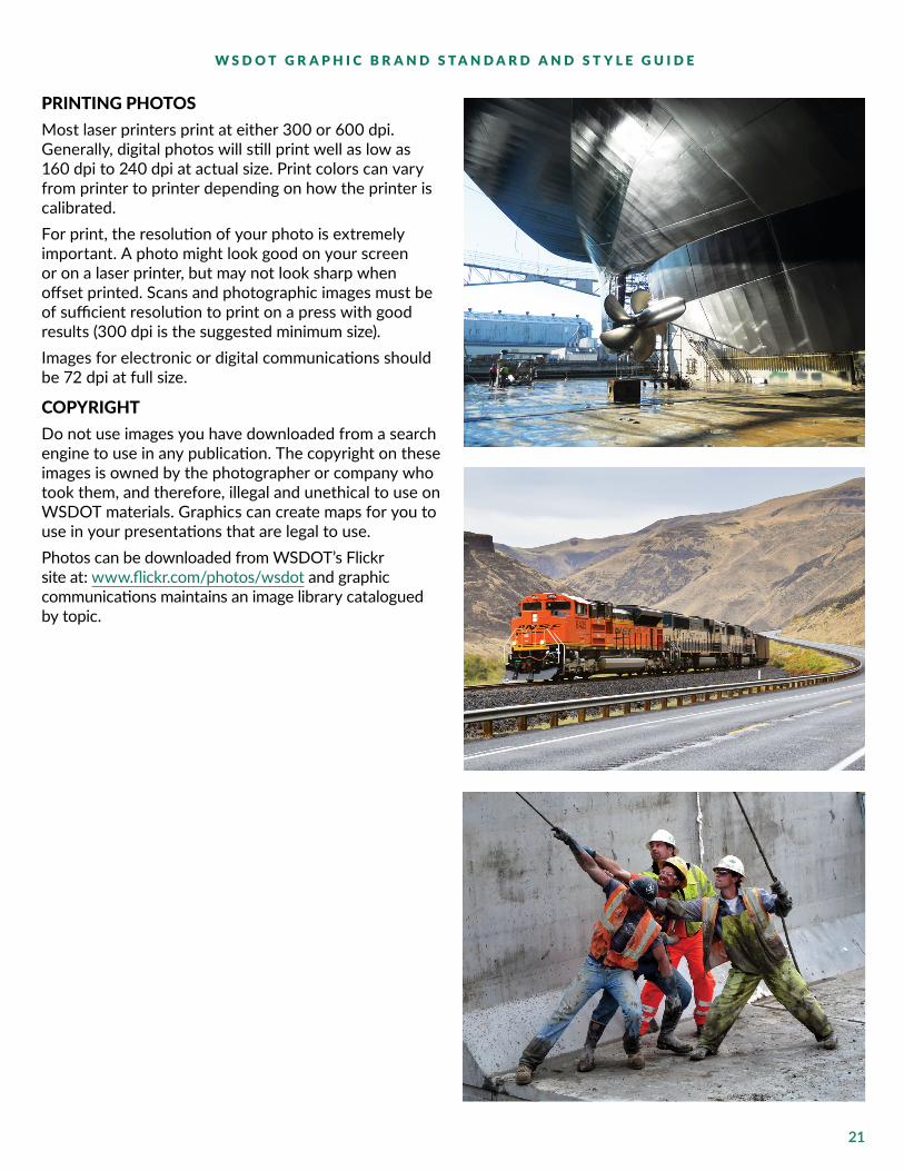
PHOTOGRAPHY STYLE
• Shoot images that are compelling and reflective of the work that WSDOT does for people using all modes of transportation.
• Avoid rehearsed images, photos should feel natural and unstaged. Simple and direct images are the best way to express who we are.
• Convey a sense of vitality. Use a variety of close-ups and wide shots, contrasting depths of field and carefully composed backgrounds.
• Represent racial, gender, age, ability/disability and professional diversity.
• Be aware of all the components of an image before shooting or using them in WSDOT publications.
• Avoid using images that are out of focus, low resolution, or darkly lit.
21
W S D O T G R A P H I C B R A N D S T A N D A R D A N D S T Y L E G U I D E
PRINTING PHOTOSMost laser printers print at either 300 or 600 dpi. Generally, digital photos will still print well as low as 160 dpi to 240 dpi at actual size. Print colors can vary from printer to printer depending on how the printer is calibrated.For print, the resolution of your photo is extremely important. A photo might look good on your screen or on a laser printer, but may not look sharp when offset printed. Scans and photographic images must be of sufficient resolution to print on a press with good results (300 dpi is the suggested minimum size).Images for electronic or digital communications should be 72 dpi at full size.
COPYRIGHTDo not use images you have downloaded from a search engine to use in any publication. The copyright on these images is owned by the photographer or company who took them, and therefore, illegal and unethical to use on WSDOT materials. Graphics can create maps for you to use in your presentations that are legal to use. Photos can be downloaded from WSDOT’s Flickr site at: www.flickr.com/photos/wsdot and graphic communications maintains an image library catalogued by topic.

22
W S D O T G R A P H I C B R A N D S T A N D A R D A N D S T Y L E G U I D E
GENERAL DESIGN DOS AND DON’TSDO make sure you have a high contrast between text and a colored background
DO NOT use non-standard WSDOT colors for text or backgrounds
DO NOT use drop shadows on photos
DO NOT use drop shadows on text
DO NOT use photos as backgrounds or watermarks behind text
DO make sure ADA and Title VI information are included and up-to-date (see page 11)
23
W S D O T G R A P H I C B R A N D S T A N D A R D A N D S T Y L E G U I D E
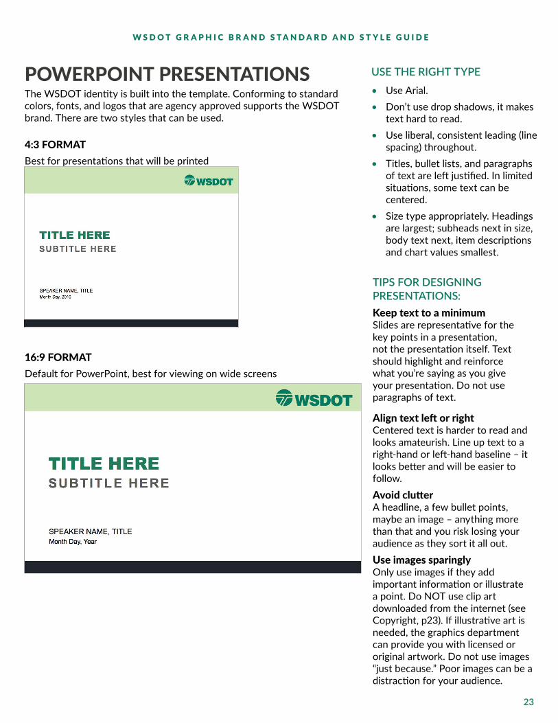
The WSDOT identity is built into the template. Conforming to standard colors, fonts, and logos that are agency approved supports the WSDOT brand. There are two styles that can be used.
4:3 FORMATBest for presentations that will be printed
16:9 FORMATDefault for PowerPoint, best for viewing on wide screens
POWERPOINT PRESENTATIONS USE THE RIGHT TYPE• Use Arial. • Don’t use drop shadows, it makes
text hard to read.• Use liberal, consistent leading (line
spacing) throughout.• Titles, bullet lists, and paragraphs
of text are left justified. In limited situations, some text can be centered.
• Size type appropriately. Headings are largest; subheads next in size, body text next, item descriptions and chart values smallest.
TIPS FOR DESIGNING PRESENTATIONS:Keep text to a minimumSlides are representative for the key points in a presentation, not the presentation itself. Text should highlight and reinforce what you’re saying as you give your presentation. Do not use paragraphs of text.
Align text left or rightCentered text is harder to read and looks amateurish. Line up text to a right-hand or left-hand baseline – it looks better and will be easier to follow.Avoid clutter A headline, a few bullet points, maybe an image – anything more than that and you risk losing your audience as they sort it all out.Use images sparinglyOnly use images if they add important information or illustrate a point. Do NOT use clip art downloaded from the internet (see Copyright, p23). If illustrative art is needed, the graphics department can provide you with licensed or original artwork. Do not use images “just because.” Poor images can be a distraction for your audience.

24
W S D O T G R A P H I C B R A N D S T A N D A R D A N D S T Y L E G U I D E
AGENCY VIDEO STANDARDS AND BEST PRACTICESAGENCY STANDARDS
• Safety is my job All employees in WSDOT videos (including the videographer) must wear required safety gear, i.e., hard hat, vest, etc. and follow WSDOT safety practices depending on the setting of the video (i.e. office, at a construction project, etc.).
• Agency branding All videos and animations should be easily identified as a WSDOT product and include the standard agency opening, closing and transparent WSDOT acronym logo in the lower right-hand corner.1
• Spokesperson name and title The speaker’s name and title should use the agency title standard, appear at the lower left bottom of the screen, and disappear after a 2-3 second duration.
• Closed captioning2 This is required of agency-produced videos to be compliant with the American Disability Act.
• Standard intro and outro Use the standard agency opening and closing. Exception: the standard intro and outro is not necessary for ‘raw’ or uncut footage and videos produced by WSDOT construction contractors (i.e. Seattle Tunnel Partners).
• Video credit Traditionally known as a video credit, credits should be used only for any royalty free music or images that require credit for use. Do not use credits for WSDOT staff or offices.
• Engage your communicators early in the video process Contact your communications staff for help with your video. Engage them and technical staff early to make sure your video is consistent with agency messaging and get help determining your goals, audience, scripting, visuals, editing, promotion,
distribution, etc. Signed release Be sure to have a video and photo release signed by video participants. If your video involves a contractor, check the contract as there may be implied consent. If other people are filmed while in a public location, a release is not necessary.
• Review and promote video Send communications staff your video to review and work with communications staff to promote the final product.
BEST PRACTICES TO GUIDE VIDEO PRODUCTION
• Have a clear goal Do not do a video to do a video. Have a clear goal and audience in mind. Talk to your communications staff to determine if video is the right tool to use based on your goals and audience.
• Your video intro Intro should be short and conversational. Visually, the intro can show a spokesperson or some other shot related to the topic.
• Simple is best Videos should have a clear message that you can state in a sentence. Keep on-screen graphics, props, animations and lengthy dialogue to a minimum.
• Short and sweet Videos should be no more than 1 to 4-minutes long. Create separate videos if it is difficult to keep it to that timeframe. Longer videos do not perform well as viewers lose interest quickly. If the message or customer drives the need for longer videos (such as a training video), discuss it with your communications staff.
• Stay up-to-date Stay up-to-date with video techniques, technologies, content types and what is popular with online audiences.
1 If you are producing a video specifically for use by media, you can move the WSDOT acronym logo to the top right corner so that it isn’t covered by the TV station’s logo.
2 An exception includes some internal training videos intended for specific audiences such as Washington State Ferries Deck, Engine, Terminal or Eagle Harbor staff. Captioning is not necessary, as employees cannot staff those positions if they are hearing impaired.
25
W S D O T G R A P H I C B R A N D S T A N D A R D A N D S T Y L E G U I D E
• Inform, educate, entertain Three types of video are consistently popular on the web: informative, entertaining and educational. Informative and educational videos should be our focus.
• Remember your audience Tailor your video to a specific audience in terms of language and style. Communicate and engage with them in a way they would appreciate.
• Interview soundbites should be short Visually, determine if you want to show the speaker on-location or in an office environment.
• Transitional title frames If necessary, short transitional subtitle frames can separate subtopics, locations, etc., throughout the video. Use the agency standard for transitional subtitle frames.
• Sensitive Security Information (SSI) Videos and/or video logs should identify SSI information appropriately. Non-disclosure documents should be on file before authorization to review the video is approved. An example of this would be a training video for how to handle an active shooter incident at Washington State Ferries. This video contains SSI and staff that view the video should have non-disclosure agreements on file.
• Include B-Roll to add visual interest These are simply shots of things that are visually interesting and simultaneously support and complement the voice-over, monologue or interview.
• Maps/charts/diagrams Minimize the use of maps, charts and diagrams. Use of these tools depends on the message and what is needed for effective delivery. Maps/charts/diagrams should use the agency standard and color palette.
• Captions The following provides ADA compliant captioning best practices: https://www.digitalgov.gov/2014/06/30/508-accessible-videos-how-to-caption-videos. YouTube and FaceBook have free caption services as part of their video upload feature. These free services do require time to
review and edit captions as needed.
KEY ELEMENTS THAT HELP US BE BETTER STORYTELLERS
• Every story has a beginning, middle and end Map out your story in advance.
• Emotion Give our audience a reason to care and a way to connect to the story. An emotion can give us a larger palette, making it possible to show not just concrete facts but the reality of the human experience.
• Visual appeal Video stories need visual appeal. Some places, people and things are inherently more visually interesting. Everyday locations and activities can spring to life with fresh perspectives, angles and composition.
• Action and movement Other media can describe or hint at motion, but only video can really show it. Processes, sequences and motions are made for video. Whether it is someone using, operating, creating or destroying something, video can reveal exactly what the process looks like and precisely how it works.
• Audio is a crucial element of video Interview sound bites tell us what the people in our stories are thinking and doing. Ambient or location sound creates a sense of place. Natural sound punctuates actions and important moments. Narration ties everything together. Audio often sets the tempo and in many cases, determines how and when shots are edited together. Video is often edited to match audio, not the other way around. Some tips:
º Audio recorded too high becomes distorted. Audio recorded too low tends to drown in noise resulting in static and hum from other on-location sound sources.
º Never depend on the camera microphone to record anything more than the ambient sound.

26
W S D O T G R A P H I C B R A N D S T A N D A R D A N D S T Y L E G U I D E
º For interviews, always use a lavaliere type microphone that is clipped to the person’s clothing about mid-chest or use a boom microphone that is kept just out of the frame.
º Whenever recording audio, use headphones. You must verify the sound that you are recording will be good enough to use in your final production.
º Use professional audio equipment for narration. Narration recorded in an office or cubicle on an inexpensive computer microphone sounds bad. There are several professionally equipped narration studios at WSDOT that can be utilized upon request.
• Editing When editing, use short clips The best videos keep the audience engaged by consistent short cuts that are 3- to 7-seconds long. Nothing will lose an audience faster than a video that runs for a minute and has no edits. Mix it up, use B-roll and keep the eye moving.
• Events and moments Video offers an unrivaled way to document unique moments in time. We should always look for ways to capture the things that only happen once.
• People The most interesting stories involve people. Use WSDOT employees to provide a point of view. Draw the viewer into our realm. Do multiple takes so that repetition removes some of the uneasiness. Make sure that you have plenty of B-roll to use as cutaways when you have to edit the interview or narrative.
• Newsworthiness Give our viewers something new, noteworthy, unusual or timely. Answer the question: why should I care?
• Settings and locations Consider where to shoot your video and the
opportunities and challenges related to it. Consider different types of shots. Wide shots —sweeping views that establish a scene — can tell where a story takes place and convey the size and purpose of a location or project. Medium shots and close-ups can reveal detail and texture providing a sense of a location’s age, condition, energy and character.
• Lighting Make sure lighting is a consideration when shooting video.
• Stability Use video camera stabilizers like tripods when necessary to minimize bumpy video. Some software can stabilize footage after the fact such as After Effects and Adobe Premier.
ONCE YOUR VIDEO IS COMPLETE
• Work with your regional or project communicators to promote Regional, program, project and mode communicators will review videos for audio and visual quality.
• Post to YouTube Email [email protected] with a title and description to upload your video to YouTube.
• Generate more views and conversation about your video Work with your communicators to determine how you can promote your video using the web and social media.
• Create and/or maintain a video log Create or maintain a video log so that videos can be easily cataloged and retrieved in the event of audits or public disclosure requests. Video creators maintain their own record of the original video copies.
27
W S D O T G R A P H I C B R A N D S T A N D A R D A N D S T Y L E G U I D E
ADA AND TITLE VI INFORMATIONBy law, both ADA and Title VI information is required on ALL publications that WSDOT produces.
This enables WSDOT to fulfill its commitment to taking those affirmative action steps which will ensure equitable participation in our business and employment opportunities without regard to race, color, religion, sex, national origin, age, disability, veteran status, marital status or sexual orientation.
WHAT IS ADA?The Americans with Disability Act (ADA) is federal legislation that opens up services and employment opportunities to Americans with disabilities. The law is intended to eliminate illegal discrimination and level the playing field for individuals with disabilities.
WHAT IS TITLE VI?Title VI of the Civil Rights Act of 1964 prohibits discrimination on the basis of race, color, sex or national origin in programs or activities receiving federal financial assistance. To get this language in an electronic format that you can cut and paste directly into your folios, go to the Title VI and ADA Language for Publications site:
http://www.wsdot.wa.gov/EqualOpportunity/titlevi.htm
ACCESSIBILITY NOTE: Design decisions shouldconsider persons who have visual disabilities or are colorblind. While it’s not possible to make all of our materials without using red, green or blue, by taking color blindness into consideration we can use different values to create contrast and make materials more readable for those with disabilities.
For more information and tips for making print more readable, visit the American Foundation for the Blind.
http://www.afb.org/info/reading-and-writing/making-print-more-readable/35

28
W S D O T G R A P H I C B R A N D S T A N D A R D A N D S T Y L E G U I D E
Americans with Disabilities Act (ADA) Information: This material can be made available in an alternate format by emailing the Office of Equal Opportunity at [email protected] or by calling toll free, 855-362-4ADA(4232). Persons who are deaf or hard of hearing may make a request by calling the Washington State Relay at 711. Title VI Notice to Public: It is the Washington State Department of Transportation’s (WSDOT) policy to assure that no person shall, on the grounds of race, color, national origin or sex, as provided by Title VI of the Civil Rights Act of 1964, be excluded from participation in, be denied the benefits of, or be otherwise discriminated against under any of its federally funded programs and activities. Any person who believes his/her Title VI protection has been violated, may file a complaint with WSDOT’s Office of Equal Opportunity (OEO). For additional information regarding Title VI complaint procedures and/or information regarding our non-discrimination obligations, please contact OEO’s Title VI Coordinator at (360) 705-7090.
FOR MORE INFORMATION Contact WSDOT Graphics for questions or guidance: